Application of different tools for Continuous Manufacturing Process Improvement
Dr.Archana Dadhe Ph.D,MBA,PGDIMM,PGDIM,DIM DMSR,G.S.College of Commerce & Economics,
Civil Lines , Amravati Road,Nagpur-440010
Abstract
Continuous quality improvement process assumes and requires that a team of experts together with the company leadership actively use six sigma and quality tools in their improvement activities and decision making process. Currently there are a significant number of quality assurance and quality management tools available, so the selection of the most appropriate is not always an easy task. Tools are essential ingredients of a process and basic instruments for the success of a quality program. Many companies have used tools without giving sufficient thought to their selection and have then experienced barriers to progress. Six sigma & Quality Tools cannot remedy every quality problem but they certainly are a means for solving problems. Consequently, it needs to be emphasized that while tools can be very effective in the right hands, they can be very dangerous in the wrong hands. It is, therefore, important to know how, when and which tools should be used in problem solving or improvement processes.
Key Words: DMAIC, DMADV, PDCA, QC tools, six sigma, Cause & effect & Histogram
SIX SIGMA
When a firm thought of improving its performance, it should remember six sigma that is one of the tools of continuous improvement. Six Sigma was developed by Bill Smith at Motorola in 1980. The idea behind inventing six sigma is to systematically improve processes by eliminating defects.
Sigma the 18th letter of Greek alphabet, it is used to represent standard deviation of population. The term six sigma process comes from the notion that if one has six standard deviations between the mean of a process& the nearest specification limit, there will be practically no items fail to meet the specifications.
Six Sigma is a systematic, fact-based problem solving methodology that provides
businesses with the tools and skills to reduce variation within their processes and create a corporate culture committed to eliminating waste and product variations.
It is a rigorous, disciplined metric, methodology and management system that focuses on:
•Understanding and meeting customer requirements;
•Aligning key business processes to achieve these requirements;
•Utilizing rigorous data analysis to minimize variations in those processes; and
Six sigma is based on 5 elements:
1) Genuine focus on the customer: It focuses on understanding the customer requirements. It indicates that the customer focus is the top priority. By eliminating defects and errors by tracking variation, thereby saving time and money & enhances customer satisfaction.
2) Data and fact driven management: Business decisions are taken based on data and fact. It identifies measures for assessing business performance, gathers data and analysis the key variables. Problems can be resolved permanently.
3) Process focus management and Improvement: It is aimed at improving an existing business process and to create new product and process designs for predictable, defect free performance. Managing and improving processes is the key to success.
4) Collaboration without boundaries: Boundary lessens organization is where teams work across organization and not within the team and improve their own performance. It saves billions of rupees by connecting all teams in organization, avoiding competition between teams, making them work for common goal, which is providing value to customers. GE’s chairman was working towards boundary lessens organization.
5) Drive for perfection, Tolerance for failure: Launch new ideas and approaches. It involves some risk. It creates better environment for new ideas and managing occasional setback.
METHODOLOGY OF SIX SIGMA
Firms can implement six sigma with the use of any one of the two methodologies available. They are DMAIC and DMADV.
Fig.1: Six Sigma Methodologies
2) Measure: Measuring the current process is necessary for future comparison and identify gaps.
3) Analyze: Experts analyze the data to verify cause and effect relationship between the factors in the process. Determine the relationship by considering all factors.
4) Improve: On the basis of analysis given by the experts in the team develop a detailed action plan to improve performance.
5) Control: Control step ensures that any variances are identified and they should be corrected before they result in defects.
II) DMADV: The steps adapted to implement six sigma and to create new product or process designs for predictable, defect free performance.
1) Define: This step is just like first step in DMAIC methodology.
2) Measure: Need to measure and identify factors which are critical to quality. Factors are like product capabilities, production process capability. While measuring & identifying critical factors it is necessary to assess risks.
3) Analyze: Develop and design alternatives, create high level designs and evaluate design capability to select the best design.
4) Design: Just developing design is not enough; it should be optimized by verification. Verification must be done through simulation models.
5) Verify: Verify the developed design through simulation models.
Year by year the number of companies adapting continuous improvement processes is increasing in general and six sigma in special. Motorola in 1986, GE in 1995, Ford in 2000 & Texas instruments in 1988 have adopted the six sigma as a major business initiative. They have used this model to invest heavily, to create new products and services and to improve relationship with customers.
Benefits of Six Sigma For the organization
Contribute to competitive advantage.
To changing the culture in an organization from reactive problem solving to proactive problem prevention.
Bottom line cost savings.
Improved quality of product or service as perceived by the customer. Reduction in process cycle times.
Development of staff skills.
Common language throughout the organization. World class standard.
For the individual
Improved knowledge and skills.
Ability to use a wide range of tools & techniques. A status that is recognized world-wide.
7 Quality Tools
been the foundation of Japan's astonishing industrial resurgence after the Second World War.
Quality pros have many names for these seven basic tools of quality, first emphasized by Kaoru Ishikawa, a professor of engineering at Tokyo University and the father of “quality circles.”
There are 7 basic quality tools:
1. Cause-and-effect diagram (also called Ishikawa or fishbone chart): Identifies many possible causes for an effect or problem and sorts ideas into useful categories.
2. Check sheet: A structured, prepared form for collecting and analyzing data; a generic tool that can be adapted for a wide variety of purposes.
3. Control charts: Graphs used to study how a process changes over time.
4. Histogram: The most commonly used graph for showing frequency distributions, or how often each different value in a set of data occurs.
5. Pareto chart: Shows on a bar graph which factors are more significant.
6. Scatter diagram: Graphs pairs of numerical data, one variable on each axis, to look for a relationship.
7. Stratification: A technique that separates data gathered from a variety of sources so that patterns can be seen (some lists replace “stratification” with “flowchart” or “run chart”).
Cause and Effect Analysis
Fig.2: Cause & Effect
Identifying the Likely Causes of Problems(Also known as Cause and Effect Diagrams, Fishbone Diagrams, Ishikawa Diagrams, Herringbone Diagrams, and Fishikawa Diagrams.)
Procedure
The steps in the procedure to prepare a cause-and-effect diagram are :
2. Determine the main groups or categories of causes. Place them in boxes and connect them through large bones to the backbone.
3. Brainstorm to find possible causes and subsidiary causes under each of the main groups. Make sure that the route from the cause to the effect is correctly depicted. The path must start from a root cause and end in the effect.
4. After completing all the main groups, brainstorm for more causes that may have escaped earlier.
5. Once the diagram is complete, discuss relative importance of the causes. Short list the important root causes.
When you have a serious problem, it's important to explore all of the things that could cause it, before you start to think about a solution.
That way you can solve the problem completely, first time round, rather than just addressing part of it and having the problem run on and on.
Fig.3: Cause & Effect Analysis Check sheet
A structured, prepared form for collecting and analyzing data; a generic tool that can be adapted for a wide variety of purposes.
Procedure:
1. Decide what event or problem will be observed. Develop operational definitions. 2. Decide what data will be collected and for how long.
3. Design the form. Set it up so that data can be recorded simply by making check marks or Xs or similar symbols and so that data do not have to be recopied for analysis.
4. Label all spaces on the form.
5. Test the check sheet for a short trial period to be sure it collects the appropriate data and is easy to use.
Check Sheet Example
The figure below shows a check sheet used to collect data on telephone interruptions. The tick marks were added as data was collected over several weeks.
Fig.4:Check Sheet Control Charts:
Control charts are used to routinely monitor quality. Depending on the number of process characteristics to be monitored.
The control chart is a graph used to study how a process changes over time. Data are plotted in time order. A control chart always has a central line for the average, an upper line for the upper control limit and a lower line for the lower control limit. These lines are determined from historical data. By comparing current data to these lines, you can draw conclusions about whether the process variation is consistent (in control) or is unpredictable (out of control, affected by special causes of variation).
Elements of a Control Chart
There are three main elements of a control chart as shown in Figure. 1. A control chart begins with a time series graph.
2. A central line (X) is added as a visual reference for detecting shifts or trends – this is also referred to as the process location.
3. Upper and lower control limits (UCL and LCL) are computed from available data and placed equidistant from the central line. This is also referred to as process dispersion.
Fig.5: Elements of a Control Chart
Control limits (CLs) ensure time is not wasted looking for unnecessary trouble – the goal of any process improvement practitioner should be to only take action when warranted. Control limits are calculated by:
1. Estimating the standard deviation of the sample data 2. Multiplying that number by three
3. Adding (3 x ? to the average) for the UCL and subtracting (3 x ? from the average) for the LCL
Mathematically, the calculation of control limits looks like:
There are different types of Control Charts
C chart. In this char we plot the number of defectives (per batch, per day, per machine etc). This chart assumes that defects of the quality attribute are rare, and the control limits in this chart are computed based on the Poisson distribution (distribution of rare events).
U chart. In this chart we plot the rate of defectives, that is, the number of defectives divided by the number of units inspected.
Np chart. In this chart, we plot the number of defectives (per batch, per day, per machine) as in the C chart. However, the control limits in this chart are not based on the distribution of rare events, but ratheron the binomial distribution. Therefore, this chart should be used if the occurrence of defectives is not rare (e.g., they occur in more than 5% of the units inspected). For example, we may use this chart to control the number of units produced with minor flaws.
P chart. In this chart, we plot the percent of defectives (per batch, per day, per machine, etc.) as in the U chart. However, the control limits in this chart are not based on the distribution of rare events but rather on the binomial distribution (of proportions). Therefore, this chart is most applicable to situations where the occurrence of defectives is not rare (e.g., we expect the percent of defectives to be more than 5% of the total number of units produced).
Control rules take advantage of the normal curve in which 68.26 percent of all data is within plus or minus one standard deviation from the average, 95.44 percent of all data is within plus or minus two standard deviations from the average, and 99.73 percent of data will be within plus or minus three standard deviations from the average. As such, data should be normally distributed (or transformed) when using control charts, or the chart may signal an unexpectedly high rate of false alarms.
When to Use a Control Chart
1. When controlling ongoing processes by finding and correcting problems as they occur. 2. When predicting the expected range of outcomes from a process.
3. When determining whether a process is stable (in statistical control).
4. When analyzing patterns of process variation from special causes (non-routine events) or common causes (built into the process).
5. When determining whether your quality improvement project should aim to prevent specific problems or to make fundamental changes to the process.
Histogram
In statistics, a histogram is a graphical display of tabulated frequencies, shown as bars. It shows what proportion of cases fall into each of several categories. The categories are usually specified as non-overlapping intervals of some variable. The categories (bars) must be adjacent. The intervals (or bands) should ideally be of the same size.
A histogram is a graphical representation of data; the data is represented by columns on a graph which vary in height depending on the frequency (how many times) the specific range of data occur.
1. Arrange all values in an ascending order.
2. Divide the entire range of values into a convenient number of groups each representing an equal class interval. It is customary to have number of groups equal to or less than the square root of the number of observations. However one should not be too rigid about this. The reason for this cautionary note will be obvious when we see some examples.
3. Note the number of observations or frequency in each group.
4. Draw X-axis and Y-axis and decide appropriate scales for the groups on X-axis and the number of observations or the frequency on Y-axis.
5. Draw bars representing the frequency for each of the groups. 6. Provide a suitable title to the Histogram.
7. Study the pattern of distribution and draw conclusion.
Fig.6:Normal Histogram
Fig.7: Histogram
Pareto Chart
The Pareto chart provides a graphic depiction of the Pareto principle, a theory maintaining that 80% of the output in a given situation or system is produced by 20% of the input.
The Pareto chart is one of the seven basic tools of quality control. The independent variables on the chart are shown on the horizontal axis and the dependent variables are portrayed as the heights of bars. A point-to-point graph, which shows the cumulative relative frequency, may be superimposed on the bar graph. Because the values of the statistical variables are placed in order of relative frequency, the graph clearly reveals which factors have the greatest impact and where attention is likely to yield the greatest benefit.
Fig.8: Number of Product Defects
Fig.9: Pareto Chart SCATTER DIAGRAM
or that one variable can be used as a surrogate for the other. When to use it: Use a scatter diagram to examine theories about cause-and-effect relationships and to search for root causes of an identified problem. Use a scatter diagram to design a control system to ensure that gains from quality improvement efforts are maintained. How to use it: Collect data. Gather 50 to 100 paired samples of data that show a possible relationship. Draw the diagram. Draw roughly equal horizontal and vertical axes of the diagram, creating a square plotting area. Label the axes in convenient multiples (1, 2, 5, etc.) increasing on the horizontal axes from left to right and on the vertical axis from bottom to top. Label both axes. Plot the paired data. Plot the data on the chart, using concentric circles to indicate repeated data points. Title and label the diagram. Interpret the data. Scatter diagrams will generally show one of six possible correlations between the variables:
Strong Positive Correlation - The value of Y clearly increases as the value of X increases. Strong Negative Correlation - The value of Y clearly decreases as the value of X increases.
Weak Positive Correlation - The value of Y increases slightly as the value of X increases. Weak Negative Correlation -The value of Y decreases slightly as the value of X increases. Complex Correlation - The value of Y seems to be related to the value of X, but the relationship is not easily determined.
No Correlation - There is no demonstrated connection between the two variables. Scatter Diagram Examples
Fig.11:Strong Negative Correlation
Fig.12: Weak Positive Correlation
Fig.13: Weak Negative Correlation
Fig.15: No Correlation Flowcharting
Flowcharts are maps or graphical representations of a process. Steps in a process are shown with symbolic shapes, and the flow of the process is indicated with arrows connecting the symbols. Computer programmers popularized flowcharts in the 1960's, using them to map the logic of programs. In quality improvement work, flowcharts are particularly useful for displaying how a process currently functions or could ideally function. Flowcharts can help you see whether the steps of a process are logical, uncover problems or miscommunications, define the boundaries of a process, and develop a common base of knowledge about a process. Flowcharting a process often brings to light redundancies, delays, dead ends, and indirect paths that would otherwise remain unnoticed or ignored. But flowcharts don't work if they aren't accurate, if team members are afraid to describe what actually happens, or if the team is too far removed from the actual workings of the process.
There are many varieties of flowcharts and scores of symbols that you can use. Experience has shown that there are three main types that work for almost all situations:
High-level flowcharts map only the major steps in a process for a good overview.
Fig.16: High Level Flow Chart
Fig.17: Detailed Flow Chart
Deployment flowcharts which organize the flowchart by columns, with each column representing a person or department involved in a process.
Fig.18:Deployment Flow Chart
The trouble spots in a process usually begin to appear as a team constructs a detailed flowchart.
To construct an effective flowchart:
1. Define the process boundaries with starting and ending points. 2. Complete the big picture before filling in the details.
3. Clearly define each step in the process. Be accurate and honest. 4. Identify time lags and non-value-adding steps.
5. Circulate the flowchart to other people involved in the process to get their comments. Flowcharts don't work if they're not accurate or if the team is too far removed from the process itself. Team members should be true participants in the process and feel free to describe what really happens. A thorough flowchart should provide a clear view of how a process works. With a completed flowchart, you can:
Identify time lags and non-value-adding steps. Identify responsibility for each step.
Brainstorm for problems in the process.
Determine major and minor inputs into the process with a cause & effect diagram. Choose the most likely trouble spots with the consensus builder.
PDCA
In a central process, the actual results of an action are compared with a target or a set point. The difference between the two is then mentioned and corrective measures are adopted if the disparity becomes large. The repeated and continuous nature of continuous improvement follows this usual definition of control and is represented by the PDCA (Plan-Do-Check-Act) cycle.
Fig.19: PDCA Cycle
Act Plan
Managing Nonconformity The Quality Concept and Objectives
Improvement Statutory Considerations
ISO 9001 Certification Product Liability & Product safety Cultural & Organizational Aspects Training & Quality Total Quality Management The Control of Design Environmental Management Systems
Fig.20: PDCA
Check DO
An Introduction to statistics Procurement
Control Charts Just in Time Supplies
Inspection Process Capability
Functional Testing Product Reliability
Inspection & Measurement Equipment Materials Handling
Metrology Servicing
Quality Audits & Reviews Service Quality
Quality & Safety related cost Documentations & Records
Benchmarking Controlling Changes
Standards, Standardization Conformity and Capability
The application of the PDCA cycle has been found more effective than adopting “the right first time” approach. Using of the PDCA cycle means continuously looking for better methods of improvement. The PDCA cycle is effective in both doing a job and managing a programme. The PDCA cycle enables two types of corrective action – temporary and permanent. The temporary action is aimed at results by practically tackling and fixing the problem. The permanent corrective action, on the other hand, consists of investigation and eliminating the root causes and thus targets the sustainability of the improved process. The aspects of the PDCA cycle were applied to internal quality-assurance procedures:
What are we trying to accomplish?
How will we know that a change is an improvement?
What changes can we make to improve?
Fig.21:PDCA cycle in continuous Improvement process
Main purpose of PDCA-cycle application is in process improvement. When the
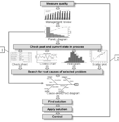
process improvement starts with careful planning it results in corrective and preventive actions, supported by appropriate quality assurance tools, which leads to true process improvement. Application of seven basic quality tools in correlation with four steps of PDCA cycle as it is shown in Table , for problem identification can be used most of the 7QC tools: Flow chart, Cause-and-Effect diagram, Check sheet, Pareto diagram, Histogram and Control charts. For problem analysis are used following tools: Cause-and-Effect diagram, Check sheet, Pareto diagram, Scatter plot and Control charts. When the team is developing a solution for analyzed problem Flow chart and Scatter plot can be useful. In the phase of achieved results evaluation can be also most of 7QC tools successfully implemented: Check sheet, Pareto diagram, Histogram, Scatter plot and Control charts.
Table 1: Model of Quality Tools
Fig.22:7 Basic Quality tools for Quality Improvement
a company can take in order to change their static quality management to a dynamic one.
Conclusion
The methodology of implementing continuous quality improvement can be varied in different organization. Regardless of the methodology of the continuous-improvement programmes, every organization needs to use a proper combination and selection of quality tools, methodologies and techniques in their implementation process. It is very important that the tools, methodologies and techniques are properly selected according to the need and demands of the team and further applied correctly to the appropriate process and approach in organization.
References
[1] Basu, R. Implementing Quality – A Practical Guide to Tools and Techniques, Thomson Learning, UK, 2004.
[2] Osanna, P.H., Durakbasa, M.N., Afjehi-Sadat, A. Quality in Industry, Vienna University of Technology, TU AuM, Wien, 2004.
[3] Tague, N.R. The quality toolbox, ASQ Quality press, Wisconsin 2005.
[4] Pimblott. J.G. Management improvement - where to start, Quality forum, Vol. 16, No. 4, December 1990, pp. 165-173.
[5] N.N. Quality Management Systems, translation of DGQ educational material, 10. issue 2001, SZK Ljubljana, Slovenia, 2002.
[6] Paliska. G. Universality and systematicness of quality tools, M.Sc. thesis, Faculty of Engineering, University of Rijeka, Croatia, 2007.
[7] Scholtes, P. Brian, J.L. Streibel, B.J. The Team Handbook, Madison, WI: Joiner/Oriel Inc., USA, 2003.
[8] http://elsmar.com/pdf_files
*9+ Sokovid, M. Jovanovid, J. Krivokapid, Z. Vujovid, A. Quality tools in improvement process, Proceedings of 2nd International Conference ICQME 2007, 12-14 September 2007, Budva, Montenegro, pp. 21-28.
[10] Keller.,P. Six Sigma Demystified – a selfteaching guide, McGraw-Hill, New York, 2005.
*11+ Sokovid, M. Pavletid, D. Quality improvement – PDCA-cycle vs. DMAIC and DFSS, Strojniški vestnik – Journal of Mechanical Engineering53 (2007), 6, pp. 369-378.
[12] http://quality.dlsu.edu.ph/tools
[13] Taghizadegan, S. Essentials of Lean Six Sigma, Butterworth-Heinemann, UK, 2006. *14+ Sokovid, M. Pavletid, D. The Lean and Six Sigma syn ergy, Proceedings of 3rd International Conference ICQME 2008, 10- 12 September 2008, Budva, Montenegro, pp. 5-12.
[15] Bisgaard, S. 1993. Statistical Tools for Manufacturing. Manufacturing Review. 6(3): 192–200
[16] Kim, J.S. and Larsen, M.D. (1997): Integration of Statistical Techniques into Quality Improvement Systems. In Proceedings of the 41st Congress of the European Organization for Quality, 2, 277-284
Engineering Science & Advanced technology, ISSN: 2250-3676, volume-2, Issue-4,1008-1017,2012.
[18+Aichouni, M. „Quality Control – The Basic Tools and their Applications in Manufacturing and Services‟, ISBN 6690-75-688-2,Dar Al-Asshab Book Publishing, Riyadh., 2007