Dashboards: Lessons Learnt
Sven Charleer1, Joris Klerkx1, Erik Duval1, Tinne De Laet2, and Katrien Verbert1
1 Dept. of Computer Science 2
Tutorial Services of Engineering Science KU Leuven, Leuven, Belgium
{Sven.Charleer,Joris.Klerkx,Tinne.DeLaet,Katrien.Verbert} @kuleuven.be
Abstract Learning Analytics (LA) dashboards help raise student and
teacher awareness regarding learner activities. In blog-supported and inquiry-based learning courses, LA data is not limited to student activ-ities, but also contains an abundance of digital learner artefacts, such as blog posts, hypotheses, and mind-maps. Exploring peer activities and artefacts can help students gain new insights and perspectives on learn-ing efforts and outcomes, but requires effort. To help facilitate facilitate and promote this exploration, we present the lessons learnt during and guidelines derived from the design, deployment and evaluation of five dashboards.
Keywords: learning analytics, learning dashboards, information
visu-alisation, guidelines, collaboration
1
Introduction
Learning Analytics (LA), or the collection and analysis of traces that learners leave behind, can help to understand and optimise (human) learning and the environments in which it occurs [40]. Furthermore, it can help raise awareness of personal and peer learning activities, help reflect on and make sense of learner traces, and impact behaviour [44]. Learning Dashboards (LD) often visualise
ef-fortssuch as artefacts produced, time spent, social interaction, resource use, and
exercise and test result [45]. However, only focusing on effort can have a detri-mental effect on motivation [36]. A collection of efforts is part of progress towards a larger goal, such as learning a language, passing an exam, etc. Throughout our case studies, we have learnt that it is essential that students are continuously aware of the impact of their efforts towards these intendedlearning outcomes. LA provides ways of taking these learner traces to help raise awareness of personal and peer learning activities, help reflect on and make sense of learner traces, and impact behaviour [44]. On the one hand, educational data mining techniques try to help students by making decisions on their behalf (like in-telligent tutoring systems [4] and educational data mining systems (EDM) [38]
do). As such, they automatically use students’ efforts to produce information regarding outcomes. For example, they show students that they have a calcu-lated chance on passing the course, or they show which paper to read next. We however believe that it is highly important to empower students rather than automating the learning process. Indeed, technology can support the student to play a more active role in the LA reflection process role [12] instead. Clearly visualising the path from effort to outcome should thus be supported by all LA dashboards. There is also a certain philosophical or ethical side to this notion of two approaches. As Klerkx et. al [22] frame it:”If learners are always told what to do next, then how can we expect them to possess the typical 21st century skills of collaboration, communication, critical thinking and creativity? Or, at a more fundamental level, can we expect students who are always told what to do next to become citizens equipped with the knowledge, skills and attitude to participate fully in society?”
To facilitate this empowerment, this paper looks at what data needs to be accessible to students and how this data should be visualised. To discover know-ledge relevant to their learning process, the empowerment should happen in their everyday lives, in and outside the classroom. We therefore also take into account the different contexts in which their learning occurs [17], and how we can leverage these contexts to promote students to explore the path from effort to outcome. We summarise this through two research questions:
– How should we visualise relevant data to facilitate students exploring the path from effort to outcomes? (RQ1)
– How can we promote students, inside and outside the classroom, to actively explore this effort to outcomes path? (RQ2)
We start by explaining the different course settings, the five dashboards and the evaluation setups in Sect. 2. Based on the design, deployment and evaluation of these dashboards, Sect. 3 explores the lessons learnt. Conclusions and remarks on future work are presented in Sect. 4.
2
Course Setting
We first explain the course settings in which our dashboards were deployed. We briefly discuss how the traces are collected, and present an overview of the dashboards and their evaluations.
2.1 Blog-Supported Courses
Blogging has become more popular in learning environments [46] as it facilit-ates assessment, reflection, interaction and collaboration among students, and improves participation in learning activities [24]. It allows students to develop their ideas and receive contributions from peers through blog comments [21,31]. During the face-to-face Master course “Human-Computer Interaction” of 2013 and 2014 at KU Leuven, students were required to use blogs to report progress,
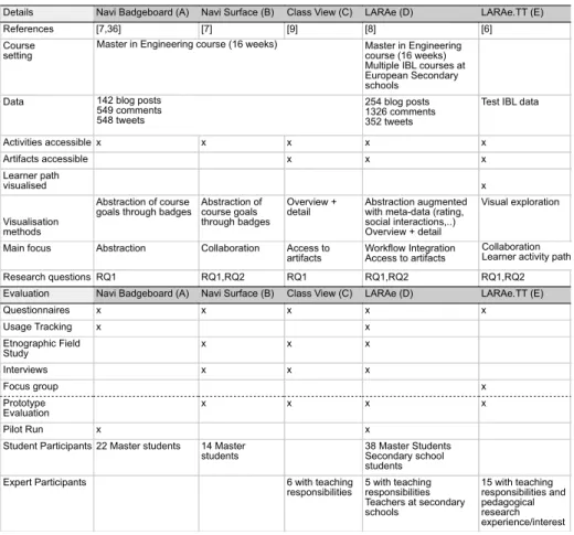
Table 1.Overview of the dashboards and evaluation setups.
Details Navi Badgeboard (A) Navi Surface (B) Class View (C) LARAe (D) LARAe.TT (E)
References [7,36] [7] [9] [8] [6]
Course
setting Master in Engineeringcourse (16 weeks) Multiple IBL courses at European Secondary schools
Data 254 blog posts
1326 comments 352 tweets
Test IBL data
Activities accessible x x x x x Artifacts accessible x x x Learner path visualised x Visualisation methods Abstraction of course
goals through badges Abstraction ofcourse goals through badges
Overview +
detail Abstraction augmentedwith meta-data (rating, social interactions,..) Overview + detail
Visual exploration
Main focus Abstraction Collaboration Access to
artifacts Workflow IntegrationAccess to artifacts
Research questions RQ1 RQ1,RQ2 RQ1 RQ1,RQ2 RQ1,RQ2 Evaluation Navi Badgeboard (A) Navi Surface (B) Class View (C) LARAe (D) LARAe.TT (E)
Questionnaires x x x x x Usage Tracking x x Etnographic Field Study x x x Interviews x x x Focus group x Prototype Evaluation x x x x Pilot Run x x
Student Participants 22 Master students 14 Master
students 38 Master StudentsSecondary school students Expert Participants 6 with teaching
responsibilities 5 with teachingresponsibilities Teachers at secondary schools 15 with teaching responsibilities and pedagogical research experience/interest Master in Engineering course (16 weeks)
142 blog posts 549 comments 548 tweets
Collaboration Learner activity path
share opinions and knowledge [23], and provide feedback to peers through blog comments. Twitter was used as a communication channel for e.g. quick questions about the topic of the course or for sharing reading material. These on-line activ-ities often generate an abundance of data. A typical course results in 140-300 blog posts, 600-1400 blog comments and 300-500 tweets.
2.2 Inquiry-based Learning Courses
Contrary to a traditional passive role in a classroom, in Inquiry-Based Learning (IBL), learners assume an active role as explorer and scientist with a focus on learning how to learn. Teachers try to stimulate learners to pose questions and create hypotheses regarding a specific topic, perform independent investigations, gather data to confirm and discuss their findings and generate conclusions. In the on-line weSPOT Inquiry Environment3, a teacher can set up an inquiry
re-3
garding a specific research topic. The students then use this on-line environment to create hypotheses, join discussions, generate mind-maps and conclusions. By taking pictures, recording videos, and registering measurements through a mo-bile application integrated into the IBL environment, students collect data in the field to support their hypotheses [27,33].
2.3 Learning Analytics Traces
To collect the learning traces from these learning environments, we use the archi-tecture presented by Santos et al. [38]. For the blog-supported courses, trackers connect to the RSS feeds of the student blogs and utilise the Twitter API to track the activities related to the course hash-tag. The content of these activit-ies, together with relevant meta-data (time of activity, student identification) is pushed to the Learning Record Store (LRS), which stores the data following a simplified xAPI format [38].
Through exposed REST services 4 of the weSPOT Inquiry Environment, the trackers access the learner artefacts (e.g. hypothesis created, picture taken, mind-map created) and meta-data (e.g. time of the activity, user identification, peer and teacher rating), and store the data in the LRS. The LRS exposes a set of REST services for data retrieval 5, which the dashboards use to request the relevant learner traces to populate the LD visualisations.
2.4 Deployed Dashboards
Five dashboards were developed and deployed during the course of three years. Each dashboard builds upon findings of the previous, taking into account the stakeholders and the specific learning context in which it will be deployed. They are built as low-fidelity prototypes at first, with four high-fidelity dashboard prototypes deployed in authentic settings during pilot studies [25]. The dash-boards were developed using web technologies such as D3.js, Processing.js, and Node.js. Table 1 provides an overview of the dashboards, their course setting and evaluations. Screenshots of the dashboards can be found in Fig. 1.
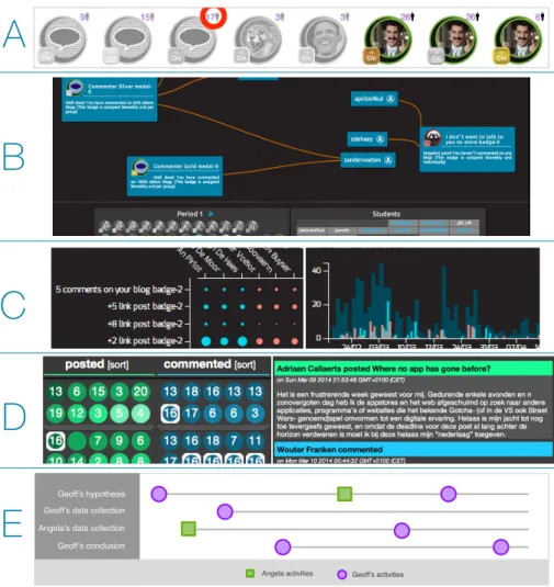
Dashboard A: Navi Badgeboard [7,35] presents the user with per student
dashboards containing an overview of achieved (in colour) and still achievable (greyed out) goals through badges. Students can position themselves among peers through the number next to each badge, indicating the amount of students who have achieved this goal. A high number next to a grey badge thus indicates that the student is one of the few students without the badge. A low number next to a coloured badge indicates that the student is one of the few to have earned this badge. The dashboard is designed to work on mobile devices and desktop browsers.
4
http://goo.gl/37mr4D 5
Dashboard B: Navi Surface [7,35] is a multi-user interactive visualisation de-signed for large multi-touch tabletop displays. Out of a list of student names and course badges, both students and teacher can simultaneously drag badges and student names onto the screen. The dashboard then visualises the badge reward relationships by drawing lines from students to badges, providing an overview and comparison of achievements to drive the conversation.
Dashboard C: The Class View dashboard [9] is designed for large desktop
mon-itors, interactive whiteboards and large touch displays. Four modules visualise the LA data in different ways: a student-badge matrix shows how many times a specific student has been awarded a specific badge. Activities and badges are visualised over time through five different bar charts, displaying the amount of activity done and badges awarded per day. Selecting a day will show the list of activities or badges awarded that day. In turn, selecting one of these activities visualises the content behind the analytic data (e.g. the text of the blog post). Another list of bar charts shows the number of awards given per badge. Two modules allow for the filtering of the above data. The user can set a time-range and split the data by grouping students. This facilitates student comparison, with each visualisation module displaying each group’s data in different colours.
Dashboard D: The LARAe dashboard [8] visualises blog and Twitter activities
of students. Following the “Overview+Context” approach, the overview shows circles coloured by age representing activities and are grouped by activity type (blog, blog comment, tweet, retweet) and by student group/staff. Selecting an activity updates the context part of the visualisation, showing a thread contain-ing the activity content (e.g. the text of the blog post) and its related activities (e.g. blog comments). The activities in this thread are also highlighted in the overview, giving a visual overview of the distribution of people engaging with the selected activity. The number in each circle indicates the amount of activity (e.g. the number of comments on a blog post). The dashboard is designed to run on large displays, desktop computers and tablets.
Dashboard E: LARAe.TT’s [6] main objective is to facilitate collaborative
exploration of the learner paths, i.e. the chronological sequence of all activities and artefacts generated. The visualisation displays a horizontal line per activity thread, e.g. the creation of a hypothesis by a learner followed by every com-ment on, rating on, and edit of the hypothesis. The chronology is maintained across threads, enabling the user to see the impact an event might have had on other parallel threads. Figure 1.E shows an example of this cross-thread rela-tionship: Angela’s comment on Geoff’s hypothesis results in Geoff accessing her data collection and changing his hypothesis and conclusion.
3
Lessons Learnt and Guidelines
As presented in Table 1, the dashboards have been evaluated in several user studies with different evaluation methods, including interviews, focus groups, questionnaires, analysis of actual behaviour, and ethnographic field studies. The number of students and teachers participating in these studies range from six users for smaller studies to 43 users for larger evaluations. In this section, we present lessons learnt and guidelines from these user studies.
3.1 How should we visualise relevant data to facilitate students
exploring the path from effort to outcomes? (RQ1)
Abstract the LA data: LA data can be visualised in multiple ways [41,15],
depending on the audience and desired message. LA prediction systems create notifications and visualisations to warn users and impact retention [1,16], while structural and content analysis help teachers gain insights at higher levels [31]. The data can also be abstracted or aggregated, providing students with aware-ness of efforts [29] and outcomes [35]. There are many ways of dealing with the abundance of LA data, so that both teachers and students can make sense of it. Overview approaches are a good basis for facilitating further and deeper exploration of the LA data.
With dashboard A and B [37], the abstract overview through the use of badges (see Fig. 1) had more impact on student motivation than our previous aggregate version that visualised the data through tables and numbers [37]. The badges still sufficed for the teacher to intervene or start a discussion in the classroom by projecting dashboard A on the wall. An interactive tabletop dashboard B visualising the reward relationship between students and badges served as enough incentive for students to actively explore and discuss their achievements with peers [7].
Guideline: Aggregating or abstracting the information can help create progress awareness towards specific learning outcomes. These “overview” presentations of the learner traces can serve as a first incentive to trigger students into further LA data exploration.
Provide access to the learner artefacts: By limiting dashboard visualisation
to an abstracted overview, teachers and students need to access the original, external environment in which the activities occur to gain further insights (e.g. the on-line learning environment, the individual blog posts). By doing so, the user loses the advantages of the LA overview, and it becomes more difficult to link effort to learning outcome (e.g. which blog posts resulted in a badge). During dashboard B’s evaluation, students could still reflect on their personal progress through memory recall, but when trying to make sense of peer data, the lack of access to the blog posts inhibited further discussion. By adding artefacts directly to the LA dashboard, we can retain the connection between effort and outcome. The visual information-seeking mantra of “Overview first, zoom and filter, then details-on-demand” [39] is the basis used in dashboard C, D and E: the
A
B
C
E
D
Geoff’s hypothesis Geoff’s data collectionGeoff’s conclusion Angela’s data collection
Angela activities Geoff’s activities
Figure 1. A.Navi Badgeboard: visualising course goals through badges.B.Navi
Sur-face: collaborative exploration of LA data.C.Two Class View modules: comparing two groups of students (red and blue) through the student-badge matrix and the total activ-ity per day graph.D.LARAe: integration of LA with student workflow.E.LARAe.TT: collaborative exploration of the learner paths.
details Artifact Activity Activity Artifact Activity Artifact Activity Activity
Abstraction/Aggregation/Notification/…
learner activity path
overview
Figure 2. Facilitating exploration of the abundance of learning traces and student
abstraction layer becomes a gateway to further exploration of the LA data (see Fig. 2). Teachers and students reported this functionality to be valuable: further exploration in the learner artefacts makes the LA dashboards applicable for e.g. evaluations with the student, or finding relevant learner artefact examples of peers for self-improvement.
Few examples of LDs provide access to the learner artefacts. Fulantelli et al. [14] support LA visualisations with direct access to the artefacts, but use is limited to teachers. When artefacts are made available to students, the selection is usually made for them: Shum et al. [42] automatically filter the large amount of assets to provide students with relevant resources. Bull et al. [5] provide as-sessment feedback to the student that can be linked with artifacts as evidence.
Many LA systems already store the learner artefacts [11,14,30], but limit its access to teachers [14]. We believe it is important for future dashboards to make personal and peer artefacts also available to students, as shown by our studies of dashboards B, C, D and E [6,7,8,9,35]. The findings are confirmed in studies of [19] and [30].
Guideline: To empower the student and promote exploration of the effort to outcome path, LDs should allow manual exploration of the artefacts.
Augment the abstracted data: Abstractions present the essentials, and thus
lower the cognitive efforts required by students. Students could access peer’s personal overviews in dashboard A, but rarely did so. However, the simplified, abstracted personal overview left room for the integration of peer information: every badge rewarded in the class was included to the personal overview, includ-ing the number of times each badge was awarded in class (see Fig. 1.A). This was regarded as a valuable asset for students: they reported the presence of peer data in the personal overview helped position themselves among their peers and played an important motivational role.
In a blog-course setting, dashboard D [8] provides an overview of each blog post generated, and augments each data point (blog post) with the age of the blog post and number of comments the blog post has received (see Fig. 1.C). This helped teachers and students find learner artefacts worthy of their attention: 55% of students considered a high number and thus active thread as interesting, while 18% reported they would avoid such threads. Teachers reported inactive threads were a sign for need of intervention. 7% of students would use the num-bers for self-assessment (e.g. low numnum-bers on personal artefacts could indicate low quality). In the IBL setup, learner artefacts can be rated by teachers and peers. This information was visualised per artefact data point, providing a good overview of both the quantity and quality of learner outcomes per student, and helped peers in finding valuable (highly rated by peer or teacher) hypotheses, conclusions, discussions.
Extra meta-data regarding the LA traces can serve as indicators to guide users to relevant information, without forcing a predefined decision. Huang et al. [30] use location, time and peer information as a way for students to find relevant data. Doug & Makryannis [10] suggest reputation meta-data to support
judgement on quality of artefacts. By leveraging meta-data to extend simple dashboards, students can be exposed to peer information without much user effort (e.g. class badge rewards of dashboard A). Interpretable indicators (e.g. social activity count in dashboard D) can help explore and find relevant artefacts.
Guideline: While abstraction can help tackle the abundance of learner traces, augmentation approaches should be taken into account to help improve judgement of quality and exploration of the abundance of LA data.
Provide access to teacher and peer feedback: For teachers, it is important
to remain up to date with student efforts and outcomes, but also to provide students with timely feedback [2,32]. Providing public access to teacher feedback was well received by both students and teachers. As mentioned above, visualising ratings of the IBL learner artefacts provides teachers with a clear view of the quality of the student contributions. Students can use these ratings as guides to find quality example artefacts to learn from.
In the blog-supported courses, feedback is given through blog comments. Dashboard D helped students quickly access all teacher feedback across the en-tire course. Students reported that having access to teacher feedback given to peers helped them to “be ahead of the game”. While the important feedback is usually repeated in face-to-face sessions, students mentioned “by then it might be too late”. Teachers, when working with multiple colleagues on the same course, reported the feedback visualisation helps keep track colleague activity, resulting in a better feedback consistency, and preventing redundant feedback.
LA-supported feedback is often related to EDM systems, where informative and explanatory notifications and visualisations attempt to change student be-haviour [1,16]. Clear evidence of dashboards that help teachers intervene when necessary, is provided in [9,26]. Bull et al. [5] successfully use artefacts as evid-ence for assessment feedback. Our evaluation participants showed interest in using the dashboard to support evaluation. But as shown in [28], incorporating teacher feedback into the LA traces can play an important role as well.
Guideline: Make teacher feedback and feedback given by peers accessible in LDs and incorporate (intermediate) assessment data to raise awareness and to support reflection.
Visualise the learner path: Until now, we have explored the vertical path
of overview to details: abstraction as a way to facilitate teacher and student to drill down and explore the abundance of learner traces. A quality learner artefact does not necessarily indicate a good understanding of the matter, and only provides a narrow view of the student’s process [3]. We define thelearner path as the sequence of student activities and artefacts: An artefact created and the activity that happens on an artefact (e.g. a rating, a comment) can impact the next one: a comment by a peer can influence the next blog post, the creation of a mind-map might result in a new hypothesis.
While the vertical path from overview to details can help navigate the LA data, this horizontal learner path (see Fig. 2) can help provide deeper insights
into students’ learning[13]. We have explored this concept in dashboard E [6], where we visualise the sequence of an entire class across multiple activity types (see Fig. 1.E). Teachers reported that visualising this path can help students backtrack through their IBL process, reflect, and make sense of it. But it can also assist students in exploring peer paths, to discover different approaches and improve their own methods: when discovering an interesting inquiry conclusion posted by a peer, both teacher and student can access and reflect on every learner activity that helped arrive at that specific solution.
Guideline: LD design should try to give insight into the learning path to support reflection, peer comparison and self-regulated learning.
3.2 How can we promote students, inside and outside the classroom,
to actively explore this effort to outcomes path? (RQ2)
Integrate the dashboard into the work-flow: During dashboard A’s
de-ployment, the Master in Engineering students reported that their high workload did not leave much room for LDs. Google Analytics logs showed that students would access the dashboard the evening before class. The successful dashboard features were those with low requirements on effort and time: a quick glance was sufficient to raise student awareness of personal and class progress [7].
With dashboard D, we attempted to integrate the dashboard into the student work-flow. As reading and commenting on peer blogs is part of the course activ-ities, dashboard D [8] provides direct access to the learner artefacts (blog posts), teacher and peer feedback, and augments the data with blog post age and activ-ity to help students navigate. Simply put, the dashboard replicates RSS6reader functionality, but leverages LA data to facilitate richer exploration to provide further insights. Dashboard D was used by 55% of the blog-supported course students on a weekly basis. During the IBL pilots, dashboard D was reported to be used in the classroom for weekly coaching tasks, while it also became part of the student’s time management tool set.
Kapros et al. [20] integrated LA visualisations into an LMS and empowered learning and development managers by providing context next to LA visual-isations. But this LA contextualisation can also benefit students. For example, Course Signals’ traffic light representation of the chance of success was success-fully integrated and accepted into the student’s course homepage [1]. Dashboard D leveraged LA to support students’ learning activities (e.g. finding, reading and reacting to relevant posts, accessing feedback), improving not only their work-flow, but also exposing them to LA data more often. Wise [47] identified a similar need for better integration into existing work-flows.
Guideline: It is important to incorporate LD use in the work-flow of stu-dents and to tailor LDs depending on the context in which learning occurs [17]. Therefore, while designing dashboards, keeping in mind the specific user needs, the course setting, and the target location and technologies available results in a better user acceptance, which in turn can help raise usage and improve impact.
6
Facilitate collaborative exploration of LA data: Dashboard A was de-veloped as a desktop application, but was several times projected on a wall in the classroom when the teacher deemed intervention necessary. Problematic students would be highlighted, and the students would get the opportunity to explain their (lack of) activity. In this situation, the teacher drives the visual-isation and students can contribute to the discussion. However, students cannot interact with the visualisation directly, only through the teacher.
Leveraging the affordances of large interactive tables, we can facilitate collab-orative sense-making [18] as students and teachers can simultaneously interact with and explore the LA traces. To the best of our knowledge, no examples exist of LA data visualised on such devices.
Dashboard B limited the visualisation to badges. This abstract view of the data was sufficient to trigger exploration and discussion, but only happened when students grouped around the tabletop. They would reflect on their own and peer achievements, and come up with arguments for their lack of achieving certain badges. However, students who approached the tabletop by themselves were not motivated to explore the LA data. Students interacting in group experienced the system as “fun”, and reported they would like to use it together with teachers.
Dashboard E visualises an overview of the class’learner paths and learner artefacts. The collaborative aspect was well-received and resulted in many scen-arios teachers considered interesting: a teacher can initiate a discussion and ask students around the tabletop to explain their reasoning. Teachers can use other students examples to inspire struggling students. Participants also mentioned that it can help students self-support their learning activities without teacher intervention: a student can explore peer activities and find “peer experts” on specific topics the student struggles with.
While many LDs visualise social and group interactions [34,26], few dash-boards are created with collaborative sense-making of the LA data in mind. Yet, dashboard B and E showed great potential for discussion, exploration, sense-making, and assessment. Even dashboard A triggered group discussions when projected in the classroom.
Guideline: While designing LDs, keep in mind that collaborative exploration can support discussion, exploration, and assessment, and can enhance reflection and awareness. Existing research in the fields of Collaborative Visualisation [18] and Computer-Supported Cooperative Learning [43] offers a promising approach to improve collaborative exploration of LA data.
4
Conclusion
The intent of this paper was to formulate the lessons learnt that the authors consider important for future development of LA dashboards. In this paper we have outlined guidelines on how to visualise relevant data (RQ1) and how to promote active exploration by students (RQ2) based on results of our user stud-ies. We believe that it is highly important to empower students to reason about their efforts and outcomes. This paper therefore discussed how to create
dash-boards that support students in actively exploring their efforts and outcomes: by providing data beyond personal analytics, through visualisation techniques to make the abundance of data accessible, multi-user interaction to facilitate col-laborative sense-making, and integration of dashboards into student workflow.
The guidelines are derived from a series of user studies with five LDs, but are based on first indicators only. Nevertheless we believe they present important steps towards the design of LDs that support important needs of students and teachers. We will explore how to improve on our current designs, evaluate further these choices, and deploy in other classroom settings to validate our findings.
Acknowledgements: The research leading to these results has received funding
from the European Community’s 7th Framework Programme (FP7/2007-2013) under grant agreement No 318499 - weSPOT project and the Erasmus+ pro-gramme, Key Action 2 Strategic Partnerships, of the European Union under grant agreement 2015-1-UK01-KA203-013767 ABLE project.
References
1. K. E. Arnold and M. D. Pistilli. Course signals at purdue: Using la to increase student success. InProc. LAK’12, pages 267–270, New York, NY, USA. ACM.
2. P. Black and D. Wiliam. Assessment and Classroom Learning. Assessment in
Education: Principles, Policy & Practice, 5(1):7–74, 1998.
3. K. Brennan and M. Resnick. New frameworks for studying and assessing the
development of computational thinking. In Proc. of the annual meeting of the American Educational Research Association, 2012.
4. P. Brusilovsky.5th Int. Conf. ITS’00 Montr´eal, Canada, June 19–23, chapter Ad-aptive Hypermedia: From Intelligent Tutoring Systems to Web-Based Education, pages 1–7. Springer Berlin Heidelberg, Berlin, Heidelberg.
5. S. Bull, M. D. Johnson, M. Alotaibi, W. Byrne, and G. Cierniak. Visualising mul-tiple data sources in an independent open learner model. InArtificial Intelligence in education, pages 199–208. Springer, 2013.
6. S. Charleer, J. Klerkx, and E. Duval. Exploring inquiry-based learning analytics through interactive surfaces. In Proc. 1st Int. Workshop on Visual Aspects of Learning Analytics. CEUR-WS, 2015.
7. S. Charleer, J. Klerkx, J. L. Santos, and E. Duval. Improving awareness and reflec-tion through collaborative, interactive visualizareflec-tions of badges. In
ARTEL@EC-TEL, volume 1103 ofCEUR Workshop Proc., pages 69–81. CEUR-WS.org, 2013.
8. S. Charleer, S. Odriozola, J. Luis, J. Klerkx, and E. Duval. Larae: learning analytics reflection & awareness environment. InCEUR Workshop Proceedings, volume 1238, pages 85–87. CEUR-WS, 2014.
9. S. Charleer, J. Santos, J. Klerkx, and E. Duval. Improving teacher awareness through activity, badge and content visualizations. InNew Horizons in Web Based Learning, LNCS, pages 143–152. Springer International Publishing, 2014.
10. D. Clow and E. Makriyannis. ispot analysed: Participatory learning and reputation. InProc. LAK’11, pages 34–43, New York, NY, USA. ACM.
11. M. A. Conde, F. J. Garcia-Penalvo, D. A. Gomez-Aguilar, and R. Theron. Visual learning analytics techniques applied in software engineering subjects. InFrontiers in Education Conference (FIE), 2014 IEEE, pages 1–9. IEEE, 2014.
12. P. Dillenbourg, G. Zufferey, H. S. Alavi, P. Jermann, L. H. S. Do, Q. Bonnard, S. Cuendet, and F. Kaplan. Classroom orchestration: The third circle of usabil-ity. InCSCL2011 Conference Proceedings, volume 1, pages 510–517. International Society of the Learning Sciences, 2011.
13. D. A. Fields, L. Quirke, J. Amely, and J. Maughan. Combining big data and thick data analyses for understanding youth learning trajectories in a summer coding
camp. InProc. SIGCSE’16, pages 150–155, New York, NY, USA. ACM.
14. G. Fulantelli, D. Taibi, and M. Arrigo. A framework to support educational decision making in mobile learning. Computers in Human Behavior, 47:50–59, 2015. 15. S. Govaerts, K. Verbert, E. Duval, and A. Pardo. The student activity meter for
awareness and self-reflection. InProc. ACM annual conf. ext. abstracts on Human Factors in Computing Systems Extended Abstracts, pages 869–884. ACM, 2012. 16. Y.-H. Hu, C.-L. Lo, and S.-P. Shih. Developing early warning systems to predict
students online learning performance. Comput Hum Behav, 36:469–478, 2014. 17. D. Huang, M. Tory, B. A. Aseniero, L. Bartram, S. Bateman, S. Carpendale,
A. Tang, and R. Woodbury. Personal visualization and personal visual analyt-ics. IEEE Trans. Visualization and Computer Graphics, 21(3):420–433, 2015. 18. P. Isenberg, N. Elmqvist, J. Scholtz, D. Cernea, K.-L. Ma, and H. Hagen.
Col-laborative visualization: Definition, challenges, and research agenda. Information Visualization, 10(4):310–326, 2011.
19. M. Ji, C. Michel, E. Lavou´e, and S. George. Ddart, a dynamic dashboard for collec-tion, analysis and visualization of activity and reporting traces. InOpen Learning and Teaching in Educational Communities, pages 440–445. Springer, 2014. 20. E. Kapros and N. Peirce. Empowering l&d managers through customisation of
inline learning analytics. InLearning and Collaboration Technologies. Designing and Developing Novel Learning Experiences, pages 282–291. Springer, 2014. 21. R. Klamma. Emerging research topics in social learning. InProc. of the 7th Int.
Conf. on Networked Learning, volume 2010, pages 224–231, 2010.
22. J. Klerkx, K. Verbert, and E. Duval. Learning Analytics Dashboards. submitted. 23. W.-J. Lin, Y.-L. Liu, K. Kakusho, H.-P. Yueh, M. Murakami, and M. Minoh. Blog
as a Tool to Develop e-Learning Experience in an International Distance Course. In6th Int. Conf. Advanced Learning Technologies, pages 290–292. IEEE, 2006. 24. A. M. Marques, R. Krejci, S. W. Siqueira, M. Pimentel, and M. H. L. Braz.
Struc-turing the discourse on social networks for learning: Case studies on blogs and microblogs. Computers in Human Behavior, 29(2):395–400, Mar. 2013.
25. R. Martinez-Maldonado, A. Pardo, N. Mirriahi, K. Yacef, J. Kay, and A. Clayphan. Latux: an iterative workflow for designing, validating and deploying learning ana-lytics visualisations. Journal of Learning Analytics, 2(3):9–39, 2016.
26. R. Martinez-Maldonado, K. Yacef, Y. Dimitriadis, M. Edbauer, and J. Kay. MT-Classroom and MTDashboard: supporting analysis of teacher attention in an or-chestrated multi-tabletop classroom. InInt. Conf. CSCL’13, pages 119–128. 27. A. Mikroyannidis, A. Okada, P. Scott, E. Rusman, M. Specht, K. Stefanov,
P. Boytchev, A. Protopsaltis, P. Held, S. Hetzner, K. Kikis-Papadakis, and F. Chaimala. weSPOT: A Personal and Social Approach to Inquiry-Based Learn-ing. Journal of Universal Computer Science, 19(14):2093–2111, 2013.
28. C. Monroy, V. S. Rangel, and R. Whitaker. Stemscopes: contextualizing learning analytics in a k-12 science curriculum. InProc. LAK’13, pages 210–219. ACM. 29. J. Nakahara, S. Hisamatsu, K. Yaegashi, and Y. Yamauchi. itree: Does the mobile
phone encourage learners to be more involved in collaborative learning? InProc. CSCL’05, pages 470–478. International Society of the Learning Sciences, 2005.
30. H. Ogata and K. Mouri. Hybrid Learning: Innovation in Educational Practices: 8th International Conference, ICHL 2015, Wuhan, China, July 27-29, 2015, Pro-ceedings, chapter Connecting Dots for Ubiquitous Learning Analytics, pages 46–56. Springer International Publishing, Cham, 2015.
31. M. C. Pham, M. Derntl, Y. Cao, and R. Klamma. Learning analytics for learning blogospheres. InProc. ICWL’12, pages 258–267. Springer.
32. A. Poulos and M. J. Mahony. Effectiveness of feedback: The students perspective.
Assessment & Evaluation in Higher Education, 33(2):143–154, 2008.
33. A. Protopsaltis, P. Seitlinger, F. Chaimala, O. Firssova, S. Hetzner, K. Kikis-Papadakis, and P. Boytchev. Working environment with social and personal open tools for inquiry based learning: Pedagogic and diagnostic frameworks. The Int. Journal of Science, Mathematics and Technology Learning, 20(4):51–63, 2014.
34. V. Rivera-Pelayo, J. Munk, V. Zacharias, and S. Braun. Live Interest Meter:
Learning from Quantified Feedback in Mass Lectures. In Proc. LAK’13, pages
23–27, New York, NY, USA. ACM.
35. J. Santos, S. Charleer, G. Parra, J. Klerkx, E. Duval, and K. Verbert. Evaluating the Use of Open Badges in an Open Learning Environment. InScaling up Learn-ing for Sustained Impact, volume 8095 of LNCS, pages 314–327. Springer Berlin Heidelberg, 2013.
36. J. L. Santos, S. Govaerts, K. Verbert, and E. Duval. Goal-oriented visualizations of activity tracking: A case study with engineering students. In Proc. LAK’12, pages 143–152, New York, NY, USA. ACM.
37. J. L. Santos, K. Verbert, S. Govaerts, and E. Duval. Addressing learner issues with StepUp!: an Evaluation. InProc. LAK’13, pages 14–22. ACM.
38. J. L. Santos, K. Verbert, J. Klerkx, S. Ternier, S. Charleer, and E. Duval. Track-ing data in open learnTrack-ing environments. Journal of Universal Computer Science, 21(7):976–996, 2015.
39. B. Shneiderman. The eyes have it: a task by data type taxonomy for information visualizations. InIEEE Symp. on Visual Languages, pages 336–343. IEEE, 1996. 40. G. Siemens and P. Long. Penetrating the fog: Analytics in learning and education.
volume 46, pages 30–32, Boulder, CO, USA, 2011. EDUCAUSE.
41. K. Silius, A.-M. Tervakari, and M. Kailanto. Visualizations of user data in a social media enhanced web-based environment in higher education. InGlobal Engineering Education Conference, pages 893–899. IEEE, 2013.
42. R. F. Simon Buckingham Shum. Social learning analytics. Journal of Educational Technology & Society, 15(3):3–26, 2012.
43. D. D. Suthers. Computer-supported collaborative learning. InEncyclopedia of the Sciences of Learning, pages 719–722. Springer, 2012.
44. K. Verbert, E. Duval, J. Klerkx, S. Govaerts, and J. L. Santos. Learning Analytics Dashboard Applications. American Behavioral Scientist, 57(10):1500–1509, 2013. 45. K. Verbert, S. Govaerts, E. Duval, J. Santos, F. Van Assche, G. Parra, and J. Klerkx. Learning dashboards: an overview and future research opportunities.
Personal and Ubiquitous Computing, 18(6):1499–1514, 2014.
46. S. Waters. The Current State of Educational Blogging. https://www.
theedublogger.com/2016/01/15/educational-blogging-2015/, 2016. [Online; accessed 29-March-2016].
47. A. F. Wise. Designing pedagogical interventions to support student use of learning analytics. InProc. LAK’14, pages 203–211. ACM.