The emotive city
Rooney, J
Title
The emotive city
Authors
Rooney, J
Type
Book Section
URL
This version is available at: http://usir.salford.ac.uk/id/eprint/19319/
Published Date
2011
USIR is a digital collection of the research output of the University of Salford. Where copyright
permits, full text material held in the repository is made freely available online and can be read,
downloaded and copied for noncommercial private study or research purposes. Please check the
manuscript for any further copyright restrictions.
The Emotive City
John Rooney
The University of Salford, United Kingdom
Abstract
The research project is designed to create new ways of looking at the story of a city; the focus is to present elements of the city as an art gallery space. Mapping technologies are used to present information as an aesthetic image. This project will add the emotional context of the moment and location as part of the information aesthetic. The story of a city is an ongoing timeline of interconnected exchanges, thoughts and ideas. The stories and ideas used in this project can be taken from any point in the timeline and presented together as information aesthetics.
Datum will be recorded via image motion capture and audio technologies to create image and soundscapes. made from the shape of letterforms. When the audio fi le is read back into a sonogram the sound wave created is in the shape of the letterform. Further research will look at creating typefaces based on the sound the letterform makes instead of any visual aesthetic.
Content will be presented in various ways, using digital and traditional formats. The artwork can be displayed in situ via web based geo tagging and augmented reality platforms on mobile devices, plus physical representations of this work as printed and sculptural forms.
Keywords: Public Art, Graphic Design, Typography, Digital Art, Art Gallery.
Introduction
How can a city, with its connections, people and architecture be viewed as a living cultural artifact? Every city has at least one ArtSpace; larger urban conurbations have a multitude of spaces devoted to art. The ArtSpace is a venue designed to contain art, in some cases, the artwork can only be considered art whilst inside the ArtSpace.
The conventional ArtSpace within the city serve different functions for different groups of people. In the community, individuals engage with the arts in all forms. Modern Art, Dance, Sculpture and the Theatre appeal to the visually literate tribe. Family groups engage in more physical interactive connections in Museum spaces. These spaces are enclosed cultural environments located in a space designed for community engagement. Ultimately, the ArtSpace is a defi ned internal space. The aim of this project is to invert what is traditionally inside the gallery to the space. Exploration of existing geographic borders in the City will delineate the ArtSpace area. Artworks created, as part of this project will exist outside of the traditional Gallery setting. The developing research methodology in this research construct uses codes, signs, language and typographic form as information aesthetics with emotional content. The connected cities of Manchester and Salford are the focus of the ArtSpace. Both locations are signifi cant centres for cultural activity and contain many creative reference points. Interviews with local people and those involved in the cultural impact of the place will be recorded, where possible by face-to-face. Datum can also be recorded via existing audio and video archives and text fi les if the contact is unavailable.
The story of the city is an ongoing timeline of interconnected exchanges, thoughts and ideas. It is in a constant state of fl ux; new messages are added to its databank via personal and digital correspondence. The stories and ideas used in this project can be taken from any point in the timeline and presented together as information aesthetics. An individual voice from the past can be transposed onto a new idea related to a specifi c location in the city, thus creating new connective dialogue across the timeline.
“Information visualization is becoming more than a set of tools, technologies and techniques for large data sets. It is emerging as a medium in its own right, with a wide range of expressive po-tential.”
Eric Rodenbeck (Stamen Design), keynote lecture at Emerging Technology 2008 [March 4, 2008.]
Detailed research will reveal the local content, this will include a wide range of creative commentary including, sculp-ture, poetry, visual arts, architecsculp-ture, pop culture and fi lm. The information will be treated as datum taken from the city space, which can then be viewed as a creative laboratory or an experimental area. The gesture is recorded with image and sound and text, though these elements do not have to be presented together in the fi nal set of artworks. The research space will be defi ned by using existing markers designed to defi ne areas of the city. In this case this will be postcode area. Postcodes were introduced in the UK in 1959 as specifi c house, street codes used for mail software. Manchester and Salford are divided in to 50 postcode zones. M3 is unique in that the code area joins Salford into Manchester. The river Irwell, a natural border in a man made location, bisects Manchester and Salford. Deconstructing the word Post + Code offers a deeper relevance to the research methodology. Post, is to be informed of current news, and what has passed before. To be supplied with up to date information. Code; to translate a mes-sage from one form into another, a series of shapes and symbols as substitute for language.
The emerging practice methodology in digital form
The project has a defi ned strategy to create new art content from the narrative of the local population. Location is defi ned by using the Post Code in the city. The next stage is to defi ne the practice methodology designed to translate the datum into new forms.
This project is a recording of observation. The unseen paths created by the patterns of gesture we make during the moment language. An initial aim in my research was to revive the hand made element of my practice. I worked as a graphic design consultant for Tate Liverpool before moving into education. In this time my work practice had changed by producing hand made artwork to fully realised digital artwork.
Initial research asked the question: what is a hand made object? Empirical research has shifted my perception of what hand made is from one point to another. To use a visual description, I exist as a three-dimensional object in a space. I am at once the fulcrum of this project and the external observer. It is feasible to change position of the view-ing angle to do two thview-ings. To observe my practice in a different light and to map the relationship and connectivity of my practice from a new vantage point.
In moving through real, “sensorial,” space we may touch immediately near objects. Distant objects in real space are “touched” in the mind (we say the mind “reaches out”). The manner, therefore, in which we make our mental approach to a distant object of attention is styled through analogy with, and expectation of, the bodily experience of near objects. This mode of appreciation, learned in exterior, sensorial space, is applied when we negotiate interior, psychological space. Kinaes-thetic analogy then, an understanding in terms of body, is constant to our reception of perceptual experience, which shifts freely between sensorial and psychological data in the life-world “tangled, muddy, and perplexed,” which precedes the ordering of experience.
Situational Aesthetics (1969) Victor Burgin http://www.ubu.com/papers/burgin_situational .html
The solution to the question of what is hand made has been resolved by application of a kinaesthetic approach. The physical memory of language is tracked and learned.
Observation
The gesture is the key. A personal moment observed when language and narrative are physically expressed. Some-times this is done with no words. I was inside the silence.
The silence observed in a supermarket full of noise. You are waiting in a queue in a huge hangar-like building full of noise colour sound and smells and other people (strangers). You do not need (are not required) to say anything to your fellow customers unless you have to. This is especially true at the till point. We use dividers to separate our shopping from the person behind. The divider politely says ‘next customer please,’ is it really asking you not to talk to the person behind you. The action has meaning, silence has the message.
One of the most infl uential of the fi rst generation of visual poets was the Swiss artist Eugen Gom-ringer, who, in seminal compositions such as “Silenco” (1954) made bold use of blank silence. The whiteness of the page in Gomringer’s “Silencio” is interrupted by a regimented raft of text, the image/poem gives the impression of disrupted calm. The pattern of disturbance fi nds further verifi cation in the printed insistence of the word “Si
lencio” and we are forced to speculate that “Silencio” might be construed as a remorseless and monotonous instruction to the reader. http://www.ubu.com/papers/powell.html
[image:3.595.170.448.488.760.2]The digital methodology in practice
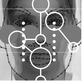
This project has deliberate intent to cut against the working practice of my traditional print based work. The narrative visuals were created in Adobe Flash. The methodology of this programme works in two ways. Flash uses a dual axis to create animated forms. Each moving element is created on a single layer, up to a maximum of 1000 layers per animation. Then, each layer has a timeline of frames. The frames work on a horizontal axis. The speed of which can be controlled in the frames per second option. The narrative images created in this research are taken from still frames of animation. The workspace that has depth, instead of a fl at working print based environment. The narrative images are still shots sliced through the time line from top to bottom. The timeline includes a feature called “Onion Skinning”. This is a traditional animation term dating back to when animation artists used onionskin paper to trace individual frames of animation. This technique is designed to be part of the production process of animation, and is not to be included in the fi nal footage. The narratives use objects and ideas that are meant to be unseen in the fi nal outcome. The footage is stopped at a single point. The screen displays whatever object is there as a set of single points.
Fig 2 Mapping the face with motion. Onion Skinning reveals the path of gesture
Onion Skinning on the timeline lets you choose how many frames you wish to see from start to fi nish. The multiple shapes are the Visible Narratives. This presents visuals of the internal skeleton of digital motion on the outside. Cutting against the grain of the way the software works to produce Visible Narratives. Creating a visual anomaly that disrupts the smooth animation process is, for me, an experimental and intuitive approach to using the software.
A chance discussion on this project with a work colleague threw the opportunity to progress the project by using Adobe Flash instead. Initially I was unconvinced that I would be able to create the narratives in fl ash by myself. The moment I started to use the software, it became clear that I would be able to progress this project myself. Understanding simple starting points like basic motion tracking, tweening and creating key frames; I soon discovered that it was possible to create results quickly with a high degree of control.
The software was malleable enough to control multiple layers of information after only a few days of use. The operating functions of the software are similar to Photoshop and Illustrator in the CS suite. Flash includes the layering of artwork on a frame-based timeline. The frame rate per second is adjustable. The more frames per second, the smoother the animation.
Understanding the fl ash software proved an important breakthrough in the development of this project in two ways. First, it meant that I did not need to rely on a colleague to assist in the production of the animated narratives. Working with an associate would have been a remote collaboration. The time and distance that separates two parties in this process means that the moment of inspiration that is created when working face to face with a colleague is lost.
Using the software myself gave me full control in producing the narrative images. I approached Flash with a naïve standpoint. I had no preconceived idea of how to sue the programme. Sometimes if one has extensive knowledge of a programme, there is a tendency to apply ready-made fi lters and visual shortcuts to achieve quick results.
[image:4.595.45.532.160.503.2]home page has complete fl exibility in terms of viewer content due to complex web 2.0 scripting.
The images I have made with Flash are created by hand, frame-by-frame. I was also interested in exploring the possibility of making the narratives in real time. To create a specifi c script designed to follow the movements of a cursor would require an in depth knowledge of script actions. However there are numerous web sites which offer samples of scripts which perform any number of tasks, motion included.
Working on script continues my methodology of cutting across working practice. Going against the grain continued with the use of Action Script. Working with Flash and Action Script is like creating sculpture with clay that never dries. There is always the opportunity to reform and remodel the work at any stage. I found the most interesting aspect of working with script the ability to edit the script text at random, and then create a test move to see what effect has been. Sometimes this culling process can lead to no change, other on other occasions glitches occurred. Using existing script I created a way of producing images that are cre-ated by moving the cursor. I adapted the script to create circle shapes similar to the forms used in the fi rst narrative.
The fi rst stage work in Flash was in reality an exercise in understanding the software. Print and Motion operating systems require a very different mind set to operate. I have years of experience in using print based technology, and just over eight months us-ing Flash. Once the differences workus-ing practice is understood there is the opportunity to play within the matrix of the operatus-ing system.
Practice discovery through digital play
Whilst developing the rationale of this project I produced three narratives tests that show the development of the research model. This work has helped defi ne the next stage of research.
Visible Narrative 1
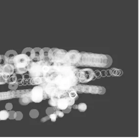
The fi rst digital output was a set of moving concentric circles. I wanted the footage not to include the video source of my face behind the circles. I felt that the image should be abstract and open to interpretation. At one point the circle mapping the mouth actually looks like a mouth. This only occurs for a split second, but it is enough for the viewer to make a connection with the shapes to reveal the footage a points of the face.
Fig 3 The path of gesture isolated as abstract form. Meaning is contained within
I feel that this work should be ambiguous. To create work with a hidden meaning again cuts across my existing work-ing practice within Graphic Design. My graphic output consisted of information graphics. Large amounts of text and image are confi ned in a concrete grid. The motion work has structure and a grid in the shape of a timeline, however the motion images are fl uid and organic created by the movement not for the movement.
The second narrative I worked on included more sophisticated and meaningful use of icons and movement. At fi rst I was unsure what the subject matter would be. One idea was to fi lm myself talking about the images I created during phase two of this study period. Then placing the captured narrative on top of the images. This was rejected in that the outcome was too close to a piece of print design than a motion output.
[image:5.595.164.449.309.592.2]Visible Narrative 2
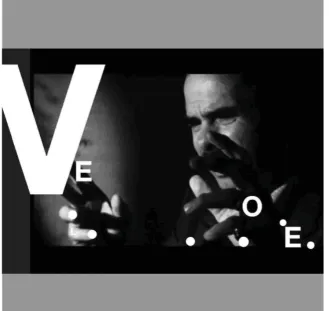
The footage I used was a short fi lm of singer and author Nick Cave. Cave was reading a passage from his new book, “The Death of Bunny Monro”. In the footage, Cave was very animated with his hand gestures. Pointing his index fi nger forcefully to emphasise a concept or word. Nick Cave is primarily known for his music, although he has written other books and screenplays. His lyrics contain dark imagery taken from the bible and drug abuse. The characters in his work are usually located in the deep south of the United States. They inhabit a landscape created by a gothic Tennessee Williams.
Fig 4 Nick Cave image with typographic signifi ers
The footage shows the physical embodiment of this deep level of dark storytelling. Using the fi ngers of both hands produced a lot of narrative movement in the animated footage. At this stage it became clear that more thought was needed for the symbols used in the narrative shapes. Tracking back to an earlier Cave song, I found a still image of Robert Mitchum with LOVE and HATE tattooed on his knuckles. Mitchum is playing the character Harry Powell in the fi lm Night of the Hunter. (Harry Powell (Robert Mitchum) marries and murders widows for their money, believing he is helping God do away with women who arouse men’s carnal instincts). (Source IMDB.com)
Cave included an oblique reference to this character in the song The Mercy Seat: Wears a wedding band that’s G.O.O.D.
‘Tis a long-suffering shackle Collaring all that rebel blood.
(The Mercy Seat. Lyrics and Music by CAVE Nick. Performed by Nick Cave and the Bad Seeds Mute Records. London UK. 1988)
I decided to use the words LOVE and HATE for the narrative as they were taken from the original image from the fi lm. I wanted the reference for the motion work to oblique. The meanings of the words are not from the obvious source but are instead taken from tattoos of the original character played by Michum.
In the narrative, as Cave moved his fi ngers forward and back the letters spin across the screen. The words LOVE and HATE are formed and deconstructed along the path of the timeline. The typeface used for this lettering is Helvetica Neue Bold, set in capital letters. This brutal matter of fact letterform was used on early Nick Cave album covers. A dot and a cross are used to map the fi ngers and eyes supported the type on the timeline.
The second stage of the narrative was created the movement of the type when onion skinning was applied. This process showed the path of the letters twisting across two points. Initial thinking in this research identifi ed the interstitial space of between the start and fi nish of a gesture as the single area to explore. To focus on the space between is not enough. The space is fi lled with gesture and language; these elements along a start and end points for the gesture complete a narrative.
[image:6.595.127.457.117.428.2]Visible Narrative 3
The video footage used for this narrative is taken from a recent documentary on Joy Division. The edit used is a description of the fi rst attempt at ‘punk’ music created by Warsaw (later to become Joy Division) guitarist Bernard Sumner. Sumner is outlining the fact that the fi rst energy fl ash of punk music was in the main intellectually limited. So limited in fact that his description of the average “punk” song consists of , “YEAH YEAH YEAH Fuck off, Fuck Off, YEAH YEAH YEAH Bollocks, Bollocks!”
Fig 5 The moment of expression. The gesture as a vocal presence
A dumb reaction could only exist in a short lifespan, the music had to develop to survive but the spirit to reject the past was consistent. The footage used in the narrative is only fi ve seconds long. The narration is simple. Three words. Delivered with venom. But followed by an ironic grin from the narrator, as if to say, this music was pretty bad, but served its purpose to make a space for something new in youth culture. The Cave narrative used multiple points in the visuals. This approach worked well to illustrate (albeit in an abstract way) the complex layering con-tained within the story and the storyteller. The Electric Circus narrative has just one point in the fl ash footage. This point is a square that tracks the movements of the mouth. The opposite shape to the fi rst narrative used on my face. This shape would provide a hard visual edge when in motion. To further embed meaning, the square is positioned at an angle of 76 degrees. The year the fi rst Warsaw concert at the Electric Circus took place. A white square on a 76-degree angle. The thickness of the square in the narrative is derived from the number of weeks that have passed since the fi rst Warsaw concert at the Electric Circus to the date of the project
hand in. (Detail 11,768 Days or 16,971840 Minutes or 1,018,310,400 Seconds or 1638 Weeks). Also the back-ground colour is yellow, the same colour used on the fi rst factory poster, which featured Joy Division.
Fig 6 The path of the gesture, isolated
The timeline is a record of time, and also the movement of an object between two points. At the fi rst stage of this research I felt that the work would be a programme of study designed to the unseen interstitial space between two objects as they move. This idea is based on a challenge to my existing knowledge base in static print design. By using Adobe Flash, which is liner and time based, I now realise that the space between the two points is only one part of the equation. The full solution requires a start and end point, with the path of the narrative or gesture mapped along the path in travels on.
[image:7.595.224.388.108.265.2] [image:7.595.221.389.455.626.2]Fig 7 The gesture in situ. A location specifi c public art statement
Conclusion
Refl ection on the digital process
Summer 1990. I picked up my camera, and without thought, photographed my hand against a bright blue sky, the image is one of many random shots of things that caught my eye I took whilst on holiday. Later…I was preparing to design a business card, which I would leave for potential employees to contact me. The image I used for this card was the shot of my hand.
When I fi rst created the type card in 1990, there was no conscious thought process beyond an image that would advertise my work. Over time there is an obvious connection the image I created then and the work and the results of this current research. The link is really a re awakening of a previous dormant need to create work ‘by hand’. The methodology of making work by hand remains the same. The location point for viewing the concept of hand made has shifted to another location. The shift in view point echoes the change of axis used to create the narrative images in fl ash. These images are based on movements of the hand and the face.
After
The project has revealed itself as an inverse Concrete Poetry. The words in the narrative began as physical ges-tures. The meaning is hidden in the visual blur of codes created by the pathways of physical gesture.
The digital, computer based project is ‘hand made’. What has changed is my perception of what hand made is and could be. One can look at the question of meaning here as a three dimensional object. The object was at fi rst lit from an one original viewpoint. The fi rst reading of what is hand made was made from the viewable perception of the question from this location. Over time, I have moved the light source to a new standpoint. From here the light casts new shadows. The Terminology has not changed, moving to a new position to view the concept at another angle is at once a conclusion to the original proposition, and a also a radical departure for my research output. The new shadows are a new proposition.
[image:8.595.186.393.35.239.2] [image:8.595.194.381.560.758.2]Typographic exploration
The fi rst three experiments in this research posited the notion that the body was the vehicle for the Visible Narrative. The visual forms presented are tracks of narrative, the physical expression of language. The outcomes are abstract, content is within the form and open to interpretation. The next stage of the project will look typography as at the vehicle of narrative, a connective tissue for visual representation and expression. One could say that typography is the original information aesthetics with emotional content
There is a vast amount of research looking at the importance of information aesthetics. These projects show traces of human activity as they criss-cross from one point in time and space to another. The patterns created show beauti-ful forms, lines, dots swashes of colour and image colliding in complex abstract patterns. Data is compressed into visual form from a vast number of sources; Aeroplane fl ights, the route of telephone conversations across borders and the proliferation of a news story across the web are mapped, analysed and presented as visual forms.
The beginning of data visualization is presented by Lev Manovich as a practice of making rational interpretation of information as a set of simple forms.
In my view, the practice of information visualization from its beginnings in the second part of the 18th century until today relied on two key principles. The fi rst principle is reduction. Infovis uses graphical primitives such as points, strait lines, curves, and simple geometric shapes to stand in for objects and relations between them.
Lev Manovich. Visualisation
Typography creates letterforms (and the space between the letters), which are designed as a set of symbols emo-tional connection between reader and writer.
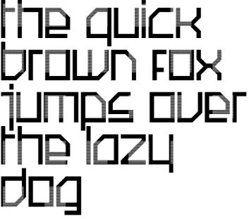
Fig 9 VN Font. Typeface designed for the Visible Narrative sequences
In book form, prose and poetry is typeset in a specifi c font. On one level, a Font performs the agreed process of presenting information in reductive and constant visual form. The basic information level of the text is constructed of straight lines, curves and shapes designed to present a forward facing representation of standard language.
The aesthetic function is the combination of typographic form and space as a connective tissue to drive the
emo-tional content of the text to the reader.
This research will explore the use of typographic form, plus content and the stories and emotion within the text to create a new form of information aesthetics created from language and text as its emotional centre. The
informa-tion aesthetic therefore is analysis of the synthesis of type and message as image. Typography is information plus
aesthetics. The project present work as image and text both together and independently. The written word presents language with an emotional content. Handwriting styles, the choice of font, the medium of delivery (stone cut letter-forms, letterpress, text language) adds emphasis to the message communicated to the viewer.
[image:9.595.136.490.294.605.2]Look at your refl ection in a pool of water. The water is still, calm, a mirror. Put one fi nger in the liquid. What happens? Your fi nger breaks the liquid into concentric circles of water. The liquid creates a pattern that contains the information of your refl ection, but in an abstract order.
This research project has the joint themes of memory, text and place at its core. The research engages with the general public to explore new ways of presenting stories and ideas as contemporary art. Ultimately, the people of the city can claim ownership for the artwork; for without the stories, ideas and gestures of the people found in a place there would be no content to base these new aesthetic representations.
Language as image and form is a central concept in this developing research methodology. Continuing typographic research includes collaborating with the acoustics department at the University of Salford. Audio scanning technol-ogy is deployed to create soundscapes made from the shape of letterforms. Each typeface has a different sound fi le. When the audio fi le is read back into a sonogram the sound wave created is in the shape of the letterform. Further research will look at creating a set of typefaces based on the sound the letterform makes instead of any visual aes-thetic. Traditional type families are designed by visual “weights” (Light, Medium, Roman etc). This type family set is designed as a set of different notes and pitches.
This research can be described as a haptic concept. To touch the place, the sense of touching the place where you live, recording and presenting the hitherto unseen movements made into physical form.
The next stage of this work is to defi ne the deliverable elements. This is project that is evolving along its timeline as it continues onwards. The content will lead to new art as information gathering and presenting techniques are included in the research mix. This will include a book of stories from the city, exhibitions and on line experiences. Ultimately the content in this research is designed to present the City Space as an Art Space which creates inclusive art state-ments authored by and for the population.
Fig 10 The Narratives in a ArtSpace. Chapman Gallery The University of Salford 2009.
Observation
What exists in the ArtSpace. What is to be mapped? What do we see here? What can be used? What can be re-placed with new things that offer a closer connectivity with the place? All the different forms of language, communica-tion and gesture create the haptic methodology. A closer conneccommunica-tion between the person and the place. Typographic forms create a mimetic topology, aesthetic representation and connection with symbol and sign and the real world
Bibliography Books
DEBORD Guy-Ernest. Society of the Spectacle (Trans by Ken Knabb) Rebel Press ISBN-13: 978-0946061129
HUGHES Ted. The Iron Man. Faber and Faber 1968 ISBN-10: 1406324671 SAGAN Carl. Cosmos. Random House 1981 ISBN-10: 0349107033
HOWARD BOOTH Mark. Bill Brandt, Shadow of Light. Gordon Frazer 1968. ISBN: 0900406658 BATES Brian, CLEESE John. The Human Face. BBC Books 2001. ISBN 0563551887
MANOVICH LEV. Software Culture. Digital Download from http://manovich.net/books/ BRUNO Giuliana. Atlas of Emotion, Journeys in Art Architecture and Film. Verso 2002. ISBN 10: 1859841333
Online resources http://ubu.com/ http://www.ubu.com/
http://www.antoninartaud.org/ http://library.nothingness.org/
[image:10.595.40.542.295.391.2]