Art and Design Theses Ernest G. Welch School of Art and Design
5-7-2016
Incongruent Ilk
Derek W. FaustGeorgia State University
Follow this and additional works at:https://scholarworks.gsu.edu/art_design_theses
This Thesis is brought to you for free and open access by the Ernest G. Welch School of Art and Design at ScholarWorks @ Georgia State University. It has been accepted for inclusion in Art and Design Theses by an authorized administrator of ScholarWorks @ Georgia State University. For more information, please contactscholarworks@gsu.edu.
Recommended Citation
by
DEREK FAUST
Under the Direction of Ruth Stanford, MFA
ABSTRACT
incongruent ilk is a thesis exhibition of formally and conceptually linked situations that
by their distilled nature initiate deeper contemplation of topics that are often just examined
superficially. For my thesis exhibition I set out to produce curated arrangements of objects and
materials because I believe something important is revealed about ourselves when we engage
with common and banal objects in the material world. The exchange between the human
experience and the unique nature of specific objects can connect us to each other by highlighting
shared, yet subjectively interpreted experiences. The linear connections in this body of work
give way to incongruent and contradictory contexts. incongruent ilk has overtones of leisure,
travel, and warning that are delivered by humor, subversion, and the formal arrangements of
materials. There is an intersection between objects and images that drips with subjective
judgment; this subjectivity is crucial to incongruent ilk. The audience excavates the depth of
potential metaphor, analogy, or concept naturally and artificially existing in the work by how
deeply they are willing to consider what is presented.
by
DEREK FAUST
A Thesis Submitted in Partial Fulfillment of the Requirements for the Degree of
Master of Arts
in the College of Arts and Sciences
Georgia State University
Copyright by Derek Wesley Faust
by
DEREK FAUST
Committee Chair: R Stanford
Committee: C Drennen
J Frank
S Richmond
Electronic Version Approved:
Office of Graduate Studies
College of Arts and Sciences
Georgia State University
DEDICATION
I would like to dedicate this thesis and paper to my amazing wife, without her support,
ACKNOWLEDGEMENTS
Thank you to my thesis committee members: Craig Drennen, Jill Frank, Susan Richmond
TABLE OF CONTENTS
ACKNOWLEDGEMENTS ... v
LIST OF FIGURES ... vii
1 INTRODUCTION ... 1
2 INFLUENCES ... 2
3 PROCESS: INTUITION & ARRANGEMENT ... 7
4 THE WORK: incongruent ilk ... 11
5 CONCLUSION ... 30
LIST OF FIGURES
Figure 1 Jessica Stockholder, On the Spending Money Tenderly ... 4
Figure 2 Heim Steinbach, tonkong rubbermaid I-1 ... 6
Figure 3 incongruent ilk, installation view ... 11
Figure 4 incongruent ilk, installation view ... 11
Figure 5 crew only ... 14
Figure 6 shade ... 16
Figure 7 eyelet ... 18
Figure 8 dune ... 20
Figure 9 florida fall ... 22
Figure 10 trace ... 24
Figure 11 circumstance ... 26
1 INTRODUCTION
“All material has history. All material has its own history built into it. There’s no such
thing as ‘better’ material. It’s just as unnatural for people to use oil paint as it is to use
anything else. An artist manufactures his materials out of his own existence-his own
ignorance, familiarity or confidence.”1 – Robert Rauschenberg
My desire as an artist and traveler in this world is to focus my attention on visual
arrangements of the everyday: rubble stacked on a broken door, a hood from a retired
semi-tractor trailer leaning on a telephone pole, or colorful tchotchkes on a shelf at a gift shop at a
touristy beach resort. Arrangements exist everywhere, and consciously and subconsciously I
catalog these scenes constantly in my mind. When I use the word arrangement, what I mean is
the result of objects and images being arranged and placed in space at varying proximities and in
varying configurations and arranged as a whole or unit.
When I enter my studio, my observations and mental connections from things I have seen
and collected in the outside world become foundational to my art-making, not necessarily in a
direct or literal way, but through my mind’s filter and my reliance on memory. For instance, in
2015 when I was in Miami, Florida for Art Basel, I noticed a cruise ship setting off on a voyage
as the sky was darkening and waves were beginning to white cap. Standing on the beach
watching this massive ship make its way across the horizon, I documented it with my camera,
thereby turning this moment into material to be explored later in my studio. There was an eerie
and ominous nature to the moment that I found related to other materials I had gathered in my
studio, like a deployed airbag, a blown-out tractor trailer tire, and a melted pool skimmer. For
me, this intuitive part of the process reveals relationships and meanings when investigating the
nature of an object or image, and I want viewers of my work to also use their own intuitions to
make these connections. For my thesis exhibition I set out to produce curated arrangements of
objects and materials because I believe something important is revealed about ourselves when
we engage with common and banal objects in the material world.
2 INFLUENCES
I work from cursory and intuitive understandings of how my work aligns with art history.
Instead of studying the scholarly descriptions of historical and contemporary art practices, I
immerse myself in looking at artists’ works that seem relevant to my current thoughts and
moods. My influences lodge in my subconscious and I don’t always know where they originated
from or how I have altered them through a fallible memory. With that said however, my research
and making tends to fit into the definition of contemporary art as proposed by the art historian
Terry Smith and further explained by the scholar Jeffrey J. Williams who writes that: “we are
immersed in an infoscape capable of instant communication of all information and any image
anywhere. That is a chief difference from previous eras, even postmodern. Postmodernism might
have responded to media like TV, but the contemporary arose with the advent of personal
computers, on every desk, beginning only in the 1980s and now in our pockets. Those change
our sense of time, plugging us into our contemporaneity.”2
It’s probable that my process and work takes most of its influence from the austere
formalism that is present in modernism and the notions in contemporary art that we have found
ourselves in a world heavily layered with information both visual and otherwise. The output
from these influences often tends to be sculptural arrangements of objects that have a distinct
interaction and response to space and proximity. The use of space in my work makes it
installation because a viewer is intended to navigate the space to access my work. Johanna
Burton discusses in her essay “Sculpture: Not-Not-Not (or, Pretty Air)” that sculpture is not
installation and that “installation has gradually surfaced, particularly in the last twenty years or
so, as a kind of catch-all formulation, one that easily bends to accommodate all manner of work
and practices that deal, however obliquely, with the spaces in which they are conceived to be
experienced.”3 I curate objects in a body of work as responses to the space the work is in. If a
body of work were to be installed in a different location, the spacing and even editing of
elements would be informed by that space.
In regards to incongruent ilk, the styles, material choices, and/or work of two artists in
particular, Jessica Stockholder and Haim Steinbach, have been especially influential. Jessica
Stockholder uses found and sourced materials and paint to create her large-scale installations.
Sometimes Stockholder uses wire to give structure to her work and/or act as visual and literal
connections between her assemblages and the gallery walls. I believe that we both operate under
the hope that viewers will mentally and visually take parts and meaning from one moment in a
piece and carry it with them to another piece in their minds. An explanation of her abilities to
have her work engage in these ways is included in a catalogue essay by Giorgio Verzotti. He
writes:
[A] key concept she [Stockholder] uses is “memory” - exercising the memory of what we
have just seen when, by moving, we go on to look at something else, so as to mentally
link together all the stimuli the installation induces. Using memory to create a virtual
reconstruction of continuity in what appears discontinuous: here we find a sense of order.
Here we find form. A formal value that is perceived through the senses - and not just that
[image:13.612.124.489.152.615.2]of sight.4
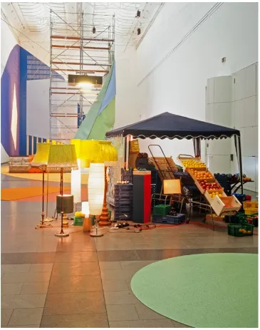
Figure 1 Jessica Stockholder, On the Spending Money Tenderly
Carpet, scaffolding, paint, linoleum, lights, 4 couches, tent, plastic fruit, real oranges and lemons, Christmas baubles, balls, boxes, tables, building materials. 2002. (Source: http://jessicastockholder.info/projects/art/on-the-spending-money-tenderly/)
The artist I am in closest dialog with, however, is Haim Steinbach. I see strong
similarities with different delivery methods. We both use “found” or sourced everyday items
with the clear objective that these items inherently have and exude meaning, but because they are
recognizable and mostly banal items there is a deep sense of familiarity at first. In an interview,
Steinbach explains, “My work always refers to a human presence. The objects I employ all have
specific identities, derived as much from the needs and desires that produce them as from the
uses and meanings they’ve accumulated over time.” 5 In my own work this familiarity is altered
by slight modifications to the material or the use of images in proximity to the object. I think
artist and writer Steel Stillman’s statement about Steinbach’s work resonates with my objectives:
“To appreciate his [Steinbach’s] work is to become an etymologist of things, reading the objects
as if they were words, in order to uncover sources and resonances. … In Steinbach’s world,
looking is a game of deciphering relationships. … There are no explicit narratives or easy
answers. But there are always connections - associations of form, color, memory and meaning -
that emerge from his surprising juxtapositions.”6
Steinbach creates meticulously crafted shelves to support his arrangements. This
platform acts not only as a functional presentation tool but also adds a formal element. The
shelves shapes and colors are in direct dialog with the work, they share similar colors and there is
often a game played with color and quantity of color creating a formal hierarchy. My own work
differs from his insofar as I use some of my found objects as the platforms to prop other images
or objects on, like a mouse pad, sign stand, or banner. I also rely heavily on the floor and walls of
a space to sustain an object’s presence, thereby also connecting it differently to space. I like to
embrace the grainy quality of a low resolution photo printed on a mouse pad similarly to how
Heim sometimes allows the materials his shelves are made of to be seen on the ends. There is a
rawness to allowing materials and pixilation to exist as a means to show its “materialness”.
Another notable deviation between my work and Steinbach’s is in our use of titles. Whereas
Steinbach sometimes uses titles that list the items on display, the titles in incongruent ilk are
intended to add another layer to the work and nudge the viewer’s interpretation in an
[image:15.612.73.522.233.537.2]idiosyncratic direction.
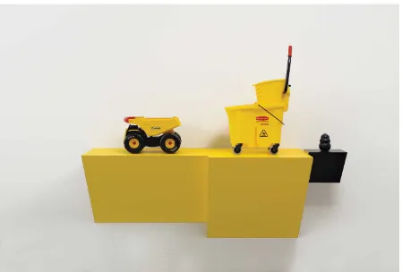
Figure 2 Heim Steinbach, tonkong rubbermaid I-1
plastic laminated wood shelf, one plastic and steel Tonka toy truck, plastic and metal wring bucket, rubber dog chew. 2007. (Source: http://www.haimsteinbach.info/works/caution-2007/)
My work is very similar to both Stockholder’s and Steinbach’s in its requirement for a
level of rigor from viewers. Endurance, patience and one’s ability to allow for contemplation are
keys to successfully engaging this kind of work. Artists use different mechanisms to encourage
3 PROCESS: INTUITION & ARRANGEMENT
Artists have no choice but to express their lives. They have only, and that not always, a
choice of process. This process does not change the essential content of their work in art,
which can only be their life.7 – Anne Truitt
I subscribe to an artistic practice of remaining available. When I say “remaining
available,” I mean that when I engage with objects, materials, and images and their locations, I
am actively seeking possible functions of that item, material, or image. The goal is to be looking,
considering, and acquiring as often as possible. I find materials during my daily commute, and
by taking advantage of motorcycle rides to new areas with a camera. There are also many online
sources for new and used materials that I use like Craigslist and Amazon. I am looking for things
that have a variety of possible uses, ranging from formal to conceptual. There is also an added
intrigue in an object when there is a presence for these formal or conceptual potentials while it
also remains somewhat banal and neutral, like a generic bathroom towel rack or a mouse pad.
These modes of acquisition are important and laden with potential for further resource materials.
The place in which something is found becomes a catalyst and subliminally remains with the
object through my memory.
After I collect materials, I store the items and images in pragmatic ways (large items get
stored outside, digital images stored in a folder on a computer, etc.). Often I begin interacting
with these found objects by pulling out various collected objects and cleaning them; sometimes I
use a pressure washer to remove grime, dirt, and various unwanted residues and clues to the
items’ former whereabouts, or other times I might crop an image to eliminate undesired
information. For instance, I found a set of worn-out ATV tires illegally dumped on the side of a
back road. I stored these tires outside of my studio until one day while working I sensed that I
might be able to use them to explore ideas about travel through their material properties. So, I
moved them onto a table outside and pressure washed the red Georgia clay off of them, which
revealed their worn surface and history of tire plug repairs and gouges. The wash also revealed
their flat black rubber surface and their very essence; they became objects without the residue
that would reference a specific place or area from which they came.
It’s after things have been collected and cleaned that I start to look for both obvious and
unlikely moments and threads that connect the materials, images, and objects I have gathered.
The intention at this point in the process is to work intuitively without a clear direction or desired
outcome. My process then requires the fostering of an experimental mindset to translate
thoughts, ideas, and aesthetic preferences through arrangement and subtle modification.
This part of the process is like playing a piano where all the keys have been scrambled:
All the strewn-about stuff in my studio starts out as a cacophony. Freely pairing and arranging
these found objects and images starts the associative process. This gathering process sometimes
develops into mild obsessions with items from similar or congruent chords. There’s typically a
melody existing in the background, whether it is visual, or through the utilitarian or formal
nature of the object. The exercise then becomes about activating various notes.
I do not have a particular desired outcome while working through my process, other than
eventually knowing that something will arise after thoughtful investigation. This is to say that
generally I don’t have an initial idea of what an arrangement might be or what other
arrangements I might pair with it. I tend towards exploring trends that develop unintentionally in
my collecting and photographing processes and I investigate and consider those trends. For
travel, both subjectively and objectively. This then led my attention to finding items or taking
pictures that had connections to the concepts and materials that tie to leisure and travel.
I use this position of “remaining available” not just at the early stages of putting together
a piece of work, but throughout my entire process. When curating and arranging, I allow myself
to move fluidly and intuitively from one decision to the next. There is a proving ground formed
within the studio. If certain things don’t function to initiate a visual, conceptual, or thoughtful
experience, I reconsider their locations or remove them from the work. I am simultaneously
reducing the quantity of pieces present as well as gauging the qualities of the arrangement. The
crux of this method is a search for a metaphor, analogy, or visual interest. If I set a few things
together, say a postcard with a cactus on it leaning inside a fishbowl centered on the fabric from
an umbrella, I might consider the nature of water, our need for it, our desire to avoid it when
unprepared, and a fish’s need to be surrounded by it. Maybe this assortment of materials leads to
a consideration of our own need to conserve water, or it might remind us of a childhood memory
of a goldfish that jumped out and died and dried out before we realized we had forgotten about it.
This chain of thoughts and experiences is the intended function of my work. The fact
that this mixture of objective and subjective thought happens in one’s mind when presented with
arrangements of objects in the gallery context is the very reason I find it important to encourage
the audience to engage the work from their own life experiences and bear witness to how objects
and images act as musical notes. The reason I use the music analogy is because music is
experienced, maybe more so than words. In comparison to words, notes are less tethered to
immediate and direct references to concepts or meanings. Music and rhythm can stimulate
movement and represent time. Objects can stimulate memory and, a physical and visual
interested in evoking thoughts the way an opera can evoke feelings. Objects can resonate with us
strongly and deeply in unique ways, and I want to elevate and highlight that.
I use materials that I genuinely believe are important and revealing about who and how
we are. There is a transition of a materials meaning or value when it is placed in an assemblage
or in a situation near other materials. By reconfiguring the access to something visual and
shifting or enhancing one’s perception of it, I change the items’ functions; I guide the thoughtful
viewer to a deeper consideration of the nature of these items and their relationship to self and
other tropes from the human experience. These relationships can be subtle, fragile, tedious,
ephemeral, and visceral and have a slippery nature and sometimes a short shelf life. In effect,
these threads and relationships between objects themselves or the viewer and the objects can be
fleeting and dissipate once the eye moves onto the next thing, or they can linger and evolve in an
additive fashion. The presence of ambiguity permits the viewer to journey through the work with
4 THE WORK: incongruent ilk
Figure 3 incongruent ilk, installation view
[image:20.612.99.515.413.694.2]Posted at the gallery’s entrance was the following show description for incongruent ilk:
incongruent ilk is a smattering of formally and conceptually linked situations. The obvious linear connections give way to incongruent and contradictory context. ilk alludes to a deeper underlying note, possibly something more weighted lurking under lighthearted, cursory connections.
There is an intersection between objects and image that drips with subjective judgment. What is reality; and where does object become image and vice versa? This subjectivity is crucial to incongruent ilk. The audience brings the breadth of metaphor, analogy or concept to the work in how far they are willing to engage their own preconceptions and perspectives.
incongruent ilk requires sustained, thoughtful openness. I am truly interested in the
experience the viewer has and what memories or meanings are conjured up when faced with
navigating the various items below. I want the audience to be in dialog with the work; I want to
let people be their own legend or key. The pieces rely on subjective perspectives in tandem with
my own artistic decisions for connections to be made.
As a whole, the works in incongruent ilk are experienced and viewed in concert with
each other as well as on their own. Each arrangement itself is a cluster of relationships that
engage with objects in its own cluster. This acts as a prop for dialog with other objects or
arrangements. The nature of the relationships and threads throughout the work are of differing
qualities. There are many tones to these relationships: some reverent, some humorous, some
poetic, some romantic, and some theatrical, as if these pieces were props in a play. Formally and
visually, the pieces can also be linked through shape and color, or through a human action or
gesture evoked in the piece, like the act of pruning a fake houseplant.
Concepts associated with leisure, travel, and the artifice of tourism underpins the entire
exhibit. Because this body of work operates as an installation, the gallery space is an actual
the gallery itself can be understood as a sort of tourist destination. Just like an art gallery, the
tourist destination can be a simulacrum of a place, and many of the pieces in this work evoke
these themes of the artifice of a simulated tourist experience. As an imitation of an adventure on
the high seas, the cruise is a strong example of this simulated experience that becomes itself its
own experience. While the advertisements for the cruise reference a unique, life-changing
adventure, the tourist boards a ship with thousands of other people all destined for the same
curated journey. Even a local’s drive to the many beaches in Florida exposes this same curated
experience. Restaurants with artificial or highly manicured palm trees and billboards with
hyper-realistic photos of alligators and birds of paradise line the roads. There is an inundation of the
experience awaiting you at the destination before you get there. The path there is laden with
amateur and professional photos of the destination, taken at ideal times of the day and year,
likely when we are not there. Setting the stage of an experience traveler fascinates me: Is that
what makes a traveler a tourist? These expectations? I want to draw attention to the layers of
these experiences.
I present this work to invite the viewer to be a traveler and to make the connections
between the objects in the gallery themselves, rather than acting as a tourist and passively
accepting the obvious narrative given to them in a particular artwork. Ultimately, however, I
would like to leave the implied differences between a tourist and a traveler for you the reader to
decipher and unpack.
Below is a description of the cursory and more in-depth relationships from incongruent
crew only(construction sign stand, photograph on aluminum): A construction road sign
is used as the stand for a highly glossy dye sublimation print (photo printed on aluminum) of a
cruise ship under an ominously darkening sky and roughening sea. The print is cut in the shape
of a square; the points of the square create the recognizable diamond-shaped “road construction
ahead” motif. The image is displayed upside down. This is one of the more noticeable pieces
when you enter the gallery space. Without much investigation, it is clearly a “sign.” There is a
cruise ship, upside down, clinging to the water on which it was originally effortlessly floating.
Typically, signage placed on these sign stands is meant to serve as a warning to a passersby, it
alerts viewers that something ahead should be traversed with caution or to heed a specific
warning. This sign, then, could be seen as a bit of a warning to use some form of caution–and
perhaps patience–while navigating the layers of relationships and threads between the works in
the gallery. The irreverence of displaying a large aluminum print on a construction sign stand
pairs interestingly with the ominous nature of the image. This deadpan humor arises again in
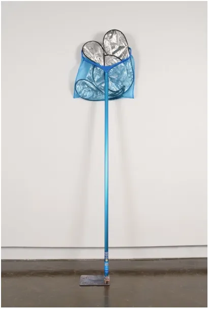
shade (photograph on mouse pad, lighter, pool skimmer, windshield reflector): A
reflective blue anodized pool skimmer with an aluminum handle leans up against the wall, with a
silver reflective car windshield sunshade in the net portion; the skimmer pole contacts the ground
on top of a mouse pad with a photo of palm tree trunk printed on it. A cheap, bronze-colored
lighter in the shape of a hand fisted with the middle finger erect also sits on the mouse pad. This
piece, similar to florida fall, uses some deadpan humor. The title, shade, is a threefold word play,
referring to (1) the shade offered by the palm tree, whose trunk begins at the mousepad and is
completed with the skimmer pole, (2) the shade referenced in the actual utility of the windshield
sun shade, and (3) the lighter crassly flipping the bird, or “throwing shade.” These puns are not
intended to be the end-all to the work, but they instead offer a lighthearted entry into it and a
different doorway that can alter the viewing experience, and eventually fall away. In this way,
humor encourages a letting down of our guard to expose more delicate and subtle moments
present in the work. These exposed moments then reference the complexities discussed above
eyelet (towel bar, rope, towel, grommets): A green bath towel hangs from a generic
store-bought towel rack. The towel has large, blue, two-inch-wide window curtain grommets,
installed down one edge like holes punched in paper. A short length of green climbing rope also
hangs from the towel rack beside the towel. Unlike the towel, the rope is gnarled and curled as if
stored on a spool with a narrow diameter. Likecircumstance, eyelet offers more formal links to
the other works and fewer conceptual ones. Conceptually, the towel does play off the idea of
leisure in the context of the pool, and the rope also references climbing or a nautical use that can
be linked to the leisure related to a cruise ship. The formal links, however, may be more obvious:
The pool skimmer of shade, and even the garden hose in trace, discussed below, are linked
through color and line. A more interactive humor is at play with the tension between the rope and
the eyelets: Persons of a certain temperament might find a slightly nagging desire to thread the
rope through the eyelets, while others might notice that the towel itself is threaded through the
towel bar, acting as its own eyelet. This play is deliberate, and more tactile in nature than some
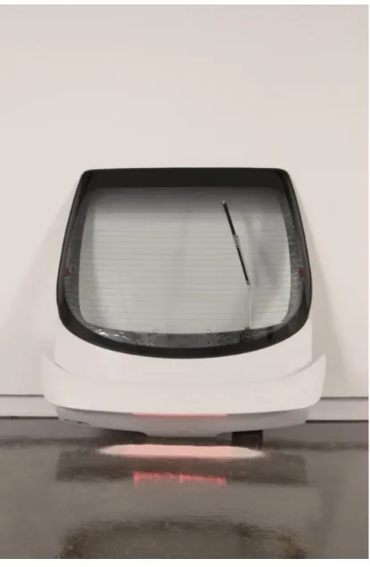
dune (hatchback door, beach sand, battery): The hatchback to a late-90s Acura Integra,
complete with blistered window tint, sun-faded windshield wiper blade, and spoiler. It leans
against the wall, almost precariously, in a vertical orientation. When your perspective shifts to
the side profile of the hatchback, a motorcycle battery is visible and wired to the door.
Underneath the spoiler is a pristine line of white sand; it runs perfectly parallel to the spoiler.
There is a faint red light emitting from the spoiler’s brake light, which illuminates one side of the
neat sand pile. The red light subtly glows on the sand, reminiscent of heat or sunlight on a dune
in an early or late part of the day.
The car is a symbol of mobility and freedom: Everyone remembers that feeling when
they first had autonomy and could go wherever they wanted. The sand is a reference to place, the
beach, the desert, or maybe a sandbox. The car hatchback, on the other hand, perhaps references
a demographic or age group that might drive a car of this ilk. Formal elements are at play too.
The lines of the defroster across the glass and the intersecting line of the windshield wiper blade
florida fall (artificial plants, machete): Two identical, artificial but realistic-looking
house plants, in their factory black plastic planters sit in the middle of the room, placed directly
on the floor. One plant sits whole, unaltered, while the other has been pruned, leaves on the floor
of the gallery, where they might have fallen if pruned off in the gallery space. A sun-faded
pink-handled machete is vertically stabbed into the florist foam of the planter. The plants are the only
organic presence in the room, containing the least visual geometry or simplicity. There are
references to plants or vegetation in other works, but they lack the qualities of “plantness” that
these imitation decorative kitschy articles have. The “nature” of this arrangement on the floor is
to bring about a variance in materiality amongst the many rigid, metallic objects and surfaces.
The two plants interrupt the harmony of the gallery, which is almost regimentally lined with the
other works. Digging deeper into this piece, viewers might realize that the plant/machete
combination brings the viewer’s eye to the center of the room after perusing the work at the
perimeter. A deeper connotation here is the reference to navigating a jungle or other tropical
vegetative places, falling in line with travel in an exotic locale. Humor is the strongest
mechanism here; one can imagine the lost tourist hacking their way out of a jungle. In addition,
the piece references forced autumnal changes in Florida, where vegetation remains lush year
round. Though there is a sense of vulnerability here, the plant that remains unscathed might
eventually succumb to the same fate as the forcibly pruned plant, should the wielder of the
machete return. Similar to crew only, florida fall sets the “stage” in the gallery. Where crew only
trace (hose, photograph on banner, galvanized pipe, ATV tire): One of the more reverent
arrangements in incongruent ilk is trace. trace is made up of galvanized water pipe, a short
length of common garden hose with the male end fastened to the female end, a well-worn ATV
tire, and a twelve-foot-long grommeted banner with a photograph of puddles in a north Texas
landscape under an expansive blue sky. There is a stoic nature to how the items are arranged in
this piece. The draping of the banner over the water pipe, the symbolism of the snake eating its
own tail in the hose, and the tire carefully leaning against the water pipe as if it is some kind of
important symbol. Like many of the other pieces there are also simple direct references. There is
a reference to the water cycle here with sky, water, hose, and pipe all being references to water in
nature and water for utility. The blue sky connects formally to the blue in circumstance, shade,
and even the grommets in eyelet. The tire, used on the recreation vehicles known as
four-wheelers or ATVs, is another connection to leisure, and the perhaps the people who might use
these vehicles are a similar ilk to the passengers on a cruise ship? The title, trace, is used to
conjure up the relationship between all the objects in this piece: The tire carves trails, and rough
circumstance (sign, vinyl, sign post, temporary fence stand): A blank road sign (much
like a speed limit sign in shape, color, and size), hangs on the wall, with 1/3 of it wrapped in a
transparent light blue vinyl. An orange chain link rental fence stand, often seen around
construction sites, leans on the wall, and a short, bent section of a galvanized signpost sits on the
floor with two bolts left in it from its previous use as a sign. This particular piece anchors the
show’s formal qualities. The sign, with rounded corners, is reminiscent of the rounded corners of
the fence base, and the two bolts in the signpost are mirrored in the fence base as well. They are
disjointedly arranged, occupying wall and floor space. This piece relates formally to the use of a
construction sign stand in crew only and to the construction sign in greetings from. This piece is
devoid of the underlying ominous tones found in some of the other pieces. Instead, it functions as
an aesthetic formal moment linking materials of galvanized metal and the color blue while also
greetings from (construction sign, post card display): A five-foot-tall white wire
postcard rack supports postcard-sized rectangles of a dissected construction warning sign. This
piece is intentionally placed near the entrance to the exhibition space as to nod to its true utility
as a souvenir stand. After the viewer traverses the series of arrangements, they will again pass
this stand as they leave the gallery space. At that point, this piece serves a different purpose than
it did when the viewers entered the gallery. In duet with crew only, the orange construction sign
becomes present as postcard-shaped tiles, facing inward towards the display but still readily
visible. The viewer might mentally take one as a souvenir as a reminder to proceed in the real
world with some semblance of caution, considering more carefully the objects and arrangements
5 CONCLUSION
Since incongruent ilk operates as an installation, the gallery space is an integral element
to the work, and not just a vessel in which to display sculptural objects. The parallels between
the audience in an art gallery and the traveler or tourist analogy are seminal; instead of a
simulacrum, the work in the gallery space is intended to be the vehicle that transports you to an
undisclosed destination. You are not taken there physically, but are meant to traverse it mentally
and intuitively. The arrangements are comprised of objects and materials that, while remaining
true representations of themselves, also act as symbols and triggers to one’s own life
experiences. Each titled work operates with its own pitch; this pitch is differentiated by the mode
of gesture, modification, or context in which it is presented.
The cautionary, ominous, and darkly humorous tone that exists throughout the work is
intended to reinforce the viewer’s residual take away, like a postcard from a gift shop. This token
is meant to serve as a subtle reminder that we can be tourists, or we can be travelers when
exploring this world. Do you explore and investigate new worlds, or do you take things at face
value? The hope is that by the mere act of participating in this work through consideration, these
seemingly disparate objects will increase our ability to further contemplate and consider our
outside interactions. I want to meet the art viewer in the middle; I want to give enough to start
someone on a journey, but to let them take the risks associated with a less manicured experience.
I am not interested in ferrying the viewer from one port to another, but instead providing them
with a vessel and a set of keys. My hopeless optimism believes that we, humans, are capable of
so much more than we might ever be able to conceive. incongruent ilk is not inaccessible, nor is
REFERENCES
Burton, Johanna. “Sculpture: Not-Not-Not (or, Pretty Air).” In The Uncertainty of Objects and
Ideas: Recent Sculptures, 10-15. Washington, D.C. : Hirshhorn Museum and Sculpture Garden,
Smithsonian Institution, 2006.
Duchamp, Marcel. “The Creative Act.” Art News 56, no.4 (1956): 28-29.
Fer, Briony. “Objects Beyond Objecthood.” Oxford Art Journal 22, no.2 (1999): 27-36.
Fried, Michael. Art and Objecthood: Essays and Review. Chicago: University of Chicago Press, 1998.
Iversen, Margaret. “Readymade, Found Object, Photograph.” Art Journal 63, no.2 (2004): 45-57.
Rose, Barbara. Rauschenberg. New York: Random House, 1987.
Smith, Terry. “The State of Art History: Contemporary Art.” Art Bulletin 92, no.4 (2010): 366-383.
Schwenger, Peter. “Haim Steinbach.” BOMB 121 (2012): 34-43.
Stillman, Steel. “Haim Steinbach.” Art in America 100, no.1 (2012): 82-91.
Truitt, Anne. Daybook: The Journal of an Artist. London: Penguin Books, 1984.
Varnedoe, Kirk. “Why Abstract Art.” In Abstraction: Documents of Contemporary Art, 48-63. Cambridge: Whitechapel Gallery and MIT, 2013.