Copyright © 2016 C-MRiC.ORG
Visual Analytics for
Non-Expert Users in
Cyber Situation Awareness
Philip A. Legg
Department of Computer Science and Creative Technologies,
University of the West of England, Bristol, UK.
ABSTRACT
Situation awareness is often described as the perception and comprehension of the current situation, and the projection of future status. Whilst this may be well understood in an organisational cybersecurity context, there is a strong case to be made for effective cybersecurity situation awareness that is tailored to the needs of the Non-Expert User (NEU). Our online usage habits are rapidly evolving with smartphones and tablets being widely used to access resources online. In order for NEUs to remain safe online, there is a need to enhance awareness and understanding of cybersecurity concerns, such as how devices may be acting online, and what data is being shared between devices. In this paper, we extend our proposal of the Enhanced Personal Situation Awareness (ePSA) framework to consider the key details of cyber situation awareness that would be of concern to NEUs, and we consider how such information can be effectively conveyed using a visual analytic approach. We present the design of our visual analytics approach to show how this can represent the key details of cyber situation awareness whilst maintaining a simple and clean design scheme so as to not result in information-overload for the user. The guidance developed through the course of this work can help practitioners develop tools that could help NEUs better understand their online actions, with the aim of giving users greater control and safer experiences when their personal devices are acting online.
1
INTRODUCTION
There is no doubt that the modern Internet has revolutionised how society interact today. Whether it be communication with friends using social media, searching for local restaurants, buying a new home, or reading the daily news, the Internet now plays a significant role in many aspects of both our work lives and our personal lives. Usage habits have also drastically changed in recent years, with smartphones and tablets bringing about greater convenience for quickly accessing information whilst on the move. In the UK, Ofcom reported in August 2015 that smartphones had overtaken laptops as the number one device for Internet users, with two thirds of people now owning a smartphone and using this for nearly two hours every day to access the Internet (Ofcom, 2015). As society begins to embrace the concept of the Internet of Things (IoT), we are now moving to a state where even more of our electronic devices will be communicating online.
However, as Internet adoption continues to grow, so do the threats that are posed online. Symantec state in their Internet Security Threat Report 2015 that non-targeted attacks still make up the majority of malware and that in 2014 there were more than 317 million new pieces of malware created (Symantec, 2015). The report also states that ransomware has rapidly increased since the previous year, including the first piece of crypto-ransomware to infect an Android mobile device. Of particular interest, the report also flags that from a recent survey conducted by Norton, one in four people admitted that they did not know what they had agreed to give access to from their phone when downloading an application. With the increase of threats online, and the lack of awareness that many of those acting in cyber space have, there is a serious need to think about how we as researchers can help to alleviate this situation. One step towards this is to consider how users can observe, monitor, and understand their own personal cybersecurity. If users could actually see and explore their online activity data, it may help them to understand risky activity and make better informed decisions, and as a result, better protect themselves when acting online.
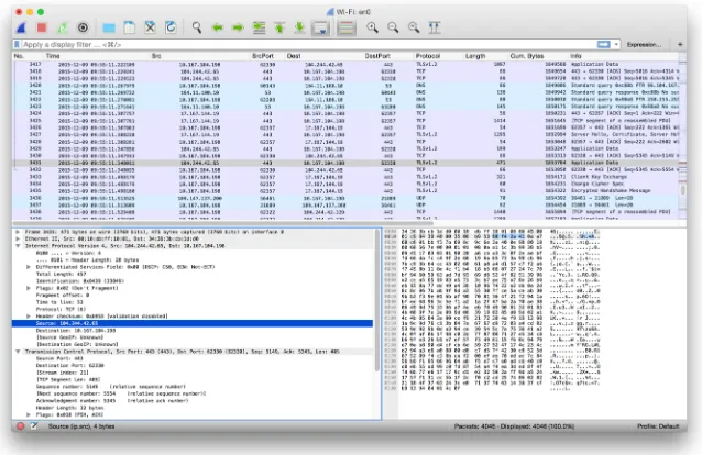
concepts, and data visualization techniques. Previously, we positioned the concept of NEUs within security visualization and security visual analytics, and argued why there is a strong case for improving understanding of security concerns for all users of cyber space. Whilst tools such as Wireshark (Figure 1) offer excellent deep analysis for security experts, they do not reveal much about the network landscape for more typical users. Yet, as the Internet continues to play a vital role in society, it is important that users are capable of understanding communications, at least at a level to perform basic network analysis.
The work described in this paper makes the following contributions:
• We extend the ePSA framework (Legg, 2016) to consider the key
factors of interest for conveying cyber situation awareness to NEUs, and we further develop the visual analytics design to better accommodate this additional information;
• We present two case studies of using the tool: the first shows how a
malware incident can be identified, and the second shows how a home network can be monitored;
• We conduct an evaluation of the system by obtaining user feedback
on their experience of the tool, and identify improvements for future study.
2
BACKGROUND
NetFlow Traffic Analyser. However, the majority of these tools are specifically designed for a technical audience. They may have complicated installation processes, or require a large amount of configuration to be able to use them. They do not cater for the needs of a NEU and are most often designed with organisation security analysts as the primary audience. Of particular interest is the work of Rao et al. (Rao, 2015), who recently proposed Meddle. Meddle uses a VPN for monitoring mobile device network connections, and flags up personally-identifiable information (PII) that appears in the traffic. Whilst the tool certainly is useful, it does not necessarily support cyber situation awareness, or allow users to visualize their network activity - the primary role is to alert the user when information of interest is detected in their activity. The authors state that the tool is soon to be available for researchers, which would serve complimentary to our visual analytic approach for better understanding of situation awareness.
[image:4.595.139.458.81.288.2]Looking more broadly at how visualization is currently used for NEUs, Fulda (Fulda, 2014) considers information visualization for non-expert users, and how such techniques can be evaluated, such as by observation. Gough et al. (Gough, 2014) propose a set of guidelines for creative practitioners developing visualizations for Non-Expert Users, which we
build upon for security analysis. Michel et al. (Michel, 2011) propose to use virtual worlds as a method for managing cyber situational awareness. They outline an experimentation of injecting anomalous activity into SecondLife and WoW, to observe whether participants can identify anomalous activity. However, they do not give their results, or divulge on their approach for visualizing such information or detecting such anomalies. Miller and Stasko developed a metaphorical visualization tool called InfoCanvas that can report on various data attributes such as number of unread e-mail, via a visual depiction (Miller, 2003). Stasko et al. extend the work to explore how a user may customise their display to create Informative Art (Stasko, 2004). Pousman et al. discuss Casual Information Visualization, which is the focus of InfoVis for the masses rather than only for bespoke or expert users (Pousman, 2007). Huang et al. present the topics of Personal Visualization and Personal Visual Analytics (Huang, 2015) - two areas within the visualization community that are begin to attract attention as individuals carry sensors such as mobile phones and accelerometers. Abdullah et al. describe a visualization framework for self-monitoring of web-based information disclosure (Abdullah, 2008). Van Kleek et al. propose Eyebrowse as a real-time web activity sharing and visualization tool (Van Kleek, 2010), to help individuals better understand how they spend their time of the web. In recent years, society has become more data-driven, which has resulted in more engagement with interactive visualizations in online spaces. Therefore, the challenge of addressing NEUs is an interesting one given that society today is more familiar with interaction and visual representation techniques. We position our work with this, to find the appropriate balance between functionality and learnability for NEUs.
The works discussed clearly demonstrate that there is much active research within the area of security data visualization. Yet, it is also apparent that many applications rely on specialist domain knowledge, or are intensive in terms of the depth of knowledge that they provide. Whilst this can be beneficial for expert security analysts, we argue that there is also a need to address how other users can also potentially explore their network activity to better understand security concerns. This work is positioned as a complimentary approach to expert tools, yet maintains the focus that our proposal should be easy to understand, intuitive to operate, and require minimal learning in order for users to be able to use the tools effectively.
3
CYBER SITUATION AWARENESS OF NON-EXPERT
USERS
access information from wherever they may be, and so the Internet is no longer confined to traditional PCs. However, many users may have little or no knowledge of what their devices are doing `under the hood' - such as what other devices they are communicating with, when they are communicating, and what data is being shared between them. It could be argued that the general user may not need, or may not care about how their device is acting - all they care about is being able to use it as and when required. However, as we continue to rely on technology it is important that users understand the cybersecurity concerns that are associated with Internet-enabled devices. As an example, observing that a device on your home network has unexpectedly started sending or receiving large volumes of data may well warrant a cause for concern.
For those tasked with analysing network activity, tools such as Wireshark provide a tabular view of network activity. For a novice user who is interested to explore network traffic, this list of activity may prove interesting, but not necessarily useful. For a novice user to identify periods of large traffic volume, or which devices and connected at what time, the tabular format does not provide these answers well. In particular, the novice user may be interested to see how many connections are made by a particular device on their network. The vast amount of data that is involved with network packet capture makes understanding this a challenge, however the aim here is to alleviate this barrier to allow NEUs to begin to understand characteristics in their network activity.
In our previous work (Legg, 2016), we conducted a small-scale user study to learn how NEUs perceive current cyber security when they are accessing online resources, and whether visualization and visual analytic tools could help users to become more proactive in monitoring their network environment. The feedback received was encouraging – many users feel that it is currently difficult to make sense of such data, or simply do not know where to start with this form of security – however, they felt that if appropriate tools were available then they would be more likely to monitor their activity in the future. This study motivated the development of different visual analytics tools for NEUs – the tool needs to clearly depict information for the users, without becoming overly-complex, creating a barrier for them to understand how to use the tool.
4
VISUAL
ANALYTICS
DESIGN
FOR
CYBER
SITUATION AWARENESS
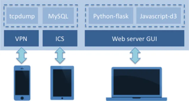
appropriate tools were available to better understand their cyber activity. As shown in Figure 2, the ePSA (Enhanced Personal Situation Awareness) tool is designed to collect, monitor, and visualize device activity across a complete network. Whilst previously we describe the process of data collection, storage, and visualization (Legg, 2016) here we concentrate on primarily on the development of the visualization and how the visual design has been extended to fully support NEUs in better understanding network traffic analysis.
Visual Analytics Design
Visualization is playing an increasingly-important role in our society when it comes to analysing and understanding large volumes of data. Here, we focus on how visual analytics can be utilised to allow NEUs to engage and interact with network data related to their Internet-enabled devices. By visualizing and interacting with network activity data, users may begin to discern how, and what, their devices are communicating online. In doing so, the objective is to promote cyber security and cyber situation awareness for NEUs so that they become more vigilant of threats when acting online.
Case Study 1: Malware Identification
The first case study is concerned with identifying malicious activity on a network. For the purpose of demonstrating this capability, we make use of a publicly-available packet capture dataset from malware-traffic-analysis.net (dataset “2014-12-15” available from their online repository). The data contains a particular incident of concern involving three windows workstations, of which at least one was hit by an exploit kit, and the challenge is to identify this incident and mitigate any further damage. We show how the ePSA tool can be utilized to achieve such results.
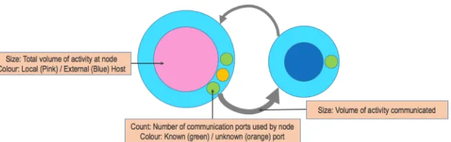
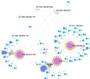
[image:8.595.139.466.95.270.2]Figure 5 shows the interactive network view that is the primary view of the ePSA tool. A semi-force-directed layout is utilised, where local devices (i.e., devices that IP addresses are in the range 192.168.*.*) are fixed in a radial layout and represented by the pink-coloured nodes in the graph. Blue nodes are indicative of all other (typically external, or specialist) IP addresses, as previously described in Figure 4. The node size relates to the total amount of traffic for each node. Here, three local nodes can be seen to be actively communicating, given the size of the nodes. Similarly, the amount of traffic can also be observed by the number of blue nodes that surround each local
node, as dictated by the force-directed layout. This allows a user to gain an overview of which devices are communicating most, and to how many different hosts.
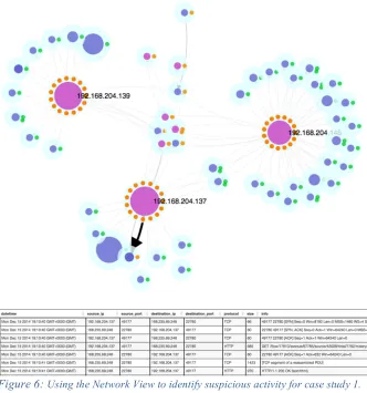
[image:9.595.137.462.77.316.2]Through interaction, users can select nodes to gain greater detail (e.g., host name), which also performs a filter on the detail view that shows the raw data. Users can re-position nodes to support their decision-making process and to reveal clearer view points. In Figure 6, the user re-positions the network view so that the three local hosts of interest are clearly separated, with all other local IPs in the center (e.g., multicast addresses). With the visual design, ports are shown on the outer ring as known or unknown services. In this example, there is one external website that has been
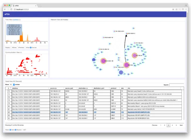
Figure 3: ePSA dashboard interface. The tool comprises of a variety of modular ‘views’, which can be positioned on screen as desired. The primary view is the network view (top-right). Supporting views include the timeline view (top-left), communication view (left), and detail view
accessed with an unknown port. This is the one node that appears with a blue center and an orange port indicator. Given that this is the only instance of an orange port indicator for an external web page, the user can identify this as an anomaly. By using the detail view (shown in the lower part of Figure 6), it can be seen that there is some communication that is obfuscated – a clear sign that this port is used by the malicious software to communicate back to its host. This shows how the visualization can support much clearer identification of anomalous activity which would typically be unknown to a NEU. Likewise, the visualization supports filtering techniques (e.g., ‘GET’ filter) to provide only nodes that perform GET requests (used for file downloads). Whilst the ePSA tool has these filters pre-defined, the visualization can be used to support new and unknown methods of attack (e.g., new ports used for attacks). Through education and awareness, NEUs may learn to recognize these instances, and through their own usage, aim to mitigate future threats.
Case Study 2: Home Network Monitoring
[image:10.595.140.467.77.180.2]The modern Internet has revolutionized the home environment in recent years. Previously, there may have been one computer per household that could access the Internet. Nowadays, each member of the household likely has 3 or 4 devices that are accessing the Internet via the home wireless network access point. Devices such as smartphones and tablets differ in that they are often “always-on”, compared to more traditional laptop and desktop computers. Similarly, there may be devices such as home media streamers connected to the TV. We are beginning to see more and more devices
Figure 4: Representation of the visual channels in the network view. We use a graph layout as metaphorically this closely resembles how a user
connected in the home - the Internet of Things – meaning that kitchen appliances through to lighting, heating, and security appliances may all be connected to the wireless network.
For such “non-computer” devices, it may be interesting to observe how they are communicating and to whom. For example, an Internet-enabled smart meter may report a reading to a central server every 24 hours. This could be configured to be sent via a dedicated IP and port number (e.g., 28192). If we observe that all outbound activity is usually on a particular port number, then what if it begins receiving communications from another address or port, and perhaps more importantly, what if it suddenly begins sending messages outward via a different port – it may not be deemed as usual.
[image:11.595.140.453.87.364.2]For this second case study, we consider a busy home network with different devices connected, including 2 iOS devices, 2 Android devices, a Windows devices and an Apple Mac. We capture 20 minutes of activity from this
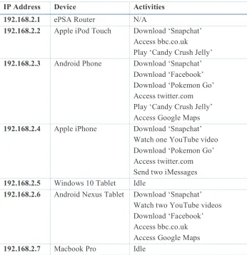
network, whilst a range of activities are performed on the devices. Using the visualization, we can examine the number of local devices, how many hosts they connect with, and how much traffic is communicated from each device. In particular, we can start to identify similarities between devices based on how they cluster in our network view. Table 1 describes the devices connected to the ePSA network, the IP address associated, and the activities performed during the 20-minute capture period. We perform various
different activities such as downloading apps from the relevant app stores, playing popular games, accessing popular web sites, and sending messages using Internet communications.
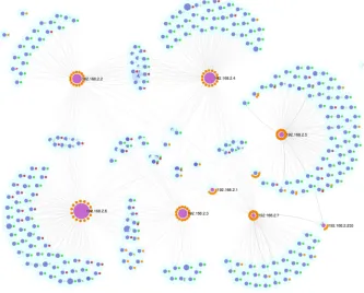
From Figure 7, it can be seen that the Nexus tablet (192.168.2.6) is the largest node, implying that this device sent and received the largest volume of data. Given the amount of data involved with video content, this device would be expected to be largest given the two YouTube videos that were watched. Each device has a sizeable number of connections – however, what is interesting here is where there are a large number of connections and yet the overall data volume is low. This is the case with the Windows 10 tablet and the Macbook Pro. Given that these are more traditional ‘desktop’ operating systems, they perform more like traditional computers and so have
IP Address Device Activities
192.168.2.1 ePSA Router N/A
192.168.2.2 Apple iPod Touch Download ‘Snapchat’
Access bbc.co.uk
Play ‘Candy Crush Jelly’
192.168.2.3 Android Phone Download ‘Snapchat’
Download ‘Facebook’ Download ‘Pokemon Go’ Access twitter.com Play ‘Candy Crush Jelly’ Access Google Maps
192.168.2.4 Apple iPhone Download ‘Snapchat’
Watch one YouTube video Download ‘Pokemon Go’ Access twitter.com Send two iMessages
192.168.2.5 Windows 10 Tablet Idle
192.168.2.6 Android Nexus Tablet Download ‘Snapchat’ Watch two YouTube videos Download ‘Facebook’ Access bbc.co.uk Access Google Maps
[image:13.595.126.472.64.422.2]192.168.2.7 Macbook Pro Idle
many more background services operating. Therefore, these are likely to generate more network activity despite no direct interaction from the user.
There are many shared nodes between the two iOS devices, and also the two Android devices. This seems reasonable given that the operating systems will have particular network requests that they make independent of the user. Similarly, our activities include downloading from the relevant App Stores (Apple App Store and Google Play). This again contributes towards the similarity of devices. Other nodes are shared such as those associated with bbc.co.uk (that link 192.168.2.2 and 192.168.2.6) and twitter.com (that link 192.168.2.3 and 192.168.2.4).
[image:14.595.134.467.80.348.2]Another useful aspect of this visualization is to indicate the security of the communications. Secure encrypted communications are typically made using HTTPS on port 443, whilst unencrypted HTTP is made using port 80.
There is a movement by the likes of Apple and Google to encourage developers to use HTTPS communications, since these can not be intercepted. To examine our network for vulnerable communications, we extend the colour palette of the port values, so that green represents 443, red indicates 80, and orange represents all other values.
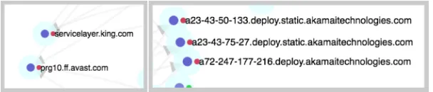
Figure 8 shows examples of vulnerable services from the overview of Figure 7. The pop-out effect of using the red colour channel enables users to identify vulnerable HTTP communications quickly. By selecting a node, details of the node can be shown (e.g., host name resolution, or IP address). Here, we see that there is potentially vulnerable communication made from the mobile devices to King.com and Avast.com. These relate to Candy Crush Jelly and Avast Mobile Anti-virus respectively. Unlike a traditional web browser, since both of these run as mobile apps on the Android devices, there is no apparent way of the user to know that there is an unencrypted communication between made by the app to an external host. Since many users now often use mobile apps over traditional web site, there needs to be new considerations of how to inform users that information is being sent without encryption. By being able to clearly and quickly identify this information using the ePSA tool, users can begin to make inform decisions about how they choose to act online, and what services they choose to trust.
5
DISCUSSION AND FUTURE WORK
In this paper, we have extended the visual capabilities of the ePSA tool (Legg, 2016), to better reveal insight into the activities being performed on a network. In particular, it is important to show what devices are connected, how much these devices communicate and to whom, and what kind of communication is being performed based on the communication ports being used.
[image:15.595.131.435.67.132.2]From our previous study, we surveyed NEUs to understand their view on cyber security for their personal devices, and found that many of them did not actively monitor their security when online. In particular, users may have used some tools such as anti-virus and firewalls whilst on traditional computers and laptops, however many had no forms of security for their smartphones or tablets. To some extent, given that these devices are being used more than traditional computers now, there is a real concern that users should have greater control over their online security. The participants of the survey all reported that they would welcome tools to help support their online security.
To further support this, we showed the ePSA tool to 5 participants of the original study, to gauge their views on the tool. We showed them the example from case study 2, and explained the purpose of the tool. We then allowed them to use the tool to interact with the data, to obtain their feedback on this. From this informal consultation, the feedback received was generally positive. The users found the visual interface to be “bright and colourful”, and to be “inviting”. This supports the idea that if we can present network activity in an appealing and engaging fashion, then users are more likely to experiment and play with the tools available. Users were able to identify devices on the network with large amounts of communication associated with them, and could also identify which devices were on the local network. They found it harder to comprehend the idea of external devices, i.e., devices hosting web sites. This supports the need for greater training and awareness of what the Internet, and how modern technologies, work. Users were able to identify which nodes were deemed as vulnerable (shown as red), which were encrypted (shown as green), and which were anomalous (shown as orange). They liked the traffic light scheme and found this “simple and intuitive”. One comment that was made is that the users wouldn’t know what to do if they found a vulnerable node. Possible suggestions here include not using an app or service, unless it is updated to use HTTPS, or to accept the risk but not to transmit sensitive information. This raises a very valid issue, in that whilst we can visualize activity using such a tool, there needs to be greater capability or guidance for what a user should then do. The problem here then is to what extent do we provide guidance in such a tool, which may increase the complexity and discourage users from wanting to use this.
form of visualization runs on a home server, or can be accessed from a tablet, as and when the user wants to check on their household network activity. Similarly, an alerting capability could be deployed that checks whether they wish to perform a particularly risky action before it is fully executed. We have also considered how more abstract representations could be used to represent network activity, such as 3D gaming environments. One drawback towards this however is that much more interaction is required, where as the clean design of the network view supports much more ‘at-a-glance’ usage that would be more in line with how prospective users may engage with the tool. Nevertheless, with the number of Internet-enabled devices in the home set to rise in the next few years, tools such as ePSA will become valuable for understanding and assessing how these devices are communicating in the online world.
6
CONCLUSION
We propose a framework that is designed to support NEUs to engage with network traffic analysis in order to better support their understanding and perception of cyber security concerns. The framework relies on the concept of capturing and storing network activity from Internet-enabled devices, and using a visual analytics GUI to analyse and understand the patterns within the activity. By incorporating visual analytic tools that are suitably-designed for NEUs, it allows them to explore and begin to analyse their own network activity. This can be beneficial to identify when devices are behaving differently to what the user may expect, such as sending or receiving large volumes of traffic, or communicating with new hosts that are unexpected. We believe that the ability to visualize network activity helps to promote awareness of how and when devices are communicating, and what information they may be sharing, which can help NEUs to take appropriate steps towards improving their cybersecurity. Whilst we have primarily addressed NEUs in this work, we believe that better approaches for visualization of network activity would be highly beneficial in many organisational contexts to provide clearer understanding of online activities. This becomes increasingly valuable as more and more devices are being utilised on corporate networks.
Online threats are constantly evolving and are not confined to traditional attacks such as viruses, so there is a real need to help NEUs enhance their understanding of how devices communicate online. By providing a clear and intuitive representation of our online activities, we can help all users of cyberspace to enhance their personal situation awareness.
ACKNOWLEDGEMENTS
This work was funded by the University of the West of England VCECR award.
REFERENCES
Abdullah, K., Conti, G. & Beyah, R. (2008). A visualization framework for self-monitoring of web-based information disclosure. In IEEE International Conference on Communications (ICC) 2008, pages 1700-1707, May 2008.
Ball, R., Fink, G.A. & North, C. (2004). Home-centrice visualization of network traffic for security administration. In Proceedings of the 2004 ACM Workshop on Visualization and Data Mining for Computer Security, VizSec / DMSEC ’04, pages 55-64, New York, NY, USA, 2004. ACM.
Cappers, B. & van Wijk, J. (2015). SNAPS: Semantic network traffic analysis through projection and selection. In Visualization for Cyber Security (VizSec), 2015 IEEE Symposium, pages 1-8, Oct 2015.
Conti, G. (2007). Security Data Visualization. No starch Press, 1st edition.
Dang, T.K. & Dang, T.T. (2013). A survey on security visualization techniques for web information systems. International Journal of Web Information Systems, 9(1), 6-31.
Fulda, J. (2014). Interactive non-expert information visualization and their evaluation beyond time and error. In Media Informatics Advanced Seminar ‘Special Aspects of Usability’.
Gough, P., Wall, C.d.B. & Bednarz, T. (2014). Affective and effective visualization: Communicating science to non-expert users. In Visualization Symposium (PacificVis), IEEE Pacific, pages 335-339.
Gray, C., Ritsos, P. & Roberts, J. (2015). Contextual network navigation to provide situational awareness for network administrators. In Visualization for Cyber Security (VizSec), 2015 IEEE Symposium, pages 1-8, Oct 2015.
Legg, P. (2015). Visualizing the Insider Threat: Challenges and tools for identifying malicious user activity. In Visualization for Cyber Security (VizSec), 2015 IEEE Symposium, pages 1-8, Oct 2015.
Legg, P. (2016). Enhancing Cyber Situational Awareness for Non-expert Users using Visual Analytics. In International Conference on Cyber Situational Awareness, Data Analytics and Assessment (CyberSA), pages 1-8, June 2016.
Marty, R. (2008). Applied Security Visualization. Addison-Wesley Professional, 1st edition.
Michel, M., Helmick, N. & Mayron, L. (2011). Cognitive cyber situational awareness using virtual worlds. In Cognitive Methods in Situation Awareness and Decision Support (CogSIMA), IEEE First International Multi-Disciplinary Conference on, pages 179-182.
Miller, T. & Stasko, J. (2002). Infocanvas: A highly personalized, elegant awareness display. In Proceedings of the Working Conference on Advanced Visual Interfaces (AVI), pages 43-50.
Ofcom (2015). The UK is now a smartphone society. Retrieved April 7th 2016 from
http://media.ofcom.org.uk/news/2015/cmr-uk-2015
Pousman, Z., Stasko, J. & Mateas, M. (2007). Casual information visualization: Depictions of data in everyday life. Visualization and Computer Graphics, IEEE Transactions on, 13(6), 1145-1152.
Rao, A., Kakhi, A. & Razaghpanah, A., Li, A., Choffnes, D., Legout, A., Mislove, A. & Gill, P. (2015). Meddle: Enabling transparency and control for mobile internet traffic. Technology Science.
Schweitzer, D. & Brown, W. (2009). Using visualization to teach security. Journal of Computer Science in Colleges, 24(5), 143-150.
Shiravi, H., Shiravi, A. & Ghorbani, A. (2012). A survey of visualization systems for network security. Visualization and Computer Graphics, IEEE Transactions on, 18(8), 1313-1329.
Stasko, J., Miller, T., Pousman, Z., Plaue, C. & Ullah, O. (2004). Personalized peripheral information awareness through information art. In N. Davies, E.D. Mynatt & I. Siio (Eds.) UbiComp: Ubiquitous Computing, Volume 3205 of Lecture Notes in Computer Science, pages 18-35. Springer Berlin Heidelberg.
Symantec. (2015). Internet security threat report 2015. Retrieved April 7th 2016 from
http://www.symantec.com/securityresponse/publications/threatreport.jsp
Van Kleek, M., Moore, B., Xu, C. & Karger, D.R. (2010). Eyebrowse: Real-time web activity sharing and visualization. In CHI Extended Abstracts on Human Factors in
BIOGRAPHY
Dr. Philip A. Legg is a Senior Lecturer in Computer Science and the