E
XCEL
-B
ASED
D
ASHBOARDS
CO N T I N U I N G PR O F E S S I O N A L ED U C A T I O N SE R I E S
To access demonstration files used in this seminar, please visit www.k2e.com, log-in in the Attendee Login section, and use the following code to access the materials:
EBD
All rights reserved. No part of this publication may be reproduced or transmitted in any form without the express written consent of K2 Enterprises, 1250 SW Railroad Avenue, Suite 240A, Hammond, LA 70403, telephone 985.542.9390. Requests to reproduce or transmit may be e-mailed to [email protected]. Further information may be obtained on the web at www.k2e.com.
The use of trade names and trademarks in these materials are not intended to convey endorsement of these vendors or products. All trade names and trademarks used in these materials are the property of their respective owners. Any abbreviations used herein are solely for the reader’s convenience and are not intended to compromise any trademarks.
The statements in these materials about specific companies or specific hardware and software products should in no way be misconstrued as statements of fact but rather are opinions of the authors and K2 Enterprises. We take great care in providing opinions that we think will be useful in helping our participants make informed decisions. K2 Enterprises reserves the right to independently evaluate the merits of the companies and of the hardware and software products that are referenced in our seminars and conference presentations.
K2 Enterprises makes no representations or warranty with respect to the contents of these materials and disclaims any implied warranties of merchantability or fitness for any particular purpose. The contents of these materials are subject to change without notice.
MISSION STATEMENT: K2’s goal is to produce and deliver the highest quality technology
seminars and conferences available to business professionals. We work cooperatively with professional organizations, such as state CPA societies and associations of Chartered Accountants, and vendors of technology products. K2 also provides consulting services and advice on technology. We make every effort to maintain a high level of integrity, family values, and friendship among all involved.
CONTRIBUTORS: The shareholders, associates and staff of K2 Enterprises contributed in the
production of these materials.
Table of Contents
INTRODUCTION ... III THREE RULES OF THIS SEMINAR ... III
COURSE DEVELOPMENT ... III
ABOUT K2ENTERPRISES ... IV
THE K2CURRICULUM ... V
ON-SITE TRAINING ... VI
WEB-BASED TRAINING ... VI
SELF-STUDY COURSES ... VII
K2INTERNET SITES ... VII
PREFACE ... IX INTRODUCING EXCEL-BASED DASHBOARDS ... IX
CHAPTER 1 - BUILDING BLOCKS IN EXCEL ... 1
LEARNING OBJECTIVES ... 1
OBTAINING AND REFRESHING DATA ... 1
CONDITIONAL FORMATTING ... 8
Conditional Formatting Basics ... 8
New Conditional Formatting Options in Excel 2007 and Newer ... 13
Conditional Formatting in Excel-based Dashboards ... 15
TABLES... 16
Creating a Table ... 16
Using Table Names ... 17
Working with Tables ... 17
DEFINED NAMES AND DYNAMIC DEFINED NAMES ... 19
Dynamic Defined Names ... 21
FORM CONTROLS ... 23
ORDERING DATA WITH EXCEL’S RANKFUNCTION ... 26
Using RANK in Conjunction with Conditional Formatting ... 27
CHAPTER 2 - EXCEL CHARTS AND GRAPHS ... 31
LEARNING OBJECTIVES ... 31
CHART TYPES ... 31
Choosing a Chart Type ... 33
ELEMENTS IN AN EXCEL CHART ... 33
CREATING A CHART ... 34
CHARTING WITH TABLES ... 37
COMMUNICATING MORE EFFECTIVELY WITH CHARTS ... 39
Dynamic Text Boxes in Charts ... 40
Conditional Formatting in Excel Charts ... 43
DASHBOARD-SPECIFIC CHARTING TECHNIQUES ... 46
Thermometer Charts ... 46
Gauge Charts ... 47
Tachometer Charts ... 48
Interactive Charts ... 49
Sparklines ... 55
Drill Down Charts ... 57
CHAPTER 3 - PIVOTTABLES AND PIVOTCHARTS IN DASHBOARDS ... 61
LEARNING OBJECTIVES ... 61
FUNDAMENTALS OF PIVOTTABLES ... 62
PivotTables Based on Tables... 66
PivotTables Based on Dynamic Defined Names ... 67
DASHBOARD-SPECIFIC PIVOTTABLE APPLICATIONS ... 68
Sorting and Filtering ... 68
Applying Slicer Filters ... 71
Adding Timelines to PivotTables ... 73
Performing Calculations in PivotTables... 73
PIVOTCHARTS ... 82
CHAPTER 4 - PUTTING IT ALL TOGETHER ... 87
LEARNING OBJECTIVES ... 87
CASE STUDY:K2ELECTRICAL SUPPLIES ... 87
Top Five Customer Balances Due ... 88
Accounts Receivable Aging ... 89
Year-To-Date Sales by Sales Rep ... 90
Year-To-Date Top Five Items Sold ... 91
Customer Satisfaction Survey Results ... 92
Three Rules of this Seminar
1. There Are No Dumb Questions.
Please ask questions if you need further explanation. We welcome your questions and will do our best to provide accurate and meaningful answers.
2. Obtain the Information For Which You Came.
If you have a specific interest in a topic, please let us know. If your topic is not already part of the course materials, we will do our best to accommodate your request. Our instructors are anxious to meet your needs, but, if you do not ask questions (rule #1), they cannot give you the information that you want.
3. Share and Share Alike.
Our instructor is here to share all possible information related to the course. We hope that you will be willing to do the same. If you have some great tips or experiences, please share them with us and with the other participants.
Course Development
The shareholders, associates, and staff of K2 Enterprises developed this course and the related course materials. Our goal is to deliver top quality educational courses that help you better use and understand the tools and concepts that are the focus of this session.
We designed our course presentation style for busy professionals. Through numerous short case studies and feature reviews, we strive to deliver concise information in a context that is easy to understand and easy to absorb.
To maximize the use of your time and the benefits of attending this course, we have worked hard to filter out trivial and obscure features. Our goal is not to cover every keystroke and menu option but to provide a fast-paced course that focuses on state-of-the-art information technology and what it can do for you and your staff.
About K2 Enterprises
Mission Statement
K2’s goal is to produce and to deliver the highest quality technology seminars and conferences available to business professionals. We work cooperatively with professional organizations such as state CPA societies, associations of Chartered Accountants, and vendors of technology products. K2 also provides consulting services and advice on technology. We make every effort to maintain a high level of integrity, family values, and friendship among all involved. K2 Enterprises is named after the second highest mountain in the world. (The summit of K2 is 28,251 feet above mean sea level; Mount Everest is 29,026 feet above mean sea level.) The shareholders and associates of K2 Enterprises are listed in the following table.
Shareholders
William C. Fleenor, CPA, Ph.D. Loranger, LA [email protected]
Randolph P. Johnston, MCS Hutchinson, KS [email protected]
Val D. Steed, CPA.CITP, MA Centerville, UT [email protected]
Thomas G. Stephens, CPA.CITP Woodstock, GA [email protected]
Associates
Karl W. Egnatoff, CPA.CITP Myrtle Beach, SC [email protected]
John K. Keegan, CPA.CITP Oakhurst, NJ [email protected]
Lawrence A. McClelland, MBA, JD Carriere, MS [email protected]
Steven M. Phelan, CPA.CITP Oklahoma City, OK [email protected]
Brian F. Tankersley, CPA.CITP Knoxville, TN [email protected]
Over the past thirty-one years, our team members have collectively delivered more than 14,000 national and international courses and conference sessions on the subject of technology. To help us stay on top of technology, our team members read numerous technology trade magazines, attend many technology conferences, and talk with numerous technology companies each year to obtain the latest information to include in our courses. In addition, we personally experience everything we teach and recommend to our audiences. Because our shareholders and associates reside in different states, the use of technology is a necessity for the success and survival of our business.
Two-Day Seminar
• Excel Boot Camp – Two Days of Intensive Excel Training
Full-Day Seminars
• Advanced Excel
• Budgeting and Forecasting Tools and Techniques
• Business Continuity – K2’s Best Practices for Managing the Risks
• Cloud Computing
• Excel-Based Dashboards
• Excel Best Practices
• Excel Financial Reporting and Analysis
• Excel PivotTables for Accountants
• Excel Tips, Tricks, and Techniques for Accountants
• QuickBooks for Accountants
• Small Business Internal Controls, Security, and Fraud Prevention and Detection
• Technology for CPAs – Don't Get Left Behind
• Top Accounting Solutions – Cloud and On-Premise
Half-Day Seminars
• Advanced Excel Reporting – Best Practices, Tools, and Techniques
• Advanced QuickBooks Tips and Techniques
• Do It Yourself Business Intelligence
• Excel Macros – Part I
• Excel Tables – Revolutionize How You Work with Excel!
• The Financial Reporting Framework for SMEs
• iPad – An Effective Business Tool
• Microsoft Office 365 – Your Office, Your Way
• The Mobile Office
• PDF Forms – What Accountants Need to Know
• QuickBooks Online – Changing the Paradigm of Small Business Accounting
• Securing Your Data – Practical Tools for Protecting Information
• Tech Tools and Gadgets for a More Efficient You
• Technology Update
• Word, Outlook, and PowerPoint – Tips and Tricks for Enhancing Productivity In addition to the twenty-nine courses listed above, K2 Enterprises also
produces approximately 25 one and two-day technology conferences each year. You can find a complete listing of our course offerings, including dates, locations, and course descriptions, on our web site at
On-Site Training
Working cooperatively with your state CPA organization, we are pleased to offer all of our seminars and conference sessions as on-site training opportunities. On-site training offers companies of all sizes numerous advantages, including the following:
• Customization. K2 Enterprises can customize the content of all on-site training events to meet the specific needs of your organization. For example, we can combine selected parts of existing courses into one customized course to meet your specific needs. Likewise, we can develop custom content from the ground up and deliver it to your team members, thereby ensuring that your training objectives are met.
• Cost savings. For organizations of all sizes, on-site training can provide significant cost savings when compared to public training venues. In addition to potentially reduced registration fees, these cost savings accrue in the form of reduced travel costs and reducing the amount of time team members spend away from the office.
• Convenience. Because you select the date, time, and location of your on-site training event, on-site training is more convenient for you and your team members than traditional training options. Many organizations schedule on-site training in conjunction with staff meetings, retreats, and customer/client events to leverage further the value of all participants’ time.
Customization, cost savings, and convenience – the three C’s of “training to go.” For more information on how you and your organization can experience these benefits or to schedule an on-site training event, please visit
http://www.k2e.com/training/on-site-training or contact [email protected].
Web-Based Training
K2 Enterprises offers web-based CPE to accounting and business professionals throughout the United States. K2's team of award-winning instructors delivers two-hour, four-hour, and eight-hour webinars on numerous technology-focused topics, including Microsoft Excel, QuickBooks, and Cloud computing. For more information on these webinar offerings or to register, please visit
K2 Enterprises provides self-study training opportunities. Self-study courses offer you the advantage of receiving top-quality training at a time and location that fits into your busy schedule. You can start a course today and complete it in the future, if that is necessary to help you achieve the work-life balance you desire. For more information on self-study offerings or to register, please visit
http://www.k2e.com/training/self-study.
K2 Internet Sites
As a service to our attendees, K2 Enterprises maintains multiple Internet sites that contain information and links that are relevant to the needs of CPAs and other business professionals and that enrich your experience during and after our seminars.
The K2 web sites contain details on the topics that we present, tips on using the software and hardware that we cover, and information on the products that we use daily and can recommend with confidence. Since the hardcopy materials provided in our seminars often age quickly, you will find additional supporting content and the most up-to-date information on our web sites. Our pages contain links to the web sites of some of the top accounting and content management software solutions as well as to other web sites of interest and even to a few sites that are just fun places to visit. We invite you to visit our web sites often. If you have any comments, questions, or suggestions regarding our web pages, please send an email to [email protected].
www.k2e.com
This is the primary web site for K2 Enterprises. Here you can access information regarding CPE opportunities, including seminars, conferences, on-site training, web-based training, and self-study opportunities. You can also access a library of technology tips and articles, and you can link to K2-related web sites.
www.cpafirmtech.com
CPA Firm Technology contains technology-related information targeted specifically to public accounting firms. Included are product reviews, hardware and operating system discussions, affinity programs for CPA firms, and Cloud computing resources.
www.accountingsoftwareworld.com
Accounting Software World provides information related to accounting and financial management solutions. You can find software and service reviews, product comparisons, white papers, and other material of interest to those seeking information about accounting software and service solutions.
www.totallypaperless.com
For information about document management and paperless process, please visit Totally Paperless. This site provides reviews on hardware and software used by all types of businesses in document imaging and management processes.
Introducing Excel-based Dashboards
hy use dashboards, and why use Excel? It is really quite simple – managers need access to increasing amounts of information in formats that are easy to access and even easier to understand. With increasingly complex accounting and information systems, navigating a seemingly endless maze of menus and applications to gain access to critical business information is simply no longer a viable option for many. Continuing to do so can be inefficient, wasteful, and technically challenging, often beyond the skills of even experienced users. Further, because of these issues, managers have a disincentive to generate key financial and operational reports, thereby perhaps limiting overall organizational performance. In sum, traditional reporting processes leave much room for improvement.
In contrast to traditional reporting processes, dashboards provide managers and executives with access to critical corporate data in a format purposefully designed to be both easy to access and easy to understand. The term “dashboard” flows from the concept of a dashboard in a car which contains gauges measuring critical components of the automobile’s performance – speed, fuel levels, engine coolant temperature, etc. The driver of the automobile can simply glance at the gauges on the dashboard to get a quick read of the overall performance of the vehicle. There is no need to seek out individual measurements; rather, the dashboard provides all critical measurements to the driver, allowing the driver to focus on the more important task of safely maneuvering the vehicle. In the same fashion, a corporate dashboard allows managers and executives to get quick and easy access to key corporate data without the cumbersome need of generating individual reports for each measurement. Rather, the dashboard displays all critical measurements in one location, freeing managers and executives for the more important tasks of planning, leading, and directing corporate activities. Key advantages to dashboard reports include those listed below.
• Dashboards provide an easy-to-understand visual presentation of key corporate performance measurements.
• Dashboards are able to identify new trends in markets and in corporate performance at early stages in their development. As such, managers and executives are able to capitalize on positive trends and to correct negative trends.
• Dashboards help to measure both efficiencies and inefficiencies by presenting comparative data across time and across organizational dimensions.
• Dashboards offer the opportunity of increased productivity, freeing managers and executives of the need to seek out critical data and to generate reports; instead, the dashboard organizes and displays all key data on demand, potentially saving many hours of mundane effort that adds little value to the organization.
• Dashboards enable managers and executives to make better decisions. Because dashboards can collect and present data from numerous sources, they offer managers
W
and executives a comprehensive view of organizational performance and positioning. With such a complete set of data inputs available to them, more informed – and therefore, presumably better – managerial decisions are the direct results of dashboard reporting.
• Dashboards assist in aligning individual and team performance with organizational strategies and goals. By providing a direct comparison of desired performance to actual performance, dashboards help to identify at an early stage situations where actual performance is not coordinated with desired performance.
For all of the reasons outlined above, plus many others not mentioned here, dashboards are rapidly ascending the ladder of corporate performance reporting tools. That, however, does not answer the question of why Excel is often the preferred technology tool for preparing and presenting dashboards. The answers to this question may be even more obvious than the answers to the question of why dashboards exist in the first place.
Perhaps no single factor is more important to the use of Excel in preparing dashboards than the ubiquitous nature of Excel. Quite simply, Excel is everywhere and is used by virtually all accounting and financial professionals. As such, organizations can deploy Excel-based dashboards often without any additional investment required in either software or hardware. Further, because of the omnipresent nature of Excel, most accounting and financial professionals already have at least a minimal working knowledge of how to use the application, further minimizing the deployment cost of Excel-based dashboards.
In addition to the current widespread use of Excel, the functionality Excel provides is particularly well suited to dashboards. Consider some of the key activities related to preparing dashboard reports – retrieving data from external data sources, sorting and filtering data, performing both simple and complex calculations, and presenting visual images of numerical data. Excel has long provided exceptional functionality in each of these four core areas, and the newer versions of Excel further elevate the application’s capabilities in each of these areas. As such, Excel lends itself quite readily to dashboard reporting.
Figure 1 - Sample Excel-based Dashboard
This is not to say, however, that all Excel users are well prepared to generate meaningful and useful Excel-based dashboards. In fact, many of the same shortcomings appear when viewing Excel-based dashboards. The following are among the most common deficiencies cited.
• Ineffective overall design. Dashboard design is an art, not a science. However, even the least artistic Excel user should strive to design dashboards that present data in a clean, simple, and concise format. For instance, in Figure 1, notice the use of simple charts and tables to display data and the uncluttered presentation of key information. Further, what is not evident in Figure 1 is the fact that the dashboard automatically extracts data from underlying spreadsheets and databases without the need for manual user intervention.
• Incorrect use of charts and graphs. Excel offers numerous – in fact, almost endless – choices for charts and graphs. Selecting the correct type of chart enhances the reader’s ability to understand the data presented in the chart. On the other hand, selecting an inappropriate chart type can cause a user to draw potentially incorrect conclusions about the data presented in a chart. For instance, using line graphs to present time-series data over unequal periods – years compared to quarters, for instance – will distort the data and could lead managers and executives to draw incorrect conclusions about the data.
• Limited use of conditional formatting to highlight key data. Conditional formatting is a long-standing feature of Excel; beginning with Excel 2007, Excel offers substantially improved conditional formatting options. Conditional formatting causes the format of data to change based on the data values. Thus, conditional formatting is an excellent tool for highlighting data that meets specific criteria. For instance, in a dashboard used to compare budget versus actual performance, the dashboard designer might format all unfavorable variances exceeding a specified percentage of the budget with conditional formatting. Despite this extreme power, many Excel-based dashboards do not utilize conditional formatting at all, most likely because the persons creating the dashboards are unaware of the ability to apply conditional formatting.
• Manual processes used for data input. Most, if not all, of the data feeding into a dashboard already exist in other spreadsheets or databases, including the databases utilized by common accounting applications. Whenever possible, use the data connectivity and interoperability features of Excel and other databases to minimize the amount of manual data input required when generating a dashboard. Doing so not only increases efficiency but also reduces the opportunity for data input errors.
The remainder of this course focuses on educating and equipping existing Excel users with tools necessary to generate highly effective Excel-based dashboards, while avoiding many of the pitfalls often encountered when doing so.
C hapter 1 -
Building Blocks in Excel
efore any Excel-based dashboard can be constructed, the data on which the dashboard is to be based must be obtained or accessed. This data may already reside in the current Excel workbook; a different Excel workbook; an entirely different database, including SQL Server and Access; on the Web; or in a text file. Fortunately, it is possible to import almost any type of data into an Excel workbook, negating the requirement to engage in inefficient and error-prone manual data entry processes.
Learning Objectives
Upon completing this chapter, participants should be able to:
• Describe how using ODBC queries automates the process of obtaining and refreshing data for inclusion in an Excel-based dashboard;
• Apply conditional formats to data as a means of calling attention to specific items;
• Create tables in Excel and describe their usefulness in dashboard environments;
• Establish defined names and dynamic defined names in Excel workbooks and identify situations when they will be necessary when building dashboards;
• Insert form controls to control the amount of data that Excel displays in dashboard components such as charts; and
• Utilize Excel’s RANK function to identify the ascending or descending order data in an Excel workbook, without sorting the data range.
Obtaining and Refreshing Data
The Data tab of the Ribbon controls Excel’s data import functions as shown in Figure 2. Here, you may initiate the process of connecting to external data sources, refreshing data, and editing and managing existing data connections.
Figure 2 - Data Importing Tools on the Data Tab of the Ribbon
Chapter
1
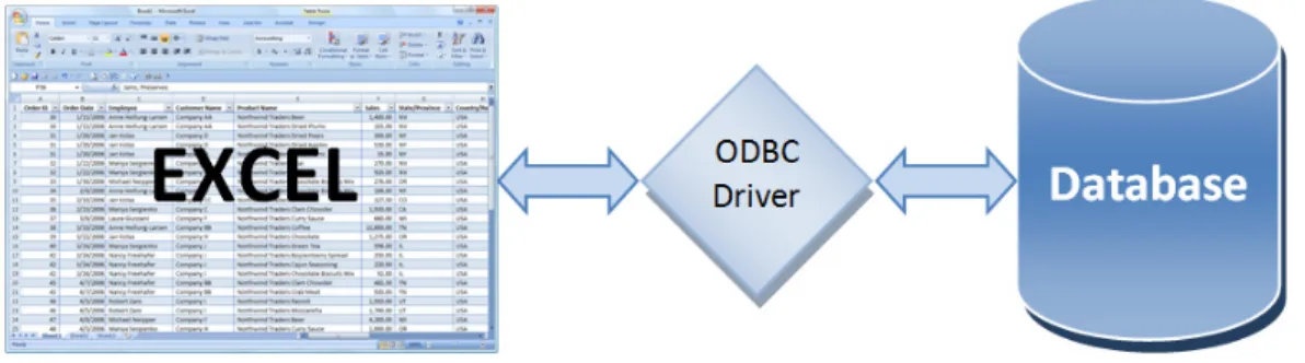
Excel has the ability to extract data directly from ODBC-compliant databases using the Data Connection Wizard or Microsoft Query. ODBC is a standard database access method developed by the SQL Access group in 1992. With ODBC, it is possible to access data stored in any ODBC-compliant database from within any ODBC-compliant application. ODBC manages this by inserting a middle layer called an ODBC driver between the application and the database management system (DBMS) that translates the application's data queries into commands that the DBMS understands. ODBC provides two-way integration between Excel and the general ledger, although read-only ODBC connections are the norm. Figure 3 presents a graphical representation of the data access process.
Figure 3 - Accessing External Data Directly from within Excel Using ODBC
While the Data Connection Wizard limits data access to a single table or view in an external database, Microsoft Query allows you to relate and query multiple tables, views, or other queries. Microsoft Query is an add-in from Microsoft that operates with Microsoft Office. It provides a Windows-based query-by-example interface similar to Microsoft Access for accessing data stored in external databases.
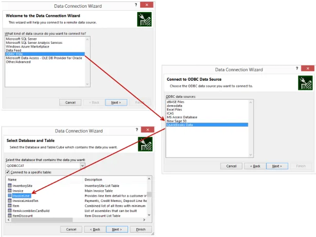
In our first example, Carl, the owner of Carl’s Computer Shop, wants to extract some data from the company’s accounting system – QuickBooks Enterprise Solutions – for use in creating a dashboard helping him to analyze sales data. To create a table of all invoice line items quickly, first open the QuickBooks company file. Then, from within Excel, click From Other Sources, From Data Connection Wizard on the Data tab. In the first pane of the Data Connection Wizard, select ODBC DSN and click Next. In the second pane, select QuickBooks Data and click Next. In the final pane, highlight the InvoiceLine Table and click Finish as shown in Figure 4.
Figure 4 - Using the Data Connection Wizard to Query QuickBooks Enterprise Solutions
Select Table as the import type, confirm the location, and then click OK in the Import Data dialog box to complete the process. The imported table dynamically links to the underlying data source and can be refreshed as required. Once Excel imports the data via the ODBC query, Carl can manipulate using some of the techniques described later in this course to produce a dashboard component such as the one presented in Figure 5.
Figure 5 - Sample Dashboard Component Created from ODBC-Based Data
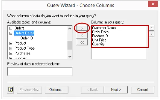
In our next example, we will use Microsoft Query to relate multiple tables before importing data from an ODBC-compliant application. In this case, an ODBC connection to the desired application already exists. ODBC connections are typically set up during the installation of compliant applications, or the connections are set up manually through the Windows Control Panel. To begin the process, click From Other Sources, From Microsoft Query on the Data tab. In the Choose Data Source dialog box, select Xtreme Accounting and click OK to open the Query Wizard – Choose Columns pane. In the Available tables and columns list on the left, select the following fields: Customer Name from the Customer Table, Order Date from the Orders Table, and Product ID, Unit Price, and Quantity from the Orders Detail Table as shown in Figure 6.
Click Next, Next, and Next through to the Query Wizard – Finish pane. Select View data or edit query in Microsoft Query and click Finish to open Microsoft Query to see how the data from the three tables is related. Create a user-defined field in the column immediately to the right of Quantity. To do so, type in the column header Quantity * “Unit Price.” Be sure to enclose “Unit Price” in quotation marks. Rename the newly created field “Extension” by double-clicking on the field and typing Extension into the Columnheading area as shown in Figure 7.
Figure 7 - User-defined Field in Microsoft Query
Note the relationships between the three tables – Customers, Orders, and Orders Detail – and then click the Return Data button to import the data into Excel as shown in Figure 8.
Figure 8 - Viewing a Related Table Query in Microsoft Query
Select Table as the import type, confirm the location, and then click OK in the Import Data dialog box to complete the process. The imported data dynamically links to the underlying
data source and can be refreshed as required. Once Excel queries the data, you can quickly create dashboard components such as those shown in Figure 9.
Figure 9 - Dashboard Components from Multi-table ODBC Query
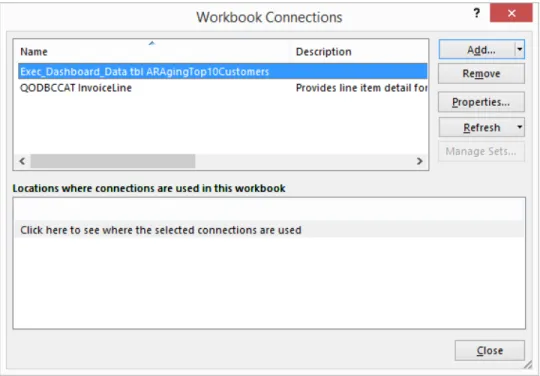
Note that you can rename, modify, or delete Excel data connections in the Workbook Connections dialog box, which is accessible by clicking Connections on the Data tab as shown in Figure 10.
Figure 10 - Clicking Connections on the Data Tab to Modify Workbook Connections Clicking Connections opens the WorkbookConnections dialog box shown in Figure 11.
Figure 11 - Workbook Connections Dialog Box
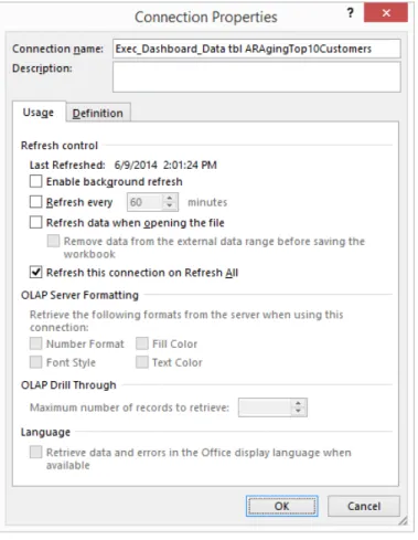
In the Workbook Connections dialog box, click Properties to open the Connection Properties dialog box shown in Figure 12. On the Usage tab of the Connection Properties dialog box, you can control attributes relative to updating and OLAP formatting and drill through. On the Definition tab of the Connection Properties dialog box, you can modify the definition of the connection, including the name of the connection file and the commands executed as part of the connection.
Figure 12 - Connection Properties Dialog Box
Conditional Formatting
Though dashboards generally incorporate graphical data, they present tabular data as well. When a dashboard presents tabular data, Excel’s Conditional Formatting tools can be excellent ways to call attention to significant values, variances, trends, and other data. Though conditional formatting is not a new feature to Excel, Excel 2007 and Excel 2010 greatly enhance this feature, and many of these enhancements readily lend themselves to use in Excel-based dashboards.
Conditional Formatting Basics
Conditional Formatting Based on Values
The simplest form of conditional formatting is that based on values. For instance, conditional formatting based on values has been applied in the Variance $ column shown in Figure 13. There, any cell containing an unfavorable variance greater than $15,000 is automatically shaded and the text displayed in red.
Figure 13 - Conditional Formatting Based on Values
To apply this conditional format, start by selecting the range of cells from D5 through D18. Then, select Conditional Formatting from the Home tab of the Ribbon and choose HighlightCellsRules followed by LessThan to open the dialog box shown in Figure 14. In that dialog box, specify both the criteria for the conditional format and the desired format. Click OK to applythe conditional format to all selected cells.
Figure 14 - Defining a Conditional Format Rule
Note that cell references can replace “hard-coded” criteria when creating conditional formats. For instance, in Figure 14, the criteria of “-15000” could be replaced by a cell reference of “G3,” thereby allowing a user to change rapidly the materiality threshold of the report interactively. Such a change would produce the results shown in Figure 15.
Figure 15 - Conditional Formatting Applied with a Cell Reference
Conditional Formatting Based on Formulas
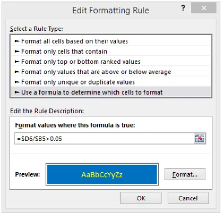
In addition to applying conditional formatting based on discrete value inputs, conditional formatting can also be applied based on formulas. For instance, formula-based conditional formatting could identify all unfavorable variances exceeding 15% of the budgeted amount. Such a formula might resemble that shown in Figure 16.
The formula and format specified in Figure 16 will format any unfavorable variance exceeding 15% of the budgeted amount with a red background and white text as shown in Figure 17.
Figure 17 - Results of a Conditional Format Applied via Formula
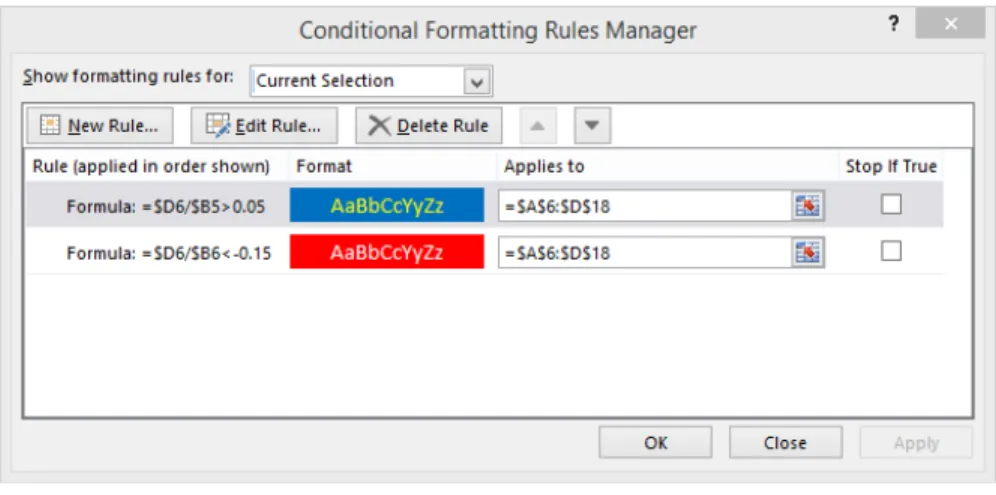
Because you can apply multiple conditional formatting rules to the same cells when designing your dashboards, it is possible to “layer” these rules on top of each other. Perhaps in addition to highlighting unfavorable variances of greater than 15% in red, you might want to highlight favorable variances of greater than 5% in blue. To do so, add a second conditional format rule as shown in Figure 18.
Figure 18 - Adding a Second Conditional Format
With the second conditional format in place, your dashboard component now might resemble that shown in Figure 19.
Figure 19 - Multiple Conditional Formats Applied to Same Cells
New Conditional Formatting Options in Excel 2007 and
Newer
Excel 2007 and newer versions provide significant new functionality in the area of conditional formatting, greatly expanding the usefulness of conditional formatting as a tool for enhancing Excel-based dashboards. Two of the more significant enhancements are:
• Removing the previous limitation of only three conditional formats applied to a given cell so that now you are limited only by the amount of available memory on the computer; and
• Adding the Conditional Formatting Rules Manager. As shown in Figure 20, the Conditional Formatting Rules Manager provides a convenient location from which to manage all conditional format rules in a workbook.
Figure 20 - Conditional Formatting Rules Manager
Beyond the enhancements described above, Excel 2007 and newer also add a number of new conditional format options. One such option is that of in-cell data bars. In the example provided in Figure 21, in-cell data bars call the reader’s attention to top-selling items without the need to sort the items out of their alphabetical sort order. Like all conditional formats, as the underlying values change, the conditional formats will change also.
Applying icon sets as conditional formats is another new conditional formatting feature. Icon sets are similar in nature to in-cell data bars and call attention to values requiring management action. For example, the icon sets used in Figure 22 segregate sales into three categories – high selling, average selling, and low selling – and call attention to items in each category.
Figure 22 - Using Icon Sets as Conditional Formats
Conditional Formatting in Excel-based Dashboards
Based on the examples presented above, it should be evident that conditional formatting is an important building block for preparing and presenting Excel-based dashboards. Proper use of conditional formats can focus a reader’s attention on items requiring attention and action such as large budget variances, slow-selling items, outstanding accounts receivable invoices, and declining trends in customer satisfaction surveys. Accordingly, whenever an Excel-based dashboard presents tabular data, consider using conditional formatting for enhancing the presentation of that data.
Tables
A Table is a list of data in which each column has a heading or field name and in which each row represents a record. The table features in Excel ease and enhance the way you can sort, filter, format, and analyze information.
Creating a Table
To create a table in Excel using the default style, place the cursor inside of the data range and press CTRL + T. In the Create Table dialog box, confirm the table range and check My table has headers as shown in Figure 23.
Figure 23 - Create Table Dialog Box
Click OK to create the table as shown in Figure 24. Instantly, Excel creates the table with the default style. In this case, the default style bands adjacent rows with different colors for readability. Drop-down filter arrows are visible at the top of each column. The arrows are for setting filters and sorting and are not visible on printouts. Excel names any fields that do not have a name at the top of the column Column1, Column2, etc.; you can rename these fields by typing over the labels.
Alternatively, you can create the table from the Ribbon. Again, position the cursor inside of the data range. From the Ribbon, select Format as Table from the Home tab. Select a style from the gallery and then confirm the data range in the Create Table dialog box. Click OK to create the table.
Using CTRL + T is a faster and easier process to create a table, but it always creates a table in the default Table style. To change the default Table style, click on Format as Table on the Home tab and then right-click on a style and choose Set As Default.
Using Table Names
Excel names each table with a generic name and displays it in the Properties group of Table Tools, Design. The table name is part of structured referencing, discussed later in this chapter. Naming tables with a representative name such as Sales or Invoices will make building formulas with structured referencing easier and more intuitive, especially if multiple tables are present in a single workbook.
Working with Tables
Let us review the sample table. It consists of monthly sales data for thirteen products over the past six months. First, use the check boxes in Table Style Options to explore how table styles adapt to meet specific needs. Figure 25 shows the results of our efforts.
Figure 25 - Using Table Style Options to Adjust Table Formatting
Altering the options in Table Style Options changes the styles presented in the Style Gallery. Formatting tables with styles may be more effective if options are set before styles are applied.Continuing with our example, let us name the table. Click inside the table and select Table Tools, Design. Enter Sales in the Table Name box.
Now, add some new records to the table. The easiest method is to position the cursor in the first blank row immediately below the table and begin typing. Press TAB to advance the
cursor to the next field. The table automatically expands to include the new row. You can add a new row by pressing TAB while in the last row of the right-hand column of the table or by dragging the resize handle in the lower right-hand corner of the table to expand its size.
Enter the following records in rows 21 and 22 of our sample table.
14 Astringent, Facial, 9 oz 15,744 17,056 15,088 15,744 19,680 23,616 15 Astringent, Facial, 16 oz 9,684 10,491 9,281 9,684 12,105 14,526
Notice that immediately upon appending the rows to the bottom of the table, the definition of the table automatically expanded to include the additional data. The fact that tables dynamically resize to accommodate the volume of data in the table is perhaps their most significant single attribute because, as the definition of the table adjusts to match the volume of data, all objects that use the table as a data source also automatically adjust to the new volume of data. Further, tables not only automatically adjust vertically as new rows are appended or deleted, but they also adjust horizontally as new columns are appended or deleted.
Now, we will add a column to the table. The column will contain a formula to total sales by product for the last six months. Position the cursor in cell I7, type in the column label Total, and press ENTER. The table immediately expands to include the new column. Now, position the cursor in cell I8. To create the formula, perform the steps listed below.
1. Type in =SUM( and move left one cell to H8. (Do not press ENTER.)
2. Hold down the SHIFT key while using the LEFT ARROW to expand the range to include cells H8 through H3. (Do not press ENTER.)
3. Type ) to complete the formula and press ENTER.
Immediately, Excel copies the formula down the full length of the column. Note the contents and format of the formula as shown below.
=SUM(Sales[[#This Row],[Jan]:[Jun]])
The format of this formula is Structured Referencing, which allows you to refer to columns, rows, or specific ranges within a table using tags. Next, try positioning your cursor in any cell outside of the table and then enter the formula shown below.
=SUM(Sales[Apr])
The formula totals sales for April – and it does not matter if the table contains 100 records or 500,000! Add another record, and the total updates to include all rows for April.
At first glance, auto-expansion of tables may appear to be just another ho-hum feature, but beneath this facade lurks great power because any formula, chart, or PivotTable that
references the table will automatically incorporate any new data added to the table. Have you heard of dynamic defined names? Tables in Excel can perform the same function but without the need for creating defined names based on relatively complex formulas. This becomes even more important in a dashboard environment. Imagine a scenario where data extracted from an ODBC connection is stored in a table in Excel. As the number of records entered into the table via the query changes (based on changes in the volume of transactions in the source database), the table automatically expands and contracts to accommodate the updated amount of data. Further, any chart, PivotTable, or PivotChart that uses the table as its data source also incorporates the data from the table. This means that your dashboard users can have confidence in knowing that they are working with current data.
Defined Names and Dynamic Defined Names
Defined names and dynamic defined names provide aliases or nicknames to row and column addresses in Excel. Used in place of cell references when building formulas and charts, defined names originated as named ranges in Lotus 1-2-3. Most users will remember defined names more easily than their corresponding cell references, constants, or formulas when building worksheet models. By default, defined names are specific to the workbook in which they originate, although you can create worksheet-specific names within a workbook. You can create defined names in numerous ways in Excel. Perhaps the easiest method is to highlight the cell or range of cells to be named and then to type the desired name in the Range Box on the Formula Bar just below the Ribbon as shown in Figure 26.
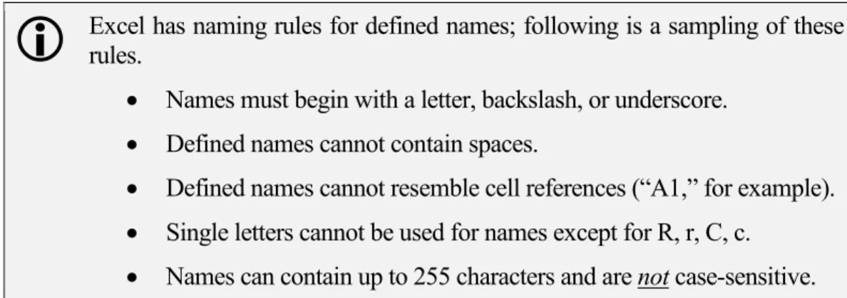
Excel has naming rules for defined names; following is a sampling of these rules.• Names must begin with a letter, backslash, or underscore.
• Defined names cannot contain spaces.
• Defined names cannot resemble cell references (“A1,” for example).
• Single letters cannot be used for names except for R, r, C, c.
• Names can contain up to 255 characters and are not case-sensitive.
Another way to create a defined name is to highlight a cell or range of cells and then to click Define Name on the Formulas tab to open the New Name dialog box as shown in Figure 27. Type in the desired Name, select the Scope, enter a Comment, and modify the Refers to information as required. Click OK to create the defined name.
Figure 27 - Using the New Name Dialog Box to Create a Defined Name
You can also create defined names from adjacent labels. Just highlight the range, including the labels, and select Create from Selection from the Formulas tab as shown in Figure 28. In the Create Names from Selection dialog box, check the boxes that correspond with the position of the labels in the selected range and click OK to create the names automatically. The underscore character replaces any spaces or special characters in the labels. Likewise, an underscore precedes any defined names created from labels that begin with a number, such as 1Q2018.
Figure 28 - Creating Defined Names from Adjacent Labels
Dynamic Defined Names
By definition, defined names refer to static cells or ranges of data. On the other hand, dynamic defined names refer to ranges where the number of rows, the number of columns, or both the number of rows and columns change. From a dashboard perspective, this is important because the volume of data used to create a dashboard might – and likely will – vary from period to period. Because dynamic defined names can serve as the data ranges for charts, charts based on dynamic defined names will then automatically expand and contract as the volume of data expands and contracts, as will charts built on tables as discussed previously.
When building a chart based on dynamic defined names, create two dynamic defined names – one for the X-axis and one for the data.Dynamic defined names are built based on a formula that includes the OFFSET function. For instance, to build a dynamic defined name based on the data shown in Figure 29, use the
following OFFSET formula to build a name that is dynamic with respect to the number of rows.
=OFFSET($A$1,0,0,COUNTA($A:$A),9)
Figure 29 - Range for a Dynamic Defined Name
The formula shown above instructs Excel to start in cell A1 and, without skipping any rows or columns, to create a range that is as many rows long as the COUNTA function dictates and nine columns wide. As rows are added or deleted, the dynamic defined name adjusts based on the volume of data.
With respect to the data presented in Figure 29, if the defined name needed to be dynamic with respect to the number of columns, modify the formula as shown below.
=OFFSET($A$1,0,0,14,COUNTA($1:$1))
As shown above, the OFFSET function will fix the dynamic defined name as beginning in cell A1 and, without skipping any rows or any columns, will cause the dynamic defined name to be 14 rows long; the number of columns would be defined as the number of nonblank columns in row 1 of the worksheet.
Lastly, again with respect to the data in Figure 29, to make the formula dynamic with respect to both the number of rows and the number of columns, modify the formula as shown below.
=OFFSET($A$1,0,0,COUNTA($A:$A),COUNTA($1:$1))
As defined by the OFFSET function shown above, the columns and rows included in the dynamic defined name will vary based on the number of nonblank entries in column A and the number of nonblank entries in row 1.
In a dashboard setting, dynamic defined names and tables provide you with tremendous capability to incorporate varying amounts of data into dashboards. Further, adding input controls to dynamic defined names as described below provides dashboard users with the capability of interactively selecting the data for display on the dashboard.
Form Controls
Formcontrols provide you with the ability to enter data by clicking on an object such as a list box, combo box, or spinner. In a dashboard environment, form controls make dashboards interactive with readers. For instance, form controls might allow a dashboard reader to select the starting and ending dates in a series of data to summarize on the dashboard.
Form controls are accessible from the Developer tab of the ribbon as shown in Figure 30.
Figure 30 - Accessing Form Controls from Ribbon
In the following example, combo boxes specify how many months of data should be included in a dynamic defined name; keep in mind that the dynamic defined name can serve as the data source for a chart, PivotTable, or PivotChart displayed on a dashboard.
First, set up the worksheet as shown in Figure 31. In this example, cell E2 has the defined name of StartingDate, and cell E4 has the defined name of EndingDate. Additionally, the range of cells A2 through A49 has the defined name of Dates.
Figure 31 - Worksheet for Using Spinner Controls
Next, add a combo box control to cell E2. After sizing it appropriately, copy and paste it to cell E4 as shown in Figure 32.
Figure 32 – Combo Boxes Added to Worksheet
Right-click on the combo box in cell E2 to open the dialog box shown in Figure 33 and enter Dates as the Input range and E2 as the Cell link. Repeat for the combo box in cell E4, substituting E4 as the Celllink.
Figure 33 - Combo Box Dialog Box
The formatted combo boxes allow you to specify starting and ending dates as shown in Figure 34. It is important to note that the values stored in cells E2 and E4 are not actually the dates depicted in the combo boxes; rather, these values are the relative position in which the selected date appears in the input range. Thus, based on the entries shown in Figure 34, the values stored in cells E2 and E4 are “1” and “8,” respectively.
Finally, create a dynamic defined name to incorporate the date data entered by the combo boxes. Recalling the previous discussion of dynamic defined names, such a formula might resemble the one shown in Figure 35.
Figure 35 - Dynamic Defined Name with Date Inputs from Form Controls
Based on the above discussion, the value of form controls in a dashboard environment should be apparent – form controls allow creators of dashboards to build components that are interactive with the end user. Further, the presence of form controls used to supply data into dynamic defined names means that users and readers of dashboards do not have to spend time modifying formulas to get the data – and only the data – they need. Instead, they simply click the form control and select the appropriate value from it.
Ordering Data with Excel’s RANK Function
The RANK function in Excel allows you to enter a formula to determine the relative position or order of one value compared to a series of values. Thus, in a range of data depicting total sales for instance, use RANK to identify and assign the relative rankings of values in the list compared to each other. In a dashboard setting, this can be particularly useful to assist in identifying and highlighting both top values as well as bottom values in a range of data. In the example shown in Figure 36, sales data is sorted based on product code. A user wishes to rank this data but does not want to sort the data on the “Total Sales” field to create the rankings. The RANK function is the perfect tool to get the job done. The RANK formulas entered in cells C2 through C11 generate numerical rankings of the data without re-sorting the data. The syntax for the formula is quite simple as shown by the formula used in cell C2.
=RANK(B2,Sales)
In this case, “Sales” is a defined name representing the range of A2 through B11.
Of course, once entered, copy the formula to the remaining cells in the range of C2 through C11.
Figure 36 - Example of Excel's RANK Function
Using RANK in Conjunction with Conditional Formatting
Like many functions in Excel, RANK can be particularly powerful when combined with another Excel feature – in this case, conditional formatting. Suppose one desires to display the results of a RANK formula using symbols rather than numbers. This is easily accomplished by applying a conditional format to the values generated by a RANK formula. Following from the previous example, the symbols shown in column C of the worksheet in Figure 37 were generated by applying conditional formatting to the results of the RANK formulas used to generate the rankings depicted in Figure 36.
Figure 37 - Conditional Formatting Used with RANK
To achieve the results depicted in Figure 37, make two adjustments to the conditional formatting rules as shown in Figure 38. First, because a ranking of “1” represents the best possible result and “10” represents the poorest possible result in this example, reverse the order of the conditional formats. To do so, check the Reverse Icon Order box shown in Figure 38. Second, to suppress the numerical display of rankings, leaving only the icons visible, check the box labeled Show Icon Only shown in Figure 38.
C hapter 2 -
Excel Charts and Graphs
hile this is not a course in creating charts in Excel per se, any discussion of Excel-based dashboards necessarily involves a discussion of the charting functions in Excel. In the newer versions of Excel, you can create and customize charts with fewer clicks and dialog boxes, which make it much easier and faster to produce professional quality charts to incorporate into Excel-based dashboards. This chapter serves to provide a summary overview of charting functions and tools in Excel and then to offer a “deep dive” into advanced charting techniques that are especially useful in dashboard settings.
Learning Objectives
Upon completing this chapter, participants should be able to:
• Identify the various types of charts available in Excel and when each type should be used, based on the objective of the chart;
• Create and edit charts in Excel, including modifying various elements in an Excel chart to meet specific needs;
• Build charts from Excel tables, and describe the potential advantages of doing so;
• Communicate more effectively with charts by adding dynamic text boxes and conditional formatting; and
• Create charts in Excel that incorporate dashboard-specific techniques such as interactivity and drill-downs.
Chart Types
Excel includes a wide range of chart types in ten broad categories, as summarized in the following table. However, when combining the different variations of each of these ten chart types with the various chart styles, chart layouts, and user-defined charts, the number of charting options available to present data visually is virtually unlimited.
• Column • XY • Line • Stock • Pie • Surface
Chapter
2
W
• Bar • Radar
• Area • Combo
Table 1 - Ten Chart Types Available in Excel
Column charts, the most common of all chart types, display data points in vertical columns. Column charts are commonly used to compare discrete values and do not imply the passage of time. A bar chart is very similar to a column chart except that a bar chart has a horizontal orientation while a column chart has a vertical orientation. Bar charts are useful when comparing a large number of values and when category labels are lengthy.
Use line charts to plot continuous data over time. Line charts are exceptionally useful at helping to identify trends in data. A line chart assumes that all of the data points plotted are spaced evenly in time. If they are not, avoid using line charts because they might provide misleading information. As an alternative, an XY chart will always space the data points according to their relative time position. An areachart is essentially a line chart with the area below the line filled. Like line charts, area charts are useful for displaying values over time. XY charts, or scatter plots, show the relationships between variables plotted on the X- and Y- axes. The values plotted on the X-axis are independent of the values plotted on the Y-axis. In other words, the values plotted on the X-axis drive or cause the values plotted on the Y-axis. Importantly, there is no category axis in an XY chart. Both axes display values. Bubble charts are a form of an XY chart but with an additional data series represented by the size of the bubbles. All data series are values – there are no category axes.
Pie charts are commonly used to display the relative makeup of data. They are useful for identifying proportional values or contributions to a total. For pie charts to be effective, use no more than five or six data points. When you have a greater number of data points, consider using a bar chart, pie of pie chart, or bar of pie chart instead. A doughnutchart is a form of a pie chart except that it can display more than one series of data. However, because each successive series of data is placed in concentric rings, it can be relatively easy to misinterpret the meaning of the chart. Given this limitation, doughnut charts are usually best utilized with only one data series. If multiple series of data are required, consider using a stacked column chart instead.
Radarcharts have separate axes for each category of data. These axes extend outward from the center of the chart. Radar charts are useful for identifying relationships among data series and for making comparisons of data values. With a surface chart, colors are used to distinguish values, not series. Surface charts can display two or more data series on a surface and are often used to find optimum combinations between two sets of data.
Stock charts are very useful for displaying information regarding security prices, such as high, low, or closing stock prices. In addition, stock charts may display opening values and volume. Stock charts may also be used to display scientific data. For example, stock charts may be useful in charting rainfall or temperatures.
Choosing a Chart Type
With all of the choices available, sometimes the most difficult part of creating a chart is choosing which type is best for a given situation. A few guidelines may be helpful.
• When comparing items to other items, column charts and bar charts are typically the best choices.
• When comparing data over time, line charts and area charts are usually superior to other options.
• To make relative comparisons of one data point to another, pie and doughnut charts are useful. Stacked bar charts, stacked column charts, 100% stacked bar charts, and 100% stacked column charts are also good choices.
• Causal relationships in data are often best depicted with XY charts. If three data values need to be plotted, use a bubble chart instead of an XY chart.
Elements in an Excel Chart
Each Excel chart contains some or all of the elements listed below. More importantly, you can format each element independently of every other element. If an element needs modification or adjustment for proper display, simply click on the element to activate it and then act on the element through the Ribbon or context menu. Adjust the formatting, scaling, and appearance as required and then move on to the next element that requires adjustment.
While Excel does a good job of automating the entire charting process, advanced users can still fine-tune charts by modifying the individual elements of a chart listed below.
• Data Series – broad categories of data plotted in a chart
• Data Points – individual data ele-ments plotted in a chart
• Category Axis – horizontal axis
• Category Axis Label – labels along the category axis
• Value Axis – vertical axis
• Legend – identifies data series
• Data Labels – identifies data points
• Gridlines – used to extend labels from an axis visually
• Chart Area – background area of a chart
• Plot Area – section of a chart containing the actual plot, including the plotted data, the axes, and the axis labels
• Walls – used for formatting the vertical axis in 3-D charts
• Floor – used for formatting the horizontal axis in 3-D charts
• Trendlines – can be plotted against data in a chart; can also be used to display a linear regression formula
• Error Bars – display potential error amounts relative to each data marker in a data series
Creating a Chart
Creating a chart in Excel requires four basics steps:
1. Arranging the data in a way that makes it easy to chart; 2. Selecting an appropriate chart type;
3. Selecting a chart layout and style from the Chart Tools tab; and
4. Fine-tuning the chart's look and feel on the Chart Tools Layout or Format tabs or by using a context-sensitive menu.
Generally, arranging the data so that the X-axis categories are in columns, and the data series are in rows produces the best charts using the default process. While most users instinctively highlight their data before creating a chart, that step is unnecessary unless you want to chart two or more noncontiguous data ranges. To select noncontiguous data ranges, use CTRL + Click and Drag to highlight the ranges.
To create the first example chart, position the cursor within the data. Press ALT + F1 to create a chart as an object on the worksheet that contains the data and then reposition and resize the chart as desired. To resize a chart, first select the chart and then click on one or more of the eight resizing handles on its border, indicated by the rectangles in Figure 39, dragging them to resize the chart.
To reposition a chart, first select the chart and then click on its border, making sure to avoid the resizing handles. The cursor will change to a compass rose, at which point you may drag the chart to its desired position. After repositioning the chart, the worksheet should resemble the one in Figure 40.
Figure 40 - Simple Column Chart Created with a Single Keystroke
To create a chart on a separate chart sheet, position the cursor within the data to appear on the chart and press F11. Both one-click methods create a chart using the default chart type. To change the default chart type, click on a chart to display the Chart Tools tab. Select the Chart Tools, Design tab and then click Change Chart Type. In the Change Chart Type dialog box, select the desired default chart type, click Set as Default Chart, and click OK.Now that we have a chart, select Change Chart Type from the Chart Tools, Design contextual tab and review the various chart types available. In our example, a simple column chart is appropriate for our needs, but you may change a chart's type at any stage of creation or use. Our chart needs a title and the Y-axis formatted so that it displays dollar signs and zero
decimal places. To choose a layout that includes a chart title, select the Chart Tools, Design tab. Expand the Chart Layout gallery and select a layout that contains a chart title and a legend on the right-hand side as shown in Figure 41. Note that the chart layout gallery will change, depending on the type of chart selected.
Figure 41 - Selecting a Chart Layout
In the chart, click and highlight the text of the placeholder label Chart Title and type in DNM Marketing LLC. Press ENTER to continue on another line. Change the font to 12pt and then enter Sales by Division. Click anywhere on the chart to end the edit process.
Now, let's change the number format of the quarterly sales amounts. Click anywhere on the numbers in the Y-axis area to activate the axis. A gray box will surround the area. Select the Charts Tools, Format contextual tab. Click Format Selection to open the Format Axis task pane. Click Number in the task pane. Select Currency in the Category box, enter 0 decimals, and select $ as the symbol. Close the pane to apply the changes. Figure 42 displays the process described above.
Figure 42 - Changing the Number Format of the Y-Axis
You can shorten the formatting process by using the context-sensitive menu. For example, to format the vertical axis of any chart, just right-click in the vertical axis area and select Format Axis. You can format any chart element using this shortcut process.
Charting with Tables
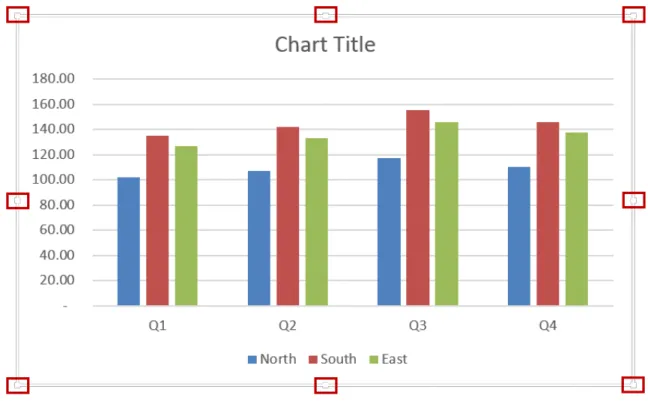
As discussed beginning on page 16, tables are dynamically adjusting ranges of data. Because the definition of a table changes dynamically as the volume of data in the table changes, objects – including charts – that are built using tables as their data sources automatically change. This means that if you build a chart based on a table and later add more data to the table, the chart will automatically include the new data; likewise, if you delete data from the table, the chart will contract. For example, the data in Figure 43 is a table named RegionalSales.
Figure 43 - Table Data for a Chart
Clicking inside the RegionalSales table and pressing ALT+F1 builds a chart in the default style based on the table. Now for the power of tables: as shown in Figure 44, adding the fourth quarter column to the table causes the chart to add fourth quarter data without any manual intervention whatsoever.
Figure 44 - Adding Data to a Table Causing Charts Built Based on the Table to Expand Automatically
Additionally, as shown in Figure 45, filtering a table causes a chart based on the table to filter automatically.
Figure 45 - Filtering a Table Causing Charts Based on the Table to Filter Automatically
Communicating More Effectively with Charts
Communicating effectively with charts requires a strategy. Before creating a chart, you need to take time to determine what information the chart is to communicate and what type of chart will be most effective at communicating the message. If possible, include the message in the title of the chart. For example, compare the two charts in Figure 46. Note how the top chart is more effective at communicating the message than the bottom chart because the message is in the title.
Figure 46 - Put the Message in the Title of the Chart
Dynamic Text Boxes in Charts
While the concept of adding a text box to a chart to enhance a reader’s understanding of the chart sounds appealing in a dashboard setting, this could prove to be problematic from a practical standpoint because of the constantly changing nature of the data. What users really need is the ability to create text boxes that alter based on changes in the underlying data. In other words, we need dynamic text boxes that provide analytical insight based on predefined criteria. Fortunately, creating dynamic text boxes in Excel charts is rather easy, as described below.
1. Create a chart based on the data in columns B and C below; a simple column chart similar to the one shown in Figure 47 will suffice.
Figure 47 - Column Chart Displaying Sales Data by Product
2. Next, create appropriate text strings providing the desired analytical messages. Excel’s TEXT, CONCATENATE, DOLLAR, and & functions are catalysts for such text strings. For example, consider the data pictured in Figure 48.