Support Software Development
Master of Science Thesis in the Programme Software Engineering and
Technology
TOBIAS ALETTE
VIKTOR FRITZON
C
HALMERS
U
NIVERSITY OF
T
ECHNOLOGY
U
NIVERSITY OF
G
OTHENBURG
Department of Computer Science and Engineering
Gothenburg, Sweden, June 2012
The Author grants to Chalmers University of Technology and University of Gothenburg
the non-exclusive right to publish the Work electronically and in a non-commercial
purpose make it accessible on the Internet. The Author warrants that he/she is the author
to the Work, and warrants that the Work does not contain text, pictures or other material
that violates copyright law.
The Author shall, when transferring the rights of the Work to a third party (for example
a publisher or a company), acknowledge the third party about this agreement. If the
Author has signed a copyright agreement with a third party regarding the Work, the
Author warrants hereby that he/she has obtained any necessary permission from this
third party to let Chalmers University of Technology and University of Gothenburg
store the Work electronically and make it accessible on the Internet.
Introducing Product and Process Visualizations to Support Software Development
TOBIAS ALETTE,
VIKTOR FRITZON,
c
TOBIAS ALETTE, June 2012.
c
VIKTOR FRITZON, June 2012.
Examiner: MIROSLAW STARON
Supervisor: ROBERT FELDT
Chalmers University of Technology
University of Gothenburg
Department of Computer Science and Engineering
SE-412 96 Gothenburg
Sweden
Telephone + 46 (0)31-772 1000
Department of Computer Science and Engineering
Gothenburg, Sweden June 2012
A
CKNOWLEDGEMENTSWe would like to thank RUAG Space AB for giving us the opportunity to do this thesis.
We are especially thankful to all interviewees and members of the studied project who
helped us throughout the study with valuable feedback. We would also like to thank
Associate Professor Robert Feldt, Chalmers University of Technology, who guided us
through this thesis.
1
Introduction
1
1.1
Scope and limitations . . . .
1
1.2
Thesis structure and contributions . . . .
1
2
Background
2
2.1
Theoretical framework
. . . .
2
2.1.1
Agile concepts . . . .
2
2.1.2
Information and data visualization . . . .
3
2.1.3
Information dashboards . . . .
3
2.2
Related work . . . .
3
2.2.1
Information needs . . . .
4
2.2.2
Related studies . . . .
4
2.2.3
Positioning . . . .
4
3
Methodology
5
3.1
Context . . . .
5
3.2
Research objective and questions . . . .
6
3.3
Design research . . . .
6
3.3.1
Initial awareness of problem & suggestion . . . .
6
3.3.2
Development & evaluation . . . .
7
4
Result
8
4.1
Charts . . . .
8
4.2
Technology . . . .
9
4.2.1
KnowSE - Architecture . . . .
9
4.2.2
Data-Driven Documents . . . .
9
4.2.3
Design and architectural choices . . . .
9
4.3
Data collection . . . .
11
4.3.1
Initial orientation
. . . .
11
4.3.2
Continuous . . . .
13
4.3.3
Evaluation . . . .
14
5
Discussion
16
6
Conclusion
16
References
17
Introducing Product and Process Visualizations
to Support Software Development
Tobias Alette and Viktor Fritzon
Chalmers University of Technology
{
alette, viktorf
}
@student.chalmers.se
SE-412 96 Gothenburg
Sweden
F
Abstract
This thesis studied the development and introduction of a continuous measurement, analysis and visualization system. The system was developed and deployed for use in a multi-team system development project at RUAG Space AB. The focus was on supporting assessment and decision making in daily stand-up group meetings through the use of an information radiator. High-level process and product information was visualized aimed at supporting meetings with participants from different teams. Challenges and guide-lines for developing and introducing similar systems are presented.
1
I
NTRODUCTIONDelivering software projects according to specification, on time within budget has proven to be a big challenge for the software industry. Poor communication and reporting on project status are commonly stated as contributing factors to project failures [1]. Agile methods, which have become mainstream during the last decade [2], has developed several concepts and practices aimed at solving these problems e.g. morning stand-up meetings [3], the informative workspace and metrics as a management tool [4]. One of the tenets of the agile movement is responding to change over following a plan [5]. The theory of bounded rationality [6] argues that the ability to make rational decisions is bounded by the available information, time to interpret it as well as the cognitive ability to do so.
Based on the premise of bounded rationality and the com-mon use of agile practices, such as informative workspaces and morning meetings, this thesis suggests that software development can be supported using information visualization to present project data in the common workspace to increase decision making ability.
This introduces a couple of challenges:
• How to decide which information is important
• How to gather data without introducing overhead
• How to best communicate it
• How to introduce the new practice to an established process
Some research have been carried out recently shedding some light on information needs for decision making in software development projects. Buse and Zimmerman [7] and Ko et. al. [8] both state that information needs of stakeholders are diverse and that no view fits all.
Both Biehl et. al. [9] and Jakobsen et. al. [10] performed in situ studies where dashboards placed in a common workplace were used to foster team awareness for developers. Both studies focus on low-level awareness such as which files are currently checked out and being edited. Both studies were done on single team software development projects.
This thesis studies the development and introduction of a continuous measurement, analysis and presentation system for a multi-team system development project at RUAG Space AB. The system is based on the KnowSE framework [11]. The project under study holds daily morning stand-up meetings for each team as well as an integration meeting attended by representatives from each team. Meetings are held in a common workplace around planning task boards.
1.1 Scope and limitations
The following items outline the scope and limitations of the thesis:
• Due to the intended use of the presentation as group meet-ing support observed from across the room, visualizations that require interactivity have not been studied.
• The study have focused on three main data sources;
re-ported and estimated time, code changes and test results. Requests for visualizations of additional data sources are discussed, but integration of additional sources was considered outside the scope of the thesis work.
• As opposed to Biehl et. al. and Jakobsen et. al. the system introduced in this thesis work is aimed at a higher-level awareness suitable to support the project morning integration stand-ups held at RUAG Space.
1.2 Thesis structure and contributions
Section 2 will further describe concepts such as stand-up meetings and informative worspaces from an agile perspective as they apply to the goal of the project and system under study.
Basic theory and best-practices from information visualization and dashboard design that has been applied throughout the thesis work is also presented in this section. A review of recent related work and research is presented in order to position the thesis work.
The following section 3 describes design research methodol-ogy and how it has been used to gain the knowledge necessary to contribute to the answers of the posed research questions which are also listed here. The context is described in terms of a brief description of RUAG Space and the process used in the project under study.
Results from the in situ study of the introduced system are presented in section 4, focusing on how it supports assessment and decision making in daily meetings as well as factors affecting its usefulness and effect on the project under study. Section 5 discuss the results and propose guidelines for the introduction of similar support systems. Finally, conclusions and suggestions for further research are given in section 6.
2
B
ACKGROUNDThe following subsections covers the theoretical framework and related work that is used throughout the thesis work. Section 2.1.1 briefly describes commonly used concepts from agile software development related to the thesis, followed by information and data visualization and finally a short description of information dashboard design.
Section 2.2 summarizes related work done on the informa-tion needs of decision makers in software development project and how to create tools to support them.
2.1 Theoretical framework
2.1.1 Agile concepts
The informative workspace is a concept described as a com-mon team area where a team member or customer should be able to get a broad view of project status in less than a minute after entering the space [12]. Using a wallboard showing work items and their status is a common practice to create an informative workspace. Many agile methods, e.g. XP (extreme programming), Scrum and Kanban, use it to support daily meetings [4] [13] [3].
Daily team meetings are typically limited in time to at most 15 minutes. Team members give short status updates on their current work and how they plan to move forward. Any obstacles that are brought up or detected during the meeting where no immediate resolution is found are handled outside the meeting [3].
In his first book describing XP [4], Kent Beck states that the basic XP management tool is the metric. He argues that showing the progress of three to four key issues on a big, visible chart can be used as an effective way for managers to non coercively communicate the need for change in projects. What to measure and which metrics that are interesting to monitor is not always obvious. Hartmann and Dymond have created a few heuristics for selecting metrics for agile teams. As Beck, Hartmann and Dymond also believe that a few well considered metrics should be used, if too many are displayed it can cause important trends to be missed
[14]. Similar findings have been found for large software development companies where a limited number of measures was found to be sufficient to monitor important trends [15]. Furthermore Hartmann and Dymond believe that metrics that provide information to discussions are important to improve processes for the team. They also argue that the data used for the metrics should be aggregated to team or iteration level.
One common chart to show on big visible charts in agile methodologies is burn down charts. It visualizes the teams progress by plotting remaining work and how it is reduced over time. This gives the observer a quick view of the team’s velocity, how much work is getting done and how fast, in comparison to planned deadlines. This can help to determine if features can be added to the current iteration [13].
Another central concept in XP management from Kent Beck’s book [4] is tracking. Beck argues that tracking accuracy of estimates by measuring outcomes is essential for learning and improving. Beck further describes the role of tracker in XP teams as responsible for selection and gathering of data for metrics to be used.
According to Beck you should be wary of introducing over-head and excessive disturbance of developers when collecting data, though he also points out that one benefit of bothering developers for data is that it raises awareness of that the data is being measured and its importance to the success of the project [4].
Alistair Cockburn extends the idea of the informative workspace with the metaphor of a project status display as an information radiator.
“Just as a heating duct blows air into a hallway or a heater radiates heat into a room, these posters radiate information into the hallway, onto people walking by.” [16]
The agile manifesto’s last of its twelve principles, “At regular intervals, the team reflects on how to become more effective, then tunes and adjusts its behavior accordingly.” [5] describes a practice well served by the big, visible chart and the informative workspace which encourages reflection and analysis of the current status of the project, especially if related to estimates and goals.
Information in agile projects is what keeps the components of a project in sync and keeps the team members in touch. It is by having the right information available at the right time that keeps the teams creative and helps them to solve problems, and this is one of the challenges for managers in agile projects [17].
It has been argued that one of the obstacles to making decisions in software development is lack of information [18], [7], [17]. This leaves managers to depend on their experience and intuition for making decisions, which might sometimes turn out well, but often does not [19].
Also, if the necessary information that the team need to get their work done is not available, the team’s ability to organize is reduced [17]. Guzzo and Dickson describe self-organizing teams as a group of members that has authority and responsibility for many tasks in their daily work, e.g. ”planning, scheduling, assigning tasks to members and making decisions with economic consequences” [20]. By bringing
the authority to make decisions to the level of operational problems, self-managing teams can directly affect team effec-tiveness by solving problems quicker [21].
2.1.2 Information and data visualization
With the concept of informative workspaces there is a need to create an environment where the project status can be seen within a short period of time. Some visualizations already exists, such as previously described burn down charts, but for new metrics also new visualizations are needed. This creates an opportunity to use information visualization which has the power to convey a lot of information in a glance.
Edward Tufte stated that ”Graphical excellence is that which gives to the viewer the greatest number of ideas in the shortest time with the least ink in the smallest space“ [22].
In his theory he discusses principles for creating visualiza-tions and the following have been considered when creating visualizations for this research. Chartjunk which means ele-ments that adds no value to the visualization ,data-ink ratio
which is a measure of how much of the ink in the visualization that is used to display data. Small multiples which refers to showing a series of many small graphics of the same type in one visualization (see figure 1). Concluding, a recurring theme in his theory is to ”Above all else show the data“ [22].
The types of visualizations focused on in this study will be described in the following paragraphs.
Sparklinesare word-sized line charts. By scaling the chart down significantly you obtain a high information density and data-ink ratio. Even though some details may be lost due to its small size and less than ideal display resolutions, sparklines can provide context to otherwise disconnected numbers or charts. Sparklines are especially effective when used as small multiples to enable comparison of values over time [23].
Bullet graphs(most often) show a single quantitative mea-surement on a linear scale. The chart can have additional features such as multiple ranges, encoded by background color in the chart for e.g. low, mid or high performance. Markers for estimated or target values are also used. Due to the basic nature of the chart it can display all its information even if scaled down, which makes it a good candidate for use in displays of small multiples [24] (see figure 1 for an example of bullet graphs created by Stephen Few [25]).
Fig. 1. Bullet graph in small multiples taken from call-center dashboard [25]
A Heat mapis shown as a two-dimensional matrix where the value of each cell is represented as shades of colors. This visualization is quite compact and many series of values can be shown in the same map without overlap.
Classical data visualization techniques such as line charts
andhistogramsare also used.
2.1.3 Information dashboards
One area where data visualizations have been used for quite some time is in information dashboards. There is no clear definition of dashboards but Stephen Few describes them as follows.
”A dashboard is a visual display of the most im-portant information needed to achieve one or more objectives; consolidated and arranged on a single screen so the information can be monitored at a glance.“ [24]
An issue often found in information dashboards today is that they show little information and the information they do show is often displayed poorly. A reason for this is the use of flashy gadgets instead of using simple visualizations. The focus of a dashboard should always be to communicate information, to help the user to acquire the information they need [24].
Brath and Peters describes dashboard as ”Dashboards and visualizations [...] help people visually identify trends, patterns and anomalies, reason about what they see and help guide them toward effective decisions.“ [26]
The challenge in creating dashboards is to combine all the interesting information onto a single screen in a manner that keeps it simple to understand and interpret. There is also often requirements on that the dashboard should be used to quickly gather information. By using visualizations instead of text this becomes possible, reading text is a rather slow process whereas visualizations can be interpreted at a glance [24].
One area where dashboards are used for software develop-ment is to raise awareness on different aspects for the project [27], [9], [10]. Treude and Storey conducted an empirical study of several large development teams to examine how dashboards and feeds could be used. In their study they found that developers mainly use dashboards for getting high-level overview for project status, gain awareness for other developers and teams, and to identify bottle-necks. Where managers instead used dashboards to compare teams and make differences between them visible. Furthermore they found that both developers and mangers used the dashboards for task prioritization before deadlines, where they depend on the dashboard to show critical work items that need to be finished before delivery [27].
2.2 Related work
There are many available tools for supporting and managing software development processes. Suites of products such as IBM Rational and its Jazz platform [28] or Thoughtwork’s adaptive ALM [29] can be used to support application lifecycle management (ALM). Chapelle [30] describes ALM as having three aspects: government, development and operations which together cover the lifecycle of an application from idea to end-of-life.
Even though many of the features provided by this type of tools fall outside the scope of this thesis there are common features such as tracking and reporting that support the same tasks as KnowSE at RUAG, which is the framework this thesis contributes to. Often, and also in the case of the previously mentioned examples from IBM and Thoughtworks, dashboards are used to present tracking and reporting. These dashboards are customizable to meet the varying information needs of users. The next section will present recent research on some of these needs.
2.2.1 Information needs
Buse and Zimmerman designed a survey that was sent to 110 developers and managers working at Microsoft, with the goal of identifying the information needs for decision-makers in software development projects. In their study they found that managers rated data and metrics as the factor that influenced their decisions the most, where the developers rated their experience instead. Both groups also found it more important to comprehend past events than attempt to predict the future. One reason for this could be that predictive models are hard to understand and making decisions without understanding the underlying data often distrusted [7].
Furthermore they investigated which metrics the developers and managers use or would use if available. When comparing all metrics, the top rated category was failure information. However an interesting thing to note was that all metrics would be used by at least half of all engineers and managers if available. Concluding they discuss that due to the nature of a software project there are many stakeholders that all have different information needs [7].
Biehl et al. [9] investigated what information that developers use to gain awareness of group members status and how this information was gained. They found that the most common way to get a view over the team’s current activities was through which tasks were assigned to each team member, bug reports and status of shared code base. The main sources for information was through whiteboards, databases, documents and source code repositories.
To support the information needs in software development Buse and Zimmerman argues that changes needs to be done, stating that data gathering so far have been too focused on data and not on the need of users. They argue that data gathering should start with the users’ needs and from that try to find the data necessary to provide a solution [7].
2.2.2 Related studies
This section summarizes results found in four related studies, starting with two that introduced dashboards on large screens in projects to raise teams awareness. This is followed by a study focused on raising awareness using dashboards and feeds on desktop computers and finally a study which reccomend general guidelines and analysis types for creating tools to support decision makers in software development projects.
In the two studies that tried to increase team awareness by introducing dashboards on large screens in the projects workspace. The first was conducted by Biehl et al. and called FASTDash [9], they reached the conclusion that introducing
the visualizations was generally well received and that they no-ticed increased discussion within the studied group. However they also noticed areas for improvement in the visualizations used, both by aggregating data to more effectively use the screen area and adding more information from work items to give a more complete view of the project [9].
The second was conducted by Jakobsen et al. and was called WIPDash [10]. They introduced the dashboard to two teams hereafter called A and B. In team A people used the dashboard more than team B and Biehl et al. argue that one of the reasons could be that it was a part of their daily meeting, where team members could use the dashboard as a summary of what tasks they completed the previous day. Team B did not have daily meetings, which could have lead to that they did not get as familiar with the dashboard. Another reason could be that team B’s dashboard contained more information, which led to it being cluttered. This was also was identified as one of the areas which could be improved to the next version of the system, to create a dashboard that is easier to interpret and get the information with a glance [10].
The third study also focused on how awareness could be achieved in software projects using dashboards, furthermore they also looked at how feeds could be used. Instead of displaying the dashboard on large screens in the project workspace they looked at a company using configurable dashboards and feeds for the developers personal computers from IBM’s Jazz platform. In their study they found that the dashboards were mainly used to get a view of the overall project status and to get an idea about the status for other teams within the project. They were also used for prioritization before deadlines, where the team depended on the dashboard to show critical work items [27].
Finally, the last study looked into the information needs for decision-makers in software projects, described in the previous section, and from the results of their study Buse and Zimmerman established guidelines for creating software analytics tools aimed to be used by managers. In short, the guidelines for a tool is that it should be easy and fast to use, be able to show the data with varying amount of details. It is also more important to show past data than having predictive models. Finally it can be useful to compare metrics to milestones in the project [7].
In addition to the guidelines they also list analysis types that can be used to help stakeholders gain insights from the data. Some of these types aretrends, by looking at how an indicator is changing, decisions can be made when negative trends are found.Alerts, by automating collection and analysis of data a tool can warn when unexpected events occur. Summarization, by aggregating data, for example change records, a tool can help the users to gain high-level insights. Finallygoals, which can help users to analyze how different aspects of the project is progressing with regards to its goals [7].
2.2.3 Positioning
In agreement with Buse and Zimmerman’s conclusion that information needs vary between stakeholders Maletic et al. [31] propose a task oriented view of software visualization systems which they position in terms of five dimensions:
System Task Audience Target Representation Medium KnowSE at RUAG Process and team
manage-ment
Developers, testing personnel, process and team managers
Source code, test suite data, process informa-tion
Low-interactivity, dy-namic, offline, graph-ics
High-def TV screen
WIP/FastDash Development activities and team management
Developers, testing personnel
Source code, process information
Low-interactivity, dy-namic, online, tables, graphics
High-def projected display, High-def TV screen
IBM Jazz Platform, (Treude and Storey)
Development activities, process and team management
Developers, testing personnel, process and team managers
Configurable Interactive, dynamic, online, configurable dashboards
Personal Computer
TABLE 1
Comparison of software visualization systems
Tasks Why is the visualization needed?
Audience Who will use the visualization?
Target What is the data source to represent?
Representation How to represent it?
Medium Where to represent the visualization? Table 1 positions KnowSE at RUAG in relation to three of the presented studies using the dimensions proposed by Maletic et al. [31].
As can be seen in the second row of the table, the studies by Biehl et al. [9] and Jakobsen et al. [10] have been merged into the same row titled WIP/FastDash. Both studies are focused on low-level awareness such as which files were being edited or checked out, primarily displaying data from source code repositories. Furthermore both studies used large screens in the studied projects workspace and targets the same tasks and audience.
This thesis, as can be seen in the first row, also used a large screen in the common workspace. A difference between the representations of the data is that this thesis is more focused on high-level awareness between teams in the project. Visualizations represents how the data changed over time to a larger extent compared to WIP/FastDash that focused on current activities of developers. In this study current tasks were already shown using planning boards. Visualizations are instead used to complement the low-level data presented on the planning boards.
The study by Treude and Storey did not present their data using a large screen in the common workspace, but instead studied how dashboards were used on computers. The studied platform, IMB’s Jazz, supported the dashboards to be configured by the users and therefore the target data can not be specified. Because of the configurability, the system can support both low- and high-level awareness.
3
M
ETHODOLOGYThis section starts out by describing the industrial and aca-demic context of the thesis. RUAG Space is described in short and the project under study (PUS) and its development process are also described. Research questions and methodology are presented in sections 3.2 and 3.3. This section starts out by describing the industrial and academic context of the thesis. RUAG Space is described in short and the project under study (PUS) and its development process are also described. Research questions and methodology are presented in sections 3.2 and 3.3.
3.1 Context
The thesis work was done in collaboration with RUAG Space AB. RUAG Space’s core business in Sweden is to design and manufacture on-board satellite equipment. 314 out of the total 378 employees are working out of their headquarter in Gothenburg. This is also where this thesis work has been conducted. The focus of the Gothenburg office is to design and manufacture digital and microwave electronics and antennas as well as develop the systems for the equipment. Their other office in Sweden is in Link¨oping where they design and manufacture launcher adapters, satellite separation systems, satellite structures and sounding rocket guidance systems.
Previous projects done in collaboration by Chalmers, Uni-versity of Gothenburg (GU) and RUAG Space have studied how project data can be measured and analyzed to create a more effective development process. The measurements have so far been done on projects after completion, i.e. on historical data. These studies have highlighted areas for im-provement [32]. RUAG predicts that by continuously measure the progress in ongoing projects to be able to react early to avoid possible problem areas [32]. To this end Chalmers, GU and RUAG started a joint effort to develop a support system to provide an automated chain of extraction, analysis and presentation of data from ongoing software projects. From this project another goal is also to be able to extract a more general framework, KnowSE [11], which this thesis is part of and contributes to.
The KnowSE framework comprises three functional mod-ules. Data extraction, analysis and presentation. At the start of this thesis the framework was in its starting phase, but an architectural design was set and base classes had been designed. Instances of data extraction and analysis of meta-data from repositories and test-logs for the PUS had also been implemented. This thesis contributes to KnowSE primarily by providing a set of configurable visualization components for the presentation module.
The introduction of the visualization system was done mid-project, just before the start of a intensive development phase. The presentation was placed in a common workplace to function as an information radiator and as support for daily meetings. Feedback and evaluation of the live system was done over three weeks.
The PUS is composed of a set of work units called objects. The objects that are focused on, and most relevant to this thesis are Software, Verification and System. All work carried
out in the PUS is categorized into work packages (WPs) which each belong to an object. Both the software and verification objects has what is called an object manager (OM). The OM is responsible for that its team delivers the work that is assigned to its object. In contrast, the System object, which by definition has a broader scope, is contributed to by roles that have a more individual responsibility for their work.
Daily, short stand-up meetings are held for each object. After the object meetings there is an integration meeting led by the integration responsible (IR). The integration responsible makes sure that dependencies between objects are accounted and planned for to make sure that objects can perform their work. Daily meetings are described further in section 4.3.1.
Outside the PUS there are additional managers e.g. de-partment and line managers who also have their respective responsibilities and interests in the status of the project.
3.2 Research objective and questions
This thesis focuses on how visualizations of project status can be used to support software development projects through the introduction of an information radiator aimed at promoting awareness and to support daily group meetings in a multi-team project.
The research questions that this thesis aims to answer are listed below with accompanying sub-questions to further specify the goals.
RQ1: How can we refine the use of information visual-izations to support assessment and decision making in daily group meetings?
SQ1.1: Which visualizations are better suited for facil-itating discussions in daily group meetings?
SQ1.2: Which principles for visualizations applies to the group meeting context?
RQ2: What effects on group meetings can be seen from introducing visualizations of project status to support assessment and decision making?
SQ2.1: How does it affect the decision cycle?
SQ2.2: Did the introduction of visualizations in group meetings improve discussion?
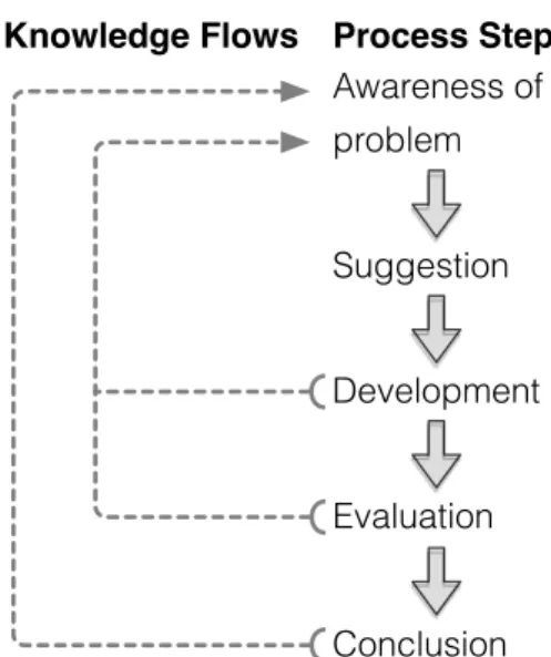
3.3 Design research
Design research methodology [33] has been used in this thesis work to. As can be seen in figure 2 design research consists of five phases. Where each phase increases the awareness of problem under study, shown by the knowledge flow arrows.
Knowledge Flows Process Steps
Awareness of problem Conclusion Development Evaluation Suggestion
Fig. 2. Design research work- and information flow
The remainder of this section describes the methods used in phases leading up to the results presented in section 4 and discussion and conclusion in sections 5 and 6.
3.3.1 Initial awareness of problem & suggestion
To gain information about the problem under study three steps were taken; review of existing theory and research articles, observation of the setting where the support system would be deployed and interviews with initial metrics and visualizations. Using the information gained during these steps the first suggestion was proposed.
The following concepts from theory and research areas were identified and considered applicable and therefore studied.
• Informative workspace and information radiators
• Daily stand up meetings
• Metric tracking as a management tool
• Data graphics design
• Dashboard design
• Previous research done at RUAG
See section 2 for a more detailed description of the studied research areas.
To better understand the setting in which the system would be used both software and integration meetings were observed without any interference. If any questions arose they were asked after the meeting had finished.
Based on the theoretical framework presented in section 2.1 a set of different visualizations as well as metrics for the available time data were selected and produced. To verify which of the visualizations that were most interesting to the PUS, interview sessions were held for evaluation.
Key stakeholders were selected as interviewees and their roles can be seen in table 2. The interviews were 30-40 minutes and started with a short introduction of KnowSE and what the purpose of the thesis was. The introduction was followed by a review of all metrics and visualizations. Two or three alternative visualizations were shown for each metric. The interviewee was asked to select the visualization they thought was best with regard to its value and usefulness.
Role
Software Line Manager Verification System engineer Software Object Manager Financial controller Line manager
TABLE 2
Metric & visualization interviewees
From these interviews the first presentation draft was created and presented at a stakeholder meeting where representatives for all project objects as well as project managers and higher management were present. At the meeting, metrics as well as their visualizations were discussed. Concluding with a discussion about the introduction of the system.
3.3.2 Development & evaluation
The system was introduced on a big screen in the PUS com-mon workspace and was followed by a two week period were the system was continuously being revised and functionality being added based on feedback from users. At the end of the two week period the functionality was considered frozen and one more week followed without any changes.
During this three week period both the system itself as well as the effects of its introduction were evaluated. Feedback was gathered through discussions either with the entire team directly after a group meeting or with individual members to discuss details about how to present the data for their specific field.
Semi-structured follow-up interviews with key stakeholders were held after the three week period for a final evaluation of the system.
Role(s) Group Manager Digital Products Manager Software Line Manager Manager Software Object Manager (Shared)
Integration responsible Manager Verification System engineer Engineer Software Requirement Responsible Engineer Software Design Responsible
Software Object Manager (Shared)
Test Equipment Object Manager Engineer
TABLE 3 Interviewees
Order Topic
A Information about anonymity B Purpose of interview C Structure of interview Q1 Role in organization - Title - Work tasks - Responsibility in organization Q2 Information needs - Information sources - Decision types
Q3 Metrics, visualizations and goals of this thesis - Early warning system
- Indicator of test maturity - Increase cost awareness
Q4 Usefulness as Meeting support and influencing factors - Initial attitude to system
- Usefulness as meeting support
- Placement of information radiator in common workspace
TABLE 4 Interview structure
The interviewees, see table 3, were selected to give a broad view over how the system had been used and its reception. The interviewees range from key stakeholders that had been involved from the beginning to stakeholders that first got to see the system when it was introduced in the workspace. Since the produced visualizations were focused on software and testing it was decided to select project members that mainly worked with those areas.
In interviews a separation between the interviewees due to their different information needs and roles within the organization was noted. It was therefore decided to divide them into two groups of engineers and managers. There is not always a clear distinction between the groups, in table 3 it can be seen that one role is even shared between two of the interviewees. The main difference between the groups can be explained as that the engineers provide information to the integration meeting as opposed to the managers that need information from the integration meeting. The members of the manager group can of course also provide information to the integration meeting, but in general it is the engineers. The roles of the interviewees and their groups can be seen in table 3.
The interviews followed the structure defined in table 4. For each topic in the table a few questions were prepared to ensure that the same topics where discussed in all interviews. Each topic was followed up with questions depending on what was discussed. All interviews were held by both authors, where one had the role of interviewer and the other transcriber. Interviews and ranged from 35 to 60 minutes.
Figure 3 illustrates the work flow of the study. Columns correlate to the phases described in this section. Rectangles represent development and study activities, ovals represent produced artifacts and hexagons represent feedback and eval-uation activities. All activities contribute to the problem un-derstanding which feeds back into following activities and ultimately to the conclusion which is base for answering research questions.
Presentation prototype Morning meeting
observations
Initial problem awareness Proposal
Pre-study Technical proof of concept Effort data visualizations Interviews Presentation proposal Stakeholder meeting
Development and Evaluation
Refined live presentation Refinement of presentation Project evaluation interviews Conclusion Cont. feedback Iteration Fig. 3. Workflow
4
R
ESULTIn the following subsections the artifacts developed during this study is described as well as the feedback gathered during the different phases of our study.
First subsection describes the charts developed and used in this study and the rationale and decisions to why they were chosen.
Second subsection in short describes the architecture of KnowSE and Data-Driven Documents which is the visualiza-tion framework used in this study. Finally a descripvisualiza-tion this study’s contribution to the KnowSE project.
The final subsection summarizes the feedback gathered during this the thesis work. It is divided into three phases, initial orientation, continuous follow-up and evaluation.
4.1 Charts
This section offers description and rationale for the choice of charts that were produced during the study. As well as a description of how they were composed in the presentation system.
The charts used to visualize the data were:
• Heat map
• Combined sparkline with bullet graph • Combined line chart and histogram
The presentation system consisted of a number of views, a dashboard with an overview of the three different data sets that were analyzed, code meta-data, test logs and reported compared to estimated time. For each data set a number detailed view were also created, to give the user the ability to further investigate the data.
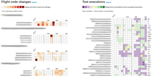
Dashboard
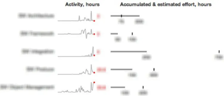
In figure 4 a screenshot of the top part of the dashboard is shown. As can be seen it is divided into three columns, Flight
code changes, Test executions and Reported & estimated hours for full project/monthly.
Heat maps are used to visualize code change and test results. The reasoning behind using them was that heat maps had previously been used successfully in post-mortem analysis and that many series of values can be shown in the same map without overlap.
Flight code changes
The heat maps for flight code changes that can be seen in the left column in figure 4 shows number of changed lines per code module. There is one heat map per directory in the flight code repository. Rows and columns in the heat map corresponds to code modules and weeks respectively. The color of the rectangles is determined by a quantization function. The input domain of the function is real values from zero to max, where max is the maximum number of changed lines in a week for any file in that directory. The range of the function is the nine value color range that can be seen in the top left below the title in figure 4.
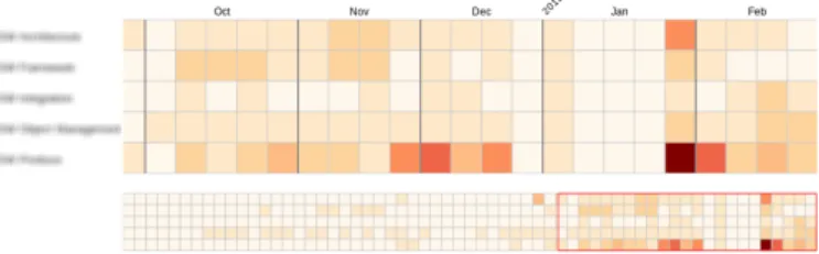
Test executions
A larger heatmap, shown in the middle column of figure 4, was used to show an overview of status of functional test runs. For this heat map a different range of color is used. Instead of using red, which could potentially cause a misleading suggestion of negative interpretation. The range shown below the title of the middle column in figure 4 is used instead. Purple, which does not have the same connotation as red, is used to show tests that had more failing than successful runs in a week.
Reported & estimated hours, full project
A combination of bullet graphs and sparklines was used to visualize time data for the full project. The bullet graphs are used in small multiples together with the sparklines, see top of left column in figure 4. Sparklines give the context over time while bullet graphs give an overview compared to estimate for the whole project. The sparklines share time scale along the x-axis for comparison of trends.
Reported & estimated hours, monthly
For monthly comparison between reported and estimated hours a combination of line chart and histograms was used. Both values are shown in the same graph to enable compari-son, see bottom part of left column in figure 4.
Detailed views
As can be seen in the black navigation bar in the top of figure 4 there are a number of links. Except for the leftmost link all lead to a detailed view for a metric. The available views are, flight code grouped by directory, flight code grouped by integration step, test code grouped by directory, daily test executions and finally reported hours. All detailed views contain the same type of visualizations as in the dashboard but with more data and details. Except for the view for daily test executions which has a different color range for the heat map.
For the daily test executions heat map, each rectangle corresponds to all of the day’s test runs. In this heat map
Fig. 4. Dashboard with code, test and time visualizations
only days with no failures are colored green, if any test failed the rectangle is colored red, see figure 5.
Fig. 5. Heatmap showing daily status of functional tests
4.2 Technology
In this section the technology and technical choices made during the thesis work is described. Starting with a description of the KnowSE architecture followed by a short description of the visualization technology used and finally a section describing the contribution to the visualization module of the KnowSE framework developed during this study.
4.2.1 KnowSE - Architecture
When this study was started the KnowSE framework was still in an early phase, however the fundamental ideas and structure were defined. A brief description of the key components in the framework can be divided into data extraction, analysis and presentation.
The data extraction is used to gather base measurements from data sources. An instrument listens to certain events and collects data when triggered. The data is saved as documents in a standardized format, e.g. JSON, to be stored in the KnowSE database to, at a later point, be able to be analyzed. The database to be used in KnowSE is CouchDB [34], which is a NoSQL database that is designed to store documents.
Before the collected data can be presented, it is analyzed and computed to a derived measure. This could be simple ag-gregates or more complex metrics using several data sources. The presenter uses the derived measures from the analyzer and presents them using visualizations to the users. The
visualizations are created using the JavaScript library D3.js (Data-Driven Documents) [35].
4.2.2 Data-Driven Documents
D3 (Data-Driven Documents) is a lightweight JavaScript li-brary that can be used to create graphics by using standard web elements such as HTML, SVG and CSS [35]. SVG (Scalable Vector Graphics) is a markup language that can describe two-dimensional graphics that can be rendered natively by most modern browsers [36]. By using D3 the graphics can be created when the page loads instead of have to generate static images in advance. Which gives more opportunities to modify the web page based on the available data. Thus, the document is driven by the data.
D3 is a very expressive language and it is easy to modify the web pages with quite few lines of code. It uses a declarative programming style meaning that it is possible to work on sets of elements. Thus, it is possible to select individual or entire groups of elements and describe how all elements in the set should be modified, no need to explicitly telling the program how to do it, e.g. writing loops changing each element.
Furthermore D3 makes it possible to dynamically update the visualizations on updates in the data. By defining enter, update and exit statements D3 will know how to handle any changes done to the data set bound to that element. D3 also supports dynamic properties by defining functions to properties instead of static values.
Finally D3 also supports animations and transitions on the visualizations, which can be used to add interactivity to let the user interact with the data.
Due to the diverse requirements from different projects and stakeholders that KnowSE might have to support, the flexibility of D3 is very useful. Since D3 only uses standard web components and it is written in JavaScript it can be extended and combined with other libraries.
4.2.3 Design and architectural choices
In this section this thesis’ contribution to the KnowSE frame-work is described. Following the architecture of KnowSE the data extraction is described first, followed by analysis and
finally presentation where the main contribution have been made.
Data extraction
As mentioned earlier extraction and analysis of meta-data from repositories and test-logs for the RUAG project under study had already been implemented. A part of the study was to complement the already existing data with informa-tion about project time estimainforma-tion and actual outcome. An instrument was developed to gather data from two of RUAG’s systems and store the data as JSON documents. Since this data was not updated frequently, data gathering was scheduled nightly.
Analysis
It was decided to keep the analysis simple, so the visualiza-tions presented the source data and instead let the users make the analysis and interpretations.
For that reason the analysis only consisted of grouping data and aggregating values. With D3’s declarative programming style and powerful features for working with datasets it was decided to do the analysis with D3.
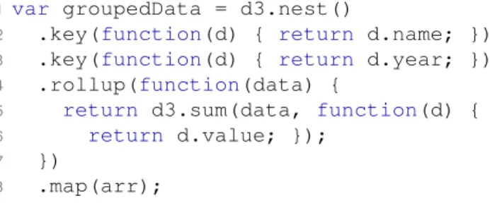
For example, with the data defined in figure 6, an array of objects, and it should be grouped by name, year and summarize the values.
var arr = [
{name:"A", year:2011, value:1}, {name:"A", year:2011, value:2}, {name:"B", year:2012, value:3}, {name:"B", year:2012, value:4}, {name:"A", year:2012, value:5} ];
Fig. 6. Example data
The D3 code in figure 7 could be used to achieve this. On line 2 it is described what to group on, i.e. the name of the object.
On line 3 it is described to also group on year.
On line 4 it is described what to do with the data in each group. This function will be called three times, two times for A since it has data for both 2011 and 2012 and only once for B since it only has data for 2012. The input for the function will be an array of objects containing of the values for that name and year.
On line 5 another D3 function is used to summarize the data in the array, the second argument to d3.sum() is an accessor that tells what data to get from each object in the array, i.e. the value.
On the last line 8arr is given as input to d3.nest() and tells it to map the result to an object which will be assigned to the variable on line 1.
1var groupedData = d3.nest()
2 .key(function(d) { return d.name; })
3 .key(function(d) { return d.year; })
4 .rollup(function(data) {
5 return d3.sum(data, function(d) {
6 return d.value; });
7 })
8 .map(arr);
Fig. 7. Example of analysis
The variable groupedData in figure 7 would be assigned the object found in figure 8. As can be seen, the name of the objects from the array arr is used as properties, which was what was stated in in figure 7 on line 2. Each name is assigned an object with the years as properties and the values have been summarized for each year.
{
A: { 2011:3, 2012:5}, B: { 2012:7}
}
Fig. 8. Result from analysis
This is of course a simple example but proves the point, only a single D3 statement was needed to group the data into the desired format.
Presenter
The main contribution of this thesis to KnowSE is with a framework of configurable visualization components called
knowse.js. The visualization have been selected considering the data to be visualized as well as theory from data visual-ization and in collaboration with RUAG and the researchers working on KnowSE.
The following base graphics have been added to the frame-work:
• Sparkline • Bullet graph
• Line chart / Histogram
• Heat map
Compositions of the base graphics was also created to provide more complex visualizations which can be created with a single function call.
• Sparkline with bullet graph
• Multiple heat maps
Each visualization is configurable through an options object with a set of properties. Some properties are the same for all objects, e.g.divId, but most are specific for the visualization. An example of a options object for aLine chart / Histogram
var options = { width: 450, height: 150, divId: "#line",
startDate: new Date(2011,0,1), endDate: new Date(2012,0,1), series: seriesData
}
Fig. 9. Example of options object
Most properties should be self-explanatory, but this object would create a chart with the width 450px and height 150px on the div with the id “line”. The chart would display the data between 2011-01-01 to 2012-01-01 and would use the data defined in the object seriesData. This object contains values mapped to dates to be used as data for the visualization.
However it is not always this straightforward how the data for the visualization needs to be formatted. In the heat map the data that should be visualized might have different formats and the metric to be used might be complex. To solve this the dynamic features of JavaScript and D3 was used by passing functions within the options object. They can either be used as accessors and only point to what data that the visualization should use or make more complex calculations. In figure 11 is an example of a function used to calculate the value and tooltip for each cell in a heat map.
function (dataArray) {
var cellInfo = {};
cellInfo.value = d3.sum(dataArray,
function(d) { return d.value; });
cellInfo.tooltip = "Example tooltip, "
+ "items: " + dataArray.length + ", value: " + cellInfo.value;
return cellInfo;
}
Fig. 10. Example of function for dynamic configuration
This function would be called for each cell in the heat map that has values assigned to it. The function gets an array of all data bound to that cell and uses it to calculate a value and a tooltip to be shown when hovering with the mouse.
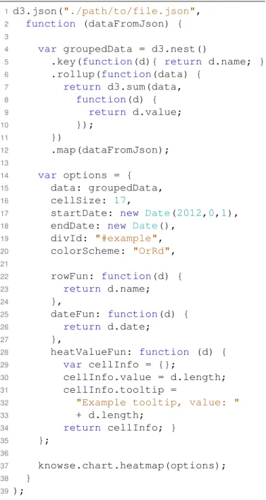
In figure 11 a complete example of how to create a visual-ization usingknowse.js can be seen.
On line 1 a file from the data instrument is loaded using d3.json().
On line 4-12 the data from the file gets analyzed and grouped into the desired format.
On line 14 the options object is defined.
On line 15-20 properties for the visualization is set.
On line 22-34 functions for rows, date and cells are defined. And finally on line 37 the heat map is created using the
knowse.js framework.
1d3.json("./path/to/file.json",
2 function (dataFromJson) {
3
4 var groupedData = d3.nest()
5 .key(function(d){ return d.name; })
6 .rollup(function(data) {
7 return d3.sum(data, 8 function(d) { 9 return d.value; 10 }); 11 }) 12 .map(dataFromJson); 13 14 var options = { 15 data: groupedData, 16 cellSize: 17,
17 startDate: new Date(2012,0,1),
18 endDate: new Date(),
19 divId: "#example", 20 colorScheme: "OrRd", 21 22 rowFun: function(d) { 23 return d.name; 24 }, 25 dateFun: function(d) { 26 return d.date; 27 }, 28 heatValueFun: function (d) { 29 var cellInfo = {}; 30 cellInfo.value = d.length; 31 cellInfo.tooltip =
32 "Example tooltip, value: "
33 + d.length; 34 return cellInfo; } 35 }; 36 37 knowse.chart.heatmap(options); 38 } 39);
Fig. 11. Complete example
4.3 Data collection
Data collection was done in three stages: initial orientation, continuous follow up, and final evaluation. The methods used in each step are described in section 3.3.
4.3.1 Initial orientation
In this section the information gathered in the initial stage that lead up to the first presentation suggestion is presented. A listing of the studied research areas are given followed by observations from daily meetings. Next, feedback gath-ered during review of the initial visualizations and metrics is summarized. Finally, the presentation suggestion and the feedback gathered from the final stakeholder meeting before introduction of the system is presented.
Studied research areas
Existing literature and research articles was studied as well as previous research done at RUAG to get insight in RUAG’s development methodologies. Some of the research areas that were identified as applicable and studied were agile concepts such as informative workspace, information radiators and daily meetings. From data and information visualization, principles for creating effective visualizations was studied as well as theory for creating dashboards to present the visualizations. More details about the studied research areas are described in section 2.
Observation of daily meetings
Every morning short meetings for each object within the project as well as integration meetings are held. Both software and integration meetings were observed to better understand the setting in which the system would be used.
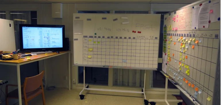
All daily meetings take place in the common workspace for the project under study (PUS) where participants gather around task boards. The task board for each object shows a table with one column for each day in the upcoming two weeks and one row for each object member. The task board used for the integration meeting has rows for each object instead of object members. For all boards, colored post-it notes are used to display what is being worked on and when it is expected to be finished. The color of the note indicates if it is a normal work item, a dead-line for a feature being worked on or a problem that they has been found. Some of the task boards also have printed papers showing status, e.g. list of project modules, list of tickets and time allocation. The focus of the boards is to show current tasks and upcoming deadlines.
The integration meetings roughly follow the pattern of daily stand up meetings seen in e.g. Scrum. The meeting is facilitated by an integration leader and meeting participants take turn answering ”the three questions”: what they have been working on, what they plan to do today and if they see any impediments for moving forward. When impediments are brought up they are discussed in short and if needed the task board is updated. If discussions that only involve some of the meeting participants start to drag on, the discussion is continued by involved parties outside of the meeting. There is always a clock set at the bottom of the integration task board to keep track of time. Meetings always start on time and laggards will have to join midway.
Software object meetings are similar to the integration meeting in most ways. The software leader use the software task board for planning in-between meetings and the object members continuously update their status. The software object only comprise three developers. Due to the object’s small size the software meetings are even shorter than the integration meetings.
Key observations:
• There is a clear focus on keeping meetings short and efficient.
• There is a high level of interaction with the boards.
• Boards are used for planning and orientation in-between meetings.
Evaluation of time visualizations and metrics
Interview sessions were held to evaluate visualizations of time allocation metrics. Two or three alternative visualizations were shown for each metric. More details and selected inter-viewees can be seen in section 3.3.1.
The first set of visualizations that was displayed were bullet graphs showing accumulated time for software work packages compared to their estimates. The bullet graphs were well received in general. Participants found it easy to compare estimated to actual reported time. When having to choose between visualizations with individual and common scale for packages. participants preferred the common, saying that it was easier to decode.
The interviewees were also shown the same bullet graphs, but with the addition of a sparkline next to it displaying the time allocation for each work package over time. Two persons were positive to the addition. One of them saying that this is interesting information that is presently not being looked at. The other saying that it could be useful to relate your current perception of patterns of time allocation. He also hypothesized that there could be some value in detecting common patterns e.g. spikes for work packages. Others were more skeptical to its value but said that it couldn’t hurt since it does not take up more space and does contribute with more data. The number showing the last weeks reported time was appreciated by all since it gave a sense of the current trend. See figure 12 for an example of a bullet graph combined with a sparkline.
Fig. 12. Bullet graph, common scale, absolute values with sparkline
There was a general consensus that this type of visualization could be valuable but that some modifications or config-urability was needed. One manager, with a broad interest in the project, wished for a more zoomed out view where time allocation was shown for each object instead of work package. Another, software manager, thought that the work package level was too crude. She stated that she produced more detailed reports for her own use. A verification manager was understandably not as interested in the software packages as he would have been in the testing.
Several of the interviewees brought up the concept of earned value, highlighting that the interpretation of the relation of the reported time to the estimated did not necessarily, at all, represent how much of the work had been finished. One commented that the printed ticket status sheet on the software board would be a good complement to the visualizations in this regard.
Which time period to show was brought up in several of the sessions. One participant raised the issue of one category dominating the common scale making the other more difficult to see. Two participants suggested that the time period should be three months since they do quarterly revisions of the time estimates.
The next set of visualizations shown in the interviews was one line chart and one set of bullet graphs showing reported compared to estimated time for all software work packages combined for each month. All interviewees preferred the line chart. One participant commented that you would be able to see how you relate to the estimate earlier compared to current practice where he only looks at it at the quarterly review and that you might be able to act earlier if it was looked at more often.
The next set shown was one line chart and one heat map. Both graphs showed reported time per work package over the span of the whole project. The general consensus was that it might be better suited for post project analysis. One interviewee commented that the heat map was very focused on showing high level of activity and that periods of no activity could be just as important. See figure 13 for an example of a heat map.
Fig. 13. Heat map showing reported time
When shown different ways of visualizing last week’s re-ported hours all agreed that it was best to use red highlighting in the bullet graph and the printed number of hours next to it. A majority thought that one week might be too short time period, they preferred a month instead.
Two more complex visualizations, one sunburst chart and one treemap, were shown at the end in each interview. These graphs were attempts at visualizing as many of the previous metrics as possible in one graphic. While entertained by the creativity, none of the interviewees thought that these were a better alternative than a compilation of the previously shown visualizations since these were much harder to interpret.
Based on feedback from the interview sessions, the visu-alizations that got the best response were collated into a first presentation suggestion. It was decided to use the bullet graphs combined with a sparkline to display accumulated time for work packages compared to their estimate as well as adding the accumulated hours for the last 30 days. All interviewees preferred the line chart over the bullet graphs to compare monthly estimated and actual reported hours and was therefore also picked. Some modifications were made to the line chart to make a clearer distinction between the actual and estimated values by displaying the estimations using a histogram instead.
Presentation of initial suggestion at stakeholder meeting
A stakeholder meeting, with representatives for all project objects as well as project managers and higher management attending, was held. The presentation suggestion was presented and chosen metrics, as well as their visualizations were discussed.
In addition to the time visualizations described in the previous subsection, visualizations of code and test metrics were shown. The code metric was visualized using a heat map and was grouped by integration step with markers for milestone dates. The test metric was also visualized with an heat map and displayed failed test runs with a red color scale. The meeting participants quickly related the visualizations to their own perception and recognized anomalies, e.g. code changes after milestones, with events in the project. The noted anomalies prompted questions about how and why those events occurred. An indicator to that the chosen visualizations were interesting and created discussions.
It was argued that it is important that the visualizations for test data encourages the test members to run even more tests. To promote a desire to show that the tests are working instead of that the visualization is only used to point out all the faulty tests that is remaining. Because of this a new color scale was requested for the test visualization.
Based on the feedback from the stakeholder meeting a second version was developed and for the first time deployed in the PUS common workspace.
4.3.2 Continuous
In this section a brief description of the introduction of the system is given. Feedback for each visualization type as well as the changes implemented are summarized.
The information radiator was presented after one of the morning integration meetings. It was placed in their common workspace and the visualizations were displayed on a big screen seen in figure 14. The system consisted of a dashboard with code, test and time visualizations as well as detailed views for each metric. All metrics and their visualizations were presented and discussed with the group.
During a two week period the system was continuously revised and functionality was added based on feedback from users. Both the system itself as well as the effects of its introduction were evaluated. At the end of the two week eval-uation a final update based on breakdown of the accumulated feedback was done. The functionality after this point declared to be frozen and one week without any changes followed.
Feedback was gathered through discussions either with the entire team directly after a group meeting or with individual members to discuss details about how to present the data for their specific field. The following paragraphs summarizes the feedback received and implemented during these two weeks.
General feedback
In the introduction meeting one of the first points that was raised was that detailed descriptions about how to interpret the visualizations and what data it uses must be easily found. This was quickly added with a section for each visualization describing its metric, data source, and latest extraction date.
Fig. 14. Presentation placement in project workspace
Feedback on code visualizations
The heat maps initially displayed one row per file, this was too much details and could be grouped to modules (each module contains a few files). Also the metric initially used for the heat maps was number of commits per file, this was instead changed to number of lines changed per file. Since developers have different styles when committing to the repository, some make many small commits and others prefer to commit fewer times with larger changes.
There were also discussions about how to group the data, the first attempt was to group by integration steps. But it was discovered early that the data source used to map modules to integration steps was not designed for this purpose. Modules could be used for several integration steps and could therefore be moved between integration steps depending on what was being implemented right now. It was decided to instead map modules to repository directories, which still somewhat grouped the modules to different stages of the development and in a structure that the developers are used to.
Feedback on test visualizations
One of the first requested features was to add information about how many times each test case had been executed. This was added to the visualizations by adding a row on the right side of the heat map were statistics for each row can be shown. For the overview visualization, the number of tests executed was added and for the detailed view the number of successful days and test executions since last failure was displayed.
The metric used for the test visualization was subject to discussion a number of times since it could be interpreted in different ways. The cells in the heat map was colored on a scale of nine different colors ranging from purple to green depending on if the test had more failed or passed test runs. E.g. if a cell is colored green it means that that the test have
had more passed runs than failed, but it does not necessarily mean that the test is stable since it could still have failed test runs. A more detailed view was therefore requested where test runs were grouped by test case and day and if a single test had failed the cell would be colored red otherwise green.
Another discussion about the metric for the test visualization was which data to use, all test runs or only nightly runs. If all test runs are used the visualization gives an indicator over what is being worked on and the general status for each test case. If only the nightly runs are used, no debug runs are included and the visualization instead displays stability for test cases that are included in the nightly runs. Work at RUAG was started to divide the nightly test runs logs into a separate directory but was not finished in time to be introduced during this thesis’ evaluation period.
Feedback on time visualizations
The time visualization showing monthly outcome compared to estimated time initially showed all objects summarized for the entire project. The group found this hard to interpret and wanted to divide it into smaller separate graphs for each object. They also wanted to see only adjacent months instead of the entire project, which was a couple of years from start to end. When these changes were introduced they asked for the possibility to on demand see even more information about the time allocation. They wanted to be able see the estimation forecast for each object with the timespan of the entire project again. The detailed view was then extended with graphs for the entire project for each object and also which work package within each object that time was reported on with outcome compared to estimate for the entire project.
4.3.3 Evaluation
In this section the feedback gathered during the final evaluation of the system is described. The section is divided into the
![Fig. 1. Bullet graph in small multiples taken from call- call-center dashboard [25]](https://thumb-us.123doks.com/thumbv2/123dok_us/1694563.2734580/7.892.64.439.856.1074/fig-bullet-graph-small-multiples-taken-center-dashboard.webp)