RAKOW, MATTHEW A. Quilted Graphs. (Under the direction of Dr. Benjamin Watson).
requirements for the Degree of Master of Science
Computer Science
Raleigh, North Carolina 2010
APPROVED BY:
Dr. Christopher Healey Dr. Matthias Stallmann
DEDICATION
ACKNOWLEDGMENTS
I’d like to thank my advisor Dr. Ben Watson, who first introduced me to the idea of quilted graphs. I’d also like to thank Dr. Matt Stallmann and Dr. Chris Healey for serving on my committee.
LIST OF FIGURES . . . vii
1 Introduction . . . 1
1.1 Layered Graphs . . . 2
2 Related Work . . . 3
2.1 Node-Link Diagrams . . . 3
2.2 Matrix Depictions . . . 4
2.2.1 Sorted Matrices . . . 4
2.2.2 Centered & Sorted Matrices . . . 4
3 Quilted Graphs . . . 8
3.1 Quilt Structure . . . 8
3.1.1 Layers . . . 9
3.1.2 Nodes . . . 9
3.1.3 Links . . . 10
3.2 Discussion . . . 11
3.3 Comparison . . . 12
3.3.1 Traditional Node-Link Depiction . . . 12
3.3.2 Matrix Depiction . . . 13
3.4 Summarization . . . 13
3.4.1 Simple Summarization . . . 14
3.4.2 Dimensional Summarization . . . 15
4 Prototype . . . 18
4.1 Processing Prototype . . . 18
4.1.1 Graph Structure and Layout . . . 18
4.1.2 Interactivity . . . 19
4.1.3 Skip Link Depictions . . . 22
4.2 Java Prototype . . . 22
4.2.1 Code Structure . . . 23
4.2.2 Differences in Functionality . . . 26
4.3 Perl Scripts . . . 26
4.3.1 graph maker.pl . . . 26
4.3.2 calc num paths.pl . . . 26
5 Applications . . . 32
5.1 SAS’s ABM Data . . . 32
5.2 OLAP Data . . . 34
5.3 Genealogy Diagrams . . . 35
6 Conclusion . . . 39
6.1 Outstanding Issues . . . 39
6.2 Future Work . . . 40
Figure 1.1 Two applications of layered graphs . . . 1
Figure 2.1 An example of traditional depictions of layered graphs . . . 6
Figure 2.2 The scalability problem in traditional depictions . . . 6
Figure 2.3 A sorted matrix depiction . . . 7
Figure 2.4 A centered & sorted matrix depiciton . . . 7
Figure 3.1 A simple quilted graph . . . 8
Figure 3.2 Comparison of scalability in traditional and quilted depictions . . . 12
Figure 3.3 The effect of simple summarization on quilted graphs . . . 15
Figure 3.4 The effect of dimensional summarization on quilted graphs . . . 16
Figure 4.1 Layer assignment in the Processing prototype . . . 20
Figure 4.2 Interactive behavior in the Processing prototype . . . 21
Figure 4.3 Alternative skip link depictions in the Processing prototype . . . 28
Figure 4.4 Class diagram for the Java prototype . . . 29
Figure 4.5 Comparison of the Java and Processing prototypes . . . 30
Figure 4.6 Comparison of interactive behavior in the Java and Processing prototypes . 31 Figure 5.1 Quilted graphs applied to SAS’s ABM data . . . 33
Figure 5.2 Henry VII’s family tree . . . 36
Figure 5.3 Henry VII’s family tree, diagonalized . . . 37
Chapter 1
Introduction
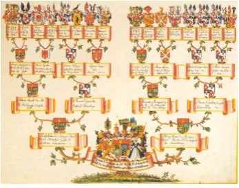
Layered graphs arise from many applications, including flow charts, process dia-grams, and family trees. They may be applied to map out evolutionary progression through the eras, trace linguistic change through history, migration patterns across landmasses, or even keep track of a sports bracket. Figure 1.1 shows two applications of layered graphs. Another source of readily available layered graphs used throughout this research was the Rome graph library [1] , which includes several applied layered graphs.
(a) SAS’s ABM Data (b) A family tree [2]
Figure 1.1: Two applications of layered graphs
matrix-Layers are considered to be ordered sequentially. We refer to layers as beinghigher
or lower than one another, due to the way they are traditionally depicted. Higher layers usually appear at the top or start of the graph, and the lower layers appear at the bottom or end of the graph.
Though layered graphs are not necessarily directed, most applications tend to lend an implied directionality to the links. In order to refer to different types of links easily, we have established terms to describe them. Links from a source node in a higher layer to a destination node in a lower layer are calleddownward links, and those from a source node in a lower layer to a destination node in a higher layer areupward links. Links between nodes in the same layer are calledintra-layer links. Downward links between adjacent layers are referred to as proper links. All links that are not proper links are referred to as skip links. When traversing directed links, going from source to destination node is called theforward
direction, and from destination to source node is thebackward direction.
Chapter 2
Related Work
2.1
Node-Link Diagrams
We refer to the best known and most common depiction of layered graphs as the traditional node-link depiction. This depiction is actually based on work by Sugiyama [5], Warfield [6], and Carpano [7]. Many applications already exist for viewing layered graph data in this format such as Gansner and North’s libraries [8]. The appearance of these depictions is similar to those used for unlayered graphs. All nodes within the same layer are positioned in the same vertical position, forming a horizontal line. The layers are then stacked one above another in order [9]. An example of this style of depiction can be found in figure 2.1.
Mapping of the nodes to layers is often predetermined by the application, but in cases where they are arbitrarily assigned there are several algorithms for placing them [10], [11], [12]. These algorithms attempt to optimize the layout based on some heuristic, such as minimizing the number of layers, maintaining a maximum graph width while minimizing layers, or reducing the number of skip links required.
There are other methods of depicting layered graphs which attempt to achieve better scalability than node-link diagrams. One of these is the matrix depiction. Matrix depictions have already been used extensively for unlayered graphs ([14], [15]) as a response to the scalability problem, but they have not been adapted to layered graphs until recently [4]. In addition to quilted graphs our previous work introduces sorted matrices and centered & sorted matrices as alternatives.
2.2.1 Sorted Matrices
Matrix depictions for unlayered graphs function based on the consideration of each ordered pair of nodes as a binary function: each pairing may either be linked or unlinked. To show this function, a two-dimensional matrix is drawn with each node represented in both the rows and the columns. Each row represents that node as a source node, while the columns represent them as destination nodes. To designate that two nodes are linked, the cell at the intersection of the source node’s row and the destination node’s column is marked in some way [14].
To adapt this depiction for layered graphs, the nodes are first sorted into layers. This groups the nodes residing in the same layer, so they are adjacent to one another. To further emphasize which layer these nodes belong to, other visual cues are given such as coloration, or placing negative space between each layer as shown in figure 2.3. These visual cues are similar to those used in the headers of our quilted graph application to OLAP data, discussed in section 5.2.
2.2.2 Centered & Sorted Matrices
destination nodes, centered matrices place one instance of each node along the diagonal. As before, to indicate connection between two nodes, the row of the source node is intersected with the column of the destination node and marked. When nodes are given an ordering and arranged in that order, a centered depiction makes it easy to see if a link is going down or up in that ordering. Downward links will be above the diagonal and upward links below it.
Figure 2.1: An example of traditional depictions of layered graphs
Figure 2.3: A sorted matrix depiction
Chapter 3
Quilted Graphs
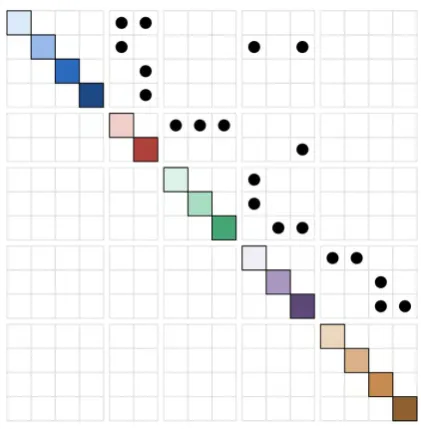
As an alternative depiction of layered graphs, we have developed quilted graphs. These are more scalable than existing depictions, remaining more legible as graphs become larger and more complex. The quilted graph structure is described below and depicted in figure 3.1, along with a discussion and comparison to existing depictions.
Figure 3.1: A simple quilted graph
3.1
Quilt Structure
Quilted graphs instead switch from positional encoding to alternative means of encoding for skip links only.
3.1.1 Layers
Similar to matrix depictions, each layer is made up of one or more nodes, arranged linearly. However, in quilted graphs each layer is only drawn once, rather than twice (in the matrix depiction, layers appear once in the horizontal direction, once in the vertical direction). The layers in a quilted graph are drawn in alternating directions, switching between horizontal and vertical orientation for each consecutive layer. Since positional encoding is only used for proper links in quilted graphs, we only actually need a link matrix between adjacent layers. These matrices are drawn between the adjacent layers, which are perpendicular due to the alternating directionality. This results in a zig-zagging appearance overall.
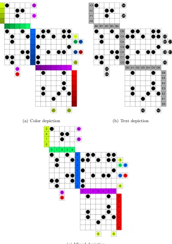
The layers must be marked in some manner which identifies them uniquely from other layers. One option we have explored is mapping colors to the layers. More specifically, selecting a particular hue and saturation for each layer. The number of layers available when differentiated by hue and saturation are limited by human inability to discern differences between very similar colors [17], [18]. Alternatively, a letter could be mapped to each layer (displayed as a text label). The importance of easily identifiable layers is discussed later in the section on skip links.
3.1.2 Nodes
levels is finite due to human inability to detect small differences in brightness [19], [18]. Again, this ensures that each node appears unique from every other node. We refer to the combination of layers mapped to hue and saturation with nodes distinguished by brightness as the color depiction of quilted graphs.
A third alternative is to use color to distinguish the layers as in the color depiction, but identify nodes by number as in the text depiction. Doing this frees brightness to be used as another dimension in further distinguishing layers from one another. We refer to this combination of colorful layers and numbered nodes as the mixed depiction of quilted graphs.
3.1.3 Links
As mentioned above, proper links are positionally encoded in quilted graphs. They are drawn as black circles in the position corresponding to the source and destination nodes they connect. To find the source node for a proper link in a quilted graph, the user traces directly to the left if the source layer is vertical, or directly upwards if the source layer is horizontal. To find the link’s destination node, the user traces directly to the right if the destination layer is vertical, or directly downwards if the destination layer is horizontal.
3.2
Discussion
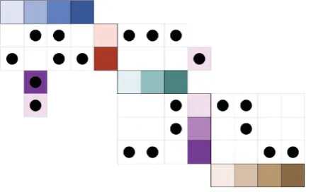
Several issues do arise when using quilted graphs. Even though the non-positional encoding of skip links gives some benefits to quilted graphs, they also have some drawbacks. For one, they are more difficult to traverse in the backwards direction. Since the position of a skip link is based on its source node, there is no immediate way of knowing if a particular node is a destination node for a skip link. Instead, the user must examine all skip links in the graph to see if they correspond with the node in question. We refer to this issue as directionally biased skip links. This problem is mitigated somewhat by the interactive path tracing feature of our prototype, discussed in section 4.1.2. However, this solution is not available in print or other non-interactive mediums.
3.3.1 Traditional Node-Link Depiction
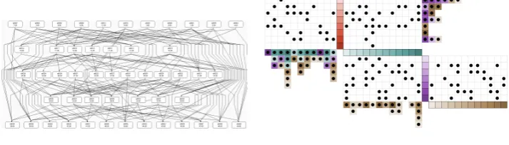
Traditional node-link depictions suffer most from scalability issues related to links. The greatest impediment to link legibility in this depiction is link crossing. Although algorithms exist to minimize the number of crossings in these depictions [6], eliminating them completely is not always possible. Additionally, solving the crossing minimization problem is NP-complete [13] and the computation cost for doing so is significant on large graphs. Dense clusters of line crossings are difficult to interpret, making it difficult to decide which nodes are connected by a link.
By comparison, links in quilted graphs will never occupy the same space or cross, and so increasing the number of links does not make it more difficult to determine the source and destination nodes. Additionally, crossing minimization is not necessary to im-prove legibility, offering a performance increase in software prototypes. Figure 3.2 shows a comparison of a traditional depiction and a quilted graph of the same data.
(a) Traditional depiction (b) Quilted graph depiction
3.3.2 Matrix Depiction
Quilted graphs have some of the same legibility benefits as matrix depictions due to the positional encoding of proper links. Where quilted graphs gain an edge over matrix depictions is by being more compact. Matrix depictions place each node along both the vertical and horizontal axis, resulting in a graph spanning an area of approximately size n2, wherenis the number of nodes. Since matrix depictions use positional encoding for all links, the entire area spanned by the graph could contain links and is meaningful.
Quilted depictions place each node along only one axis, either vertical or horizontal. Discounting additional space needed for skip links, this results in a graph spanning an area of approximately size n42. This varies based on the number of layers and the way that nodes are distributed between them. Also, the number and distribution of skip links will affect the proportions and area of the graph, though the rectangular area spanned by the graph will not change unless they extend beyond the final layers. In contrast to the matrix depictions, there will be area that is spanned by the quilted graph depiction that is not meaningful or being used. This area is comprised of two roughly triangular regions outside of the proper link matrices and skip links. Although the rectangular area spanned by the graph is not reduced by these two regions, they do present space that may be reclaimed for other purposes (such as a description of the graph, other figures, etc.).
The more compact nature of quilted graphs gives them a slight edge in scalability over matrix depictions, as they may be drawn in greater detail or resolution using the same amount of space. More detail and resolution makes them more legible, especially with large graphs with small nodes and links.
Matrix depictions have an advantage over quilted graphs with regard to the ease of following skip links. Matrix depictions’ positionally encoded skip links eliminate the chance of users mistaking what color the skip link is indicating. Additionally, they allow the user to directly follow the skip link in both directions, whereas quilted graphs’ directionally biased skip links do not.
3.4
Summarization
a common solution for graph summarization [20], [21], [22]. By trading fine grained detail for a big-picture look at the data we reduce the problem set to a comprehensible size.
Summarization is not only used for the purpose of meeting size constraints. Sum-marization may provide a different and useful perspective of the data. It can do this through classification and generalization of data when summarized along a data dimension.
3.4.1 Simple Summarization
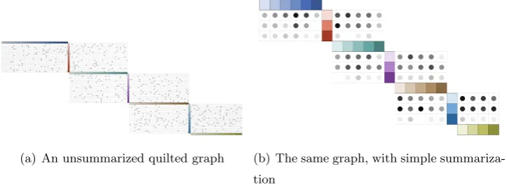
In general, summarization is most useful when groupings are meaningful. When this is not possible, some sort of summarization may still be required to reduce the area needed for the graph. In this case, simple summarization provides a fallback method for condensing data.
Simple summarization groups nodes until the graph fits in the available area, but no more than is necessary to maintain legibility. To do this, the number of nodes that must be grouped is calculated based on a minimum allowable node size (such as its size in pixels), the size of the media, and the dimensions of the graph. Once the group size has been calculated, that number of adjacent nodes in each layer are grouped, with the final group in each layer containing the remaining number of nodes. This final group may be smaller than the predetermined group size; if the number of nodes in the layer is not evenly divisible by the group size it will be of sizen mod swherenis the number of nodes in the layer ands is the group size.
Once node groups have been designated, they are displayed in the same manner as nodes in an unsummarized graph. All that remains is to depict the links. Proper links are still drawn as circles and placed in the row and column corresponding to the groups which contain their source and destination nodes. These circles are drawn for every node group pair joined by at least one proper link in the graph.
To indicate how strongly a group pair is linked, we vary the brightness of the linking circle to represent how many links were grouped. For a group size ofs, a maximum of s2 links may be grouped. The brightness of the summarized link is then set to 1− l
wherel is the number of grouped links.
(a) An unsummarized quilted graph (b) The same graph, with simple summariza-tion
Figure 3.3: The effect of simple summarization on quilted graphs
3.4.2 Dimensional Summarization
A more useful manner to summarize graphs is by grouping them along some di-mension of the data represented. We call this didi-mensional summarization. Didi-mensional summarization can be described as classification of the nodes that are being grouped. This might involve categorizing nodes within a dimension and grouping them. Nodes may also be divided into intervals, in cases where dimensions are continuous and do not have dis-crete values. In addition to intelligent grouping, the graph may be summarized further by eliminating irrelevant groupings. Selection of a particular group allows for a more focused view of the graph, and increases the area available to display that group.
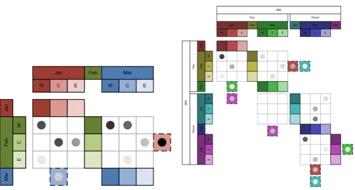
One application where dimensional summarization can be found is in OLAP data, which will be discussed in section 5.2. The current implementations of pivot tables are based on summarizing the data along their many dimensions, and then allowing the user to elaborate specific dimensions of interest. The appearance of this summarization is shown in figure 3.4.
(a) A quilted graph with summarized OLAP data
(b) The same graph, with expansion on the company and product dimensions
Figure 3.4: The effect of dimensional summarization on quilted graphs
an unsummarized form. Value can be offered to the user by allowing them to dynamically expand and summarize nodes based on dimensions of their choosing. The appearance of the summarization is the same as in basic summarization, though the clustering is done deliberately by combining nodes along the summarized dimensions. The multidimension-ality of the OLAP data also implies that it may be expanded in various ways, resulting in different summarization graphs. In figure 3.4(b) the user has elected to expand the graph along both the company and product dimensions. It is also important to note that the order of the expansion is significant as it changes the resultant graph depiction, as will be described in section 5.2. In this figure the user has placed these two expansions before the pre-existing expansions. Furthermore, the user has selected IBM as the company to focus on, eliminating other companies from the view.
of visually separating nodes within a layer to expand on an additional dimension. For ex-ample, we might want to add price as a dimension within each layer. We could then break the region nodes in the current image into one node for each region/price combination. We then visually separate the region groups from each other with a thicker or darker line than is used to separate nodes in the same region.
Chapter 4
Prototype
4.1
Processing Prototype
Processing is a Java-based design programming framework and development en-vironment which is free and open-source [23]. It allows for quick and easy graphical pro-totyping and the ability to export to applets easily. This framework was used in our first prototype to draw quilted graphs.
The Processing prototype provides some additional functionality beyond the core concept of quilted graphs. This functionality affects the layout and structure of the graph, the way a user may interact with the graph, and how skip links are depicted.
4.1.1 Graph Structure and Layout
The Processing prototype assumes a graph has already been created and written to a file following one of two specific formats. The first format consists of a file with a list of nodes and associated attributes, and a list of links with their associated weights. Node attributes might include information such as a name for the node, and a numeric value associated with the node. Link weights are a numeric value. Of particular interest is the fact that the format does not specify any information about layers, or which nodes are in the same layer. This is the format that SAS ABM data was provided in, discussed later in the chapter on Applications.
unique identifier, such as names, values, or weights. Second is that each node is explicitly assigned to a layer, also with a unique identifier. These graphs were generated randomly, which is explained in more detail in the Perl Script section below.
Since the layers are not explicitly assigned in the first format, the prototype must algorithmically determine which layer each node should be placed in, how to order the layers, and how to order the nodes within each layer. The best algorithm may vary from application to application. For example, in genealogy diagrams it is common to group people that lived at the same time into the same layer. For the purposes of this prototype, we implemented a push-up algorithm. This algorithm first places source nodes (those with no incoming links) in the first layer. Then the other nodes are placed based on their minimum distance to a source node. Nodes which are adjacent to a source node are placed in the adjacent layer, nodes which are two links away from a source node are placed two layers from the source layer, and so on.
In the event that the layers are explicitly assigned, the graph structure is prede-termined. Layers are ordered in the same way they are ordered in the file, and nodes are added to their layers in the same order as they appear in the file. This format is most useful when layers have already been mapped to a dimension that can be derived from the node itself, and the layers do not need to be algorithmically determined. The sports bracket application, described in more detail in the chapter on Applications, is a good example of this. Figure 4.1 shows a comparison of the two layout methods acting on the same set of nodes and links.
4.1.2 Interactivity
(a) Dynamically assigned layers (b) Predefined layers
Figure 4.1: Layer assignment in the Processing prototype
Pop-up Tooltips
In traditional node-link depictions, the manner in which the nodes are depicted is rather flexible. They may be enlarged or reshaped to allow extra data to be shown within their boundaries. Quilted graphs must have uniformly sized and shaped nodes, in order to fit them into a grid. Increasing the size of the nodes to display other data within their bounds subsequently increases the size of all other items in the grid, meaning that the graph size grows at a rapid rate. To keep the graph concise, pop-up tooltips allow the user to find out more about particular nodes without having the data displayed permanently. Additionally, they can be used to show information about links, which is not as easy to implement in the traditional node-link depiction.
Figure 4.2: Interactive behavior in the Processing prototype
nodes and links.
Figure 4.2 shows the appearance of pop-up tooltips when the first node in the second layer is moused over.
Connection Highlighting
Connectivity is a key element in node-link graphs. Connection highlighting makes a graph’s connections more apparent by quickly showing every element that a selected element is connected to. To highlight all connected elements, the user clicks on their target element, and all connected links and nodes are highlighted. Lines are then drawn from links to the nodes they connect, except in the case of skip links which only draw lines to their source node. This exception is to prevent trace lines from traveling across other data and potentially obscuring it.
and the nodes they are associated with. These are the depictions associated with color, text, and mixed depictions as described earlier. The method used to render the quilt may be selected by setting a flag in the code. Figure 4.3 shows a comparison of these three different skip link depictions.
4.2
Java Prototype
As research progressed more ideas for new features, applications, interactive be-havior, and other modifications arose. It became apparent that Processing and the existing prototype would not be flexible enough to accommodate these changes, so a new prototype was written in Java without the use of the Processing package. The goal of the rewrite was to procure a prototype that would be capable of easy modification and adaptable to new applications. To do this, the rewrite implemented the prototype in an object-oriented manner.
The Processing prototype’s inflexibility stems from the structure of the code. All of the code is located in a single monolithic file, with many classes sharing global variables and global methods. Modification has often unpredictable effects since there is so much shared information. Since nearly all instance variables are public, there are many cases where external objects are acting upon them. Decoupling classes was one goal of the rewrite.
it is hardcoded into the methods for handling mouse events, and is spread across many methods and classes. Easily modifiable behavior was a third goal of the rewrite.
4.2.1 Code Structure
The Java implementation is made up of 12 classes. The classes making up the logical structure of the graph are Graph, Layer, Node, and Link. The graphical portion consists of the classes QuiltFrame, JNode, JLink, and JSkipLink. Interactive behavior is controlled by the classes SelectableComponent and SelectableMouseListener. The last two classes are for utility: GraphLoader and Main.
Logical Classes
As per the second goal of the rewrite, the logical portion of the code has been designed to be independent of any graphical representation. Decoupling the logic from the GUI allows it to be reused in alternative methods of depiction without being changed. The logical elements have been charged with storing information about the graph that doesn’t pertain to depiction. They also have the responsibility of executing any manipulations or calculations on the graph itself where depiction doesn’t factor in.
4.4 shows that while Nodes and Links contain references to each other, they do not contain references to their containing Layers. Additionally, while Graphs contain references to Layers, Nodes, and Links, none of those three classes refer back to the Graph. This is by design, for the purposes of flexibility in future modifications.
As will be discussed in 5.2, we may want to rearrange nodes into new layers at run time. By keeping Nodes agnostic of the Layer they are contained in, we may move them freely between Layers without being concerned about inconsistencies in the data structure. Keeping Layers, Nodes, and Links agnostic of the Graph that is using them is another useful decoupling. The component classes may be reused in different Graph imple-mentation without needing modification. They can also be created and exist outside of the context of a Graph, for example if functionality is added for removing some elements from the Graph without erasing their data. All of these decouplings work toward the first goal of the code rewrite.
component. One particularly important responsibility is determining whether a given Link is a skip link or not. Links do not inherently have the quality of being a proper or skip link until their source and destination Nodes have been placed in Layers, and then those Layers ordered in a Graph. This means the Graph and its structure determines whether a particular link is a proper or skip link.
Nodes and Links don’t have much responsibility beyond maintaining references to the components they directly connect to. They lack knowledge of the Graph structure to perform most of the functions required for the prototype. In the future they may be tasked with maintaining reference to the data they store and represent, and actions performed on that data. Layers are similarly devoid of responsibility beyond maintaining reference to the Nodes they contain, with exception of finding the index of a Node within it. This corresponds to the only piece of Graph structure the Layer knows, which is how Nodes are ordered within it.
Graphical Classes
The graphical portion of the Java prototype consists of four classes: QuiltFrame, JNode, JLink, and JSkipLink. QuiltFrame extends the existing JFrame class, and is re-sponsible for the graphical layout of the components. It keeps reference to the Graph that is being depicted as well as mappings connecting logical elements to their corresponding graphical elements since they do not maintain that relationship themselves.
natural way of referring to vertical or horizontal layers. It has one additional method, oth-erDirection(), which allows a Direction object to be toggled between vertical and horizontal easily.
JNode, JLink, and JSkipLink all contain references to the logical elements they represent, and the ability to draw themselves appropriately once initialized. JSkipLink is a subclass of JLink, and all of these are subclasses of SelectableComponent, which is discussed in the next section.
Interactive Behavior
Interactive behavior is handled by two classes: SelectableComponent and Se-lectableMouseListener. SelectableComponent, the superclass of all the component classes, is itself a subclass of the built in JComponent class. This gives it a large amount of func-tionality for interactive behavior already, including built in click detection and the ability to assign ActionListeners to accept events on the component. The key abilities of a Se-lectableComponent are to be selected, deselected, and know which type of component they are. They must be able to store this information as well.
SelectableMouseListener describes how SelectableComponents behave when they are clicked. In the current implementation it also selects all components connected to the one which was clicked by following paths outward. In the future, if different behavior is desired when a SelectableComponent is clicked, a DifferentSelectableMouseListener could be written and swapped in. No other classes would need to be changed to accommodate a new interactivity mode. This easily modifiable behavior helps accomplish the third goal of the rewrite.
Utility
In the process of the rewrite, some prototype functionality changed. Changes in appearance and style are generally intentional. This includes changes in how gridlines are drawn, how colors are ordered, how nodes are ordered, how connection highlighting is depicted, etc. Some features present in the Processing prototype that are not yet available in the Java prototype include pop-up tooltips, simple summarization, and alternate skip link depictions. Figure 4.5 and figure 4.6 show some differences between the two prototypes.
4.3
Perl Scripts
In order to create, evaluate, and manipulate graph datasets, three Perl scripts were written.
4.3.1 graph maker.pl
One requirement that arose during development was the need to quickly create new graphs of varying sizes and structures. To this end, graph maker.pl was written. Given an input file with a desired number of nodes and layers, a probability that a direct link will occur, and a ratio of skip links to direct links, graph maker.pl creates a randomized graph. It outputs this graph to a text file in the format that the Processing prototype can interpret.
4.3.2 calc num paths.pl
4.3.3 translate.pl
(a) Color depiction (b) Text depiction
(c) Mixed depiction
(a) Java Prototype (b) Processing Prototype
(a) Java Prototype (b) Processing Prototype
Chapter 5
Applications
5.1
SAS’s ABM Data
The initial application and development scenario of quilted graphs was in data from SAS’s activity-based management application, or ABM [24]. The ABM application uses data from an organization to model the flow of its processes. The model is used to analyze costs and profits from products and customers and improve return on investment (ROI). Rather than looking only at cost and revenue hierarchically, it includes information on interaction between groups. These interactions manifest as revenue assigned to the producers or providers of services.
This interaction based approach to revenue yields a directed graph describing cost flow. In large organizations this graph can become quite large and complex, involving millions of nodes and tens of millions of links. It’s reasonably easy to find specific data in these graphs by simple lookup, but discovering trends requires effective visualization. These trends might suggest different products with similar process flows, portions of a process that are not as efficient as they might be, or customer-product affiliations. Traditional node-link depictions don’t scale well enough to show such trends on extremely large graphs. Quilted graphs can be applied to these extremely large graphs more easily.
(a) ABM data with a traditional depiction
(b) The same graph, with a quilted graph depiction
Figure 5.1: Quilted graphs applied to SAS’s ABM data
is not immediately relevant when browsing a graph, after navigating to relevant nodes the user should be able to see information about them. Pop-up tooltips provide a solution that doesn’t require additional graph real estate to be used but quickly informs the user of the extra details. This feature is especially important in the quilted graph depiction since node data cannot be printed directly on the node as in the traditional depiction. In figure 5.1(b) the name and cost sum for the Cooks node is displayed as the user hovers over it with their mouse.
5.2
OLAP Data
One type of data that we have investigated applying quilted graphs to is OLAP data. OLAP, or Online Analytical Processing, describes queries run on multidimensional data [25]. This could include many problem domains, such as data on product sales, census data, or any other domain where each entry contains many attributes.
Typically, OLAP data is viewed in what is called a pivot table. This view resembles a spreadsheet, with text and numbers appearing in cells which are arranged in rows and columns. To execute and view queries, at least three pieces of information must be provided. Two of these are dimensions for the rows and columns to be mapped to. For example, the rows may be mapped to product types and the columns to the regions in which products are sold. The third piece of data required for the query is a formula describing what the content cells should contain. This could be a simple count, such as the number of units sold, or perhaps average revenue or maximum profit. If we select units sold, then the table would display the number of units sold of a particular product in a particular region, depending on the row and column it is in.
graphs in PivotGraphs, providing a more visual interpretation of the data [26]. Quilted graphs can provide an alternative view of these types of graphs with the same scalability benefits as mentioned in section 3.3.
In section 3.4.2 we describe an adaptation of quilted graphs for an OLAP dataset. The key to adapting basic quilted graph structure to OLAP hierarchies is in displaying which dimensions are expanded and how the dimensions have been ordered. The dimensions and their order determine what projection of the data is given and how it is organized, respectively. The solution we provide is to display the dimensions as headers along the border of the graph in line with the groups of layers, groups of nodes, and nodes they correspond with. When multiple dimensions are included, the ordering is shown by the ordering of the border labels from the outside in. In figure 3.4, the company dimension has been expanded first, and IBM has been selected to remove other companies from the view. After that the product dimension has been expanded to show Pen and Pencil, followed by expansion of the date by month containing January, February, and March, and finally region is expanded with west, central, or east.
Each node falls into the same vertical and horizontal space as the header for each dimension it is in. For example, the dark red node is located at the intersection of IBM, Pen, January, and west. To further ease the user’s ability to match dimensions to nodes, the headers are marked in the same way as their nodes whenever possible, in this case by color.
5.3
Genealogy Diagrams
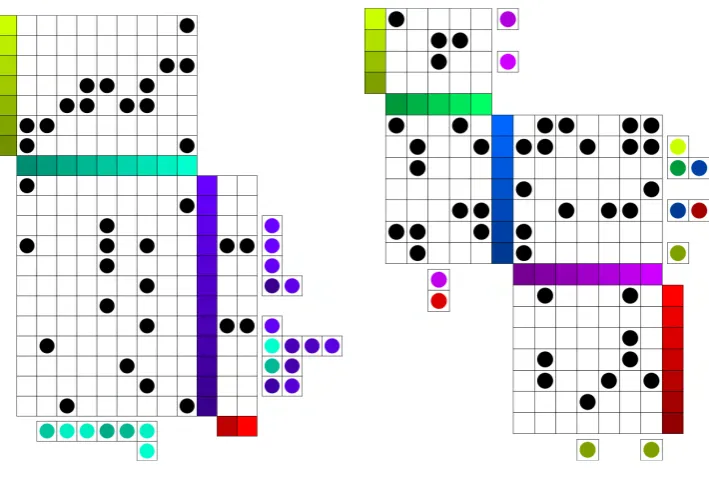
(a) Node-link graph depiction [28] (b) Quilted graph depiction
Figure 5.2: Henry VII’s family tree
Although the structure fits well, there is a lot of data that needs to presented for a family tree to be useful. The emphasis is much more on the nodes, or people, than on the links, or relationships. Finding a particular person by name is the first step for virtually any operation on a genealogical diagram. For that reason, we suggest modifying the graph to allow for names to be printed on the nodes at all times, rather than only being visible by pop-up tooltip.
Figure 5.3: Henry VII’s family tree, diagonalized
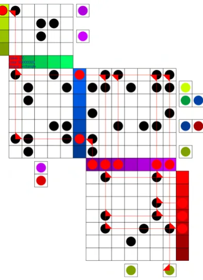
To save additional space, we can also condense the diagram to only show blood relations. To do this, we simply remove any relatives that married into the family. We add an icon to their husband or wife to symbolize that there is a hidden spouse. In most family tree diagrams, these relations are terminal nodes; no further parents or children are shown for them that are not related by blood. Because of this, there is no risk of concealed links from their removal. Figure 5.4 shows a condensed view of the quilted graph depiction of the family tree in figure 5.3
Figure 5.4: Henry VII’s family tree, diagonalized and condensed
family which are older than her, for example James V Stuart.
The structure of the quilted graph makes the timeline of the tree very apparent. Contemporaries are placed in the same layer, so it is easy to identify members of each generation. Even more positional encoding is possible since all individuals are arranged linearly in the quilted graph representation. Members can be definitively sorted by a means such as birth date, to show precise age relationship between all members of the graph. Also, as with other node-link versus quilted graph comparisons, the quilted graphs scale better.
Interactive behavior, such as that found in the prototypes, would also aid in us-ing these family trees. Clickus-ing on any family member would highlight all of their blood relatives. Additionally, pop-up tooltips provide a means for displaying even more informa-tion about individuals in the graph. This could include birthdates, educainforma-tion informainforma-tion, employment, pictures, or other data the user might be interested in knowing about their family.
Chapter 6
Conclusion
Although the concept of quilted graphs may be applied to any layered graph, we have found that most applications benefit from some modification to the basic depiction that we have established. ABM data contains many details on each cost object that must somehow be presented to the user. OLAP data needs means to explicitly inform the user of what dimensions the data they are looking at are in. Genealogical diagrams are more beneficial when the nodes are reshaped to allow full names to be printed within them.
Therefore the core concept of quilted graphs is not rooted in any single applica-tion but rather in the mixture of matrix-style link representaapplica-tion with alternate means of encoding skip links. We expect each application of quilted graphs will vary somewhat in appearance based on the problem domain.
6.1
Outstanding Issues
Several outstanding issues remain. The Java prototype does not yet implement all the functionality of the Processing prototype, most notably the pop-up tooltips and simple summarization. These features should be implemented in the new prototype before it is truly complete, though they are lower in priority than some of the other features which prompted the rewrite, discussed in section 6.2 below.
allow for more rapid prototyping of new quilt modifications, and dynamic view switching could make it easier to compare different depictions when evaluating changes.
6.2
Future Work
The framework is now in place for new interactivity modes to be implemented. One mode that was originally discussed was a testing mode. This mode would be able to track the interaction of the user for the purposes of usability testing. It will include means for timing the user’s actions, recording what they click on, and modifying the way the graph reacts to their actions. These changes will allow the system to challenge the user to follow a path between two nodes, and measure their performance. The portions of code that need to be modified to make these changes have been isolated to the SelectableMouseListener class.
Interactive modification of traditional depictions of layered graphs [14], [29] is made difficult by their structure. Each time the set of links changes, the graph must become more complex, undergo a process for crossing minimization, or both. Matrix style depictions, not having these same structural restrictions, are much more capable of interactive modification [30]. This property makes quilted graphs ideal for navigating multidimensional data such as OLAP cubes where not all dimensions can be displayed at once. Interactive graph modification is feasible in the Java prototype and should greatly increase its value.
Another priority is an OLAP-capable prototype. Although we have discussed pos-sible representations of OLAP data in quilted graphs and presented several design sketches, the ability to view OLAP data is not yet implemented in the prototype. Since many of the design decisions around quilted graphs arose only after seeing them implemented, we expect an OLAP-capable prototype to improve our design of this feature.
is another priority we will continue work on as we collaborate with other researchers in the field of genealogy.
Bibliography
[1] Giuseppe Di Battista, Ashim Garg, Giuseppe Liotta, Roberto Tamassia, Emanuele Tassinari, and Francesco Vargiu. An experimental comparison of four graph drawing algorithms. Comput.Geom.Theory Appl., 7(5-6):303–325, 1997.
[2] Waldburg ahnentafel.jpg, February 14 2006.
[3] Ben Watson, David Brink, Matthias Stallmann, Ravi Devarajan, Matt Rakow, Theresa-Marie Rhyne, and Himesh Patel. Visualizing very large layered graphs with quilts. In IEEE InfoVis Poster, 2007.
[4] Ben Watson, David Brink, Matthias Stallmann, Ravi Devarajan, Matt Rakow, Theresa-Marie Rhyne, and Himesh Patel. Matrix depictions for large layered graphs.
[5] Kozo Sugiyama, Shojiro Tagawa, and Mitsuhiko Toda. Methods for visual understand-ing of hierarchical system structures. Systems, Man and Cybernetics, IEEE Transac-tions on, 11(2):109–125, Feb. 1981.
[6] John N. Warfield. Crossing theory and hierarchy mapping. Systems, Man and Cyber-netics, IEEE Transactions on, 7(7):505–523, July 1977.
[7] Marie-Jose Carpano. Automatic display of hierarchized graphs for computer-aided decision analysis. Systems, Man and Cybernetics, IEEE Transactions on, 10(11):705– 715, Nov. 1980.
[9] I. Herman, G. Melancon, and M. S. Marshall. Graph visualization and navigation in information visualization: A survey. Visualization and Computer Graphics, IEEE Transactions on, 6(1):24–43, Jan-Mar 2000.
[10] Markus Eiglsperger, Martin Siebenhaller, and Michael Kaufmann. An Efficient Imple-mentation of Sugiyama’s Algorithm for Layered Graph Drawing, pages 155–166. 2005.
[11] E. R. Gansner, E. Koutsofios, S. C. North, and K. P Vo. A technique for drawing directed graphs. Software Engineering, IEEE Transactions on, 19(3):214–230, Mar 1993.
[12] Nikola S. Nikolov, Alexandre Tarassov, and J¨urgen Branke. In search for efficient heuristics for minimum-width graph layering with consideration of dummy nodes.
J.Exp.Algorithmics, 10:2.7, 2005.
[13] M. R. Garey and D. S. Johnson. Crossing number is np-complete. SIAM Journal on Algebraic and Discrete Methods, 4(3):312–316, 1983.
[14] M. Ghoniem, J. D Fekete, and P. Castagliola. A comparison of the readability of graphs using node-link and matrix-based representations. InInformation Visualization, 2004. INFOVIS 2004. IEEE Symposium on, pages 17–24, 0-0 2004.
[15] Jacques Bertin. Semiology of graphics. University of Wisconsin Press, Madison, Wis., 1983. Jacques Bertin ; translated by William J. Berg.; Translation of: Semiologie graphique.; Includes index.
[16] Zeqian Shen and Kwan-Liu Ma. Path visualization for adjacency matrices. In IEEE-VGTC Symposium on Visualization, 2007.
[17] J. Pujol, F. Martnez-Verd, M. J. Luque, P. Capilla, and M. Vilaseca. Comparison between the number of discernible colors in a digital camera and the human eye. pages 36–40, 2004.
[18] P. Rheingans. Task-based color scale design. InApplied Image and Pattern Recognition, 1999.
[21] James Abello and Frank van Ham. Matrix zoom: A visual interface to semi-external graphs. InINFOVIS ’04: Proceedings of the IEEE Symposium on Information Visu-alization, pages 183–190, Washington, DC, USA, 2004. IEEE Computer Society.
[22] Doug Schaffer, Zhengping Zuo, Saul Greenberg, Lyn Bartram, John Dill, Shelli Dubs, and Mark Roseman. Navigating hierarchically clustered networks through fisheye and full-zoom methods. ACM Trans.Comput.-Hum.Interact., 3(2):162–188, 1996.
[23] Overview: A short introduction to the processing software and projects from the com-munity.
[24] Peter B. B. Turney. Activity-based costing: An emerging foundation for performance management. Cost Technology, 2008.
[25] Edgar F. Codd, Sharon B. Codd, and Clynch T. Salley. Beyond decision support.
Computerworld, 27(30):87, 1993.
[26] Martin Wattenberg. Visual exploration of multivariate graphs. InCHI ’06: Proceedings of the SIGCHI conference on Human Factors in computing systems, pages 811–819, New York, NY, USA, 2006. ACM.
[27] M. J. McGuffin and R. Balakrishnan. Interactive visualization of genealogical graphs. InInformation Visualization, 2005. INFOVIS 2005. IEEE Symposium on, pages 16–23, Oct. 2005.
[28] Muriel Gottrop. England-tudor.png, November 12, 2003 2003.