ABSTRACT
LIN, JUAN. Factors Affecting the Perception and Measurement of Optically Brightened White Textiles. (Under the direction of Prof. Renzo Shamey).
Whites comprise approximately 3% of the total volume of CIELAB color space, but their relative importance is much larger than the small volume of the color solid that they occupy. Textile products commonly contain many different textures and patterns. Variations in surface roughness can significantly affect the colorimetric attributes of textile substrates. In addition to texture, other influential factors include background color, luminance in the viewing field, physical size of samples, and sample presentation mode. Moreover, surface texture's effect on the perception and measurement of white substrates, including those containing fluorescent brightening agents (FBAs) is not fully understood.
It is well established that surface roughness influences color perception. A number of recommended color difference formulae, e.g., CMC (l:c), CIE94 and CIEDE2000, include adjustment factors to account for varying interaction of light with different surfaces. More than 100 whiteness indices were also developed. Main factors influencing these equations include:
1. the visual experimental data developed;
2. accuracy and precision of the spectrophotometers used in measurement of optically brightened materials;
3. accuracy of the correlation model between measured and visual data; and
A number of studies have reported unsatisfactory correlations between visual responses and CIE whiteness models especially for tinted white samples. The unsatisfactory performance is not solely due to errors in the formula, but may be due to one or more critical variables that currently are not adequately controlled. These variables include:
1. Differences in geometry and light sources between spectrophotometers used for measurement of fluorescent materials;
2. Unknown or non-standardized UV emission of lamps used in standard viewing booths.
The objective of this research is to investigate several factors affecting the perception and measurement of optically brightened white textiles with a view to determine whether the performance of the whiteness index can be improved. Several approaches were examined to achieve this objective:
1. Preparation of textile sample sets with various textures to be used in visual and instrumental evaluation of whiteness;
2. Visual/instrumental evaluation of the effect of texture on lightness and whiteness under sources simulating illuminant D65;
6. Assessment of the uniformity of a monitor and examination of the uniformity boundary of the screen for display of white textile samples;
7. Development of software incorporating color management system to generate a patch incorporating simulated textures;
8. Generating images of the textured substrates with similar lightness and whiteness properties using linear transformation methods;
9. Designing a visual assessment protocol to evaluate perceived whiteness, conduct visual assessment using reference anchors based on forced ranking method;
10.Examination of the effect of background on perception of simulated white textiles on the monitor;
11.Analysis of the whiteness perception results based on texture variation;
12.Correlation of responses from perceived whiteness of knitted textures to perceived whiteness of simulated textures; and
Factors Affecting the Perception and Measurement of Optically Brightened White Textiles
by Juan Lin
A dissertation submitted to the Graduate Faculty of North Carolina State University
in partial fulfillment of the requirements for the degree of
Doctor of Philosophy
Fiber and Polymer Science
Raleigh, North Carolina 2013
APPROVED BY:
_______________________________ ______________________________
Dr. Renzo Shamey Dr. David Hinks
DEDICATION
To my whole family, my mother, father and sister, for without their help and support, graduate school would have been surely impossible.
BIOGRAPHY
ACKNOWLEDGMENTS
The author would like to thank Prof. Renzo Shamey, for his advice, support, patience, guidance and financial support throughout this research; and Prof. Joel Trussell, member of the advisory committee, for his great contribution to the author's development of image processing skills. Their continuous input and encouragement provided immeasurable support for the author. Also, the author would like to extend her gratitude to Prof. David Hinks and Prof. Douglas Gillan, members of the advisory committee, for their valuable suggestions and encouragement.
In addition, the author thanks all observers who willingly participated in the visual assessments related to this work.
The author is very grateful to Mr. Jeff Krauss for the help received in bleaching and brightening fabric samples and Mr. Brian Davis for the help in setting up the machinery which enabled the author to prepare knitted samples with various textures.
Thanks are also due to Dr. Yuzheng Lu and Mr. Renbo Cao, for their help and suggestions during experiments.
TABLE OF CONTENTS
LIST OF FIGURES ... xiii
LIST OF TABLES ... xxii
TERMS AND NOMENCLATURE ... xxvii
I. Introduction ... 1
II. Literature Review ... 2
1. Color Vision and Factors Affecting Color Perception ... 2
1.1 Perception of Color... 2
1.1.1 Structure of the Eye ... 2
1.1.2 Theories of Color Vision ... 8
1.1.2.1 Trichromatic Theory ... 8
1.1.2.2 Opponent Color Vision Theory ... 9
1.1.2.3 Zone Theory ... 11
1.1.3 Color Constancy ... 13
1.1.3.1 Color Contrast ... 14
1.1.3.2 Lightness Crispening ... 20
1.2 White and Whiteness ... 21
1.3 Illuminants and Light Sources ... 27
1.3.2 Light Sources ... 31
1.3.3 CIE Standard Illuminants ... 33
1.3.4 Fluorescent Lamps and Tubes ... 37
1.3.5 LEDs ... 39
1.4 Texture Analysis ... 40
1.4.1 Definition of Texture ... 40
1.4.2 Effect of Texture on Color Perception ... 42
1.5 Improving the Whiteness of Material ... 49
1.5.1 Bleaching and Bluing ... 50
1.5.2 Application of FBAs and Optical Brightening ... 51
1.5.3 Fluorescence ... 52
2. Measuring Whiteness ... 55
2.1 Whiteness Formulas ... 55
2.1.1 One-dimensional Whiteness Formulas ... 55
2.1.2 Two-dimensional Whiteness Formulas ... 63
2.2 Instrumental Assessment ... 67
3. Psychophysical Evaluation of Whiteness ... 76
3.1 Ordinal Scaling Methods ... 78
3.1.1. Rank Order Method ... 78
3.1.2 Paired-Comparison Method ... 80
3.2 Psychophysical Experiments ... 82
3.2.1 Factors Effecting Visual Assessments ... 82
3.2.2 Observers' Evaluation ... 84
3.2.2.1 Average Rank ... 84
3.2.2.2 PF/3 ... 85
3.2.2.3 Standardized Residual Sum of Squares (STRESS) ... 86
3.2.2.4 Correlation Coefficient ... 88
4. Surface Texture ... 89
4.1 Overview of Various Methods for Texture Analysis ... 90
4.1.1 Grey-level Histogram ... 91
4.1.2 Grey Level Co-occurrence Matrices ... 93
4.1.3 Discrete Fourier Transformation ... 95
4.2 Modulation Transform Function ... 96
1. The Effect of Texture on Perception and Measurement of White Knitted Textiles under D65
Illumination ... 99
1.1 Experimental ... 100
1.1.1 Preparation of Samples ... 100
1.1.2 Instrumental Measurement ... 104
1.1.3 Visual Assessment ... 106
1.2 Data Analysis ... 107
1.2.1 Cluster Analysis ... 108
1.2.2 Weighted Probability Analysis ... 108
1.3 Results and Discussion ... 111
1.3.1 The Effect of Texture on Measured and Perceived Lightness ... 112
1.3.2 Correlation between Perceived Lightness and Perceived Whiteness ... 115
1.3.3 Correlation between L* and Perceived Whiteness ... 117
1.3.4 The Effect of Texture on Whiteness ... 119
1.4 Conclusions ... 123
2. The Effect of Light Source on Perception and Whiteness of Knitted Structures ... 125
2.3.1 Correlation between Perceived Lightness and Measured Lightness ... 132
2.3.2 Correlation between Perceived Whiteness Rank and Mean Perceived Lightness ... 135
2.3.3 Effect of Texture on Perceived Whiteness ... 137
2.4 Conclusions ... 140
3. Factors Affecting the Whiteness of Optically Brightened Material ... 141
3.1 Methods ... 142
3.1.1 Materials ... 142
3.1.2 Preparation of Fluorescent Cotton Samples ... 143
3.1.3 Spectrophotometric Measurement of Materials ... 143
3.1.4 Spectrophotometric Measurement of Light Sources ... 144
3.1.5 Determination of UV Spectra ... 147
3.1.6 Perceptual Assessments ... 149
3.2 Results and Discussions ... 151
3.3 Conclusions ... 170
4. The Investigation of Spatial Uniformity and Whiteness Boundary of an EIZO Monitor ... 172
4.1 Calibration of the LCD Monitor ... 172
4.2 Spatial Uniformity of Monitor ... 173
4.3 Whiteness Boundary of an EIZO Monitor ... 176
4.3.1.1 Samples Preparation ... 177
4.3.1.2 Sample Color Measurement ... 178
4.3.2 Visual Assessment ... 179
4.3.3 Results and Discussions ... 182
5. Investigation of Various Methods to Generating Texture ... 188
5.1 Mapping Samples Used to Determine Device Dependent Whiteness Boundary ... 188
5.1.1 Polynomial Regression Method ... 189
5.1.2 Artificial Neural Networks ... 191
5.1.3 Look-Up-Table Method ... 194
5.2 Comparison of Color Space Mapping between Polynomial Regression and Neural Network Methods ... 194
5.3 Generating Texture Images with Different Surfaces ... 197
5.3.1 ICC Color Management ... 198
5.3.1.1 PCS ... 199
5.3.1.2 ICC Profile ... 199
5.3.1.3 Rendering Intent ... 200
5.3.2.3 Measurement of Woolen Samples with a PR-670 Spectroradiometer ... 208
5.3.2.4 A Comparison of Accuracy Different Rendering Intents ... 211
5.3.2.5 Conclusions ... 217
5.3.3 Generated Texture Images with Similar Lightness and Whiteness based on woolen Samples ... 219
5.3.3.1 The Effect of Surround on the Measured Value of Displayed Images ... 219
5.3.3.2 Generation of Texture Images with Similar L*a*b* Values ... 222
5.3.3.3 Generated Anchor (reference) Images ... 228
5.3.3.4 Preliminary Design of Experiment ... 229
5.3.3.5 Adjustment of Whiteness of Displayed Images ... 233
5.3.3.6 Generation of A New Set of Images based on the AATCC Standard ... 234
5.3.3.7 Generation of a New Set of Texture Images with Improved Whiteness ... 235
5.3.3.8 Visual Assessment ... 239
5.3.3.9 Results and Discussions ... 245
6. Visual Perception of Texture ... 257
6.1 Investigation of the Effects of Texture on Color Perception ... 257
6.1.1 Experimental Preparation ... 259
6.1.2 Frequency Content and Color Perception ... 259
6.1.4 Summary and Conclusions ... 267
6.2 Influence of Texture on Perceived Whiteness of Objects ... 268
6.2.1 Generating White Textured Images ... 268
6.2.2 Visual Assessment of Whiteness ... 270
6.2.3 Features based on Texture Analysis ... 270
6.2.3.1 Transformation to Grey Images ... 271
6.2.3.2 Roughness ... 272
6.2.3.3. Directionality ... 274
6.2.3.4 Density ... 276
6.2.4 The Influence of Texture-determined Factors on Perceived Whiteness ... 278
6.2.5 Conclusions ... 282
7. Conclusions and Future Work ... 288
LIST OF FIGURES
Figure 1. Cross section of the structure of the human eye. ... 3
Figure 2. Schematic diagram of the human retina. ... 5
Figure 3. The distribution of rods and cones in the human retina. ... 6
Figure 4. Diagram representing zone color vision theory. ... 12
Figure 5. Successive contrast. ... 15
Figure 6. Simultaneous contrast in lightness. ... 17
Figure 7. Assimilation / spreading effect. ... 19
Figure 8. Lightness crispening effect. ... 21
Figure 9. Spectral reflectance of white textures. ... 22
Figure 10. Chromaticity loci of perceived white objects. ... 25
Figure 11. The effect of additive mixing and subtractive mixing on lightness. ... 27
Figure 12. Spectrum distribution of sun light. ... 28
Figure 13. Relative SPD in visible region normalized at 555 nm. ... 30
Figure 14. Relative SPD of different phases of daylight, normalized at 555 nm: (a) cloud-free zenith skylight, (b) cloud-free north skylight, (c) overcast skylight, (d) medium daylight, and (e) direct sunlight. ... 32
Figure 15. Relative SPD of illuminant A. ... 34
Figure 16. Relative SPD curves of illuminants B and C... 35
Figure 17. Relative SPD of CIE illuminant D series. ... 36
Figure 19. SPDs of three types of fluorescent lamp. ... 38
Figure 20. Semiconductor junction laser. ... 39
Figure 21. Light propagation in a fiber. ... 42
Figure 22. Light propagation in a colored medium. ... 43
Figure 23. Polar distribution of reflected light for various surfaces. ... 44
Figure 24. Schematic model of light reflection from a woven textile. ... 45
Figure 25. KES-FB4 surface tester. ... 46
Figure 26. Effect of fluorescence on the spectral reflectance. ... 54
Figure 27. Basic features of a dual-beam spectrophotometer (Datacolor SF500). ... 70
Figure 28. Flowchart of measuring whites containing FWA based on ... 71
Figure 29. The diagram of a scanning telespectroradiometer (Bentham instrument). ... 73
Figure 30. Sample arrangement in grey-scale assessments. ... 82
Figure 31. Texture segmentation. ... 90
Figure 32. Typical modulation transfer function. ... 98
Figure 33. Bleached woolen yarn, scoured woolen knitted fabric, bleached woolen fabric, bleached & optically brightened woolen fabric (from left to right). ... 102
Figure 34. Different surface textures examined in the study. ... 103
Figure 37. Correlation of mean perceived lightness magnitude against L* for woolen samples. ... 112 Figure 38. Correlation of mean observer lightness rank against L* for cotton and woolen
samples separately (a) and as a group (b). ... 114 Figure 39. Correlation of mean observer lightness ranks against mean whiteness ranks for
woolen (a) and cotton (b) samples. ... 116 Figure 40. Mean observer lightness rank against mean whiteness rank for woolen and cotton
samples based on texture. ... 117 Figure 41. Correlation between perceived whiteness and measured lightness (L*) of samples
separately (a) and as a group (b). ... 118 Figure 42. Correlation of observer's rank against CIE Whiteness Index of knitted woolen
samples. ... 120 Figure 43. Textured samples ranked based on perceived whiteness from least white (left) to
most white (right). ... 121 Figure 44. Correlation of observer whiteness rankings against CIE Whiteness Index values of knitted cotton samples. ... 122 Figure 45. Weighted probability of different cotton and woolen structures being ranked as the most white. ... 127 Figure 46. Correlation of mean perceived lightness against measured lightness for cotton
Figure 47. Correlation of mean perceived lightness against measured lightness for cotton under illuminant A. ... 133 Figure 48. Correlation of mean perceived lightness against measured lightness for wool
under source U30. ... 134 Figure 49. Correlation of mean perceived lightness against measured lightness for wool
under illuminant A. ... 134 Figure 50. Correlation of perceived whiteness rank against mean perceived lightness for
cotton under source U30. ... 135 Figure 51. Correlation of perceived whiteness rank against mean perceived lightness for
cotton under illuminant A. ... 136 Figure 52. Correlation of perceived whiteness rank against mean perceived lightness for wool under source U30. ... 136 Figure 53. Correlation of perceived whiteness rank against mean perceived lightness for wool under illuminant A. ... 137 Figure 54. Correlation of perceived whiteness rank against CIE Whiteness Index for cotton
under source U30. ... 138 Figure 55. Correlation of perceived whiteness rank against CIE Whiteness Index for cotton
Figure 57. Correlation of perceived whiteness rank against CIE Whiteness Index for wool under source A. ... 139 Figure 58. SPD of standard illuminants D65, D75 and the simulated daylight sources in the
viewing booths, including the simulated daylight sources with a supplementary UV source. ... 147 Figure 59. The arrangement used to block approximately 25% of the UV radiation using
opaque dark gray cardboard rings placed around the UV light bulb. ... 149 Figure 60. Visual assessment of optically brightened white samples under varying UV levels.
... 150 Figure 61. Measured spectral radiance curves of (a) the PTFE plate (b) untreated cotton
substrate (c) 0.025% FBA treated (d) 0.25% FBA treated and (e) 2.5% FBA treated white materials irradiated at various relative UV intensities as measured by a reflectance spectrophotometer using illuminant D65. ... 153 Figure 62. CIE WI of white samples calculated from measurements with a spectrophotometer
employing sources D65 (a) and D75 (b) filtered to contain various UV contents. ... 154 Figure 63. Uchida WI of white samples calculated from measurements with a reflectance
spectrophotometer employing sources D65 (a) and D75 (b) filtered to contain various UV contents. ... 155 Figure 64. The Correlation between perceived whiteness and predicted whiteness from
perceived whiteness and predicted whiteness from Uchida and CIE WI under D75 for all UV levels (b). ... 158 Figure 65. Spectral irradiance of fluorescent white materials illuminated with D65 (a) and
D65 +UV (b) sources in a SpectraLight III viewing booth determined
radiometrically. Spectral irradiance of fluorescent white materials illuminated with D75 (c) and D75 +UV (d) sources in a SpectraLight III viewing booth
determined radiometrically. ... 160 Figure 66. Comparison of spectral irradiance curves measured over the surface of untreated
(a) 0.025% FBA treated (b), 0.25% FBA treated (c) and 2.5% FBA treated (d) white materials between D65 against D75 and D65+ UV against D75+ UV in SpectraLight III viewing booths. ... 162 Figure 67. Spectral irradiance curves measured in various illuminant combinations in a
SpectraLight III viewing booth. ... 163 Figure 68. Variations in total UV energy measured by summing up the spectral irradiance
from the surface of optically brightened samples illuminated under different conditions in SpectraLight III viewing booths. ... 164 Figure 69. Perceived whiteness of five samples treated with various amounts of FBA and
Figure 73. Samples display in the center of EIZO screen. Color of the block was changed 182 Figure 74. The relationship between perceptibility responses and color difference
magnitudes. ... 186 Figure 75. Samples considered as white at acceptable threshold of 50%. ... 187 Figure 76. Schematic diagram of an artificial neural network with one hidden layer. ... 192 Figure 77. Schematic diagram of how ICC profile works. ... 200 Figure 78. Transformation of a bitmap image between a scanner profile and EIZO monitor
profile. ... 203 Figure 79. The interface generated using Visual Studio 2008, Qt Project including little CMS.
... 204 Figure 80. Colorimetric distribution of selected data in L*a*b* color space. ... 205 Figure 81. Schematic representation of the methodology to test the accuracy of EIZO monitor profile. ... 206 Figure 82. Calibration of Spectroradiometer PR-670. ... 209 Figure 83. Measurement of 10 woolen samples with Spectroradiometer PR-670. ... 209 Figure 84. The interface generated with STS of displaying the scanned woolen sample. ... 212 Figure 85. A schematic demonstration of the position of the black dot in PR-670
spectroradiometer's view finder focused in an image during measurements. ... 220 Figure 86. The 10 normalized images with the approximate L*a*b* values displayed on an
Figure 88. Display arrangement of the normalized images in the center of the monitor. .... 230 Figure 89. Two anchors with L* values of 70 and 98 respectively (left to right), displayed
above the texture image, and measured with a PR-670 spectroradiometer (a), three anchor samples with L* values of 75, 80 and 85 respectively (L to R), displayed above the texture image and measured with a PR-670 spectroradiometer (b). .. 232 Figure 90. Display of the 10 normalized woolen texture images with improved whiteness. 236 Figure 91. Visual assessment of 10 normalized texture images using three anchors. ... 238 Figure 92. Visual assessment of normalized textured white image using three anchor samples on top. ... 240 Figure 93. The interface designed for the visual assessment of textured images. ... 242 Figure 94. Twelve texture images displayed mostly within 6 blocks. ... 243 Figure 95. The interface designed for the visual assessment of textured images. ... 244 Figure 96. The mechanism of lateral inhibition affecting the perceived whiteness of the
LIST OF TABLES
Table 1. Constants for Illuminants A, C and D65 for 2o and 10o observers ... 58 Table 2. Illustration of data matrix R. ... 79 Table 3. Gray Scale grades corresponding with CIELAB Color Difference. ... 81 Table 4. Some texture features extracted from Gray Level Co-occurrence Matrices. ... 95 Table 5. CIE L* and perceived lightness of textured woolen samples. ... 104 Table 6. CIE whiteness index and L* of textured samples. ... 105 Table 7. Percentage weighted probabilities of different woolen samples ranked from most to least white. ... 110 Table 8. Percent probabilities of cotton and woolen samples being ranked ... 128 Table 9. Mean perceived lightness for each sample for wool and cotton samples. ... 131 Table 10. Units for radiance and irradiance. ... 146 Table 11. Mean inter- and intra-subject variability (in CIEWI units) in determination of
perceived whiteness. ... 156 Table 12. Effect of variations in UV on measured CIE whiteness index of non-brightened and
Table 13. Effect of UV content on perceived whiteness (PW) of non-brightened and (0-2.5%) FBA treated samples. Correlation coefficients are reported between each level and the calibrated UV level in the spectrophotometer based on AATCC TM110. .... 167 Table 14. Effect of variations in UV content on perceived whiteness (PW) of non-brightened
and (0-2.5%) FBA treated samples. Results in each column show % mean change in perceived whiteness of each sample for the UV intensity level shown against zero supplementary UV. ... 168 Table 15. Colorimetric values of 30 blocks covering the entire screen of the EIZO display.
... 175 Table 16. The color difference, DEab*, between each of the 29 blocks against the reference
block H4V3. ... 176 Table 17. RGB values of selected blocks for examining the whiteness boundary. ... 178 Table 18. Parameter estimates. ... 184 Table 19. Chi-Square tests. ... 184 Table 20. Augmented matrix used in polynomial regression method. ... 190 Table 21. Model performance, in terms of DEab*, using various polynomials for five
components. ... 195 Table 22. Model performance, in terms of DEab*, by various polynomials for all 76 color
Table 25. Color difference between (Lab)CMS and (Lab)m for selected 180 samples. ... 207 Table 26. L*a*b* values measured with a Datacolor SF600X Spectrophotometer with UV and
without UV. ... 208 Table 27. L*a*b* values obtained using a PR-670 Spectroradiometer with and without UV.
... 210 Table 28. The color difference, DEab*, between SF600x photometer and PR-670 radiometer
with UV and without UV. ... 211 Table 29. L*a*b* values of 10 scanned woolen samples displayed on EIZO monitor measured
with spectroradiometer PR-670 under four rendering intents. ... 214 Table 30. Color differences calculated for 10 woolen samples under different rendering. .. 215 Table 31. Color difference obtained when samples displayed in the viewing booth and
measured with a radiometer versus those measured with a spectrophotometer SF600X. ... 217 Table 32. L*a*b* values of 6 images with different background settings. ... 221 Table 33. The mean, maximum and minimum L*a*b* values of 10 scanned texture ... 223 Table 34. L*a*b* values of 10 normalized images, minimum, maximum, mean as well as
Table 37. L*a*b* values of a target image corresponding to block positions 8, 9, 10, 11, 14, 15, 16 and 17 on an EIZO monitor. ... 227 Table 38. L*a*b* values of normalized reference images (anchors). ... 229 Table 39. L*a*b* values of normalized images displayed in the center of the monitor and
measured by a PR-670 spectroradiometer. ... 231 Table 40. Whiteness and Tint values of the 10 normalized images based on measured XYZ
values. ... 234 Table 41. XYZ, L*a*b*, whiteness and tint values of 13 normalized AATCC Std. samples. 235 Table 42. XYZ, L*a*b*, CIEWI and Tint values of the 10 converted woolen texture images.
... 237 Table 43. Ordered sample number and relative perceived whiteness of 10 texture images
displayed under three backgrounds with different lightness. ... 245 Table 44. Mean, minimum and maximum relative perceived whiteness in three different
backgrounds. ... 246 Table 45. Correlations for imaging texture parameters; PL represents Perceived Lightness 266 Table 46. Roughness of the samples tested together with weighted probability (wP) of sample appearing as most white. ... 273 Table 47. Directionality of the samples tested together with weighted probability of sample
appearing as most white (wP). ... 276 Table 48. Density of the scanned textures together with weighted probability of sample
Table 49. Results of the regression analysis. ... 281 Table 50. WINCSU and weighted probability (wP) of sample appearing as most white,
normalized for TUVCS at 100, for illuminant D65. ... 285 Table 51. Weighted probability (wP) of sample appearing as most white and WINCSU under
TERMS AND NOMENCLATURE
CIE: The Commission Internationale de l'Eclairage or the International Commission on Illumination (ICI).
Lightness: The brightness of an area judged relative to the brightness of similarly illuminated area that appears to be white or highly transmitting.
Luminance: The total integrated luminous flux for all wavelengths, emitted per unit solid angle, per unit of projected area in a given direction, of the luminous surface. Illuminance: The area density of luminous flux received by an illuminated body, integrated
for all wavelengths and all directions.
SPD: The radiative power emitted by a heated body described by a plot showing the variation across the electromagnetic spectrum of the emittance per unit
wavelength.
Irradiance: The area density of radiant flux received by an illuminated body, integrated for all wavelengths and all directions. Irradiance is the radiant power per unit area incident onto a surface and has units of watts per square meter.
Radiance: A measure of the power emitted from a source or a surface, rather than incident upon a surface, per unit area per unit solid angle with units of watts per square meter per steradian.
Fluorescence: The phenomenon by which a compound absorbs UV light and, through a process of quantum mechanical intersystem crossing, re-emits visible light, after a loss of energy, at a longer wavelength than that which is absorbed.
Whiteness: In colorimetry, whiteness is the degree to which a surface appears to be white. Chroma: Colorfulness of an area judged as a proportion of the brightness of a similarly
illuminated area that appears white or highly transmitting.
Saturation: Attribute of a visual sensation which an area appears to exhibit more or less chromatic color judged in proportion to the brightness.
I. Introduction
II. Literature Review
A visual perception of colored objects requires three essential elements: light source, object and the eye. All these factors influence the object appearance visualized by the observer. While vision is common in the animal kingdom, color vision is only limited to species with color receptors. To understand color vision, one must pay attention first to the physics of light and its interaction with objects. Color vision is the capacity of an organism or machine to distinguish objects based on spectral distribution of the light. Two complementary theories of color vision are the trichromatic theory and opponent process theory [1]. Color receptors detect the spectral distribution of the light, react by producing signals at different wavelengths that are processed by the brain resulting in perception of color.
1. Color Vision and Factors Affecting Color Perception
1.1 Perception of Color
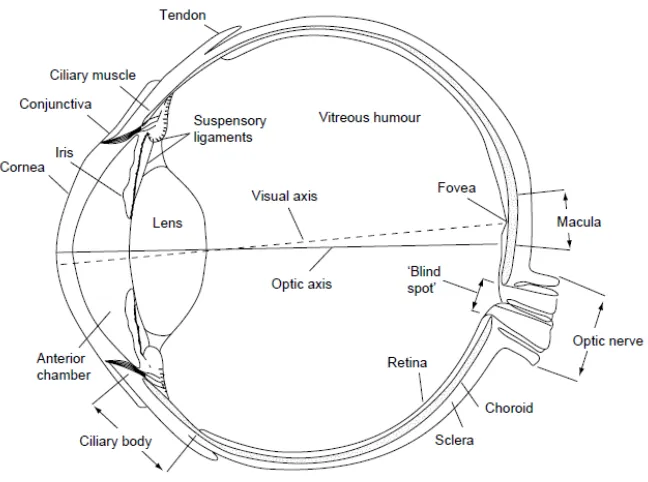
1.1.1 Structure of the Eye
Figure 1. Cross section of the structure of the human eye.
reducing the size of the aperture in a camera; similarly the pupil increases in size to let in more light, under dim illumination condition.
The lens in most vertebrate eyes is located directly behind the pupil. Since the curvature of the lens determines the amount by which light entering it is bent, its shape is critical in bringing an image into focus at the rear of the eye. The process by which the lens changes its focus is called accommodation. In other words, variation in lens shape allows the eye to adjust its optical power to maintain a focused image of objects at different distances, this process is affected by natural ageing. With aging, the quality of vision worsens due to reasons independent of aging or eye diseases. The aging lens and cornea causes glare by light scattering, especially for shorter wavelengths. The yellowing of the lens with aging is believed to be responsible for the reduced ability to discriminate blues and blue-greens. Contrast sensitivity shows a significant age-related decline [3].
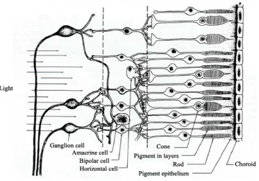
Figure 2. Schematic diagram of the human retina.
The blind spot shown in Figure 3 is the place in the visual field that corresponds to the lack of light-detecting photoreceptor cells on the optic disc of the retina where the optic nerve is connected [5]. Since there are no cells to detect light on the optic disc, the section of the image associated with this part of the field of vision is not perceived.
The outer segments of the photoreceptor cells contain pigments that absorb light as shown in Figure 2. The middle layer of the retina consists of bipolar cells, which are neurons with two long extended processes. One end makes synapses with the photoreceptors; the other end makes synapses with the large ganglion cells in the third layer of the retina.
into the primary visual cortex, at the back of the brain. The brain itself reconstructs the images and reverts them in a highly complex process which has not been fully understood.
1.1.2 Theories of Color Vision
It might be thought that a single theory of color vision should predict all the known perceptual attributes of color and the relative color phenomenon. However, no such theory that could fully explain the complex array of perceptual experiences has thus far been developed. Several theories are widely used in describing key aspects of color vision, however, and three of the most important models are described briefly in the following section.
1.1.2.1 Trichromatic Theory
receptors in the retina supported the trichromatic color vision theory. One set of receptors is sensitive to long wavelengths such as red, one to medium wavelengths such as green, and one is sensitive to short wavelengths such as blue. Thus the trichromatic theory has some physiological support.
However, certain aspects of color vision cannot be accounted for by the trichromatic theory, for example, the phenomenon of color afterimages. If one stares at a red dot, then moves their gaze to a white wall, they will see a green dot as an afterimage. If one stares at a green dot, followed by viewing a white surface, they will see a red afterimage. The same thing happens with yellow and blue [8, 9].
In addition, it is difficult to explain several color vision facts, based on the trichromatic theory as summarized below:
1. Observers are capable of selecting four unique hue: red, green, yellow and blue; 2. Dichromats: perceive white and yellow color and
3. Color discrimination functions and opponent color perceptions, cannot be explained.
1.1.2.2 Opponent Color Vision Theory
red detectors are fatigued. The green receptors, as opponents gain the upper hand, and one sees a green afterimage when viewing a white surface.
The modern form of this theory assumes there are three basic channels involved in color vision [11]. One channel is the red/green opponent channel; and another is the yellow/blue channel. A third channel, the black/white or brightness/darkness channel, may also provide information relevant to color vision, though this is a complex issue which is debated among researchers.
The yellow/blue channel may seem odd, because there are no yellow-sensitive cones in the retina. Yellow light stimulates a combination of long-wavelength (red-sensitive) and medium wavelength (green-sensitive) cones. If there is more activity in blue receptors (compared to red plus green receptors) the brain interprets this as blue. If there is more red plus green activity (as compared to blue) the brain interprets this as yellow. The result is a yellow/blue channel. Yellow and blue act as opponent processes just like red and green. If one stares at a blue image, one gets a yellow afterimage; if one stares at a yellow dot, one gets a blue afterimage.
chromosome) do not have the extra copy, so red/green colorblindness is about 20 times more common in men than in women.
A person with no color-sensitive pigments, therefore no color vision, is called a
monochromat (one-color person). To such a person, the world looks like a black-and-white TV picture. Colors are shades of gray. A person with a defect in one channel-either the red/green or yellow/blue channel-is called a dichromat. Both colors in a channel are affected, so if the person cannot distinguish red that same person cannot distinguish green. A person who cannot see blue as a distinct color will also not see yellow as a distinct color. People with normal color vision use all three channels (black/ white, red/green, and yellow/blue) and are called trichromats.
1.1.2.3 Zone Theory
Despite their success on explaining on a certain color phenomena, none of these theories alone provides full explanations and proper predictions of color experience. However, when these theories are combined into a single one, namely, zone theory, additional color vision phenomena can be explained as well.
In the final stage, the signals are interpreted in a complex manner in relation to the other spatial and temporal information associated with light from previous visual experience such as memory.
1.1.3 Color Constancy
The human visual system is a miraculous part of the body which provides us with a three-dimensional perception of our world. When the reflected light enters our eyes, it is recorded by our retinal cells, however, most of the information analysis is carried out inside our brain. How this kind of information is actually processed is still largely unknown. In the computer science domain, a large number of algorithms have been developed to imitate and match the capabilities of our human visual system. Their goal typically revolves around maximum color reproduction fidelity. How to duplicate color in different environments such as various illuminants, media, etc., and keep color constancy is a key factor that needs to be considered. Without color constancy, objects could no longer be reliably identified by their color.
moved to a living room decorated with electric tungsten-filament lighting. However, our human visual system is amazingly capable of compensating for changes in both the level and the color of the lighting in a visual process known as adaptation, and recognizing the object as having nearly the same color in various conditions, which is the phenomenon known as color constancy [15].
1.1.3.1 Color Contrast
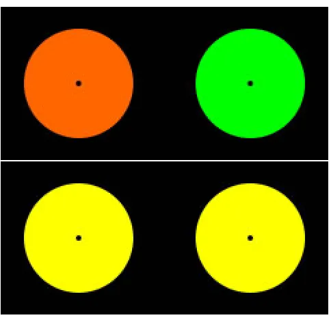
In our real world, colors are always seen in relation to their spatial context. Furthermore, our perception of the brightness of targets often depends more on the luminance of adjacent objects than on the luminance of the target itself. For example, objects that have only a small contrast with respect to their background are difficult to observe. The associated phenomena, therefore, are detected and defined into three fundamental types of contrast, successive contrast, simultaneous contrast and spreading effect. The causes of these slight failures of color constancy are still under active scientific investigation while it is still being questioned whether they truly exist. All may be broadly regarded as reflecting the fact that our visual system does not work like an objective measuring device, sending raw light and color data to the brain.
lower disks, though identically colored, will appear different with the left-bottom color appearing greenish and the right-bottom color appearing reddish [16,17].
Figure 5. Successive contrast.
Figure 6. Simultaneous contrast in lightness.
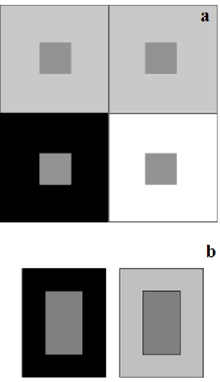
visual areas of the brain, show lateral inhibition. In other words, neighboring visual neurons respond less if they are activated at the same time than if one is activated alone. Therefore, the fewer neighboring neurons stimulated, the more strongly a neuron responds [22]. This process greatly increases the visual system's ability to respond to edges of a surface. Since neurons responding to the edge of a stimulus respond more strongly than do neurons responding to the middle, the "edge" neurons receive inhibition only from neighbors on one side, the side away from the edge. Neurons stimulated from the middle of a surface get inhibition from all sides. This makes the very faint edges look much sharper and this is the function of lateral inhibition, to make edges stand out.
As shown in Figure 6-b [23], most people see the center rectangle on the left as darker than the one on the right, even though physically they are identical. The center rectangle on the left gets little lateral inhibition from its dark surround. The center rectangle on the right gets considerable lateral inhibition from its light surround. Therefore, the light from the center rectangle on the left sends a stronger neural signal to the brain than does the same light from the center of the right rectangle, so the center rectangle on the right appears brighter.
Figure 7. Assimilation / spreading effect.
1.1.3.2 Lightness Crispening
Figure 8. Lightness crispening effect.
1.2 White and Whiteness
Color perception is not a physical quantity but rather a purely psychophysical response, usually to visual light after entering the eye. It is thus not measurable by normal engineering methods. However, it is possible to describe colors in an objective manner by quantifying them with at least three distinct numbers. These numbers are called color values and are dimensionless quantities.
chroma of objects would be very low, usually less than a few tenths, and their Munsell value would be very high, usually more than 9 according to the ISCC-NBS Method of Designating Colors [29]. White is in a range where Munsell chroma is no higher than 0.5 for all hues, except for 4Y to 9Y where up to 0.7 is acceptable, and a Munsell value of at least 8.5.
Physically, a white surface reflects strongly throughout the visible spectrum. As this spectral reflectance becomes higher and more uniform, the surface appears whiter as shown in Figure 9 [31]. In geometrical terms, a white surface such as cotton reflects diffusely in all directions and, of course, white objects have high scattering coefficients and low absorption coefficients. Therefore, a glossy white tile used in spectrophotometer calibration shows an approximately constant reflectance.
causing a large increase in the blueness of the substrate as well as in its lightness, and thereby significant increase in the perceived lightness, and whiteness of the treated material.
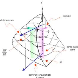
Figure 10. Chromaticity loci of perceived white objects.
whites is represented by the regions deviating from the whiteness axis which contain samples perceived as being white but showing certain shades, e.g., reddish or greenish as compared with neural whites. The angle of inclination can be used to determine regional preferences. In general, a color may be defined as a combination of three attributes which are given by the tri-stimulus values for the standard color normal observer. The perceived color is seen as a result of the light from a source modulated by the reflectance factors of the object or from self-luminance of the object. Generally, each process can be understood using two mechanisms.
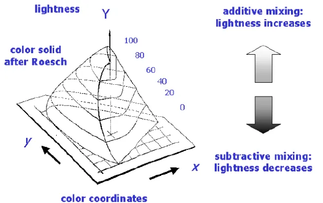
In additive color mixing, the desired color can be obtained as the mixture of light coming from three light sources with primary colors, red, green and blue. For example, on a CRT monitor, very small dots of red, green and blue phosphors are excited to generate various lights on the screen. The main characteristic of additive color mixing is that the luminosity value of the mixed color is always higher than those of its components.
Figure 11. The effect of additive mixing and subtractive mixing on lightness.
Luminosity plays an important role when choosing a proper mechanism for increasing whiteness due to different impacts of color mixing mechanisms on the appearance of whites as shown in Figure 11 [34].
In textiles and printing industries, values for luminosity can be increased up to a certain extent by adding optimal amounts of fluorescent brightening agents.
1.3 Illuminants and Light Sources
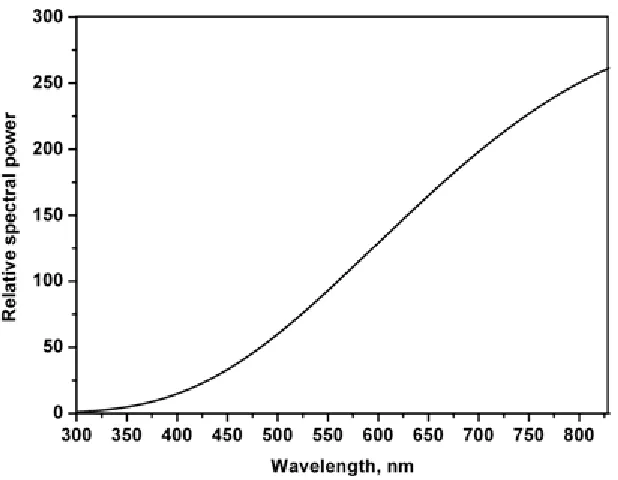
electromagnetic radiation with the publication of Newton's descriptions and explanations of the effect of passing white light from the sun through combinations of prisms [35]. The visible region of the electromagnetic spectrum makes up a very small part of the total spectrum as shown in Figure 12 [36], where electromagnetic radiation is arranged according to wavelength.
Figure 12. Spectrum distribution of sun light.
1.3.1 Color Temperature
Figure 13. Relative SPD in visible region normalized at 555 nm.
Planckian radiator whose perceived color most closely resembles that of the given stimulus at the same brightness and under specified viewing conditions [41].
1.3.2 Light Sources
The most important natural source of light is the sun. The daylight as seen on the surface of the planet is formed by absorption and scattering of sunlight due to the presence of particulate matter in the atmosphere before it reaches the earth's surface.
Figure 14. Relative SPD of different phases of daylight, normalized at 555 nm: (a) cloud-free zenith skylight, (b) cloud-free north skylight, (c) overcast skylight, (d) medium daylight, and
(e) direct sunlight.
over ordinary tungsten lamps. They are more compact and provide a better light output, can be operated at higher temperatures than tungsten-filament lamps, and thus provide SPD with correspondingly higher color temperature from 2900K to 3300K [43,44].
1.3.3 CIE Standard Illuminants
The Commission Internationale de l'Eclairage (CIE) recommended a set of spectral radiant power distributions known as the CIE standard illuminants, and CIE Standard sources A, B and C, were adopted at that time as approximations to three common illumination conditions [45].
Illuminant A
Figure 15. Relative SPD of illuminant A.
Illuminants B and C
Figure 16. Relative SPD curves of illuminants B and C.
CIE Standard Illuminant D Series
color assessment and measurement. Illuminant D65 exhibits a higher UV content when compared with illuminants A, B and C.
Figure 17. Relative SPD of CIE illuminant D series.
CIE Standard Illuminant F Series
triband fluorescent, and illuminants F7 and F8 represent daylight fluorescent lamps as approximations of D65 and D50, respectively [46].
Figure 18. Relative SPD of illuminant F series.
1.3.4 Fluorescent Lamps and Tubes
incorporated to enhance the color rendering properties of the source. Another type, the three-band fluorescent such as TL84 or prime color lamps, use narrow-line phosphors to give emission at approximately 435 nm, 545 nm and 610 nm as well as an overall white light color with a better color rendering properties. The SPDs of these three fluorescent tubes are compared in Figure 19 [48].
Figure 19. SPDs of three types of fluorescent lamp.
The UV content of bulbs is not often measured and standardized. A variation in UV content significantly affects the perception of white samples treated with fluorescent brightening agents. Also the UV content applied in viewing booths used for visual assessments does not correlate with that used for measurement of whites [50].
1.3.5 LEDs
Semiconductor materials are used in the manufacture of light emitting diodes (LEDs) and the phenomenon of electroluminescence is used to generate light in the LEDs [51].
Figure 20. Semiconductor junction laser.
which is referred to holes, results in an energy gap. Light emission occurs via electron and hole recombination across the p-n semiconductor junction as shown in Figure 20 [52]. This effect is called electroluminescence and the color of the light, corresponding to the energy of the photon, is determined by the energy gap of the semiconductor.
LEDs emit a very narrow band wavelength only 50-80 nm wide that depends on the chemical composition of the semiconductor materials. LEDs generate white light either by mixing red, green, and blue monochromatic LEDs or by a color conversion process, which is more common [53, 54]. It relies on a mixture of blue LED light and subsequent re-emission from green, yellow, or red phosphor materials to make white light. Recent studies have highlighted the importance of a sophisticated design of the color conversion element (CCE) to make superior-quality white LED light sources. This includes not only the CCE’s arrangement within the white LED package and use of multiple phosphors to increase color rendering, but also the design of the CCE itself [55, 56, 57].
1.4 Texture Analysis
1.4.1 Definition of Texture
processing. Computer vision researchers have used measures of texture to discriminate between different objects and segment scenes.
Richards & Polit [60] define texture as an attribute of a field having no components that appear enumerable. The phase relations between the components are thus not apparent. Nor should the field contain an obvious gradient. The intent of this definition is to direct attention of the observer to the global properties of the display - i.e., its overall "coarseness", "bumpiness", or "fineness". Physically, non-enumerable patterns are generated by stochastic as opposed to deterministic processes. Perceptually, however, the set of all patterns without obvious enumerable component will include many deterministic textures [60].
ASTM (The American Society for Testing and Materials) defines texture as the "visible" surface structure depending on the size and organization of small constituent parts of a material, typically, surface structure of a woven fabric [61].
The human response to texture often is described with terms like fine, coarse, grained and smooth, etc. Alternatively, texture can be described as a variation in tone (intensity or lightness) and structure. Other responses to a physical surface can be described in the following terms:
• Roughness;
• Smoothness;
• Ripple - the appearance of irregularity of a surface resembling the skin of an orange; • Apparent mottle - a spotty non-uniformity of color appearance on a scale that is larger
• Speckle - a phenomenon in which the scattering of light by a rough surface or
inhomogeneous medium generates a random-intensity distribution of light that gives the surface or medium a granular appearance.
1.4.2 Effect of Texture on Color Perception
From a microscopic perspective, when light hits a fiber, it may be partly transmitted, absorbed or reflected as shown in Figure 21 [62]. The relative contribution of each of these components determines the visual appearance of the fiber, including its color shade and luster. From a macroscopic perspective, surface appearances influence our color perception directly. Consider a beam of white light incident on the surface of an object. As soon as the light meets the substrate's surface the beam undergoes refraction, while some of the light is reflected. The refracted beam entering the layer undergoes absorption and scattering, and it is the combination of these two processes which gives rise to the underlying color of the medium as shown in Figure 22 [63].
Figure 22. Light propagation in a colored medium.
according to Fresnel's law. Depending on their surface properties media exhibit a balance between specular and diffusely reflected light and this is schematically depicted by directions and sizes of arrows representing reflection in Figure 23 [64].
Figure 23. Polar distribution of reflected light for various surfaces.
Figure 24. Schematic model of light reflection from a woven textile.
Figure 25. KES-FB4 surface tester.
The KES system, designed for assessing fabric surface properties, measures the height of a surface of a fabric over a 2cm length (forwards and backwards) along principal directions as shown in Figure 25 [67].
MIU = 1 𝑋 ∫ 𝜇
𝑋 0 𝑑𝑥
SMD = 1
𝑋 ∫ |𝑇 − 𝑇�| 𝑑𝑥 𝑋
0 (1)
where µ: frictional force/pressure force
x, displacement of the contractor on the surface of specimen
X: 2cm is taken in standard measurement
T: Thickness of the specimen at position x, the thickness is measured by the contactor 𝑇�: Mean value of T
The SMD metric, however, does not always correlate with perceptual assessments of roughness for a given surface. Several parametric effects influence the perceived color of products including lightness as well as whiteness attributes and variations in these parameters can change the magnitude of differences amongst otherwise identical objects. In addition to texture, other contributing factors include the color of the background, luminance in the viewing field, the physical size of samples, the mode of sample presentation, the magnitude of color differences, and whether the color can be described as a surface or self-luminous color.
interaction of light with different surfaces. More recently, the influence of texture on color difference evaluation [71] and on suprathreshold lightness differences [72] was reported. Therefore, texture is an important parametric effect that needs to be incorporated in color-difference metrics. Attributes supporting texture perception such as lightness, brightness, whiteness as well as darkness have been widely used in textiles from a colorimetric perspective. Also properties such as roughness/smoothness and coarseness provide means of physical measurement.
In the field of imaging, texture refers to an aerial construct that defines local spatial information of spatially varying spectral values that is repeated in a region of larger spatial scale. Therefore the perception of texture is a function of spatial and radiometric scales. Descriptors providing measures of properties such as smoothness, coarseness, which are also used in the textile domain as well as regularity, are used to quantify the texture content of an object. The most common method adopted in image analysis is the spatial distribution of gray values, by computing local features at each point in the image, and deriving a set of statistics from the distribution of the local features [73].
coarse in a close distance, but the same sample could be perceived as fine texture form a longer distance.
Since textiles have geometric characteristics, such as natural convolution of fibers, cross-sectional shapes of fiber, twists of yarn, and surface fluff, incident light beams are scattered at different strengths in different directions, according to surface geometry, particularly surface roughness. When a subject views a real textile sample, light reflected from the surface stimulates the subject's eyes and provides two-dimensional color images on the subject's retinas as an image of the woven construction, at which point the subject registers a three-dimensional image by way of recognizing memories of experiences with fabrics [74].
1.5 Improving the Whiteness of Material
1.5.1 Bleaching and Bluing
Bleaching agents convert impurities into colorless particles. Color is imparted by a chromophore, i.e. a moiety usually involving alternating carbon-carbon single and double bonds [79]. Bleaching process increases blue reflectance of the substrate by destroying the coloring matter with strong reducing or oxidizing agents. The function of bleaching is to destroy blue-absorbing yellow contaminants via oxidation so that there is a large increase in the whiteness.
However, even the most effective bleaching cannot remove all traces of yellowish cast. Therefore, an additional whitening stage is often essential.
1.5.2 Application of FBAs and Optical Brightening
The third way is to use fluorescent brightening agents (FBAs), fluorescent whitening agents (FWA) or optical brightening agents (OBA). Unlike bleaching and bluing, FBAs offset the yellowish cast and at the same time improve lightness, because they do not subtract green-yellow light, but rather add blue light. FBAs are virtually colorless compounds which, when present on a material, have the ability to absorb mainly invisible ultraviolet light in the 300-400 nm range and remit violet to blue fluorescent light. The emitted fluorescent light is added to the light reflected by the treated material, producing an apparent increase in reflectance in the blue region. Dazzling whiteness may be perceived, especially on a well-bleached material. A slight improvement in base whiteness enhances whiteness of FBA-treated material significantly.
FBAs are used to brighten not only textile materials but also paper, leather and plastics. They are important constituents of household detergent formulations. More specialized areas of application include lasers, liquid crystals and biological stains. By far the most important uses of FBAs, however, are in applications to textiles and paper. FBAs should be applicable without undesirable side-effects, such as staining or subsequent photosensitization or degradation of the substrate to which they are applied.
permanent nature. Chemical bleaching of textile fibers is further aided by addition of optical brighteners [80].
Certain organic compounds possess the ability to fluoresce whereby they absorb UV light and re-emit it at longer wave-lengths within the visible spectrum. Therefore, at a specific wavelength, a surface containing a fluorescent compound can emit more than the total amount of daylight than falls on it, giving an intensely brilliant white. Compounds that possess these properties are called optical brightening agents or OBA's. The effect is only operative when the incident light has a significant proportion of ultraviolet rays such as sunlight. When OBA's are exposed to UV fluorescent light bulbs, they glow, a sure fire way of identifying fibers that are treated with optical brighteners [81]. When OBA's are not exposed to UV light, the OBA's are not activate causing the eye to see the actual color without OBA's and may look creamy or somewhat yellow. The extent of OBA's fluorescence and loss in activity will vary depending upon how much exposure the sample has to UV light.
1.5.3 Fluorescence
bright bluish white color [82]. However, other tints of white can be made by modifying the emission properties of fluorescent brightening agents. FBAs are widely employed in the processing of paper and textiles to improve their white appearance. The whiteness of fluorescent white materials depends on the fluorescence properties of the FBA employed and the UV content of the incident light source(s) [83-86]. While the quantity of fluorescence is related to the amount of FBA applied, maximum whiteness is attained at an optimum concentration of FBA. An overload of FBA limits UV absorption and causes quenching of fluorescence either of which results in reduction of perceived whiteness of fluorescent white materials [87]. Fluorescence, therefore, is dependent not only on the structure of the molecule, but also on its condition.
Figure 26. Effect of fluorescence on the spectral reflectance.
2. Measuring Whiteness
2.1 Whiteness Formulas
By the 1990's more than 100 whiteness indices had been developed [90, 91]. In whiteness measurements, the issue is how to develop a single formula that gives an appropriate weighting to the tristimulus values. In equations developed thus far, tristimulus values are incorporated using different algebraic functions to assign a suitable weight that takes into account the role of blue hues on perception of white objects. The human visual system, classifies a slightly blue white object whiter than objects reflecting perfectly over the whole visual range [92]. Moreover, a single whiteness formula is often not sufficient for general applications since the perception of the appearance of an object varies amongst different individuals [93]. In addition, there is no general agreement in the best method for the evaluation of whiteness. Nonetheless, some of the important whiteness formulae are described in the following sections.
2.1.1 One-dimensional Whiteness Formulas
The first attempts exerted at describing whiteness are based on lightness, yellowness or blueness. Equation 2 shown below [93]:
quantifies whiteness in relation to lightness only, where the result is a relative quantity based on a preferred white defined by a Magnesium oxide or Barium sulfate tablet, using the CIE function y(λ) to describe the luminance factor under a given observer and illuminant setting. This is purely a luminance value and does not report if the observed object is bluish or yellowish. Equation 3 [93] relates whiteness to a blue reflectance defined by the CIE function
z(λ).
W = B (3)
Moreover, It is clear that Equation 3 gives no negative values regardless of the real color of the observed substrate, also values are not corrected by the relative amount of absorbed yellow light and it does not take into account the bluing techniques.
The equations were corrected by using yellowness factors that considered the relative amount of blue and yellow in the reflected light. A large number of whiteness calculations are based on measuring the reflectance at two wavelengths - one at the short wavelength for blueness and another at long wavelength for redness. The methods were originally devised for non-fluorescent white to determine the general level of reflectance, and decreased reflectance in the blue region due to the yellowish cast. Stephansen formula, an empirical relation based on a similar approach, is shown in Equation 4,
The Harrison formula which is shown in Equation 5 and the bracketed terms shown in Eq. 4 and 5 refer the difference between the reflectance levels in the yellow and blue region and aimed to measure the yellowish cast in order to lowers whiteness. Harrison's formula considers the value of 100 for physically ideal white [94]. However, these four whiteness models are not applicable to materials containing a blue dye [93].
WI Harrison = 100 - (R - B) (5)
The non-standardized band pass filters used resulted in a loss of popularity for this type of formulas, especially after the introduction of filter colorimeters that employed G, B and A (green, blue and amber) filters that were related to the CIE y(λ), z(λ) and x(λ) color matching functions weighted by a CIE standard illuminant. Generally, following relationships are shown in Equation 6 were used to model the characteristics of these filters.
A = 1
𝑎 ∙ 𝑋 −
𝑏 𝑎∙𝑐 ∙ 𝑍
G = Y (6)
B = 1
𝑐 ∙ 𝑍
Table 1. Constants for Illuminants A, C and D65 for 2o and 10o observers
Observer Illuminant a b c
2° A 1.044623 0.053849 0.355824
C 0.783185 0.197520 1.182246
D65 0.770180 0.180251 1.088814
10° A 1.057190 0.054170 0.352020
C 0.777180 0.195660 1.161440
D65 0.768417 0.179707 1.073241
The Taube formula based on the above approach is shown in Equation 7 [96],
W Taube = 4B - 3G (7) where B and G are defined in Eq. 6.
Hunter Whiteness Formula
𝐿= 100∙ �𝑌𝑌
𝑛
𝑎= 175⋅�0.0102⋅𝑋𝑛 𝑌𝑌 𝑛 � ∙ � 𝑋 𝑋𝑛− 𝑌
𝑌𝑛� (9)
𝑏= 70⋅�0.00847⋅𝑍𝑛 𝑌 𝑌 𝑛 � ∙ � 𝑋 𝑋𝑛− 𝑍 𝑍𝑛�
and Xn, Yn, Zn are the coordinates of the achromatic point. The simplicity of the Hunter formula is remarkable while it clearly takes into account the importance of having high lightness and neutral blue b values.
MacAdam Formula
A close relative of Hunter formula are the MacAdam formula given by Equation 10 [96],
W MacAdam = �𝑌 − 𝑘𝑝2 (10) where Y is the luminance factor, k is a constant of 6700 [96] and p is the colorimetric or excitation purity, that is:
𝑝= �(𝑥 − 𝑥𝑤)2+ (𝑦 − 𝑦𝑤)2
�(𝑥𝑑 − 𝑥𝑤)2+ (𝑦𝑑− 𝑦𝑤)2
where x and y are the chromaticity co-ordinates of the sample, xd and yd are the chromaticity co-ordinates of the dominant wavelength, and xw and yw are the chromaticity coordinates of the white corresponding to source C:
Selling Formula
The Selling formula [96] is shown in Equation 11:
𝑊𝑆𝑒𝑙𝑙𝑖𝑛𝑔 = 100− �100 ∙ ∆ (𝑌1�2)2+ 𝑘 ∙ (∆𝑠)2 (11)
where ∆ �𝑌1�2�= �𝑌𝑀𝑔𝑂− �𝑌𝑠𝑎𝑚𝑝𝑙𝑒
𝑌MgO is the luminance of a perfect diffuser based on MgO used as whiteness standard, ∆s is
deviation of the sample from the neural color of the same lightness as measured on the MacAdam's UCS diagram, k is a constant of 6700 [98].
Berger Whiteness Formula
This formula was developed by A. Berger in 1959. Whiteness index developed after the formula of Berger formula was developed mainly for application in the paper as well as textile industries which is shown in Equation 12 [98].
W Berger = Y + a ⋅ Z - b ⋅ X (12)
Whiteness Index (ASTM)
The ASTM-whiteness index is defined according to Equation 13 [99],
WI = 3.388 ⋅Z - 3⋅Y (13)
Where Z and Y are the tristimulus values of the object.
This formula requires the measurement with a source equivalent to illuminant C, also during the measurement; instrument can be a three-filter colorimeter or spectrophotometer type with geometry 45/0.
C/V Index
The perceived whiteness evaluation formulas proposed discussed so far, are empirical ones
based on results of visual evaluation without considering the visual mechanism that regulates
the perceived whiteness. Therefore, the basis of the evaluation in these formulas is not clear.
Also, these perceived whiteness indices are subject to the evaluation under the CIE standard
illuminant D65 or C, and the evaluation method under an arbitrary illuminant has not been
established. However, it may be argued that white papers are rarely viewed outdoors; most
are used under a source with the correlated color temperature of less than 6500K [100]. One
approach to predict whiteness under varying conditions might be to use a color appearance
model since color appearance models such as CIECAM02 predict the appearance of an
object under arbitrary illuminants [100,101].
However, it is difficult to describe the perceived whiteness exactly by the chroma of the color
with the highest perceived whiteness. Also, in case of applying the chromatic adaptation
correction to the existing whiteness indices, the perceived whiteness changes due to changes
of illuminants cannot be predicted because tristimulus values of the white sample are
normalized to those of the corresponding colors under the reference illuminant [102].
By considering the relationship between the chromatic strength and the perceived whiteness, the perceived whiteness evaluation index called C/V index was proposed which is presented in Equation 14 [103].
C V index = ∫ P(λ)R(λ)C(λ)dλ
780 380
∫380780P(λ)R(λ)ν(λ)dλ ∙Y ∙a
� (14)
C V index = ∫380780P(λ)R(λ)C(λ)dλ
∫380780P(λ)v(λ)dλ ∙100 ∙a
� (16)
2.1.2 Two-dimensional Whiteness Formulas
The introduction of a second dimension resolves the problem posed by the existence of multiple preferred whites; each white sample is characterized by a whiteness number, W, and a tint or shade deviation value T calculated with formulas shown in Equation 17 [105],
𝑊 =𝑌+𝑃 ∙(𝑥0− 𝑥) + 𝑄 ∙(𝑦0− 𝑦) (17)
𝑇=𝑚 ∙(𝑥0− 𝑥)− 𝑛 ∙(𝑦0− 𝑦)
where whiteness numbers refer to a neutral white characterized with the dominant wavelength of 472nm; the perfect diffuser is assigned the whiteness value of 100; xo, yo are the tristimulus values for the given illuminant and P, Q, m, n are all constant.
Ganz Whiteness Formula
Ganz whiteness formula is the first that refers to a neural white and the second dimension of tint or shade deviation. The whiteness formula that Ganz proposed is as follows [106, 107,108],