MEASURING VISUAL SEARCH REACTION TIME AND ACCURACY FOR A PRODUCT LABEL WARNING AS A FUNCTION OF ICON, COLOR, COLUMN
AND VERTICAL PLACEMENT
SWINDELL, JULIE ANN
Abstract
There is a large body of work written on how to design effective warnings. Within an information-processing perspective, before a warning can be heeded it must be noticed, read, understood, retained, retrieved at the appropriate time, and acted upon. If a warning is not noticed (the first step in the process), the linear sequence is broken and compliance behavior is much less likely to result. This study examined factors that might facilitate the noticeability of a warning in a simulated product label. The factors examined were icon, signal word color and placement. The experiment examined a 5 icon x 3 color x 2 column x 3 placement design. Participants were to decide which of two warnings was present in a given label and reaction time was measured. Afterwards, participants were asked to order the 16 label conditions from the most- to least-noticeable warnings.
difference was found between the latter two locations. The addition of color or icon overrode any effects of column or placement.
The results of this study suggest that minor changes to a fairly extensive warning label such as the addition of an icon or color, could greatly improve warning
MEASURING VISUAL SEARCH REACTION TIME AND ACCURACY FOR A PRODUCT LABEL WARNING AS A FUNCTION OF ICON, COLOR, COLUMN
AND VERTICAL PLACEMENT
by
JULIE ANN SWINDELL
A thesis submitted to the Graduate Faculty of North Carolina State University
in partial fulfillment of the requirements for the Degree of
Master of Science
PSYCHOLOGY
Raleigh 1999
Biography
I grew up in Arlington Heights, Illinois and attended John Hersey High School. I received a BA in Cognitive Sciences/Psychology from Rice University in May of 1994. I have attended North Carolina State University in the Psychology Department pursuing a Masters degree in Ergonomics.
Table of Contents
List of Figures iv
Introduction 1
Placement of Warnings 3
Defining the Hazard 5
Designing the Warning 6
Signal Word 6
Icons 7
Color 9
User Perceptions 10
Visual Search 12
Present Research 15
Method 20
Participants 20
Materials 21
Design 23
Procedure 24
Results 25
Reaction Time Data 25
Ranking Data 35
Discussion 37
Conclusions 41
References 43
Appendices 48
Appendix A: Reaction Time Data 49
Appendix B: Ranking Data 73
Appendix C: Ranking Labels 78
List of Figures
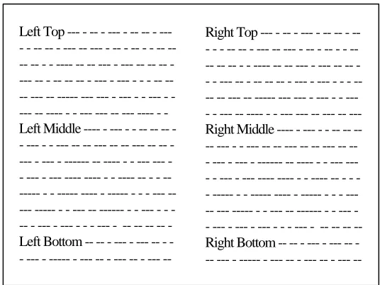
Figure 1 Example of Label 1; Black, No Icon, Left Middle. 20
Figure 2 Warning Column and Placement Conditions 22
Figure 3 The icons used in the experiment 23
Figure 4 Mean RT as a function of Icon factors (in s) 28
Figure 5 Mean RT as a function of Color factors (in s) 29
Figure 6 Mean RT as a function of Column factors (in s) 29
Figure 7 Mean RT as a function of Placement factors (in s) 30
Figure 8 Mean RT as a function of Icon and Color factors (in s) 31
Figure 9 Mean RT as a function of Icon and Column factors (in s) 31
Figure 10 Mean RT as a function of Icon and Placement factors (in s) 32
Figure 11 Mean RT as a function of Color and Column factors (in s) 32
Figure 12 Mean RT as a function of Color and Placement factors (in s) 33
Figure 13 Mean RT as a function of Column and Placement factors (in s) 34
Measuring Visual Search Reaction Time and Accuracy for a Product Label Warning as a Function of Icon, Color, Column and Placement
Introduction
One of the main causes of hospitalization, emergency room visits, and missed work time in this country is accidents. Although accidents can occur from unforeseeable circumstances, most are probably preventable. Some accidents are attributable to a person’s everyday interaction with consumer products, and these accidents can often lead to lawsuits in which the manufacturer is held liable for defects in the product.
Manufacturers should attempt to design the hazard out of their products.
However, sometimes this is not possible. For example, if you dull the blade of a saw or remove the caustic substance from a drain cleaner, this will reduce the functional property of the product, so a manufacture should attempt instead to guard against the hazard. Guarding can sometimes be ineffective in controling hazardous contact and injury. “Any hazard which cannot be guarded against or designed out of a product must be the subject of a warning” (Hardie, 1994). Manufacturers add warnings to the product, in the instruction manual, or on the packaging itself in an attempt to make the hazards known to users. Bogett and Rodriguez (1987) state that it is the legal duty of the product manufacturer to instruct the user on the safe and proper use of the product. Hardie (1994) states that it is the legal duty of the manufacturer to warn against all hazards of the
product, as well as hazards from all foreseeable uses, misuses, and alterations of the product.
possible injuries that can occur while using the product and (2) promote behaviors that can help the user avoid these injuries. Assuming the warning is noticed, if the warning has these components, then the user can make an informed decision regarding the
benefits and risks of complying with the warning. Many studies have been conducted by researchers in disciplines such as Human Factors/ Ergonomics, to determine what makes a warning effective. Wogalter, Godfrey, Fontenelle, Desaulniers, Rothstein, and
Laughery (1987) stated that an effective warning should be: (a) attention getting, i.e., if a target person does not notice the warning they can not read it; (b) comprehensible, i.e., if a warning is not understood by users they may use the product improperly; (c) concise, i.e., the warning should be long enough to get the message across but short enough that it does not intimidate the user; and (d) durable, i.e., the warning label should outlive the product it is placed on. Wogalter and Laughery (1996) present an information-processing model of warning compliance consisting of 5 stages that occur in the following sequence: (1) attention, (2) comprehension, (3) attitudes and beliefs, (4) motivation, and (5)
behavior. This study will be concerned with the first stage, attention.
Lehto (1992) proposed an eight-step model of warning compliance: (1) exposure to the warning stimulus, (2) attention to and active processing of the warning stimulus, (3) comprehension and agreement with the warning message, (4) retention of the warning in memory, (5) retrieval of the message at the time it is relevant, (6) a decision to respond to the warning, (7) performance of the response, and (8) a response adequate to prevent an accident. When designing a warning message, it is important that each of these steps be taken into consideration. Hardie (1994) suggests that this process could be
attention must be drawn to the warning. Assuming the presence of the warning stimulus, step 2 requiring the warning to be attended or noticed will be examined in this thesis.
Placement of Warnings
One way to make a warning noticeable is to place it on an area of the label that is likely to be read. Frantz (1994) found that compliance with a warning was most effective when the warning was integrated with the product’s operating instructions. The warning was most effective in this location as opposed to other places on the label, because people are more likely to read the instructions than any other part of the label. According to Franz, people tend to selectively read only parts of a product label, even if they are unfamiliar with the product. Frantz found that people were more likely to look at the back of a product’s packaging for a warning than the side of that package. Because the warnings on most products are located on the back of the package or label, consumers have formed a preconceived idea or expectation of where the warning should be located. All studies did not agree. In other work, Strawbridge (1986) found that imbedding a warning in the instructions for proper use of the product decreased compliance with the warning.
removed in order to use the cord. This type of label was found to be read and complied with more than a standard on-product label. Unfortunately, many products do not offer this type of interactive label. Also, the intrusiveness of this type of label may cause it to be removed and discarded by an end user which would make the warning ineffective for subsequent uses. This indicates the design and location of an on-product label is critical. One way a warning can be designed to interrupt the normal flow of information
processing is to embed the information within the product instructions. This increases the likelihood that the user will read the warning, assuming they read the instructions.
Wogalter, Kalsher, and Racicot (1992) found that embedding the warning in the instructions produced significantly greater compliance with the warning than if the warning were displayed separately in the user’s environment (on a nearby wall). Placing the warning in a sheet of instructions, instead of on a sign posted on the wall, created a situation in which the warning was more likely to be read by users, because they had to follow a specific set of instructions.
instructions for use and lastly, the active ingredients of the product. In summary, these studies suggest (although they are not all consistent in their findings) that the warning should be placed within the operating instructions or in some other place that interrupts the normal usage of the product, in order to increase the likelihood that the warning will be seen and read.
Defining the Hazard
Before designing a warning for a product, one must first determine what hazards are associated with that product. Bogett and Rodriguez (1987) state that a hazard is an attribute of the product, a condition of the product environment, or an effect of the interaction between the product and the user which is capable of producing a hazardous result. Some guidelines have been provided to help define a hazard (Gormley, Agnew, Anderson, Drown, Fax, Ratica & Ross, 1981). First one should try to look at the product as if it were a new and novel experience. In doing this, one should determine how
should be some coordination between safety labels and instruction literature. This will insure that warning labels do not contradict anything in the manuals, or provide
information that was not present in the manuals. Finally, one must consider product design changes. This can help determine if any changes can be made to the product that could make product safer (Gormley et al., 1981). Once the hazards have been
determined, warnings should be written outlining those hazards and providing suggested avoidance behaviors.
Designing the Warning
The American National Standards Institute (ANSI Z535.4, 1991) has established guidelines recommending that a consumer product warning must contain four
components: (1) a signal word, (2) a statement describing the hazard, (3) a statement of the consequences of involvement with the hazard, and (4) instructions on how to avoid the hazard.
Signal Word
perceived as significantly different in the hazard level they are reporting, ANSI standards still define them as conveying two different levels of hazard. Other studies (Wogalter et al., 1995; Wogalter & Silver, 1995) have tested additional signal words to determine whether three significantly different levels of hazard connotation can be achieved. It was found that using a signal word such as DEADLY or LETHAL produced significantly more hazard association than DANGER. It would be wise, however, to reserve these signal words for hazards with the most dire consequences. Wogalter and Silver (1995) tested 43 words including the three standard signal words. They used a more diverse population of participants than other studies, examining the perceptions of both grade school children and the elderly. Participants were asked to rate these words on evoked carefulness, strength and understandability. The rankings of words were found to be consistent across age groups, but younger students gave higher carefulness ratings than undergraduates. In a study by Wogalter et al. (1987), participants rated the signal word to be the most redundant part of a warning. According to Chapanis, the removal of this signal word has a smaller effect on how a person rates a hazard than the removal of any of the other components, but the signal word can still be useful in capturing attention and relaying some information about the level of the hazard.
Icons
an analogous image to relay the message such as street signs that indicate a steep grade coming up. Exemplar icons use a typical example for a class of objects. Signs depicting a knife and fork to indicate an eating establishment are using exemplar icons. Symbolic icons represent a higher level of abstraction. For example, an icon depicting a child can indicate a school zone. Arbitrary icons use an image that has no relationship to the hazard. For example, the icon that indicates a biohazard is an arbitrary icon. Other researchers divide icons into different categories. Hardie (1994) has defined two different types of icons, pictorials and symbols. Pictorials are pictures that attempt to depict the warning message while symbols are abstractions whose meaning must be learned in order for them to be effective.
the signal icon, an exclamation point enclosed in a triangle, was not rated significantly lower than the skull icon, but was rated significantly higher than other shapes (e.g., circle, triangle, rectangle).
The presence of an icon in a warning has also been found to be more effective in attracting attention to the warning. Laughery, Young, Vaubel, and Brelsford (1993) studied the use of color and icon placement to make a warning more noticeable on alcoholic beverage labels. They measured the reaction time exhibited by participants when searching for a warning on a bottle containing a simulated product label. The results found that warnings paired with an icon were found significantly more quickly than warnings that were not paired with icons.
Color
hazard ratings than when the same word was presented in the control color, black. In a study by Strawbridge (1986) warnings on labels were manipulated by highlighting, embeddedness and position. Each participant was given only one warning highlighting/ embeddedness/ position combination. The participants were directly observed as to whether or not they complied with the warning and afterwards were given a follow-up questionnaire asking whether they had noticed, read, and complied with the warning. The results showed that while highlighting a warning with a color did not improve compliance with the warning, it did improve the likelihood that the participant would read the warning.
User Perceptions
Bogett and Rodriguez (1987) conducted a study examining the relationship
between risk taking and seat-belt usage. Employees of a plant were observed entering the parking lot on the first day of the study and were then given a sensation-seeking survey which examined the risk-taking characteristics of the employee. Employees were
observed for the next two days to see if the survey affected their seat-belt usage. Both the survey and observation should have raised their self-awareness. Bogett and Rodriguez found that the probability of incurring loss had a greater effect on the perceived
perception was more closely related to the severity of the injury and to the severity of the first accident scenario that comes to mind than it was to the probability of injury.
Godfrey, Allender, Laughery and Smith (1983) found that the more hazardous a product is perceived to be, the more likely a person is to look for a warning. The perceived hazardousness of a product can become weaker over time as a person becomes more familiar with a product. If people are familiar with a product, they will be less likely to look for a warning. Familiarity with one product can cause a person to be less likely to look for a warning on a similar product even if the person has not used that product before. However, Wogalter et al. (1991) found that the perceived hazardousness had a much greater influence over a person’s willingness to read a warning than their
familiarity with that product. This study also found that if a product were perceived to be hazardous, a person would expect to find a warning closer to the product (e.g., on the product itself instead of the packaging) and that the warning would not be judged to detract from the appearance of the product. Godfrey and Laughery (1984) found that female participants were more likely to notice a warning on a product during their first interaction with the product.
There are also other factors which can affect a person’s likelihood to look for a warning. For example, if a product is perceived to be hazardous, difficult to use, or expensive, it will increase the person’s likelihood of looking for a warning (Lehto, 1994). This can cause a problem if a product has new warnings on the label about newly
majority of its users, the manufacturer will have to make the warning noticeable. Wright, Creighton, and Threlfall (1982) used 60 products (30 electrical and 30 non-electrical) to study people’s likelihood of reading an accompanying product information pamphlet. Participants were asked to rate how much of an informative pamphlet they would read for each of the products and then asked to rate each product as to whether or not it was familiar, safe, simple, cheap, or used by the participant. They found that whether or not a product was used by a participant, its perceived complexity was a good determinant of how likely a person would be to read the pamphlet. Godfrey et al. (1983) asked participants to rate products with skin-contact, inhalation, and swallowing hazards on familiarity, perceived hazard, and how likely they would be to look for a warning on the product. They found that the more hazardous a product was perceived to be, the more likely a participant would be to look for a warning. Wogalter, Barlow, and Murphy (1995) studied whether participants complied with a warning when installing a computer hard drive under various warning conditions. They found that participants were more likely to comply with the warning if they were less experienced setting up computer components.
Visual Search
report that they have seen a warning or incorrectly remember having seen the warning. The present study will use a reaction time technique to measure a person’s search time for a warning under different conditions.
There are many guidelines for designing a display in order to make a search for a given object as easy as possible. Tullis (1994) suggests many such guidelines and characteristics for displays, in order to make a target easier to find in the display. For example, it is important not to have a cluttered display. Clutter, also known as visual noise, refers to the number of distracters present which compete for one’s attention when searching for a target. This can be applied to the design of product labels. Often labels are very cluttered, particularly for over-the-counter (OTC) pharmaceuticals, because a lot of information needs to be displayed in a limited amount of space, and search for any given aspect on the label is difficult. Tullis (1994) suggests, “when using the same items on different displays, make an attempt to locate them in the same position on all
displays.” While some standardization may be possible, there are inevitable difficulties due to the different sizes, layouts, and amount of information which different product labels must convey to the consumer. The designer should, instead, look at different ways of coding the information to make it stand out on the label. Wogalter et al. (1992) also showed that compliance was significantly greater when a warning was presented in an uncluttered environment than in a cluttered one.
from trial to trial. Viewing a product label for a given warning is most similar to varied mapping condition. Depending on the task, a person may be searching for a warning about allergies, storage conditions, or contraindications. A warning may not always be what a person is searching for on a product label. Recently, the U.S. Food and Drug Administration has published a proposed rule requiring standardized placement of information on over-the-counter drug labels (Vigilante & Wogalter, 1996). This would aid in the search for warnings on a label, because they would always be in the same place. Therefore, if the manufacturer wants the warning to be noticed, they may have to use some other ways to make it stand out from its background (i.e. the rest of the label).
to the consumer. A problem arises, however, if color is used on other parts of the display. In a visual search task, if someone is searching through a field of characters for a given target and a non-target character is a different color than everything else, it will increase the search time for the target. This is due to the fact that the highlighted item is always examined first in a search task (Jonides & Yantis, 1988).
Present Research
noticeable combination of the aforementioned characteristics, one hopes that this
information will be useful for the design of warning labels, by maximizing the likelihood that they will be noticed on a cluttered label.
The experiment was a 5 (icon) x 3 (signal word and color) x 2 (column) x 3 (placement), with a control added, repeated measures, within-subjects design. There were five icon conditions (no icon, asterisk, signal icon, Mr. Yuk, and a
skull-and-crossbones icon). The skull-and-skull-and-crossbones symbol (see Figure 3 in Method section) was used because people associate it with poison and a high level of hazard (Wogalter et al., 1995). Unfortunately, the skull-and-crossbones symbol does not show the same hazard association when tested with children (Kirk, 1971). The Mr. Yuk symbol (see Figure 4 in Method section) was designed by the Pittsburgh Poison Control Center to give children an icon to associate with hazardous substances. The Mr. Yuk resembles a scowling, green face with a protruding tongue and was tested to be the least attractive to children (Kirk, 1971). Here it will be used to indicate that the product in the container has associated hazards. This icon is usually presented with a fluorescent green background, but in this study, just the outline form was used. The signal icon (see Figure 5 in method section) was tested, because it is already used on a wide variety of consumer product labels and containers (as per ANSI Z535.4). The asterisk (see Figure 6 in Method section) was tested to see if any graphic symbol, even one with no associated hazard connotation, would improve noticeability. Each icon spanned two lines in height. This was necessitated by the resolution of the screen. If the icons were sized down to fit on a single line, they were no longer legible (i.e. recognizable) when presented on the
signal word warning was presented in all capital letters. While there were other words on the label appearing in all capital letters, this reflects the design of the original label and was retained for ecological validity.
HYPOTHESIS 1: The presence of an icon with the signal word
WARNING will significantly decrease reaction time to detect the presence of an adjacent warning (i.e., improve performance) over conditions where the signal word WARNING appears alone. Also, there will be no
significant difference in reaction time found between different icons. However if there is a difference, it is expected that the hazard-connoting icons (e.g., signal icon, skull-and-crossbones, Mr. Yuk) will product faster reaction times than an icon with no obvious hazard connotation (asterisk). The color conditions presented the icon and signal word in one of three colors; red, blue or black (the same color as the surrounding text). The presence of a color different than the surrounding text was expected to influence reaction time to detect a target warning on a label. Thus, the presence of color different than the surrounding text in the warning element should decrease reaction time relative to its absence because it should cause the signal word and icon to “pop-out.” One color that was tested is red, because it has been found in several studies that red has the highest level of associated hazard (Wogalter et al., 1995; Chapanis, 1994) and has been shown to increase the
Blue was the second color used in this study. In conditions where the color was present, the signal word, icon, or both were presented in that color. The signal word condition also involved the presence versus absence of the signal word. The signal word tested was WARNING. Although DANGER is associated with higher levels of hazard than WARNING, WARNING is more common on over-the-counter drug labels.
HYPOTHESIS 2: The signal word/icon pair presented in either red or blue will significantly improve (decrease) reaction time for warnings over the signal word/icon presented in black (the same color as the surrounding text).
The warning appeared in either the left or the right column on the simulated product label. This placement was expected to affect reaction time. It has been found that a person’s culture can have an effect on their pattern of scanning when looking at a field of objects. Native readers of English or most other European languages have a tendency to fixate on the top left quadrant of the visual search space (Abed, 1991). Abed also found that the tendency to fixate on the left visual field appears to override usual cultural scanning tendencies. Chen (1981) found that native Chinese readers who had as little as one year of English, showed a tendency to scan material from left to right.
Because the student population at North Carolina State University is largely composed of native English readers, or those who have a high fluency, it was predicted that warnings located in the left column of text would produce faster reaction times than those warnings located in the right column.
where the warning is in the right column.
The warning appeared at the top, in the middle or at the bottom of a column. This placement was also predicted to affect reaction time. People of all cultures tend to show a stronger tendency to scan material from top to bottom than from bottom to top (Abed, 1991; Chen, 1981). Therefore it is predicted that warnings located at the top of a column of text would produce faster reaction times than those located in the middle or at the bottom of a column.
HYPOTHESIS 4: Conditions which place the warning at the top of the column will show significantly better (faster) reaction times than warnings placed in the middle or at the bottom of a column. It was predicted, however, that there would be no significant difference found in the reaction times for warnings located in the middle or at the bottom of a column.
A final condition included the warning label with no signal word or icon. This condition served as the control.
HYOTHESIS 5: Any condition containing WARNING and/ or an icon, regardless of color, will show significantly better (faster) reaction times than the control condition.
Method
Participants
Forty participants were recruited from the introductory psychology course at North Carolina State University, and all participated as part of a course requirement. The recruitment sheet for the study indicated that the task would involve searching for a phrase in a block of text. The recruitment sheet also stated that people who sighed up should not be color-blind. Twenty-three of the participants were male (57%) and 17 were female (43%). The average age of the participants was 20.6 yrs., with a standard
deviation of 4.31 yrs. The ethnic variation of the participants was 70% Caucasian (28),
multi-symptom relief of colds, sinusitis and flu. Each tablet contains a decongestant to temporarily relieve nasal congestion, sinus pressure and reduce swollen nasal passages; an antihistamine to temporarily relieve sneezing, runny nose, and watery eyes; and a pain reliever to temporarily relieve headache, body aches, minor sore throat pain and reduce fever. Each tablet is coated for easy swallowing. INDICATIONS: For the temporary relief of headache, nasal congestion, runny nose, sore throat, fever and minor aches and pains due to a cold and for sneezing and itchy, watery eyes due to hay fever or other upper respiratory allergies. DIRECTIONS: ADULTS: 2 tablets every 4 hours, not to exceed 12 tablets in 24 hours. CHILDREN (6-12): 1 tablet every 4 hours, not to exceed 5 tablets in 24 hours. Children under 6 years of age: consult a doctor. WARNING: Keep this and all drugs out of reach of children. Do not take this product if you are taking sedatives or tranquilizers, without first consulting your doctor. Use caution when driving a motor vehicle or operating machinery. Do not exceed recommended dosage because at higher doses nervousness, dizziness or sleeplessness may occur. Do not take this product if you have a breathing problem such as emphysema or chronic bronchitis, glaucoma, heart disease, high blood pressure, thyroid disease, diabetes, or difficulty in urination due to an enlargement of the prostate gland, unless directed by a doctor.
THIS PRODUCT IF YOU ARE PRESENTLY TAKING A PRESCRIPTION DRUG FOR HIGH BLOOD PRESSURE OR DEPRESSION, OR A MONAMINE OXIDASE INHIBITOR, WITHOUT FIRST CONSULTING YOUR DOCTOR. Do not take this product for more than 7 days or for fever for more than 3 days. If pain or fever persists or gets worse, if new symptoms occur, or if redness or swelling is present, consult a doctor because these could be signs of a serious condition. If sore throat is severe, persists for more than 2 days, is accompaniefdby fever, headache, rash, nausea, or vomiting, consult a doctor. As with any drug, if you are pregnant or nursing a baby, seek the advice of a health professional before using this product. In case of accidental overdose, seek professional assistance or contact a poison control center immediately. Prompt medical attention is critical for adults, as well as for children, even if you do not notice any signs or symptoms. ACTIVE INGREDIENTS: Each tablet contains Acetaminophen 325 mg, Phenylephrine HCI 5 mg and Chlorpheniramine Maleate 2 mg. INACTIVE INGREDIENTS: Calcium Stearate, Crescamallose, Sodium, S&C Yellow #10 Lake, FD&C Yellow #6 Lake, Hydroxypropyl Methylcellulose, Microcrystalline Cellulose, Polyethylene Glycol, Povidone, Starch, Stearic Acid. May also contain D&C Red #7 Lake, Pharmaceutical Glaze, Titanium Dioxide.
17% African-American (7), 5% Asian-American (2), and 8% Other ethnic background. The participant group consisted of 18 Freshmen (45%), 11 Sophomores (27%), 5 Juniors (13%), 4 Seniors (10%), and 2 (5%) of other classification. Twelve of the participants had some sort of vision correction, either glasses or contacts, and 10 of them were wearing them for the experiment.
Materials
presentation were adjusted to the same brightness when displayed on the computer screen. By changing two sample areas of color to grayscale the brightness could be numerically compared. The colors were then altered until both grays were measured to have the same brightness.
The warning was placed on the label in one of two columns and one of three vertical positions (see Figure 2). This prevented the participant from anticipating the position of the warning on the label. This also reflects real life, as product labels are not standardized in their layout. Each label contained one of four warning phrases; “Keep this and all drugs out of reach of children,” “Keep this and all drugs out of direct sunlight,” “May cause drowsiness,” and “May cause dizziness.” Within a single experimental condition, either the “Keep this and all drugs out of reach of children”-“Keep this and all drugs out of direct sunlight” pair or the “May cause drowsiness”-“May cause dizziness” pair were used. One warning appeared on each label, and the participant
- - - - - - - - - - - - - - - Left Middle - - - - - - - Left Bottom
Right Top - - - - - - - - - - - - - - - - - - -- - -- -- - -- - - -- - - -- - - - -- -- -Right Middle - - - - - - - - - - -- - -- -- - -- -- - -- -- -- Right Bottom - - - - - - - - -
had to determine which one was present. These warnings were paired such that they hadsimilar word lengths and messages; “Keep this and all drugs out of reach of children,” was paired with “Keep this and all drugs out of direct sunlight,” and “May cause drowsiness,” was paired with “May cause dizziness.” The participant would, therefore, have to read the entire warning before making a response.
Design
This experiment examined 5 icon conditions (no icon, asterisk, signal icon, Mr. Yuk, and the skull-and-crossbones, see Figure 3) paired with the signal word
WARNING, 3 color conditions (icon/signal word pair presented in black, red, or blue), 2 column conditions (left, right), 3 placement conditions (top, middle, bottom), and 1 control (no icon or signal word). In this 5x3x2x3+1 design, there were 96 different label conditions for each warning. So within an experimental condition, each warning of a warning pair would be seen in all conditions and the control condition (absence of color, signal/icon pair) would be seen once in each of the positions for a total of 192 stimuli.
Ý
N
Asterisk Signal Icon Mr. Yuk Skull and Crossbones
Procedure
The participants were invited into the laboratory and sat down at the computer. They then viewed a pair of warnings on a piece of paper according to their experimental condition. They were given as long as they wanted to look at the warnings with the understanding that the warnings had to be memorized. Half of the participants were searching for the “Keep this and all drugs out of reach of children” - “Keep this and all drugs out of direct sunlight” pair. The other half were searching for the “May cause drowsiness” - “May cause dizziness” pair.
It was then explained how the experiment worked and what they could expect to see on the screen. At the beginning of each trial, the word “READY?” appeared in the center of the screen until the participant hit the space bar located in the middle of the bottom row on the keyboard. Next, a simulated product label appeared on the screen and the participant decided which of the two given warnings was present on the label. The participants were told that the warning that they were looking for would always appear adjacent to the icon/signal word pair and that one of the two warnings was always present. They were shown which warning corresponded to which response key. The participants used the numeric keypad located on the right hand side of the standard
any way. The computer recorded the reaction time between the initial presentation of the label and the participant’s keypress and provided feedback after each response by
sounding a bell for a correct response and a buzzer for an incorrect response. The participants were told what these sounds meant and heard them for the first time during the practice trials.
Each warning of a warning pair was present in 50% of the trials. First, participants were given a practice session of trials representing each warning in each label condition once, presented in a random order (32 practice trials). When the participants were done with the practice trials, they were asked to write down the two warnings that they were looking for. They were then allowed to look at the warnings again before beginning the main experiment. At the beginning of the experiment, the PsyScope program prompted participants for demographic information (age, sex, ethnic background, year in school, whether or not they normally wore glasses, and whether they were wearing glasses or contacts for the experiment). This information was recorded in a log with the reaction times. Each participant completed 192 trials in their experimental condition (one of the two pairs of warning phrases). The 192 stimuli, each
color/icon/placement/column condition plus control for each of two warnings, were presented in random order. Each participant saw every label condition twice over the experiment, once for each of the two warning phrases.
out of reach of children,” and was presented in the middle of the left column. The cards represented all combinations of the signal word/icon pair and the control. All participants received the same set of cards. This ranking procedure was to see if there were any subjective difference between the different icon and color conditions. Even if the icons showed no significant difference in the reaction time study, a person’s reaction to a certain icon might affect their warning compliance.
Results
Reaction Time Data
There was no significant difference in reaction times when comparing the four different testing conditions nor was there a difference among the four warnings used (different warning pairs and key mappings, see Appendix A4). Thus, the reaction times for the separate warning messages were combined.
A 5 (icon) x 3 (color) x 2 (column) x 3 (placement) analysis of variance (ANOVA) was carried out on the reaction data (See Appendix A1 for the complete summary table). There was an average error rate of 3.17 out of 192 (1.7%). Because of this low rate, errors were averaged in with the rest of the reaction times.
Reaction times for all combinations of icon, color, column and placement were significantly faster than reaction times for the control condition at a value of p<.05.
slower than for conditions in which any of the other icons were present. There were no significant reaction time differences among the four icon-present conditions.
There was a significant main effect found for color, F (2, 78) = 184.9, p < .05 (see Figure 5). Tukey’s HSD post hoc test at a significance level of α=.05 indicated that reaction times for conditions in which the icon/signal word pair was presented in the same color as the rest of the surrounding text (black) produced significantly slower reaction times than for conditions in which the icon/signal word pair was in a color that was different than the surrounding text (red, blue). There was no significant difference in reaction time found between conditions in which the icon/signal word pair was presented in red and those in which it was presented in blue.
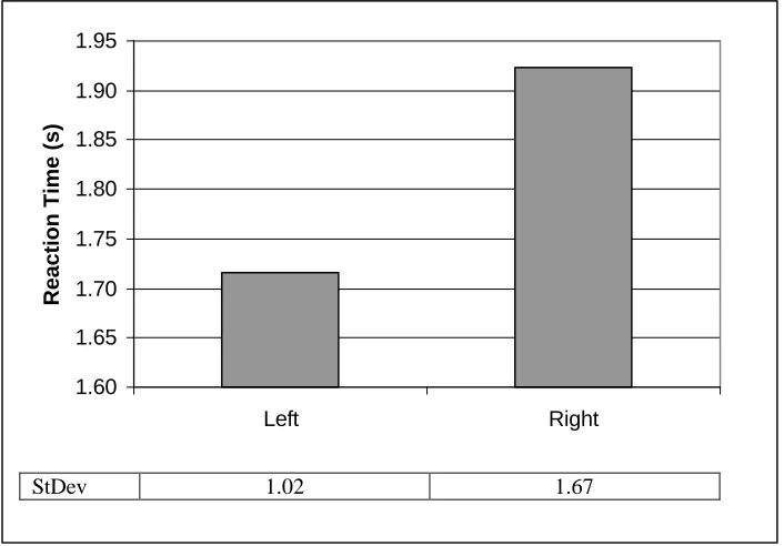
The results showed a significant main effect for column, F (1,39) = 18.4, p<.05 (see Figure 6). Conditions in which the warning was placed in the left column showed significantly faster reaction times than conditions in which it was placed in the right column.
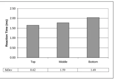
There was a significant main effect found vertical placement, F (2,78) = 20.5, p< .05 (see Figure 7). Tukey’s HSD post hoc test at a significance level of α=.05 showed that reaction times for warnings placed at the bottom of a column were significantly slower than reaction times for warnings placed either in the middle or at the top of a column. Reaction times for warnings placed in the middle of a column were not significantly different than reaction times for warnings placed at the top of a column.
the surrounding text (black) and not paired with an icon, was there any significant
difference. All other conditions combining icon and color show no significant difference among them. Although part of this effect could be due to the fact that when an icon was present there was more color on the label, no significant differences were found between labels with an icon/signal word pair presented in color and labels with only the signal word presented in color.
The interaction of icon and column showed a significant effect at F (4, 156) = 39.1, p < .05 (see Figure 9). The condition in which no icon was present showed significantly slower reaction times than those conditions in which an icon was present. There was no significant difference in reaction times found among the conditions in which an icon was present, regardless of the column that it was presented in. The
3.19
1.53 1.42 1.45 1.50
10.57
0.00 2.00 4.00 6.00 8.00 10.00
No Icon Asterisk Signal Icon Mr. Yuk Skull Xbones
Control
Reaction Time (s)
StDev 2.69 0.27 0.17 0.16 0.22 4.31
2.59
1.46 1.41
10.57
0.00 2.00 4.00 6.00 8.00 10.00 12.00
Black Red Blue Control
Reaction Time (s)
StDev 2.20 0.24 0.15 4.31
Figure 5 – Mean RT as a function of Color factors (in s)
1.60 1.65 1.70 1.75 1.80 1.85 1.90 1.95
Left Right
Reaction Time (s)
StDev 1.02 1.67
condition in which the signal word was presented with no icon in the left column showed significantly faster reaction times than the condition in which it was in the right column.
The interaction of icon and placement was significant at F (8, 312) = 6.2, p <. 05 (see Figure 10). Conditions in which no icon was present, located at the top, in the middle or at the bottom of a column, showed significantly slower reaction times than for conditions in which an icon was present in all placements. Within the condition where no icon was present, warnings located at the top of the column were found to be significantly faster than those located in the middle of the column, which were found to be
significantly faster than warnings located at the bottom of the column. There was no significant difference found among the conditions in which an icon was present regardless of the placement of the warning within the column.
0.00 0.50 1.00 1.50 2.00
Top Middle Bottom
Reaction Time (ms)
StDev 0.62 1.59 1.69
0.00 1.00 2.00 3.00 4.00 5.00 6.00 7.00
Reaction Time (s)
Black 6.34 1.71 1.62 1.55 1.73
Red 1.70 1.49 1.33 1.37 1.40
Blue 1.55 1.40 1.32 1.43 1.37
No Icon Asterisk Signal
Icon Mr. Yuk
Skull Xbones
Figure 8 – Mean RT as a function of Icon and Color factors (in s) (Mean RT for control=10.57s)
Figure 9 – Mean RT as a function of Icon and Column factors (in s) (Mean RT for control=10.57s)
0.00 0.50 1.00 1.50 2.00 2.50 3.00 3.50 4.00
Reaction Time (s)
Left 2.58 1.54 1.46 1.46 1.55
Right 3.81 1.53 1.38 1.44 1.45
0.00 0.50 1.00 1.50 2.00 2.50 3.00 3.50 4.00
Reaction Time (s)
Top 2.62 1.44 1.36 1.38 1.44
Middle 3.22 1.43 1.41 1.38 1.45
Bottom 3.74 1.73 1.50 1.59 1.61
No Icon Asterisk Signal
Icon Mr. Yuk
Skull Xbones
Figure 10 – Mean RT as a function of Icon and Placement factors (in s) (Mean RT for control=10.57)
0.00 0.50 1.00 1.50 2.00 2.50 3.00 3.50
Reaction Time (s)
Left 2.24 1.47 1.44
Right 2.94 1.44 1.38
Black Red Blue
The interaction of color and column was significant at F (2,78) = 34.0, p<.05 (see Figure 11). The conditions in which the icon/warning pairs were presented in the same color as the surrounding text (black) in either the left and right column, showed
significantly slower reaction times than conditions in which the icon/warning pairs were presented in a contrasting color (blue, red). The warnings were found significantly faster when the icon/signal word pair was presented in black and located in the left column than when it was located in the right column. There was no significant difference in reaction times between warnings presented in red or blue regardless of which column the warning was presented in.
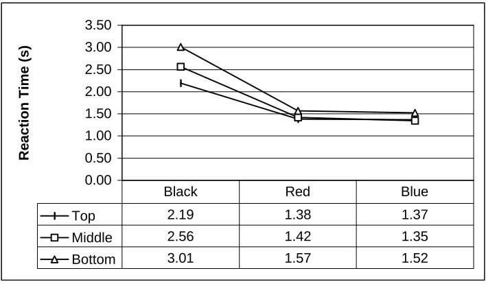
The interaction of color and placement was significant at F (4, 156) = 6.3, p < .05. Signal word/icon pairs presented in black showed significantly slower reaction times than those presented in red or blue in all placement positions. Within the condition where the
0.00 0.50 1.00 1.50 2.00 2.50 3.00 3.50
Reaction Time (s)
Top 2.19 1.38 1.37
Middle 2.56 1.42 1.35
Bottom 3.01 1.57 1.52
Black Red Blue
were found significantly faster than those located in the middle of the column which were found significantly faster than warnings located at the bottom of the column. There was no significant difference in reaction times between warnings presented in red or blue regardless of their column placement.
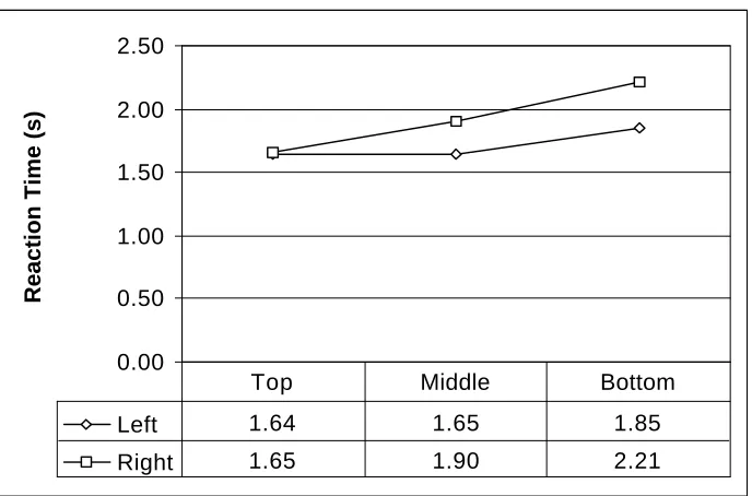
The interaction of column and placement was significant at F (2, 78) = 5.2, p < .05 (see Figure 13). Warnings located in the bottom of the right column showed
significantly slower reaction times than warnings in any other position. Warnings in the middle of the right hand column showed significantly slower reaction times than
warnings in the middle of the left column or at the top of either column. Warnings located in the middle of the right column were found significantly more slowly than warnings located at the bottom of the right column, but not those located at the bottom of the left column. There was no significant difference between reaction times for warnings
Figure 13 – Mean RT as a function of Column and Placement factors (in s) (Mean RT for control=10.57s; the control was not averaged in here)
0.00 0.50 1.00 1.50 2.00 2.50
Reaction Time (s)
Left 1.64 1.65 1.85
Right 1.65 1.90 2.21
located at the top of either column, or the middle of the left column.
The interaction of color, icon and column was significant at F (8, 312) = 36.3; p<.05 (see Appendix A3.6). The conditions in which the warning was presented in black with no icon showed significantly slower reaction times than all other conditions. Within this group, warnings located in the right column were found significantly more slowly than warnings located in the left column. There were no significant differences found between the other conditions.
The interaction of color, icon and placement within the column was significant at F (16, 624) = 6.3, p<.05 (see Appendix A3.7). When the warning was presented in black with no icon present in all three positions the reaction times were significantly slower than all other warning conditions. Within this grouping, warnings located at the bottom of a column were found significantly more slowly than those located at the top of a column. Warnings located in the middle of the column were found faster than those at the bottom of the column and slower than those at the top of the column, but were not significantly different from either of these. There were no significant differences found among the other conditions.
Ranking Data
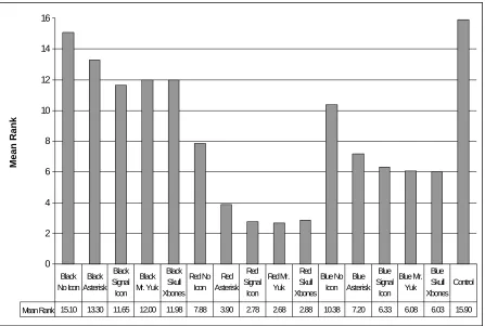
indicates that a warning was more noticeable; a ranking of 1 was given to the most noticeable.
Based on the Wilcoxon signed rank-sum-test with Bonferonni correction for α, the control label condition was ranked significantly worse than any of the other labels (all labels conditions are presented in Appendix C). The black/no icon label condition was ranked significantly worse than any other condition, except for the control label. The control label condition was ranked the worst of all conditions.
Overall, labels with the signal word/icon pair presented in red were preferred over those presented in blue or black. Those signal word/icon pairs presented in blue were preferred over those presented in black.
0 2 4 6 8 10 12 14 Mean Rank
Mean Rank 15.10 13.30 11.65 12.00 11.98 7.88 3.90 2.78 2.68 2.88 10.38 7.20 6.33 6.08 6.03 15.90 Black No Icon Black Asterisk Black Signal Icon Black Mr. Yuk Black Skull Xbones Red No Icon Red Asterisk Red Signal Icon Red Mr. Yuk Red Skull Xbones Blue No Icon Blue Asterisk Blue Signal Icon Blue Mr. Yuk Blue Skull Xbones Control
Overall, labels which had some sort of icon present were preferred over those that that did not have an icon. Although very few preference differences were seen among the different icons, the asterisk tended to be less preferred.
While labels with icons were preferred, the labels in which the icon was absent but the signal word was presented in red or blue were preferred over conditions in which icons were present, but presented in black.
The specific interactions are summarized in Appendix A4
Discussion
This study examined the effects of manipulating several warning characteristics, using a reaction time experiment and a preferrence task. It was only the second-known reaction-time study using warning materials. Several interesting and meaningful results were found.
hazard. If the product contains a poisonous substance, one might want to use the skull-and-crossbones icon. If the main concern is that a product be kept away from children even though it is not inherently poisonous (e.g., large doses of aspirin can be toxic), the Mr. Yuk icon might be the best choice. In the ranking task, people showed a preference for warnings with icons that have some hazard connotation over the asterisk (Wogalter, Magurno, Frederick & Herrera, 1997; Wogalter, Kalsher, Frederick, Magurno & Brewster, 1998), even though this effect was not reflected in the reaction time data.
The study showed that there was also a substantial effect of the addition of a color different than the rest of the text to a warning on a product label. Reaction times were reduced, showing that people were finding the warnings faster. The presence of color on a label with otherwise uniform black text helps that area “pop-out” of the surrounding text due to a pre-attentive search. The color makes it easier to find a warning. Although no difference in reaction time was found between searching for warnings placed next to a red icon/signal word pair and one next to a blue icon/signal word pair, one should not consider these to be interchangeable. Studies have found that red connotes a greater hazard than blue (Wogalter et. al., 1997; Wogalter et. al., 1998). A manufacturer would also have to consider that different colors indicate different levels of hazard. While red may indicate a warning, blue may connote a less critical piece of information. Even though no difference was found in reaction time, people tended to prefer the icon/signal word pair presented in red over blue as shown in the sorting task.
placement showed no effect. The presence of an icon/signal word pair seems to “pop-out” of the surrounding text, due to a pre-attentive search. The icon/signal word pair makes it easier to find a warning.
Similarly, this effect is found in the interaction between icon and placement within the column. When no icon was present, the search pattern caused the warnings located at the top of a column to be found more quickly than those located at the bottom of the column. The addition of an icon overrode this scanning pattern, causing the icon/signal word pair to “pop-out” of the surrounding field of text.
The interaction effect between color and column showed that the addition of color overrode any effects associated with the column in which a warning was presented. When the icon/signal word pair was presented in black, the warning was found more quickly in the left column than in the right column, but when it was presented in either red or blue, no difference was found between placement in the left or right column. The color caused the icon/signal word to “pop-out” of the surrounding text and therefore made the warning located next to it more noticeable.
The interaction between color and vertical placement showed that the addition of color overrode any effects of where the warning was placed within the column.
Icon/signal word pairs presented in black showed significant differences in reaction time depending upon where the warning was located within the column. This result showed a scanning pattern that follows the top-to-bottom pattern used in reading. When an
The interaction between icon, color and column and the interaction between icon, color and placement, showed similar results. The search pattern which seems evident (left to right, top to bottom) when there was no icon paired with the signal word
disappeared with the addition of an icon or color. Even when the icon/signal word pair was presented in black, as long as there was an icon, the “pop-out” effect was still present.
Although very clear effects were found for the different factors tested here, the warning searched for was the first sentence after the icon/signal word pairs. It will not always be the case that the first warning is the warning that a consumer is seeking. Further research should be done to see what sort of effect color and icon have on a warning located deeper in a list of warnings or even located in another location on the label. Other areas that could be examined in future research include the effect of the presence of more than one warning on a given label, the consequences of having more of the warning text in a different color, and the influence of labels that have multiple colors or that do not have a white background.
or black print might be considered. Alternately, the background might be changed. In this study, no significant difference was found in reaction times for signal words paired with known warning icons and those paired with the asterisk. As with color, it can be assumed that any icon might work in this situation to improve the reaction time over labels which do not have an icon present. However, this should not be the only consideration in deciding which icon to use on a warning label. The manufacturer should also take into consideration the hazard connotation of the icon. While the asterisk might help noticeablility in the pre-attentive phase, it might not be good for the hazard
connotation phase. Hazard connotation was not examined in the present research. In further study it would also be advisable to test these icon/signal word pairs on actual product labels instead of simulated labels presented on a computer. With the advancement of software and printer technology, realistic product labels could be simulated and attached to containers similar to the actual product being tested. With the advancing technology, three-dimensional rendering could allow the participants to
interact with a label in a computer environment that better mimics the real world. In both of these cases, reaction time could still be used as a measure of noticeability. These icon/signal word pairs could also be tested to see if these conditions have any effect on reading, memory retention or compliance.
Conclusions
• Add color.
• Add an icon.
References
Abed, F. (1991). Cultural influences on visual scanning patterns. Journal of Cross-Cultural Psychology, 22, 525-534.
Beaumont, G. P., & Knowles, J. D. (1996) Statistical Tests: An introduction with MINITAB commentary. Prentice Hall International. Englewood Cliffs, NJ.
Bogett, W. R., & Rodriguez, L. (1987). On the influence of a perception of danger on the effectiveness of warnings for product users. Hazard Prevention, July/August, pp. 19-24.
Braun, C. C., & Silver, N. C. (1995). Interaction of signal word and colour on warning labels: differences in perceived hazard and behavioral compliance.
Ergonomics, 38, 2207-2220.
Chapanis, A. (1994). Hazard associated with three signal words and four colours on warning signs. Ergonomics, 37, 265-275.
Chen, M. J. (1981). Directional scanning of visual displays: A study with Chinese subjects. Journal of Cross-Cultural Psychology, 12, 252-271.
Dewar, R. (1994). Design and evaluation of graphic symbols. Proceedings of Public Graphics, pp. 24.1-25.
Doll, T. J. (1993). Preattentive processing in visual search. Proceedings of the Human Factors and Ergonomics Society 37th Annual Meeting, pp. 1291-1294.
Duffy, R. R., Kalsher, M. J., & Wogalter, M. S. (1993). Increased
effectiveness of an interactive warning in a realistic incidental product-use situation. Proceedings of the Human Factors and Ergonomics Society 37th Annual Meeting, pp. 935-939.
Frantz, J. P. (1994). Effect of location and procedural explicitness on user processing of and compliance with product warnings. Human Factors, 36, 532-546.
Godfrey, S. S., Allender, L., Laughery, K. R. & Smith, V. L. (1983). Warning Messages: Will the consumer bother to look? Proceedings of the Human Factors Society 27th Annual Meeting, pp. 950-954.
Godfrey, S. S., & Laughery, K. R. (1984). The biasing effect of product familiarity on consumers’ awareness of hazard. Proceedings of the Human Factors Society 28th Annual Meeting, pp. 483-486.
Gormley, J. F., Agnew, G. R., Anderson, R., Drown, J. L., Fax, D. H., Ratica, R., & Ross, K. (1981) Product Safety Label Handbook. Trafford, PA: Westinghouse Printing Division.
Hardie, W. H. (1994). A critical analysis of on-product warning theory. Product Safety & Liability Reporter, February 11, pp. 145-163.
Heiman, G. W. (1992) Basic Statistics for the Behavioral Sciences. Houghton Mifflin Company. Boston, MA.
Jonides, J., & Yantis, S. (1988). Uniqueness of abrupt visual onset in capturing attention. Perception & Psychophysics, 43, 346-354.
Meeting, pp. 1519-1523.
Kirk, N. S. (1981). Poison prevention packaging act, 1970: A human factors standard. Applied Ergonomics, 12, 195-201.
Laughery, K. R., Young, S. L., Vaubel, K. P., & Brelsford, J. W. Jr. (1993). The noticeability of warnings on alcoholic beverage containers. Journal of Public Policy & Marketing, 12, 38-56.
Lehto, M. R. (1992). Designing warning signs and warning labels: Part II-Scientific basis for initial guidelines. International Journal of Industrial Ergonomics, 10, 115-138.
Strawbridge, J. A. (1986). The influence of position, highlighting, and imbedding on warning effectiveness. Proceedings of the Human Factors Society 30th Annual Meeting, pp. 716-720.
Tullis, T. S. (1983). The formatting of alphanumeric displays: A review and analysis. Human Factors, 25, 657-682.
Vigilante, W. J., Jr., & Wogalter, M. S. (1996). The ordering of over-the-counter pharmaceutical label components. Proceedings of the Human Factors and Ergonomic Society 40th Annual Meeting, pp. 141-145.
Wang, Q., Cavanagh, P., & Green, M. (1994). Familiarity and pop-out in visual search. Perception & Psychophysics, 56, 495-500.
(1991). Consumer product warnings: The role of hazard perception. Journal of Safety Research, 22, 71-82.
Wogalter, M.S., Frederick, L. J., Magurno, A. B, & Herrera, O. L. (1997). Connoted hazard of Spanish and English warning signal words, colors, and symbols by native Spanish language users. Proceedings of the 13th Triennial Congress of the International Ergonomics Association, IEA’97, 3, 353-355.
Wogalter, M. S., Godfrey, S. S., Fontenelle, G. A., Desaulniers, D. R., Rothstein, P. R., & Laughery, K. R. (1987). Effectiveness of warnings. Human Factors, 25, 599-612.
Wogalter, M. S., Jarrard, S. W., & Simpson, S. N. (1994). Influence of warning label signal words on perceived hazard label. Human Factors, 36, 547-556.
Wogalter, M. S., Kalsher, M. J., Frederick, L. J., Magurno, A. B., & Brewster, B. M. (1998). Hazard level perceptions of warning components and configurations.
International Journal of Cognitive Ergonomics, 2, 123-143..
Wogalter, M. S., Kalsher, M. J., & Racicot, B. M. (1992). The influence of location and pictorials on behavioral compliance to warnings. Proceedings of the Human Factors Society 36th Annual Meeting, pp. 1029-1033.
Wogalter, M. S., & Laughery, K. R. (1996). Warning! Sign and label effectiveness. Current Directions in Psychological Science, 5, 35-37.
Wogalter, M. S., Magurno, A. B., Carter, A. W., Swindell, J. A., Vigilante, W. J., & Daurity, J. G. (1995). Hazard association of warning header components.
strength and understandability by children, elders, and non-native English speakers. Ergonomics, 38, 2188-2206.
Appendix A: Reaction Time Data
A1 ANOVA Table
A2 Main Effects
A2.1 Icon Factors A2.2 Color Factors A2.3 Column Factors A2.4 Placement Factors A3 Interaction Effects
A3.1 Icon and Color Interaction Factors A3.2 Icon and Column Interaction Factors A3.3 Icon and Placement Interaction Factors A3.4 Color and Column Interaction Factors A3.5 Color and Placement Interaction Factors A3.6 Icon, Color and Column Interaction Factors A3.7 Icon, Color and Placement Interaction Factors
A1 ANOVA Table
Key
A Icon
B Color
C Column
D Placement
Source of Variation
df Sum of Squares Mean Square F p
Subjects 39 357960612.034 9178477.232
A 4 1706940662.937 426735165.734 241.531 0.0000
Error 156 275619257.241 1766790.111
B 2 1068456696.000 534228348.000 184.956 0.0000
Error 78 225296305.622 2888414.175
AB 8 2545657712.186 318207214.023 131.349 0.0000
Error 312 755854129.636 2422609.390
C 1 38394959.868 38394959.868 18.406 0.0001
Error 39 81355378.532 2086035.347
AC 4 235553133.824 58888283.456 39.072 0.0000
Error 156 235121454.665 1507188.812
BC 2 112862012.776 56431006.388 34.034 0.0000
Error 78 129331329.824 1658093.972
ABC 8 498327576.399 62290947.050 36.301 0.0000
Error 312 535376476.445 1715950.245
D 2 92600802.602 46300401.301 20.517 0.0000
Error 78 176018960.687 2256653.342
AD 8 86237206.901 10779650.863 6.254 0.0000
Error 312 537749726.588 1723556.816
BD 4 56129741.993 14032435.498 7.670 0.0000
Error 156 285387486.251 1829406.963
ABD 16 171931464.796 10745716.550 6.297 0.0000
Error 624 1064843804.516 1706480.456
CD 2 19515110.111 9757555.055 5.229 0.0074
Error 78 145557703.623 1866124.405
ACD 8 16934849.398 2116856.175 1.460 0.1713
Error 312 452502488.980 1450328.490
BCD 4 4199768.841 1049942.210 0.777 0.5416
Error 156 210767580.826 1351074.236
ABCD 16 20133207.909 1258325.494 0.892 0.5784
A 2.1 Icon Factors
Icon Means(in s)
No Icon 3.19
Asterisk 1.53
Signal Icon 1.42
Mr. Yuk 1.45
Skull Xbones 1.50
Control 10.57
Tukey's HSD at .05 signifigance level
No Icon Asterisk Signal Icon Mr. Yuk Skull Xbones Control
None * S S S S S
Asterisk * - - - S
Signal Icon * - - S
Mr. Yuk * - S
Skull Xbones * S
S = significant, - = not significant
Mean RT as a function of Icon factors (in s)
3.19
1.53 1.42 1.45 1.50
10.57
0.00 2.00 4.00 6.00 8.00 10.00 12.00
No Icon Asterisk Signal Icon Mr. Yuk Skull Control
A2.2 Color Factors
Color Means (in s)
Black 2.59
Red 1.46
Blue 1.41
Control 10.57
Tukey's HSD at .05 signifigance level
Black Red Blue Control
Black * S S S
Red * - S
Blue * S
S = significant, - = not significant
Mean RT as a function of Color factors (in s)
2.59
1.46 1.41
10.57
0.00 2.00 4.00 6.00 8.00 10.00 12.00
Black Red Blue Control
A2.3 Column Factors
Column Means (in s)
Left 1.72
Right 1.92
Mean RT as a function of Column factors (in s)
1.60 1.65 1.70 1.75 1.80 1.85 1.90 1.95
Left Right
A 2.4 Placement Factors
Placement Means (in s)
Top 1.65
Middle 1.78
Bottom 2.03
Tukey's HSD at .05 significance level
Top Middle Bottom
Top * - S
Middle * S
Bottom *
S = significant, - = not significant
Mean RT as a function of Placement factors (in s)
0 0.5 1 1.5 2 2.5
Top Middle Bottom
A3.1 Icon and Color Interaction Factors
Interaction Means (in s)
Icon
No Icon Asterisk Signal Icon Mr. Yuk Skull Xbones
Black 6.34 1.71 1.62 1.55 1.73
Red 1.70 1.49 1.33 1.37 1.40
Color
Blue 1.55 1.40 1.32 1.43 1.37
Tukey's HSD at .05 significance level
No Icon Asterisk Signal Icon Mr. Yuk Skull Xbones Black Red Blue Black Red Blue Black Red Blue Black Red Blue Black Red Blue
Black * S S S S S S S S S S S S S S
Red * - - -
-No Icon
Blue * - - -
-Black * - - -
-Red * - - -
-Asterisk
Blue * - - -
-Black * - - -
-Red * - - -
-Signal Icon
Blue * - - -
-Black * - - - -
-Red * - - -
-Mr. Yuk
Blue * - -
-Black * -
-Red *
-Skull Xbones
Blue *
A3.1 Icon and Color Interaction Factors
Mean RT as a function of Color and Icon factors (in s)
0.00 1.00 2.00 3.00 4.00 5.00 6.00 7.00
No Icon Asterisk Signal Icon
Mr. Yuk Skull Xbones
Reaction Time (s)
Black Red
A3.2 Icon and Column Interaction Factors
Interaction Means (in s)
Column
Left Right
No Icon 2.58 3.81
Asterisk 1.54 1.53
Signal Icon 1.46 1.38
Mr. Yuk 1.46 1.44
Icon
Skull Xbones 1.55 1.45
Tukey's HSD at .05 significance level
No Icon Asterisk Signal Icon Mr. Yuk Skull Xbones
Left Right Left Right Left Right Left Right Left Right
Left * S S S S S S S S S
No Icon
Right * S S S S S S S S
Left * - - -
-Asterisk
Right * - - -
-Left * - - - -
-Signal Icon
Right * - - -
-Left * - -
-Mr. Yuk
Right * -
-Left *
-Skull Xbones
Right *
A3.2 Icon and Column Interaction Factors
Mean RT as a function of Icon and Column conditions (in s)
0.00 0.50 1.00 1.50 2.00 2.50 3.00 3.50 4.00
None Asterisk Signal Icon
Mr. Yuk Skull Xbones
Reaction Time (s)
A3.3 Icon and Placement Interaction Factors
Interaction Means (in s)
Placement
Top Middle Bottom
None 2.62 3.22 3.74
Asterisk 1.44 1.43 1.73
Signal Icon 1.36 1.41 1.50
Mr. Yuk 1.38 1.38 1.59
Icon
Skull Xbones 1.44 1.45 1.61
Tukey's HSD at .05 significance level
No Icon Asterisk Signal Icon Mr. Yuk Skull Xbones Top Middle Bottom Top Middle Bottom Top Middle Bottom Top Middle Bottom Top Middle Bottom
Top * S S S S S S S S S S S S S S
Middle * S S S S S S S S S S S S S
No Icon
Bottom * S S S S S S S S S S S S
Top * - - -
-Middle * - - -
-Asterisk
Bottom * - - -
-Top * - - -
-Middle * - - -
-Signal Icon
Bottom * - - -
-Top * - - - -
-Middle * - - -
-Mr. Yuk
Bottom * - -
-Top * -
-Middle *
-Skull Xbones
Bottom *
A3.3 Icon and Placement Interaction Factors
Mean RT as a function of Icon and Placement factors (in s)
0.00 0.50 1.00 1.50 2.00 2.50 3.00 3.50 4.00
No Icon Asterisk Signal Icon
Mr. Yuk Skull Xbones
Reaction Time (s)
A3.4 Color and Column Interaction Factors
Interaction Means (in s)
Column
Left Right
Black 2.24 2.94
Red 1.47 1.44
Color
Blue 1.44 1.38
Tukey's HSD at .05 significance level
Black Red Blue
Left Right Left Right Left Right
Left * S S S S S
Black
Right * S S S S
Left * - -
-Red
Right * -
-Left *
-Blue
Right *
S = significant, - = not significant
Mean RT as a function of Color and Column conditions (in s)
0.00 0.50 1.00 1.50 2.00 2.50 3.00 3.50
Black Red Blue
Reaction Time (s)
A3.5 Color and Placement Interaction Factors
Interaction Means (in s)
Placement
Top Middle Bottom
Black 2.19 2.56 3.01
Red 1.38 1.42 1.57
Color
Blue 1.37 1.35 1.52
Tukey's HSD at .05 significance level
Black Red Blue
Top Middle Bottom Top Middle Bottom Top Middle Bottom
Top * S S S S S S S S
Middle * S S S S S S S
Black
Bottom * S S S S S S
Top * - - - -
-Middle * - - -
-Red
Bottom * - -
-Top * -
-Middle *
-Blue
Bottom *
S = significant, - = not significant
Mean RT as a Function of Color and Placement Conditions (in s)
0.00 0.50 1.00 1.50 2.00 2.50 3.00 3.50
Black Red Blue
Reaction Time (s)
A3.5 Column and Placement Interaction Factors
Interaction Means
Column
Left Right
Top 1.64 1.65
Middle 1.65 1.90
Placement
Bottom 1.85 2.21
Tukey's HSD at .05 significance level
Top Middle Bottom
Right Left Right Left Right Left
Right * - S - S
-Top
Left * S - S
-Right * S S
-Middle
Left * S
-Right * S
Bottom
Left *
S = significant, - = not significant
Mean RT as a Function of Column and Placement Factors (in s)
0.00 0.50 1.00 1.50 2.00 2.50
Top Middle Bottom
Reaction Time (ms)