A Thesis
Submitted to the Faculty of
Drexel University by
Raghu Shivaraman in partial fulfillment of the requirements for the degree
of
Master of Science in Digital Media June 2017
Dedications
I would like to thank and dedicate this thesis work to my Amma and Appa (Mother and Father). Without their unconditional love and support, I would not have been able to complete this work. They are my pillars of strength.
acknowledge and thank every one of them. First and foremost, I would like to thank my entire committee starting with Prof Troy Finamore who was absolutely fantastic to work with and has always lead me in the correct path. I would like to thank Prof Jervis Thompson (who is in charge of the department of Interactive Digital Media funds) for his technical expertise as well as providing me with a brand new Samsung Galaxy S8 phone for testing my application. Without the phone, I would not have been able to complete my evaluation on time. I want to thank Prof Erjia Yan for always giving me a positive feedback and encouraging me till the last moment.
I also want to thank couple of my friends Ananth and Surya who provided me strength and moral support. Lastly, I want to thank my friend Abhishek Sahu who was crucial in helping me during the evaluation by getting enough participants from the business college.
Table of Contents LIST OF FIGURES . . . v ABSTRACT . . . vii 1. Introduction . . . 1 2. Research Statement . . . 5 3. Literature Review. . . 6 3.1 Google Analytics . . . 6 3.2 Tableau Software . . . 7
3.3 A Unity 3D Application for geo-spatial visual analytics of Twitter data 8 3.4 iViz . . . 10
4. Method . . . 12
4.1 Collection of Data-set . . . 13
4.2 Wireframe/Sketches . . . 15
4.3 Prototype . . . 17
4.4 Implementation phase using WebVR (A-frame and D3) . . . 20
5. Evaluation . . . 28
5.1 Pre-test Questionnaire . . . 29
5.2 Screen Record / Think Aloud technique . . . 30
5.3 Post-test Questionnaire. . . 31
5.4 Emo cards . . . 32
6. Analysis and Interpretation . . . 34
7. Discussion . . . 50
7.1 Summary of Findings . . . 51
8. Conclusion . . . 52
8.1 Limitations and Future Discussion . . . 52
3.3 Data Process Pipeline . . . 9
3.4 Rendition of MIT’ campus as an imported FBX model into Unity3D engine as seen from game’s free-form camera. . . 9
3.5 iViz Interface. . . 10 4.1 UX LifeCycle Template . . . 13 4.2 Preliminary Design 1 . . . 16 4.3 Preliminary Design 2 . . . 17 4.4 VR Prototype . . . 18 4.5 Aframe and D3 . . . 20 4.6 3D Radial Layout . . . 20 4.7 Parallel Co-ordinates . . . 21
4.8 Static Scatter Plot Design . . . 23
4.9 Scatter Plot Iteration 1 . . . 24
4.10 Scatter Plot Iteration 2 . . . 24
4.11 Scatter Plot Final . . . 25
4.12 VR Box with Remote . . . 26
5.1 Testing Phases . . . 28
5.2 Screen Record . . . 30
5.4 SUMI questionnaire . . . 33
6.1 Pre-test Questionnaire result - 1 . . . 35
6.2 Pre-test Questionnaire result - 2 . . . 36
6.3 Pre-test Questionnaire result - 3 . . . 37
6.4 UX Problem Record 1 . . . 39
6.5 UX Problem Record 2 . . . 40
6.6 SUMI histogram . . . 42
6.7 SUMI line graph . . . 43
6.8 SUMI boxplot . . . 44
6.9 Statistically significant results . . . 45
6.10 User Records . . . 46
6.11 Worst aspects . . . 47
6.12 Best aspects . . . 48
6.13 Summary statistics . . . 49
Virtual reality (VR) is one of the technologies that has slowly and steadily gained popularity in the recent years. Many companies such as Facebook, HTC and Samsung have invested billions of dollars in the production of VR headsets. The analyst team of the multinational finance giant Goldman Sachs predicts that VR/AR technology will have an estimated market value of 80 billion dollars by the year 2025. Most of the applications concerned with virtual reality is related to the entertainment industry. However, some recent works have shown us that VR can be used as an effective tool for data visualization. The main focus of this paper was to evaluate a data visualization tool in WebVR for a multi-dimensional data-set based on the usability and learn-ability of the user experience. This project used the Samsung Galaxy S8 as the visualization device and VR Box along with Bluetooth controller as the equipment for viewing and interaction mechanism. The implementation was majorly carried out by collecting the data-set from an online repository called UCI Machine Learning repository and the system was implemented using WebVR and D3.js. The evaluation consisted of four sections namely: pre-test questionnaire, screen record/ think-aloud technique, post-test questionnaire and emotion card. From the evaluation, the project surmised that smart-phones have the potential to be used as a data visualization platform and it can be further improved upon with future research and additional iterations. Furthermore, this project hopes that it provides information to explore innovative inputs and creating novel UI that enables us to see the changes made to the data in real time.
ularity in the recent years. In the year 2016, the growth of virtual reality has taken a giant leap. The analyst team of the multinational finance giant Goldman Sachs predicted that VR/AR technology will have an estimated market value of 80 billion dollars by the year 2025 [28] . That is why VR technology is already considered as a game-changer [6]. In computer-science terminology, virtual reality can be defined as a computer generated digital environment that can be experienced and interacted with as if that environment were real [12]. In general terms, virtual reality is an immersive 360 degree experience of an artificial world where people can interact. The development of VR headsets are on the rise especially after the invention of the hugely popular Oculus Rift. Companies such as Google, Facebook, HTC and Samsung have already invested considerable amounts of money in the production of VR Headsets. However, the price range of these devices starts at 599 US dollars [10]. Eventually, the prices should decline as the technology evolves [28]. In the meantime, there are alternate options to explore the world of virtual reality with products such as Google Cardboard, Google Daydream VR and the Samsung Gear VR. These products are an affordable and simple means to experience virtual reality on the smart-phone de-vices. In its formative years, the major contribution of VR application focused on the commercial market comprised of the entertainment industry. However, VR has evolved recently and its application now ranges from academic research to engineer-ing, design, business and arts [4]. Continuous research and development is on-going especially in the hardware department in order to offer a product that is less cum-bersome and lightweight. On the software side, there has been a rapid increase in the amount of games and apps added on to the app store. For those interested in
develop-ing apps/games, there are different Software-Development-Kits (SDK) support in the form of plugins for game engines such as Unity and Unreal. This has enabled game designers to develop VR oriented games with relative ease. Alternatively for web designers or developers, there is a web framework called as WebVR. WebVR simply put is a framework to embed virtual reality for viewing in a web browser. The main vision for WebVR was to bridge the gap between VR developers and web designers. WebVR serves as a common platform to design and create rich innovative experiences in an immersive environment. WebVR applications can be launched in a web browser. WebVR is actually an experimental JavaScript API which provides access to VR ex-periences in Oculus Rift, HTC Vive, Samsung Gear VR or Google Cardboard via a standard browser. (WebVR) WebVR was developed by the Mozilla team. It contains support for frameworks such as A-frame and three.js. The framework enables us to develop 3D computer graphic applications for the web browser. The framework has a wide array of applications in domains such as entertainment, business, space explo-ration and bio-medical fields. This research project is about assessment/evaluation of a data visualization application that was created for a multi-dimensional data-set with a number of usability tests.
Data visualization is the presentation of data in a pictorial or graphical format. It enables decision makers to see analytics presented visually, so they can grasp difficult concepts or identify new patterns. Since we have been living in an era of Big Data (large amounts of structured, unstructured and semi-structured data that has the potential to be mined for information) [20], the need for data visualization has con-stantly increased. From an organizations perspective, data visualization is required to make better business decisions because it provides better insights about the data [27].Since VR is growing rapidly, this is the most appropriate time to integrate data visualization and virtual reality. We now have an opportunity to display quantitative
help to structure and simplify complex real-time data. This would particularly aid companies that handle large amounts of raw data. Visualization in VR is an essen-tial part of not just finding data patterns but also of data mining process which is a vast topic on its own. It could provide innovative ways to visualize and analyze multi-dimensional data [8]. However, data visualizations have two benefits i.e. it can be used for exploratory purposes, or it can be used for explanatory purposes. The application created by this research project is an explanatory one.
Multi-dimensional or multivariate data can be defined as having more than two or three dimensions and subsequently requires extensive analysis in order to understand the underlying information. A typical multi-dimensional data-set contains a measure attribute and its associated feature attributes. Conceptually, a multi-dimensional database uses the idea of a data cube to represent the dimensions of the data [19]. These attributes contain relationships to each other in a particular way which be-comes an essential part of visualization especially if the overall scope hinges upon one attribute. There are various data analytic tools on the market that are used by busi-nesses to understand and extract information from raw data. However, raw data is not used for data visualization purposes. Raw data undergoes several analytical tests and gets cleansed into readable data. Visualizations are created only with readable data [2].
This paper is about an interactive WebVR data visualization system for a multi-dimensional data-set that was developed to offer a simple yet powerful solution for the users to understand and gather useful information. It has an interactive user interface where users utilize the Bluetooth Controller as an interaction mechanism
and the Google Cardboard for viewing and gazing. Alternatively, the system is also fully functional with a web browser on a personal computer.
VR system. The research question was to find out how data visualization in WebVR can improve our understanding of a multi-dimensional data set in order to assist in the collection and interpretation of meaningful information in an efficient manner. Additionally, the focus was on the usability/learn-ability aspect of data visualization which has the potential to promote new knowledge acquisition that cannot be gained through a traditional 2D visualization process.
3. Literature Review
There are many data visualization and analytic tools present in the market for the web. This section consists of two commercially well known software packages utilized by many organizations and two recent research projects which displayed the potential for virtual reality to be used as a visualization platform:
3.1 Google Analytics
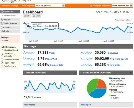
Google Analytics is a free premium web analytics service offered by Google to monitor and track website traffic. It can be setup through an existing or a new Google account to track how users navigate and click through a website. The Reports are organized in the form of a dashboard kind of interface with graphs and charts. As seen from Figure 3.1, Google analytics presents a basic 2D visualization. Broadly, the features are concerned with report generation with respect to Audience/Visitors (kind of technology and traffic from a location), traffic sources (based on search results and navigation of the users), content (sorting of pages based on the number of views) and Goals (based on e-commerce applications which deal with online purchases). The data is displayed as pie charts and graphs which are very accessible. However, reports created are not always intuitive because of Advanced Segments and Secondary Dimensions which often leads to misinterpretation of the data [9].
Figure 3.1: Google Analytics Dashboard
3.2 Tableau Software
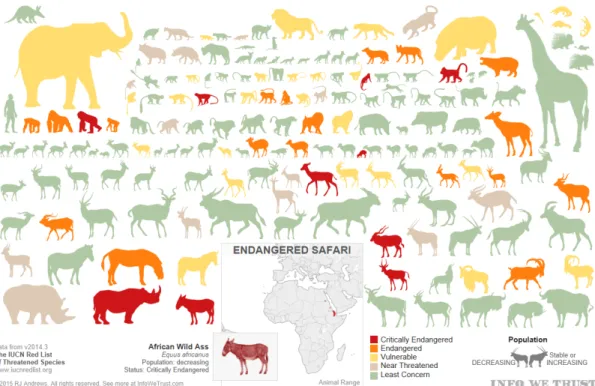
Tableau is an American software company from Seattle that builds interactive data visualization products focusing on business intelligence. It started in 2003 as a desktop application and became popular for the enterprise and Big Data domains. It currently has five main products: Tableau Desktop, Server, Reader, Online and Public. The core functionality of the software is to query databases and generate reports and graphs by combining them into a dashboard. The information can also be shared in a cloud network. A sample report Figure 3.2 shows the endangered species in Africa:
Figure 3.2: Sample Report in Tableau
3.3 A Unity 3D Application for geo-spatial visual analytics of Twitter data
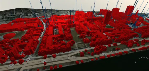
This research project was undertaken by a group of researchers at MIT. The project focused on visual analytics of Big Data and how virtual reality can be used as a data visualization platform. The data was collected from Twitter and was mapped onto a 3D model of MIT campus. This project mainly focused on two things; data visualization and interaction. Data was first extracted and pre-processed. Then, the model and scene were created in the Unity 3D game engine. The data process pipeline is explained in the following Figure 3.3:
Figure 3.3: Data Process Pipeline
Figure 3.4: Rendition of MIT’ campus as an imported FBX model into Unity3D engine as seen from game’s free-form camera.
Figure 3.4 represents the layout of this application. This work was developed using Unity 4.6, Oculus Rift DK1 and the leap motion controller. The idea of this project was to create the visualization experience as a game so that the user would be more involved while using the application. One of the main limitations with this project was activating/deactivating the collider component of the leap motion con-troller which was proving to be computationally expensive because collision detection requires considerable amount of computation. There were also additional unnecessary rendering taking place. Also, this application needed a faster processing computer to achieve better performance and reduce the jerky movement of the scene. The
recommended frame rate for running Oculus based project is around 60-75 fps. Nev-ertheless, this project confirmed that data visualization has a wide scope in virtual reality realm which needs to be explored [22].
3.4 iViz
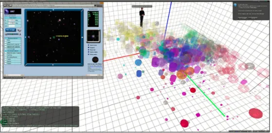
iViz is an immersive, multi-dimensional data visualization tool that was built in Unity 3D by a group of researchers at Caltech. It is an experimental setup that plots points in 3D space with up to ten layers of information. It allows the user to control the camera to explore data visually. Information is encoded in the form of XYZ co-ordinates, color levels, size, shape and texture [8]. Figure 3.5 contains the sample interface of iViz:
Figure 3.5: iViz Interface
The iViz multi-dimensional tool gave us the first insights into the potential of immersive VR as a scientific data visualization platform. Although it can plot up
ever, the scope of these tools are limited in terms of understanding multi-dimensional data. They fall short in providing clear insights and sometimes different users draw different insights from them. Dealing with real-time data is still difficult at times. In some cases, the interface although looks neat are not customizable according to organizations needs. Thus, it imposes the users to utilize the tool in a certain way. The interface that this project had built was similar to the iViz with some addi-tional improvements such as exploring data-set with a new interaction mechanism i.e. Bluetooth Controller. It had a dashboard that displays the legends and buttons in a sophisticated manner where users were be able to interact with Google cardboard using gaze or the touch input. There was also a toggle switch that conveniently hides the user interface so that the viewer had complete freedom to view the graph from any perspective. In terms of affordability, the visualization was built using WebVR technology so that it was readily accessible with Google Cardboard or the VR Box on the Android smart-phone without spending money on an actual dedicated VR de-vice. The Bluetooth Controller was used for navigation and interacting with the user interface inside the environment. The Controller mimics the Gamepad Controller and the support was extended recently for WebVR framework via a component. The component uses the HTML5 Gamepad API. The underlying API supports Firefox, Chrome, Edge and Opera [21].
4. Method
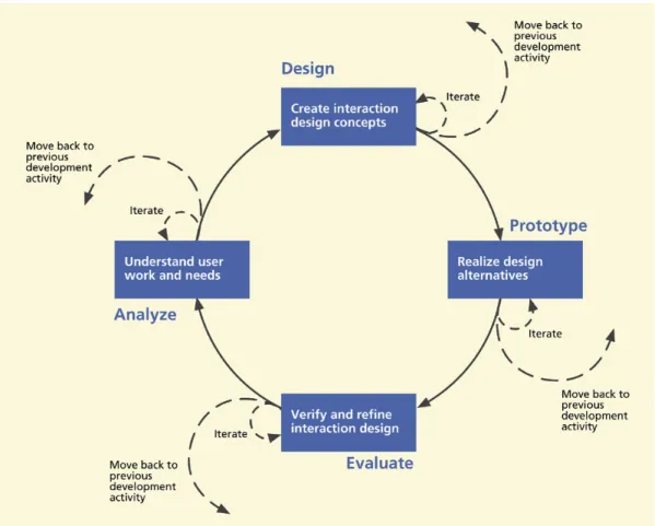
Since this project focused on the usability aspect of data visualization, the ap-proach taken was similar to a user-experience (UX) process for a software design. It is important to realize that UX is about engagement. VR is constantly improving in engaging user interaction with innovative inputs in the market such as HTC Vive controllers, Daydream remote, Leap motion device and the Oculus Rift touch. VR could essentially help us understand data by providing new perspectives and scenar-ios. It can leverage the third dimension and represent data in a different manner than a traditional 2D data visualization tool. Usability is a big part of the user ex-perience which includes characteristics such as ease of use, productivity, efficiency, effectiveness, learn-ability, retain-ability and user satisfaction. Usability evaluation can be thought as being equivalent to usability testing. This paper focused on us-ability and learn-us-ability aspects of the UX method. In the context of UX process and interactivity, the UX life cycle template consists of Design, Prototype, Evaluate and Analyze phases (See Figure 4.1). Analysis is about the user work and needs, design relates to conceptual design, look and feel, implementation is prototyping the design and evaluation means to verify if it meets users requirements and needs [11].
Figure 4.1: UX LifeCycle Template
4.1 Collection of Data-set
The first phase involved collection of proper data-set. The selection criteria in-volved the following aspects:
• It had to be a scholarly data-set for academic use.
• It had to be in a readable format such as CSV (Comma Separated Values) or JSON (JavaScript Object Notation).
• The data-set had a measure attribute. • It contained multiple attributes.
This study obtained a bank marketing data-set from the online repository called UCI Machine Learning Repository[18]. The data was related with direct marketing campaigns of a Portuguese banking institution [26]. The marketing campaigns were based on phone calls. Often, more than one contact to the same client was required, in order to determine if the product (bank term deposit) would be (’yes’) or not (’no’) subscribed. There were a total of 21 attributes in the data-set. However, this study limited it to 10 principal attributes. The reason for this is explained in the next sub-section. The attributes are as follows:
1. age (numeric)
2. job : type of job (categorical:’admin.’,’blue-collar’,’entrepreneur’,’housemaid’, ’management’,’retired’,’self-employed’,’services’,’student’,’technician’,
’unemployed’,’unknown’)
3. marital : marital status (categorical: ’divorced’,’married’,’single’,’unknown’; note: ’divorced’ means divorced or widowed)
4. education : (categorical: ’basic.4y’,’basic.6y’,’basic.9y’,’high.school’,’illiterate’, ’professional.course’,’university.degree’,’unknown’)
5. default : has credit in default? (categorical: ’no’,’yes’,’unknown’) 6. housing : has housing loan? (categorical: ’no’,’yes’,’unknown’) 7. loan : has personal loan? (categorical: ’no’,’yes’,’unknown’)
8. month : last contact month of year (categorical: ’jan’, ’feb’, ’mar’, ..., ’nov’, ’dec’)
9. campaign : number of contacts performed during this campaign and for this client (numeric, includes last contact)
Designing wireframes is important because they allow you to explore, test and iterate design ideas. In web design terms, wireframes define the containers that would have content in them. Wireframing is an essential part of design process in software application [7]. Designing wireframe for a 3D environment is completely different than a 2D one. There are only two dimensions that we have to deal with when designing for 2D wireframe and most of the time they are done using online tools or Photoshop.
Since the major portion of virtual reality application is on the gaming industry, game engines such as Unreal and Unity have expanded their support to develop vir-tual reality applications for a wider audience. The ever growing gaming community has enabled programmers/game designers to test and iterate their designs using these game engines. Hence, there is no particular solution or a standard to design 3D wire-frame. Although, there is a new workstation developed by Microsoft called Surface Studio that is mostly targeted for creative users. It has an interactive device called Surface Dial that enables users to sketch out immersive content which may become a potential application for sketching 3D wireframe in future. However, designing 3D wireframe is as simple as placing an object in 3D space using the game engine and testing it with a VR headset. It should be an iterative process [15].
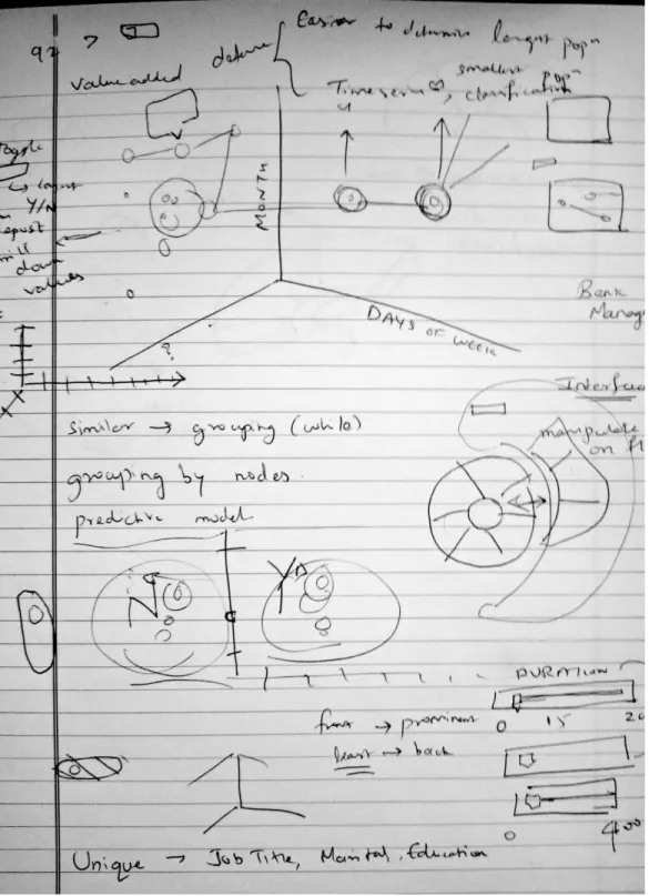
Figures 4.2 and 4.3 shows the preliminary designs of the wireframe sketched on a notebook
Figure 4.3: Preliminary Design 2
4.3 Prototype
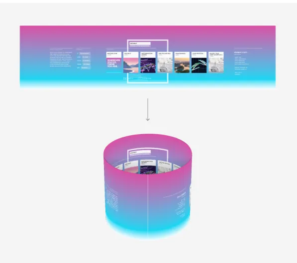
The prototyping phase is an important and fundamental aspect of the UX lifecycle. They are the building blocks of design process which brings ideas to life. The idea of prototyping is to provide fast and easily changed early view of the envisioned interactive design [11]. After the creation of the wireframes, this project moved on to build and test the prototype with the requirement criteria. For prototyping in VR, a new approach was suggested by Josh Carpenter (Ex- UX Lead on Firefox OS). In order to build simple prototypes in WebVR, there are four major steps that are to be followed:
• Create a layout in 2d design app and export as a bitmap.
• Create a cylindrical mesh in three.js or similar framework that supports WebVR with a circumference/height ratio that matches the width/height ratio of the bitmap.
• Apply the bitmap as a texture to the cylinder and flip the cylinder faces. • View in VR.
The final output of these steps would look like this (See Figure 4.4) [13].
provision to include actual 3D objects.
The actual system that this project tested was a hybrid system which had 2D buttons for interaction with 3D visualization of data. The interactive dashboard was created using A-frame. A-frame is a web framework built on top of three.js which is a JavaScript library that supports WebVR. It is based on entity-component pattern where entity is the scene, and the component is some aspect that is attached to the entity such as appearance, functionality or behavior. Hence, the prototype was built by creating polygonal shapes in the WebVR framework using A-frame and slowly figuring out the layout with iterative designs.
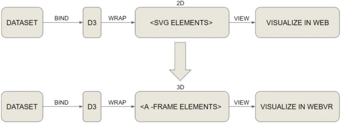
Since data visualization is about graphical representation of the data, there are several frameworks which support the creation of graphs and charts in a web envi-ronment. There are JavaScript graphic libraries such as D3.js and b3.js that are sup-ported in the WebVR framework. D3 (data driven documents) is a popular JavaScript library for manipulating documents based on data. It helps in handling and extract-ing data usextract-ing HTML, CSS and SVG. It is based on the DOM (Document Object Model). There is another library called b3.js which is a similar version to D3. b3.js is an open source library that supports 3D graphs on the web application that can be interacted with the Oculus Rift and Leap Motion device. This library supports three.js objects [16]. The main approach for the prototype was to assign all the heavy lifting to Aframe and create the actual chart using D3. The workflow of combining both these technologies is explained via the following Figure 4.5:
Figure 4.5: Aframe and D3
4.4 Implementation phase using WebVR (A-frame and D3)
The implementation phase began with the discussion of the layout with the com-mittee members. There were three layouts shortlisted for the visualization a 3D Radial layout (Figure 4.6), Parallel co-ordinates (Figure 4.7) and 3D Scatter plot (Figure 4.8).
One of the most popular techniques for representing multivariate data is the Par-allel co-ordinates (Figure 4.7). ParPar-allel co-ordinates is very similar to a profile plot. It comprises of separate parallel axis to each dimension or variable. Although it is indis-tinguishable from a profile plot, the representation was new because of the recognition of the high dimensional space and 2D parallel coordinate space. In simple terms, it is the separation of each dimension and normal 2D scales used for a profile plot. Since it is a line that passes through different dimension or variable, addition of graphics such as coloring the line do not have much of an effect on the overall representation of the visualization [29].
The computer graphic libraries uses perspective planar projection. One of the problems associated with 3D graphics is they often elicit more perceptual illusions and make it difficult to use scale look-up in perspective to recover data values. However, virtual reality offers us the freedom to navigate through the environment making it possible to view the representation from various angles. This can be particularly useful when encountering configurality among variables. Consider the 3 point coordinate system with values x, y and z. For three variables x, y and z, configurality occurs when the way z changes across values of y at some level of x is different from the way z changes across values of y at some other level of x [29].
Thus, the 3D Scatter Plot seemed to be the ideal choice for visualization with the data encoded in the form of X, Y, Z co-ordinates, size and color. The user was only able to view 5 dimensions at one point of time. The reason for limiting the number of dimensions to 5 was based on the theory of dimensionality reduction. In machine learning and statistics, dimensionality reduction or dimension reduction is the process of reducing number of random variables under consideration, via obtaining a set of principal variables [17].
Figure 4.8: Static Scatter Plot Design
Figure 4.8 shows the first static version of the Scatter Plot that was created using Maya and Aframe. Aframe technology enables us to import obj models into its scene. So the obj model was created in Maya and then imported into Aframe to create a quick static scatter plot design.
Over the course of several iterations and tweaks, Figure 4.9 and 4.10 shows the design and layout direction for the application that was officially finalized by the committee. However, one of the main drawbacks with the data-set that this project encountered were the number of data-points. The original data-set had over 41,000 data-points. Plotting the entire data-set into a scatter plot proved to be difficult because collectively it had a huge impact on the performance of the application. By limiting the data to only those customers who enrolled for the term deposit (who said ’yes’), the data was reduced to 452 data-points. Maintaining high frame rate was one of the key factors that constituted the performance in VR mode and this was a big challenge addressed in this project. As a best practice in WebVR, it is highly recommended that there should be less number of entities in the scene as possible [1].
Figure 4.9: Scatter Plot Iteration 1
Figure 4.10: Scatter Plot Iteration 2
Initially, the study used 4120 instances (see Figure 4.10) and also the shape of the entities were spherical which meant more number of polygons impacting the overall performance. In order to improve performance on smart-phone, the data had to be reduced to 452 data-points and the spheres were switched to boxes or cubes which
Figure 4.12: VR Box with Remote
Figure 4.11 shows the final version of the prototype with the user interface. The Samsung Galaxy S8 was used for visualization of the data-set. The (See Figure 4.12) VR Box with Bluetooth controller are the hardware equipment that were used for viewing and interacting with the system. The entire functionality of the application are as follows:
mouse click. If you gaze into a particular object for a specified period of time, it triggers a click event just like you would click a button. There are a certain number of selective objects that you can click and can differentiate them by viewing the cursor. If you hover above a particular object and the cursor turns yellow that means it can be clicked or gazed upon and you would hear a click sound.
3. Bluetooth Controller’s joystick controls are used for navigation (or the WASD keys on the keyboard).
4. There are some additional buttons (keys on the keyboard) mapped for hiding the user interface panel and closing the details.
The issue of compatibility was taken into consideration especially with selecting a suitable smart phone while implementing the system using the WebVR technology. Additionally, the Bluetooth Controller was only supported on Android devices as of now. The system was initially tested with an old Sony Xperia Z3 which had a big performance and lag issue. Hence, the study was then tested with the latest Samsung Galaxy S8 which was eventually used for the evaluation of the application.
5. Evaluation
In software engineering terms, we perform experiments and empirical studies be-cause the objective of these methods is to get statistically significant results regarding the understanding of the software [31]. Often, the UX of a system is evaluated in qualitative terms.
This project utilized a mixed approach of qualitative and quantitative evaluation techniques. The basic outline of the UX evaluation process was as follows:
College of Business due to their experience in data analysis and data science. The evaluation process was broken down into four parts.
5.1 Pre-test Questionnaire
The pre-test questionnaire session involved questions to determine the participants awareness about virtual reality systems, data visualization and multivariate data-set. The questions were as follows:
1. Do you know what data visualization is or at least heard the term before? • Yes
• No
2. Are you aware that smart phones can be used as a virtual reality device? • Yes
• No
3. Are you aware of web based virtual reality system or heard the term WebVR? • Yes
• No
4. Did you know that you can use Google chrome in your phone/desktop as an immersive environment?
• No
5. Do you know what Google Cardboard is? • Yes
• No
6. Have you ever used a Google Cardboard before? • Yes
• No
5.2 Screen Record / Think Aloud technique
Figure 5.2: Screen Record
Figure 5.2 shows the screen record. This study performed an analytical evalua-tion method called think aloud technique. Analytical evaluaevalua-tion deals with intrinsic
system verbally expressed their thoughts about the interactive experience, including what feels right or wrong? Why it feels that way? This research project used a combination of think aloud technique along with screen record [3]. Screen capture allows us to record the instructions and their verbal think aloud for later analysis. This project used a screen capture application called AZ Screen Recorder which is available for free in the Android’s Google Play Store.
5.3 Post-test Questionnaire
These tests were followed by a post-test questionnaire which focuses on the learn-ability and uslearn-ability of the application [3]. It utilized a UX method called SUMI (software usability measurement inventory). It is a rigorously tested and proven method of measuring software quality from the end users point of view [14]. The following Figure 5.3 (courtesy of SUMI) contains sample structure of the questions:
Figure 5.3: SUMI questionnaire
5.4 Emo cards
The last evaluation method was the emo cards or emotion cards which measured the participants’ overall satisfaction level. This project chose emotion cards over a
6. Analysis and Interpretation
The evaluation was conducted with a total number of fifteen participants. The evaluation was broken down into four stages :
• Pre-test Questionnaire • Screen Record
• Post-test Questionnaire • Emo Cards
Thus, the analysis was performed individually for each section keeping in mind the usability and learn-ability aspects of the system. The first section was the pre-test questionnaire. As seen from the following Figure 6.1, all the participants were aware of the term data visualization. Also, 66.7% of the participants knew that smart phones are being used as a virtual reality device.
More than 60 % of the participants answered “No” to the rest of the questions as seen from Figures 6.2 and 6.3:
This was followed by screen record/ think aloud testing section where a formative data analysis was conducted by taking notes in real time and generating a UX problem record. Problem records are a way to diagnose a particular problem that the user encounters while using a system. They typically follow a format that consists of problem name, description, severity and the problem diagnosis. Figure 6.4 and 6.5 represents the UX problem records.
The problem severity ranged from irritant to unusable (color coded). The scale was outlined in this book [25] and it represents the following:
• Unusable: The user is not able to or will not want to use a particular part of the product because of the way that the product has been designed and implemented.
• Severe: The user will probably use or attempt to use the product here, but will be severely limited in his or her ability to do so.
• Moderate: The user will be able to use the product in most cases, but will have to undertake some moderate effort in getting around the problem.
• Irritant: The problem occurs only intermittently, can be circumvented easily, or is dependent on a standard that is outside the products boundaries. Could also be a cosmetic problem.
Figure 6.4: UX Problem Record 1
The third section was the post-test questionnaire i.e. SUMI which consists of 50 statements that the participant had to reply as Agree, Disagree or Undecided. The
Figure 6.5: UX Problem Record 2
SUMI scales [14] are defined by six parameters :
• Efficiency: this refers to the respondent feeling that the software is enabling them to do their task(s) in a quick, effective and economical manner or, at the opposite extreme, that the software is getting in the way of performance. • Affect: this is a psychological term for emotional feeling. In this context it refers
A low score on this scale indicates that the software is not communicating ad-equately with the respondent and making things difficult.
• Control: this sub-scale refers to the feeling that the respondent has that the software is responding in an expected and consistent way to inputs and com-mands. It is not difficult to make the software work and the respondent can get their work done with ease. A low score on this scale indicates that the software is making unwanted mental demands on the respondent and that the respondent prefers to stick with however much they have mastered with this software.
• Learn-ability: this sub-scale refers to the feeling that the respondent has that it is relatively straightforward to become familiar with the software; and that its tutorial interface, handbooks etc. are readable and instructive. This also refers to re-learning how to use the software after a while away from it.
• Global Usability: refers to a general feeling of satisfaction with the users’ expe-rience of the software being evaluated.
The SUMI professional report was generated which contained three different graphs, SWOT analysis, individual user records, summary statistics, comments for general questions and a CSV format data file. The following Figure 6.6 represents the SUMI scale values and its means with 95% Confidence Interval. The mean is the arithmetic average of a set of numbers. The SUMI scale values ranges from 10 to 73. It has a slight positive skew. This graph shows the mean for each SUMI scale. If the value
is above 50 line, then the bar is shown in green. If it is below the 50 mark, the bar is shown in red. The graph also shows the range of the 95% CI which means that if the questionnaire is repeated under same conditions for n number of times, then the staples show where the mean of the samples would fall 95% of the time [14].
Figure 6.6: SUMI histogram
The line graph represents the SUMI scores with respect to the standard deviation. The standard deviation is 10 and the data has an arithmetic mean of 50. The cross in the centre of the ring shows the location of the mean, the bars are extended by one standard deviation on each side of the mean [14]. Figure 6.7 shows the line graph:
Figure 6.7: SUMI line graph
The last graph is the median boxplot. The median of a set of numbers is the value above and below which exactly half of the observed data will be found. It is sometimes called the 50th percentile. The 25th and 75th percentiles are sometimes called the quartiles and they show how bunched up the data is on either side of the median. The median is the horizontal line inside each of the boxes. The upper and lower ends of the boxes on this graph show the upper and lower quartiles, what is called the inter-quartile range. The staples (or whiskers) on either side of the box show roughly where we would expect to find 95% of the data of the sample [14]. As seen from Figure 6.8, there are a few outliers that are outside the fences:
Figure 6.8: SUMI boxplot
The SWOT analysis represents the statistically significant results and NOT sig-nificant results. For the sigsig-nificant results, there are three categories of difference:
• A strong ’Agree’ or ’Disagree’: If the statement is a positive one, this is a good sign. If the statement is a negative statement, then this is bad. Conversely, a ’Disagree’ to a negative statement is good and a ’Disagree’ to a positive statement is bad. ’Good’ statements are shown in black and ’Bad’ statements are shown in red.
• ’Undecided’: This happens often when a respondent gives a lot more votes to the central ’Do not Know’ option, which means a lot fewer ’Agrees’ and a lot fewer ’Disagrees’ than expected. ’Undecided’ statements are shown in purple.
The following Figure 6.10 represents the individual user responses with respect to the six parameters of SUMI scales. Any potential outliers are in red.
Figure 6.12: Best aspects
The summarized statistical results for this section is represented below in Figure 6.13. It is based on SUMI scales Global Usability, Efficiency, Affect, Helpfulness, Control-ability and Learn-ability. The Average Global SUMI score is 60.13.
The last section of evaluation was the emotion card which measured the over-all satisfaction level of the participants. Out of fifteen participants, 80% gave it a “Thumbs up” and 20% had a neutral reaction. Figure 6.14 represents the summary of emotion card:
Figure 6.13: Summary statistics
7. Discussion
The pre-test questionnaire concentrated on participants’ awareness about data visualization, WebVR and Google Cardboard. Evidently, the evaluation conducted revealed that the majority of the participants were unaware of WebVR, Google Card-board and Google Chrome being used as an immersive environment.
In the screen record section, participants were subjected to the application with VR Box as the viewing device and the Bluetooth controller as the interaction mech-anism. Notes were taken in real time during the think aloud protocol and later on it was documented into UX Problem Record. As seen from the UX Problem Record, there are two critical problems that were addressed. One participant experienced slight headache after some time while using the application. This is highly subjective because the application developed in this research project did not contain any elabo-rate animations or changing scenes like a game. Also, none of the other participants addressed this problem. The other issue was the general blurriness at the bottom of the screen which can only be proved with other VR Cardboard devices. Apart from these two critical issues, there were minor problems such as text size, alignment, color de-saturation and axis labels being too small. Although they were minor problems, these issues can be amended with an iterative round of testing to have a recognizable effect on satisfaction level.
The third section involved the usage of SUMI which is essentially a rigorous method to test the global usability and learn-ability of a system. As seen from the summarized results, the global SUMI score for this application was 60.13. There were two potential outliers identified in this evaluation but pertaining to the confidence interval, the mean score of the samples were always positive and above 50 (as seen from the staples). This evaluation method was crucial in assessing the user
experi-liked it and three had a neutral reaction with the study. In summary, the evaluation suggests that though the application developed by this project had some problems, it provided the interactive experience and the overall usability for visualizing multi-dimensional data.
7.1 Summary of Findings
The evaluation was performed with a number of usability tests and the participants were recruited from Drexel’s Lebow College of Business. As per the analysis of the results, this project deduced the following statements for this application:
• Smart-phones are usable and an affordable means to visualize data in a virtual reality environment. However, usability of smart-phones for visualization can be further improved upon with better user interface and interaction mechanisms. • The VR Box (along with Bluetooth controller) is an effective equipment for the
usage of data visualization applications.
• It is easier to navigate and accurately pinpoint data points within a virtual reality environment.
• This application in future can potentially be expanded and integrated within business organizations for getting better insights and making better business decisions.
8. Conclusion
The aim of this research project was to determine the usability and learn-ability of an interactive WebVR system for data visualization. Alternatively, the system was also built so that it can run on a Mac or PC’s Google Chrome browser. This project used the Samsung Galaxy S8 as the VR device and the VR Box along with Bluetooth controller as the equipment for viewing and interaction. The whole design process began with creation of sketches on a notebook and then creating the pro-totype for a multi-dimensional data-set. The data-set was collected from an online repository called UCI Machine Learning Repository [18]. The prototype underwent several iterations until the 3D scatter plot was finalized. This project used a WebVR framework called A-frame for creating the virtual reality scene and D3.js for plotting the data points in a 3D environment. A new user interface was also developed for interacting with the application. The VR Box and the Bluetooth controller were the most accessible and cost-effective equipment available in the market at the moment. One of the main reasons for bringing this application into the WebVR environment was due to its high accessibility and maintainability.
8.1 Limitations and Future Discussion
For WebVR applications, performance always plays a vital role in providing the best experience to the user. And a lot of it has to do with maintaining a high frame-rate which was one of the main limitations that this project encountered. Also, this project used cubes instead of other shapes such as a sphere or cylinder because cubes have the least number of sub divisions (polygon count) which also affects the overall performance. This project was tested with the latest android phone i.e. the
company called Looker. They created their own custom APIs and are using the HTC Vive as the virtual reality device [5]. This corroborates that WebVR although in its experimental phase is already becoming one of the popular technologies to emerge in recent times due to its wide array of applications and high compatibility across many domains.
In the near future, this project hopes that it can provide sufficient information in creating a visualization platform that can have different graphs and data-sets in a WebVR setting for smart-phones where data changes can be seen in real time and implemented across various domains. Since the processing power of smart-phones are increasing at a rapid pace, they may potentially become one of the competing medi-ums for visualizing and analyzing multi-dimensional data in future. This could also means providing more interaction with data-points using innovative input technology such as hand gloves or 3D mouse. If smart-phones are utilized in an effective manner for visualization, it could potentially become a viable option in the field of technology and science which is highly portable, accessible and affordable as well as at the same time it could also provide a gateway for interdisciplinary research and applications.
Bibliography
[1] Aframe best practices. URL https://aframe.io/docs/0.5.0/introduction/ best-practices.html.
[2] Steps in the data analysis process. URL http://www.bcps.org/offices/lis/ researchcourse/data process.html.
[3] All ux evaluation methods. URL http://www.allaboutux.org/all-methods. [4] Applications of virtual reality. URL
https://www.vrs.org.uk/virtual-reality-applications/.
[5] Data analytics in virtual reality because why not?, February 2017. URL https://info.looker.com/youtube-product/data-analytics-in-virtual-reality-because-why-not.
[6] R. L. Adams. Five reasons why virtual reality is a game-changer, March 2016. URL http://www.forbes.com/sites/robertadams/2016/03/21/ 5-reasons-why-virtual-reality-is-a-game-changer/#3de0e9e06d78. [7] J. Allen and J. Chudley. Smashing UX Design: Foundations for Designing
Online User Experiences. Smashing magazine book series. Wiley, 2012. ISBN 9780470970621. URL https://books.google.com/books?id=b1Ga 0p1zIUC. [8] C. Donalek, S. G. Djorgovski, S. Davidoff, A. Cioc, A. Wang, G. Longo, J. S.
Norris, J. Zhang, E. Lawler, S. Yeh, A. Mahabal, M. J. Graham, and A. J. Drake. Immersive and collaborative data visualization using virtual reality platforms.
CoRR, abs/1410.7670, 2014. URL http://arxiv.org/abs/1410.7670.
[9] S. Galbraith. Google analytics. Journal of the Canadian Health
Li-braries Association / Journal de l’Association des bibliothques de la
sant du Canada, 34(2):119–122, 2014. doi: 10.5596/c13-022. URL
https://journals.library.ualberta.ca/jchla/index.php/jchla/article/ view/22651.
[10] C. Hall and E. Betters. Best vr headsets to buy in 2017, whatever your bud-get, January 2017. URL http://www.pocket-lint.com/news/132945-best-vr-headsets-to-buy-in-2017-whatever-your-budget.
[13] C. Josh. Quick vr prototypes, DECEMBER 2014. URL https:// blog.mozvr.com/quick-vr-prototypes/.
[14] J. Kirakowski and M. Corbett. SUMI: the Software Usability Measurement In-ventory. British Journal of Educational Technology, 24(3):210–212, 1993. ISSN 1467-8535. doi: 10.1111/j.1467-8535.1993.tb00076.x. URL http://dx.doi.org/ 10.1111/j.1467-8535.1993.tb00076.x.
[15] C. Laura. The ux of vr, March 2016. URL http://www.creativebloq.com/ux/ the-user-experience-of-virtual-reality-31619635.
[16] H. Le, A. Joshi, and M. Betke. b3.js: A library for interactive web data visual-izations in virtual reality. 2016.
[17] J. A. Lee and M. Verleysen. Nonlinear Dimensionality Reduction. Springer Publishing Company, Incorporated, 1st edition, 2007. ISBN 0387393501, 9780387393506.
[18] M. Lichman. UCI machine learning repository, 2013. URL http:// archive.ics.uci.edu/ml.
[19] R. Margaret. multidimensional database (mdb), September 2005. URL http: //searchoracle.techtarget.com/definition/multidimensional-database. [20] R. Margaret. Big data, July 2014. URL http://
searchcloudcomputing.techtarget.com/definition/big-data-Big-Data. [21] D. Mccurdy. Gamepad. URL
https://github.com/donmccurdy/aframe-gamepad-controls.
[22] A. Moran, V. Gadepally, M. Hubbell, and J. Kepner. Improving big data visual analytics with interactive virtual reality. CoRR, abs/1506.08754, 2015. URL http://arxiv.org/abs/1506.08754.
[23] J. Nielsen and T. K. Landauer. A mathematical model of the finding of usability problems. In Proceedings of the INTERACT ’93 and CHI ’93 Conference on Human Factors in Computing Systems, CHI ’93, pages 206–213, New York, NY, USA, 1993. ACM. ISBN 0-89791-575-5. doi: 10.1145/169059.169166. URL http://doi.acm.org/10.1145/169059.169166.
[24] O. Rist and D. Strom. Looker, June 2016. URL http://www.pcmag.com/ article2/0,2817,2495564,00.asp.
[25] J. Rubin. Handbook of Usability Testing: How to Plan, Design, and Conduct Effective Tests. John Wiley & Sons, Inc., New York, NY, USA, 1st edition, 1994. ISBN 0471594032, 9780471594031.
[26] P. C. S. Moro and P. Rita. A data-driven approach to predict the success of bank telemarketing. Decision Support Systems Elsevier, 62:22–31, jun 2014.
URL http://archive.ics.uci.edu/ml/datasets/Bank+Marketing.
[27] P. Simon. Wiley and SAS Business Ser. : The Visual Organization : Data Visualization, Big Data, and the Quest for Better Decisions (1), chapter 1: The Ascent of the Visual Organization. John Wiley & Sons, Incorporated, February 2014. ISBN 9781118858417.
[28] J. Verhage. Goldman sachs has four charts showing the huge potential in virtual and augmented reality, January 2016. URLhttp://www.bloomberg.com/ news/articles/2016-01-13/goldman-sachs-has-four-charts-showing-the-huge-potential-in-virtual-and-augmented-reality.
[29] L. Wilkinson. The Grammar of Graphics (Statistics and Computing). Springer-Verlag New York, Inc., Secaucus, NJ, USA, 2005. ISBN 0387245448.
[30] A. Williams. Datahero turns data into rich visuals without the need for a data analyst, May 2013. URL https://techcrunch.com/2013/05/01/ datahero-turns-data-into-rich-visuals-without-the-need-for-a-data-analyst/.
[31] C. Wohlin, P. Runeson, M. Hst, M. C. Ohlsson, and B. Regnell. Experimentation