DATA VISUALIZATION FOR USE
IN WEBSITE DESIGN
An analysis conducted for the New York State Center for
Rural Schools by Eric R. Schultz and Peter C. Fiduccia,
Cornell University
Data Visualizations in Website Designs for the New York State Center for Rural Schools
Acknowledgements: We would like to sincerely thank Dr. John Sipple of Cornell University and the New York State Center for Rural Schools for assistance in this analysis and willingness to work with us, as well as Laurie Miller, director of the CIPA capstone program, the teaching assistants of the capstone program, and our fellow capstone participants for their feedback and advice in undertaking this project.
Table of Contents:
Executive Summary………... 4
Introduction………. 6
Literature Review……… 8
Data and Methodology……….. 13
Findings and Results ……… 18
Conclusions and Recommendations………. 33
References………. 37
Executive Summary:
Increasingly complicated data are being translated by organizations and individuals for consumption by the general public. As technologies have grown more advanced, visualizing data has become an increasingly popular means to convey complex data to decision-makers and the public. However, this work is assuming that the general public can accurately interpret these visualizations. Researchers have a responsibility to ensure their work, especially when
translating complex ideas and relationships to the public, is interpreted correctly. To this end, the New York State Center for Rural Schools has sought assistance from us. We have attempted to ascertain the extent to which users of the NYSCRS website can accurately and quickly interpret the types of visualizations presented on the website.
In an effort to better understand the effectiveness of these visualizations for website users, a survey was designed and implemented to better understand how users interpret school district-related data visualizations. Specifically, we sought to ascertain the differences in
accuracy and latency when interpreting identical data visualized as scatterplots, bar graphs, line graphs, and in tabular formats. This was accomplished through asking survey respondents to correctly identify trends or relationships displayed in different data visualizations (tabular, line graph, bar chart, and scatterplot), multiple times. The amount of time taken to answer correctly was recorded, and then compared against the amount of time taken to correctly answer the same question using a different visualization. Once the survey data was collected, we used statistical techniques to analyze the results, specifically seeking to understand any existing relationships between the demographic identifiers of respondents and respondents’ ability to accurately and swiftly interpret data visualizations. Details concerning this analysis can be found in the following pages, and the surveys can be found in the Appendix of this paper.
In summary, our results suggest that the NYSCRS website should focus on performance, financial, and demographic data. These were the types of data for which respondents expressed the most interest, and for which administrators indicated they use the most frequently. The website should also maximize the usage of the most effective forms of visualizations. Our results suggest the most effective forms of visualizations with respect to accuracy and latency are line graphs and tables of non-bivariate relationships. Scatterplots, if used, should be constructed thoughtfully and with clear, concise labeling in order to assist with users’ understanding of the data displayed. Finally, the ‘matrix’ visualizations currently displayed on the website should be reevaluated to determine whether the information displayed is too complex or redundant. This may assist users in more quickly and accurately garnering information from the visualization. Across all of these initiatives, design should pay attention to aesthetic. Our findings suggest that when users identify a visualization or tabular representation as aesthetically pleasing, they are, generally, more likely to answer those questions correctly. As outlined throughout this paper, our research was specific to the school district level data, and we recommend further research in ascertaining the effects of data visualization across and within visualization types.
Introduction:
The last ten years have seen enormous strides in the abilities of individuals to visualize data. Newspapers and blogs have adopted what was once reserved for academic journals, and new visualization software companies are regularly entering the expanding market. Driven by enhanced technologies and analysis capabilities, increasingly complicated statistics and relationships are being visualized for consumption by the general public. However, the
assumption these efforts make is rather glaring. Despite the apparent appeal of visualized data, there is little research exploring the extent to which consumers can accurately interpret these visualizations. Do users understand what they are seeing? Are certain data visualizations a waste of time with users? Beyond user utility, under the guise of quantitative legitimacy lies devious potential to manipulate consumers of data with visualizations that are either false or misleading. This study does not explore the psychological underpinnings of users’ willingness to accept or deny the legitimacy of data visualizations. However, the implications have been noted in the design of this study, and we recommend further research in this area.
For the New York State Center for Rural Schools, understanding the extent to which data visualizations are being accurately interpreted is crucial. A significant aspect of the
organization’s mission lies in providing available and relevant district-level data to users. These data are provided using open-sourced tools embedded on the Center’s website,
nyruralschools.org. Much of these data are visualized using a combination of tabular
representations, line graphs, and maps. As the Center for Rural Schools continues to develop its data tools, plans for integrating bar graphs and scatterplot visualizations have also been
considered, as have options to make these visualizations interactive through platforms such as Tableau. The users of these visualizations are generally expected to be superintendents and
school district administrators from New York State. In an effort to better understand the
effectiveness of these visualizations for website users, a survey was designed and implemented to better understand how users interpret school district-related data visualizations. Specifically, we sought to ascertain the differences in accuracy and latency when interpreting identical data visualized as scatterplots, bar graphs, line graphs, and in tabular formats. This was accomplished through asking survey respondents to correctly identify trends or relationships displayed in different data visualizations (tabular, line graph, bar chart, and scatterplot), multiple times. The amount of time taken to answer correctly was recorded, and then compared against the amount of time taken to correctly answer the same question using a different visualization. After
randomizing the order of questions, this approach allowed us to understand whether visualizing identical data in different ways was associated with accuracy and latency of respondents.
Once the survey data was collected, we used statistical techniques to analyze the results, specifically seeking to understand any existing relationships between the demographic identifiers of respondents and respondents’ ability to accurately and swiftly interpret data visualizations. Primary techniques included descriptive and bivariate analysis, as well as Ordinary Least Squared (OLS) regression analysis. These approaches are further detailed in the methodology section of this paper.
The following pages explore existing literature on data visualization interpretation, as well as the data and methodology used in implementing and statistically analyzing the
aforementioned survey. The paper then discusses the findings and results of the survey and accompanying analysis, followed by conclusions and recommendations for the Center for Rural School’s website design and visualization implementation. This paper is concluded with
Literature Review:
Data tools are growing increasingly popular among the general public. As a tool for simplifying complex relationships, data visualization is particularly favored by decision makers seeking to understand and interpret large amounts of information as quickly as possible.
Although existing research is limited, several scholars have attempted to understand the nuances of data visualization among users. The following pages outline those efforts and findings.
In Use of Data Visualization in the Teaching of Statistics: A New Zealand Perspective, the authors argue the gap between statistical practice and statistical education is widening, and one must then question the extent to which the recent abundance of free data visualization tools is usable by students(Forbes, Chapman, Harraway, Stirling, & Wild, 2014).
For the purposes of the NYSCRS project, a similar question persists: despite the ability of data visualization tools to distill complex information into more easily interpreted images, to what extent do NYSCRS website users know how to use and interpret these instruments? The paper provides a brief history of computer-generated data visualization from the 1980s to present day, and then explores four different types of data visualization software, examining their
usability by randomly chosen users. The authors conclude that “pictorial representations are better retained than numerical summaries,” but otherwise, more research is needed on which user groups interpret newly presented visualizations correctly, and on which tools are more effective for different user groups(Forbes, Chapman, Harraway, Stirling, & Wild, 2014). As a relatively recent paper, this call for more specific research lends itself well to the current NYSCRS initiative.
The Effect of Aesthetic on the Usability of Data Visualization explores the use of aesthetic
perceived aesthetic as well as the efficiency and effectiveness of retrieval tasks across a set of eleven different data visualization techniques” (Cawthon & Moere, 2007). This methodology is quite similar to what the NYSCRS hopes to employ in its evaluation of online data visualization tools. Using visualizations from an identical dataset, the study attempts “to measure parameters including speed of completion, accuracy rate, task abandonment and latency of erroneous response.” Respondents ranked aesthetic of each visualization type on a scale of 0 to 100, and were then ranked on their own completion of the survey in terms of effectiveness, efficiency, erroneous responses, task abandonment, and latency. The study finds that visualizations can include usability and aesthetic, as one technique ranked the highest in aesthetic and as one of the top performing visualizations in both efficiency and effectiveness. However, the study also found that “visualization techniques that were both efficient and effective did not necessarily embody aesthetic beauty” (Cawthon & Moere, 2007).
Ultimately, the study found “correlation between latency in task abandonment and
erroneous response time in relation to visualization perceived aesthetic.” The authors recommend exploring whether certain types of visualization techniques are better suited to different dataset types and whether color schema played a significant role in the aesthetic scoring of
visualizations, further acknowledging the importance of interactivity in visualizations. They state, “there exists both a joy and aesthetic in playful interaction with a system which raises the level of affect and emotion” (Cawthon & Moere, 2007).
An empirical evaluation of four data visualization techniques for displaying short news
text similarities uses empirical methodologies to examine the efficacy and effectiveness of data
visualization, specifically through the participants’ analysis of local news article headlines (Butavicius and Lee, 2007). Though the sample, in this case, 81 participants, is relatively low, it
is one of few studies to attempt to measure “human performance using … visualization techniques.” Applicable to the NYSCRS work, the study also aimed to test “exploratory document analysis” as opposed to extremely specific “query-based” searches. Though some users of the NYSCRS data systems will be looking for very specific information / metrics, it is also understood that many users will want to ‘play’ with the data tools and gather a multitude of information from the information presented. In this vein, the study aims to ascertain the ability of data visualization system users to understand macro-level trends in information sets, not just solutions to questions participants may have coming into the space (Butavicius and Lee, 2007). Participants were asked to answer questions about the news articles and the questions were formulated so that they could be answered using information found only in the article itself. By presenting said information using varying techniques, the researchers were able to determine which method(s) were most effective in providing users with the correct answer, and also timing information (i.e. how long it took participants to arrive at the correct answer). The visualizations were two, one-dimensional visualizations [written tables], and two, two-dimensional
visualizations [one ISOMAP and one multi-dimensional scalar].
Butavicius and Lee’s (2007) article found that the two-dimensional visualizations provided an “advantage in accuracy” and “subjective confidence in these displays,” indicating that indeed visualizations above and beyond text-style tables may be a promising method to display and disseminate information. Furthermore, the fact that individuals feel more confident in the information they’ve obtained when using more non-traditional (two-dimensional,
graphical visualizations) is an exciting prospect for NYSCRS’s purposes.
Visualizers, Visualizations, and Visualizees: Differences in Meaning-Making by Scientific
intricate nuances of disseminating data and information to and between expert and lay audiences through the analysis of data visualization. A robust piece, Stofer’s aim to determine the
applicability of data visualization methods to two very different audiences sheds light on how the demographics of NYSCRS’s membership will also need to be taken into account when designing the implementation of the data tools. The article posits there are three groups of individuals, in this case scientists: “everyday scientists without formal science training”; “the laboratory novice group”; and “experts.” Also covered in the narrative are commentaries about the nature of visualizations themselves, such as word choice, color, labeling, method of data collection, etc. (Stofer, 2013) which will prove to be excellent information off of which to base NYSCRS presentation alterations. Specifically, the article mentions the benefit of keeping visualizations simple. Presenting too much data in a single visualization can be associated with overwhelming users and their ability to correctly interpret the data.
Specific takeaways from the article include recommendations for interacting with the ‘lay’ audience such as ensuring there is a buy-in between educators, visualizers, and so-called visualizees (Stofer, 2013) so as to maximize the knowledge transfer. For educating audiences, the article – Visualizers - suggests allowing more time for individuals to acclimate to using visualizations or even simply the interfaces through which the information is presented; Stofer even goes so far as to suggest curriculum alterations to accommodate visualization. Lastly, Stofer indicates that when designing or planning visualizations for audience members with multiple levels of education / depth of understanding, it is important to provide alternative methods by which individuals can gather the underlying information. For NYSCRS, this may take the shape of text files explaining metrics, or glossaries to assist users in analyzing the visual displays.
Effectiveness of Animation in Trend Visualization aims to determine animation’s role in
presenting compelling and effective visualizations of data. Though modern techniques of depicting data visualization grow increasingly more complex and, admittedly, impressive,
Robertson’s piece signifies bigger isn’t always better. The sample size for this study is quite low, 18 participants, however, the results are telling to the researcher’s end goals. In context with NYSCRS’s efforts, this paper would yet again underscore the importance of understanding the audience in relation to whether or not animation would be beneficial, as mentioned in regards to the Stofer 2013 article. Based on the study results, animation is expected to provide successful results in the context of presentations, where the principal has control over both the setting and information being disseminated (Robertson et al., 2008). Even in this setting, however, the article clearly states the importance of “ensuring [the] data tells a clean story” by reducing data clutter, making certain animated data points do not reverse their track over the timeframe, and that all animated data points move “in synchronicity.”
Based on their data gathering, the investigators in the article posit that animation is indeed an effective method of presenting data as well as augmenting traditional forms of data visualization, but that animation seems only to be truly effective when a presenter or researchers is able to be with the audience to explain the changes (Robertson et al., 2008). This, though interesting, may indicate that for NYSCRS purposes, animation will not be a primary option to implement. Though individuals may well use the information at presentations, for individuals seeking to explore the data tools on their own (without the added benefit of a S.M.E. present), it could prove to be less effective at transmitting information than a scatterplot or line graph.
Based on these existing pieces of research and our own analysis, preliminary
“cleanliness” of data presentations, and, if possible, the use of interactivity within visualizations. Implementing these items will be further discussed in the conclusions and recommendations section.
Data and Methodology: Data:
Prior research on data visualization suggests aesthetic plays a role in the accurate
interpretation of graphics, but the extent to which variables including color schemes, tabular vs. two-dimensional / graphical visualizations, and ease of user interface (u.i.) affect
usability/interpretability has not been explored in detail. Several research models, outlined in the literature review, suggest timing survey respondents on certain questions as a metric of
efficiency and accuracy, and others recommend asking respondents to interpret different visualizations presenting similar data, measuring any differences in accuracy, latency, and respondents’ preferences of aesthetics. Furthermore, some researchers explored the effectiveness of animation in data visualization, finding animation is expected to provide more successful results in the context of presentations, when the principal researcher or presenter can assist an audience in walking through the visualization. This research also stressed the positive effect of having data points move in synchronicity.
The ultimate goal of this project is to use data from respondents in designing a more useful and efficient website, housing data tools and visualizations for NYS school districts. Data for this project will be collected through two primary measures: a focus group, consisting of CIPA Fellows engaged in the capstone course, and a survey. Qualitative results from the focus group will be used to inform final survey designs as well as general findings. Similarly,
quantitative results from the survey will be analyzed statistically and used to inform final visualization and website designs.
Focus Group:
The survey design was pre-tested in a focus group-style setting with CIPA Fellows engaged in the capstone course. Initial feedback was requested from members of the course in order to ascertain the effectiveness of animation and interactive components of visualization techniques. This was done using actual interactive visualization on the NYSCRS website, the CartoDB website, and in Tableau software. The questions asked were qualitative in nature, focusing on general impressions of usability, interpretability and aesthetic concerns. The data collected from this focus group, though qualitative, provided valuable input for both final survey designs and, ultimately, visualization designs. Most notably, the decision to exclude the use of maps from the survey design was noted. Respondents indicated the distinct difference in one’s ability to geo-spatially reference a location versus the ability to accurately and quickly interpret purely quantitative data. In addition, consultation with the Cornell Statistical Consulting Unit further advised the omission of map-based visualizations from the survey for similar reasons.
The focus group of CIPA Fellows was also used to test the survey. Allowing this group to take the survey prior to official release allowed us to ascertain the average time needed to take the survey, as well as identify any initial problems in its design. From this session, we
ascertained the need to randomize the order of questions so as to not obviously present respondents with the same data-driven questions, sequentially.
Survey:
The survey was designed to focus on usability, interpretability, accuracy, latency, and the relationships of these variables to visualization types, demographic variables and aesthetic
ratings. The survey was administered using Qualtrix software and distributed via a professional contact e-mail list to which NYSCRS has access, as well as over social media.
Building upon existing techniques, the survey presented the same data trends using several different graphics (tables, scatter plots, bar charts, and line graphs), asking respondents to interpret the data and, later, score them for aesthetic using an ordinal scale. The response time for each question was measured, with the intention of measuring latency against the accuracy of respondents’ answers and perceived aesthetic; statistically exploring the relationships between these variables for each visualization technique. The survey also produced categorical variables regarding respondent’s age, gender, and school administrative role. These variables will be statistically compared in univariate and bivariate analyses.
For the purposes of internal validity, the survey was generated in three different versions. These surveys are appended to this document under Appendix A, B, and C. Each survey was generated under an identical format, using the same ordering and question types. The only difference between surveys was the source of the “fictional” school district used in each question. Survey A used Watkins Glen school district of New York, while Survey B used Horseheads school district and Survey C used Elmira City school district. Within their Board of Cooperative Educational Services (BOCES) region, these three districts fall in the middle, top, and bottom of the distributions for performance and the number of students receiving free and reduced-price lunch. Their inherent differences, and the resulting variation in their data
visualization appearances was used to control for the possibility that one visualization could be answered correctly or incorrectly by non-random chance. These distinct variations in
Statistical Analysis:
The purpose of the statistical analysis is to ascertain the effect of visualization types on both the accuracy with which respondents can collect information from a given
graphic/visualization and the speed with which they can process that information. As such, this study is defining usability solely as a function of speed and accuracy. Interpretability will be defined solely as a function of speed, accuracy, and aesthetic. The distinction between these terms stems from prior research (Cawthon & Moere, 2007.), which also emphasizes how aesthetic plays a role in the overall effectiveness of data visualization methods.
Using the statistical analysis software STATA, the researchers utilized univariate and bivariate analyses to observe interactions between variables; particularly, the relationships between dependent variables and explanatory variables as detailed below.
Name Type 1 Type 2 Description
Speed Continuous Dependent
The time, in seconds, it takes a respondent to complete each survey question
Accuracy Continuous Dependent
The total number of questions answered correctly as a percentage
Aesthetic Ordinal Explanatory
An ordinal ranking, scaled 1 to 5, of perceived aesthetic pleasure for each visualization
Interpretability Ordinal Explanatory
An ordinal ranking, scaled 1 to 5, of perceived ease of interpretability for each visualization
Age (Range) Categorical Explanatory The age of respondent in 10-year block ranges
Gender Categorical Explanatory The gender of the respondent
Education Level Categorical Explanatory
The level of education, ranging from ‘Less than High School’ to
‘Doctorate’ of the respondent
School District
Role Categorical Explanatory
The professional role, if any, of the respondent within his/her respective school district
Visualization
Type Categorical Explanatory
Whether the
visualization is a table, line graph, scatter plot, bar chart, or mapping graphic.
In bivariate analyses, accuracy and latency were compared to demographic variables across respondents to ascertain the existence of relationships between variables. These bivariate analyses were conducted in STATA software as well as Tableau, using basic bar charts and scatterplots. This analysis also incorporated Ordinary Least Squared Regression techniques. These analyses were conducted in STATA software, and the outputs from these models as well as model interpretations are included in the Findings section of this paper. STATA was also used for cross tabulation analysis of aesthetic and interpretability on the dependent variables accuracy and latency.
Incorporation of findings into website design:
H1: There is a positive relationship between speed and aesthetic H2: There is a positive relationship between accuracy and aesthetic H3: There is a positive relationship between speed and education level H4: There is a positive relationship between accuracy and education level H5: There is a positive relationship between speed and age
Based on the results of the statistical analyses, we are able to make informed
recommendations to the NYSCRS website’s main data tools section in order to most effectively disseminate school district data to users. Specifically, if hypotheses H1 and H2 are confirmed, researchers will focus on efforts to create more aesthetically pleasing visualizations (more color,
interactive effects, graphic design, etc.) whereas if these hypotheses are disproven, it may indicate the necessity for more data-driven visualizations (tabular format) rather than ‘flashy’ graphics.
Findings and Results:
Initial findings across the three surveys reveal similar trends in answers to questions despite slightly different compositions of respondents. The following breakdown of findings will summarize and present descriptive statistics for the demographic responses of each survey, followed by a brief analysis of the visualization interpretation question block and the ordinal preferences question block. Regression analysis is also included in this report.
The age distribution of survey A is depicted in Figure 1, and illustrates a somewhat right-skewed distribution of respondents. The mean age of survey group A falls between 45 and 54 years old, while the majority of respondents (40%) were between the ages of 25 and 34.
Figure 1
Figure 2 displays the average education of respondents, which is quite high. 58% of respondents possess a professional degree, 28% a four-year degree, and 7% a doctorate, indicating relatively high education levels among respondents. This is not surprising, considering the target
Figure 2
Figure 3 represents the count of gender identification, in which 81 respondents identified as female 41 as male, and one respondent identified as neither male nor female.
Figure 3
Figure 4 represents the affiliation of respondents with their local school district, which evidently includes significant variation. “Other” responses included self-identified retired teachers and administrators who felt they did not fall under any of the other categories, including librarians, tax-payers, and in one instance, a self-identified concerned alumnus. Of all respondents, 45% did not identify with their local school district, meaning slightly more than half of all respondents identified as being affiliated with their local school district in some way. Interestingly, 23% of respondents identified as teachers, and 13% identified as superintendents.
Figure 4
The data from Figure 5 reflects a question asking respondents which type of school district data they would be most interested in exploring. Although respondents indicated performance data as being of the most interest, there is, again, significant variation in responses. The data for which the most interest was expressed was performance data, representing 24% of all responses. Map-based data demonstrated the least amount of interest, accounting for 11% of all responses.
Figure 5
The data from Figure 6 represents the type of data self-identified school district administrators most frequently use. The contrasting lack of variation between data interest and data use is worth noting, and will be further discussed in later sections of this paper. Despite interest across many
financial and demographic data. This trend is identical to the indicated interest for all data types among all respondents.
Figure 6
Regarding the nine visualization-based questions, a cross tabulation examination of question type results compared against accuracy and latency reveals several interesting findings. These are the focal variables in the study, with accuracy (% Correct) and latency (Average time to answer in seconds) being the dependent variables, and visualization type being the focal independent variable. The results were properly recoded and exported to STATA statistical software for more in-depth analysis of relationships among and between demographic groups. It is worth noting that while the average time to answer a question is a normalized metric, the standard deviations are sizeable, and cases were dropped in the final analysis in order to suppress erroneous observations. Respondents who completed the survey taking over 25 minutes and respondents completing the survey in less than 5 minutes had their responses deleted. A legitimate observation was then counted as one which took between 5 and 25 minutes, and for which the survey was completed. The initial number of total observations before dropping illegitimate cases was 346. This figure dropped to a final N of 123 legitimate observations.
Figure 7 depicts the visualization types and the associated percentage of correct responses compared to question latency.
Figure 7
Findings from Figure 7 can be summarized as follows:
• The line graph, scatterplot, and financial matrix visualizations were answered correctly more often than their tabular counterparts
• The most frequently correctly answered question was the line graph visualization. It was also answered correctly quicker than other visualization types.
• The line graph was answered in nearly half the time of the table representing identical data.
• The scatterplot tabular representation of data was answered incorrectly more often than any other visualization types.
• The control scatterplot was answered correctly more frequently and in a shorter period of time than the test scatterplot and table, leading the researchers to again question the validity of all responses included in this preliminary analysis.
• Despite the tabular representations of data yielding slightly more accurate interpretations for bar charts, the margin of error might allow us to conclude that there is little to no difference in accuracy between tables and visualizations among the bar charts used in this study. Further research involving different bar chart types is required to make more substantial claims.
• The bar chart visualizations required more time to answer than their counterpart tables, but only by a slight margin.
• The line matrix visualization required less time to answer than its counterpart table, and it was answered correctly more often than the tabular format.
The average latency of respondents in correctly answered questions was also explored, as was the demographic nature of respondents who answered correctly. The following figures represent the bivariate relationships of age, education level, any relationship to a school district, and gender on latency and accuracy. These analyses are followed by regression analyses in which we attempt to hold these variables constant to ascertain a purer understanding of how demographic differences affect accuracy and latency among responses.
Figures 8 and 9 compare school district affiliation with the average time taken to answer questions correctly. Immediately, we observed that principals both took the least amount of time to answer questions correctly, and answered questions correctly, on average, more often than other respondents. The other easily observable relationship concerns the school board members, who required the longest amount of time to answer questions correctly, but also answered
correctly less often than other respondents. Other relationships among groups are not as obvious, although superintends did answer questions correctly almost as often as principals, averaging
90% of questions correct. It is worth noting that the number of self-identified board members and principals was quite low, suggesting these data likely lack the statistical power necessary to make generalizations.
Figure 8
Figure 9
Figures 10 and 11 demonstrate the bivariate relationships between education, latency, and accuracy. The meaning of these relationships is not entirely clear. However, respondents
possessing some college education took the longest amount of time, on average, to answer correctly, and also answered more questions correctly than other respondents, on average. Respondents possessing high school diplomas took the shortest amount of time to answer correctly, on average, but also answered fewer questions correctly. Perhaps the most significant finding of these comparisons concerns the variance of correctly answered questions. Regardless
about one question, or 9%. The relationship of education to percentage of questions answered correctly is unclear from this graph.
Figure 10
Figure 11
Figures 12 and 13 illustrate the 65-74-year-old age group requiring the most amount of time, on average, to answer questions correctly, but also answering fewer questions correctly, on average, than other age groups. However, the variance between age groups answering questions correctly is minimal, and one might better interpret these data as displaying little relationship among age groups and the likelihood of answering a question correctly.
Figure 13
Finally, the relationship of gender to latency and accuracy is described in Figures 14 and 15. Only one respondent identified as “other,” leaving little statistical ability to generalize that those identifying as such answered more quickly, on average, than females or males. Additionally, as with other comparisons within groups, there is little variance among questions answered
correctly, on average, for males, females, and “other” identifiers.
Figure 14
Model 1:
Source SS df MS Number of obs = 123
F(4, 118) = 4.3100
Model 43.7284 4 10.9321 Prob > F = 0.0027
Residual 299.2263 118 2.5358 R-squared = 0.1275
Adj R-squared = 0.0979
Total 342.9547 122 2.8111 Root MSE = 1.5924
Time Per Q^2 Coef. Std. Err. t P>t Conf. Interval] [95%
Age 0.4274 0.1314 3.2500 0.0010 0.1671 0.6877
Gender -0.3290 0.2994 -1.1000 0.2740 -0.9219 0.2639
Education -0.1888 0.1697 -1.1100 0.2680 -0.5248 0.1472
Affiliation 0.0041 0.0820 0.0500 0.9600 -0.1582 0.1664
Constant 7.5193 1.1113 6.7700 0.0000 5.3187 9.7199
Linear regression Model 1 displays the transformed variable Time per Question (squared) and the effects of the demographic variables. Age is the only variable that returns statistically significant (at the .05 level) within the model, returning a positive relationship. The explanatory variables account for approximately 10% of the overall variability in the dependent variable. Model 2:
Source SS df MS Number of obs = 120
F(5, 114) = 6.3500
Model 81.9952 5 16.3990 Prob > F = 0.0000
Residual 294.3715 114 2.5822 R-squared = 0.2179
Adj R-squared = 0.1836
Total 376.3667 119 3.1627 Root MSE = 1.6069
NumCorrect Coef. Std. Err. t P>t Conf. Interval] [95%
TimePerQ^2 0.1700 0.0890 1.9100 0.0590 -0.0063 0.3464 Pleasing Visualizations 0.2383 0.3376 0.7100 0.4820 -0.4305 0.9072 Pleasing Tables -0.3871 0.2355 1.6400 0.1030 - -0.8536 0.0795 Interpretable Visualizations 0.4639 0.2340 1.9800 0.0500 0.0003 0.9275 Interpretable Tables 0.6802 0.3236 2.1000 0.0380 0.0392 1.3213 Constant 2.3948 0.9941 2.4100 0.0180 0.4255 4.3641
Linear regression Model 2 displays the variable of “Number of Questions Answered Correctly” and the effects of the aggregated measures of interpretability and aesthetic. At the .05 level, both interpretability measures (visualizations and tables) return as significant with a positive effect on the dependent variable. In other words, a respondent who notes a graphic as interpretable is more likely to answer a question about that graphic correctly, which is consistent with our conceptual understanding of interpretation. It should be noted that the dependent variable, “NumCorrect,” is not normally distributed as the tenets of linear regression traditionally assume. We attempted to perform various transformations in order to ascertain a more normal distribution, though none were successful.
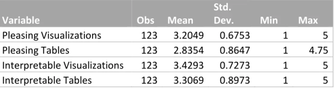
Table of Means:
Variable Obs Mean Std. Dev. Min Max
Pleasing Visualizations 123 3.2049 0.6753 1 5
Pleasing Tables 123 2.8354 0.8647 1 4.75
Interpretable Visualizations 123 3.4293 0.7273 1 5
Interpretable Tables 123 3.3069 0.8973 1 5
The above table is a summary of mean statistics for the data which determined the indicator variables of aesthetic and interpretability. It can be observed that, on the aggregate, respondents find visualizations to be both more interpretable and more visually pleasing than their tabular counterparts.
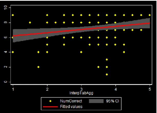
Figure 16 depicts the relationship between the interpretability of tabular graphics and the number of questions answered correctly. This bivariate relationship can be interpreted as slightly
positive.
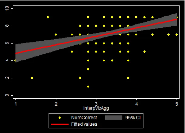
Figure 17 depicts the relationship between interpretability of visualization graphics and the number of questions answered correctly. This bivariate relationship can be interpreted as positive.
Figure 18 depicts the relationship between the aesthetic rating of tabular graphics and the number of questions answered correctly. There is no determinable bivariate relationship observed.
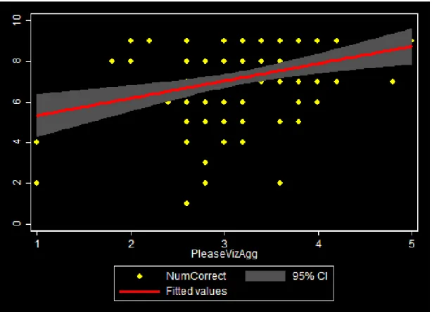
Figure 19 depicts the relationship between the aesthetic rating of visualization graphics and the number of questions answered correctly. This bivariate relationship can be interpreted as positive.
Figure 19
H1: There is a positive relationship between speed and aesthetic: NOT CONFIRMED H2: There is a positive relationship between accuracy and aesthetic: CONFIRMED
H3: There is a positive relationship between speed and education level: NOT CONFIRMED H4: There is a positive relationship between accuracy and education level: NOT CONFIRMED H5: There is a positive relationship between speed and age: CONFIRMED
Conclusions and Recommendations:
Most directly, the survey revealed that respondents affiliated with school districts most frequently used performance-related data. Interestingly, respondents also indicated the highest level of interest in performance-based data over other types, regardless of affiliation. This speaks to public interest as well as administrative applicability; 49% of administrators indicated that they most frequently used performance-based data while the greatest share of general interest (24%) in data types was also performance-based data. Levels of both interest and usage were then followed by financial data and demographic data. These results reinforce the applicability of currently produced tools on the NYSCRS website, which primarily focus on performance,
financial and demographic data.
On the aggregate, there was a high level of variability among respondents’ ability to correctly and quickly interpret data visualizations. Observations suggest that the usage of line graphs results in quicker and more correct response rates. Contrary to this finding, however, we found that more complex, line graph visualizations (financial matrices) were answered more correctly than their tabular counterparts, but at a lower rate than both the simple line graph and its tabular counterpart. For both the simple line graph and the financial matrix, the visualizations were answered more correctly and quickly than the tabular representations of the same data. These findings suggest that the website should focus on displaying primarily simple line graph data, where applicable, and where complex matrices can be used, the presence of an
accompanying line graph component should be ensured.
Scatterplot visualizations yielded interesting results. They took respondents the most time to answer correctly, however, the difference between correct answer percentages for the
is, perhaps, intuitive. A scatterplot visualization may more quickly trigger a respondent’s realization of a linear relationship between data points. The same data represented in a tabular format, however, does not grant the respondent the advantage of directly observing a general or linear relationship prior to analyzing line by line. Though the respondents did answer the tabular representation more quickly, it is difficult to ascribe importance to this dimension as the correct response rate was so low. These findings suggest that scatterplots should be used carefully and, when used, there should be accompanying and objective explanations and labeling.
Bar chart visualizations returned interesting results in that they were the only visualization type for which the tabular counterpart was answered both quicker and more correctly. Though the difference in latency was negligible between the bar chart and the tabular component, respondents’ correct answer rate was noticeably higher for the table. We believe the higher tabular score was, in part, due to the survey design in which the graphical representation of the bar chart may have been too small to interpret (on some mobile screens, or for example). These findings inform the future design of the NYSCRS website with regards to the usage of bar charts. Although bar charts are not currently used on the website, our findings, pending survey design error, suggest that when data is present which can be represented as either a table or a bar chart, the former be used. This dimension (bar chart visualizations) was included in the survey as an exploratory metric, and given its somewhat peculiar results compared to other visualization types; we would call for further research regarding different types of bar chart visualizations and their interpretability.
Regarding aesthetic and interpretability, cross tabulations appear to confirm that those respondents who indicated a graphic to be more aesthetically pleasing were more likely to answer its associated question correctly. Likewise, those indicating a visualization to be
displeasing were more likely to answer it incorrectly. As briefly mentioned above,
interpretability follows our conceptual understanding as, when respondents mark a graphic (visualization or tabular) as interpretable, they are more likely to answer that question correctly. For the website design, this suggests that graphics should be constructed with attention to aesthetic items which could include color palettes, cleanliness, labeling, etc. Further research regarding the more detailed nature of these intricacies should be undertaken. Such an
investigation could design surveys wherein the types of graphics (be they visualizations or tables) are consistent throughout the survey. In this manner, the type of visualization (scatterplot, table, bar, line) will be the same throughout the entire survey, serving as the ‘constant,’ and variation can be measured as a function of changes to the aesthetic (labeling, color, simplicity, cluttering, etc.).
In summary, the NYSCRS website design should focus on performance, financial, and demographic data. The website should also maximize the usage of the most effective forms of visualizations: line graphs and tables of non-bivariate relationships. Scatterplots, if used, should be constructed thoughtfully and with clear, concise labeling in order to assist with users’
understanding of the data displayed. Finally, the ‘matrix’ visualizations currently displayed on the website should be evaluated to determine whether the information displayed is too complex or redundant. This may assist users in more quickly and accurately garnering information from the visualization. Across all of these initiatives, design should pay attention to aesthetic.
References:
Bartram, L. (1998). Enhancing Visualizations with Motion. In Hot Topics: Information Visualization 1998, May 1998.
Butavicius, Marcus A. and Lee, Michael D. (2007). An empirical evaluation of four data visualization techniques for displaying short news text similarities. In International Journal of
Human-Computer Studies, Volume 65, Issue 11, November 2007, (pp. 931-944). ISSN 1071-5819,
http://dx.doi.org/10.1016/j.ijhcs.2007.07.001.
Cawthon, N., & Moere, A. V. (2007). The effect of aesthetic on the usability of data visualization. In Information Visualization, 2007. IV’07. 11th International Conference (pp. 637–648). IEEE. Retrieved from http://ieeexplore.ieee.org/xpls/abs_all.jsp?arnumber=4272047
Forbes, S., Chapman, J., Harraway, J., Stirling, D., & Wild, C. (2014). Use of Data Visualisation in the Teaching of Statistics: A New Zealand Perspective. Statistics Education Research Journal, 13(2), 187–201.
Kuosa, K., Distante, D., Tervakari, A., Cerulo, L., Fernández, A., Koro, J., & Kailanto, M. (2016). Interactive Visualization Tools to Improve Learning and Teaching in Online Learning
Environments. International Journal of Distance Education Technologies, 14(1), 1–21. Mudrak, Erika. (2014) "Data Visualization–Choosing a Figure Type." StatNews #89. Cornell
Statistical Consulting Unit, http://cscu.cornell.edu/news/statnews/stnews89.pdf
Orey, M. A., & Nelson, W. A. (1994). Visualization Techniques for Examining Learner Interactions with HyperMedia Environments.
Robertson, G., Fernandez, R., Fisher, D., Lee, B., & Stasko, J. (2008). Effectiveness of animation in trend visualization. Visualization and Computer Graphics, IEEE Transactions on, 14(6), 1325– 1332.
Stofer, K. A. (2013, January 1). Visualizers, Visualizations, and Visualizees: Differences in Meaning-Making by Scientific Experts and Novices from Global Visualizations of Ocean Data. ProQuest LLC.
Unlu, A., & Sargin, A. (2009). Interactive Visualization of Assessment Data: The Software Package Mondrian. Applied Psychological Measurement, 33(2), 148–156.
Zhang, Y. (2011, January 1). Exploring the Integration of Data Mining and Data Visualization. ProQuest LLC.
Zhu, Y. (2007). Measuring effective data visualization. In Advances in Visual Computing (pp. 652– 661). Springer. Retrieved from http://link.springer.com/chapter/10.1007/978-3-540-76856-2_64