Project Acronym: CATALYST
Project Full Title: Collective Applied Intelligence and Analytics for Social Innovation
Grant Agreement: 6611188
Project Duration: 24 months (Oct. 2013 - Sept. 2015)
D4.6 Collective Intelligence Analytics Dashboard Usability Evaluation
Deliverable Status: Final
File Name: CATALYST_D4.6.pdf
Due Date: November 2014 (M14)
Submission Date: November 2014 (M14)
Dissemination Level: Public
Task Leader: The Open University
This project has received funding from the European Union’s Seventh Framework Programme for research, technological development and demonstration under grant agreement n°6611188
The CATALYST project consortium is composed of:
SO Sigma Orionis France
I4P Imagination for People France
OU The Open University United Kingdom
UZH University of Zurich Switzerland
CSCP Collaborating Centre on Sustainable Consumption and Production Germany
Purpose Purpose Europe United Kingdom
Wikitalia Wikitalia Italy
Disclaimer
All intellectual property rights are owned by the CATALYST consortium members and are protected by the applicable laws. Except where otherwise specified, all document contents are: “© CATALYST Project - All rights reserved”. Reproduction is not authorised without prior written agreement. All CATALYST consortium members have agreed to full publication of this document. The commercial use of any information contained in this document may require a license from the owner of that information.
All CATALYST consortium members are also committed to publish accurate and up to date information and take the greatest care to do so. However, the CATALYST consortium members cannot accept liability for any inaccuracies or omissions nor do they accept liability for any direct, indirect, special, consequential or other losses or damages of any kind arising out of the use of this information.
Revision Control
Version Author Date Status
0.1 Thomas Ullmann (OU) October 13, 2014 Initial Draft 0.2 Thomas Ullmann (OU) November 24, 2014 Draft
0.3 Michelle Bachler (OU) November 25, 2014 Proof reading 0.4 Thomas Ullmann (OU) November 25, 2014 Draft
0.5 Lee-Sean Huang (Purpose) November 26, 2014 Peer-review 0.6 Anna De Liddo and Thomas
Ullmann (OU)
November 28, 2014 Final Draft 1.0 Stéphanie Albiéro (Sigma
Orionis)
Table of Contents
Introduction ... 7
1.
The Collective Intelligence Dashboard ... 9
2.
The Collective Intelligence Analytics Dashboard Visualisations ... 11
2.1 Quick overview visualisation ... 11
2.2 Debate network visualisation ... 13
2.3 Social network visualisation ... 13
2.4 People and issue ring visualisation ... 14
2.5 Activity bias visualisation ... 15
2.6 Rating bias visualisation ... 16
2.7 Conversation nesting visualisation ... 18
2.8 User activity analysis visualisation ... 18
2.9 Activity analysis visualisation ... 20
2.10 Contribution stream ... 21
3.
Evaluation of usefulness and usability of the CI dashboard visualisations ... 23
3.1 Evaluation of the analytics visualisation with a field experiment ... 23
3.1.1 Background information ... 24
3.1.1.1 Gender ... 24
3.1.1.2 Usage of Debate Hub ... 24
3.1.1.3 Familiarity with visualisations ... 25
3.1.1.4 Summary ... 27
3.1.2 User Interaction ... 27
3.1.2.1 Quick overview visualisation ... 27
3.1.2.2 Debate network visualisation ... 27
3.1.2.3 Social network visualisation ... 28
3.1.2.4 People and issue ring visualisation ... 28
3.1.2.5 Activity bias visualisation... 28
3.1.2.6 Rating bias visualisation ... 28
3.1.2.7 Conversation nesting visualisation ... 28
3.1.2.8 Activity analysis visualisation ... 29
3.1.2.9 User activity analysis visualisation ... 29
3.1.2.10 Contribution stream visualisation ... 29
3.1.2.11 Summary ... 30
3.1.3 Usefulness and usability of the visualisations... 31
3.1.4 The good and the bad of the visualisations ... 32
3.1.4.1 Quick overview visualisation ... 32
3.1.4.2 Debate network visualisation ... 32
3.1.4.3 Social network analysis ... 32
3.1.4.4 People and issue ring ... 33
3.1.4.5 Activity bias visualisation... 33
3.1.4.6 Rating bias visualisation ... 33
3.1.4.7 Conversation nesting visualisation ... 33
3.1.4.8 Activity analysis visualisation ... 34
3.1.4.9 User activity analysis visualisation ... 34
3.1.4.11 Summary ... 35
3.1.5 Favourite visualisation ... 35
3.2 Usability lab study ... 36
3.2.1 Background information ... 37
3.2.2 User Interaction ... 37
3.2.2.1 Conversation nesting visualisation ... 37
3.2.2.2 User activity analysis visualisation ... 37
3.2.2.3 Quick overview visualisation ... 38
3.2.2.4 Debate network visualisation ... 38
3.2.2.5 Activity analysis visualisation ... 38
3.2.2.6 Summary ... 38
3.2.3 Usefulness and usability of the visualisations... 39
3.2.4 The good and bad of the visualisations ... 39
3.2.4.1 Conversation nesting visualisation ... 39
3.2.4.2 User activity analysis visualisation ... 40
3.2.4.3 Quick overview visualisation ... 40
3.2.4.4 Contribution network visualisation ... 40
3.2.4.5 Activity analysis visualisation ... 40
3.2.4.6 Summary ... 41
Conclusions ... 42
References ... 43
List of Tables and Figures ... 44
Annex 1
–
Field experiment questionnaires ... 45
1. The general part of the questionnaires ... 45
2. The individual parts of the questionnaires ... 48
2.1. Quick overview visualisations ... 48
2.2. Debate network visualisations ... 49
2.3. Social network visualisations ... 50
2.4. People and issue ring visualisation ... 51
2.5. Activity bias visualisations ... 52
2.6. Rating bias visualisations ... 53
2.7. Conversation nesting visualisation ... 54
2.8. Activity analysis visualisation ... 55
2.9. User activity visualisation ... 56
2.10. Contribution stream visualisation ... 57
3. Favourite visualisation evaluation ... 58
Annex 2 - Usability lab session protocol ... 61
1. Project summary sheet... 61
2. Consent form ... 63
3. Initial information request form ... 64
4. Session introduction ... 65
5. Tasks for round 1 ... 68
6. Tasks for round 2 ... 72
Executive summary
The present document is a deliverable of the CATALYST project, funded by the European Commission’s Directorate -General for Communications Networks, Content & Technology (DG CONNECT), under its 7th EU Framework Programme for Research and Technological Development (FP7).
This deliverable reports the outcome of usefulness and usability studies about ten visualisations of the Collective Intelligence Analytics Dashboard.
Stakeholders deliberating about a wide range of societal issues generate a huge amount of contributions. Tool support helping to make sense of all these contributions is an essential aid for effective deliberation. From the analysis of pain points (D2.1, and especially for the CI dashboard D3.9) it is known that users and moderators of such tools would benefit from analytics to get an overview about the state of the deliberation. CATALYST developed a range of analytics visualisations supporting users to summarise facets of the conversations, to explore conversations, and to raise awareness about the state of the deliberation.
The collective intelligence dashboard (see D3.9) makes these visualisations available to moderators or end users in one place. The evaluation of the collective intelligence dashboard is based on newly developed visualisations and visualisations already described in D3.9. The data format for all visualisations is the CATALYST Interchange Format (CIF) (specified in D3.1). The visualisations act either directly on CIF data or on the results returned from the metric server, which implements a range of deliberation analytics as outlined in D2.2. The visualisations and the metrics respond to the pain-points summarised in D2.1 and D3.9.
This deliverable presents results from the usefulness and usability evaluation of these visualisations. Based on the results of the evaluations we prepared a set of recommendations to inform CI tool providers about the usefulness and usability of each visualisation. In addition the feedback received by the participants will guide the improvement of the evaluated visualisations.
The evaluation of the visualisations for the Collective Intelligence Analytics Dashboard took place in two settings. 1.) We conducted a field experiment of participants debating on Debate Hub in collaboration with Purpose. The participants of this study evaluated ten visualisations. The data for each visualisation was taken from the debates of this group. The participants therefore could see their debate though the lenses of the analytics visualisations. In addition the participants gave feedback about their top favourite visualisation to be included in a CI analytics dashboard.
2.) In addition to the field experiment we conducted a usefulness and usability study in the usability lab of the Open University. The lab setting helped to inspect the interaction of the users with the visualisation and to pinpoint problems, which cannot be derived from questionnaire data.
These two settings were chosen over a log-file analysis approach in order to gather a rich set of empirical data ranging from questionnaire and interview data to video and screen recording data.
Taking both studies in account, the usability of most the visualisations was rated as good to excellent. The participants performed well on the tasks. Rich feedback was gathered about what the participants of the studies liked and what they recommend to improve the visualisations.
Introduction
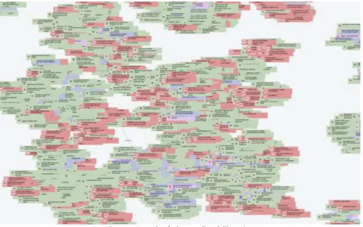
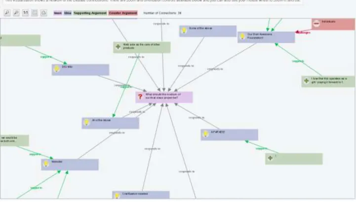
Online deliberations can reach a size where it is not possible anymore to quickly infer what is going on in a debate. Long discussion forum threads can reach hundreds of posts and require scrolling along and across different Webpages for a reader to get a sense of the overall online discussion. Alternative visualisations to forum threading, such as network graphs, are often used to support discussion structuring and improve sense making, but the effectiveness of these visualisations also tend to quickly fail when the number of posts and participants increases. The following illustration serves as an example of this, showing a partial view of a large online deliberation in form of a debate network. Hundreds of people contributed their ideas to several issues. The ideas were vividly discussed, which can be seen by the large amount of pro and counter arguments (in red and green). While this example is about one large online deliberation, the problem of sense-making exacerbates when considering the job of a moderator in charge of many online deliberations. Moderators are in need of tools to quickly get an overview of what is going on in each of the deliberations they are in charge of.
Figure 1: Example of a large online deliberation
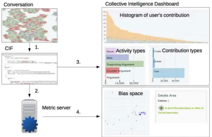
Considering the above outlined scenario, visual analytics can help to summarise the state of a deliberation and provide insights, which can be used to make informed decisions to advance the deliberation. The CATALYST Collective Intelligence Dashboard is the place where CATALYST provides facilities to instantiate individual and collections of visualisations (custom dashboard) to the members of the CATALYST projects and everyone interested in their usage. The following picture gives an overview of the building blocks of the Collective Intelligence Dashboard. First, the CI tool providers transform the raw conversation data into the CATALYST Interchange Format (CIF) (Conversation -> link 1 in Figure 2). The CIF data serves as input to either the metric server (link 2 in figure 2), which transforms the data into collective intelligence metrics, or as direct input to the Collective Intelligence Dashboard (link 3), or both (link 4). The Collective Intelligence Dashboard takes as input either only the CIF or the CIF with the calculated metrics coming
from the metric server. Based on these two types of input data the dashboard provides several visualisations of the data. Each visualisation shows a facet or perspective of the underlying data. In the illustration below users can request a histogram of user's contributions, an overview of activity and contribution types, or they can inspect the date returned by the metric server to check for biases of the deliberation.
1.
The Collective Intelligence Dashboard
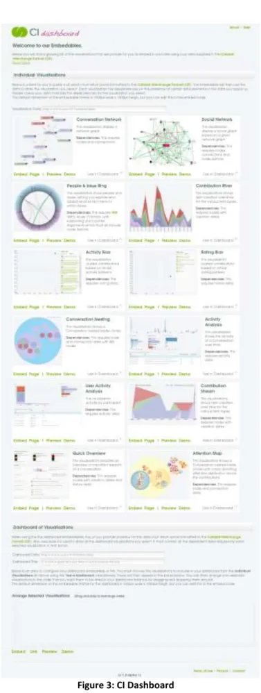
The online tool provisioning the analytics visualisations is the CATALYST Collective Intelligence Dashboard (the Collective Intelligence Dashboard was reported in deliverable D3.9. Here, we present a short recap about its function and features).
The CI dashboard is the place where people can get an overview of available visualisations, to view them with default data (demo function), to test visualisations with their own data, to compile their own dashboard, or instantiate an individual visualisation.
The individual visualisations are displayed in a grid layout. Each cell contains one visualisation. Each visualisation comes with a screenshot, a short description, and a description about any data dependencies (i.e. specific requirements of the data). CI dashboard users can demo each visualisation with a default data set, and they can preview the visualisation with their own CIF data. In addition the dashboard provides for each visualisation the embed code, or can generate a link which will display the visualisation with the provided data source. The CI Dashboard is the mechanism by which: the CATALYSTs’s CI Visualisations can be used and embedded in other project websites or tools, and the CI analytics can be applied and delivered to third parties as reusable service.
Furthermore, users can compile their own dashboard. They can choose any of the visualisations to be included in the dashboard and can arrange their order of appearance in the custom dashboard. The CI dashboard generates an embeddable HTML code or a link to the custom dashboard (see the lower part of the following figure).
2.
The Collective Intelligence Analytics Dashboard Visualisations
The next section gives an overview of the visualisations that have been evaluated regarding their usefulness and usability. These do not represent all visualisations available from the CI dashboard. As we follow an agile development methodology, new visualisations have been added since the end of the evaluation as direct feedback form the most recent testing-design cycle. These visualisations may be object of further evaluation in the remainder of the project (depending on the quick assessment of their potential value during the next phases of development and testing). Three types of collective intelligence analytics visualisations have been explored: Visualisations to explore data, visualisations to summarise data, and visualisations raising awareness about the state of the conversation. The third type is based on the idea of attention-mediated feedback (D2.2, and D3.9) and consists of mini-visualisations to focus users attention on specific analytics results, such as, for instance, the participation, contribution or lurking level in a group being below or above certain acceptable thresholds (indicators of debate’s health).
New visualisations, implemented after the submission of deliverable D3.9 and which took part in the evaluation, are explained in depth, while visualisations reported in D3.9 are briefly recapped. The visualisations reported in D3.9 are marked with an asterisk.
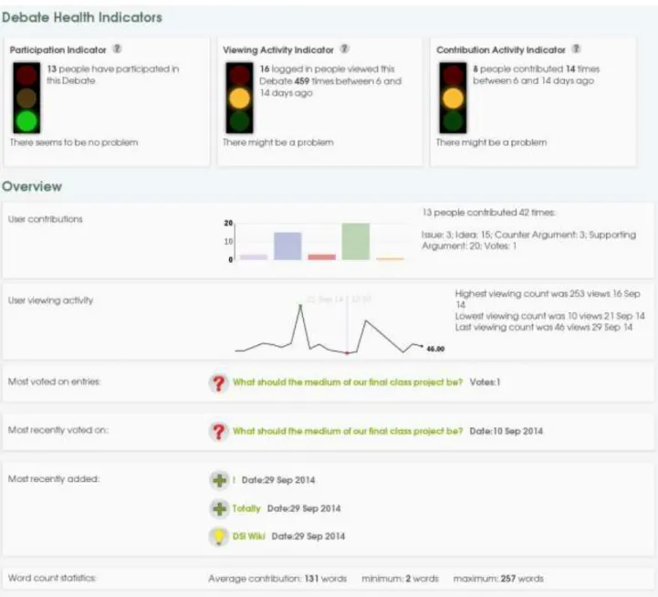
2.1
Quick overview visualisation
The quick overview visualisation provides several sections summarising important facets of the conversation in one single view. It contains three conversation health indicators (general participation, viewing and contribution) and several overview visualisations about user contributions, users' viewing activity, most voted entries, recent contributions, and word counts.
The three health indicators on top of the page follow the traffic light metaphor. A red traffic light indicates a problem with the conversation, yellow that there might be a problem, and green that there might be no problem (similar to real traffic lights where green has the meaning to proceed with caution). The traffic lights switch depending on the state of the conversation. Switching is based on a threshold concept. If a certain threshold is reached the traffic light switches its state from green, to yellow, to red.
The participation health traffic light (on the left) gives a quick indication of whether or not enough people participated/voices were heard in the conversation. The thresholds are set at the time of writing as follows. If less than three people participated in the conversation then show a red traffic light. If between three and five people have participated then show a yellow traffic light. If more than five people participated then show a green traffic light. Participation is based on users' contributions (i.e. adding a contribution to the conversation for example an idea, supporting argument, counter argument, etc.). Viewing activity was excluded from what counts as participation. The viewing activity indicator is based on the viewing activity of logged in users. The longer the conversation was not viewed the more the traffic light switches towards red. The current thresholds are set to the following: If a logged in user viewed the conversation in the last five days then it shows a green traffic light. If the conversation was viewed between six and 14 days, then it shows a yellow traffic light. If the conversation was not viewed with 14 days then it shows a red traffic light.
The contribution activity indicator takes into account the time of the last contribution made to the conversation. If a user added a new entry within the last five days it shows a green traffic light. If a user contributed five to 14 days ago then it shows a yellow traffic light. If the conversation did not receive any contribution within 14 days then it shows a red traffic light.
These thresholds may change based on the feedback of users or the requirements of the application using the traffic lights.
Below the traffic light two mini visualisations display conversation data. The first visualisation shows a bar chart of contribution types for the whole conversation. Contribution types are issues, ideas, supporting and counter
arguments, as well as the number of votes. Hovering over the visualisation displays the count for each type. In addition, the information displayed in the bar chart is also shown in textual form.
The second mini visualisation is a sparkline visualisation of the viewing activity over the period of the whole conversation. The highest, lowest, and last viewing activity is visually marked with coloured dots. Users can hover over the sparkline to see the viewing activity of the day at the position of the mouse pointer. In addition to the sparkline visualisation this block also contains a textual description of key events on the sparkline.
These two mini visualisations follow three blocks, which show the most voted entry, the most recently voted entry, and what got recently added to the conversation. Each block shows a symbol indicating the contribution type, its description, and additional information.
The last block of this page shows word count statistics of the conversation. It shows how many words have been contributed on average, the smallest number of word contribution, and the largest word count.
2.2
Debate network visualisation
The debate network visualisation is described in depth in deliverable D3.9 (p. 16). It shows a single or multiple graphs of the whole conversation. The root element of each graph is the issue of the conversation. The children of the root elements are its ideas, and the leaf nodes are the supporting and counter arguments of the idea.
Figure 5: Debate network visualisation
2.3
Social network visualisation
The social network visualisation is described in depth in deliverable D3.9 (p. 15). The visualisation shows a social network of participants of the conversation. A link between user A and B is formed if user B contributed to the node of user A. For example, user A wrote an idea and user B provided a supporting argument to this idea.
Figure 6: Social network visualisation
2.4
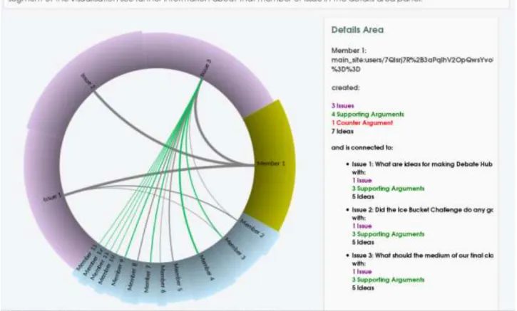
People and issue ring visualisation
The people and issue ring visualisation is described in depth in deliverable D3.9 (p. 15). This visualisation shows the relation between people and issues and in particular how a user distributed her activities across different issues and what was her average attitude toward each issue (represented with different links between issues and users and coloured grey for neutral, green for positive, and red for negative attitude). The segment size for users represents their amount of contributions proportionally to all other users. The colour and weight of the links represents the main argument type and the amount of contributions.
Figure 7: People and issue ring visualisation
2.5
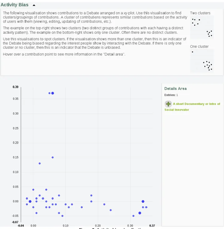
Activity bias visualisation
The activity bias visualisation is based on the results of the metric server for the request "interest_space_post_coordinates". This metric calculates how active each post is in each topic. It clusters posts, which tends to be viewed, edited, updated, etc. together. The metric is based on singular value decomposition (SVD) (Golub & Kahan, 1965). SVD is applied to represents each post in an N-dimensional space. The visualisation shows the first two dimensions for all posts, which are also the most important dimensions.
The visualisation can be used to detect clusters/groupings of contributions. A cluster of contributions represents similar contributions based on the activity of users with them (viewing, editing, updating of contributions, etc.). The description of the visualisation contains two examples helping people to spot clusters in the visualisation. The example on the top-right shows two clusters (two distinct groups of contributions with each having a distinct activity pattern). The example on the bottom-right shows only one cluster. Often there are no distinct clusters. If the visualisation shows more than one cluster, then this is an indicator of the conversation being biased regarding the interest people show by interacting with the conversation. If there is only one cluster or no cluster, then this is an indicator that the conversation is unbiased.
Figure 8: Activity bias visualisation
2.6
Rating bias visualisation
As with the activity bias visualisation the rating bias visualisation is based on the results of the metric server. The specific request to the metric server is "support_space_post_coordinates" to receive the values for the visualisation. The metric calculated for each post coordinates in an N-dimensional space based on rating activity. It uses singular value decomposition (SVD) for this transformation. The visualisation shows the first two dimensions, as they are the most important ones.
The visualisation can be used to detect clusters/groupings of contributions. A cluster of contributions represents similar contributions based on the rating activity of users.
The description of the visualisation contains two examples aiding users to make sense of the visualisation. The example on the top-right shows two clusters (two distinct groups of contributions with each having a distinct voting pattern). The example on the bottom-right shows only one cluster. Often there are no distinct clusters.
If the visualisation shows more than one cluster, then this is an indicator of the conversation being biased regarding the voting behaviour of people. If there is only one cluster or no cluster, then this is an indicator that the conversation is likely unbiased.
This visualisation could be particularly useful to extract activity patterns in large datasets. The downside of the analytical method used to build the visualisation, is that the type and nature of the identified patterns is not explained. This means that the visualisation is useful to identify clusters of “similar” posts but it will not tell the users anything about why they are “similar”.
2.7
Conversation nesting visualisation
The conversation nesting visualisation shows an entire conversation as nested circles of contributions. It gives a visual overview of which issue received most contributions (in purple in figure 10), and how the contributions’ types (solutions, pro and con arguments) are distributed across different issues. In Figure 10 for example the group conversation (clustered under the blue circle) contained three issues of which one (purple circle at the top) much more contributed to then the other two. We can also deduct that overall people contributed much more pro (green circles) than counter-arguments (red circles). In summary: the outer circle represents the whole conversation, the next level down is the issue level. Each issue can then consist of solutions or ideas; and finally each solution can contain pro-/supporting and con-/counter arguments. People can zoom into each circle, which is particularly useful for larger conversations.
Figure 10: Conversation nesting visualisation
2.8
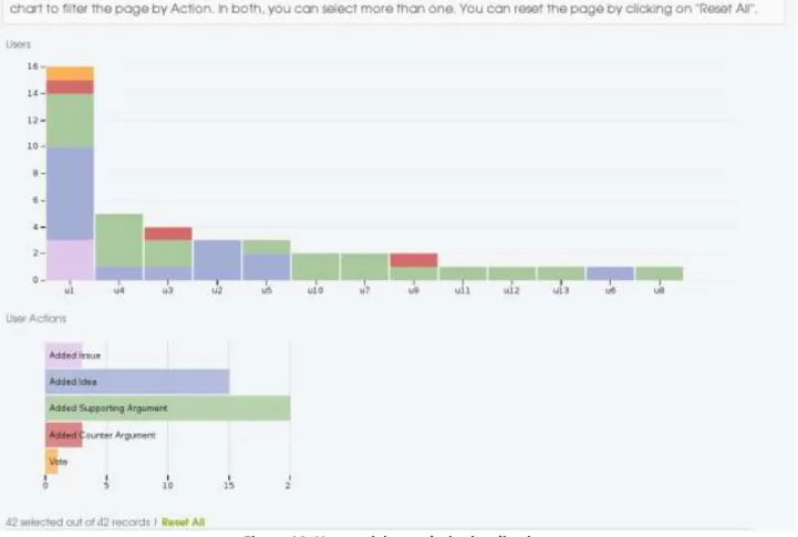
User activity analysis visualisation
The user activity chart shows an ordered bar chart of users' activities. Users are ordered by decreasing activity magnitude from left to right, basically the most active user is displayed on the very left, while the least active user is to
the very right. The activity types of each user are shown as a stacked bar. There are 5 activity types: adding issues, ideas, supporting arguments, counter arguments, and voting. In figure 11, below, the vertical bar chart there is another horizontal bar chart showing the count of each action type in the entire conversations. The two visualisations are coupled and allow group filtering (by consecutively selecting more than one bar). This means that by clicking on one user bar (e.g. U1) the horizontal bar chart will filter the results to show only the activities form U1 in the user actions chart. If in sequence we then click on another user bar (e.g. U3) then the horizontal bar chart will show the activities of U1+U3. In the same way, by clicking on the horizontal chart below the vertical chart will be filtered accordingly. The Reset all link allows removing any filter and start again.
Figure 11: User activity analysis visualisation
Below both charts there is a table with the data of the visualisation (Figure 12). The table will update with each filter action. The table shows for each user the date of the action, action type, and the title of the action. For example user u2 added an idea on Tuesday with the title "clarification needed".
Figure 12: Table of the user activity analysis visualisation
2.9
Activity analysis visualisation
The activity analysis visualisation shows the activity of a conversation over time. It consists of three main building blocks. On top is a bar chart that shows the activity for each day of the conversation. The middle block shows horizontal bar charts for day of the week, contribution type, and activity type. The third building block is a table showing the underlying data of the visualisation. All three blocks and their visualisations are coupled and will update according to the filter actions of the user.
Users can filter the timeline by selecting a date range (click and drag). They can also filter according to days of weeks, contribution types, and activity types by selecting one or several of the horizontal bars. The data table will update its information accordingly.
Figure 13: Activity analysis visualisation
2.10
Contribution stream
The contribution stream is similar to the activity river reported in deliverable D3.9 (see page 16). It shows contributions over time. Each colour represents a contribution type (issue, idea, counter argument, supporting argument). The user can flip between a stacked, stream, and an expanded view of the contribution stream. The following figure shows the stream view of contributions. Users can filter the visualisation by contribution type. Hovering over a specific date will show a pop up with the exact count for each contribution type.
3.
Evaluation of usefulness and usability of the CI dashboard visualisations
The collective intelligence analytics dashboard usability evaluation tests the usefulness and usability of several deliberation analytics visualisations provided by the CI dashboard (T3.9). The dashboard visualisations are generated from data specified in the CATALYST interchange format (D3.1) and the deliberation analytics (D3.5) returned by CATALYST metrics server.
The evaluation follows a multi-method approach applying a mix of qualitative and quantitative methods in lab and field experiment settings. The experiments were designed in a way that participants work on realistic tasks in which they answered questions about the debate with the help of the analytics visualisation. The methods used for the evaluation ranged from questionnaires to video and screen recordings, providing a rich data source about aspects of usefulness, usability, and use of the collective intelligence dashboard visualisations. Two main settings are evaluated, which structure the following sections.
Field Experiment
The first study was a field experiment. Our test bed partner PURPOSE recruited participants for this trial. The participants took part in an online deliberation on Debate Hub (D3.6). They formed the group "Design community 2014" to debate design issues of web projects, for example, the "Beyond Fear Project", a project aiming to help people overcoming their personal fears. The participants had ample time to familiarise themselves with the tool. The data, which they generated while debating, served as data source for the analytics visualisations. The evaluation of the usefulness and usability of the visualisations was gathered with an online questionnaire. PURPOSE disseminated the links for the online questionnaire to the participants of this group.
Lab Experiment
The second setting was a usefulness and usability study in a usability lab setting. Participants recruited by the OU conducted several tasks with the visualisations. The sessions were screen captured and video recorded. This evaluation collected rich data about the usefulness and usability of different visualisations in a controlled environment and with a small group of participants.
The field experiment study and the usability lab study consisted of four major parts. The first part collected background information about the participants, especially the familiarity of the participants with analytics visualisations. The second part measured the use of the visualisations based on performance tasks. The third part measured the usefulness and usability with the SUS (System Usability Scale) questionnaire (Bangor, Kortum, & Miller, 2009, 2008; Brooke, 2013), and the fourth part gathered information about what the participants liked and did not like about the visualisations, and what they would improve.
3.1
Evaluation of the analytics visualisation with a field experiment
Purpose initiated the creation of the "Design Community 2014" group on Debate Hub. Several people participated in multiple debates. The questionnaires used for the evaluation of the usefulness and usability of the CI analytics dashboard was sent to this user group (see the annex section "Field experiment questionnaires"). Participants in the evaluation had the time to familiarise themselves with the collective intelligence debate tool. The data generated during their activity with the Debate Hub group until the start of the evaluation were used as data source for all visualisations. This choice was made to enhance the authenticity of the evaluation. The participants were then able to see their debate through the lenses of several analytics visualisations.
The questionnaires were generated with the maQ-online Questionnaire Generator (Ullmann, 2004) freely available at http://maq-online.de. Purpose sent the questionnaire links to 26 participants. The task for each participant was to fill
out 11 questionnaires: One questionnaire to assess each of the 10 visualisations and one final questionnaire to compare visualisations and gather data about users’ favourite visualisations.
Each participant received unique links to the online questionnaires. Each participant received for each visualisation two links. The second link served as a backup in case the participant got interrupted during the first time they filled out the questionnaire. The following procedure was applied to ensure that only one questionnaire of each participant got included into the sample. If a participant used both questionnaires, the questionnaire with most filled out questionnaire pages was kept and the data from the other questionnaire was discarded. In addition, questionnaires were deleted if the person only filled out the first page, but not any of the other 7 pages. All participants gave their consent to use their data for research.
3.1.1 Background information
In total six questions were asked to get to know more about the background of the participants. One question asked for their gender, two questions asked about their participation on Debate Hub, and three questions were used to gather data about the participants' familiarity with visualisations.
3.1.1.1 Gender
Most of the participants were females. At least one male person filled out each questionnaire.
Table 1: Gender
Questionnaire N Male Female
Quick overview visualisation 12 2 10
Debate network visualisation 8 2 6
Social network visualisation 9 1 8
People and issue ring visualisation 8 1 7
Activity bias visualisation 8 1 7
Rating bias visualisation 8 2 6
Conversation nesting visualisation 7 1 6 Activity analysis visualisation 4 1 3 User activity analysis visualisation 6 1 5 Contribution stream visualisation 7 2 5
3.1.1.2 Usage of Debate Hub
The next two questions are indicative of how familiar the participants are with the collective intelligence tool Debate Hub.
The first question was: "How often did you visit the discussion about ‘Designing Community 2014’ on Debate Hub?" Most people visited Debate Hub between 2 to 10 times. None of the participants had never visited Debate Hub.
Table 2: Visits of Debate Hub
Questionnaire N Never 1 time 2 to 4 times 4 to 10 times more than 10 times
Quick overview visualisation 12 0 1 4 6 1
Debate network visualisation 8 0 1 2 4 1
Questionnaire N Never 1 time 2 to 4 times 4 to 10 times more than 10 times
People and issue ring visualisation 8 0 1 3 3 1
Activity bias visualisation 8 0 1 2 4 1
Rating bias visualisation 8 0 0 4 3 1
Conversation nesting visualisation 7 0 1 2 3 1
Activity analysis visualisation 4 0 0 1 2 1
User activity analysis visualisation 6 0 0 2 3 1
Contribution stream visualisation 7 0 1 3 2 1
The next question was: "How often did you make a contribution to the discussion about ‘Designing Community 2014’ on Debate Hub?" A contribution could have been to add an idea, write a supporting or counter argument, or voting. Most of the participants contributed one or more times to the conversation.
Table 3: Contributions to Debate Hub
Questionnaire N Never 1 time 2 to 4 times 4 to 10 times more than 10 times
Quick overview visualisation 12 4 3 3 2 0
Debate network visualisation 8 1 4 1 2 0
Social network visualisation 9 3 4 0 2 0
People and issue ring visualisation 8 2 3 1 2 0
Activity bias visualisation 8 2 3 1 2 0
Rating bias visualisation 8 2 3 1 2 0
Conversation nesting visualisation 7 1 4 0 2 0
Activity analysis visualisation 4 0 2 0 2 0
User activity analysis visualisation 6 1 3 0 2 0
Contribution stream visualisation 7 1 3 1 2 0
Overall, all participants stated that they have seen Debate Hub, and most people have contributed at least once to the debate.
3.1.1.3 Familiarity with visualisations
Three questions were designed to gauge information about the participants' familiarity with visualisations. The first question was: "How familiar are you with analytics dashboards in general?" Most people answered that they are novices or have basic experiences.
Table 4: Familiarity with analytics dashboards
Questionnaire N Expert Advanced Average Basic experiences Novice
Quick overview visualisation 12 0 1 2 4 5
Debate network visualisation 8 0 1 1 2 4
Social network visualisation 9 0 0 1 4 4
People and issue ring visualisation 8 0 0 0 4 4
Activity bias visualisation 8 0 0 1 2 5
Questionnaire N Expert Advanced Average Basic experiences Novice
Conversation nesting visualisation 7 0 0 0 3 4
Activity analysis visualisation 4 0 0 0 1 3
User activity analysis visualisation 6 0 0 0 2 4
Contribution stream visualisation 7 0 1 0 3 3
The next question was: "How familiar are you with visualisations for analysing and exploring data?" As with the first question most participants answered with being novices or having basic experiences. Overall there is a slight move away from answering as novice.
Table 5: Familiarity with visualisations
Questionnaire N Expert Advanced Average Basic experiences Novice
Quick overview visualisation 12 0 2 3 3 4
Debate network visualisation 8 0 1 1 3 3
Social network visualisation 9 0 0 1 5 3
People and issue ring visualisation 8 0 0 1 4 3
Activity bias visualisation 8 0 0 0 4 4
Rating bias visualisation 8 0 0 2 2 4
Conversation nesting visualisation 7 0 0 1 3 3
Activity analysis visualisation 4 0 0 0 2 2
User activity analysis visualisation 6 0 0 1 2 3
Contribution stream visualisation 7 0 1 1 3 2
The last question was: "How familiar are you with visualisations for analysing and exploring debates?" While the previous questions asked about general familiarity with visualisations to explore data, this question narrowed the context to debates. Most participants rated themselves as novices or as having basic experiences. Compared to the other two questions, participants reported the least amount of experience with debate visualisations.
Table 6: Familiarity with debate visualisations
Questionnaire N Expert Advanced Average Basic experiences Novice
Quick overview visualisation 12 0 1 1 4 6
Debate network visualisation 8 0 1 1 2 4
Social network visualisation 9 0 0 1 4 4
People and issue ring visualisation 8 0 0 0 4 4
Activity bias visualisation 8 0 0 1 2 5
Rating bias visualisation 8 0 0 1 2 5
Conversation nesting visualisation 7 0 0 0 3 4
Activity analysis visualisation 4 0 0 0 1 3
User activity analysis visualisation 6 0 0 0 2 4
3.1.1.4 Summary
We gathered answers from 77 questionnaires in total. Each of the 10 visualisations was assessed by an average of 8 people. Most of the participants were female. All of them have seen Debate Hub and most of the contributed to the deliberation at least once. Most of the participants reported to have basic experiences with analytics visualisations or analytics dashboards. Having only limited experiences with analytics visualisations will be true for most of the users of collective intelligence tools, as their primary focus is on online debating and not on analysing their conversation. Considering this, the following results will be indicative for most users, with no or little experience in using analytics visualisations.
3.1.2 User Interaction
To assess the user interaction with the visualisations, small tasks were constructed for each visualisation. The tasks were designed in a way that they cover the core functionalities of the visualisation. After the tasks followed a yes/no question together with a free-text answer questions. This final question was used to allow qualitative insights of users’ reactions, ideas and open comments. The tasks of the questionnaire will be presented for each individual visualisation. The results are summarised at the end of this section.
3.1.2.1 Quick overview visualisation
The first question asked, "How many people participated in the debate?" Nine out of ten participants answered this question correctly. All 10 participants correctly answered the second question "How many counter arguments have been contributed?" Eight out of 10 answered the question "What is the highest viewing count?" correctly. Nine out of 10 could answer the question "What is the average word count over all contributions?"
Overall, most participants were able to successfully answer the questions of the task.
After this task the participants were asked their opinion regarding the question: "Is the debate a healthy debate?" Three people answered with yes, five with no, and 2 could not tell.
From the five people who think that the debate is not healthy four saw the lack of activity as a problem. They mentioned low viewing activity and low contribution activity as reasons.
From the three people who think that the debate is a healthy debate, two people mentioned that there is a good amount of ideas, which received supporting arguments.
From the free-text answer replies of the participants it seems that two different blocks of the visualisation sourced their judgement about the health of the debate. The explanations of the five people thinking that the debate is not healthy indicate that they looked at the debate health indicators. Two of the health indicators showed a red traffic light for the viewing activity indicator and the contribution activity indicator. The explanations of the three people judging the debate as a healthy debate indicate that they took their information from the user contribution bar chart, which showed a proportionally larger amount of ideas and supporting arguments than the other contribution types. Interesting is that both types of visualisations were used as source to judge the healthiness of a debate. This may indicate that besides the health indicators the distribution of debate types plays a role as well to judge the healthiness of a debate.
3.1.2.2 Debate network visualisation
Five out of six people answered the question "Which issue received the most responses?" correctly. Half of the participants answered the question "How many ideas got challenged?" correctly. Five out of six correctly answered the question "Which idea has the most connections?"
Five participants answered the question "Is the debate dominated by one of the two argument types" in the affirmative. The two argument types were supporting arguments and counter arguments. One participant answered in the negative. All five participants explained that the debate was dominated by supporting arguments. Two of them
elaborated that there is an imbalance between supporting and counter arguments with many more supporting arguments than counter arguments.
3.1.2.3 Social network visualisation
Five out of seven participants answered the question "Who is the most connected user?" and four out of seven answered the question "How many connections are between the most connected user and the user which is the second most connected user? " correctly.
They were then asked "Is the debate dominated by one or more users?" Six participants answered with yes and one participant with no. These six users explained it with the amount of connections of this user. The visualisation showed indeed a very central user with many connections to other users, which was identified as the dominating user.
3.1.2.4 People and issue ring visualisation
All eight participants correctly answered the questions "Which member contributed most issues" and "Which member contributed to issue 2?" Five out of eight answered correctly the question "How many ideas were contributed by member 1?" The three participants who incorrectly answered with three seemed to mismatch ideas with issues, which might be caused by overseeing the information in the detail area and only checking links in the visualisation, which shows three outward links from member 1. Seven out of eight participants correctly answered the question "Which issue received the most supporting arguments?"
Seven participants thought that the debate was dominated ("Is the debate dominated by one or more users?"). One person could not tell. The explanations ranged from member 1 having the largest section, to member 1 has thicker lines, to member 1 contributed the most issues.
3.1.2.5 Activity bias visualisation
The question "How many clusters can you see?" was an open question without right or wrong answers. The scatterplot showed a pattern, which did not show a specific amount of clusters. Three out of eight participants saw two clusters, two saw three clusters, one person saw one cluster, another one saw 5 clusters, and one person saw 27 clusters. Assuming that the correct answer is between two and three clusters, then five out of 8 correctly answered the question.
Most people could not tell whether the debate was biased or not ("Is the debate biased?"). Out of eight two answered with yes and two with no. Their explanations revealed that it was difficult for them to assess whether the scatterplot showed clusters or not.
3.1.2.6 Rating bias visualisation
Similarly to the activity bias visualisation there was not a clear-cut answer to the question "How many clusters can you see?" Five out of seven people saw one cluster. One person saw two, and one person 12 clusters. Assuming that the correct answer lies between one and two then six out of seven participants correctly answered the question.
Most people (5) could not tell if the debate was biased. One person said yes, and one person no. In their explanation they stated that they found the visualisation confusing, or did not understand how the visualisation relates to the concept of bias.
3.1.2.7 Conversation nesting visualisation
All seven participants answered all three questions correctly. The questions were: "How many pro arguments can you see?", " How many contra arguments can you see?", and "How many solutions do not have any pro or contra arguments?".
This visualisation therefore proved to be very intuitive and easy to explore and interpret (100% of participants had no problem with the information seeking tasks).
3.1.2.8 Activity analysis visualisation
The first three questions were answered correctly by all four participants ("What day of the week shows most activity?", "What is the most frequent contribution type?", and " What is the most frequent activity type?"). The question "Between Thu 11 and Fri 19, how often was an idea created?" seemed to be difficult to answer. None of the four answered it correctly. To find the answer to this question several steps are necessary. First, selecting the time range, and then filtering only for the activity type "create" to find the answer in the contribution type chart. This is a more complex information seeking tasks, which required the use of the time range filtering function in association to other type of filtering, which seemed more difficult to answer.
All four participants answered with yes to the two statements "Is the debate dominated by one or more types of debate (issue, idea, supporting argument, counter argument)?" and "Is the debate dominated by one or more activity types?"
Regarding the first question they briefly explained that the dominating type was ideas, and that the most dominating activity type was views.
The visualisation showed indeed a proportionally higher count of ideas than other types of the debate. The same applied to the activity type views. In this case the visualisations helped the participants to spot dominating debate and activity types.
3.1.2.9 User activity analysis visualisation
All six participants correctly answered the question "How many counter arguments have been made in the whole debate?". Four correctly answered the question "How many users are very active?" as well as the question "How often did the most active user contribute to the debate?", and "How many ideas did user u1 (user on the left) add?". All six participants thought that the debate was dominated by one or more users ("Is the debate dominated by one or more users?"). The two main explanations were that there was one user contributing the most, and that there were more contributions to the left side of the chart then to the right. The visualisations showed indeed one very active user. After this user was a steep drop of activity. The remaining users had a more equally spread amount of contributions slowly fading out towards the last user. The explanations of the participants indicate that it was this gap of high activity of the first users and the activity of the other users, which helped them to infer that this first user dominated the debate.
3.1.2.10 Contribution stream visualisation
Five out of seven participants correctly answered the following three questions: "Which day has the highest count of supporting arguments?", "Which of the contribution types (issue, idea, counter argument, supporting argument) has overall the smallest count?", and "Which of the contributions types (issue, idea, supporting argument, counter argument) has overall the highest count?".
After seeing this visualisations six people thought that a contribution type dominated the debate ("Is the debate dominated by one or more contribution types (issue, idea, supporting argument, counter argument)?"). One person could not tell. Their explanation highlighted that it was dominated by supporting arguments. One person mentioned that this was very visible with the expanded view of the visualisation.
3.1.2.11 Summary
The following table summarises the task performance for all visualisations of the field experiment. The order of the visualisations is aligned to the task performance evaluation of the usability lab study. It shows for each visualisation their tasks, how many people answered the question correctly and incorrectly. In addition it shows the percentage of correct answers.
Table 7: Task performance field experiment
Visualisation Question Correct Incorrect Percentage
Conversation nesting
How many pro arguments can you see? 7 0 100
How many contra arguments can you see? 7 0 100
How many solutions do not have any pro or contra arguments?
7 0 100
User activity analysis
How many counter arguments have been made in the whole debate?
6 0 100
How many users are very active? 4 2 67
How many times did the most active user contribute to the debate?
4 2 67
How many ideas did user u1 (user on the left) add?
4 2 67
Quick overview How many people participated in the debate? 9 10 90 How many counter arguments have been
contributed?
10 0 100
What is the highest viewing count? 8 2 80
What is the average word count over all contributions?
9 1 90
Debate network Which issue received the most responses? 5 1 83
How many ideas got challenged? 3 3 50
Which idea has the most connections? 5 1 83
Activity analysis What day of the week shows most activity? 4 0 100
What is the most frequent contribution type? 4 0 100
What is the most frequent activity type? 4 0 100
Between Thu 11 and Fri 19, how often was an idea created?
0 4 0
Social network analysis
Who is the most connected user? 5 2 71
How many connections are between the most connected user and the user which is the second most connected user?
4 3 57
People and issue ring
Which member contributed most issues 8 0 100
Which member contributed to issue 2? 8 0 100
How many ideas were contributed by member 1?
5 3 63
Contribution stream
Which day has the highest count of supporting arguments?
5 2 71
Which of the contribution types (issue, idea, counter argument, supporting argument) has
overall the smallest count?
Which of the contributions types (issue, idea, supporting argument, counter argument) has overall the highest count?
5 2 71
In general most people could correctly answer the task performance questions. This is a notable result considering that most of the users rated themselves as novices or as having basic experiences with analytics visualisations.
Some of the tasks, however, seemed to be more difficult. For example the question "How many ideas got challenged" in the debate network visualisation, or the question "How many connections are between the most connected user and the user which is the second most connected user?" of the social network analysis visualisation. Tasks with low performance can be seen as indicators where the users of the visualisations need better support. One way of providing this support is to extend the help text of these visualisations and to explicitly provide information about how to solve these tasks.
The activity and rating bias visualisations were not listed in the summary table above. As outlined above the aim of the visualisation is to spot clusters. There is however not a definite answer about the correct cluster count. Taking this into account it is notable that most participants agreed on the cluster count if a derivation of 1 is allowed. This indicates that the visualisation can indeed help to detect clusters.
Nonetheless, qualitative feedback form the user study demonstrates that these two visualisations were possibly the least usable. Users’ feedback and reactions to the activity and rating bias visualisations showed that people did not understand what to do with the information provided by the visualisation. They found this visualisation confusing and often did not understand how to interpret it. This could be both due to the type of analytical method used (which does not disclose the meaning of the detected similarity clusters) or that it is challenging to identifying clear-cut clusters of points. In any case this visualisations did not show promising results.
3.1.3 Usefulness and usability of the visualisations
The usefulness and usability of the visualisation was measured with the SUS usability questionnaire (Bangor et al., 2009, 2008; Brooke, 2013). The questionnaire consists of 10 items. These 10 items are used to create a single usability index. In addition we asked for an overall rating of the visualisation, and how responsive the visualisation was. The following table presents the results. A highlight marks the highest usability values. The usability of the conversation nesting visualisation is between good and excellence. The activity bias, rating bias, and contribution stream visualisation was rated between poor and ok. The remaining visualisations were rated between ok to good. The rating scale for the responsiveness of the visualisation ranged from 1 to 5. All values are slightly higher than the midpoint of the scale.
Table 8: Usefulness and usability of 10 visualisations
Questionnaire N SUS Overall Responsive
Quick overview visualisation 9 57.50 4.22 3.11
Debate network visualisation 6 67.08 4.50 3.17
Social network visualisation 6 71.67 4.67 3.33
People and issue ring visualisation 8 65.31 4.50 3.50
Activity bias visualisation 7 23.57 3.14 3.43
Rating bias visualisation 7 31.43 3.43 3.14
Questionnaire N SUS Overall Responsive Activity analysis visualisation 4 53.75 4.50 3.75 User activity analysis visualisation 6 67.08 4.67 3.17 Contribution stream visualisation 7 44.64 3.29 3.57
3.1.4 The good and the bad of the visualisations
After the participants had filled out the usefulness and usability questionnaire we asked them to explain what they liked about the visualisation, what they did not like, and what they would improve. This information was gathered with free-text forms. The following sections present the results by visualisation. Instead of reporting all participants' recommendations the following section will only present answers, which were common amongst the participants. Only if two or more people reported the same idea it was included in the results.
3.1.4.1 Quick overview visualisation
Please explain what you liked about this visualisation:
Three people said that they quickly could find answers to the questions of the task. Three people mentioned the user contribution mini bar chart, and two people liked the traffic lights.
Please explain what you did not like about this visualisation:
Two people mentioned that there was too much text.
What improvements should be made?
Two people mentioned to have more graphical visualisations. Two people mentioned that the text should be integrated into the visuals
3.1.4.2 Debate network visualisation
Please explain what you liked about this visualisation:
Participants liked the idea of having the whole debate in one picture.
Please explain what you did not like about this visualisation:
Three people referred to having issues with the zooming. These issues were expressed on several levels. One person mentioned that this visualisation needs a bigger screen. Another person noted that it was not possible to see the individual nodes without losing the overview. And one person could not zoom without using the buttons.
What improvements should be made?
There was no overlap of participants' comments. One user recommended adding user information, one user to have
improved zooming, and one user to more quickly load the visualisation.
3.1.4.3 Social network analysis
Please explain what you liked about this visualisation:
Two people liked the colour of the visualisations as they helped to make sense of the relations. Two people mentioned that this visualisation makes it easy to spot the connection between people.
Three people mentioned the anonymous user name (too long or confusing). Two people had problems with the connections between users.
What improvements should be made?
The responses of the participants did not overlap.
3.1.4.4 People and issue ring
Please explain what you liked about this visualisation:
Two people liked the varying size of the ring segments.
Please explain what you did not like about this visualisation:
Two people mentioned that the detail area information was confusing for the members and issues statistics.
What improvements should be made?
Two people recommended improving the detail area, and two people briefly mentioned changes to the style of the visualisation (graphic style, user labels, colours).
3.1.4.5 Activity bias visualisation
Please explain what you liked about this visualisation:
Three people noted that they could not say much about what they liked about the visualisation. The responses did not come with any further explanation then that.
Please explain what you did not like about this visualisation:
Four people explained that they could not make sense of the information provided by the visualisation.
What improvements should be made?
Three people expressed that they were not sure what improvements could be made to this visualisation. Two people referred to needing more information.
3.1.4.6 Rating bias visualisation
As with the activity bias visualisation, most comments confirmed that the participants could not make sense of the visualisation and did not like it.
What improvements should be made?
Two people mentioned that this visualisation needs better explanation. Two people were not sure how to improve it.
3.1.4.7 Conversation nesting visualisation
Please explain what you liked about this visualisation:
Five people mentioned that the visualisation was easy to understand.
Please explain what you did not like about this visualisation:
What improvements should be made?
There was no overlap of comments.
3.1.4.8 Activity analysis visualisation
Please explain what you liked about this visualisation:
There was no overlap of comments.
Please explain what you did not like about this visualisation:
Two people referred to the count of numbers. One person found the numbering system confusing (values too high), and one person described that it was necessary to count the table rows in order to find the count.
What improvements should be made?
Three people mentioned that the axis should be labelled.
3.1.4.9 User activity analysis visualisation
Please explain what you liked about this visualisation:
Five people liked the details provided about each user.
Please explain what you did not like about this visualisation:
There was no overlap of comments.
What improvements should be made?
There was no overlap of comments.
3.1.4.10 Contribution stream visualisation
Please explain what you liked about this visualisation:
Two participants liked the colours.
Please explain what you did not like about this visualisation:
Four people found it confusing and did not know how to interpret the visualisation.
What improvements should be made?
There was no overlap of comments.
We asked the participants which view of the contribution stream they prefer the most. Preference is nearly equally split between all three types. Two participants prefer the expanded view, two the stream view, and three the stacked view. They explained that their chosen type was easier to understand than the others. One person mentioned that the stream view was not understandable; while another person highlighted that the stream view was the most understandable view.
3.1.4.11 Summary
The following table summarises the free-text usability questions. For each visualisation the recommendations of the participants are condensed into what they liked and what should be improved.
Visualisation Liked Improve
Quick overview visualisation
Quick way to find answers to their questions. They liked user contribution bar chart and the traffic lights.
Less text and more graphical visualisations. Better integration of text and visualisation. Debate network
visualisation
Whole debate in one picture. Zoom functionality.
Social network visualisation
Makes it easy to spot connections. Colour scheme helps to make sense.
Anonymised user text string to bulky. Better explanation of how to use the connections between users.
People and issue ring visualisation
The varying size of the ring segments is a good indicator.
Better detail area. Activity bias visualisation It is difficult. Needs more explanation. Rating bias visualisation It is difficult. Needs more explanation. Conversation nesting
visualisation
Easy to understand. -
Activity analysis visualisation
- Labelling of axes. Better explanation of how
the numbers of the charts are influenced by filtering.
User activity analysis visualisation
Good level of details about the users. - Contribution stream
visualisation
Nice colours. Better explanation.
3.1.5 Favourite visualisation
After the participants have worked through the questionnaires about the visualisations, they filled out a last questionnaire, which was about choosing their favourite visualisation. This questionnaire aimed at getting to know
which of the visualisations the participants would include in an analytics dashboard. The questionnaire aimed at getting insights about what are the top five visualisations and which are the least favourite visualisations.
The results of this questionnaire determined the priority of visualisations evaluated in the usability lab setting. Visualisations, which are deemed as important for inclusion in the Collective Intelligence Dashboard were analysed in depth using qualitative methods. This process ensures that further development of the visualisations is based on an empirical determined research process, which guides the progress of the dashboard visualisations.
The questionnaire was designed in a specific way in order to prepare the participants for the question about their favourite visualisation. First, they had to vote what is their most favourite visualisation. Then they were asked to vote for the least favourite visualisation. They had to explain both choices. These questions were aimed at helping them to think about which visualisation they would include in a dashboard. Here, we present the outcome of the final question, where the participants had to vote for their favourite visualisations.
We asked the participants "Which five visualisations would you add to the debate analytics dashboard?" Each person was allowed to give his or her vote to five visualisations. The following table summarises the results.