_ 1
_ Poverty trends since the transition Poverty trends since the transition
Poverty trends since the transition: What we know
SERVAAS VAN DER BERG, MEGAN LOUW AND LEON DU TOITStellenbosch Economic Working Papers: 19/09
KEYWORDS: POVERTY, INEQUALITY, REDISTRIBUTION, FISCAL INCIDENCE, SOCIAL DELIVERY, SOUTH AFRICA
JEL: D31, H22, H5
SERVAAS VAN DER BERG DEPARTMENT OF ECONOMICS UNIVERSITY OF STELLENBOSCH
PRIVATE BAG X1, 7602 MATIELAND, SOUTH AFRICA
E-MAIL: SVDB@SUN.AC.ZA
MEGAN LOUW DEPARTMENT OF ECONOMICS UNIVERSITY OF STELLENBOSCH
PRIVATE BAG X1, 7602 MATIELAND, SOUTH AFRICA
E-MAIL: MEGANLOUW@GMAIL.COM LEON DU TOIT DEPARTMENT OF ECONOMICS UNIVERSITY OF STELLENBOSCH PRIVATE BAG X1, 7602 MATIELAND, SOUTH AFRICA
E-MAIL:
LEONDUTOIT@SUN.AC.ZA
A WORKING PAPER OF THE DEPARTMENT OF ECONOMICS AND THE BUREAU FOR ECONOMIC RESEARCH AT THE UNIVERSITY OF STELLENBOSCH
Poverty trends since the transition: What we know
SERVAAS VAN DER BERG, MEGAN LOUW AND LEON DU TOITABSTRACT
Using alternative data sources on income and poverty with a shorter time lag makes it possible to discern trends that can inform the policy debate. A strong decline in poverty rates was recorded since 2000. This has since been confirmed by General Household Survey data that showed that the proportion of households with children reporting that their children had gone hungry in the previous year had almost halved between 2002 and 2006. This policy success would not have been tracked using the less regular and more conventional data sources such as the Income and Expenditure Survey of 2000 (IES2000). One successful policy measure – the social grant system – can be clearly identified. Through the child support grants, much of the expansion of the grants system was targeted at children. In contrast, other areas of policy intervention, in particular social delivery in health and education, have been far less successful.
This Working Paper is part of longer, ongoing research on poverty and social poverty in the Department of Economics at Stellenbosch University. It first appeared as a publication that attempted to make available some of these research results to a wider public in an accessible and non-technical format
Keywords: Poverty, Inequality, Redistribution, Fiscal incidence, Social delivery, South Africa
Poverty trends since
the transition:
What we know
Servaas van der Berg
Megan Louw
Leon du Toit
Department of Economics,
Stellenbosch University
Funding
Funding for this publication was contributed by the Conflict and Governance Facility
(CAGE), a project of the National Treasury - South Africa, which is funded by the European
Union under the European Programme for Reconstruction and Development.
Credits
Department of Economics
Stellenbosch University
Email: GMKruger@sun.ac.za
Tel: 021 808 2247
Edited, designed and produced by Wordworx
Email: info@wordworx.net
Contents
1. Introduction
2. Economic context
3. Post-transition poverty
4. Post-transition inequality
5. Targeting of spending and service delivery
6. Future prospects
7. Bibliography
8. Appendix
9
11
13
27
31
39
43
47
Preface
In July 2007 survey data was released that came as a surprise for many people. It showed that in the space
of a brief four years the proportion of households with children reporting that their children had gone hungry
in the previous year had almost halved, from 31,2 per cent in 2002 to 16,0 per cent in 2006. This drastic
reduction in this one measure of poverty is an important policy success, but until recently very little data had
been available to track the progress with poverty alleviation after the Income and Expenditure Survey of 2000
(IES2000). While further analysis largely has been awaiting the release of IES2005, a team of Stellenbosch
economists have been trying to inform the policy debate by using alternative data sources that allow us to
follow trends with a shorter time lag.
What our data has been showing is in line with the results on child hunger now confirmed by the General
Household Survey. This is good news, from two perspectives: Not only does it mean that the situation of the
poor is improving, but also that one successful policy measure – the social grant system – can be clearly
identified. Through the child support grants much of the expansion of the grants system was targeted at
children. In contrast, other areas of policy intervention, in particular social delivery in health and education, have
been far less successful.
This research is part of longer, and ongoing, research on poverty and social poverty in the Department of
Economics at Stellenbosch University. This publication is a modest attempt to make available some of our
research results to a wider public in a format that is both accessible and non-technical. In the words of Prof
Jan Sadie, policy research starts with getting the numbers right.
I wish to thank the Conflict and Governance Facility (CAGE), who funded this publication, as well as other
members of the team over the past few years: Ronelle Burger, Marlé van Niekerk, Derek Yu and Rulof Burger,
as well as my co-authors, Megan Louw and Leon du Toit. This publication is one offshoot of a major research
programme, much of it available in the usual academic literature, including working papers on the combined
website of the Department of Economics and the Bureau for Economic Research (BER), our sister institution
at Stellenbosch University. These are available at:http://stbweb02.stb.sun.ac.za/economics/3.Research/2.
Working%20Papers.php.
Servaas van der Berg
Professor of Economics
Stellenbosch University
More than a decade after South Africa’s transition to democracy, it is not clear to which extent the country achieved the objective of reducing poverty and inequality. The uncertainty is the result of an absence of good and comparable data that is relevant and up to date. This publication aims to fill the gap by reporting on the progress with poverty reduction, but also on the poor record with service delivery. It draws together insights from two decades of research on Poverty, Affluence and Mobility, a research programme at Stellenbosch University instituted to create a coherent picture of the progress and setbacks in fighting poverty. The research draws on scores of data sets and many economists were involved in the analysis. The report aims to present, in a non-academic and reader-friendly format, main conclusions from recent research in this programme, making the results accessible to the policy community.
The transition to democracy marked a turning point in the history of South Africa by extending full social participation to groups who used to be systemically excluded. At the heart of meaningful social participation and, therefore, meaningful democracy, lies the reduction of poverty and income inequality. Throughout the post-transition period, spanning the implementation of the RDP (Reconstruction and Development Programme), GEAR (Growth, Employment and Redistribution) and now ASGISA (Accelerated and Shared Growth Initiative for South Africa), a consistent policy priority was to reduce poverty and inequality. This requires measuring and monitoring trends in policy-making to understand the role and effect of different policies and indicate further directions and actions for policy intervention.
Section 2 briefly reviews economic trends. It highlights the connection between trends in economic growth, the labour market and the income of households and individuals. Section 3 presents the main findings on poverty. Poverty in terms of headcount, depth and severity seems to have increased slightly from 1993 to 2001, but decreased substantially from 2001 to 2006. We expect this downward trend to continue.
Section 4 finds that inequality has remained stubbornly high, mainly because of rising inequality within race groups. There is evidence of a large and growing black middle class. Section 5 studies shifts in state expenditure and service delivery. South African public spending is currently well-targeted, but inefficient social delivery is still widespread due to ineffective managerial skills. Section 6 concludes with a look at future prospects and a policy discussion. Poverty is likely to decline and inequality to remain high, while the deracialisation of the middle class will continue.
Some central conclusions emerge. Firstly, money-metric poverty declined substantially since the turn of the century. The reduction is to a large extent due to a dramatic expansion in social grants expenditure from 2002 onwards. This improvement is mirrored in access to basic services – a rapid decline in asset poverty even preceded the decline in money-metric poverty. Secondly, although the reductions in poverty have been substantial, aggregate inequality increased during the 1990s. Thirdly, the dynamics underlying the poverty and inequality trends determine the broad policy outlook. We show that poverty has decreased
Many government efforts, such as the extension of social grants, the roll-out of housing and various categories of fiscal expenditure, have contributed to the reduction of poverty. Wage inequality remains the main driver of overall inequality. Relating to the former, there is little scope for more grant expenditure and achieving better targeting of public spending is very difficult. As in health and in education, the problem is converting the fiscal resources into changes in social outcomes. The key to improving the real resources provided to the poor and the non-poor is managerial efficiency. With the limited scope for further government intervention, and with very little room for increased state expenditure, improving the managerial skills of government is a highly attainable goal. This is the best way that government can contribute meaningfully to poverty alleviation in the future.
Related to inequality are the educational backlogs. Backlogs in education among the poor leave them with less education and poorer in terms of quantity as well as quality of education. This means they have a significant disadvantage in the labour market. More specifically, they cannot find jobs, and if they manage to get employment, the wages tend to be low. In this way the educational backlog of the poor reinforce inequality (and poverty) through the labour market. The demand for labour is unlikely to change in favour of unskilled labour, which means the situation is likely to persist unless educational quality is improved. The best option in the long term reduction of inequality, from a policy perspective, does not prescribe any spending behaviour at all. Rather, it prescribes an improvement in managerial skills – in converting fiscal resources into social outcomes.
In 1994 the South African economy was isolated from the rest of the world. Years of racist legislation had left the country with a deeply divided socio-economic structure. The economy was characterised by poor and sometimes even negative growth. The dual challenge was to bring about social transformation and pull the economy out of the recessionary slump in order to finance the required redistribution.
Initially economic growth did not accelerate much, although it was steady. The recent experience has been far more positive. Between 1994 and 2000 the economy grew at an annual rate of only 3 per cent, but from 2000 to 2006 there was a rapid increase in the growth rate to 4,1 per cent per year. The population growth slowed considerably between these two periods, so that the per capita GDP growth rate accelerated to an even greater extent. This was a strong improvement, and an even bigger one compared to the last two decades of apartheid, when the per capita growth largely stagnated.
Growth figures mask the extent to which the structure of the economy changed. Since opening the borders to international trade and shifting incentives to remove the persistent anti-export bias in previous trade policy, South Africa has seen major shifts in production. Whereas the country was once an exporter of predominantly primary goods, South Africa is increasingly moving towards exporting relatively skill intensive manufactures, thereby diversifying its export base. This means there is an increasing need for more capital and skills.
The structural shifts in the economy have had important consequences for the structure of the labour market. The slower growth of the labour intensive primary sector and manufacturing activity has resulted in a relative decline in the demand for unskilled workers. Their share in the labour force consequently fell from 31 per cent in 1995 to 27 per cent in 2002 (Bhorat 2003: 11 - 12).
In contrast, the rapidly growing technology-intensive parts of the manufacturing sector have absorbed mostly additional semi-skilled and skilled labour. The skills-hungry nature of the growth, coupled with rising wages and high labour market rigidities, initially led to rising unemployment rates and a formal sector employment structure that was increasingly skewed towards the highly skilled end of the spectrum.
High unemployment, which peaked at 26 per cent by the narrow definition and 41 per cent by the broad definition a few years ago, should be viewed in the context of a country with a very small informal sector by international standards, as well as a small peasant agriculture. This leaves unemployed workers with few alternative income earning opportunities and therefore increases the probability of these workers falling into poverty.
Although the rise in the unemployment rate until 2002 shows that employment growth did not keep up with labour force growth in the first part of the transition, the official LFS data shows that approximately
asserted (Burger 2004; Bhorat 2003). The recent decline in poverty, due to increased job creation and the slowing down of labour force growth, hold prospects of a considerable reduction in unemployment – if the economy can sustain this momentum. Given the increased confidence of foreign and domestic investors in the macro-economic management of the economy, sustained strong growth seems quite likely.
Recent labour market trends have reduced poverty only moderately. This is partly because many of those who obtained new jobs were the better educated unemployed who were at the front of the job queue and who were largely not attached to poor households. On the other hand welfare policy, in an effort to alleviate poverty through the provision of social grants, has become increasingly proactive.
The government expanded the social grants system considerably, notably through introducing the child support grant for poor children younger than 15. The old age pension is well-targeted and effective in reducing poverty (Case and Deaton 1998; UNDP 2003: 89). The child support grant, although significantly smaller than the pension, is also important for poverty relief, given that children are among the most economically vulnerable individuals (World Bank/RDP Office 1995). Income earning capacity however remains very important for economic upliftment.
The previous discussion shows the interconnection between shifts in the structure of the aggregate economy and the structure of the labour market, and that these structural changes have not been in favour of the poor. As wages make the largest contribution to overall income inequality in South Africa and because wages are derived from employment, the labour market remains one of the most important long term vehicles for the reduction of poverty.
The majority of the research conducted on data covering the early part of the post-transition period suggests that poverty has become a greater problem from 1994 until the turn of the century. These studies are summarised in the Appendix, but leave unexplained what happened after the turn of the century. After 2001 economic growth and job creation accelerated and the state massively expanded its social grants. The reason for the lack of studies since 2000 is the shortage of appropriate official data sets. While researchers await the release of the 2005 IES, which will provide new insights, policy-making has to continue without information as to its effectiveness. We have undertaken a number of studies on other official and private data sets in order to arrive at tentative conclusions regarding poverty policy and the poverty debate.
3.
Post-transition poverty
Most recent studies on poverty trends have analysed data from the 1995 and 2000 IES household surveys (together with the linked 1995 October Household Survey (OHS) and September 2000 LFS) or income data from the censuses conducted in 1996 and 2001. To aid the discussion, Box 1 below explains some of the key technical terms used in poverty analysis.
Box 1: Glossary of terms
Poverty
We follow Sen (1999) in viewing poverty as the deprivation of capabilities rather than merely low income. Its measurement is discussed in more detail elsewhere in the text.
Poverty line
Following the definition of poverty as the deprivation of capabilities, the poverty line should be set at a level of income that enables individuals to achieve certain capabilities, such as a healthy and active life and full participation in society. The poverty line separates the poor from the non-poor by specifying the level at which these capabilities are attained, making it possible to determine the number of poor people in the population.
Inequality
Inequality refers to the distribution of income. We focus mainly on the money-metric aspect due to measurement issues.
Quintiles
When dividing a group into quintiles five equally sized groups are created.
Deciles
When dividing a group into deciles ten equally sized groups are created.
Real and nominal
To make comparisons that are not complicated by changes in purchasing power because of inflation, all money values are converted into real values, i.e. the value is adjusted for the effects of inflation. The nominal value remains unadjusted.
Box 2: A guide to official data sources
for the post-transition period
The literature review of studies on poverty before the turn of the century (Appendix) alludes to deficiencies in official data sets covering the post-transition period that have serious consequences for comparative analysis. Two major types of official data sets are used for poverty analysis, namely the population censuses and the Income and Expenditure Surveys.
a) Population censuses
Population censuses provide researchers with rich data sets that do not suffer from any potential sampling problems. They do however collect income data in a relatively small number of bands, implying that analysts are required to derive income in one of a number of ways before performing distributional analysis. This can affect the reliability of derived poverty and inequality trends. Ardington et al. (2005) show that inequality levels are generally underestimated as a result of collecting income information in bands (as opposed to point estimates).
A more serious problem is that census data for 1996 and 2001 suffers doubly from a high number of households reporting zero income and a large number of missing observations for personal income. “Zero income” households amounted to 12,6 per cent of the total in 1996 and 23,2 per cent in 2001 (Simkins 2004: 6). In 1996 11,8 per cent of households returned missing values for one or more members (Simkins 2004: 6), while in 2001 incomes were imputed for the large number of households that did not provide income data. In this year more than a quarter of all individuals in households did not report their income (Ardington et al. 2005: 7). Imputing income for households with missing or reported zero income. Ardington et al. (2005) found that estimates of mean income and inequality are higher than when these households are excluded, while estimates of poverty are lower. The reason for this is that survey non-response was higher for households in urban areas and among white people – groups that are on average more affluent.
b) Income and Expenditure Surveys (IES)
The IES have some features that make them particularly suitable for asking questions about trends in poverty. They are large enough to be representative and they obtain point estimates of income and expenditure. The 1995 and 2000 data sets are however plagued by issues that make comparability particularly difficult. Two years after publishing its report contrasting the results of these surveys, Statistics South Africa admitted that the two surveys were not directly comparable.
Many analysts have also been doubtful about comparing these results. One reason is the large drop in income illustrated by these two surveys. The implied drop in income between 1995 and 2000 implicit in these surveys is larger than the decline experienced by the South African economy during the Great Depression of the 1930s. It is also larger than the decline experienced in some of the affected countries during the Asian economic crisis of 1998. If one compares this to the national accounts data for the same period, these two data sources appear to be describing two quite different countries. Whereas the national accounts figures show fairly consistent growth for this period, the IES figures show a dramatic drop in income and expenditure. Consequently, a paper by Leibbrandt, Levinsohn & McCrary (2005) finds a decline of 40 per cent in real household earnings between these two surveys. This is clearly not compatible with the national accounts.
The question immediately arises if the national accounts could perhaps be incorrect. To answer this question, we turn to some other data series that could provide possible evidence supporting the national accounts or the IES results. There has been a considerable increase in revenue from all forms of taxes: Value Added Tax, income tax and company tax. All these revenue sources grew more rapidly than the national income. This lead to some economists arguing that growth might even be underestimated by the national accounts data, rather than being greatly overestimated as the IES data would imply. The logical conclusion would therefore be that the IES data is not an accurate reflection of the South African reality.
If one analyses the income tax reported in the two Income and Expenditure Surveys, further support for this conclusion is obtained. The income tax recorded in 1995 constituted 97 per cent of the actual revenue from income tax in that year. This is a very high ratio, given the usual trend of under-reporting in surveys. In contrast, only 38 per cent of the national income tax revenue was captured in 2000 in the IES. The IES is clearly not a useful data source for comparison purposes, and there is little doubt that comparing the Income and Expenditure Surveys for 1995 and 2000 is not useful for most purposes. Finding appropriate data to analyse income distribution in South Africa is a challenge. This is because of the poor quality of the data, difficulties in comparing data across different types of surveys or censuses and incomparability within the same type of survey or census. Additionally, some data sources provide income and expenditure data while others only provide one or the other. Many data sources ask respondents to provide their income levels or expenditure levels in broad income or expenditure bands. As a result, the data is not necessarily accurate. It is universally acknowledged that when respondents are not prompted to give further answers on specific questions on income and expenditure, many income sources or expenditures are not taken into consideration when respondents answer the questions. As a result, the data is often of poor quality and difficult to compare across different years. A specific problem in the South African context is that the major source of data on income and expenditure, the 1995 and 2000 Income and Expenditure Surveys are already quite dated.
In response to the challenge presented by the deficient official data sources, we have turned to the analysis of a non-official, but in some cases more appropriate, data set, namely the All Media and Products Survey (AMPS).
Box 3: The All Media and Products Survey (AMPS)
The AMPS has been conducted semi-annually or annually by the South African Advertising Research Foundation (SAARF) since 1975. It is mainly used for market research. A substantial amount of South African advertising expenditure is allocated according to information drawn from the survey. The number of households surveyed differs from year to year, historically ranging from 14 000 in the early 1990s to well over 20 000 from 1997 onwards. As the name of the survey suggests, data on the usage of a wide range of household goods and services is collected.
One respondent aged 16 or above from each household, not necessarily the household head, is asked to fill in the questionnaire. This study is primarily concerned with the information on household income, which is collected through showing respondents cue cards divided into 28 or more categories (surveys in more recent years include up to 32 income categories). Where a respondent withholds such information, the SAARF imputes household income on the basis of household expenditure implied by the product questionnaire.
As the AMPS survey has not been used for formal distributional analysis before, the survey sampling frame and methodology are first described. The sample is stratified first by province and then by the size of a community. Communities are grouped into metropolitan areas (250 000 or more inhabitants), cities (100 000 to 250 000 inhabitants), large towns (40 000 to 100 000 inhabitants), small towns (8 000 to 40 000 inhabitants), rural areas and farming communities. Large and small towns are grouped together, while rural areas and farming communities are grouped together. All metropolitan areas and cities are sampled. For the remaining community types, communities are ranked according to size and then randomly selected.
Within the selected communities, interview points are randomly selected. Two addresses are selected at each interview point. If there is more than one household at any address, they are surveyed separately. Within households, a respondent is chosen according to the Politz methodology. For example, within each cluster of two households, one man and one woman are interviewed, each from separate households. Interviewers must return to a selected address a further three times if the first attempt to survey the people living there proved unsuccessful. Only then will substitution be allowed.
Approximately 15 per cent of households surveyed for the AMPS come from areas defined by the SAARF as rural. By contrast, the IES samples households in location proportions closer to those reflected by the census: 45 per cent of the total came from rural areas in 1995 and 39 per cent in 2000. However, location types are not defined in the same way in the AMPS as they are by Statistics South Africa (Stats SA). Secondly, the number of households in rural areas surveyed for the AMPS is still fairly large (more than 2 000 rural households were included, even in years in which smaller surveys were conducted), and once weights are applied, the AMPS and IES distributions of the population across urban and rural areas are quite similar.
Cell weighting is allocated by province (of which there are nine), community type (of which there are four), age group (of which there are four) and gender. The gender and age weights come from the Bureau of Market Research, which provides estimates of the country’s demographic composition. This yields a total of 288 cells each, containing a minimum of 10 people. The ratio of weights across any pair of cells among the total of 288 may not exceed 2:1.
After weights are applied, the data is externally validated using subscriber data from M-Net and new electricity connections (made during the past 12 months) from Eskom. Validation occurs by checking whether the AMPS figures fall within the 95 per cent confidence intervals generated by these data sources. There is also internal validation using historical sales data for consumer durables with long lifespans and low duplication rates (such as microwaves and computers). The consumers indicate whether they have made purchases of these goods during the past 12 months.
The SAARF has gone to considerable effort to ensure that the AMPS is a reliable data source. There is indeed evidence of a great deal of stability in the data between 1993 and 2004.
1Unlike in some earlier work, we do not adjust the data to make it compatible to the national accounts data series. The exception is for the final two years of the data, where we moderate the somewhat excessive growth shown by AMPS by adjusting the growth downward so as not to exceed growth rates derived from the national accounts.
Figure 1 below shows the trends in income derived from the AMPS data for the period 1993 to 20061.
It is clear that the real income for all race groups has increased since the mid 1990s, especially from 2002 onwards. The robust growth in the income of white people can be attributed to members of this group maintaining a constant share of wage income, increasing their share of property income and experiencing negative population growth. The income of Indian people also climbed steadily throughout the post-transition period, for similar reasons. The modest acceleration of economic growth rates of the first post-transition decade and an improvement in the ability of the economy to generate jobs are likely to have benefited these groups in particular, given their relatively large stocks of human capital. While black and coloured people have also benefited from these developments, they have been the primary beneficiaries of the rapid expansion of South Africa’s social safety net system.
Between the financial years of 2000/01 and 2005/06 social grant payments doubled, rising by more than R18 billion in real terms (2000 Rand value). The bulk of the additional grant spending came in the form of assistance for households with children with the age limit for eligibility for the child support grant being raised to 14. In addition, there were substantial increases in the number of beneficiaries of the disability grant, foster care grant and the care dependency grant. Table 1 on page 19 shows the number of beneficiaries of each social grant in 2000 and 2006, reflecting these trends.
Attention will now be given to trends in poverty. Post-transition poverty trends are of great interest and concern in policy debate, as their direction establishes whether the government has succeeded in achieving a certain critical socio-economic objective. Box 4 discusses some more important concepts used in this poverty trend analysis.
Box 4: Poverty lines
The poverty line separates the poor from the non-poor by specifying the level of income at which certain capabilities (such as a healthy and active life and full participation in society) are attained. The poverty line is necessary to measure absolute poverty.
Basic methods for determining the line
a) Cost of basic needs
- This calculates the cost of a bundle of goods deemed necessary to attain capabilities such as a healthy and active life.b) Food energy intake
- This is a statistical fit between household food consumption and calories consumed. This determines the food consumption level required to meet minimum calorie needs.Measuring poverty at a given line: Foster-Greer-Thorbecke measures
• P
α= measure of poverty
• q = number of poor households
• n = total number of households
• z = poverty line
• y
i= income of the
i
th household
• households are ranked from poorest to richest
Using the FGT measures
P
0:
Headcount ratio - percentage poor in total population.This measure is simple and clear, but sensitive to changes around the line and insensitive to changes among the poor.
P
1:
Poverty gap index - Reflects depth of poverty.This index is left unchanged by redistribution among the poor.
(
)
(
1
)
1
1z
y
z
y
z
n
P
i q i i≤
⎟
⎠
⎞
⎜
⎝
⎛ −
=
∑
= α αFigure 2: Poverty headcount rates (1993 to 2006) based on AMPS data
(Poverty line R3 000 per capita per year in 2000 Rand values)
We set the poverty line at R250 per month or R3 000 per year in 2000 Rand values, in line with our earlier research (Van der Berg & Louw 2004). This is higher than the $2 a day line used by some others (Appendix), which converts into R174 per month in 2000 Rand. It therefore encompasses both severe and more moderate poverty, although it remains lower than the cost-of-basic-needs measure employed by Hoogeveen and Özler (2006). For the purposes of analysis in this paper, the Foster-Greer-Thorbecke poverty measures are employed (Box 4). The poverty headcount (
P
0) reflects the extent of poverty; the poverty gap index(
P
1) reflects the depth of poverty; and the squared poverty gap index (P
2) reflects the severity of poverty.In the case of
P
0, two figures are presented: the headcount rate (percentage of the population falling belowThe story told by these numbers is one of increasing poverty around the mid 1990s, followed by a period of stability until the turn of the century and then by a dramatic reduction in poverty after 2001. The initial increase in poverty is probably due to a combination of sluggish economic growth and poor labour market prospects in the second half of the 1990s. The progress made in fighting poverty since 2001 has been large enough to more than offset the preceding rise in poverty. The drop in poverty is driven by upward income mobility among black people. There is little trend in poverty among coloured and Indian people over the period, while poverty among white people increased slightly. The recent substantial decline in poverty is the result of a combination of faster economic growth, improving labour market prospects and increased social grant spending.
The speed of the decline in poverty from 2002 onwards is striking. This trend, visible from the AMPS data, is supported by the following facts:
• The recent expansion of social grants spending is likely to have had a major impact on the poor, considering that transfers from government increased by some R18 billion over the period 2000 to 2004 (2000 Rand). This is well in excess of R1 000 per poor person. Bearing in mind that poverty is defined in this paper as income of less than R3 000 per capita per year, this amount is clearly large compared to the poverty line. The grants are supposed to be targeted through the means test. Therefore, most of the additional R18 billion goes to poor households. Considering that the income of the poor was only R27 billion in 2000, an increase in social grants of this size would lift many out of poverty if grants were well-targeted to the poor. Indeed, research on black and Indian households in KwaZulu-Natal shows that the amount of transfers per household doubled between 1998 and 2004 (Agüero et al. 2005).
• According to the national accounts data, real remuneration rose by approximately R100 billion in real terms between 2002 and 2006; an exceptionally large increase in terms of South African experience of 22,6 per cent in only four years. This effect, if accurately measured, must have had a strongly positive influence on income, either through higher wages or increased employment.
• Income distribution in the black section of the population is relatively clustered around the poverty line. This means that small shifts in the income distribution could have a large impact on poverty. The implications of distributional shifts for poverty are particularly large when black income changes, given the size of this group and the observed clustering near the poverty line. The impact of grants on poverty is therefore strongest if grants contribute predominantly to black income, as would be the assumption.
In summary, the AMPS data shows a marked decline in poverty since the turn of the century. The direction of the trend in poverty over 1993 to 2000 is consistent with the findings of other authors that poverty may have increased somewhat during the second half of the 1990s, although it is not consistent with the massive income decline obtained from the IES.
Since the set poverty line can make a large difference to conclusions regarding trends in poverty, it is reasonable to question the robustness of any poverty analysis based on a single poverty line. For this reason, cumulative density functions are plotted to determine whether stochastic poverty dominance holds (Box 5). The distribution in 2006 strictly dominates the distribution in 1995 as well as 1993, i.e. poverty is lower in terms of extent, depth and severity over any reasonable range of poverty lines.
In comparing different distributions represented by the different curves, we say that stochastic poverty dominance exists when one curve lies consistently above another. In such a case, the relative poverty ordering between groups or periods (different curves) would remain unchanged for any FGT measure at any poverty line. When there is stochastic poverty dominance, the results of the analysis in terms of the ordering of poverty is therefore not affected by the poverty line used, or the poverty measure selected. For instance, if the CDF for one year consistently lies above the CDF for an earlier year, there was definitely more poverty in the later period.
Box 5: Limitations of poverty lines and the use
of cumulative density functions (CDFs)
Despite the use of the cost of basic needs (CBN) and food energy intake (FEI) methods, the determination of the poverty line remains somewhat arbitrary. This can result in the line being set either too high or too low, making the result of the poverty measurement contestable. To confront these problems, one can use cumulative density functions to measure poverty. With this method, the level of the poverty line is not the driver of the results.
In plotting a cumulative density function or curve (often referred to as a CDF), the population can be arranged from poorest to richest, and those below any given poverty level can be expressed as a percentage of the total population.
Figure 3: Cumulative density functions: AMPS 1993, 1995 and 2006
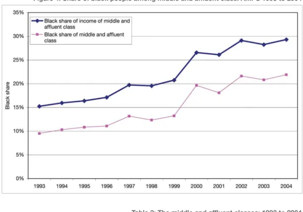
The rapidly growing black middle class is a natural consequence of the advancement in the living conditions of black people. To be broadly inclusive, the middle and affluent class are here defined as comprising individuals with an annual household income of at least R15 000 per household member (2000 Rand). Two things are immediately evident: the ranks of this class are growing, and this rise is driven by burgeoning black purchasing power. Between 1993 and 2004 the size of the group defined here as relatively affluent people grew by approximately 1,5 million. Over the same period, the number of black people belonging to this group escalated by 1,3 million. Consequently, black people constituted almost 40 per cent of the
Figure 4: Share of black people among middle and affluent class: AMPS 1993 to 2004
Table 3: The middle and affluent classes: 1993 to 2004 (income per person above R15 000 per year)
Doubts about the reliability of the AMPS poverty trends remain. These can be associated with peculiarities in the AMPS sampling frame, design or methodology, or because the AMPS is still an unknown factor in measuring money-metric poverty. For this reason, three additional pieces of evidence can be presented.
Firstly, AMPS-based poverty trends may be incompatible with official data. To address this possibility, an exercise using official data is conducted. The increase of R18 billion in social grant expenditure between 2000/01 and 2004/05 is equivalent to a per capita annual increase in income of R400 (2000 Rand). Assuming that grants were not targeted at the poor (although in fact they are, via the means test), the entire income distribution derived from the IES2000 would increase by R400. As shown in Figure 5 on page 25, the social grant expansion, if equally distributed, results in a decline in the poverty headcount rate of 5 percentage points between 2000 and 2004 (from 34 per cent to 29 per cent).
Figure 6: Percentage of households with children reporting that children went hungry in the past year: GHS 2002 to 2006 Figure 5: Cumulative density functions based on IES2000
Secondly, as Seekings (2006) points out, data from the GHS surveys shows that nutritional outcomes have improved greatly since 2002, the first year in which the GHS was conducted. Among households that include children (defined as those aged 17 and younger), the number of households reporting that a child went hungry declined dramatically (from just over 31 per cent to 16 per cent) between 2002 and 2006. This suggests that the poverty situation has improved remarkably, particularly among people experiencing the greatest degree of welfare deprivation. The prevalence of hunger among children has virtually halved over four years.
Thirdly, household income and expenditure are poorly captured in surveys, and some believe that analysing such data does not reliably capture movement in welfare trends. Money-metric measures of poverty do not reflect the many dimensions of poverty accurately. To deal with this shortcoming, Bhorat, Naidoo and Van der Westhuizen (2006) used a range of official data sources to track changes in asset poverty (defined to include deprivation of access to basic services) over 1993 to 2004. They found that asset poverty as well as asset inequality declined over the period. This suggests that the welfare of the poor improved in a number of dimensions as a result of government efforts to target poverty through both income (in the form of social grants) and basic service delivery. Those likely still to be suffering the greatest welfare deprivation are the poor in remote rural areas (Burger et al. 2004). These people are also least likely to have information on and access to forms of social assistance. Collectively this group represents a core policy challenge to the government, who needs to devise innovative and cost-effective ways of reaching them.
Finally, additional support for a hypothesis of falling poverty is reflected in two recently released preliminary research papers. Meth (2006) analysed data from Labour Force Surveys and found that poverty had fallen after 2000, although not to the same extent as reflected by the AMPS.
The work of Agüero et al. (2005) on the third wave of the KwaZulu-Natal Income Dynamics Survey also supports a conclusion of poverty reduction in recent years. They reported that between 1998 and 2004 poverty declined among black and Indian households in KwaZulu-Natal, and they found evidence of less downward mobility and chronic poverty over this period than during the first post-transition years. Finally, their research indicated that social grants do alleviate poverty among people who are chronically poor, therefore providing evidence of effective targeting.
Attention will now be given to the results of the analysis of the AMPS data, within the context of inequality. Steadily increasing black per capita income coupled with higher than average population growth rates among black people are reflected in changes in the racial share of total income in favour of this group. This trend started in the 1970s. Trends in the racial shares of wage income, as drawn from official data (OHS and LFS surveys), mirror the post-transition movements in racial shares of total income observed from the AMPS data. This gives us added confidence that the observed trends are accurate reflections of the underlying social realities.
4.
Post-transition inequality
Figure 7: Racial shares of income: AMPS 1995 to 2004
Encouraging upward trends in the per capita income are only one part of a bigger story, of which the telling requires closer examination of income distribution. Examining the income distribution means measuring incomes and looking at the dispersion. To conceptualise inequality we use a range of measures that quantify income inequalities between groups, or individuals. These measures are explained in Box 6 on page 28.
Box 6: Inequality measures
- Gini coefficient:
The area between the diagonal and the Lorenz curve (actual deviation from equality) divided by the area under the diagonal (maximum possible deviation from equality); a Gini coefficient of 0 indicates perfect equality, while a coefficient of 1 indicates perfect inequality.
- Theil’s entropy measures
One advantage of the Theil measures (not applicable for example by the Gini) is that it is decomposable – the total inequality of a population can be broken down into a weighted average of:
(i) the inequality existing within subgroups of the population (ii) the inequality existing between the subgroups
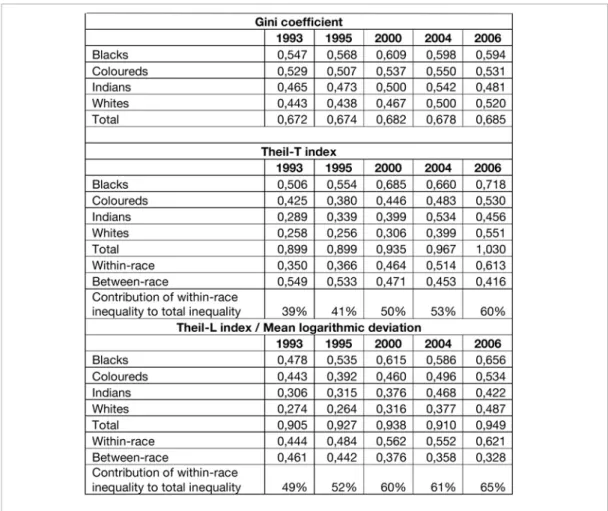
The profile of income inequality illustrated above is proof of rising aggregate inequality during the 1990s, stabilising somewhat from the turn of the century onwards. After 2000 intra-racial inequality continued to rise. This escalation is particularly rapid if one draws inference from the mean logarithmic deviation rather than the conventional Gini. The small but surprising decline in black inequality is consistent with the scenario where the expansion of social grants and – to a lesser extent – improvements in job prospects have benefited poor individuals more than proportionately.
A decomposition of the Theil index shows that the decline in income inequality between race groups throughout the period offset the rising inequality within groups. This trend of falling inter-racial inequality coupled with rising intra-racial inequality is also a continuation of a phenomenon first observed in the 1970s (Whiteford & Van Seventer 2000). Note that these estimates of the population Gini are near the upper end of South African Gini estimates, although they remain smaller than those calculated by Ardington et al. (2005) using the 2001 census. The trends in inequality derived from the AMPS data are likely to be more reliable than the estimated levels, as the levels may be more affected by the nature of the data (household income estimates in income bands based on a single question).
The Gini coefficients shown here are higher than those often reported. The reason for that is that many Gini calculations use the weighting for the household, without multiplying that by the household size, as should be done: Larger households have more members, and this should be considered in calculating inequality. The Gini coefficients here are thus the correct ones, and much higher than those reported by among others the World Bank, which are based on inappropriate weights. The Gini coefficient of 0,685 reported for 2006 would have been only 0,638 if the more common, but incorrect, weights were used.
5.
Targeting of spending
and service delivery
Targeting of spending: Evidence for 1995 to 2000
Expenditure incidence investigates who benefits from public expenditure. As part of the wider research project, the research team examined 45 per cent of government expenditure that directly benefits specific members of the population (unlike expenditure on defence, protection services or general government). These expenditures include large programmes such as education (secondary and tertiary), health, social grants and housing. This was done in order to assess the targeting of social expenditure between 1995 and 2000.
There are two factors that determine fiscal incidence: firstly, who it is that uses the services (or who gain the benefits of access), and secondly the monetary value of the service or benefit. Historically, there was a big difference between the beneficiaries in South Africa. Enormous differences in the subsidisation of services between groups existed under apartheid. These are still evident.
The largest remaining differences were in the subsidies per child at schools, but shifts of teachers to historically disadvantaged schools have almost completely eliminated them (Gustafsson & Patel 2006). The remaining minor differences arise from poorer schools not attracting well-qualified teachers, a common problem in societies with shortages of qualified teachers. Due to differences in qualifications, black teachers in Gauteng for example earn on average 16 per cent more than those in Limpopo. Overall school costs are currently distributed more or less equally. This implies that cost differentials between the more and less affluent are no longer of major consequence. Complete equity in costs would only benefit poor schools by about three per cent of spending per learner.
Overall, social spending increased by 20,5 per cent or R15,1 billion (2000 Rand) over the period, indicating a 14 per cent increase per member of the population. The major expenditure shift between programmes was a reduced share for school education and an increase in spending on social grants, housing and clinics, three relatively well-targeted spending items (Table 5 on page 32).
Box 7: Concepts and interpretations:
Concentration curves and concentration index
A concentration curve shows the cumulative proportion of spending going to cumulative proportions of the population, ranging from poorest to richest (for this study, based on pre-transfer income). It is therefore similar to a Lorenz curve, but can lie above the diagonal: Although the poorest 20 per cent of the population cannot earn more than 20 per cent of income, they can get more than 20 per cent of public spending. A concentration curve above the diagonal indicates that spending is strongly equity-enhancing or per capita progressive, i.e. that it is targeted at the poor, who benefit more than proportionately to their numbers.
The concentration index, similar to the Gini coefficient, summarises targeting accuracy. A value of zero indicates complete equality of public expenditure. (The theoretically possible range of values is -1 to +1, but in practice the values range in a narrower band around zero. A negative value indicates good targeting, where the poor receives more than their share of spending). Where a concentration curve lies above the diagonal, the area between the curve and the diagonal contributes to negative values.
The concentration index measures how well spending is targeted at the poor (Box 7).
2In net terms, after considering health fees.
Table 5: Government spending magnitudes and shifts: 1995 to 2000 (in constant 2000 Rand)
Table 6 shows that the overall concentration index declined noticeably from an already negative value of -0,057 in 1995 to -0,120 in 2000. This is remarkably good targeting for a middle income country and results from the broad access to social services by the poor, particularly schools, as well as the magnitude of the social grants system, which is unique in developing countries in its size and reach. Social grants are best targeted, with a concentration index of -0,431. Tertiary education is at the bottom of the spectrum. The successful targeting to the poor is a major achievement, considering that South African public spending was notoriously unequally distributed under apartheid.
As mentioned above, the largest pro-poor shift has taken place in school education. This is unsurprising, considering the earlier degree of inequality in pupil-teacher ratios. The substantial shift of teacher costs between 1995 and 2000 reduced the concentration index considerably, from -0,016 to -0,104. The health sector also showed strong improvement in equity, driven by improved targeting and the relative shift towards clinic-based (primary) health services. The concentration curves below show aggregate social spending and some major components thereof to illustrate the extent of changes in targeting.
Figure 8: Concentration curves for all social spending: 1995 and 2000
Figure 9: Concentration curves for spending on public schools: 1995 and 2000
The results of the study of targeting of government spending can be summarised as follows: • Overall, social spending increased markedly, benefiting all recipients.
• The poor gained mainly from shifts in spending from not so well-targeted programmes to programmes or sub-programmes that were particularly well-targeted, such as social grants and clinics.
• Spending shifts between schools were particularly beneficial to the poor.
• The richest two deciles experienced reduced real spending per capita, largely resulting from shifts in school spending.
• The bottom four deciles gained between R286 and R597 per capita, mainly from social grant spending. Compared to their overall income before grants of R22,5 billion, social spending of R52,3 billion dramatically increased their access to resources.
• Black people gained considerably. All other population groups experienced a small decline in per capita social spending, mainly through equalisation of teacher-pupil ratios.
• Metropolitan areas experienced a slight decline in social spending per person, driven by the objective of establishing equity in school education. Rural regions gained significantly with an increase of one third, amounting to R543 per person. School education, social grants and health spending all contributed to the increase.
Spending is therefore now extremely well-targeted. Recent policy initiatives (such as the roll-out and expansion of the child support grant, free basic municipal services and post-provisioning favouring poorer schools) improved the targeting of the poor even more. Further significant improvements in targeting however become increasingly difficult, emphasising the need for more equity of outcomes through improved efficiency in social delivery to the poor.
The link between spending and delivery: Preliminary evidence
The above analysis focuses on the distribution of public spending. Underlying such analyses is the implicit assumption that spending is relatively efficient, or that efficiency is relatively uniform across people and regions. The government is still trying to address differences in the efficiency of social delivery to different areas, population groups and income groups. Even meticulously equitable spending will not necessarily lead to equity in social outcomes. Large differences in social outcomes, despite the massive shifts in spending documented above, illustrate the limitations of expenditure incidence analysis.
Health
International evidence indicates that government health spending has a limited impact on health outcomes (cf. e.g. Filmer, Hammer & Pritchett 1997; Gupta, Verhoefen & Tiongson 1995; Inter-American Development Bank 1998). Increased spending is not always converted into the delivery of more effective health services, because of slippage between spending and delivery. Health services are furthermore often not the major factor determining health outcomes and conditions: Clean water and sanitation, nutrition, personal hygiene and education may play an even larger role.
Attempts to improve public health services have focused on improving access. Shifts in health spending and primary health care to historically poorly endowed provinces (e.g. Collins et al. 2000) were accompanied by the provision of free health care to pregnant women and young children. Consumers nevertheless show overwhelming preference for private care, where it is available and affordable (e.g. Palmer et al. 2002; Haveman & Van der Berg 2003; Swanepoel & Stuart 2006). In economic terms public health care is an inferior good – as an individual’s income increases, there is a shift away from using public health services in relative terms. Calculations utilising the 1998 Demographic and Health Survey based on research by Booysen (2002) show that, even among the poorest 60 per cent of the population, a third of visits to health facilities were to private providers. This is especially the case for more serious health conditions. A large proportion of unskilled and semi-skilled workers and their families use private health care far more than public care, even though only one in five belong to a medical aid fund.
Palmer (1999) identified four reasons why even the poor prefer private health services and often avoid public services. The reasons were derived from focus group discussions in rural towns: Respondents felt paying for a service meant there was an incentive for good service delivery, and that the public sector did not provide effective care. According to the respondents the public sector nurses “merely prescribe pills” and also treat patients badly, in contrast to the friendly attitude of private doctors. There is a conception that public clinics are primarily for pregnant women, babies and people with tuberculosis. From the perspective of potential users, the quality of public health care requires attention to ensure that expanded provision of public health resources is positively evaluated by the intended beneficiaries.
The national responses to the General Household Survey of 2004 is proof that the situation has not improved: A large proportion of the public (at least 40 per cent for public clinics and 20 per cent for public hospitals) complained that public hospitals and especially public clinics are not clean, have long waiting times and inconvenient operating times, that medication is not available, that the staff are incompetent and that they have been incorrectly diagnosed. The respondents did not have similar complaints about private health services (Swanepoel and Stuart 2006: 20).
Education
Spending on school education increased substantially after 1994, with a dramatic shift towards former black schools. In 1991 a relatively large school with 1 000 black learners had only 24 teachers. This school now has 31 teachers, paid for by the state. In contrast, a school of the same size serving white children, used to have 59 teachers paid for by the state. Now it only has 31 teachers paid for by the state and perhaps 12 teachers paid for by the parents. Even considering these privately funded teachers, the number of teachers per 1 000 students still declined from 59 to 43 in formerly white schools, while it increased from 24 to 31 in black schools. Despite these resource shifts school results did not improve significantly: Between 1991 and 2000 results in formerly black schools deteriorated slightly. This could be because some affluent black students moved to historically white schools, who maintained their results over the period. Differences in school performance are striking. Some of the improvements may take time to take effect, but there is strong evidence that resource efficiency is a severe problem.
Figure 11 shows that, despite the additional state resources channelled to school education and the more equal distribution of such resources, the aggregate number of successful matric candidates has increased only moderately since the transition to democracy. Increases in pass rates were largely driven by a reduction in the number of candidates, mainly because of restrictions on children over age 18 in the school system. Matriculation results at former black schools (mainly Department of Education and Training or homeland schools) for higher grade mathematics, an important gateway to tertiary education in many technical disciplines, are very poor compared to other schools that historically served other groups. While the largest concentration of candidates from mainly black schools obtain marks of below 20 per cent in mathematics, the mode (the most common mark obtained) for black students in formerly white schools lies well above 50 per cent. This exceedingly poor performance in the bulk of the school system severely restricts equity of educational outcomes and ultimately equity in the labour market. It also limits the economy’s ability to sustain high levels of technologically driven economic growth.
The poor performance in the school system as a whole is well-illustrated by international educational evaluation. Hanushek and Woessman (2007:56) quote data from the TIMSS (Trends in International Mathematics and Science Study) grade 9 evaluation, where a multiple choice question with four potential answers was asked: “Alice ran a race in 49,86 seconds. Betty ran the same race in 52,30 seconds. How much longer did it take Betty to run the race than Alice?” There were only 29 per cent correct responses among South African learners, which is only marginally better than the 25 per cent that random guessing would give. Similarly, a recent school pilot survey in poor schools in Limpopo found that scarcely one out of three grade 6 pupils in those schools could correctly calculate the answer to “53 minus 28”.
Poorer schools struggle to attract well-qualified teachers. Good teachers are scarce and it is difficult to convince them to work in deep rural areas and townships, where they are most needed. Management, a factor that appears to be particularly crucial for well-functioning schools, is equally in scarce supply in many poor schools and is not much influenced by fiscal shifts.
Overall assessment
The discussion above illustrates that fiscal resource inputs do not guarantee the desired social outcomes. There are two possible areas of slippage between the inputs and outcomes. On the one hand, fiscal resources do not necessarily translate into the scarce real resources (qualified teachers, nurses, etc.) required to improve social delivery. More funding for poor schools for instance does not necessarily convert into attracting more well-qualified teachers into township or rural schools. Secondly, even where the real resources are available, they are not always effectively utilised.
The government recognises the urgent need for improved service delivery. Successful targeting of expenditure – one of the major achievements of the democratic period – only ensures that expenditure is equitably applied, not that it is effectively spent. In the education sector resources were shifted to the poor, but outcomes, when measured in terms of quality, remained largely unchanged. Regarding health care, the services provided by the public health sector are not highly rated by the population – even the poor often opt for paying more to get higher quality private health care. Only in the case of social grants (where resources are shifted directly to the intended beneficiaries) and perhaps in the cases of housing, physical infrastructure and water provision (where provision of services often bring direct benefits) did the poor clearly gain from increased and more effectively targeted social expenditure.
We have seen that poverty and inequality in South Africa are closely linked to the general macro-economic situation. The major source of poverty and inequality is the inability of many individuals to get a productive job. This section takes a look at future prospects for poverty and inequality, considering likely developments and their impact.
Economic growth is likely to continue at a fair pace. Therefore it seems quite realistic that the per capita income can grow by a full 40 per cent between now and 2019, a quarter century after the transition. Demographic projections indicate that fewer people will enter the labour market – the labour force growth will be less than 1 per cent per annum. At the same time the economic growth is likely to continue, creating more jobs. Access to jobs is likely to improve, thereby also improving wage and overall income distribution. A decomposition of inequality measures shows that 80 per cent of inequality between households results from inequality in access to wage income.
Among the employed wage inequality will however remain high and might even grow. This is because economic growth will favour more employment for skilled and educated people, while the demand for unskilled workers will decline. As the skills base is expanding slowly, the skills-hungry economy will ensure that people who are better educated will experience most of the wage increases, further widening wage inequality. This will tend to keep the overall inequality high, thereby limiting the poverty reduction potential of economic growth.
Given that most inequality derives from the labour market, the possibility that income distribution will improve as a result of the trends in other income sources or the further expansion of social grants is limited. This makes it likely that inequality will remain high. But poverty should continue to improve, due to economic growth, even though the high inequality will reduce this positive impact.
Household dynamics and poverty and inequality
An important issue is the possible impact of household formation on poverty and inequality. Broadly speaking, the roll-out of houses by the government during the post-transition period has contributed to a decrease in poverty by helping people escape from poverty traps. This is because the houses help form a base from which labour market activity can be organised. Box 8 gives a more detailed discussion.
Box 8: Household formation and poverty
Since the political transition, 2,4 million houses have been built by the government. Survey data shows that over the same period, the number of households increased quite dramatically, accompanied by a reduction in household size. This gradual decrease in household size is also consistent with slowly improving labour market conditions and the roll-out of housing after 1994.
Smaller household size usually means an increase in income per person, as the reduction in household size signals a rising ability of members of larger households to splinter off and form their own financially viable households. In the South African case, the provision of housing in urban areas also facilitates rising income through providing a solid base from which household members can search for jobs close to home.
The system of social safety nets has expanded rapidly during the post-transition period, especially benefiting households that include pensioners and children. Studies suggest that grants have made possible the migration of more working age adults from grant-receiving households to places of employment (Posel, Fairburn & Lund 2004; Ardington, Case & Hosegood 2007). The income support offered by grants appears to lower the barriers faced by members of poor households in accessing labour markets. If their job search is successful, remittances from urban areas may enable the original rural households to escape poverty in the long run.
These recent developments promote rising urbanisation among the poor, since jobs and housing projects are concentrated in urban areas. This enables poor people to access major labour markets and better quality basic social services that are not typically found in rural areas. Most importantly, these developments encourage upward income mobility among the poor in the long run, enabling them to escape poverty traps.
Box 9: A summary of the conclusions
• Poverty has declined strongly since the turn of the century – whether one looks at the headcount, depth or severity of poverty, or whatever poverty line one uses.
• Child hunger has halved in four years.
• A massive expansion of social grants was the main factor in poverty reduction.
• Income distribution is not improving, and inequality will remain high, as poor education prevents the poor from benefiting from labour market developments.
• Income inequality is diminishing between groups, but growing within race groups.
• Despite improved economic growth, high levels of inequality may constrain future poverty reduction. • The black middle class is expanding rapidly.
• Government spending became remarkably well-targeted in a short space of time. • Despite this, some social outcomes (e.g. in health and education) are improving little. • There are severe problems of inefficiency of social delivery in these areas.
• Poverty will probably decline, but inequality will remain high.
Policy discussion
The main findings on poverty and inequality trends discussed above are summarised in Box 9.
The dynamics underlying the poverty and inequality trends determine the broad policy outlook and policy options. We have shown that poverty has decreased since the transition, but that inequality has remained high. These trends are likely to continue. Many government efforts, such as the extension of social grants, the roll-out of housing and various categories of public spending, have contributed to the reduction of poverty. We have also seen that wage inequality remains the main driver of overall inequality. There is little further scope for expanding grant expenditure and expenditure is already well-targeted. In health and in education the problem is converting the fiscal resources into improved social outcomes.
The key to improving social outcomes for the poor is improved social delivery, which depends on managerial efficiency and good accountability structures. Given the limited scope for increasing government expenditure, it is imperative to improve the efficiency of social delivery. Improving managerial skills and accountability structures is an attainable goal that requires careful attention but does not depend on massive financial resource inputs.
The educational backlog, in terms of quantity as well as quality, means that the poor have a significant disadvantage in the labour market. More specifically, they cannot find jobs, or if they do, wages tend to be low. The backlog consequently reinforces inequality and poverty through the labour market. Labour market developments are not likely to favour unskilled labour, considering the skills intensive nature of global economic growth internationally. The situation is therefore likely to persist unless educational quality improves. Consequently, the long term reduction of poverty and inequality requires not so much changing government spending but rather an improvement in how public resources are managed. This will improve the conversion of public expenditure into social outcomes. This task is not beyond the capacity of the South African government, but it is one that requires immediate attention.
The attainments of the post-transition period have been many. In the context of this publication, these accomplishment include achieving and sustaining higher economic growth, creating jobs, delivering “hard” services (housing, water, electricity and sanitation) on an unprecedented scale, expanding the social grants system, reducing poverty substantially since the turn of the century, and crucially, shifting government resources to address the needs of the poor. There has been one major failure, namely the poor efficiency in the delivery of social services, including education. Improvement on this front is crucial – not only for the poor, but also for the progress of the South African society as a whole.