Analyzing Evolution of Network Attributes and Content
with NetFlow: A Network Evolution Visualization Tool
Robert Gove
1,2,3, Nick Gramsky
1, Rose Kirby
1, Emre Sefer
1 1Department of Computer Science 2Human-Computer Interaction Lab 3Institute for Advanced Computer Studies
University of Maryland College Park, MD
{rpgove,ngramsky,rkirby,esefer}@cs.umd.edu
ABSTRACT
Visualizations of static networks in the form of node-link diagrams have evolved rapidly, though researchers are still grappling with how best to show evolution of nodes over time in these diagrams. This paper introduces NetFlow, a network visualization system designed to support users in exploring temporal evolution in networks by using heat maps to display node attribute changes over time. NetFlow’s novel contributions to network visualizations are (1) to clus-ter nodes in the heat map by similar metric values instead of by topological similarity, and (2) align nodes in the heat map by events. We compare NetFlow to existing systems and de-scribe a formative user evaluation of a NetFlow prototype with four participants emphasized the need for tooltips and coordinated views. However, the user evaluation shows that participants can discover insights about temporal changes in network attributes despite the presence of some usability issues. Despite the presence of some usability issues, in 30-40 minutes the user evaluation participants discovered new insights about the data set which had not been discovered using other systems.
Keywords
Information visualization, network evolution, network visu-alization
1.
INTRODUCTION
In recent years, visualization techniques for the analysis of network evolution have lagged behind the rapid growth of social media and electronic databases. Few tools currently exist for the visualization of networks that change over time, often termed “temporal networks.” Researchers are inter-ested in questions about metrics that measure different sta-tistical elements about networks. Potential questions in-clude: Which nodes have been in the network for the longest period of time? For any given time period, which nodes
were connected to the most other nodes? Which node was the most connected in its third year after being added to the network? Analysis of temporal network evolution could yield important insights about the world’s increasingly ubiq-uitous networks.
Typical approaches for visualizing temporal evolution in-volve node-link diagrams that morph or change as the state of the network varies over a period of time. Node-link di-agrams present a topographical view of a network where each node appears as a point on a graph connected to other points by lines representing links. Node-link diagrams let re-searchers visually interpret network analytics as opposed to directly revealing statistical values. Other researchers have tried a matrix visualization approach, which can show net-work metrics explicitly. However, these solutions alone are not adequate for answering all types of questions regard-ing temporal changes to network metrics because they limit users from simultaneously seeing data for all timesteps in the lifetime of the network. In this paper we introduce NetFlow, a novel system to visualize network node attributes over time by using matrices and heat maps. The main contributions of NetFlow are heat maps that can be clustered according to node attributes and aligned by temporal events. Section 3 describes NetFlow and its capabilities. Section 5 describes a formative user evaluation of NetFlow with four participants who performed an insight-based exploration task and two timed tasks. Overall, participants were able to use NetFlow to discover insights about the data despite some existing us-ability problems. Section 6 discusses the outcomes of the user evaluation and presents plans for future work.
2.
RELATED WORK
Many network evolutions systems rely on visualizing net-work metrics. Many of these metrics involve the degree of a node, defined as the number of links incident to the given node. Degree is connected to centrality measurements like betweenness centrality, which measures the lengths of the shortest paths from a node to all other nodes in the net-work. These measurements are often referred to as social network analytics, which are derived from graph theory. A typical approach for the visualization of network changes over time is network animation which uses animated node-link diagrams that evolve with the state of the network. Moody et al. [8] explain two methods of node-link
anima-tions, one with fixed nodes where edges aggregate over time and another movie-style method where nodes change posi-tions relative to their relaposi-tionships with other nodes. Gloor et al. [5] and Ahn et al. [1] implement the modification of node-link diagrams over time through the use of time slid-ers. Gloor et al. use the Fruchterman-Reingold algorithm to modify the graph layout at each time step of the time slider. In contrast, Ahn et al.’s TempoViz solution fixes the position of a node in the viewing window but varies the rendering of edges at each time point. Statistics are shown along a time axis at the bottom of the window that paral-lels the position of the time slider in order to give insight into how edge metrics change temporally. Gloor et al. use a line graph to show metrics for individual nodes whereas Ahn utilizes a bar chart to show how certain metrics vary over time for edges. Both of these methods require users to view a visualization in the context of each time step in order to see modifications to the network over its lifespan. Freire et al.’s work with ManyNets utilizes non-node-link diagrams to analyze networks [4]. Tables of numbers and mini-drawings designed to help sort and filter allow users to explore a network based on metrics or attributes instead of through direct network representation. An entire network over all time periods can be loaded into the tool by loading each time slice as a independent network, though filtering and metrics are limited to the network as a whole excluding individual nodes and edges. An entire network over all time periods can be loaded into the tool by loading each time slice as an independent network, though filtering and metrics are limited to the network as a whole, excluding individual nodes and edges.
Another approach to temporal network visualization is based on matrices and adjacency matrices. Henry et al. [7] used MatLink as a visualization tool to analyze networked com-munities. This method, however, only utilizes a one-time snapshot of the network and does not capture how the net-work may evolve.
TimeMatrix presents the most advanced use of matrices for time-based network evolution [18]. A high-level overview of the entire network is captured and used for exploration using a matrix of TimeCells, cells that vary in color based on the amount of space a bar graph utilizes over a time period. The evolution of metrics of both edges and nodes can be explored using this method of adjacency matrices. Yi listed three noteworthy tasks for network visualization tools: (1) analysis of change at global level, (2) analysis of temporal changes within subgroups (cliques), (3) analysis of temporal associations between nodes and edges. These tasks were considered as NetFlow was designed and implemented. In response, NetFlow provides an analysis of the network at the global level by utilizing the Workspace Window. Clustering and aggregating of nodes attempts to analyze nodes and cliques within the tool. Finally, the node-to-node adjacency matrices allow a user to analyze associations between nodes and edges in a given time period (or periods if time binning is used).
Clustered heat maps have also been used by Sopan et al. [15] to give an overview of distributions. In this instance, clusters are computed by similar attributes, whereas several
network analysis systems such as SocialAction compute node clusters using network topology [13]. Sopan et al. conducted a usability study which suggested that the heat map is ben-eficial for showing an overview of the data and identifying outliers and clusters of similar data.
Shneiderman and Aris [14] offer a different approach for vi-sualizing networks by semantic substrates, which uses node attributes to lay out network nodes in a grid-like view. Node attributes can be categorical, such as publication venue, or numerical, such as publication year or citation count. Node size coding can also indicate node attribute values. Node metrics such as degree or betweenness centrality could also be used in semantic substrates.
Networks and nodes are not only a sequence of fluctuating values, but might also contain temporal events. Wang et al. [16] presented the align, rank, and filter framework for an-alyzing temporal categorical data. Wang et al. focus their framework on electronic health records of event sequences, and do not explore using the align, rank, and filter frame-work for netframe-work data.
3.
NETFLOW: VISUALIZATION OF
NET-WORK EVOLUTION
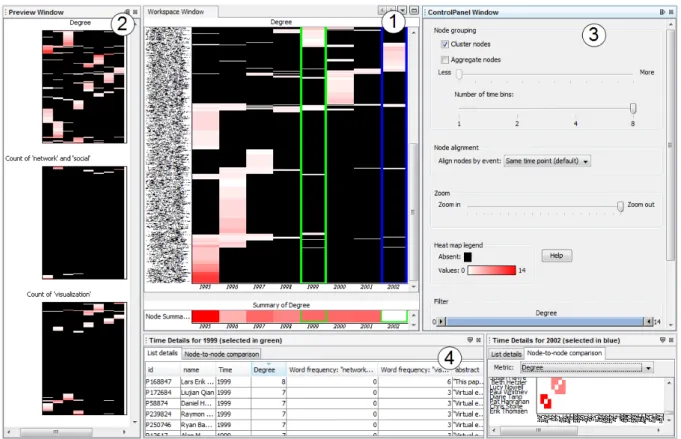
NetFlow is a system that uses matrices and heat maps to vi-sualize a given network over a temporal period. Through the use of four coordinated views we utilize matrices and heat maps to show previews of the network for all calculated met-rics, a large workspace for analyzing the network according to a specified metric, and a pair of time specific windows that provide detailed views for all nodes in any given time period. These are shown in Figure 1.
3.1
Preview Window
Users can begin analyzing the network by viewing each net-work metric in the Preview Window. The Preview Window allows a user to quickly view each possible metric for the network. Because users can only view one metric at a time in the Workspace Window, it might not be obvious which metric could be “interesting.” The Preview Window shows all available heat maps as a preview. Clicking on a partic-ular heat map populates the Workspace Window with that map. Each preview heat map has the same node and time dimensions since each metric is calculated and visualized for all nodes over all imported time points.
3.2
Workspace Window
The Workspace Window is the main working area. The en-tire network across time is presented in one visual window as a heat map: Time is represented as columns on the horizon-tal axis and each node is a row on the vertical axis. Prior to any filtering, clustering or binning, all time periods for the loaded data set are shown on the horizontal axis and the vertical axis shows all the nodes in the network. Data is visualized through the heat map by varying the color in-tensity to indicate the node’s metric value during each time period. Black indicates the node does not have a value for that metric in the appropriate column. For example, for the degree metric, black indicates that the node does not exist in the network during that time period. Gradients vary from white to red to indicate the variation in values
Figure 1: NetFlow: (1) Workspace Window, (2) Preview Window, (3) Control Panel, (4) Time Details views.
from low to high; for the degree metric, white indicates a low degree and red indicates a high degree. The sharp con-trast between black and the color scheme allows users to see where nodes were active at any given time and the change in gradient color across time periods visually indicates how nodes’ metric values changed over time.
This heat map does not give any indication of edges or the relationships between the nodes. Metrics such as degree, content (word count in our example) and betweenness cen-trality can be displayed for each node1, but these values are
assigned to the node only. Degree and betweenness central-ity are metrics that indicate nodes’ involvement with other nodes, but the exact relationship to neighboring nodes is not shown in this view. The two Time Details Views at the bot-tom can show matrices which capture the edges and their respective metrics. Using tools in the Control Panel to the right, users can arrange, filter or bin according to the time the nodes appear in the Workspace Window. Regardless of how users modify the nodes, data, and time columns for fil-tering or summarization, the entire network is still captured.
3.3
Control Panel: Filter, zoom, bin, cluster,
aggregate, and align
NetFlow supports many typical information visualization ca-pabilities such as zooming, filtering and clustering.
The Control Panel to the right of the Workspace Window
1
The current version of NetFlow does not include between-ness centrality, but NetFlow is designed to be modular so additional metrics can be added easily.
Figure 2: The heat map in the Workspace Window can be clustered, and users can zoom out to see an overview of the heat map.
allows users to cluster, aggregate, bin, zoom, and filter. The “Cluster nodes” checkbox will cluster the nodes using the algorithm given by Bar-Joseph et al. [2] (see Figure 2). Clustering is based on attribute similarity across all time periods in the network, so that nodes with similar values across time will be rearranged to appear next to each other. The default “unclustered” view sorts the nodes alphabeti-cally. The zoom slider allows users to zoom in to have a closer view of particular nodes or zoom out to observe the entire network.
In order to improve readability, NetFlow can aggregate simi-lar nodes and collapse them into a single row after the nodes have been clustered. The height of the new row is logarith-mically proportional to the number of nodes used to form the new row, which indicates how many nodes are aggre-gated in the row while reducing the amount of screen space used by the heatmap. Users adjust how many nodes are ag-gregated by changing the node aggregation slider, and nodes collapse accordingly.
By default, each column represents one time period. Be-cause there could be many time periods, and thus many columns, NetFlow also allows users to merge adjacent time periods together into one column. This allows the Workspace heatmap to be more compact if users want to see a more coarse-grained view of the data.
Users can also filter nodes by attribute values. The con-trol panel contains range sliders to filter nodes by attribute values. Using these controls, users can filter out nodes to re-move them from the heatmap, list details, and matrix views. For example, users can focus their analysis on potentially interesting nodes by filtering the views to show only nodes that have at least degree five and have used a certain key-word between three and nine times.
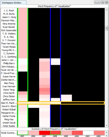
NetFlow also allows users to align nodes by temporal events. Aligning nodes shifts them horizontally according to a tem-poral event so that nodes become aligned according to rel-ative time points. Selecting a node alignment option will shift the data for all nodes according to the type of align-ment specified. For example, when selecting “Joining Net-work”, all nodes are aligned so that their first appearance in the network is in the first time column (see Figure 3). [16] illustrates this concept in the Lifelines2 software.
3.4
Time Details Views
These bottom two panels allow users to take a deep dive into a specific time period of the network. This is the area for a user to view more details after working in the Workspace Window. In the Workspace Window there are two column selection indicators (green and blue) used to indicate the time time periods which are selected. Users select time columns with the left and right mouse buttons to change the green and blue column selections respectively. Selecting a column in green populates the left Time Details views with the data for the selected year, and selecting a column in blue performs the same action with the right Time Details views. The list in the Time Details views shows the specifics of all node-based metrics. Clicking on the matrix view, users can see the node-to-node relationships during that time period (see Figure 4). Here users see the visualization of the edges
Figure 3: Nodes are aligned on the horizontal axis by when they joined the network, and the heat map val-ues show the number of times each author has used the word “visualization” in their abstracts per year. In this data, most authors only used the word in the first year they published papers, but Alan M. MacEachren used the word for four consecutive years.
in the network. Metrics are populated for edges between nodes in adjacency matrix form.
The use of adjacency matrices for network visualization is not a new idea. TimeMatrix utilizes adjacency matrices to provide an overview of the network. NetFlow, however uses adjacency matrices to facilitate further inspection of partic-ular time periods. Beyond elementary metrics such as de-gree, NetFlow’s adjacency matrices provide additional met-rics data including Pearson Correlation Coefficients and Co-sine Similarity to help locate and define similar nodes and cliques. Per M. E. J. Newman [9], these metrics help to show similarity by giving a value based on common neighbors be-tween nodes.
Additionally NetFlow can visualize content between nodes in the adjacency matrix view. For example, a heat that shows how often certain text phrases were used between nodes can be shown in this matrix view. As with node metrics, Net-Flow is modular and new node-to-node metrics can be added to the matrix view.
3.5
Implementation
NetFlow was written in Java and built using the NetBeans Rich Client Platform (RCP), Swing, JHeatChart, S-Space, and the Prefuse Visualization Toolkit (http://prefuse.org). NetBeans RCP provided the window system, GUI compo-nents and data sharing between windows. A nice feature of NetBeans RCP is the removable window feature. Any window can be removed and moved to an additional mon-itor to allow a user to customize the visual layout of Net-Flow. Many of the data structures and some of the metrics come from the use and extension of the Prefuse Visualiza-tion Toolkit. Networks can naturally be stored in the Graph class Prefuse provides. A SubGraph extension written for this project allowed for the network to exist in the many temporal bins needed. The JHeatChart was the vehicle to visualize data in matrix form, both for the Workspace Win-dow and the Time Details Views.
NetFlow was developed and runs on both Microsoft Win-dows and Mac OS platforms with minimal visual differences between the two. NetFlow loads node and edge data, which can include optional content for nodes or edges. Currently NetFlow can only load text and CSV, however simple mod-ifications will allow NetFlow to load other formats such as GML.
A social network analyst at the University of Maryland eval-uated an early paper prototype of NetFlow. Comments from the social network analyst affirmed NetFlow’s design and functionality decisions, and helped define clearer system ter-minology.
4.
CASE STUDY
This section describes a brief case study using NetFlow to analyze an example data set.
4.1
Use Case
The data set from the Cell Phone Mini Challenge from the
2008 Vast Challenge (http://www.cs.umd.edu/hcil/VASTchallenge08/tasks.html) will serve as the backdrop for this use case.
Starting in the preview window, we can select a metric that we find interesting. By default this data set only has degree loaded, but cell towers utilized for a call could very easily be utilized as content and visualized. Clicking on degree loads the Workspace Window with a heat map. The vertical axis shows every caller over the 10-day period. The horizontal axis shows a column for every 12-hour period. This example bins all events in 12-hour increments resulting in 20 time columns.
The Control Panel has a few options to analyze the data. The simplest task involves zooming in to gain a better view of particular nodes. We can also filter the heat map such that nodes that only ever have a degree over a certain amount are present, align nodes according to the first time they were present in the network or click on clustering to group the nodes such that like nodes are placed alongside one another. Figure 5 shows the Workspace Window after the clustering checkbox had been selected. Doing so shows some interest-ing sets of nodes that seem to transfer properties from one time period to the next.
The green and blue columns indicate the temporal period that will populate the two windows below. Each window has a list of all the nodes in question for that time period. Sorting is supported and the user can see which nodes were active in this time period based on degree or name. Clicking on the matrix allows us to examine several metrics for that particular time period. Degree shows the number of calls the two nodes made to each other. Cells are different shades of red, indicating increased degree counts. White cells indicate there the tow nodes in question did not make a phone to one another. Clicking on the Pearson Coefficient shows how dif-ferent nodes and cliques are similar. Values are normalized from -1 to 1. Black indicates that no relations are present. Yellow cells are values less than 0 and orange/reddish cells are greater than 0.
4.2
Analysis of Results
The use of the clustering checkbox can bring to light traits of common entities in a social network. Viewing Figure 5 we see four nodes that are very active up until the evening of the 7th. These four nodes then become almost silent and four additional nodes that had been silent throughout the life of the network spring to life with the same activity of the previous four. Through the use of clustering this trait of the network is almost immediately known to the user. Perer [12] and Ye et al. [17] both point out similar results and findings regarding these nodes, although they also performed further analysis.
5.
EVALUATION
In order to evaluate NetFlow, the present authors conducted a user evaluation with several goals: (1) to evaluate the gen-eral usability of NetFlow, (2) to evaluate whether users can make insights using NetFlow, and (3) to identify potential improvements to NetFlow.
5.1
Participants
The investigators recruited four participants who are cur-rent computer science graduate students who have already taken or are currently taking a graduate-level course in in-formation visualization. The goal was to recruit participants
Figure 4: The Time Details matrix view of 2002 which shows the frequency that each pair of authors uses the word “visualization” in a paper they co-author.
Figure 5: Clustered heatmap of entire Cell Phone network over 20 time periods (10 days, 2 periods/day), then filtered to remove nodes with low degree. Note how the top 4 nodes (outlined in purple) and the bottom 4 nodes (outlined in purple) trade activity profiles on the morning of the 8th.
who would be familiar with network analysis and understand network metrics such as degree.
The age range for the participants was 25 to 33 years old. Three participants were male, and one was female. Partic-ipants’ names are coded as P1, P2, P3, and P4. Our goal was to have enough users to identify most of the obvious usability problems, and there is reason to believe that four participants may be sufficient for that [10].
5.2
Experimental Design
Evaluations were performed on an Intel Core i3 2.26 Ghz laptop with 4 GB of RAM. NetFlow was displayed on an external 24-inch monitor at 1920x1200 resolution. The in-vestigators loaded a subset of the InfoVis 2004 contest data set [3] into NetFlow. The subset has been transformed from a citation network to a collaboration network, so that nodes are authors and an edge between a node indicates that the two authors co-authored a paper together. This subset con-tains all authors from the InfoVis Conference from 1995 to 2002 and all of the references from 1995 to 2002. In total this subset is composed of 840 authors which is stored as 1034 nodes with 1569 edges over this eight year timespan. The smallest granularity of time for this subset was one year. During each year, two nodes have an edge connecting them for each paper they wrote together in that year.
5.3
Procedure
Each participant took part in separate evaluation sessions, and all participants signed the consent form before begin-ning the session. All participants volunteered their time and did not receive compensation. Each session began with a training phase, continued with an experimental phase, and concluded with a debriefing phase. During the training phase, participants watched three training videos and per-formed training tasks after each video. In the experimental phase, participants began by performing free exploration of the data, and continued by performing two tasks. After the experimental phase participants filled out a questionnaire and were debriefed by the investigator. Each session lasted 30–40 minutes.
Training consisted of three videos which ranged between 1 minutes 43 seconds to 2 minutes 10 seconds in length. Par-ticipants performed one training task after each video. The order of videos and training tasks was fixed for all partic-ipants. All participants gave correct answers for the first two training tasks (“Identify a person who coauthored at least one paper during 2002” and “Identify a group of peo-ple who have a similar co-authorship pattern throughout the history of the network”). Three participants answered the third training task correctly (“Identify the year that the words “network” and “social” were mentioned by the fewest number of people”), but P1 incorrectly answered 1999 in-stead of 1998.
The experimental phase began after participants finished the last training task. Participants were asked to think aloud during this phase. Following North’s recommendations for insight-based evaluations [11], the participants began the experimental phase by performing an undirected search for 10 minutes and describing all of the interesting things they found in the data.
5.4
Results
During the free exploration phase, participants did not gen-erate many insights, but the participants did provide useful feedback on NetFlow’s usability.
P1 loaded heatmaps of all the metrics into the main workspace view, but did not cluster nodes or zoom out. P1 used the tabular list details and noticed a few authors who have a high degree, but did not make any other insights.
P2 compared two arbitrary years in the Node-to-node com-parison view and saw that the matrix in the later year was smaller and had much fewer nodes. P2 then continued by examining the size of the matrix in each year, and noticed that each year had fewer authors than the previous. P2 also noticed three large clusters in the Noto-node de-gree comparison for 1995, indicating groups of people who probably worked together a lot in that year. P2 also looked at the heatmap in the main workspace and commented that “1995 seems to be a hot year.”
P2’s final insight was that there are many authors who only publish paper in one year and then don’t have any other papers in the dataset. P2 commented that these might be graduate students, but that the authors who have papers in six out of the eight years are probably more “impressive” authors who P2 would like to investigate further.
P3’s main insight was that there was an “interesting phe-nomenon” about clusters based on the Pearson coefficient in 1995. But P3 unsuccessfully tried to investigate further and found it difficult find more details about the groups because the labels were difficult to read and there was no ability to select nodes in the Node-to-node comparison view.
By viewing the heatmap in the main workspace, P4 found two authors in the year 2000 that used the words “network” and “social” a lot in that year, but not before or after. P4 had trouble finding these two authors in the Node-to-node comparison of the degree metric, but eventually found them and concluded that did indeed work together.
5.4.1
Timed Tasks
In the two remaining tasks for the experimental phase, the investigators permuted the order of the tasks to reduce or-dering effects. Therefore, two participants performed Task 1 before Task 2, and the other two participants performed Task 2 before Task 1. All participants responded correctly to all of the tasks during the experimental phase.
For Task 1 (“In 1996, who co-authored with the largest num-ber of people?”), P3 completed the task in 26 seconds, P1 and P2 completed the task in 52 seconds, and P4 completed the task in 2 minutes 26 seconds. The task required iden-tifying the two authors (Roth and Shneiderman) who both had higher degrees than all the other authors. P1-P3 took the approach of identifying the year 1996 in the heatmap in the main workspace, selecting 1996, viewing the tabular list details, sorting the table by degree, and then noting the two authors with the highest degree. P4’s approach was to view 1996 in the main workspace’s heatmap of the degree metric and then visually scan the 1996 column for brightly colored
cells. P4 was able to correctly identify one of the authors (Shneiderman) before realizing that it might be easier to view 1996 in the List details. After opening the list details and sorting the table by degree, P4 confirmed that Shnei-derman is at the top of list, and P4 also found that Roth had co-authored with the same number of people as Shnei-derman.
For Task 2 (“Identify which author used the word “visual-ization” in the longest span of consecutive years”), P4 com-pleted the task in 1 minute 33 seconds, P3 in 2 minutes 6 seconds, P2 in 3 minutes 7 seconds, and P1 in 6 minutes 41 seconds. The correct answer was Alan M. MacEachren, who used the word for four consecutive years. Participants found it difficult to vertically scan the main workspace heatmap for individual rows which spanned many columns. Participants frequently identified an author who used the word “visual-ization” for three consecutive years, but had difficulty iden-tifying the maximal entry (Alan M. MacEachren). Even after participants found the correct entry, they had trouble tracing it back to the label on the left because there are no horizontal gridlines to guide users’ eyes. However, despite this difficulty, all participants were able to correctly iden-tify Alan M. MacEachren as the author who used the word “visualization” in the most consecutive years.
5.4.2
Questionnaire
In the debriefing phase, participants filled out a question-naire with seven closed-ended questions and two open-ended questions. The first five closed-ended questions were on a 9-point Likert scale. For all questions, low values are posi-tive responses and high values are negaposi-tive responses. The investigators designed the Likert-scale questions to include one question each about the overall interface design, navi-gation, responsiveness, learnability, and terminology. The two closed-ended questions were designed to identify which specific features features in NetFlow the participants found useful.
For the first question (“The interface is: simple to complex”), the participants were split: P1 and P2 responded 8 and 7 respectively, and P3 and P4 responded 1 and 3 respectively. For the second question (“Navigating the interface is: easy to difficult”), participants were also split, but differently from the first question: P1 and P4 responded 8 and 7 respectively, and P2 and P3 responded 3 and 1 respectively.
For the third question (“The interface responds: quickly to slowly”), the participants were mostly in agreement that the responsiveness is very slow: P3 responded 6, P4 and P1 responded 8, and P2 responded 9.
For the fourth question (“Learning to use the interface is: easy to difficult”), participants responded more favorably: P3 responded 2, P4 responded 4, and P1 and P2 both re-sponded 5.
For the fifth question (“The system’s terminology is: infor-mative to uninforinfor-mative”), participants were mostly favor-ably (P2, P3, and P1 responded 1, 2, and 3 respectively), but P4 felt the terminology was mildly uninformative (P4 responded 6).
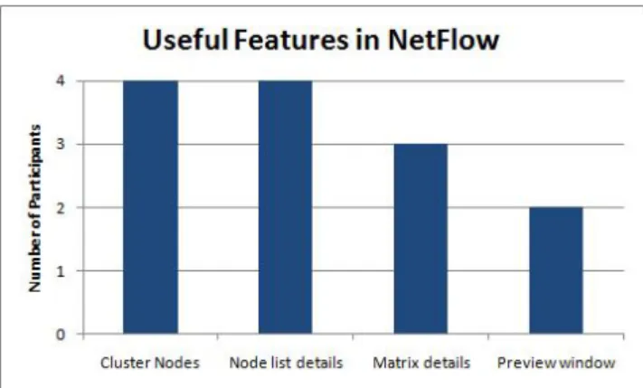
Figure 6: The number of participants who found each feature useful.
Figure 7: The number of participants who found each network metric useful.
Overall, participants appear to have differing opinions of NetFlow. P3 responded favorably to all but the third ques-tion, whereas P1 responded negatively to the first three questions, moderately to the fourth, and positively to the fifth.
The next two questions attempted to quantify which of Net-Flow’s features and network metrics participants found use-ful. Figure 6 shows the number of participants who found each of NetFlow’s features useful. We see that in our four participants, they did not find the Preview Window as use-ful as the cluster nodes and node list details views. Figure 7 shows the number of participants who found each of Net-Flow’s network metrics useful. In our limited sample size, users do not appear to think that there is not much differ-ence in usefulness between the network metrics.
The last two questions were open-ended questions that ask participants to discuss additional features, comments, and suggestions to improve NetFlow. There were several com-mon themes in the comments. Participants made several comments about improving the responsiveness: showing a progress bar when performing clustering and caching clus-tered views to avoid recalculating them. Participants also wanted to see tooltips to show exact values in the visualiza-tions by hovering the mouse over the data, and they said that the node labels were often unreadable. Participants
re-quested being able to select a node in the main workspace heatmap and show the selection in the List details and Node-to-node comparison matrices. Finally, participants men-tioned that the Preview display is not helpful: they wanted the visualizations to be smaller so that they would all fit in the display without scrolling, and they wanted the current selection to be highlighted.
5.5
Summary
During free exploration, participants usually began by ex-ploring the degree metric, and did not usually have time to explore the word frequency metrics before the 10 minutes expired.
Performing the clustering operation took around eight sec-onds or more of computational time, which slowed down participants in the tasks. Because of this, it’s possible that task-completion times would be shorter if the clustered views were pre-computed and cached in the system.
Participants’ comments suggest that NetFlow needs tighter integration between the different views of the data. Adding tooltips to show node details, and allowing users to select a node in any view and show it selected in other views could improve the analysis capabilities of NetFlow. Some partic-ipants also asked if NetFlow has the capability to search nodes textually, usually because they found a node in one view and wanted to find the same node in another view. Searching is not a feature that is currently supported, but it could be incorporated into future versions of NetFlow. Overall, users were able to discover trends and outliers that might be difficult to identify in node-link diagrams. For example, participants were successfully able to identify an author who used the word “visualization” in four consecutive years, and P2 was able to see that the number of authors publishing per year was shrinking over time.
6.
DISCUSSION
6.1
Comparison to InfoVis 2004 Contest
Re-sults
After the user study, we examined the InfoVis 2004 con-test submission papers to compare the data insights from our user study participants to the insights from the con-test participants. Between the insights gained during the timed tasks and the free exploration task, our user study participants discovered many of the insights noted in the InfoVis 2004 contest papers. However, because our version of the data set focused on co-authorship relationships, the user study participants were not able to gain insights regard-ing citations or relationships between authors and specific papers.
The contest papers gained three insights that our user study participants did not gain: the contest papers discovered (1) the top authors with the largest number of co-authors, (2) the number of who tended to have coauthors, or who started co-authoring less over time, and (3) groups of authors who co-author frequently. P2 was able to gain an insight that we could not find in the InfoVis 2004 contest papers: P2 discovered that the number of authors declined from year to year. Our user study participants were also able to identify
authors who used certain keywords over a continuous span of time, even though the event alignment functionality was not implemented at the time of the user study.
The results of the user study showed that NetFlow can be successfully used by novice users to analyze the temporal evolution of a network. Several features in NetFlow were not implemented for the user study: aligning by event, aggregat-ing, filteraggregat-ing, and time binning. Despite this, participants still successfully used NetFlow to answer questions about the data set. Several usability problems limited participants’ performance, and it was clear from the questionnaire that not all participants found NetFlow’s interface simple or easy to navigate, but despite this all of the participants were able to identify the correct response to both of the timed tasks during the experimental phase. None of the participants made any comments indicating that they had trouble under-standing a network visualization which was not a node-link diagram.
6.2
NetFlow Improvements and Future Work
A major limitation of our system is responsiveness, which is worsened by our large data set. During the free exploration task, participants usually only had enough time to explore the heatmap for the degree metric. However, with better overviews and a more responsive interface the participants may have been able to explore the data set using more met-rics which might allow them to discover more insights. This is an area of ongoing work.
System responsiveness may also be improved by filtering out irrelevant nodes from the views, which could also allow users to discover other types of insights that might be difficult or impossible without filtering. After the user study, we were able to implement user controls that filters nodes by node attributes (degree and keyword frequency). Future work will be to evaluate the effectiveness of these controls.
The user study also emphasized the need for users to be able to make a selection in one view and see the same node se-lected in the other views. We have since implemented this functionality, so that users can select nodes in the List De-tails views or the Workspace heat map view. Selections in the List Details views and Workspace heat map are coordi-nated so that selecting nodes in one view will also automat-ically select those nodes in the other views.
Currently there is no node-link diagram view of the net-works. A node-link view could help uses examine toplogical changes in the network. One avenue of future work will be to investigate whether such a view is beneficial. One poten-tial way to integrate is to overlay an arc diagram on top of selected columns or selected nodes, such as in Figure 8. This is similar in concept to MatLink [6].
In summary, the workspace heatmap allowed participants to identify trends regarding the evolution of the network. For example, participants could find that most authors in the data set only published a paper in one year, and that Alan M. MacEachren was the only author who used the word “visualization” in four consecutive years. However, several usability problems interfered with the participants’ analyses. Resolving these usability problems will be the primary focus
Figure 8: A mockup showing how links might be in-corporated into the heatmap view. If two nodes share a link, this link could be displayed when the time col-umn is selected or when one of those nodes is selected. Here, a yellow link indicates that Allison Woodruff and Michael Stonebraker were co-authors in 1997, and an-other yellow link indicates that Stuart K. Card and Jock D. Mackinlay were co-authors in 1999.
of future work.
7.
CONCLUSION
This paper presented NetFlow, a new approach for visu-alizing the evolution of numerical node attributes over the history of a network by using a 3-dimensional clustered view. This paper also presented a user study demonstrating that novice users can learn NetFlow and generate insights after only a few minutes. Nevertheless, the user study revealed several potential improvements to NetFlow, such as smaller visualizations in the Preview Window, and brushing and linking for selections between the different views. We have since implemented modifications to address these problems. Users also were frustrated with the interface responsiveness, which is an area of ongoing work. Future work will also evaluate the new version of NetFlow.
Our main contributions are: (1) a clustered heatmap view of the evolution of numerical node attributes over time, (2) aligning nodes by temporal events, and (3) a usability evalu-ation of NetFlow, which integrates a clustered heatmap view into a visual analytics tool.
8.
ACKNOWLEDGEMENTS
We appreciate the support, ideas, and feedback from our sponsor Meirav Taieb-Memom as well as our cosponsors Awalin Sopan, Cody Dunne, and Krist Wongsuphasawat. We would also like to thank our user evaluation study partic-ipants for their time and insightful feedback of our prototype application, and to anonymous reviewers whose comments improved the quality of this paper.
9.
CREDITS
Robert GoveTeam Leader/Manager, NetFlow interface design, Designed and conducted user study.
Programming: Early system API, data conversion code, GUI code.
Wiki: GUI mockups, bibliography, review of software libraries, review of data sets, requirements list.
Report: Abstract, Introduction, Evaluation, Discussion, Conclu-sion, and editing.
Nick Gramsky
NetFlow interface design, Setup SVN, Created videos for user study and project report.
Programming: Early system API, metric, matrix and temporal calculations.
Wiki: GUI mockups, bibliography, user scenario.
Report: Abstract, Related Work, NetFlow description, and edit-ing.
Emre Sefer
NetFlow interface design. Programming: Visualization code (heat map, preview, matrix visualization, integration with GUI). Wiki: Requirements list, bibliography.
Rose Kirby
NetFlow interface design, NetFlow help document, Evaluation insight analysis.
Programming: Early system API. Wiki: Editing.
Report: Introduction, Related Work, and editing.
10.
REFERENCES
[1] J.-W. Ahn, M. Taieb-Maimon, A. Sopan, C. Plaisant, and B. Shneiderman. Temporal visualization of social network dynamics: prototypes for nation of neighbors. In
Proceedings of the 4th international conference on Social computing, behavioral-cultural modeling and prediction, SBP’11, pages 309–316, Berlin, Heidelberg, 2011. Springer-Verlag.
[2] Z. Bar-Joseph, D. K. Gifford, and T. S. Jaakkola. Fast optimal leaf ordering for hierarchical clustering.
Bioinformatics, 17(suppl 1):S22–S29, 2001.
[3] J.-D. Fekete, G. Grinstein, and C. Plaisant. Ieee infovis 2004 contest, the history of infovis, 2004.
[4] M. Freire, C. Plaisant, B. Shneiderman, and J. Golbeck. Manynets: an interface for multiple network analysis and visualization. InProceedings of the 28th international conference on Human factors in computing systems, CHI ’10, pages 213–222, New York, NY, USA, 2010. ACM. [5] P. A. Gloor, R. Laubacher, Y. Zhao, and S. Dynes.
Temporal visualization and analysis of social networks. In
NAACSOS Conference, June 27 - 29, Pittsburgh PA, North American Association for Computational Social and Organizational Science. In, 2004.
[6] N. Henry and J.-D. Fekete. Matlink: enhanced matrix visualization for analyzing social networks. InProceedings of the 11th IFIP TC 13 international conference on Human-computer interaction - Volume Part II,
INTERACT’07, pages 288–302, Berlin, Heidelberg, 2007. Springer-Verlag.
[7] N. Henry, J.-D. Fekete, and M. J. McGuffin. Nodetrix: a hybrid visualization of social networks.IEEE Transactions on Visualization and Computer Graphics, 13(6):1302–1309, 2007.
[8] J. Moody, D. A. McFarland, and S. Bender-DeMoll. Dynamic network visualization: Methods for meaning with longitudinal network movies.American Journal of Sociology, 110:1206–1241, 2005.
[9] M. Newman.Networks an Introduction. Oxford: Oxford Univ., 2010.
[10] J. Nielsen and T. K. Landauer. A mathematical model of the finding of usability problems. InProceedings of the INTERACT ’93 and CHI ’93 conference on Human factors in computing systems, CHI ’93, pages 206–213, New York, NY, USA, 1993. ACM.
[11] C. North. Toward measuring visualization insight.IEEE Comput. Graph. Appl., 26:6–9, May 2006.
[12] A. Perer. Using socialaction to uncover structure in social networks over time. InVisual Analytics Science and Technology, 2008. VAST ’08. IEEE Symposium on, pages 213 –214, oct. 2008.
[13] A. Perer and B. Shneiderman. Integrating statistics and visualization: case studies of gaining clarity during exploratory data analysis. InProceeding of the twenty-sixth annual SIGCHI conference on Human factors in computing systems, CHI ’08, pages 265–274, New York, NY, USA, 2008. ACM.
[14] B. Shneiderman and A. Aris. Network visualization by semantic substrates.Visualization and Computer Graphics, IEEE Transactions on, 12(5):733 –740, sept.-oct. 2006. [15] A. Sopan, M. Freire, M. Taieb-Maimon, J. Golbeck, and
B. Shneiderman. Exploring distributions: Design and evaluation. Technical report, HCIL, April 2010. [16] T. D. Wang, K. Wongsuphasawat, C. Plaisant, and
B. Shneiderman. Visual information seeking in multiple electronic health records: design recommendations and a process model. InProceedings of the 1st ACM
International Health Informatics Symposium, IHI ’10, pages 46–55, New York, NY, USA, 2010. ACM.
[17] Q. Ye, T. Zhu, D. Hu, B. Wu, N. Du, and B. Wang. Cell phone mini challenge award: Social network
accuracy—exploring temporal communication in mobile call graphs. InVisual Analytics Science and Technology, 2008. VAST ’08. IEEE Symposium on, pages 207 –208, oct. 2008. [18] J. S. Yi, N. Elmqvist, and S. Lee. Timematrix: Analyzing
temporal social networks using interactive matrix-based visualizations.International Journal of Human-Computer Interaction, 26(11):1031–1051, 2010.