Effects of Scale Orientations, Scale Formats, and
Background Display Styles on
Thai High School Students’ Bar Graph Visualization
Chatpong Tangmanee Department of Statistics Chulalongkorn Business School
Chulalongkorn University Bangkok 10330, Thailand
Corresponding author: [email protected]
Promwith Jittarat Department of Statistics Chulalongkorn Business School
Chulalongkorn University Bangkok 10330, Thailand [email protected]
ABSTRACT
A bar graph is a well-known quantitative presentation technique, but research is rare in the Thai context regarding the effects of scale orientations (vertical or horizontal), scale formats (conventional or unconventional), and styles of background display (static or animated) on visualization. This study aims to fill this void using a lab experiment in which 160 Thai high school students were recruited as experimental units and asked to visualize eight formats of nearly identical bar graphs (2 scale orientations x 2 scale formats x 2 styles of background display). The results confirm that (1) the effects of scale orientations and scale formats on visualization are statistically significant at a 0.05 level, but (2) the effect of background display styles or the interaction effect of the three factors on this variable is not significant. This study extends insight into information visualization in the Thai context and presents findings that could help graph developers to enhance readers’ bar graph visualization.
International Journal of Business and Information
1.
PROBLEM STATEMENT
Bar graphs have been widely used in a variety of disciplines [Katz, 2008; Kosslyn, 2006; Moon, 2006]. Their wide acceptance could be a result of the ease of decoding quantitative data presented in a bar graph [Cleveland and McGill, 1985; Simkin and Hastie, 1987].
According to Kosslyn [2006], a bar graph has three basic components: framework, content, and labels. A bar graph’s framework is L-shaped. That is, on a horizontal (or X) axis are values of a variable depicting a few categories or types such as gender, which includes male and female categories. On a vertical (or Y) axis are values of another variable depicting what is measured. The variable could be temperature (measured in the Celsius unit) or frequency of a certain behavior (measured as the number of times). A graph’s content is any symbol or mark that could specify the particular relationship between two variables identified in the framework. The symbol in the current study is a bar, but in other instances, it could be a line or a dot. In Kosslyn’s [2006] summary are recommendations on how to display content effectively. Finally, a graph’s
labels are details supplementing the content, such as names and units of the Y or X axes, graph captions, graph titles, or background display styles. These labels may not be the graph’s main focus, but they often enhance its readability. Figure I is an example of a bar graph.
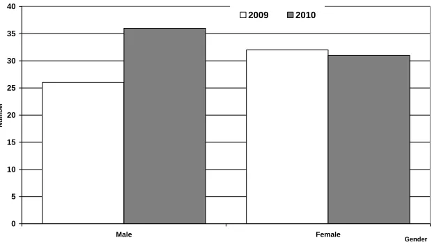
The number of participants in 2009-2010 grouped by gender
0 5 10 15 20 25 30 35 40
Male Female
Gender
Nu
mb
er
2009 2010
In Figure I, the Y axis indicates the number of male and female participants, noted as two values of gender variables on the X axis. The content includes four vertical bars representing numbers of male and female participants in 2009 and 2010. The year in this graph is the third variable known as a specifier or a parameter [Kosslyn, 2006]. The white bars depict data for 2009 and the checked bars depict data for 2010. Also shown in Figure I are labels, including the title, descriptions of the two axes, and the legend.
According to scholars and practitioners in information visualization [Spence, 2007; Few, 2009; Kosslyn, 2006; Robbins, 2005], a person’s visualization of a bar graph could be enhanced through the use of a computer-created bar-shaped representation of quantitative data. This activity is mainly to amplify one’s cognition regarding the data representation. Spence [2007] stated that advances in the field of information visualization are mainly due to three types of computational support: (1) affordable access memory, (2) powerful and quick computation, and (3) state-of-the-art, high-resolution screens. More affordable access memory allows vast amounts of storage for all types of firms. Highly powerful and quick computation “allows the rapid interactive selection of subsets of data for flexible exploration” [Spence, 2007, p. 16], which is vital since one view of data representation may be too ambiguous to convey any meaning until individuals can examine the others. Today’s state-of-the-art screens with high resolution and direct manipulation interaction provide the perfect match between various human visualizing skills and multiple data representation formats.
According to the literature, the outcome of visualizing data encoded in a bar graph could be determined by whether one correctly decodes information in the graph [Cleveland and McGill, 1984; 1985; Lohse, 1993; Simkin and Hastie, 1987]. The current study, therefore, defines visualization of a bar graph as the extent to which graph viewers can respond correctly to questions regarding the data encoded in the graph. The correct responses are the graph viewers’ proper interpretation of the data in the graph, which further could indicate the success in presenting data in a bar style [Few, 2009].
International Journal of Business and Information
2009; Robbins, 2005]. Most of these studies have stated that the three-dimensional bar graph is still as effective as the two-three-dimensional one.
Graph orientation is referred to in the current study as the direction of the graph’s display. The display could be either horizontal or vertical. Figure I, shown earlier, depicts a vertical orientation. When visualizing this vertical bar graph, one often starts by observing what is on the X axis and then shifting his or her observation to the frequency or the value, often represented by the bar height on the Y axis [Kosslyn, 2006]. Switching the two axes would yield a horizontal bar graph. How one visualizes the horizontal graph would be similar to how one visualizes the vertical graph. A fair number of publications, however, have found that a vertical bar graph tends to outperform a horizontal one [Fischer, 2000; Schonlau and Peters, 2008; Simkin and Hastie, 1987; Stewart, et. al., 2009]. On the other hand, Price and colleagues [2007] discovered from their risk assessment study that viewers of horizontal bar graphs make more accurate decisions faster than those viewing the vertical counterpart.
Although some attributes such as graph orientation seem to receive a fair amount of research attention, other display attributes, albeit equally important, have been largely overlooked in research. Two other attributes of interest in the current study are scale display formats and styles of background display. In this study, scale format refers to a character or a style of the scale on a bar graph that a graph maker uses to convey different values of a given variable. This format could be of any value on the X or Y axis. For example, the format used in Figure I’s Y axis is a numeric display with a conventional five-unit interval.
that could have affected risk-related decisions, many of which were made after the decision-maker had inspected bar graphs. Speier [2006] confirmed that display formats and decision performance were empirically moderated by the complexity of the task that required those decisions.
Different formats of scale display on a bar graph include a behaviorally anchored rating scale [Benson et al. 1988], graphic display [Schapiro et, al., 2006; Wilson and Addo, 1994; Stone et al., 1997, 2003], scale nearness as opposed to scale remoteness, and scale coarseness as opposed to scale fairness [Graham, 1937]. These factors may affect the critical applications of scale formats to bar graphs. Typical graph makers may adopt a conventional display format so that viewers can concentrate on interpreting the bar graph. Such a conventional display could be the numeric value, which is often a multiplication of 5 or 10. (In Figure I, it is the multiplication of 5.) If graph makers were to adopt an unconventional format, the decision would add interesting points to the bar graph and challenge viewers to take a more careful look at the graph. No previous studies, however, have examined such formats of display on bar graphs. The current study aims to fill this gap.
The second display attribute of interest in the current study is background display. Taking advantage of advances in computer technology, webpage designers often include animation in order to make their pages visually appealing. Although animation can “facilitate comprehension, learning, memory, communication, and inference,” Tversky and colleagues [2002] found that it must be incorporated into the design with great caution. They described two principles under which animation can work best: (1) the congruence principle, which suggests that the content and format of the animation should correspond well to the content of a given page; and (2) the apprehension principle, which posits that the animation should be presented in such a way that viewers can interpret the content correctly.
International Journal of Business and Information
the web page, in which case the presentation would then enhance content readability. Zhang and Massad [2003] found that too much animation can damage search performance.
Considerable attention has been given to examining the effects of animation on webpage comprehension and on decisions made on the basis of details presented on the webpage [Tail et al., 2010; Carling et al., 2009; Garcia-Retamero and Gallisic, 2010]. Similarly, much attention has been given to investigating the role of background display on graph perception [Simkin and Hastie, 1987; Cleveland and McGill, 1984]. In contrast, virtually no studies have encompassed empirical research to verify the effects of an animated background on bar graph visualization. The work of Tversky and colleagues [2002] strongly suggests that there is an urgent need to compare outcomes between static (or unanimated) and animated conditions of background display.
2. OBJECTIVES OF THE STUDY
Our review of the literature on conceptual ideas and empirical research strongly motivated us to investigate an important, yet largely overlooked, field of bar graph perception. Drawing on literature in the fields of visualization, cognitive psychology, and human-computer interaction, we resolved to examine the effects of scale orientation, scale format, and background display styles on bar graph visualization. The three main objectives of our study are:
1. To compare bar graph visualization between a graph with horizontal orientation and one with vertical orientation
2. To compare graph visualization between a graph with a conventional scale format and one with an unconventional scale format
3. To compare bar graph visualization between a graph with a static background display and one with an animated display of background
3. RESEARCH METHODOLOGY
3.1. Selection of the content, scale formats, and background display styles of each of the eight displays of bar graphs on computer screens so that all eight would convey comparable meanings
3.2. Recruitment of experimental subjects to visualize the graphs
3.3. Measurement of bar graph visualization
3.4. Collection of data
3.5. Analysis of results to ascertain the effects of scale formats and background display styles on visualization
3.1. Selection of Content, Scale Formats, and Background Display Styles
In order to ensure that any possible differences in visualization of the bar graphs would result from the three display attributes only, it was critical that the content of all eight displays of bar graphs yield identical meaning. Having decided to use high school students as our experimental subjects, we strove to select content that would interest them. We decided to use data on those who purchase products or services online, categorized by residential area. Since all the subjects would be Thai, we used the Thai language on the bar graphs.
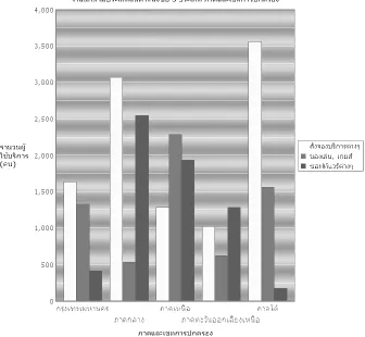
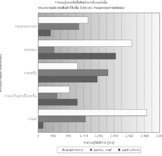
The bar graph with vertical orientation, animated background, and conventional scale format and the bar graph with horizontal orientation, static background, and unconventional format are shown in Figure II and Figure III, respectively.
International Journal of Business and Information
Business School to assess: (1) whether the two scale formats fairly represented the conventional and unconventional scale formats of bar graphs, and (2) whether the animation in the background was noticeably different from the other. They all confirmed the typical/untypical continuum and the different degrees of animation in the graph background.
Figure II. Vertical Bar Graph with Conventional Scale Format
Figure III. Horizontal Bar Graph with Unconventional Scale Format And Static Background Display
3.2. Selection of Experimental Subjects
International Journal of Business and Information
would genuinely be a result of the scale orientations, the scale formats, or the background styles of the bar graphs. In deciding on 160 as the number of experimental subjects, we were influenced also by eight conditions of the experiment and the availability of 40 seats in the lab facility.
3.3. Measurement of Bar Graph Visualization
Bar graph visualization in this study was measured as graph comprehension. That is, we developed 20 multiple-choice questions that required the subjects to visualize the bar graphs in order to come up with possible answers to those questions. The order of the questions in the two sets was arbitrary, but all subjects were required to answer the same questions. We also set a time limit for answering all of the questions. A subject would earn one point for each correct answer within the time limit, or zero points otherwise. The maximum and minimum visualizing scores were thus 20 and 0 points, respectively.
3.4. Collection of Data
Because of the 40-seat lab capacity, we scheduled a total of eight sessions for the eight conditions of our experiment (2 scale orientations x 2 scale formats x 2 background display styles). For each of the eight conditions, there were 80 randomly assigned experimental subjects.. In each session, one subject worked with one desktop computer. The computers for all subjects were identical. The subjects were instructed to view a certain graph and then respond to all questions pertaining to that graph. They were also assured that their answers would have no impact on their semester performance, and were also encouraged to stay focused on the given task. After they had answered all of the questions, the subjects were thanked for their efforts and offered a snack as a token of our appreciation.
3.5. Analysis Framework
We used SPSS to export data from the database in the proper format for analysis. The analysis was twofold: (1) we presented the key descriptive statistics for major variables; and (2) we adopted the analysis of variance (ANOVA) technique to verify the three effects on bar graph visualization scores. To comply with the technique’s basic assumptions, we assessed whether the scores were normally distributed. If they were not, we replaced the ANOVA test with a nonparametric technique.
4. RESULTS
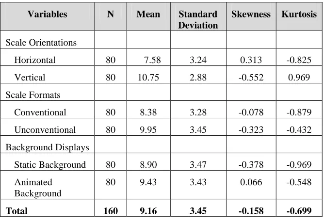
Table 1 presents descriptive statistics on bar graph visualization scores, categorized by two scale orientations, two scale formats, and two styles of background display.
Table 1
Descriptive Statistics on Graph Visualization Scores
Variables N Mean Standard
Deviation
Skewness Kurtosis
Scale Orientations
Horizontal 80 7.58 3.24 0.313 -0.825
Vertical 80 10.75 2.88 -0.552 0.969
Scale Formats
Conventional 80 8.38 3.28 -0.078 -0.879
Unconventional 80 9.95 3.45 -0.323 -0.432
Background Displays
Static Background 80 8.90 3.47 -0.378 -0.969
Animated Background
80 9.43 3.43 0.066 -0.548
Total 160 9.16 3.45 -0.158 -0.699
International Journal of Business and Information
formats and orientations than between background styles. Determining whether the differences are statistically significant depends on the inferential techniques used.
As seen in Table 1, the absolute values of skewness and kurtosis statistics are between -1 and 1. According to the recommendation of Mulylle and coworkers [2004], the visualization scores in this experiment are normally distributed. Consequently, it was possible to compare means of the scores across different values for all three independent variables, using the ANOVA test [Zikmund, 2003].
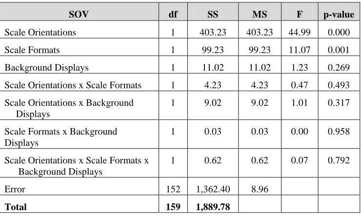
The analysis of variance results shown in Table 2 indicates (1) that the effects of scale orientations and scale formats on bar graph visualization are statistically significant at a 0.05 level, but (2) that the effects of background displays or interaction effects of the three factors on the same variable are not significant. The descriptive statistics shown previously in Table 1 reveal that the average visualization scores for the vertically oriented bar graph is higher than the average scores for the horizontally oriented graph. The data also show that scores for the unconventional scale format are slightly higher than scores for the conventional format.
Table 2
Analysis of Variance Results
SOV df SS MS F p-value
Scale Orientations 1 403.23 403.23 44.99 0.000
Scale Formats 1 99.23 99.23 11.07 0.001
Background Displays 1 11.02 11.02 1.23 0.269
Scale Orientations x Scale Formats 1 4.23 4.23 0.47 0.493
Scale Orientations x Background Displays
1 9.02 9.02 1.01 0.317
Scale Formats x Background Displays
1 0.03 0.03 0.00 0.958
Scale Orientations x Scale Formats x Background Displays
1 0.62 0.62 0.07 0.792
Error 152 1,362.40 8.96
5. CONCLUSIONS AND IMPLICATIONS
This study examined whether the effects of displaying bar graphs (1) in two orientations, (2) using two scale formats, and (3) on two styles of background display are statistically significant in terms of graph visualization. Subjects in the lab experiment were senior high school students in Thailand who visualized eight different bar graphs with the same content (2 scale orientations x 2 scale formats x 2 styles of background display).
The mean visualization score was 9.16 points, which was less than half of the total of 20 points. There are two possible explanations for the below-average score: (1) this group of Thai students had a problem visualizing bar graphs; or (2) the bar graph is not the right tool for presenting numeric data; hence, it prevented these students from reaching a common understanding regarding the details in the graph. Although previous studies [Few, 2009; Fisher, et al., 2005] contend that a bar graph is an effective tool for presenting data, none have examined visualization skills in a particular context (e.g., Thailand). This finding emphasizes the urgent need to investigate graph visualization in a particular context. We have no explanation for why Thai subjects in our experimental lab performed slightly below average with regard to visualization.
A comparison of visualization scores between those reading bar graphs with conventional scale formats and those reading similar graphs with unconventional scale formats confirmed that the difference between the two is statistically different. Yet, the scores in Table 1 show that those who read a graph in an unconventional scale format apparently achieved a higher level of visualization than those who read it in the conventional format. One plausible explanation is that an unconventional (or odd) scale on a bar graph may have attracted the viewer’s attention to a greater degree than a typical scale format. The irregularity of an unconventional format could, therefore, enhance graphical interpretation, thereby leading to significantly higher scores on visualization. This conjecture is very premature, however, since the current study is one of the first efforts to examine effects of bar graph scale formats on visualization. We thus encourage fellow researchers to pursue further investigations on the issue in order to obtain a more valid insight..
International Journal of Business and Information
showing that a vertically oriented bar graph appears to enhance viewers’ visualization better than a horizontally oriented one.
Prior studies [Spence, 2007; Zhang and Massad, 2003] indicate that animation excites viewers and, consequently, draws their attention to a display on a computer screen. The finding, however, seems invalid in the current study, which found that the difference between visualization scores for those viewing bar graphs with an animated background and those viewing similar graphs with an unanimated (static) background was not significant. In other words, in the current study, the static background was found to be as visually effective as the animated one. This topic warrants further discussion. Based on the recommendations of Tversky and colleagues [2006], we used a tidal wave moving upward as the animation on our bar graphs. It may be that this particular animation was incongruent with the graph content. Such incongruence could further distort readability, as one subject stated after he completed the experiment. This situation is a reminder that animation must be carefully adopted following guidelines from previous work [cf., Tversky et al., 2006].
Further discussion is warranted for findings that show that the interaction effects of all three factors on bar graph visualization are not significant. We could not locate any publication that examined such interaction effects. Our discussion would thus be speculative. It appears (1) that, although scale orientations and scale formats have significant effects on visualization, their interaction effects may cancel each other out, and (2) that any interaction involving background displays seem trivial. These speculations reveal the need for more empirical research on this issue.
This study also revealed that use of a traditional vertical bar graph is still valid in that such a graph could lead to a better understanding of content than the horizontal graph.. The default style for bar graphs, therefore, should be the vertical design.
The contributions of this study were constrained by two limitations. First, the experimental lab work was conducted using Thai bar graph viewers, all of whom were high school students. The generalization of results to other contexts, such as viewers of other nationalities, other professions, or other types of graphs, would therefore be inappropriate. Second, the lab experiment, although high in internal validity [Babbie, 2010], offered little with regard to issues of external validity. In summary, there are plenty of research opportunities relating to these issues, including an experiment in a setting where multiple graphs are used by various viewers.
REFERENCES
Amer, T.S., and S. Ravindran. 2010. The effect of visual illusions on the graphical display of information, Journal of Information Systems 24(1), 23-42.
Babbie, E. 2010. The Practice of Social Research, International Edition, CA.: Cengage Learning.
Benson, P.G.; M.R. Buckley; and S. Hall. 1988. The impact of rating scale format on rater accuracy: An evaluation of the mixed standard scale, Journal of Management 14(3), 415-423
Carling, C.L.; D.T. Kristoffersen; S. Flottorp; A. Fresheim; A.D. Oxman; H.J. Schunemann; E.A. Aki; J. Herrin; T.D. MacKenzie; and V. Montorium. 2009. The effect of alternative graphical displays used to present the benefits of antibiotics for sore throat on decisions about whether to seek treatment: A randomized trial, Plos Medicine 6(8), 1-11.
Cleveland, William, and Robert McGill. 1984. Graphical perception: Theory, experimentation and application to the development of graphical methods, Journal of the American Statistical Association, 79(387), 531-554.
Cleveland, William, and Robert McGill. 1985. Graphical perception and graphical methods for analyzing scientific data, Science 229(4716), 828-833.
International Journal of Business and Information Fischer, Martin H. 2000. Do irrelevant depth cues affect the comprehension of bar
graphs? Applied Cognitive Psychology 14, 151-160.
Fischer, Martin H; Nele Dewulf; and Robin L. Hill. 2005. Designing bar graphs: Orientation matters, Applied Cognitive Psychology 19(70), 953-962
Garcia-Retamero, Rocio; and Mirata Galesic. 2010. Who profits from visual aids: Overcoming challenges in people’s understanding of risks, Social Science & Medicine 70, 1019-1025.
Graham, James. 1937. Illusory trends in the observations of bar graphs, Journal of Experimental Psychology, 597-608.
Huang, Weidong, and Peter Eades. 2005. How people read graphs, In: Asia Pacific Symposium on Information Visualization (APVIS 2005) 45, 2005, pp. 51-58.
Katz, Susan M. 2008. Creating appropriate graphics for business situations, Business Communication Quarterly 71-75.
Kim, S.; M. Yoon; S.M. Whang; B. Tversky; and J.B. Morrison. 2007. The effect of animation of comprehension and interest, Journal of Computer Assisted Learning 23, 260-270.
Kosslyn, S.M. 2006. Graph Design for the Eye and Mind. England, Oxford University Press.
Lohse, Gerald Lee. 1993. A cognitive model of understanding graphical perception, Human-Computer Interaction 8, 353-388.
Moon, J. 2006. When good information goes bad, Journal of Accountancy 137(1349), 62-65.
Mulylle, S.; R. Moenaert; and M. Despontin. 2004. The conceptualization and empirical validation of web site user satisfaction, Information & Management 41, 543-560.
Price, Melanie; Rachel Cameron; and Phylis Butow. 2007. Communicating risk information: The influence of graphical display format on quantitative information perception – Accuracy, comprehension, and preferences, Patient Education and Counseling 69, 121-128.
Robbins, Naomi B. 2005. Creating More Effective Graphs, NJ: Wiley & Sons.
Schonlau, Matthias, and Ellen Peters. 2008. Graph comprehension: An experiment in displaying data as bar charts, pie charts, and tables with and without the gratuitous 3rd dimension, Working Paper #618, Rand Corporation, 17 pp.
Simkin, David, and Reid Hastie. 1987. An information-processing analysis of graph perception, Journal of the American Statistical Association 82(398), 454-465.
Speier, Cheri. 2005. The influence of information presentation formats on complex task decision-making performance, International Journal of Human-Computer Studies, 64, 1115-1131.
Spence, Robert. 2007. Information Visualization: Design for Interaction, 2nd edition, NY: Pearson Prentice Hall
Stewart, Brandie M,; Jessica M. Cipolla; and Lisa A. Best. 2009. Extraneous information and graph comprehension: Implications for effective design choices, Campus-Wide Information Systems 26(3), 191-200
Stone, Eric R.; J. Frank Yates: and Andrew M. Parker. 1997 Effects of numerical and graphical displays on professed risk-taking behavior, Journal of Experimental Psychology 3(4), 243-256.
Stone, Eric; Winston R. Sieck; Benita E. Bull; J. Frank Yates; Stephanie Parks; and Carolyn J. Rush. 2003. Foreground: Background salience: Explaining the effects of graphical displays on risk avoidance, Organizational Behavior and Human Decision Processes, 90, 19-36.
Tait, Alan R.; Terri Voepel-Lewis; Brian Zilmund-Fisher; and Angela Fagerlin. 2010. The effect of format on parents’ understanding of the risks and benefits of clinical research: A comparison between text, tables, and graphics, Journal of Health Communication 15(5), 481-501.
Tversky, Barbara, and Julie Bauer Morrison. 2002. Animation: Can it facilitate? International Journal of Human-Computer Studies 57, 247-262.
Wilson, E. Vance, and Theophilus B.A. Addo. 1994. An investigation of the relative presentation efficiency of computer-displayed graphs, Information & Management 26, 105-115.
Zhang, Ping, and Nelson Massad. 2003. The impact of animation on visual search tasks in a web environment: A multi-year study in Proceedings of the Americas Conference on Information Systems (AMCIS), 8 pp.
International Journal of Business and Information
ABOUT THE AUTHORS
Chatpong Tangmanee ([email protected]) is an assistant professor in the Department of Statistics, Chulalongkorn Business School, Chulalongkorn University. He received his Ph.D. in information transfer from Syracuse University in 1999. His research interests mainly cover human-computer interaction in the business context and electronic commerce. His publications appear in the Australian Journal of Information Systems, Journal of the American Academy of Business, Cambridge, Journal of Research and Practice in Information Technology, and the Journal of Business Administration Research.