R E S E A R C H A R T I C L E
Open Access
Usability of data integration and
visualization software for multidisciplinary
pediatric intensive care: a human factors
approach to assessing technology
Ying Ling Lin
1,2, Anne-Marie Guerguerian
1,2,3, Jessica Tomasi
1, Peter Laussen
2and Patricia Trbovich
1,4,5*Abstract
Background:Intensive care clinicians use several sources of data in order to inform decision-making. We set out to evaluate a new interactive data integration platform called T3™made available for pediatric intensive care. Three primary functions are supported: tracking of physiologic signals, displaying trajectory, and triggering decisions, by highlighting data or estimating risk of patient instability. We designed a human factors study to identify interface usability issues, to measure ease of use, and to describe interface features that may enable or hinder clinical tasks.
Methods:Twenty-two participants, consisting of bedside intensive care physicians, nurses, and respiratory therapists, tested the T3™interface in a simulation laboratory setting. Twenty tasks were performed with a true-to-setting, fully functional, prototype, populated with physiological and therapeutic intervention patient data. Primary data visualization was time series and secondary visualizations were: 1) shading out-of-target values, 2) mini-trends with exaggerated maxima and minima (sparklines), and 3) bar graph of a 16-parameter indicator. Task completion was video recorded and assessed using a use error rating scale. Usability issues were classified in the context of task and type of clinician. A severity rating scale was used to rate potential clinical impact of usability issues.
Results:Time series supported tracking a single parameter but partially supported determining patient trajectory using multiple parameters. Visual pattern overload was observed with multiple parameter data streams. Automated data processing using shading and sparklines was often ignored but the 16-parameter data reduction algorithm, displayed as a persistent bar graph, was visually intuitive. However, by selecting or automatically processing data, triggering aids distorted the raw data that clinicians use regularly. Consequently, clinicians could not rely on new data representations because they did not know how they were established or derived.
Conclusions:Usability issues, observed through contextual use, provided directions for tangible design improvements of data integration software that may lessen use errors and promote safe use. Data-driven decision making can benefit from iterative interface redesign involving clinician-users in simulated environments. This study is a first step in understanding how software can support clinicians’decision making with integrated continuous monitoring data. Importantly, testing of similar platforms by all the different disciplines who may become clinician users is a fundamental step necessary to understand the impact on clinical outcomes of decision aids.
* Correspondence:[email protected]
1Institute of Biomaterials and Biomedical Engineering, University of Toronto, Rosebrugh Building (RS), 164 College Street, Room 407, Toronto, ON M5S 3G9, Canada
4Institute of Health Policy, Management and Evaluation, University of Toronto, 155 College St., Suite 425, Toronto, ON M5T 3M6, Canada Full list of author information is available at the end of the article
Background
The Intensive Care Unit (ICU) setting is a complex socio-technical environment where patients with life-threatening conditions, frequently needing advanced organ support technologies, are continuously monitored by teams of specialized clinicians [1, 2]. This setting is synonymous with multimodal monitoring (MMM) de-fined as “the combined use of monitors, including […] clinical examination, laboratory analysis, imaging stud-ies, and physiological parameters” and relies on human knowledge and skills to effectively use the data [3–6]. However, the massive amount of data may not be serv-ing patient outcomes. Clifford reports a“growing aware-ness within medical communities that the enormous quantity and variety of data available cannot be effect-ively assimilated and processed without automated or semi-automated assistance” [7]. Celi attributes the diffi-culty of establishing cause and effect relationships be-tween the interventions and the critically-ill patients to the “exceptional complexity of the [ICU] environment […] particularly vulnerable to variation across patient subsets and clinical contexts” [8]. In pediatric intensive care, complexity of care is increased compared adults due to weight-based dosing, and age-dependent pharma-cokinetics, pharmacodynamics, and physiological norms [9, 10]. Multidisciplinary team care that complements physician care has improved survival of this complex pa-tient population [11]. In fact, the Society of Critical Care Medicine maintains that “Right Care, Right Now™” is best provided by an integrated team of dedicated med-ical experts [12]. In the Canadian setting, the core team is comprised of physician intensivists, nurses, and re-spiratory therapists. Consequently, all these clinicians must be able to effectively detect and react to changes in patient status informed by the vast array of MMM data. As such, we propose that data integration and visualization software may be a solution to help clinicians process MMM data. The study’s purpose was to test the data inte-gration and visualization software, specifically the level of simplicity to detect and understand changes in the patient state. We hypothesize that to properly display patient-specific ICU data in a manner which conveys meaning to the clinician, software should support data processing in a thoughtful, intuitive, and user-friendly manner [13]. Sub-optimal care may be traced to“flawed user interfaces”that result in cognitive errors and data misinterpretation [14–16]. A human factors study approach was chosen to empirically identify ease of use and safety issues. This approach is well established in aviation and nu-clear power industries to help inform what an optimal user-interface design is and has recently been applied to healthcare [17–20]. In this study, we tested the usability of T3™, a data integration and visualization software program. The study is the first to report the
usability of a commercially available, interactive, data integration, and visualization software for an ICU setting.
Data integration and visualization software
In March of 2013, the T3™software was implemented in a large pediatric ICU department. This web-based tool cap-tures and displays integrated physiologic data exported from devices and monitors attached to patients. Specific-ally, it displays patient-generated physiological data and therapeutic intervention data (e.g. from infusion pumps and/or a ventilator, or diagnostic results from blood work with timestamps of important medical events such as chest closures or cardiac arrests). A schematic of data sources is presented in Fig. 1. Its three main functions are tracking (e.g. supports tracking of patient parameters to their unique norms over time), trajectory (e.g. visually in-tegrates patient-specific data to show relationships), and triggering (e.g. derives meaning to support clinical decision-making through real-time computation of the data). It was available to all clinicians in the unit to either use in real-time or at a later point for review and debriefing.
To access T3™, a login separate from the existing hospital-based network is required. The interface is not permanently displayed, requiring the clinician to login and access the integrated data. Prior to implementation, the clinicians were shown the T3™ platform and were provided information about access and function. How-ever, expectations for use within the ICU workflow were not made. It should also be noted that T3™ is not an approved patient monitor and there are no alarms incor-porated into the software. It is used at the discretion of clinicians rather than mandated.
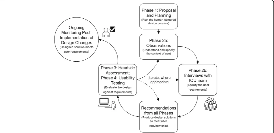
Overview of project phases
cost-effective usability technique. It identifies potential usabil-ity issues and associates them to violations of established good interface design principles [21]. Two human fac-tors specialists, a senior ICU nurse and a senior ICU physician, found 50 potential usability issues associated
with 194 heuristic violations [22]. While heuristic evalu-ation is an efficient and inexpensive method to uncover potential usability issues, usability testing is recognized as a better method because obstacles are obtained dir-ectly from the end-user’s interaction with the system.
Iterate, where appropriate
Phase 2a: Observations (Understand and specify
the context of use)
Phase 2b: Interviews with
ICU team (Specify the user
requirements)
Recommendations from all Phases (Produce design solutions
to meet user requirements) Phase 3: Heuristic
Assessment; Phase 4: Usability
Testing (Evaluate the design against requirements)
Phase 1: Proposal and Planning (Plan the human-centered
design process) Ongoing
Monitoring Post-Implementation of
Design Changes (Designed solution meets
user requirements)
Fig. 2User-centered design and evaluation process of an existing data integration and visualization platform in accordance with the ISO 9241–210 standard. The iterative design and evaluation cycle is broken down into phases with the related ISO 9241–210 standard’s phases in parenthesis. The cycle was carried out once with each phase described for the design/evaluation of data integration and visualization software for intensive care monitoring and decision-making. Phase 1 was an initial phase where the user-centered design process was identified and work included gathering existing studies in the form of a systematic review. Phase 2 included both unit-level observations and clinician-level interviews to gather information about intensive care work using continuous data. Phase 3 was a heuristic assessment of the software to determine usability issues that violate accepted interface design principles and to suggest design solutions. Phase 4 was a usability test method where issues were identified by actual users
performing true-to-work tasks and recommendations for design solutions were provided. Results from this last phase are presented here
The fourth phase was a usability study, of which results are presented here. The goal of this final phase is to as-sess how existing data integration software can support physicians, nurses, and respiratory therapists with their use of continuous data.
Usability testing has been used to evaluate a number of healthcare technologies such as infusion pumps, com-puterized physician order entry systems, radiation ther-apy systems, and electronic medical record systems [10, 23–27]. There has been little focus on usability testing of data integration software from MMM devices [28, 29]. By observing users as they carry out realistic tasks, human factors specialists evaluate how technology helps users accomplish their work goals while assessing their needs and satisfaction. The strength of usability testing stems from the qualitative information revealed while using the software. Through these observations, human factors specialists identified the following: 1) what con-tent is missing, and 2) what design elements went un-detected, led to confusion, and/or led to errors. Based on this data, the design can be refined to provide better support mechanisms. Consequently, corrective actions are primarily system-based as opposed to changing hu-man behavior.
The objectives of this study were to identify and evalu-ate usability issues of the data integration software and to determine the ease of use and potential safety impact on clinical decision-making, while considering the differ-ent perspectives of the multidisciplinary critical care team. In addition, recommendations to improve this and similar data integration platforms are provided.
Methods
Study design
This is a human factors usability study to assess specific continuous monitoring data integration software. The study was approved by the Research Ethics Board of the test site institution and the clinician participants’hospital.
Setting
Testing sessions were conducted from January to February of 2016 in a usability laboratory equipped with obser-vational booths behind one-way glass and multiple ceiling-mounted cameras and microphones. During the two-month study period, internal data showed low usage with an average of 10 weekly users. Physi-cians used the software most of the time (96%) com-pared to nurses (4%) and respiratory therapists (0%). Usage logs from the ICU indicated there were be-tween five and 17 weekly users, or approximately 6% of an over 300-clinician staff. The active users were mostly physicians, and they collectively used the soft-ware a total of 30 h per week.
Software
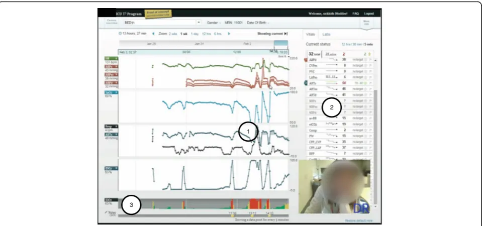
T3™is a web-based software available at multiple tertiary hospitals in North America, which continuously collects, integrates, and displays data from monitoring and inter-vention devices every five seconds. Four types of visual aids are generated: 1) time series of continuous numer-ical data (e.g. trend lines) displayed as an average over five seconds, 2) colored highlighted layer over time series (e.g. shading of trend lines), 3) automatic short-term trends (e.g. sparklines), and 4) persistent bar graph representation of percent risk (e.g. IDO2 indicator). All
are shown in Fig. 3. We tested T3™version 1.6 as a fully-interactive working prototype software, identical to what was available in the ICU. The version we tested included a 16-parameter proprietary algorithm which estimated the risk of inadequate oxygen delivery [30]. Software was accessed through an intranet website, hosted on a virtual server behind the hospital’s firewall, and used a Google Chrome™ web browser installed on a computer running a Microsoft® Windows™ operating system. TechSmith® Morae® software version 2.0.1 was used to collect audio and video data from the computer screen and the partic-ipant’s facial expressions as they interacted with the soft-ware during the simulations (See Fig. 3). R softsoft-ware version ×64 3.2.2, package irr, function kappa2, was used to calculate statistics.
Scenarios and tasks
Scenarios, of which there were three, were based on post-cardiac surgery newborn patients, their data sets, and the events they experienced while in the unnamed North American pediatric hospital’s ICU. The compre-hensive data sets included dozens of monitoring and intervention data streams and were good representations of closely monitored ICU patients. The data sets, pro-vided by the software developers, were populated with fictitious names, medical record numbers, and back-ground information (See Table 1). During each test ses-sion, the data replayed from the same start time and presented the patient’s evolving status in real-time. Each scenario contained at least 24 parameters of continu-ously collected data, and clinicians could simultanecontinu-ously visualize data from up to 16 parameters (four per panel). These three scenarios were the overall context in which participants were asked to carry out 20 types of tasks regarding continuous data use. The tasks are de-scribed in Additional file 1.
Participants
tertiary, Canadian, pediatric hospital and all had access to T3™in their ICU. To detect at least 80% of possible discipline-specific usability issues, seven participants from each discipline were sufficient [31].
Procedure
Upon arriving to the simulation lab, each participant received a brief orientation, outlining the purpose and objectives of the evaluation, and consent was formally obtained. Participants were informed that they would be observed, videotaped, and audiotaped. The study facilita-tor addressed any questions or concerns before the participants reviewed and signed the consent form. Participants then completed the pre-test questionnaire. No training was provided before the experiment,
although some clinicians received introductory training sessions post ICU software launch.
During the simulations, participants were asked to
“think aloud” as they executed each task. This was to gain insight into their thought process, as well as provid-ing insight into their use of data and the information available to them. Both audio and video recordings were made of simulations (See Fig. 3). When a participant was challenged, they verbalized their thoughts to indi-cate the cause. A facilitator and two data recorders were in the observation room behind a one-way mirror. They facilitated, observed, and recorded participant perform-ance (e.g. use, difficulties, and errors) and feedback. After participants completed scenarios or the allotted time was exhausted, the facilitator conducted a debrief
Table 1Description, parameters available, key data features of three scenarios, based on real patients, used to test the T3™software functions
Scenario number Main events or interventions Number of parameters Key data features
1 - 2 episodes of hypotension - 1 cardiac arrest
- 1 initiation onto extracorporeal membrane oxygenation
32 total 24 active
- physiological monitoring - infusion pump data - temperature data - laboratory data
2 - 1 increased erroneous, medical infusion (dopamine) - 1 intervention (inhaled nitric oxide therapy)
34 total 28 active
- physiological monitoring - infusion pump data - laboratory data
3 - 1 attempt at bedside chest closure - 1 cardiac arrest
46 total 36 active
- physiological monitoring - infusion pump data - ventilator data
- three oxygen saturation parameters - laboratory data
2
1
3
interview and a post-test questionnaire. Feedback about participant experience with the T3™ system was col-lected, comments during simulation were clarified, and any concerns and/or questions arising from the evalu-ation were addressed.
Data analysis
Scoring task completion and usability error definition: Use error rating
Within this study, we established Use Error Ratings (UERs) on a scale of 2–0 to assess clinicians’software competency. (UER definitions are presented in Table 2, both in nominal form and as numerical codes). Two means a“Pass” and indicates clear task completion with no hint, clarification, or reminder required. One means
“Help” and indicates one hint was provided for the task to be completed. Zero means “Fail” and indicates the task could not be completed despite providing the participant with two hints or more. Task-related usability issues occurred with an average UER of 1.1. For more depth regarding this data, see Additional file 2 which an-alyzes the data. The same usability issues were analyzed using a percentage pass rate.
To ensure appropriate evaluation, the 20 types of tasks attempted were coded by two raters (authors YL and JT). Interrater reliability was reported both as an abso-lute percent agreement and equal weighting Cohen’s Kappa, taking into account chance agreement [32]. Where there was disagreement, agreement was reached through discussion. Based on the associated numerical code for each clinical group, an average UER was calcu-lated for each task. The average UER was also calcucalcu-lated for each group of tasks which represented the three gen-eral functions of the software (e.g. tracking, trajectory, and triggering). Finally, a global UER average was calcu-lated for all participants and for all tasks.
Usability issue severity level
Potential severity of the use error was categorized as minor, if patient was unlikely to be harmed; moderate, if patient could be temporarily harmed; or high, if patient could be permanently harmed. This was coded by one
rater (YL) and confirmed with an expert physician inten-sivist (author AMG). In the case of discrepancies, final score was determined through discussion. This approach was used to rate the importance of a use error [33].
Results
Participants
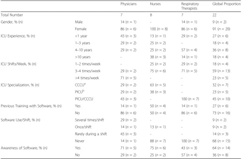
At the time of the study, the 22 participants were full-time ICU staff. Participant demographics are shown in Table 3. From the pre-session questionnaire, only 27% of participants received formal training when it was offered over two years ago. Though 64% of the participants were aware of the software, 82% rarely or never used.
The extent of underuse was unknown when usability testing was carried out. Consequently, the pre-session questionnaire did not ask participants why they did not use the software. The research team included the ques-tion “Did you know that T3™ is accessible from all PC workstations?” because they suspected that staff were unaware they had access to the software. Of the 20 par-ticipants who answered this question, 14, or 70%, were aware they could access the software. Two participants, who knew they had access but did not use T3™, provided insight as to why they did not use it. One nurse pre-ferred to look at the physiological monitor because it of-fered a real-time view of the patient status with more detail than T3™. The other nurse stated it could compliment his/her view of the patient status if s/he had time to use it during his/her shift. These findings suggest that, at the very least, most participants did not exten-sively use the T3™ software and were naïve to the software.
Interrater reliability
For all attempted tasks by each participant, the interrater reliability of the UER was 89% between the two raters (YL and JT). This is in absolute agreement with an equal weighted Cohen’s kappa of 0.85, corresponding to a strong level of agreement [32].
Software strengths (aid to task completion) and usability issues (hindrance to task completion)
Overview
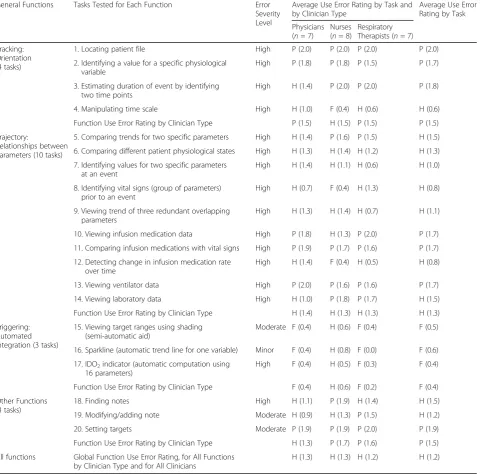
Due to time constraints, not all 20 types of tasks could be completed. Participants attempted an average of 18 of all 20 types of tasks (88%). The task groups representing the three main software functions had the following UER: 1.5/2, or “Pass”, for tracking; 1.3/2, or “Help”, for trajectory; and 0.4/2, or “Fail”, for triggering. For all tasks, the overall UER was similar across disciplines with a UER of 1.3 for physicians, a UER of 1.3 for nurses, and a UER of 1.2 for respiratory therapists. A summary of the average ratings, by tasks and clinician groups, are shown in Table 4 and illustrated in Fig. 4.
Table 2Use error rating definitions, shown as nominal and numerical codes
Normative Use Error Rating
Numerical Use Error Rating
Definition
Pass 2 User completed task with no
hint, clarification, or reminder
Help 1 User completed task with
one hint
Fail 0 User did not complete task
Tracking function
Tracking describes the general function of patient census navigation (using the dedicated census page or short-cut drop-down menu) and time orientation (using time series visual aids). It is a critical function since making time-sensitive decisions on the wrong patient, or with data that corresponds to a mistaken time period, can potentially lead to patient harm. The average UER for patient tracking tasks was 1.8, indicating that partici-pants completed tasks with little or no help. All tracking tasks had potentially high clinical impact severity. Clinicians easily completed three of four patient tracking tasks: Task 1) locating a patient in the census, Task 2) identifying a value for a specific physiological variable, and Task 3) estimating duration of an event by identify-ing two time points. However, clinicians had difficulty completing Task 4) manipulating the timeline, which corresponded to a UER of 0.6.
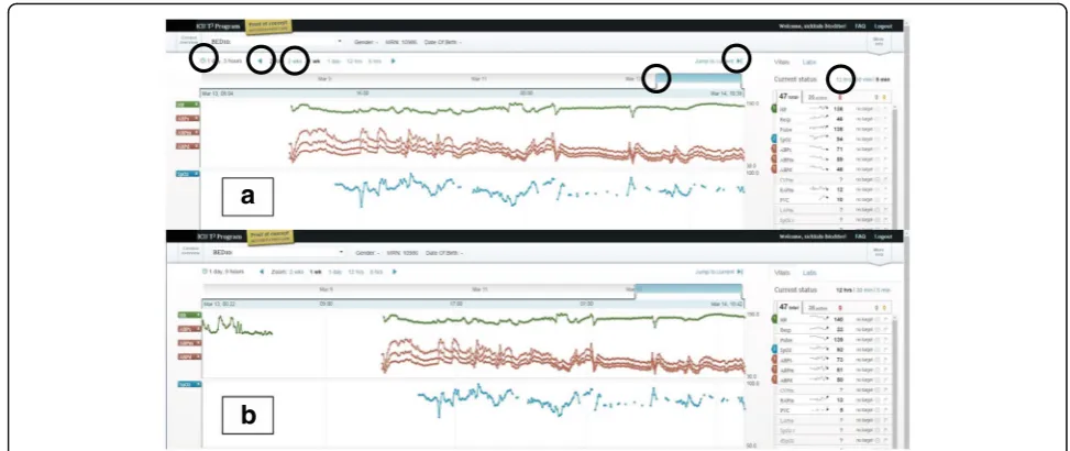
Tracking usability issue: Situating the patient data in time Though clinicians could choose their patient and select data from a given time period of data, they could not easily select specific time periods. To test partici-pants’ ability to situate the data in time, participants were asked to determine the patient’s length of stay by
manipulating the interface from a default view showing partial patient data. All clinician groups encountered dif-ficulty with this task, demonstrated by UER scores of 1.0 for physicians, 0.4 for nurses, and 0.6 for respiratory therapists.
This task can be parsed into three successive steps: 1) condense all the collected data into a single window, 2) check the start and end of the data, and 3) mentally cal-culate the entire length of stay. Task difficulty may be due to the first two steps which required clinicians to understand how to use the six interactive features for time manipulation (See circles in Fig. 5a). Clinicians needed to manipulate the interface and find the start and end of the patient data. Since this was a “live” pa-tient, the start and end of the data indicated to clinicians when continuous monitoring of the patient started and, consequently, when they first came to the ICU. The six interactive features were, at times, imperceptible to participants and required high visual acuity, as well as manual dexterity. As participants looked back at the parametric data in time, they assumed they had found the start of the patient data if they encountered a gap (See Fig. 5a). When prompted to continue to look back, they found that there was still more data (See Fig. 5b). These two screenshots show how the interface did not
Table 3Demographics, clinician specialization, training, current use, and awareness of data integration software Physicians Nurses Respiratory
Therapists
Global Proportion
Total Number 7 8 7 22
Gender, % (n) Male 14 (n= 1) - 14 (n= 1) 9 (n= 2)
Female 86 (n= 6) 100 (n= 8) 86 (n= 6) 91 (n= 20)
ICU Experience, % (n) <1 year 43 (n= 3) 13 (n= 1) 29 (n= 2) 27 (n= 6)
1–3 years 29 (n= 2) 25 (n= 2) - 18 (n= 4)
4–10 years 29 (n= 2) 25 (n= 2) 57 (n= 4) 36 (n= 8)
>10 years - 38 (n= 3) 14 (n= 1) 18 (n= 4)
ICU Shifts/Week, % (n) 1–2 times/week - 25 (n= 2) 29 (n= 2) 18 (n= 4)
3–4 times/week 29 (n= 2) 75 (n= 6) 71 (n= 5) 59 (n= 13)
>4 times/week 71 (n= 5) - - 23 (n= 5)
ICU Specialization, % (n) CCCUa 29 (n= 2) 63 (n= 5) - 32 (n= 7)
PICUb 29 (n= 2) 38 (n= 3) - 23 (n= 5)
PICU/CCCU 43 (n= 3) - 100 (n= 7) 45 (n= 10)
Previous Training with Software, % (n) Yes 14 (n= 1) 50 (n= 4) 14 (n= 1) 27 (n= 6)
No 86 (n= 6) 50 (n= 4) 86 (n= 6) 73 (n= 16)
Software Use/Shift, % (n) Several times/shift 29 (n= 2) - - 9 (n= 2)
Once/shift 14 (n= 1) 13 (n= 1) - 9 (n= 2)
Rarely during a shift 43 (n= 3) - - 14 (n= 3)
Never 14 (n= 1) 88 (n= 7) 100 (n= 7) 68 (n= 15)
Awareness of Software, % (n) Yes 71 (n= 5) 75 (n= 6) 43 (n= 3) 64 (n= 14)
No 29 (n= 2) 25 (n= 2) 57 (n= 4) 36 (n= 8)
a
CCCU: Cardiac critical care unit;b
communicate to clinicians the start and end of patient data and could leave users with a sense of uncertainty about whether they were seeing all the data for a par-ticular patient.
In conclusion, for the tracking function, most clinician groups could complete three of four tasks, but the main usability issue centered on the task requiring precise and accurate manipulation of data presented as a time series. For the specific task of viewing all the data for a particu-lar patient, exploring the data may leave users with a sense of uncertainty or frustration. Some participants
asked for a manual input of the horizontal (time) range suggesting they did not feel they could choose the time window of data to a satisfying extent.
Trajectory function
Clinicians closely monitor patient trajectory for rapid or gradual changes by comparing current physiological monitor data to daily target thresholds. With the avail-ability of continuous data from a patient’s entire ICU stay, determining trajectory then involves viewing related parameters and investigating both overall trends and
Table 4Usability tasks tested with severity levels and use error ratings General Functions Tasks Tested for Each Function Error
Severity Level
Average Use Error Rating by Task and by Clinician Type
Average Use Error Rating by Task
Physicians (n= 7)
Nurses (n= 8)
Respiratory Therapists (n= 7)
Tracking: Orientation (4 tasks)
1. Locating patient file High P (2.0) P (2.0) P (2.0) P (2.0)
2. Identifying a value for a specific physiological variable
High P (1.8) P (1.8) P (1.5) P (1.7)
3. Estimating duration of event by identifying two time points
High H (1.4) P (2.0) P (2.0) P (1.8)
4. Manipulating time scale High H (1.0) F (0.4) H (0.6) H (0.6)
Function Use Error Rating by Clinician Type P (1.5) H (1.5) P (1.5) P (1.5)
Trajectory:
Relationships between Parameters (10 tasks)
5. Comparing trends for two specific parameters High H (1.4) P (1.6) P (1.5) H (1.5)
6. Comparing different patient physiological states High H (1.3) H (1.4) H (1.2) H (1.3)
7. Identifying values for two specific parameters at an event
High H (1.4) H (1.1) H (0.6) H (1.0)
8. Identifying vital signs (group of parameters) prior to an event
High H (0.7) F (0.4) H (1.3) H (0.8)
9. Viewing trend of three redundant overlapping parameters
High H (1.3) H (1.4) H (0.7) H (1.1)
10. Viewing infusion medication data High P (1.8) H (1.3) P (2.0) P (1.7)
11. Comparing infusion medications with vital signs High P (1.9) P (1.7) P (1.6) P (1.7)
12. Detecting change in infusion medication rate over time
High H (1.4) F (0.4) H (0.5) H (0.8)
13. Viewing ventilator data High P (2.0) P (1.6) P (1.6) P (1.7)
14. Viewing laboratory data High H (1.0) P (1.8) P (1.7) H (1.5)
Function Use Error Rating by Clinician Type H (1.4) H (1.3) H (1.3) H (1.3)
Triggering: Automated Integration (3 tasks)
15. Viewing target ranges using shading (semi-automatic aid)
Moderate F (0.4) H (0.6) F (0.4) F (0.5)
16. Sparkline (automatic trend line for one variable) Minor F (0.4) H (0.8) F (0.0) F (0.6)
17. IDO2indicator (automatic computation using 16 parameters)
High F (0.4) H (0.5) F (0.3) F (0.4)
Function Use Error Rating by Clinician Type F (0.4) H (0.6) F (0.2) F (0.4)
Other Functions (3 tasks)
18. Finding notes High H (1.1) P (1.9) H (1.4) H (1.5)
19. Modifying/adding note Moderate H (0.9) H (1.3) P (1.5) H (1.2)
20. Setting targets Moderate P (1.9) P (1.9) P (2.0) P (1.9)
Function Use Error Rating by Clinician Type H (1.3) P (1.7) P (1.6) P (1.5)
All functions Global Function Use Error Rating, for All Functions by Clinician Type and for All Clinicians
H (1.3) H (1.3) H (1.2) H (1.2)
point data. To support such analysis, we asked clinicians to complete ten tasks (Tasks 5 to 14), which tested how easily clinicians could create multiparametric visualiza-tions (Tasks 5, 6, 9, 10, 11, 13 and 14) and extract data from these complex visualizations (Tasks 7, 8 and 12). Creating multiparametric visualizations required clini-cians to intuitively understand how to select parameters from a list and view them together on one of four panels (See Fig. 6). Identifying a single point of data required clinicians to hone in on the time series visualization and read off the chosen parameter’s value on the left-hand side (See Fig. 6). Of the ten trajectory tasks, clinicians failed to complete four (Tasks 7, 8, 9 and 12) and re-quired little or no help (an average UER above 1) to complete the remaining six tasks (Task 5, 6, 10, 11, 13, and 14) (See Fig. 4 and Table 4). All clinician groups had similar UERs for this set of tasks with 1.4, 1.3, and 1.2 for physicians, nurses, and respiratory therapists, re-spectively (See Table 4).
Trajectory software strength: Creating multiple parametric
visualizations Generally, seven tasks (Tasks 5, 6, 9, 10,
11, 13, and 14) were used to test how clinicians used the software to visualize multiple parameter trends. Essen-tially, the tasks were to find parameters and add them to a default of three basic vitals: heart rate; systolic, dia-stolic, and mean blood pressures; and oxygen saturation. Task completion generally had a good UER above 1.3, except for Task 9 which had a UER of 1.1 due to un-familiar data labels assigned at a different ICU. Physi-cians, nurses, and respiratory therapists required little or no facilitation to accomplish the task of combining dif-ferent parameters (Task 5, 6, 10, 11, 13 and 14), and the combined average of all three groups was above 1.0 when creating complex visualizations.
Task 11 was used to test how easily clinicians could visualize both intervention and physiological data streams, thereby, investigating their interrelationships. Most clini-cians successfully completed this task and had a group
UER of 1.9, 1.7, and 1.6 for physicians, nurses, and respira-tory therapists, respectively. One nurse stated that instead of looking at infusions and vitals separately, making it ne-cessary to recall a child’s baseline physiological vitals from memory, the software supported this task by displaying both types of parameters on the same graph. A second nurse remarked that it was “easier to put together the picture [compared to the current electronic charting sys-tem]” and, similarly, one physician remarked “I’m not
working as hard with T3™to make a mental visualization”. These comments indicate that participants liked how the software helped them to visualize parameter trends or see all the pieces of the puzzle.
Trajectory usability issues: Using multiple parametric
visualizations Intensive care requires knowledge of
both overall patient trajectory, spanning their ICU stay, and the immediate trajectory, such as in response to a
a
b
Fig. 5Usability issue of time manipulation interface. Screenshots of patient view with time manipulation interactive light blue icons, circled on top section, with heart rate, arterial blood pressures, and oxygen saturation data streams. Screenshotaappears to show start and end of data but screenshotb) shows the same gap as an interruption in the data streams, signifying the patient was away from the ICU and therefore, was not continuously monitored
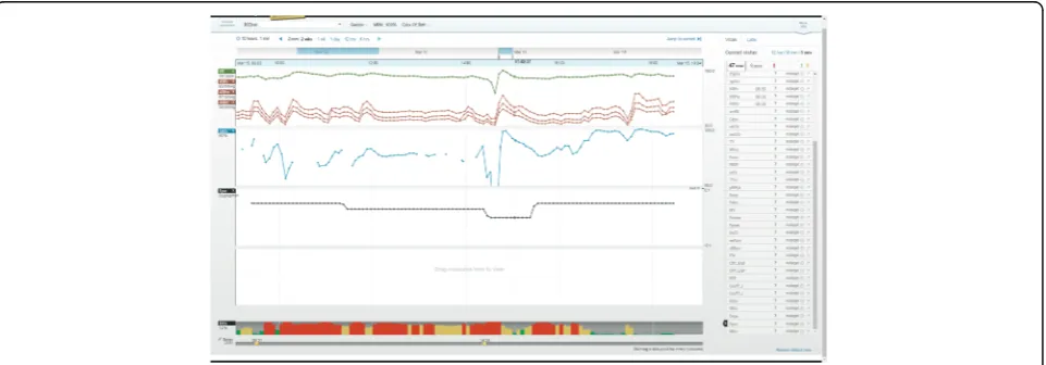
therapeutic intervention. Software should partially off-load the cognitive processes required to transform nu-merical, short-term data into longitudinal trends without losing the granularity of the point data. In this study, once clinicians chose and viewed a set of parameters from dozens available, they were asked to extract and understand nuances about the combined trends. Two types of tasks tested how clinicians interpreted multi-parametric visualization: 1) identifying point data (Tasks 7 and 8), and 2) detecting change (Task 12).
To hone in on the time of an event, both Tasks 7 and 8 required time manipulation, a core usability issue pre-viously discussed. Participants were asked to report values for parameters by identifying point data from the trends. This dynamic manipulation of the interface re-quired high visual acuity, manual dexterity, and visual sensitivity to display data for a given time period. It also required the ability to scan values associated with each parameter chosen (See Fig. 6). Clinicians had more diffi-culty reporting values for groups of parameters (Task 8) than two specific parameters (Task 7).
Task 12 required clinicians to detect when a continu-ous infusion was stopped. Though physicians (a task average UER of 1.4) could better detect an interruption in the infusion than nurses (a task average UER of 0.4) and respiratory therapists (a task average UER of 0.5), most participants failed to notice this. This may be due to 1) an infusion rate of 0 μg/kg/min was plotted as a continuous line, and/or 2) the automatic vertical scaling feature called “best-fit” created a vertical range of −0.1 to +0.1 μg/kg/min (See Fig. 7). Participants were often surprised that a rate of 0μg/kg/min was plotted as a line in the middle of the graph and, instead, expected a gap in the data when the rate was 0 μg/kg/min. A higher physician UER may also be explained by the investigative
nature of physician work, more advanced training in pharmacokinetics, and their role as initiators of medical infusions.
The failure to detect change could be attributed to dis-traction from the multiple viewing panels (four) that were populated by several parameters of different scales and may have divided participant attention, making de-tecting parameter changes more challenging. Further-more, detecting change only from the time series pattern may have been troublesome due to a small font size.
Participants suggested scaling based on realistic param-eter ranges. For example, medication infusion scales should always start from 0 since negative infusion rates are impossible and differences in orders of magnitude be-tween infusions should be graphed as to not dwarf each other (e.g. dopamine and epinephrine differ by two orders of magnitude). Additionally, scales for temperature plots should start at approximately normal body temperatures to help highlight important variances around the baseline to be more informative than if the scale started from 0.
Triggering function
Currently, monitoring a patient involves data from physiological monitors displayed as short-term (e.g. below a minute) waveforms and numerical values with visual or audible alarms to signal out-of-range targets. To partially off-load the cognitive processing of monitor-ing, the software provided three visual aids, or triggers to decision-making, which are overlaid on the long-term time series data to make unstable time periods more apparent. The triggers were either semi-automated, re-quiring clinician input, or fully-automated visualizations, derived only from the data. Deviations from baselines were highlighted by 1) shading time series data, 2) displaying mini-trends (sparklines) with exaggerated
minima and maxima, and 3) by automatically computing and displaying the risk of inadequate oxygen delivery (IDO2) as a color-coded bar graph (See Fig. 3). Thus, the
software highlighted periods of continuous data with un-desirable trajectory, either for single or combinations of parameters. In this way, clinicians may interpret data faster by focusing their attention on a portion of data from the computer-generated visual trends instead of memorizing and creating their own long-term mental trends.
To test the triggering function, clinicians were asked to use the visual aids of shading (Task 15), sparklines (Task 16), and the IDO2indicator (Task 17). In general,
participants ignored the visual aids until they were asked to attempt the task and all had UERs below 1, with a global triggering UER, aggregated by task and clinician type, of 0.4 (See Table 4). Specifically, one physician’s comment on shading out-of-range values: “I'm not sure if the shading is helpful, I'm getting distracted by the area under the curve or the shape or something. Maybe if target ranges were shown as two straight lines across the graph.”Clinicians stated that sparklines did not pro-vide enough detail to be useful. One nurse commented that “[they] prefer[red] just looking at the graph than looking at that little [graph] on the side because it's big-ger, you can see [the graph] better.” Usability of the IDO2trigger will be discussed in following section.
Data reduction: IDO2 indicator The IDO2 indicator,
derived using a 16-parameter algorithm, calculates and displays the risk of inadequate oxygen delivery. Six out of seven physicians were unaware of the IDO2indicator
and were skeptical of it because they did not know how it was derived. One physician’s mistrust was voiced as follows: “I don’t believe this [indicator] because I don’t know where it came from [or] what formula [it is based on].” In addition, since physicians regularly integrate data and derive their own assessment of patient instabil-ity, they stated that the indicator was redundant with their own assessment. For physicians using IDO2for the
first time, the indicator did not provide enough predict-ive value for them to incorporate it into their clinical practice. As one remarked “It’s almost too late. [IDO2]
shows you when they are unstable rather than trying to predict adverse events. [IDO2] tells me what I already
know.” However, one physician who had prior know-ledge of the IDO2 indicator and trusted the underlying
algorithm remarked that it would prompt investigation and “pull in more variables to explain what was seen [as a period of instability].”
Nurse impressions of IDO2were mixed with some
voi-cing confusion as to the meaning of the indicator as well as annoyance, and others voicing usefulness to confirm their own assessment. As one nurse stated "I don't really
know what this graph is trying to tell me. If it's just tell-ing me that the [saturations] are low, I already know that the [saturations] are low." Though all nurses found a correlation between the IDO2 indicator and their own
assessment, made directly from vitals data, they dis-agreed on whether this was advantageous or redundant. Similar to the physician group, nurses were skeptical of the new indicator because its derivation was unclear.
Respiratory therapists found that the indicator corre-lated with their assessment of instability from the hemodynamic data and also indicated that they would use it if they could trust it. As one respiratory therapist stated, "because I don't know how this percentage is cal-culated or what it takes into account, I don’t find that it is useful other than the color coding which is very intui-tive." Respiratory therapists stated the indicator could help them assess quickly and prompt further investiga-tion: “[IDO2 is] a first look at what’s going on. If you
want details you can look at parameters more closely”;
“it only really tells me that I need more information”; and "[it] might prompt me to be proactive about suggesting different modalities. Especially because it's O2-related, it would prompt me as an RT to think
outside the box." In summation, the IDO2indicator may
potentially help clinicians proactively detect deterior-ation, but the software should allow users to understand how it was derived.
Visually, when attention was called to the persistent bar graph of the IDO2 indicator participants all
inter-preted it correctly with higher values represented as red bars thus perceiving the patient as being at high risk of inadequate oxygenation. This composite par-ameter could also be seen as a time series on one of the four graph areas. Two physicians, one nurse, and one respiratory therapist viewed the IDO2indicator as
a time series. One physician found that the indicator correlated well with the charted events while the re-spiratory therapist found that it correlated with the hemodynamic data. The nurse preferred the bar graph visualization to the time series. One important differ-ence between the bar graph and the time series was that each bar was color coded with low IDO2 values
in green, intermediate values in yellow, and high values in red.
Other functions: Charting
Summary of results
In summary, for all functions and tasks the UERs were similar across clinician groups with physicians, nurses, and respiratory therapists having a global UER of 1.3, 1.3, and 1.2, respectively, indicating a need for some facilitation. The UER for tracking, trajectory, and trigger-ing functions for all users and groups of tasks was 1.5, 1.3, and 0.4, respectively. The main tracking usability issue was time manipulation while the main trajectory usability issues were identifying multiple data points and detecting changes in the data. All three triggering aids had usability issues due mainly to a lack of transparency about who set the target ranges and what parameters contributed to the calculation algorithm.
Despite usability issues, it is undeniable that the dynamic-ally displayed time series visualization and complimentary algorithms helped clinicians visualize and interpret the many overwhelming high-frequency data streams. Testing these novel data visualizations is a first step at observing how computerized pre-processing of data can be communi-cated to clinicians in realistic scenarios and for tasks supporting clinical decision-making.
Discussion
Usability testing revealed how data integration software supported or hindered tasks that require use of continu-ous patient data by a representative sample of end users. The qualitative nature of our study provided insight into the user experience and opportunities for user-centered design modifications. Clinicians had a high degree of flexibility and, consequently, easily produced data dense visualizations but encountered usability issues of time manipulation, point data identification, and detection of trend deviations. These issues confirm those identified using the heuristic evaluation method [22]. Attributable themes include the transformation of point data into time series visualization, the emergence of visual pattern overload, visual aids representing computer-processed data, data trustworthiness, and use variability among clinical disciplines.
Transforming numerical point data to long-term, time-scaled visualizations
Through tracking and trajectory tasks, we found that time series visualizations were appreciated by clinicians since it off-loaded their existing cognitive task of creat-ing visualizations from continuous numerical patient data. This may indicate that the software alleviated point data overload. Point data recall was effective for single parameter trends. However, multiparametric visualiza-tions lead to denser and overlapping time series making the recall of multiple point data difficult. While some confusion and misinterpretation was observed, we found that time series data displays allowed for quick
determination of the duration of instability. The software provided clinicians with a high degree of choice and flexibility to create multiparametric visualizations. How-ever, it consequently limited their ability to interpret and extract point data. The effort required to make distinc-tions between the alternatives appear to outweigh the benefits of having many options and is consistent with Schwartz’s statement in “The Paradox of Choice”:
“choice no longer liberates, but debilitates” [34]. A sug-gestion for improvement is to simplify the user interface by eliminating some interactive features and communi-cating to the user the meaning of each feature to facili-tate clear action, to reduce confusion, and to make the user feel in control of the system.
As previously mentioned, manipulating the software interface required high visual acuity and manual dexter-ity causing tasks to be somewhat time consuming. In addition, clinicians were unaccustomed to the large choice of continuous parameters. Consequently, partici-pants voiced frustration after completing tasks because they expected to have completed them much faster. This is consistent with Hick’s law which postulates that time on a task is positively correlated with number and com-plexity of choices, and as time to decision increases user satisfaction decreases [35]. This further reinforces that if the interface has poor usability, then low uptake may re-sult since real ICU tasks are highly time-sensitive.
Integrating data trends: Visual pattern overload
The availability of dozens of data streams on a single software platform is an undeniable advantage over existing dispersed clinical information systems and is a crucial step to understanding relationships between parameters [36, 37]. The software helped clinicians visualize multiple parameters as a time series on a single chart. This represented thousands or millions of data points but were boiled down to single pat-terns which resulted in dense visualizations. For a given parameter, individual data points were trans-formed to more discernable patterns. However, when participants combined multiple parameters we ob-served a phenomenon of “visual pattern overload”. Consequently, participants experienced difficulties in extracting specific data or detecting subtle changes among the many patterns. To address the usability issues associated with multiparametric trends, we sug-gest four strategies outlined below to better support their use.
Pre-defined parametric grouping
this is translated into more appropriate and targeted treatments” [38]. Since interventions act on groups of physiological parameters, visual clutter may be reduced if displays are reassembled according to intervention, helping to inform targeted treatments. For example, dopamine infusions can be automatically grouped to-gether with heart rate and blood pressure, upon which they are known to act. Similarly, mechanical ventilation, which acts on pulmonary physiological parameters, could be grouped with peripheral oxygen saturation and carbon dioxide data. Parameter grouping through con-figurable displays has been studied for basic vitals [39]. However, with more advanced monitoring modalities, further systematic selection of parameters is warranted for each medical infusion or organ support data stream. Hajdukiewicz et al. postulated the use of the abstraction hierarchy (AH) framework to represent the patient data and information at several levels of aggregation and abstraction [40]. This framework supports problem-solving and embodying the current state of biomedical knowledge [40, 41]. For interface designers, AH patient representations offer a means of allocating roles and re-sponsibilities to different clinical specialties. Also, it structures data from monitoring devices and therapeutic interventions by mapping the types of data onto the patient model, at defined levels of abstraction and aggre-gation. In this way, configurable displays may off-load the task of selecting relevant parameters and minimize superfluous data streams. Thus, the clinician is aided in determining cause-and-effect relationships and sup-ported in their problem-solving activities.
Scaling according to the nature of the parameters
The issue of automatic scaling was provided as a“one size fits all”solution; however, clinical parameters have known limitations anchored in the use of the medical devices or knowledge of human physiology. A few examples are that medical infusions cannot be negative, differences in infu-sion rates vary by orders of magnitude, and the temperature of the living human body generally stays within a few degrees of baseline. Inappropriate scaling led clinicians to ignore parametric changes or created mis-trust of the software. Usability testing incited clinicians to describe appropriate and realistic scaling for different types of parameters. These preferences could be easily programmed into the software, avoiding or minimizing the false conclusions observed during testing. Therefore, usability testing was instrumental in highlighting how data dense visualizations can be confused and, consequently, be rectified in a subsequent software iteration.
Data reduction using algorithms
Visual pattern overload reduction and pre-defined para-metric grouping were automatically performed through
the IDO2 algorithm. The percentage risk of inadequate
oxygen delivery was displayed as a persistent bar graph at the bottom of the screen. In this way, data for 16 pa-rameters were effectively reduced and was intuitive to understand. Now, the physician’s complex cognitive process of relating respiratory physiology and medical interventions to gauge oxygen delivery, typically from disparate monitors, can be off-loaded. In addition, IDO2’s estimation of risk addresses the problem of
un-certainty inherent to the dynamic nature of critical care and supports the high-level analytical task of decision-making [42, 43].
Lack of transparency and published evidence of the new composite IDO2parameter led to mistrust and was
the main barrier to its use. The only clinician familiar with it was prompted to investigate further. Thus, our findings suggest that although triggering functions such as the IDO2indicator have the potential to aid with
pa-tient monitoring, it is imperative that the interface com-municate how new indicators were derived. As an early warning system, the IDO2indicator could achieve what
Bion described as the proactive identification of early changes to“empower ward staff to call for help and ini-tiate further investigation to prevent or limit the magni-tude of adverse events”[44]. Observations from usability testing warn that without consistent exposure and inte-gration into clinical practice, data interpretation aids may be ignored, and, thus, excluded from critical decision-making where they would be most useful.
Novel visualizations
In our study, we tested four types of visualizations and found that time series visualization worked well for single parameters but was less usable when parameters were combined. In addition, highlighting out-of-target range data, using shading, as well as exaggerating minima and maxima by using sparklines were imperceptible to partici-pants. Tasks that required specific use of multiparametric data should be developed to further test these and other types of data-dense visualizations. For example, metaphor displays that use various shapes to represent physiological processes have been explored in anesthesia [45]. Indeed, Doig suggested using shapes to help nurses better visualize hemodynamic parameters [37].
Data trustworthiness
The integrated single-view of multiple data streams im-proved the trustworthiness of the data as a whole. For example, by viewing both etCO2 data and intermittent
CO2blood gas data, respiratory therapists could confirm
and trust the continuous etCO2trend. Also, continuous
0 mmHg, respiratory therapists could assume this was the exact time the ventilator was disconnected and man-ual bagging was initiated. Indeed, Doig found that to prevent data from going unused, it was necessary to contextualize data [37]. Redundant data and additional clinical context may improve data trustworthiness of continuous data itself and the charted patient record. Future clinical information systems should integrate MMM data with EMR qualitative information to provide a complete picture of the patient and automatically check data integrity.
Usability testing with diverse clinician groups
Bion states that information technologies require“staged
“bottom-up” development, pilot testing, and appropriate implementation into existing hospital culture” [44]. Given the complexity of intensive care and the high de-gree of specialization of the critical care professional, feedback from representative end-users is essential for acceptance of the software. This study provides recom-mendations for appropriate implementation by revealing aspects of the ICU culture that would impact software acceptance.
Different types of clinicians required different levels of data granularity. Physicians operated on a longer patient timeline than nurses, who usually operate within sec-onds or minutes, and respiratory therapists, who usually operate on a moderate timeline. Therefore, averaged values, over five seconds, were not as useful to nurses but were more usable to physicians and respiratory ther-apists. To encourage system usage with nurses, more precise data should be made available. To support ap-propriate decision-making, the display should show pre-ferred data streams for each clinical specialty.
Proposed iteration and improvements
At the time of writing, a new version of the software, which addressed heuristically found usability issues, was launched. This new version improved the reading of values on the time series trend by displaying the chan-ging value close to the scanning cursor, as well as its font size and style. Also, absolute maximum and minima of the trend is now always visible. In addition, shortcuts for viewing grouped parameters related to respiratory or hemodynamic functions are now available. This study’s usability issues should be addressed if the software is to be useful to clinicians. Future iterations should offer support to select, filter, reduce redundant data streams, provide contextual meaning to the data, and provide novel visualizations that are intuitively understood. For example, pairing etCO2 with pCO2, which respiratory
therapists do to determine trustworthiness of the etCO2
continuous trend can be readily available if a respiratory therapist is detected as the user. Better still, employing
algorithms to correct the etCO2 trend using more
reli-able pCO2 blood gas values and eliminating redundant
data thereby reducing overall data and pattern overload. In the long-term, the future versions of the software should integrate with the medical record system or new medical record systems should integrate with the existing data visualization software so as to provide a single source of patient data and information. Table 5 provides practical suggestions for data integration and visualization software.
Although this study focused on the usability of data in-tegration software, pre- and post-session questionnaires, the think-aloud nature of the test method revealed as-pects of clinical work which may explain software under-use in clinical practice. For example, the pre-session questionnaire indicated that six of the 22 participants received training. Training was provided when the soft-ware was launched in the unit but was not mandatory and was not provided on an ongoing basis to incoming staff. In addition, nurses and respiratory therapists dedi-cate a large proportion of their time to charting on the medical record accessed from the bedside computer terminal. Since the software was web-based, it required clinicians to stop charting, pull up the web-browser and login on the computer they use to chart. Therefore, staff may deprioritize accessing the data visualization software because of the numerous steps required to do so. In addition, the unit’s UNIX-based EMR system was re-placed by a Windows-based system during the study period. Staff may also have devoted more time to learn-ing the new EMR system and had even less time to ex-plore auxiliary data platforms such as T3™.
In the end, our work indicates that the ideal system for capturing and utilizing continuous physiologic date in the intensive care unit will allow seamless integration into work flow, is intuitive and fits with the way clini-cians think and work, and is trusted as a platform that diminishes work and enhances decision-making, rather than contribute to additional confusion, uncertainty, or skepticism.
Improvements over existing work
software features to provide tangible suggestions to im-prove software design of interfaces running on similar computational hardware and operating platforms.
We identified factors influencing usability of a fully interactive, commercial data integration system by physi-cians, nurses, and respiratory therapists. Also, usability testing enabled a deeper understanding of how continuous data was identified and interpreted by three distinct clin-ical specialties. Finally, recommendations for future itera-tions of the current software were provided as well as a description of an ideal integrated data and visualization software platform.
Limitations
The software we tested addressed several theoretical informatics barriers and our findings may be generally applied to software with a similar level of data integra-tion. Our simulations tested how untrained participants used the software and provided insight as to the intui-tiveness and ease of the basic tracking functions. A training session focused on the tracking function tasks may have aided the use of trajectory and triggering func-tions. Future usability testing could include training and focus on tasks related to higher-level visualization functions.
The simulations tested 20 types of tasks, most of which were explorative in nature and more closely related to physician work than the other occupations. As such, these
simulations forced nurses and respiratory therapists to perform investigative tasks outside their usual work scope. In reality, they spend more time charting or working dir-ectly with the patient or other monitoring devices. Any new software should aim to integrate the data from these technologies and reduce the burden of charting if it is to be useful to these groups of users.
The simulation environment varied from an actual ICU due to differences in time and stakes. As a result, transferable information from the simulation may be limited. In the simulation, for example, clinicians were assigned one patient at a time, removing the realism of a multi-patient workload. Also, the clinicians did not have access to other existing clinical information systems (e.g. EMR, monitoring and intervention medical device inter-faces, and physical paper chart components) and an ac-tual patient presenting physical symptoms. In addition, the data included artefacts inherent to medical device sig-nal noise, and sharp peaks or dips in the data could not be verified as true values instead of positives or false-negatives. Again, scenarios were based on newborn pa-tients who were post-cardiac surgery, limiting transferable information to other patient populations such as medical-surgical, trauma, or adult. However, we designed tasks using the software to be plausible to clinicians from both medical-surgical and cardiac specialties. Future work may include high-fidelity simulations with realistic patients; complementary technologies; a larger variety of reliable
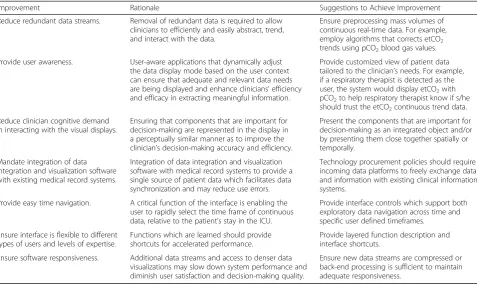
Table 5Practical Improvement Suggestions for Data Integration and Visualization Software
Improvement Rationale Suggestions to Achieve Improvement
Reduce redundant data streams. Removal of redundant data is required to allow clinicians to efficiently and easily abstract, trend, and interact with the data.
Ensure preprocessing mass volumes of continuous real-time data. For example, employ algorithms that corrects etCO2 trends using pCO2blood gas values.
Provide user awareness. User-aware applications that dynamically adjust the data display mode based on the user context can ensure that adequate and relevant data needs are being displayed and enhance clinicians’efficiency and efficacy in extracting meaningful information.
Provide customized view of patient data tailored to the clinician’s needs. For example, if a respiratory therapist is detected as the user, the system would display etCO2with pCO2to help respiratory therapist know if s/he should trust the etCO2continuous trend data.
Reduce clinician cognitive demand in interacting with the visual displays.
Ensuring that components that are important for decision-making are represented in the display in a perceptually similar manner as to improve the clinician’s decision-making accuracy and efficiency.
Present the components that are important for decision-making as an integrated object and/or by presenting them close together spatially or temporally.
Mandate integration of data integration and visualization software with existing medical record systems.
Integration of data integration and visualization software with medical record systems to provide a single source of patient data which facilitates data synchronization and may reduce use errors.
Technology procurement policies should require incoming data platforms to freely exchange data and information with existing clinical information systems.
Provide easy time navigation. A critical function of the interface is enabling the user to rapidly select the time frame of continuous data, relative to the patient’s stay in the ICU.
Provide interface controls which support both exploratory data navigation across time and specific user defined timeframes.
Ensure interface is flexible to different types of users and levels of expertise.
Functions which are learned should provide shortcuts for accelerated performance.
Provide layered function description and interface shortcuts.
Ensure software responsiveness. Additional data streams and access to denser data visualizations may slow down system performance and diminish user satisfaction and decision-making quality.
and validated scenarios; and, eventually, in-situ clinical simulations with appropriate metrics that replicate condi-tions for higher-level decision-making tasks [54, 55].
Conclusions
Data integration and visualization software offers new ways of perceiving and interpreting data. Time series vis-ual aids to represent continuous intensive care data were found to be satisfactory for single parameters but were less useful for multiparametric visualization and single point recall. Shading to highlight data overlaid on time series visualizations, as well as miniaturized time series (sparklines) with exaggerated extreme data values, were ignored. The multiparametric single indicator, which uses a visual aid to summarize the dynamic calculation of a 16-parameter algorithm, may support the dense use of data but should be tested further in the context of clinically relevant tasks. These findings highlight the importance and value of conducting usability testing to uncover potential ease of use and safety issues that can impact the acceptance of a data integration and visualization system. A recent review of 39 articles of physiologic data visualization found only one study on the usability of this type of software [56].
Our unique contributions to the study of interactive data integration systems is an understanding of how different clinical specialties interact with a commercial data integration and visualization technology. We also identified potential interface barriers to the use of such technology to each discipline-specific practice. The bar-riers include a difficulty with acquiring multiple param-eter data from data-dense visualizations and perceiving out-of-target data. Another barrier is the limited clinical context of continuous data due to the separate medical recording systems (EMR). While this study was based specifically on the T3™ system, findings from this study may be applied generally to other data integration and visualization platforms. Specifically, the practical improve-ment suggestions may be applied to other platforms. For instance, features such as reducing redundant data streams and clinician cognitive demand in interacting with the visual displays can be effective in allowing clinicians to efficiently and easily abstract, trend, and interact with data thus resulting in improved clinician’s decision-making ac-curacy and efficiency.
Many opportunities exist to uncover other contributory factors beyond usability issues (e.g., perceived usefulness, implementation and change management strategy, and training) that can influence adoption of data integration technologies into clinical practice. Future research direc-tions include the optimization of the software interface to improve data acquisition and interpretation; impact assessment of the optimized interfaces during realistic simulations; and, finally, naturalistic decision-making in
the ICU setting. Design solutions, iteratively implemented and focused on the software system, are expected to miti-gate use errors and promote the safe use of such novel software for intensive care. If tested in simulation, these solutions should be evaluated in a more realistic setting regarding environment and task load. Alternatively, solu-tions could be evaluated during use in the real ICU.
Intensive care clinicians must comprehensively integrate data from disparate technologies to closely monitor pa-tients. The availability of multimodal continuous data may improve patient outcomes but risks being simply ignored, or worse, inadvertently introducing new problems such as cognitive overload that could lead to sub-optimal decision-making [3, 57]. Data integration software that enables real-time computation and visualization of continuous monitoring data are in rapid development [30, 47, 58, 59]. However, research has shown that poorly designed technologies lead to unintended issues, including cognitive overload, mental fatigue, and device recalls [38, 57, 60–66]. Grinspan et al. suggest that the ideal system should “allow clinicians to abstract, trend, and interact with copious amounts of data through an intuitive user interface” [10]. Moving forward, ICUs and vendors should consider how staff usability testing can assist selecting or customizing data integration software for improved acceptance of new technologies into high-risk, technologically-intense settings.
Additional files
Additional file 1:List of usability tasks tested and representative questions posed to the participants. (DOCX 23 kb)
Additional file 2:Usability tasks tested with pass rates as percentage and fraction of total users. (DOCX 42 kb)
Abbreviations
AH:Abstraction hierarchy; DR: Physician intensivist; EMR: Electronic medical record; ICU: Intensive care unit; MMM: Multimodal monitoring; RN: Registered nurse; RT: Respiratory therapist; UCD: User-centered design; UER: Use error rating
Acknowledgments
We would like to thank the staff from the critical care department of the Hospital for Sick Children who consented to participate and publish study findings and the internal scientific reviewers, Drs. Alejandro Floh and Briseida Mema; Professor Anthony Easty and Professor Kim Vicente, doctoral thesis committee members; Professor Ana Almeida and Mark Fan from the HumanEra group at University Health Network; and Andrew Goodwin and Helena Frndova from the SickKids Critical Care Data Management team and Mike McManus, WillMoik, Derek Chawalit, Jim Boucher and Dimitar Baranov from Etiometry for providing technical support.
Funding