Jessica Shiaofahn Lin. “Commerce To Go”: How Are Mobile Versions of E-Commerce Homepages Different? A Master‟s Paper for the M.S. in I.S degree. December, 2010. 40 pages. Advisor: Bradley M. Hemminger
This paper will explore the differences in E-Commerce homepage sites for desktop and mobile displays by examining the fifteen (15) most popular mobile commerce sites, as reported by The Nielsen Co. User interface design, navigation, search and browse functionality, and content will all be factors for consideration in determining the content richness of the mobile commerce sites. Similarities will be drawn between the standard E-Commerce PC sites and the mobile commerce sites, as well as between the mobile commerce sites themselves.
Headings:
HCI
mobile web interactions
webpage design
user interfaces
graphical user interfaces
by
Jessica Shiaofahn Lin
A Master‟s paper submitted to the faculty of the School of Information and Library Science of the University of North Carolina at Chapel Hill
in partial fulfillment of the requirements for the degree of Master of Science in
InformationScience.
Chapel Hill, North Carolina December 2010
Approved by
Table of Contents
List of Figures and Tables 2
1. Introduction 3
2. Descriptive Survey of Mobile Commerce site interfaces 7
2.1. Homepage 12
2.1.1. Visual Elements 12
2.1.2. Layout 16
2.2. Navigation 18
2.2.1. Standard 19
2.2.2. Mobile 23
2.3. Search 25
2.3.1. Text Search & Visual Search 25
2.3.2. Faceted Search & Browse 28
2.3.3. Clustered Search 30
2.4. Content Analysis 31
2.4.1. Content Retained for Mobile 31
2.4.2. Content Not Included on Mobile 32
3. Summary and Conclusions 33
List of Figures and Tables
Figure 1. Technology Acceptance Model (TAM) 4
Figure 2. Main graphic banner: static (FTD.com) 13
Figure 3. Main graphic banner: rotating (ToysRUs.com) 13
Figure 4. Slider example (FTD.com) 14
Figure 5. Small internal advertisement (Amazon.com) 14
Figure 6. Store credit card advertisement (Macy‟s) 14
Figure 7. Mobile advertisement (Macy‟s) 15
Figure 8. Featured product on mobile site (Amazon.com) 15
Figure 9. Graphic deal buttons (Target) 15
Figure 10. J.C. Penney‟s mobile site 15
Figure 11. Mainly graphic standard PC sites (Macy‟s & J.C. Penney) 16
Figure 12. Product shots and CSS (Buy.com and Walmart) 17
Figure 13. Target‟s Menus (Top and Left Navigation) 22
Figure 14. Zappos.com Menus (Top, Left, and Right Navigation) 23
Figure 15. Visual Search Function (Overstock.com) 27
Figure 16. Visual Search Function (Overstock.com): Filter Results dialog box 28
Figure 17. Faceted Search on a standard PC site (Macy‟s) 29
Figure 18. Breadcrumbs (Walmart mobile) 30
Table 1. Top 15 M-Commerce Sites & Apps (by traffic) 6
1. Introduction
The increased use of Smartphones in recent years has spurred E-Commerce
businesses to recognize the potential of growth in the mobile web. Consumers can easily check the availability of a product, find a store‟s location and hours, and view special
deals from their mobile device. However, browsing can be difficult on some mobile
commerce (M-Commerce) websites, and not all M-Commerce websites give consumers
the option to purchase. Mobile commerce (M-Commerce) sites and applications already
number over 100, as measured by Internet Retailer research (Briggs, 2009). eBay, the top
visited mobile commerce site, garners 6,400 unique visitors monthly (Internet Retailer,
Trends & Data, 2010).
While many of the E-Commerce sites examined in this paper share common
marketing schemes on their standard PC sites, the execution of the mobile commerce
sites is approached in different ways, most likely due to the perceived usage of the
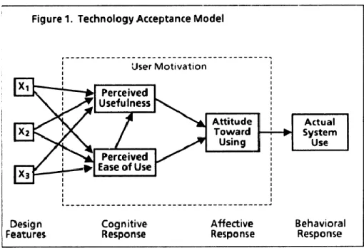
M-Commerce sites. Davis‟ technology acceptance model (TAM) proposes that a user‟s
actual behavior is an outcome of perceived usefulness combined with perceived ease of
Figure 1. Technology Acceptance Model (TAM) (Davis, 1986).
Wu & Wang (2005) found that perceived ease of use has no significant effect on
behavioral intention to use. A thorough examination of the top fifteen (15) mobile
commerce sites as reported by the Nielsen Co. (shown in Figure 2, as cited by Internet Retailer Trends & Data, 2010) proves Wu & Wang‟s finding to be correct, since navigation through some of these top sites is very cumbersome. General constraints of
developing for the mobile web are limited screen real estate, user interface (lack of
precise inputs, such as a mouse and keyboard), and network speeds. Developers and designers have to employ the “bare-bones” approach to create an effective mobile site
that contains only essential information, designed with simple graphics and backgrounds
to reduce processing speed.
Internet retailers carry different perceptions on how consumers will use their
M-Commerce site versus their standard PC site, which is the reason that so many
principles do exist among the sites surveyed. Most of the M-Commerce sites allow the consumer to save a “wishlist” on their site, even if they do not allow an actual purchase
transaction. Customers can use this same account to log-on to the standard PC site,
retrieve the saved wishlist, and make a purchase. Most of the M-Commerce sites also have a “store finder” function, with hours and contact information provided. Some of
these sites also provide maps and directions to the closest stores. The assumption here is that consumers “on the go” are looking for stores nearby, and not necessarily looking to
purchase. Almost all of the M-Commerce sites have browsing capability, which addresses the assumption that consumers “on the go” are curious to know whether a
nearby store carries a certain product.
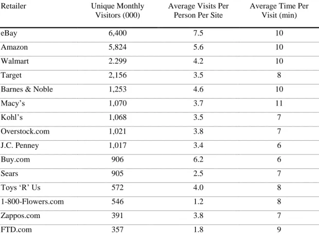
The top 15 M-Commerce sites & apps in traffic as reported by the Nielsen Co. are
listed in Table 1 below. This paper will survey similarities and differences between the
standard E-Commerce PC sites and the M-Commerce sites, as well as similarities and
differences among the M-Commerce sites, and try to draw conclusions about the choices
Table 1. Top 15 M-Commerce Sites & Apps (by traffic). The Nielsen Co., 2010
Retailer Unique Monthly
Visitors (000)
Average Visits Per Person Per Site
Average Time Per Visit (min)
eBay 6,400 7.5 10
Amazon 5,824 5.6 10
Walmart 2.299 4.2 10
Target 2,156 3.5 8
Barnes & Noble 1,253 4.6 10
Macy‟s 1,070 3.7 11
Kohl‟s 1,068 3.5 7
Overstock.com 1,021 3.8 7
J.C. Penney 1,017 3.4 6
Buy.com 906 6.2 6
Sears 905 2.5 7
Toys „R‟ Us 572 4.0 8
1-800-Flowers.com 546 1.2 8
Zappos.com 391 3.8 7
2. Descriptive Survey of Mobile Commerce site interfaces
Four main categories will be discussed in this section: homepage, navigation,
content analysis, and search & browse capabilities. The following tables (Tables 2–6)
compare elements of mobile commerce sites and the standard E-Commerce PC sites.
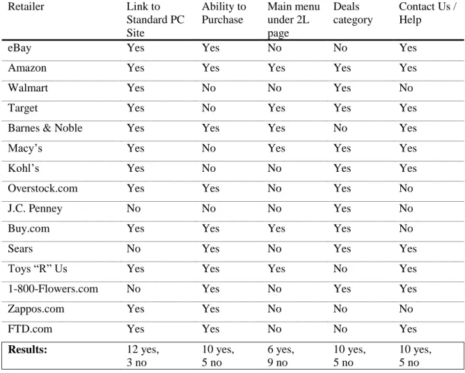
Table 2. Mobile Commerce Site Features: User Interface Design & Main Content
Retailer Link to
Standard PC Site Ability to Purchase Main menu under 2L page Deals category
Contact Us / Help
eBay Yes Yes No No Yes
Amazon Yes Yes Yes Yes Yes
Walmart Yes No No Yes No
Target Yes No Yes Yes Yes
Barnes & Noble Yes Yes Yes No Yes
Macy‟s Yes No Yes Yes Yes
Kohl‟s Yes No No Yes Yes
Overstock.com Yes Yes No Yes No
J.C. Penney No No No Yes No
Buy.com Yes Yes Yes Yes No
Sears No Yes No Yes Yes
Toys “R” Us Yes Yes Yes No Yes
1-800-Flowers.com No Yes No Yes Yes
Zappos.com Yes Yes No No No
FTD.com Yes Yes No No Yes
Results: 12 yes,
Table 3. Mobile Commerce Site Features: Search & Browse Retailer Advanced Search Faceted Search
/ Browse
Results displayed
Mobile Search Breadcrumbs
eBay Yes Yes 5, 10, 20 (all) No
Amazon No Yes 10 (top 50) No
Walmart No No 10 (all) Yes
Target No Yes 10 (all) No*
Barnes & Noble Yes Yes 10 (all) No
Macy‟s No Yes 12 (all)** Yes
Kohl‟s No Yes 13 (all) Yes
Overstock.com No Yes 25 (total
unknown)
No
J.C. Penney N/A No N/A N/A
Buy.com No Yes 20 (total
unknown)
No*
Sears Yes Yes 20 (all) Yes
Toys “R” Us No No 25 (all) No
1-800-Flowers.com N/A Yes N/A*** N/A
Zappos.com No No 100 (total
unknown)
No
FTD.com No Yes 5 (all) No
Results: 3 yes, 10 no,
2 N/A
11 yes, 4 no All: 9 Top 50: 1 Total Unknown: 3 N/A: 2
4 yes, 9 no, 2 N/A
*Target & Buy.com: Breadcrumbs are only applicable when browsing. Search results do not return breadcrumbs.
**Macy‟s: 12 results are returned after performing a product search, but results are not shown immediately. The user is prompted to filter the results.
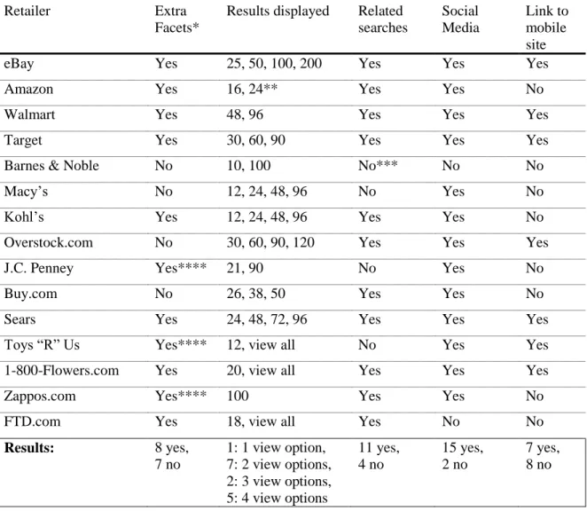
Table 4. Standard E-Commerce PC Site Features: Content, Search & Browse
Retailer Extra
Facets*
Results displayed Related searches Social Media Link to mobile site
eBay Yes 25, 50, 100, 200 Yes Yes Yes
Amazon Yes 16, 24** Yes Yes No
Walmart Yes 48, 96 Yes Yes Yes
Target Yes 30, 60, 90 Yes Yes Yes
Barnes & Noble No 10, 100 No*** No No
Macy‟s No 12, 24, 48, 96 No Yes No
Kohl‟s Yes 12, 24, 48, 96 Yes Yes No
Overstock.com No 30, 60, 90, 120 Yes Yes Yes
J.C. Penney Yes**** 21, 90 No Yes No
Buy.com No 26, 38, 50 Yes Yes No
Sears Yes 24, 48, 72, 96 Yes Yes Yes
Toys “R” Us Yes**** 12, view all No Yes Yes
1-800-Flowers.com Yes 20, view all Yes Yes Yes
Zappos.com Yes**** 100 Yes Yes No
FTD.com Yes 18, view all Yes No No
Results: 8 yes,
7 no
1: 1 view option, 7: 2 view options, 2: 3 view options, 5: 4 view options
11 yes, 4 no 15 yes, 2 no 7 yes, 8 no
*In relation to the mobile site counterpart.
**16 results are displayed after performing a search. An advanced search within a department returns 24 results.
***Related searches only appear when the user is initially searching as suggestions in “real-time.” Related searches are not present on the main results page.
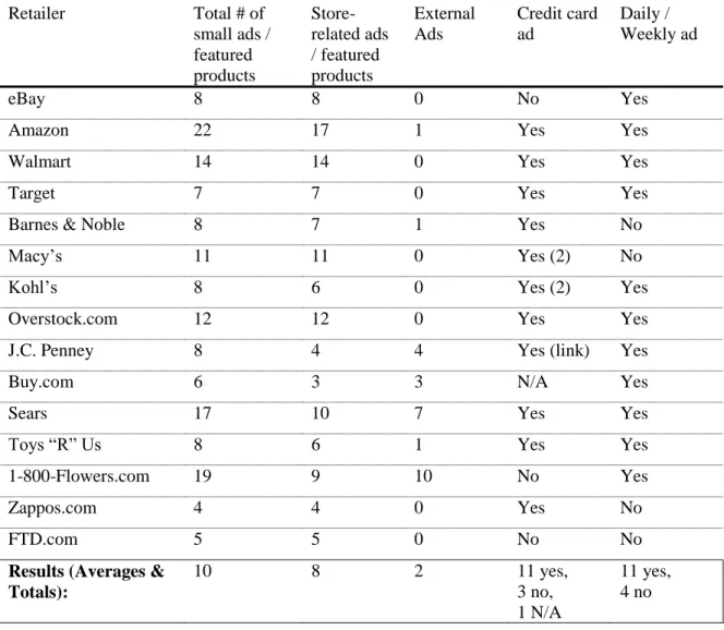
Table 5. Standard E-Commerce PC Site Features: Small Advertisements
Retailer Total # of
small ads / featured products Store-related ads / featured products External Ads Credit card ad Daily / Weekly ad
eBay 8 8 0 No Yes
Amazon 22 17 1 Yes Yes
Walmart 14 14 0 Yes Yes
Target 7 7 0 Yes Yes
Barnes & Noble 8 7 1 Yes No
Macy‟s 11 11 0 Yes (2) No
Kohl‟s 8 6 0 Yes (2) Yes
Overstock.com 12 12 0 Yes Yes
J.C. Penney 8 4 4 Yes (link) Yes
Buy.com 6 3 3 N/A Yes
Sears 17 10 7 Yes Yes
Toys “R” Us 8 6 1 Yes Yes
1-800-Flowers.com 19 9 10 No Yes
Zappos.com 4 4 0 Yes No
FTD.com 5 5 0 No No
Results (Averages & Totals):
10 8 2 11 yes,
3 no, 1 N/A
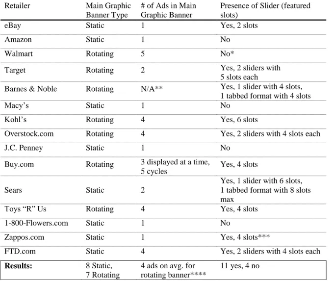
Table 6. Standard E-Commerce PC Site Features: Layout & Advertisements
Retailer Main Graphic
Banner Type
# of Ads in Main Graphic Banner
Presence of Slider (featured slots)
eBay Static 1 Yes, 2 slots
Amazon Static 1 No
Walmart Rotating 5 No*
Target Rotating 2 Yes, 2 sliders with
5 slots each
Barnes & Noble Rotating N/A** Yes, 1 slider with 4 slots, 1 tabbed format with 4 slots
Macy‟s Static 1 No
Kohl‟s Rotating 4 Yes, 6 slots
Overstock.com Rotating 4 Yes, 2 sliders with 4 slots each
J.C. Penney Static 1 No
Buy.com Rotating 3 displayed at a time,
5 cycles Yes, 4 slots
Sears Static 2
Yes, 1 slider with 6 slots, 1 tabbed format with 8 slots max
Toys “R” Us Rotating 4 Yes, 4 slots
1-800-Flowers.com Static 1 No
Zappos.com Static 1 Yes, 4 slots***
FTD.com Static 4 Yes, 2 sliders with 4 slots each
Results: 8 Static,
7 Rotating
4 ads on avg. for rotating banner****
11 yes, 4 no
*Walmart does not have a slider on its homepage, but it does have an extra section with 5 featured deals.
2.1 Homepage
The standard E-Commerce PC sites are very similar in layout and image usage.
Common elements include a main graphic banner, graphically advertised deals, and the
use of the top or left navigation menus to list out categories. Although the mobile sites
vary in other characteristics, these sites have also developed a standard layout format,
with vertical menus, solid background, and minimal use of images.
2.1.1 Homepage: Visual Elements
All of the fifteen sites surveyed use a main banner ad that is either static or
rotating (see Figures 2 and 3 for examples) to showcase a deal. The standard
E-Commerce PC sites are rich in content, so they rely heavily on graphic elements to draw the consumer‟s attention to the most important deals. A light colored or white
background is standard with bright accent colors, along with the deals and featured
products displayed in a graphical format. Ten (10) sites employ the use of a slider on
their homepage, which has the capability of showcasing multiple deals within a frame
(see Figure 4). These sliders usually feature four (4) deals and allow the user to click
arrows on each side to view more. On average, the standard E-Commerce PC site
homepages contain ten (10) small advertisements (including featured products). These
small advertisements/featured products are mostly internal, and some retailers choose to
display promos such as gift cards and free shipping in a graphical banner (see Figure 5).
Eleven (11) of these sites advertise a store credit card, usually including the card as an
Figure 2. Example of a static banner with button toggle to view the other 3 ads (FTD.com)
Fig 4. Example of a typical slider on the standard E-Commerce web sites (FTD.com)
Figure 5. Small internal advertisement, Figure 6. Store credit card
Amazon.com) advertisement, Macy’s
In contrast, the mobile commerce sites are kept fairly simple, with only the retailer‟s logo at the top (usually a clickable link that takes the consumer back to the
homepage), a solid color for the background, and the menu. Four sites (Macy‟s, Kohl‟s,
Overstock.com, Toys “R” Us, and 1-800-Flowers.com) have chosen to include one large
graphic advertisement on their mobile site (see Figure 7). Two sites (Amazon.com and
Buy.com) showcase a product deal (image and price, see Figure 8). Four sites (Target, Macy‟s, Overstock.com, FTD.com) also include 2 small graphic deal buttons on their
mobile site (see Figure 9). J.C. Penney‟s mobile site (http://jcp.mobi) features four (4)
menu items that are displayed graphically, rather than textually (see Figure 10). J.C. Penney‟s mobile site also has some other key differences from the other mobile sites that
Figure 7. Mobile Ad Figure 8. Featured Product
2.1.2 Layout
As mentioned previously, the standard E-Commerce PC sites are heavy in graphics. Macy‟s and J.C. Penney create the appearance of mainly graphic websites by
using banner advertisements to showcase deals, promotions, and featured products, while
also keeping their content simple (see Figure 11). This approach allows the designers to
really carry the brand through with custom graphics. The designers are unrestricted by
web fonts and do not have to pay custom font licensing fees for services like typekit
(http://www.typekit.com).
Figure 11. Mainly graphic websites: Macy’s & J.C. Penney
Another popular, simpler method for showcasing featured deals is by using
product shots and CSS to create text styles. The retailers employing this method (for
example, Buy.com and Walmart) usually have multi-column layouts underneath their
text is live and searchable, as opposed to static images that need to be tagged in the code
to create similar text search functions. The deals are most likely easier to be switched out,
since they do not require heavy graphic treatment.
On the other hand, the M-Commerce site layouts are fairly similar, with the
exception of J.C. Penney. The screen of a mobile device does not really allow for much
room for layout experimentation, and since this field is fairly new, it explains the
adherence to a set template that users are familiar and comfortable with (like with
websites created in the early phases of the Internet Age).
The M-Commerce site layouts are vertical, with the logo on top as a header, and
menu items listed underneath (See Figures 7–10). Most of the sites also include footers
that contain additional contact information and/or terms & conditions. Some sites, as
mentioned previously, choose to include a few graphic elements, such as a large banner
ad, or graphic buttons. Since large images decrease processing speed, these elements are
low in quantity (usually less than 3 if present at all, with the exception of J.C. Penney).
2.2 Navigation
Navigation and menu placement are very similar among the standard
E-Commerce PC sites as well as among the M-E-Commerce sites. By following a standard for
formatting E-Commerce and M-Commerce sites, the retailers contribute to establishing
credibility to the consumer through the notions of perceived ease of use and perceived usefulness as defined in Davis‟ TAM model. Users become familiar with shopping portal
2.2.1 Navigation: Standard E-Commerce PC Sites
Navigation in standard E-Commerce PC sites is very important, since the sites are
content rich, and information can be easily overlooked if the page is not organized in an
intuitive manner. Hence, the top 15 retailers have chosen to use a combination of top
navigation bars and side navigation bars to better aid the user. The following table (Table
7) compares the elements of navigation in standard E-Commerce PC sites.
Top navigation menus are highly utilized in the standard sites to regulate content.
On average, the number of top navigation menus totals four (4). The “My Account”
navigation bar is present on all of the sites, and is usually positioned as the top-most
navigation bar. All of the E-Commerce sites surveyed display their product categories on
the homepage. A slight majority of eight (8) sites use a top navigation bar to display their
product categories, with the average number of nine (9) categories for breadth.
The left navigation menu is not as common as originally thought, numbering only
four (4) out of fifteen (15) sites. However, using a left navigation menu to display
product categories allows for greater flexibility in terms of quantity, since the average
number of product categories equals seventeen (17). To compensate for lack of space on the top navigation menus, some sites such as eBay and Toys “R” Us choose to display
their product categories in a category labeled “Category”, which contains a drop-down
list of their numerous offerings. Since all of these sites use a main graphic banner, a left
navigation menu might get lost next to the graphic busyness of the main content.
Although the majority of the sites prefer to use a top navigation menu to display
out of the eight (8) sites that use the top navigation menu also utilize the left hand
navigation menu for “extras” such as specials (1-800-Flowers.com and FTD.com), “Top 20 Hot Searches” (Toys “R” Us), and favorite categories (eBay).
Target and Zappos.com both utilize more than one navigation menu to list product
categories. Target chooses to use both a left navigation menu, which lists the most
popular categories (Video Games, Women, Baby, Electronics, Weekly Ad), in
conjunction with the top navigation menu, which lists all of the categories (See Figure
13). Zappos.com is very content heavy and utilizes the top menu, left hand menu, and
right hand menu to list out all of its categories and sub-categories (See Figure 14). The
main categories are listed in the top navigation menu, with a drop-down menu for “all departments.” The left hand menu lists sub-categories of shoes, specialty shoes, specialty
clothing, and specialty sites. The right hand menu lists sub-categories of clothing, casual
Table 7. Navigation elements: Standard E-Commerce PC Sites
Retailer Number
of top navigation menus
Main category menu type Left navigation menu purpose
eBay 3 Top navigation menu (5) Ads, favorite categories
Amazon 3 Left navigation menu (13) Departments
Walmart 3 Left navigation menu (13) Departments
Target 3 Left (5) & Top (15) Popular Departments
Barnes & Noble 3 Top navigation menu (12) N/A
Macy‟s 4 Top navigation menu (11) N/A
Kohl‟s 5 Top navigation menu
(9, 8)*
N/A
Overstock.com 3 Left navigation menu (21) Departments, Visual Search
J.C. Penney 5 Top navigation menu (11) N/A
Buy.com 5 Left navigation menu (25) Departments
Sears 8 Left navigation menu (22) Departments
Toys “R” Us 4 Top navigation menu (7)** Top 20 Hot Searches
1-800-Flowers.com 3 Top navigation menu (9) Specials
Zappos.com 4 Top (11), Left (28),
Right (29)
Sub-categories
FTD.com 4 Top navigation menu (7) Flowers by tomorrow
Results: 4 Top: 8, Left: 4, Top & Left:
1, Top, Left, & Right: 1
5 out of 8 with top navigation as main menu use the left menu for extras
*Kohl‟s uses a tiered top navigation menu with two levels to list their department categories. Altogether, the department categories total 17, with 9 categories on top and 8 categories on bottom.
Figure 14. Zappos.com uses the top navigation menu, left navigation, and right navigation menu to list out all of its product offerings
2.2.2 Navigation: M-Commerce Sites
All of the retailers display their logo on their M-Commerce sites, and all but three
page. Amazon.com and Overstock.com employ an iconographic “home” button on their
2L and 3L pages, while Buy.com has a home button located at the very bottom of a menu
displayed under the product results on the 2L page. Sears.com, 1-800-Flowers.com, and
FTD.com take no chances and use the clickable logo in conjunction with a text link to
navigate back to the home screen.
Six (6) of the sites surveyed chose to include the main menu under the content of
the 2L and 3L pages presumably to aid the consumer in navigation. This method,
although slightly cumbersome (since it forces prolonged scrolling) is effective, since the
consumer does not have to keep on hitting the back button to return to the main screen to
select a different category. The majority of the sites (9) do not provide this extra feature
(See Table 2).
Most of the mobile sites have all of their categories listed on their main menu, so
the user does not usually end up drilling down into sub menus. However, both Target and
FTD.com employ the drill-down method. It is not surprising that most of these sites do
not use the drill-down method, because it is very cumbersome and time consuming to
step through many items, especially if tapping on a Next Page button or similar is
required. Generally, it would probably be more effective to use categories to drill down
2.3 Search
Searching is arguably the most essential element on any E-Commerce site (See
Table 3 for comparable elements). While the standard E-Commerce PC sites all have the
option of advanced search, an overwhelming majority of their mobile counterparts (10)
do not employ this function. Only three (3) sites have advanced search capability: eBay,
Barnes & Noble, and Sears. The limitations of mobile devices, including small screens,
user interface constraints (such as the lack of a convenient point device and keyboard
entry), and network speeds seem to factor into the absence of advanced search on the
majority of the M-Commerce sites. Two (2) sites, J.C. Penney and 1-800-Flowers.com do
not even have search functionality on their mobile sites. A number of reasons could
explain the reasoning behind exclusion of search: cost/resources, network speeds, a
preference to present the consumer with pre-selected products.
2.3.1 Text Search & Visual Search
The standard E-Commerce PC sites and M-Commerce sites, with the exceptions
of J.C. Penney mobile and 1-800-Flowers.com mobile all use text based searching. One
interesting finding is that Overstock.com also has a visual search option (See Figures 15
& 16 below), which allows the consumer to filter results by clicking on a picture (and displays objects similar to the item clicked) or through the “filter results” dialog box
(presented as a button in the top menu). It is in the beta stage, but an interesting solution
subcategories. The visual search provides an engaging way to shop online. It‟s refreshing
compared to faceted lists of metadata, instead almost mimicking the way that a consumer would shop at a retailer‟s physical location.
As the consumer “drills down” during a search, the items are saved in the left
navigation menu. These items can be removed from the list. The items can also be
promoted, which gives the characteristics of the selected product more importance when
aggregating similar results. Once the consumer has navigated to the details page of an
item in the left navigation menu, the previously clicked items are lost when the “back”
Figure 16. Visual Search function at Overstock.com: “Filter Results” pop-up dialog box, accessed from top menu
2.3.2 Faceted Search & Browse
In his book, Faceted Search, Daniel Tunkelang (2009, p. 23) defines faceted navigation as a function that “allows the user to elaborate a query progressively, seeing
the effect of each choice in one facet on the available choices in other facets”. Although
most of the M-Commerce sites surveyed do not have advanced search capability, ten (10)
of the sites do provide faceted search capability (usually executed through a drop down
menu). Only three (3) sites, Walmart, Toys “R” Us, and Zappos.com, which do not offer
advanced search, also do not have faceted searching capability. Faceted searching is
important in this regard, so that the consumer can filter results in a more efficient manner.
The product search results on the M-Commerce site for Zappos.com are displayed with
mobile site for 1-800-Flowers.com does not even offer a simple search capability, but
allows the consumer to conduct faceted browsing.
In contrast, all of the standard E-Commerce PC sites offer faceted searching with
their advanced search capability. Faceted searching is even more effective on a computer
screen than on a mobile screen. The layout can accommodate a left hand navigation menu
and also a top navigation menu to display more facets, which aid in refining the search
(see Figure 17).
Figure 17. Faceted search on a standard E-Commerce PC site (Macy’s)
Two (2) of the M-Commerce sites have tried to make searching and browsing
easier by displaying breadcrumbs (Walmart and Sears, see Figure 18 below). Walmart‟s
Buy.com do not offer the breadcrumb navigation element in their faceted search, these
sites do include breadcrumbs in faceted browsing mode. Breadcrumbs are an important
navigational aid, particularly on a mobile device, when the consumer does not necessarily
have a way to back out without needing to start over from the home page.
Figure 18. Breadcrumbs (Walmart mobile)
2.3.3 Clustered Search
Clustered search returns results that are grouped together according to relevance.
The Clusty search engine, (now search.yippy.com) dynamically clusters the search
results, then displays the clusters in the left-hand navigation menu, and allows users to
drill down by selecting subclusters to explore (Iskold, 2007). None of the mobile sites
surveyed use clustered search. Since online retailers already know all of the possible
search results, dynamic clustering is unnecessary, making faceted search/browse a more
2.4 Content Analysis
Mobile devices generally have significantly less screen space than desktop
systems. As a result, retailers must make difficult decisions regarding which content to
present on the mobile display. What material and functionality to retain, and even
whether to take a completely different approach for the user interface. Examining the
choices retailers make in deciding what content to make available on the mobile web,
which information is most pertinent to their consumers in the context of mobile use, can
be very revealing of retailers expectations and assumptions. Are consumers going to the
mobile site to purchase products or merely to browse? Do consumers want to find the
nearest store location so that they can purchase the product in person? Will the mobile
site offer search functionality in conjunction with the store locator function, so that the
consumer will be able to see if a product is located in a store nearby? Does the consumer
need the same level of customer support that is provided on the standard site? Should
only the most popular products be displayed, or should full product results be displayed?
Is access to the standard PC site provided?
2.4.1 Content Retained for Mobile
All but three (3) of the mobile sites surveyed provide a link back to the standard
E-Commerce PC site, whereas a little less than half (7) provide a link to the mobile site
from the standard site (See Figure 3). For mobile users, this is a good sign, since it is
often the case that extra information (such as customer support) has not been developed
for the mobile site. It is not absolutely necessary for the standard sites to have a link to
on a mobile device. However, the link would serve as a handy promotional tool for the
internet retailer to increase consumer awareness of their mobile presence.
A majority of the M-Commerce sites (10) contain a “deals” category. This
category might operate on the assumption that the user might visit a physical store based
on the deals displayed on their mobile device. J.C. Penney‟s mobile site operates
exclusively on deals, making it a radical departure from the other mobile sites, which choose to showcase everything. In fact, J.C. Penney‟s mobile site only contains 2 out of 9
categories listed on their standard site: Women‟s Apparel and Men‟s Apparel, which
contain 4 subcategories each.
All of the other mobile sites, with the exception of J.C. Penney, contain a majority
of the categories listed on their standard sites. While it is probable that many of these
retailers do not include their entire product catalog on their mobile sites, the mobile sites
still offer abundant product selections. For the most part, the consumer can still search
and browse the product catalog as he/she would on the standard PC site (see Section
2.3.2). Account and wishlist information is standard (wishlist in lieu of purchasing on
sites that do not offer purchasing functionality). Other common elements include store
locator functionality, a simple help center, and terms of use.
2.4.2 Content Not Included on Mobile
Advanced search on mobile devices was a big function that was not usually
carried over from the standard site to the mobile site. The option to display results
differently from a product search was also discarded (such as in a grid, or number
included categories such as top rated, best selling, related searches, recommended
products, recalls, special categories (such as the Halloween Shop for Kohl‟s), careers,
e-mail alert sign up, weekly ad (that is run in the newspaper but displayed in digital format
on many standard sites), wedding registries, store credit card, and returns.
Social media links to twitter and facebook, as well as the capability to email a
product page to a friend, are common in the standard sites. Community forums have a
strong presence on some standard PC sites, such as Overstock.com, Zappos.com, and
Amazon.com, but are not available on their mobile counterparts.
The standard E-Commerce PC sites also include a Spanish help section, which is
not typically seen on the mobile sites. Some of the mobile sites have not fully developed
their help section, opting to link the consumer back to the full HTML site. The help
sections on the mobile sites are often specific to mobile site use, rather than the general
help sections (i.e. returns, tracking) that are found on the standard PC sites.
Overstock.com has chosen not to develop four (4) of its major sections on their
mobile site: Community, Cars, Real Estate, and Auctions. This retailer probably assumes
that the consumer is more likely to visit the mobile site to shop for products.
3. Summary & Conclusions
A number of commonalities were identified across the mobile websites, such as
the ability to purchase, store locator functionality, faceted search and browse, the absence
of social media and community forums, and the relative ease of navigation among the
from the mobile website. The retailers that disable purchasing provide the option of
creating a wishlist. The consumer must create an account to save items in the wishlist,
which can be accessed later from the standard PC site, and subsequently purchased. It can
be assumed that the retailers that choose not to enable purchasing might view the
consumer‟s intentions for visiting their mobile site as browsing, finding deals, or locating
a store. The retailers might also be concerned with financial security settings on the
mobile web. As with other features, such as advanced search, these retailers might not
have the resources to include purchasing functionality on their mobile web sites.
J.C. Penney‟s elimination of a majority of its categories on their mobile web
could be based on popular clicks from their standard PC site. J.C. Penney also seems to
lean towards an “act now” approach, since their mobile site focuses on deals. The other
retailers have erred on the safe side and taken the approach of including a large selection
of their product catalog. Zappos.com is a perfect example: after performing a search,
many pages are returned, with each page containing 100 results.
The store locator functionality, which is included on most of the M-Commerce
sites, assumes that it is essential for a consumer “on the go” to find the nearest location.
Most M-Commerce sites also offer search functionality, which allows the consumer to
check product availability before heading to the store.
Faceted search & browse is used on all of the standard sites, although it is not
employed on all of the mobile sites. This capability effectively cuts down on product
search & browse time. Breadcrumbs are not generally used on the mobile sites when
performing a faceted search or browse, but provide an effective way for the consumer to
Social media functionality and community forums are discarded across the board.
Integrating social media functionality probably takes up too much processing speed,
while community forums contain too much text. Although mobile keypads have
improved greatly, it is generally not expected that a mobile user would want to type out a
lengthy review or participate in a discussion on a mobile device.
The mobile websites were fairly easy to navigate since their content was stripped
down significantly. In contrast, their standard PC site counterparts, while organized in a
visually intuitive manner, were overflowing content-wise with menus, categories,
subcategories, and advertisements.
Mobile commerce is on the rise, and although these sites share some similar
patterns, they are not all on the same wavelength in regards to their target audience. It is
surprising that while the standard E-Commerce PC sites have conformed to a standard
user interface, their mobile counterparts have a fair number of differences. Perhaps the
content specifically chosen for the mobile application was decided based on page hits of
Citations
Briggs, B. (2009, September 2). Mobile milestone: number of M-Commerce sites
and apps tops 100. Internet Retailer. Retrieved from
http://www.internetretailer.com/2009/09/02/mobile-milestone-number-of-
M-Commerce-sites-and-apps-tops-100
Brohan, M. (2010, January 6). Mobile consumers flock to top M-Commerce sites
and apps, Nielsen says. Internet Retailer. Retrieved from
http://www.internetretailer.com/2010/01/06/mobile-consumers-flock-to-top-
M-Commerce-sites-and-apps-nielsen
Davis, F.D. (1986). A Technology Acceptance Model for Empirically Testing New
End-User Information Systems: Theory and Results (Doctoral dissertation).
Massachusetts Institute of Technology, Boston, MA.
Internet Retailer, Trends & Data. (2010). E-Retailers: Top 15 M-Commerce Sites & Apps (By Traffic). Retrieved from http://www.internetretailer.com/trends/e-retailers/ Iskold, A. (2007, January 5). Overview of Clustering and Clusty Search Engine.
ReadWriteWeb. Retrieved from
http://www.readwriteweb.com/archives/overview_of_clu.php
http://www.morganclaypool.com/doi/abs/10.2200/S00190ED1V01Y200904ICR0
05 doi: 10.2200/S00190ED1V01Y200904ICR005
Wu, J.H. and Wang, S.C. (2005) What Drives Mobile Commerce? An empirical
evaluation of the revised technology acceptance model. Information & Management, 42(5), 719-729.
List of Websites
1-800-Flowers.com. Retrieved from http://ww11.1800flowers.com,
http://app.digby.com/shops/web/flowers (2010 August 20).
Amazon.com. Retrieved from http://www.amazon.com,
http://www.amazon.com/gp/aw/h.html (2010 August 20).
Barnes and Noble. Retrieved from http://www.barnesandnoble.com,
http://www.barnesandnoble.com/mobile/index.asp (2010 August 20).
Buy.com. Retrieved from http://www.buy.com, http://mobile.buy.com/iBuy
(2010 August 20).
eBay. Retrieved from http://www.ebay.com (2010 August 20).
FTD.com. Retrieved from http://www.zappos.com, http://mobile.ftd.com
(2010 August 20).
J.C. Penney. Retrieved from http://www.jcpenney.com, http://jcp.mobi/
(2010 August 20).
Kohl‟s. Retrieved from http://www.kohls.com (2010 August 20).
Macy‟s. Retrieved from http://www.macys.com, http://mobile2.macys.com
Overstock.com. Retrieved from http://www.overstock.com (2010 August 20).
Sears. Retrieved from http://www.sears.com, http://m.sears.com/sears_Home.jsp
(2010 August 20).
Target. Retrieved from http://www.target.com,
http://sites.target.com/site/en/spot/mobile.jsp (2010 August 20). Toys “R” Us. Retrieved from http://www.toysrus.com,
http://toysrus.digby.com/shops/web/toysrus (2010 August 20).
Walmart. Retrieved from http://www.walmart.com, http://mobile.walmart.com
(2010 August 20).
Zappos.com. Retrieved from http://www.zappos.com, http://m.zappos.com