COVID-19 Results Briefing: Hawaii
December 4, 2020
This document contains summary information on the latest projections from the IHME model on COVID-19 in Hawaii. The model was run on December 03, 2020.
Current situation
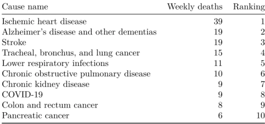
• Daily deaths in the last week increased to 0 per day on average compared to 0 the week before (Figure 2). This makes COVID-19 the number 8 cause of death in Hawaii this week (Table 1).
• Effective R, computed using cases, hospitalizations, and deaths, is greater than 1 in 43 states (Figure 3). The Effective R in Hawaii on November 19 was 1.
• We estimated that 3% of people in Hawaii have been infected as of November 30 (Figure 4).
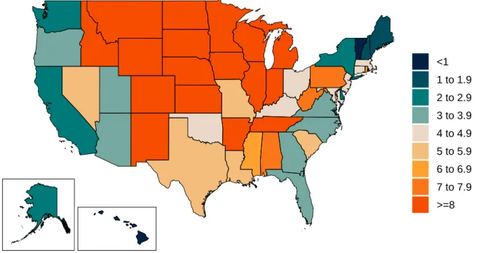
• The daily death rate is greater than 4 per million in Alabama, Arkansas, Colorado, Connecticut, Idaho, Illinois, Indiana, Iowa, Kansas, Kentucky, Louisiana, Maryland, Massachusetts, Michigan, Minnesota, Mississippi, Missouri, Montana, Nebraska, Nevada, New Jersey, New Mexico, North Dakota, Ohio, Oklahoma, Pennsylvania, Rhode Island, South Carolina, South Dakota, Tennessee, Texas, West Virginia, Wisconsin, and Wyoming (Figure 6).
Trends in drivers of transmission
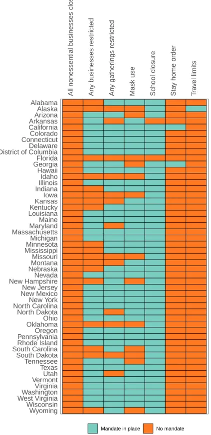
• In the last week, new mandates have been imposed in North Dakota. Mandates have been lifted in California (Table 2).
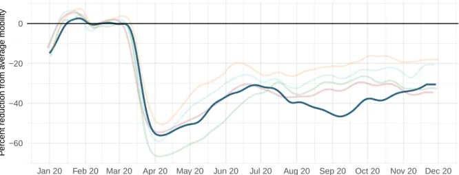
• Mobility last week was 31% lower than the pre-COVID-19 baseline (Figure 8). Mobility was near baseline (within 10%) in Alabama, Mississippi, South Dakota, and Wyoming. Mobility was lower than 30% of baseline in California, Colorado, Hawaii, Illinois, Maryland, Massachusetts, Michigan, Minnesota, New Jersey, New York, Oregon, the District of Columbia, Utah, Vermont, and Washington.
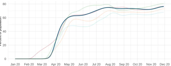
• As of November 30 we estimated that 76% of people always wore a mask when leaving their home (Figure 9) compared to 76% last week. Mask use was lower than 50% in South Dakota, and Wyoming.
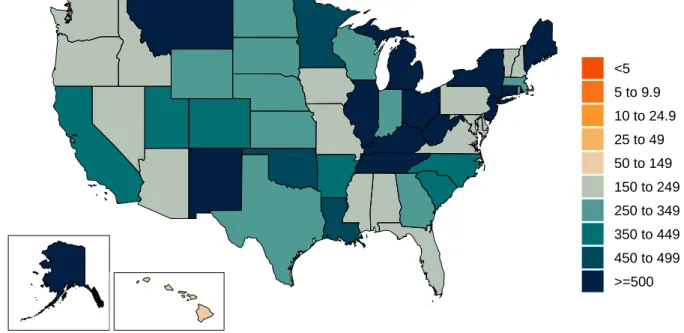
• There were 131 diagnostic tests per 100,000 people on November 30 (Figure 10).
Projections
• In our reference scenario, which represents what we think is most likely to happen, our model projects 1,000 cumulative deaths on April 1, 2021. This represents 1,000 additional deaths from November 30 to April 1st (Figure 14). Daily deaths will peak at 10 on February 17, 2021 (Figure 15).
• The reference scenario assumes that 43 states will re-impose mandates by April 1, 2021.
• If universal mask coverage (95%) were attained in the next week, our model projects 0 fewer cumulative deaths compared to the reference scenario on April 1, 2021.
• Under our mandates easing scenario, our model projects 1,000 cumulative deaths on April 1, 2021.
• By April 1 2021, we project that 40 lives will be saved by the projected vaccine rollout. If rapid rollout of vaccine is achieved, 90 lives will be saved. Rapid rollout targeting high-risk individuals only could save, compared to the “no vaccine” scenario, 90 lives. • Figure 21 compares our reference scenario forecasts to other publicly archived models.
Forecasts are widely divergent.
• 46 states will have high or extreme stress on hospital beds at some point in December through February (Figure 22). 48 states will have high or extreme stress on ICU capacity in December through February (Figure 23).
Model updates
This week’s model update includes the expected impact of vaccination scale-up and alternative vaccination scenarios. To allow the transmission model to incorporate
vaccinations, we added two features to the SEIIR transmission model formulation. First, because it is unclear if any potential vaccine will prevent transmission or only reduce the probability of disease, we allowed the option for some vaccinated individuals to still be infected (and become infectious to others). These individuals are tracked through their infection, and the impact of the vaccine is only calculated when estimating the probability that their infection resulted in death. As the vaccine may result in the prevention of infection, we added a second pathway where susceptible individuals may become removed from the transmission process. It is important to note that in the absence of more detailed information on pre-screening for vaccine distribution, we assume individuals who have been previously infected with COVID-19 are as likely to receive the vaccine as susceptible individuals. The modeling framework allows us to specify the number of vaccinations, their effectiveness at preventing death, and their effectiveness at preventing infections. The parameterization of these numbers is described below.
The second feature we added to the model was to split out high-risk individuals (e.g., individuals with a higher infection-fatality rate such as those over the age of 65 or with comorbidities) and track them explicitly through the SEIIR process with their own set of pathways. By doing this, we can easily accommodate targeted vaccination campaigns that preferentially focus early vaccine distribution on this group. There is no differential mixing or alteration of infectiousness within this group versus the rest of a location’s population, but rather the creation of these new groups feeds into the calculation of future deaths by using a group-specific infection-fatality rate. This addition doubles the number of
compartments in the SEIIR model as we now simultaneously track individuals who are unvaccinated, vaccinated and unprotected from disease, vaccinated and protected from disease, and vaccinated and protected from infection, in both the high-risk and low-risk
This framework was used to add expected vaccination to the mandates easing scenario, reference scenario and universal mask scenario. The pace of vaccine scale-up and how it was calculated for each country is described below. In addition, we developed a scenario where vaccine maximum capacity was doubled and the speed of vaccine scale-up was twice as fast. In addition, we developed a scenario where fast vaccine delivery was targeted exclusively to high-risk individuals. Finally, to help quantify the marginal impact of
vaccination, we included an alternative no vaccine scenario that has the same assumptions as the reference scenario such as the reimposition of mandates with the daily death rate exceeds 8 per million.
The scale-up of COVID-19 vaccine by location was estimated using data specific to each candidate vaccine on: (i) Manufacturer capacity by quarter through the end of 2021
(Linksbridge, https://pharmanews.linksbridge.com/Covid-19); (ii) Secured doses by country or purchasing group, e.g., COVAX; (iii) Current vaccine candidate development status (discovery, Phase I-III, limited use; Linksbridge); (iv) Probability of success by vaccine candidate development status (https://www.ncbi.nlm.nih.gov/pmc/articles/PMC6139376/); and (v) Self-reported rates of vaccine hesitancy from surveys conducted by Facebook (https://covidsurvey.mit.edu/). We assumed efficacy of 95% for the Pfizer/BioNTech and Moderna mRNA vaccines (https://www.pfizer.com/news/press-release/press-release-detail/pfizer-and-biontech-conclude-phase-3-study-covid-19-vaccine;
https://investors.modernatx.com/news-releases/news-release-details/moderna-announces-primary-efficacy-analysis-phase-3-cove-study); 70% for the AstraZeneca/Oxford vaccine ( https://www.astrazeneca.com/media-centre/press-releases/2020/azd1222hlr.html); 90% for other mRNA vaccines; and 75% for all other vaccines (assumed). Among individuals who are effectively vaccinated, in the absence of any data from the trials on efficacy blocking transmission, we assumed 50% of them are protected from infection and the remaining 50% are protected from death due to severe disease if infected. We assumed the Pfizer/BioNTech vaccine would be available for use on December 15, 2020; the Moderna vaccine on
December 22, 2020; and the AstraZeneca/Oxford vaccine on January 7, 2021. Availability dates for other vaccines were based on development status (Discovery, 12 months; Phase I, 9 months; Phase II, 6 months; and Phase III, available February 1, 2021). These data were combined to estimate the number of effective doses available by location and time.
For our reference scenario, we assumed, based on the number of annual seasonal flu vaccinations in the USA of 180 million, with most doses delivered over three months, that the maximum number of vaccines delivered per day is 3 million, and assumed a scale-up period to this maximum rate of 90 days using an exponential growth function. For the fast scale-up scenario, the maximum number of vaccines, delivery was assumed to be 6 million per day with a scale-up period of 45 days. We estimated the maximum delivery rate per day for other locations by linearly scaling the delivery rate for the United States, using the Healthcare Access and Quality (HAQ) Index (http://ghdx.healthdata.org/record/ihme-data/gbd-2016-healthcare-access-and-quality-index-1990-2016). We assumed vaccine wastage was 10% and the dropout rate between the first and second doses was 10%. Vaccine doses were distributed between the two priority populations of essential workers and adults aged 65 years and over, proportional to size. Doses were delivered to these two populations first, before doses were administered to the general adult population aged 18 to 64 years. We defined the essential worker population as the proportion of people who left their homes for work at the period of time with the lowest mobility during the pandemic, using data from surveys from Facebook.
Hawaii CURRENT SITUATION
Current situation
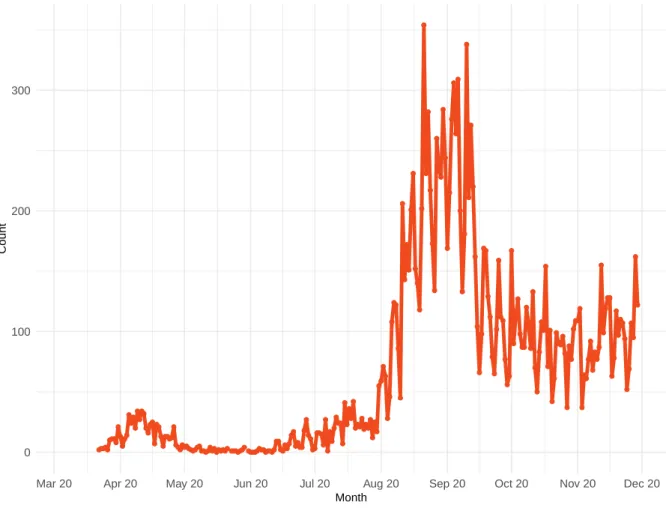
Figure 1. Reported daily COVID-19 cases
0 100 200 300
Mar 20 Apr 20 May 20 Jun 20 Jul 20 Aug 20 Sep 20 Oct 20 Nov 20 Dec 20 Month
Count
Hawaii CURRENT SITUATION
Table 1. Ranking of COVID-19 among the leading causes of mortality this week, assuming uniform deaths of non-COVID causes throughout the year
Cause name Weekly deaths Ranking
Ischemic heart disease 39 1
Alzheimer’s disease and other dementias 19 2
Stroke 19 3
Tracheal, bronchus, and lung cancer 15 4
Lower respiratory infections 11 5
Chronic obstructive pulmonary disease 10 6
Chronic kidney disease 9 7
COVID-19 9 8
Colon and rectum cancer 8 9
Pancreatic cancer 6 10
Figure 2a. Reported daily COVID-19 deaths
0 2 5 8
Mar 20 Apr 20 May 20 Jun 20 Jul 20 Aug 20 Sep 20 Oct 20 Nov 20 Dec 20
Hawaii CURRENT SITUATION
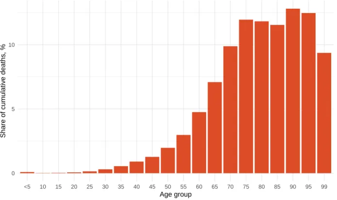
Figure 2b. Estimated cumulative deaths by age group
0 5 10
<5 10 15 20 25 30 35 40 45 50 55 60 65 70 75 80 85 90 95 99 Age group
Share of cum
ulativ
e deaths
, %
Figure 3. Mean effective R on November 19, 2020. The estimate of effective R is based on the combined analysis of deaths, case reporting, and hospitalizations where available. Current reported cases reflect infections 11-13 days prior, so estimates of effective R can only be made for the recent past. Effective R less than 1 means that transmission should decline, all other things being held the same.
<0.85 0.85−0.88 0.89−0.91 0.92−0.95 0.96−0.99 1−1.03 1.04−1.07 1.08−1.1 1.11−1.14 >=1.15
Hawaii CURRENT SITUATION
Figure 4. Estimated percent of the population infected with COVID-19 on November 30, 2020
<5 5−9.9 10−14.9 15−19.9 20−24.9 >=25
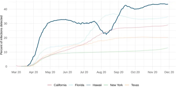
Figure 5. Percent of COVID-19 infections detected. This is estimated as the ratio of reported daily COVID-19 cases to estimated daily COVID-19 infections based on the SEIR disease transmission model.
0 10 20 30 40
Mar 20 Apr 20 May 20 Jun 20 Jul 20 Aug 20 Sep 20 Oct 20 Nov 20 Dec 20
P
ercent of inf
ections detected
Hawaii CURRENT SITUATION
Figure 6. Daily COVID-19 death rate per 1 million on November 30, 2020
<1 1 to 1.9 2 to 2.9 3 to 3.9 4 to 4.9 5 to 5.9 6 to 6.9 7 to 7.9 >=8
Hawaii CRITICAL DRIVERS
Critical drivers
Table 2. Current mandate implementation
All nonessential b
usinesses closed An y b usinesses restr icted An y gather ings restr icted
Mask use School closure Sta
y home order
T ra v el limits Wyoming Wisconsin
West VirginiaWashington
Virginia
VermontUtah
Texas Tennessee South Dakota
South CarolinaRhode Island
PennsylvaniaOregon
OklahomaOhio
North Dakota
North CarolinaNew York
New MexicoNew Jersey
New HampshireNevada
NebraskaMontana Missouri MississippiMinnesota Michigan MassachusettsMaryland Maine LouisianaKentucky KansasIowa IndianaIllinois Idaho Hawaii GeorgiaFlorida
District of ColumbiaDelaware
ConnecticutColorado
California
ArkansasArizona
Alaska Alabama
Hawaii CRITICAL DRIVERS
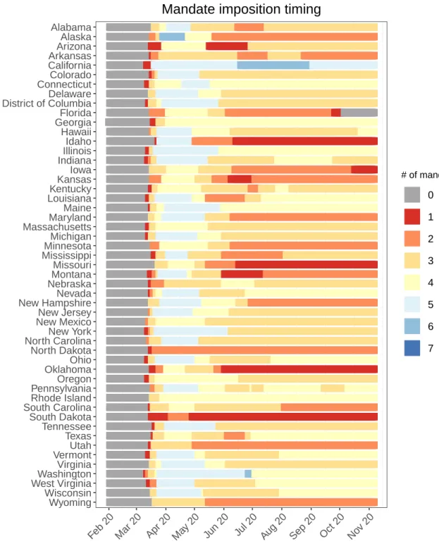
Figure 7. Total number of social distancing mandates (including mask use)
Wyoming Wisconsin West VirginiaWashington Virginia VermontUtah Texas Tennessee South Dakota South CarolinaRhode Island PennsylvaniaOregon OklahomaOhio North Dakota North CarolinaNew York New MexicoNew Jersey New HampshireNevada NebraskaMontana Missouri MississippiMinnesota Michigan MassachusettsMaryland Maine LouisianaKentucky KansasIowa IndianaIllinois Idaho Hawaii GeorgiaFlorida District of ColumbiaDelaware ConnecticutColorado California ArkansasArizona Alaska Alabama
Feb 20 Mar 20 Apr 20 May 20 Jun 20 Jul 20 Aug 20 Sep 20 Oct 20 Nov 20
# of mandates
0 1 2 3 4 5 6 7
Hawaii CRITICAL DRIVERS
Figure 8a. Trend in mobility as measured through smartphone app use compared to January 2020 baseline
−60 −40 −20 0
Jan 20 Feb 20 Mar 20 Apr 20 May 20 Jun 20 Jul 20 Aug 20 Sep 20 Oct 20 Nov 20 Dec 20
P
ercent reduction from a
v
er
age mobility
California Florida Hawaii New York Texas
Figure 8b. Mobility level as measured through smartphone app use compared to January 2020 baseline (percent) on November 30, 2020
=<−50 −49 to −45 −44 to −40 −39 to −35 −34 to −30 −29 to −25 −24 to −20 −19 to −15 −14 to −10 >−10
Hawaii CRITICAL DRIVERS
Figure 9a. Trend in the proportion of the population reporting always wearing a mask when leaving home
0 20 40 60 80
Jan 20 Feb 20 Mar 20 Apr 20 May 20 Jun 20 Jul 20 Aug 20 Sep 20 Oct 20 Nov 20 Dec 20
P
ercent of population
California Florida Hawaii New York Texas
Figure 9b. Proportion of the population reporting always wearing a mask when leaving home on November 30, 2020
<30% 30 to 34% 35 to 39% 40 to 44% 45 to 49% 50 to 54% 55 to 59% 60 to 64% 65 to 69% >=70%
Hawaii CRITICAL DRIVERS
Figure 10a. Trend in COVID-19 diagnostic tests per 100,000 people
0 200 400 600 800
Jan 20 Feb 20 Mar 20 Apr 20 May 20 Jun 20 Jul 20 Aug 20 Sep 20 Oct 20 Nov 20 Dec 20
T
est per 100,000 population
California Florida Hawaii New York Texas
Figure 10b. COVID-19 diagnostic tests per 100,000 people on November 22, 2020
<5 5 to 9.9 10 to 24.9 25 to 49 50 to 149 150 to 249 250 to 349 350 to 449 450 to 499 >=500
Hawaii CRITICAL DRIVERS
Figure 11. Increase in the risk of death due to pneumonia on February 1 2020 compared to August 1 2020
<−80% −80 to −61% −60 to −41% −40 to −21% −20 to −1% 0 to 19% 20 to 39% 40 to 59% 60 to 79% >=80%
Hawaii CRITICAL DRIVERS
Figure 12. This figure shows the estimated proportion of the adult (18+) population that is open to receiving a COVID-19 vaccine based on Facebook survey responses
<50% 50−59% 60−69% 70−74% 75−79% 80−84% >85%
Figure 13. The number of people who receive any vaccine and those that are immune accounting for efficacy, loss to follow up for 2 dose vaccines, and a 28 day delay between first dose and immunity for 2 dose vaccines.
0 200,000 400,000 600,000 800,000
0 20 40 60
Dec 20 Jan 21 Feb 21 Mar 21 Apr 21
P
eople
P
ercent of adult population
Reference rollout Rapid rollout
Hawaii PROJECTIONS AND SCENARIOS
Projections and scenarios
We produce six scenarios when projecting COVID-19. The reference scenario is our forecast of what we think is most likely to happen. We assume that if the daily mortality rate from COVID-19 reaches 8 per million, social distancing (SD) mandates will be re-imposed. The mandate easing scenario is what would happen if governments continue to ease social distancing mandates with no re-imposition. The universal mask mandate scenario is what would happen if mask use increased immediately to 95% and social distancing mandates were re-imposed at 8 deaths per million. These three scenarios assume our reference vaccine delivery scale up where vaccine delivery will scale to full capacity over 90 days.
The rapid vaccine rollout scenario assumes that vaccine distribution will scale up to full delivery capacity in half the time as the reference delivery scenario and that the maximum doses that can be delivered per day is twice as much as the reference delivery scenario. The rapid vaccine rollout to high-risk populations scenario is the same but high-risk populations are vaccinated before essential workers or other adults. The no vaccine scenario is the same as our reference scenario but with no vaccine use.
Hawaii PROJECTIONS AND SCENARIOS
Figure 14. Cumulative COVID-19 deaths until April 01, 2021 for six scenarios
0 250 500 750 1,000
0 20 40 60
Oct 20 Nov 20 Dec 20 Jan 21 Feb 21 Mar 21 Apr 21
Cum
ulativ
e deaths
Cum
ulativ
e deaths per 100,000
Reference scenario Universal mask use
Continued SD mandate easing
Rapid rollout
Rapid rollout to high−risk No vaccine
Hawaii PROJECTIONS AND SCENARIOS
Figure 15. Daily COVID-19 deaths until April 01, 2021 for six scenarios
0 3 6 9
0.0 0.2 0.4 0.6
Feb 20 Apr 20 Jun 20 Aug 20 Oct 20 Dec 20 Feb 21 Apr 21
Daily deaths
Daily deaths per 100,000
Reference scenario Universal mask use
Continued SD mandate easing
Rapid rollout
Rapid rollout to high−risk No vaccine
Hawaii PROJECTIONS AND SCENARIOS
Figure 16. Daily COVID-19 infections until April 01, 2021 for six scenarios
0 500 1,000 1,500 0 30 60 90 120
Feb 20 Apr 20 Jun 20 Aug 20 Oct 20 Dec 20 Feb 21 Apr 21
Daily inf
ections
Daily inf
ections per 100,000
Reference scenario Universal mask use
Continued SD mandate easing
Rapid rollout
Rapid rollout to high−risk No vaccine
Figure 17. Susceptible population, accounting for infections and people immune through vaccination
0 500,000 1,000,000 1,500,000 0 25 50 75 100
Oct 20 Nov 20 Dec 20 Jan 21 Feb 21 Mar 21 Apr 21
P
eople susceptib
le Percent susceptib
le
Reference scenario Universal mask use
Continued SD mandate easing
Rapid rollout
Rapid rollout to high−risk No vaccine
Hawaii PROJECTIONS AND SCENARIOS
Figure 18. Month of assumed mandate re-implementation. (Month when daily death rate passes 8 per million, when reference scenario model assumes mandates will be re-imposed.)
December 2020 January 2021 February 2021 March 2021 No mandates before April 1 2021
Hawaii PROJECTIONS AND SCENARIOS
Figure 19. Forecasted percent infected with COVID-19 on April 01, 2021
<5 5−9.9 10−14.9 15−19.9 20−24.9 25−29.9 30−34.9 35−39.9 40−44.9 >=45
Figure 20. Daily COVID-19 deaths per million forecasted on April 01, 2021 in the reference scenario
<1 1 to 1.9 2 to 2.9 3 to 3.9 4 to 4.9 5 to 5.9 6 to 6.9 7 to 7.9 >=8
Hawaii PROJECTIONS AND SCENARIOS
Figure 21. Comparison of reference model projections with other COVID modeling groups. For this comparison, we are including projections of daily COVID-19 deaths from other modeling groups when available: Delphi from the Massachussets Institute of Technology (Delphi; https://www.covidanalytics.io/home), Imperial College London (Imperial;https://www.covidsim.org), The Los Alamos National Laboratory (LANL;
https://covid-19.bsvgateway.org/), and the SI-KJalpha model from the University of Southern California (SIKJalpha;https://github.com/scc-usc/ReCOVER-COVID-19). Daily deaths from other modeling groups are smoothed to remove inconsistencies with rounding. Regional values are aggregates from availble locations in that region.
0 2 4 6
Dec 20 Jan 21 Feb 21 Mar 21 Apr 21
Date
Daily deaths
Models IHME Delphi LANL SIKJalpha
Hawaii PROJECTIONS AND SCENARIOS
Figure 22. The estimated inpatient hospital usage is shown over time. The percent of hospital beds occupied by COVID-19 patients is color coded based on observed quantiles of the maximum proportion of beds occupied by COVID-19 patients. Less than 5% is consideredlow stress, 5-9% is consideredmoderate stress, 10-19% is consideredhigh stress, and greater than 20% is consideredextreme stress.
Wyoming Wisconsin West Virginia Washington, DC Washington Virginia Vermont Utah Texas Tennessee South Dakota South Carolina Rhode Island Pennsylvania Oregon Oklahoma Ohio North Dakota North Carolina New York New Mexico New Jersey New Hampshire Nevada Nebraska Montana Missouri Mississippi Minnesota Michigan Massachusetts Maryland Maine Louisiana Kentucky Kansas Iowa Indiana Illinois Idaho Hawaii Georgia Florida Delaware Connecticut Colorado California Arkansas Arizona Alaska Alabama
Apr 20 Jun 20 Aug 20 Oct 20 Dec 20 Feb 21 Apr 21
Stress level Low Moderate High Extreme
Hawaii PROJECTIONS AND SCENARIOS
Figure 23. The estimated intensive care unit (ICU) usage is shown over time. The percent of ICU beds occupied by COVID-19 patients is color coded based on observed quantiles of the maximum proportion of ICU beds occupied by COVID-19 patients. Less than 10% is consideredlow stress, 10-29% is considered
moderate stress, 30-59% is consideredhigh stress, and greater than 60% is considered extreme stress.
Wyoming Wisconsin West Virginia Washington, DC Washington Virginia Vermont Utah Texas Tennessee South Dakota South Carolina Rhode Island Pennsylvania Oregon Oklahoma Ohio North Dakota North Carolina New York New Mexico New Jersey New Hampshire Nevada Nebraska Montana Missouri Mississippi Minnesota Michigan Massachusetts Maryland Maine Louisiana Kentucky Kansas Iowa Indiana Illinois Idaho Hawaii Georgia Florida Delaware Connecticut Colorado California Arkansas Arizona Alaska Alabama Stress level Low Moderate High Extreme
Hawaii PROJECTIONS AND SCENARIOS
Table 3. Ranking of COVID-19 among the leading causes of mortality in the full year 2020. Deaths from COVID-19 are projections of cumulative deaths on Jan 1, 2021 from the reference scenario. Deaths from other causes are from the Global Burden of Disease study 2019 (rounded to the nearest 100).
Cause name Annual deaths Ranking
Ischemic heart disease 2,000 1
Alzheimer’s disease and other dementias 1,000 2
Stroke 1,000 3
Tracheal, bronchus, and lung cancer 800 4
Lower respiratory infections 600 5
Chronic obstructive pulmonary disease 500 6
Chronic kidney disease 500 7
Colon and rectum cancer 400 8
COVID-19 300 9
Hawaii MORE INFORMATION
More information
Data sources:Mask use data sources include PREMISE; Facebook Global symptom survey (This research is based on survey results from University of Maryland Social Data Science Center) and the Facebook United States symptom survey (in collaboration with Carnegie Mellon University); Kaiser Family Foundation; YouGov COVID-19 Behaviour Tracker survey.
Vaccine hesitancy data are from the COVID-19 Beliefs, Behaviors, and Norms Study, a survey conducted on Facebook by the Massachusetts Institute of Technology (https://covidsurvey.mit.edu/).
Data on vaccine candidates, stages of development, manufacturing capacity, and pre-purchasing agreements are primarily from Linksbridge and supplemented by Duke University.
A note of thanks:
We wish to warmly acknowledge the support of theseand others who have made our covid-19 estimation efforts possible.
More information:
For all COVID-19 resources at IHME, visithttp://www.healthdata.org/covid.