DRIVERS OF LIVE DISCHARGE FROM THE MEDICARE HOSPICE PROGRAM: A MIXED METHODS STUDY
Rachel B. Dolin
A dissertation submitted to the faculty at the University of North Carolina at Chapel Hill in partial fulfillment of the requirements for the degree of Doctor of Philosophy in the Department
of Health Policy and Management in the Gillings School of Global Public Health.
Chapel Hill 2017 Approved by: Pam Silberman Mark Holmes Laura C. Hanson Sally Stearns Donald H. Taylor, Jr.
© 2017 Rachel B. Dolin ALL RIGHTS RESERVED
ABSTRACT
Rachel B. Dolin: Drivers of Live Discharge from the Medicare Hospice Program: A Mixed Methods Study
(Under the direction of Pam Silberman)
The proportion of Medicare decedents accessing the hospice benefit at the end of life increased by more than 30 percentage points between 2000 and 2013. Yet the share of patients disenrolling from hospice prior to death has steadily increased over the last decade, representing nearly a fifth of all hospice discharges in 2012. Due to variations in the rate of live discharge at the hospice- and market-level, this outcome has come under scrutiny from policymakers,
providers, and advocates as a potential indicator of poor quality. Such variations in live discharge rates and their documented association with hospice characteristics suggest that factors beyond patient choice may be driving these trends.
The overall objective of this dissertation study was to better understand the factors driving live discharge from hospice. To explore this area of inquiry, I conducted three studies: 1) A qualitative study exploring provider perceptions of the factors driving live discharge from hospices (chapter 2), 2) a quantitative facility-level study analyzing the relationship between hospice margins and live discharge rates (chapter 3), and 3) an empirical work delving into the relationship between the timing of live discharges relative to the hospice aggregate cap (and each hospice’s respective risk of exceeding the cap at different points in the year) and the likelihood of an individual patient’s experiencing a live discharge (chapter 4).
Overall, the results from these three studies together paint a complicated picture in which live discharges stem from not one primary driver but the confluence of many factors, arrayed in
a variety of ways, to produce each individual patient-level outcome. Although these three studies provide evidence for “gaming” in the hospice delivery system, such trends do not suggest that higher live discharge rates are automatically reflective of poor quality — and vice versa. The Centers for Medicare & Medicaid Services ought to, thus, exercise caution before proceeding with a live discharge claims-based quality indicator. More generally, the totality of this work suggests that the Medicare hospice program has serious issues that must be resolved through payment system reform, increased oversight, benefit redesign, or some combination thereof.
To my grandparents, Inez and Saul Dolin, Irma and Eli Etscovitz, whose experiences with hospice inspired me to pursue research on end-of-life care.
ACKNOWLEDGMENTS
Completion of my doctoral training would not have been possible without my vast personal and professional support network of family, friends, colleagues, and mentors. Specifically, I would like to thank my dissertation committee for their continued wisdom, thoughtfulness, and support: Pam Silberman (chair and co-advisor), JD, DrPH; Mark Holmes (co-advisor), PhD; Laura C. Hanson, MD, MPH; Sally Stearns, PhD; and Donald H. Taylor, Jr., PhD, MPA. I would also like to thank Denise Kirk, MS, for her tireless assistance with Medicare claims management, and my colleagues at L&M Policy Research for their professional support throughout this process. I would additionally like to thank Morris Weinberger, PhD, for his mentorship throughout my time in UNC’s doctoral program, and Laura Pinheiro for her friendship and inspiring work ethic. Finally, I would like to thank my parents, Diane and Scott Dolin; my brother, Adam Dolin; and my partner, Thomas Eager, for their unconditional love and support.
This material is based upon work supported by the National Science Foundation Graduate Research Fellowship Program under Grant No. DGE-1144081.
TABLE OF CONTENTS
LIST OF TABLES ... x
LIST OF FIGURES ... xi
PROLOGUE ... 1
CHAPTER ONE: BACKGROUND ... 5
OVERVIEW OF THE MEDICARE HOSPICE PROGRAM ... 5
Hospice benefit design ... 5
Criticism and responses ... 8
PATTERNS OF HOSPICE USE AND CARE DELIVERY ... 9
Patient-level trends ... 10
Provider-level trends ... 11
Notable patterns of use: Length of stay ... 14
HOSPICE PAYMENT SYSTEM ... 16
Misaligned incentives and the potential for reform? ... 23
DISENROLLMENT FROM HOSPICE ... 24
Current state of the literature ... 28
Gaps in the literature ... 38
RATIONALE ... 39
CHAPTER TWO: AIM 1 STUDY ... 41
Participants ... 43
Interviews ... 44
Analysis ... 45
STUDY RESULTS ... 46
Difficulty with prognostication ... 48
Increased CMS oversight ... 50
Rising market competition and hospice business practices ... 52
Challenges with inpatient contracting ... 55
Solutions ... 55
DISCUSSION ... 57
Limitations ... 60
CONCLUSION ... 61
CHAPTER THREE: AIM 2 STUDY ... 62
STUDY DATA AND METHODS ... 64
Conceptual model ... 64 Data ... 65 Key variables ... 67 Analysis ... 68 STUDY RESULTS ... 69 DISCUSSION ... 74 Limitations ... 77 CONCLUSION ... 79
CHAPTER FOUR: AIM 3 STUDY ... 81
STUDY DATA AND METHODS ... 84
Data ... 84 Key variables ... 85 Analysis ... 86 STUDY RESULTS ... 87 DISCUSSION ... 93 Limitations ... 96 CONCLUSION ... 97
CHAPTER FIVE: IMPLICATIONS ... 99
WHAT FACTORS DRIVE LIVE DISCHARGE FROM HOSPICE? ... 99
LIVE DISCHARGE RATES: A QUALITY INDICATOR? ... 101
HOSPICE PAYMENT SYSTEM: TIME FOR WIDESPREAD REFORMS? ... 102
THE MEDICARE HOSPICE PROGRAM IN THE CONTEXT OF THE LARGER DELIVERY SYSTEM ... 103
APPENDIX 1: CONCEPTUAL MODEL ... 105
APPENDIX 2: AIM 2 STUDY COST REPORT FISCAL YEAR ASSIGNMENT ... 106
APPENDIX 3: AIM 2 STUDY SENSITIVITY ANALYSES ... 107
APPENDIX 4: AIM 2 STUDY MARGIN EQUATIONS ... 111
APPENDIX 5: AIM 2 STUDY ANALYTIC APPROACH ... 112
APPENDIX 6: AIM 3 STUDY SENSITIVITY ANALYSES ... 114
LIST OF TABLES
TABLE 1. CATEGORIES OF HOSPICE CARE ... 17
TABLE 2. RESPONDENT CHARACTERISTICS1 ... 47
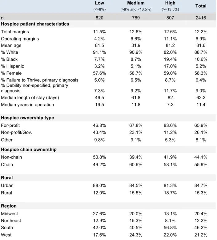
TABLE 3. DESCRIPTIVE STATISTICS, 2012-13, DISTRIBUTION OF HOSPICE CHARACTERISTICS BY DISCHARGE GROUP TERTILE ... 70
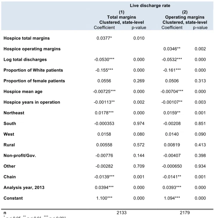
TABLE 4. MULTIVARIATE ANALYSIS OF LIVE DISCHARGE, BY HOSPICE CHARACTERISTICS, 2012 AND 2013 ... 73
TABLE 5. DESCRIPTIVE STATISTICS, 2012-13, DISTRIBUTION OF HOSPICE CHARACTERISTICS BY PATIENT MONTHLY DISCHARGE STATUS CODE ... 88
TABLE 6. MARGINAL EFFECTS ON CAP RISK, MULTINOMIAL LOGIT MODEL ... 93
TABLE 7. OVERVIEW OF THREE STUDY OBJECTIVES AND RESULTS ... 99
TABLE 8. SENSITIVITY ANALYSES, TOTAL MARGINS ... 107
TABLE 9. SENSITIVITY ANALYSES, OPERATING MARGINS ... 109
TABLE 10. SENSITIVITY ANALYSIS, MARGINAL EFFECTS ON MEAN LENGTH OF STAY, MULTINOMIAL LOGIT MODEL WITH THREE-OUTCOME DISCHARGE STATUS VARIABLE ... 115
TABLE 11. MARGINAL EFFECTS ON MEDIAN LENGTH OF STAY, MULTINOMIAL LOGIT MODEL WITH FOUR-OUTCOME DISCHARGE STATUS VARIABLE ... 116
TABLE 12. SENSITIVITY ANALYSIS, MARGINAL EFFECTS ON MEAN LENGTH OF STAY, MULTINOMIAL LOGIT MODEL WITH FOUR-OUTCOME DISCHARGE STATUS VARIABLE ... 116
LIST OF FIGURES
FIGURE 1. REASONS FOR PATIENT- AND PROVIDER-INITIATED LIVE DISENROLLMENT ... 26
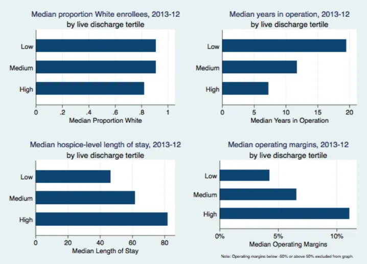
FIGURE 2. SELECT DESCRIPTIVE CHARACTERISTICS BY DISCHARGE TERTILE, 2012-13 ... 72
FIGURE 3. ENROLLEE DEATHS AND LIVE DISCHARGES, BY MONTH ... 90
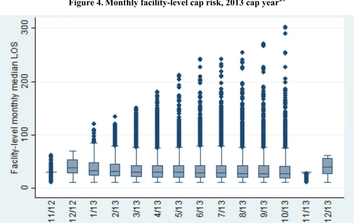
FIGURE 4. MONTHLY FACILITY-LEVEL CAP RISK, 2013 CAP YEAR ... 92
FIGURE 5. CONCEPTUAL MODEL ... 105
FIGURE 6. FISCAL YEAR ASSIGNMENT, 2012 AND 2013 COST REPORT DATA ... 106
FIGURE 7. FISCAL YEAR ASSIGNMENT, 2011 AND 2012 COST REPORT DATA24 ... 106
PROLOGUE
“We can do much more to relieve suffering, respect personal dignity, and provide opportunities for people to find meaning in life’s conclusion.”
— Institute of Medicine, Committee on Care at the End of Life, 1997
When the U.S. Congress passed the Affordable Care Act (ACA) in 2010, the 2,000-plus page bill excluded proposed legislation policymakers had introduced in 2009 to reimburse physicians for the time they spent counseling Medicare patients on end-of-life (EOL) care options
(Zeytinoglu 2011). The nationwide debate over the suggested change in Medicare reimbursement — the so-called “death panels” — and the ultimate decision to omit this reimbursement change from the final bill capped off a decade of significant change in EOL care delivery, marked by notable expansion in the volume of hospice and palliative care providers on the one hand and misperceptions regarding the value of such services on the other.
That decade of change began in 1997 when the Institute of Medicine (IOM) issued a landmark report on the EOL care delivery system, entitled Approaching Death: Improving Care at the End of Life (1997). The IOM Committee on Care at the End of Life catalogued the
insufficiencies of the national, regional, and local services and supports available to individuals nearing the end of life and provided suggestions for improvement (1997). “We can do much more to relieve suffering, respect personal dignity, and provide opportunities for people to find meaning in life’s conclusion,” the report said (1997).
Approaching Death heralded in an era of change: Between 2000 and 2012, Medicare hospice spending increased by more than 400 percent — from $2.9 billion in 2000 to $15.1
billion in 2012 — and the number of hospice providers increased by 65 percent during that time (MedPAC March 2015). The rate of enrollment also kept pace with the boom in spending and provider availability: In 2013, 1.3 million Medicare beneficiaries received hospice services — a far cry from the 197,400 patients who had enrolled in services in 1992, 10 years after Congress had passed the Tax Equity and Fiscal Responsibility Act of 1982 (TEFRA) to create the
Medicare hospice program for terminally ill patients (Bernstein, Hing et al. 2003, MedPAC March 2015).
Despite the increasing availability and visibility of hospice providers and palliative care programs, there is consensus that the U.S. health care system is still ill-equipped to provide the necessary services and supports to individuals nearing the end of life and, furthermore, that the payment mechanisms currently in place do not appropriately reflect the complexity of patient social, emotional, psychological, and physical needs at the end of life. At the same time that the public conversation about EOL care turned into an acrimonious debate about death panels, the Medicare Payment Advisory Commission (MedPAC) released a report encouraging significant reforms to the Medicare hospice payment system, which the commission believed encouraged inappropriate profit-maximization behavior among some providers (MedPAC March 2009). In fact, a CMS Proposed Rule published in the Federal Register in May 2015 expressed these concerns in no uncertain terms: “We are concerned that some hospices are making
determinations of hospice coverage based solely on cost and reimbursement as opposed to being based on patient-centered needs, preferences and goals for those approaching the end of life,” (CMS May 2015). Although the Medicare payment system has experienced a wave of reform since the passage of the ACA, it still largely resembles the per-diem hospice payment system the U.S. Congress put in place through TEFRA in 1983.
Concerns regarding the Medicare hospice program are reflective of larger issues in the EOL care delivery system: The need for services at the end of life has grown and, yet, the payment mechanisms to facilitate such services are either non-existent or products of an era that catered primarily to cancer patients. In the fall of 2014, the IOM released another report
discussing the insufficiencies of a care delivery system oriented toward acute, curative
treatments rather than palliative, comfort treatments. “At present, the U.S. health care system is ill designed to meet the needs of patients near the end of life and their families,” the IOM’s Committee on Approaching Death said in its report, Dying in America: Improving Quality and Honoring Individual Preferences Near the End of Life (2014).
Although the Medicare hospice program is not the only mechanism for the delivery of palliative treatments for individuals with terminal illness, it is by far the most institutionalized, making it ripe for initial research and reform. Analyses that enhance our understanding of inappropriate or inadequate patterns of hospice use — inconsistent with patient preferences — may highlight priority areas for change that could ultimately ensure higher quality care is provided at the end of life. Accordingly, through a thorough literature review (Chapter 1) and a series of three related studies (Chapters 2, 3, and 4), this dissertation explores an outcome that, in some instances, may signal poor quality care: live discharge from hospice (also referred to as “live disenrollment” throughout this report). We define a “live discharge” as instances when a patient enrolls in hospice and then disenrolls — for various patient- or provider-initiated reasons — prior to death. Such patterns of hospice use are important to understand and explore in further depth because they may reflect larger issues in the EOL delivery system: fragmented care, potential lack of adherence to patient preferences at the end of life, and misaligned financial incentives. More nuanced understanding of issues such as these may provide additional evidence
for payment and delivery system reform, which, in turn, may begin to turn around a system in dire need of the type of change the IOM encouraged nearly two decades ago.
CHAPTER ONE: BACKGROUND Review of the literature Overview of the Medicare hospice program
Twenty years before Congress passed TEFRA, solidifying hospice as a staple of the Medicare program, Florence Wald, Dean of the Yale School of Nursing, invited Cicely Saunders to deliver a series of lectures cataloguing her innovative hospice work in the United Kingdom (Connor 2008). Saunders’s visit marked the beginning of the modern hospice movement, leading to the establishment of the United States’ first hospice in Branford, Connecticut, in 1973 (Connor 2008). The early U.S. hospice movement of the 1970s emphasized home-based alternative care for terminally ill patients, delivered by a large number of volunteers — both lay and professional (Kelley and Meier 2014) (Connor 2008). National stakeholder meetings in the mid- to late 1970s cemented hospice’s presence in the health care delivery system, manifesting in the 1978
establishment of the National Hospice Organization (which became the National Hospice and Palliative Care Organization in 1999) and paving the way for the development of a formal benefit package and payment mechanism under the Medicare program (Connor 2008). Hospice benefit design
As conceived in 1982, the Medicare hospice program continues to provide palliative and support services for terminally ill individuals expected to live six months or fewer, as certified by two physicians (Aldridge Carlson, Barry et al. 2012, MedPAC October 2014). Eighty-four
encompassing 87.9 percent of patient days that year (NHPCO 2012). The program requires beneficiaries to opt out of traditional services covered under Medicare, though they may still receive support for conditions unrelated to the terminal condition2 (Plotzke, Christian et al. May 2014, CMS May 2015, MedPAC October 2014). Once the patient enrolls in the program, the Medicare Hospice Benefit (MHB) covers two 90-day periods followed by unlimited 60-day stints; the hospice medical director must certify the patient’s terminal condition at the end of each benefit period (Kutner, Meyer et al. 2004, MedPAC March 2015). Although these time-limited restrictions do not result in an automatic discharge once hospice patients exceed the six-month limit, they must continue to show persistent decline to continue to receive the MHB (LeSage, Borgert et al. 2014). Alternatively, enrollees have the option of revoking the benefit at any point in time to seek curative treatment therapies (Johnson, Kuchibhatla et al. 2008,
MedPAC March 2015).
Patients can receive hospice care in a range of service locations: their home, an assisted living facility, a nursing home, an inpatient hospital, an inpatient hospice facility, or other locations (Bogasky, Sheingold et al. 2014). As has been the case since the beginning of the Medicare hospice program, the largest proportion of Medicare beneficiaries receive care in their own homes; however, other settings of care have increased in popularity — particularly nursing homes, following the 1989 Omnibus Reconciliation Act, which reduced restrictions associated with receiving hospice care while in a nursing home (Stevenson and Bramson 2009). According to an analysis Bogasky, Sheingold et al. (2014) conducted using hospice claims from 2008 to
1Other payers covering hospice use that year included: managed care or private insurance (7.7 percent), Medicaid
(5.2 percent), uncompensated care (1.3 percent), self-pay (1.1 percent), and other (0.7 percent).
2In Fiscal Year (FY) 2013, Medicare paid $694.1 million for Part A and Part B services and $347.1 million for Part
D for patients receiving hospice care. In a recent Department of Health and Human Services Office of Inspector General report, it was found that some of these Part D claims should have been paid for by the hospices.
2011, 55 percent of all users received care at home during that time, followed by nursing homes (27 percent), inpatient hospices (16 percent), inpatient hospitals (11 percent), assisted living facilities (eight percent), and other sites (two percent) (Stevenson, Huskamp et al. 2007).3
Upon admission to hospice, patients receive a plan of care — outlining the range and frequency of services to be provided — from a multidisciplinary team of providers, which must include a hospice nurse, social worker, and counselor (MedPAC March 2015). The MHB covers a range of services, including but not limited to: nursing care, physician services, home health and homemaker services, short-term hospice inpatient care, physical therapy, occupational therapy, speech therapy,4 drugs (for symptom control), medical equipment, and family
bereavement services (MedPAC March 2015, MedPAC October 2014). And such services can be provided from a number of staff members participating in the hospice multidisciplinary care teams, including: physicians, nurses, social workers, therapists, spiritual counselors, home health aides, bereavement counselors, and volunteers (NHPCO 2012).
Out-of-pockets costs are minimal under the program, as hospices can only charge up to five percent coinsurance for drugs delivered outside inpatient settings (though the coinsurance cannot exceed $5 per drug) (MedPAC October 2014). In 2012, daily average coinsurance across total hospice days was $1.51 (Plotzke, Christian et al. May 2014). Beneficiaries enrolled in inpatient respite care are responsible for paying five percent of Medicare’s daily rate, although annual payments are capped at the Part A inpatient hospital deductible amount for the enrollment year ($1,216 in 2014) (MedPAC October 2014).
3Typically, hospice agencies contract with nursing homes, assisted living facilities, and other institutional care
providers to deliver palliative care related to the patient’s terminal illness; all other services (e.g., room/board and long-term services in a nursing home) are provided by the institutional setting.
4Physical, occupational, and speech therapists assist patients with pain relief by working with clients on issues
Criticism and responses
Although the MHB has remained consistent since the program began providing services in 1983, its design has come under criticism in recent years — particularly as beneficiaries continue to enroll in greater numbers. As early as 1997, the IOM noted that the restrictions associated with hospice eligibility may exclude “many [people] who might benefit from hospice services” (1997). Of specific concern is the six-month prognostic criterion, which some consider to be an arbitrary timeframe and, perhaps more importantly, difficult to forecast for many
patients, particularly those with non-cancer diagnoses who may not experience a predictable decline (Kutner, Blake et al. 2002, Kelley and Meier 2014). Such eligibility restrictions often result in patients being referred to and enrolling in hospice too late, which frequently yields worse outcomes for patients and their families (Teno, Shu et al. 2007). Nearly one-third of hospice patients and family members interviewed for a survey conducted in West Texas said they would have preferred starting hospice earlier in the course of illness (Adams, Bader et al. 2009). Similarly, 11.4 percent of family members surveyed by Teno, Shu et al. (2007) said their loved one received hospice services too late.
In response to these restrictions, some hospices have enacted open-access enrollment policies, which enable them to enroll patients prior to their eligibility for the MHB (Aldridge Carlson, Barry et al. 2012). In such instances, hospices absorb the costs of care for patients until they enroll in the MHB — which, in some instances, can include chemotherapy and radiation treatments (Aldridge Carlson, Barry et al. 2012). Open access policies vary across hospices, with some having completely unrestricted policies and others putting in place some combination of restrictions, which can include: requiring that the patient has a caregiver at home or refusing admission to patients receiving chemotherapy, transfusions, tube feeding, palliative radiation,
etc. (Aldridge Carlson, Barry et al. 2012). According to a national survey of hospices conducted between 2008 and 2009, nearly one-third (29 percent) of hospices had an open-access enrollment policy, with large, non-profits located in the South Atlantic region more likely to enact these less restrictive enrollment procedures (Aldridge Carlson, Barry et al. 2012). On the other hand, hospices located in the Pacific and Mountain regions were more likely to have restrictive enrollment rules (Aldridge Carlson, Barry et al. 2012).
Furthermore, the requirement that patients forgo conventional treatment options upon hospice enrollment has come under such debate that Section 3021 of the Affordable Care Act (ACA) mandated the Centers for Medicare & Medicaid Services (CMS) launch the Medicare Care Choice Model demonstration, to test the effect of eliminating this requirement on the timing of enrollment/referral and the costs and quality of care delivered (CMS , MedPAC March 2015).
Patterns of hospice use and care delivery
Despite such perceived limitations in eligibility requirements, for patients who ultimately enroll, the MHB improves outcomes through its holistic approach to care delivery, managing physical, spiritual, social, and psychological symptoms; supporting caregivers; and reducing inpatient stays (Kutner, Blake et al. 2002, Kelley and Meier 2014). According to a study of hospice enrollees in the late 1990s and early 2000s, hospice beneficiaries lived an average of 29 days longer than comparable non-enrolled Medicare beneficiaries (Connor, Pyenson et al. 2007). Furthermore, research has shown hospice reduces costs: Compared to a similar group of
beneficiaries who do not use hospice during the last two months of life, those who enroll in hospice incur less Medicare spending (MedPAC March 2015). Between 1993 and 2003,
of non-enrollees5 (Taylor, Ostermann et al. 2007). Such general patterns of positive health-related and cost outcomes may be good news for an industry that continues to grow: In 2013, 47.3 percent of Medicare beneficiaries who died that year used hospice, marking an increase from the 46.7 percent who used it in 2012 (MedPAC March 2015). This uptick represented only a small shift in use for an industry that saw the number of hospice users double between 2000 and 2012, however (MedPAC October 2014).
Patient-level trends
During that time, the hospice industry also experienced an increase in the diversity of the patient population accessing the benefit (Aldridge 2015). Overall, hospice users tend to be older, female, White, and urban-dwelling with a non-cancer diagnoses — but such a profile does not fully capture an industry increasingly in flux (MedPAC March 2015). Between 2000 and 2010, the number of 65-plus Medicare decedents who accessed the MHB increased from 15.9 percent to 32.3 percent, with the 85-plus population group experiencing the largest rate of growth, encompassing 46 percent of all users in 2010 (Aldridge 2015). The racial/ethnic makeup of hospice users remained relatively unchanged during that same period, however, with an
overwhelming majority of White decedents (88 to 89 percent) accessing the benefit, compared to seven to eight percent of African Americans and one to two percent of Hispanic beneficiaries (Aldridge 2015). Regionally, the greatest growth in the number of users has come in the South Atlantic region — encompassing, Delaware, Florida, Georgia, Maryland, North Carolina, South Carolina, Virginia, West Virginia, and Washington, D.C. — while the New England region experienced the greatest rate of growth during that decade at 152 percent (Aldridge 2015).
Perhaps the most notable change in patient-level characteristics among hospice enrollees during the 30-plus years of the program’s existence has been primary patient diagnoses. When Medicare began offering the MHB in 1983, an overwhelming majority of beneficiaries were cancer patients (May 2015). In 1992, cancer patients represented 75 percent of the hospice population and 58 percent in 2000 (Kutner, Meyer et al. 2004, Aldridge 2015). By 2013, however, 68 percent of hospice decedents had a non-cancer diagnosis (MedPAC March 2015). During fiscal year (FY) 2012, the top five principal diagnoses among hospice enrollees were: lung cancer (11 percent), congestive heart failure (CHF) (seven percent), debility unspecified (six percent), chronic obstructive pulmonary disease (five percent), and Alzheimer’s Disease (five percent) (May 2015). From 2000 to 2010, the industry saw a 501 percent increase in beneficiaries with ill-defined conditions, leading to a regulatory change on Oct. 1, 2014, that prohibited hospices from including “debility” and “adult failure to thrive” as the principal hospice diagnoses on a claim (Aldridge 2015, May 2015).
Provider-level trends
Similar to the patient population, the profile of hospice providers has shifted dramatically over the last decade, marked, most notably, by the rise of the for-profit hospice. When Medicare started reimbursing for hospice care, it certified 40 hospices — and only 10 percent of them were for-profit (Thompson, Carlson et al. 2012). Now, the picture is much different: Between 2000 and 2012, the number of agencies increased by 65 percent, with the proportion of individuals enrolled in for-profit hospices more than tripling (Aldridge 2015, MedPAC March 2015). During that same period, both the number of non-profit and government-owned hospices declined (Stevenson, Dalton et al. 2015). In 2013, 61 percent of the industry was for-profit, 33 percent
was non-profit, and five percent was government-owned — with the number of for-profit providers increasing by 9.6 percent in that year alone (MedPAC March 2015).
The changing face of the hospice provider over the last decade-and-a-half can not only be attributed to the opening of new hospice agencies but also hospice closures and ownership changes (Thompson, Carlson et al. 2012). One-fifth of Medicare-certified hospices delivering care in 1999 had closed by 2009, while 44 percent had changed ownership (Thompson, Carlson et al. 2012). Such changes in the industry are notable, as, compared to non-profits, for-profit hospices tend to provide a smaller scope of services with a lower staff-to-patient ratio (Aldridge, Schlesinger et al. 2014). Furthermore, Gandhi (2012) found that for-profit hospices more often enroll non-cancer patients who are likely to have longer lengths of stay (see Notable patterns of use: Length of stay section below for more details on the implications of length of stay) and obtain referrals from long-term care facilities; in contrast, they less frequently receive referrals from physician practices.
Stevenson, Dalton et al. (2015) argue that such for-profit/non-profit distinctions are too broad to draw conclusions about hospice provider behavior in a meaningful way, as chain ownership and corporate behavior often drive care delivery practice patterns more so than mere for-profit or non-profit financing structure. The authors found that between 2000 and 2011, the proportion of chain-owned hospices — particularly in the for-profit sector — increased
dramatically, from 19 percent of the market share in 2000 to 41 percent in 2011, accounting for the care of 45 percent of enrollees, compared to 26 percent in 2000 (Stevenson, Dalton et al. 2015). More specifically, the market share of for-profit chains increased from 13 percent in 2000 to 32 percent in 2011, while the market share of non-profit chains grew from five to nine percent during that same period (Stevenson, Dalton et al. 2015). The number of non-profit non-chains
remained relatively stable, as did the number of government-owned facilities; for-profit non-chains increased in number from 379 to 917 (Stevenson, Dalton et al. 2015).
Nearly all (91 percent) of for-profit chains operated in freestanding facilities in 2011 — a trend that extended to 85.4 percent of for-profit non-chains (Stevenson, Dalton et al. 2015). Overall, in 2013, 72 percent of hospices were freestanding, 14 percent were co-located in a hospital, 13 percent were home-health based, and less than one percent were located in a skilled nursing facility (SNF) (MedPAC March 2015). Between 2012 and 2013, hospital-based facilities declined by 2.6 percent, while freestanding and home health-based providers increased by 7.6 and 2.2 percent, respectively (MedPAC March 2015). Such changes represented an even greater shift from just over a decade earlier in 1999, in which 40 percent of hospices were freestanding, 34 percent were home health-affiliated, and 25 percent were associated with a hospital
(Thompson, Carlson et al. 2012).
During the decade of 2000 to 2010, the percentage of hospice users served by small hospices declined by 19 percent, while the group served by large hospices grew by 29 percent — a trend largely driven by the fact that for-profit chains represent a group of larger agencies than non-chains and non-profit chains (Stevenson, Dalton et al. 2015, MedPAC March 2015). Of the 10 largest chains in 2011, only one was non-profit (Stevenson, Dalton et al. 2015).
Geographically, the distribution of for-profit chains is concentrated in the South, where the percentage of hospice enrollees receiving care from these types of agencies was highest:
Louisiana (61 percent), Delaware (61 percent), Alabama (56 percent), Georgia (55 percent), and Texas (55 percent) (Stevenson, Dalton et al. 2015).
The boom in number of hospice providers has yielded improved geographic access to hospice providers — yet geographic variations in hospice supply persist. In 2008, the
Midwestern and Southwestern regions of the United States had the smallest supply of hospices, while the two coasts – east of the Mississippi River and west of the Rocky Mountains had the greatest supply (Silveira, Connor et al. 2011). There were an average of 24.3 hospice agencies per county that year, with 26 counties having no hospice services (Silveira, Connor et al. 2011). According to a multivariate analysis Silveira, Connor et al. (2011) conducted, predictors of high hospice supply in 2008 included: county population size, wealth (median household income), race (proportion of African American residents), and age (proportion over 65 years). Still, a 2015 MedPAC analysis emphasized that there is no relationship between the supply of hospices and the hospice enrollment rate (MedPAC March 2015).
Since a majority of hospice enrollees do not receive care in an inpatient hospice facility, a better indicator of geographic access to care may be driving distance to the nearest hospice. According to a study Carlson, Bradley et al. (2010) conducted using data from 2008, a large majority of hospice beneficiaries (88 percent) lived within 30 minutes driving time of the nearest hospice, while 98 percent lived within 60 minutes of the local hospice. Furthermore, the mean driving time to the nearest hospice was 15 minutes with certain regional characteristics more frequently associated with greater geographic access to hospice: higher population density, higher median income, higher educational attainment, higher proportion of African American residents, and absence of a state Certificate of Need law (Carlson, Bradley et al. 2010). Notable patterns of use: Length of stay
Such shifting patient and provider characteristics have come hand-in-hand with extreme patterns of use — both short and long length of stay (LOS) — which, in some instances, could indicate poor quality care delivery and inappropriate provider behavior (Aldridge 2015). On the one hand, incredibly short stays may signal late referral, limiting patients from receiving
palliative services and other resources aimed at symptom management that would have been beneficial had they been delivered sooner (Williams 2003, Aldridge 2015). On the other hand, long stays are concerning because they may be associated with patients’ inappropriate referral to hospice (Aldridge 2015). Although more than half (53.4 percent) of hospice enrollees in 2010 were enrolled for a short period of time, and, on average, a quarter were enrolled for five days or fewer between 2000 and 2010, the main area of concern among policymakers and regulators has been long stays (Thompson, Carlson et al. 2012, Aldridge 2015). As opposed to short LOS, which likely reflects difficulty providing accurate prognoses earlier in the course of a patient’s illness or hesitation on the part of a patient and his/her family to forgo curative treatments, long LOS may reflect misaligned hospice incentives — which could require payment system reform (MedPAC March 2015) (2014).6 Because hospice stays are typically more expensive at the beginning and the end of the episode of care and Medicare reimburses according to a daily rate regardless of services rendered (for more details on the payment system, see Hospice payment system section below), patients with longer stays are more financially lucrative (Gandhi 2012).
Beginning in the late 1990s, the Department of Health and Human Services (HHS) Office of Inspector General (OIG) began investigating potential fraudulent behavior among hospices trying to enroll patients more likely to have longer LOS. Such practices, the OIG concluded, could stem from hospices trying to leverage the per diem payment structure (Gandhi 2012). When Medicare began reimbursing hospices in 1983, the average lifetime LOS was between 55 and 75 days (May 2015). LOS has increased steadily since that time to 88 days in 2013, with growth at the 90th percentile from 141 to 246 days between 2000 and 2012 (MedPAC March
6Short stays may also reflect misaligned incentives, but these are likely driven by the larger payment system, in
which the fee-for-service reimbursement structure encourages the use of high-intensity treatments and discourages earlier hospice referral. This issue is beyond the scope of this study, however, so we do not discuss these
2015). Although hospices cannot predict a patient’s LOS upon referral or enrollment, certain conditions are associated with longer LOS — and, thus, the concern among regulators is the potential cherry-picking that might occur among providers hoping to gain a more favorable financial return on their patient panels (Gandhi 2012). More specifically, according to a
MedPAC (March 2015) report, in 2013, patients with neurological conditions or whose primary diagnosis was debility or adult failure to thrive had substantially longer LOS (147 days and 116 days, respectively) compared to cancer patients (53 days). Aldridge (2015) found that the largest predictor of a long stay was a non-cancer diagnosis.
Of particular concern is the relationship between long LOS and hospice provider type. In contrast with non-profit hospices, for-profits have a much longer LOS — 105 days compared to 68 days in 2013. Although for-profit hospices enroll patients with diagnoses that tend to have longer LOS in greater numbers than their non-profit and government-owned counterparts, they also have longer LOS across all diagnosis types, yielding higher profit margins overall (MedPAC March 2015). LOS also varies by setting of care, in which hospice patients in assisted living facilities had an average LOS of 152 days in 2013, followed by nursing facilities (111 days) and patients at home (89 days). In January 2015, the HHS OIG released a report discussing the implications of for-profit hospices receiving a large share of their respective revenues from assisted living facility patients (January 2015).
Hospice payment system
In the early 1980s, when policymakers first conceived of the Medicare hospice program, they launched 26 demonstrations to examine the cost-effectiveness of the potential benefit as well as the services that should be offered (Ruiz 2011, MedPAC October 2014). Hospice payments have remained virtually unchanged since that time — despite the fact that utilization
and cost patterns have transformed significantly over the last 30-plus years of the program’s existence (MedPAC October 2014). CMS pays hospice providers a daily rate for each enrolled patient, whether or not the patient uses services in a given day and regardless of patient diagnosis (MedPAC March 2015). The per diem rate is calculated based on four base categories of care, which are updated annually according to the hospital market basket index7 and encompass a labor- and non-labor-related adjustment (CMS August 2015). Notably, the hospice payment system does not make adjustments for case mix, urban/rural location, or particularly costly outlier patients (Nicosia, Reardon et al. June 2006).
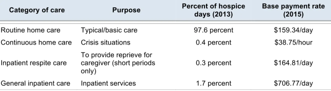
The four categories include: routine home care, continuous home care, inpatient respite care, and general inpatient care; Table 1 provides an overview of these payment categories and associated reimbursement rates (MedPAC October 2014).
Table 1. Categories of hospice care
Category of care Purpose Percent of hospice
days (2013)
Base payment rate (2015)
Routine home care Typical/basic care 97.6 percent $159.34/day
Continuous home care Crisis situations 0.4 percent $38.75/hour
Inpatient respite care To provide reprieve for caregiver (short periods only)
0.3 percent $164.81/day
General inpatient care Inpatient services 1.7 percent $706.77/day
Adapted from MedPAC (March 2015).
Routine home care is ubiquitous, accounting for 97.6 percent of hospice days in 2013 and reimbursed at a rate of $159.34 per day in 2015 (MedPAC March 2015). Continuous home care represents the other end of the spectrum, billed in 0.4 percent of hospice days in 2013 (MedPAC March 2015). Because continuous home care is intended for acute crisis situations, it is the only
7Section 3401(g) of the Affordable Care Act (ACA) mandated the hospice payment rate be annually reduced to
care category reimbursed at an hourly rate — $38.75 per hour in 2015. More than half (58 percent) of hospices did not provide continuous care to their patients in 2013 (MedPAC March 2015). Inpatient respite care is available to provide brief stints of reprieve for the primary caregiver when patients are receiving hospice services at home (MedPAC March 2015). The per diem is $164.81, accounting for 0.3 percent of 2013 hospice days. Similar to continuous home care, inpatient respite care is not widely used, with 25 percent of hospices not delivering this category of care in 2015 (MedPAC March 2015). General inpatient care represents the highest per diem rate at $708.77 in 2015; 1.7 percent of hospice days that year were paid for with general inpatient care (MedPAC March 2015). According to a 2015 MedPAC analysis, 28 percent of hospices did not provide general inpatient care in 2013, while 19 percent delivered neither general inpatient nor continuous home care. And even more limited, 12 percent of hospices — mostly smaller hospices — provided only routine home care in 2013 (MedPAC March 2015).
CMS adjusts the per diem base rate according to the hospice wage index — based on the previous fiscal year’s (FY) pre-reclassified, pre-floor hospital wage index adjustment factors8 — to account for geographic differences across markets (2011, CMS August 2015, MedPAC October 2014). CMS determines geographic location for the labor adjustment based on the Core-Based Statistical Area (CBSA)9 in which the beneficiary resides when receiving routine or continuous home care (CMS August 2015). Adjustments for patients receiving inpatient respite care or general inpatient care are based on the location of the facility at which the patient obtains care (CMS August 2015). For urban CBSAs that do not have a hospital from which to derive the
8This index refers to values prior to changes CMS makes on the basis of hospital requests for labor market
classification changes as well as the application of lower limits to the wage index.
9CMS transitioned from an MSA-based to a CBSA-based designation in 2006. Per a 2015 CMS Final Rule, the
hospice wage index underwent a one-year transition to new Office of Management and Budget CBSA delineations, which encompassed a blended wage index for FY 2016.
hospice wage index, CMS calculates a statewide pre-reclassified, pre-floor CBSA average and uses this as a proxy; only Hinesville, Georgia, required this calculation for FY 2016. In contrast, CMS calculates the hospice wage index for rural CBSAs without a hospital by averaging the pre-reclassified, pre-floor wage data for hospitals in all contiguous CBSAs.10
Until FY 2016, hospice wage index values below 0.8 were subject to either a budget neutrality factor (BANF) adjustment or a hospice floor adjustment, amounting to a 15 percent maximum increase to create a wage value no higher than 0.8 (CMS August 2015). CMS began a seven-year BANF phase-out (15 percent reduction each year) as mandated by the 2010 Hospice Wage Index Final Rule, which was completed in FY 2016 (CMS August 2015). The hospice floor adjustment is still in effect.
The proportion of the base category attributed to the labor- and non-labor-related adjustments varies by base category to reflect the estimated proportion of each category likely attributable to labor/non-labor costs; the non-labor portion is 100 percent minus the labor portion for each base category. More specifically, for routine home care and continuous home care, the labor portion is 68.71 percent and the non-labor portion is 31.29 percent; for general inpatient care, the labor portion is 64.01 percent and the non-labor portion is 35.99 percent; and for respite care, the labor portion is 54.13 percent, whereas the non-labor portion is 45.87 percent (CMS August 2015).
The Medicare hospice program also includes two caps on payments — an inpatient cap and an aggregate cap. Seldom exceeded, the inpatient cap limits the provision of inpatient care to 20 percent of a given hospice’s total Medicare patient days (MedPAC March 2015). CMS
reimburses hospices that provide inpatient care in excess of this cap at the routine home care rate
(MedPAC March 2015). The purpose of this cap is to ensure hospice care continues to be a primarily home-based benefit (May 2015).
The second cap, which has garnered attention over the last few years due to increased scrutiny of trends in excessive length of stays, restricts the aggregate payments hospices receive from Medicare within the November 1 to October 31 calendar year11 (MedPAC March 2015, May 2015). Hospices must repay Medicare any total payments in excess of the cap amount ($27,820.75 for the year ending on October 31, 2016) times the number of Medicare beneficiaries the hospice serves (CMS August 2015). In essence, CMS implemented the aggregate cap to ensure hospices solely provide terminal care and do not exceed conventional care expenditures at the end of life; today, the cap penalizes hospices with a high average LOS (Aldridge, Schlesinger et al. 2014, May 2015). According to MedPAC (March 2015), the cap “represents the only significant fiscal constraint in growth of hospice expenditures for hospice care.”
Until recently, CMS exclusively employed a “streamlined” approach to count patients for the cap year, by which hospice patients were counted in only the first year of their hospice election (which starts on September 28 and ends on September 27 of the following year) and not in subsequent years (CMS August 2015). This counting year differed from the cap year to ensure that patients who enrolled in hospice right before the end of the cap year were included in the calculation for the following year — in which they likely received more services (CMS August 2015). Beneficiaries who obtained care from multiple hospices during the cap year were only
11This timeframe does not align with the hospice rate update year (also the federal fiscal year (FY)), which extends
from October 1 to September 30. The FY 2012 Hospice Wage Index Proposed Rule considered aligning the cap accounting year with the FY, but this change never came to fruition. Finally, in a Final Rule published in the Federal Register on August 6, 2015, CMS changed the cap year to align with the federal FY starting in FY 2017.
included in an individual hospice’s cap calculation as the proportion of the patient’s total hospice days spent in that hospice (CMS August 2015).
The FY 2012 Hospice Wage Index Final Rule added the cap calculation to include an alternative patient-by-patient proportional methodology — a slightly different way to count beneficiaries — which applied to new hospices or existing hospices that decided not to use the original streamlined methodology (May 2015). By the 2013 cap year, a majority of hospices had transitioned to patient-by-patient methodology, with only 486 hospices still relying on the streamlined approach (CMS August 2015). Through this new method, hospices count
beneficiaries by dividing the number of days a patient spent in that hospice during the cap year by the total number of hospice days for a given patient across all years in hospice (CMS August 2015). The new patient-by-patient methodology counts patients according to the cap accounting year (November 1-October 31) rather than the timeframe used in the streamlined approach (September 28-September 27) (CMS August 2015).
When initially enacted in 1983, the cap amount equaled $6500 per beneficiary; Medicare adjusts this amount each year to reflect annual changes in the consumer price index for urban consumers (CPI-U) medical care expenditure category based on the CPI-U medical expenditures amount in the fifth month of the current accounting year — in this case, March (CMS August 2015, May 2015). To calculate the annual cap amount, Medicare divides this current rate (444.020 in March 2015) by the rate from March 1984 (105.4) and then multiplies this amount by the original cap base amount in 1984 ($6500) (CMS August 2015). In FY 2016, CMS further multiplied this rate by an additional 1.016 to account for the payment system update during that year, ultimately yielding a cap amount of $27,820.75.
Despite these annual updates to the cap calculation literature notes potentially troubling trends regarding the rates of hospices exceeding — or nearly exceeding — the cap, as well as the types of providers more likely to incur the penalty. The proportion of hospices surpassing the cap peaked in 2009, although the rate began to grow again a couple years later, from 9.8 percent in 2011 to 11 percent of hospices in 2012. And in 2012, more hospices finished the year just below the cap compared to several years earlier in 200612 (MedPAC March 2015, Plotzke, Christian et al. May 2014). According to an analysis Plotzke, Christian et al. (May 2014) conducted for CMS in anticipation of potential revisions to the hospice payment system, newer hospices certified since 2000 were more likely to exceed the cap in 2012 (19.9 percent) than those certified in the 1990s (4.0 percent) or earlier (1.2 percent); for-profit hospices were also more likely to exceed the cap than their non-profit counterparts (17.9 percent compared to 2.4 percent). Similarly, 15.1 percent of freestanding compared to 2.7 percent of facility-based hospices surpassed the
aggregate cap in 2012, while 14.2 percent of urban and 7.3 percent of rural hospices experienced the same trend (Plotzke, Christian et al. May 2014). Finally, hospices operating in the South were the most likely to exceed the cap (16.5 percent) compared to the West (14.2 percent), Northeast (5.0 percent), and Midwest (4.0 percent) (Plotzke, Christian et al. May 2014). Such 2012 trends appeared to hold across time, as Plotzke, Christian et al. (May 2014) found the same hospice-level predictors in 2006. A follow-up analysis using 2014 data found similar trends in above-cap hospices with significant geographic variations (Plotzke, Christian et al. 2015). States with the highest rate of above-cap hospices that year included: Nevada (40.7 percent), South Carolina (29.6 percent), Mississippi (29.4 percent), and Georgia (27.2 percent) (Plotzke,
Christian et al. 2015). In comparison, fewer than one percent of hospices in a number of states were above the cap in 2014 (Plotzke, Christian et al. 2015).
Misaligned incentives and the potential for reform?
Such LOS patterns have prompted calls to reform the hospice payment system that more appropriately account for its evolution over the last 30 years. A year before Congress passed the ACA, MedPAC released a report recommending reforms to the hospice payment system to better reflect the trajectory of episodes of care. Although, among other reforms, Section 3132(a) of the ACA authorizes the Secretary of Health and Human Services to conduct a review of the payment system to make budget-neutral reforms, MedPAC’s 2015 report conveyed the same message as its 2009 report. “Medicare’s hospice payment system is not well aligned with the costs of
providing care through a hospice episode,” the report said (MedPAC March 2015). Reliance on a per diem has created perverse financial incentives for hospices to not only cherry pick lower cost patients but also to enroll patients for longer stays (Aldridge Carlson, Barry et al. 2012, Kelley and Meier 2014, MedPAC March 2015). As such, MedPAC recommended the payment rate be restructured in the form of a u-shaped curve, in which hospices are paid more at the beginning and the end of an episode of care and less in the middle. The Commission also recommended a focused review of hospices with excessive long stays.
Plotzke, Christian et al. (May 2014) delivered a report to CMS in 2014, which served as the first step on the path toward payment reform, spurring an effort to monitor vulnerabilities in the payment system using real-time claims data. This work culminated in passage of the
Improving Medicare Post-Acute Care Transformation (IMPACT) Act on Sept. 18, 2014 (Plotzke, Christian et al. May 2014, May 2015). IMPACT required further CMS hospice monitoring activities, including: surveying hospices every three years for the next decade and
implementing an ACA provision for face-to-face medical review of patients in hospice more than 180 days (May 2015).
A May 2015 CMS Proposed Rule referenced both the Plotzke, Christian et al. (May 2014) study as well as the 2009 MedPAC recommendations in its proposal to alter routine home care payments (Section III.A) to reflect the beneficiaries’ LOS by offering a higher base payment for the first 60 days and a reduced rate thereafter,13 with a service intensity add-on (Nicosia, Reardon et al.), which would pay for service rendered in the last seven days of life, provided the patient meets certain criteria (May 2015). The SIA would equal the continuous home care rate multiplied by the amount of direct patient care a registered nurse or social worker provides in the last days of a patient’s life. The Rule also proposed changes to the calculation of the aggregate cap and the hospice wage index, including aligning the cap accounting year with the federal FY starting in FY 2017 (Section III.C and Section III.D) (May 2015). CMS ultimately published its Final Rule in the Federal Register on August 6, 2015, implementing the aforementioned changes on Jan. 1, 2016 (CMS August 2015). As such, for FY 2016, the per diem for a typical day on routine care was $187 for days 1-60 and $147 thereafter (MedPAC March 2016). During the last seven days of life, CMS reimburses up to four hours of nursing or social work visits a day at $39 per hour (MedPAC March 2016).
Disenrollment from hospice
Concerns regarding potential misalignment of hospice incentives have also increased scrutiny over the rate of live discharges (or disenrollments) from hospice, which, in some cases could reflect good quality care — through adherence to patient preferences, stabilization of
13CMS also considered a “tiered” payment system but determined that this approach relied too heavily on the patient
conditions, etc. — but, in others, potentially inappropriate behaviors motivated by the payment system structure. Although the most common way to be discharged from hospice is through death, there are also a significant proportion of patients who disenroll from hospice while they are still alive. Once discharged, the patient resumes traditional Medicare coverage that had been waived upon hospice enrollment (May 2015). The reasons for live hospice discharges vary and can be either patient/family- or hospice-initiated, as shown in Figure 1 (Carlson, Herrin et al. 2009, LeSage, Borgert et al. 2014). Patients may choose to disenroll to pursue life-sustaining treatment because they are dissatisfied with the hospice care they are receiving, because they lacked a fundamental understanding of the hospice program (i.e., its focus on comfort rather than curative care) upon initial enrollment, or as a result of sudden changes in hospice personnel (Casarett, Marenberg et al. 2001, Carlson, Herrin et al. 2009, LeSage, Borgert et al. 2014). They may also disenroll because their condition has stabilized or a family member/caregiver suddenly becomes available to provide care (Kutner, Blake et al. 2002, LeSage, Borgert et al. 2014).
Although the decision to revoke hospice care lies in the beneficiary’s hands (42 CFR §418.28) — federal regulations require that the patient and/or proxy sign a statement attesting to this course of action — providers can initiate discharge through a written physician discharge order (42 CFR §418.26) .14 Hospices may discharge a patient alive if they determine the patient is no longer eligible for hospice (i.e., the patient’s health status improves and the prognosis changes); if the patient moves from the hospice’s service area; if the patient is disruptive, aggressive, or uncooperative; or in situations when the hospice does not have a contract with a facility (e.g., hospital) to which the patient must be transferred (LeSage, Borgert et al. 2014,
14Although hospice revocation and discharge both result in a patient disenrolling from the Medicare hospice
program, federal regulations distinguish between the two acts: Patients revoke hospice care, while providers discharge patients.
Chung 2015). Furthermore, it is possible that hospice-initiated disenrollment could reflect improper behavior on the part of the hospice, with hospice providers electing to avoid
hospitalization costs by disenrolling the patient when he/she requires short-term inpatient care to stabilize acute conditions associated with the terminal illness (Teno, Plotzke et al. 2014, Chung 2015). According to federal regulations, hospices must contract with institutional settings prior to making a general inpatient referral (i.e., hospitals and SNFs) and are financially responsible for reimbursing the hospital or SNF the general inpatient rate received from Medicare. When patients disenroll from hospice prior to an inpatient stay, such costs fall on the institutional setting rather than the hospice (Chung, Richards et al. 2015).
Figure 1. Reasons for patient- and provider-initiated live disenrollment
LeSage, Borgert et al. (2014) conducted a medical chart review in one hospice between 2006 and 2011 and found that patients were discharged from hospice because: they no longer
met the hospice criteria (57.5 percent), the patient/family initiated the discharge (30 percent), they were transferred to another hospice (10 percent), or the hospice staff deemed the patient unsafe (2.5 percent). Another more representative study found that 32 percent of live discharges in 2007 occurred because the patient stabilized or improved, 29 percent occurred because the patient opted to pursue more aggressive treatment, 13 percent occurred because the patient moved outside the hospice service area, and 27 percent occurred for “other” reasons (Chung 2015). Such other reasons fell into three distinct categories: 1) the hospice was unable to contract with a hospital or nursing facility in which the patient was to be admitted, 2) the hospice could not provide an inpatient bed for the patient, or 3) a crisis occurred that the hospice could not control (e.g., the patient’s caregiver called 911 instead of the hospice) (Chung 2015).
Beginning in July 2012, Medicare included new occurrence codes on claims to allow for further clarification of the reasons for a live discharge, differentiating between patient- and hospice-initiated discharge (Plotzke, Christian et al. May 2014). MedPAC’s 2016 report on hospices found that 39 percent of discharges occurred because a patient revoked his/her service, while the rest were provider-initiated, primarily because the hospice deemed the patient to be no longer terminally ill (MedPAC March 2016). Another study using claims from the last four months of 2012 additionally found that African American and cancer patients had higher rates of patient-initiated revocation (Plotzke, Christian et al. May 2014).
The reasons underlying live disenrollment are key to determining whether this pattern of EOL service utilization reflects good or poor quality care delivery. A 2011 technical advisory panel convened to provide recommendations for the development of hospice quality metrics15
15The ACA required for the public reporting of hospice quality metrics through the Hospice Quality Reporting
suggested several claims-based measures, including live discharge rates, as indicators of potential poor quality care delivery (MedPAC March 2015). Because live disenrollment may create discontinuities in care and disrupt ongoing patient-provider relationships — oftentimes landing frail and terminally ill patients in the hospital, ED, or ICU — it is important to
understand the key drivers of this trend (Casarett, Marenberg et al. 2001, Taylor, Steinhauser et al. 2008, Carlson, Herrin et al. 2010, Unroe, Greiner et al. 2012). Patient-preference-driven discharges and condition stabilization may reflect an EOL system that appropriately caters to the changing individual needs/prognoses of patients, while discharges that occur because hospices do not have the appropriate resources to provide care or — worse — because hospices do not want to shoulder the financial burden, could point to signs of provider misuse or abuse of the hospice benefit.
Current state of the literature
To date, we found 15 peer-reviewed articles published between 2001 and 2016 focused solely on exploring patterns of live discharge from hospice. Despite the limited number of studies on the topic and the range of data sources used (across nearly two decades), the papers point to similar trends across patient- and hospice-level predictors/outcomes of live
disenrollment. Overall, the studies together suggest that non-White, unmarried patients with non-cancer diagnoses who have had a longer LOS in hospice are more likely to be discharged alive than other types of patients. At the hospice level, smaller, newer (five years or fewer), for-profit hospices operating in more competitive markets have higher rates of disenrollment. Patient-level predictors
The majority of the studies on this topic catalogue some component of patient-level live disenrollment predictors, with nearly half exploring the relationship between
comorbidities/primary diagnoses and disenrollment and others reporting statistical significance of covariates: age, race, sex, marital status/caregivers, average LOS, and institutional residence. Among the four studies that reported a statistically significant relationship between age and the likelihood of live disenrollment, one study found that younger patients were more likely to withdraw from hospice before death (Casarett, Marenberg et al. 2001), while two reported that older age was associated with live discharge from hospice (Johnson, Kuchibhatla et al. 2008, Carlson, Herrin et al. 2009). Another study, still, reported that the median age of 72 for the group of individuals discharged alive was not statistically different from the group that died while in hospice (Kutner, Blake et al. 2002).
The four articles that reported a statistically significant relationship between race and live discharge all pointed to the same relationship: Non-White patients (African Americans,
Hispanics, and Other race/ethnicity) were more likely to be discharged alive than White patients (Johnson, Kuchibhatla et al. 2008, Carlson, Herrin et al. 2009, Unroe, Greiner et al. 2012, Teno, Plotzke et al. 2014, Aldridge 2015). One study found that 4.5 percent of African American patients revoked hospice specifically to pursue more aggressive care compared to 2.5 percent of White patients, which is consistent with evidence that Non-White populations tend to
receive/prefer a higher intensity of care at the end of life (Chiriboga 2008, Johnson, Kuchibhatla et al. 2008, Hanchate, Kronman et al. 2009). Fewer studies reported a statistically significant relationship between sex and live disenrollment, with one suggesting that males were more likely to disenroll alive (Casarett, Marenberg et al. 2001) while two later studies reported that a larger proportion of females had a live discharge (Kutner, Blake et al. 2002, Johnson, Elbert-Avila et al. 2012). In terms of marital status/caregiver relationships, two studies found that unmarried
primary caregiver were more likely to die in hospice care (Casarett, Marenberg et al. 2001, Kutner, Blake et al. 2002). In addition to caregiver support, living in an institutional setting may also be associated with being discharged alive, although this covariate was only considered in one study (Kutner, Blake et al. 2002).
Overall, the literature points to a positive correlation between non-cancer diagnosis and live discharge. Among the six studies that specifically reported results on the relationship between comorbidities/primary diagnoses and likelihood of having a live discharge, four compared cancer to non-cancer patients, and all four reached this same conclusion (Casarett, Marenberg et al. 2001, Kutner, Blake et al. 2002, Taylor, Steinhauser et al. 2008, Teno, Plotzke et al. 2014). More specifically, the most common primary diagnoses among patients discharged alive were: dementia, failure to thrive,16 cerebral vascular accident, congestive heart failure, and pneumonia, according to a recent study, which used 2010 Medicare fee-for-service (FFS) claims data (Teno, Plotzke et al. 2014). Further, Carlson, Herrin et al. (2009) found that patients with a higher score on the Charlson Comorbidity Index17 were more likely to have a live disenrollment, whereas, Kutner, Blake et al. (2002) reported that patients with three or more activities of daily living (ADLs) were more likely to die in hospice.
Findings related to LOS were disparate, with one study reporting a mean LOS prior to live discharge of 70 days (Kutner, Blake et al. 2002), while another reported a median of 22 days (Johnson, Kuchibhatla et al. 2008) — and yet another found a median stay of 236 days prior to live disenrollment, compared to 12 days for those who died while receiving hospice care
16In October 2014, CMS restricted the use of non-specific condition codes as the principal diagnosis on a hospice
claim (August 2014). Hospice Manual Update for Diagnosis Reporting and Filing Hospice Notice of Election (NOE) and Termination or Revocation of Election., Centers for Medicare & Medicaid Services..
(Johnson, Elbert-Avila et al. 2012). Despite the range of these estimates, there is evidence that patients enrolled longer are more likely to be discharged alive; in fact, as Johnson, Elbert-Avila et al. (2012) report, individuals enrolled for longer than 180 days had more than 12 times the odds of being discharged alive relative to those enrolled in hospice for fewer than 180 days. Similarly, Teno, Plotzke et al. (2014) found that 26.6 percent of live discharges in 2010 were among patients who had a LOS of 180 days or more. On the other end of the spectrum, 10.8 percent of live discharges represented patients who had spent seven days or fewer on hospice (Teno, Plotzke et al. 2014).
Patient-level outcomes
Beyond predictors, the literature — particularly the studies published in more recent years — explores some of the patient-level outcomes associated with live disenrollment, with a particular emphasis on patterns of re-enrollment in hospice as well as length of survival
following discharge; a sampling of studies also explore patterns of post-discharge utilization (e.g., inpatient hospitalizations) and costs. Across the studies, the rate of live disenrollment ranged from five to 18.5 percent, although one study that focused on patients who disenrolled expressly to pursue more aggressive care estimated the rate of disenrollment to be 2.8 percent; Plotzke, Christian et al. (May 2014) report to CMS on hospice payment reform recommendations estimated the rate to be 18.1 percent in 2012 (an increase from 13.2 percent in 2000 and 17.2 percent in 2006); MedPAC’s 2016 hospice report found the average rate in 2012 to be 18.5 percent, decreasing to 18.4 percent in 2013 and 17.2 percent in 2014 (MedPAC March 2016). In contrast, Aldridge (2015), using a 2000 and 2010 cross-section of FFS claims, estimated that the disenrollment rate decreased from 2000 to 2010. Such variation in the estimated overall rate is likely a product of the range of datasets employed as well as the years of that data, which,
spanning nearly two decades, encompassed a period of significant change in the hospice industry (Aldridge, Schlesinger et al. 2014).
Nine of the 15 studies noted a distinct pattern of disenrollment and re-enrollment in the same hospice, often sandwiching an inpatient hospital stay. Estimates of the proportion of patients experiencing such a trend ranged, although three of the studies reported that
approximately one-third of those who disenrolled re-enrolled shortly thereafter (Kutner, Meyer et al. 2004, Carlson, Herrin et al. 2010, LeSage, Borgert et al. 2014). And among those who re-enrolled, 75 percent used the same hospice; only 10 percent of all disenrollees re-enrolled with a different hospice (Carlson, Herrin et al. 2009). Despite this disenrollment-reenrollment trend, between 2000 and 2010, fewer than one percent of patients experienced more than two enrollment-disenrollment-reenrollment patterns (Aldridge 2015).
In 2010, 7.6 percent of all patients discharged alive endured a pattern of hospice discharge, hospital admission and discharge, and hospice re-enrollment18 (Teno, Plotzke et al. 2014). In fact, 6.4 percent (unadjusted) of those with a live discharge were defined as having a “burdensome transition” — hospitalization within two days of hospice discharge followed by a hospice readmission within two days of hospital discharge — in 2012, according to a follow-up analysis conducted by Plotzke, Christian et al. (May 2014). That rate represented a noticeable increase from 3.4 percent in 2000 (Plotzke, Christian et al. May 2014). Adjusted analyses determined that burdensome transitions were higher in for-profits (6.4 percent) compared to non-profits (4.0 percent) in 2012 (Prsic, Plotzke et al. 2016), and that, when controlling for chain status, for-profits without a chain had a higher burdensome transition rate compared to their chain counterparts (Teno, Bowman et al. 2015). Non-profit hospices had the lowest rate of
18A majority of those discharged alive (75.9 percent) were not hospitalized within 30 days of disenrollment; 16.5
burdensome transitions (Teno, Bowman et al. 2015). Hospices at the 90th percentile in discharges occurring on or after 180 days in hospice or on or before seven days exhibited similar trends by chain affiliation and profit status (Teno, Bowman et al. 2015).
A number of the 15 of the peer-reviewed studies explored this pattern of hospice discharge followed by a hospital stay — and the trend was clear: Those who disenrolled were more likely to be hospitalized, admitted to an emergency department (ED), or admitted to the intensive care unit (ICU) than those who remained continuously enrolled in hospice until death (Taylor, Steinhauser et al. 2008, Carlson, Herrin et al. 2010, Unroe, Greiner et al. 2012). Among patients with cancer, the trend appeared particularly striking, with 39.8 percent of disenrollees (compared to 1.6 percent of those who remained on hospice) being admitted as an inpatient to the hospital, ultimately spending almost three times as many days in the hospital as their counterparts (19.3 vs. 6.7 days) (Carlson, Herrin et al. 2010). ED and ICU admission were similarly significant: 33.9 percent of disenrollees vs. 3.1 percent of those who remained on hospice landed in the ED, while 5.7 percent compared to 0.1 percent accessed the ICU (Carlson, Herrin et al. 2010). Such trends are not specific to cancer patients, however. Across all patient groups, using data from 1993-2000, Taylor, Steinhauser et al. (2008) found that only 2.6 percent of those who remained continuously enrolled were admitted to a hospital, while 31.3 percent of patients who were discharged (and did not subsequently re-enroll) and 42.4 percent of those who disenrolled and re-enrolled ultimately entered a hospital.
The timing of such hospitalizations underscores a potential insufficiency in the care provided at the end of life to individuals who disenroll from hospice: Twenty-five percent of individuals who experienced a live discharge were hospitalized within 48 hours of that discharge (Carlson, Herrin et al. 2010). Similarly, Teno, Plotzke et al. (2014) estimated that nearly a