Bachelor’s thesis Information Technology 2016 Vasylysa Karyelova
STEP-UP IN WEB
DEVELOPMENT
BACHELOR´S THESIS | ABSTRACT
TURKU UNIVERSITY OF APPLIED SCIENCES
Degree in Information Technolofy | Information Technolofy January 2016 | 41 pages
Patric Granholm
Vasylysa Karyelova
STEP-UP IN WEB DEVELOPMENT
This Bachelor’s thesis introduces the new major technologies in Web Development that are opening new possibilities, giving new features to websites and web applications, namely Web Components and PolymerJS library, which is based on the Web Components. These new technologies - allow creating simpler code, but more interactive and interesting content on the web.
The primary purpose of the Thesis was to explore, learn, and try putting into practice these new technologies and find their advantages and disadvantages; a secondary purpose of this Thesis was to understand why and how they were developed; how popular they are in the modern Internet, where they have already been implemented.
KEYWORDS:
CONTENTS
LIST OF ABBREVIATIONS (OR) SYMBOLS 4
1 ONSET OF FRONT END 5
2 WEB COMPONENTS 10 2.1 Template 11 2.2 Shadow DOM 13 2.3 Custom Elements 18 2.4 HTML Imports 21 3 POLYMER 1.0 24 3.1 Paper Elements 27 3.2 Platinum Elements 30
3.3 Websites build on Polymer. Examples 33
4 CONCLUSION 37
REFERENCES 40
PICTURES
Picture 1. Output with Shadow DOM 14
Picture 2. Shadow DOM output 16
Picture 3. Shadow DOM Example 18
Picture 4. Styling Custom Elements 20
Picture 5. Google Translate Community 34
Picture 6. Atavist.com 35
Picture 7. Vaadin. vaadin-grid 36
FIGURES
Figure 1. The pressure of work 5
Figure 2. Structure of PolymerJS 25
LIST OF ABBREVIATIONS (OR) SYMBOLS
HTML HTML, which stands for Hyper Text Markup Language, is the predominant markup language for web pages.
API application programming interface. A set of routines, protocols, and tools for building software applications. Web Framework a software framework that is designed to support the
development of web applications including web services, web resources and web APIs.
User Interface (UI) in the industrial design field of human–machine interaction, is the space where interactions between humans and
1 ONSET OF FRONT END
In most companies, large and small, web development is often interpreted as a mix of design and engineering. Often one can see how web developers find themselves in a peculiar working environment. Sometimes they sit in the design department, and sometimes in product management, it happens that they like it and do not. Nevertheless, it is quite clear that front-end development is not an exact profession at all.
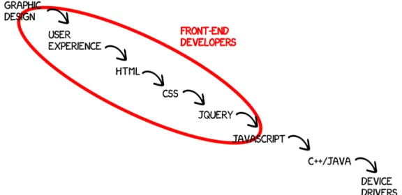
The profession of front-end development appeared in the mid 90s, when the solution for ending the First Browser War came up. In the 1994 Tim Berners-Lee founded the W3C (World Wide Web Consortium), which is the main international standards organization for the World Wide Web (W3C 2009). W3C claimed to be the "one ring to rule all of the web technologies" or at least uphold a standard. The creation of those standards, functions and features, which must be supported by a web browser for a better and easier maintenance of the websites, forced the development of such languages as CSS (Cascade Style Sheets) and JavaScript. Prior to this, there was already such a profession, similar to a modern Front-end developer, but just the knowledge of HTML was sufficient for that. Nowadays next to HTML stand such languages as CSS and JavaScript, which all together form the core of Front-end technologies.
Figure 1 shows the range of necessary knowledge a modern Front-end developer needs to have. The professionalism of a front-end developer is judged by the ability not only to create an HTML template of the page’s outlook, but also a talent of performing as a designer at some point, and finding creative solutions for parts of the website, where the initial ideas of web designers can not be turned into reality for technical reasons.
The main developing languages are the following:
• CSS. In the 1990s CSS became one of a kind because it finally allowed a document's style sheets be “cascaded”, i.e., to implement styles from several source files, which became an irreplaceable feature for better maintenance of style sheets. Therefore its evolution was inevitable. In the first era, the abilities of CSS were mainly just the font tags and the nested tables tag with a huge depth of the selectors, which of course was one of the greatest problems. From primitive tasks, the CSS developed itself to the fourth era we are entering now. It is the era of CSS frameworks, substantially Bootstrap. Bootstrap is a free and open-source collection of tools for creating websites and web applications (Mozilla Developer Network 2015). A very convenient feature of Bootstrap is that it is very easy to pick and choose features, which will make the website responsive.
• JavaScript. JavaScript is one of the core programming languages used in web programming; often is considered, as a joke, to be the ‘real programming’ in Front-end development by designers. It allows to make a website more interactive, the access to its subpages easier, and realize all fancy designers’ ideas. From the inline commands embedded in HTML, it has grown up to full-blown asynchronous applications executed on the fly on the browser as unobtrusive rich functionality. Despite all the possibilities of JavaScript, its main problem, with time, became the fact that even the huge scope of JavaScript is not able to satisfy all the requirements in web development. Nonetheless, JavaScript can handle tasks such as different email manipulations; server-side programming; game development; and even creating desktop applications. From the speed of its growth, we can judge how productive and useful it is. From being rendered in a different manner by all browsers, JavaScript gained authority to force browsers to implement JavaScript uniformly, saving time, needed later for debugging or improving the performance for certain web
browsers. The widespread usage of JavaScript libraries such as jQuery or Polymer.js has produced an abundance of visual effects that turn web pages into an immersive experience.
• jQuery. Even though jQuery is not exactly a language but a library from a technical point of view, it would be wrong not to include it in this list. jQuery, being just a small library weighting only 83 KB, became very popular and widely spread, making it almost impossible for any website not to use it. Shortly after its first announcement, the library caused a fundamental change in the culture of open source programming and the web development industry. The powerfulness of which served as a reason for many people to wrongly consider it to be a separate programming language. jQuery is more than a tool that helps to build modern websites. jQuery plugins became the essential of modern websites, even though it might seem confusing: a library based on another library. While such plugins are very powerful and easy to implement, writing one’s own code, which is in most cases shorter and clearer, is always considered more professional and, as a result, easier to debug or improve later, if needed. Still for many urgent projects, or designers, that do not have professional knowledge about programming and JavaScript in particular, it is very handy to implement in the website the needed plugin, and following the instructions make it running.
Discussing of Web and Internet then and now, it becomes clear that today the web has changed remarkably. It is a different way of thinking about UI components on a page, about UX complexity, and moreover – the code and logic behind all this interfaces. Every day thousands of new libraries, scripts and plugins are developed using these languages for a better, easier development. Some of such innovations become lost in the web on the same day, but some become a turning point in the web development. Web Components, which will be discussed in more detail later, are one of the great novelties in the late history of development. Their idea is to use "widgets" on web applications, which is a totally new view and prospective on web programming and the structure of websites. At the moment, the use of widgets is possible with both HTML and JavaScript via API. The most popular libraries that have stepped up to help abstract some of the complexities of the Web Component specifications are Polymer and X-tag. Their developers aim to bring component-based software engineering to the World Wide Web.
The very important and significant impact in the progress of web development sphere was made by numerous Google teams. They have been showing how the latest innovations can be implemented to the websites straight away; their web browser – Google Chrome – is always the most popular among users, because it has a very user-friendly interface and almost faultless performance; not to mention the greatest of all times searching engine. The Community Google Developers became practically irreplaceable due to the versatile range of products that can be used for creating, maintaining, and debugging websites, and getting supported online by the actual creators/developers of a certain product. One of the main creations that helped to debug and improve websites is Google Analytics. It is possible that Google Analytics brought web developers to the new level, and helped them to look at the websites from a new perspective, to prevent possible errors by thinking and seeing them beforehand. This service collects different types of data, like the language of a browser that users are using, or the loading speed of the whole page. The information on how the users flow over the website, which path they take more often, can help improve the structure of certain pages.
Each of new innovations that were made or supported, and brought to the front by Google has sped up the process of evolution and the simplification of web development. They increase the interests in web programming by showing what can be achieved, how interesting and sometimes fun it can be. They are considered to be the heart of Internet and websites’ technical side; and perhaps therefore Google is the fastest growing company with the most prestigious job positions for information technology students.
All those new standards of browsers, faster computers and, of course, the appearance of touch screen devices on the market, pushed the Front-end development further and further. Five or ten years ago there were no such needs in the web, as today. For example, a simple element combo box that is used very often for submission forms or shopping carts, was a very difficult in implementation element, the development of which could take up to couple of hours. Nowadays, the combo box takes 5 minutes to insert.
Unfortunately, there are still several companies in the world that do not respect web development. Often web developers are not considered to be real programmers, and the other "real programmers" simply shun them. And probably this statement is correct, since the technologies and methods of profession are developing, being simplified
giving new possibilities to web developers constantly. Further on the most significant and decisive changes and innovations in this sphere will be explained.
2 WEB COMPONENTS
One Web Developer (unknown) said: “If you think that HTML5 has changed the Web, wait to see, what Web Components will do.” The person who said this phrase was one hundred per cent right. Unfortunately, not everyone believes in this at the moment; Web Components are not used around Internet as widely as they should because developers are used to old, not complicated, well studied methods and often do not want to waste time on learning new material. This is, at this point, very unprofessional as well as considering the fact, that web components were created to reduce the working time and created as many as possible reusable widgets for web application. They are the great assistants to developers due to their versatility. Technically speaking, Web Components are a collection of standards that have been developed as W3C specifications and give the possibility of creating reusable widgets, or components, for a new project, or even share them with other developers around the world through Internet. They allow bundling mark-up and styles into custom HTML elements (Dodson 2013).
The Web Component’s standard consists of the following elements:
• Template. As it is stated in the tag name, the content between the opening and closing template tag is considered to be a template, a design. The browser parses it, but the script is not executed and the extra resources (e.g., pictures, videos etc.) are not loaded.
• Shadow DOM is an encapsulation instrument for HTML. Shadow DOM allows developers to change the internal representation of HTML element, leaving the external representation permanent. A great example is elements of <audio> and <video>. In the code, we place a single tag, and the browser displays multiple items (sliders, buttons, the player window). In Chrome, these and other elements use Shadow DOM.
• Custom Elements. They allow creating and defining their own API HTML elements. The insertion of menu, or some user info on social network sites, have never been easier because with custom elements it became possible to create tags like <menu> or <user-info>.
2.1 Template
Until now web frameworks were, and are, the most popular way of structuring a web application and keeping all data in order. They were designed to support the development of web applications including web services, web resources and web APIs; they aimed to alleviate the overhead associated with common activities performed in web development as well as to provide libraries for database access, templating frameworks and session management (Docforge 2015). In the modern web-frameworks, а pattern is a line of code or fragments of DOM in which the data is inserted before it is shown to the end-user. In Web Components patterns are already pieces of DOM, which makes its understanding and debugging much easier. The browser parses the content, but does not execute it as long as we do not insert it into a document itself. This means that the browser will not load images, audio or video, will not run scripts, hence will not increase the page loading time.
For example this part of the code will not load an image from the server:
<template id="tmpl-user">
<h2 class="name">Steve Jones</h2> <img src="photo.jpg">
</template>
Even though the code within <template> tag is not executed, it does not mean that it cannot be executed at all. We still can get its data throughJavaScript:
var tmpl = document.querySelector('#tmpl-user');
// the content of <template>
var content = tmpl.content; var imported;
// we insert the data in the pattern:
content.querySelector('.name').innerText = 'Donald';
/* in order to copy the content and make it a part of the document,
/* we can use document.importNode()
/*
/* It will force the browser to ‘execute’ the code inside the <template>,
/* in this case – load the picture ‘photo.jpg’ */
imported = document.importNode(content);
// The result is inserted into the document:
The templates can be written in three different ways and each one of them has own purpose and peculiarities to know. Those are:
• Offscreen DOM. Add the code to the hidden div on the page. In this case, later on we can copy the code and past it in the script whenever we will need it. For example:
<div hidden data-template="my-template"> <p>Template Content</p>
<img></img> </div>
The advantage is in Using DOM, since it is a language independent model, well known to all browsers, therefore, there will be no reading problems. We can easily clone it. In addition, nothing is rendered – the attribute ‘hidden’ indicates that the element is not yet, or no longer, relevant to the page's current state (W3C 2014). The disadvantage of such method is that the browser is still trying to execute the code, i.e., load the multimedia data, run the code inside template etc.
• Overloading script. This technique implies writing our template in a script tag and insert it in the <head> of the page, and then manipulating it as a string. For example:
<sctipt type="x-template" data-template="my-template"> <p>Template Content</p>
<img src="{{ image }}"></img> </script>
The positive side of this technique is that nothing is rendered. By default, all the <script> tag is set to display: none and, since its type set x-template and not text/javascript the content will not be parsed as JavaScript.
• Compiled templates are ready template engines that are using string in the same manner as in the overloading script. One of the popular engines is hogan.js from Twitter. These kinds of engines are used for compiling templates beforehand, or included in a browser for a dynamic use of templates later on. The new <template> tag itself does not have any disadvantages, mentioned for all 3 types of template techniques. With <template> we are working directly with the DOM, hence we are deciding whether to execute code or not, where and when.
2.2 Shadow DOM
Shadow DOM is the most controversial, crucial element of all four mentioned before. It carries the most important meaning and qualities, but, at the same time, it is much debated and is a doubtful element and considered to be rebuilt. In PolymerJS they have even restructured it completely, and renamed to Shady DOM, since the meaning of it is the same, but different logic of archiving certain functionality is applied. It is planned to eliminate Shadow and Shady DOMs later, after its functionality will be fully integrated into elements themselves. Still, it is the starting point of Web Components in general and is important to know about.
The main idea behind Shadow DOM is encapsulation. It allows to pack, group data or some functions into a single component. Substantially it is done, by using classes. When inserted into the document, Shadow DOM is one of many parts working more or less independently from each other. Therefore, at the designing of implementation, it was necessary to establish functional boundaries in the document tree, in order to somehow to operate with a collection of such "independent" fragments. To solve the problem of encapsulation a new abstraction - the Shadow DOM was introduced, allowing creating multiple DOM trees within a single parent tree.
To understand the principle of shadow DOM better here is a small example. The example includes a little script for a page, displaying a video from the Summer School programme in deepblue networks, where the <video> tag was used to insert the source file in there. This what it looks like in the code editor:
<body>
<div class="content">
<h1>Example of using tag <video></h1>
<div id="video">
<h3> Here is the video</h3>
<video id="test" controls="">
<source id="summer-school" src="assets/summer%20school.mp4" type="video/mp4"> </video> </div> </div> <script> … </script> </body>
The output of the above written code, when opened in the browser, is different from what is expected. The output video is displayed in a media player with such elements as controls, progress bar, and the length of the video indicator. These elements were not written with HTML or added through JavaScript. So where did these elements come from and how can we reach them? The response is that they all are the Shadow Tree element. To see those elements, the DevTools of the browser can be used. The initial code looks completely different, from what is shown in the web:
Picture 1. Output with Shadow DOM
To understand the theory of Shadow DOM, the understanding of such an important, mentioned earlier, term, as Shadow Tree is essential. It is a sub-tree that is attached to an element in the document, a tag element. In the example above, it is a <video> tag. The element itself, in this case, is called the shadow host. Instead of the element itself, the browser displays the contents of the shadow tree at its place, ignoring the initial content of the element. This is what happens with the <video> tag in the example above; in its place the browser renders the contents of the shadow tree with media player and all its components.
The trick with the shadow DOM is that the styles defined within it with the help of
<style> tag or in CSS files, do not apply to the parent document. We also have an opportunity to limit the influence of parental styles document the content of shadow tree. This will be explained in more detail later.
The Shadow DOM API allows users to create and manipulate the contents of the shadow tree themselves. Nowadays, only Chrome browser, together with Chrome Canary, supports the shadow DOM because it is still not as widely spread and required to be supported by all browsers. Additionally, it still needs some development improvements.
The next example will be shown in the browser Chrome Canary, which is a special version of Chrome for web developers that supports all the new features of browsers, but not yet completely tested or improved. Its corresponding output can be seen in Picture 2, view from Chrome Canary:
<body>
<div class="content"> <div class="shadow-host"> This text will be hidden. </div>
<template id="replacer-tmpl">
This text comes from <strong>shadow tree</strong>. </template>
<script>
var shadowHost = document.querySelector('.shadow-host'); var shadowRoot = shadowHost.createShadowRoot(); var template = document.querySelector('#replacer-tmpl');
shadowRoot.appendChild(template.content); </script>
</div> </body>
The example above shows how Shadow DOM allows changing the internal representation of an HTML element, leaving the external representation the same. It is an alternative to iframe. Iframe, unlike the classical approach, does not require the replacement of the <body> tag to the tag <frameset>. That means that this tag can be inserted at regular pages, for example, inside a paragraph or elsewhere. At its core, this element is very similar to the standard tag <img>. It is an inline/line element with replaceable content because it behaves exactly as an inline element, but inside of it,
the external content is displayed. There are only four such elements in the HTML language: - <img>, <iframe>, <object> and <embed>.
So far, iframe was probably the only technique for encapsulation needs. But unlike iframe that is the actual document and cannot coexist with the normal <body> in the document, Shadow DOM is part of the document. Although the shadow tree is somewhat isolated, if desired, we can change its view by using styles, or pick open the script.
Picture 2. Shadow DOM output
As mentioned earlier, the main idea behind Shadow DOM is encapsulation, and so is the idea of styling in Shadow DOM. The styles that are specified inside the Shadow DOM are only implemented inside the shadow tree. This is a great advantage, but the negative side is that this style is the only one that takes effect in the shadow tree. The external style sheets cannot be implemented on elements inside the shadow tree, except for the inherited values by default, like font-size, line-height, text-align and
others. However, it is possible to disable even those defaults values and use the new styles for our elements. This can be archived by making the value
shadowRoot.resetStyleInheritance = true. The advantage is if there is a style written in the document directly, internal style, we can use it for our shadow tree elements, as well as we can disable it, and use the style only written in the scope of the
shadow tree. This can be achieved by specifying
shadowRoot.resetStyleInheritance = true (or false).
So as for encapsulation idea, the fact is that: “CSS styles defined inside Shadow DOM are scoped to the ShadowRoot. This means styles are encapsulated by default.” (Bidelman 2014)
Another example of a page, where some text will be written with the native HTML elements, then a shadow DOM root will be created with some styles applied to it.
<head> <style type="text/css"> h3 { color: #717171; } </style> </head> <body> <div class="testShadowRoot"> <h3>Hamburg, Germany</h3> </div> <div>
<h3>Ideas. Love. Technology.</h3> </div>
<script>
var root = document.querySelector('.testShadowRoot').createShadowRoot(); root.innerHTML = '<style>h3{ color: #2fa5d8; }</style>' +
'<h3>deepblue networks (in shadow DOM)</h3>'; </script>
</body>
In the example above, the testing div was overwritten with the .createShadowRoot()
method, creating an instance of shadow DOM. The element, to which shadow DOM was attached, in the example – element div with class testShadowRoot, is now the shadow root. As a result, in the output we do not see the original content of the div, but rather the new defined content. The result of performed manipulations can be seen in Picture 3.
Picture 3. Shadow DOM Example
2.3 Custom Elements
Custom elements are a tool for creating new HTML elements, and not only for personal use; but once created, the element can be shared and used by other web developers. In combination with Shadow DOM and templates, custom items allow a developer to create full-fledged widgets like <audio>, <video> or even <gangnam-dance>. To avoid conflicts, according to the standards, custom elements must contain a hyphen (‘-‘) in their name. This is necessary, in order for custom elements inherit the HTMLElement by default. Thus a browser encounters a mark-up type <my-custom-element>, it parses it as an HTMLElement, but in the case of <mycustomelement>, the result will be HTMLUnknownElement.
To create a custom element, we need to use JavaScript. As a first step, we need to create a prototype of our new element, which will inherit from the HTMLElements; and then register this element in the DOM.
For example:
var ExtendedLink = document.registerElement('extended-link'); document.body.appendChild(new ExtendedLink());
These two lines of code will create an element <extended-link> in the body of our page. The .registerElement() method has only one argument, which is the created element’s tag name; but it is possible to add a second one, totally optional, – prototype. In this way, we acquire another great feature about custom elements. It will be possible to extend the existing, native HTML elements, making our code more refreshing, readable and easier in maintenance. So, as it would be normally done with any other native html element, if the extension of another element is needed, the first element needs to inherit the prototype of the second one.
var FancyInput = document.registerElement('fancy-input', { prototype: Object.create(HTMLInputElement.prototype), extends: 'input'
});
var fancyInput = new FancyInput(); document.body.appendChild(fancyInput);
The new FancyInput element is called type extension custom elements. And in our DOM it will appear as <input is="fancy-input">. The newly created custom element can inherit not only native HTML elements, but also another, earlier created custom elements, thus creating a nest of inheritance.
Over all the lifecycle of custom element includes 4 (four) events, each of which has its own Callback() method:
• created – create an instance of new element; • attached – inset it into the document;
• detached – remove it from the document;
• attributeChanged – an attribute of custom element was added, changed or removed.
have them in use, and see the output, we have to define the callbacks earlier than creating and inserting custom element. One of its useful features is to render some HTML inside our elements, or some style. Because when creating a new element, if it does not inherit features from input tag, for example, it is totally blank. For this case we can use both the possibility for creating a prototype and a callback to inset some text in our new element, when it is being initialized.
var CustomTextPrototype = Object.create(HTMLElement.prototype);
CustomTextPrototype.createdCallback = function() { this.innerHTML = "We used prototype and callback to generate this text."; };
var CustomText = document.registerElement('custom-text', { prototype: CustomTextPrototype });
var customText = new CustomText(); document.body.appendChild(customText);
Custom Elements are a step towards semantic mark-up. It is important in web developing to create an abstraction for easier use later on. It helps to follow three rules of good programming: KISS – “Keep It Simple and Stupid”, YAGNI – “You Aren’t Gonna Need It” and DRY – “Don’t Repeat Yourself”.
As for styling the custom elements, in style sheets we just use the selector of type
[is=’fancy-input’] {}. Otherwise for custom elements it is all the same and we can as well inherit global styles that were defined for elements <input>, <a>, for example, if we create a type extension element.
Semantically neutral <div> or <ul> are well suited for low-level layout, while the Custom Elements give us a possibility to write modular, readable code at a high level. Shadow DOM and Custom Elements together make it possible to create context independent widgets to a convenient API, and encapsulate the internal representation. With the development of HTML5, browsers began to actively support new media formats. Elements like <canvas> appeared. We now have many opportunities to create interactive applications. Earlier this standard also introduced few elements like
<article>, <header>, and others. The marking now began to "make sense" as it acquired semantics.
2.4 HTML Imports
HTML Imports are a simple API that gives an opportunity to insert the mark-up fragments from other files. One can think that such a feature should have been existing in HTML already, but so far, only such possibility as using PHP with HTML, or
<iframe> have been existing. The HTML Imports standards are very practical and important for creating simple, one-paged websites, personal blogs, for example. It is also an advantage not to be restricted just to mark-ups, but also be able to import CSS, JavaScript, or any other sources, that are usually included into .html file. In other words, this makes imports a fantastic tool for loading related HTML/CSS/JS.
The structure of using HTML Imports is the same as for including reference to CSS, in the head part of our web page, with only the difference to the rel attribute whose value now is import:
<head>
<link rel="import" href="/path/to/imports/navigation.html"> </head>
What is important to remember, when using HTML import, or any other Web Component, is to check if the browser already supports the needed feature. Even though these features were introduced quite a time ago, they are still not available on all platforms and browsers, and very often require the enabling the experimental
features of Web Components on our browser (e.g., in Chrome visit the chrome://flags page and click for enabling on #enable-experimental-web-platform-features).
As relieving as this feature sounds, it is not quite that yet. One must be careful when inserting import link into their document and foresee the behaviour of such. Thus, it must be understood by a programmer, that using import link, does not mean that it will just plop the content of imported link into our page. But rather it will load the page so that a developer can use it, and as it often is nowadays, - with JavaScript. To access the content we would just use the attribute rel of the link:
var content = document.querySelector('link[rel="import"]').import, template = link.import.querySelector('.copyright .info'),
clone = document.importNode(template.content, true); document.querySelector('.content').appendChild(clone);
Web Components is definitely the next step to the future development, the future itself. Developers will be able to create interactive widgets. They are easy to maintain, reuse and integrate in the page. The code page will not look like the set of "blocks", "paragraphs" and "lists". We will be able to use elements like "menu", "news feed" and "chat", which make it clear from the first sight what it is doing, decrease the amount of classes. At the moment, the standard is still new and raw, which was the reason for Chrome occasionally to be pulled down. Nevertheless, the volume of striking innovations is impressive, indeed. Even some of these capabilities are able to make developers’ life easier. Some of them noticeably speed up the work of existing frameworks. Some parts of the Web Components can be used now with the help of polyfills. Polymer Project, PolymerJS - is a complete application-level framework that uses the Web Components.
The important factor is that web developers are not completely free to stand on the bleeding edge all the time and implement into projects the new technologies, because of the responsibility that is lying on them, and employers are not usually interested in supporting the website with the latest technologies. Another factor is the browser development. Engineers that develop browsers, come up with standards for a better performance every day, but are not web developers and are not following their needs. Even working on one idea – improving and developing Internet and its components, does not make it easier to come to the understanding of each other’s needs. Because there is tons of frameworks and tons of choices and every single one is different, but none of those are working together. The key word in this situation is working together. The advantage is that at the heart of all of them is an idea of components, little bits of
apps that can be used in different applications. Web Components are this revolutionary, because one can use them universally. That is why they became such a popular and innovative technology. Polymer is a library for building Web Components. Web Components built with Polymer can work with everything. That is, hence, the main reason, why we say that web components are not just the future of web development, but the only future, the future we are already in – it is when everything can work together. The next chapter will explain in more detail, how and why it is happening; additionally what exactly Polymer is and how is it working.
3 POLYMER 1.0
PolymerJS is a library, “a set of polyfills and syntactic sugar”, to create and use Web Components, particularly – Custom Components. Web Components, as written earlier, are a set of standards for W3C, which are already supported by some browsers. To understand fully and correctly, what exactly is and why we need PolymerJS, it is important to understand fully and correctly what are the earlier mentioned polyfills. The term polyfill comes from an American brand for putty – “Polyfilla”. The creator of it, while choosing the right word, thought that this word would simply say and explain the main idea of what this piece of code would do. The poly, coming from the Greek “Polloi”, means many, in our context – the great number of solutions, techniques, for existing problems, saying that JAVASCRIPT is not the only way to add numerous functionalities, solve the shortage of Browser’s functionality; and fill means just what it means, fill the gaps in the browser, that does not yet have technologies that are needed to be. This does not necessarily mean only old browsers (e.g., IE9, since this browser does not provide many of modern technologies, that are supported by all other browsers nowadays), but also new browsers that have not implemented new technologies yet. Lately polyfills became very popular, and are often essential in different projects. Still, one of the main problems with polyfills was that they were never meant to be fast, but to fill some gaps and make the browser complete. The aim of polyfills at this stage is to help to integrate to the future, when the new projects will not be dependent on extra libraries. Polyfills are supposed to be something extra that can be easily removed after when no longer needed.
As an example, let us look at the very popular Modernizr library. This JavaScript library helps to create statics of what features of HTML5 and CSS3 are supported by users’ browsers. By finding out what features are in use and supported, the web developers can either undo, delete some new features from their sites, in order for it to be more useful for older browsers; or, on the contrary, add new features, they were planning to integrate, and be sure they will be displayed correctly. The creators of Modernizr call this checking “feature detection”, and using this library gives more efficient and detailed information for improving, modernising their website, rather than just getting the information about what browsers are in use by their clients.
So what exactly is Polymer? It is part of the web platform on Chrome; and is often wrongly considered as a framework. The creators of Polymer strongly emphasise it: “It
is NOT a framework!” By their definition, PolymerJS is neither a web component, nor an element. It is built on top of the web components standards and helps to build own custom elements. The Polymer strategy is to push front-end developers using and integrating all currently leading edge, still-to-come, browser-based technologies. At the moment, this is all slightly contradictorily, since Polymer’s aim to stop using extra JavaScript libraries for creating websites.
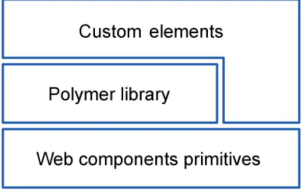
Figure 2. Structure of website
In Figure 2 we can see that the structure of the website is effective for faultless performance and creation of web components together with Polymer library. The idea of such duet is а perfect combination, since PolymerJS is completely based on Web Components. Since not all browsers support them yet, it is necessary to use the webcomponent.js polyfill that will fill the gaps of browsers at this point. The Polymer library itself provides a declarative syntax that makes it simpler to define one’s own custom elements, as well as to use already provided elements and decrease the use of third-parties libraries in the project and be dependent only on the browser in the future. Now the new custom elements are built with, and dependent on Polymer library, and
certain structure in mind, and is divided into four layers to be able support all declarations and changes:
• Native layer provides all front-end web technologies that are currently supported by major browsers, e.g., Shadow DOM, pointer events.
• Foundation layer fulfils the gaps of browsers that do not support certain features at the moment with polyfills. This layer is temporary and is tended to disappear over time.
• Core layer provides the polymer.js library itself, necessary infrastructure for Polymer elements and integrates it into the project.
• Elements layer provides standard sets of polymer elements, included in the library that will be explained in detail later.
This Polymer structure was the same for both versions 0.5 and 1.0, but the difference between two versions is in the actual code and the logic of how the same tasks should be applied. Further in this work, the semantics and the features of particularly Polymer 1.0 that were launched in May 2015 will be discussed. The main point to know about Polymer 1.0, is that it is not just a better version of technology used in front-end development, not like anything that came out before. The current version’s number - 1.0, does not simply mean the version, it says that Polymer is completely new technology, compared to the first launch of Polymer v0.5; and it was not created to replace frameworks or any libraries; but rather to make it all work together.
As mentioned earlier, Polymer is a library, with already some ready, custom sets of elements in the library. These elements have defined style and behaviour, certain tag name and are ready to be implemented; they are initially divided into sets, according to subject and tasks of the programming website. As the Polymer 1.0 has been launched, they had 5 sets of element, which are:
• Iron Elements. Core Polymer elements that do not have a specific range of use but can be used on all websites and set the material design style to the new website.
• Paper Elements. UI Components following the material design guidelines. • Google Web Components. Components for Google’s APIs and services.
Every single one API was wrapped into his own element, like <google-map>, <google-translate>, <google-youtube>.
• Platinum Elements. Push notifications, offline caching <platinum-sw-cache>, elements like register sw-register>, push messages with <platinum-push-messaging> and much more, are now just one single element.
• Gold Elements. E-commerce elements, that support auto validating credit card fields, auto validating name input fields etc.
Now the PolymerJS team have increased the line of sets, which at the moment have only 1 element in the line, and upgraded the Platinum Elements set to 1.2.0. The two new sets are:
• Neon Elements. For Animation and Special Effects, with its <neon-animation>. • Molecules. Wrappers for third party libraries. With <marked-element>.
Seeing how fast the new sets of elements have been added to PolymerJS elements line, the speed of developing, upgrading and modernising of web development tools, utilities can be seen and judged. It was only at the end of May 2015, when the Polymer 1.0 was introduced, with its initial five lines of included elements into library, and already 4-5 months later, they introduced the new two lines with different target of problems. The reason, at first place, why those elements were grouped into different sets, is that there were, and still are, some areas, directions in websites development where web developers have been facing certain problems and definitely need to spend more time on developing some components for the page. There are several great features that Polymer 1.0 has, and that turns the future web development into nowadays web programming.
3.1 Paper Elements
The paper elements are probably the most exciting and intriguing elements of all elements introduced so far. They give an impression that it is a toy that is easy to understand and work with, which is actually so indeed. The implementing process of paper elements to the project is very easy, and has several possibilities. The most obvious one is to download a ZIP file to the root folder of the project. Alternatively, there is a better for organisational purposes way to install paper elements with bower or git clone, and the last step for all downloading possibilities is to include a link tag to the HTML file with path to the paper elements. The downloaded or installed file already contains default elements and from now can be used in the project.
At this point it is important to shortly explain what exactly material design is. Basically these style guidelines are going along the side of PolymerJS and are the core idea of the future websites style and are quite popular nowadays as well. The goal of the Google Team that works on the material design is to create a visual language that synthesizes classic principles of good design with the innovation and possibility of technology and science (“Material Design. Introduction”). It is a visual style with bold and graphics involving motion design, a single system that allows for a unified experience across platforms and different screen sizes. Polymer, with its Paper Elements, is Google’s implementation for Material Design on the web. The Polymer and Material Design teams have been working very closely together to make sure the Paper Elements set works great cross-device. They have been reviewing hundred of apps before they have launched them. Based on those reviews, a couple of common patterns and themes were marked out that are present in all apps.
• Position. The position of an element can be core to discoverability and usability of the app and therefore web developers should always pay attention to it. The users of web application are changing the screen sizes on the desktop many times, they can move from mobile device to tablet, and during all those migrations, the expectations of users change. Different elements are expected to be in different positions on different screen sizes. And the Polymer team solves this by simple CSS, standard media-queries; avoiding any unnecessary JavaScript, as mentioned earlier.
• Transform. Transformation forms, like changing the menu from top-positioned navigation bar, for example displayed as tabs on desktop, to the boxed-list that slides in from the right on mobile, can also be technically the most complex adaption of UI, and also from the UX prospective. So the content stays the same, but its container was changed in order to fit it better in the screen, to make more discoverable in different views.
• Reflow. It is a main component that developers think of when thinking of the responsive design. That is why this theme was also included into consideration when creating paper elements and its logic.
Those three patterns are not the only ones, but the main ones that help thinking of better responsiveness, UX, and smoother performance. What is interesting to notice is that whether these three themes are targeting different results and functionalities, they all are fired with the help of media queries. If the most well-known way seems a little
too banal, when writing in the CSS file, e.g. @media all (min-width: 768px) {}, Polymer offers another primitive that is very useful for building an adaptive UI, particularly – element: <iron-media-query query=”(min-width: 768px)” query-matches=”{{queryMatches}}” on-query-matches-changed=”_switchLayout”> </ iron-media-query>
Iron media query does data binding on top of CSS media queries. It is an element that is built on top of the HTML match media queries, which lets us parse out media queries and perform intelligent manipulations on them. This element has three parameters. One standard media query, specifying, in which conditions, circumstances the following styles should be applied; the second attribute is a simple Boolean value that says whether the media queries have been matched or not; and the last attribute is an event that allows to hook into whether that media query has been reached and called on-query-matches-changed.
Just like the Googles logo has been developing alongside the dominant styles of websites across all Internet, that was updating from using more volume, 3D impression, to the so called flat graphics and fonts, the Google Team of designers have been summing up the core ideas of modern style guidelines. As a result, three main principles of the material design have been developed, which are now the distinguishing features of Internet style; and recently have been spread widely in both the web and print areas quite fast.
Those principles are:
• “Material is the metaphor”. Its idea is to use, pay attention to the lights, surface and movements of the objects on the web. Those are the keys for a user to understand affordances quicker and better.
• “Bold, graphic, intentional”. This principle guides designers and developers to use all the foundational elements of print-based design – typography, grids, space, scale, colour, and use of imagery (Material Design. Introduction).
• “Motion provides meaning”. The motion gives the user an understanding of some actions that something has been made to cause the changes in the design; it focuses the attention and maintains continuity of the user.
Figure 3. Material Design principles on the web
Figure 3 shows the three principles of Material Design are shown correspondingly, how they look on the web or in print, and how, exemplarily, the components of the website following these guidelines can look like.
The tag names of paper elements, as mentioned before, are really easy to understand and remember. For example <paper-drawer-panel> is a panel that spans along the full height of the screen in the left (rarely on the right), is not scrollable, and on a smaller screens, e.g. mobile, will slide in from the left on a toggle of the specified button, make the main content darkened and not active, but still visible; <paper-listbox> is a list of some data, wrapped in box. These examples of tag names show how the naming is thought through in PolymerJS and the needed element can be found quickly. There is also no need in writing manually the CSS styles and position those elements. All together Paper Elements help developers to create an adaptive, responsive website that will stay bold and memorable in all screen sizes.
3.2 Platinum Elements
Platinum elements help to create the real and complete web application out of just a website. These elements serve to create the actions and logic when surfing on the page. The main functionality that is provided by the Platinum elements is the new service worker API. It has nothing to do with the Web Components, on which the Polymer is built on, or with the Polymer itself, but rather the new HTML API standard.
• Offline app
By saying offline, the Polymer team really means not dependent on the network. Even though it sounds confusing, how the offline application can be the future, we can still agree with the former statement. And here is why. Our generation is getting involved in the Internet more and more every day doubtlessly, but still there are some situations, like every day travel to work with the subway, for example, or a train travel to the countryside, where there can be no Internet connection. To understand it better, let us take Platinum elements as an example. The idea behind creating them was to wrap those complicated APIs and provide the most obvious use cases simplified out so that the developer can just drop them in. Platinum elements are targeting one specific sphere – dynamic web application. The ability to perform offline is a great feature indeed, and has several reasons and advantages for users themselves: cutting down the internet usage costs, being able to search something in subway, and the last, but not the least – longer battery life.
So thinking about the application itself. The first and most obvious app that does not require a network connection would be most likely a game, e.g., snake. It is entirely offline; there are no online components. One just has to put all the elements to cache, load them up and the application is set to go. For some applications, like an email application, one must be connected to the Internet in order to perform some basic operations. With the use of caching the user can still read the downloaded earlier messages while offline, and even more. The user can still control that offline experience, like write draft email, playing a certain game in the web browser. As an instance, from Chrome (since Polymer is from Chrome team), when the Internet connection is lost and the user cannot surf the Internet, in the browser’s tab the user can see a green dinosaur, and play an interacting game while the connection is established. The Polymer team now gives us an opportunity to have a game of our own on our website or whatever we would like to, if the user looses a connection. How is it all connected with Polymer? - ‘There is an element for that’. The Platinum Element <platinum-sw>, where sw stands for service worker, which is a new feature implemented in Chrome.
So normally, when a user visits a website, the request to server for information is sent, straightforward and pretty simple. The service worker element has a so called mediator (which is normally a script) that is added between a page and a server, and this
mediator already makes a decision whether to go to the network, go online, download the sources from the server or stay offline and get the sources from cache.
• Push messaging
Push notifications are indicators that something has happened on the server of an application. They are very common in modern apps and are almost impossible to live without. The most common push notifications are probably Facebook or Whats App message notifications, which are most likely received millions of times by users; or weather updates; e-mails and many more. So Polymer decided to improve them and make as user friendly as possible. They managed to add the logic, catching styling and easy handling of push notification, just like the user expects it. They have created an element <platinum-push-messaging>, that can handle the trigger, for example, for enabling the push notification and following it permission notification; thus the user understands why they have to click that button to say that that there were notifications. Another useful feature is that all those push notifications can be generated and sent by application even though it is closed, or running in the background. One can also make all the necessary configurations right in the app, which makes it more logical and easier for web developers to setup. The code for the whole push notification can now look just as simple as that:
<platinum-push-messaging title="Thesis presentation!"
body="You have the thesis presentation tomorrow." img="turkuamk.png"
click-url="uni.png"> </platinum-push-messaging>
• Device access
This feature is at the moment exactly what a sneak peek into future can be called, because it is not implemented even in Chrome, or other browsers yet, but is almost in use and often requested by the users. At the moment of the announcement, it was in the stage of development by Polymer team and at that time was only available on Chrome Operating System, not even on Chrome Canary. The Device Access feature is based on Web Bluetooth, and is an API behind it. The idea is the same as for the Smart Bluetooth, to connect to nearby Bluetooth Low Energy devices. And even though this API is at the moment in development and only experimental, there is
already an element for that, which is <platinum-bluetooth>, for a faster implementation, when it is ready.
The core idea of this element, is to create a nicer, easier to understand and smarter Bluetooth connection between devices. Web developers can also implement this by themselves (when this feature is stable and available for use on different browsers). It will be only one element, in which the filter type for device, the values that we want to collect can be written; presumably this all will be done by data attribute, which is an accessible, functional thing.
3.3 Websites build on Polymer. Examples
Having discussed Polymer library, its advantages and disadvantages, we can now take a look at exciting websites that were built on PolymerJS. Further on, we will look at three different websites that have different user target groups, different content and different platforms, but one specification in common – they were built on PolymerJS library.
Picture 5. Google Translate Community
When looking into statistics of such websites, it is evident that the majority of them are daughter websites from Google. This can be described by the fact that new technologies always need time to become stable and well appreciated; but can be well implemented by the designers of the idea. The first example from Google Team is a website for community of Google Translate (https://translate.google.com/community). The design of the website has clear features of Material Design guidelines. It has bright colours, bold blocks and compact view. It does not have any commercial thematic and does not require complicated forms and validations; therefore, it is built with paper elements. It has a very simple, responsive layout, and, as a result, the website achieved all the objectives that were aimed by Polymer elements. What is even greater is that Google Team confirmed that the complete website for Google Translate Community was built from start to finish by only front end engineers in just a few months. By using exclusively Paper Elements, those developers were able to focus only on building a successful application, and not on how to implement all those Material Design standards in a better way.
Picture 6. Atavist.com
Another example is the Atavist website (https://atavist.com/). Atavist was founded by a small team of developers, editors, designers, and other creative staff, and at the end was shaped into a software platform where it became possible to create a thriving home based on web for deeper stories, beautiful design, and innovative publications. So even though the core of their platform still stays a text, they managed to create a more powerful tool/application, where all kinds of different media can be used for creation of interactive content, including maps and charts, by a simple drag-and-drop function. To create so easy-to-use elements, blocks and components, they used Polymer. Using Polymer makes it really easy to integrate all of those different kinds of media from the web into Atavist, and, moreover, Polymer makes it possible for the team to easily build more.
Picture 7. Vaadin. vaadin-grid
The last but not least, or less interesting example that is considered here, is the enterprise website vaadin (http://vaadin.com), which has one of the most popular Java frameworks for building enterprise applications. At vaadin they have confusing and knotty system at the first sight. Vaadin is a Java-based framework application, which provides their clients with elements and components that are built out as Polymer elements. Their specific target is to show big sets of data in compact ways, like databases. The element that is shown in Picture 7, is a <vaadin-grid>, all-inclusive table. Being a very problematic element that is difficult to construct exactly how the client would like it to be in short time, the vaadin team created a reusable component of such a grid, which has all the expected features like lazy loading, multi select rows, sticky header and many others.
4 CONCLUSION
The step-ups in web development sphere are happening every year and all have different character, reasons and tasks; but all together step-ups have the same factors of their appearance. The most important step for developers to do here is to be noticed and explain clearly to the audience the meaning and purpose of their innovation; why and how it can improve the performance of already exciting websites.
So the first type of step-ups is caused by the peculiar to humans need for the evolution, the wish to do something in the different, easier or maybe more difficult way. It has been present in humans constantly. More often step-ups represent the improvement of some language, plugin or even software, that have been already developed and are of great importance, and therefore they cannot be substituted, but can be improved and updated. For example HTML developed from variation number four (HTML4) to the current number 5 (HTML5). The HTML is the base language of programming the websites; it is what the front-end development has started from and still is the core of the websites. Nonetheless, the new HTML5 has made a huge step up, was refined greatly and needed to be learnt almost from scratch. It helps us to correct bugs of previous versions and improve the performance of irreplaceable components.
The second type of step-ups is the completely new technologies. They usually appear because existing modules, software, and techniques or even so called hacks, do not fulfil all the demands of desired performance for the website. These could be modules for creating a smoother animations, more flexible block structure for better responsiveness or faster website loading. The reasons and aims could be different, but what pushes them is the lack of what has been created so far. Web Components fall into this category. Most likely, before the finished, shaped, and developed Web components appeared, there were attempts for creating something similar, that is how it all came to styled, reusable widgets that can be used in different projects. One of the impulses to create particularly this collection of standards is so to say the rule “Do not repeat yourself”. Following this rule helps to keep the code clean and pretty; and if before it was not always possible to follow this rule and the “dirty-fix” rule was used, now there is the whole collection of clean, set-to-use widgets that can be used for creating interesting, stylish websites with clean code.
as such big organisations as Google that will support most creative and promising ideas. Being the leading developing company, Google have a variety of convections and contests where new ideas can be presented, and in case of rational thoughts, business plan and approximate results of introduction of those new technologies to the mass market, receiving support from Google, both moneyed assistance and assistance with senior programmers. However, even the support from Google, high expectations and the conjectural indispensability of the new technology, the lifecycle of the innovation can vary from 1 month to 1 year, and can even become irreplaceable. This is influenced by many factors, such as the development team and the budget of the project. The team usually needs constant support and good hardware for faultless and exact computation, statisticsm, which results sometimes in great costs.
The adaption time to new technologies can also vary greatly, and there are several reasons for that. Some small improvements and updates, new package managers or code editors can be adapted and be widely used very fast, as long they have gone through the testing and approval stages. They do not need some complicated changes of the website structures or layout. Such major innovations like Web Components or Polymer imply more complicated manipulations. For huge companies, that have thousands and millions of viewers per day, the total rebranding and re-launch of the website is a decision that has to have substantial reasons. Very often such companies have complicated, large databases, deep trees of pages into the website. This all would need, e.g., in case of implementing Polymer, thorough and careful work, may cause at this time slow loading of website or close the website for this time in order not to overload the servers, which in the end may cause the decrease of user visits. On the other hand, the small companies that have started recently have a chance of building their website with new technologies, which will end up in a better and faster performance nowadays. So even if some companies do follow this thought, they still need time to become noticeable.
There is a great amount of rumours about how Web Components did not actually make any breakthrough and are not going to, since by this day it is already more than three years since they were first introduced. Many developers are asking themselves, how popular is it actually today? The real answer would be – not that many. Looking back at the history, we can notice similar template of events. The first example that shows similar trend of developments is Ajax. It is a set of web development techniques utilizing many web technologies used on the client-side to create asynchronous Web
applications (Ullman 2007). With Ajax, web applications can send data to and retrieve from a server asynchronously, in the background. More than ten years ago it made a revolution, but after couple of year becoming more stable and giving developers the actual value of it, it had a similar to the current Web Components situation. Some developers were already working with Ajax, building projects based on Ajax, giving an account of how powerful and cool it can be, trying to let other developers understand that. But all comes in its time. The main problem with Web Components today that thwarts the progress is the lack of browsers’ supports. Luckily this situation is changing, thanks to smart developers in Mozilla, Chrome and other teams that do realise all the powerfulness of this innovation, and are actively working on implementing support for Web Components.