The impact of World War II on the
cancer rates in Norway
by
Anahita Rahimi
THESIS
for the degree of
MASTER OF SCIENCE
(Master i Modellering og dataanalyse)
Faculty of Mathematics and Natural Sciences University of Oslo
February 2011
Det matematisk- naturvitenskapelige fakultet Universitetet i Oslo
Preface
After a meeting with Bjørn Møller and Freddie Bray from the Cancer Reg-istry of Norway and Ørnulf Borgan from the University of Oslo in December 2008 we decided that this thesis should be written in collaboration with the Cancer Registry of Norway. At this particular meeting Møller and Bray had two suggestions for topics, whereas one of the topics where chosen for this thesis. In earlier studies it has been shown that there is a transient effect of World War II on rates of colorectal, breast and testicular cancer, most probably due to the change in dietary and physical habits during the occupation period. Thus Møller and Bray where curious to see if a wartime effect could be found for other cancer sites in Norway as well.
Due to the fact that the incidence rates for cancer in Norway - and other countries - are growing I thought it might be interesting to see if the dietary and physical habits could significantly influence the incidence rates in certain epochs of time. This is also of concern to general public health.
Thus “The impact of World War II on the cancer rates in Norway” was
chosen as topic.
The Cancer Registry of Norway provided the data for the thesis. In ad-dition the registry provided me with office space and supervising via Freddie Bray.
Acknowledgements
I would like to express my appreciation towards those people who made the completion of this thesis possible. My greatest gratitude goes to my supervisor Professor Ørnulf Borgan from the University of Oslo. With his great intelligence, kindness and patience he has helped me throughout the entire process of writing this thesis. Ørnulf, with his encouraging words and the amount of time spent on guidance, is an excellent supervisor. My gratitude also goes to my second supervisor Dr. Freddie Ian Bray, who with his encouragement and his excellent sense of humor has helped me to stay positive and enjoy the great amount of time spent on this thesis. In addition I am grateful for all the time and knowledge Freddie has shared with me. It has been a great honor working with both of you.
I would also like to show my appreciation towards my parents Mah-boubeh Eftekhari and Reza Rahimi, with whom I have learned that with determination and hard work anything can be accomplished. Through their great amount of support and always believing in me, they have helped me to never give up, especially when things seem unbearable. Mom and Dad, thank you for everything.
To the rest of my family and wonderful friends, thank you so much for all your support and encouragement.
Last, but not least, I would like to thank the Cancer Registry of Norway, which gave me the opportunity of writing this thesis.
Oslo, February 2011 Anahita Rahimi
Contents
1 Introduction 9
2 Routine sources of data 13
2.1 Summary of data and sites . . . 13
2.2 Lexis diagram . . . 14
2.3 Cancer rates . . . 16
3 Age-period-cohort model 21 3.1 Age model . . . 22
3.2 Age-drift model . . . 23
3.3 Age-period and age-cohort models . . . 24
3.4 Age-period-cohort model . . . 25
3.4.1 Holford’s drift . . . 29
3.5 Natural regression splines . . . 31
Comments . . . 35
4 Testing cohort effects 37 4.1 Second differences . . . 37
4.2 Testing for non-linear cohort effects . . . 39
4.2.1 Change in linear trend . . . 39
4.2.2 Change in curvature . . . 45
4.2.3 Comparison of the change in linear and curvature . . . 47
4.3 Nonparametric evaluation of birth cohort trends . . . 52
5 Results for all cancer sites 57 5.1 Digestive organs . . . 58
5.2 Female genital organs and breast cancer . . . 61
5.3 Male genital organs . . . 62
5.4 Urinary organs . . . 65
5.5 Lymphoid and haematopoietic tissue . . . 65 7
5.6 Others . . . 67
5.7 Conclusion . . . 67
6 Discussion 73
6.1 Summary . . . 73
6.2 Further research . . . 74
A CA-plots for all sites 77
B Estimated cohort effects using splines for all sites 89
C Orthogonal polynomials 101
Chapter 1
Introduction
The second World War (WWII) involved most of the world’s nations and lasted from 1939-1945. Several countries were occupied during this period. One of these countries was Norway, which was occupied during a five year period from 1940 to 1945. Due to the rationing of several food items during the occupation period, the dietary habits changed (e.g. Tretli and Gaard, 1996). While the intake of fresh vegetables, fish and potatoes increased in people’s diet, the intake of energy, fat, meat and milk consumption de-creased. As a result of the occupation period, tobacco and alcohol was not easily accessible, thus the consumption of these items was also reduced. In addition physical activity changed for the Norwegian population during the occupation period. Thus assumptions that changes in these factors might have affected the risk of cancer for selective cancer sites during the occu-pation period are present. Earlier studies have concluded with a transient reduction in incidence rates due to the impact of WWII for colorectal cancer, breast cancer for females and testicular cancer (Svensson et al., 2002; Tretli
and Gaard, 1996; Wander˚as et al., 1995). The decrease in risk for colorectal
cancer was observed for birth cohorts born during and shortly after WWII. Similarly for breast cancer a decrease in the incidence rates was observed for the cohorts being in puberty during the occupation period. For testic-ular cancer, the decrease was observed for those born during the war, and it might seem that the cohorts being born just before the war also might
have been affected (Wander˚as et al., 1995). The three studies all imply that
dietary habits are vital when it comes to risk of cancer, more specifically during early life for colorectal and testicular cancer and beginning of breast development at puberty and first full-time pregnancy for breast cancer for females. More specifically, Tretli and Gaard (1996) found a decrease for
women that were between eight and 27 years of age during the occupation period. In addition the study observed that the slope of the cancer rates for women being born between 1933-1944 had a tendency to level off after a strong increase.
Now if dietary habitsdoplay a vital role in the risk for colorectal, breast
and testicular cancer, a natural conjecture would be that it could play a vital role for other cancer sites as well. Thus we would like to investigate for other sites a possible decrease in cancer risk for birth cohorts born during WWII. In addition, we will consider birth cohorts experiencing puberty around WWII for females registered with breast cancer. These considerations are
the motivation for the topic being addressed in this thesis, that isthe impact
of World War II on the cancer rates in Norway.
The Cancer Registry of Norway started recording cancer cases as early as 1952 (Cancer Registry of Norway, 2010a). It is mandatory to report all cancer cases to the Cancer Registry. Thus we trust the data being used in this thesis to be reliable and accurate. The data will be used for both visual inspections and statistical tests. It would be too time consuming and not of any purpose to try the methods on all the sites in question before being somewhat certain that the methods are reliable. Thus whenever examples need to be given to illustrate a methodology, data for colon cancer by sex will be used. When feasible, data for breast cancer for females and testicular cancer may be used as well. This is due to the fact that earlier studies have concluded with a transient reduction in the incidence rates for the birth cohorts around WWII for these specific cancer sites. Thus visual inspections and statistical tests should be able to capture this feature for these specific sites if we should trust them to give us reasonable results for the other cancer sites as well.
As mentioned above we hope that inspection of data will help us get a better overall view of the trends in incidence rates around WWII. The
studies by Svensson et al. (2002), Tretli and Gaard (1996) and Wander˚as
et al. (1995) found that WWII has had an impact on the estimated incidence rates for the specific cancer sites considered. However these studies did not test for significant wartime effects. We will introduce such formal tests in this thesis and hope to verify a wartime effect beyond visual inspections. However we are aware of the possibility that the relatively small population size in Norway might be a drawback for the analysis part of this thesis.
Calculations and graphics in this thesis were obtained using R (R
De-velopment Core Team, 2010). One of the advantages of using R is that we
easily can implement different packages in the software. The packages are developed to be used in the different fields of statistics and hence with
func-11 tions not given directly in the software itself. As for this thesis the so-called Epi package is ideal. The package contains functions which can be used for both visual inspections and the statistical tests considered in this thesis. We will not go into further details of the functions or other details regarding the software here. However, when needed, we will specify which functions we consider from the Epi package for the statistical tests and visual inspections considered in the following chapters.
The outline of the thesis is given as follows. In Chapter 2 we give an overall summary of the data. The chapter also gives details on how to define
birth cohort by age and period and also gives a graphical presentation of this
by introducing theLexis diagram. A summary of thecancer sites considered
in this thesis is also given in Chapter 2. In addition colon cancer is used
as an example where the number of new cases,person-years and incidence
rates given by sex are given in appropriate tables. Figures of observed rates given by period by age and birth cohort by age, also for colon cancer, are given for a better understanding of how to observe a period or cohort effect. Thus the purpose of Chapter 2 is mainly to give background information so the reader better will understand the methods and interpretations given in the following chapters.
In Chapter 3 we introduce theage-period-cohort model (apc model). The
apc model is a Poisson regression model which considers age, period and co-hort effects simultaneously. The three variables are hopelessly entangled since cohort is obtained by subtracting age from period. Due to the linear dependency between the three variables the use of the apc model and inter-pretations of the results should be handled with care. Necessary details for a better understanding of the model and its results are given, although the reader should consider for example Holford (1991) or Bray (2005) for further details. Visual inspections of the estimated effects from the apc model for colon cancer by sex are also considered in the chapter. The apc model can be used directly on 5-year age and period intervals. However, as the occu-pation period lasted for five years, we examine estimated effects by using yearly data as well as an aid to interpretation. Thus we introduce the term
splines, which are integrated in the apc model for smooth estimated effects when using yearly data. Furthermore the model is the foundation of both the visual inspections and statistical tests introduced later in this thesis.
Chapter 4 introduces two tests which may help us give more formal con-clusion in our interpretations of the estimated cohort effects for the cancer sites discussed in this thesis. Both tests were introduced by Tarone and
Chu (1996, 2000). The first test can be seen as a generalization of second
given in the chapter. Basically, the first test examines the non-linear cohort effects around WWII by considering two scenarios. In the first scenario, we assume linear slopes in two adjunct time intervals. In the second scenario we assume the estimated effects to be given as a curvature in a coherent time interval. In both scenarios we examine how the estimated cohort effects, given as linear slopes or curvature, change during the time around WWII. In both scenarios we hope to find a transient reduction in the estimated effects around WWII. We also compare numerical results, for colon, breast and testicular cancer, for both scenarios in this chapter. The second test is a nonparametric test which is a generalization of the sign test and is based on observed rates. However, the authors Tarone and Chu suggest that the test is used as a adjunct to the apc model introduced in the previous chapter.
In the fifth chapter, we present numerical results for all cancer sites considered in this thesis by using the first test introduced in the previous chapter. The results will be given in appropriate tables and figures. We hope that the results obtained in Chapter 5 will help us gain more strength in our conjecture of a wartime effect on the incidence rates for some cancer sites in Norway.
In the sixth and final chapter we will sum up the main findings in this thesis. We will give room for discussion and proposals for further research.
Chapter 2
Routine sources of data
In this chapter we give a summary of the data used in this thesis. The summary involves details of the variables available in the data extracted from the Cancer Registry of Norway. To better understand how birth cohorts are defined, the Lexis diagram will be introduced. The diagram graphically shows how a birth cohort is given by age and period. For illustration tables of the number of new cases and incidence rates are given for colon cancer. Visual inspections for the observed rates given by period by age and birth cohort by age for colon cancer, by sex, are also given.
2.1
Summary of data and sites
To make the analysis as good as possible we extract registered cases for 19 of the most common cancer sites given in Table 2.1. For each site the
data contain the number of new cases andperson-years for a given year, by
age and sex. To better understand the definition of person-years we may consider 1000 individuals for a time period of 1 year (Scenario 1) and 500 individuals for a time period of 2 years (Scenario 2). For Scenario 1 we
calculate the person-years by 1000 individuals × 1 year and similarly for
Scenario 2 the calculation is given as 500 individuals × 2 years. Thus for
both scenarios the person-years are equal to 1000. More formally we define person-years as the sum total of length of time a group of people are at risk for a given period, by age and sex. Data are available for both 1- and 5-year age and period intervals. From the yearly data we may easily obtain data with 2-year age and period intervals as well. The choice of dataset in the different settings of visual inspection and statistical tests will be specified when needed.
Regardless of the dataset the youngest and oldest age groups will have very few or zero observed number of new cases. To avoid irregularities and misinterpretations of the visual inspections we omit the youngest and oldest age groups. Thus we restrict the age interval for the cancer sites to be 30-69 years. For testicular cancer younger males are more at risk (Cancer Registry of Norway, 2010c) and the age interval will be restricted to 15-54 years for this particular cancer site. The age groups at risk for prostate cancer also deviate from the majority of cancer sites where there is almost zero incidence for those under the age of 40. For this site we restrict the age interval to 40-79 year.
Table 2.1: The cancer sites considered in this study.
ICD-10 Site
C00-14 Mouth and pharynx
C16 Stomach
C18 Colon
C19-21 Rectum, rectosigmoid and anus
C25 Pancreas
C33-34 Lung and trachea
C43 Melanoma of the skin
C50 Breast (for females)
C53 Cervix Uteri
C54 Corpus Uteri
C56 Ovary
C61 Prostate
C62 Testis
C64 Kidney excluding renal pelvis
C66-68 Bladder, ureter and urethra
C70-72 Central nervous system
C73 Thyroid gland
C82-85+C96 Non-Hodgkin lymphoma
C91-95 Leukaemia
2.2
Lexis diagram
The main purpose of this thesis is to study trends in incidence rates forbirth
cohortsaround WWII. A graphical presentation of the relationship between age, period and cohort can be given by a Lexis diagram. The Lexis diagram
2.2. LEXIS DIAGRAM 15 will be presented with 5-year age and period intervals. Interpretation and presentation of the diagram by using 1- and 2-year age and period intervals will basically be the same, except some minor adjustments to the length of the intervals and axis labels.
Calendar time Age 1953 1963 1973 1983 1993 2003 30 40 50 60 70 1923 1918 1913 1908 1903 1898 1893 1888 1928 1923 1918 1913 1908 1903 1898 1893 1933 1928 1923 1918 1913 1908 1903 1898 1938 1933 1928 1923 1918 1913 1908 1903 1943 1938 1933 1928 1923 1918 1913 1908 1948 1943 1938 1933 1928 1923 1918 1913 1953 1948 1943 1938 1933 1928 1923 1918 1958 1953 1948 1943 1938 1933 1928 1923 1963 1958 1953 1948 1943 1938 1933 1928 1968 1963 1958 1953 1948 1943 1938 1933 1973 1968 1963 1958 1953 1948 1943 1938 1923 1918 1913 1908 1903 1898 1893 1888 1928 1923 1918 1913 1908 1903 1898 1893 1933 1928 1923 1918 1913 1908 1903 1898 1938 1933 1928 1923 1918 1913 1908 1903 1943 1938 1933 1928 1923 1918 1913 1908 1948 1943 1938 1933 1928 1923 1918 1913 1953 1948 1943 1938 1933 1928 1923 1918 1958 1953 1948 1943 1938 1933 1928 1923 1963 1958 1953 1948 1943 1938 1933 1928 1968 1963 1958 1953 1948 1943 1938 1933 1973 1968 1963 1958 1953 1948 1943 1938
Figure 2.1: Lexis diagram which shows the relationship between age, period and birth cohort using 5-year data. Period is given on the horizontal axis and age on the vertical axis. The birth cohorts can be seen on the diagonal, with a line going through the 1923 and the 1933 birth cohort, that is for those being born in 1918-27 and 1928-1937.
Now for 5-year age and period intervals, the age groups considered are
30-34, 35-39,. . ., 65-69 years and the periods are 1953-1957, 1958-1962, . . .,
2003-2007. The respective birth cohorts are derived by subtracting age from period. As an example we subtract the oldest age group 65-69 from the first period interval 1953-1957. This leads to the cohort of people being born sometime in the 10-year interval 1883-1892. Hence the birth cohorts are given as the following 10-year overlapping intervals 1883-1892, 1888-1897,
. . ., 1968-1977. As a matter of notation we will denote the age groups and
period intervals more briefly as 32.5, 37.5, . . ., 67.5 and 1955.5, 1960.5, . . .,
period. The corresponding birth cohorts are also denoted by the midyear of
the 10-year intervals, i.e. by 1888, 1893,. . ., 1973.
In the Lexis diagram, see Figure 2.1, age is given on the vertical axis and period on the horizontal axis. Thus the respective birth cohort intervals are given following the diagonal up and towards the right. A line through the 1923 (1918 - 1927) and 1933 (1928 - 1937) birth cohorts are added so we can get at better feel of how the birth cohorts can be traced in the Lexis
diagram. The Lexis diagram is easily made by the function Lexis.diagram
in the Epi package in the softwareR (R Development Core Team, 2010).
As mentioned earlier we introduce the Lexis diagram so we can better understand the relationship between age, period and birth cohort. For fur-ther details, I will refer to the part about the Lexis diagram in Bray (2005).
2.3
Cancer rates
It will be helpful to examine incidence rates around WWII. 5-year age and period intervals for colon cancer, by sex, will be used for illustration. The tables and figures given in this section are constructed by the functions
stat.tableandrateplot in the Epi package in the softwareR(R Development Core Team, 2010).
We define the estimator for the incidence rate in age group a and
pe-riod p by ˆrap = Ydapap, where dap and Yap are the number of new cases and
person-years for the corresponding age group and period. An overview of the number of new cases for both sexes are given in Table 2.2. Corresponding tables of person-years for both sexes are given in Table 2.3.
Table 2.2: The number of new cases for colon cancer, by age and period.
Male Period Age 1955.5 1960.5 1965.5 1970.5 1975.5 1980.5 1985.5 1990.5 1995.5 2000.5 2005.5 32.5 8 13 12 6 12 15 25 15 12 15 23 37.5 17 26 17 18 15 29 22 30 17 29 29 42.5 36 33 39 32 29 38 51 62 69 58 74 47.5 44 53 76 65 77 70 74 112 111 113 133 52.5 58 67 104 113 132 121 128 174 178 209 225 57.5 102 100 127 181 195 237 238 220 253 336 391 62.5 134 185 213 222 258 345 411 427 411 428 531 67.5 140 195 257 271 328 442 572 672 621 618 635 Female Period Age 1955.5 1960.5 1965.5 1970.5 1975.5 1980.5 1985.5 1990.5 1995.5 2000.5 2005.5 32.5 7 5 6 5 19 14 13 12 13 15 20 37.5 19 28 21 24 27 40 26 39 44 31 44 42.5 24 39 36 58 42 54 63 63 79 78 83 47.5 50 50 74 86 71 85 83 110 117 143 117 52.5 79 75 120 137 166 164 155 160 211 243 223 57.5 111 130 152 176 225 268 264 250 287 338 385 62.5 129 198 216 242 291 400 402 409 410 453 511 67.5 162 218 258 303 374 495 534 601 588 557 661
2.3. CANCER RATES 17 Table 2.3: Person-years in 100 000 for colon cancer, by age and period.
Male Period Age 1955.5 1960.5 1965.5 1970.5 1975.5 1980.5 1985.5 1990.5 1995.5 2000.5 2005.5 32.5 6.65 5.83 5.15 5.11 6.38 8.05 7.87 8.11 8.36 8.91 8.63 37.5 6.45 6.56 5.76 5.12 5.11 6.37 8.05 7.91 8.10 8.41 9.01 42.5 6.17 6.37 6.48 5.71 5.09 5.08 6.34 8.01 7.85 8.09 8.44 47.5 5.59 6.07 6.26 6.38 5.62 5.02 5.01 6.25 7.90 7.77 8.05 52.5 5.08 5.45 5.91 6.08 6.21 5.47 4.89 4.88 6.11 7.75 7.66 57.5 4.53 4.88 5.21 5.63 5.81 5.92 5.23 4.68 4.71 5.93 7.52 62.5 3.66 4.23 4.54 4.82 5.22 5.39 5.50 4.86 4.39 4.47 5.65 67.5 2.82 3.31 3.76 4.01 4.27 4.63 4.78 4.90 4.39 4.02 4.12 Female Period Age 1955.5 1960.5 1965.5 1970.5 1975.5 1980.5 1985.5 1990.5 1995.5 2000.5 2005.5 32.5 6.52 5.62 4.99 4.95 6.03 7.52 7.44 7.72 7.93 8.52 8.41 37.5 6.40 6.44 5.59 4.97 4.96 6.05 7.54 7.47 7.77 8.02 8.66 42.5 6.12 6.34 6.39 5.56 4.96 4.95 6.04 7.53 7.47 7.80 8.08 47.5 5.73 6.05 6.28 6.34 5.52 4.93 4.93 6.00 7.49 7.46 7.80 52.5 5.39 5.63 5.96 6.19 6.26 5.45 4.87 4.86 5.94 7.42 7.40 57.5 4.87 5.25 5.50 5.83 6.06 6.13 5.34 4.77 4.78 5.84 7.29 62.5 4.04 4.67 5.04 5.31 5.63 5.86 5.93 5.16 4.64 4.66 5.68 67.5 3.31 3.77 4.37 4.75 5.01 5.33 5.56 5.63 4.92 4.44 4.46
Table 2.4: Incidence rates per 100 000 for colon cancer, by age and period.
Male Period Age 1955.5 1960.5 1965.5 1970.5 1975.5 1980.5 1985.5 1990.5 1995.5 2000.5 2005.5 32.5 1.20 2.23 2.33 1.17 1.88 1.86 3.18 1.85 1.44 1.68 2.67 37.5 2.64 3.96 2.95 3.51 2.94 4.55 2.73 3.79 2.10 3.45 3.22 42.5 5.83 5.18 6.02 5.61 5.70 7.48 8.05 7.74 8.79 7.17 8.77 47.5 7.87 8.73 12.15 10.19 13.70 13.95 14.76 17.93 14.06 14.54 16.53 52.5 11.41 12.29 17.60 18.57 21.27 22.13 26.19 35.63 29.15 26.98 29.39 57.5 22.52 20.50 24.38 32.13 33.59 40.02 45.54 47.05 53.72 56.71 51.97 62.5 36.64 43.72 46.96 46.01 49.41 64.02 74.70 87.85 93.55 95.78 93.94 67.5 49.57 58.91 68.29 67.63 76.81 95.42 119.55 137.03 141.61 153.74 154.04 Female Period Age 1955.5 1960.5 1965.5 1970.5 1975.5 1980.5 1985.5 1990.5 1995.5 2000.5 2005.5 32.5 1.07 0.89 1.20 1.01 3.15 1.86 1.75 1.55 1.64 1.76 2.38 37.5 2.97 4.35 3.76 4.83 5.45 6.61 3.45 5.22 5.67 3.87 5.08 42.5 3.92 6.15 5.63 10.43 8.47 10.90 10.43 8.37 10.57 10.00 10.27 47.5 8.72 8.27 11.79 13.56 12.86 17.24 16.85 18.33 15.61 19.18 15.00 52.5 14.66 13.32 20.15 22.15 26.52 30.08 31.81 32.91 35.51 32.76 30.15 57.5 22.79 24.78 27.63 30.20 37.14 43.74 49.44 52.39 60.02 57.86 52.84 62.5 31.94 42.42 42.82 45.58 51.68 68.24 67.80 79.20 88.44 97.26 90.04 67.5 48.95 57.83 59.08 63.77 74.62 92.95 95.98 106.71 119.52 125.57 148.34
The tables of incidence rates are given in Table 2.4. Compared to the Lexis diagram given in section 2.2 age is given in ascending order in the tables. Thus the birth cohorts are given on the diagonal down and towards right, which is opposite to the Lexis diagram. If the incidence rates change si-multaneously for all age groups for a specific birth cohort or period we say we have a cohort or period effect respectively. The intention of introducing explorative data analysis is to explore such features of the data. Thus it will be interesting to examine possible cohort or period effects for the cancer
sites in question. Fortunately we can easily obtain figures for examining both possible cohort and period effects in the so called CA- (rates vs. cohort by age) and PA- (rates vs. period by age) plots.
Figure 2.2 gives CA-plots (upper panel) and PA-plots (lower panel) for colon cancer by sex. The figures given on the left are for males and the figures on the right are for females. In the CA-plots the cohorts are given on the horizontal axis. Similarly in the PA-plots the periods (date of diagnosis) are given on the horizontal axis. For both plots the incidence rates per 100 000 are given on the vertical axis. For each age group the line represents the incidence rates over time. We expect the incidence rates to increase by age and time and this feature is captured in both the CA- and PA-plots for colon cancer. That is, we observe that the lines are higher the older the age group. Similarly the lines are higher for the latest compared to the earliest time periods for all age groups. For a specific birth cohort or period, we observe the incidence rates for all age groups simultaneously by following a vertical line in the CA- or PA-plot respectively. Thus by following a vertical line for the birth cohorts around WWII in the CA-plots we notice a decrease in the lines for almost all the age-groups for both sexes, which indicates that we have a birth cohort effect for those born around WWII. However it is not easy to observe a possible period effect for either males or females.
CA-plots are given for all cancer sites considered in this study in Ap-pendix A. By concentrating the eye on the birth cohorts around WWII it might be possible to observe a transient reduction in the incidence rates for other sites as well. We should be careful however, not to over overinterpret the figures. The figures are discussed more closely in Chapter 5.
Even though the CA-plot imply that there might be a birth cohort effect for the cohorts born around WWII for colon cancer, statistical methods aid determining whether the trends are real or random. Since the dependent variable, the number of new cases, is a count, the model to be considered is the Poisson regression model, with age, period and cohort as covariates and log person-years as offset. This model is introduced in the following chapter.
2.3. CANCER RATES 19 1900 1920 1940 1960 1 2 5 10 20 50 100 Date of birth Rates per 100,000 32.5 42.5 52.5 62.5 1900 1920 1940 1960 1 2 5 10 20 50 100 Date of birth Rates per 100,000 32.5 42.5 52.5 62.5 1960 1970 1980 1990 2000 2010 1 2 5 10 20 50 100 Date of diagnosis Rates per 100,000 32.5 42.5 52.5 62.5 1960 1970 1980 1990 2000 2010 1 2 5 10 20 50 100 Date of diagnosis Rates per 100,000 32.5 42.5 52.5 62.5
Figure 2.2: CA- and PA-plots for colon cancer by sex. The CA-plots are in the upper panel and the PA-plots in the lower panel. The figures given on the left are for males and the figures on the right are for females.
Chapter 3
Age-period-cohort model
The age-period-cohort model (apc model) is a well-known tool used by statis-ticians world wide when it comes to analysis of temporal patterns in disease data and will be introduced in this chapter. The apc model allows for mea-suring age, period and cohort effects simultaneously.
An estimator for the incidence rates for age group a and period p is
defined as ˆrap = dYapap, where dap and Yap are given as the corresponding
number of new cases and person-years. We consider the person-years to be
non-random. The number of new cases, dap, are counts and we assume they
are independent and Poisson distributed. Thus we assumedap∼P o(rapYap)
where the rate rap is the expected number of cancer cases per person-year
in age a and period p. We may consider a Poisson regression model where
we implement the number of new cases, dap, as the response. For a
Pois-son regression model the mean rapYap of dap is explained in terms of the
explanatory variables via an appropriate link, g() (e.g. de Jong and Heller,
2008). To restrain the mean to be positive we consider the log-link. Then
g(E(dap)) = logE(dap) = log(rapYap) = lograp+ logYap.
In an age-period-cohort model we assume that lograp is a linear function
of age, period and cohort effects, cf. below. The model may be fitted by
the software R for Poisson regression by including logYap as offset (see R
Development Core Team, 2010).
From section 2.2 we have that cohort cis expressed by age group aand
period p, that is c = p−a. Due to the linear dependency between the
three covariates the model should be handled with care (Holford, 1991). In addition we should not trust that statistical models will provide definite answers and results for something as complex as trends in the number of new
cancer cases (Bray, 2005). Nevertheless when used with care and caution the apc model will aid to interpretation of the trends in incidence rates for the birth cohorts around WWII.
Before we introduce the full age-period-cohort model, we will introduce the so-called age, age-drift, and age-cohort and age-period models. The models can be seen as the hierarchy of models given in Figure 3.1 (Clayton and Schifflers, 1987a,b).
Age
Age-drift
Age-cohort Age-period
Age-period-cohort
Figure 3.1: Hierarchy of models introduced by Clayton and Schifflers.
The term drift represents the average annual change in the rates over time
(Bray, 2005) and will be discussed in section 3.2, where the age-drift model is introduced. The model considered further in this thesis is the full apc model. However, the apc model is the last model in the model-hierarchy and by introducing the other models first we will more easily understand the full apc model. We start by introducing the age model and work our way down the hierarchy of models.
Fortunately the functionapc.fit, developed by Bendix Carstensen, in the
Epi package in the softwareR(R Development Core Team, 2010) compute
the age, period and cohort effects. Thus the function is used for all the models fitted throughout this chapter.
3.1
Age model
The age model is the simplest model included in the hierarchy of models given in Figure 3.1. As the name of the model implies the only covariate considered in this specific Poisson regression model is age. We use age as
3.2. AGE-DRIFT MODEL 23 a categorical covariate. With a log-link the rates can then be explained in terms of age by
log(rap) = logE(ˆrap) =µ+αa (3.1)
whereµis the rate for the reference group and whereαa measures the effect
of age group a relative to the reference. Note that the estimated rates are
presented visually as eµˆ+ ˆαa.As cancer rates always depend on age, the age
model can be considered as the null hypothesis of no temporal variation (Clayton and Schifflers, 1987b, pg. 470).
3.2
Age-drift model
The second model suggested by Clayton and Schifflers is the age-drift model. Due to linear dependency between age, period and cohort, there is a linear variation over time which can be predicted by both the period and age-cohort model (Clayton and Schifflers, 1987a). This temporal variation can
be considered as the drift, δ, and may be estimated by considering the
following model
lograp =µ+αa+δ·j (3.2)
whereµandαacan be considered as in the age model. The drift is estimated
by either specifying period or cohort as a continuous covariate, i.e. j = p
or j = c. The model will have the same estimated value for δ and the
same fitted values ofrap whether period or cohort is used to model the drift.
However the age effects αa will differ, and we cannot distinguish which of
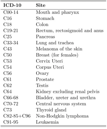
the two models represents the true age curve. That is, the reference will change depending on whichever of period or cohort is included in our model (Clayton and Schifflers, 1987a, pg. 462). As an example we consider the age effects estimated from the age-drift model for colon cancer, see Figure 3.2. The estimated effects are for considering cohort as a continuous variable. Similarly the dashed lines represents the estimated effects when considering period as a continuous variable. The figures to the left are the estimated effects for males and the figures to the right are the corresponding effects for females. From the figure we see that the estimated effects for age differ depending on whichever of period or cohort are given as the continuous covariate. Thus, the drift describes the temporal variation unattributable to specifically period or cohort influences.
35 40 45 50 55 60 65 0.0000 0.0005 0.0010 0.0015 Age Rate
Age and cohort Age and period
35 40 45 50 55 60 65 0.0000 0.0005 0.0010 0.0015 Age Rate
Age and cohort Age and period
Figure 3.2: Estimated age effects estimated from the age-drift model for colon cancer in Norway 1953-2007. Estimated effects for males are given on the left and on the right for females. The lines represent the estimated effects when including cohort as a continuous variable and the dashed lines on considering period as a continuous variable.
The age-drift model is not of great interest by itself. However it is important to understand how the linear dependency between age, period and cohort influences the results. This will help us make valid interpretations of the result we obtain by using the full apc model later in this thesis.
3.3
Age-period and age-cohort models
In the hierarchy of models given in Figure 3.1, the next level is shared
between the age-period and the age-cohort models. The models can be
given as
lograp =µ+αa+βp (3.3)
or
3.4. AGE-PERIOD-COHORT MODEL 25
where µ and αa are defined as above. Further βp and γc are given as the
period and cohort effect for periodp and cohortc. The estimated rates will
be presented visually aseµˆ+ ˆαa, similarly as for the age model. The estimated
period and cohort effects will be presented visually as the relative risks, that
is eβˆp and eˆγc. For the age-period model we assume no cohort effect, i.e.
that the drift is allocated to period. Similarly for the age-cohort model, we assume no period effect (Clayton and Schifflers, 1987a). Choosing a reference cohort with relatively high number of new cases will make the fitted cell rates for the age-cohort model more reliable (Clayton and Schifflers, 1987a, pg. 460). Fortunately we have already excluded the youngest and oldest age groups and rely on the reference cohort to be chosen as a cohort with sufficient number of new cases.
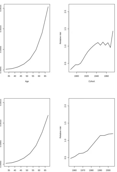
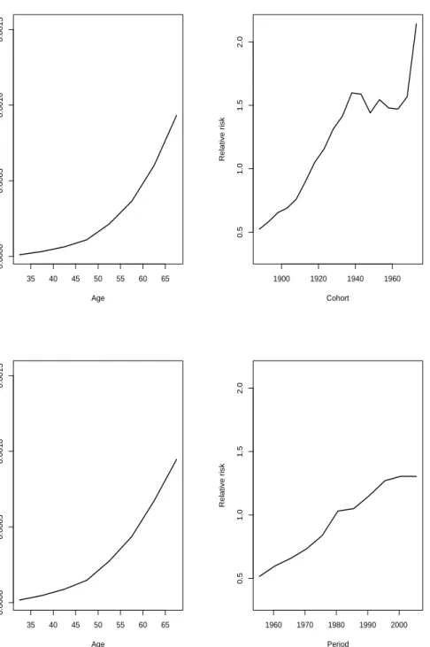
As an example we consider the estimated effects from the age-period and age-cohort model for colon cancer. The estimated effects for males are given in Figure 3.3 and in Figure 3.4 for females. The estimated age effects for females look relatively similar. Although by closer examination we can see that they slightly differ. When it comes to the estimated cohort effects from the age-cohort model, we assume no non-linear period effect, and we see that all drift is allocated to cohort. From the age-cohort model a possible wartime effect is apparent for both sexes in the estimated effects for cohort. The estimated effects from the age-cohort and age-period model are only given as examples in this section. Due to the fact that these specific model are not of key interest, we will not discuss the results any further.
As there are less parameters used in the age-period model compared to the age-cohort model, which can be seen by the Lexis diagram given in section 2.2, it is not unlikely that the age-cohort model will have a better fit than the age-period model (Clayton and Schifflers, 1987a, pg. 466). However as the two models are not nested it is not straightforward to tell which, if any, model is better than the other (Clayton and Schifflers, 1987b, pg. 470). Thus we fit the full apc model and compare the cohort and the age-period model to the 3-factor-model. The apc model is the last model in the hierarchy of models suggested by Clayton and Schifflers and is introduced in the next section.
3.4
Age-period-cohort model
The full apc model measures the effect of age, period and cohort simultane-ously. We are mainly interested in examining the trends in incidence rates for the birth cohorts in this thesis. However, by including period in the
35 40 45 50 55 60 65 0.0000 0.0005 0.0010 0.0015 Age Rate 1900 1920 1940 1960 0.5 1.0 1.5 2.0 Cohort Relative risk 35 40 45 50 55 60 65 0.0000 0.0005 0.0010 0.0015 Age Rate 1960 1970 1980 1990 2000 0.5 1.0 1.5 2.0 Period Relative risk
Figure 3.3: Estimated effects for the age-cohort model are given in the upper panel and estimated effects for the age-period model are given in the lower panel. Esti-mated age effects are given on the left and estiEsti-mated cohort and period effects are given on the right. The estimated effects are for colon cancer for males in Norway 1953-2007.
3.4. AGE-PERIOD-COHORT MODEL 27 35 40 45 50 55 60 65 0.0000 0.0005 0.0010 0.0015 Age Rate 1900 1920 1940 1960 0.5 1.0 1.5 2.0 Cohort Relative risk 35 40 45 50 55 60 65 0.0000 0.0005 0.0010 0.0015 Age Rate 1960 1970 1980 1990 2000 0.5 1.0 1.5 2.0 Period Relative risk
Figure 3.4: Estimated effects for the age-cohort model are given in the upper panel and estimated effects for the age-period model are given in the lower panel. Esti-mated age effects are given on the left and estiEsti-mated cohort and period effects are given on the right. The estimated effects are for colon cancer for females in Norway 1953-2007.
model we are adjusting for non-linear period effects as well, which will make our interpretations more reliable. The Poisson regression model for the apc model can be given as
lograp=µ+αa+βp+γc (3.5)
see Clayton and Schifflers (1987b, pg. 472), whereµis given as the reference.
Further we consider αa, βp and γc as the effect for age group a, period p
and cohort c respectively. We would like to find out how well the models,
given in the hierarchy in Figure 3.1, fit the data. Thus we include the
analysis of deviance tables by sex. Basically an analysis of deviance table compares the models of interest to a saturated model, where a saturated model is a model with as many parameters as there are observations. Thus the saturated model fits perfectly (e.g. de Jong and Heller, 2008). We define
the maximum possible log-likelihood for the saturated model as ˜l and as ˆl
for the model at interest. Further we define the deviance as
∆ = 2(˜l−ˆl)
that is the distance between the saturated and fitted model. A model that gives a good fit will have a log-likelihood value close to the log-likelihood value for the saturated model. Thus the smaller the deviance value, the better the fit. Further we have that
∆∼χ2n−p,
i.e. the deviance is chi distributed withn−pdegrees of freedom. This yields
if our models are adequate. For further details see for example de Jong and Heller (2008).
The analysis of deviance tables for colon cancer are given in Table 3.1 for males and in Table 3.2 for females.
Table 3.1: Analysis of deviance for males experiencing colon cancer. Results are given for all models, including the age-drift model with both cohort and period given as a continuous variable.
Model Df ∆ Change df Change ∆ P(>|χ2|) Age 80 1445.35 Age-drift 79 238.55 1 1206.81 0.000 Age-cohort 63 70.90 16 167.65 0.000 Age-period-cohort 54 53.74 9 17.16 0.050 Age-period 70 155.48 -16 -101.74 0.000 Age-drift 79 238.55 -9 -83.07 0.000
3.4. AGE-PERIOD-COHORT MODEL 29 Table 3.2: Analysis of deviance for females experiencing colon cancer. Results are given for all models, including the age-drift model with both cohort and period given as a continuous variable.
Model Df ∆ Change df Change ∆ P(>|χ2|) Age 80 1401.06 Age-drift 79 222.32 1 1178.74 0.000 Age-cohort 63 66.89 16 155.43 0.000 Age-period-cohort 54 46.95 9 19.94 0.020 Age-period 70 152.63 -16 -105.68 0.000 Age-drift 79 222.32 -9 -69.69 0.000
The first column in tables 3.1 and 3.2 represents the models given in Figure
3.1. The second and third column represents the degrees of freedom,n−p,
and the deviance corresponding to the model given in the first column. The fourth and fifth column gives the change in degrees of freedom and deviance, except for the age model. If the models are not nested this does not make any statistical sense. As mentioned in section 3.3, the cohort and age-period model are not nested. Therefore they are both compared to the full apc model. The last column contain p-values for comparing the reduction in deviance for the row to the residuals. Thus we should consider the model(s) with a p-value higher than 5% or 1% significance level. From section 3.2, where the age-drift model is discussed, we know that the model will have the same fitted values for whichever of period or cohort are chosen to be included the model. Hence, as we can see from the analysis of deviance tables by sex, the age-drift model has the same deviance. Due to the difference in the number of parameters included in the two different models, which is discussed in section 3.3, we see from the tables that the age-cohort model has a better fit than the age-period model for both sexes. However, for both males and females, we see that the only model which gives a good fit is the apc model.
3.4.1 Holford’s drift
As discussed above, we should be careful when interpreting the results from the apc model due to the linear dependency between the three factors age, period and cohort. Thus, we should find a way to extract the drift to make the interpretations easier. The usual constraints given for this model are
αa = 0, βp = 0 and γc = 0 for the first age group, period interval and
cohort. However due to the linear dependency between age, period and cohort, these constraints are not sufficient. Thus an additional constraint is
necessary (Heuer, 1997). However, as there exists no a priori information
before the additional constraint is defined, this may lead to many different
anything else. Thus the parameter estimates for age, period and cohort will depend on the specific restrictions used. However the models all obtain the same fitted values, regardless of the parameter estimates, and this is referred
to as the problem ofnon-identifiability.
Holford (1991) figured that if we find the common features of all possible sets of allowed parameters, it will be possible to interpret the trends for age, period and cohort effect in a specific problem at hand. He suggests that we remove the overall linear trend (slope) and consider the remaining residuals,
which can be interpreted as the curvature. Denote byA, P andC the total
number of age groups, periods and cohorts and introduce
αa = a−A+ 1 2 αL+φa βp = p− P+ 1 2 βL+φp γc = c−C+ 1 2 γL+φc
where αL, βL and γL represents the slope for age, period and cohort and
where φa, φp and φc represents the corresponding curvature (Bray, 2005,
page 92). The relationship between the three covariates,c=p−a, leads to
linear terms which are not identifiable. On the other hand the curvatures are identifiable.
Although the slopes may vary considerably for the various sets of pa-rameters, due to the linear dependency, there are still limitations on the variations. Consider the linear terms for the three covariates. Then for any
pair of numbers (x, y) the linear combination
xαL+yβL+ (y−x)γL
is identifiable. As an example we consider x = y = 1, which shows that
αL +βL is identifiable. Choosing x = 0, y = 1, we see that we may
estimate the sum of the period and cohortβL+γL, which will be denoted
Holford’s drift (e.g. Bray, 2005, page 92). Holford’s drift is usually a good
approximation to Clayton and Schifflers’s interpretation of the drift,δ, given
in (3.2). If we fix one of the slopes,αL, βL orγL, to a particular value, the
two other slopes are determined. Thus the linear slopes are dependent of
3.5. NATURAL REGRESSION SPLINES 31 for an arbitrary model as
α∗L = αL+v
βL∗ = βL−v
γL∗ = γL+v
where αL, βL andγL are the true slopes. Our main interest in this thesis is
examining the trends in the incidence rates for birth cohorts around WWII. Visual inspections of the estimated rates with all the drift placed in cohort will make it easier for us to spot a possible decrease in the incidence rates.
More formally we will assume no period slope, i.e. βL= 0. Thus v =−βL∗
which givesαL=α∗L+β ∗ LandγL=βL∗+γ ∗ L, where we recognizeβ ∗ L+γ ∗ L as
Holford’s drift. We will use Holford’s interpretation of extracting the drift when estimating age, period and cohort estimates in this thesis. Further details of how to manage and interpret the apc model can be found in several different written documents such as Holford (1991) and Bray (2005). As an example we consider the estimated age, period and cohort effects for colon cancer where we extract the drift by Holford’s method. We will present two scenarios graphically, where we in the first scenario assume no period slope and place all the drift in cohort. In the second scenario we place all the drift in period, see Figure 3.5. The figures to the left are the estimated age, period and cohort effects for males and the figures to the right are the corresponding effects for females. As we can see estimated age effects by sex are slightly affected by the choice of where we put the drift. In addition, the estimated period and cohort effects are obviously affected depending on where drift is allocated.
As assumed a decrease in the birth cohorts around WWII for both males and females are present in Figure 3.5. We observe that it is easier to spot the decrease in the incidence rates for the birth cohorts for the estimates given by allocating all drift to cohort. As we are not particularly interested in the period effects they are not discussed in details here. However as for illustration, we see that the period effects differ depending on the choice in whichever of period or cohort we place the drift as is expected by the discussion given above.
3.5
Natural regression splines
When using the apc model it is most common to use data grouped by 5-year age and period intervals. An advantage of using wider time intervals is that the estimated effects are fairly smooth in graphic presentations, as for
30 45 60 1900 1940 1980 2020 Age Calendar time
2e−05 5e−05 1e−04 2e−04 5e−04 0.001 Rate 0.2 0.5 1 2 5 10 Age effects Cohort effects Period effects 30 45 60 1900 1940 1980 2020 Age Calendar time
2e−05 5e−05 1e−04 2e−04 5e−04 Rate 0.2 0.5 1 2 5 Age effects Cohort effects Period effects 30 45 60 1900 1940 1980 2020 Age Calendar time
2e−05 5e−05 1e−04 2e−04 5e−04 0.001 Rate 0.2 0.5 1 2 5 10 Age effects Cohort effects Period effects 30 45 60 1900 1940 1980 2020 Age Calendar time
1e−05 2e−05 5e−05 1e−04 2e−04 5e−04 Rate 0.1 0.2 0.5 1 2 5 Age effects Cohort effects Period effects
Figure 3.5: Estimated age, period and cohort effects for colon cancer in Norway 1953-2007. The figures in the upper panel represents the estimated effect with all drift allocated to period. Similarly the figures in the lower panel represents the estimated effects with all drift allocated in cohort. The figures given on the left are for males and the figures on the right are for females.
3.5. NATURAL REGRESSION SPLINES 33 example in Figure 3.5. A disadvantage of grouping data in larger intervals is the loss of information, which can in many cases lead to an incomplete
interpretation of data. The occupation period lasted for a total of five
years and we hope to gain more information by using yearly data. Thus we
introduce splines.
By using yearly data we may obtain estimated age, period and cohort effects from the apc model introduced above. However the curves of the estimated effects will not be as smooth as for the estimated effects when using 5-year age and period intervals. For our interpretations to be as re-liable and accurate as possible, we would like to examine the estimated effects graphically. Splines are useful when considering yearly data in the apc model. Heuer (1997) gives a detailed description of how to include re-gression splines in the apc model where parts of the details will be presented in this section. Spline functions are well known in mathematical and thus statistical context and there exists a numerous number of spline functions. The area of application for spline functions are interpolation and smoothing, in which the latter is of particular interest.
For general regression splines we assume a time interval (a, b) partitioned
in m+ 1 subintervals. The subintervals are defined by m inner knots ξ1 <
ξ2 < . . . < ξm and we define the outer knots asa=ξ0andb=ξm+1. In each
subinterval we fit a polynomial of degree q (Heuer, 1997). To ensure that
the polynomials for different subintervals are smoothly joined at the knots, and hence gives a smooth looking function, we assume that the piecewise
polynomial functions are q−1 times differentiable at the knots. As we will
use splines in the context of the apc model, we have to consider the issue of non-identifiability, discussed in section 3.4. In addition the spline curves need to be stable in the tails. This is due to the low number of new cases for the earliest and latest age groups, periods and especially birth cohort groups. However, as we already omitted the youngest and oldest age groups this might not be crucial in our case. But we will still consider the spline function suggested by Heuer (1997). Thus we will consider natural regression
splines with degree q = 3. More specifically these are defined as restricted
cubic regression splines which are constrained to be linear in the tails, i.e.
linearity is forced on the first interval (a, ξ1) and on the last interval (ξm, b).
Heuer (1997) gives a thorough description of how we can integrate
nat-ural regression splines and the apc model. He introduces B-splines and
shows how this particular spline function basis can be considered as natural
regression splines by defining its degree q = 3 and restricting the function
to be linear in the tails. Further he explains how we can manage the prob-lem of non-identifiability and discuss how we can impprob-lement the method
introduced by Holford (1991), i.e. to separate constant, linear and nonlin-ear components, to the spline functions. Introducing spline functions and explaining how they can be applied in the apc model is a challenging task. The functions and their definitions are complicated. However Heuer (1997) has managed to present and describe the spline functions and their usage together with the apc model thoroughly and we refer to his work for sub-stantial details regarding spline functions.
We give room for a short discussion concerning the choice of knots. Let ˜
N be the number of observation years for either age, period or cohort. Then
the number of inner knots is recommended as m = [ ˜N /5], which returns
the largest integer which does not exceeds its argument (see Heuer, 1997,
pg. 169). We considerm to be the maximum number of inner knots when
considering the apc model. As mentioned above the spline function is con-strained to be linear at the boundaries. Thus the first and last inner knots
(ξ1 and ξm) need to have exceptional positions, see Heuer (1997, pg. 169)
for details about the positions of the knots ξ1 and ξm for age and period.
However for cohort the first and last inner knots are defined to be ξ1 = 6
andξm=C−7. Further the remainingm−2 knots can be equally spread
out in the interval (ξ1, ξm), i.e. ξi =ξ1+ (i−1)ξmm−−ξ11 fori= 1, . . . , m.
As we will see when using natural cubic splines for our data, the fluc-tuations may vary from cancer site to cancer site, and it is important not to overinterpret the plots. In the same way it is important that we choose the number of knots relatively large so we do not miss out any important trend changes, (Heuer, 1997, pg. 170). Even though Heuer (1997) has sug-gested the number of knots to use, he also recommends to vary the number of knots to find the number that fits the data in question best. It should be mentioned that he recommends at least four inner knots and not more than
m= [ ˜N /5] inner knots, which gives about one knot for every five years.
When using splines in practice, choosing the number of knots can be crucial to our interpretation of the results. In our case, since we are to compare different cancer sites, or at least if there is a specific year that has the main effect of the transient reduction of incidence in the birth cohorts, we should and will use the same number and position of the knots for all sites.
The age interval considered in this thesis is (30, 70), thus the number of
knots should bem= [ ˜N /5] = 8. We hope to smooth the estimated curves as
much as possible, without any loss of information, i.e. we have to be careful not to smooth out any possible non-linear effects in the curves. Fortunately the apc.fit function in the Epi package in the software R (R Development Core Team, 2010) allows us to easily integrate natural regression splines
3.5. NATURAL REGRESSION SPLINES 35 in the apc model. In addition the function allows us to easily specify the number of knots we wish to include in the spline functions.
As an example we consider 4, 6, 8 and 10 knots for colon cancer by sex. In Figure 3.6 we observe that the variations in the estimated effects increase with the number of knots. For 4 knots the wartime effect seem to be smoothed away. It is not easy to distinguish between the figure using 6 and 8 knots. On the other hand, we expect the decrease to be around the same time for males and females and we can see that this will not be the case when we increase to 10 knots. Therefore we will hold on to Heuer’s suggestion of using 8 knots for the best possible interpretation in this context. Compared to the estimated cohort effects for colon cancer when using 5-year data, see Figure 3.5, where all the drift is allocated to cohort we see that the overall trends in the rates are the same, which is as expected. Estimated cohort effects using natural splines with 8 knots for the sites in Table 2.1 are given in Appendix B and will be discussed in Chapter 5.
Comments
In this chapter we have introduced the apc model which is a well-known statistical model when it comes to analyzing disease data over time. Thus it is a suitable model when analyzing birth cohort rates for cancer data. We have discussed how we can use data given in 5-year age and period intervals by using age, period and cohort as factors in a Poisson regression model. We have also discussed how we can integrate spline functions and the apc model. As an attempt to recognize the expected transient reduction in the estimated cohort effects for colon cancer by sex, visual inspections are given. However, we would also like to have more formal conclusions of whether or not the wartime effect is significant. Thus, we introduce two statistical tests in the following chapter.
1900 1920 1940 1960 1980 0.0 0.5 1.0 1.5 2.0 2.5 3.0 3.5 Calendar time Relative risk 1900 1920 1940 1960 1980 0.0 0.5 1.0 1.5 2.0 2.5 3.0 3.5 Calendar time Relative risk 1900 1920 1940 1960 1980 0.0 0.5 1.0 1.5 2.0 2.5 3.0 3.5 Calendar time Relative risk 1900 1920 1940 1960 1980 0.0 0.5 1.0 1.5 2.0 2.5 3.0 3.5 Calendar time Relative risk
Figure 3.6: Estimated cohort effects for colon cancer in Norway 1953-2007, using natural splines for yearly data. Green represents male and purple represents females. Notice the different scales on the y-axis for the different figures. The number of knots used is 4, 6, 8 and 10, respectively.
Chapter 4
Testing cohort effects
In this chapter we will introduce two statistical tests, both introduced by the authors Tarone and Chu (1996, 2000). The first test can be considered
as a generalization of thesecond differences. Thus a short recapitulation of
second differences will be given before the test itself is introduced. Further the test is based on the estimated rates from the apc model where we com-pare the slopes between two time intervals and hope to identify any possible wartime effects. The first tests allows us to examine curvature for a coher-ent time interval as well. The second test is a non-parametric test which considers observed rates. However, Tarone and Chu (2000) suggest that the test is used adjunct to the results from the apc model. The second test is a generalization of the sign test. For both tests, examples will be given for colon, breast and testicular cancer.
4.1
Second differences
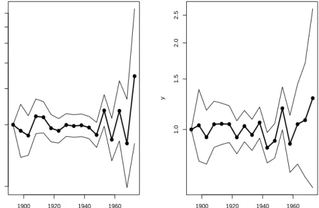
As mentioned several times above, the examination of period and birth co-hort effects are not easy due to the linear dependency between the three factors age, period and cohort. However we still hope to identify any possi-ble birth cohort effects by including both visual inspections and statistical test in our analysis. One idea, which is discussed in both Holford (1991) and Clayton and Schifflers (1987b), is to examine non-linear changes more
closely. As will be discussed in section 4.2.1, the second differences are
identifiable. Thus by examining the second differences we can see how a particular period or cohort deviates from the overall trend (e.g. Holford, 1991, pg. 22). We will only consider second differences for cohort effects in this thesis, however the principal ideas are the same for period effects. For
a specific cohortc consider the contrast
Kc=γc+1−2γc+γc−1 (4.1)
which is defined by the second order differences of the cohort effects from the apc model. Thus which compares the difference between the change
in the effects for birth cohort c+ 1 and c and birth cohort c and c−1.
For further details I will refer to Holford (1991) and Clayton and Schifflers (1987b). However an example for colon cancer by sex is given in Figure 4.1, where we have used 5-year age and period intervals.
● ● ● ● ● ● ● ● ● ● ● ● ● ● ● ● ● 1900 1920 1940 1960 0.5 1.0 1.5 2.0 2.5 3.0 x y ● ● ● ● ● ● ● ● ● ● ● ● ● ● ● ● ● 1900 1920 1940 1960 1.0 1.5 2.0 2.5 x y
Figure 4.1: Estimated second differences for birth cohorts using 5-year age and period intervals. The estimated effects are given for colon cancer by sex. The figure given on the left is for males and the figure on the right is for females.
The plots given in Figure 4.1 are easily obtained by the function contr.sec
implemented in the softwareR, see Appendix D. The figure given on the
left is for males and the figure on the right is for females. We may say we have a decrease or increase in the incidence rates between adjacent birth cohorts if we observe a decrease or increase in the second differences given in the figure.
As we can see from Figure 4.1, due to random variation, it is not an easy task to observe any wartime effects for the birth cohorts. Colon cancer has
4.2. TESTING FOR NON-LINEAR COHORT EFFECTS 39 relatively high number of new cases compared to many of the other sites considered in this thesis. Thus it will be even more difficult to examine the figures for the other sites due to higher amount of random variation. It would be ideal to examine second differences for 1- and 2-year age and period intervals as well. However, these figures are subject to even more random variation compared Figure 4.1 where we have used 5-year age and period intervals. Therefore we will not examine second differences any further and we introduce the first formal test in the following section.
4.2
Testing for non-linear cohort effects
Extending the number of cohort effects included in the calculations in the previous section would make it possible to examine non-linear trends for wider intervals at the time, which may give more meaningful results and in-terpretations. The idea is adopted from a paper by Tarone and Chu (1996) and motivated with the fact that it is possible to identify the difference in
slopes between two time intervals, without taking into considerationhow we
extract the drift from the apc model (see Tarone and Chu, 1996, Appendix 1). The number of cohort effects in each time interval is not set and depends on the problem at hand. Norway was occupied in a five year period during
WWII. We therefore compare cohort periods, i.e. a time interval which
con-sists of successive birth cohorts, with length of around five years. By using data with five year intervals for age and period we would only compare sin-gle cohort effects, thus using shorter time intervals will help us get a more detailed picture of the birth cohort effects before, during and after the oc-cupation period, which is recommended by Tarone and Chu (1996) as well. Thus data with 1- and 2-year age and period intervals will be considered in this chapter. A description of the method is given in section 4.2.1.
By using the method of comparing slopes between two disjoint cohort periods, we assume that the slopes are linear. Now if the cohort effects are more like a second degree polynomial rather than linear, there is a way to capture the curvature when trying to identify a possible wartime effect. This method is described in section 4.2.2. Comparisons of the results based on change in linear trend and curvature for colon, breast and testicular cancer, are given in section 4.2.3.
4.2.1 Change in linear trend
Consider two cohort periods,C1andC2, whereη1andη2are the linear slopes
such that the birth cohort effects are given by
γc1 =θ1+η1c1
forc1≤cA, and
γc2 =θ2+η2c2
forc2 ≥cB. In this case η1 and η2 are not identifiable, although the
differ-enceη2−η1 is identifiable regardless of how the drift is extracted (Tarone
and Chu, 1996).
The method introduced here will be considered for both data with 1- and 2-year age and period intervals, i.e. data with 2- and 4-year cohorts. The general method will be the same for both types of datasets, except some minor adjustment of the formulas depending on the data we use which we soon will see.
For data with 2-year age and period intervals Tarone and Chu (1996) consider the contrast
K=γc2+4−γc2−(γc1+4−γc1) (4.2)
which compares the slope of two disjoint cohort periods with three consec-utive births cohorts in each period. Another example of a contrast is
K = 3γc2+6+γc2+4−γc2+2−3γc2−(3γc1+6+γc1+4−γc1+2−3γc1) (4.3)
with four consecutive births cohorts in each cohort period. For yearly data we consider similar contrasts where the general formula will be defined shortly.
More generally we consider contrasts of the form
K =s0γ, (4.4)
wheresandγ are given as vectors of weights and birth cohort effects. Let ˆγ
be the vector of estimated cohort effects from the apc model and introduce
the estimated contrast ˆK=s0γˆ. Then the variance of the estimated contrast
ˆ
K, ˆσ2K, is estimated as s0Vˆγs, where ˆVγ denotes the estimated covariance
matrix of ˆγ.
Furthermore we want to test the null hypotheses H0 : K = 0 vs. the
alternativeHa:K 6= 0. To this end we may use the test statistic
z= ˆ K ˆ σK , (4.5)
4.2. TESTING FOR NON-LINEAR COHORT EFFECTS 41
which is approximately standard normal under H0. Note that the weights
s may be scaled differently than the weights defined by Tarone and Chu
(1996) without changing the value of the test statisticz. Using standardized
weights as described below will restrain the estimated contrast ˆK to have
the same unit regardless of the number of cohort effects we include in each period and whether we use 1- or 2-year age and period intervals. Thus it will be easier to compare the value of the estimated contrasts in different scenarios. For simplicity we use the notation for the estimated contrast as
ˆ
K =s0γˆ regardless of the scaling of weights we use.
The standardized weights can be justified by an argument using least squares. Thus a short recapitulation of the least squares method will help the reader understand how the birth cohort effects and weights are defined.
Now assume J+ 1 data points (y0,x0),. . ., (yJ,xJ), and fit a straight line
θ+ηx for theyj’s. The least square estimate for the slope is:
ˆ η = PJ j=0(xj −x¯)(yj−y¯) PJ j=0(xj−x¯)2 = 1 M J X j=0 (xj−x¯)yj (4.6) where M = J X j=0 (xj−x¯)2.
Now for a specific cohort c, let yj = ˆγc+j and yj = ˆγc+2j for 1- and 2-year
age and period intervals with j = 0,1, . . . , J. Further consider xj =j and
xj = 2j for 1- and 2-year age and period intervals respectively. A more
precise definition would be to let xj =c+j and xj =c+ 2j. However since
the results will not be affected by this we will for simplicity define the xj’s
as the former vectors.
As an example we consider the estimated birth cohort effects for a general period when considering 2-year data with four birth cohorts in each cohort period (cf. (4.3)) as
ˆ
γc, γˆc+2, γˆc+4, ˆγc+6. (4.7)
Now assume we wish to find the estimated slope for the birth cohort esti-mates which is given by
ˆ η= 1 M 3 X j=0 (2j−3) ˆγc+2j where M = P3 j=0(2j−3)2 = (−3)2 + (−1)2 + (1)2+ (3)2 = 20. Thus we
obtain ˆη = 201(−3γc−γc+2+γc+4+ 3γc+6). Except for the scaling 201 , this
Now for a more general statement consider J+ 1 estimated cohort rates included in each period. Then the estimated birth cohorts rates are given as ˆ γc, γˆc+1, . . . , ˆγc+J (4.8) and ˆ γc, γˆc+2, . . . , ˆγc+2J (4.9)
for 1- and 2-year age and period intervals. The estimated slope for yearly data are then given as
ˆ η = 1 M J X j=0 j− J 2 ˆ γc+j where M = J X j=0 j−J 2 2
For 2-year age and period intervals the slope is given as
ˆ η= 1 M J X j=0 (2j−J) ˆγc+2j where M = J X j=0 (2j−J)2
By using simple calculations and rules for series of sequences it is possible to
find explicit formulas forM, although I will not do the actual calculations
here.
So far we have considered two disjoint cohort periods. There might also
be cases when the two cohort periods overlap, i.e. period C2 starts where
periodC1 ends. When this is the caseswill slightly change. As an example
consider two cohort effects in each period (cf. (4.2)) and letC be the cohort
whenC1 =C2 which leads to the contrast
K =γc+4−2γc+γc−4.
which is exactly the second differences given in (4.1). Similarly for (4.3)
4.2. TESTING FOR NON-LINEAR COHORT EFFECTS 43
Note that M will have the same value as if the two cohort periods were
disjoint.
For illustration examples are given for colon cancer by sex. Even though there are many different cohort periods we can examine, we will start by comparing the pre-war and occupation periods, see Table 4.1. The reader should keep in mind that the number of estimated cohort effects included in each cohort period will change depending on the dataset we use.
Table 4.1: Estimated contrastKˆi for colon cancer where i= 1, 2 represents 1- and
2-year age and period intervals respectively. Corresponding p-values are given to the right of the contrast. The two cohort periods under consideration are
1936-42 vs. 1942-48 for males and 1932-38 vs. 1938-44 for females. For
yearly data for females we had to adjust the lower age group from 30 to 35 years, because of the small number of new cases for the youngest age groups. Standard deviations of the estimated contrasts are given in parentheses.
ˆ
K1 p Kˆ2 p
Male -0.068 (0.021) 0.001 -0.055 (0.018) 0.002
Female -0.063 (0.018) 0.000 -0.051 (0.015) 0.001
From Table 4.1 we see that the value of ˆK slightly differ, depending on
the dataset we use, even if the cohort periods under consideration are the same. We might think that the values should be similar since the motivation for the method introduced by Tarone and Chu (1996) is that the difference in
slope,η2−η1, is identifiable. However we should keep in mind that the data
are divided in different time intervals depending on the dataset we use. The standard deviations (given in parentheses) are smaller for 2-year age and period intervals which is not unexpected as the random variation decrease by higher number of new cases in each cell. Estimated birth cohort effects for colon, breast and testicular cancer for 2-year data are given in Figure 4.2. The estimated effects are obtained using linear regression splines with eight knots where the figures given on the left are for males and the figures on the right are for females. We see that the reduction in the incidence rates are a little earlier for females than for males for those experiencing colon cancer. Thus the period, 1936-42 vs. 1942-48 for males and 1932-38 vs. 1938-44 for females, where chosen for this purpose. Apparently the linear slopes for both sexes are significantly decreasing, i.e. a negative contrast for both datasets, when comparing the cohort periods before and during the occupation period for Norway.
1900 1920 1940 1960 1980 0.5 1.0 1.5 2.0 2.5 3.0 Calendar time Relative risk
(a) Colon, male
1900 1920 1940 1960 1980 0.5 1.0 1.5 2.0 2.5 3.0 Calendar time Relative risk (b) Colon, female 1900 1920 1940 1960 1980 0 1 2 3 4 Calendar time Relative risk (c) Testis 1900 1920 1940 1960 1980 0.4 0.6 0.8 1.0 1.2 Calendar time Relative risk (d) Breast
Figure 4.2: Estimated birth cohorts for 2-year age and period intervals for colon, breast and testicular cancer in Norway 1953-2007. The estimated effects are ob-tained by using natural splines with eight knots. The drift is allocated in cohort and extracted by the method of Holford.
4.2. TESTING FOR NON-LINEAR COHORT EFFECTS 45
4.2.2 Change in curvature
Figure 4.2 indicates that there may be more like a curvature than a change in slopes. A possible drawback of the method introduced in the previous section might be that it only considers change in linear trend. Modeling curvature can easily be obtained by the use of orthogonal polynomials. As an example consider the following estimated birth cohort effects for 2-year age and period intervals:
ˆ
γc−6, γˆc−4, γˆc−2, γˆc, ˆγc+2, γˆc+4, γˆc+6
corresponding to (4.3) with one coherent time interval instead of two disjoint cohort periods. We may fit a second degree polynomial to the estimated rates given above, where the polynomial can be defined as
γc+2j =θv0j +η1v1j+η2v2j (4.11)
with j = 0, ±1, ±2, ±3 where v0j = 1,v1j = 2j and v2j =−4 +j2. Note
that P3
j=−3v1j = P3
j=−3v2j = 0 and
P3
j=−3v1jv2j = 0. Thus the vectors
v0, v1 and v2 (with elements v0j, v1j, v2j) are orthogonal. Now that we
have defined an orthogonal set of vectors, the estimated η2 from (4.11) will
be the same as for γc+2j = θv0j +η2v2j, i.e. where we have removed the
first-degree term. Thus an estimate of η2 in (4.11) is obtained similarly as
(4.6), that is ˆ η2 = 1 M 3 X j=−3 (v2j−¯v2)ˆγc+2j = 1 M(5ˆγc+6−3ˆγc+2−4ˆγc−3ˆγc−2+ 5ˆγc−6) where M =P3
−3(v2j−¯v2)2 = 84. It is common to standardize the weights
and obtain an orthonormal set of vectors with length 1, i.e. u0 = v0√17,