OmniUpdate, Inc. 1320 Flynn Road, Suite 100 Camarillo, CA 93012
End-User Reference Guide for OU
Campus v10
Long Support Site Version
1320 Flynn Road, Suite 100 Camarillo, CA 93012 800.362.2605 805.484.9428 (fax) www.omniupdate.com
Copyright ® 2014 OmniUpdate, Inc. All rights reserved. Document Number: End-User Reference Guide Publish Date: 8/18/2014
OmniUpdate® and OU Campus™ are trademarks or registered trademarks of OmniUpdate, Inc. Any other company and product names, and trademarks mentioned within are property of their respective owners. Content is subject to change without notice.
About OmniUpdate, Inc.
OmniUpdate® is the leading web content management system (CMS) provider for higher education. The company focuses on providing an exceptional product and customer experience to its OU Campus™ CMS users who manage more than 700 web and mobile sites in the U.S. and around the world. OU Campus is secure and scalable, server and platform independent, and seamlessly integrates with other enterprise campus systems. It provides college and university web developers, administrators, and marketers with the user-friendly tools and deployment flexibility they need to achieve excellence. For more information, visit .
About This Guide
The End-User Reference Guide provides information about using OU Campus including how to get started with editing, reviewing, and publishing pages and other content.
OU Campus Support
The Support site is available to everyone and users are encouraged to visit and browse the site for information. An institution's administrators are also available if the answer cannot be found on the Support site or further explanation and clarification is needed. Administrators may contact the OmniUpdate Support Team. Ways to access the OU Campus support documentation include:
• Support site: http://support.omniupdate.com/
• The help link in the main interface of OU Campus • The WYSIWYG Help link
• Help links embedded in the system
• Text instructions are provide onscreen for specific fields and functionality • OmniUpdate Community Network (OCN): http://ocn.omniupdate.com/
Conventions
Shorthand for navigation through the OU Campus CMS is indicated with a greater-than sign and bolded: > For example, Setup > Sites. Code snippets use Courier New and a shaded background.
Contents
End-User Introduction... 7
OU Campus Support... 7
Filter and Quick Search... 8
Log In... 10
Overview...10
About DirectEdit... 10
Editing a Page with DirectEdit...10
Logging Out...11
Reset Password... 11
Failed Logins and User Lockouts... 13
Checked Out/In...14
Overview...14
Checking In a Page...15
Behaviors of Checked Out Pages... 15
Best Practices... 16
Drag and Drop...17
Overview...17
The Drop Zone... 17
Moving Content with Drag and Drop... 18
Uploading Content with Drag and Drop...19
Inserting Content with Drag and Drop... 20
WYSIWYG Editor... 21
WYSIWYG Editor Overview... 21
Toolbars and Tools... 22
Toolbar Functionality...22
Toolbar Row 1... 23
Overview...23
File Tools (Save, Save As, Revert, Restore)... 23
Cut, Copy, Paste, Find, Replace... 24
Undo Redo Functions... 26
Spell Check...26
Remove Formatting... 26
Font Formatting... 27
Lists, Indents...27
Text Placement (Vertical)... 28
Align, Justify (Horizontal)... 28
Link Tools, WYSIWYG Help Documentation... 28
WYSIWYG Spell Check...32
WYSIWYG Spell Check Overview... 32
Correcting Misspelled Words... 32
Adding Words... 33
Browser Specific Spell Check vs. OU Campus Spell Check... 34
Disabling Automatic Spell Checking in Firefox...34
Disabling Automatic Spell Checking in Safari... 35
Insert/Edit Link... 37
Insert/Edit Link Overview...37
Links and Dependency Manager...37
Inserting an Internal Link (Typical)...38
Linking to an External Page...41
Linking to an Unpublished File... 41
Linking Across Sites within an Account... 42
Specifying a Link Target... 42
More Options with Insert/Edit Link Tool...43
Renaming or Moving a Directory or File... 43
Broken Links...43
Final Notes and Reminders...44
Toolbar Row 2... 45
Toolbar Row 2 Overview...45
Font Properties (Family, Size, Format, Styles)... 45
Text Color, Text Background... 47
Images/Media...47
Miscellaneous Functionality... 48
Insert/Edit Image... 51
Insert/Edit Image Overview... 51
Inserting an Image... 51
Editing an Inserted Image... 54
Additional Information and Reminders... 55
Decorative Images...55
Image Editor... 56
Image Editor Overview... 56
Image Editor Restrictions and Requirements... 56
Image Editor Tools... 57
Image Editing on Upload...57
Image Editing from Pages List View...59
Editing Images in WYSIWYG Mode... 60
Insert/Edit Embedded Media Overview... 63
Inserting Embedded Media from OU Campus... 64
Uploading and Inserting Embedded Media from the WYSIWYG...65
Inserting Embedded Media from an External Source... 66
Final Notes/Troubleshooting... 68
Toolbar Row 3... 69
Toolbar Row 3 Overview...69
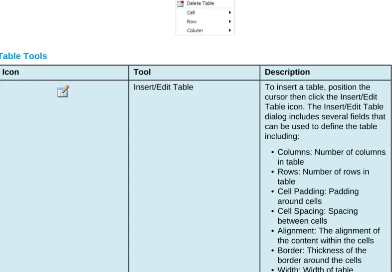
Table Tools... 69 Form Tools...71 Rename... 72 Overview...72 Renaming a File... 72 Copy... 74 Copy Overview... 74
Copying a Single File... 74
Copying a File from the Pages List View... 74
Copying a File by Drag and Drop... 75
Copying Multiple Files... 77
Move... 79
Move Overview...79
Moving a Single File...79
Moving a File from the Pages List View...79
Moving a File by Drag and Drop...80
Moving Multiple Files...81
Recycle Bin...84
Move to Recycle Bin... 84
Permissions...84
Moving a File to the Recycle Bin...84
MultiFile Recycle...85
Directories...86
Delete...87
Deleting Files and Directories... 87
Deleting a File... 87
Deleting Multiple Files... 88
Deleting a Directory... 88 Review... 90 Review Overview...90 Preview... 90 Page Check...91 Versions...91 Log...91 Preview...92 Preview Overview...92 Navigating...92
Page Preview from Content > Pages View... 92
Page Preview with Preview or Edit Modes...92
Multi-Output Preview...92
Multi-Browser Preview... 93
Publish Target...93
Page Check...94
Page Check Overview...94
Initiating a Page Check... 94
From the Folder Structure (Content > Pages)...94
From Preview, Edit, or Editing... 94
As Final Check... 95
Choosing Various Options...95
Analyzing Results of the Error Reports... 97
Enabling Page Check in User Settings... 98
W3C Valid... 99
W3C Valid Overview... 99
W3C Validation Results Dialog... 101
Performing a W3C Valid Test...102
Spell Check...104
Spell Check Overview... 104
Spell Check Results Dialog... 106
Performing a Spell Check... 106
Link Check... 108
Link Check Overview...108
Link Check Legend... 110
Performing a Link Check... 111
Accessibility Check... 112
Accessibility Check Overview...112
Accessibility Check Results Dialog...114
Performing an Accessibility Check... 116
Versions... 117
Versions Overview...117
Saving a New Version...117
Navigating to Versions... 119
From Preview or Edit... 119
Filtering Versions...119
Comparing Versions... 119
Comparing with Production Version...120
Comparing with a Previous Version...120
Sorting Versions... 120
Viewing a Revision... 121
Viewing a Page Version... 121
Viewing the Source...122
Reverting to a Version...123
Compare...124
Compare Overview...124
Versions Screen... 124
Comparing with a Production Version... 125
Comparing with a Previous Version...125
Examples and Legends...126
Production Page... 126
Source and Other Versions... 127
Example of Source Comparison... 127
Final Words... 127
Publish... 128
Publish Overview...128
More About Publish... 128
Binary Files and Publishing... 128
Assets and Publishing... 128
"Unpublishing" a File: About Recycle, Delete, and Restore... 129
Publishing a Page... 130
Publish Dialog... 130
Navigating to the Publish Dialog...130
Publish Dialog Reference... 131
Selecting a Publish Target...132
Viewing the Publish Notes... 133
MultiFile Select... 133
Final Check... 134
Final Check Overview... 134
Running Final Check... 134
With Multi-Target Publish...136
Schedule... 138
Schedule Overview...138
Schedule Tab... 138
Performing a Scheduled Publish... 140
Removing a Scheduled Publish... 140
Submit for Approval... 141
Submit for Approval Overview...141
Sending for Approval...142
New Content... 143
New Content Overview...143
New Folder vs New Section... 143
Creating New Content... 143
Creating a New Page... 146
Creating a New Page Overview... 146
New Page Creation Options...146
New Page Wizard (Typical)...147
Creating a New Page... 148
Upload and Edit Image... 150
Upload and Edit Image Overview...150
Selecting and Uploading the Image... 150
Editing the Image...150
Resize... 150 Crop (Custom)... 151 Rotate...151 Zoom... 152 Undo/Redo... 153 Creating Assets...154
Creating Assets Overview... 154
Asset Info Panel... 154
Access Settings Panel...155
Asset Content Panel... 155
Creating a New Asset... 156
Inserting Assets... 157
Inserting Assets Overview...157
Inserting an Asset with the WYSIWYG Editor... 157
Inserting an Asset Only Region...158
Inserting an Asset with the Source Editor...159
Dashboard...160
Overview...160
Example Dashboard with Gadgets and Sidebars Expanded...161
Dragging Dashboard Gadgets... 161
Overview... 161
Workflow... 161
Inbox... 162
Configure Dashboard...162
Overview...163 Workflow Screen... 163 Status... 164 View... 164 Reply... 165 Delete...166 Inbox...167 Overview...167 Inbox... 167 Composing Messages... 168
Viewing, Replying to, and Deleting Messages...170 Sent... 171 Forwarding a Message ... 171 Gadgets... 173 Overview...173 Gadget Configuration... 173 Dashboard Gadgets... 174
Configuring the Dashboard... 175
Rearranging Dashboard Gadgets... 176
Gadgets Sidebar... 176
Gadget Sidebar Icon Reference... 177
Choosing Gadgets on the Gadget Sidebar...178
End-User Introduction
OU CampusTM provides users an easy way to manage web pages. With the ability to login directly from the institution’s website, it is easy to navigate to the page to be edited. Once logged in, users can simply click on the area to edit, and they are placed in a user-friendly What-You-See-Is-What-You-Get (WYSIWYG) Editor.
The system allows an approval process to be put into place, which results in users either having the ability to publish pages once they have finished editing them, or they can send the completed pages to other users as defined by the workflow to gain approval prior to publication. The system has a built-in intelligence that allows the workflow process to be defined prior to page creation. Users do not have to understand which pages need approval prior to publication because the system tells them.
Pages are checked out to only one user at a time to prevent users from overwriting each other’s work, but as the pages move through the workflow system, the system automatically changes to whom the page is checked out based on its placement in the workflow system. In addition, users can only access content to which they have permissions to edit. When creating new pages, preconfigured templates are made available to provide consistency in web page design. Users may also have the ability to upload new images, add words to the OU Campus dictionary, access full page source, and much more.
OU Campus Support
Online support is available through the OmniUpdate Support site at: http://support.omniupdate.com/oucampus10/
The Support site, which is accessible by everyone in its entirety, includes user support on all the features in OU Campus, as well as video and text tutorials, archived Training Tuesdays, which are the free monthly webinars offered the last Tuesday of every month unless otherwise announced at 11:00 AM PST, and access to the Permissions Chart.
The Support site can be accessed through the Help link in the upper, right-hand corner of OU Campus. Additionally, support can be gained using the contextual help links found within OU Campus. Throughout the site the in-context help links are available and are specific to the area or task at hand. These links open the relevant page at the Support site.
institution’s administrators are also available if the answer cannot be found on the Support site or further explanation and clarification is needed. Administrators may contact the OmniUpdate Support Team.
Filter and Quick Search
The Filter tool is available on the Pages list view and many views within the content management system. The Filter tool allows the content listed on the screen to be delimited by the string typed into the Filter field. The filter applies to specific columns that are available on the the screen and usually the filter does not apply to the date column.
If the Quick Search functionality is turned on, it is possible to search the entire site for content. This search allows the user to find content in order to easily navigate to a desired page.
On the Pages list view the Quick Search is also the Filter tool. Content in the current view is filter; pressing Enter uses the Quick Search functionality to search the entire site.
Advanced Search allows for additional search criteria to be applied. The search can be narrowed by: • Content (the search term)
• Path • Title
• Description • Keywords • Other Meta
• Limited in scope to current folder and below
Log In
Overview
Content contributors and administrators alike can log in to OU Campus through a published page with the use of an on-page link known as DirectEditTM. DirectEdit can be a link, a button, an image, and more anywhere on a published page, as it can be styled to match the look and feel of the site. Typically, every page of a web site managed by OU Campus includes a DirectEdit link to allow content contributors to log in directly to edit a page.
After clicking the DirectEdit link, users are logged in directly to the Edit view of the page they logged into. Users must have the proper access privileges granted in order to access the page. Without proper access, users will be logged into OU Campus, but will be unable to view the page they logged into via DirectEdit. The DirectEdit button type is configurable for the site by a Level 10 administrator. At the account level, the Login Page settings can be used to configure log in, log out, and authentication pages.
The layout that is viewed upon logging in to OU Campus depends upon the access settings for that particular editable region.
About DirectEdit
Users can access the OU Campus interface using DirectEdit by navigating to the page to be edited and clicking the DirectEdit link. DirectEdit links are determined by the template design. For example, the demo site, Gallena University, uses the Last Updated date found in the footer of the web pages as the DirectEdit link.\
Each implementation will be different, however. If a user is unsure as to what the DirectEdit link is for their site, they should contact a site administrator.
Clicking the link will take the user to the OU Campus login page. Once logged in, the browser session is persistent and a user can open another page in the same browser without having to log in again.
Editing a Page with DirectEdit
1. Click the DirectEdit link on the published page. If a user does not know what has been specified for their institution, they should contact their administrator.
2. Use the login credentials that have been provided for the user by the administrator. This might be a user name and password that is specific to OU Campus, or it may be that another authentication method is being used, such as LDAP, CAS, or Shibboleth.
3. Select an editable region. For more information on editable regions, visit the Editable Regions page. 4. Edit the page.
5. Save and publish the page (or send to an approver).
Logging Out
Users can log out of OU Campus via the global navigation bar. 1. Hover over the user’s name.
2. Choose Logout from the menu.
3. The original Login screen will be shown unless otherwise configured by an administrator.
Reset Password
Content contributors and administrators alike can create a new password for their account. Reset Password allows users to change their password by entering their username and email address in a modal. After the information has been provided, an email is sent to the user, containing directions and a link that users can use to reset their password on their own without having to contact a system administrator.
Note: if a user's password is managed by an external authentication method, such as CAS or LDAP, the
user will have to contact a system administrator for a password reset, as passwords are not stored within OU Campus in these cases.
username. Once both text fields have been entered, clicking Submit will send the email to the user's email inbox. If the operation needs to be cancelled, simply choose Cancel.
3. After a user has submitted their request, the system notifies them that it has sent an email to their inbox with instructions and a link to reset their password.
Failed Logins and User Lockouts
If a user incorrectly enters their login credentials more than three consecutive times, then they will
automatically be locked out of the OU Campus system. This will prevent users from trying to log in again. In the event of a user lockout, the Reset Password function becomes unavailable. Instead, an administrator must be contacted to reset the user’s privileges.
Checked Out/In
Overview
The checked out/in icon, represented by a lightbulb, reflects the state of an OU Campus page or file. When a user edits a page by clicking on an editable region button, or clicks to a from a list view, the page is automatically checked out to that user.
Likewise, when the user publishes a page it is automatically checked back in.
When a page or file is checked out to a user, no other users can enter the pages and make changes until the file has been checked back in. A level 10 administrator can override this and manually check pages back in that are checked out, and doing so will cancel any unsaved changes to the page.
A user might also decide to check out a page in order to make other page options available. OU Campus also has status indicators help make clear why a page is not available for editing as well as who has checked out a page, scheduled an action, or if the page is in the process of a workflow. These icons are shown on many of the screens that display content lists, most notably the File Navigation sidebar, Pages list view and the My Checked-Out Content gadget.
For example, in the Pages list view (Content > Pages), the page status indicators are found in the Status column. A lit light bulb indicates a page is checked out to the currently logged in user and a red lock indicated the page is checked out to another user. An unlit light bulb indicates the file is checked in and available to be checked out.
Page Status Indicators in File Navigation Sidebar
Status Indicators
Icon Description
An unlit light bulb indicates that the page is checked in and can be checked out for editing by any user with the proper permissions.
A lit light bulb indicates that the page is checked out to the current user (the individual currently logged into OU Campus).
A red lock indicates that the page is checked out to another user. Users can hover over the lock to see who has checked out the page.
A green calendar icon is the status indicator
for a publish scheduled by the current user. Administrators or the individual who scheduled the page to be published can click on the icon to change the publish date and time or cancel the publish completely.
A red calendar icon is the status indicator for a publish scheduled by another user. Administrators or the individual who scheduled the page to be published can click on the icon to change the publish date and time or cancel the publish completely.
A red circle with a line through it is the status
indicator for an expire scheduled by the current user or another user. A scheduled expire can be removed or rescheduled by the user who scheduled the expire. An administrator can check in the page, which effectively cancels the scheduled expiration. This icon is displayed to all users, not just the user who scheduled the expiration.
Checking In a Page
It is valuable to note that pages stay checked out to the user until the user: • Sends the page to another user for review.
• Publishes the page.
• Checks the page back into the system by clicking on the lit (yellow) light bulb.
Behaviors of Checked Out Pages
If a page is checked out by another user, the current user may still perform the following actions; even though the page is locked:
• Edit reminders • Preview the page • View the log • Copy the file
Available Actions for a Locked Page
Best Practices
• Make sure to check the page back in when finished editing the page so it can be made available to other users.
• OU Campus supports WebDAV and can be enabled by a Level 10 administrator. When WebDAV is enabled, OU Campus supports file locking with specific WebDAV clients that utilize file locking.
Drag and Drop
Overview
OU Campus includes the ability to drag and drop content including pages, files, and directories. Users may drag and drop objects from one location to another within the interface, or they may drag objects from their local computer into OU Campus.
This is especially useful for quickly uploading files from a local computer to a server or moving content within OU Campus. Users can utilize the drag and drop functionality of the interface to move, upload, and insert content using what are referred to as "drop zones."
In addition to image file types, files with extensions of .html, .js, .txt, .xsl, .exe, .asp, .php, and .pcf may also be dragged to the Pages list view.
The Drop Zone
The drop zone refers to the area within OU Campus where a file or directory can be dropped when dragging to the interface.
When dragging files into or within OU Campus, The content area will be outlined in green or the content row will be highlighted in green to indicate where the dragged file will be placed. When dragging files from the local computer into OU Campus in order to upload them, a blue alert at the bottom of the screen will also appear to indicate where the file will be uploaded.
The example below shows the green outline in the content area of OU Campus, the green highlighted rows (which are folders into which content can be moved/uploaded), and the blue alert at the bottom of the screen.
Dragging content in to a page being edited with the Source Editor results in the dragged content being placed inline in the source code and highlighted.
Moving Content with Drag and Drop
Drag and drop functionality can be used to move files from one location to another within an OU Campus site. When Dependency Manager is on, content moved on the staging server, including directories, are silently republished to the production target and the links are updated automatically, unless the content is locked with an action that would otherwise prevent auto-publishing such as a scheduled expire. Moving content on the production server, including directories, will not be reflected on the staging server.
Content can be moved using drag and drop within and between the Pages list view and the File Navigation sidebar. Content can also be moved from the Gadgets sidebar into a directory in the Pages list view. When moving files within OU Campus, a file with the same name cannot be overwritten; for example, moving an index.pcf file from one directory to another that already has an index.pcf file would result in an error notification and no files being moved.
Users can move files either individually or in bulk using drag and drop. To move files using drag and drop: 1. Navigate to the Pages list view by selecting Content > Pages from the global navigation bar.
Alternatively, expand the File Navigation sidebar and navigate to the file using that method. 2. Once the file has been selected, drag the content to its new destination.
3. To move multiple files, select the checkbox next to each target item in the Pages list view and then drag the content to the new destination folder. The icon displays a number, indicating the number of files being moved. Note: Multiple files cannot be selected from the File Navigation sidebar.
Uploading Content with Drag and Drop
When Binary Management is not enabled, binary files uploaded through staging are either uploaded directly to the production server or the default publish target. With Binary Management enabled, binary files can be uploaded directly to staging.
When dragging content that will take a lengthy amount of time to complete, users can continue to navigate around the CMS and a notification will show on the bottom of the screen upon the completion of the action. For more information on uploading content, refer to the Upload page.
Inserting Content with Drag and Drop
When a user is in the WYSIWYG Editor or the Source Editor, they are also able to utilize drag and drop to insert content directly onto the page. Content can be inserted in the WYSIWYG Editor using the Images gadget. To insert images with the Images gadget:
1. a. Ensure that the Images gadget is enabled by expanding the Gadgets sidebar and clicking
Choose Gadgets (gear icon). Select Images from the dialog and click Save.
b. Navigate to the page to be edited and open an editable region to display the WYSIWYG Editor. c. Expand the Images gadget in the Gadgets sidebar to display the available images.
WYSIWYG Editor
WYSIWYG Editor Overview
There are several types of editors available to edit pages in distinctly different ways, but the WYSIWYG editor is the most common way for users to edit pages in OU Campus. The WYSIWYG (What You See Is What You Get) Editor allows for a familiar experience of editing a page similar to that of many web applications and traditional word processors.
When logging into the system to directly edit a page, there may be several editable regions available. The available editable regions are defined by permissions levels and group associations. Only areas that are available to be edited by that user are shown with an edit button. Clicking on the Edit button above a region allow for the area to be edited. This opens the WYSIWYG Editor by default and the assigned toolbar is available.
Keep in mind that part of the configuration of the template design may include an image
in the background that helps present a more accurate rendering of how the content will appear on the page. It is intended for visualization purposes and to help understand how the content is organized on the page into editable regions. Once the content has been saved, an actual view of the configured page can be seen using the Preview mode.
When editing in the WYSIWYG, modifications should be saved by clicking the Save icon before navigating away from the page. If an attempt is made to navigate away from the page without first saving it, the user notification is shown as a reminder to save the page.
Toolbars and Tools
Many of the editing tasks for a page such as inserting images and links, applying formatting such as bold, and spell checking a page can be accomplished from within the WYSIWYG using the toolbar. WYSIWYG toolbars are customizable and the toolbar the user sees may contain a subset of the available tools as various custom toolbars can be created, which can be assigned to users, sites, directories, pages, and editable regions.
Icons represent the tools. Clicking on any icon performs an action, either directly to the page, or to the selected text and graphics. Some icons display more options in a drop-down menu, or in a dialog.
The availability of a function is based on the selected items, or the location of the cursor on the page. For example, if nothing is selected, functions such as Insert Link are dimmed, signifying that this function is not available at the moment. For the Insert Link function button to be available, the user must first select text or a graphic.
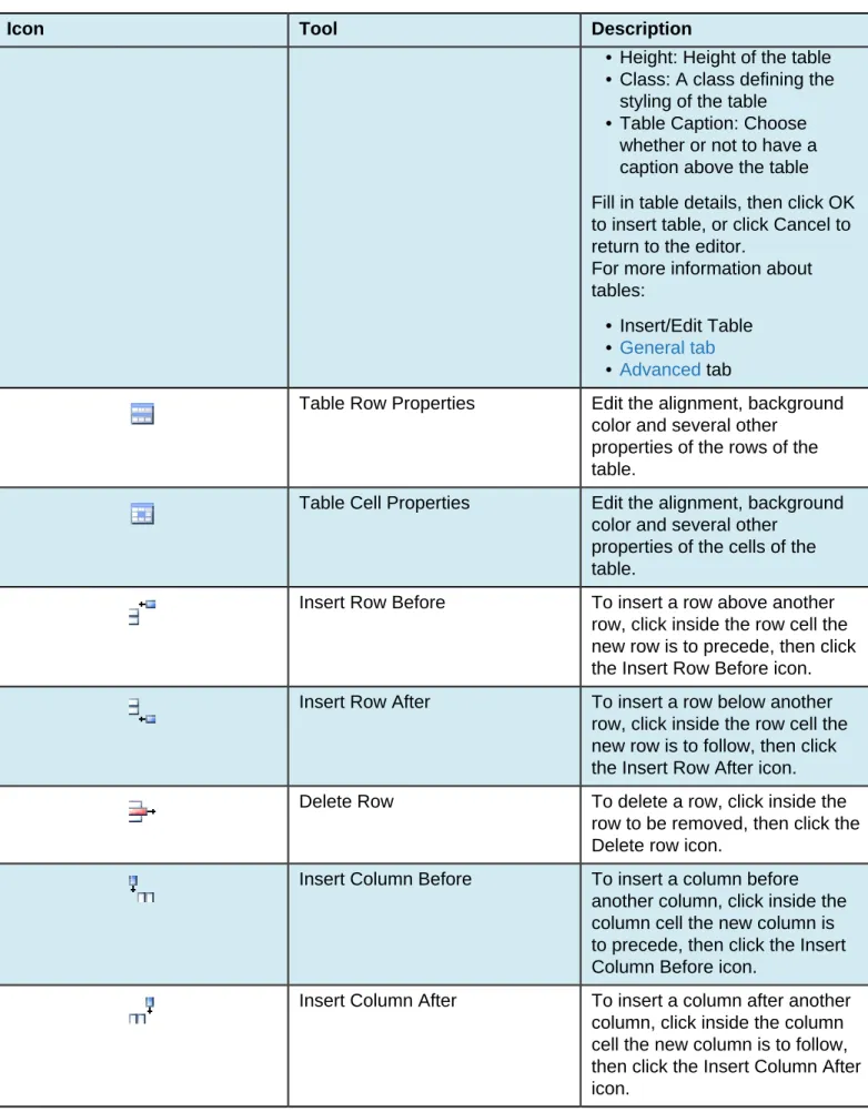
In many cases, right-clicking offers contextual functions. For example, right-clicking within a table provides a list of available table editing and formatting functions. Additionally, commonly used control key combinations are available such as CTRL+X, CTRL+C, and CTRL+V for cut, copy, and paste respectively for PC.
Toolbar Functionality
Each toolbar is organized into three rows and each row has groups of functionality. In the WYSIWYG, the groups are divided by a vertical line on-screen. The behavior of the icon is specific to the functionality of the tool. For example, some functionality such as the link tool requires text or another type of content to be selected before it is available on the toolbar. Other items on the toolbar include icons that are unavailable until the main feature has been inserted on a page. For example, the Insert/Edit Table icon will be available, but the other table editing tools such as those to define row properties or delete a column are not available until a table has been inserted on a page. Some items such as the Insert/Edit Image icon or spell check, when clicked, provide a dialog with a much more underlying functionality than is readily apparent. One last type of element that might be available on the toolbar are several drop-down selectors that provide the ability to style text.
One item that is not represented on the toolbar, but is available from within the WYSIWYG is the ability to save-in-place (CTRL+S or CMD-S). This offers users the ability to save the page without clicking the usual save icon that ends the editing session. Save-in-place saves the page and allows the user to continue editing.
Toolbar Row 1
Overview
Most of the tools available on the first row of a toolbar for the WYSIWYG are basic text formatting and linking. The descriptions of the functionality available for each tool is provided on this page. A few of the features have a more in-depth description; links are provided to those pages.
The tools are grouped on this page as follows: • Save, Save As, Revert, Restore
• Cut, Copy, Paste, Find, Replace • Undo/Redo
• Toggle Spell Checker • Remove Formatting • Font Formatting • List, Indents
• Text Placement (Vertical) • Align, Justify (Horizontal)
• Link Tools, WYSIWYG Help Documentation
File Tools (Save, Save As, Revert, Restore)
Icon Tool Description
Save Click on the Save icon to save
the current file on the staging server and exit the WYSIWYG Editor. Remember, it will not be live on the production server until it is published. To use save-in-place, use the keyboard shortcut CTRL+S for Windows or CMD+S for Mac.
Save As Click on the Save As icon to
save the current file with a new file name and exit the WYSIWYG Editor.
Revert to Last Saved Click on the Revert to Last Saved icon to undo all changes and revert the content in the editable region to its original state.
Auto Draft Click on the Auto Draft icon to
restore the content to its last auto-saved point. For more information:
Auto Draft
Cut, Copy, Paste, Find, Replace
Icon Tool Description
Cut To remove content from the
document, highlight the content and click the Cut icon. The keyboard shortcut is CTRL+X for Windows or CMD-X for Mac. Many browsers (specifically Firefox, Chrome, and Safari) disable the use of the cut, copy, and paste commands via the WYSIWYG
toolbar for security purposes. This is not a function of OU Campus
; this is a browser behavior. The alternative workaround is to use keyboard shortcuts.
Copy To copy a content from the page,
highlight the content and click the Copy icon. The keyboard shortcut is CTRL+C for Windows or CMD-C for Mac.
Many browsers
(specifically Firefox, Chrome, and Safari)
disable the use of the cut, copy, and paste commands via the WYSIWYG
toolbar for security purposes. This is not a function of OU Campus
; this is a browser behavior. The alternative workaround is to use keyboard shortcuts.
Paste To paste content on to a page,
click the location the content should be placed on the page and click the Paste icon. The
Icon Tool Description
keyboard shortcut is CTRL+V for Windows or CMD-V for Mac. This pastes only valid content, code, and styling. The paste automatically switches between a traditional paste (e.g., pasting the code when text is copied from a page in a web browser), and pasting from Word, removes the MSO formatting that is not appropriate for a web site, as needed. The Paste function always cleans up the content to be pasted to remove any formatting or code that is not compliant with the requirements of the WYSIWYG Editor.
Many browsers
(specifically Firefox, Chrome, and Safari)
disable the use of the cut, copy, and paste commands via the WYSIWYG
toolbar for security purposes. This is not a function of OU Campus
; this is a browser behavior. The alternative workaround is to use keyboard shortcuts.
Paste as Plain Text To paste as plain text, click the Paste as Plain Text icon. The icon stays selected until clicked again, and all pastes going forward until exiting the WYSIWYG Editor will be plain text. This removes all formatting.
Find Click the Find icon to search for
text on the current page. Find/Replace Click the Find/Replace icon to
search for text on the current page then replace that text with other text.
Undo Redo Functions
Icon Tool Description
Undo Click the Undo icon to undo
the last changes made in this session one by one.
Redo Click on the Redo icon to redo
changes that were previously undone and should be restored.
Spell Check
Icon Tool Description
Toggle Spell Checker To spell check the region that is being edited, click the Toggle Spell Checker tool. Misspelled words are underlined with a red, squiggly line. Change the incorrectly spelled word with the suggested words provided or choose one of the other options provided:
• Ignore the incorrectly spelled word (e.g., not make any changes to it).
• Add to the word to the dictionary: Level 9 and 10 administrators can add marked words to a site-wide dictionary, and administrators can give users Levels 1 through Level 9 the ability to add words to the dictionary as well.
Learn more about the spell checking.
Remove Formatting
Icon Tool Description
Remove Formatting To remove all formatting for a selection, highlight the text to be updated and click the Remove Formatting icon. This returns the selected text back to the default settings.
Font Formatting
Icon Tool Description
Bold Applies bold formatting to
selected text.
Italic Applies italicized formatting to
selected text.
Underline Applies
underlined
formatting to selected text. Please note that underlined text usually means that a word or phrase is a link to another web page. In this case however, the underline formatting does not create a link (to create a link, click Insert/Edit Link).
Strikethrough Applies
strikethrough
formatting to selected text.
Lists, Indents
Icon Tool Description
Unordered list Turns the selected text into an bulleted list. Example:
• Apples • Oranges • Bananas
Ordered list Turns the selected text into a numbered list. Example:
1. Click the Go button.
2. Enter the text to search on. 3. Click Start.
Outdent To decrease the indent of a
paragraph, click the Outdent tool. Each consecutive click moves text further to the left.
Indent To increase the indent of a
paragraph, click the Indent icon. Each consecutive click moves text further to the right.
Blockquote Blockquote is a block-level element in HTML that can be used to set-off quotations or to cite material.
Text Placement (Vertical)
Icon Tool Description
Superscript Formats the selected text as
superscript text
.
Subscript Formats the selected text as
subscript text.
Align, Justify (Horizontal)
Icon Tool Description
Align Left Aligns a block-level element such
as a paragraph or a heading to the left margin.
Align Center Center aligns a block-level
element such as a paragraph or a heading within the left and right margin.
Align Right Aligns a block-level element such as a paragraph or a heading to the right margin.
Align Full Justifies text making it flush on both the left and right side
Link Tools, WYSIWYG Help Documentation
Icon Tool Description
Insert/Edit Link To create a hyperlink:
1. Select the text or image for the link.
2. Click the Insert/Edit Link tool. If applicable, the dialog contains existing link information.
3. Click the Browse icon to select an internal page to which to link. 4. After locating the file, click Select Link.
Icon Tool Description
5. Click Insert.
For links to pages internally, a page should generally be chosen from a production server, publish target, or an auxiliary server. An unpublished file on the staging server or publish target can also be chosen by choosing the staging server or publish target from the drop-down, navigating to the file, and selecting the HTML version that is available. Links can also be made across sites within an account with the file browser by clicking Sites in the breadcrumb and choosing the appropriate site.
For links external to the site, the complete URL for the resource can be typed (or pasted) into the URL field. Optionally, a target window type and an anchor name can also be entered. For more information about links and linking:
Insert/Edit Link
If Dependency Manager has been enabled for the account, dependency tags instead of URLs are inserted into the source of the page when inserting a link.
Create or Modify a Mailto Link To create a mailto link, select the text or image for the link, then click the Create or Modify a Mailto Link icon. If applicable, the resulting dialog contains existing mailto information. Properties for the mailto link can be defined including the email address that is provided when the link is clicked. For more information: Mailto Link
Unlink Select in the hyperlink and click the Unlink icon to remove a hyperlink.
Note
: For unlinking anchors, the Unlink icon works with anchors in Internet Explorer. It will not work on anchors in Firefox, Safari, or Chrome.
Insert/Edit Anchor To create an anchor:
1. Position the cursor where the anchor should be placed or select the text or image.
2. Click the Insert/Edit Anchor icon.
3. In the Anchor Name field, enter the name for the anchor. It is not necessary to enter a # (hash mark).
4. Click Insert.
To modify an existing anchor: 1. Click the existing anchor shown in the editing area.
2. Click the Anchor icon on the toolbar.
3. The Insert/Edit Anchor dialog shows the existing text for the anchor.
4. Make the modification to the text and click Update.
The specifics of valid anchor names can be found in the HTML specifications:
HTML 4.01 HTML 5
Help Icon The Help icon displays the help
Icon Tool Description
show help text for all available functions, not only those limited to the toolbar being used.
WYSIWYG Spell Check
WYSIWYG Spell Check Overview
Within the OU Campus™ WYSIWYG Editor there is a built in spell checker. Provided that this feature is available in the selected toolbar being used, utilizing the spell checker before publishing a page helps increase the professionalism of the site. Currently the spell checker supports five languages, each with its own custom dictionary. The current languages supported are: English, Spanish, French, Italian, and Portuguese. These are the same custom dictionaries that are used during Page Check and/or Final Check. The WYSIWYG Spell Check feature checks the spelling for the editable region that is open in the WYSIWYG. This differs from the Page Check/Final Check spell check, which performs the spell check on the complete page prior to being published.
New and custom words can be added to the spell check dictionary on a per site basis. This is a useful tool for organizations with a set of custom words they do not want to appear marked as misspelled when using spell check in the WYSIWYG Editor. Custom words that have been added to a site’s dictionary are omitted by the spell checker tool in the WYSIWYG Editor for any page within that site. Keep in mind that it is possible that the spell checker in an individual#s browser may still mark the word as misspelled. If a word has been added to the dictionary, and it is still being marked as misspelled, check the browser's spell check settings.
The default language is a configuration option, which allows various pages or users to be able to be able to use by default different language options. The different custom dictionary can be selected from the drop-down menu.
Once the WYSIWYG Spell Check is toggled on, misspelled words stay highlighted until an action is performed that corrects the issue. If new words are typed and misspelled, the spell check should be run again to catch more words.
Correcting Misspelled Words
1. Click the Spell Check icon from the WYSIWYG Editor toolbar. The default language will be used to spell check the page. However, if the page should be edited in another language click the downward facing arrow portion of the split button and select another language.
Misspelled words are identified with a wavy, red underline.
2. Click on a word identified as misspelled. This displays a list of words that may be selected to replace the misspelled word and other options.
3. Select one of the suggested words or, one of the other options. Other options are:
• Add to dictionary (if access has been granted)
• Ignore word: Allows just the current instance of the word to not be marked as misspelled • Ignore all: Allows all current instance of the word to not be marked as misspelled
Note
: Keep in mind that the browser’s spell checker may be active and marking
words as misspelled while the page is being edited. However, only OU Campus’ spell checker references the OU Campus custom dictionary. To help verify that a word is being marked as misspelled by the OU Campus dictionary, look to see if the
spell check icon is highlighted. This indicates that the OU Campus spell checker is being used.
Adding Words
Adding custom words to the spell check dictionary is available dependent upon authority level. It is included automatically for Level 9 and 10 and it can be made available to Level 1 and above users by a Level 10 administrator.
1. Click the Spell Check icon from the WYSIWYG Editor toolbar. 2. Click the misspelled word that should be added.
3. From the shortcut menu, choose Add to dictionary.
When adding new words to the custom dictionary, they will get added to the dictionary of the language that is set for the spell checker tool. Unless set differently by an administrator, the default language is English. An additional custom dictionary may exist at the account level.
Browser Specific Spell Check vs. OU Campus Spell Check
In the WYSIWYG Editor misspelled words can still appear underlined in red (indicating a misspelled word), even after they’ve been added to the dictionary. The reason for this is that many modern browsers have spell-as-you-type or automatic spell-checking capabilities built-in. This can lead to some confusion as to whether or not a word has in fact been added to the dictionary. To eliminate this problem it can be helpful to turn off the browser#s spell-as-you-type functionality.
Refer to the specific browser help documentation on spell check for Firefox and Google Chrome. Safari also has a built in spell checker. Internet Explorer requires an add-on. Keep in mind that this is not all-inclusive of all available browsers, platforms, add-ons, or applications for spell checker options. Should the information needed not be listed in this help document, please see the help documentation for the browser, add-on, or application being used.
Disabling Automatic Spell Checking in Firefox
By default, Firefox is configured to automatically check spelling. It can be turned off in the Preferences window:
1. At the top Firefox menu bar, click the Tools > Options on Windows or Firefox > Preferences on a Mac.
2. Select the Advanced panel. 3. Click the General tab.
4. Clear the checkbox labeled Check my spelling as I type. 5. Click Okay or exit the Preferences window to save the changes.
Disabling Automatic Spell Checking in Safari
By default, Safari is configured to automatically check spelling. Turn it off on the Edit menu: 1. At the top Safari menu bar, click Edit.
2. Click Spelling and Grammar.
3. Click Check Spelling While Typing. If a checkmark is present, spell check is enabled for Safari. If a checkmark is not present, spell check is disabled for Safari.
Insert/Edit Link
Insert/Edit Link Overview
The Insert/Edit Link tool provides the basic functionality to add a hyperlink within the WYSIWYG Editor. Links are created by highlighting text or an image, clicking the Insert/Edit Link icon, and specifying the Link URL. The Insert/Edit Link icon is dimmed until the text or image to be hyperlinked is selected. A hyperlink can point to an internal web page, an external web page not maintained in OU Campus, as well as a
directory or file within OU Campus or external to it. This can include linking to binaries, such as PDFs. Links can be made among sites within an account. In addition to providing the basic functionality for creating and maintaining links, this tools provides more advanced functionality relating to linking including linking to anchors, specifying targets, applying classes, and utilizing JavaScript and HTML to affect the style and behavior of a link. Several tutorials are included on this page:
• Inserting an Internal Link (Typical) • Linking to an Unpublished File
• Linking Across Sites within an Account • Inserting a Link to an External Site • Specifying a Target
Links and Dependency Manager
It is possible for links to pages or directories maintained within OU Campus to be updated automatically when the page or directory to where the link is pointed is moved or renamed. The links are tracked by Dependency Manager. When Dependency Manager is activated, it is important to browse for the
appropriate page in order to ensure that the link will be updated if the target page, directory, or other content is moved or renamed. Pages can also be linked to internally without browsing and inserting a dependency tag, and can also be specified with a root-relative syntax.
Dependency Manager can be configured to manage links both within a site and across sites within an OU Campus account. However, it does not manage links to external websites such as CNN. If Binary Management is in use for the site or sites, binary files such as PDFs and images are also managed. Links with dependency tags may also be inserted with the Source Editor and file choosers and are supported across publish targets if Multi-Target Publish is configured. Once the appropriate page is selected, a dependency tag is shown instead of the page path. The actual path to which the link will be pointed is shown below the dependency tag.
Example syntax for the tags are shown as follows: • {{d:####}} — Directory tag
• {{f:####}} — File/Page tag • {{a:####}} — Asset tag • {{s:####}} — S-tag
Example of a Dependency Tag
Inserting an Internal Link (Typical)
1. Within the WYSIWYG Editor, select the text or image for the link.
2. From the toolbar, click the Insert/Edit Link tool.
The Insert/Edit Link dialog > General tab is shown. If applicable, the dialog contains existing link information.
3. Click the Browse icon to select an internal page to which to link.
should be selected in order to have links managed. Navigation can be accomplished by: • Clicking the breadcrumb link to navigate up the folder structure
• Filtering by enter the first few characters of a subfolder or file name. • Uploading a file and linking to it (Click the Upload button)
• Selecting a different environment or auxiliary site.
Generally, for internal linking just select the PCF, click Insert, and see the next step.
4. From the Select Product dialog, the HTML output is usually the default and highlighted, so click Insert
Link.
5. In the Title field, it is frequently a best practice to add a short descriptive phrase. 6. From the Insert/Edit Link dialog, click Insert.
Other configuration options for a link are also available before inserting the link; for example, selecting a
Target window/tab for the link to open in.
The Title is both valuable and important as this is used by screen readers and helps keep the site in compliance with accessibility compliance standards. The text entered in this field is used to create the title attribute for the <a> element in HTML. A developer might use this attribute to display the text when mousing over the link. Here’s what it looks like in HTML:
<a title="Contact Us" href="{{f:####}}">test</a>
Linking to an External Page
The steps are the same as the procedure outlined in the Inserting an Internal Link (Typical) heading, but rather than browsing for the internal link the complete URL for the resource can be typed (or pasted) into the URL field. Links to external pages are not under Dependency Manager tracking. The protocol prefix is required; i.e., http:// or https://
Linking to an Unpublished File
An unpublished file on the staging server or publish target can also be linked to prior to actually publishing the page. The steps are the same as the procedure outlined in the Inserting an Internal Link (Typical) heading up to and including linking to the HTML product. Note that the important difference is that when publishing the file, there will be an Include Unpublished Dependencies checkbox and by default it will be selected. This ensures that the unpublished file that was linked to is also published and proper link management is maintained.
1. Select the text or image for the link. 2. Click the Insert/Edit Link tool.
3. From the Insert/Edit Link dialog > General tab, click the Browse icon. 4. From the Select File dialog, select the file and click Insert Link.
Link.
6. Click Insert.
7. For a publish or scheduled publish, make sure the Include Unpublished Dependencies checkbox is selected before publishing.
Linking Across Sites within an Account
Links can also be made across sites within an account when inserting a link on a page within the WYSIWYG. The steps are the same as the procedure outlined in the Inserting an Internal Link (Typical) heading, but rather than selecting from production select Sites in the breadcrumb, choose the appropriate site, and navigate to the desired file.
Specifying a Link Target
The steps are the same as the procedure outlined in the Inserting an Internal Link (Typical) heading, but the target is chosen from the Target drop-down on the General tab.
As a general rule, when inserting a link to another page on the institution’s website, the link should open in the same window. When inserting a link to a page outside the institution’s website, or to a PDF, or other similar file, the page should open in a new window. The options for the Target field include:
• Open in This Window/Frame: Linking to pages on the institution’s website • Open in New Window (_blank): Linking to pages on another site or binary files • Open in a Parent Window/Frame (_parent): Used with framesets
More Options with Insert/Edit Link Tool
For more information about the additional functionality available on the other tabs, see: • Links: General Tab
• Insert/Edit Link Popup Tab • Insert/Edit Link: Events Tab • Insert/Edit Link: Advanced Tab
Renaming or Moving a Directory or File
Dependency Manager maintains the correct link association when files or directories are moved or renamed. All the files that link to a moved or renamed file or directory are automatically republished to maintain the correct link.
When a file or directory is either moved or renamed, a prompt that all dependent pages will be republished will appear. This will republish the page based on the current version of the page on the live production server with the new dependency links. If changes have been made but not published to the live site, those changes will still not be published to the live production server but will be available in OU Campus and still saved on the staging server. This includes backed up versions.
Broken Links
When initiating a recycle action, the dialog provides a warning that any derivatives on the production server or publish target will be removed, as well as listing any files that contain links that will become broken.
If content is deleted anyway, a broken link is created. The system has various indications for broken links. Dependency Manager provides informative reporting for broken links and broken assets. When a dependency is lost; for example, a linked-to page or a subscribed-to asset is deleted, the dependency tag, path, and file name are shown within asterisks. For example:
*** Broken f:1234 /training/about/filename.html***
One way to avoid broken links is to utilize the Include Unpublished Dependencies checkbox from the publish dialog to publish any unpublished content. Dependency Manager reports at page publish time if there is dependent content that has not been published to the target server. This includes content that is linked or referred to by the page that is being published, as well as any unpublished assets. By selecting to include the unpublished dependencies, those unpublished files are published as well. This action prevents broken links (for example) from existing on the current page being published.
used in the page being published, and one or more of those dependency tags refer to files that have not been published to the target yet.
Final Notes and Reminders
Dependency Manager links are case sensitive. As such, it is advised that paths for links to pages managed in OU Campus are always inserted using the browse functionality.
Dependency Manager inserts Dependency tags into <a> and <link> tags at the “href” attribute automatically, both when the Dependency Manager Scanner is run and when new links are created. However, tags can be manually included elsewhere as desired.
Dependency Manager will not automatically add Dependency tags to any other types of tags, including php, asp, and JavaScript.
Important Exception: Dependency tags cannot be placed within processing instructions or the prologue, which is the instructions prior to the opening XML comment. Entering in Dependency tags within these will cause an error as they will not be able to be rendered.
Dependency Manager renders root relative links (i.e. /directory/page) or absolute links (i.e.
http:www.college.edu/directory/page), depending on the site settings. The rendered URL to the Production Site cannot and will not be page relative (i.e., ../page).
Reporting is available with details on which Dependency tags refer to which pages, and which pages are currently subscribing to those pages.
Toolbar Row 2
Toolbar Row 2 Overview
A brief description of the functionality available with each tool on row 2 of the toolbar is provided in the tables below. Several of the features require a more in-depth description and links to those pages are provided also. Content on this page includes:
• Font Properties (Family, Size, Format, Styles) • Text Color, Text Background
• Images/Media
• Miscellaneous Functionality
The Font Properties drop-downs and the selectors for text color and background color can be toggled on and off. For example, if the Format drop-down was used to apply Heading 1, the use of Heading 1 can be deactivated by deselecting it in the drop-down. Formatting applied with the use of the Styles drop-down, and those for selecting text color and background color can also be cleared with the use of the Remove Formatting tool, which is represented by the Eraser icon on the toolbar. In other words, if a span has been applied, it can be removed by locating the cursor within the span and clicking the Remove Formatting tool. It is not necessary to be in code view to perform this action.
Font Properties (Family, Size, Format, Styles)
Icon Tool Description
Font Family This Font Family drop-down
displays a list of the standard fonts recognized by most web browsers. To change the font of existing text, select the text and choose a font from the drop-down list. To start typing new text with a specific font, position the cursor where text where the text should be inserted and select a font from the drop-down list, then begin typing. Text can also be selected and the formatting applied. Note that the appearance in the WYSIWYG Editor may not reflect the newly applied styling. From the drop-down deselect the font size to stop applying it in the WYSIWYG by clicking on it again. The markup is added as a span; for example:
<span style="font-family: 'book antiqua',
palatino;">on the bright plume</span>
Font Size This Font Size drop-down
changes the size of selected text. Font size properties are configured by an administrator and labeled 1 through 7. To start typing new text with a specific font size, position the cursor where text is to be inserted, select a size from the drop-down list, then begin typing. From the drop-down deselect the font size to stop applying it in the WYSIWYG by clicking on it again. The markup is added as a span; for example:
<span style="font-size: x-large;"> This is a font size
application.</span>
Format The Format drop-down lists
built-in styles that can be applied to a selected paragraph. To apply an element from the Format drop-down, click within the paragraph (or select text), and then click the element from the drop-down. For more information:
Format Drop-Down
Styles This drop-down sets the style
of any selected text. The styles available are configured by the system administrator. Note that when applying a class from a Styles drop-down and then selecting another class from the Styles drop-down that both styles are applied to the text. For example:
<span class="compare note">This paragraph has two classes applied.</ span>
Text Color, Text Background
Icon Tool Description
Select Text Color The color for selected text may be selected by using a picker, using a hexadecimal, chosen from a palette, or by color name. Alternatively, if a custom color has already been selected, click the icon to apply the text color. There are 216 color choices on the palette. To start typing new text with a specific font color, position the cursor at the location where new text is to be inserted, choose a color by clicking on it, or by clicking More Colors and using the color slider, palette, name selector, or by typing in the hexadecimal color code preceded by a number sign, and then begin typing.
Select Background Color The color for the background of the selected text may be selected by using a picker, using a hexadecimal, chosen from a palette, or by color name. Alternatively, if a custom color has already been chosen, clicking on the icon applies the choice. There are 216 color choices on the palette. To start typing new text with a specific font color, click the cursor at the location where new text is to be inserted, choose a color by clicking on it, or by clicking More Colors and using the color slider, palette, name selector, or by typing in the hexadecimal color code preceded by a number sign, and then begin typing.
Images/Media
Icon Tool Description
Insert/Edit Image The Insert/Edit Image tool provides the functionality for linking to an image by browsing
or by uploading, and allows for access to the Image Editor. Additional tabs and fields provide advanced options for images such as including styling and JavaScript. It also includes a preview. For more information: Image Editor
Insert/Edit Image
Insert/Edit Embedded Media The Insert/Edit Embedded Media tool
provides the functionality for embedding media specific to several format types to an image by browsing or by uploading. Additional tabs and fields provide advanced options for embedded media such as specifying
dimensions, setting audio quality options and Flash options, and previewing the source. For more information:
Insert/Edit Embedded Media
Miscellaneous Functionality
Icon Tool Description
Insert Horizontal Line Adds a horizontal rule.
<hr />
Insert line break To insert a line break, click the Line break icon. This is the same as entering <br /> into the source.
Insert Special Character To insert a special character such as an copyright symbol, registered trademark, or other symbol, click the Insert Special Character icon. The Select Special Character dialog provides a selection of 200 special character from which to choose. Hover or use left and right keyboard arrows to navigate the selection. During
Icon Tool Description
the selection process, a preview of the character is shown with its name, HTML
character
reference, and numerical character
entity reference.
Click on the icon of the character to insert into the page. Right click the symbol and choose Copy Link from the shortcut menu, to copy to the clipboard, which allows the symbol to be repeatedly pasted on a page.
Cleanup Messy Code The Cleanup Messy Code icon removes extraneous tags and adds appropriate ending tags where necessary. This helps with cross-browser functionality as well as being a best practice. Show/Hide Block Elements Toggles the WYSWISYG view to
show or hide block-level element labeling. Each element such as <p> or <article> is displayed encapsulated with a thin border and labeled with a small tag. For more information:
Show/Hide Block Elements Show/Hide Guidelines/Invisible
Elements
The Toggle Guidelines/Invisible Elements icon adds/removes the outlines of tables and other elements, for visual purposes only.
Edit HTML Source The Edit HTML Source icon opens a code view of the HTML source. If a user has been granted access, there is also an HTML Source Editor available for the source code editing. For more information, see:
HTML Source Editor
CodeProtect Displays the position of server-side code within the WYSIWYG Editor represented within the editing area with the PHP Symbols icon:
This allows for easy editing of server side code (PHP only).
Snippets Click the Snippets icon in
order to select preexisting snippets of HTML or text to be inserted into the page. The Snippets available are set by the system administrator. For more information:
Snippets
Assets Click the Assets icon in order to
select a preconfigured asset to insert into the page. For more information about assets: Assets
Insert/Edit Image
Insert/Edit Image Overview
The Insert/Edit Image tool is available on the default toolbar for the WYSIWYG Editor. Custom toolbars can be created and assigned to a user or content region utilizing the OU Campus CMS administrator functionality; and if so utilized, the Insert/Edit Image tool may not be shown on the toolbar. Note that using the Images Gadget may also be used to drop an image on a page and will automatically spawn the Insert/ Edit Image dialog.
The Insert/Edit Image tool provides access to a plenitude of functionality related to images, image management, and code markup for images. At the very simplest, it can be used to link to an image and provide a description for it, which is usually required. On the other hand, Insert/Edit Image can also be used to:
• Upload an image and edit it with the Image Editor • Manually enter a URL of an image to insert on the page
• Browse to an image that was previously uploaded in order to link to it, including the ability to choose from an auxiliary site
• Provide metadata about an image in the form of an Image Description (alt tag) and Title (title tag) • Preview an image
• Align an image
• Add space or a border around an image • Assign a CSS class or styling to an image • Create an image swap with JavaScript • Specify an image map
When using the Insert/Edit Image tool, once an image has been selected for insertion on a page, the WYSIWYG Editor seamlessly provides the HTML mark-up and the dependency tag for the link behind the scenes. A dependency tag can also be inserted from within the Source Editor.
In addition to adding an image to a page, the Insert/Edit Image tool includes the Appearance and Advanced tabs, which provide content contributors with the ability to further manipulate images by entering information in a field or selecting it from a drop-down. The Appearance tab provides the ability to modify the appearance of the inserted image with CSS, but without having to know CSS or directly interface with CSS syntax. The Advanced tab, in a fashion similar to the Appearance tab, provides miscellaneous functionality for image manipulation with JavaScript and HTML, including the ability to swap images on mouse over, designate an image map, and add an ID to the IMG tag. For more information:
Appearance Tab Advanced Tab
Inserting an Image
1. To insert an image, position the cursor where the image should be inserted and click the Insert/Edit
2. The location of the image can be manually entered in the Image URL field, but to take full advantage of link management, click the Browse icon to browse to the image as in this manner the image will be assigned a dependency tag.
3. An image can be selected by doing one of the following:
• Navigating the folder structure via the breadcrumb links. This includes being able to navigate to another site within the account.
• Uploading an image.
• Uploading and editing an image.
• Selecting a different environment from the drop-down; such as the production server or publish target. Staging is the default when Binary Management is in effect.
• Selecting an auxiliary site from the drop-down.
• Filtering by entering one or more characters. The filter is relevant to the file name, including extension. • Switching between list view and thumbnail view.
• Previewing in the preview pane by single-clicking. • Double-clicking to immediately select and insert. • Viewing the preview pane content details
• Clicking through the Edit Image link to edit an image. After editing, click save to return to the Select Image dialog. This edits the physical file and can be useful for quick resizing of an image.
4. Once the image has been selected, click Insert. Alternatively, double-click an image in the list or thumbnail view.
5. From the Insert/Edit Image dialog, enter a value for the Image Description field. 6. Click Insert. The image is shown in the context of the page within the WYSIWYG Editor.
Note: When linking to an image or other binary file from staging the file must be published to production. This can be accomplished by making sure that the Include Unpublished Dependencies checkbox is selected.