Evaluation of a Learning Analytics Application for Open
edX Platform
José A. Ruipérez-Valiente1,2, Pedro J. Muñoz-Merino1, Héctor J. Pijeira Díaz1, Javier Santofimia Ruiz1 and Carlos Delgado Kloos1
1 Universidad Carlos III de Madrid
Avenida Universidad 30, 28911 Leganés (Madrid) Spain
{jruipere@it, pedmume@it, 100075697@alumnos, 100060449@alumnos, cdk@it}.uc3m.es 2 IMDEA Networks Institute
Av. del Mar Mediterráneo 22, 28918 Leganés (Madrid) Spain [email protected]
Abstract. Massive open online courses (MOOCs) have recently emerged as a revolution in education. Due to the huge amount of users, it is difficult for teachers to provide personalized instruction. Learning analytics computer applications have emerged as a solution. At present, MOOC platforms provide low support for learning analytics visualizations, and a challenge is to provide useful and effective visualization applications about the learning process. At this paper we review the learning analytics functionality of Open edX and make an overview of our learning analytics application ANALYSE. We present a usability and effectiveness evaluation of ANALYSE tool with 40 students taking a Design of Telematics Applications course. The survey obtained very positive results in a system usability scale (SUS) questionnaire (78.44/100) in terms of the usefulness of visualizations (3.68/5) and the effectiveness ratio (92/100) of the actions required for the respondents. Therefore, we can conclude that the implemented learning analytics application is usable and effective.
Keywords: learning analytics, human machine system, open edx, MOOCs, information visualization
1.
Introduction
learning (TEL) is to provide comprehensive and well-coordinated activities for the distributed participants that take part in the learning process [2]. Learning analytics is an outstanding technique that seeks to use educational data about students and their context in order to improve the learning process. The data types, such as demographics, course activity data, survey data, class grades and more, can be very different [3]. Learning analytics can have a big impact on higher education for different purposes, e.g. to improve the decision-making process, to assist in making sense of what is happening in a course or in complex topics, to provide learners with insight about their learning behaviors or to be helpful in detecting problems in educational resources among other things [4]. Learning analytics tools can be of different natures; one of the most widespread paths for information transfer is the use of visualizations [5]. Moreover, we can also find tools, which provide educational recommendations of what resources might be more useful out of a potentially overwhelming variety of choices [6]. Another possibility is the implementation of warning systems that can try to prevent students from dropping out or failing a course by sending warning messages when there is risk [7].
One of the trends that have had an impact on education over the last few years is the strong emergence of MOOCs. These courses have evolved from a more connectivist and networking approach (cMOOCs) to a more behaviorist approach (xMOOCs), the later of which is now being boosted [8]. Despite the use of MOOCs being well known during recent years, there are authors who argue that the methodology has been used since long ago [9]. Some of the key factors, which have helped to promote MOOCs have been the important support of leading universities such as Harvard and MIT and the contributions of influential companies like Google and Microsoft. Some of the most well known MOOC computer-based platforms that are used nowadays are Coursera1, Open edX2 and Udacity3. MOOCs in these platforms are usually taken by thousands of students who wish to expand their knowledge of a concrete topic. The massiveness makes it a perfect scenario because great amounts of educational data are generated in each one of these courses, providing of a wished for research environment to learn more about the learning process, to prevent dropouts and to maximize learning achievement among other things. In addition, it is also necessary for both instructors and teachers to have a sense of what is happening in the course; to this end, learning analytics techniques, such as visualizations, should be applied to facilitate and improve the experience while teaching and taking MOOCs. Although there are a lot of possibilities of presenting useful visualizations in MOOC platforms regarding user interactions, the present MOOC platforms do not provide extensive visual analytics support. It is a challenge to select and design visualizations for MOOC environments, which are usable and effective for the involved stakeholders.
In this study, we focus on the Open edX platform. Despite edX being originally implemented as a proprietary platform, on June 1, 2013, edX open sourced its entire platform, creating a collaborative environment called Open edX4. Results from edX
1 https://www.coursera.org/
courses have been analyzed in several research papers. As an example, Breslow et al.
[10] explored the results from the very first MOOC delivered by edX; they analyzed diversity in demographics, key factors of students who succeeded in the MOOC and discussion forum activity. Furthermore, the open sourcing of the edX code has also provided a perfect scenario where researchers can obtain additional findings and develop new functionalities, such as serious games as edX activities [11].
Currently, the support of analytics in Open edX is very limited with only a basic visualization of students’ progress. In this paper, we present one of the first learning analytics developments for Open edX; we have denominated this application as ANALYSE (Add-on of learNing AnaLYtics Support for open Edx). We present a set of 12 brand new visualizations about exercises, videos and course activities, which are not present in Open edX by default. In addition, this work evaluates these proposed visualizations with 40 users in terms of usability and effectiveness; this evaluation reveals which are the most useful visualizations from the point of view of the respondents. These results can be also of use for future researchers who wish to implement visual analytics in education.
The rest of the article is organized as follows. The second section examines learning analytics related works on visualizations and usability evaluations. The third section reviews learning analytics support and other learning analytics initiatives in Open edX. The forth section makes an overview of the dashboard of visualizations of ANALYSE with a justification regarding how to interpret them, whereas the fifth section presents the results of evaluating the learning analytics application with 40 users taken from a
Design of Telematics Applications course. We finish the article with some conclusions and future lines of work that we are preparing.
2.
Related Work
Raw data alone stored in databases do not hold much meaning, so one of the key actions is to transform this data into information that can be useful for the learning process. One of the pioneer educational platforms in providing strong learning analytics support was Khan Academy5; the platform has individual and class visualizations about factors such as time spent in exercises and videos and progress over time. Some of these visualizations are similar to the ones that we have developed and others are not. Many studies have approached the process of transforming raw data into indicators and parameters related to learning. We can find a review of different learning analytics indicators in the literature presented by Dyckhoff et al. [12]. Depending on the platform and the specific research work, we can find different parameters in the literature, for example, specific learning indicators for the Khan Academy platform, such as the video avoidance or hint abuser [13] and other lower level parameters for Moodle, such as resource coverage or access time patterns [14]. One of the challenges for learning analytics in MOOCs and specifically in Open edX is addressing which learning indicators can be inferred from all the raw data which is generated through students’
interactions; MOOC platforms have an intensive use of videos and exercises, so a deep analysis of these interactions with videos and exercises should be done.
Once these parameters have been implemented, we have to make use of the new information related to the learning process. We can find many studies that apply data mining techniques in order to obtain conclusions, for example, relationship mining to see what is the relationship of optional activities and learning indicators in Khan Academy courses [15] and predictive analysis with the objective of preventing students from dropping out in Coursera courses [16]. Another possible outcome is the development of recommendation systems, for example, to recommend specific papers that are more adequate for a learner’s goal [17]. Adaptive learning, such as the adaptation of an educational environment depending on the interaction of the learner, which greatly improves the quality of provided learning services, is another possible application [18]. Furthermore, the use of visual analytics is one of the most common techniques to transfer learning information to stakeholders during the learning process; this study is focused in this direction since we have developed a visualization tool for Open edX.
To validate the usability and effectiveness of these visualization tools, a study is often required for their evaluation to verify that the computer application can be used by non-technical users and can help to improve the quality of learning. Two of the main ways of testing the usability of an application are by preparing a usability survey (or using one of the ones available in the literature, like the SUS questionnaire) and by preparing a set of tasks that respondents must perform in order to be able to answer questions. An evaluation of TrAVis [19] was performed where six students and one teacher answered the questionnaire; the authors noted that most of the comments about the usability and utility of TrAVis were positive. The LARAe platform [20], which is also a teacher-oriented learning analytics dashboard, was evaluated with six people with teaching responsibilities; the respondents tried to make sense of the data transmitted by visualizations in a survey obtaining a 4 in 5-scale Likert questions. They also included an SUS, which had a result of 76. Similarly, the SAM tool [21] was also evaluated with 11 teachers. First, a series of tasks were proposed to the respondents, and then a set of open questions and a SUS questionnaire (with a result of 71.36) were performed. A prototype of the exploratory learning analytics toolkit [22] was evaluated by four teachers who were asked to perform tasks without giving a detailed explanation; the authors indicated that good usability results were achieved. Similar to the evaluations previously addressed, in this study we perform an extensive usability evaluation survey of 39 questions with 40 students, who are taking a Design of Telematics Applications
3.
Learning analytics in Open edX
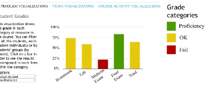
Currently, learning analytics support in Open edX is very limited. There are basic analytics presented in tables related to the number of students enrolled, demographics or gender information. In addition, there is a visualization about student progress regarding the graded problems of a course; an example can be found in figure 1. This visualization shows the scores of a student in each one of the assignments of a course (including exams, homework, laboratory work and other possible categories of assignments) and also a total score of the course where every category is weighted with its respective value specified by the course instructors. There is also a table below this visualization where students can numerically consult all the information included in the chart.
The Open edX community knows about the importance of learning analytics functionality and is encouraging several learning analytics initiatives. One of these initiatives is called EdX Insights6, which is a Django infrastructure to provide information about a certain course to the course members who are staff or instructors. Some of the information provided is related to the demographics of course enrollment, student engagement and student performance. EdX Insights is divided into three main applications: an analytics API server, a Hadoop-based data pipeline and the analytics dashboard. Another development towards obtaining conclusions about the learning process is the implementation to support A/B testing, in which two different learning conditions are evaluated. This way, edX course instructors can prepare courses where each group will get different learning contents to explore outcomes and go deeper into what educational resources and course designs are best for learning achievement.
Despite, as far as we know, no additional visual analytics tools being completely developed to obtain just-in-time information, there have been several studies on post-hoc analysis applied to data from edX courses. For example, the behavior of students when using different resources has been analyzed, as well as the evolution of use over time and the actions that students carry out when trying to attempt a test [23]. Another study [24] surprisingly showed a strong negative correlation between student skill and resource use. It is also interesting to whether all student cohorts, grouped by different demographics, initial knowledge or even in-campus vs. off-campus classes, learn equally when taking a MOOC. Results from a study by Colvin et al. [25] showed that their MOOC produced significant and roughly equal learning for all cohorts as none of the cohorts had significant differences in normalized gain. It is also possible to use this raw data in order to develop improved prediction analysis for Open edX courses. For example, an application may be able to predict student performance in an Open edX course using video-watching clickstream events [26]. Therefore, there is a lot of research in this direction in order to maximize learning, and there is still a lot of work, which needs to be done.
We can identify many challenges for learning analytics in Open edX. In this study we make our contribution by presenting 12 new parameters with their related visualizations in Open edX, as well as an evaluation study about their usability and the effectiveness of these visualizations that can be helpful for other researchers implementing visual analytics in education.
Fig 1. Example of a basic visualization included in Open edX about student progress in a course
4.
Overview of ANALYSE
4.1. Description of the tool
Open edX is a project built using the Django web framework, and the project is composed of a mix up of technologies. There are two main Django projects, which supply different functions: the course management system (CMS) and the learning management system (LMS). ANALYSE is a Django application included within the LMS as one more of the installed applications with has its own templates and static content files. ANALYSE processes the data generated by the students and it provides of a visualization dashboard for instructors and students that adds information and graphics that are not enabled by default in Open edX. ANALYSE works within the scope of each course, this means that the metrics are generated per course (note an Open edX instance can have many courses) and it is accessible by instructors and students by clicking on a new tab in the course contents. Therefore, instructors belonging to a course are able to access all the individual visualizations and aggregates of the entire class about the students that have enrolled for that course, whereas students can only access their own information. In the case that an instructor or students is enrolled in several courses, they will be able to access the information of each course separately, but they will not have access to information available from courses they are not enrolled.
4.2. Dashboard of Visualizations
for the visualization options, the graphic is centered and on the right we can find the descriptive legend. Figure 2 shows an example of Student Grades visualization within the dashboard for instructors.
Fig 2. Example of the visualization dashboard and Student Grades graphic
Course Summary
The Course Summary bar chart visualization shows the percentage of students who have achieved proficiency (can be seen as honors or pass with distinction), passed, failed and not accessed each category of resource of the course. The level for each one of these categories can be established by the instructor. The different categories of a course are defined by the course instructors; common elections are homework, laboratories and/or a final exam.
This visualization has similarities with Student Grades, which is shown in figure 2. However, the Course Summary visualization has the percentage of students in each position instead of average scores. In addition, if a user clicks on one of the categories, for example on the Homework category, the chart will dynamically change to a new one in which the Homework category will be divided into each item within the category (all the individual units of the Homework category in a course).
Student Grades
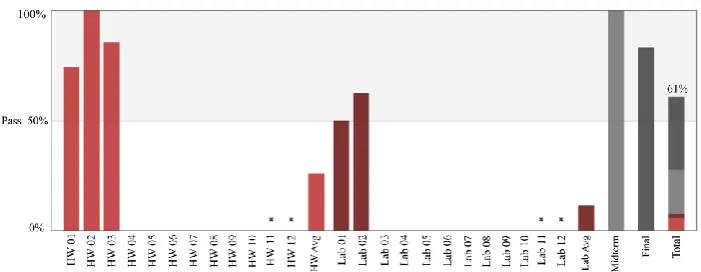
The Student Grades visualization is shown in figure 2. The graphic shows, in a bar chart, the average score of a student or an entire class (it also supports filtering by groups of students) in each category of a course. A user can also click on each category to see the score of each item in the category for a student or the average score in each item if the user has selected all of the class. Figure 2 shows that the average score for the student JoseRuiperez in the Homework category is 7.5. If we click on the Homework
category, we see that there are three Homework items where he has obtained 5.7, 10 and 7 points, which makes an average of 7.5. In addition, the total score of the course takes into account the weight of each category. This visualization is actually very similar to the information provided in the progress visualization included in Open edX, which appears in figure 1. However, the Open edX visualization does not include this information for instructors but only for students for self-awareness. This information is very useful for students in order to gain knowledge about their progress towards passing a course and for course instructors to know what the students’ scores are in each scoring item of the course. It can also be used to detect resources where students have greater problems.
Problem Time Distribution
The Problem Time Distribution visualization shows the number of minutes and the percentage of time spent by an entire class or each student individually in a course. The legend shows the given name of a problem and the pie slice is highlighted when the mouse goes above the legend item. This visualization can be used in order to reach conclusions based on detecting which problems students spend larger amounts of time on. We can calculate this period of time by knowing when the student accessed and quitted a page; therefore, an important issue of this indicator is to detect if the time invested by a student on the page has been spent really trying to solve a problem or whether the student was doing something else like surfing the web or being away from the keyboard. A possibility would be to set up a maximum time threshold; however, it would be hard to estimate the value of that threshold, and we would lose information about those students who require more time to solve problems.
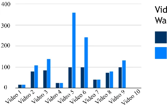
Video Time Watched
The Video Time Watched visualization provides two different indicators. The first one is
Video Time would be 200%. As an example, let us consider a video with a total length of 100 seconds and a student who has first watched from second 0 to second 50 and later accessed the video again and watched it from second 20 to second 90. This student has watched a total number of 90 different seconds, which represents 90% of the Different Video Time, and the student has watched a total number of 110 seconds, which represents 110% of Total Video Time. We can see an example in figure 3 where the x-axis represents the name of a video. This visualization can be used to monitor progress by class or by each student for each video (detecting underused videos) and also to detect which videos need to be watched more times, which could indicate problems. The visualization also indicates if some students do not watch some videos or if they need to repeat some videos a lot. Although YouTube Analytics API7 provides of an extensive set of metrics about channel and content activity, it does not permit to do analysis per user of an Open edX course by default, as with the ones we perform in ANALYSE. We only use YouTube API to obtain information about the videos, e.g. the total time of a video.
Fig 3. Example of the Video Time Watched visualization
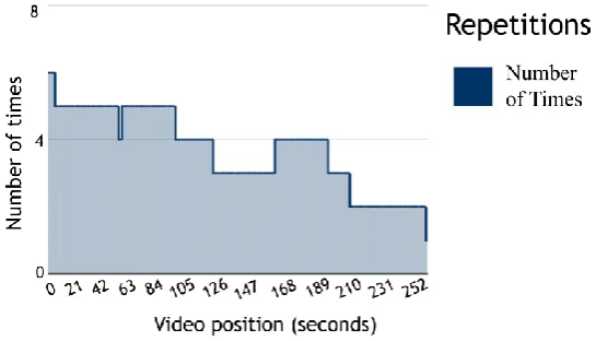
Repetition of Video Intervals
Although Video Time Watched visualization informs us of the progress of videos, which videos are watched more times and the repetition of videos, we do not know which parts of videos are more watched. The visualization called Repetitions of Video Intervals tries to provide additional information so that instructors can have a better idea of which video sections are watched more times. This can be related to problematic sections of a video because of elevated complexity or other issues.
We have developed an algorithm that counts the number of times that each second of a video has been watched and represents this information by means of a stepped area chart. Therefore, course instructors can know the exact time intervals that are more and less frequently watched for each video to detect problems. Figure 4 shows an example, which follows the typical descendent tendency that represents students who watch only the starting times of a video but quit it later.
Fig 4. Example of the Repetition of Video Intervals visualization
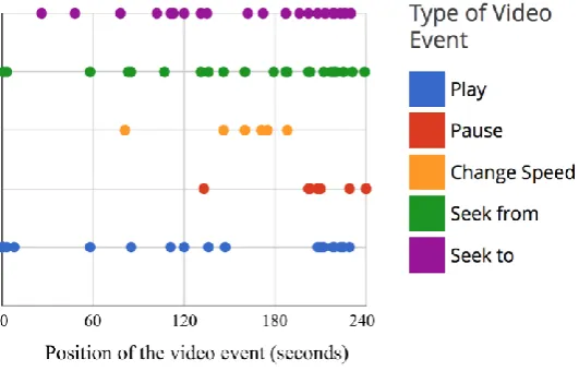
Video Event Distribution
Another interesting possibility is to locate and place all the events that students trigger while watching videos, and this is what the Video Event Distribution visualization provides. The events that we can detect are play, pause, change speed, seek from and seek to. We represent each one of these events in a scatter plot codified by a color; we place the events in the video second when they were triggered. We can watch this information for each one of the videos of a course and for all students at the same time. This information can provide insight regarding at which intervals students stop a video more or seek from and seek to, which could be related again to problems in those intervals.
Fig 5. Example of the Video Event Distribution visualization for a single student
Video Time Distribution
The Video Time Distribution is analogous to the Problem Time Distribution
visualization but is for videos. It represents the number of minutes and the percentage of time, which have been spent by an entire class or each student individually for each video. Despite a lot of information about videos being presented in the other visualizations, this one can be still of use to compare and support the rest of the information. A similar problem here (and also in all the other video visualizations) is that we cannot guarantee that a student is watching a video despite the video being played; a student might be surfing the Internet while a video is playing, and the data would be perfectly valid. A good detail is that, despite not being able to guarantee that a user is watching a video, since the video would stop playing once it is finished, there would not be the same problem as in the Problem Time Distribution indicator where a student might leave a page open and go away and where the time would be increasing without a stop.
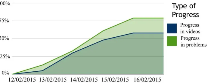
Problem and Video Progression
exercises might be associated with progress in videos. We can see an example of this visualization in figure 6.
Fig 6. Example of the Problem and Video Progression visualization.
Daily Time on Problems and Videos
This visualization shows, in a bar chart, the amount of time spent on problems and videos for each day of a course. This visualization can be used complementarily to
Problem and Video Progression, to know, for example, if a student who is devoting a lot of time is not progressing well, which could mean that the student is struggling. In addition, knowing the amount of time spent every day, we can also get a feeling of how constant students are in their learning, whether they work a bit every day or they work a lot on certain days.
Course Accesses
Fig 7. Example of the Course Accesses visualization
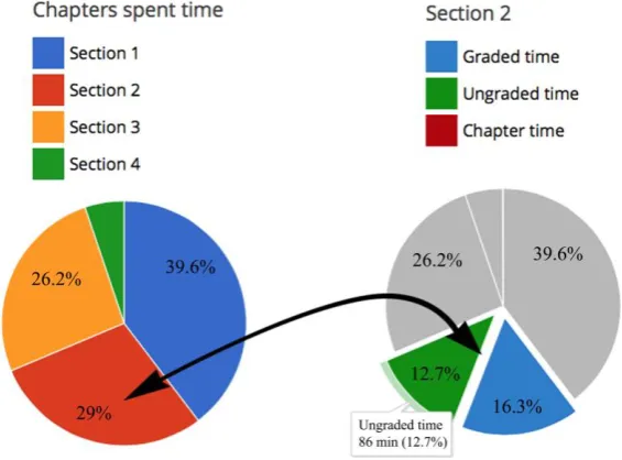
Chapter Time
This visualization shows the number of minutes spent in each section of a course. A user can also click on one of the sections to see the time divided into graded time, which is the time spent on problems, ungraded time, which is the time spent on other resources that cannot be graded in terms of their own nature, such as videos, and chapter time, which is the time spent in HTML sections of a course. We can see an example of the visualization in figure 8 where the first graphic shows the percentage in each chapter, and, after clicking on “Section 2”, we can see that time is divided into graded, ungraded and chapter time. This visualization can provide more insight about how students invest their time in each chapter of a course
Student Time Schedule
This pie chart visualization shows all the time spent in the platform in three different time intervals: morning [7:00 to 13:59], afternoon [14:00 to 20:59] and night [21:00 to 06:59]. This visualization shows in which time intervals students use the platform the most. This information could be used, for example, to schedule online learning experiences at the best time intervals where more students could participate.
5.
Evaluation of ANALYSE
5.1. Participants
The participants in the evaluation survey were graduate students taking Design of Telematics Applications class, which is part of the Telecommunications Engineering master’s degree at Universidad Carlos III de Madrid. There were two different groups taking this course. Only participants that answered all the questions of the study were taken into account. A total of 40 students participated in this study and were introduced into the results. We expect that ANALYSE can be used by non-technical users, i.e. without further training on teaching or any other specific skills besides basic computer knowledge. We believe the respondents represent a non-technical sample which did not have any specific training on teaching and it was their first time interacting with ANALYSE. Additionally, they did not have any special interest in MOOCs. Therefore, we believe that the respondents represent a good sample to obtain a reliable evaluation and representative conclusions. We note out that the survey has been performed using the role of instructor within ANALYSE. We think that this type of student is a good target group to use the instructor functionality because several of these graduate students will become instructors in the following years and they do not have any training for teaching so we can check if people without experience in teaching can use the tool as instructor.
5.2. Methodology
The intervention took place for 60 minutes in a regular class session of the postgraduate class. There were six different phases in the following order:
1) Participants were able to interact with different functionality of a typical course in Open edX (about 8 minutes).
2) Participants were able to interact with ANALYSE, our learning analytics extension for Open edX (about 7 minutes).
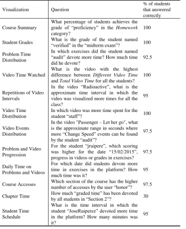
typical learning situation was simulated. Participants were asked a question for each one of the 12 visualizations (the ones of table 3) to check the effectiveness of the visualizations, i.e. if participants could reach proper conclusions from these visualizations. Students were to answer briefly for each question (about 25 minutes).
4) Participants were asked to rate, in a 5-point Likert scale, three general questions about the usefulness of ANALYSE (table 1). In addition, the degree of usefulness of each of the 12 visualizations from a lecturer’s perspective was asked (table 2) (about 5 minutes).
5) Participants were asked the 10 questions of the SUS survey in order to evaluate usability (about 5 minutes).
6) Finally, participants were asked two open questions about the best and worst features of ANALYSE (about 5 minutes).
To summarize, the respondents had to answer 12 questions to measure the effectiveness of the visualizations, 3 questions about the general usefulness of ANALYSE, 12 questions regarding the usefulness of each visualization, 10 questions about the usability and 2 qualitative open questions about the best and worst features of ANALYSE.
5.3. Results and Discussion about Usability
The SUS questionnaire was used as it is one of the most extended questionnaires for evaluating usability. A total score of 78.4 (over a scale of 100) was obtained, which means being within the better 15% percentile in terms of all the considered studies in the research developed by Sauro [27]. These are very good results, which show that the ANALYSE system was usable. Comparing these results with other evaluations of similar visual analytics systems that use the SUS scale, we can see that the results on ANALYSE are a bit above these other systems, such as the LARAe system [20] with an SUS result of 76 or the SAM tool [21] with an SUS of 71.36.
5.4. Results and Discussion about Usefulness
Table 1. General questions about the usefulness of ANALYSE
Questions Mean Std.
deviation I think that the use of this application can help instructors to
evaluate students who are taking online courses 4.2 0.76
I think that these visualizations are useful to understand better
the learning process of students who are taking online courses 4.38 0.77 I think that these visualizations can be used to detect problems
in educational resources such as exercises or videos 4.35 0.89
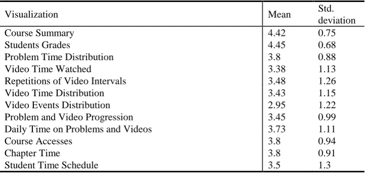
Table 2. Usefulness of the 12 different visualizations of ANALYSE
Visualization Mean Std.
deviation
Course Summary 4.42 0.75
Students Grades 4.45 0.68
Problem Time Distribution 3.8 0.88
Video Time Watched 3.38 1.13
Repetitions of Video Intervals 3.48 1.26
Video Time Distribution 3.43 1.15
Video Events Distribution 2.95 1.22
Problem and Video Progression 3.45 0.99
Daily Time on Problems and Videos 3.73 1.11
Course Accesses 3.8 0.94
Chapter Time 3.8 0.91
Student Time Schedule 3.5 1.3
5.5. Results and Discussion about Effectiveness
Table 3. Effectiveness when solving tasks related to the 12 different visualizations
Visualization Question
% of students that answered correctly
Course Summary
What percentage of students achieves the grade of “proficiency” in the Homework
category?
100
Student Grades What is the grade of the student named
“verified” in the “midterm exam”? 100
Problem Time Distribution
In which exercises did the student named “audit” devote more time? How much time did he devote?
92.5
Video Time Watched
What is the video with the highest difference between Different Video Time
and Total Video Time for all the students? 100
Repetitions of Video Intervals
In the video “Radioactive”, what is the approximate time interval in which the video was visualized more times for all the class?
95
Video Time Distribution
In which video was more time spent for the
student “staff”? 100
Video Events Distribution
In the video "Passenger – Let her go", what is the approximate range in seconds where more “Change Speed” events can be found by the student “audit”?
97.5
Problem and Video Progression
For the student “jruipere”, which scoring was higher for the date “15/02/2015”, progress in videos or grades in exercises?
97.5
Daily Time on Problems and Videos
For which date did students devote more time in exercises in the platform? How much time was it?
95
Course Accesses Which section of the course has the higher number of accesses by the user “honor”? 97.5
Chapter Time How much “graded time” has been devoted
by all students in “Section 2”? 30
Student Time Schedule
What is the time interval in which the student “JoseRuiperez” devoted more time in the platform? How many minutes was it?
95
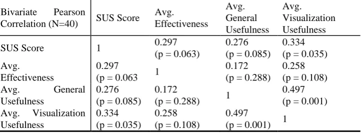
5.6. Results and Discussion about Correlations
- SUS Score: The global SUS score from 0 to 100
- Avg. Effectiveness: The average percentage of correct answers from the questions in table 3.
- Avg. General Usefulness: The average score for the questions regarding general usefulness of ANALYSE in table 1.
- Avg. Visualization Usefulness: The average score for the questions regarding the usefulness of each visualization of ANALYSE in table 2.
We show the correlation between these metrics in table 4. We found two statistically significant correlations. The first one is SUS Score with Avg. Visualization Usefulness
(0.334, p = 0.035), which we think makes sense because if the respondents think that the application is usable, they had a nice experience and thought that the application is also useful. The second one is between Avg. General Usefulness and Avg. Visualization Usefulness (0.497, p = 0.001), which is logical to think that the respondents find the visualizations useful they probably find the global application useful as well. We found interesting that there were not any significant correlations between Avg. Effectiveness
and the rest of the metrics, but we think is reasonable taking into account that as we say in section 5.5, most of the questions were solved correctly, thus there was not much variation in this variable.
Table 4. Bivariate Pearson correlation of SUS score, average effectiveness, average general usefulness and average visualization usefulness.
Bivariate Pearson
Correlation (N=40) SUS Score
Avg. Effectiveness Avg. General Usefulness Avg. Visualization Usefulness
SUS Score 1 0.297
(p = 0.063)
0.276 (p = 0.085)
0.334 (p = 0.035) Avg.
Effectiveness
0.297
(p = 0.063 1
0.172 (p = 0.288)
0.258 (p = 0.108)
Avg. General
Usefulness
0.276 (p = 0.085)
0.172
(p = 0.288) 1
0.497 (p = 0.001) Avg. Visualization
Usefulness
0.334 (p = 0.035)
0.258 (p = 0.108)
0.497
(p = 0.001) 1
5.7. Results and Discussion about Qualitative Open Questions
the benefits in terms of awareness and self-reflection. These benefits have been reported also previously in other works related to visual analytics in education [21], [28].
There were also good comments regarding the usefulness such as “I think the tool is really useful”. A common opinion was that the Course Summary and Students’ Grades were the most useful visualizations; this was also clear according to the survey results. Furthermore, we found several positive comments regarding the usability such as “The app was very intuitive and I did not need any previous knowledge to make use of it” or “The best features are that is really easy to use and the interactive visualizations makes it very intuitive”. This positive feedback regarding usability is also in line with the high SUS score obtained.
The second open question reads “Which features should be improved and what new functionality could be added?”, and several users recommended implementing visualizations about social activity, and we are already planning to do this in the future as we mention later in the conclusions as part of the future work ideas. A few users also complained about the language (note that respondents were Spanish and ANALYSE is in English); they recommended that several languages should be available. They reported several more improvements that we will take into account in the future. Several users addressed the Repetitions of Video Intervals visualizations, some of them by saying positive things, such as it would permit to detect problems in videos, and others expressing their concern because it was hard to understand. We can say that it generated a bit of controversy, and we can also see that it has one of the highest standard deviations (1.26).
6.
Conclusions
MOOCs have acquired a high level of importance in education over the past years. Education can be provided in a massive way to thousands of students. This implies that it is much more difficult for teachers to provide personalized feedback. Learning analytics tools are required to improve this learning process, augmenting a teacher’s information and providing students with self-awareness tools. In addition it is required that these learning analytics tools are easily usable by instructors and students and fulfil their requirements. In this direction, this work presents an outline of our contribution for the Open edX MOOC environment. ANALYSE incorporates 12 brand new visualizations for Open which have proven to be useful and effective according to the presented evaluation. The code has been released in a GitHub account8 for the Open edX community.
We have performed an evaluation of our learning analytics module ANALYSE. The results have shown a good score of SUS (78.44/100), which is above the average value. In addition, we consider the average value in terms of the usefulness of visualizations to be good (3.69/5), so, broadly speaking, students found the module both useful and usable. The most useful visualizations voted by students were Course Summary (4.43/5) and Students Grades (4.45/5), which makes sense as they are the most straightforward
and easy to understand. The Video Event Distribution (2.95/5) was the one found to be least useful; however, we think that this is due to it being hard to make sense of the information, such as how to interpret that there are many stops in a section of a video. The questions that required actions from the respondents obtained a correctness ratio above 90%, except for one where students had to click on the graphic to dynamically change it and get the correct information. With this result and some of the free answers, we conclude that we need to make more visible the interaction possibilities that each visualization provides. The answers to the open questions of the survey also reported good comments in terms of usability, usefulness and awareness. Additionally, the respondents suggested new features and improvements that we plan to carry out in the future.
As future steps, we want to develop and implement more complex parameters regarding student behavior or forum activity. We also want to include other types of visualizations and tools, for example to visualize network analysis of the social activity in the discussion forum using tools such as qgraph9 [29]. Also we plan to take into account some of the suggestions done by the respondents of the survey and implement additional improvements in ANALYSE. Moreover, we would like to integrate tools within ANALYSE that can permit a more advanced statistical analysis. Following this previous idea, we could implement as part of this extension, we would also like to implement a recommender system that can encourage good behaviors for learning and send warnings about bad ones.
Acknowledgements. This work has been supported by the “eMadrid” project (Regional Government of Madrid) under grant S2013/ICE-2715, the “RESET” project (Ministry of Economy and Competiveness) under grant RESET TIN2014-53199-C3-1-R and the European Erasmus+ SHEILA project under grant 562080-EPP-1-2015-BE-EPPKA3-PI-FORWARD
References
1. D. Clow, “The learning analytics cycle: closing the loop effectively,” in Proceedings of the 2nd International Conference on Learning Analytics and Knowledge, 2012, pp. 134–138. 2. L. Tao and M. Zhang, “Understanding an online classroom system: Design and
implementation based on a model blending pedagogy and HCI,” IEEE Trans. Human-Machine Syst., vol. 43, no. 5, pp. 465–478, 2013.
3. C. Bach, “Learning Analytics : Targeting Instruction , Curricula and Student Support,”
2010. [Online]. Available:
http://www.iiis.org/CDs2010/CD2010SCI/EISTA_2010/PapersPdf/EA655ES.pdf. [Accessed: 20-May-2014].
4. G. Siemens and P. Long, “Penetrating the Fog: Analytics in Learning and Education,”
Educ. Rev., 2011.
5. E. Duval, “Attention Please ! Learning Analytics for Visualization and Recommendation,” in 1st International Conference on Learning Analytics and Knowledge, 2011.
6. K. Verbert, N. Manouselis, X. Ochoa, M. Wolpers, H. Drachsler, I. Bosnic, and E. Duval, “Context-Aware Recommender Systems for Learning : A Survey and Future Challenges,” IEEE Trans. Learn. Technol., vol. 5, no. 4, pp. 318–335, 2012.
7. Y.-H. Hu, C.-L. Lo, and S.-P. Shih, “Developing early warning systems to predict students’ online learning performance,” J. Comput. Hum. Behav., vol. 36, pp. 469–478, Jul. 2014.
8. J. Daniel, “Making Sense of MOOCs: Musings in a Maze of Myth, Paradox and Possibility.,” J. Interact. Media Educ., vol. Perspectiv, 2012.
9. J. J. O’Donnell, “The Future Is Now, and Has Been for Years,” Chron. High. Educ., 2012.
10. L. Breslow, D. E. Pritchard, J. DeBoer, G. S. Stump, A. D. Ho, and D. T. Seaton, “Studying Learning in the Worldwide Classroom: Research into edX’s First MOOC,” Res. Pract. Assess., pp. 13–25, 2013.
11. M. Freire, Á. Blanco, and B. Fernández-manjón, “Serious Games as edX MOOC Activities,” in Global Engineering Education Conference (EDUCON), 2014, no. April, pp. 867–871.
12. A. L. Dyckhoff, V. Lukarov, A. Muslim, M. A. Chatti, and U. Schroeder, “Supporting action research with learning analytics,” in Proceedings of the Third International Conference on Learning Analytics and Knowledge - LAK ’13, 2013, p. 220.
13. P. J. Muñoz-Merino, J. A. Ruipérez Valiente, and C. D. Kloos, “Inferring higher level learning information from low level data for the Khan Academy platform,” in Proceedings of the Third International Conference on Learning Analytics and Knowledge - LAK ’13, 2013, pp. 112–116.
14. H. Zhang, K. Almeroth, A. Knight, M. Bulger, and R. Mayer, “Moodog: Tracking students’ online learning activities,” in World Conference on Educational Multimedia, Hypermedia and Telecommunications, 2007, pp. 4415–4422.
15. J. A. Ruipérez-Valiente, P. J. Muñoz-Merino, C. D. Kloos, K. Niemann, and M. Scheffel, Do optional activities matter in virtual learning environments?, vol. 8719 LNCS. 2014.
16. M. Kloft, F. Stiehler, Z. Zheng, and N. Pinkwart, “Predicting MOOC dropout over weeks using machine learning methods,” in Workshop on Analysis of Large Scale Social Interaction in MOOCs, 2014, pp. 60–65.
17. T. Tang and G. McCalla, “Utilizing Artificial Learners to Help Overcome the Cold-Start Problem in a Pedagogically-Oriented Paper Recommendation System 2 What Is Special About Paper Recommendation for e-Learning System,” Lect. Notes Comput. Sci., vol. 3137, pp. 245–254, 2004.
18. Y. Kritikou, P. Demestichas, E. Adamopoulou, K. Demestichas, M. Theologou, and M. Paradia, “User Profile Modeling in the context of web-based learning management systems,” J. Netw. Comput. Appl., vol. 31, pp. 603–627, 2008.
19. M. May, S. George, and P. Prévôt, “TrAVis to Enhance Students ’ Self-monitoring in Online Learning Supported by Computer-Mediated Communication Tools,” Int. J. Comput. Inf. Syst. Ind. Manag. Appl., vol. 3, pp. 623–634, 2011.
20. S. Charleer, J. L. Santos, J. Klerkx, and E. Duval, “Improving teacher awareness through activity , badge and content visualizations,” in New Horizons in Web Based Learning, 2014, pp. 143–152.
21. S. Govaerts, K. Verbert, E. Duval, and A. Pardo, “The student activity meter for awareness and self-reflection,” in CHI ’12 Extended Abstracts on Human Factors in
Computing Systems, 2012, pp. 869–884.
23. D. T. Seaton, Y. Bergner, I. Chuang, P. Mitros, and D. E. Pritchard, “Who does what in a massive open online course?,” Commun. ACM, vol. 57, pp. 58–65, 2014.
24. J. Champaign, K. F. Colvin, A. Liu, C. Fredericks, D. Seaton, and D. E. Pritchard, “Correlating skill and improvement in 2 MOOCs with a student’s time on tasks,” in
Learning at Scale, 2014, pp. 11–20.
25. K. F. Colvin, J. Champaign, A. Liu, Q. Zhou, C. Fredericks, and D. E. Pritchard, “Learning in an introductory physics MOOC : All cohorts learn equally, including an on-campus class,” Int. Rev. Res. Open Distance Learn., vol. 15, no. 4, pp. 1–15, 2014. 26. C. Brinton and M. Chiang, “MOOC Performance Prediction via Clickstream Data and
Social Learning Networks,” in IEEE Conference on Computer Communications, 2015, pp. 2299–2307.
27. J. Sauro, “SUStisfied? Little-Known System Usability Scale Facts,” User Exp. Mag., vol. 10, no. 3, 2011.
28. S. Govaerts, K. Verbert, J. Klerkx, and E. Duval, “Visualizing activities for self-reflection and awareness,” in The 9th International Conference on Web-based Learning, 2010, pp. 91–100.
29. S. Epskamp, A. O. J. Cramer, L. J. Waldorp, V. D. Schmittmann, and D. Borsboom, “qgraph: Network Visualizations of Relationships in Psychometric Data,” J. Stat. Softw., vol. 48, no. 4, pp. 1–18, 2012.
José A. Ruipérez-Valiente completed his BSc and MSc in telecommunications
engineering at Universidad Católica San Antonio de Murcia and Universidad Carlos III de Madrid (UC3M) respectively. He has worked both in the private (Accenture and Group Multimedia Vocento) and public sector (UC3M). Right now he is a PhD candidate at UC3M and Research Assistant at Institute IMDEA Networks. He has completed two research visits of three months each, the first one at Massachusetts Institute of Technology and the second one at the University of Edinburgh. As a student and researcher he has received several awards. He has currently published more than 20 works in important journals and international conferences related to his main fields of research. His research is focused nowadays in learning analytics and educational data mining.
Pedro J. Muñoz-Merino is a lecturer and researcher at the Universidad Carlos III de Madrid, where he is the Director of the Master in Telematics Engineering. In 2009 he got his PhD in Telematics Engineering from the Universidad Carlos III de Madrid. He obtained his acreditation in May 2012 as Associate Professor by the ANECA agency from the Spanish Ministry of Education. Pedro has received several awards for his work on educational technologies. He is author of more than 90 scientific publications and has participated in more than 20 research projects, coordinating some of them with private companies. He has coordinated the development and deployment of different learning analytics tools. You can contact him at twitter at @pedmume.
Héctor J. Pijeira Díaz received his Master in Telecommunication Engineering from the
research interests include learning analytics and physiological data processing applied to learning sciences. He is a member of the Society for Learning Analytics Research (SOLAR).
Javier Santofimia Ruiz received Long Cycle Degree in Telecommunications
Engineering from Carlos III de Madrid University, Spain, in September 2015. Employed in NPG Tech as Android Developer from May 2014 to April 2015. Currently employed in Assystem Iberia S.L., as Software Engineer in the railway sector. Research interests in Learning Analytics and Big Data applied to e-learning.
Carlos Delgado Kloos received the Ph.D. degree in Computer Science from the Technical University of Munich and in Telecommunications Engineering from the Technical University of Madrid. Since 1996, he is Full Professor of Telematics Engineering at the Universidad Carlos III de Madrid, where he is the Director of the online Master's program on "Management and Prodution of e-Learning", Holder of the UNESCO Chair on "Scalable Digital Education for All" and of the GAST research group. He is also Vice President for Strategy and Digital Education.
He coordinates the eMadrid network on Educational Technology in the Region of Madrid. He is an IEEE Senior Member. His main interests are centered on educational technologies.