Facilitating the Interaction with Data Warehouse
Schemas through a Visual Web-Based Approach
Clemente R. Borges and José A. Macías
Escuela Politécnica Superior, Universidad Autónoma de Madrid Francisco Tomás y Valiente 11.
28049 Madrid, Spain {clemente.borges, j.macias}@uam.es
Abstract. In most respects, there are implicit drawbacks concerning representation and interaction with data in relational-database applications. On the one hand, there is a lack of expressiveness and ease of use in the user interfaces that handle such data. On the other hand, there is an implicit need for interactive end-user visual tools to query data and avoid dependency on programming languages. The main aim of this work is to study the problem of database interaction and usability, comparing existing solutions and providing a new approach that overcomes existing problems. We propose a web-based tool that manipulates Data Warehouse schemas by using a visual language to represent the database structure and providing several visualization techniques that facilitate the interaction and creation of queries involving different levels of complexity. We based our research on an End-User Development approach that has been evaluated to obtain some initial usability indicators.
Keywords: Human-Computer Interaction, User-Centered Design, Usability, User Interface for Data Warehouse.
1.
Introduction
Over the last decade, database research has produced notable results concerning architectural and storage facilities. This has enabled database systems to deal with large volumes of information for different purposes. Nonetheless, this advance does not necessarily mean that the data can be quickly and easily accessed by end-users. In this sense, it is essential to take into consideration the logical data models, which are the basis for a successful modeling and management of information. The Relational Model [1] can be considered as one of the most commonly used. This model has been worldwide used and extended for the management of large volumes of tables and complex relationships. In general, to outweigh the use of the Relational Model, it is necessary to consider two different problems that claim a common solution: the management of data models and the effective construction of query-based applications that make easier the way end-users can obtain information from the data models.
technique that allows having a reduced number of tables, also producing data that are easier to understand and represent.
The collection of tables in a DW is called a schema. A typical schema consists of a fact table and several dimension tables that are related to the fact table. The fact table represents the business measures (numeric values), whereas the dimension tables contain dimensional attributes that describe the facts (textual descriptions). This type of structure is commonly known as a star schema, and it is based on the dimensional modeling. One of the most important characteristics of this type of model is its simplicity [4]. Users who utilize a star schema are benefiting from the simplicity of data that are easier to understand, navigate and query [5]. In addition, queries based on a star schema become simpler and facilitate the visual authoring in the query-building process. All in all, there are also some implicit problems concerning the understanding of data models by end-users. Such difficulties are somehow related to the applications and tools being used to manage the data. Everyday more non-expert-in-query-language users deal with data tools to face daily problem-solving activities. In general, a trade-off between expressiveness and ease of use is mandatory in order for end-users to manage data and thus reduce the user’s cognitive load regarding the interaction with database systems. In other words, it is necessary to get the balance right between the richness of the visual languages and the implicit ease of use provided by the application functionality.
The aim of our work is to facilitate the process of query building to non-expert end-users in DW environments. To validate our approach, we have developed a tool called VISQUE (VIsual Star schema QUery by Example) [6], [7], which aims at creating queries by example focused on Data Warehouses and more specifically on the star schema, allowing database users, not necessarily experts in SQL, to build queries in a visual and easy way, but featuring fewer expressive limitations than other similar tools.
We think that star-schema models are easier to represent in a visual manner, and also they seem to be more natural for end-user understanding. To this end, we have based on the End-User Development (EUD) paradigm [8] as a solution that provides a set of methods, techniques, and tools that allow users of software systems, which act as non-professional software developers, to create, modify, or extend in some way a software artifact.
Our research is focused on specific instances of EUD approach such as the Programming by Example [9], [10]. In Programming by Example (PBE), the application observes and gathers information while the user proves how to perform a task that is used by the system to automatically complete similar tasks later. A PBE system can make the programming process easier by providing a visual representation of the objects and avoiding the need to understand programmatic specifications, therefore inferring the user's intentions based on (mostly graphical) demonstrations. In consequence, our research is more specifically focused on the Query by Example paradigm (QBE) [11], which is an extension of PBE dealing with the creation of queries by using graphical demonstrations and visual elements.
More specifically, our research can be summarized in the following objectives: 1) Provide end-users, who do not have to be necessarily experts in query languages,
with facilities for the construction of queries based on DW star-schema models. 2) Offer appropriate mechanisms for the visualization and interaction with star
3) Improve the expressiveness in the creation of visual queries by considering advanced operators (such as set-based and nested queries) that are commonly unsupported or unavailable in other existing approaches.
4) Reduce the number of steps required to build queries and provide adequate feedback to end-users based on the visualization of immediate real-time results and the multi-visualization of queries, as an effort to improve the interaction process and reduce the learning curve.
5) Design a query-based visual tool that has been evaluated with real users in order to have early usability clues for further improvement, carrying through a user-centered development approach.
These objectives imply a compelling challenge, as the proposed tool should be aimed at end-users with general knowledge on databases and related tools such as Microsoft Access or Excel, for instance, but not on Data Warehousing. Moreover, the users may have knowledge on SQL or just a basic level of it.
However, development issues have to be considered as well, taking into account usability features, allowing a high level of user satisfaction and reducing the learning burden at the same time [12].
This paper is organized as follows. In Section 2, we present previous work along with a study of some related tools in the field. Section 3 describes our approach in terms of the elements of the visual language and a worked use case. In Section 4, we present a comprehensive evaluation of the tool, discussing the most important results. Finally, Section 5 reports on the main conclusions and activities to be considered as future work.
2.
Related Work
Over the last decades, several visual tools and languages using different interaction methods have been created to assist users in building queries for different domains [13]. In this sense, our aim was to study the most important works by means of a comparative evaluation to find common drawbacks and carry through an innovative solution for querying Data Warehouse schemas.
For a long time, QBE has been the inspiration for several visual query tools such as XQBE (XQuery By Example) [14], among others. Generally, example-based languages have been traditionally used to encourage users to build queries by specifying a visual example of them on a user interface. There are several example-based database query languages [15], which are principally based on a tabular representation of relations with boxes that are filled in by users, including constants and example elements (such as variables and field names). Also, there have been proposed several dynamic queries interfaces [16] allowing database users to obtain interactive control over the construction of different kinds of queries. Such approaches include many principles of direct manipulation that reduces the difficulties in programming [17], such as visual presentation of the query´s components, visual presentations of results, selection by pointing (versus typing), and immediate and continuous feedback, among others.
By contrast, Hyperion Interacting Reporting tool [20] provides a manipulation metaphor based on drag & drop, which represents the database tables as boxes (a common feature in many query-building tools), and includes a selection area with fields and filters that allow to build more complex queries. However, this approach forces the user to select and relate the data model tables, increasing the level of skill required for end-users to create a query. There are other open-source tools like Eclipse Birt Project [21], which provides facilities for creating queries, but it also lacks of visual expressiveness and is not suitable for unskilled users, as it demands to manipulate SQL code manually.
A different approach is presented in Spago BI QbE Enterprise Scope [22], which proposes the creation of queries through a wizard that significantly reduces the expressiveness of query constructions. This tool provides an initial data model as a structure in which there is a clear distinction between measures and dimensions, but by contrast it lacks the visual richness and variety of (relational) query operations as well. Additionally, Tableau Desktop [23] is the commercial version of a research tool called Polaris [24], an application focused on Data Warehouse schemas. However, this tool utilizes a classification method for measures and dimensions based on the kind of the data related to the table field, implying that even relationship fields are displayed as measures being non-relevant for the query building.
Spotfire [25] is another related tool including a database exploration system based on interactive information visualization. It allows working with different types of data sources and displays default visualizations along with several objects that users can manipulate according to the data type of each field in order to adapt the visualization to their needs. However, users have to select and manipulate tables and fields when importing data from a database. On the other hand, the Active Query Builder tool [26] includes an environment to address a variety of complex queries visually. However, this tool utilizes the typical representation of tables as drag & drop boxes in which users have to deal with several complex concepts and relations, and they usually need to understand the model very well in order to extract valuable information.
In order to highlight potential shortcomings, we now analyze some well-known tools and applications considering their most important functionality related to usability issues. All those existing products have already been fully implemented, and therefore they can be tested and analyzed in detail. The competitive analysis is a HCI analysis technique that evaluates existing tools to see how acceptable they are in terms of the functionality and interaction techniques that they provide, in order to improve and optimize requirements for a new system [27].
The objective of the competitive analysis that we report here is to gather different issues provided by some common used tools, in order to identify usability design problems in the user interface. In our case, this analysis helped to provide ideas for the design of VISQUE, obtaining a list of successful guidelines and also those to be avoided. The idea was to assess the cognitive load and the sequence of steps that are typically required to build queries (specifically focused on Data Warehouses). To do this, we selected the following popular tools:
1. Microsoft Access- Query By Example
2. Hyperion Interactive Reporting
3. Spago BI QbE Enterprise Scope
4. Crystal Reports
6. Tableau Desktop
In order to carry out the competitive analysis, we performed a typical sequence of steps for the DW query building on each of the above-mentioned tools. In short, brief descriptions of the interactive aspects reviewed are outlined:
Database table visualization method: indicates the method used to visualize the
data-model tables that are available to create a query. Drag & drop boxes are the most typical representations of database tables used. Moreover, the tree view is another typical mechanism to display database tables.
Table selection method: implies the type of interaction used to select the tables involved in a query (i.e., tables included in the clause FROM in a SQL query). Field selection method: indicates the type of interaction used to select fields from
the tables available for the creation of a query (i.e., fields that follow the clause SELECT in a SQL query).
Filter selection method: represents the type of interaction used to select the filters that apply to a particular query (i.e., the logical conditions that are part of the clause WHERE in a SQL query).
Function selection method: indicates the type of interaction used to apply an aggregation function, which will be applied to a particular field in the query (i.e., functions such as SUM, MAX, MIN, AVG, etc., in a SQL query).
Order selection method: embodies the type of interaction used to apply specific
sort criteria over any of the fields included in a query (i.e., fields that are part of the clause ORDER BY in a SQL query).
On the other hand, a couple of specific features were considered, as they are rare or difficult to find in most query-building applications. Such features have been taken into account in the design of VISQUE. Specifically, we have evaluated the following features:
Set-based operations: this functionality refers to the ability to create set-based operations, such as union and intersection, in a visual way.
Nested queries: refers to the ability to visually represent nested queries (SQL clauses IN and NOT IN).
Based on the competitive analysis conducted, we present a summary of the main problems found in the reviewed tools:
In the selection of aggregation functions in fields, we found several problems. First, in many tools it is not obvious to find this functionality. In the case of Hyperion Interactive Reporting, the action is achieved by following a long sequence of steps, which does not facilitate the memorization by end-users. Finally, in several cases, the user is allowed to apply aggregation functions in fields where the data type is not supported, and therefore this does not help preventing errors. For example, it does not make any sense to apply an Average (AVG) aggregation function to a text field.
In the selection of query filters, the main shortcoming found in most tools is the inability to suggest possible values existing in the database to create a filter on a field. As a result, the user needs to know or guess these values in advance.
added to an SQL sentence that is displayed. Users must add commas to separate the fields, so that it forces the user to directly manipulate the SQL code.
The Crystal Reports tool forces the user to perform complicated tasks, such as set up the relationships between tables, so involving the user in the design of the Entity-Relationship database model. This is obviously a difficult task for non-expert users or those who are unfamiliar with the logical data model.
The Spago BI tool presents some inconsistencies in the visualization of data schemas. It shows the same dimensions at different levels in the tree view representing the DW schema. This is not really necessary, and it might cause confusion when visualizing the data model.
The Tableau Desktop tool shows all numeric fields as fact table measures, and the rest of non-numeric fields are displayed as dimensional attributes. Consequently, numeric fields belonging to dimension tables (serving as relationships to the fact table) are included as measures, when they are really not.
Hyperion Interactive Reporting is the only tool providing a visual representation of set-based operations. However, none of the tools analyzed provides a way to visualize nested queries.
In general, all the mentioned approaches offer a great deal of features and capacities to manipulate data by experts, also increasing the final complexity and the level of expertise required for end-users to create queries.
As we will see in the next section, our approach seeks to overcome these common shortcomings, improving the deficiencies found in the analysis, and taking into account several critical interaction points for the creation of queries. To do that, our approach encourages the automatic representation and visualization of the star schema in order to avoid the selection of tables, and the explicit creation of relationships between tables of the DW data schema as a prelude to the query-building process. In addition, we propose a visual interaction mechanism, which clearly and uniquely identifies each of the elements of the DW data schema. Also, our aim is to reduce the steps required to apply aggregate functions (SUM, AVG, etc.) on the measures, noting that this kind of steps are typically carried out in the construction of queries for DW, as well as the need to restrict these functions only to numeric fields. Additionally, the tool proposes the construction of visual queries involving set-based operations and nested queries, which are visual features unavailable in most common tools, and particularly in those previously reviewed.
3.
Our Approach
3.1. Elements of the Visual Language
VISQUE includes several main graphical elements comprising the Web user interface at the front-end, namely: a) the visual-schema interactive component, b) the operation selection boxes, c) the results table, d) the set-based and nested queries operations, e) the query tabs, and f) the operation visualization.
a) Visual-schema interactive component
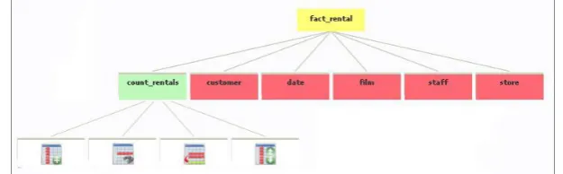
A star schema can be represented as a hierarchical structure. This way, the root node represents the fact table, and the subsequent levels correspond to the measures and dimensions. The tree view is a common graphical user interface model presenting a hierarchical view of information, and it has been used for many years in different types of applications.
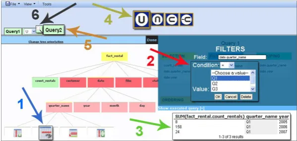
It is essential to make a clear distinction between measures and dimensions as each of these concepts plays a different role. Figure 1 shows an example of the visual-schema interactive component with several descriptive icons and different colors. The fact table is represented as a yellow root node. Items related to the fact table (measures) are represented in green, and items related to dimensions in red color. When the user clicks on any measure, the node expands and displays a series of icons representing the operations that can be performed on this measure. In the case of dimensions, when expanding one of the nodes representing a dimension table, dimensional attributes are shown initially and then, when selecting a specific dimensional attribute, this expands a new level showing the operations that the user can perform on the dimensional attribute.
Fig. 1.Visual-schema interactive component
We have created four different icons representing field operations to build queries. Figure 2 depicts the field operators represented by icons that determine specific operations in our tool. The icon numbered as 1 represents a simple selection of fields (SELECT clause), icon 2 concerns the application of filters (WHERE clause). Icon 3 allows the grouping of rows (GROUP BY clause). Finally, icon 4 implies the order to arrange the final results (ORDER BY clause).
In short, this mechanism provides facilities to end-users in the selection of elements of a data schema, specifying a familiar interactive tree-view based mechanism, clearly differentiating between measures and dimensional attributes, and restricting the kind of operations that can be performed on each of these elements.
b) Operation selection boxes
When selecting a particular action over a field –either a measure or a dimensional attribute, the selection is registered in a specific operation selection box. The selected measures are displayed with a unique name. By contrast, in the case of dimensions, it is displayed the name of the dimension table, followed by a point and the name of the selected dimensional attribute.
Fig. 3. Operation selection boxes
In this case, Figure 3 depicts some user field selections. For instance, the dimensional attribute "date.year" refers to the dimension table "date", and "year" corresponds to the dimensional attribute, intending to avoid confusion in the case of having similar names in different dimensional attributes between the dimension tables.
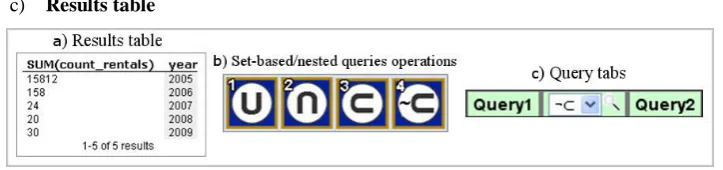
c) Results table
Fig. 4. a) Results table, b) Set-based/ nested queries operations and c) Query tabs
Each time a particular operation is applied; a SQL translator automatically processes the query and builds the SQL statement. Once the system has executed the query, it obtains the corresponding output and the results table is then updated with the data retrieved (see Figure 4.a above), showing also the number of rows affected.
d) Set-based and nested queries operations
e) Query tabs
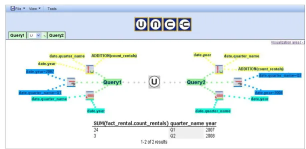
Tabs handle each query independently. Multiple query tabs are displayed when the user operates with set-based or nested queries, showing the query number and the applied operation between queries. Figure 4.c, show the query tabs for a nested-query NOT IN operation () corresponding to two existing queries (Query1 Query2). Finally, to observe the composite operations, it is necessary to click on the magnifying glass icon located between the two queries, and then the result appears in the operation visualization window that will be explained below.
f) Operation visualization
The operation visualization window displays the visual results of the operation between queries. Moreover, it shows all the field operation icons selected by the user for each query, and the parameters for each operation, that is, selection, filtering, grouping, or ordering. By contrast, it has the disadvantage that it shows too many items onscreen when the number of queries involved in the operation increases significantly (see Figure 8).
3.2. A Worked Use Case
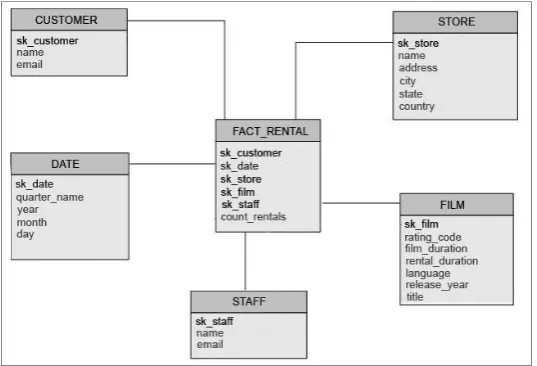
We introduce a use case to briefly describe the process of building queries with VISQUE. To do so, let us introduce the sample database schema shown in Figure 5.
Fig. 5. Star schema to describe the use case including the fact table (FACT_RENTALS) and five dimension fables
(FACT_RENTAL) represents a quantity of rented films (count_rentals). The dimension tables are used to show different views of the measures.
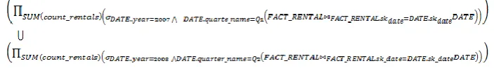
According to the schema shown in Figure 5, let us suppose that the user wants to design a query to obtain the number of films rented in the first quarter of 2007 along with the ones rented during the second quarter of 2008. To do this, two separate queries can be created and linked one another by a union set-based operation. The query can be formally expressed as follows:
Figure 6 shows the sequence of steps to create the first sub-query. Initially, it is necessary to select the field that matches the rented films (count_rentals), clicking on the corresponding element and expanding the options on that field. Then, the user has to click on the operation icon that indicates the simple selection of fields (1), which will be placed in the selection box on the right (2). By default, the tool applies the aggregation function "SUM" when facts are added as part of the selection of fields. However, the user can modify and include any other function by double-clicking the field name in the selection box. Afterward, the tool infers the query and builds a table displaying the query results (3). The results are automatically updated in real time, those being visible in the results box located at the lower right corner that, in this case, displays a single record corresponding to the total number of rented films (i.e., 16044).
Fig. 6. Fields selection corresponding to the SELECT SQL clause
Both fields come from the table DATE, and they are obtained by using the same selection steps shown before. By default, the tool automatically adds the new selected fields to the grouping box, and therefore the data is grouped by quarter and year. Later on, the user has to indicate the filters to include the results for the first quarter and then the year “2007”.
In Figure 7, the necessary steps to implement these filters can be observed. To carry out this task, the user has to click on the quarter dimensional attribute in table DATE, and then select the icon for the filters (1), which immediately adds the field to the filter box and activates the selection of conditions and values for the filter, suggesting possible values that the user can choose from the dropdown list (2). In this case, the expression "= Q1" is selected. This action automatically updates the results table showing the number of rented films in quarter one, and the data grouped by quarter and year (3).
Fig. 7. Establishment of conditions for filtering and grouping
Finally, another filter related to the field "year" (in the same dimension table) must be applied, following similar steps as mentioned before for the quarter filter. In this case, the condition "= 2007" provides the first query results referring to the quantity of rented films in the first quarter of 2007. Throughout the process mentioned above, the user completes the first sub-query. Then, the user can create a second sub-query to take into account the rented films in the second quarter of 2008. To do this (see Figure 7), s/he can click on the icon representing the operation UNION (4), allowing the inclusion of a new sub-query (5). Later on, a similar query is built including different conditions and values for the filters (“quarter_name = Q2” and “year = 2008”), in order to establish a result table showing a single record with rented films in the second quarter of 2008. Finally, to see the results based on the union of the two queries together, it is only necessary to click on the icon depicting the magnifying glass that is located between the sub-query tabs one and two (6).
Fig. 8. Visualization of the query through the UNION operation and the results obtained
For each sub-query, we can see visual elements that indicate the operations that were selected and, in turn, each icon showing the fields that were used, the function that was applied in the selection of facts, the conditions and values through applying information filtering, and the selected field for grouping. Additionally we can observe, at the bottom, an area showing the results, that is, the union between the two data sets representing the main query stated: the number of rented films in the first quarter of 2007 and the second quarter of 2008. The proposed visual language significantly facilitates the visualization of all elements for each query in set-based operations, and enables the possibility to easily construct multiple queries such as Q1 Q2 Q3 … Qn,
for instance. This improves the user interaction and the representation of complex queries, which is fairly unusual in other query-by-example tools (as analyzed in Section 2).
In next section, we carry out an initial evaluation of the tool. To do this, a user evaluation is presented, in order to accomplish our objective related to usability.
4.
User Evaluation
4.1. The Study
some basic knowledge on SQL, whereas the rest of them did not have any knowledge on SQL.
The study was focused on the creation of 5 different queries by using VISQUE, representing a notable variety of set-based and nested operation for extracting reliable information from the study. Users were instructed on the tool for about 10 minutes before performing the test, showing them a quick overview of VISQUE, and explaining the purpose of the evaluation. In addition, the evaluator previously commented that the entire session would be recorded, and they could give impressions, questions or doubts along the evaluation. After the training, it was provided a new data model on which users built the selected queries, which consisted on a simple version of the model showing the numeric values they can measure, and the dimensions in which they could give different measure perspectives. After that, the evaluator left them alone until they finished building all the queries. By using the Retrospective Testing, [29] a usability testing technique that records the whole interaction between the end-user and the tool, all the interaction process was recorded on audio and video. This way, the execution of each task performed by the user was studied and analyzed in detail to extract further information about the interaction, so identifying important critical incidents and usual difficulties on selecting specific data collections. The aforementioned technique included the Thinking Aloud protocol [30], which allows analyzing user interaction during the study, with the purpose of obtaining information about their thoughts, feelings and opinions while interacting with VISQUE. This allows observing behavior patterns and/or phrases that may provide clues about the user satisfaction while interacting with our tool.
Once the interactive session with the tool was finished, users were requested to fill in a questionnaire based on the USE survey [31] but including some variations provided by the Purdue Usability Testing [32] and the Perceived Usefulness and Ease of Use [33] questionnaires. The questionnaire had 31 questions classified into the following four variables or dimensions:
1) «Usefulness» – 8 questions 2) «Ease of use» – 10 questions 3) «Ease of learning» – 6 questions 4) «Satisfaction» – 7 questions
Additionally, we included in the questionnaire a set of four open questions intended to have the user’s impressions in several aspects of the tool by including explicit issues such as positive/negative aspects, common usage in daily problem-solving activities and so on, as they help contribute to the user’s explicit opinion about VISQUE.
4.2. Results
4.2.1 Interactive Session Results
As mentioned before, during the interactive session users were requested to build five queries having incremental levels of difficulty. The data model used for the study sessions was the movie rental use case presented in Section 3 – Figure 5. The queries were selected in order to maximize the expressiveness of the tool, and also to allow users to perform the tasks in different ways, including query constructions with set-based and nested operations. Although users were encouraged to perform the queries without any specific order, the queries were numbered as follows:
Q1: Number of rentals of each film.
Q2: Number of rentals of films released in 2006.
Q3: Number of films rented in the past five years except in 2007.
Q4: Name and last name of people who rented films with duration between 60 and 90 minutes.
Q5: Number of films rented in the first quarter of 2006, the second quarter of 2008, and the third quarter of 2009.
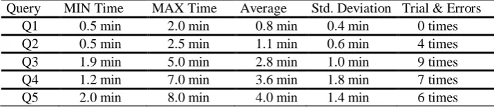
Table 1 shows the time spent for users to build each query – i.e., minimal, maximal and average time, the standard deviation, as well as the total number of trial & errors for each query. This information was useful in order to corroborate the level of complexity of each query (effectiveness) and observe the queries in which users may have had specific problems. It is important to point out that the calculated time refers to the user’s query-building time (efficiency) and not to the query execution time.
Table 1.Query-building time results and number of trial and errors
Query MIN Time MAX Time Average Std. Deviation Trial & Errors
Q1 0.5 min 2.0 min 0.8 min 0.4 min 0 times
Q2 0.5 min 2.5 min 1.1 min 0.6 min 4 times
Q3 1.9 min 5.0 min 2.8 min 1.0 min 9 times
Q4 1.2 min 7.0 min 3.6 min 1.8 min 7 times
Q5 2.0 min 8.0 min 4.0 min 1.4 min 6 times
In a nutshell, the average time to carry out all the queries was 12 minutes and 30 seconds. The longest time to perform the tasks was 20 minutes and 40 seconds, whereas the shortest time was 6 minutes and 20 seconds. The standard deviation was 3 minutes and 45 seconds. In addition, a total of 6 users (the half of them) decided to utilize nested queries. We particularly noticed that 5 out of 6 users using nested queries in Q3 needed at least 1 trial-and-error attempt in order to accomplish the query. By contrast, only 3 out of 6 users needed 1 trial-and-error attempt to finalize the query when using filters. In consequence, we can say that users using only filters for Q3 were more effective. Similarly, regarding the query involving an intersection operation (Q4), 5 out of the 12 users tended to use this facility, and 4 out of those 5 needed at least 1 trial-and-error attempt to conclude the query. The rest of them (7 users) decided to apply filters, and only 2 of them required at least 1 trial-and-error attempt. Therefore, users applying filters in Q4 were also, in this case, more effective. Finally, the set-based union operation (in Q5) was carried out clearly by all users (12 in total), and 5 users needed at least 1 trial and error attempt to finish the query.
4.2.2 Questionnaire Results
As mentioned above, once the interactive session was finished, users were requested to fill in a satisfaction questionnaire consisting of 31 questions divided into four categories, namely: (a) «Utility», (b) «Ease of use», (c) «Ease of learning», and (d) «Satisfaction».
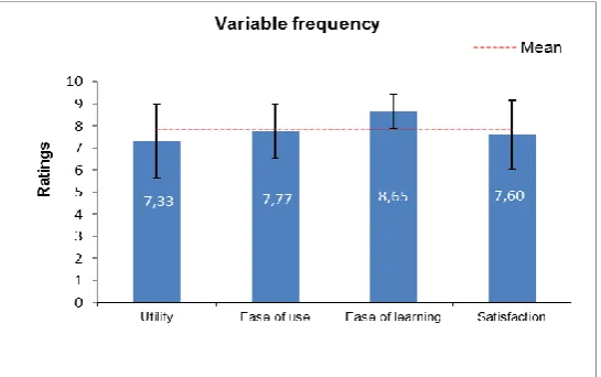
Fig. 9. Mean for each of the four variables, error bars (± σ) and global mean for the four variables.
The users had to respond to each question in a scale ranging from 1 (completely disagree) to 10 (completely agree). Finally, each user was requested to answer four open questions about the general perception of VISQUE, in order to obtain and identify additional comments about strengths and weaknesses to improve the tool.
study obtained a reliability value of 94.8% (α = 0.948) for the 31 statement values included. Consequently, we can conclude that the questionnaire had an acceptable level of reliability (an acceptable reliability is considered from 80% onwards).
Next, we proceeded to calculate the mean for each rating provided by users for each question (grouped into the four variables commented before). Furthermore, the standard deviation was also calculated for each variable to determine the dispersion. Figure 9 shows a bar chart including the mean values of all user responses for each grouped variable, as well as an error bar corresponding to the dispersion (± σ) for each one.
The overall mean for all variables is 7.83, with a standard deviation of 1.40. The highest rated variable was «Ease of learning», obtaining an average of 8.65 with a standard deviation of 1.66. This implies that the visual representations are appreciated by users as they reduce the learning burden greatly. The variable related for «Ease of use» obtained an average of 7.76 with standard deviation of 0.77 (the lowest dispersion). Consecutively, «Satisfaction» obtained an average of 7.59 with a standard deviation of 1.55. Finally, «Utility» variable had an average of 7.33 with a standard deviation of 1.66, representing the lowest value among all the variables. The «Utility» value mostly depends on the user’s projection about the usage of the tool in (her/his) commonplace context, and so this value usually have a higher deviation. However, in general, the four variables were above 7.0, which is a good indicator for the VISQUE’s early usability measurement.
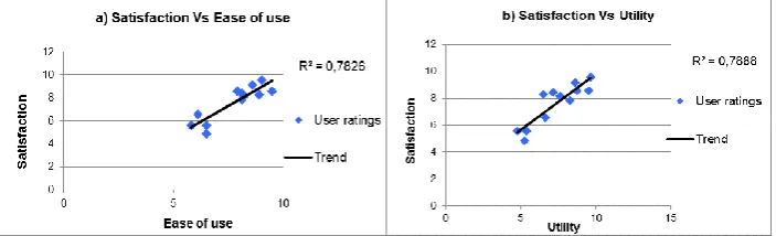
Fig. 10.Correlation between pairs of variables: a) satisfaction vs. ease of use, and b) satisfaction vs. utility
Moreover, we analyzed the correlation degree between all variables (multivariate correlation) by using the Pearson correlation coefficient. This way, we found out a positive correlation between «Ease of use» & «Satisfaction», «Utility» & «Satisfaction» and «Ease of use» & «Utility», having a Pearson coefficient of 0.884, 0.888 and 0.802 respectively. These values are near to 1, indicating a strong correlation. Additionally, we analyzed the correlation degree between those pairs of variables. To do this, we use the average ratings for each variable, comparing the values (one against the other), and calculating a linear regression. Consequently, we corroborated some degree of correlation between such variables.
programming languages (PHP and Java) and basic knowledge on SQL. This indicates that these kinds of user are quite critical about the tool, mainly because of their technical programming and SQL knowledge, therefore their means are lower for this item. Also, Figure 10.b shows a correlation between «Utility» and «Satisfaction» indicating that the users felt more satisfied if the tool covers his/her expectations regarding the work carried in the study.
4.3. Discussion
The measures obtained from the user’s interaction with the tool reported interesting results about the user behavior and his/her impression about the application. Specifically, we took into account the following issues:
Amount of time to build the five queries and the number of trial & errors. Audio and video recordings of the interactive sessions.
Regarding the construction of the five queries, simpler constructions were undertaken in a short time without major drawbacks. More complex queries required, in some cases, trial and error to be performed, and thus an extra time to be completed. However, an interesting result was the construction of queries using the UNION set-based operation, as all users tended to use this operation. Generally speaking, this indicates that the proposed visual language met the user's mental model, exploiting expressive facilities especially in the construction of set-based query operations, which is not common in other similar tools. As corroborated by the empirical results, this also denotes a good learning curve.
In addition, 5 users achieved the intersection operation, while the rest decided to use filters. Regarding nested-queries operations, the result is neutral because half of the users used this option and the rest of them used filters. However, according to the trial & error results, the usage of filters seemed more natural and easy in both cases, probably because users already knew how they worked from previous queries (Q2), and also because filter constructions might be closer to the user’s mental model than intersection ones. In any case, users were able to perform queries in a way or another, highlighting the expressiveness provided by the tool so that users can successfully build queries in different ways with an acceptable ease of use.
Additionally, the audio and video recorded in the interactive session reported valuable information for improving the tool, analyzing the user’s behavioral patterns in the construction of queries. For instance, despite the clear differentiation between measures (in green color) and dimensional attributes (in red color) in the VISQUE interface, we noticed that some users begun to include dimensional attributes firstly and, in consequence, they got empty results since all the information depends on measures. However, VISQUE can be improved in this sense, in order to guide users to select measures firstly. Also, video sessions allowed detecting some minor bugs to be considered in future improvements. However, the tool had an acceptable fault tolerance, giving feedback to the user when an error occurred.
Additionally, such relationships between variables were corroborated through a multivariate correlation analysis.
According to this first study, used to measure and improve the tool in an iterative and incremental end-user-centered development process, we can affirm that most users found the tool, the visual mechanisms and the interaction method useful for the construction of queries. Also, the most highly rated aspects reported by users in the open questions were, to cite a few: the facility for extracting large amounts of data from a Data Warehouse, the intuitiveness provided, the implicit advantages in the usage of visual set-based operators, the interface look-and-feel and the short time took to understand it, the visual impact of the results in real time, and the expressiveness for building queries, among others.
5.
Conclusion
Generally, databases can be considered as the main data source for most information systems. However, the usability of the data application and its user interface can be implicitly affected by data-model design. Consequently, it is necessary to consider aspects of data modeling and user interface design together in order to increase the overall usability [34]. Based on these arguments, the work reported in this paper is an attempt to facilitate database query on Data Warehouses, which are specific database structures helping reduce complex relationships in data modeling and simplify the user's mental model overall. Our work is mainly focused on end-users with some general knowledge on databases and related tools such as Microsoft Access or Excel, but not on Data Warehousing, and with little or inexistent knowledge on SQL.
By means of the competitive analysis carried out on related tools, we missed some features that are difficult to find in most query-building applications, such as an easy way to add aggregation functions, the suggestion of possible values when creating query filters, preventing users from setting relationships between tables, set-based operations, and nested queries, among others. To leverage those common problems that we have identified in existing systems, we have developed VISQUE, which provides more expressive advantages for query building on Data Warehouses, and more specifically on star schemas. Furthermore, we contribute with the following features: a visual language and automatic representation of DW model to avoid dealing with relationships and the data model; an interactive and intuitive mechanism to build queries overcoming the drawbacks previously commented, and the inclusion of set-based operations and nested queries.
As for the future work, first, we will improve our tool further considering the results of the test achieved. We plan to improve on guiding the user to select measures in dimensional attributes, as we have identified this issue as a repetitive problem. Also, VISQUE is limited by the database model it can retrieve/interpret. By now, the tool is only capable of automatically recognizing star-schema models. However, we think that the language can be easily expanded to other DW schema models like the snowflake schema. Also, we consider as a promising future work to investigate on data-model usability in order to obtain new findings on how Data Warehouse structures can affect the overall usability in database applications, in order to envision an explicit user-centered development process focused on both data and data interfaces, and ensuring a tradeoff between expressiveness and ease of use [35] by providing specific analysis, design, implementation and evaluation activities at every step of the software engineering lifecycle.
Acknowledgements.This work has been supported by the founded project TIN2011-24139.
References
1. Codd, E.F.: A relational model of data for large shared data banks. Communications of the ACM 13, 377-387. (1970)
2. Inmon, W.:Building the Data Warehouse. Wiley Publishing Inc, New Jersey. (2005) 3. Kimball, R., Ross, M.: The Datawarehouse Toolkit: Second Edition. John Wiley and Sons
Inc, New Jersey. (2002)
4. Adamson, C.: Mastering Data Warehouse Aggregates: Solutions for Star Schema Performance. Wiley Publishing Inc., New Jersey. (2006)
5. Giovinazzo, W.: Object-oriented Data Warehouse Design: Building a Star Schema. Prentice Hall, New Jersey. (2000)
6. Borges, C., Macías, J.A.: Interacting with Data Warehouse Schemes through a Visual Web-Based Approach. In: Proceedings of the IADIS International Conference on WWW/Internet. IADIS press, Rome, Italy, pp. 314-318. (2009)
7. Borges, C., Macías, J.A.: Feasible Database Querying Using a Visual End-User Approach. In: Proceedings of the 2nd ACM SIGCHI Symposium on Engineering Interactive Computing Systems. ACM, Berlin, Germany, pp. 187-192. (2010)
8. Lieberman, H., Paternò, F., Wulf, V.: End-User Development. Springer, Dordrecht. (2006) 9. Cypher, A.: Watch what I do: programming by demonstration. MIT Press, Boston. (1993) 10. Lieberman, H.: Your Wish is My Command – Programming by Example. Morgan
Kaufmann Publishers, San Francisco. (2001)
11. Zloof, M.M.: Query by example. In: Proceedings of the national computer conference and exposition. ACM, Anaheim, CA, pp. 431-438. (1975)
12. Macías, J.A.,Paternò, F.:Customization of Web Applications through an Intelligent Environment Exploiting Logical Interface Descriptions. Interacting with Computers 20, 29-47. (2008)
13. Catarci, T., Costabile, M., Levialdi, S., Batini, C.:Visual Query Systems for Databases: A Survey. Journal of Visual Languages and Computing 8 (2), 215-260. (1997)
14. Braga, D., Campi, A., Ceri, F.: XQBE (XQuery By Example): A visual interface to the standard XML query language. ACM Transactions on Database Systems (TODS) 30 (2), 398-443. (2005)
16. Shneiderman, B. Dynamic queries for visual information seeking. IEEE Software 11 (6), 70-77. (1994)
17. Hundhausen, C., Farley, S., Brown, J.: Can direct manipulation lower the barriers to computer programming and promote transfer of training?: An experimental study. ACM Transactions on Computer-Human Interaction 16 (3). (2009)
18. Microsoft Office Access. Retrieved April 16: from <http://office.microsoft.com/es-es/access/default.aspx>. (2008)
19. Microsoft SQL Query Designer. Retrieved April 23: from
<http://www.microsoft.com/sqlserver/2008/en/us/default.aspx>. (2008) 20. Oracle Hyperion Interactive Reporting. Retrieved April 14: from
<http://www.oracle.com/technology/products/bi/interactive-reporting/index.html>. (2008) 21. Eclipse BIRT Project. Retrieved April 13: from <http://www.eclipse.org/birt/project/>.
(2008)
22. Spago BI QbE Enterprise Scope. Retrieved April 18: from <http://www.spagobi.org/>. (2008)
23. Tableau Desktop. Retrieved May 24: from <http://www.tableausoftware.com/>. (2009) 24. Stolte, C., Tang, D., Hanrahan, P.: Polaris: a system for query, analysis, and visualization of
multidimensional databases. Communications of the ACM 51 (11), 75-84. (2008)
25. Ahlberg, C.: Spotfire: an information exploration environment. ACM SIGMOD Record 25 (4), 25-29. (1996)
26. Active Query Builder. Retrieved January 5: from <http://www.activequerybuilder.com/>. (2011)
27. Nielsen, J.: The Usability Engineering Life Cycle. IEEE Computer Journal 25 (3), 12-22. (1992)
28. Rettig, M.: Prototyping for tiny fingers. Communications of the ACM 37 (4), 21-27. (1994) 29. Nielsen, J.: Usability Engineering. Morgan Kaufmann Publishers, San Francisco. (1993) 30. Nørgaard, M., Hornbæk, K.: What do usability evaluators do in practice?: an explorative
study of think-aloud testing. In: Proceedings of the 6th conference on Designing Interactive systems. ACM, University Park, PA, pp. 209-218. (2006)
31. Lund, A.: Measuring Usability with the USE Questionnaire. Usability and User Experience Special Interest Group 8 (2). (2001)
32. Lin, H.,Choong, Y., Salvendy, G.: A Proposed Index of Usability: A Method for Comparing the Relative Usability of Different Software Systems. Behaviour and Information Technology 16 (4/5), 267-278. (1997)
33. Davis, F. D.: Perceived Usefulness, Perceived Ease of Use, and User Acceptance of Information Technology.MIS Quarterly 13 (3), 319-340. (1989)
34. Catarci, T., Dix, A., Kimani, S.: User Centered Data Management. Morgan & Claypool, San Francisco. (2010)
35. Macías, J. A.: Enhancing Interaction Design on the Semantic Web: A Case Study. IEEE Transactions on Systems Man and Cybernetics – Part C 42 (6), 1365-1373. (2012)
José A. Macías received M.S. and Ph.D. degrees in computer science from Madrid Technical University and Autónoma University of Madrid, Spain, in 1999 and 2003, respectively. He is Associate Professor in the Computer Science Department at the Madrid Autónoma University. His principal research area of interest is Human-Computer Interaction (HCI). He appears as author in a great number of publications in prestigious HCI conferences, books and Journals, and he serves as President of AIPO (Spanish HCI Association), also obtaining outstanding academic awards such as the "Outstanding Paper Award" conferred by IEEE Neural Networks Society.