Designing a clustering algorithm
and graphical user interface for
efficient clinical interpretation of
Interical Epileptiform discharges
THE CLUSTER TOOL
The Cluster Tool: designing a clustering algorithm
and graphical user interface for efficient clinical
interpretation of Interictal Epileptiform Discharges
For the title of Master of Science in Technical Medicine
F.L. Spijkerboer Bsc.
November 4, 2019
Grudation committee
Chairman: Prof. dr. ir. M.J.A.M van Putten
Medical supervisor: dr. G.H. Visser
Technical supervisor: dr. ir. J. le Feber
Process supervisor: drs. B.J.C.C. Hessink - Sweep
External member: Prof. dr. ir. P.H. Veltink
UNIVERSITY OF TWENTE
Technical Medicine
Faculty of Science and Technology PO BOX 217
Abstract
Objective: Manual detection of interictal epileptiform activity in long-term EEG recordings is time-consuming and highly susceptible to individual interpretation. Automatic detection algorithms offer a faster, reproducible and more objective, and therefore more efficient method for EEG evaluation. These algorithms are able to reach human-like sensitivities. Nevertheless, they are rejected in the clinical practice due to their high false-positive rate and mostly imprac-tical manner of displaying their results. Therefore, the objective of this research is to design a clustering algorithm and graphical user interface, that presents the automatically detected Interictal Epileptiform Discharges according to their morphology and localisation.
Methods: The clustering algorithm was based on the events found by the Persyst P13 spike detector. We divided single lead EEG segments into groups according to their localisation. The events within these groups were then clustered with the K-means algorithm. The Squared Euclidean distance and Dynamic Time Warping distance were considered as distance measures for the clustering. The combination of clustering algorithm and graphical user interface is referred to as the Cluster Tool.
The Cluster Tool was evaluated with usability and clinical performance tests. A total of 23 EEGs was used.The usability tests were performed by five EEG experts, through moderated testing. The clinical performance assessments were done by two test participants. Mutually agreed on clinical conclusions were compared to the clinical conclusion that was described in the EEG report, which was considered the gold standard.
Results: The usage of the tool resulted in remarkably similar clinical diagnoses in comparison to the EEG report. However, the clusters derived by the algorithm did not consistently meet the expectations of the neurologists. This decreased their trust in the performance of the tool and caused them to spend time on manually checking detections within clusters. The use of the Cluster Tool did not speed up the EEG evaluation. The Dynamic Time Warping distance showed a slightly better separation of the cluster results than the SE distance.
Preface
When I started my graduation project, I knew little about clustering techniques. Through the scope of this project, I learned a lot about the wide variety of clustering algorithms and their applications. The exploratory nature of this project kept me curious and eager to look for solutions for every hurdle on the road. I enjoyed working together with the clinical field to ensure that we were working towards a product that would be clinically useful.
First of all, I would like to thank Gerhard for showing me the importance of designing clinical innovation in the clinical field. I have learned a lot from you about the field of epilepsy and the struggle of using new diagnostic tools within this field. Your relentless spirit for innovation and clinical implementation of new technologies were a great source of inspiration. Joost, thank you for your technical support. Whenever I was lost in the world of cluster analysis, your advice and critical questions put me back on track. Although your door was on the other side of the country, it felt like I could always come by to knock on that door for advice.
I would also like to thank Michel for support and guidance. Our interesting discussion and your to-the-point comments helped me to focus on the important aspects of this project.
At the EMU of SEIN, I enjoyed participating in the clinical research team. Elise, thank you for teaching me the beginnings of EEG reading. I know now that there is still much more to learn. I also would like to thank Hannah for all the meetings and discussions. It was nice to have someone to brainstorm with.
To everyone from the clinical research team, thank you for all your intellectual input and of course, the time spent using the Cluster Tool. Without your help, I would have never come this far.
Bregje, thank you for being my process supervisor during the last two year. Your questions made me reflect and observe situations from different perspectives.
Thanks to all my friends for all the fun and warmth in my life. Elsa, Lennart and especially Rens, thank you for proofreading this thesis. Nikki, thanks for your fantastic help with the cover design. And of course, Casper, thank you for being there for me.
Last of all, I want to thank my family for supporting me and teaching me to do what feels right.
List of abbreviations
AP Affinity Propagation
BSS Between cluster Sum of Squares
DBSCAN Density-Based Spatial Clustering of Applications with Noise
DBA DTW Barycenter Averaging
DTW Dynamic Time Warping
ECG Electrocardiogram
EEG Electroencephalogram
EMG Electromyogram
EMU Epilepsy Monitoring Unit
FPR False Positive Rate
GUI Graphical User Interface
IED Interictal Epileptiform Discharge
LCM Local Cost Matrix
MVP Minimum Viable Product
PNES Psychogenic non-epileptic seizure
POSTS Positive Occipital Sharp Transients of Sleep
SE Squared Euclidean
SEIN Stichting Epilepsie Instellingen Nederland
SSE Sum of Squared Error
Contents
Preface i
List of abbreviations ii
1 Introduction 1
1.1 Motivation . . . 1
1.2 Literature review . . . 2
1.3 Outline of this thesis . . . 3
2 Conceptual framework 5 2.1 Clinical setting and procedures . . . 5
2.1.1 Future vision of the workflow . . . 5
2.2 Persyst P13 spike detector . . . 6
2.2.1 Performance of the P13 spike detector . . . 7
2.3 Theoretical background . . . 8
2.3.1 Interictal Epileptiform Discharges . . . 8
2.3.2 Artefacts . . . 9
2.3.3 Components of the clinical diagnosis epilepsy . . . 10
2.4 Research objective . . . 11
3 Development of the Clustering Algorithm 12 3.1 Introduction . . . 12
3.2 Input and Output . . . 13
3.2.1 Input data . . . 13
3.2.2 Output data . . . 15
3.3 Data Preparation . . . 15
3.4 Distance measure . . . 18
3.4.1 Categories of distance measures . . . 18
3.4.2 Squared Euclidean Distance . . . 19
3.4.3 Dynamic Time Warping distance . . . 20
3.5 Clustering . . . 21
3.5.1 K-means . . . 21
4 Design of the graphical user interface 24 4.1 Introduction . . . 24
”Success consists of going
from failure to failure
without loss of enthusiasm”.
1
|
Introduction
1.1
Motivation
Epilepsy is one of the most common neurological diseases worldwide, with around 50 million people diagnosed1. Epilepsy is a disease of the brain that is characterised by at least one unprovoked epileptic seizure and a high risk of further seizures2. The occurrence of seizures is unpredictable, and epilepsy can, therefore, lead to a sudden loss of autonomy. Besides of seizures, epilepsy can cause cognitive and psychological problems. Hence, the disease entails a major burden in seizure-related disability, comorbidities, and costs1.
Accurately diagnosing epilepsy, including the specific seizure type and seizure onset area, can be challenging. Despite this difficulty, an accurate diagnosis is essential in epilepsy to en-sure proper treatment and to avoid false diagnosis and thereby, ineffective treatment. Epilepsy can be diagnosed by examining the patients’ history, where especially seizure semiology con-tains essential information. However, patient history is always subjective and often does not provide enough information to make a certain diagnosis.
The electroencephalogram (EEG) provides supplementary evidence of the clinical suspicion of epilepsy and is the most important technological device in the diagnosis and management of epilepsy. Once an epileptic seizure is recorded on EEG, the diagnosis ’epilepsy’ can be confirmed. The EEG during a seizure is also referred to as ictal EEG. Epileptic seizures may occur daily in some patients, but in most cases, weeks, months or even years can pass without the occurrence of a seizure. Hence, it is often not possible to record the ictal EEG.
The interictal EEG is defined as the EEG between seizures. Epileptiform discharges can be seen in the interictal EEG. These Interictal Epileptiform Discharges (IEDs) are often referred to as ’spikes’. The presence of such IEDs in the EEG is a sign for an increased likelihood of seizures and therefore serves as a marker for epilepsy3. This stresses the importance of the EEG as a diagnostic tool.
GUI and graphical layout are presented in this chapter.
The clustering algorithm and GUI together are referred to as the Cluster Tool. The per-formance and usability of the Cluster Tool are evaluated and discussed in chapter 5.
Chapter 6provides a general discussion on the Cluster Tool, where the methods applied in this research are reviewed, and recommendations are suggested based on the results of the validation.
2
|
Conceptual framework
2.1
Clinical setting and procedures
Stichting Epilepsie Instellingen Nederland (SEIN) in the Netherlands, is a tertiary expertise centre for epilepsy and sleep medicine. At the Epilepsy Monitoring Unit (EMU) of SEIN, eight rooms are available for patient intake, where the long-term EEG recordings are performed un-der continuous monitoring of video, audio and co-registration of the Electrocardiogram (ECG) and on occasion Electromyography (EMG). Each room has four rotatable cameras, which are controlled and observed around the clock by nurses. These nurses also assist the patient and perform cognitive tests on the patient when a seizure occurs. This way, the EEG, ECG, video and audio of the patients are recorded during the entire intake. Two of the rooms are used for pre-surgical admissions. These patients come in on Monday and stay for five days. The other six rooms are used for 24- and 48-hour recordings. This means that during a full week over 800 hours of EEG recordings are registered.
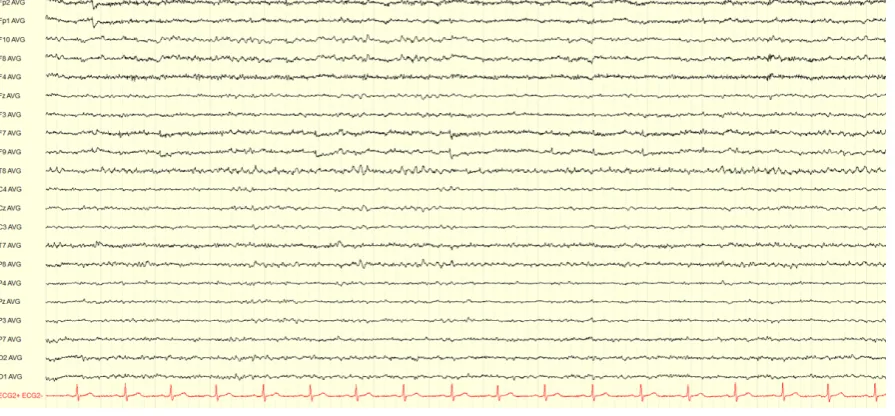
Currently, all EEG recordings are analysed manually. Figure 2.1 shows a screenshot of one EEG page, which typically includes 15 seconds of EEG recording. The visual evaluation of the entire EEG is performed by the EEG technicians. They start with the evaluation of the background pattern and the diagnostic tests, of which they make a representing selection. The inspection of the rest of the registration is done by scrolling chronologically through the EEG. All pieces of EEG containing abnormal and suspicious events are marked. It can sometimes be difficult to distinguish abnormal activity from regular activity or artefacts. Many kinds of artefacts can occur in EEG recordings. The definition of these artefacts is explained more in detail in section 2.3.2. In cases when it is difficult to interpret EEG phenomena, the video recording provides additional information and is used by the technician to decide which parts to mark.
Once the entire EEG has been evaluated and annotated by the technician, the neurologist will look into the registration and review the representative selections and the annotated parts. Based on these selections, the neurologist will form a conclusion and recommendation according to the clinical question of the outpatient physician who had referred the patient to SEIN.
2.1.1 Future vision of the workflow
Figure 2.1: EEG recording shown for 15s in the average reference montage. The EEG was recorded according to the 10-20 system with additional F9 and F10 electrodes.
detection will be implemented within the clinical field. Their vision of future EEG evaluation is to review only one hour of the wake EEG, including the diagnostic test, the first hour of sleep and the first half-hour after waking. This should provide enough information to get a good impression of the background activity and general EEG of the patient. The rest of the EEG should be analysed by automatic detection software, as shown in Figure 2.2. Note that for a completely automated evaluation, a reliable seizure detection and trend analysis must also be used. However, the current study will only focus on the automatic detection of IEDs.
The implementation of an automatic detection algorithm at SEIN would directly help to optimise the diagnostic process and thereby increase the quality of patient care. Experts at SEIN are willing to use semiautomatic spike detection software in the clinical practice and are actively testing available software. The current project is part of this research field.
2.2
Persyst P13 spike detector
The P13 spike detector, as is presented by Scheuer et al. (2017) uses EEG recordings in the common average reference montage to detect focal IEDs5. Generalised discharges are detected in another referential montage, which uses either the two frontopolar electrodes (Fp1 and Fp2), the temporal electrodes (T7 and T8) or the occipital electrodes (O1 and O2)5.
Figure 2.2: Schematic overview of the workflow of EEG evaluation. a) shows the current workflow of EEG evaluation used in SEIN, where the entire EEG is reviewed manually. b)
presents an overview of the workflow of EEG evaluation SEIN wants to achieve in the future. Only one hour of wake, which includes the diagnostics tests, the first hour of sleep and the half hour after waking up are reviewed manually. The rest of the EEG is evaluated by automatic detection software.
All features describing the morphology, localisation and context of the detection are used in a set of neural networks to create a likelihood score for the event to be truly an IED. This results in every detection being assigned a perception value between 1 and 0. A value of 1 represents a very high likelihood, and a value of 0 represents that it is very unlikely for the event to be an IED. Whenever an event is uncertain, it is assigned a perception value near 0.55.
2.2.1 Performance of the P13 spike detector
An internal study at SEIN compared three commercially available software packages for au-tomatic spike detection and showed that the Persyst P13 outperformed the spike detection software of AIT Encevis and BESA Epilepsy 2.013. The study revealed that the P13 indeed performed equal to the human reviewers, as is also stated by other studies5,11. The perfor-mance of the Persys P13 was evaluated by comparing the clinical conclusion based on the software, with the clinical conclusion as described in the EEG report. Each event was cate-gorised based on its importance as either high, medium or low. Events with high importance had a direct impact on the clinical diagnosis, medium important event supported a diagnosis and events with low importance only gave vague information about waveforms present in the EEG, without influencing the clinical diagnosis. Figure 2.3 shows the results of this compari-son and it can be observed that by using Persyst a large part of the events were detected.
Figure 2.3: Number of events detected when using Persyst P13, compared to the current practice. The events are divided by importance. Events with high importance had a direct impact on the clinical diagnosis, medium important event supported a diagnosis and events with low importance only gave vague information about waveforms present in the EEG, without influencing the clinical diagnosis. Persyst P13 performed similar to the current practice on all levels of importance. Figure adapted from ‘A practical comparison of automatic detection software for interictal spikes in long-term EEG recordings at SEIN’ by Spijkerboer, F. L. (2018).13
pairwise false positive rate of 1.2 per minute, when applying the 0.9 perception threshold11. The fear of overlooking important events resulted in a workflow where all detected events were inspected and classified manually. Hence, the workload of long-term EEG review was not found to be mitigated when using Persyst P13. It was therefore concluded that the software is not ready for implementation in the clinical workflow yet, which agrees with the conclusion of Halford et al. (2018)11.
2.3
Theoretical background
2.3.1 Interictal Epileptiform Discharges
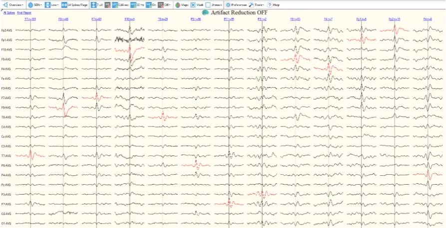
Figure 2.4: Overview of the user interface of Persyst P13 spike review. The events are grouped per electrode location, which are shown in the top row above the EEG segments. Below each electrode group a very short segment of the average waveform of all detections present in group are presented in the average reference montage.
It is important to realise that many epileptiform like patterns exist, which do not sup-port the diagnosis epilepsy. In patients with non-epileptic disorders, such as psychogenic non-epileptic spells (PNES) and syncope, misreading epileptiform like patters have caused in-correct diagnosis many times. Studies have shown that approximately 30% of adult patients which are referred for intracable epilepsy have non-epileptic events16. Distinctive physiolog-ical waveforms like vertex waves, lambda waves, positive occipital sharp transients of sleep (POSTS), or sharp transients which are poorly distinguished from background activity, such as 6Hz spike-and-slow-waves, are not considered epileptiform. Generalised paroxysmal fast activity or wicket spikes are also examples of epileptiform like patterns that are frequently confused with IEDs16. This shows the difficulty of accurately detecting IEDs.
2.3.2 Artefacts
comprehensive overview. Three crucial components can be distinguished, by which epileptiform events are described and interpreted in the current clinical practice; wave morphology, temporal occurrence, and localization. A neurologist would write a conclusion in the clinical report formulated like ”The EEG showed occasional poly spikes with maximum right fronto- temporal”
or ”The EEG is often interrupted by clusters of high-amplitude, bioccipital, sharp and slow
waves”4. Therefore, the comprehensive overview should provide information on the wave
morphology, temporal occurrence and localisation of the detected events.
2.4
Research objective
This research was executed at the EMU of SEIN, and the IEDs were detected by the Persyst P13 spike detector. The general objective is to design a clustering algorithm to group au-tomatically detected IEDs according to their localisation and morphology and present those clusters in a comprehensive overview, to enable efficient clinical interpretation of long-term EEG recordings. This is realized through the following specific research objectives:
• Develop a cluster algorithm which groups all events detected by Persyst P13 according to their morphology and localization
• Design a Graphical User Interface (GUI) which presents the results of the clustering by their morphology, localization and temporal occurrence
3
|
Development of the Clustering
Algorithm
3.1
Introduction
This chapter describes the algorithm, developed to cluster the events which are detected by the Persyst P13 spike detector, according to their morphology and localisation. Clustering is a form of unsupervised classification where groups are created in a way that objects within a cluster are similar, and objects belonging to different clusters are not similar. It is not known in advance what the groups will look like and no label is assigned to the groups or clusters. The process of clustering can be divided into four steps:
1. Data preparation
The preparation step determines the structure of the clusters. This may include the data size, data selection and pre-processing steps. When using a feature-based approach, the selection of the features is also included in this step.
2. Definition of the distance measure
This is often considered as the most important step of the entire clustering process18.
The distance measure quantifies the degree of dissimilarity between two or more time-series, in a way that it can be used as a criterion for creating clusters. Care should be taken when choosing a distance measure because a proper criterion for dissimilarity is based on the characteristics of the time-series, the representation method of the data, and the objective of the clustering19.
3. Clustering
The clustering algorithm uses the set of distance measures as input to create clusters based on the characteristics of the algorithm. Many different types of clustering exist, and they can serve in many different applications. The choice for a clustering algorithm depends on the application, the type of clustering desired and the type of input data. 4. Validation of the clustering
Figure 3.1: Flowchart of the clustering process. It starts on the left with the input data, which is applied to the clustering algorithm. The input data consists of an EEG file, and a file containing the output of the Persyst P13 spike detector. Both input files are patient-specific. The algorithm consists of three steps: the data preparation, the definition of a distance measure and clustering. The output consists of clusters, which require a visualisation step to be inspected. The visualised clusters can then be validated, as the last step of the clustering process.
The first three steps of the clustering process define the performance of a clustering algo-rithm. The following sections will present the algorithm developed in this project. First, the in- and output data are presented. Subsequently, the methods applied for data preparation, calculation of the distance measure and clustering are described. The last step of the clustering process is the validation of the results. This will be discussed in chapter 5.
3.2
Input and Output
3.2.1 Input data
A flowchart of the in- and output data is shown in Figure 3.1. The clustering algorithm de-pended on two input files, which were patient-specific. These were the EEG recording and the output of the spike detection software Persyst P13. The latter was used to select segments in the EEG recording which contained a spike. These segments were selected based on the time where Persyst P13 marked a detection. This section analyses the types of input data which is important because it is essential to choose proper methods for data representation, the calculation of the distance measure and the clustering algorithm.
EEG data
The algorithm was based on EEG files which were stored as .TRC file. EEG recordings are a type of time series data. Time-series clustering is a special type of clustering because its feature values change as a function of time. Time series data is stored with multiple entries per second and is therefore naturally high dimensional and often large in data size19. Dimensionality in
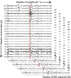
Figure 3.2: Visualisation of the dimensionality of EEG data. The horizontal axis represents the number of samples, which consists of the sample frequency f s times the duration s in seconds. The vertical axis shows the number of electrodes n, which is 21 electrodes for the EEG shown. In depth, the number of EEG segments N are presented.
EEG data is not only multidimensional, but it also consists of several recordings on the same time scale, recorded by multiple electrodes. This makes the data multivariate. When we use a sample frequency f s and select EEG segments with a duration s, we get a time series with a length off s×ssamples. Considering an EEG recording on ndifferent electrodes, one EEG segment would already consist of a n×f s×s matrix. Figure 3.2 shows an example of the input data withN EEG segments. The high dimensionality of the multivariate EEG data limits the choice of clustering algorithms, and a large data size slows down the computational time of the algorithm.
Persyst P13 output
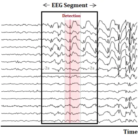
Figure 3.3: Selection of an EEG segment with a total duration of four seconds, used for visualisation. The zero-time, marked in the figure by the red line, corresponds to the exact timestamp which was detected by Persyst P13. The lighter red area represents the segment which ranges from 200ms before the detection time to 500ms after the detection time. This smaller EEG segment is used for calculation of the distance measure and clustering.
The EEG segments were loaded into MATLAB (R2019, MathWorks Inc.). The Fieldtrip Toolbox was used for preprocessing and visualisation of the EEG segments. Fieldtrip is a free MATLAB toolbox for EEG analysis. All EEG segments were re-referenced to the average reference montage. A highpass filter, with a cutoff frequency of 2 Hz and a Hanning window was applied on the EEG segments to get rid of low-frequency drifts and to taper off the EEG segments towards the ends. The hereby created EEG segments with a duration of four seconds were used for the visualisation of the surrounding EEG. For clustering, the EEG segments were further narrowed to an interval of 200ms before the exact detection time and 500ms after (see Figure 3.3). By narrowing the EEG segment, we decreased the possible amount of background activity present in the signal and thereby ensured that the clustering was done mainly based on the EEG waveform, and less on the background activity.
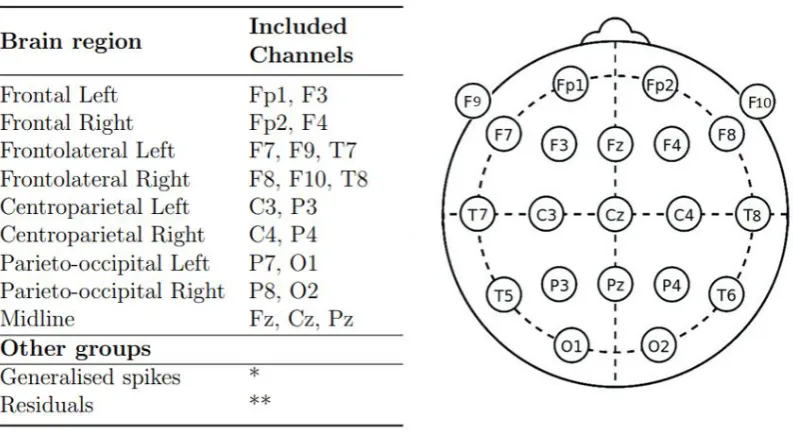
Figure 3.4: Definition of the Brain Regions used in the cluster algorithm Left: Overview of the Brain Regions and the electrodes that are included in each of them. Right: Electrode placement according to the 10-20 system with additional F9 and F10 electrodes.
* The EEG segments included in this group are detected by Persyst P13 as generalized and are therefore not found on a specific electrode.
** The EEG segments included in the residuals can results from all electrodes
The pre-selected IEDs were then further divided according to their localisation. We defined a total of nine brain regions to describe the localisation of the IED; Frontal, Frontotemporal, Centroparietal and Parieto-occipital, all separated in the right and left hemisphere, and the midline. A detailed overview of the definition of the brain regions and the corresponding elec-trodes is presented in Figure 3.4. This figure also shows the scalp position of the elecelec-trodes. Not all events were assigned to one of the brain regions. Some events were marked as gener-alised by Persyst, meaning that they did not have a specific source but arose from activity all over the brain. Therefore, these events could not be assigned to a certain brain region and were therefore assigned to the ‘generalised’ group.
Figure 3.5: Dimension reduction of the EEG data by selecting only the channel where the spike was detected by Persyst. The new EEG segment is no longer multivariate, but exists of a 1×f s×stime series.
3.4
Distance measure
To determine whether time series were similar, we had to define a function to measure similar-ity. This so-called distance measure could then be used to quantify the degree of dissimilarity between two or more time-series. Note that similarity and distance are inverse concepts. Find-ing a proper distance measure is one of the most important steps of the clusterFind-ing process since it directly influences the shape of the clusters21. Humans are very good at visually recognising patterns and determining similarity, but programming an algorithm to perform the same is a difficult problem22. Moreover, time series can be noisy, contain outliers and shifts, and suffer
from discontinuities and temporal drifts19. Therefore, the choice for a distance measure should be well considered.
Notation
We use the notation D(Xi, Yj) to represent the distance between two EEG segments X =
(x1, x2, ..., xi) and Y = (y1, y2, ..., yj), where X ∈ R and Y ∈R. Note that iand j represent
the length of the EEG segments t = f s×s, with t the number of samples, f s the sample frequency and sthe duration of the time series in seconds.
3.4.1 Categories of distance measures
(a) Lock-step distance (b) Elastic distance
Figure 3.6: Comparison of two time series made with lock-step and elastic measures, re-spectively. a. Example of a lock step measure, where sample iwill always be compared with sample j=i. b. Elastic measure, where sampleican be compared with sample j=i+x.
a model to the time series and subsequently compare the parameters of the hereby created models. Shape-based distance measures compare a pair of time series directly, based on their raw data. Literature study reveals that feature and shape-based methods are most common in time series clustering18,19. Esling and Agon (2012) state that shape-based methods are most appropriate when the time series are relatively short and visual evaluation can be used for interpretation of the results23. The EEG segments at hand correspond to short time series. Therefore, a shape-based approach was considered most likely to provide the best results.
Shape-based distance measures can be divided into two categories; the lock-step measures and the elastic measures. Figure 3.6 presents a comparison of two time series made with lock-step and elastic measures, respectively. Lock-lock-step measures always compare the ith sample of time series X to the jth sample of time series Y, with i = j. Elastic measures methods take into account the surrounding points in time to allow for shifts in time, so that the ith sample of time series X can be compared to thejth sample of time series Y, withi6=j. We used the Squared Euclidean distance as lock-step measure, and the Dynamic Time Warping distance as an elastic measure. These two measures were chosen because they represent the two different categories of shape-based distances as well as the most commonly used distance measures according to literature18,19,21,23.
3.4.2 Squared Euclidean Distance
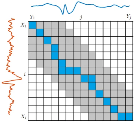
Figure 3.7: Minimum warping path through the LCM of two EEG segments X andY. The grey area represents the boundaries of the warping window.
Note that this distance is equal to the SE distance when the minimum warping path traverses only the diagonal of the LCM.
3.5
Clustering
Many different applications of cluster analysis exist, and therefore many different clustering techniques have been developed. Generally, five different categories of cluster algorithms can be distinguished: distance-based methods, sub-divided into partitional and hierarchical methods, density-based, grid-based, model-based and multi-step methods19. Each of these categories
can be divided into many more sub-categories and combinations. Since this an exploratory study, we wanted to start with an algorithm which was as simple as possible, but suitable for the time series data at hand. Distance-based methods are considered the most simple and easy to implement20. Moreover, they can be used on time series data when an appropriate distance measure is applied. Therefore, we chose the K-means clustering algorithm, developed by Lloyd in 198224. The K-means is one of the oldest and most widely used distance-based algorithms25. The main reason for choosing the K-means algorithm was its computational simplicity20,26.
3.5.1 K-means
4
|
Design of the graphical user
in-terface
4.1
Introduction
The results of the cluster algorithm are visualized in a Graphical User Interface (GUI). This chapter provides an overview of the GUI. The purpose of the GUI is to facilitate interaction between the cluster algorithm and the neurologist (user).
Kawamoto et al. (2005) showed that ‘automatic provision of decision support as part of the clinician workflow’ increases the success rate of clinical decision support systems with 75%29. Hence, the workflow of the clinical department contains valuable information for the definition of the requirements. The potential users of the GUI were asked which features and require-ments they found essential. The neurologist of the EMU at SEIN described that they desire a user interface to make the results of the clustering algorithm, and thereby automatic detection
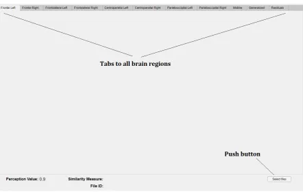
Figure 4.2: Screenshot of the startup screen of the Cluster tool. The tool always opens an empty version of the Mainapp GUI. The top row shows the tabs to all brain regions. In the left lower corner, the information about the visualised EEG and cluster settings will be displayed. In the lower right corner a push button is present which can be used to open the Select files GUI to select and visualise a specific EEG recording.
Residuals. At the bottom of the GUI, the minimal perception value, the similarity measure used to create the clusters, and the file ID of the EEG are presented. These last two values are empty upon startup because no file is selected. The bottom line also includes a push-button to select files. Figure 4.2 shows a screenshot of the opening screen of the Cluster tool.
The Mainapp GUI has several callback buttons to other GUIs, such as the ‘select files’ GUI, the ‘databrowser’ GUI and the ‘0.4threshold plot’ GUI. The architecture of the GUIs is shown in Figure 4.3. Each GUI has different functionalities. The select files GUI is used to select and import data, to select a distance measure and to start the clustering algorithm. The Mainapp GUI is used to visualize the results of the cluster algorithm, of all events with a perception value of 0.9 or higher, whereas the 0.4 threshold GUI does the same for all events with a perception value above 0.4. The Data Browser GUI can be used to visualize the indi-vidual events within a cluster, including four seconds of the surrounding EEG.
4.2.1 Data import, distance measure selection and clustering
Figure 4.3: Architecture of the GUIs of the Cluster tool. The Mainapp GUI is always the first GUI to open. From here, other GUIs can be opened as pop-up window.
(a) Layout of the Select files GUI
(b)User action flowchart
corresponding Persyst output file and select a folder where the cluster results will be saved. Through the ‘Browse” -button, a pop-up window lets the user browse the file system to locate the specific EEG, .csv file and folder that the user wants to select. From the check-box in Figure 4.4a, the user can select the distance measure to be used in the cluster algorithm. After selecting all input, the user must press the “Run” -button, which starts the cluster algorithm as described in the previous chapter. When the clustering is done, or the cluster results of that specific EEG were already saved in the selected folder, the OK push button will be enabled. This initiates the plotting of the cluster results in the Mainapp GUI, as described in the next section. These user actions are visualised in the flowchart in Figure 4.4b.
4.2.2 Visualization of the clusters
The results of the cluster algorithm are presented in the Mainapp GUI. Each cluster is plotted in the tab of the corresponding brain region. The number of clusters per brain region can vary between zero and five. Figure 4.5 shows an example of the frontolateral right region of a patient with five clusters. Each cluster is visualized by all electrodes belonging to that specific brain region (see Figure 3.4 in Chapter 3). That means that, although the event is detected on F8, the EEG signal of F10 and T8 is also displayed in the cluster plot, and these signals are also included in the calculation of the average waveform. The average waveform is presented by the fat coloured line, where each cluster has a different colour within a brain region. The grey waveforms which are seen in the background of the average waveform, are the individual
detections. This view can be used as an indication of the variation of the individual detections from the average waveform. The text box below each cluster plot contains information about the exact number of detections found on each electrode. Cluster 5 in Figure 4.5 for example contains 16 detections which are all detected on F8.
Each tab contains a timeline which visualises the temporal occurrence of the detected events per minute. The colour of the vertical line corresponds to the cluster number, and the height shows how often an event is detected per minute. Figure 4.5 only contains detections which occur once per minute. The “View cluster”-button enables the user to view all individual events within a cluster. By pressing this button, a pop-up window will open the Data Browser GUI. This GUI exists of the FT databrowser function, implemented in the Fieldtrip Toolbox, which is a free MATLAB toolbox for EEG analysis.
Figure 4.6 shows an example of a frontolateral left brain region with only one cluster, which is inspected in detailed through the ft databrowser function. This GUI allows scrolling through all the individual detections within a specific cluster. The EEG shown in the Data Browser GUI contains 2 seconds of EEG before and after the exact detection time and there-fore provides more information about the context of the detection than the average plot. The “Show perception 0.4”-button can be used to open the ‘0.4threshold plot’ GUI. This GUI is a
copy of the Mainapp GUI, except that the Perception value (left bottom corner) shows a value of 0.4. This option should only be used when the 0.9 threshold has only a few, or no detected events, and the user doubts if there are any epileptiform detections.
5
|
Evaluation of the Cluster Tool
5.1
Introduction
In the previous chapters, we described the design of the clustering algorithm and the design of the GUI. The clustering algorithm was implemented in the GUI and subsequently used for visualisation of the cluster results. The combination of algorithm and GUI is from now on, referred to as the Cluster Tool. Evaluation of the Cluster Tool is necessary to measure the performance of the clustering algorithm and to assess if the tool fits into the clinical workflow of SEIN. The current chapter introduces methods to evaluate the performance and usability of the Cluster Tool. First, a review of existing methods on cluster evaluation is provided. Then, the methods applied for evaluation of the Cluster Tool are presented, followed by the results. Finally, we discuss the results and evaluation methods applied.
5.2
Literature review
Cluster evaluation is a difficult part of cluster analysis19,20,31. The main problem of cluster evaluation is captured well by Aggarwal et al. (2013), who state that ”clustering is a prob-lem in which precise quantification is often not possible because of its unsupervised nature.”32. Generally, a cluster is defined to be good when objects in a cluster are similar to each other and different from the objects in other groups. Therefore, cluster evaluation is directly linked
Figure 5.2: Illustration of the definition of a) Cohesion and b) Separation. Adapted from ‘Cluster Analysis: Basic Concepts and Algorithms’ in Introduction to Data Mining, by Kumar, V., Tan, P.-N., & Steinbach, M. (2005)20
case studies is their intended focus on a particular issue or feature that provides the possibility to point out specific drawbacks or advantages of an algorithm. On the other hand, case studies only present individual cases. Consequently, the interpretation of a case study can only lead to assumptions on the behaviour of the algorithm on a larger scale. It must be considered that evaluation of the clustering through visualisation does not only evaluate the performance of the clustering algorithm but also evaluates the quality of the visualisation of the clusters.
5.2.3 Usability tests
Usability tests provide another method to get an impression of the performance of a digital product and simultaneously assess its usability. Usability testing is the process of watching an actual user while they use the product. The so-called moderator sits together with the test participant and helps them through the task, answers their questions and replies to the feedback. Moderated usability testing provides live user feedback which contains valuable information about the usability of the product, including the achieved accuracy and speed for reaching the products goal36.
5.3
Methods
A visualisation-based approach, including case-studies, was chosen to evaluate the performance and usability of the Cluster Tool. Qualitative methods offer an effective way of measuring user experience and discovering the pitfalls and advantages of a product. However, qualitative results are more difficult to compare systematically. Quantitative evaluation through scalar measures was considered but was found not to be feasible. Due to the absence of class labels, we could not perform external validation. The usage of two internal validation measures was explored during this project: the sum of squared errors (SSE) to measure the cohesion and the between the sum of squared errors (BSS) to measure the separation of the cluster results. However, these were no good indicative measure for the quality of the clustering, as presented in Appendix A.3.
of the number of detections per EEG was positively skewed, with a mean of 480 and a median of 128 detections per EEG. The exact number of detection per EEG is presented in Table A.1 in Appendix A.5.
5.4.2 Performance evaluation
The clinical conclusion based on the EEG report and the conclusion created with the Cluster Tool with both, the SE and DTW distance, are presented in Appendix A.5. Comparison of these conclusions revealed that the clinical diagnoses made with the SE and DTW distance were the same for all EEGs. Figure 5.3 shows whether the diagnosis created with the Cluster Tool corresponded to the diagnosis as described in the EEG report. It can be observed that the clinical diagnosis ‘epilepsy’ (red colour) corresponded in all EEGs, except one. This exception was EEG ID 9, for which the diagnosis made with the Cluster Tool was ’uncertain’. It stands out that the results in Appendix A show similar morphology, localisation and even temporal occurrence as described in the EEG report, but differs regarding the clinical diagnosis. A detailed case study on the output of the Cluster Tool for this EEG is presented in section 5.4.5.
Figure 5.4: Number of times a certain number of clusters is created in a brain region. Most of the times, only one cluster is formed per brain region.
Figure 5.5: Number of detections in a brain region in relation to the number of clusters in that brain region. Most clusterings that contained one cluster contained a relative small number of detections.
5.4.3 Usability evaluation
Figure 5.6: Example of three different clusters, where all events were put together into one cluster. A. shows a cluster which contains 1493 events. B. shows a cluster that contains only five detected events and C. shows a cluster which contains 63 events, disrupted by many artefacts
The test participants distrusted the performance of the clustering algorithm, and thereby the overview of the clusters, because the it did not show clearly when different morphologies were present. Especially when the data set was partitioned into one cluster, the amount of different morphologies within a cluster was high. Figure 5.6 shows three different examples of clustering results where just one cluster was created. In Figure 5.6 A, a cluster which contains sharp-waves and sharp-and-slow-waves is presented. Test participants could not distinguish these two morphologies based on the cluster overview. This supported the distrust of the test participants in the performance of the clustering algorithm. Figure 5.7 shows an example of different morphologies which were found within a cluster.
Clusters that contained a small number of detections were often often easy to interpret for the test participant. Figure 5.6 B shows an example of a cluster with only five detections. On the other hand, clusters that contained many artefacts, as shown in Figure 5.6 C, were experienced as difficult to interpret. For clusters that contained a high number of detections or many artefacts, the ‘view cluster’-button was used frequently by the test participants to inspect the detections individually. Since the test participants spend a lot of time on manually checking the detections within the clusters, the review time of an EEG was experienced as relatively long.
5.4.4 Distance measures
Figure 5.7: Example of three detections from the same cluster, originating from the fronto-lateral left brain region. The morphology from the different detections is not similar.
in one cluster, which resulted in a better separation than the clustering with SE distance. It occurred more frequently that the DTW clustering resulted in a higher separation between clusters compared with the SE clustering.
5.4.5 Case study
The evaluation of the EEG with ID 9 revealed several interesting facts about the performance and usability of the Cluster Tool. A total of 101 events were detected by Persyst P13 in this EEG. The only difference between the DTW and SE distance measures was observed in the frontolateral right brain region, which is depicted in Figure 5.9 and 5.10. It shows that DTW clustering resulted in more clusters, which waveforms can be distinguished more clearly than in the single cluster created with the SE distance. However, in both cases, the users could not draw a conclusion based on solely the cluster overview and preferred to inspect the detections in detail.
Figure 5.8: Screenshot of the GUI presenting the results of SE and DTW clustering. A. shows the results of clustering with SE distance, where the wave forms of the different clusters look similar to each other. B.shows the results of clustering with DTW distance. The DTW captures all spike-and-slow-waves into one cluster.
information was needed because the waveforms reviewed in this EEG were unclear. The EEG readers discussed that the waveforms mainly looked like small sharp-and-slow-waves, which could be interpreted as physiological small sharp spikes, also known as Benign sporadic sleep spikes. This shows the difficulty of the interpretation of these waveforms and the importance of additional information of the EEG in such cases.
5.5
Discussion
Our prototype shows a striking visual comparison between the clinical diagnosis based on the Cluster Tool and the EEG report. The diagnoses ’normal’ and ’epilepsy’ were made correctly for all except one case. Three EEGs with the diagnoses ’abnormal non-epileptic activity’ were also diagnosed incorrectly. The Custer Tool is designed with the purpose to present IEDs in a comprehensive overview. It does not provide any information about slow rhythmic activity or other abnormal non-epileptic phenomena. Therefore, it is acceptable that the EEGs with diagnoses other than ’normal’ and ’epilepsy’ are not correctly diagnosed.
Figure 5.9: General overview in the GUI for the results of the clustering with squared euclidean distance in the Frontolateral brain region of EEG ID 9
waveforms. It is known that IEDs lack a clear definition, and due to high interrater variability, the gold standard is doubtful6,9. This is also shown by the fact that the EEG report, which is
considered our gold standard, defined four EEGs with an uncertain diagnosis. Nevertheless, the Cluster Tool must provide all information that is needed so that its users can apply their knowledge about the EEG to their full extent. This requires access to the surrounding EEG and the patient’s history as well as to different montages, filter settings and a more detailed version of sensitivity settings. Lagerlund (2002) also stresses the importance of access to differ-ent montages and filters for accurate EEG evaluation37. It is recommended that these features
will eventually be included in such a visualisation tool.
Figure 5.10: General overview in the GUI for the results of the clustering with dynamic time warping distance in the Frontolateral brain region of EEG ID 9
It was expected to observe a learning curve based on the number of clusters that was inspected individually. An increased usage of the Cluster Tool was presumed to result in a decreased usage of the ’view cluster’-button. Figure A.4 in Appendix A.4 shows that this was not the case. We assume that this is also caused by the distrust of the EEG readers towards the performance of the clustering algorithm.
The usage of the DTW distance seemed to result in clusters with a higher separation. The goal of the Cluster Tool was to group all events with similar morphology in the same cluster. It is known from previous research, that IEDs within patients tend to be morphologically more similar than between patients15. Since the DTW distance results in a slightly better separtation of the clusters compared with the SE distance, it seems like it captures similarity of EEG waveforms more effectively. Thomas et al. (2016) also compared Euclidean and DTW distance when clustering IEDs and found that DTW provided a more effective approach than the non-elastic Euclidean distance27. Therefore, DTW distance is found to be a more promis-ing distance measure.
6
|
General Discussion
The evaluation of the clinical performance and usability of the Cluster Tool indicates the potential of using a comprehensive overview, which summarises the results of an automatic spike detection algorithm through clustering techniques. It shows the importance of post processing the results of automatic spike detection algorithms, to visualise them in a way that enables correct interpretation. Clustering is an essential part of the post processing, and entails an important step towards a proper visualisation and thereby clinical implementation of automatic detection algorithms.
The Cluster Tool designed in this project is a prototype, and this was the first time such a tool was created and evaluated in SEIN. Therefore, many choices have been made to keep things simple for this initial prototype. The Cluster Tool still suffers from many limitations, impeding its implementation in the clinical practice. However, by building this prototype, many insights have been gained on what features are important for the visualisation of IEDs, how to improve the clustering, and on alternative methods that might provide better results. This chapter reviews the methods used in the Cluster Tool in the context of the gained insights and discusses which alternative methods are likely to lead to better clustering performance, necessary for clinical adoption.
6.1
The cluster algorithm
The visual assessment of the Cluster Tool indicated that the current clustering algorithm was too inaccurate. In order to use the Cluster Tool in the clinical practice the clustering algorithm must be improved. The clustering algorithm developed in this project consists of three main steps: the data preparation, the definition of the distance measure and the choice of cluster algorithm. The three steps are reviewed separately in the following sections.
6.1.1 Data preparation
Figure 6.1: Normalized SSE over the iterations of the K-means algorithm
DTW Barycenter Averaging (DBA) K-means. DBA enables the calculation of an average time series that is consistent with DTW as similarity measure, by taking into account the time-warping40. Figure 6.2 presents the difference in cluster average when calculated according to the mean and to the DBA. It shows that DBA captures the warping of a time series better. It is expected that the usage of DBA K-means will improve the cluster performance.
Besides from DTW, there are numerous other measures which can be used to capture the (dis)similarity between EEG segments20,39,42. In our current algorithm, we only use the EEG segment originating from one channel. As stated before, it is recommended to experiment with the clustering of EEG segments containing information of multiple electrodes. Defining an appropriate similarity function, which captures the shape of a time series becomes even more challenging for multivariate time series39. It is therefore proposed to compare different similarity measures and study which measure captures similarity of multivariate EEG segments best. Additionally, the performance of the cluster algorithm can be improved by combining different similarity measures. The perception value, as defined by Persyst, already contains valuable information about the likeliness of a detection to be truly epileptiform. Correlation of the perception value or the channel of detection can be used as additional similarity measure.
6.1.3 Clustering algorithm
The cluster algorithm used in the Cluster Tool was the K-means, one of the most widely used clustering methods. K-means is easy to implement, and the algorithm is known to perform well for finding non-overlapping spherically shaped clusters in small to medium-sized data sets18. However, the number of clusters needs to be pre-defined in the K-means algorithm. In this research, gap statistics are used to estimate the optimal number of clusters. Due to the lack of a labelled data set, it was not possible to evaluate if the number of clusters was estimated correctly. The need to pre-assign the number of clusters, while it is not known if the data contains any natural clusters, is a major drawback of the K-means algorithm19. Besides, it is
Figure 6.2: Difference between a euclidean and DBA k-means. The x-axis represent time, whereas the y-axis shows the amplitude. Adapted from tslearn: A machine learning toolkit dedicated to time-series data by Tavenard et al. (2017) Retrieved October 14, 2019, via https://tslearn.readthedocs.io/en/latest/autoexamples/plotkmeans.html41
Various clustering techniques have been developed for time series clustering18. Figure 6.3 gives an overview of various well-known clustering algorithms and their impact on different data structures. Previous studies on clustering interictal epileptiform detections have used, among others, agglomerative hierarchical clustering, affinity propagation (AP), K-means and sequential clustering with subsequent template matching12,27,43,44. A comparison between a K-means and AP algorithm for IED clustering showed that the AP algorithm outperformed the K-means, based on DTW distance27. Another study on clustering noisy time series compared the K-means to DBSCAN and concluded better results for the DBSCAN45. This encourages further research on the performance of other algorithms on the clustering of IEDs.
6.1.4 Dimension reduction
of different representations should be studied, while considering the distance measure and clustering algorithm.
The implementation of the timeline to indicate the temporal occurrence of the events in a specific cluster was found to be potentially very valuable. It enabled the user to give a quantitative measure of the occurrence of events in a cluster. Since not all events in a cluster were defined as truly epileptiform, the quantitative value of the timeline could not be used to give an accurate quantitative measure but only an indication of the temporal occurrence. However, as the performance of the clustering and the detection algorithm increases, the quantitative value of the timeline will increase as well. We recommend to keep using a timeline for the visualisation of the temporal occurrence, and improve the cluster algorithm to increase its quantitative value.
7
|
Conclusion
Bibliography
1. W. media centre World Health Organization, “Epilepsy [Fact Sheet],” 2019.
2. R. S. Fisher, C. Acevedo, A. Arzimanoglou, A. Bogacz, J. H. Cross, C. E. Elger, J. Engel Jr, L. Forsgren, J. A. French, M. Glynn, D. C. Hesdorffer, B. Lee, G. W. Mathern, S. L. Mosh´e, E. Perucca, I. E. Scheffer, T. Tomson, M. Watanabe, and S. Wiebe, “Ilae official report: A practical clinical definition of epilepsy,”
Epilepsia, vol. 55, no. 4, pp. 475–482, 2014.
3. M. van Putten, “The EEG in epilepsy,” in Essentials of Neurophysiology; Basic Concepts and Clinical Applications for Scientists and Engineers (Springer, ed.), ch. Electroenc, Mairdumont Gmbh & Co. Kg, 2009.
4. C. P. Panayiotopoulos, “Epileptic seizures and their classification,” inA Clinical Guide to Epileptic Syn-dromes and their Treatment, vol. 14, pp. 21–63, London: Springer London, 2010.
5. M. L. Scheuer, A. Bagic, and S. B. Wilson, “Spike detection: Inter-reader agreement and a statistical Turing test on a large data set,”Clinical Neurophysiology, vol. 128, no. 1, pp. 243–250, 2017.
6. S. B. Wilson and R. Emerson, “Spike detection: a review and comparison of algorithms.,”Clinical neuro-physiology : official journal of the International Federation of Clinical Neuroneuro-physiology, vol. 113, pp. 1873– 1881, 2002.
7. C. N. Joshi, K. E. Chapman, J. J. Bear, S. B. Wilson, D. J. Walleigh, and M. L. Scheuer, “Semiautomated Spike Detection Software Persyst 13 Is Noninferior to Human Readers When Calculating the Spike-Wave Index in Electrical Status Epilepticus in Sleep,”Journal of Clinical Neurophysiology, vol. 35, pp. 370–374, sep 2018.
8. J. J. Halford, “Computerized epileptiform transient detection in the scalp electroencephalogram: Obstacles to progress and the example of computerized ecg interpretation,”Clinical Neurophysiology, vol. 120, no. 11, pp. 1909 – 1915, 2009.
9. W. Webber and R. P. Lesser, “Automated spike detection in EEG,” Clinical Neurophysiology, vol. 128, pp. 241–242, 2017.
10. S. Jawad, J. Oxley, W. Yuen, and A. Richens, “The effect of lamotrigine, a novel anticonvulsant, on interictal spikes in patients with epilepsy.,”British Journal of Clinical Pharmacology, vol. 22, pp. 191–193, aug 1986.
11. J. J. Halford, M. B. Westover, S. M. LaRoche, M. P. Macken, E. Kutluay, J. C. Edwards, L. Bonilha, G. P. Kalamangalam, K. Ding, J. L. Hopp, A. Arain, R. A. Dawson, G. U. Martz, B. J. Wolf, C. G. Waters, and B. C. Dean, “Interictal Epileptiform Discharge Detection in EEG in Different Practice Settings,” Journal of Clinical Neurophysiology, vol. 35, no. 5, p. 1, 2018.
12. S. B. Wilson, C. A. Turner, R. G. Emerson, and M. L. Scheuer, “Spike detection ii: automatic, perception-based detection and clustering,”Clinical Neurophysiology, vol. 110, no. 3, pp. 404 – 411, 1999.
A
|
Appendix
A.1
Gap statistics
To estimate the optimal number of clusters, we applied gap statistics as proposed by Tibshirani et al. (2001)26. Gap statistics compares the within cluster cohesion Wk with the expected
cohesion. First, Tibshirani et al. define the within cluster sum of squares Wk for a range of
values of kas:
Wk = k
X
n=1
1 2|Cn|
X
x,y∈Cn
DSE(x, y) (A.1)
where |Cn| is the number of objects within cluster n. DSE(x, y) is the sum of pairwise
SE distances for all points in cluster n. Note that this is a different way of calculating the cohesion than used in Appendix A.3, where the within cluster sum of squares is not divided by the number of objects within the clusters.
Figure A.1b. shows the value ofWkfor different number of clustersk. The optimal number
forkis the number where the value ofWkdoes not decrease significantly when adding a cluster.
It can be observed that this is the case for two clusters. This method is known as the elbow method. However, the optimal number of clusters cannot always be identified clearly when using the elbow method51. Therefore, Tibshirani et al. suggest to standardize the graph of
log(Wk) by comparing it with its expectation under an appropriate null distribution26. The
optimal number of clusters is then estimated by the value ofkfor which the functionlog(Wk)
falls the farthest under the reference function. Therefore they define:
Gapn(k) = ˆEn∗{log(Wk)} −log(Wk) (A.2)
Figure A.1: Results for a two-cluster example: a) data; b) within sum of squares function
(a) (b)
Figure A.3: Boxplots of the between sum of squared errors (BSS) and sum of squared errors (SSE) of the clustering based on the SE and DTW distance. a) BSS of clusterings with SE and DTW distance. The BSS represents the separation of a clustering. Note that the y-axis applies a squared scale. The DTW distance shows a remarkable lower BSS than the SE distance b)SSE of clusterings with SE and DTW distance. The SSE represents the cohesion of a clustering. Note that the y-axis applies a squared scale. The SSE of the DTW and SE distance are comparable, although the DTW distance seems to result in a slightly lower SSE.
SSE of the SE distance (see Figure A.3b). This is because the DTW distance is not restricted to the lineair warping path, but can find smaller distances by comparing sample i to sample
A.4
Learn curve of the cluster tool
Table A.1: Comparison of the conclusion as described in the EEG rapport with the conclusion made by using the cluster tool. The conclusion is split into information regarding waveform, location, temporal occurrence and diagnosis.
EEG ID Method
nr. of detec-tions
nr. of
clusters Waveforms Localisation Temporal info Notes Diagnosis
SE 22 4
(poly-)spike-and-slow
-waves frontal F3, Fz,
sometimes F4 only 22 detections epilepsy DTW 22 4 (poly-)spike-and-slow
-waves
frontal F3, Fz,