DATA VISUALIZATION &
TQM IMPLEMENTATION
A STUDY OF THE IMPLEMENTATION OF DATA
VISUALIZATION IN TOTAL QUALITY MANAGEMENT IN
VICTORIAN MANUFACTURING INDUSTRY
Submitted in fulfilment of the requirements for the degree of
Master of Business Administration
in the Faculty of Business
Victoria University of Technology
(CITY CAMPUS)
1995
BY
JIGAOHU
^ **&&.
THESIS
001.4226 HU
30001004467041
iHu, Jigao
Data visualization
implementation : a
the implementation
ACKNOWLEDGMENT
First of all, I wish to express m y appreciation to m y supervisor, M r Authur Tatnall, for the valuable advice and the enormous encouragement he has given me throughout the
research. His wonderful style of supervision has played a key role in the success of this project.
Special thanks are also due to Professor Keith Lansley who, provided his
encouragement and support generously at both the beginning and final stage of the project, which enabled the emergence and completion of this report.
The appreciation extends to the fifty-two quality managers who participated in the
CONTENTS
LIST OF FIGURES
LIST OF TABLES
EXECUTIVE SUMMARY vii
vi
CHAPTER 1 INTRODUCTION 1
1.1 Background of Research 2
1.2 Introduction to Data Visualisation (DV) 2
1.1.1 What is Data Visualisation? 3
1.1.2 Data Visualisation Techniques 4
1.1.3 Hardware Requirements 5
CHAPTER 2 LITERATURE REVIEW 6
2.1 Visual Data Analysis (VDA) Software 7
2.2 Functions of VDA Software 8
2.3 VDA Software Application Area 7
2.2.1 Medical Imaging 10
2.2.2 Quality Control (QC) 11
2.3.1 Definition 13 2.3.2 Quality System in an Manufacturing Organisation 13
2.3.3 Basic TQM Tools 15
2.4 Summary 17
CHAPTER 3 RATIONALE 18
3.1 Purpose of Study 19
3.2 Theoretical Framework 20
3.2.1 Company Size and the Implementation of DV Technology 20
3.2.2 Stage of TQM Program Implementation and the Implementation of DV Technology 22 3.2.3 Company Size and Stage of TQM Program Implementation 23
3.2.4 Summary 25
3.3 Hypothesis Statements 26
CHAPTER 4 METHODOLOGY 27
4.1 Population and Sampling 28
4.1.1 Population 28 4.1.2 Sampling 29
4.2 Data Collection Method 30
4.3 Data Processing and Analysis 31
CHAPTER 5 FINDINGS
33
5.1 T h e Sample Profile 34
5.1.1 Distribution According to Size of Companies 34 5.1.1.1 Distribution According to Employee Level 3 4 5.1.1.2 Distribution According to Turnover Volume 3 5
5.1.1.3 Relationship between Turnover Volume and Employee Level 3 6 5.1.2 Distribution According to Structure of Companies 3 7
5.1.2.1 Distribution According to the Existence of a Separate Quality Management Department 37
5.1.2.2 Distribution According to the Stage of Implementation of a Formal Total Quality Management (TQM) Program 37
5.1.2.3 Correlation between Stage of TQM and Size of Companies 3 8
5.1.2.4 Stage of the Implementation of a TQM Program According to Size of Companies 39
5.2 The Adoption of Data Visualisation Tools 39
5.2.1 Test of the Hypothesis of Frequency Differences of the Software Application among Different Sizes of Companies 40
5.2.2 Types of Computer Software Adopted by Different Size of Companies 42 5.2.3 Hardware Support for the Software Adopted 43
5.2.4 The Application of Different Types of Computer Software in Different Aspects of TQM 45 5.2.4.1 General Pattern of the Application of Different Types of Computer Software in
Different Aspects of TQM 45
5.2.4.2 Companies That Use Computer Software in Different Aspects of TQM According to Their Stage of TQM Program Implementation 48
5.2.5 The Adoption of Data Visualisation Techniques in TQM 50
5.2.5.1 The General Pattern of the use of Data Visualization Tools in TQM 50
5.2.5.3 T h e Usage of Data Visualization Tools According to Size of Companies 53
5.2.6 Rating of the Importance of Data Visualisation Features 54
5.2.6.1 General Rating of the Importance of Data Visualization Features 54
5.2.6.2 Specific Rating of the Importance of Data Visualisation Features by Different Groups
of Companies According to Stage of TQM Program Implementation 56
5.2.7. Rating of the Importance of the Data Visualisation Features by Companies at Different
Stages of TQM Implementation 58
5.2.7.1 Rating of the Importance of the Data Visualization Features by Small Companies 58
5.2.7.2 Rating of the Importance of the Data Visualization Features by Companies That are
Implementing TQM Program 59
5.2.7.3 Rating ofthe Importance of the Data Visualization Features by Companies That
Have Completed TQM Program Implementation 60
5.2.8 Future Expectation 61
CHAPTER 6 CONCLUSIONS AND RECOMMENDATIONS 62
6.1 Conclusions 63
6.2 Recommendations 65
BIBLIOGRAPHY 66
APPENDICES 68
APPENDK1 WHERE TO FIND VDA SOFTWARE 68
APPENDIX 2 LIST OF SOFTWARE ADOPTED BY SAMPLE COMPANffiS 69
APPENDIX 3 TABLES 70
LIST OF FIGURES
Figure 2.4.2 The Manufacturing Quality L o o p 14 Figure 3.2.1 Diagram of the Relationship between the Independent Variable
(Company Size) and the Dependent Variable (Implementation of D V Technology) as Moderated by the Moderating Variable (Data
Complexity) 22 Figure 3.2.2 Diagram of the Relationships among the Independent (Stage of T Q M
Program Implementation), Intervening Variable (Aspects of Quality Management) and the Dependent Variable (Implementation of
D V Technology) 23 Figure 3.2.3 Relationship between the Independent Variable (Company Size) and the
Independent Variable (Stage of T Q M Program Implementation) 24
Figure 3.2.4 Schemetic Diagram of the Theoretical Framework 25
Figure 4.0 Diagram of the Research Process 28 Figure 5.1.1.1 Distribution of Sample According to Employee Level 3 5
Figure 5.1.2.2 Distribution of Sample According to the Stage of Implementation ofa Formal T Q M Program 3 8 Figure 5.1.2.4 Stage of the Implementation ofa T Q M Program According to
Size of C o m p a n y 39 Figure 5.2.3 Hardware Support for Different Types of Software Adopted 43
Figure 5.2.4.1 The Application of Different Types of Software in Different Aspects of
TQM 46
Figure 5.2.5.1 General Pattern of the use of Data Visualisation Tools 49LIST OF TABLES
Table 5.1.1.2 Distribution According to Turnover Volume 3 5 Table 5.1.1.3a Correlation between Turnover Volume and Employee Level 3 6 Table 5.1.1.3b Turnover Volume vs Employee Level 3 6 Table 5.1.2.1 C o m p a n y Structure in Respect of Separate Quality Department
According to Size of Company 37 Table 5.1.2.3 Correlation between Stage of T Q M and Size of Company 3 8
Table 5.2.1 One-way Analysis of the Frequency Differences of the Software
Application among Different Sizes of Companies 41 Table 5.2.2 Type of Computer Software Used in Total Quality Management
According to Size of Companies 42 Table 5.2.4.2 Companies That Use Computer Software in Different Aspects of T Q M
According to Their Stage of T Q M Program Implementation 48 Table 5.2.5.2 One-way Analysis of the Frequency Differences of the Data
Visualisation Tools Application among Different Sizes of Companies 51 Table 5.2.5.3 Data Visualisation Tools Application According to Size of Companies
52 Table 5.2.6.2 One-way Analysis of the Rating Differences on the Importance of the
Data Visualisation Features among Companies at Different Stages of
T Q M Implementation 57 Table 5.2.7.1 The Importance o f D V Features to Companies at Planning Stage 58
Table 5.2.7.2 The Importance of D V Features to Companies That are Implementing
T Q M Program 60 Table 5.2.7.3 The Importance of D V Features to Companies That Have Completed
EXECUTIVE SUMMARY
Introduction
Data visualisation (DV) is the process of creating and presenting a chart given a set of active data and sets of attribute and entity constraints. It rapidly and interactively investigates large multivariate and multidisciplinary data sets to detect trends, correlations, and anomalies.
Data Visualisation is the latest analytical tool for both technical computer users and business computer users. Total Quality Management (TQM) is continuous
improvement in the performance of all processes and the products and services that are the outcomes of those processes. In quality management, DV is one of the three new tools that complement the existing seven, which are flow charts, Ishikawa or cause and effect diagrams, Pareto charts, histograms, run charts and graphs,
scattergrams and control charts. It lets quality control engineers readily see the real reasons for quality problems by presenting the data in up to six dimensions.
Methodology
The source for company information was Kompass Australia 1994/1995. The statistical analysis tool used was Statistica.
Major Findings
The TQM program implementation tends to be more complete in companies with more employees.
Wordprocessing software is adopted by all companies in TQM practice, mostly for producing a quality instructional manual. Spreadsheet and database packages are the second and the third most commonly used software.
Companies that have completed their formal TQM program implementation generally use computer software in more aspects of their TQM practice than companies at lower TQM stages though not always.
Two-dimensional DV techniques are more commonly used than three-dimensional ones with the 2-D colour and 2-D shade the most widely used by all. The 3-D animation tool needs to be explored.
DV features are generally important for all the users. The ability to handle complex data is more important for companies at a higher stage of TQM program
CHAPTER ONE
CHAPTER 1
INTRODUCTION
1.1 Background of Research
In the United States and the United Kingdom, Visual Data Analysis (VDA) software business has been booming for the last couple of years.
Carl Machover, industry analyst and president of Macho ver Associates Corp., White Plains, NY, says that VDA is a blossoming business - a robust $1.5 million market in 1992 and growing at a healthy 18% per year. Machover projects that by 1998, the industry will mushroom into a $4.9 million market.
Both technical and business computer users are turning to VDA software for data analysis. The users said that what VDA software did to technical computing equals what the spreadsheet had done to business computing.
However, up to now there has been little formal research into the implementation of Data Visualisation technology in Australia. There has been little information about whether Australian industries are using Data Visualisation software or how Data
Visualisation technologies are serving Australian Business. An interest to fill a gap in the development of Data Visualisation has led to this research.
1.2 Introduction to Data Visualisation (DV)
CHAPTER 1
INTRODUCTION
Data visualisation is the latest data presentation technique which contributes tremendously to complex data analysis.
1.1.1 What is Data Visualisation?
Parsaye & Chignell (1992) explain:
Data visualisation is the process of creating and presenting a chart given a set of active data and sets of attribute and entity constraints. Data visualisation is concerned with understanding the patterns, trends, and relationships that exist in groups of numbers, which must be related to some model of the domain of interest. They are then used to close the knowledge gap between the user's
understanding of the current situation and the situation as it actually is (p.22).
Bourne (1993) defines data visualisation in another way: Visualisation is 'the ability to gather the largest amount of information in the least amount of time from a particular set of views. Those views can range from simple text to the representation of a set of data points in some graphical way to a digitised image that can be manipulated in real-time' (p.3 8).
CHAPTER 1
INTRODUCTION
expenditures, customers, and the demographic and lifestyle attributes that differentiate
the response of different market segments to different products. In quality control, the system might be the production process and the causes of defects, along with the
workers who monitor the system and the customers who react to the quality of the product over time (Parsaye & Chignell 1992, p. 22).
1.1.2 Data Visualisation Techniques
Data visualisation involves a range of techniques that enable the display of abstract numerical data and statistics in graphical form to provide a way of identifying and analysing underlying patterns in data.
Many elements combine to make up data visualisation technology. Among them are
animation (rapidly changing still images used to create the illusion of movement), 3-D graphics (an illusion of depth produced by using perspective), and rendering (computer images created to represent the surfaces of 3-D objects, complete with shading and texture) (Weber 1993, p. 121).
Virtual reality (VR) is a natural extension of data visualisation. VR increases the number of dimensions in which information can be displayed and allows the user to "enter" and explore the information as if it were a physical environment. The first VR product for market traders, Metaphor Mixer from Maxus Systems International of
New York, appeared in 1993. It represents financial instruments as animated 3D
CHAPTER 1
INTRODUCTION
1.1.3 H a r d w a r e Requirements
Until recently, only super-computer users had access to visualisation's full potential. Now anyone with a Personal Computer (PC) or a Macintosh (Mac) can produce
sophisticated and meaningful visualisations with "off-the -shelf "software.
Whether it is a Mac, a PC, or a workstation, the main requirements for visualisation are fast maths-processing capabilities and high-quality graphics. A 66-Mhz 486 PC with VGA graphics or a PowerMac is able to perform most kinds of visualisation. The more powerful the machine, the more sophisticated the visualisation application can be. In order to conduct animation, a video-out card may be needed to transfer the
CHAPTER TtfO
CHAPTER 2
LITERATURE REVIEW
2.1 Visual Data Analysis (VDA) Software
Data visualisation systems can be general or they may be customised to deal with
particular application areas (eg. project management or quality control). For instance, in project management, data visualization provides decision makers with a high level view of project status using 3D colour pictures and network diagrams. The visual representation of the project network makes it easy to understand the schedule of the project as well as the complexity, cost, and risk involved in each project.
Data Visualisation technologies have integrated graphical user interfaces (GUI) with presentation graphics software. GUIs simplify the process of creating presentation graphics. Products such as Precision Visuals Inc's and IMSL Inc's PV-Wave
Advantage application development software, SAS Institute Inc's SAS/Insight database management system (DBMS) and DSP Development's DADisp DBMS
represent great strides in the visualisation area.
A notable example of a data visualisation GUI builder is SL Graphical Modeling System from SL Corp. in Corte Madera, California. SL-GMS develops dynamic
CHAPTER 2 LITERA TURE REVIEW
PV-Wave
One example of commonly used VDA software is PV-Wave. PV Wave from Precision
Visuals is an interactive Visual Data Analysis (VDA) software for the Sun, DEC, IBM RS/6000, HP/Apollo, and Silicon Graphics environments running UNLX, ULTRIX, or
VMS. It is available in two formats - a command language version and a point-and-click version. The Point & Click version eliminates the need to learn syntax or commands while keeping most of the power of the command language version. PV-Wave point and click provides convenient access to various kinds of files. Data Visualisation is the program's strength, and data can be visually interpreted and analysed in various ways (Francis 1992, p. 55).
A list of common VDA software names and contact addresses is presented in Appendix 1.
2.2 Functions of VDA Software
Brian Ritchie, IBM's vice president of marketing, says visual data analysis software normally consists of four component functions. The first is data access, which is the importing and exporting of information to and from the visualisation program,
including links to external data sources. The second function is data management,
CHAPTER 2
LITERATURE REVIEW
time series and data modeling algorithms, and support of c o m m o n image processing
operations and functions. The final function is visualisation, or the display techniques that add the graphic elements to the image, which includes 2-D and 3-D surface
displays, colour, shading and animation (Dickey 1992, p. 20).
2.3 VDA Software Application Area
Data visualisation is important in all applications for which large amounts of data must be sifted and interpreted. Visualisation provides a picture of the data and its internal relationships to make it easier to understand complex information. For instance,
medical researchers (epidemiologists) gather reams of data daily from hospitals across the country. This data is collected for analysis, the goal of which might be to improve diagnostic capabilities or to prevent disease. For instance, a striking relationship is found between average per capita consumption of fat and incidence of cancer. Data
visualisation can illustrate such relationships by graphically demonstrating the correlation among variables (Parsaye & Chignell 1992, p.22).
Data Visualisation can assist in the analysis of numerical data by presenting it graphically, and assist the comprehension of complex information more easily. What is more, today's data visualisation software is easy to learn, simple to use and, quite cheap to buy. All these features are leading to a wide implementation of data
CHAPTER 2
LITERATURE REVIEW
V D A application areas currently include scientific research, test engineering, engineering for design, medical imaging, experimental analysis, simulation, energy exploration, financial analysis, and quality control. Here are some examples.
2.3.1 Medical Imaging
In his article 'Visual analysis software opens windows on medicine', Baum (1993) told a very interesting story about how VDA software helped a medical doctor with his research.
Dr. Roger Pierson is an associate professor in the Department of Obstetrics and Gynecology at the University of Saskatatchewan in Saskatoon, Canada, and director of the school's Reproductive Biology research unit, which is mainly concerned with the study of infertility.
Like many clinics of this type, the reproductive Biology unit relies heavily on ultrasound technology to generate pictures of internal body tissues. These are black and white images which are studied against a light board, similar to x-rays. Because most people can only discern a dozen or so shades of grey through this visual
inspection, medical diagnoses, as well as research efforts, are marked to some degree by uncertainty and guess-work.
Pierson hoped to make his science more exact by bringing computers into the process. He worked with engineers from the company producing the unit's ultrasound
CHAPTER 2
LITERA TURE REVIEW
processor, the images are directed to a digitiser, and then posted to a Sun Microsystems Inc. workstation. Then the images are interrogated by visual data analysis (VDA) software.
The package Pierson and his team use is PV-Wave, from Visual Numerics Inc. of Houston. PV-Wave integrated all the key components of image processing: accessing, manipulating, and analysing the data, displaying it visually; and outputting it as an image or as numerical data, The end result is that the Sun workstation can distinguish 256 shades of grey in an ultrasound image; by using PV-Wave's bandwidth filters,
superimposed colours, and three-dimensional visualisation techniques, even finer distinctions and variations can be observed (p. 66).
2.3.2 Quality Control (QC)
According to Parsaye & Chignell (1993), Data Visualisation is 'the ninth' QC tool that complements the existing seven tools of quality together with the eighth tool,
information discovery, and the tenth tool, hypermedia..
Most diagramming techniques used within the seven existing tools of QC are 2-D and do not reflect state-of-art developments in computer technology. Three dimensional
(3-D) visualisation adds the critical third dimension to graphical views of data, giving depth of charts and graphs and more fully exploiting human perception capability.
CHAPTER 2
LITERATURE REVIEW
Data visualisation is essential for understanding data and interpreting information. People are highly visual and see patterns in well-presented figures that are less noticeable in corresponding tables of numbers. Here are some data visualisation capabilities that are particularly useful in QC:
• The 2-D box plot lets analysts view the range of values on one variable that are associated with a specific range of values on another variable.
• The 3-D bar chart displays the relative frequencies (scaled along the z axis) of groups identified as falling within specific ranges on two variables (plotted along the x and y axis). The 3-D bar chart provides a 3-D representation of the data and
represents the relative frequencies of variate range combinations in terms of the heights of bars as opposed to the size of boxes.
CHAPTER 2 ^ LITERATURE REVIEW
2.4 Total Quality Management
2.4.1 Definition
Total Quality Management can be defined in many ways. Bruce Irwin (1990), the
founding Chief Executive of Enterprise Australia, defined total quality management as 'continuous improvement in the performance of all processes and the products and
services that are the outcomes of those processes'.
The main difference between the traditional approach to quality and Total Quality Management is the word 'Total'. A totality of involvement which has transformed Quality Management from being at best the monitor of manufacturing mistakes to being at the center of the drive to improve its total operations performance (Slack 1991, p. 24)
This means that TQM involves all functional areas in an organisation, from product design and development, to manufacturing, to marketing and to administration.
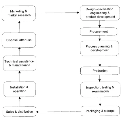
2.4.2 Quality System in an Manufacturing Organisation
CHAPTER 2
V
L1TERA TV RE REVIEW
improvement of all of these activities and their inter-relationships with each other. In addition, the relationship of the manufacturing company and its suppliers for a number of the activities on the right hand side of the loop offers potential for the application of TQM, as do the relationships of the activities on the left hand side of the loop with the customers. The whole process keeps circling as product improvements are
continuously designed and implemented with the aim of exceeding current customer requirements (Gilmour & Hunt, 1995, p. 3).
Figure 2.4.2 T h e Manufacturing Quality L o o p
Marketing & market research
Disposal after use
I
Technical assistance & maintenance V
Installation & operation
Sales & distribution
Design/specification engineering & product development
I
Procurement
I
Process planning & development
Production
I
Inspection, testing & examination
CHAPTER 2 LITERA TURE REVIEW
2.4.3 Basic TQM Tools
According to McConnell(1986), there are seven basic techniques for total quality management. They are flow charts, Ishikawa or cause and effect diagrams, Pareto charts, histograms, run charts and graphs, scattergrams and control charts.
Flow charts
Constructing a flow chart is an effective way to understand a process quickly and clearly. A complete understanding of the process is a prerequisite to use this tool. McConnell(1986) suggests a technique as 'imagineering'. With imagineering, the user draws a flow chart of the real process and another flow chart of an ideal process. The difference between the two flow charts is the area to be improved.
Ishikawa or cause and effect diagrams
The cause and effect diagrams are used to define the relationship between a particular quality characteristic (the effect) and the factors which impact it (the cause). The quality to be controlled is a measurable characteristic such as diameter, length, or hardness of an item, or the completion time, defective percentage of a process.
Pareto charts
A Pareto chart is a bar chart with the horizontal axis showing the variable of interest (the type of errors, factors contributing to the problem, types of products) and the vertical axis showing the number of occurrences of each factor. It is used to determine the significance of quality problem factors and hence determine how improvement
CHAPTER 2 1 LITERATURE REVIEW
Histograms
A histogram is a chart (usually a simple column chart) that plots a distribution analysis which reports the number of items in a data range that fall between specified
boundaries.
Run charts and graphs
A run chart shows the trends or unusual movements in the process over time. It can be a line diagram or a graph or a bar chart, with time on the horizontal axis and variable of interest (percentage of defective or production volume, etc.).
Scattergrams
Scattergrams are typically used to determine what kind of relationship - if any - exists between two data series. On both axes ofa scattergram are values of variables. Data is collected in pairs and each pair is represented by a dot or point on the scattergram. As more pairs are plotted, the relationship between the two variables becomes apparent.
Control charts
Control charts are usually constructed to determine if and when the operation is out of control. It sets a target value and upper and lower control limits. If a subsequent
CHAPTER 2 LITERATURE REVIEW
2.5 Summary
The main types of Data Visualisation tools are colour, size, shade, shape and
animation. These tools can appear in two dimensional form or three dimensional form.
The main benefits of Data Visualisation technologies can be summarised as • analysing numerical data graphically;
• viewing data multidimensionally;
• revealing the effects of multiple factors on each other clearly; • displaying data changes over time; and
• comprehending complex information more easily.
CHAPTER THREE
CHAPTER 3
RATIONALE
3.1 Purpose of Study
The purpose of the study is to find out how Data Visualisation technology has been implemented in Australia. However, due to limitations of resources and time, the research area is narrowed down to the implementation of Data Visualisation technology in the total quality management (TQM) in Victorian manufacturing industry. This includes
• what DV techniques have been adopted for TQM purpose; and • in what aspects of TQM DV technologies are implemented.
Users' perception of the importance of DV technology and their future expectation of DV technology for the purpose of TQM are also explored.
In this research, the subject is general Data Visualisation technology and not any particular VDA software. There are two reasons for this:
1) the term of 'VDA software' is not commonly used in Australia. An uncommon term in a questionnaire might bias the responses of the survey.
2) Nowadays, most software has Data Visualisation features and can be used for Data Visualisation purpose to some extend.
The findings of this research will give direction to future research on Data
CHAPTER 3
RATIONALE
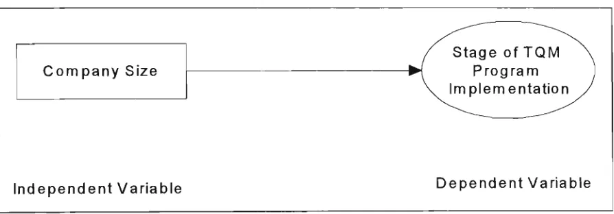
3.2 Theoretical Framework
Since the main object of this research is to find out to what extend Data Visualisation (DV) technology has been implemented in Victorian manufacturing industry, the
implementation of DV technology is the main factor of interest of the study and varies
according to other factors, hence it is the dependent variable.
The two most important independent variables that are hypothesised to influence the dependent variable are company size and stage of TQM program implementation
The moderating variable of data complexity modifies the relationship between the
independent variable of firm size and the dependent variable. The intervening variable
oi aspects of quality management surfaces between the time the independent variable
stage of TQM program implementation operates to influence the dependent variable
and its impact on the dependent variable. The independent variable of company size also influences the other independent variable of stage of TQM program
implementation. The interrelationships hypothesised among the variables are explained
as below.
3.2.1 Company Size and the Implementation of DV Technology
In the literature review, all the examples of companies which have adopted VDA
CHAPTER 3
RATIONALE
complex high volume data, organisations such as M o r g a n Grenfell, L e h m a n Brothers and Barclays BZW are now using data visualisation products originally developed for scientific application (Davidson 1994, p28). It can thus be argued that there is a relationship between the independent variable: firm size, and the dependent variable: implementation of DV technology.
Although this relationship can be said to hold true, it is the complex data the large companies have that impels the large companies to use DV technology, for complex data analysis is one of the main features of DV technology. With small quantities of data, numerical data analysis will serve the purpose easily. Thus complex data
moderates the relationship between company size and implementation of DV
technology. To put it differently, the relationship between company size and the implementation of DV technology is contingent upon data complexity. The judgement
of 'data complexity' is subject to respondents' perception, for no explicit definition of the term could be identified from the literature review. The influence of data
CHAPTER 3
RATIONALE
Figure 3.2.1 Diagram of the relationship between the independent variable (company size) and the dependent variable (implementation of DV technology) as moderated by the moderating variable (data complexity)
Company Size
Independent Variable
J L
^ ^ Data
^^^^ Complexity
Moderating Varia ble
^
^i
Implementation of \ DV Technology J
Dependent Variable
3.2.2 Stage of T Q M Program Implementation and the Implementation O f D V
Technology
The stage of TQM program implementation influences the implementation. If a company has started implementing a TQM program, it would have considered or started implementing DV technology to most or all of the aspects of its quality management in order to assist the implementation of the TQM program. Likewise, if a company has completed the implementation of a TQM program, it would have
V
CHAPTER 3 RATIONALE
implementation of Data Visualisation technology. The dynamics of these relationships
are illustrated in Figure 3.2.2.
Figure 3.2.2 Diagram of the relationships among the independent (stage of TQM
program implementation), intervening variable (aspects of quality
management) and the dependent variable (implementation of DV
technology)
Stage of T Q M Program Implementation
Independent Variable
3.2.3 C o m p a n y Size and Stage of T Q M Program Implementation
Company size also influences the stage of TQM program implementation. The quality
operation in large companies is more complicated than that in small companies. Large
companies need a formal program to manage their quality operations more urgently
than small companies. In addition, large companies have higher capacity to adopt new
techniques such as TQM to improve their management. This relationship is
diagrammed in Figure 3.2.3.
/ Aspects of
-*/ Quality
/ Management
Intervening Variable
V
CHAPTER 3
RATIONALE
Figure 3.2.3 Relationship between the independent variable (company size) and the independent variable (stage of TQM program implementation)
C o m p a n y Size
Stage of T Q M • Program
Implementation
CHAPTER 3
RATIONALE
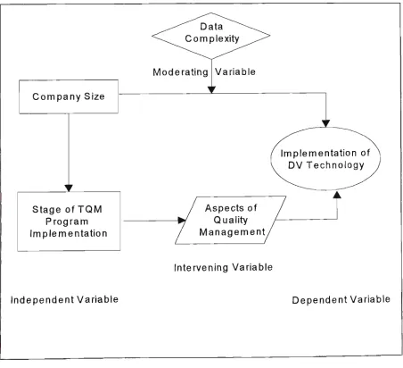
3.2.4 S u m m a r y
In sum, company size and stage of TQM program implementation significantly
influence the implementation of DV technology and explain the variance in it. In the mean time, data complexity moderates the relationship between company size and DV implementation. Aspects of quality management intervene between the stage of TQM program implementation and the implementation of DV technology. Company size also influences the stage of TQM program implementation. The relationships between these factors are schematically diagrammed in Figure 1.4.4.
Figure 3.2.4 Schemetic diagram of the theoretical framework
C o m p a n y Size
Stage of T Q M Program Implementation
Independent Variable
Moderating Variable
Implementation of D V Technology
Aspects of Quality M a n a g e m e n t
Intervening Variable
3.3 Hypothesis Statements
To test whether the relationships that have been theorised among the variables do in
fact hold true, five hypotheses have been developed. By testing these hypotheses scientifically, we will be able to obtain some reliable information on what kinds of relationships exist among the variables and thus figure out what factors are involved and how the factors influence the implementation of Data Visualisation technology in the TQM practice in Victorian manufacturing industry. The results of these tests will offer us some clues as to what could be done to improve the implementation of DV
technology. The hypothesis statements are as follows.
1. Large companies have more complex data than small companies.
2. Companies which report they are ahead with TQM implementation use DV techniques to a more advanced level.
3. Companies which have completed TQM programs implementation use DV techniques in more aspects than companies that have not implemented TQM programs.
4. DV techniques are more important to companies that have implemented TQM programs than companies that have not implemented TQM programs.
CHAPTER FOUR
CHAPTER 4
METHODOLOGY
The approach of this research is survey. It adopts the hypothetico-deductive method.
This method starts with a theoretical framework, and formulating hypothesis, and
makes logical deductions from the results of the study (Uma 1992, p. 15). The process
of the research is diagrammed in Figure 4.0.
Figure 4.0 Diagram of the research process
Broad Area of Research
Literature Survey
Conclusion Recommendation
Problem Definition
Hypotheses Deduction
Theoretical Framework
Data Collection Analysis and
Interpretation
Hypotheses Generation
Research Design
4.1 Population and Sampling
4.1.1 Population
Due to the limitation of research resource, the survey is geographically restricted
within Victoria and classically restricted among manufacturing organisations. The
population of the research is the quality managers of Victorian manufacturing
organizations. This population is considered to be practical for the research work and
METHODOLOGY
4.1.2 Sampling
It is practically impossible for a sole researcher to collect data from the entire population within the given time limit, therefore sampling is necessary. Stratified random sampling is used to reduce the number of elements.
The companies are stratified into three groups according to their employee numbers. These three groups are companies with employee number less than one hundred,
between one hundred and five hundred and more than five hundred. They are referred to as small-size firms, medium-size firms and large-size firms. After stratifying the elements, a disproportionate sampling method is used to decide the final subjects for the survey. The proportions of the subjects from each stratum is forty per cent from large-size companies and thirty per cent from each of the medium and small-size companies. This sampling method is in line with hypothesis 5, which hypothesizes the stage of TQM program implementation has a positive correlation with the difference of the company sizes. It is easier to test this hypothesis when the population of the survey is stratified by company size. In addition, companies at higher stages of TQM program implementation are hypothesized to be more likely ahead with the
implementation of data Visualization technology as opposed to medium or small-size companies. Assuming these hypotheses substantiate, company size and the
implementation of Data Visualization technology will be positively correlated. Thereby in order to explore the application of data Visualization technology in Victorian
CHAPTER 4
METHODOLOGY
4.2 Data Collection Method
The data collection method used in this research is mail questionnaire. Kompass
Australia 1994/1995 was used to identify specific organizations according to activity classification for manufacturing and both postcode and telephone number beginning with '3'. One copy of the questionnaire was mailed to each of the quality managers in the sampled one hundred Victoria manufacturing organisations.
The respondents are assumed to be highly educated and have no problem with understanding the questions addressed in the questionnaire. As managers, the
respondents do not usually have flexible schedules so that it is good for them to have a choice of arranging their time to fill in the questionnaire. In this case, mail
questionnaire is the most suitable means to collect data for this survey.
The questionnaire itself comprises four sections numbered as A, B, C and D. Section A examines the variables of company size and stage of TQM program implementation.
This section tests hypothesis five (H5). It answers the questions of 'whether large companies are at a higher stage of TQM implementation than smaller companies.' Section B examines the relationship between the stage of TQM program
implementation and aspects of quality management, the relationship of which was hypothesized in hypothesis three (H3). Hypothesis two (H2) is also tested in this section. It answers the questions 'whether companies which are ahead with TQM implementation use DV techniques to a more advanced level'; and 'whether companies which have completed TQM program implementation use DV techniques in more
CHAPTER 4
METHODOLOGY
examines the participants' perception regarding the importance of the main data
Visualization features to their total quality management. Section D offers the
participants a copy of the results of the survey.
The questionnaire had been tested by five random companies before it was
administered to the survey population. This pilot study gathered valuable information
for further refinement. A copy of the final questionnaire is attached in Appendix 4.
4.3 Data Processing and Analysis
Fifty-two companies responded to the survey, however the sample size in each analysis
may slightly vary due to the fact that not all respondents answered all the questions.
Data were processed and analyzed using Statistica, a Microsoft package for statistical
analysis. Frequency Tables, stub-and-banner Tables, correlation Matrix and
ANOVA/MANOVA modules were utilized to carry out the analysis of sample
distribution, correlations between different variables and variance among different
variables against a certain criterion. The significance of the statistical analysis was also
CHAPTER 4
METHODOLOGY
4.4 Limitations of Study
The applicability of the findings may be constrained due to the following reasons:
• The sample size was limited by the limited resource of time and funds.
• The industry applicable area is constrained within manufacturing companies.
• The reference materials are limited because the topic of DV has not emerged for
long.
• No work in the area of this research could be identified from the available literature.
C H A P T E R FlVfe
CHAPTER 5 FINDINGS
5.1 The Sample Profile
5.1.1 Distribution According to Size of Companies
The size of companies is categorised in two ways. One method used is to categorise the companies by the number of employees. The other method used is to classify the companies by their turnover volume.
5.1.1.1 Distribution According to Employee Level
The normal employee levels used to classify manufacturing companies are less than one hundred, between one hundred and five hundred and over five hundred. The
companies that fall within these three levels are categorised as small, medium and large companies.
FINDINGS
Figure 5.1.1.1 Distribution of Sample According to Employee Level
O<100 • 100-500 D>500
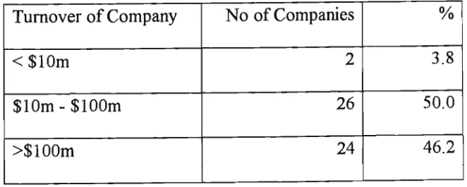
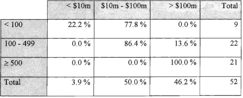
5.1.1.2 Distribution According to Turnover Volume
With classification of turnover volume, small companies are defined as those with less than $10 million turnover per year. Companies with yearly turnover between $10
million and $100 million are classified as medium-size companies. Large companies are those with yearly turnover more than $100 million.
Table 5.1.1.2 Distribution According to Turnover Volume Turnover of C o m p a n y
< $ 1 0 m
$ 1 0 m - $ 1 0 0 m > $ 1 0 0 m
N o of Companies
2
26
24
%
3.8
50.0 46.2From Table 5.1.1.2 w e can see that 5 0 % of the sample can be classified as medium-sized companies, and 46.2% and 3.8% of the sample are large and small companies
CHAPTER 5 FINDINGS
5.1.1.3 Relationship between Turnover Volume and Employee Level
Table 5.1.1.3a Correlation between Turnover Volume and Employee Level
Correlation Coefficient (r)
.84
P
.0000N
52
The correlation coefficient is close to +1, which means that the turnover volume of the
company is highly positively correlated to the employee level of the company, but the
relationship is not always perfect. The p value is zero, which indicates that this test
result is significant.
Table 5.1.1.3b Turnover Volume vs Employee Level
<100 100-499 £500 Total < $10m 22.2 % 0.0 % 0.0 % 3.9% $10m-$100m 77.8 % 86.4 % 0.0 % 50.0 %
: > $100m 0.0 % 13.6% 100.0% 46.2 % Total
9
22
21
52
Most of the small companies and medium companies (77.8% of the small companies
and 86.4% of the medium ones) have turnover volume between $10 million and $100
million while all the large companies have turnover above $100 million. Only 22.2% of
the small companies have a low volume of turnover, which makes the correlation
CHAPTERS FINDINGS
5.1.2 Distribution According to Structure of Companies
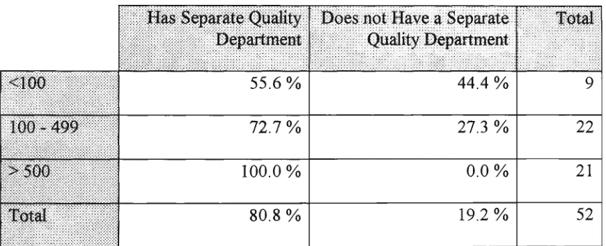
5.1.2.1 Distribution According to the Existence ofa Separate Quality Management Department
Table 5.1.2.1 shows that a high percentage (80.8%) of the sample have a separate quality management department in the company. The percentage of companies with a separate quality department increases from small companies to large companies accordingly. All large companies had a separate quality department.
Table 5.1.2.1 Company Structure in Respect of Separate Quality Department According to Size of Company
<100 100-499 > 5 0 0 Total
H a s Separate Quality Department
55.6 % 72.7 % 100.0 % 80.8 %
Does not Have a Separate : ; Quality Department
44.4 % 27.3 % 0.0 % 19.2 %
Total
9
22
21
52
5.1.2.2 Distribution According to the Stage of Implementation ofa Formal Total Quality Management (TQM) Program
FINDINGS
Figure 5.1.2.2 Distribution of Sample According to the Stage of Implementation ofa
Formal T Q M Program
5.1.2.3 Correlation between Stage of TQM and Size of Companies
Table 5.1.2.3 Correlation between Stage of T Q M and Size of Company
Variable x & Variable y Employee & Stage of T Q M Turnover & Stage of T Q M
r (x, y)
.79
.69
lllfll
.0000 .0000
| : N
52
52
In Table 5.2.1.3, employee level is from low to high. Stage of T Q M is from planning
to completion or in other words, from low to high as well.
Both correlation coefficients, r values are high, so that both the relation between
employee level and the stage of TQM implementation and the relation between the
turnover volume and the stage of TQM implementation are positive.
Since ^Turnover & Stage of TQM) > r(Employee & Stage of TQM), employee level
is more closely related to the stage of TQM program implementation and hence is
FINDINGS
5.1.2.4 Stage of the Implementation ofa TQM Program According to Size of
Companies
Figure 5.1.2.4 Stage of the Implementation ofa T Q M Program According to
Size of Company
Completed Being Planning N o
Completed Intention • Small
• Medium E3 Large
According to Figure 5.2.1.3, over 9 0 % of the large companies have completed the
implementation of a formal TQM program. Nearly 70% of the medium-sized
companies are implementing the program and about 70% of the small companies are
still at the planning stage. This pattern conforms with the correlation result in 5.2.1.3.
5.2 The Adoption of Data Visualisation Tools
Wordprocessors, spreadsheets, databases, statistics and quality-documenters are the
types of computer software that were set up to check which type of software is the
most commonly used and which type is the least commonly used in the total quality
CHAPTER 5
FINDINGS
the frequencies of the software application a m o n g the three different sizes of companies.
5.2.1 Test of the Hypothesis of Frequency Differences of the Software
Application among Different Sizes of Companies
In order to determine whether there are any differences in the frequencies of the computer software application among the three different sizes of companies, a one-way analysis of variance (ANOVA) was carried out to compare the means of the
software application frequencies in the three groups of different sizes of companies. The null and alternative hypotheses are as follows:
Null hypothesis(770): There is no difference in the frequencies of the computer software application among the three different
sizes of companies.
Alternative hypothesis (HI): There are differences in the frequencies of the computer software application among the three different sizes of
companies.
The F statistic values were computed and compared with the appropriate F critical
values at 95% confidence interval. The group size varies from 52 to 46 , which leads to the within group degree of freedom (dfw) varying from 49 to 46. However, with the
same between group degree of freedom (dfb) of 2, the critical values for dfw=40 (3.23)
CHAPTER 5
FINDINGS
values for dfw=49 and dfw=46 with the same dfb=2 would be almost the same.
Therefore, the critical value for this test is decided to be the value which is close to the
median of critical values for dfw=40 and dfw=60 with dfb=2 , which is 3.20, for the ease
of analysis.
The statistical significance w a s also tested. In this test, the effects are significant at p
.0500. The results are regarded to be highly statistically significant if p < .0100.
<
Table 5.2.1 O n e - w a y Analysis of the Frequency Differences of the Software
Application among Different Sizes of Companies
Type of :: :: :: :: :: :: :: :: :rt: :: :: :: :: :: ': ;: :: :: :: :: ;: :i: :: :: ;v:: :; :: :: :: :: :-:::::;::: :: software Wordprocessor Spreadsheet Database Statistics Quality-Documenter statistic — 6.34 11.04 10.90
.79
(
lf
bf critical = 2,: d & = 49
a=.05 3.20 3.20 3.20 3.20 3.20 Accepted Hypothesis F>f, HI F>f, HI F>f, HI
F < f, # 0
P Level .004 .0001 .0001
.46
| Statistical Significance Highly significant Highly significant Highly significant N o t significantThe above table reveals that spreadsheet, database and statistical packages are used at
significantly different frequencies by the three different sizes of companies whereas
there is not much difference on the adoption of a Quality-documenter or a
FINDINGS
5.2.2 Types of Computer Software Adopted by Different Size of Companies
Table 5.2.2 Types of Computer Software Used in Total Quality Management
According to Size of Companies
Small Medium : Large Total
illlll
Word-processor 100.0 % 100.0 % 100.0 % 100.0 % Spread-y sheet 55.6 % 86.4 % 100.0% 86.5 % Database 33.3 % 72.7 % 100.0 % Statistics 11.1 % 50.0 % 0.0 %76.9 % | 23.1 %
Quality-Documenter 11.1 % 27.3 % 14.3 % 19.2 %;:
Wordprocessor, spreadsheet and database software are the most commonly used
computer software in the total quality management of the sample companies. The
percentage of applications for these three types of software are 100%, 86.5% and
76.9% respectively. Statistical packages and quality-documenter packages are much
less commonly used, with only around twenty percent users.
With regard to the differences in the software adoption by different sizes of companies,
wordprocessing packages are used by all companies while quality-documenter
packages are not highly used by any group of companies. The adoption of spreadsheet,
database and statistical packages varies significantly for different sizes of companies.
Among the three types of software, the frequency of the application of spreadsheet and
database packages increases with the increase of company size. The frequency of
companies to m e d i u m companies but stops this increasing trend suddenly with a zero frequency of application by large sized companies.
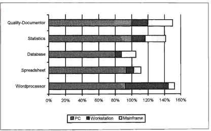
5.2.3 Hardware Support for the Software Adopted
The distribution of different types of hardware support for different types of software adopted is shown in Figure 5.2.3.
Figure 5.2.3 Hardware Support for Different Types of Software Adopted
Quality-Documentor Statistics Database Spreadsheet Wordprocessor 0
i
i
!!• I
ii I
% 2 0 % 4 0 % 6 0 % 8 0 % 1 0 0 % 12
| E3PC B Workstation D Mainframe
0% 140% 16 3%
P C is the dominant hardware support for the software adopted in T Q M . The lowest
percentage base of PC is 80%, for database packages. One hundred percent of quality-documenter and statistics packages are base on PCs.
All types of software in use are also located on workstations and mainframes, although
CHAPTER 5
FINDINGS
The bar length exceeds 1 0 0 % means that the particular type of software is located on
more than one type of hardware. In this case, all types of software adopted are located
on PCs plus both or either of workstations and/or mainframes.
FINDINGS
5.2.4 T h e Application of Different Types of C o m p u t e r Software in Different
Aspects of TQM
The aspects of TQM that were surveyed for the use of the computer software are: production design and development, quality instruction manual, vendor quality
assessment, inspection of incoming raw materials, statistical process control, product reliability assessment, product release, customer service assessment, supplier quality assessment, productivity analysis, sales analysis, marketing analysis and financial analysis.
5.2.4.1 General Pattern of the Application of Different Types of Computer Software in Different Aspects of TQM
Figure 5.2.4.1 reveals that almost all (98%) of the companies use wordprocessing
packages to produce their quality instruction manuals. Wordprocessing software is also the most commonly used software for vendor quality assessment, recording of the
inspection of incoming raw materials, recording of product release, supplier quality assessment and marketing assessment. Spreadsheet software is commonly used for
sales analysis (65.4%) as well as product design and development. It is also the most commonly used type of software for statistical process control, product reliability assessment, customer service assessment, productivity analysis, and financial analysis. Database, statistics and quality-documenter packages are not commonly used for TQM at all. The detailed percentages for Figure 5.2.3.1 are presented in Table 5.2.4.1 in
Figure 5.2.4.1 T h e Application of Different Types of Software in Different Aspects of
TQM
N o n e
Quality-Documenton
Statistics
Database
Spreadsheet
Wordprocessor
I Financial Analysis
• Marketing Analysis
D Sales Analysis
H Productivity Analysis
• Supplier Quality Assessment
• Customer Service Assessment
I Product Release
Q Product Reliability Assessment
H Statistical Process Control
• Inspection of Incoming R a w Materials • Vendor Quality
Assessment
B Quality Instruction Manual
• Product Design and Development
CHAPTER 5 FINDINGS
5.2.4.2 Companies That Use Computer Software in Different Aspects of TQM According to Their Stage of TQM Program Implementation
Companies at all stages of TQM program implementation use computer software in TQM very often. The only outstanding difference among companies at different TQM stages is all companies that have completed TQM implementation use computer
software in product design and development, quality instructional manual, vendor
quality assessment, statistical process control, product release record, supplier quality assessment, sales analysis, marketing analysis and financial analysis.
However, the conclusion cannot be made that companies that have completed TQM
FINDINGS
Table 5.2.4.2 Companies That Use Computer Software in Different Aspects of T Q M
According to Their Stage of TQM Program Implementation
Product Design & development Quality Instructional Manual Vendor Quality Assessment
Inspection of Incoming R a w Material : Statistical Process Control ;
Product Reliability Assessment Product Release
Customer'Servicei Assessmjeht 1 Supplier Quality Assessment
Productivity Analysis
:;.Sjyes :
Analysis^; :^; Marketing Analysis Financial Analysis Completed % 100.00 100.00 100.00 96.00 100.00 20.00 100.00 32.00 100.00 76.00 100.00 100.00 100.00 Being Implemented % 85.00 100.00 100.00 80.00 75.00 65.00 75.00 70.00 90.00 60.00 80.00 90.00 90.00
N varies from 49 to 52.
CHAPTER 5 FINDINGS
5.2.5 The Adoption of Data Visualisation Techniques in TQM
The Data Visualisation techniques that were surveyed were two dimensional and three dimensional tools with the five same aspects, which are colour, shade, size, shape and animation. The general pattern of the use of Data Visualisation tools and the deference in the Data Visualisation tools application among different size of companies are
explored.
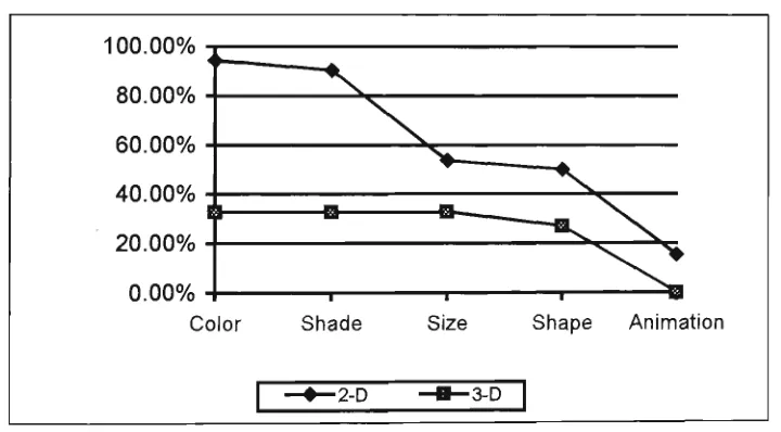
5.2.5.1 The General Pattern of the use of Data Visualisation Tools in TQM
Figure 5.2.5.1 General Pattern of the use of Data Visualisation Tools
1 nn nnn/ Rn nno/. . ou.uu /o ' 6 0 . 0 0 % • 4 0 . 0 0 %
-I
20.00%
-n -n-no/. .
\ s ^
I Q B . • N ,
\
^^O*
Color Shade — • — 2 - D
Size
- B — 3-D
Shape
I
Animation
CHAPTER 5 FINDINGS
users. As a contrast to the two-dimensional tools, none of the three-dimensional tools are commonly used, especially the 3-D animation tool which has not been adopted by any of the sample companies.
Three-dimensional tools are regarded as more advanced than two-dimensional tools. Unfortunately more advanced tools are generally less commonly used. How are the
tools used in different sizes of companies? The answer is provided in the next section.
5.2.5.2 ANOVA Test on the Level of Data Visualisation Tools Application in TQM
among Different Sized Companies
It is assumed that there are differences in the use of the Data Visualisation tools among different size companies. In order to determine whether this assumption is true, a
ANOVA test was carried out to compare the means of the each of the tools'
application frequencies in the three groups of different sizes of companies. The null and alternative hypotheses are as follows:
Null hypothesis(i/0): There is no difference in the frequencies of the Data Visualisation Tools application among the three
different sizes of companies.
Alternative hypothesis (HI) : There are differences in the frequencies of Data Visualisation Tools application among the three different
CHAPTER 5 FINDINGS
The confidence interval, degrees of freedom and statistical significance criteria are the
same as those applied in the ANOVA test in 5.2.1.
Table 5.2.5.2 O n e - w a y Analysis of the Frequency Differences of the Data
Visualisation Tools Application a m o n g Different Sizes of Companies
D V Tools
2-D Colour 2-D Shade 2-D Size 2-D Shape 2-D Animation 3-D Colour 3-D Shade 3-D Size 3-D Shape 3-D Animation F statistic 3.09 2.20 8.23 6.14
.13
5.76 5.76 4.15 6.55 f critical dfb = 2,dfw = 4 9a-05
3.20 3.20 3.20 3.20 3.20 3.20 3.20 3.20 3.20 3.20 Accepted HypothesisF < f, HO
F<f,
HO
F>f,
HI
F>f,
HI
F<f,H0
F > f, # /
F > f, # /
F > f, #7
F > f, #7
P Level .054 .121 .0008 .0004 .877 .006 .006 .022 .003 — Statistical Significance Not Significant
N o t significant Highly significant Highly significant Not Significant Highly Significant Highly Significant Significant Highly Significant
The above table reveals that there is not significant difference in the use of
CHAPTER 5 FINDINGS
companies, though the effects are not very significant.. However, the table reveals that
there are significant differences in the use of two-dimensional size, shape, and three
dimensional colour, shade, size and shape among the three different size of companies.
And the effects are highly significant. The detailed differences are explained in the
following section.
5.2.5.3 The Usage of Data Visualisation Tools According to Size of Companies
Table 5.2.5.3 Data Visualisation Tools Application According to Size of Companies
Small Medium Large 2 -Dimension Colour % 77.8 95.5 100.0 Shade • % 77.8 86.4 100.0
Size
% 66.7 77.3 23.8 S^ape:illllBi
55.6 72.7 23.8 Aiumation ; % 11.1 18.2 14.3 n = 52Small Medium Large.
3 - Dimension Colour %
0.0
54.6 23.8 Shade0.0
54.6 23.8 Size %0.0
50.0 28.6 Shape %0.0
50.0 14.3 Animation %0.0
0.0
0.0
n = 51The percentage figures in the table tell us that 2-D colour and 2-D shade tools are very
commonly used by all size of companies with an increasing trend from small to large
CHAPTER 5
FINDINGS
by small companies and medium-sized companies (over 5 0 % ) but not the large
companies (23.8% for both tools). In fact, the large companies are only favourable to 2-D colour and 2-D shade. All the other tools are only used by a small proportion of the large companies with the percentage use being between fourteen and thirty except a zero for 3-D animation tool. None of the small companies has introduced
three-dimensional tools into their total quality management, whilst over half of the medium-sized companies are using three-dimensional colour, shade, size and shape.
In general, Data Visualisation tools are more commonly used in large companies than in small-sized companies for TQM purpose, and large companies use the Data
CHAPTER 5
FINDINGS
5.2.6 Rating of the Importance of Data Visualisation Features
The main Data Visualisation features are summarised as : • Handle complex data easily
• Display periodic data changes in one graph
• Recognise the effects of multiple factors on each other • Analyse data quickly
• Analyse data accurately
The importance is scaled at three levels as very important, important and not important. Mssing data are deleted casewise and the percentage of missing data is summarised in the column of'no comments'.
The general rating for the importance of these Data Visualisation features and specific rating for each of these features by each group of companies are analysed as follows.
5.2.6.1 General Rating of the Importance of Data Visualisation Features
CHAPTER 5
FINDINGS
comments'. T h e speed of the data analysis is also rated highly important with about
eighty-eight percent of the respondents rating it as very important or important.
In general, all the five main Data Visualisation features are important to the users.
Detailed percentages of the rating are presented in Table 5.2.6.1 in Appendix 3.
Figure 5.2.6.1 General Rating of the Importance of Data Visualisation Features
• No Comments • Not
Important • Important
CHAPTER 5
FINDINGS
5.2.6.2 Specific Rating of the Importance of Data Visualisation Features by
Different Groups of Companies According to Stage of TQM Program
Implementation
Before we go down to the specific rating by specific groups of companies, a test of the difference on the rating among different groups is carried out to determine the
necessity of breaking down the analysis into particular features by different groups. As previous tests, ANOVA is the tool used to perform this task. The null and alternative hypotheses are set out as follows:
Null hypothesis(/70): There is no difference in the rating of the importance of the Data Visualisation features among the companies at
the three different stages of TQM program implementation.
Alternative hypothesis (HI) : There are differences in the rating of the importance of the Data Visualisation features among the companies at
the three different stages of TQM program implementation.
The confidence interval, degrees of freedom and statistical significance criteria are the same as those applied in the ANOVA test in 5.2.1.
CHAPTER 5 FINDINGS
Table 5.2.6.2 One-way Analysis of the Rating Differences on the Importance of the
Data Visualisation Features among Companies at Different Stages of
TQM Implementation
D V Features
Handle
complex data easily
Display
periodic data changes in o n e graph
Recognise the effects o f multiple factor on each other Analyse data quickly Analyse data accurately F statistic 8.96 10.69 13.49 4.45 5.37 f critical dfb = 2, dfw = 4 9
a = .05 3.20 3.20 3.20 3.20 3.20 Accepted Hypothesis
F > f, # /
F>f, HI
F>f, HI
F >f, HI
F > f, HI
P
.0005 .0001 .00002 .017 .008 Statistical Significance Highly Significant Highly significant Highly significant Significant Highly SignificantFor all the variables tested, H I is the hypothesis accepted. These results tell us that for
the five main Data Visualisation features, companies at different stages of TQM
program implementation rated the importance differently. And the test effects are
either significant or highly significant. This leads to a further breakdown analysis on the