762 IEEE SYSTEMS JOURNAL, VOL. 11, NO. 2, JUNE 2017
Semantic Systems and Visual Tools to Support
Environmental Communication
Arno Scharl, David Herring, Walter Rafelsberger, Alexander Hubmann-Haidvogel,
Ruslan Kamolov, Daniel Fischl, Michael Föls, and Albert Weichselbraun
Abstract—Given the intense attention that environmental topics such as climate change attract in news and social media cov-erage, scientists and communication professionals want to know how different stakeholders perceive observable threats and pol-icy options, how specific media channels react to new insights, and how journalists present scientific knowledge to the public. This paper investigates the potential of semantic technologies to address these questions. After summarizing methods to extract and disambiguate context information, we present visualization techniques to explore the lexical, geospatial, and relational context of topics and entities referenced in these repositories. The exam-ples stem from theMedia Watch on Climate Change, theClimate Resilience Toolkitand theNOAA Media Watch—three applications that aggregate environmental resources from a wide range of online sources. These systems not only show the value of providing comprehensive information to the public, but also have helped to develop a novel communication success metric that goes beyond bipolar assessments of sentiment.
Index Terms—Climate science, context, global communication, knowledge extraction, visual analytics, web intelligence.
I. INTRODUCTION
P
UBLIC concern about climate-related changes has risen, but only a small percentage of citizens are taking ac-tion to reduce their carbon footprint [2]. Among the reasons for this discrepancy are: 1) a lack ofcollective awareness, the widespread perception of climate change as a risk that predom-inantly impacts geographically and temporally distant places; and 2) a lack of personal efficacy, the belief that one’s own actions will not make a difference [2]. There are several causes that help explain these observations. Citizens are being exposed to large amounts of heterogeneous and often conflicting infor-mation from a wide range of sources, making it increasingly difficult to identify what is correct, accurate, and relevant. ThisManuscript received November 23, 2014; revised May 16, 2015 and July 28, 2015; accepted July 31, 2015. Date of publication September 8, 2015; date of current version June 26, 2017. This work was supported by the European Union’s 7th Framework Program for research, technology development and demonstration under the Grant Agreements 610829, 611233 and 619706. The presented work has been conducted as part of the research projects DecarboNet (www.decarbonet.eu), Pheme (www.pheme.eu) and ASAP (www.asap-fp7.eu). A. Scharl is with MODUL University Vienna, Department of New Media Technology, 1190 Vienna, Austria, and also with webLyzard technology gmbh, 1190 Vienna, Austria (e-mail: [email protected]).
D. Herring is with the Climate Program Office, U.S. National Oceanic and Atmospheric Administration (NOAA), Silver Spring, MD 20910 USA (e-mail: [email protected]).
W. Rafelsberger, A. Hubmann-Haidvogel, and A. Weichselbraun are with webLyzard technology gmbh, 1190 Vienna, Austria.
R. Kamolov, D. Fischl and M. Föls are with MODUL University Vienna, Department of New Media Technology, 1190 Vienna, Austria.
Digital Object Identifier 10.1109/JSYST.2015.2466439
is particularly evident in the case of contested positions and intrinsically multidisciplinary domains such as climate change. Effective decision making by citizens requires accurate and ac-tionable knowledge, but meaningful access to such knowledge is often hampered not only by the sheer volume and inconsis-tency of available resources, but also by increasing diversity in terms of user needs and access scenarios. Therefore, many stakeholders including policy makers and environmental NGOs seek novel methods to analyze the public dialog, and to better understand mechanisms that support collective awareness.
Content analytics solutions provide such methods and have been applied to various domains including sports [11], politics [5]; [17] and climate change [9]; [15], often focusing on specific aspects such as event detection [1], content classification [9] and automated video annotation [5]. To generate actionable knowl-edge and support decisions, such content analytics systems face a number of major challenges:
1) Compile and annotate large document collections from online sources that are heterogeneous in terms of au-thorship, structure, formatting, style (news articles, social media postings, etc.), update frequency, and the contained type of knowledge (factual versus affective).
2) Provide an interactive user interface to select the most relevant subsets of the information space, and to analyze and visualize the extracted information.
3) Develop methods to assess the success of communication strategies and guide the campaigns and educational pro-grams of environmental stakeholders.
Many tools address these challenges by providing results as statistical charts [3]; [25]. Rather than relying on simple sta-tistical representations, the visual analytics platform presented in this paper supports the real-time synchronization of multiple coordinated views to convey context information along various semantic dimensions. When properly disambiguated, such con-text information helps to address the challenges outlined above. It improves several steps in the content processing pipeline: targeted acquisition via focused crawling [10], for example, or more accurate knowledge extraction tailored to the specifics of user-generated content [18]—especially when trying to under-stand the role of affective knowledge in the decision-making process [8]. This paper presents methods to acquire, analyze, and visualize three types of context information.
1) Lexical context—specific vocabulary and sequence of words that precede or follow a statement [6]; [21]. 2) Geospatial context—the author’s location and the
geospatial references contained in a document [13]; [16].
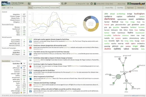
Fig. 1. Screenshot of the multilingualMedia Watch on Climate Change(www.ecoresearch.net/climate), showing the results of a query for “Earth Hour” based on Anglo-American news media coverage between March and April 2015.
3) Relational context—frequency distribution of named en-tities in the content repository, and co-occurrence patterns among these entities [4]; [24].
The remainder of this paper is structured along the sequence of context processing steps. Section II first introduces auto-mated methods for aggregating and filtering environmental Web content. Section III presents algorithms to extract factual and affective knowledge from the gathered Web content, which provide the context information that is then visualized by a portfolio of interactive tools described in Section IV. Sentiment expressed in online publications, a popular example of affective knowledge, is used for the color coding of various visual elements. While sentiment helps to understand positive and negative emotions associated with an issue, its usefulness as a communication success measure is limited. Section V therefore extends the discussion by emphasizing the need for metrics beyond sentiment, and introducing a hybrid approach that in-cludes a real-time assessment of whether communication goals have been reached—e.g., regarding the positioning of a brand, product, or service. Section VI presents a formal assessment of the factual and affective knowledge extraction algorithms in terms of their precision and recall, as well as heuristic and for-mative usability testing. The evaluation also includes feedback from real-world use cases that apply the presented methods to provide environmental knowledge repositories and support communication experts in fostering collective awareness and promoting sustainable lifestyle choices. The use cases include
theMedia Watch on Climate Change[31], a publicly accessible news and social media aggregator on climate change and related environmental issues shown in Fig. 1, the Climate Resilience Toolkit [28], a new decision support initiative of the U.S. government to help environmental stakeholders build resilience to climate-related changes and extreme events, and theNOAA Media Watch[14], a visual analytics solution developed for the National Oceanic and Atmospheric Administration (NOAA) that makes use of advanced text mining and knowledge vi-sualization services to measure the success of communication strategies.
II. AUTOMATEDMETHODS FORAGGREGATING AND
FILTERINGENVIRONMENTALWEBCONTENT
People’s health, security, and economic well-being are closely linked to environmental issues. Communities around the world grapple with challenges due to extreme weather and changing climate conditions. Policy leaders, analysts, corporate decision makers, and citizens are asking for reliable information to help them address climate-related risks and opportunities.
764 IEEE SYSTEMS JOURNAL, VOL. 11, NO. 2, JUNE 2017
municipalities, and environmental NGOs. Automated docu-ment enrichdocu-ment services then transform the gathered in-formation into a contextualized inin-formation space spanning geospatial, temporal and social dimensions. Analyzing this information space sheds light on stakeholder perceptions, re-veals information flows, and provides indicators for assessing the impact of environmental campaigns and public outreach activities.
Released in 2014, theClimate Resilience Toolkit[28] applies and extends methods initially developed for theMedia Watch on Climate Changeto identify the most relevant online content from the Web sites of U.S. federal agencies participating in the Global Change Research Program[34], as well as regional U.S. climate science centers. The Toolkit was developed in response to President Obama’sClimate Action PlanandExecutive Order to help communities, businesses, and state, local, and tribal governments build resilience to climate-related changes and extreme events. It provides an entry point for the public to access authoritative information about the impacts of climate variability and change, with online tools to help people plan and prepare.
The Toolkit was among the nominees for the “Green” cat-egory of the Webby Awards 2015[37], the prestigious annual award by the International Academy of the Digital Arts & Sciences. Its portal-wide search function is designed to help visitors quickly locate the most relevant content both within the Toolkit and across all the U.S. federal government’s Web sites. Toolkit users can query the platform for their desired type of resource—funding opportunities, data sets, visualizations, etc.—and group search results by topic of interest. At the same time, communication experts at NOAA can analyze the con-tained information through interactive visualization services, allowing them to monitor the stream of new online publications and continuously improve the Toolkit’s repository of environ-mental knowledge.
Both environmental applications described above use the webLyzard Web intelligence platform [38] to process and en-rich data from unstructured and structured evidence sources, working toward a focused crawling strategy. Managing the abundance and dynamic nature of news and social media content requires efficient pre-processing techniques to remove irrelevant content at an early stage of the processing pipeline. This initial filtering reduces the number of documents to be processed by computationally more expensive information ex-traction algorithms. Automated measures of domain specificity combine blacklists and whitelists to assess the relevance of gathered documents in the context of climate change and related environmental issues.
III. EXTRACTINGFACTUAL ANDAFFECTIVEKNOWLEDGE
Environmental stakeholders have a keen interest in news media coverage and the public dialogue on social platforms: Which are the most visible environmental organizations, for example, and what are mainstream media associating with their recent activities? Who has the most favorable reputation among social media users? The platform’s seamless integration of fac-tual (entities, relations, etc.) and affective (sentiment, opinions,
etc.) knowledge helps to answer such communication-related questions:
1) Factual Knowledge. The webLyzard platform includes a named entity recognition and resolution component calledRecognyze[24] that draws upon structured external linked data sources such as DBpedia.org,Freebase.com andGeoNames.orgto identify and disambiguate named entities (organizations, persons and locations). The sys-tem assigns confidence values and aligns references in a document with the corresponding items of the linked data sources—e.g., the DBpedia entry for politi-cal figures such as UN secretary general Ban Ki-moon (www.dbpedia.org/page/Ban_Ki-moon). The result is a continuously evolving knowledge repository that helps to better understand communication networks and the dynamic relations [1] among their actors.
2) Affective Knowledgeincludes sentiment and other emo-tions expressed in a document, which are captured and evaluated by opinion mining algorithms. Such algorithms typically are based on machine learning, lexical methods, or a combination of both [22]. Lexical methods rely on sentiment lexicons, which contain known sentiment terms and their respective sentiment values. The ratio of posi-tive and negaposi-tive terms found in the vicinity of a target term is used as an indicator of overall polarity. Overall accuracy is improved by considering linguistic features such as negations and intensifiers, and by creating a contextualized version of the sentiment lexicon to disam-biguate terms and consider specifics of the domain under consideration. Such a contextualized lexicon contains additional information on possible polarity shifts when a term co-occurs with a specific set of other concepts [22].
IV. VISUALIZINGCONTEXTINFORMATION
Sustainability and ecosystem protection are information-bound and quickly evolving domains that are governed by the behavior of millions of stakeholders embedded in complex and overlapping social networks. Revealing the dynamics of these networks and the relations between identified entities leads to a better understanding of how collective awareness emerges, and provides actionable knowledge and guidance for analysts and risk managers, especially in time-critical situations.
The visual dashboard [15] of theMedia Watch on Climate Changereveals popular issues that are being discussed in con-junction with environmental topics, including the context of the observed communicative processes (Fig. 1). Using the annual Earth Hour[19] organized by theWorld Wide Fund for Na-ture (WWF) as a case study and example of a large envi-ronmental campaign, this section describes three visualization components embedded into the dashboard, designed to convey different types of context information—aword treefor lexical context, amap projectionfor geospatial context, and anentity trackerfor relational context across organizations, persons and locations.
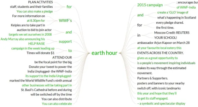
Fig. 2. Word tree for the term “Earth Hour” in March 2015 online coverage by news media and environmental organizations.
saturation, depending on the degree of polarity—vivid colors indicate emotional articles or postings, and lower saturation a more neutral online coverage.
A. Lexical Context
Once a user has entered a search query, the matching results are ranked by relevance, date, sentiment, or geographic loca-tion. For each result, the color of the date field conveys its over-all sentiment. Clicking on a quote extends the entry; a second click activates full text mode. When the full text of a document is shown, the header includes document keywords and source URL, while the footer summarizes other annotations including source type, source location, target location, sentiment, and relevance. Alternatively, the system lists matching quotes as a concordance list. Users can sort the concordances by source, date of publication, and sentiment on either a document or sentence level.
The word tree module presents the concordance list in a visual and more structured manner, summarizing the different contexts in which an entity or topic is being discussed. Its graph-based display facilitates the rapid exploration of search results and conveys a better understanding of how language is being used surrounding topics of interest.
Based on the popular keyword-in-context technique [21], the specific implementation of theword tree metaphor shown in Fig. 2 adopts a symmetrical approach [12]. The root of the tree is the search term. The left (right) part of the tree displays all sentence parts that occur before (after) the search term (prefix versus suffix tree). The branches help users to spot repetition in contextual phrases that precede or follow the search term. Mouse-over effects highlight the various phrases, allowing users to quickly reconstruct the structure of entire sentences. Visual cues include different font sizes to indicate the frequency of phrases, and connecting lines to indicate typical sentence structures.
Fig. 2 shows the tree-like structure after searching for the term “Earth Hour,” grouping identical phrases containing the term into sub-nodes such as “WWF’s Earth Hour.” This group-ing together of equal phrases into a connected tree structure sheds light on word usage within the selected source(s) in a
given time interval. The atomistic character of the word tree complements more aggregated term visualizations such as the tag cloudandkeyword graphshown in Fig. 1.
B. Geospatial Context
The geospatial context is of particular relevance when com-municating sustainability issues—on local, regional, and global levels. Many repositories of environmental knowledge such as NOAA’sClimate Resilience Toolkit[28] or the United Nations’ UNEP Live[35] platform convey their data sets using geospa-tial interfaces. TheMedia Watch on Climate Changeis no excep-tion. It projects geo-tagged Web content onto a map, reflecting the regional distribution of online coverage about an issue, event, or organization—e.g., references to locations co-occurring with “WWF” (World Wildlife Fund for Nature) as shown in Fig. 3. The position of circles is determined by the geographic co-ordinates of these references; their size is proportional to the number of documents mentioning a specific location.
There is a wide range of real-world use cases for this type of visualization. Geospatial projections can help summarize the global impact of an event such asEarth Hour, reveal differences in the public perception of organizations such as the WWF, indicate where a particular environmental issue is most heavily discussed, or analyze the public dialog about a recent natural disaster—for example, whether emergency response measures were perceived as timely and adequate.
When rendering documents in their geospatial context, the system distinguishes between source and target information— i.e., the authors’ locations versus the locations referenced in the documents, which are determined by applying the afore-mentionedRecognyzecomponent to identify and disambiguate references to geographic entities (=geo-tagging).
C. Relational Context
766 IEEE SYSTEMS JOURNAL, VOL. 11, NO. 2, JUNE 2017
Fig. 3. Geographic map of locations that co-occur with mentions of theWorld Wide Fund for Nature (WWF) in March and April 2015 online coverage by news media and environmental organization.
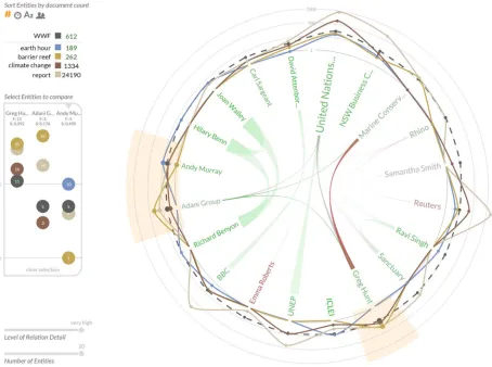
among the entities themselves helps analysts to develop a deeper understanding of the public dialog. How did a recent speech of the CEO of an electric car manufacturer impact the company’s reputation, for example, and what are journalists as-sociating with the products of the fossil fuel-based competition? To help answer such questions, the Entity Map shown in Fig. 4 visualizes relations among named entities in the analyzed corpus, and co-occurrence patterns between these entities and user-defined search terms.
Based on news media coverage between March and April 2015, the shown entities include (i) individuals such asGreg Hunt, the Australian Minister for the Environment, and Andy Murray, a British tennis player and WWF global ambassador, as well as (ii) organizations such as the Australian Marine Conser-vation Society[27] and UNEP, theUnited Nations Environment Programme [36]. In addition to Earth Hour 2015, the visualization reflects the publication of a WWF report on steps to ensure sustainable economies [7], as well as discussions about the Great Barrier Reef’s World Heritage status in light of prior controversies regarding the planned dumping of dredged seabed into the ocean [20].
The Entity Map combines a radial convergence diagram located in the center of the graph with a surrounding line chartwith radial imposition. The convergence diagram displays relations among entities using ribbons. Entity names are dis-played along a circle—their font size indicates the number of documents that mention the entity, their color ranges from red to green depending on average sentiment. The arcs’ thickness represents the number of co-occurrences between entity pairs. Slider elements control the number of entities to be shown
and the level of detail—i.e., the co-occurrence threshold for showing relations.
The data points in the line chart show the number of co-occurrences between an entity and selected topics. To increase the readability of the display and facilitate comparisons across topics, the chart uses a logarithmic scale. Interactive elements control which entity types are displayed (persons, organiza-tions or locaorganiza-tions), and allow re-arranging the entities by type, name, frequency of mentions, or the average sentiment of the documents containing the entity. Both the line chart and the radial convergence diagram are updated by means of smooth, animated transitions.
Hovering over an entity highlights the corresponding sector, shows a tooltip with the top three keywords associated with the chosen entity, and changes the opacity of the arcs in the radial convergence diagram.
Additional interactions support more detailed comparisons. Clicking on entities causes supplemental information to be displayed in a sidebar, which includes the data points with the co-occurrence values and the entity information—i.e., the name of the entity, the frequency of its occurrence, and the average sentiment. The three most recently selected entities remain highlighted.
V. MEASURINGCOMMUNICATIONSUCCESS—HYBRID
METRICSBEYONDSENTIMENT
Fig. 4. Entity Map showing people and organizations related to theWorld Wide Fund for Nature(WWF) in online media coverage between March and April 2015, the relations among those entities, and their association with associated topics.
services and success metrics. ThewebLyzard Stakeholder Di-alog and Opinion Model(WYSDOM), for example, provides a dynamic metric that goes beyond the bipolar assessment of sentiment (Section III). Initially developed for theNOAA Media Watch, this novel metric allows real-time insights into the success of public outreach activities. WYSDOM goes beyond descriptive measures of attention and sentiment by revealing whether communication targets have been reached. It measures to what extent the chosen strategy impacts observable patterns in online coverage, how consistently a message is being con-veyed, and whether this message helps to reinforce the desired positioning.
A. Progress Monitoring With the NOAA Media Watch
Web-based communication and engagement channels such as online news and social media play important roles in shaping public opinion. Large science organizations such as NOAA benefit from a thorough understanding of who uses these media channels, and how. Mandated to advance scientific understand-ing of the Earth’s climate system, and to share the resultunderstand-ing knowledge with the public, NOAA concentrates on climate risks in the following areas:
1) reducing vulnerability and improving resilience to ex-treme weather and climate events;
2) preparing for droughts and water resource challenges;
3) protecting coastal communities and infrastructure from inundation due to sea level rise and storm surges; 4) identifying and managing threats to marine ecosystems; 5) developing strategies for mitigating and adapting to
climate-related changes.
The NOAA Climate.gov portal provides climate-related in-formation to help the public understand the current state of the climate system, as well as expected long-term impacts, so that citizens and environmental stakeholders can make more informed decisions. To engage with these target groups and disseminate scientific results, the NOAA Climate Program Office(CPO) employs a three-pronged strategy:
1) Publishing data sets and information via Climate.gov, targeting four public segments: policy leaders and deci-sion makers, scientists and data users, educators, and the climate-interested public.
2) Engaging with target groups in interactive events de-signed to build relationships and to foster deeper, richer exchanges of information.
768 IEEE SYSTEMS JOURNAL, VOL. 11, NO. 2, JUNE 2017
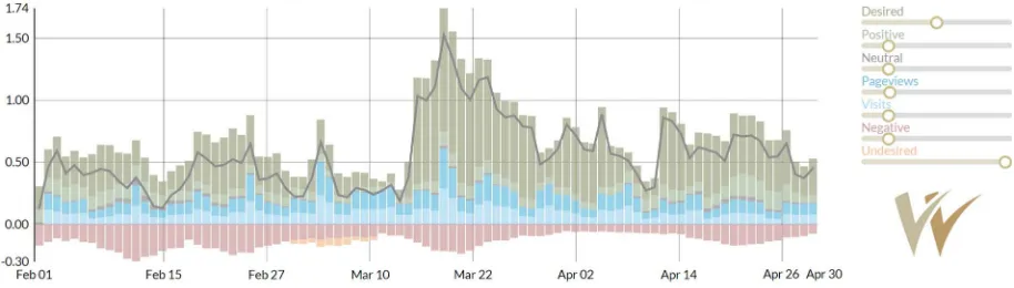
Fig. 5. Visual representation of the WYSDOM success metric (target term: NOAA; source: news media, February–April 2015).
review how these visitors rate the provided online content; 2) conduct focus groups and surveys designed to measure the Quality of Relationshipwith each target public; and 3) use the NOAA Media Watch, a visual analytics tool to monitor how others host, report on, or discuss published climate science information.
Applying semantic technologies to environmental Web con-tent adds an important dimension to the ability of communi-cation experts to assess and evaluate online communicommuni-cations. For exploring this dimension, the webLyzard platform has become an essential part of NOAA’s evaluation strategy. The CPO is using the system to track online communications ef-forts that otherwise could not be measured—e.g., observing sudden spikes or dips [5]; [8] in news or social media coverage about NOAA’s climate research and data products, or tracking climate-related topics and related societal challenge areas. The system reveals the number of articles in a given period—how this number compares to the long-term average for a given topic, and whether overall sentiment in online articles shows a positive or negative trend [11].
B. Tracking Communication Goals With the webLyzard Stakeholder Dialogue and Opinion Model (WYSDOM)
The WYSDOM metric evaluates the degree of association between an organization (or its products and services) with desired topics considered important and in line with evolving communication goals. It also determines whether undesired topics and media coverage were avoided successfully. This goes far beyond language characteristics such as positive and nega-tive sentiment. In the case of NOAA, for example, a desired association with “climate change” contributes positively to the success metric, although the term typically carries a negative sentiment.
The WYSDOM metric is adaptive and part of an iterative feedback cycle, customized to an organization’s evolving com-munications and dissemination goals. To specify these goals, analysts at NOAA have full control over the lists of desired and undesired topics, and the opportunity to update them in line with changing priorities.
As an optional component, WYSDOM provides seamless integration of server access statistics such as visits, page views, and average viewing time—for example by collecting and en-riching data from existing log file analysis tools such as Google
Analytics [30]. This allows communication professionals to analyze successful strategies in terms of their impact on both content production(i.e., knowledge extracted from news arti-cles or social media coverage) as well ascontent consumption (i.e., level of user activity on a corporate Web site, typically expressed in metrics such as unique visitors and page views).
The visual representation of the success metric based on a stacked bar chart is shown in Fig. 5. Green areas above the horizontal axis represent the association with 1) desired topics and the number of 2) positive references; blue areas the number of 3) visits and 4) page views; the grey area the number of 5) neutral references; red areas below the axis the number of 6) negative references and the association with 7) undesired topics. The grey line indicates the overall WYSDOM score.
Interactive tooltips display additional context information; e.g., topics and opinion leaders responsible for observable changes. The adaptive calculation enables analysts to assign weights to the aforementioned seven components to set their perceived importance.
VI. EVALUATION
Following an evolutionary development approach, rapid feedback cycles and agile software development have been instrumental in the conceptualization and implementation of the system. The evaluation activities focused on the accuracy of algorithms to extract factual and affective knowledge, the usability of the dashboard, and the added value of the platform when applied to real-world use cases.
A. Knowledge Extraction Algorithms
This section summarizes the results of formal evaluations to assess the performance of the knowledge extraction methods presented in Section III.
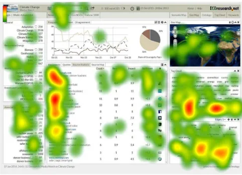
Fig. 6. Heatmap of the dashboard for a query on “solar energy”.
balancing the typical tradeoff between a method’s precision and recall) of up to 0.63 for entity linking [24]. Although the literature has reported higher accuracies for certain machine learning techniques,Recognyzeis better suited for many real-world applications since it is not limited to a particular knowl-edge source and does not require training corpora.
Affective Knowledge:The annotations of the sentiment anal-ysis component [9] and its context-aware extension [22] enrich the visual methods presented in this paper. Contextualization increased the observed average F-measure from 64.2 to 73.7 across all user reviews contained in the evaluation corpus. Bro-ken down by category, the context-aware extension achieved an FH (TripAdvisor hotel reviews) of 81 for positive and 72
for negative polarity, an FP (Amazon product reviews) of 72
for positive and 69 for negative polarity, and an FM (IMDB
movie reviews) of 75 for positive and 73 for negative po-larity [22]. A follow-up evaluation showed that the observed F-measure improvement remains stable across review cate-gories, for example when comparing results by product type or movie genre [23].
B. Visual Analytics Dashboard
The dashboard’s synchronization of multiple coordinated views [9] is fundamental to its ability to provide context-specific content recommendations. To gain insight into the user experience of the dashboard’s synchronization mechanism, usability evaluations were conducted in regular intervals, typ-ically several times per year. The aim of these evaluations was to determine strengths and weaknesses of the interaction design, distinguishing three types of assessment which include: 1)heuristic evaluation, where small groups of about three to five experts examined the interface and judged its compliance with established usability principles; 2) formative usability tests, where individual test users were observed while working on predefined tasks in realistic settings. Their gaze data was recorded with aTobii X60 Eye Tracker to generate heat maps (Fig. 6) that show which elements of the dashboard were used to complete a given task, and in which sequence; and 3)feedback from actual users—i.e., more than 100 employees of large
organizations including the NOAA Climate Program Office, the World Wide Fund for Nature, and the Austrian Federal Chamber of Commerce.
The explicit feedback from these use cases was comple-mented by implicit feedback from monitoring user activities (the 2014 access log files of the Media Watch on Climate Change, for example, indicate that about 19 200 visitors per-formed more than 130 000 search queries).
We also obtained additional feedback from presentations at the United Nations Conference on Sustainable Development (Rio+20), the United Nations Climate Change Conference (COP-18, COP-19), the 2013 Annual Meeting of the American Association for the Advancement of Science (AAAS), and the World Bank’s Connect4Climate Conference in conjunction with Earth Day 2015.
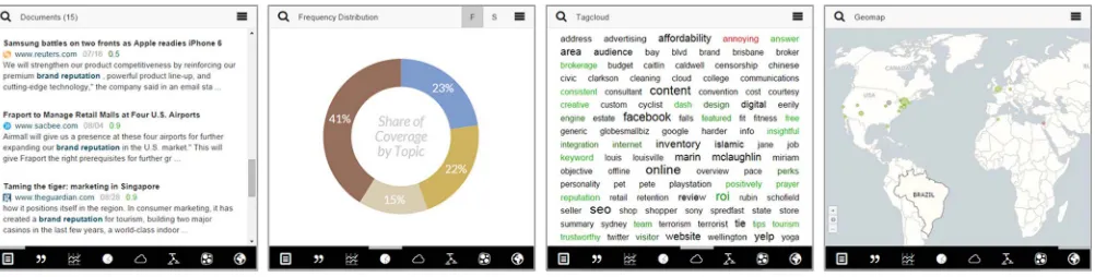
The assessments showed that most users have little difficulty accomplishing their tasks after receiving proper training. They appreciate the synchronized views to keep track of the lexical, semantic and geospatial context of their current search tasks. For untrained first-time users, however, the complexity of the dashboard can be overwhelming. To overcome this shortcom-ing, a mobile version of the dashboard was developed [32] to provide a more linear user experience, reducing complexity for inexperienced users. The mobile dashboard is tailored to the requirements of tablets and smartphones. Fully compliant with HTML5 and other Web standards, the dashboard behaves like a native app on iPhone/iPad and Android devices. For desktop users, it provides a simple yet powerful alternative to the multiple coordinated views of the regular dashboard.
While preserving the fundamental design choices of the desktop version, the mobile dashboard simplifies the interac-tion, reduces the cognitive overhead of using the system, and focuses user attention on one particular data representation (Fig. 7). The dashboard is responsive and adjusts its layout to the size of the browser window as well as to its aspect ratio (e.g., when switching between portrait and landscape mode on mobile devices). This flexibility ensures ubiquitous access to environmental information in a wide range of usage scenarios, for example as a secondary window while the user is working on other tasks.
Following accepted user interface principles, the mobile dashboard supports direct manipulation using touch inputs that loosely correspond to real-world actions: swiping to switch between the various representations,(reverse) pinchingto zoom in (out), andtappingto trigger searches or interact with visual elements. Highly optimized rendering algorithms enable imme-diate processing of user input and provide users with a fluid multi-touch interface experience.
VII. SUMMARY ANDCONCLUSION
770 IEEE SYSTEMS JOURNAL, VOL. 11, NO. 2, JUNE 2017
Fig. 7. Mobile dashboard of the Media Watch on Climate Change (www.ecoresearch.net/climate/mobile).
The context of Web coverage is important when aiming to investigate and better understand the processes that shape opinions and foster collective awareness. Visual tools reveal this context by identifying connections between named entities (persons, organizations, and locations based on references to these entities in aggregated content from news and social media sources such as Twitter, Facebook, Google+ and YouTube.
The three environmental Web applications discussed in this paper—theMedia Watch on Climate Change[31], theClimate Resilience Toolkit[28], and theNOAA Media Watch [14]—use the Recognyze component [24] to identify named entities, and external knowledge repositories such as DBpedia.organd GeoNames.orgto disambiguate them.
Extracting and visualizing context information transforms unstructured collections of crawled Web content into structured repositories of actionable knowledge. Thereby, the presented context processing techniques can support the decision mak-ing processes of a wide range of stakeholders, includmak-ing en-vironmental organizations, science agencies, non-government entities, enterprises, news media outlets, and policy makers. Uncovering patterns and trends in Web coverage can help these stakeholders to develop better strategies for engaging audiences, and improve the impact of their communication and public outreach campaigns.
Three ongoing research initiatives advance the presented knowledge extraction and visualization methods. The ASAP Project [26] increases the scalability of these methods, the Pheme Project [33] enriches their functionality by adding ve-racity detection to reveal online myths and rumors, and the DecarboNet Project [29] extends and applies them to transform theMedia Watch on Climate Changeinto a collective awareness platform that combines content analysis and social network analysis to reveal information diffusion patterns within and across online communities.
REFERENCES
[1] B. Adams, D. Phung, and S. Venkatesh, “Eventscapes: Visualizing events over times with emotive facets,” inProc. 19th ACM Int. Conf. Multimedia, Scottsdale, AZ, USA, 2011, pp. 1477–1480.
[2] T. Bowman, “Summary report: A meeting to assess public attitudes about climate change,” Nat. Ocean. Atmosp. Admin. (NOAA), George Mason Univ. Center Clim. Change Commun., Silver Springs, FL, USA, 2008. [3] I. Cleary, 26 Social Media Monitoring Tools, Reference Guide, Razor
Social, 2015. [Online]. Available: www.razorsocial.com/social-media-monitoring
[4] L. Derczynskiet al., “Analysis of named entity recognition and linking for tweets,”Inf. Process. Manag., vol. 51, no. 2, pp. 32–49, Mar. 2015. [5] N. Diakopoulos, M. Naaman, and F. Kivran-Swaine, “Diamonds in the
rough: Social media visual analytics for journalistic inquiry,” inProc. IEEE VAST, Salt Lake City, UT, USA, 2010, pp. 115–122.
[6] D. Fischl and A. Scharl, (2014). “Metadata enriched visualization of keywords in context,” inProc. 6th ACM SIGCHI EICS, Rome, Italy, 2014, pp. 193–196.
[7] S. Godinot, “From crisis to opportunity: Five steps to sustainable European economies,” WWF Eur. Policy Office, Brussels, Belgium, Feb. 2015.
[8] T.-A. Hoang, W. W. Cohen, E.-P. Lim, D. Pierce, and D. P. Redlawsk, “Politics, sharing and emotion in microblogs,” inProc. IEEE/ACM Int. Conf. Adv. Social Netw. Anal. Mining, Niagara Falls, ON, Canada, 2013, pp. 282–289.
[9] A. Hubmann-Haidvogel, A. Scharl, and A. Weichselbraun, “Multiple co-ordinated views for searching and navigating web content repositories,”
Inf. Sci., vol. 179, no. 12, pp. 1813–1821, May 2009.
[10] V. Mangaravite, G. T. Assis, and A. A. Ferreira, “Improving the efficiency of a genre-aware approach to focused crawling based on link context,” in
Proc. 8th LA-WEB, Cartagena de Indias, Colombia, 2012, pp. 17–23. [11] A. Marcus et al., “Twitinfo: Aggregating and visualizing microblogs
for event exploration,” inProc. CHI, Vancouver, ON, Canada, 2011, pp. 227–236.
[12] A. Muralidharan, M. A. Hearst, and C. Fan, “WordSeer: A knowledge synthesis environment for textual data,” in Proc. 22nd ACM CIKM, San Francisco, CA, USA, 2013, pp. 2533–2536.
[13] F. Niepold, D. Herring, and D. McConville, “The role of narrative and geospatial visualization in fostering climate literate citizens,”Phys. Geogr., vol. 29, no. 6, pp. 529–544, 2008.
[14] A. Scharl and D. Herring, “Extracting knowledge from the web & social media for progress monitoring in public outreach and science communi-cation,” inProc. 19th WebMedia, Salvador, Brazil, 2013, pp. 121–124. [15] A. Scharl, A. Hubmann-Haidvogel, A. Sabou, A. Weichselbraun, and
H. Lang, “From web intelligence to knowledge co-creation—A plat-form to analyze and support stakeholder communication,”IEEE Internet Comput., vol. 17, no. 5, pp. 21–29, Sep./Oct. 2013.
[16] A. Scharl and K. Tochtermann, Eds,The Geospatial Web—How Geo-Browsers, Social Software and the Web 2.0 are Shaping the Network Society. London, U.K.: Springer-Verlag, 2007.
[17] D. A. Shamma, L. Kennedy, and E. F. Churchill, “Tweetgeist: Can the Twitter timeline reveal the structure of broadcast events?” in Proc. ACM CSCW, Savannah, GA, USA, 2010, pp. 589–593.
[18] R. Sipos, A. Ghosh, and T. Joachims, “Was this review helpful to You? It depends! Context and voting patterns in online content,” inProc. 23rd WWW, Seoul, Korea, 2014, pp. 337–347.
[19] M. D. Sison, “Creative strategic communications: A case study of earth hour,”Int. J. Strategic Commun., vol. 7, no. 4, pp. 227–240, 2013. [20] The Economist, Australia’s Great Barrier Reef—Judgment Day.
Apr. 11, 2015.
[21] M. Wattenberg and F. B. Viégas, “The word tree, an interactive vi-sual concordance,”IEEE Trans. Vis. Comput. Graphics, vol. 14, no. 6, pp. 1221–1228, Nov./Dec. 2008.
[22] A. Weichselbraun, S. Gindl, and A. Scharl, “Extracting and grounding contextualized sentiment lexicons,” IEEE Intell. Syst., vol. 28, no. 2, pp. 39–46, Mar./Apr. 2013.
[24] A. Weichselbraun, D. Streiff, and A. Scharl, “Consolidating heteroge-neous enterprise data for named entity linking and web intelligence,”Int. J. Artif. Intell. Tools, vol. 24, no. 2, 2015, Art ID. 1540008.
[25] S. Wörmann and J. Sedlacek, Goldbach Interactive Monitoring Toolre-port 2014. 2014. [Online]. Available: http://www.goldbachinteractive.ch/ insights/fachartikel/toolreport14-monitoring-tools
[26] ASAP Project. [Online]. Available: www.asap-fp7.eu
[27] Australian Marine Conservation Society. [Online]. Available: www. marineconservation.org.au
[28] Climate Resilience Toolkit. [Online]. Available: toolkit.climate.gov [29] DecarboNet. [Online]. Available: www.decarbonet.eu
[30] Google Analytics. [Online]. Available: www.google.com/analytics [31] Media Watch on Climate Change. [Online]. Available: www.ecoresearch.
net/climate
[32] MWCC Mobile Dashboard. [Online]. Available: www.ecoresearch.net/ climate/mobile
[33] Pheme Project. [Online]. Available: www.pheme.eu
[34] U.S. Global Change Research Program. [Online]. Available: www. globalchange.gov
[35] UNEP Live. [Online]. Available: uneplive.unep.org
[36] UN Environment Programme. [Online]. Available: www.unep.org. [37] Webby Awards. [Online]. Available: www.webbyawards.com [38] webLyzard technology. [Online]. Available: www.webLyzard.com
Arno Scharlheads the Department of New Media Technology, MODUL University, Vienna, Austria (www.modul.ac.at/nmt) and is the Managing Direc-tor of webLyzard technology gmbh, Vienna (www. weblyzard.com). Prior to his current appointments, he held professorships at the University of Western Australia, Perth, Australia, and Graz University of Technology, Graz, Austria, and was a Visiting Fellow at the University of California, Berkeley, CA, USA. He has authored more than 170 refereed publica-tions on Web intelligence and big data analytics, human–computer interaction, environmental communication, and the integra-tion of semantic and geospatial Web technology.
David Herring is the Director of Communication and Education within the Climate Program Office, U.S. National Oceanic and Atmospheric Adminis-tration (NOAA), Silver Spring, MD, where he also serves as Program Manager of NOAA Climate.gov (www.climate.gov) and the U.S. Climate Resilience Toolkit (toolkit.climate.gov). Before joining NOAA in 2008, he worked for 16 years at NASA’s Goddard Space Flight Center, where he led development of NASA’s Earth Observatory (earthobservatory.nasa. gov). Mr. Herring is an elected Fellow of the Ameri-can Association for the Advancement of Science.
Walter Rafelsbergeris a Senior Researcher at web-Lyzard technology gmbh, Vienna, Austria. Since 2003, he has focused on social network analysis and data visualization in the context of big data appli-cations. Mentioned byBloomberg Businessweekas one of the “heroes of data visualization,” he has been sharing his knowledge in various talks and work-shops on visual analytics and Web intelligence. As lead developer of the US Election 2008 Web Monitor for MODUL University, Vienna, he was awarded the Austrian National Prize for Multimedia and E-Business in the category “Online Communities, Web2.0 and Social Net-works.”
Alexander Hubmann-Haidvogel is a Senior Re-searcher at webLyzard technology gmbh, Vienna, Austria, and at the Department of New Media Technology, MODUL University, Vienna. He is in-volved in several Austrian and European research projects, leading the Web front-end development team responsible for the Media Watch on Climate Change (www.ecoresearch.net/climate) and other award-winning Web applications. His research inter-ests include social networks, information visualiza-tion, and human–computer interaction.
Ruslan Kamolovreceived the M.Sc. degree in de-sign and multimedia from the University of Coimbra, Coimbra, Portugal.
He is a Researcher at the Department of New Media Technology, MODUL University, Vienna, Austria. He applies his expertise to developing and continuously refining key components of the Media Watch on Climate Change (www.ecoresearch.net/ climate) and the research group’s other Web plat-forms. His research interests focus on information and data visualization, as well as interface design.
Daniel Fischlreceived the B.S. degree in media informatics. He is currently working toward the M.S. degree in visual computing (based on graph-based visual tools such as webLyzard’s Word Tree and Topic Wizard) and the B.S. degree in the economic sciences.
He is a Researcher at the Department of New Media Technology, MODUL University, Vienna, Austria. His main research interests are information visualization, visual analytics, and human–computer interaction.
Michael Fölsreceived the B.S. degree in business informatics and the M.S. degree in theatre, film, and media sciences.
He is a Researcher at the Department of New Media Technology, MODUL University, Vienna, Austria, and the Department of Information Systems, Vienna University of Economics and Business, Vienna. His research interests focus on recommender systems, games with a purpose, and mobile interface design.
Albert Weichselbraunis a co-founder and CTO of webLyzard technology, gmbh, Vienna, Austria, and a Professor of information science, University of Applied Sciences Chur, Chur, Switzerland. His ha-bilitation thesis combined work on database systems with methods from data mining, natural language processing, and information retrieval.