Crosstabulation Tables
A technique for organizing data by groups, categories, or classes, thus facilitating comparisons; a joint frequency distribution of observations on two or more sets of variables.
Cross-tabs display “the joint distribution of values of the dependent and independent variables by listing the categories for one variable along one side and the categories for the other variable across the top. Each case is then placed in the cell of the table that represents the combination of values that corresponds to its scores on the variables”
Contingency table. The results of a cross-tabulation of two variables, such as survey questions Classifies data on two dimensions
Rows classify according to first dimension
Columns classify according to a second dimension Percentages
One way to investigate relationships is to compute row and column percentages
Compute row percentages by dividing each cell’s frequency by its row total and expressing as a percentage
Compute column percentages by dividing by the column total
Types of Variables
Can use two qualitative variables
Can use a quantitative variable versus a qualitative variable or two quantitative variables With quantitative variables, often define categories
Graphs and Tables for Two Variables (Bivariate Data) Two Categorical Variables:
Contingency Table (also called cross-classification table or two-way table) Side-by-Side Bar Chart
Two Numerical Variables: Time Series Plot Scatter Diagram
Contingency table. The results of a cross-tabulation of two variables, such as survey questions.
A multicolumn table that present the count or percentage of response for two categorical variables. In a two way table, the categories of one of the variables form the rows of the table, while the categories of the second variable form the columns. Statisticians use two-way tables and segmented bar (Stacked Bar) charts to examine the relationship between two categorical variables.
Entries in the cells of a two-way table can be displayed as frequency counts or as relative frequencies (just like a one-way table); or they can be displayed graphically as a segmented bar chart.
Two-Way Frequency Tables: Example
Table 4.1. Preferences for leisure activities in adults by gender
Gender Dance Sports TV Total
Interpretation: To the right, the two-way table shows the favorite leisure activities for 50 adults; 20 men and 30 women. Because entries in the table are frequency counts, the table is a frequency table.
If we looked only at the marginal frequencies in the Total column, we might conclude that the three activities had equal appeal. Yet, the joint frequencies show a strong preference for dance among women; and little interest in dance among men.
Entries in the "Total" row and "Total" column are called marginal frequencies or the marginal distribution. Entries in the body of the table are called joint frequencies.
Relative Frequency of Table
We can also display relative frequencies in two-way tables. Tables below show preferences for leisure activities in the form of relative frequencies. The relative frequencies in the body of the table are called conditional frequencies or the conditional distribution.
Two-way tables can show relative frequencies for the whole table, for rows, or for columns. The table on the left shows relative frequencies for rows; and the table on the right shows relative frequencies for columns.
Row percentage preferences for leisure activities Colum percentage preferences for leisure activities In adults by gender in adults by gender
Dance% Sports% TV% Total% Dance% Sports% TV% Total%
Men 10 50 40 100 Men 11 62 50 40
Women 53 20 27 100 Women 89 38 50 60
Total 36 32 32 100 Total 100 100 100 100
Each type of relative frequency table makes a different contribution to understanding the relationship between gender and preferences for leisure activities. For example, "Relative Frequency for Rows" table most clearly shows the probability that each gender will prefer a particular leisure activity. For instance, it is easy to see that the probability that a man will prefer dance is 10%; the probability that a woman will prefer dance is 53%; the probability that a man will prefer sports is 50%; and so on.
Clustered Bar Charts
Figure 2.1.Preferences for leisure activities in adults by gender
%
Segmented Bar or Stacked Bar
Such relationships are often easier to detect when they are displayed graphically in a segmented bar chart. A segmented bar chart has one bar for each level of a categorical variable. Each bar is divided into "segments", such that the length of each segment indicates proportion or percentage of observations in a second variable.
Figure 2.2. Preferences for leisure activities in adults by gender
Interpretation: Each inner cell represents the count or percentage of a pairing, or cross-classifying, of categories from each variable.
The graphs show that women have a strong preference for dance; while men seldom make dance their first choice. Men are most likely to prefer sports, but the degree of preference for sports over TV is not great.
Example
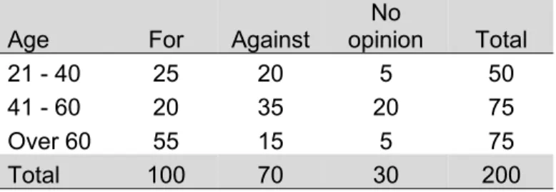
A public opinion survey explored the relationship between age and support for increasing the minimum wage. The results are summarized in the two-way table which can see bellow.
Table 2.2 Opinion for support for increasing the minimum wage by age
Age For Against
No
opinion Total
21 - 40 25 20 5 50
41 - 60 20 35 20 75
Over 60 55 15 5 75
Total 100 70 30 200
In the “21 to 40” age group, what percentage supports increasing the minimum wage?
A total of 50 people in the “21 to 40” age group were surveyed. Of those, 25 were for increasing the minimum wage. Thus, half of the respondents in the “21 to 40” age group (50%) supported increasing the minimum wage.
The Scattergrams
Used to study relationships between two variables. Scattergrams are used for bivariate numerical data. Bivariate data consists of paired observations taken from two numerical variables
Place one variable on the x-axis Place a second variable on the y-axis Place dot on pair coordinates
Types of Relationships
Linear: A straight line relationship between the two variables
Positive: When one variable goes up, the other variable goes up Negative: When one variable goes up, the other variable goes down
scores on the first exam also obtain low scores on the second exam? In other words, are scores on the first exam predictive of how students will perform on the second exam? Are the scores co-related to one another—hence, the term correlation.
Features scattergrams
Depending on how the cloud of points we can obtain the following information:
• To determine whether there is a direct or inverse relationship between the variables. • Whether the relationship is strong or weak.
• Determine if the ratio is set to a linear model or a different mathematical model (e.g. curvilinear model, etc).
Figure 2. 3: Different scatter plots and their respective regression models for them
Example
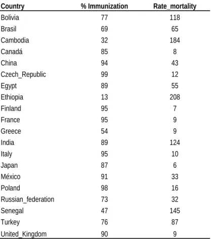
A study was conducted to find whether there is any relationship between the mortality rate and percentage of the immunization in some countries of the world. The following set of data was found in the page "http:// www.unicef.org/statistics/". Let us determine the coefficient of correlation for this set of data. The first column represents the countries and the second and third columns represent the % of immunization and mortality rate of each country.
Table 2.3: Mortality rate and % immunization by some countries in the world
Country % Immunization Rate_mortality
Bolivia 77 118
Brasil 69 65
Cambodia 32 184
Canadá 85 8
China 94 43
Czech_Republic 99 12
Egypt 89 55
Ethiopia 13 208
Finland 95 7
France 95 9
Greece 54 9
India 89 124
Italy 95 10
Japan 87 6
México 91 33
Poland 98 16
Russian_federation 73 32
Senegal 47 145
Turkey 76 87
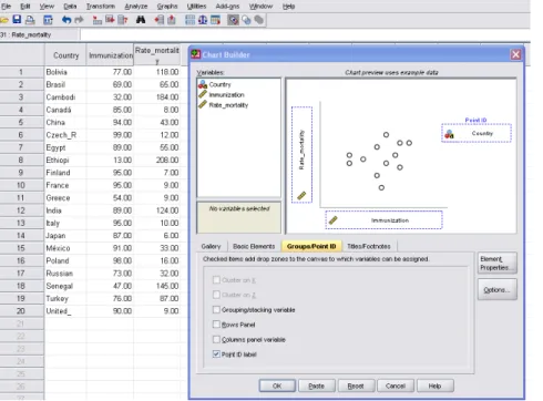
Steps in SPSS version 22 for draw Scatter diagram
Graphs>Chart builder>OK>front the variable box, take the variable immunization to “x-axis” and Rate_mortality to “y-axis” and click in Group Point ID> take the variable country to the Point ID>OK
Figure 2.4: Scatter diagram of the mortality rate by % immunization with regression line inserted in some countries in the world
It is always a good idea to start with a visual inspection of the data, since it will give you a hint about patterns and relationships and also about potential problems such as outliers. A visual inspection of the scatter plot shows a clear trend to higher immunization lower rate of mortality, i.e. a negative correlation between the two variables.
Correlation.
Correlation is a way of describing how two variables are related to one another simultaneously. Therefore, we will need to discuss the nature of bivariate distributions where we look at two variables simultaneously. We will discuss the use of z-scores as a starting point in understanding correlation. We will learn about the Pearson Product-Moment Correlation coefficient, how to compute it, and how to interpret it. Finally, we will look at correlation as a step in making predictions.
There are many times when we are interested in how two variables relate to one another. For example, are scores on the first examination in a course related to the scores on the second or subsequent examinations? Do students perform consistently on the course?
Types of Correlation
There are two important types of correlation. They are (1) Positive or Negative correlation and (2) Linear and Non Linear correlation.
Positive and Negative Correlation
If the values of the two variables deviate in the same direction i.e. if an increase (or decrease) in the values of one variable results, on an average, in a corresponding increase (or decrease) in the values of the other variable the correlation is said to be positive.
Some examples of series of positive correlation are:
You want to know if a relationship exists between school achievement and attendance. You collect the grade point average (GPA) and days present during the school year.
Heights and weights.
Amount of rainfall and yield of crops.
Ice cream sales and temperature (as temperature goes up, ice cream sales go up).
Correlation between two variables is said to be negative or inverse if the variables deviate in opposite direction. That is, if increase (or decrease) in the values of one variable results on an average, in corresponding decrease (or increase) in the values of other variable.
Some examples of series of negative correlation are:
TV viewing and class grades-students who spend more time watching TV tend to have lower grades (or phrased as students with higher grades tend to spend less time watching TV).
Imagine that you are conducting research on school performance. You want to know if a relationship exists between high school students' performance in school and video games. You collect the grade point average (GPA) and the weekly hours spent playing video games
Linear correlation coefficient (Pearson r)
To quantify the degree of linear relationship between two variables we use the correlation coefficient of Pearson (r). The 'r' is given by the following formula:
, also
r = coefficient of correlation n= number of pair of the data ∑x= the summation of the x score ∑y= the summation of the y score
∑xy= the summation of the crossproducts of the scores ∑x2= the summation of the squared scores on x
∑y2= the summation of the squared scores on y
values are between +/- 0.20 and +/- 0.60 would be moderate, and values greater than +/- 0.60 would be strong. Nevertheless, that these labels are arbitrary guidelines and will not be appropriate or useful in all possible research situation.
A Caveat
It must, however, be considered that there may be a third variable related to both of the variables being investigated, which is responsible for the apparent correlation. Correlation does not imply causation. Also, a nonlinear relationship may exist between two variables that would be inadequately described, or possibly even undetected, by the correlation coefficient.
Continue example from table 4.3; you are interested in showing the relationship between the mortality rate and the percentage of immunization with the countries under study.
Steps in SPSS for correlation
To obtain a quantitative measure of the degree of association between the two variables, Select Correlate Bivariate from the Analyze pull-down menu. In the dialogue box, move the two variables % immunization and rate mortality into the Variables frame. Make sure that Pearson is selected in the Correlation Coefficients frame and that Two-tailed is selected in the Test of Significance frame. Click OK. Take a look at the output table: What is the correlation between the two variables? Is it significant?
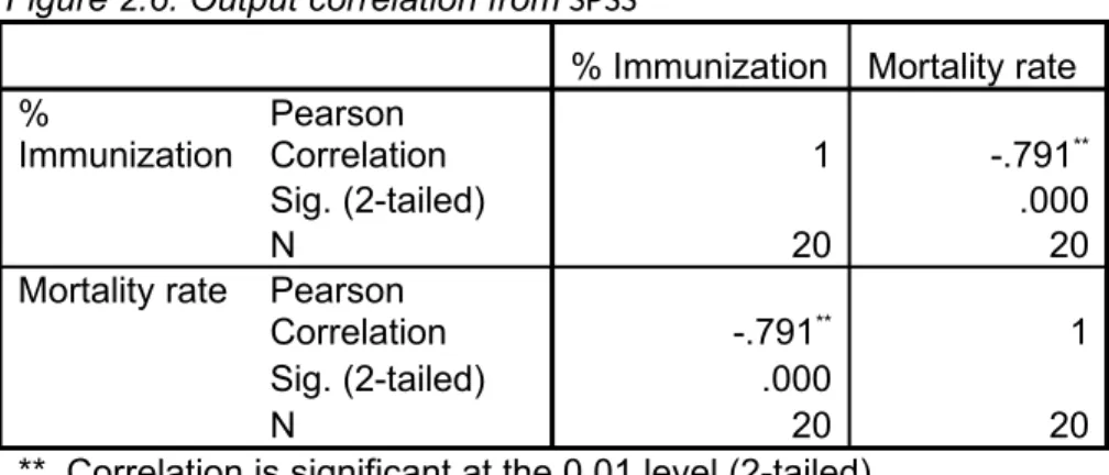
Output of SPSS
Figure 2.6: Output correlation from SPSS
% Immunization Mortality rate %
Immunization
Pearson
Correlation 1 -.791**
Sig. (2-tailed) .000
N 20 20
Mortality rate Pearson
Correlation -.791** 1
Sig. (2-tailed) .000
N 20 20
**. Correlation is significant at the 0.01 level (2-tailed).
Interpretation. The correlation output from SPSS is shown in above table, where we can see that the Pearson correlation coefficient for the two variables is r = -.791 **, this value indicates a strong, negative linear relationship between the variables. Furthermore, we see that it is high significant, with p < 0.001
Hypothesis test of correlation
Ho: (there is no association between mortality rate and the % of immunization by country) Ha: (There is an association between them)
Decision: We reject the Null Hypothesis given a significance of (Sig. .000)
Conclusion: r = - .791** There is a high inverse correlation between mortality rate and the % of immunization, i.e., higher % of immunization, the mortality rate was significantly decreased (Sig = .000).
Coefficient of Determination (Goodness of Fit) How well does this line fit the data?
Goodness of fit is measured by:
Coefficient of determination r2 = (r)2 x 100; and express your interpretation with percentage.
From the example above, the correlation coefficient r was (-0.791) so we have r2 = (-0.791)2 x 100 = 62.6% fit. This high value indicates that any predictions made about “y” from a value of “x” will be good.
The 'goodness of fit' indicates the rate of the variation in mortality rate which is accounted for by the variation of the % of immunization, in other hands 63% of the variance in mortality rate is explained by the % of immunization.
Regression Analysis
If two variables are significantly correlated, and if there is some theoretical basis for doing so, it is possible to predict values of one variable from the other. This observation leads to a very important concept known as ‘Regression Analysis’.
Regression Analysis, in general sense, means the estimation or prediction of the unknown value of one variable from the known value of the other variable. It is one of the most important statistical tools which are extensively used in almost all Sciences – Natural, Social and Physical. It is specially used in education and Psychology to study the relationship between two or more variables that are related.
Linear function
It is calleda linear function ofone variable,a function of the form:
Models of regression
Linear
Quadratic
Cubic
Logarithmic
Inverse
Power
Compound
Logistics
Exponential
Multiple linear
Simple linear Regression Model
Equation of Simple linear Regression Model
Suppose we have a sample of size ‘n’ and it has two sets of measures, denoted by ‘x’ and ‘y’. We can predict the values of ‘y’ given the values of ‘x’ by using the equation, called the REGRESSION EQUATION.
Where
Y= dependent variable
X= independent variable (predictor variable or explanatory variable) = Intercept (value of “Y” when “X”=0)
The coefficients and are given by:
,
Assumptions of the Regression Model (errors) 1. The errors are independent
2. Normality: The Error term has a normal probability distribution
3. Homoscedasticity: The errors have a constant variance. The variation around the regression line is constant for all values of x, no matter the value taken is high or low, in any case the variation is supposed to be the same.
4. Values are not correlated
Continue example 1:
We want to show the relationship between mortality and the percentage of immunization with the countries studied. The data are given in Table 2.3 of this chapter. Is there a significant linear relationship between two variables? Calculate the regression line of mortality based on the percentage of immunization. How much increases or decrease the mortality rate for each 1% of immunization? What rate of mortality could be predicted for the group of countries with 80% immunization?
Steps in SPSS for Regression. Analyze >Regression Linear> Figure 2.7. Steps for Regression Analysis
Figure 2.8: Output correlation from SPSS Model Summaryb
Model R R Square
Adjusted R Square
Std. Error of the
Estimate Durbin-Watson
1 .791a .626 .605 40.139 2.679
a. Predictors: (Constant), % Immunization
b. Dependent Variable: Mortality rate
Interpretation: The model summary table reports the strength of the relationship between the model and the dependent variable. “R=.791”, correlation coefficient, is the linear correlation between the observed and model-predicted values of the dependent variable. Its large value indicates a strong relationship.
R Square = .626, the coefficient of determination, is the squared value correlation coefficient. It shows that about 62.6% the variation in mortality is explained by the model.
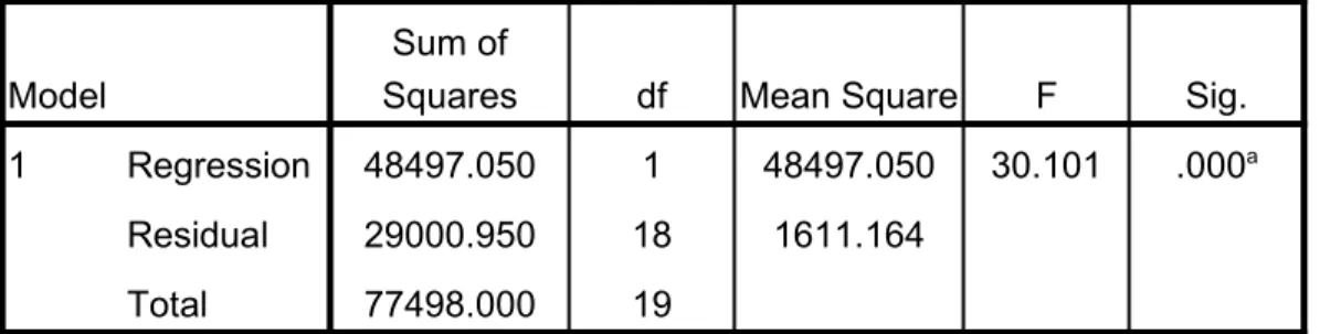
2. Checking the ANOVA of Regression
Figure 2.9: Output regression from SPSS. The ANOVA table tests the acceptability of the model from a statistical perspective.
ANOVAb
Model
Sum of
Squares df Mean Square F Sig.
1 Regression 48497.050 1 48497.050 30.101 .000a
Residual 29000.950 18 1611.164
Total 77498.000 19
a. Predictors: (Constant), % Immunization
b. Dependent Variable: Mortality rate
The Regression row displays information about the variation accounted for by your model.
The Residual row displays information about the variation that is not accounted for by your model.
The significance value of the F statistic is less than 0.05, which means that the variation explained by the model is not due to chance. In other words the p_value or Sig. associated with this F value is very small (.000). These values are used to answer the question “Do the independent variables reliably predict the dependent variable?
While the ANOVA table is a useful test of the model's ability to explain any variation in the dependent variable, it does not directly address the strength of that relationship. (r, and r2 given the strength of the relationship).
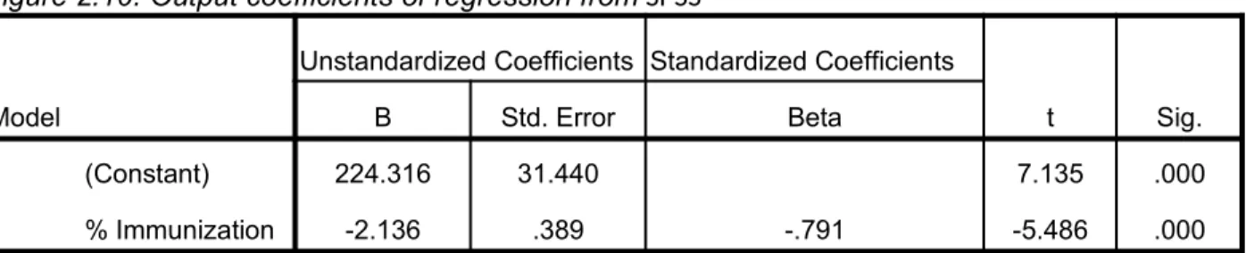
3. Checking the coefficients of the regression line (parameter estimates) This table shows the coefficients of the regression line:
The second, these are the values for the regression equation for predicting the dependent variable from the independent variable.
The regression equation can be presented in many different ways, for example:
Mortality predicted= 224.316 - 2.136* % of immunization
Figure 2.10: Output coefficients of regression from SPSS
Model
Unstandardized Coefficients Standardized Coefficients
t Sig. B Std. Error Beta
1 (Constant) 224.316 31.440 7.135 .000
% Immunization -2.136 .389 -.791 -5.486 .000
a. Dependent Variable: Mortality rate
= 224.316 average mortality rate without any influence of the % of immunization (constant source). = - 2.136 decreased mortality rate for each % of immunization as indicated nonzero correlation (slope of the line)
Prediction of Mortality Rate
What rate of mortality could be predicted for the group of countries with 80% immunization?
The best estimate of the mortality is obtained by substituting the value of 80% for that of the independent variable, x, and calculating the corresponding value of the Mortality.
Estimated Mortality:
Expected mortality would be 53 mortality rate.
In terms of hypothesis testing. Ho: = 0
Ha:
Making a decision and interpret the result: Sig.= .000 for % of immunization is less than .05, therefore reject null hypothesis. And we conclude to a confidence level of 95% that of the dependent variable values depend on the values of the independent variable, i.e. that the mortality rate depends on % immunization.
With these results we conclude:
1 º. The variables are associated or related linearly in the population from which the sample comes (with a very small chance that the relationship found is explained by chance, less than one per thousand).
2 °. Found that the relationship is very good (r = - .791), in fact that the independent variable (% of immunization) explained 62.6% ( ) the variability of the dependent variable (mortality).
3 º. That the relationship is inverse or negative, decreasing in average mortality rate 2,136 per % increase in immunization in the countries under study.
Basic assumptions of correlation and regression analysis
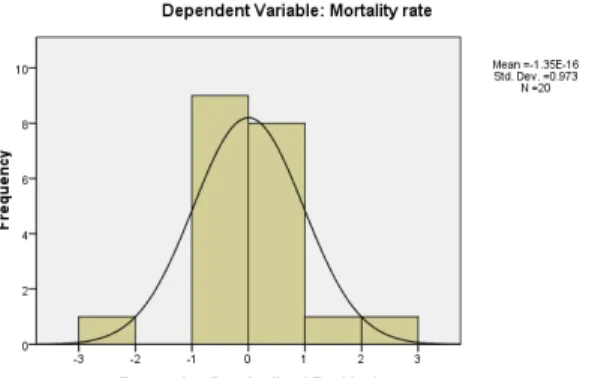
Normal distribution of residuals
A residual is the difference between the observed and model-predicted values of the dependent variable. The residual for a given product is the observed value of the error term for that product. A histogram or P-P plot of the residuals will help you to check the assumption of normality of the error term.
Checking the Normality of the Error Term
Figure 2.11: Output for assumption of correlation and regression analysis from SPSS
The shape of the histogram should approximately follow the shape of the normal curve. This histogram is acceptably close to the normal curve.
Checking Independence of the Error Term
We use the graph of standardized residuals
against estimates
typified. If the variance of the residuals is constant, the cloud of points would be concentrated in a band centered at zero and parallel to the x-axis. We note that there is no consistent pattern clearly defined in the data and the residuals fluctuate randomly around the line corresponding to the average of the same and "0" There is, otherwise, good scatter.
Homoscedasticity:
As for equality of variances, the chart above serves to test this assumption. If the variability of the waste along the predicted values is more or less constant, as is the case, we can conclude that if it satisfies the equality of variances. Not otherwise.
On the other hands we do not see any unusual patterns in this plot except the large negative outlier when the mortality rate is approximately 1; also we observe that the most countries are concentrated between -1 to 0
Checking Values are not correlated (Mullticolinearity)
Multicollinearity exists when independent variables in a regression equation are highly correlated among themselves
Figure 2.12.: Output of mullticolinearity by Durbin Watson from SPSS
Model Summaryb
Model R
R Square
Adjusted R Square
Std. Error of the Estimate
Durbin-Watson
1 .791a 0.626 0.605 40.139 2.679
a. Predictors: (Constant), % Immunization; b. Dependent Variable: Mortality rate
Spearman Correlation Coefficient Technique Measures Correlation Between Ranks
Corresponds to Pearson Product Moment Correlation Coefficient Values Range from -1 to +1
The technique is appropriate when the degree of association between two sets of ranks (pertaining to two variables) is to be examined.
• Illustrative research question(s) this technique can answer
Is there a significant relationship between Quality of Life and Percentage of New Residents
Procedure
1. Assign Ranks, Ri , to the Observations of Each Variable Separately 2. Calculate Differences, di , Between Each Pair of Ranks
3. Square Differences, di 2, Between Ranks 4. Sum Squared Differences for Each Variable 5. Use Shortcut Approximation Formula
di = the difference between the ith sample unit's ranks on the two variables n = the total sample size
Example: Quality of life
Five cities have been rated on an index that measures the quality of life. Also, the percentage of the population that has moved into each city over the past year has been determined. Have cities with higher quality of life scores attracted more new residents?
Table 2.4. Association between Quality of Life and Percentage of New Residents
City
Quality of life
Percentage of New Residents
A 25 14
B 10 3
E 20 15
F 12 4
G 17 12
H 28 16
I 35 20
J 42 25
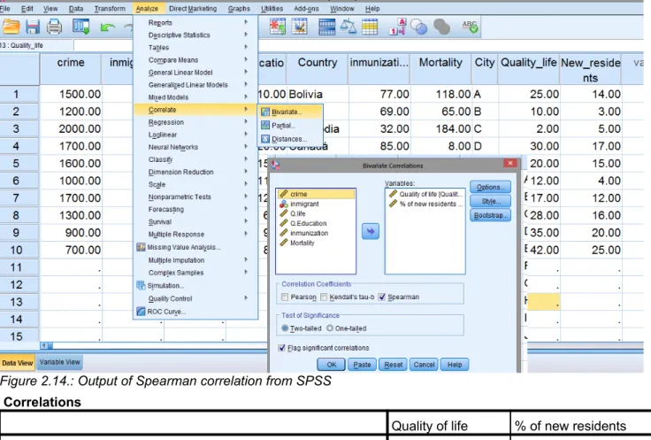
Figure 2.13. Steps in SPSS for Spearman Correlation
Analyze > Correlation > Bivariate > Pass the two variables > check on Spearman > OK
Figure 2.14.: Output of Spearman correlation from SPSS
Correlations
Quality of life % of new residents Spearman's rho Quality of life Correlation Coefficient 1.000 .952**
Sig. (2-tailed) . .000
N 10 10
% of new residents
Correlation Coefficient .952** 1.000
Sig. (2-tailed) .000 .
N 10 10
**. Correlation is significant at the 0.01 level (2-tailed).
Interpretation from outcome of SPSS
Note: Spearman’s rho is an index of the strength of association between the variables: it ranges from 0 (no association) to +/- 1.00 (perfect association). A perfect positive association (rs = +1.00) would exist if there were o disagreements in ranks between the two variables. A perfect negative relationship (rs = -1.00) would exist if the ranks were imperfect disagreement.
For testing Spearman’s Rho for significance, when the number of cases in the sample is 10 or more, the sampling distribution of Spearman’s rho approximates the t distribution, and we will use this distribution to conduct the test.
Example: Industrial Marketing Firm
An industrial marketing firm has been hiring all its salespeople from among the graduates of 10 business schools in the vicinity of its headquarters
The firm developed a subjective ranking of the perceived prestige levels of the 10 schools and the performance levels of the groups of graduates recruited from these schools
Question
What is the degree of association between the prestige levels of the schools and the sales performance levels of their graduates hired by this company?
Table 2.5. Association between Business School and Ranking of school's Prestige
Business Scholl Ranking of school's Prestige Ranking of performance of School's Graduates Difference Between Ranks Squared Difference
1 10 8 2 4
2 7 3 4 16
3 9 7 2 4
4 1 2 -1 1
5 6 9 -3 9
6 2 4 -2 4
7 3 5 -2 4
8 8 10 -2 4
9 5 6 -1 1
10 4 1 3 9
Sum= 56
Hypotheses
Spearman's rho=.661* Sig. (2-tailed) = .038
• Decision Rule:
– Since Sig. < 0.05 (Sig.=.038), we “Reject H0, and conclude that there is a true association between the prestige of business schools and the job performance of its graduates. In other words, the sample correlation of rs= 0.661 is unlikely to have occurred because of chance.
Figure 2.15. Output of Spearman correlation from SPSS
Correlations Ranking of school's Prestige Ranking of performance of School's Graduates
Sig. (2-tailed) . .038
N 10 10
Ranking of
performance of
School's Graduates
Correlation
Coefficient .661
* 1.000
Sig. (2-tailed) .038 .
N 10 10
*. Correlation is significant at the 0.05 level (2-tailed).
Review problems of chapter
Short answers
1. When studying the simultaneous response to two categorical variables, you should construct a: a. Histogram
b. Pie chart c. Scatter plot
d. Cross-classification table
2. In a cross-classification table, the number of rows and columns: a. Must always be the same
b. Must always be 2 c. Must add to 100% d. None of the above
Answer True or False:
3. A professor wants to study the relationship between the number of hours a student studied for an exam and the exam score achieved. The professor can use a scatterdiagrams_________
4. A professor wants to study the relationship between the number of hours a student studied for an exam and the exam score achieved. The professor can use a bar chart. _________
Fill the blank:
5. To evaluate two categorical variables at the same time ______________________________________ should be developed.
6. A _______________________________ chart should be used when you are studying a pattern between two numerical variables.
Problems
7. The children in a school are to have extra swimming lessons if they cannot swim. The table below gives information about the children in Years 7, 8 and 9.
Can swim Cannotswim
year 7 120 60
Year 8 168 11
Year 9 172 3
Construct Cluster Bar Chart and interpret
8. The children in a class conducted a survey to find out how many children had videos at home and how many had computers at home. Their results are given in the table below.
Video No video
Computer 8 2
No computer 20 3
Construct a Segmented or Stacked bar and interpret.
9. The following table show the number of students enrolled in three business majors for two different years at one small private university.
Student enrollment in three Business Majors, 2000 and 2005
Major 2000 2005
Finance 160 250
Marketing 140 200
Accounting 100 150
Construct Stacked bar and Cluster bar and compare both graph Short answers
10. The slope (B1) represents: a. Predict value of y when x=0 b. Change in Y per unit change in X c. Predict value of Y
d. Variation around the regression line
11. The Y intercept (B0) represents the: a. Predict value of y when x=0 b. Change in Y per unit change in X c. Predict value of Y
d. Variation around the regression line
12. The coefficient of determination (r2) tells you:
a. That the coefficient of correlation (r) is larger than 1 b. Whether the slope has any significance
c. Whether the regression sum of squares is greater than the total sum of squares d. The proportion of total variation that is explained
13. In performing a regression analysis involving two numerical variables, you assume: a. The variance of X and Y are equal
b. The variation around the line of regression is the same for each X value c. That X and Y are independent
d. All of the above
14. The residuals represent:
How many children did not have a video at home? And what is the percentage?
How many children had a computer at home? And what is the percentage? How many children had no home computer neither video? And what is the percentage?
c. The square root of the slope
d. The predicted value of y when X = 0
15. If the coefficient of correlation (r) = -1.00, then:
a. All the data points must fall exactly on a straight line with a slope that equal 1.00 b. All the data points must fall exactly on a straight line with a negative slope. c. All the data points must fall exactly on a straight line with a positive slope
d. All the data points must fall exactly on a horizontal straight line with a zero slope.
16. Assuming a straight line (linear) relationship between X and Y, if the coefficient of correlation (r) = -0.30:
a. There is no correlation b. The slope is negative
c. Variable X is larger than variable Y d. The variance of x is negative
17. In a simple linear regression model, the coefficient of correlation and the slope: a. May have opposite signs
b. Must have the same sign c. Must have opposite signs d. Are equal
18. Why does voter turnout vary from election to election? For municipal election in the five different cities, information has been gathered on the percent of registered voters who actually voted, unemployment rate, average years of education for the city, and the percentage of all political ads that used “negative campaigning” (personal attacks, negative portrayals of the opponent’s record, etc.).
For each relationship:
a. Draw and interpret a scatter gram and a freehand regression line b. Compute and interpret the coefficient of correlation
c. Compute and interpret the coefficient of determination d. Compute the line of regression
e. Predict the voter turnout for a city in which the unemployment rate was 12, a city in which the average years of schooling was 11, and an election in which 90% of the advertising were negative. f. Assume these cities are a random sample and conduct a test of significance for each relationship. g. Describe the strength and the direction of the relationships in a sentence or two. Which (if any)
relationships were significant? Which factor had the strongest effect on turnout?
TURNOUT AND EMPLOYMENT Answer: r = .950, r2 =90.3%,
City Turnout Unemployment rate ,
A 55 5
B 60 8
C 65 9
D 72 12
E 68 9
F 70 10
TURNOUT AND LEVEL OF EDUCATION
City Turnout Average years of school Answer: r = .941, r2 =88.6%,
A 55 11.9 ,
B 60 12.1
C 65 12.7
E 68 12.9
F 70 13.0
TURNOUT AND NEGATIVE CAMPAIGNING
City Turnout
% of Negative
Advertisements Answer: r =-.694, r2 =48.2%,
A 55 60 ,
B 60 63
C 65 55
D 72 53
E 68 60
F 70 48
19. For eleven cities, data has been gathered on total crime rate (major felonies per 100,000 populations) and the percentage of people who are new immigrants (arrived in Rwanda within the past five years). Are the variables related?
City
Total Crime
Rate
Percent Immigrant
s
A 1500 10
B 1200 8
C 2000 6
D 1700 11
E 1600 15
F 1000 16
G 1700 9
H 1300 12
I 900 10
J 700 15
K 500 17
a. Draw and interpret a scatter gram and a freehand regression line.
b. Compute and interpret the coefficient of correlation, Answer: r =-.665, Sig..026
c. Compute and interpret the coefficient of determination within the context of this problem, Answer: r2 =44.2%,
Compute the regression equation, Answer: ,
d. Compute a 95% prediction of percent immigrants, if the total crime rate decreases in 1100 per 100,000 of Population.
A 10 10
B 12 13
C 15 18
D 18 20
E 10 15
F 9 11
G 11 12
H 8 6
I 13 9
J 6 8