University of New Orleans University of New Orleans
ScholarWorks@UNO
ScholarWorks@UNO
University of New Orleans Theses and
Dissertations Dissertations and Theses
Spring 5-14-2014
Packaged Little Lives
Packaged Little Lives
Corbin R. Covher
University of New Orleans, [email protected]
Follow this and additional works at: https://scholarworks.uno.edu/td
Part of the Fine Arts Commons
Recommended Citation Recommended Citation
Covher, Corbin R., "Packaged Little Lives" (2014). University of New Orleans Theses and Dissertations. 1787.
https://scholarworks.uno.edu/td/1787
This Thesis is protected by copyright and/or related rights. It has been brought to you by ScholarWorks@UNO with permission from the rights-holder(s). You are free to use this Thesis in any way that is permitted by the copyright and related rights legislation that applies to your use. For other uses you need to obtain permission from the rights-holder(s) directly, unless additional rights are indicated by a Creative Commons license in the record and/or on the work itself.
Packaged Little Lives
A Thesis
Submitted to the Graduate Faculty of the University of New Orleans in partial fulfillment of the requirements for the degree of
Master of Fine Arts in
Fine Arts Sculpture
by
Corbin R.Wayne Covher
B.A. University of Illinois, 2003 M.A. Northwestern State of Louisiana, 2011
ii
Acknowledgement
I would like to express my sincere gratitude to the entire faculty and staff of the UNO
Department of Fine Arts, in particular the members of my thesis committee: Kathryn Rodriguez,
Tony Campbell, and my sponsor Aaron McNamee. Thanks to Cheryl Hayes and Richard
Johnson for passing on valuable teaching knowledge. I would like to extend an extra special
thanks to Christopher Saucedo for choosing me to come to UNO before he retired. It has been a
pleasure serving as his artist assistant and having him as a mentor. Thanks to all my fellow
graduate students for the camaraderie, patience and conversations. Thanks to Doyle Gertjejanson
for his time and help with the scholarship. Most importantly thanks to my beautiful fiancée
Natalie Olivia Webb for sticking by me through all the craziness of my process. I look forward to
iii
Table of Contents
List of Illustrations ... iv
Abstract ...v
Introduction ...1
Cardboard Is Allowed ...3
Experiments with Crayon and Foam...6
Color Replacement...12
Packaging ...17
Conceptual Ideas ...20
What We Leave Behind ...24
Conclusion ...29
Bibliography ...30
iv
List of Illustrations
Figure 1: environment ...4
Figure 2: box experiment 3 ...7
Figure 3: coliseum ...8
Figure 4: into the blue ...10
Figure 5: islands 5 and 6 ...14
Figure 6: flow and the sound of snow ...16
Figure 7: no flow, flow ...18
Figure 8: all around the art series...21
Figure 9: the origin of objects or the original urinal ...23
Figure 10: installation view ...25
Figure 11: formation ...26
v
Abstract
This document attempts to capture the main ideas and evolution of my art making process
during the three years of graduate studies at the University of New Orleans. My art making
practice is an ever-evolving exploration of materials and ideas. Through art processes and
experimentations I am able to overcome negative feelings about my role in society. I get lost in
my process making things, thinking about things, and trying to come up with new ideas for the
world. I am attempting to heighten mundane materials like cardboard, crayons, foams and
concrete with intuitive abstract shape making. I am trying to present materials to the viewers in a
way that is unusual and engaging. It is my hope that in doing so they might think about similar
things that I think about while making the objects.
1
Introduction
My work examines materials, experiments with them, and attempts to re-contextualize
them into fine art objects. I work to heighten the mundane. My work’s foundation is built on
tedious tasks, including processing detritus and low-brow materials. Most of my processes are
monotonous actions full of repetition, which allows my practice to become meditative. I love
getting lost in my process. I love knowing I made something, but feeling like I did not.
I have embraced a process that showcases an object’s construction method and the
textures of the materials it is created with. My work is inspired by Kurt Schwitters, Robert
Rauschenberg, and Jessica Stockholder; like them, I transform mundane materials and this
process becomes an inseparable part of the content. My work is inherently affected and inspired
by my surroundings and the choices I make for consumption. I have decided to remove my guilt
of consumerism by repurposing the materials that are left behind from it. It negates my guilt of
producing trash and trash produced by others. This is driven by a compulsive need to use the
intelligence I have developed with my hands. I am likewise compelled to save, sort, and process
materials that pique my creative interests. I see potential, shapes, and uses for packaging before I
transform it. Most people see a package they have been waiting for and only want what is inside.
Like a child I am more excited about the box. It is not just those boxes but food boxes, thin
cardboard used as protection during transport, and packing of all sorts. I am pulled towards
materials like bubble wrap, plastic packaging, and chunks of foam.
Experimenting is a constant part of my process. I have experimented in the ideas of
abstraction, Dada, and appropriation with mundane materials like cardboard, crayons and blue
foam. Where artists like Stockholder and Folkert De Jong seem to embrace the colorfulness of
2
I call “visual calamity.” Unnatural color relationships in the supermarket and the larger world
have become normal. I imagine post-apocalyptic scenarios that could happen because of the
things we are doing to the planet, and I try to call attention to this in my work.
The evolution of my material interest led to an interest in the origin of the ideas I was
dealing with. My relationship with color and packaging as a human, as a consumer, and as an
artist changed with the development of several art processes that I learned along the way.
Examining my relationship with color and its role in our society was paramount in my work. My
work became directly related to my own habits of art making, consumption, and resulting ideas. I
made interesting discoveries about nature’s adaptations to our waste along the way.
I work at representing humanity, our environment, and the substance that makes us
individuals with an intuitive art-making process. Each piece I create has a multitude of ideas
which I relate to the choices people make every day. Simple choices like brewing your own
coffee or buying it on the way to work could have profound implications if looked at on a bigger
scale. Some choices are not even consciously made but the implications still occur. Every action
has a reaction, these reactions affect others, and we are all interconnected. Textures and colors
are also used like metaphors for the interconnectedness of people as my work explores a more
permanent material, concrete. My struggle to control or remove the visual calamity became
easier as I let packaging material become one step removed from the final work of art. Residual
color left from a product box or the texture of bubble wrap I used to make a mold, might reflect
the choices of the consumer who originally bought the item with the box and bubble wrap. I
make connections among all kinds of things that impact my work that the viewers may never
learn. I invite the viewers not only to examine the nuances of the surface texture and construction
3
Cardboard Is Allowed
I began my thesis work by investigating my motivations and experimenting with making
art objects out of cardboard and found materials. My interest in cardboard started while studying
the origins of installation and learning of Kurt Schwitters’ Merzbau. I was enamored with a story
of a chair being pushed against the wall at one point and then becoming engulfed and ultimately
part of a piece. It was this story that allowed me to see past the walls of the art supply store for
the first time. Schwitters wrote, “Merz is about the total breakdown of inhibition. It means
creating relationships between everything in the world.”1 Schwitters’ Merz style of merging
ideas and media convinced me that there is something important in attempting to combine the
seemingly unrelated. In his work, Merz Picture 32A The Cherry Picture, Schwitters combined
items such as paper, cloth, wood, metal, cork, oil, pencil and ink on paperboard in a collage. He
was using trash and detritus to represent how that part of the world had been “trashed,” left war
torn and impoverished. Seeing his Merz series and especially the Merzbau got me interested in
using different materials like cardboard and found objects.
Schwitters worked in all kinds of media: sound, paint, print and more. He “was
responsible for legitimizing the use of rubbish in art for generations of artists, from Robert
Rauschenberg and Jasper Johns to Rachel Whiteread and Damien Hirst.”2 Rauschenberg, in his
piece Monogram from the Combines series, used items found on the street such as taxidermy, a
tire, and other bits of debris and trash to bridge the gap between life and art, and to blur the lines
1
Kurt Schwitters, quoted in Mark Hudson, “Kurt Schwitters, Inspiration of Pop Art,” Telegraph, January 27, 2013, accessed January 12, 2014, http://www.telegraph.co.uk/culture/art/art-features/9810512/Kurt-Schwitters-inspiration-of-Pop-Art.html
2
4
between painting and sculpture.3 Both Schwitters and Rauschenberg recontextualized other
people’s trash into art and showed me that no materials are off the table. A world of untapped,
seemingly useless materials was steadily making its way into my thoughts. Ultimately,
Schwitters’ use of cardboard inspired and allowed me to begin an investigation of mundane
materials.
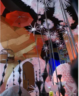
Figure 1, environment, 2011, mixed media installation
My first idea about cardboard was to exploit the similarity that crumpled cardboard has
with the texture of a rock. Schwitters’ Merzbau was an experiment in combining art and
architecture, resulting in what I think resembles a geometric cave-like interior. This installation
3
5
was a great inspiration for me to make large imitation rock forms. In the show “Symbiosis and
Textures 2011,” I used large cardboard groundforms to break up a long narrow gallery space into
four distinct sections. In section three, environment (Figure 1), I used large cardboard shapes to
refer to rock formations, since I was thinking about our relationship as evolving beings that once
emerged from caves. The installation was made almost entirely out of found objects and things
bound for a landfill. The piece environment was about how we are impacting our environment,
and the design made viewers literally impact the work. Viewers were forced to leave footprints
and evidence of traversing through shredded paper, soil and sand if they wanted to enter the
room. If viewers did not notice their impact as it happened, over time it became more evident
and subsequent viewers certainly noticed that footprints and damage had accumulated. This
piece represents my understanding of individual responsibility. It is easy to participate in small
6
Experiments with Crayon and Foam
Once cardboard made its way into my work, I started experimenting with all kinds of
materials that I would not regularly use for art. I was working with a hot glue gun, which is the
adhesive method I prefer for cardboard construction, when I happened to have some crayons
near me. A Dadaist sensibility toward material curiosity led me to discover that crayons fit
through the hot glue gun. I had previously been working on installation, large cardboard forms
and interdependent elements that collectively addressed the whole room. Wanting a change from
working large, I began to work assembling pieces of cardboard, plastic packaging, and bits of
wood for small wall-hanging pieces. I put together little compositions and added bits of crayon
drips and color swatches for interest. I felt these works related back to the Merz series again in
that the works were assembled with detritus from around me. In box experiment number 3
(Figure 2), I was thinking about Schwitters’ placement of the cherries in the center of Merz
Picture 32A The Cherry Picture as a gesture to create interest.4I was trying to develop new ways
of working abstractly and I attribute the use of crayon in boxexperiment number 3 to Schwitters’
cherry gesture. Unable to escape the drive that consumer guilt has on my work, I wanted to focus
on a coherent body of work. Dabbling in crayon drips as an ingredient in box experiment 3 led
me to the idea of creating a series of crayon works, moving away from consumerism, and
focusing on abstraction and the material’s potential uses.
Pushing crayons through the glue gun allowed me to draw or pool melted crayon,
spawning an entire series exploiting its properties. Seeking an emotional sabbatical from my
consumer guilt I allowed myself to explore different methods while developing this body of
work. I focused my attention on crayons as a material, searching for an appropriate surface on
4
7
which to work. I narrowed down the perfect substrate material to urethane foams. Melted
crayons tended to bond with foams, which was unlike using canvas, wood, and metal, where they
tended to delaminate. After burning out twenty-something glue guns, which usually ended in
some sort of sizzle, pop, fire, I adapted my process. I tried everything, but ultimately I settled
into using small pots for melting large amounts of crayon and liquid candles for controlling drips
and details. Working intuitively with a medium that lends itself to the nature of the drip, I was
inspired to gain a better understanding of the Abstract Expressionists, especially Jackson
Pollock.
Figure 2, box experiment 3, 2012, mixed media
As I began to study the Abstract Expressionists, I quickly latched onto some ideas of
Clement Greenberg and was later influenced by the sculptures of David Smith. The “all-over”
two-8
dimensional nature of paint on canvas.5 He believed that the best art exploits the properties
individual to each material.6 I was disinterested in the “all-over” compositions and flat nature of
Pollock’s paint. Crayon drips have a more three-dimensional quality than paint. As paint dries, a
drip shrinks some, but a crayon drip cools and solidifies faster, retaining more of its shape. I
found crayons’ best properties to be pooling or dripping color. I developed a process limited to
crayon and blue foam for a series of thirty-three pieces. The crayon series consists of works
trying to get at the quintessential attributes of the material through abstract composition.
Figure 3, coliseum 2012, crayon on blue foam
5
Clement Greenberg, “Modernist Painting,” accessed January 13, 2014,
http://web.archive.org/web/20060105194921/http://www.sharecom.ca/greenberg/modernism.html 6
9
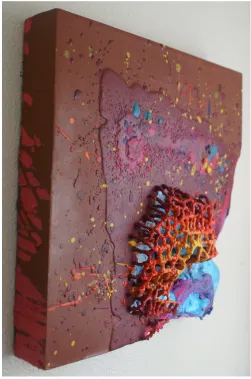
Experimenting with crayon properties, I found I was able to control crayons well enough
to build structures drip by drip. Allowing individual drips to painstakingly solidify one on top of
the other, I was able to build small structures of crayon without armatures. In Figure 3, the piece
coliseum is 12”x12,” consisting of crayon on blue foam. It is the climactic piece of the series.
The lower right hand corner of the blue foam was melted inward toward a field of primarily red
drips. At the threshold of the two colors, a crayon structure protrudes from the substrate over an
inch. I was able to blur the lines between painting and sculpture, breaking the picture plane by
building material outward. I believe I have adhered to Greenberg’s sensibilities toward
exploiting the material properties of crayons and blue foam. Focusing on crayons and blue foam
as a material allowed me to escape consumerism until a coincidence of process led me back to
ideas of responsibility. I did not mean to burn the foam during my process with the crayons,
similarly consumers do not mean to be ruining the planet with their small decisions, but they are.
My experimentation with different heat sources while creating the crayon series led me to
accidently burn into the substrate of blue foam in coliseum. The light pastel blue of the foam
richened into a bright brilliant sky blue as it contracted away from the flame and became harder,
with a shiny plastic quality to it. This experience proved to me that even when I try to ignore my
consumer guilt and focus on formal beauty that I may still experience guilt from the toxicity I
might release.
This attribute of the blue foam led me to burning foam on purpose in the piece, into the
blue (Figure 4). I used a liquid candle and time after time let the flame gouge into the blue foam
until a 4’x8’ sheet was covered in the repetitive convex texture. I found the little flame of the
candle made a nice round indentation if the foam was burned from underneath. The texture I
10
realized that in burning the foam in this way I was directly contributing to greenhouse gasses and
therefore the glaciers melting. I felt bad about the process I had developed for this piece due to
the toxic nature of burning foam. I decided to research artists who also use foam, hoping to find
justification for my actions.
Figure 4, into the blue, 2013, blue foam
I came across an interview with Folkert De Jong, an artist who works in a myriad of toxic
materials, foam included. When he was questioned about the darkness of his materials and
subject matter, he responded, “By bringing up evil, or to recall evil, I’m trying in a way to bring
those negative energies together and to contain them and to give them personality so they’re safe
and we can recognize them.”7 De Jong presents figures dealing with themes of horror, politics
and war made with toxic materials. His work draws attention to our actions through history and
storytelling. His medium is part of the story of us all. Similarly, I want my work to help tell a
7
11
story of the world of possibilities found in materials people are around every day. History shows
us that we as a people can be comfortably ignorant to dangerous materials. I hope my work
12
Color Replacement
I love the way Jessica Stockholder uses color. She appropriates new and found objects for
their colors and shapes. She acquires objects, paints on them, and assembles them in a way that
makes them part of something larger. She often creates installations that manipulate the color
and interaction of the objects in a room. Stockholder’s Table Top series manipulates objects’
shapes and colors to become groupings. In several of her object groupings she includes chairs,
which I relate to Schwitters’ chair story. Where Stockholder embraces the colorfulness of
plastics and society as part of a playful palette, I view the collision of color seen in our cities and
especially in our supermarkets as “visual calamity.”
Supermarkets now present us with large areas of concentrated color. That complexity of
color down every aisle gives me a sense of overstimulation and anxiety. Systematically,
supermarkets are wonderful; they are organized and efficient means of getting a lot of food to a
lot of people. In my understanding, humans evolved from a hunter-gatherer society, so did our
corresponding relationship with colors and food. Certain colors trigger certain wants, and this
contributes to peoples’ behaviors as consumers. Each brand in a supermarket is individually
competing for our attention with all of the influence that color can provide. This war within the
aisles is the best example of what I call “visual calamity.” Everything in the store is individually
calling for our attention, saying, “Pick me! Pick me!” like a piece of ripe fruit. Our instinctive
relationship with color and corresponding foods evolved as our means of obtaining food
changed. “Visual calamity” is not confined to market shelving, however; branding of these
products and more exists all over our unnatural landscape. Our human habitat is covered with
ads trying to lure in consumers. Video billboards are popping up on taxi cabs and around cities.
13
a future not too far down the road when monitor technology becomes cheap enough and flat
enough for a greeting card. I fear visual calamity and how far it will reach in the future. If and
when that technology threshold happens, I can imagine food boxes having moving videos of
their characters on every box, down every aisle.
The theory of evolution is impactful on my art. People who lived in caves and chased
food changed slowly over time into organized societies who control the production of their food
instead. I imagine settlers’ finding an ideal place to live was about the availability of resources. It
was important to find a place with fresh water, an abundance of food, and enough resources to
create shelter and maintain some comforts. Small settlements formed and grew into cities. More
and more people moved to those areas enjoying the positive fruitful existence with like-minded
people trying to find their niche. A color relationship once attributed to hunting and gathering
became replaced with bartering and commerce. Colors that used to attract us to food sources
were now being used to sell us things. The food sources that once drew people to an area were
pushed outward, replacing natural growth with artificial materials and colors. Humankind’s
structures have evolved from huts, teepees and other natural shelters into an array of relatively
box-shaped structures. Glass, steel, and concrete buildings line the concrete streets of our cities.
Appropriately nicknamed concrete jungles, cities replaced the natural relationship between
human beings and their food. The more people gathered, the further out they pushed their food
sources, effectively creating food deserts in what used to be the best areas. These areas where
cities have formed are where the most unnatural color is concentrated. I began to think of cities
as islands of unnatural color, cancerous growths on the skin of the earth. The further I travel
14
undesirable separation from nature living in the city. I believe this non-natural way of life is
counterproductive to society.
.
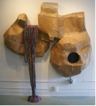
Figure 5, islands 5 and 6, 2013, cardboard packaging and milk jugs
I was experimenting with negating the “visual calamity” of the colorful package design
by dissecting boxes and turning them inside out. I wanted to get away from making squares and
rectangles, the fundamental forms of product boxes, big box stores, and billboards, the major
contributors to “visual calamity.” In the islands series, I created undulating imitation rock forms
for the wall in an attempt to transform what I perceive as negative. To me, the brown, more
organic colored side of the box is far more appealing, and refers to simpler more nutritious times.
15
has an element of flora that refers to the earth’s evolutionary response to human waste. Island 5,
the one on the right in figure 5, is topped with a mushroom made out of a Swiffer box. The
inherent properties of one-sided corrugation lent itself to being perfect for the gills of the
mushroom. While making the mushroom, I was thinking about the discovery of the fungus,
Pestalotiopsis microspora, which can extract sustenance from plastics.8 The plastic plant on the
left island signifies a kind of bacteria in the genus Vibrio, which scientists discovered in the
ocean and which has also begun to break down plastic debris.9 Both sculptural floras signify the
apparent truth of evolution: organisms have evolved to consume humans’ plastic waste. This
gives me hope that evolution and adaptation might be able to overcome the damage humans are
inflicting on the planet.
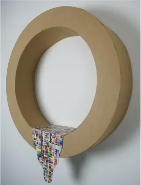
In the piece, flow and the sound of snow (Figure 6), I once again experimented with
combining ideas. Turning food boxes inside out, I made a large piece similar to the islands
series. The neutral brown interior of the food box is parted on the upper left side by a colorful
palette of melted crayons that seemingly flows from the wall to the floor, frozen in motion. I
experimented with the drip and gravity, allowing chance to affect the outcome. The flow of
crayons is meant to be a visual metaphor for the supermarket enabling the colorful flow of food
products. The “crayonfalls” is further complemented with a porthole in the cardboard on the
right leading to a television. The TV cycles between off (with a black screen) and on (with
nothing but television snow), creating a repeating pattern of black and white. The TV snow with
its classic shhhhh-ing ad-free sound parallels the frozen colorful flow of crayons, almost
sounding like the white noise of a waterfall. I hoped that the viewers would imagine the
“crayonfalls” in motion when accented by the sound of the snow. In this piece, negating the color
8
“Biodegradation of Polyester Polyurethane by Endophytic Fungi,” Published July15, 2011, http://aem.asm.org/content/early/2011/07/15/AEM.00521-11.full.pdf
9
16
of my packaging and then re-applying color with crayons became directly about filtering the
“visual calamity.” I am attempting to act like a filter by taking this aspect of society I do not like
and re-presenting it to the viewer in way that is less offensive to me. The colorful flow of the
falls represents the flow of “visual calamity.” The television represents technology. The
cardboard represents nature. I am juxtaposing these opposing forces and trying to balance them.
Figure 6, flow and the sound of snow, 2013, mixed media
17
Packaging
I became obsessed with saving my own packaging and interrupting its lifecycle’s known
outcome. Packaging is made to be temporary and disposable. It is meant to protect products from
the time they leave their place of origin until they reach the consumer. By choosing to create
something new with my packaging I hope to give my materials new life. I give my packaging the
chance to exist outside of the realm it was made for. I have developed a complex system of
caring for my packaging, sorting and dissecting my materials in a manner similar to a
hunter-gatherer behavior. I process most of my packaging back into a material state, one step removed
from the objects they once were. This action of transforming my trash makes me feel better
about my participation in the consumer cycle. I feel that packaging is freed from the shape and
ideas it once contained when it is reduced back to a material state.
I make distinctions and categories as far as keeping recyclables and trash, always with
some idea in mind. Growing up, there was about a five- to ten-year period where my divorced
father hit a rough patch. He became best friends with a bum. He dumpster dove all the time and
he became a hoarder, living in his used car dealership. My sister and I grew to expect horrible
conditions for out-of-state visits, as well as weird gifts for presents and repurposed greeting
cards. Very aware that we inherit and learn traits of our parents, I set limitations on what I allow
myself to keep.
Cardboard has become a staple of my work. My first step is dissecting and sorting, which
I have reduced to an assembly line process. I remove precious test patterns and other graphic
language and separate them. Then, the bulk of the box is processed depending on its intended
18
process reminds me of watching my grandfather clean fish when I was a child. He chopped them
up and sorted the parts according to importance: meat, edible organs, and the rest.
I work intuitively with the cardboard building and color application. Brown
non-corrugated packaging, like inside-out cereal boxes, makes up the majority of my cardboard
object’s surface texture. I typically use corrugated cardboard to build armature-like structures
and texture accents. I only use white cardboard boxes when color is needed, or for their test
patterns. I collect all of the test patterns that I can.
19
Test patterns are the little swatch of color on product boxes that a machine uses to check
color correctness for printing. It is the sum of all of the color science and the work that goes into
each package’s color. I started to think of test patterns as the sum of “visual calamity.” In the
piece no flow, flow (figure 7), the phrase “no flow”in the title refers to the pipe shape, negating
the visual calamity of the product boxes it is constructed with. This aspect is contrasted with the
“flow”part of the title, a symbolic shape of pouring liquid that showcases a year of saving test
patterns. I have begun to think of crayons and test patterns as interchangeable materials of color.
I think of all the industries that are using color influence to sell us things, and I try to sum that up
20
Conceptual Ideas
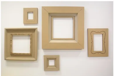
After experimenting in making cardboard shapes, I began to wonder what else I could do
with cardboard. I began to simplify, and think a little more conceptually. I began to question the
packaging of art, beyond bubble wrap and cardboard as a material. I thought of the frame as a
sort of package for art. Frames often help draw our attention to an artwork, like color does for
our food products. In the beginning, frames functioned as a transition from the wall to the
artwork, easing the viewer’s understanding of where the piece of art began. Painters used to
make their own specifically elaborate frames for each painting until the conventions of painting
evolved past needing them.
I spent a year and a half in Florida as the Production Manager of a photographer’s custom
frame shop and gallery. Understanding the specialized industry, I thought of making a horrible
painting and putting it in an elaborate cardboard frame. Then I discarded the painting idea
altogether. I became interested in the idea of making an art piece concerning the frame as
disposable packaging. I made a series of empty cardboard frames loosely based on the general
shapes that frames take. I used cardboard’s different textures and shapes to imitate the scallops
and beading of traditional frames.
After creating several empty frames, I was reminded of Allan McCollum’s conceptual
series, Surrogates. In an article about McCollum’s Surrogates, Trevor Starke perfectly describes
the relationship of the “surrogate” to painting:
The surrogate fulfills the task of painting: it facilitates aesthetic engagement and economic exchange, produces discourse, and takes up space on the wall. It does all the things that a painting should do. But it is not a painting. It is a fraud, a fake, a stand-in.10
10
21
I think that the cardboard frames in my all around the art series (Figure 8) also fulfill the
tasks of painting. The empty cardboard frames have more of an artist’s hand involved than
Surrogates, with a Dada sensibility toward the nonsensical.
Figure 8, all around the art, 2013, cardboard
The Dada-ish absurdity of cardboard frames led me to the realization that the bulk of my
materials for the past several years of art making have been low brow, detritus or mundane
objects that I reuse in some way to make art objects. My work is influenced by a number of
found object and appropriation artists like Robert Rauschenberg, Jasper Johns and Jessica
Stockholder, who in turn were influenced by Duchamp. Duchamp’s Fountain was the original
appropriated art piece. How does one follow an idea like Fountain? I had a funny thought:
“Duchamp’s urinal was the original object of appropriation, but trees were the original urinals.”
As a boy growing up in Illinois, I learned a Boy Scout’s rhyme while camping, “Find a tree when
you have to pee; find a bush to use your tush.” With that funny thought, I set out to make a funny
22
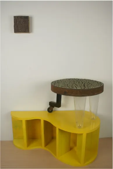
Trees are where cardboard comes from, and they are one of the first places I learned to
pee. Understanding it would be difficult to try to get a viewer to connect bark texture to
Duchamp’s Fountain, even with a witty title, I set out to make a funny piece about it anyway.
After all, Duchamp’s Fountain is about taking a conceptual leap. I first molded a live oak tree, an
emblem of Louisiana, with latex to get the texture of bark. This tree texture was the foundation
for the artwork. The final piece consists of three parts. An inverted cardboard box was faced with
brown- and black-colored hot glue, resembling an uncanny bark texture. This small box hung on
the wall like a canvas. The second part, a small table, had a top made of concrete with the same
texture. It had two clear plastic legs appropriated from five gallon sweet tea containers that were
cast into the concrete of the table top inspired by Rauschenberg. The third steel leg I chose to end
with a wheel as a tribute to the use of the wheel in Duchamp’s readymades. The wheel in my
piece remained functional as a table leg. The table sat on an unusual pedestal pushed against the
wall. The pedestal shape was inspired by the area under the bridge where one is likely to see a
bum peeing. The shape is also based on the shape that urine might make pooling against the wall.
It was painted yellow and made of scrap wood and backed with yellow Cheerios boxes, because
eating Cheerios makes urine smell funny. In Figure 9 is the piece I titled, the origin of objects or
the original urinal. I made a joke with a piece of art that no one really seemed to understand
without a long explanation. I made a piece that dealt with the placement of art, simultaneously
existing on the wall, floor, and pedestal. The part of the piece on the wall inverted a material
relationship, making glue a surface material. The little table had a concrete, bark-textured top,
making it function less like a table, and it was presented on a pedestal. The table was also one of
my first experiments with concrete. The success of the concrete taking the bark texture led me to
23
24
What We Leave Behind
Thinking about time passing and the evolution of my process, I realized how quickly the
things I have been making would perish if they were not cherished and protected like an art
object. I began to wonder if artworks made of concrete could carry the same artistic language I
developed by experimenting with cardboard. I introduced concrete to my experimentations as a
means to find a more permanent material. I found that through reinforcing cardboard molds, I
could not only translate my freeform cardboard building techniques more permanently, but I also
had other great results. Trying to build intuitive abstract shapes, I want the viewer instantly
engaged in shape determination, like finding shapes in clouds. Upon further discovery a world of
texture begins to exist like an imaginary landscape. All the nuances of the different cardboard
textures and shapes transferred into the final object. When molds were made with the product
faces of boxes on the inside of the mold, unpredictable color transfers ended up in some areas of
the concrete surface.
I created a small installation in a classroom for a critique, working with and around the
first batch of cast concrete pieces. I was experimenting with concrete shapes on and off the
pedestal, trying to make the pedestal part of something without changing its shape. I imagined
pedestals emerging from larger shapes crowned with miniature monuments. I created an
installation with mostly cardboard, thinking of all the trees that are cut down every year for
various paper consumptions. I placed concrete stump shapes atop pedestals wrapped in brown
paper as remembrance to the trees that were cut down. The concrete shapes, though a more
permanent material, are formed with cardboard molds having the same connection to trees, one
step removed. Figure 10 shows an installation view of the classroom. stump 3 sits on the front
pedestal and stump 1 on the rear one. The concrete pieces were well received, although I did find
25
and spoiled the mystery. I found viewers like the abstract concrete shapes better when it is harder
to discern how they were made.
Figure 10, stump, concrete, brown paper, and cardboard
Concrete, a material invented by the Romans and first used to ‘glue’ blocks of stone
together, revolutionized construction.11 Prior to concrete’s invention, stone construction was all
dry-fit and was hardly airtight or watertight. It allowed Romans to build aqueducts that supplied
the world’s first super city with enough water for bathhouses, pools, fountains, and restrooms.12
Humans have invented many uses for it since then. I have noticed that recently, construction here
in New Orleans is done primarily with I-beam or reinforced concrete construction methods used
for the structure of large buildings. Concrete is the first thing to go into new construction and the
last thing to come out of demolition. It is regularly seen and unavoidable in urban areas.
11
“Mankind The Story of Us All,” http://www.amazon.com/gp/product/B00AD07GM2/ref=dv_dp_ep3, accessed February 2, 2014.
12
26
I wondered if I could create shapes with concrete that resonate with the power of a
naturally occurring object. For me, stones with holes are one example of this. One of my most
prized possessions is a yellowish stone with a naturally worn hole in it. I often think of the
formation of rock from volcanic vents in the ocean and imagine what buildings would look like
if we could pipe and form them out of molten rock. In the piece, formation (figure 11), all those
thoughts poured into the creation of an abstract concrete form. I was thinking of these things as I
used a glue gun to make the cardboard mold.
Figure 11, formation, 2014, concrete
I found Andy Goldsworthy somehow inspiring for these new concrete works. His ability
to create powerful objects with just nature, his hands, and a pocket knife is admirable.
27
piece, resulting in something viewers really pay attention to. I thought maybe by imitating nature
with unnatural materials I could eventually evoke a sense of importance that people respect,
similar to a Goldsworthy piece.
I first saw Jason de Caires Taylor, a sculptor and underwater photographer, featured in a
large online photo spread covering his underwater sculptures in National Geographic in 2010.
Taylor’s underwater sculptures are inspiring because they coexist with nature and facilitate
growth.
Jason deCaires Taylor is an internationally acclaimed eco-sculptor who creates underwater living sculptures, offering viewers mysterious, ephemeral encounters and fleeting glimmers of another world where art develops from the effects of nature on the efforts of man. His site-specific, permanent installations are
designed to act as artificial reefs, attracting corals, increasing marine biomass and aggregating fish species, while crucially diverting tourists away from fragile natural reefs and thus providing space for natural rejuvenation. Subject to the abstract metamorphosis of the underwater environment, his works symbolize a striking symbiosis between man and nature, balancing messages of hope and loss.13
In The Silent Evolution, Taylor placed hundreds of sculptures on the ocean floor off the
coast of Mexico.14 Consisting of mostly life-sized people standing around in a crowd, the
sculptures only get more interesting over time, as life grows and the details become obscured.
I set out to transform mundane materials into a series of abstract works, elevating them
from the “visual calamity,” into the art world. Building cardboard molds to fill with concrete I
thought of making larger sculptures that take up space in a room like people. Thinking about
what McCollum did with Surrogates, I wanted to make sculptural metaphors about people.
People are the source of visual calamity, the accumulation of trash, and waste in the world. I
13
James Buxton, “Jason de Caires Taylor,” overview, http://www.underwatersculpture.com/about/overview/ accessed February 2, 2014
14
28
began to think of the ingredients and differences in each sculpture as metaphors for the
differences in people and the choices they make. I wanted to reduce my palette of material,
centering on concrete as the final object with evidence of color and other materials in the surface
texture, but one step removed. The concrete sculptures become a more permanent record of
mundane materials used in my time. Figure 12 is a view of three sculptures interacting together. I
think of them as people needing to interact together, like Stockholder’s objects do. I have been
assigning them names like truck driver and optometrist based on funny ideas I have about each
one’s shape and ingredients. They represent individuals just trying to make it in the world.
29
Conclusion
I get lost in my process making things, thinking about things, and trying to come up with
new ideas for the world. I act like a filter, attempting to transform materials that participate in the
“visual calamity” and negativity that I perceive in the world. I explore shape-making and
heightening the mundane while trying to perpetuate the ideas contained in sculpture. I have
explored a selection of mundane materials, including cardboard, plastic, crayons, foams and
concrete. In the end, I think of the fragility and adaptability of life, the differences and
similarities between people, and the use of art in metaphorically representing those relationships.
Cities popping up and spreading out slowly consume the face of the planet. The biggest
thing that plagues me in our society today is garbage. Although awareness of how much
individuals actually participate in producing this garbage is low, the cycle of destruction is well
under way on our planet. I push my art toward inspiring awareness of this garbage and the
materials in our daily surroundings. I see a cycle that ends in a negative way as a burden: piles of
trash with no forethought of what to do with them. I make art with them, transforming them into
imitations of nature and metaphors about people and our environment. Even if viewers do not
know it; they are affected by what they see. It is my hope that in seeing the controlled color and
abstract shapes of my work, viewers will walk away with positivity and let any awareness settle
30
Bibliography
"Allan McCollum | Plaster Surrogates." Allan McCollum | Plaster Surrogates. N.p., n.d. Web. 14 Mar. 2014.
"Art Sales: Kurt Schwitters' Material World." The Telegraph. Telegraph Media Group, 28 June 0022. Web. 30 Nov. 2013.
Batchelor, David. Chromophobia. London: Reaktion, 2000. Print. 12, 23, 25
“Biodegradation of Polyester Polyurethane by Endophytic Fungi,” Published July15, 2011, http://aem.asm.org/content/early/2011/07/15/AEM.00521-11.full.pdf
Buxton, James, “Jason de Caires Taylor,” overview, accessed February 2, 2014 http://www.underwatersculpture.com/about/overview/
De Jong, Folkert, “Folkert De Jong,” Uploaded November 14, 2008, https://www.youtube.com/watch?v=SYqcA_CqgR0
"FOLKERT DE JONG." YouTube Interview. YouTube, 14 Nov. 2008. Web. 30 Nov. 2013.
Gleadell, Colin, “Art Sales: Kurt Schwitters’ Material World,” Telegraph, January 22, 2013, accessed January 12, 2014, http://www.telegraph.co.uk/culture/art/artsales/9816335/Art-sales-Kurt-Schwitters-material-world.html
Goldstein, E. Bruce. Blackwell Handbook of Perception. Oxford, UK: Blackwell, 2001. Print. 55, 63
Greenberg, Clement, “Modernist Painting,” accessed January 13, 2014,
http://web.archive.org/web/20060105194921/http://www.sharecom.ca/greenberg/modernism.htm
Kuehni, Rolf G. Color: An Introduction to Practice and Principles. Hoboken: J. Wiley & Sons, 2005. Print.
4, 17, 19, 147
"Kurt Schwitters, Inspiration of Pop Art." The Telegraph. Telegraph Media Group, 28 July 0027. Web. 30 Nov. 2013.
“Mankind The Story of Us All,” accessed February 2, 2014.
http://www.amazon.com/gp/product/B00AD07GM2/ref=dv_dp_ep3
31
Schwitters, Kurt, quoted in Mark Hudson, “Kurt Schwitters, Inspiration of Pop Art,” Telegraph,
January 27, 2013, accessed January 12, 2014, http://www.telegraph.co.uk/culture/art/art-features/9810512/Kurt-Schwitters-inspiration-of-Pop-Art.html
Smith, Kiki, “MoMA Highlights: 350 Works from The Museum of Modern Art, New York: Revised Edition 2004,” p. 115
Simon, Hilda. Color in Reproduction: Theory and Techniques for Artists and Designers. New York: Viking, 1980. Print.
82, 93, 114
32
Vita
The author was born in Phoenix, Arizona and grew up in Mahomet, Illinois. He obtained
a Bachelor’s degree in Industrial Design from the University of Illinois in 2002. He obtained a
Master of Arts in Sculpture from Northwestern State University of Louisiana in 2011. That same
year he joined the University of New Orleans fine arts graduate program to pursue a Master of