Cuoricino Thermal Pulse Classification by Machine Learning
Algorithms
A Senior Project
By
Joshua Mann
Advisor, Dr. Thomas Gutierrez
Department of Physics, California Polytechnic University SLO
Approval Page
Title: Cuoricino Thermal Pulse Classification by Machine Learning Algorithms Author: Joshua Mann
Date Submitted: June 6, 2018
Senior Project Advisor: Dr. Thomas Gutierrez
Signature
Contents
1 CUORE and Motivation 8
2 Classification Methods 13
2.1 Support Vector Classifier (SVC) . . . 14
2.2 Random Forest Classifier (RFC) . . . 15
2.3 Deep Neural Network (DNN) . . . 17
2.3.1 Gradient Descent for DNNs . . . 18
2.4 Convolutional Neural Network (CNN) . . . 19
2.5 Mini Batch K-Means . . . 20
3 Pulse Classification Results 20 3.1 SVC Results . . . 21
3.2 RFC Results . . . 21
3.3 Mini Batch K-Means Results . . . 24
4 Conclusions 29
List of Tables
1 Acronyms . . . 6List of Figures
1 Sample of a signal pulse. This is a particularly clean pulse. Both the differential data (dTdt(t), green, noisier) and integrated (T(t), blue, cleaner) are shown. . . 112 Sample of a signal pulse. This one is not too bad in terms of noise, but is worse than Figure (1). . . 11
3 Sample of a heater pulse. As being the calibration pulse, these types should be the cleanest in the set. . . 12
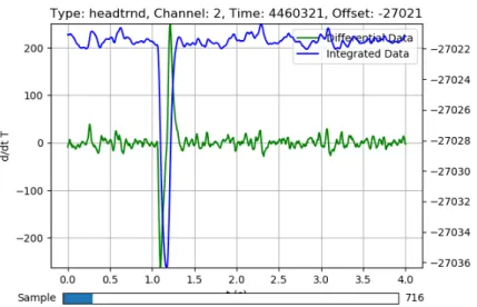
5 Sample of a noise pulse with an anomaly. Although there appears to be some sort of pulse at 1 second which would constitute a signal capture, the pulse is inverted and slightly after 1 second which clarifies that this is in fact a noise capture. . . 13
6 Graph of a two class, 2-D SVC concept. The solid line separates the two clusters and the dashed lines show the functional margin. [6] . . . 14
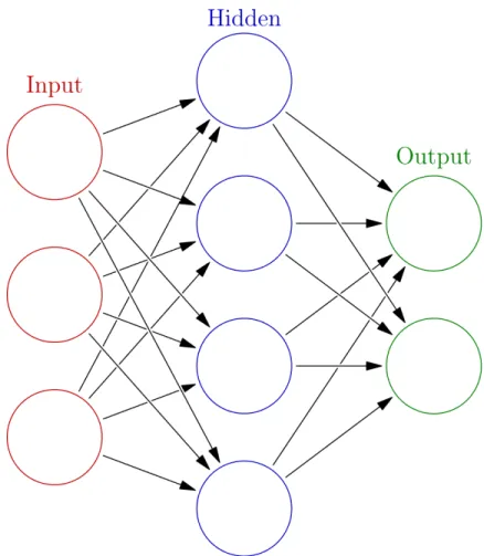
7 Graph of a decision tree for flowers. The decision process goes from the top to the bottom, leftwards being True and rightwards being False decisions. [6] . . . 15 8 Graphic of fully connected neural network with one hidden layer. This would be an
example of a neural network which processes objects with three features and two types, using four hidden neurons in the process. . . 16 9 The accuracy of the SVC learning algorithm in one instance. It used 17,739 samples,
half for training and all for testing. Most notably, it misclassified a significant percent of signal pulses as noise. . . 22
10 An example where SVC classified a signal pulse as noise. The differential data (green, very noisy) shows little structure. The integrated data (blue, has some shape) does have structure. However, it is possibly understandable that the algorithm may have trouble
with it. . . 22 11 The RFC learning algorithm’s performance with differential data. It appears to have
some mix-ups with signal and noise data. . . 23 12 The RFC learning algorithm’s performance with integrated data. This shows a strong
improvement over using differential data, with an approximate four-fold improvement
on the signal and noise mix-ups. . . 23 13 The Mini Batch K-Means learning algorithm’s classifications of all possible data into
three categories. Note that the numbered categories have no intrinsic relation to the actual
capture types (i.e., category 0 need not only contain signal pulses for a good classification). 25 14 The Mini Batch K-Means learning algorithm’s classifications of all possible data into
15 The Mini Batch K-Means learning algorithm’s classifications of signal and heater pulses into two categories. . . 26 16 Representative pulse of category created by Mini Batch K-Means learning algorithm
which possesses an overall downward trend. While data was not intended to be classified in this way, it appears that the learning algorithm learned to pick out what are likely tail
ends of other pulses that were captured by the random trigger. . . 27 17 The Mini Batch K-Means learning algorithm’s classifications of signal and heater pulses
into 10 categories. The learning algorithm was given free rein on what categories it
wanted to create, which created some interesting results. . . 28 18 Representative double pulse picked out by unsupervised learning algorithm. The first
Acronym Meaning
SVC Support Vector Classifier
RFC Random Forest Classifier
DNN Deep Neural Network
CNN Convolutional Neural Network
CUORE Cryogenic Underground Observatory for Rare Events API Application Programming Interface
Abstract
1
CUORE and Motivation
Neutrinos are still very mysterious in the particle physics world. For decades they have been thought to have no mass, but observations regarding neutrino oscillations now suggest that they do. There is another
curiosity, however. One of the rules when playing with fundamental particles is that lepton number has to be conserved. That is, the number of electrons and electron neutrinos (e−, νe) combined minus the number of their anti-counterparts (e+, νe) at the beginning of an interaction must be the same as their
combined number at the end [1], or in equation terms:
ne−,i+nν
e,i−ne+,i−nνe,i=ne−,f +nνe,f −ne+,f−nνe,f (1) The same is true for theµandτ particle counterparts, independently from each other. This applies well experimentally and in theory, but there is a caveat. It is yet unknown if neutrinos are Dirac fermions or Majorana fermions. If neutrinos are in fact Dirac fermions, then the neutrino is distinct from its
anti-counterpart, and a new neutrino created from some reaction will not be in a superposition of a neutrino and anti-neutrino. However, if neutrinos are Majorana fermions, then neutrinos are the same as their anti-counterparts and a new neutrino made from a reaction may be a superposition of the two. This gives
rise to neutrino oscillations from antiparticle to particle and back and forth. This clearly violates the lepton number conservation rule.
If neutrinos are in fact Majorana particles, then a theorized neutrinoless double beta decay may occur. Typical beta decays (emission of an electron) require the emission of an anti-electron neutrino to conserve lepton number. If two electrons are emitted, then this is called a double beta decay (Equation
2).
2p→2n+ 2e−+ 2νe (2)
The lepton number conservation rule dictates that, in this case, two anti-electron neutrinos must be emitted. However, if neutrinos are Majorana particles, then a different reaction is possible such that there only exists one neutrino that acts as a virtual particle to aid the process, and in the end there are no
2p→2n+ 2e− (3)
This is the neutrinoless double beta decay, and if it is detected then neutrinos must be Majorana particles as it could not happen otherwise. The CUORE experiment aims to find evidence of this decay
occurring.
With a neutrinoless double beta decay, the electrons emitted are of precisely, theoretically known
en-ergies. The CUORE experiment [2] possesses a large array of cubes, which are both acting as detectors and the source of these reactions. Each cube is made of tellurium dioxide (TeO2). 130Te is one material which could theoretically undergo this radioactive decay, as it already goes through the (neutrinofull)
double beta decay [3]. The cubes are cooled down to 6 mK and their temperatures are measured con-stantly. If a particle of any kind interacts with the cube and deposits all of its energy, the experiment is to
measure the change in temperature of the cube. However, as is expected, there are many noise particles including gamma rays, beta particles, and alpha particles. It is ideal to remove as much noise as possible, especially gamma ray and alpha particles since they are not products of the neutrinoless double beta
decay. Since the data observed is simply a temperature spike, it is difficult to tell these particles apart, aside from their energies. Currently, noise removal is done using the energy of the particle. It would be more ideal to be able to decipher what particle was detected just by the shape of the temperature spike.
By eye there seems to be no difference, but perhaps a computer could do the job.
We will preliminarily test the classification abilities of certain machine learning algorithms on
Cuori-cino data. CuoriCuori-cino is a predecessor to CUORE, with similar data [4, 5]. CuoriCuori-cino had the same goal as CUORE, the differences only going as far as noisier data and slightly different data structures, at least as far as this investigation is concerned. As the goal of discerning alpha, beta, or gamma particles would be
a long-term project, this data will be used to attempt to discern among capture types. In the experiment there are three types of pulse data. For each pulse shown, integrated (T(t)) and differential (dTdt(t)) data
is overlaid. Differential data will be in green and will seem noisier than the integrated data. For a pulse, it will first go up (positive) and then drop down (negative), and approach 0. The integrated data will be in blue, and for a pulse will increase and then decrease back down to its original value in an, ideally,
Signal data is a capture of what appears to be a real thermal pulse. Examples of these pulses are shown in Figures (1) and (2). The process ideally goes as follows: a particle deposits some or all of its energy into one of the TeO2 cubes, providing a pulse in the temperature. A particle originating from a
double beta decay would likely originate from the detecting cube or one of its neighboring cubes. The thermocouple detects this pulse and begins to record and, using a buffer, it records from 1 second before
the pulse to a total of 4 seconds (3 seconds after the pulse). Over time the thermal energy deposited will dissipate into the temperature-maintained background. This process creates what looks like a sharp increase (energy deposited) followed by a steady decrease (energy dissipates) towards the original
tem-perature. The data it records is differential (dTdt(t)), so the temperature as a function of time comes from the numerical integral of the data. The pulse height and shape vary on the energy that gets deposited, the specific cube in the array, and potentially other factors.
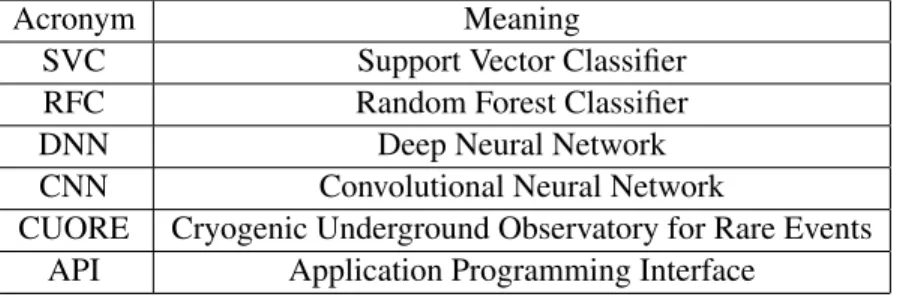
Heater data is essentially calibration data. Examples of heater data is shown in Figure (3). A heater attached to the cube deposits a set amount of energy into the cube, and the system of detection previously
described measures it. While signal pulses may vary a lot in quality, heater pulses tend to be fairly clean and regular, making it useful to determine how much energy is deposited in a signal pulse compared to a heater pulse (which has known energy).
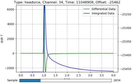
Noise data is a randomly acquired data. Examples of noise data is shown in Figures (4) and (5). This establishes the background noise in the system, which aides in removing or interpreting the background
Figure 1: Sample of a signal pulse. This is a particularly clean pulse. Both the differential data (dTdt(t), green, noisier) and integrated (T(t), blue, cleaner) are shown.
Figure 3: Sample of a heater pulse. As being the calibration pulse, these types should be the cleanest in the set.
Figure 5: Sample of a noise pulse with an anomaly. Although there appears to be some sort of pulse at 1 second which would constitute a signal capture, the pulse is inverted and slightly after 1 second which clarifies that this is in fact a noise capture.
2
Classification Methods
All classification methods aim to take input data (such as the CUORE or Cuoricino data or other vari-ables) and provide a prediction based on this data. The methods we will be considering are machine
learning methods, which means that a person needs not program in, for instance, what makes a pulse a heater pulse as opposed to a signal pulse. We provide these methods with a given dataset and, if it is a supervised learning algorithm, their associated pulse types. The machine learning algorithm will then
devise a method to classify this data as accurately as possible. Since the algorithm generally takes a very broad mathematical idea and specializes it to the data, it will often be able to classify data it has not seen
before correctly.
We will consider five machine learning algorithms: Support Vector Classifiers (SVC) [6, 7], Ran-dom Forest Classifiers (RFC) [6], Deep Neural Networks (DNN) [8, 9], Convolutional Neural Networks
2.1 Support Vector Classifier (SVC)
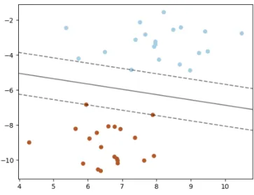
The SVC method uses a simple graphical concept. Consider the scenario where we have objects with two real-valued parameters (parameters being quantitative descriptions, like age, height, weight, etc.).
These objects will be of two classes (like fast and slow). In Figure (6) some objects of two different types are plotted based on their traits. It is clear that a line may be drawn separating the two types in this
space, and SVC aims to make this separation. Additionally, as a means of determining how good the fit is once the data is split, SVC will maximize the functional margin, depicted as the dotted lines in Figure (6). By having the maximum functional margin, the fit will be most certain to correctly separate data. A
new data point with unknown class may be classified by plotting it and finding which side it is on. It is easy enough for an example like this, but with Cuoricino data we have 511 data points for each object (if
including all pulse data and no other parameters) and more than two classes. What SVC has to do in this case is create two 510-D hyperplanes in 511-D space separating the three pulse types from each other. The mathematics behind this is a bit complicated, but Scikit-Learn provides a simple API to utilize this
tool. [6, 7]
2.2 Random Forest Classifier (RFC)
The RFC is an ensemble-type classifier which uses many decision trees to classify data. Decision trees are what a programmer may intuitively (but painstakingly) program when trying to classify data. For
example, with Cuoricino data, the first decision may be: x[0]>4 && x[127]<24. If true, it will move to one part of the tree and, if false, it will move to the other part of the tree. This process will
continue until it hits the end of the tree, where the final decision is made. A graphic showing this process for flower classification is shown in Figure (7). Again, the learning part of this is a bit complicated, and Scikit-Learn’s API is extremely useful. A single decision tree would actually be a quite poor application
for this data, however. The trees are prone to over-fitting, which means that it will learn data it was given to train off of well, but it will classify new data poorly. The RFC gets around this by creating a forest, a
collection of decision trees, and it polls all the trees at once and chooses the majority vote. This works surprisingly well and is simply parallelizable. [6]
2.3 Deep Neural Network (DNN)
The neural network takes some inspiration from the biological brain. Our brains consist of neurons that are able to send signals to adjacent neurons, and those neurons may respond and send signals to
other connected neurons, and the process continues. Without going too deep into neuroscience, this is essentially how an artificial neural network functions. Of course, to make computation simpler and more
efficient, some details must be changed. For a standard, fully connected, neural network, each ”neuron”, or node, takes on a certain value. These nodes live in layers. A deep neural network will have many layers. The first layer will be the input layer, where feature values will be put. For instance, with the
Cuoricino data, the pulse data may be the input layer, with 511 nodes. The last layer will be an output, one node for each possible outcome. When classifying Cuoricino data, we would have three possible
outcomes (heater, signal, or noise). While this is enough for some progress, adeep neural network requires what are called hidden layers. These layers are similar to output layers, except they are not the end of the network. Their size and number may vary depending on what is needed or what works for the
dataset.
Each neuron has a weighted connection to all other neurons in the previous layer. For instance, the neural network shown in Figure (8) has four nodes in its hidden layer. The top node has a connection to
all three nodes in the input layer. When addressing one of the neurons, we may say we are looking at the value ofai,j where we are in layeriand looking at neuronj. Each neuron is connected to the layer
before it (if it is not the input layer), and the way we facilitate this mathematically is by saying that:
ai,k =σ
ni−1
X
j=1
ai−1,jwi−1,k,j+bi,k
(4)
whereni is the number of neurons in layeri, wi,k,j is the weight of the connection between ai,k and ai−1,j, bi,k is the bias (simply an offset value to make sure the node does not become useless if its corresponding nodes have low values), andσis the step function (often a sigmoid) applied to the value. Without the step function, the network is nothing more than a single matrix transformation, no matter the complexity. The weights may be more simply expressed as a matrix and the nodes made be expressed as
whereaiandbihave shapen,ai−1has shapem(both are understood to be column vectors), andwi−1
has shape(n, m). It is also understood that σ is applied to all values of its vector input individually. It is simple enough to move on from here to get the output of the neural network by taking the input
layer, using Equation 5 to get the next, and propagating forward to get the next layer and the next until the output layer is reached. This is called forward propagation. The values of the weights and biases
may be determined via gradient descent and backwards propagation. Computationally this can become complicated, so like we will be using Scikit-Learn for the SVC and RFC (and the unsupervised) learning algorithms, we will be using TensorFlow for neural network algorithms [9].
2.3.1 Gradient Descent for DNNs
The difference between the expected output and the actual output of a neural network is quantified by error, or the cost function. Typically, error is calculated by:
E = 1
2(af −y)
2 (6)
whereaf is the final layer in the network (the output), y is the expected output, and it is understood that by squaring we are finding the magnitude squared of the vector. A trained neural network would
ideally have the minimal error, and so any alterations must be done in hopes of reducing this quantity. Mathematically, we (messily) perform a derivative:
dE
af
= (af−y) (7)
and in order to minimize error, we go in the negative direction of this derivative (which is really a
gradient). So, we aim to have:
daf =−k(af −y) (8)
wherekis some constant that controls the speed at which we approach the minimum, or the learning
rate. The derivative may be expanded, providing:
σ0(wf−1af−1+bf)◦(wf−1∂af−1+∂wf−1af−1+∂bf)
=−k(af −y) (9)
thena◦b = (4,10,18). We may then rearrange elements to achieve the change inwf−1,bf and the desired change inaf−1:
∂af−1 =w−f−11
−k(af −y)◦σ0(wf−1af−1+bf)
(10)
∂wf−1 =−k(af −y)◦σ 0(wf−1af−1+bf)
a−f−11 (11)
∂bf =
−k(af −y)◦σ0(wf−1af−1+bf)
(12)
where
◦is the division version of the Hadamard product and, yes, the weights and layers are being
inverted even though they are not necessarily square matrices. This is possible numerically. Equations
11 and 12 may be used to find the desired change in the bias in the final layer and the weights just before the final layer. Additionally, ∂af−1 in Equation 10 may be differentiated again, creating a similar
equation to Equation 9, which involves the layers before it and can then be formed into similar versions
of Equations 10, 11, and 12. This is where backpropagation comes in. Error is propagated backwards in the neural network and the weights and biases are being altered to adjust for it. I invite the reader to
try going through this. There are more mathematically thorough and careful approaches out there [8]. Implementing this method directly results in some unstable learning (inverses obtain infinities, divide by zeros occur, etc.), so if one were to implement this method by hand more research should be done.
Finally, the selection ofk, the learning rate, is quite difficult in itself. Withktoo large, and the network will hover around minima and constantly overshoot them, possibly even losing the minima. Too small, and it will never reach a minimum and may also never have a chance of finding a better minimum. These
issues are handled cleanly where we do not need to consider them within the TensorFlow framework [9].
2.4 Convolutional Neural Network (CNN)
A CNN is a DNN which includes a convolutional layer. This convolutional layer takes the previous layer and discretely convolves it with a kernel function. This kernel function is usually a few points (typically
around five), and it is what is modified when the network is learning. For instance, perhaps the network will learn a kernel which takes a derivative, one which takes a local integral, or even some combination.
type of discrete convolution done, but with a small kernel it will not change by much). So, a pooling layer is added, which simply pairs nodes up into groups of some set integer (typically two or three), and then performs an operation on them with the goal of combining them. Usually the operation takes the
maximum of the group or the average. If the groups were of two nodes, then the 1000 nodes are now 500. Usually a CNN would be designed with multiple convolutional layers and pooling layers (each with its
own learnable kernel) until the layer size is manageable. Then, the typical design inserts a large layer of hundreds or thousands of nodes, fully connected (like a standard DNN) and then the final layer is a fully connected output layer (so two or three nodes). These networks are reputably good for image analysis,
and so perhaps signal classification is up its alley. [9]
2.5 Mini Batch K-Means
The Mini Batch K-Means learning algorithm is the only one we will be considering for unsupervised machine learning. That is, for our application, we will provide the algorithm with a set of pulses,
unla-beled, and observe how it sorts them. This is the faster version of the k-means learning algorithm. The k-means learning algorithm aims to find a vector that is a good representative of a subset of the data. So, if provided with heater pulse and noise data, it would likely create a pulse-looking sample to represent
the heater pulses and noise or a line to represent the noise data, without even knowing the classification in the first place. Then it can classify new data by seeing how it compares to the representatives it now
possesses. This learning algorithm must be told how many classes there are, and so we encounter the dilemma of how much freedom we should provide it (which will be explored a bit). [6]
3
Pulse Classification Results
For all trials, the data is equally split by type. That is, the datasets that the learning algorithms learn from and are tested on have the same amount of heater, signal, and noise pulses. Additionally, in the plots
the classes will be labeled Sign (for Signal), Srce (for Source, or heater), and Trnd (for noise, or random capture). Each algorithm is run multiple times to ensure that its behavior is well understood. Again, the DNN and CNN classifiers will not be explored here as there are currently no significant results. However,
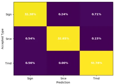
A probability plot such as Figure (9) will be used throughout the process. In this plot, the vertical axis is the accepted type, that is, what the pulse actually was. The horizontal axis is the predicted type, that is, what the learning algorithm thinks it is. The percentages show where the data fell. A pulse in the
top right corner would be a signal pulse, but classified as noise (in this case, 6.91% of all pulses were in this category). The best learning algorithm will create a diagonal on this plot: all signal pulses are
classified as signals, etc. Because the data is equalized (so there are an equal number of each type of pulse), each row adds up to 33.33%. In the best-case scenario, the diagonals will all be 33.33%.
3.1 SVC Results
SVC, being unparallelizable, is a fairly slow learning algorithm (minutes as opposed to seconds for RFC).
Regardless, it does well when classifying among heater, signal, and noise pulses. The goodness of fit can vary from run to run. First is an instance where the algorithm did not do so well. SVC was trained using the differentiated data in this case, but integrated data behaves just as well (or poorly). Taking an FFT
of the data beforehand is even worse. Figure (9) shows the accuracy of SVC with differential data. It classifies heater pulses (which tend to be very clean) and noise pulses (which tend to just be noise) fairly
well. However, it has some trouble with signal pulses. In this case, about 21% of the time a signal pulse will be miscategorized as noise. An example pulse which is miscategorized is shown in Figure (10). The differentiated data (green) in this example looks to be noise, so it may be reasonable for the algorithm
to miss it. The overall accuracy on untrained data for SVC is about 87.7% while its accuracy on all data was 88.6% here, indicating that while it was not all that accurate, it did not overfit to the data.
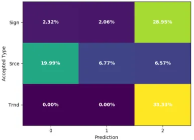
3.2 RFC Results
RFC runs much faster than SVC and provides better results. We use 100 decision trees in the RFC for
these tests. When provided with differential data, it had an overall accuracy of 94.64%, but an accuracy of only 89.3% on untrained data. While it is still superior to SVC, the large difference between trained and untrained data is a sign of some overfitting to the data. This is a well-known problem with decision
trees, the underlying components of RFC [6]. This time, instead of only classifying signal pulses as noise, RFC is also classifying noise pulses as signal. It seems to be finding a compromise, which may be
Figure 9: The accuracy of the SVC learning algorithm in one instance. It used 17,739 samples, half for training and all for testing. Most notably, it misclassified a significant percent of signal pulses as noise.
Figure 11: The RFC learning algorithm’s performance with differential data. It appears to have some mix-ups with signal and noise data.
The RFC seems to thrive with the integrated data (T(t) instead of dTdt(t)). In one test, we observe
an overall accuracy of 97.8% and an accuracy on untrained data of 95.6%. The accuracy map is shown in Figure (12). The RFC tends to miss half as many pulse classifications with integrated data when
compared with differential data. However, it still seems to miss about twice as many of the untrained data when compared with all data (which indicates that it is 3 times worse at classifying data it has not seen
before). A speculative reason as to why the learning algorithm may perform better with integrated data as opposed to differential data is that the act of integrating averages out the noise within the differential data. Integration is good at picking out trends around zero in the differential data, so even if the differential
data was very noisy and if there was a pulse hiding in it (the average of the differential data was a little positive, for instance) then the integrated data would show a steady increase. This decrease in noise and increase in trend prominence is a good candidate as to why this integrated data is preferred. By
integrating the data beforehand, the learning algorithm does not need to learn how to pick out the small trends hiding in the noise (i.e., learn how to integrate).
3.3 Mini Batch K-Means Results
Mini Batch K-Means is an unsupervised learning algorithm, meaning that we do not need to provide it with the classifications of the pulses, only the pulses themselves. The learning algorithm is to observe patterns and make a decision on how to categorize data. This particular method requires that we tell it
how many clusters there are, i.e. how many pulse classifications there are.
We start with giving the learning algorithm all data (all pulse types) and request that it creates three categories. From an outside standpoint, we would hope that it finds the heater, signal, and noise data
and splits it up accordingly. Of course, this is what is inferred with the context of the experiment, which the algorithm does not possess. The results of this test are shown in Figure (13). It appears that it chose
the cleanest data to be in category 0. Category 1 holds some of the slightly noisier data, but since the majority of this category is still heater pulses it is still mostly clean pulses. Category 2 holds all the rest of the data which was not entirely clean. Running the algorithm again may bring new categorical patterns,
but it never really discerns between the signal, heater, and noise pulses entirely. It is mostly only able to decide how clean a signal is.
Figure 13: The Mini Batch K-Means learning algorithm’s classifications of all possible data into three categories. Note that the numbered categories have no intrinsic relation to the actual capture types (i.e., category 0 need not only contain signal pulses for a good classification).
between heater and clean signal pulses versus noise and noisy signal pulses. This test is shown in Figure
(14). This shows a similar behavior as when it was tasked with creating three categories. Category 1 possesses only the cleanest data, mostly heater pulses and some especially clean signal pulses. Note that this category holds no noise data, much like before. Category 0 holds everything else: lower quality
heater pulses, most signals and all noise.
Although it seems the algorithm has a difficult time discerning among all three data types, perhaps it
will do well with only signal and heater pulse data. The learning algorithm now categorizes all data, sans noise, into two categories. These results are shown in Figure (15). Not much changes here. Category 0 holds most of the data, while only the cleanest pulses are placed in category 1. We repeat this for only
signal pulses, heater pulses, and noise, and again one category holds most of the data and the other holds the cleanest data. Interestingly, most of the noise data is put into one category except for about 5%, whose pulses have an overall downward trend as shown in Figure (16). These are likely the tail ends of
a signal pulse or a heater pulse that just so happened to occur before the random capture.
Figure 14: The Mini Batch K-Means learning algorithm’s classifications of all possible data into two categories. Category 0 holds most data, while category 1 holds only the cleanest data (strong signal and most heater pulses).
Figure 16: Representative pulse of category created by Mini Batch K-Means learning algorithm which possesses an overall downward trend. While data was not intended to be classified in this way, it appears that the learning algorithm learned to pick out what are likely tail ends of other pulses that were captured by the random trigger.
provided with a large amount of freedom to discern the signal and heater pulses. We allow the algorithm to create 10 categories, with results shown in Figure (17). It appears that most of the categories have similar attributes as before, but categories 2, 3 and 4 seem to contain double pulses, one of which shown
Figure 17: The Mini Batch K-Means learning algorithm’s classifications of signal and heater pulses into 10 categories. The learning algorithm was given free rein on what categories it wanted to create, which created some interesting results.
4
Conclusions
We have observed that the classification of pulse type is feasible. Although it may not be all that con-vincing that this translates to discerning among particles detected just by their thermal pulse, it is a step.
There are many signal pulses in the dataset that look just like noise and some that look like heater pulses. But from our observations, it appears that the RFC was able to thrive with this dilemma, only failing to classify signal pulses about 3% of the time. Most of these 3% do in fact look like the pulse type that
the learning algorithm claimed they were. These pulses have been normalized, meaning that their total contained energy has been lost (aside from how the pulse compares to the noise around it). This means
that, in the current state, these methods must be somewhat adjusted before attempting to classify CUORE pulses as alpha, beta, or gamma particles.
If this project is to continue onward with classifying CUORE pulses as radiation particles, some
more consideration must be done. For one thing, neural networks of all kinds (DNN, CNN, etc.) should be looked into more. CNNs have a good reputation in image analysis, and hopefully this may translate
well to digging deeper into the shapes of these pulses. Since this would likely be a supervised machine learning endeavor, simply giving the learning algorithm the pulse and its magnitude may only do as well as what is currently being done to classify pulses. But, perhaps providing the learning algorithm with
the channel number (detector location), trigger time, and any other available information as well as other pulses close in time and their information could pose an improvement on current methods.
References
[1] David Griffiths.Introduction to Elementary Particles. 2nd ed. 2008.
[2] C. Alduino et al. “First Results from CUORE: A Search for Lepton Number Violation via 0νββ
Decay of130Te”. In:Physical Review Letters120 (2018).
[3] Chiara Brofferio et al.The saga of neutrinoless double beta decay search with TeO2thermal
detec-tors. arXiv:1801.03580v1 [hep-ex].
[5] Monica Sisti. “From Cuoricino to CUORE: investigating neutrino properties with double beta de-cay”. In:Journal of Physics203 (2010).
[6] F. Pedregosa et al. “Scikit-learn: Machine Learning in Python”. In: Journal of Machine Learning Research12 (2011), pp. 2825–2830.
[7] Jake VanderPlas.Python Data Science Handbook. OReilly Media, Inc., 2016.
[8] Michael Nielsen. How the backpropagation algorithm works. Dec. 2017. URL:
http://neuralnetworksanddeeplearning.com/chap2.html.