Responsive Web Design for
Higher Ed
By 2017
Global mobile data traffic will increase 1300 times
Mobile Device usage to increase 66%
Table of Content
Introduction………..……….……….3
Fig. 1: Coping up with mobile device proliferation
Different approaches to Mobile Web Development……….………5
Building separate website
Building responsive web design Web Hosting
Responsive Web Design explained………….………6
Recommendations for Responsive web design
Higher Ed: Why Responsive Design seems to be the best option? ...7
Fig. 2: Global Mobile Data Traffic by device type (TB per Month), 2012-2017
Fig. 3: Global Mobile Data Traffic Compound Annual Growth Rate (CAGR) by
device type, 2012-2017
Fig. 4: Global Mobile Data Traffic by Application Category (TB per Month),
2012-2017
Fig. 5: Global Mobile Data Traffic Compound Annual Growth Rate (CAGR) by
Application Category, 2012-2017
Fig. 6: Global Mobile Data Traffic by Region (TB per Month), 2012-2017
Fig. 7: Global Mobile Data Traffic Compound Annual Growth Rate (CAGR) by
Region, 2012-2017
Reinforcing the concept for Higher Ed: Smartphone adoption trends among American teens………11
Fig. 8: American Teen Cell Phone and Smartphone Ownership over Time, %
of all teens aged 12-17
Fig. 9: American Teen Smartphone Ownership over Time, % of all teens aged
12-17
Fig. 10: American Teen accessing the Internet on a cell phone, tablet or other mobile device (at least occasionally) - % of all teens aged 12-17
Conclusion……...………..……..14 References and Further Reading………..15 About Sanmita………16
Introduction
With mobile device proliferation today, it is no longer sufficient to design websites built solely for desktop computers. There’s no doubt at all that mobile devices have become an integral part of our day-to-day living today. Both the amount of time and money people are spending on mobile devices is growing rapidly. As such, you need to make your website accessible beyond time, space and form. Now more than ever it’s important that your website be developed for mobile devices, for enhanced user experience. If approached properly mobile web development can:
Open up new source of traffic for your website
Boost visitor engagement
Increase sales
But, the sheer variety is overwhelming and difficult to manage.
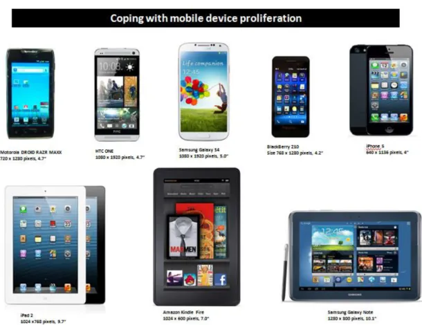
Fig. 1: Coping up with mobile device proliferation:
Technology never remains static for long, and this holds good for this amazing mobile technology more than it does for any other domain. This leads to constantly changing user needs and increasing variety of mobile devices. With changing needs and increasing variety of mobile devices, it becomes crucial to inspect all the viable approaches to mobile web development, to make the most of this technology.
Different Approaches to Mobile Web Development
Building separate website specifically adapted to a particular mobile devices. Here, user-agent detection is used to route visitors on mobile devices to a separate mobile site, typically at m.example.com.
Building responsive web design capable of adapting its layout to the width of
the browser window of any mobile device.
Responsive website design is Google’s recommended approach of going mobile.
Responsive Web Design Explained
“Responsive web design” is not a fad, which is to go as quickly as other seasonal trends in the industry. It has actually proven itself to be a game changer in mobile arena in particular and broader industry landscape in general. With responsive design, you can build a website which is enabled to self-optimize itself across all mobile devices.
In a broader term, responsive web design refers to an advance web design process enabling the content to resize, reorganize, and reposition itself in real-time. This way, it adapts itself and prioritizes to suit the anticipated needs of the end-user.
Recommendations for Responsive Web Design
First and foremost, Google recently recommended responsive web design as
their preferred method for mobile sites. Some obvious outcome of this recommendation could be Google’s factoring it into its algorithms.
Consistency of content: With responsive web design, content is adjusted for
different screen resolutions, eliminating the need for a separate mobile website.
Smooth end-user experience – With responsive design, the user receives
You only need to manage one set of content rather than multiple versions for different site versions. Time and money saved by not having to commission the design and development of separate sites.
Ease of maintenance - It’s usually easy to maintain a single HTML/CSS
codebase than maintaining different sets of codebase for different devices.
Higher Ed: Why Responsive Design seems to be the best
option?
Higher Ed strategists and administrators always endeavor to build their brand around their institutional personality. Being a Higher Ed administrator, you need to ask yourself, “Which approach is for me?” Should you be building multiple sites, optimized for all the available devices? This is almost impossible! You can at the most try to cover the popular devices first, which is not a complete solution in most of the cases.
According to the Cisco VNI Global Mobile Data Traffic Forecast - 2012-2017, “Global mobile data traffic will increase 13-fold between 2012 and 2017”
Based on the current growth trends, the Cisco VNI is forecasting an increment of 50% in mobile data traffic in 2013, due to increased usage on smartphones. The forecast also states that the monthly mobile tablet traffic will surpass 1 Exabyte per month in 2017, and tablets will exceed 10 percent of global mobile data traffic in 2015.
Fig. 2: Global Mobile Data Traffic by device type (TB per Month), 2012-2017
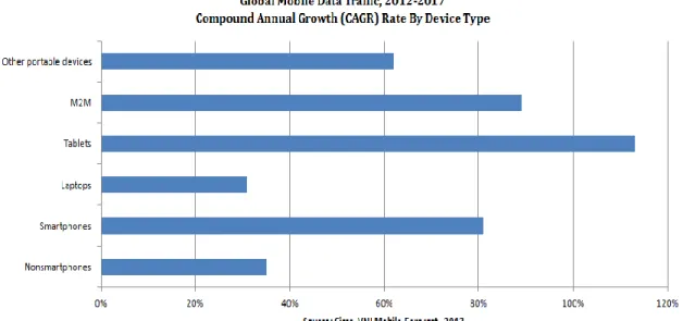
The same forecast goes on to claim that, mobile data traffic will grow at a compound annual growth rate (CAGR) of 66 percent from 2012 to 2017. It will reach 11.2 exabytes per month by 2017. Fig. 3: Global Mobile Data Traffic Compound Annual Growth Rate (CAGR) by device type, 2012-2017
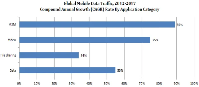
The Cisco VNI Global Mobile Data Traffic Forecast - 2012-2017 also provides some other suggestive stats:
Fig. 4: Global Mobile Data Traffic by Application Category (TB per Month), 2012-2017
Fig. 5: Global Mobile Data Traffic Compound Annual Growth Rate (CAGR) by Application Category, 2012-2017
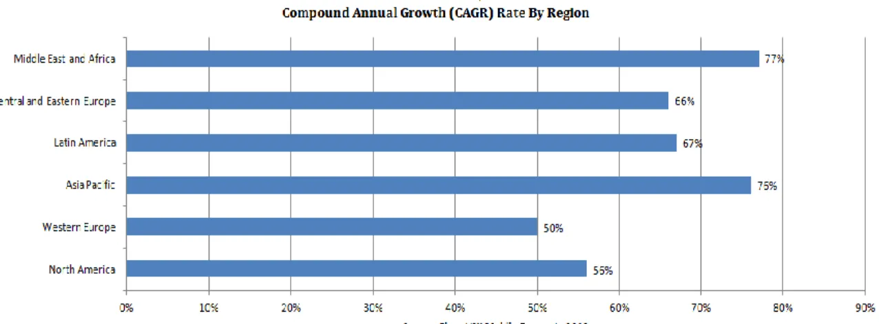
According to the forecast, the Asia Pacific and North America regions will account for almost two-thirds of global mobile traffic by 2017, as shown in Figure 6. Fig. 6: Global Mobile Data Traffic by Region (TB per Month), 2012-2017
Fig. 7: Global Mobile Data Traffic Compound Annual Growth Rate (CAGR) by Region, 2012-2017
If the stats say anything, it’s that responsive web design should now be a part of your vocabulary. In a world that’s changing and evolving-in terms of technology-faster than ever, responsive web design seems to be an interesting and effective option available. To be agile, to be adaptive and to be responsive to changing technology environment, platforms and social trends is what characterizes responsive design.
But one fundamental question that must precede any consideration of the value of responsive design is simply a “why?” What are the promises and potential business benefits that make Higher Ed professionals excited about responsive design, what are the problems it means to solve for their institutions?
There could be several appropriate answers to these questions, but the most important one certainly relates to the end-user experience with digital content. Although separate mobile site has its own utility, you as a Higher Ed administrator know that your audience is a vibrant, modern, and tech savvy user community requiring all of the functionality that they have on their desktop. You know with such a vibrant target persona, and present technological environment characterized by mobile device proliferation, responsive web design is your solution.
Reinforcing the concept for Higher Ed: Smartphone adoption trends among American teens
Smartphone adoption among American teens has increased substantially in last few years. With rising smartphone adoption, mobile access to the internet has become pervasive. According to The Pew Research Center's Internet & American Life Project, “One in four teens are “cell-mostly” internet users, who say they mostly go online using their phone and not using some other device such as a desktop or laptop computer.”
Fig. 8: American Teen Cell Phone and Smartphone Ownership over Time, % of all teens aged 12-17
Fig. 10: American Teen accessing the Internet on a cell phone, tablet or other mobile device (at least occasionally) - % of all teens aged 12-17
The important findings from this nationally representative survey conducted by The Pew Research Center's Internet & American Life Project are as follows:
- 78% of teens now have cell phone(s), and 47% of those own smartphones. That makes into
37% of all teens who have smartphones, up from 23% in 2011.
- 95% of all teens are online and this percentage has been consistent since 2006.
Although 95% of all teens are consistently online since 2006, the nature the internet usage of teens has changed dramatically during that time. From just stationary connections tied to their desktops to always-on the go mobile connections, teens represent a significant community of mobile connectivity users. In some cases, mobile connectivity serves as their primary point of access.
Conclusion:
Every Higher Education website has (or at least should have) some pre-defined goals and objectives, based on broader institutional objectives. As such, it is of paramount importance to approach the issue of multi-device user experience from a strategic standpoint. As a necessity, you must carry out some research including user behavior, technology trend, etc., before getting started with your mobile effort. Consulting experts could be a good idea if you are unable to qualify your needs and solutions thereupon.
As the target persona of the Higher Ed institutions include a tech savvy user community requiring all of the functionality that they have on their desktop, responsive web design is always a better solution.
References and Further Reading
http://www.thinkwithgoogle.com/mobileplanet/en/
http://www.pewinternet.org/Reports/2013/Teens-and-Tech.aspx,
Mary Madden, Amanda Lenhart, Maeve Duggan, Sandra Cortesi, Urs Gasser. Teens and Technology 2013, Mar 13, 2013,accessed on May 23, 2013
http://www.cisco.com/en/US/solutions/collateral/ns341/ns525/ns537/ns705/ns 827/white_paper_c11-520862.html
About Sanmita
Sanmita is full services web solutions company that fills the gap between higher education web needs and true experience in the field. We are an award winning team of strategist, designers, and developers who have a rich history working in higher ed settings. With clients such as Cornell University, The University of Chicago and Texas Wesleyan, Sanmita provides valuable services such as design,
development, infrastructure and content management services.