DATA VISUALIZATION AND
DISCOVERY FOR BETTER
BUSINESS DECISIONS
THIRD QUARTER 2013
By David Stodder
Research Sponsors
Adaptive Planning
ADVIZOR Solutions
Esri
Pentaho
SAS
Tableau Software
DATA VISuAlIZ ATIOn AnD DISCOVERY
FOR BET TER BuSInESS DECISIOnS
By David StodderTable of Contents
Research Methodology and Demographics 3
Executive Summary 4
Data in the Eye of the Beholder 5
Increasing Expectations for Visual Excellence . . . .5
Matching Visual Interfaces to User Requirements 6
Who Develops and Deploys Visualizations? . . . . 10
Business Benefits, Barriers, and Objectives 12
Visualization and Performance Management for Business Objectives . 13 Implementation Practices for Better Decisions 16
Geospatial Analysis and Visualization . . . . 17
Provisioning Data for Visual Access and Analysis 19
In-Memory Computing for Visual Analysis and Discovery . . . . 19
Dashboard Strategies and Data Visualization 21
Visualization Functionality and Chart Types 25
Most Popular Visualization Types . . . . 26
Vendor Products 28
About the Author
DAVID STODDER is director of TDWI Research for business intelligence. He focuses on providing research-based insight and best practices for organizations implementing BI, analytics, performance management, data discovery, data visualization, and related technologies and methods. He is the author of TDWI Best Practices Reports on mobile BI, customer analytics in the age of social media, and BI/DW agility, as well as TDWI Checklist Reports on data discovery and information management. He has chaired TDWI conferences on BI and big data analytics. Stodder has provided thought leadership on BI, information management, and IT management for over two decades. He has served as vice president and research director with Ventana Research and was founding chief editor of Intelligent Enterprise, where he served as editorial director for nine years. You can reach him at [email protected], on Twitter @dbstodder, and on LinkedIn at linkedin.com/in/davidstodder.
About TDWI
TDWI, a division of 1105 Media, Inc., is the premier provider of in-depth, high-quality education and research in the business intelligence and data warehousing industry. TDWI is dedicated to educating business and information technology professionals about the best practices, strategies, techniques, and tools required to successfully design, build, maintain, and enhance business intelligence and data warehousing solutions. TDWI also fosters the advancement of business intelligence and data warehousing research and contributes to knowledge transfer and the professional development of its members. TDWI offers a worldwide membership program, five major educational conferences, topical educational seminars, role-based training, onsite courses, certification, solution provider partnerships, an awards program for best practices, live Webinars, resourceful publications, an in-depth research program, and a comprehensive website, tdwi.org.
About the TDWI Best Practices Reports Series
This series is designed to educate technical and business professionals about new business intelligence technologies, concepts, or approaches that address a significant problem or issue. Research for the reports is conducted via interviews with industry experts and leading-edge user companies and is supplemented by surveys of business intelligence professionals.
To support the program, TDWI seeks vendors that collectively wish to evangelize a new approach to solving business intelligence problems or an emerging technology discipline. By banding together, sponsors can validate a new market niche and educate organizations about alternative solutions to critical business intelligence issues. Please contact TDWI Research Director David Stodder ([email protected]) to suggest a topic that meets these requirements.
Acknowledgments
TDWI would like to thank many people who contributed to this report. First, we appreciate the many users who responded to our survey, especially those who responded to our requests for phone interviews. Second, our report sponsors, who diligently reviewed outlines, survey questions, and report drafts. Finally, we would like to recognize TDWI’s production team: Jennifer Agee, Michael Boyda, and Denelle Hanlon.
Sponsors
Position
Business executives, sponsors/users 48%
Data and IT professionals 42%
Consultants 10% Industry Consulting/professional services 16% Software/Internet services 12% Financial services 11% Healthcare 9% Education 7% Government 6% Insurance 6% Manufacturing (non-computer) 5% Retail/wholesale/distribution 4% Telecommunications 4% Media/entertainment/publishing 3% Transportation/logistics 3% Utilities 3% Other*
* “Other” consists of multiple industries, each represented by 2% or less of respondents.
11% Geography United States 55% Europe 19% Canada 8% Australia/New Zealand 5%
Asia/ Pacific Islands 4%
South Asia 3% Africa 2% Central/South America 2% Middle East 2% Number of Employees More than 100,000 10% 10,000–100,000 22% 1,000–10,000 33% 100–1,000 19% Less than 100 16%
Based on 453 survey respondents.
Research Methodology
and Demographics
Report Scope Strong data visualization and graphical discovery analysis are essential for users to realize benefits from large, complex, and diverse data volumes. Early business intelligence dashboards broke ground by giving many users easy-to-use graphical interfaces for accessing and analyzing data. Now, sophisticated charts enable users to advance their understanding. They can discover hidden data relationships within a range of internal and external sources, including geospatial data, and improve self-service actionable insight. This report examines organizations’ experiences with data visualization and discovery practices and technologies and recommends best practices for improving decision making and analysis.
Survey Methodology In February 2013, TDWI sent an invitation via e-mail to business and IT executives; VPs and directors of BI, analytics, and data warehousing; business and data analysts; IT application managers; and other BI/DW professionals, asking them to complete an Internet-based survey. The invitation was also delivered via websites, newsletters, and publications from TDWI. The survey analysis drew from a total of 453 respondents. Of these, 343 completed every question. Answers from respondents who answered enough questions for their input to be valuable are included in the results. Thus, some questions have different numbers of responses.
Survey Demographics The largest percentage of survey respondents are business executives and sponsors/users (48%); included in that group are business analysts (12%) and data analysts or scientists (15%). Forty-two percent are data and IT professionals, with VPs and directors of BI, analytics, and data warehousing (16%) and BI developers (15%) making up the largest segments in this second group. Respondents from consulting and professional services organizations made up the largest industry segment (16%), with software/Internet services (12%) and financial services (11%) next highest. Most respondents reside in the U.S. (55%), followed by Europe (19%), but other regions account for 26%.
Other Research Methods TDWI conducted telephone interviews with business and IT executives, VPs of BI/DW, business and data analysts, BI directors, IT application managers, and experts in data visualization and visual data
Executive Summary
Far from mere “eye candy,” data visualization is critical to fulfilling widely held goals for expanding organizations’ analytics culture and driving more decisions with data. Across organizations, employees who are subject matter experts in areas such as marketing, customer service, online engagement, finance, and more need to interact with data and analyze it for significant patterns, trends, and anomalies. Yet, most of these professionals would hardly consider themselves “business intelligence users,” much less professional data scientists or data analysts. Tools and practices for data visualization, data discovery, and visual analysis are enabling these “nontechnical” users to make effective use of data and reduce their time to insight.
Data visualization sits at the confluence of advances in technology, the study of human cognition and perception, graphical interfaces, widespread adoption of standards for rich Internet applications, and the continuing expansion of interest and experience in analytics and data discovery. Data visualization can contribute significantly to the fruitful interpretation and sharing of insights from analytics, enabling nontechnical SMEs to perform data discovery in a self-directed fashion. Implementation of chart engines and the growth in the number and variety of visualizations available in graphics libraries are supporting new sophistication in visual analysis, allowing users to go beyond simple bar and pie charts to express more advanced insights about quantitative information.
This TDWI Best Practices Report focuses on how organizations can use data visualization, visual analytics, and data discovery to improve decision making, collaboration, and operational execution. The report provides analysis of an in-depth research survey and user stories to reveal current
strategies and future plans for data visualization and analysis. The report offers recommendations for successfully evaluating and deploying data visualization, data discovery, and visual analysis technologies to achieve shorter time to insight for users across the enterprise.
Users need data visualization for a variety of BI and analytics activities, including reporting, scorecards, operational alerting, and data discovery and analysis. Rather than just giving users “new toys” to play with, organizations should examine how they can match visualization technologies and practices to user requirements. Across the board, however, a key element in the success of visualization is data interaction; users need broad capabilities for manipulating data, including to drill down, cross cut, slice, and dice data directly from graphical interfaces.
For many organizations, dashboards take the center stage for data visualizations, especially for BI reporting and performance management. Many users would like to consolidate views of multiple sources and types of information into their dashboard workspaces. One new source of interest is geographical information. Although using maps to enhance corporate data (and vice versa) is not yet widespread, organizations in a growing number of industries are interested in geospatial analysis as an addition to their visualization repertoire. Mobile device adoption is likely to accelerate interest in visualizations offering location information and geospatial analysis; frontline employees in sales, service, and support will use these technologies to enhance customer interactions.
TDWI Research finds that organizations are pursuing a range of potential business benefits with their current and planned implementations of data visualization and discovery technologies. Operational efficiency is the top benefit sought, according to our research; organizations seek to implement data visualization and discovery to reduce the time users lose when they have difficulty accessing, reporting, and analyzing data. With self-directed capabilities for uncovering root causes as well as other insights from data, organizations will be able to move away from gut feel and common wisdom and use data to drive innovation in strategy and operations.
Tools and practices for data visualization, data discovery, and visual analysis are enabling “nontechnical” users to make effective use of data and reduce their time to insight
Data visualization and discovery can help reduce the time users lose when they have difficulty accessing, reporting, and analyzing data
Data in the Eye of the Beholder
Data visualization is one of the great innovations of our time. From the moment most of us wake up in the morning, infographics and other visual representations of data fill our lives. Whether these visualizations are presented as part of our work, to enrich our enjoyment of sports, to deepen our understanding of current events, or to track household expenses, we encounter graphical images of data every day and try to make sense of them. Quantitative communication through graphical representation of data and analytical concepts is essential to surviving amid the deluge of data flowing throughout our world.
Visual representations of data are increasingly part of public discourse. Leading media organizations such as The New York Times use advanced data analysis and innovative computer graphics to dazzle readers with infographics and provide insights into news stories that would otherwise be buried in text. Data sets made available by the U.S. federal government (see data.gov) and industry sources allow individuals to create and share graphical interpretations of data on their own, often in blogs and social networks. “Graphics reveal data,” wrote Edward Tufte in his seminal work The Visual
Display of Quantitative Information. “Indeed graphics can be more precise and revealing than
conventional statistical computations.”
Humans are born to perceive meaningful patterns, outliers, and structures in what they see. Our processing of information is guided by how it is presented, including attributes such as color, size, texture, density, movement, and more that activate our visual sensitivity. Psychologists and brain scientists have studied extensively how humans respond to graphical stimuli and how we use short- and long-term memory to bring previous experiences to bear on the processing of information. These studies are becoming increasingly important as professionals in all walks of life, including physicians, pilots, financial services specialists, law enforcement and military personnel, and more depend on data visualization to make decisions and discover new insights to drive strategy. “We acquire more information through vision than through all of the other senses combined,” according to Colin Ware, in his book Information Visualization. “The 20 billion or so neurons of the brain devoted to
analyzing visual information provide a pattern-finding mechanism that is a fundamental component in much of our cognitive activity.”
Increasing Expectations for Visual Excellence
Graphical interaction with data is fast becoming the expected norm for the full spectrum of users, from executives to frontline personnel. Visualization is therefore a key concern for business
intelligence and data analysis professionals because it affects how data is provisioned for users and the value they gain from it. Good data visualization is critical to making smarter decisions and
improving productivity; poorly created visualizations, on the other hand, can mislead users and make it more difficult for them to overcome the daily data onslaught. Users can lose confidence in their business intelligence (BI) systems if they are unable to understand or trust what they see. This TDWI Best Practices Report focuses on data visualization, visual discovery practices, and
technology implementation. Through graphical interfaces such as dashboards and portals, users have been steadily moving away from static reports and data tables and toward interactive workspaces that allow them to manipulate data through a growing library of charts and other visualizations. Visual data discovery, a key subject of this report, has accelerated the transition toward easy-to-use, self-service visual analysis. As users interact with data visually, they see and then want to explore data
Quantitative
communication through graphical representation of data and analytical concepts is essential to surviving amid the deluge of data flowing throughout our world
Visualization affects how data is provisioned for users and the value they gain from it
likely to want to integrate non-relational sources such as geospatial data. This report will discuss the significance of this trend.
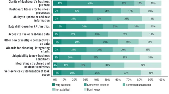
Although the seeming ubiquity of BI dashboards would make it appear that data visualization must be commonplace, the reality is that most organizations are in the early stages of adoption and are still learning what users need. TDWI Research finds that only 7% of the 453 respondents to the survey for this report are “very satisfied” with their ability to view and interact with data visually so that they can communicate information effectively and make decisions based on information through graphical means. Almost a quarter (23%) said they are “not satisfied,” and about one-third each are somewhat satisfied or somewhat dissatisfied. This report will discuss many of the factors that affect user satisfaction.
Matching Visual Interfaces to User Requirements
Visualization is important for all types of BI and analytics applications, whether they are deployed to individuals, departments, or at an enterprise level. Users’ requirements can be diverse; some need simple interfaces that emphasize actionable information, while others demand more complete analytics capabilities, including many of the slice-and-dice, drill-down, and roll-up features of online analytical processing (OLAP).
To sharpen our research view of what organization are doing with visualization and how they are meeting user requirements, we asked respondents which types of activities they are currently implementing or are planning to implement with their data visualization technologies. We identified these activities as falling into three common types, discussed next. We will refer back to these three main activities throughout the report:
• Display/snapshot reporting (including scorecards)
• Operational alerting
• Visual discovery and analysis
Display or Snapshot Reporting (Including Scorecards)
Many organizations are implementing dashboards to display basic reports, including on mobile platforms. Snapshot reports are typically scheduled rather than requested on demand, although some users create snapshots manually. The results are often stored for users in a cache or database as a “snapshot” of a certain point in time. Because users examine snapshots to identify changes in data
over time, they must be provisioned and presented consistently so that the trends and comparisons drawn are valid. The viewing format, including the use of animation or other options for richer visualization, can depend on the user’s application platform or whether the request is made through a Web browser that supports industry standards such as AJAX, HTML5, and Microsoft Silverlight. Scorecards, which are often used with corporate performance management methodologies, help orient personnel toward achieving particular goals. Key performance indicators (KPIs) and other metrics help personnel measure and manage progress toward the goals over time. Scorecards can provide essential context for looking at historical trends and projecting future results. Innovative organizations let their interface designers loose on scorecards to create graphical representations that replace standard data tables and charts with gauges, widgets, dials, race cars, or other imagery to inspire employees in the context of their roles and levels of accountability.
Because users examine snapshots to identify changes in data over time, they must be provisioned and presented consistently
Dashboards and scorecards should allow users to drill down to at least one if not more levels of data to gain a detailed view behind the KPIs, metrics, and visual objects. Users should be able to spot anomalies easily and recognize where performance is out of line with expectations. More mature and successful dashboard implementations will allow users not only to drill down into data, but also to perform various types of analysis to explore patterns or determine the root cause for why numbers are out of line with expectations.
Three out of five (57%) of respondents to the TDWI Research survey are currently implementing display or snapshot reports and/or scorecards; 31% are planning to do so, and 9% have no plans for them (see Figure 1). Among the 7% of respondents noted earlier who are very satisfied with their ability to view and interact with data visually, 77% are currently implementing visualization for these types of activities.
Are users in your organization currently implementing or planning to implement data visualization technologies for the following activities?
Currently implementing Plan to implement no plans Don’t know Display, snapshot reporting, and/or scorecards 57% 31% 9% 3% Operational alerting 26% 39% 27% 8% Visual data discovery and analysis 33% 45% 17% 5%
Figure 1. Based on answers from 453 respondents.
Operational Alerting
Many BI and visual discovery tools offer alerting functions. These are designed to notify personnel of particularly important changes in the data or when situations arise that demand immediate attention. Color is often used for alerts on dashboards. Some tools enable users to perform visual analysis to discover why an alert condition exists, such as if sales have decreased for a certain product line. Although alerts are often set ahead of time to be coordinated with KPIs and business rules, some
tools allow users to custom-tune alerts for particular data changes and their preferred visualizations. Operational alerting, as the term implies, is an important ingredient in emerging operational intelligence systems. These systems focus on monitoring activities in business, distribution chains, manufacturing, networks, IT systems, and more for problems, threats, and other critical
developments. Alerts signify that monitors have uncovered something important in (often) real-time data or event streams; some systems provide analytics for determining root causes and the best way to address situations.
TDWI Research shows that only about one-quarter (26%) of respondents are implementing data visualization technologies for operational alerting. More (39%) are planning to do so, while 27% have no plans (see Figure 1). This could reflect the current immaturity of the emerging operational intelligence field.
Operational alerting is an important ingredient in emerging operational intelligence systems
Visual Discovery and Analysis
Business analysts, data analysts, and a growing segment of nontechnical users across organizations want to go beyond the limits of reporting and predefined metrics to examine data and discover interesting relationships, patterns, and answers to their “why” questions. When practices for analytical reasoning, test-and-learn inquiry, and advanced computation are fused with data visualization, the result is “visual analytics.”
Visual analytics enables business users to interact with data and engage in analytical processes through visual representations supported by powerful computer graphics engines, and often integrated, in-memory storage of data that facilitates rapid updates of multiple visualizations based on users’ interaction. Visual functionality for filtering, comparing, and correlating data can then be integrated with the users’ analytical application functions for forecasting, modeling, and statistical, what-if, and predictive analytics.
The term “visual data discovery” is essentially synonymous with “visual analytics”; in industry usage, it applies to tools and practices that make it easier for nontechnical business users to interact with data. The tools enable users to engage in self-service data analysis through visual representations rather than the tabular results delivered by standard BI queries. Visual discovery frees users from the typical BI constraints of predefined questions and known types of answers, such as the sales figures for a given region. Users have the freedom to look for insights that numbers such as sales figures alone can hide.
However, rather than give users a complete blank slate, most visual data discovery tools guide users in selecting the right visualizations or even automate the selection. Some tools include predictive modeling capabilities to direct users to examine what is most important going forward. Predictive modeling complements visual discovery, especially when there are large data sets to examine with many dimensions and variables.
Visual data discovery and analysis will be discussed throughout this report; the purpose here is to offer brief definitions. As was shown in Figure 1, one-third (33%) of respondents to the survey for this report said that they are currently implementing data visualization for discovery and analysis, and 45% are planning to do so. This finding suggests that we are still in the early stages of deployment of such tools. Not surprisingly, within the segment of respondents mentioned earlier who indicated that they are very satisfied with their ability to view and interact with data, 70% are currently implementing data visualization for discovery and analysis.
The user story on the next page illustrates how Dartmouth College has used visual analysis to shorten the path to insight and improve focus on high-priority donation prospects.
Visual analytics enables business users to interact with data and engage in analytical processes through visual representations
USER STORY
DARTMOUTH SHARPENS FUNDRAISING FOCUS WITH VISUAL ANALYSIS
Fundraising from alumni sources has long been critical to the economics of colleges and universities. Alumni fundraising becomes even more important as costs rise and facilities require upgrades. Colleges and universities must be smarter about how they research and identify prospects in alumni rosters. By analyzing records that go back decades as well as external demographic sources, institutions can discover who might have the right combination of wealth, inclination, and affi nity to be motivated to give back.
Dartmouth College, one of the premier higher education institutions in the U.S., captures a broad range of information about its alumni—from when they were undergraduates and engaged in sports or other on-campus activities to the progress of their careers, travels, and advanced degrees. Its large Ellucian Advance donor, prospect, and events management system database contains information on about 120,000 constituents. “Our responsibility is to go through all that information to pull out prospects who have the highest probability to give back, either in general or for specifi c campaigns such as funding a capital project,” said Michael Foote, director of Research and Prospect Management at Dartmouth College.
In analyzing the data, Foote said that Dartmouth wanted to avoid the usual “cycle of pain”: that is, giving requirements to an IT reporting group, waiting for programmers to do manual lookups and build reports, discovering that the results were not quite what was needed, and then having to resubmit the request and start the cycle over again. Dartmouth deployed ADVIZOR Solutions to automate the linking together of separate, siloed data tables and a visual presentation of the results. “Within seconds, I can immediately see how many in the class of 1978, for example, are in a particular fi eld of work, how many of those participated in football, what their giving history has been, and so on,” said Foote. “I can initiate other types of analysis myself.”
Dartmouth uses ADVIZOR’s business analysis software to visualize relationships in the data and fi nd outliers— “the folks we may have missed,” Foote said, due to improper coding or other data cleansing issues. Foote’s team has been able to build demographic profi les of individuals at different giving levels and use predictive analytics built into the software to mine the data, analyze variables, and attach scores to statistically measure wealth, inclination, and affi nity. “We built a model based on a target group of current high donors and then applied that model to everyone else in our database. This has helped us ensure that our prospect managers are focused on the right alumni at the right time.”
Dartmouth’s scatterplot chart shows proposal status by age, color-coded by primary staff member name. It also includes a bar chart fi lter that allows users to locate proposals in the pipeline by “ask amount” totals. Note the large number of proposals in the “qualifi cation” stage that are more than 6 months old.
Who Develops and Deploys Visualizations?
As more users show an interest in analytics, organizations are facing the question of whether nontechnical users can perform analytics on their own or if the organization needs to hire more specialists, including data scientists. A key objective of implementing visual analytics and discovery tools is making it easier for nontechnical users to create visualizations and perform some analytics on their own, with less IT intervention.
TDWI Research finds that in nearly two-thirds of organizations surveyed, IT personnel develop and deploy charts, graphs, maps, and other visualizations for users to implement (see Figure 2). Business analysts, however, are the second most prevalent, with 54%; this indicates that visualization development and implementation is fairly common outside of IT. Business analysts can use
visualizations for strategic and operational planning, business model analysis, project planning, and other responsibilities.
The third largest group is power users (45%). These often self-selected but indispensable figures in business departments and divisions have long performed advanced BI and analytics tasks for the benefit of others in their groups. They appear to be continuing in this role for data visualization at nearly half of those organizations surveyed. The percentage of power users who will be implementing visual discovery and analysis is therefore likely to grow in coming years.
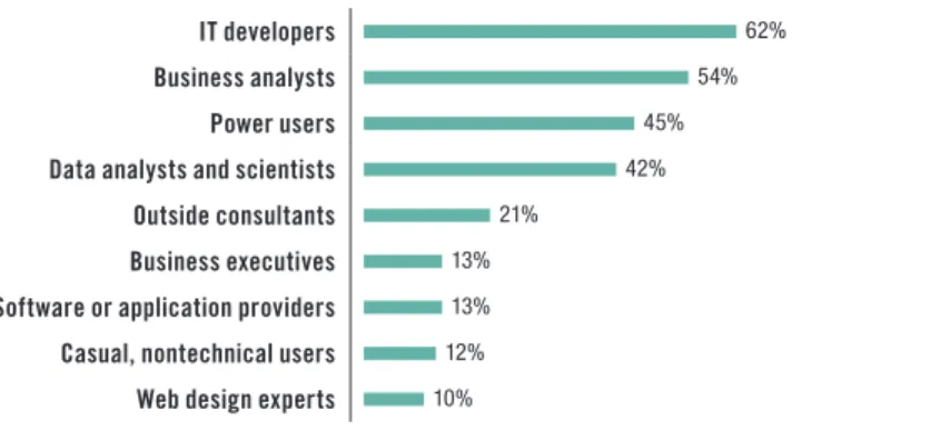
Who in your organization develops and deploys visualizations (e g , different types of charts, graphs, or maps) for users to implement? (Please select all that apply )
IT developers 62%
Business analysts 54%
Power users 45%
Data analysts and scientists 42%
Outside consultants 21%
Business executives 13%
Software or application providers 13%
Casual, nontechnical users 12%
Web design experts 10%
Figure 2. Based on answers from 453 respondents; respondents could select more than one answer.
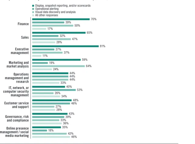
Executives do not develop visualizations, but do highly value them Figure 2 shows that business executives—the dominant users of BI tools in many organizations—do not commonly develop and deploy visualizations; only 13% of respondents said that they do so. However, TDWI Research finds that executive management highly values visualizations for display or snapshot reporting, and/or scorecards; 81% of respondents said that visualizations for these activities are important for executives (see Figure 3). Somewhat less critical are visualizations for executives’ operational reporting and visual data discovery and analysis; just 27% and 37% of respondents indicated that visualizations are important to executives for these activities, respectively. Once again, it is possible that this is because dashboards for reports and scorecards are more mature in organizations compared to visual operational reporting, analytics, and data discovery.
The percentage of power users who will be implementing visual discovery and analysis is likely to grow
Figure 3 offers a view of the relative importance of visualizations for different types of users for the three primary activities identified in this report. Nearly two-thirds of respondents (64%) said that visualizations are important to marketing and market analysis users for visual data discovery and analysis. In many organizations, the marketing function is the first to adopt new tools for analytics and discovery to improve insight into customer behavior and use data discoveries to fine-tune campaigns. Half of respondents (50%) said that visualizations for these activities are also important to users in finance, which is evidence of the increasing role of discovery analytics for CFOs and other managers seeking a broader and deeper view for corporate financial management.
Compared with most other departments, visualizations for operational alerting are the highest priority for IT, network, and computer security management (53%). Managers in these functions require real-time alerts regarding threats, performance, and resource utilization problems; data visualizations can provide faster recognition of actionable information and help administrators respond proactively to negative trends. Customer service and support (46%) is another function where operational reporting is critical. Rather than waiting out the lag for business or data analysts to provide contact center managers with historical reports, visual operational intelligence can enable managers to see and respond to customer concerns in real time.
For users in the following functions in your organization, which of these main data visualization activities are important? (You may choose more than one answer per row )
Display, snapshot reporting, and/or scorecards Operational alerting
Visual data discovery and analysis All other responses
Finance 70% 39% 50% 17% Sales 65% 32% 47% 28% Executive management 81% 27% 37% 11% Marketing and market analysis 59% 19% 64% 24% Operations management and research 44% 44% 44% 33% IT, network, or computer security management 40% 53% 26% 34% Customer service and support 48% 46% 27% 28% Governance, risk and compliance 43% 39% 33% 36% Online presence management / social media marketing 35% 18% 42% 46%
Figure 3. Based on answers from 432 respondents; respondents could select more than one answer per row. Organization functions are listed in order of most total responses.
Visualizations are important to marketing and market analysis users for visual data discovery and analysis
The user story below illustrates how visual reporting enabled OLX to respond more effectively to the challenges of rapid business growth and increasing volumes of data.
USER STORY
OLX DEPLOYS VISUAL BUSINESS INTELLIGENCE TO GUIDE RAPID GROWTH
OLX, a fast-growing “Craigslist for the rest of the world” online classified advertising site, is luring investors from around the globe as it picks up speed. Based in Buenos Aires, OLX is active in more than 105 countries and is strong in Latin America and Asia; it supports more than 40 languages. With more than 125 million unique visitors per month worldwide, OLX is generating up to one billion page hits per month, according to Francisco Achaval, manager of business intelligence at OLX. In addition, since the website allows users to design and personalize advertisements and display them in their social networking profiles, the big data analytics opportunities are enormous.
As tempting as the diverse, non-relational data is, the first step for OLX has been to bring its already considerable relational data velocity under control by building a data warehouse to support its main key performance indicators. OLX has been implementing Pentaho Business Analytics and data integration software to provide users with visual, actionable data so that “business users in different areas of the company can, in a self-service fashion, make changes based on the insights they are getting,” said Achaval.
“The challenge has been not so much the number of metrics as the number of member dimensions that business users want to touch,” Achaval explained. With OLX’s supply and demand business data model, the metrics are fairly straightforward for the supply of items, demand in terms of number of customer users, and the conversion to sale. But, with 105 countries, 700 categories, and more than 4,000 cities to analyze, aggregating the data can be daunting. Visualization has been critical to the analysis because “while it may be easy for a BI analyst to understand what’s happening in the numbers, to explain this to business users who are not versed in BI or OLAP, you need visualization.”
OLX is embarking on projects to automate how the company uses KPIs and analytic insights to respond more quickly. “We want to be able to automatically launch campaigns if we see that demand is low in a certain city or category.” The company is also preparing to tackle big data to enable visual analysis of its variety of unstructured data sources.
Business Benefits, Barriers, and Objectives
Reducing time to insight is a critical objective for enhancing visualization capabilities in BI, data discovery, and analytics applications, no matter which of the three main visualization activities is the primary focus. Today, it is not only line-of-business (LOB) operations managers who need actionable insight from low-latency data; CEOs and other top executives at industry-leading organizations are also demanding faster data insights. They are directing the creation of real-time decision support “cockpits” that feature advanced data visualization.
From the central location of a cockpit, executives can view high-resolution screens with dashboard reports and analytics that let them monitor whether projected trends for customer demand, market share, profitability, and other measures are playing out as expected. Executives in marketing are also implementing cockpits to monitor the performance of campaigns across multiple channels and to analyze sentiment expressed in social media.
CEOs and other top executives at
industry-leading organizations are also demanding faster data insights
Operational efficiency is the foremost benefit sought TDWI Research finds that improved operational efficiency is the business benefit that most organizations surveyed (77%) hope to gain from
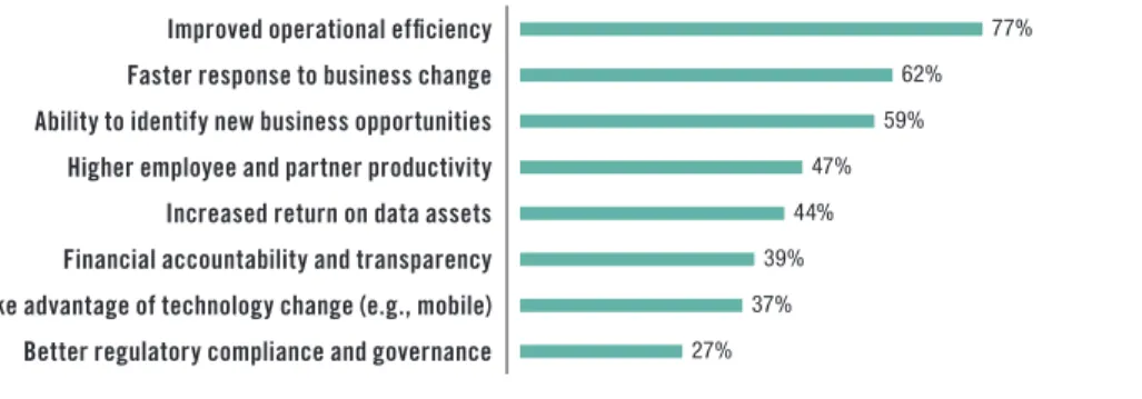
deploying data visualization and visual analysis technologies (see Figure 4). Poor information flow to employees who are directly responsible for process efficiency and optimization is the Achilles’ heel of many organizations. Employees are often delayed in operation execution when they have to look for the right information across siloed applications and interfaces. Dashboards that can consolidate information for easy-to-use reporting and analysis will contribute to operational efficiency. Faster response to business change (62%) is the second most common priority among respondents. Leaders in most organizations understand that if they can analyze data and feed insights sooner and more frequently to decision makers, they will realize advantages over firms that are locked into slower decision cycles. Self-service visual data discovery and analytics can relieve decision makers of many steps in the traditional dance with IT to gain access to data and develop new reports and visualizations. The third highest potential business benefit cited by respondents was the ability to use visualizations to identify new business opportunities (59%).
Which of the following are the most important business benefits that your organization seeks to gain from deploying data visualization and visual analysis technologies? (Please select all that apply )
Improved operational efficiency 77%
Faster response to business change 62%
Ability to identify new business opportunities 59%
Higher employee and partner productivity 47%
Increased return on data assets 44%
Financial accountability and transparency 39%
Take advantage of technology change (e g , mobile) 37%
Better regulatory compliance and governance 27%
Figure 4. Based on answers from 424 respondents; respondents could select more than one answer.
Skills and budget shortages are the biggest barriers We asked respondents to name the most significant barriers to adoption of data visualization and analysis. The top three were lack of skilled personnel or training, not enough budget or resources, and difficulty identifying or quantifying hard returns. The barrier indicated by the smallest percentage of respondents was insufficient computing or networking for visualization, followed by scalability to serve increasing numbers of intended users. These results suggest that the biggest perceived barriers are not about whether organizations have the
technology infrastructure to support data visualization and analysis. Even data quality is not a topmost concern; only about a third of respondents said this was a barrier. The greatest concern centers on whether employees will have adequate knowledge and skills to make effective use of the tools and whether deployment can be justified from a business perspective.
Visualization and Performance Management for Business Objectives
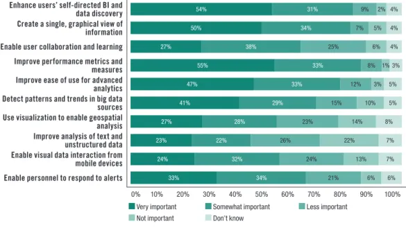
Organizations have a variety of information objectives guiding their implementation of data visualization and visual analysis technologies. In Figure 5 (page 15), we can see how respondents to the TDWI Research survey view 10 objectives that are priorities for most organizations. More than half (55%) said that improving performance metrics and measures is very important, and another
The greatest perceived barrier centers on whether employees have adequate knowledge and skills to make effective use of the tools
self-directed BI and data discovery is a high priority (54% and 31%, respectively). TDWI Research finds that these two objectives are increasingly related.
Performance management metrics and scorecards, usually presented to employees through dashboards, have been somewhat successful for aligning decisions and actions with strategic and financial objectives. The most difficult parts of performance management are often defining the KPIs and then ensuring that users have access to valid data to implement the measures. Managers and employees who are held accountable for certain metrics and measures need actionable information so that they can make positive changes or alert upper management when additional resources are needed. Because they are closer to their areas of responsibility, they often know more about the data than corporate management does, but they lack the tools to interact with it effectively. Self-directed BI and data discovery could be helpful in giving such employees the tools they need to perform. The user story below offers an example of how visual analytics and discovery plays a key role in
performance management. USER STORY
VISUAL DISCOVERY DELIVERS THE BIG PICTURE FOR FINANCIAL ANALYSIS AT AAPA
Reducing time to insight is critical for many organizations, but sometimes not all departments and divisions get the tools they need to make this happen for their concerns. Executives and customer-facing groups such as marketing, sales, and service usually come first. Finance and business management users are often left to use spreadsheets and siloed back-end accounting systems, with custom coding required to supply data for analysis. If these users implement more sophisticated budgeting, forecasting, and planning applications, these are often removed another step further from the data.
However, with data analysis becoming ever more essential to financial performance management, business and finance managers are beginning to implement tools that enable them to easily drill down into the data behind key performance indicators and scorecards in their budgeting, forecasting, and planning applications. Visual discovery can decrease time to insight for performance management. With self-service capabilities, the tools can reduce users’ dependency on IT to custom-build visual reports and code access to data.
Integrated tools have been a boon for the American Academy of Physician Assistants (AAPA). Based in Alexandria, Virginia, the Academy is the national professional society for physician assistants (PAs); it advocates and educates on behalf of the profession and the patients PAs serve. AAPA works to ensure the professional growth, personal excellence, and recognition of PAs. Shyam Desigan, CFO and SVP of IT at AAPA, implemented the cloud-based Adaptive Planning suite, which includes the visual discovery tool Adaptive Discovery. AAPA uses the suite to integrate its visually interactive dashboards and scorecards with planning, budgeting, and forecasting processes. Users can automate access from visualizations to data in the Academy’s back-end Microsoft Dynamics SL financial management and accounting system.
“I can point my cursor at a particular number, such as the cash-flow variance, and drill down from the visual discovery graph right in to the transactions to see the variance,” Desigan said. “I describe it like a camera. Visual discovery gives the global view; as part of the integrated suite, we can use it to pan around or zoom in to get a more close-up, granular view of data in the back-end system.” Desigan said that the visualization is particularly helpful for seeing how things are moving, the variances in budgets, and other key trends. “The integrated tools cut out a lot of the prep work to get data; developing visual graphs is automated.”
Employees closer to their areas of responsibility often know the most about the data, but they lack the tools to interact with it effectively
Users need visualization to create a single view of information Figure 5 shows that organizations put a high priority on using data visualization to create a single, graphical view of information; 50% see this as very important and 34% as somewhat important. Organizations implementing advanced dashboards are able to provide mashups of data from multiple sources, both internal and external, including news and social media feeds. Such dashboards can improve employee productivity where staff currently find it necessary to jump from report to report and across different applications to gain a complete view.
Managers and employees who need to increase their level of data analysis require integrated access to information as well as tools for easier implementation of advanced analytics, according to TDWI Research. For some users, advanced analytics can mean OLAP; for others, it includes activities such as testing, training, scoring, and monitoring predictive models that involve many variables. Machine learning, neural networks, and other statistical, quantitative, or mathematical modes of deeper data analysis may also be part of an advanced analytics effort.
Nearly half (47%) of respondents said that they hope to implement data visualization and analysis technologies to improve the ease of use of advanced analytics; one-third said it was somewhat important. Visualization for big data analytics is also a priority for many; a significant percentage (41%) find it very important (and 29% find it somewhat important) for visualization and visual analysis to help them detect patterns and trends in big data sources. Less important currently is using visualization for improving analysis of text and unstructured data. Just under one-quarter (23%) said this was a very important objective, while 26% said it was less important and 22% said it was not important at all. It is likely that this is due to the general immaturity of text and unstructured data analysis in most organizations.
How important to users in your organization are each of the following objectives for implementing data visualization and analysis technologies?
Enhance users’ self-directed BI and
data discovery 54% 31% 9% 2% 4%
Create a single, graphical view of
information 50% 34% 7% 5% 4%
Enable user collaboration and learning 27% 38% 25% 6% 4%
Improve performance metrics and
measures 55% 33% 8% 1% 3%
Improve ease of use for advanced
analytics 47% 33% 12% 3% 5%
Detect patterns and trends in big data
sources 41% 29% 15% 10% 5%
Use visualization to enable geospatial
analysis 27% 28% 23% 14% 8%
Improve analysis of text and
unstructured data 23% 22% 26% 22% 7%
Enable visual data interaction from
mobile devices 24% 32% 24% 13% 7%
Enable personnel to respond to alerts 33% 34% 21% 6% 6% 0% 10% 20% 30% 40% 50% 60% 70% 80% 90% 100%
Very important Somewhat important less important
not important Don’t know
Figure 5. Based on answers from 416 respondents; respondents could select one answer per row. Selections are ranked by number of responses.
For some users, advanced analytics can mean OLAP; for others, it includes activities such as testing, training, scoring, and monitoring predictive models that involve many variables
Implementation Practices for Better Decisions
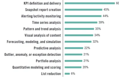
With these business benefits, barriers, and objectives in mind, we can now turn to implementation issues and look at how organizations can use visualization to arrive at better decisions. Increasingly, implementation success rises and falls with users, not IT; dashboards, visual analytics, and discovery tools are giving users more control, enabling them to progress further on their own rather than depend on IT. This is important for large organizations where IT application backlogs are a problem; it is also a significant benefit for small and midsize firms that do not have extensive IT support for visual reporting and analysis. However, as always, with the advantages come new challenges. One of the most potent benefits is better communication. Our research makes it clear that performance management continues to be a vital initiative and that the associated dashboards are intended to be the centerpiece. In Figure 6, we can see that KPI definition and delivery is the most prevalent activity currently deployed for users through implementation of data visualization and visual analysis technologies (60%). Second and third highest are snapshot report creation (45%) and alerting/monitoring activity (44%). For all three of these activities, visualizations are critical in providing actionable insight; they enable executives, managers, and other users to focus on the situation at hand rather than having to tease out facts from data tables, ratios, and formulas.
Which of the following business analysis, reporting, and alerting activities are currently deployed for users in your organization through implementation of data visualization and visual analysis technologies? (Please select all that apply )
KPI definition and delivery 60%
Snapshot report creation 45%
Alerting/activity monitoring 44%
Time series analysis 39%
Pattern and trend analysis 35%
Visual analysis of content 34%
Forecasting, modeling, and simulation 32%
Predictive analysis 22%
Outlier, anomaly, or exception detection 21%
Portfolio analysis 21%
Quantitative modeling and scoring 20%
List reduction 6%
Figure 6. Based on answers from 408 respondents; respondents could select more than one answer.
Visualizations enable new forms of collaboration on data Many tools allow users to publish charts, not only in dashboards for viewers to share, but also through e-mail and collaboration platforms such as Microsoft SharePoint. Dashboards can deliver context for visualizations by providing annotations and related charts, since one chart often cannot tell the whole story. Other means of storytelling, including animation or video and audio files, may be part of the collaboration.
KPI definition and delivery is the most prevalent activity currently deployed for users through implementation of data visualization and visual analysis technologies
Storytelling is important because visualizations are usually—and often, intentionally—left open to interpretation. Different viewers can draw different interpretations, which they can investigate by drilling down into the data. Some charts may hide the importance of certain factors, while others might exaggerate them. This ambiguity makes it important for executives, managers, and users to work with visualizations as tools to engage in a productive dialogue about metrics and measures. Organizations can use visualizations to overcome the “one-way street” limitations often cited as the bane of performance management and standard BI reporting.
Time series analysis is an important focus A significant percentage of respondents implement visualizations for time series analysis (39%). Users in most organizations need to analyze change over time, and they typically use various line charts for this purpose. Some will also apply more exotic visualizations such as scatterplots for specialized time series analysis, including examining correlations over time between multiple data sources. Visualizations for pattern and trend analysis, often related to time series analysis, are employed by 35% of respondents.
Time series, pattern, and trend analysis complement predictive analysis. Organizations want to use history to forecast what will happen next and identify what factors will cause patterns to repeat themselves. Almost a third (32%) of respondents use visualizations for forecasting, modeling, and simulation, and 22% are doing so for predictive analysis. Again, visualizations can improve vital collaboration on predictive analysis among different subject matter experts, who can share perspectives and help the organization adjust strategies to be proactive. The organization will anticipate events and be prepared with the most intelligent way to respond.
Geospatial Analysis and Visualization
The ability to superimpose data visualizations on top of maps is already a powerful asset for firms in industries such as real estate, energy, telecommunications, land management, law enforcement, and urban planning. As more location-based data from geographical information systems (GIS) becomes available, organizations in many other industries are also becoming interested in analytical
capabilities. Retail firms, for example, can use the combination of business data and maps to determine where to locate stores; healthcare organizations can better understand patient behavior and disease patterns; insurance firms can use location analysis to improve risk management; and marketing functions in a variety of firms can overlay customer information and demographics on maps to sharpen messaging to different neighborhoods.
Although just under half (49%) of organizations surveyed are not currently implementing geospatial analysis, a significant percentage are implementing visualization for activities such as geographic targeting (35%), routing and logistics (14%), and finding nearest locations. Nearly a third (31%) of respondents seek to integrate geospatial with other types of analysis. The ability to visualize corporate data and advanced analysis such as time series along with location information can help organizations add a new dimension to business strategy and operational intelligence. Mapping visualizations can be enhanced with data to become geographical heat maps; these might show the most or least profitable sales territories or where customers are having particular kinds of service problems.
The user story on the next page describes how visualization and location analysis increased the success of retail store launches.
Some charts may hide the importance of certain factors, while others might exaggerate them
As more location-based data from geographical information systems becomes available, organizations in many industries are becoming interested in analytical capabilities
USER STORY
PLANET FITNESS USES VISUAL GIS ANALYSIS TO FIND THE SWEET SPOTS FOR RETAIL
Where should we locate a new store? What kinds of customers will come, and how far are they willing to travel? How will new zoning laws affect our strategy? Answering these questions can be critical to the success of retail organizations, and questions of a similar nature often confront decision makers in real estate, business and industrial development, healthcare services, city planning, and more.
Rather than having to look at data silo by silo, GIS analysis can help decision makers by giving them a single mashup view of relevant data within the context of maps. “All of this comes together to paint you a picture of a story that is in fact already there in the data,” said Matt Felton, president of Datastory Consulting. “But if you don’t have the right lens to see it, you can’t see it.”
Datastory Consulting, an offshoot of the Maryland-based commercial real estate firm MacKenzie, is helping Planet Fitness use the Esri ArcGIS platform to sharpen its strategy for locating new facilities. Planet Fitness has been growing fast; it has more than 600 low-cost health club locations in the U.S. With GIS analysis playing a key role, the company has been active in Maryland, opening 20 locations in just the first quarter of 2013. Working closely with John Schultz, senior vice president and principal at MacKenzie, which has a brokerage relationship with Planet Fitness, Datastory enables Planet Fitness to bring multiple variables to bear on finding location “sweet spots.” Through visual data interaction with “cloud maps”—what Datastory calls its rich, online data mashups of different sources shown on GIS maps—Planet Fitness decision makers can consider options even as new and ongoing developments take place in the location scenario.
“The cloud maps work as a collaboration tool to track current locations, the potential sites Planet Fitness is considering, and changes that affect the status of all sites,” said Felton. Decision makers can apply variables and attributes in the cloud maps and update the status of potential sites as they become more or less interesting, as construction begins on chosen locations, or as other milestones in the process of opening a site occur. “Deals get done smarter and faster, with a clearer perspective, after looking at data and sometimes thousands of variables to narrow down to sites with the highest potential,” Felton said.
Geospatial analysis of the potential for Planet Fitness club membership cannibalization among facilities in the same region.
Provisioning Data for Visual Access and Analysis
In most organizations, users need to tap multiple data sources to fuel visual reporting, analytics, and discovery. Business environments are dynamic, with mergers, acquisitions, and restructuring adding new sources to the mix. Big data trends are increasing interest in accessing “sub-transactional” raw data, often held in Hadoop files, to detect patterns and understand behavior.
At the same time, data aggregations and summaries remain critical for supporting visual reporting and analytics so that users can see specific time periods and frame other areas of interest without getting overwhelmed by the data deluge. Along with providing access to Hadoop files, many modern visual reporting and data discovery tools enable users to create aggregations as the need arises rather than having to suffer the delays of requisitioning them ahead of time from IT developers. In a number of leading tools, this is accomplished through an integrated in-memory data store where the aggregations are done on the fly from detailed data stored in memory.
TDWI Research finds that enterprise data warehouses, BI reporting and OLAP cubes, spreadsheets, and analytic databases are the most important data sources for visual analysis and data discovery, according to survey respondents. Nearly three-quarters of respondents also regard access to
departmental data marts as important. Analytic databases, somewhat of a new technology category, are considered very important by 46% of respondents and at least somewhat important by 24%. Analytic databases are purpose-built for analytics rather than OLTP; through columnar organization,
compression, and other techniques, they can improve speed and performance for visual analytics and discovery. Some analytic databases use Hadoop internally for data storage.
Interestingly, significant numbers of respondents said that the least important sources for visual analysis and data discovery are NoSQL databases and Hadoop files. Just under half (44%) said that these sources are not important, while only 10% said they were very important and 14% said they were only somewhat important. Evidently, these sources have not yet become the mainstream.
Operational source systems and transaction applications are not forgotten Along with access to traditional BI, data warehousing, and data mart sources, many users require direct access to OLTP and application data. More than a third (37%) of respondents said that access to ERP, CRM, and other applications is very important, and 27% said it was somewhat important. Nearly the same percentages of respondents indicated that their organizations need direct access to operational source systems.
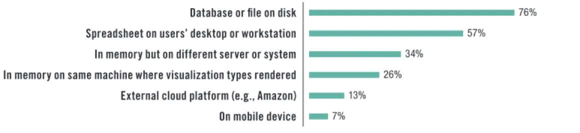
In-Memory Computing for Visual Analysis and Discovery
Although in-memory computing for analytics is a hot industry topic, TDWI Research finds that overwhelmingly, the physical location of data accessed for users’ visual analysis and discovery is on a database or file on disk (76%; see Figure 7). The second most prevalent source is spreadsheets on desktops or workstations (57%). Use of in-memory computing, however, does garner a healthy amount of interest; one-third of respondents are implementing in-memory on different servers or systems from where the visualization types are rendered, and 26% are doing so on the same machine.
Data aggregations and summaries remain critical for supporting visual reporting and analytics
Sixty percent of respondents are using in-memory computing to help render visualizations
In your organization, where physically does data that is accessed for users’ visual analysis and discovery reside? (Please select all that apply )
Database or file on disk 76%
Spreadsheet on users’ desktop or workstation 57%
In memory but on different server or system 34%
In memory on same machine where visualization types rendered 26%
External cloud platform (e g , Amazon) 13%
On mobile device 7%
Figure 7. Based on answers from 393 respondents; respondents could select more than one answer.
Adoption of 64-bit operating systems has made it easier for developers and users of BI and analytics systems to exploit very large memory and bring powerful functions closer to the data. With in-memory computing, the traditional I/O bottleneck constraint—where queries have to read information from tables stored only on disk—becomes less of a factor. Users can perform, on their own, types of analysis that would be too slow with disk-dependent systems and limited in scope because not enough data is available. In-memory computing could therefore be an advantage for complex, highly interactive analytics or in circumstances where it would hurt the performance of operational data sources to go against live data.
Several leading visual discovery and analysis tool providers include an in-memory data mart as part of their applications. These integrated offerings load data from a variety of disk and spreadsheet sources into memory for display and analysis. By integrating this data automatically, the applications avoid the need for additional IT setup and management.
However, in-memory computing is not a silver bullet, nor is it the right approach in all cases. As data volumes rise, management of the memory space can become an issue. Organizations also have to consider how frequently they need to update the data in memory. Data management issues can arise if users are essentially creating in-memory, siloed data marts that then become difficult to update and maintain from a data quality perspective.
Overall, TDWI Research finds that most respondents give the speed of data access and selection for data visualizations a middling grade, with just over a third somewhat satisfied and just under a third somewhat unsatisfied. Only 6% are very satisfied; however, this segment is implementing in-memory computing at a higher rate. Nearly two-thirds of these respondents are working with data in memory but on a different server or system from where visualization types are rendered; 42% of these respondents have data in memory on the same machine.
The user story below describes the potential XL Group sees for implementing visual analytics on big data sources.
USER STORY
XL GROUP TAPS VISUAL ANALYSIS TO IMPROVE INSIGHTS AND ENHANCE COLLABORATION
In a data-driven world, business innovation depends on a strong bond between subject matter experts who know the business and data analysts and scientists who have expertise in finding patterns, trends, and correlations in the data. In many organizations, however, the two cultures live separately; without a common language, communication and collaboration are difficult. As a result, organizations can be slow to realize potential competitive advantages and may miss shifts in customer demand.
Most respondents give the speed of data access and selection for data visualizations a middling grade
New big data sources are creating “powerful and potentially transformative analytical opportunities” at XL Group, according to Kimberly Holmes, head of strategic analytics. XL, through its subsidiaries, is a global insurance and reinsurance company that offers property, casualty, and specialty products to firms throughout the world. The internal and external big data sources are giving business and data analysis teams much larger data sets than they have ever had, in order to support decision makers who analyze risk and develop strategic and potentially profitable new products. “Our mandate is to develop decision-making tools using a broader set of data and advanced analytics to enable business leaders to make better decisions.”
By implementing advanced analytics, XL is “testing conventional wisdom and pushing beyond hindsight and one-way analysis,” said Holmes. A critical objective of the implementation is “minimizing the challenges of conveying complex relationships in the data to decision makers.” XL is in the early stages of implementing SAS Visual Analytics to “bridge the gap between the business decision maker’s expertise and that of the analyst.” SAS Visual Analytics, which XL is deploying as a hosted system, offers advanced visualization backed by an in-memory analytics engine.
“Visual analytics is a way of enabling business leaders to explore data and look for patterns without having an extensive education in data analysis,” Holmes said. “If the business leader is working alongside the analyst and leading the exploration of the data, it will lead to deeper understanding of the data and the business. This collaboration is easier with visual analytics because the business leader can see the story in the data.”
Dashboard Strategies and Data Visualization
It seems hard to imagine BI applications today without dashboards. From an industry perspective, it is easy to take for granted the pairing of these two technologies. Dashboards provide the front-end workspace that enables users to access and visualize their data without having to get their hands dirty with queries and code. Meanwhile, BI and data warehousing systems work behind the scenes to handle queries, metadata, data integration, and other data management duties.
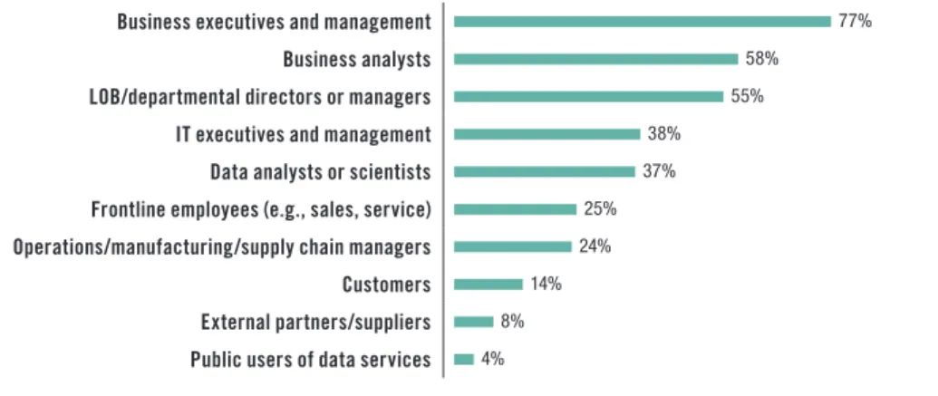
However, TDWI Research finds that dashboards are not as ubiquitous as they might seem. Half of respondents to the research survey said that one-quarter or less of users in their organizations are implementing dashboards for any of their BI and/or analytics applications. Only 5% indicated that 75–100% of their users are implementing dashboards; 27% said between 50–75% are using them. Thus, the research tells us that regarding dashboard implementations, there is room to grow. For
example, Figure 8 shows that only a quarter of survey respondents said that frontline employees such as those in sales and service are users of dashboards in their organizations. TDWI Research finds that the majority of respondents report only mild satisfaction with how easily users can understand visual analytics presented in their dashboards. This could be one reason why organizations have not yet expanded the use of dashboards to the majority of their users.
Executives are the dominant users of dashboards In Figure 8, we can see that business executives and management users (77%) are in the majority as the primary users of dashboards or similar visual data analysis, access, and reporting workspaces. Our research suggests that they are primarily consumers of snapshot reports and scorecards prepared by IT developers, business analysts, and power users—more so than visual analytics and discovery. After business analysts (58%), line-of-business (LOB) and departmental managers form the third largest segment (55%). Survey respondents who said LOB and departmental managers are users of dashboards identified improved
Dashboards are not as ubiquitous as they might seem