THE DISPLAY OF VERY LARGE DATASETS
_______________
A Thesis Presented to the
Faculty of
San Diego State University
_______________
In Partial Fulfillment
of the Requirements for the Degree Master of Science in Geography
with a Concentration in Geographic Information Science
_______________
by
Nicole Marie Stotz Spring 2015
Copyright © 2015 by
Nicole Marie Stotz All Rights Reserved
ABSTRACT OF THE THESIS
Usability Evaluation of Google Fusion Tables for the Display of Very Large Datasets
by
Nicole Marie Stotz
Master of Science in Geography with a Concentration in Geographic Information Science
San Diego State University, 2015
The elasticity and on-demand nature of cloud services have made it easier to create web maps. Users only need access to a web browser and the Internet to utilize cloud based web maps, eliminating the need for specialized software. To encourage a wide variety of users, a map must be well designed; usability is a very important concept in designing a web map. Fusion Tables, a new product from Google, is one example of newer cloud-based distributed GIS services. It allows for easy spatial data manipulation and visualization, within the Google Maps framework. ESRI has also introduced a cloud based version of their software, called ArcGIS Online, built on Amazon’s EC2 cloud. Utilizing a user-centered design framework, two prototype maps were created with data from the San Diego East County Economic Development Council. One map was built on Fusion Tables, and another on ESRI’s ArcGIS Online. A usability analysis was conducted and used to compare both map prototypes in term so of design and functionality. Load tests were also ran, and
performance metrics gathered on both map prototypes. The usability analysis was taken by 25 geography students, and consisted of time based tasks and questions on map design and functionality. Survey participants completed the time based tasks for the Fusion Tables map prototype quicker than those of the ArcGIS Online map prototype. While response was generally positive towards the design and functionality of both prototypes, overall the Fusion Tables map prototype was preferred. For the load tests, the data set was broken into 22 groups for a total of 44 tests. While the Fusion Tables map prototype performed more efficiently than the ArcGIS Online prototype, differences are almost unnoticeable. A SWOT analysis was conducted for each prototype. The results from this research point to the Fusion Tables map prototype. A redesign of this prototype would incorporate design suggestions from the usability survey, while some functionality would need to be dropped. This is a free product and would therefore be the best option if cost is an issue, but this map may not be supported in the future.
TABLE OF CONTENTS
PAGE
ABSTRACT ... iv
LIST OF TABLES ... viii
LIST OF FIGURES………... ... ix ACKNOWLEDGEMENTS ... xi CHAPTER 1 INTRODUCTION ...1 1.1 PROBLEM STATEMENT ...2 1.2 RESEARCH QUESTIONS ...4 2 LITERATURE REVIEW ...5
2.1 WEB MAPS AND MASHUPS ...5
2.2 CLOUD COMPUTING ...8
2.3 USER CENTERED DESIGN ...11
3 METHODS ...13
3.1 STUDY AND TESTING DESIGN ...13
3.2 DATA GATHERING AND REFINING ...14
3.3 PROTOTYPE DEVELOPMENT ...15
3.3.1 FUSION TABLES MAP PROTOTYPE DEVELOPMENT ...17
3.3.2 ARCGIS ONLINE MAP PROTOTYPE DEVELOPMENT ...19
3.4 PERFORMANCE TESTING WITH DATASET ...20
3.4.1 PERFORMANCE TESTING: FUSION TABLES MAP PROTOTYPE ...21
3.4.2 PERFORMANCE TESTING: ARCGIS ONLINE MAP PROTOTYPE ...21
3.5 USABILITY STUDY DESIGN ...22
3.5.1 PARTICIPANTS ...22
3.5.2 SURVEY DESIGN ...22
3.5.3 SURVEY QUESTIONS ...23
4 ANALYSIS OF RESULTS ...26
4.1.1 FUSION TABLES MAP PROTOTYPE PERFORMANCE
TESTING ...26
4.1.2 ARCGIS ONLINE MAP PROTOTYPE PERFORMANCE TESTING ...29
4.2 ANALYSIS OF USER SURVEY ...32
4.2.1 ANALYSIS OF FUSION TABLES MAP PROTOTYPE SURVEY DATA ...32
4.2.2 ANALYSIS OF ARCGIS ONLINEMAP PROTOTYPE SURVEY DATA ...36
4.2.3 COMPARISON OF SURVEY DATA FROM BOTH PROTOTYPES ...39
5 DISCUSSION AND CONCLUSIONS ...42
5.1 LIMITATIONS ...42
5.2 SWOT ANALYSIS OF EACH PROTOTYPE ...42
5.3 CONCLUSIONS...45
LIST OF TABLES
PAGE
Table 1 Datasets used prototype design ...15
Table 2 Tools used in prototype creation ...16
Table 3 Task questions for each prototype ...24
Table 4 Multiple choice questions (on a scale of 1 to 7, with strongly disagree (1)/no opinion (4)/strongly agree (7) qualifiers) ...24
Table 5 Open ended question ...25
Table 6 Multiple choice question about web map usage ...25
Table 7 Fusion Table SWOT analysis ...43
LIST OF FIGURES
PAGE
Figure 1 Screenshot of California Portal (Zeemaps [https://www.zeemaps.com/]) ...3
Figure 2 Literature review subject areas ...5
Figure 3 Screenshot of HealthMap ...7
Figure 4 (Foster et al., 2008) ...8
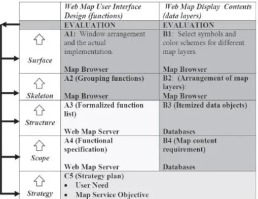
Figure 5 The implementation of user-centered design approaches for web mapping components (map servers, databases, and map browsers) with iterative feedback procedures. (Tsou & Curran, 2008) ...11
Figure 6 Study design ...13
Figure 7 Fusion Tables map prototype ...19
Figure 8 ArcGIS Online map prototype ...20
Figure 9 Fusion Tables Map Prototype: Page Hits with Increasing User Load Over Time ...27
Figure 10 Fusion Tables Map Prototype: Page Load Times with Increasing User Load Over Time ...27
Figure 11 Fusion Tables Map Prototype: Page Timeouts with Increasing User Load Over Time ...28
Figure 12 Fusion Tables Map Prototype: Page Errors with Increasing User Load Over Time ...28
Figure 13 Fusion Tables Map Prototype: Data Received with Increasing User Load Over Time ...28
Figure 14 Fusion Tables Map Prototype: Data Transferred with Increasing User Load Over Time ...29
Figure 15 ArcGIS Online Map Prototype: Page Hits with Increasing User Load Over Time ...30
Figure 17 ArcGIS Online Map Prototype: Page Timeouts with Increasing User Load Over Time ...30
Figure 19 ArcGIS Online Map Prototype: Data Received with Increasing User Load Over Time ...31
Figure 20 ArcGIS Online Map Prototype: Data Transferred with Increasing User
Load Over Time ...31 Figure 21 Fusion Tables map prototype survey task times: minimum, maximum, and
average time in seconds (including abandoned tasks) ...33 Figure 22 Fusion Tables Map Prototype: Detailed Task Times by Participant
(including abandoned tasks) ...33 Figure 23 Fusion Tables Map Prototype Task Completion and Abandonment by
Survey Participant ...34 Figure 24 Fusion Tables map prototype survey multiple choice Likert scale questions,
by total number of participant responses per question...35 Figure 25 Fusion Tables map prototype survey open ended question responses ...35 Figure 26 ArcGIS Online map prototype survey task times: minimum, maximum, and
average time in seconds (including abandoned tasks) ...36 Figure 27 ArcGIS Online Map Prototype Task Completion or Abandonment by
Survey Participant ...37 Figure 29 ArcGIS Online map prototype survey multiple choice Likert scale
questions, by total number of participant responses per question ...38 Figure 30 ArcGIS Online map prototype survey open ended question responses ...39 Figure 31 Survey participants web map usage (25 responses) ...40 Figure 32 Comparison of task times (minimum, maximum, and average time in
seconds) for Fusion Tables map prototype survey and ArcGIS Online map
prototype survey...40 Figure 33 Comparison of multiple choice Likert questions for ArcGIS Online map
prototype and Fusion Tables map prototype surveys, A=ArcGIS Online
ACKNOWLEDGEMENTS
I would like to thank Jo Marie Diamond and Brenda Gajon of the East County
Economic Development Council for the use of the Connectory’s data for this thesis. I would also like to thank my committee: Dr. Ming-Hsiang Tsou, Dr. Piotr Jankowski, and Dr. Carl Eckberg. I especially thank my advisor, Dr. Ming-Hsiang Tsou, for being supportive and patient during the whole writing process. I also thank my family for their love and support, and who can now finally stop asking me if I’m done with my thesis.
CHAPTER 1
INTRODUCTION
The power of GIS has grown, shifting “from a closed, centralized GIS architecture, to an open, distributed geographic information services (GIServices) framework” (Tsou 2008). Advances in computer hardware and software, as well as advances in network speeds have encouraged creation of cloud based GIS services. These cloud based GIS services are both more flexible and more intuitive than earlier forays into web mapping applications.
GIS is moving away from the domain of ‘experts’ and into the realm of the novice user. Developments of tools like Google Maps API, and mashups have led to an interest in easy to create and readily accessible maps. The elasticity and on-demand nature of cloud services have also made it easier to create web maps. Storage, software, and most
components are located in remote servers. Users only need access to a web browser and the internet to utilize cloud based web maps, eliminating the need for specialized software. Since a web map can be accessed from most any device with a browser, the platform for web based GIS has expanded from desktops, to almost any device.
Terms like ‘the cloud’ and ‘cloud-based’ are used as a shorthand to refer to “a large-scale distributed computing paradigm that is driven by economies of large-scale, in which a pool of abstracted, virtualized, dynamically-scalable, managed computing power, storage, platforms, and services are delivered on demand to external customers over the Internet” (Foster et al., 2008). Remotely housed network and data centers provide pooled storage and data analysis capabilities that can be accessed by many users at once.
Fusion Tables, a product from Google, is one example of newer cloud-based distributed GIS services. It allows for easy spatial data manipulation and visualization, within the Google Maps framework. The service is free and easy enough to use that a simple map can be set up in a few minutes (Gonzalez et al 2010). This simplicity and intuitive
design is part of a larger trend of involving non-technical users in the creation and design of web maps (Goodchild, 2007) (Tsou and J Curran 2008)(Newman et al., 2010).
ESRI’s ArcGIS Online is another example of a cloud based GIS service. Like Google’s Fusion Tables, it offers data hosting and simple map visualizations for free. Data analysis features are available through a system of pre-paid credits. Pre-designed templates are built to work on web and mobile platforms, or customized through the ESRI JavaScript API.
Usability is a very important concept in designing a web map. It covers four broad areas: quality in use, product quality, process quality, and organizational capability (Bevan, 2001). ISO 9241-11 defines usability as “the extent to which a product can be used by specified users to achieve specified goals with effectiveness, efficiency and satisfaction in a specified context of use” (Abran, Khelifi, Suryn, & Seffah, 2003). To encourage a wide variety of users, a map must be well designed. The concept of User Centered Design places the user at the center of the design process “which incorporates human factors and
ergonomics knowledge and techniques with the objective of enhancing effectiveness and productivity, improving human working conditions, and counteracting the possible adverse effects of use on human health, safety and performance”(Bevan 1999). This iterative process includes functionality, performance, and user evaluation and input throughout all stages.
Fusion Tables is adaptable, and there are many existing examples of visualizations and maps. However, there does not seem to be any formal research into the usability and performance of Fusion Tables in comparison to established web mapping technology with large datasets. This study aims to address this gap, utilizing data from a local non-profit as a test case.
1.1
PROBLEM
STATEMENT
The data for this study came from the East County Economic Development Council (ECEDC). The ECEDC is based out of El Cajon, CA, and is “an alliance of representatives from business, government, and education working to promote successful business activity in San Diego's east county” (http://eastcountyedc.org/). They run a site called the Connectory (http://www.connectory.com/), with a focus on Western U.S. states. This site features a number of web maps displaying information on over 25,000 businesses.
Originally, the web maps were powered by Zeemaps, a free web map service. While fine for small datasets, Zeemaps could not effectively handle the large amount of profiles the Connectory has, with load times being very slow for larger geographic areas. The design was not that intuitive; there was a page long explanation needed to orient the user on how to use the map. Design was also not consistent, with symbols and colors changing across the
different portal maps (Figure 1).
To address issues of usability (design, performance) and implementation (cost, ease of design and maintenance), two test maps were created utilizing data from the East County Economic Development Council. One map was built on Fusion Tables, and another on ESRI’s ArcGIS Online, both cloud based platforms. A user centered design process was utilized in the creation of both map prototypes. A user survey was administered to judge the
effectiveness of both prototypes. Finally, performance testing was performed on both prototypes. Feedback and survey analysis will point to which platform is actually perceived to be more effective for the needs of a non-profit.
1.2
RESEARCH
QUESTIONS
The purpose of this research is to evaluate which cloud based mapping service is most effective at displaying the Connectory’s very large size of point data.
1) How should cloud-based tools be utilized for the effective map display of very large point datasets?
To address this question, a user centered design process was utilized in the initial creation of both map prototypes.
2) How does the usability of a Fusion Tables based web map compare to that of an ArcGIS Online web map?
A usability survey that addressed design and functionality was given to ## participants from the geography department. Finally, performance testing was conducted to see how both maps handled multiple users with different sizes of the dataset.
3) What are the technical challenges and functional limitations in the development and implementation of both map prototypes?
The design of each map prototype came with a variety of unique issues that are very
important to consider when evaluating the usefulness of each one. These range from the ease of design and setup, to cost and future maintenance. A SWOT analysis was conducted to evaluate the strengths and weaknesses of each prototype.
CHAPTER 2
LITERATURE REVIEW
The literature review covers three areas: web maps/mashups, cloud computing, and user centered design. This project lies at the intersection of these areas (Figure 2). Web based maps and new cloud based maps have evolved to handle the increasingly large datasets that are now available online. As the public becomes more aware of this information, and technology needed to create these maps has become more user-friendly, mashups and visualizations are popping up.
Figure 2 Literature review subject areas
2.1
WEB
MAPS
AND
MASHUPS
The rise of cheaper and faster computers, coupled with faster network technologies, are leading to interesting possibilities for the growth of internet GIS. A more inclusive and participant centered GIS was behind the development of the concept of GIS/2, where the
User Centered
Design
Web maps & mashups Fusion Tables and ArcGIS Online Map Prototypes Cloud Computing
networked technologies of the web were acknowledged as intrinsic in the creation of a more user friendly GIS (Schroeder, 1996). A slightly similar concept, public participatory GIS, also acknowledges the necessity of citizen involvement in GIS decision making (Jankowski, 1996). Moving from a centralized, expert model, to a distributed, participatory model has ‘socialized’ GIS (McLafferty, 2004). The use and implementation of geographic data is of interest to variety of users, the range of which becomes more diverse as GIS moves towards a more open framework (McLafferty, 2004)(Sheppard, 1995). A paradigm shift from the ‘isolated islands’ of traditional GIS to an ‘open and distributable’ GIS is underway (Tsou & Curran, 2008).
Sieber suggests the need for a ‘rewiring’ of the GIS/2 concept (Sieber, 2004), in which participants take control of the creation and development of a GIS. The four
approaches he suggests (integrating local and traditional knowledge, infiltrating the cyborg, rewriting code, and rebuilding GIS) are analyzed further by Haklay (Haklay, 2006) in terms of Feenburg’s analysis of the role of society and technology (Feenberg, 1999). Haklay laid out a typology of four different types of hacking; use (applying existing tools differently), meaning (using information in new ways), shallow (end user programming), and deep
technical (system programming). Newer web mapping technologies have allowed the GIS/2 concept to embrace most of the typology of hacking yet GIS still remains highly technical, with deep technical hacking out of the knowledge domain of many (Haklay, 2006).
Haklay’s typology of hacking is part of the emergence of neogeography, which “consists of a set of techniques and tools that fall outside the realm of traditional GIS” (Haklay, Singleton, & Parker, 2008). Turner further defines neogeography as being “about people using and creating their own maps, on their own terms and by combining elements of an existing toolsets” (Turner, 2006). Here, Haklay’s typology boils down to the repurposing of existing GIS technologies and standards, as the lines between producer, communicator, and consumer of geographical information become blurred (Goodchild, 2009). The rise of free, web based geospatial software (OpenStreetMap, Google Maps, Wikimapia) has furthered the phenomenon of volunteered geographic information (VGI), also known as crowdsourcing (Goodchild, 2007).
The introduction of the Google Maps API in 2005 led to the introduction, and popularization of mashups (Miller, 2006)(Turner, 2006) (Goodchild, 2007). Mashups
combine disparate sources of information into one interface (Zang & Rosson, 2008), and exemplify the bottom-up, rather than top-down map creation that is central to participatory GIS and GIS/2 (Jankowski, 1996)(Schroeder, 1996). A small study found that Google Maps API based map mashups were the most popular (Zang & Rosson, 2008), yet also noted the technical complexity behind their creation. The technical limitations of novice users (Nivala, Brewster, & Sarjakoski, 2008) (Zang & Rosson, 2008) and threats to public data through monetization schemes may be limiting factors in the development and application of mashups (Rouse, Bergeron, & Harris, 2007).
At present, the future directions for mashups lie at this intersection of data
availability, rapid tech innovation, and the ability of the non-geographer to participate in map making. Tsou (2011) discusses how ubiquitous web maps have become with the popularity and new mapping functions in modern mobile phones. User generated content can be easily collected and added to mobile apps. These apps include voice functionality, media linkages, location awareness, and even augmented reality.
One recent example is HealthMap [www.healthmap.org], created by the Boston Children’s Hospital to provide real-time alerts of current disease outbreaks (Figure 3). It incorporates a range of data sources, and also allows map users to add outbreak alerts to the map. The map is based on the Google Maps API, with both web and mobile versions.
2.2
CLOUD
COMPUTING
The ability to analyze and present large datasets quickly and without the need for specialized software is the result of current virtualization technology. The thin client application face draws on a network of computers for both data storage and analysis. What was an idea in the 1960s, evolved into grid computing by the 1990s. A grid of computers
Figure 4 (Foster et al., 2008)
would act like a power grid, acting as a centralized pool of computing and software
resources. The idea of cloud computing is based on the concept of grid computing, but the difference lies in the scale and purpose of applications. Grid computing applications are oriented towards specific academic and scientific projects, with a smaller and more specialized user base. Cloud computing applications are usually driven with commercial purposes and a variety of users in mind (Figure 4) (Foster, Yong Zhao, Raicu, & Lu, 2008). TeraGrid is one example of the overlap between grid and cloud based services, growing out of the need to combine specialized information clusters to a wide array of users (Wilkins-Diehr, Gannon, Klimeck, Oster, & Pamidighantam, 2008). The ability of cloud computing to provide elastic, on-demand service is another feature that moves it beyond the capabilities of grid computing (Yang et al., 2011).
The architecture of cloud computing is based on four levels - 1) fabric, 2) unified resource, 3) platform, and 4) application layers (Foster et al., 2008). The foundation layer is the actual hardware, with virtualization services on the next layer, APIs and end-user
customizations on the third, and the user interface as the final layer. The virtualization layer is the main difference between cloud and grid models – as a business model, cloud
computing charges access by either time or information units for access to computing
resources. Examples include Amazon’s Elastic Cloud service, and ESRI’s Business Analyst Online. The differences between these two examples show the variety in cloud computing models, with Amazon offering a base to build an application on, and ESRI offering a
complete user interface. There are three levels of cloud computing services, SaaS (system as a service), PaaS (platform as a service), and IaaS (infrastructure as a service). These range from applications offered on demand through a thin client interface (SaaS), to the ability to create and control applications (PasS), to the ability to control fundamental computing resources (IaaS) (Mell & Grance, 2011).
A “cloud-based service for data management and integration”, Fusion Tables
launched in July of 2009, and is still in beta (testing phase, yet open to the public) (Gonzalez et. al. 2010). While there are many definitions of the cloud, and it is not an entirely new concept, the simplest definition is “a large-scale distributed computing paradigm that is driven by economies of scale, in which a pool of abstracted, virtualized, dynamically-scalable, managed computing power, storage, platforms, and services are delivered on demand to external customers over the Internet” (Foster et al., 2008). The importance of information access and maintaining that access becomes increasingly important as
information becomes a commodity (Sheppard, 1995). Open access and collaboration across fields and between users also offer an interesting future direction of GIS and cloud-based services (Wright & Wang, 2011).
The goals of Fusion tables are to provide easy data management, sharing, and collaboration for the non-technical user. One key aspect of Fusion Tables is the lack of a learning curve – there are no complex database systems or visualization concepts to learn since data is stored in the cloud (Gonzalez et al 2010). Data can be uploaded in popular formats (.csv, .xls), or added directly online. The primary format is a table, with the ability to set permissions for editing and viewing data stored in the table. There are also options for
simple visualizations, such as charts and maps. Visualizations are embeddable with the use of an automated link. Maps can also be exported as .kml, a popular and widely used web mapping format (Gonzalez et. al. 2010).
There are other similar products that provide some of the same functionality as Google’s Fusion Tables. ESRI hosts a service called ArcGIS Online, where a user can easily create and publish web maps. Data (in the form of .shp or .csv files) is uploaded by the user, a background map is picked, with a publish option giving both a static and embeddable URL. Basic lines and polygons can be added, and the map can be formatted so that anyone can add information. No complex spatial queries can be ran.
While ESRI’s ArcGIS Online and Google’s Fusion Tables host all information and server load, they provide very rigid interfaces. Amazon’s EC2 functions as a cloud-based hosting service. ESRI and Amazon EC2 partnered to create a virtual instance of ESRI’s ArcServer. The mapping platform and data are delivered on demand to both developer and user. This is highly customizable, with the ability to run complex spatial queries. However, this is not a novice friendly setup.
The 1995 definition of a GIS/2 identified several problems areas that didn’t have solutions (at that time), several of which Fusion Tables might address; participant inclusion, new methods of analysis, and an emphasis on legitimate rather than established agendas (Schroeder 1996). This is similar to the concept of citizens as sensors (Goodchild 2007) and citizen science projects (Newman 2011), with novice users being able to provide data for analysis and inclusion in predetermined projects. Yet Fusion Tables goes beyond this in that the expert is absent in every step from data collection, to collaboration, visualization, and analysis. There is still room for the expert, with a Fusion Tables API providing integration into other Google services.
Implications of an information base gathered, shared, visualized, and analyzed by a novice user base has recently been touched on in terms of information accuracy (Goodchild, 2009) and map design (Zang & Rosson, 2008) (Newman et al., 2010). Effective map design is important in accurately conveying information. The concepts of good design can vary, for example novice and expert map developers may have different ideas about the design and purpose of a mashup (Zang & Rosson, 2008).
2.3
USER
CENTERED
DESIGN
Good map design is based on an effective development interface. To make a GIS useful to people, the interface must be intuitive, and the interface designer must understand
Figure 5 The implementation of user-centered design approaches for web mapping components (map servers, databases, and map browsers) with iterative feedback procedures. (Tsou & Curran, 2008)
how people interact with information (Lanter & Essinger, 1991). User centered design is a framework that centers all aspects of development around the needs and expectations of the user (Figure 5) (Tsou & Curran, 2008).
The process for user centered design stems from research into usability engineering by Jacob Nielsen. He outline a few critical elements to consider when designing a user interface (Nielsen, 1992):
“-Consider the larger context
-Know the user: individual user characteristics, the user’s current task, functional analysis, evolution of the user
-Competitive analysis -Setting usability goals -Participatory design
-Coordinated design of the total interface: standards, product identity -Guidelines and heuristic analysis
-Prototyping -Empirical testing
-Iterative design: capture the design rationale -Collect feedback from field use”
One key issue when applying these elements to designing a web map interface is considering how different groups of individuals interpret informational and design elements. Since a web map is an interactive representation of a two dimensional object, a “key challenge...is to develop a typology of geovisualization tasks” (MacEachren & Kraak, 2014). Determining the functionality (and limits of) a design with as many variations of a user as possible is part of an effective design process.
To ensure the usability of a web mapping site, usability tests are conducted, with one part of the process consisting of user surveys (Pucher, 2008) (Tsou & Curran, 2008)(Nivala et al., 2008) (Newman et al., 2010). Drawing on Nielsen’s elements to consider in a user interface design, Robinson and MacEachren detail their approach to the usability and design of geovisualization tool for epidemiology. In developing their approach, they aim to
incorporate the end-user into the development of ESTAT by utilizing assessment surveys and focus groups (Robinson, A. et al, 2005). Roth describes the usage of an online survey as part of their design process of an interactive crime map (Roth, et al, 2015).
One of the key strengths of Fusion Tables is that it allows users to visualize data without having formal knowledge of visualization heuristics (Cammarano et al., 2007). Yet this also means that users have no knowledge of effective map design, and little to no research has been conducted on the usability of Fusion Tables in terms of map design.
ArcGIS Online also allows users to create maps without having to think of map design. The design is centered on easily creating maps. It is not a multi-purpose service. Tools presented are easily learned, and very similar to other ESRI layouts. Google provides a one-size-fits all design schema, but is this suitable for all purposes? What is the ultimate functionality of Fusion Tables, given design and size constraints?
CHAPTER 3
METHODS
3.1
STUDY
AND
TESTING
DESIGN
There were five steps in the design and testing phase of my study:
Figure 6 Study design
Using the five step model outline in Tsou (Tsou & Curran, 2008), I determined the best way to design my test maps. Figure 6 demonstrates the five model implementation as relative to design and data. I met with Connectory representatives multiple times throughout the design process to formalize their expectations, and to determine what could actually be implemented. Special concerns included privacy of certain types of data, and ease of future maintenance. Refine Data : East County Economic Development Council Connectory Database Initial Map Design Creation of Fusion Tables and ArcGIS Online map prototypes Analyze performance of each prototype with varying user and data sizes Usability study to determine effectiveness of the map prototypes
3.2
DATA
GATHERING
AND
REFINING
All data was gathered from the ECEDC and the US Census. The data for the Connectory is housed in a custom SQL database, comprised of over 50 tables with around 25,000 active business profiles. Only a small subset of the current SQL database is used in the current map setup, as most of this information is proprietary. Any information displayed on the web map is within the public domain, mostly consisting of contact and product information. To ensure that the project complied with ECEDC privacy and use concerns, only data that was needed was exported from the database.
Data from the SQL table was exported using custom SQL queries. Since I did not have access to the ECEDC server or database out of privacy concerns, these queries were created and ran by Brenda Gajon from the ECEDC. There were certain difficulties in formatting the SQL queries, mostly related to syntax errors in the database. Brenda also added a small table to the SQL database, which associated marker color names with industry categories. Since the original map was broken down into nine industry categories, the marker color names were linked to the 14 industry category numbers. This step was a workaround the symbology limitations of the Fusion Tables API.
Initially the data was exported as one large .csv file, but the size of the file proved to be an obstacle in actually uploading the data to the fusion table account. This was solved by creating three queries that output three .csv files. However, performance issues of the Fusion Tables prototype design at this stage were significant enough to require a new strategy in data organization.
The original 3 .csv files were reduced to one master file using OpenRefine, an open source data refining tool. One of the initial performance problems in the Fusion Tables prototype was that businesses were listed multiple times, as there are several data categories with multiple entries per business. This works fine in a SQL database, but there are
limitations to how Fusion Tables references and displays large datasets. The final version of the .csv as a flat file was published to ArcGIS Online and Fusion Tables.
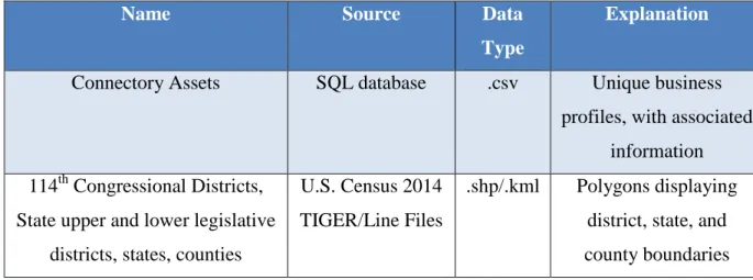
Overlay data was obtained from 2014 U.S. Census Tiger/Line files. This included counties, state senate districts, state legislative districts, and 114th Congressional districts (Table 1). The U.S. Census Tiger/Line files are provided as individual shape files. The
shapefiles were imported into ArcMap, where a subset of the data was extracted. Then, unnecessary fields were deleted, and field names standardized. Symbology and color were also standardized. The overlays were published as feature services to ArcGIS Online, but further processing steps were necessary for uploading to Fusion Tables. The overlay shapefiles were exported as .kmz files. These .kmz files were then unzipped to obtain the .kml file type that fusion tables supports.
Name Source Data
Type
Explanation
Connectory Assets SQL database .csv Unique business profiles, with associated
information 114th Congressional Districts,
State upper and lower legislative districts, states, counties
U.S. Census 2014 TIGER/Line Files
.shp/.kml Polygons displaying district, state, and county boundaries Table 1 Datasets used prototype design
3.3
PROTOTYPE
DEVELOPMENT
Once a data and design framework is established, test maps were created utilizing both web map platforms (Fusion Tables and ArcGIS Online). Development steps for each prototype were quite different. The Fusion Tables map prototype was developed first, and the ArcGIS Online map prototype second. This timeline was necessary since the API’s were different enough for each platform to be slightly confusing if developed in conjunction. Table 2 outlines the tools used in development of the prototypes.
Table 2 Tools used in prototype creation
Name Developer Version Explanation
JavaScript Netscape Communications Corporation, Mozilla
Foundation
A cross-platform, object-oriented programming language widely used
to provide web pages with interactive elements and features. Google Maps
API
Google 3 Web mapping service application and technology provided by Google;
JavaScript based. Fusion Tables
API
Google 2
(beta)
Cloud-based service for data management and integration.
HTML/CSS WW3C 4.01/3 Markup language/style sheet language
ArcGIS Online/ ESRI JavaScript
API
ESRI Create, manage, and distribute GIS services over the Web to support desktop, mobile and Web mapping
applications.
Dojo The Dojo Foundation 1.10 JavaScript development library
NotePad++ 6.77 A free source code editor which supports several programming languages running under the MS
Windows environment. OpenRefine Google Opensource date refining and
analysis tool
3.3.1
FUSION
TABLES
MAP
PROTOTYPE
DEVELOPMENT
The design of the Fusion Tables prototype had a few distinct stages: data refining, creation of tables, symbology, and connecting Fusion Table data with the map interface. Fusion Tables is still in beta, which added an extra layer of difficulty in development since past versions of the API have been deprecated.
The first step was to set up a Google account, necessary to create and access Fusion Tables. Fusion Tables is accessible through Google Drive, or as a freestanding Chrome app. Once the data had been processed and cleaned, it was very easy to upload into new tables. Separate tables were created to hold overlay layers (congressional districts, counties, state house and senate districts) and the Connectory business profile data.
The next step was to geocode the data. Google provides a free geocoding service in Fusion Tables. For the overlay data, the location was drawn from the kml file. KML files encode their location, field names, and other information in an XML-like file structure. Overlay information was only provided for the states that have contain business profiles. These states are: California, Oregon, Washington, Hawaii, Alaska, Idaho, and Montana. This step of the uploading process was the longest, as there are daily geocode limits per account.
Once they were all geocoded, the symbology was created. Symbology options set through the Fusion Tables interface can referenced through the API as a custom map style option. When the tables were visualized as maps, an option was available to change the color and transparency of the polygon overlays. All four overlays were given a semi-transparent grey shade, with a thick, dark gray border. There is also an option to create and style a simple info window. These info windows draw data from the tables fields. The info window for the overlays gave the name and number of the political district or county if clicked on. For the Connectory business profiles table, the marker color column was referenced for point symbology. The info window was also populated with business name, address, and contact information.
The Fusion Tables API provides access to the data in the Fusion Table with a SQL like query structure. Within the Google Maps API, it can be integrated as a map layer.
These APIs allow for a more customizable map, and extend beyond the default options allowed in the visualization options of Fusion Tables.
The Google Maps API is JavaScript based, and is called from within a web page. In the design of the map code, the base map is created first, with additional layers and
functionality created and called later on. Basemap imagery is provided by Google, and functions such as zoom and pan are default options. Symbology and color schemes are default Google Map colors, unless changed. Symbology set for each Fusion Table within the app interface can be referenced as a custom style when a new Fusion Tables layer is
declared.
Structuring the queries with the Fusion Tables API was the most challenging part of the development of this prototype. Since it is still in beta, API syntax has changed several times. There are also data-call and data storage limitations. Only five Fusion Tables layers can be called within a single Google Map.
Once the JavaScript for the map and queries was coded, the final step was the creation of the html elements of the map. This was hand coded using Plunker
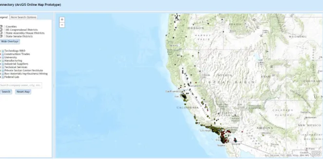
[http://plnkr.co/], a browser based web development environment. Dojo, a JavaScript library, was used to create the interface elements. This library is what the ArcGIS JavaScript API is built on. To make both prototypes as similar as possible, the dojo library was used in the creation of both interfaces. The final Fusion Tables map prototype (Figure 7) is hosted on a geography department server.
Figure 7 Fusion Tables map prototype
3.3.2
ARCGIS
ONLINE
MAP
PROTOTYPE
DEVELOPMENT
The first step in development was setting up an ArcGIS Online account. Setting up an account is free, but utilizing hosted services is fee-based. My account access was set up with publisher rights under the SDSU Geography department’s account. This allowed me to upload data, utilize fee-based services (geo-coding), and publish maps.
All data layers were published as feature services to the ArcGIS Online account through ArcGIS Desktop. The .csv file containing the Connectory business profile information had to be geocoded before being published as feature service. This cost 40 credits per 1000 geocodes, and took under an hour to complete.
The layout of ArcGIS Online prototype is similar to that of Fusion Tables prototype. First, a basemap is called, with the imagery hosted on ESRI’s servers. Next, layers are created and called. There is no limit on the amount of layers called. In total there were 5 layers called.
Once the layers were created, a locator and query tasks were added. The ArcGIS JavaScript API is used to call and query the feature services hosted on ArcGIS Online. While it uses a SQL-like syntax for query construction like the Fusion Tables API, the use of custom dojo modules (ESRI dijits) made this the hardest part of coding the map.
The final step was creating the map interface. Like the Fusion Tables prototype, the interface was created with the dojo library and edited in Plunker. Text boxes and buttons were added to call data and display it on the map. Layer symbology was set before each layer was published as a feature service. The final ArcGIS Online map prototype is also hosted on a geography department server (Figure 8).
Figure 8 ArcGIS Online map prototype
3.4
PERFORMANCE
TESTING
WITH
DATASET
To compare data load times, each prototype was subjected to a series of load tests. The load tests were administered via Blazemeter [www.blazemeter.io] a commercial cloud-based load testing service. A load test is when page activity is mimicked through scale of users to see where a site ‘breaks’, stressing it to find weaknesses in design. This helps in predicting how a web page or application will work under high load. Blazemeter allows the tester to create a variety of user scenarios (how a typical user might interact with the site). Test time and the number of virtual users can be scaled as needed. Several different server regions are available to test page response times, such as Europe or the East Coast. Credits must be bought to run tests, but there is a free trial period. Metrics recorded included page load times, page hits, page errors, timeouts, bytes received, and bytes transferred. Reports are created for each tests, and raw metrics can be downloaded as .csv.
To find out if the size of the dataset had any impact on page load or performance, the data was broken into groups of 1000 points. The smallest set was 1000 points, and the largest was 22,000+ points, for a total of 22 data groups. A map page was created for each map
Since the map is not the main component of the Connectory’s site, the test time and user load was designed to reflect brief interactions by a small number of concurrent users. Each load test ran for 5 minutes, with a linear progression of 0 to 200 virtual users. The test time was chosen as a medium between brief and extended interaction. The virtual user number was chosen since it represented about 1% of the total business profiles represented in the dataset.
The test consisted of a GET request to each page from a California server. Most of the current businesses featured in the map are located in California, so server response time from other regions doesn’t matter for the current design. A more complex load test was possible, but at this stage the interest was in seeing how the prototypes were affected by increasing the dataset sizes and user load over time.
Each of the 44 tests pages were hosted on a personal website. They were not hosted on a geography department server because of security concerns. While this setup does not mimic the actual server setup of the Connectory website, it does represent best practices to use a production server for testing purposes.
3.4.1
PERFORMANCE
TESTING:
FUSION
TABLES
MAP
PROTOTYPE
There were 22 tests performed on the Fusion Tables map prototype. The data points were hosted in separate Fusion Tables, for a total of 22 Fusion Tables. The page code was
modified to point to the corresponding table for each test page. Preparing the individual data tables and tests pages was time consuming. Each test page was hosted on a personal website for testing purposes.
3.4.2
PERFORMANCE
TESTING:
ARCGIS
ONLINE
MAP
PROTOTYPE
There were 22 tests performed on the ArcGIS Online map prototype. The groups of points were called through a series of definition queries within the map page code. This was done instead of breaking up the original shapefile into multiple shapefiles. When a new
shapefile is uploaded to ArcGIS Online, it needs to be geocoded. This process uses credits, and it seemed unnecessary to overload the Geography departments ArcGIS Online account resources.
Creating the test pages for this prototype was easier than it was for the Fusion Tables prototype. Each test page was hosted on a personal website for testing purposes.
3.5
USABILITY
STUDY
DESIGN
3.5.1
PARTICIPANTS
Students were recruited from the geography department to participate in this study. Surveys were given to students in enrolled in Geography 780, 584, and 484. Geography students were selected because of their familiarity with web maps and geographical concepts.
The survey was administered as a link given to participants. About half of the
participants took the survey on geography department computers during set times. The other participants took the survey at a time of their choosing, either on geography department computers or on their own computers. A total of 25 students took the survey.
3.5.2
SURVEY
DESIGN
The survey incorporated three time based tasks, and a series of questions addressing map functionality, design, and effectiveness for each prototype. The survey was hosted through Loop11 [www.loop11.com], a commercial remote usability testing service. They offer both a paid version, and a free student version. The site provides a standard framework for answering questions and recording data. For time based tasks, it records time to completion, success/failure rates, and user interaction with the site (clickstream and path analysis). For heuristic sections, it records responses and aggregates them. Data is exportable in .pdf or .csv formats for further analysis.
Two surveys were created, covering both map prototypes. Questions and tasks were identical for each survey. The first survey started with questions and tasks about the Fusion Tables prototype, then moved on to questions and tasks about the ArcGIS Online prototype. The second survey reversed the order of the first survey – tasks and questions about ArcGIS Online map prototype, then tasks and questions about the Fusion Tables map prototype. This A/B testing method was chosen so that each participant would test both prototypes, but would not know the order of the prototypes, nor be influenced by other survey participants.
Each survey is web based, guiding users through a brief tutorial, task analysis, and brief evaluation afterwards. The first part of the survey is a task analysis based on
Newman’s methods (Newman et al., 2010). Users were asked to complete simple map query functions, such as turning layers on and off, searching for a specific term, and navigating to a point. Each task has a “Complete” or “Abandon” button, which records the completion time of a task once submitted.
From there, users were asked questions based on identifying effectiveness of the following elements: text, numbers, symbols, colors, images, flow, and functionality (Sears et al., 2000). Answers were be based on the Likert scale, which is a numerical scale from 7 (strongly agree) to 1 (strongly disagree). This is based on both the simplicity to the user, and the ability to perform statistical analysis (Sears et al., 2000). A comment box was provided at the end for open-ended comments from users. Each user was asked how often they used web maps (daily, weekly, monthly). An optional comments page was presented at the end of the survey for any additional feedback.
3.5.3 SURVEY QUESTIONS
There were three task based questions (Table 3), one multiple choice question (Table 4), and one open ended question per prototype (Table 5). There was also a multiple choice question addressing frequency of web map usage (Table 6) at the end of each survey.
Table 3 Task questions for each prototype
Table 4 Multiple choice questions (on a scale of 1 to 7, with strongly disagree (1)/no opinion (4)/strongly agree (7) qualifiers)
Task 1
• Locate and select the Congressional Districts overlay button. • Turn the overlay on by selecting the button
Task 2
•Go to the search box located near the bottom-left of the menu. •Type 'solar' and then click search.
•Navigate and zoom to the company "WholeSolar LLC" in Coronado. •Click the dot to open the info window.
Task 3
•Go to the search box located near the bottom-left of the menu. •Enter "5500 Campanile Drive" into the search box. Click Search. •Zoom into the SDSU campus.
Please indicate how strongly you agree or disagree with the following statements? •I think I would use this map frequently
•I found the map unnecessarily complex. •I thought the map was easy to use.
•I think that I would need the support of a technical person to be able to use this map. •I found the various functions in this map were well integrated.
•I thought there was too much inconsistency in this map.
•I would imagine that most people would learn to use this map very quickly. •I found the map very cumbersome to use.
•I felt very confident using the map.
•I needed to learn a lot of things before I could get going with this map. •The overall color scheme of the map was easy to understand. •The map symbologies make sense.
•The text of the map was easy to read. •The query functions are easy to use.
•It was easy to tell which industry a business belonged to. •The pan tool is easy to use.
•The zoom tool is easy to use.
Table 5 Open ended question
Table 6 Multiple choice question about web map usage
Do you have any other further comments about this map? After you answer this question, you will be directed to the second map user test.
How often do you use web maps? •Never
•Few times a year •Few times a month •Few times a week •Daily
CHAPTER 4
ANALYSIS OF RESULTS
4.1
ANALYSIS
OF
PERFORMANCE
TESTING
Load testing both prototypes confirmed that increasing dataset size and user load does affect page performance – namely that the map loads slower as both data and user sizes increase over time. The Fusion Tables prototype had faster response times than the ArcGIS Online prototype. Possible bottlenecks were detected at user loads of 90 and 150.
Differences in load times perhaps are affected by what types of data are allowed to be uploaded by Google or ESRI. Fusion Tables only accepts a few raw data formats and .kml, while ESRI accepts many more types of formats. Since there is more latitude in data types, more of the processing and guesswork is up to the user.
4.1.1
FUSION
TABLES
MAP
PROTOTYPE
PERFORMANCE
TESTING
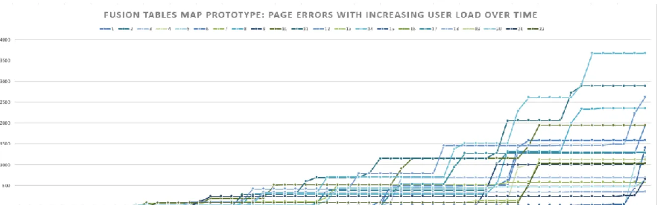
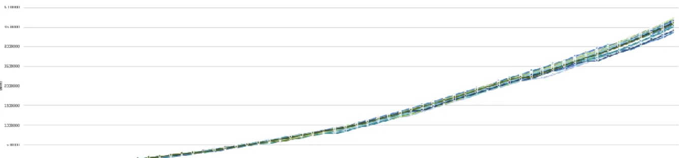
Metrics returned for performance testing on the Fusion Tables prototype included page hits, page load time, time outs per page, errors per page, bytes received, and bytes transferred. There was a trend of increasing hits per page as user load increased for all pages tested (Figure 9). Page response times (Figure 10) for all pages was followed an S-curve shape, with peaks around 90 and 170 users. These peaks represent the longest response times for most of the pages tested. For timeouts (which set to 1000 milliseconds), there was a slight increase around 100 users (Figure 11). This was also similar to the highest page error rates, which peaked around 100 users (Figure 12). Data transferred (Figure 14) was under .03 Gigabytes, while data received (Figure 13) was under .2 Gigabytes.
The small size of the data transferred and received is because Google’s servers do all of the work in data compression. The Maps API and Fusion Tables API are built with heavy user load in mind. The peaks in page response time, timeouts, and errors may reflect that the
map application would experience a slow response at 90 and 170 concurrent users. At such low user levels, any lag in the application would not be very noticeable.
Figure 9 Fusion Tables Map Prototype: Page Hits with Increasing User Load Over Time
Figure 10 Fusion Tables Map Prototype: Page Load Times with Increasing User Load Over Time
Figure 11 Fusion Tables Map Prototype: Page Timeouts with Increasing User Load Over Time
Figure 12 Fusion Tables Map Prototype: Page Errors with Increasing User Load Over Time
Figure 13 Fusion Tables Map Prototype: Data Received with Increasing User Load Over Time
Figure 14 Fusion Tables Map Prototype: Data Transferred with Increasing User Load Over Time
4.1.2
ARCGIS
ONLINE
MAP
PROTOTYPE
PERFORMANCE
TESTING
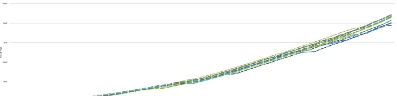
Metrics returned for performance testing on the ArcGIS Online prototype included page hits, page load time, time outs per page, errors per page, bytes received, and bytes transferred. There was a trend of increasing hits per page as user load increased for all pages tested (Figure 15). Page response times (Figure 16) for all pages was followed an S-curve shape, with peaks around 90 and 170 users. These peaks represent the longest response times for most of the pages tested. For timeouts (which set to 1000 milliseconds), there was a slight increase around 50, 90, and 160 users (Figure 17). This was also similar to the highest page error rates, which peaked around 40, 90, and 150 users (Figure 18). Data transferred (Figure 20) was under .03 Gigabytes, while data received (Fig 19) was around 8.6 Gigabytes.
The large amount of data received accounts for slightly slower page response. The peaks in page response time, timeouts, and errors may reflect that the map application would experience a slow response at around 50, 90, and 150 concurrent users.
Figure 15 ArcGIS Online Map Prototype: Page Hits with Increasing User Load Over Time
Figure 16 ArcGIS Online Map Prototype: Page Loads with Increasing User Load Over Time
Figure 17 ArcGIS Online Map Prototype: Page Timeouts with Increasing User Load Over Time
Figure 18 ArcGIS Online Map Prototype: Page Errors with Increasing User Load Over Time
Figure 19 ArcGIS Online Map Prototype: Data Received with Increasing User Load Over Time
Figure 20 ArcGIS Online Map Prototype: Data Transferred with Increasing User Load Over Time
4.2
ANALYSIS
OF
USER
SURVEY
The user survey was given to 25 SDSU geography students. Two versions of the survey were given, with participants not knowing which version they were taking. The first survey started with tasks and questions about the Fusion Tables map prototype, and ended with tasks and questions about the ArcGIS Online map prototype. The second survey reversed the order of the prototypes – tasks and questions about the ArcGIS Online map prototype, followed by tasks and questions about the Fusion Tables map prototype. This was done as modified type of A/B testing, to control for any effects of a learning curve in use of map functions among survey participants. Results for each survey were aggregated for further comparison.
4.2.1
ANALYSIS
OF
FUSION
TABLES
MAP
PROTOTYPE
SURVEY
DATA
The first task asked participants to locate and select the Congressional Districts overlay button, and was the simplest of the three tasks. It took participants an average of 47 seconds to complete this task, with a minimum complete time of 11 seconds, and a maximum completion time of 83 seconds (Figure 21). There was a 100% completion rate for this task (Figure 23).
The second task asked participants to type the term “solar” into the company search bar, and navigate to a company called “WholeSolar LLC” located in Coronado Island, and then click the marker representing the company to open an info window. This was the hardest task, with an average completion time of 157.5 seconds, a maximum completion time of 281 seconds, and a minimum completion time of 34 seconds. It also had the most
variation in completion time among participants (Figure 22), taking much longer than other tasks. One participant abandoned the task.
The third task was the quickest completed of all. Participants were instructed to type “5500 Campanile Drive” in the address search box, and zoom to the SDSU campus. It took an average of 42.5 seconds to complete, with a maximum completion time of 66 seconds, and a minimum completion time of 19 seconds. There was a 100% completion rate for this task.
Figure 21 Fusion Tables map prototype survey task times: minimum, maximum, and average time in seconds (including abandoned tasks)
Figure 22 Fusion Tables Map Prototype: Detailed Task Times by Participant (including abandoned tasks)
Figure 23 Fusion Tables Map Prototype Task Completion and Abandonment by Survey Participant
Answers to the multiple choice Likert scale questions were mostly positive in regards to map design and functionality. Most respondents would use the map again, and found it very easy to use. The pan, zoom, query functions and map symbologies made sense and were easy to use. The positive ‘negative’ responses indicated that participants did not think they would need a technical person to use this map, that they did not need to learn a lot of things to get going with the map, and the map was not too cumbersome or inconsistent to use Figure 24).
Figure 24 Fusion Tables map prototype survey multiple choice Likert scale questions, by total number of participant responses per question
Responses to the open ended question were a little more critical in regards to the Fusion Tables map prototype design and functionality (Figure 25). Some respondents merely answered “no”, since some response was required before they could continue to the next page. Those responses were not included in Figure ## below.
Generally, respondents liked the zoom and thought the user interface was “simple and straight forward”. The Google map imagery was familiar, and the legend easier to
understand. A few comments mentioned that two search inputs seemed unnecessary. One comment mentioned that the interface could be improved to “look a little more elegant”. A comment specifically mentioned that more tasks should be added before rating the design, as they felt their answers were “wishy-washy” because they hadn’t used the map enough to fully critique it.
4.2.2
ANALYSIS
OF
ARCGIS
ONLINEMAP
PROTOTYPE
SURVEY
DATA
The first task asked participants to locate and select the Congressional Districts overlay button. It took participants an average of 186 seconds to complete this task, with a minimum complete time of 17 seconds, and a maximum completion time of 355 seconds (Figure 26). Two participants abandoned this task (Figure 27). Their task times were still included in the task times.
The second task asked participants to type the term “solar” into the search bar, and navigate to a company called “WholeSolar LLC” located in Coronado Island, and then click the marker representing the company to open an info window. This task had an average completion time of 97.5 seconds, a maximum completion time of 193 seconds, and a minimum completion time of 4 seconds. This task had the most variation in completion times amongst participants (Figure 28). There was a 100% completion rate for this task.
The third task was the quickest completed of all. Participants were instructed to type “5500 Campanile Drive” in the search box, and zoom to the SDSU campus. It took an average of 54 seconds to complete, with a maximum completion time of 104 seconds, and a minimum completion time of 4 seconds. There was a 100% completion rate for this task.
Figure 26 ArcGIS Online map prototype survey task times: minimum, maximum, and average time in seconds (including abandoned tasks)
Figure 27 ArcGIS Online Map Prototype Task Completion or Abandonment by Survey Participant
Figure 28 ArcGIS Online Map Prototype: Detailed Task Times by Participant (including abandoned tasks)
Answers to the multiple choice Likert scale questions were mostly positive in regards to map design and functionality. Most respondents would use the map again, and found it very easy to use. The pan, zoom, query functions and map symbologies made sense and were easy to use. The positive ‘negative’ responses indicated that participants did not think they would need a technical person to use this map, that they did not need to learn a lot of things to get going with the map, and the map was not too cumbersome or inconsistent to use (Figure 29).
Figure 29 ArcGIS Online map prototype survey multiple choice Likert scale questions, by total number of participant responses per question
Responses to the open ended question were a little more critical in regards to the ArcGIS Online map prototype design and functionality (Figure 30). Some respondents merely answered “no”, since some response was required before they could continue to the next page. Those responses were not included in Figure 30 below.
Respondents felt the zoom was difficult to use, since the map didn’t automatically zoom to a location once a search was performed. Most thought the map interface itself was easy to use. Some said the map loaded quickly, while others said the overlays and basemap
loaded slower than the Fusion Tables map prototype. One person wasn’t sure what sort of search terms could be entered into the search tool, saying they “didn’t know the topic of this map”.
Figure 30 ArcGIS Online map prototype survey open ended question responses
4.2.3
COMPARISON
OF
SURVEY
DATA
FROM
BOTH
PROTOTYPES
The last question asked of participants on both surveys was about we map usage. About half of the participants used web maps a few times a week, about 40% used them daily, and 12% used them a few times a month (Figure 31). Participants use of web maps meant that their responses to the survey were detailed enough to address design and performance issues overlooked during the initial design of both prototypes.
Figure 31 Survey participants web map usage (25 responses)
Comparing average time spent on tasks for both prototypes (Figure 32), participants were able to complete each task quicker when using the Fusion Tables map prototype.
Figure 32 Comparison of task times (minimum, maximum, and average time in seconds) for Fusion Tables map prototype survey and ArcGIS Online map prototype survey
Comparing responses for the multiple choice Likert questions points (Figure 33), a trend points to the Fusion Tables map prototype as the preferred choice. It seems that slightly more people would use the Fusion Tables map more, and also found it easier to use and less complex. There are slightly more positive responses to functions in the map, and
respondents found the map less inconsistent and less cumbersome than the ArcGIS Online map prototype.
Figure 33 Comparison of multiple choice Likert questions for ArcGIS Online map prototype and Fusion Tables map prototype surveys, A=ArcGIS Online responses, F=Fusion Tables responses
Comparing the responses to the open ended questions gives a more detailed insight on what respondents liked and didn’t like about each map prototype. One respondent had questioned the accuracy of the multiple choice Likert questions, explaining there hadn’t been enough tasks for them to give an accurate response. Perhaps this is why most responses on the multiple choice Likert questions for both prototypes trended towards a positive response. That itself doesn’t help to provide conclusive data on which prototype is preferred.
Respondents didn’t like the slower load times of the ArcGIS Online map prototype. It seems the faster load times of the Fusion Tables map prototype was preferred.
Respondents also liked the search functionality of the ArcGIS Online map prototype, but preferred the auto-zoom of the search on the Fusion Tables map prototype. People were also confused by the two search bars in the Fusion Tables Prototype, but liked the legend,
CHAPTER 5
DISCUSSION AND CONCLUSIONS
5.1
LIMITATIONS
This case study was limited by several factors. Survey results were a limitation, as users were only asked to test a limited range of map functions. User opinions are subjective, and can be influenced by a range of outside variables out of the control of this study.
Technical experience of some users may also have been a limitation (e.g. experience with web maps and navigating through the usability test). Initially, some survey respondents had issues with the service used to host the usability test. This was corrected and later
respondents did not have the same issues.
Time and cost were limiting factors in the development, testing, and survey development for each prototype. Performance testing itself was not strictly necessary, as both mapping services test and configure their servers to process large datasets. A functional test script with actual user scenario involving interaction with the map application was too time intensive to create.
Initial map design and functionality requirements were also hard to meet because of limits of either the data structure or the APIs utilized.
5.2
SWOT
ANALYSIS
OF
EACH
PROTOTYPE
Both Fusion Tables (as part of the Google Maps service) and ArcGIS Online (as part of ESRI’s offerings) have pros and cons to consider when deciding which is best for a particular use. The most important factors are cost, ease of implementation, and ongoing support. A basic SWOT analysis was done for each prototype to address these factors (Table 7, Table 8). A SWOT (S = strengths, W = weaknesses, O = opportunities, T =threats) analysis is a tool in which internal and external factors are examined as part of the decision making process.
Strengths
-Free to use (up to a certain data limit), no license fees
-Easy to upload and share information -Easy to create visualizations
-Familiar cartography scheme
-Fusion Tables API integrates into Google Maps API for customizable map interfaces -Fast loading and rendering times for maps and visualizations
-Geocoding services provided for free -Scales very well
-No setup or maintenance of software, computers, or servers needed – everything exists in Google’s ‘cloud’
-Created by leading internet company, products well known and work on multiple platforms
Weaknesses
-Few data types accepted (only .csv, .kml, .ods, .xls, or Google spreadsheets)
-Not meant for complex data structures and relationships
-Fusion Tables API has a steep learning curve for those with no programming or database knowledge
-Help guides can be spotty at best -Map template is not very customizable -Data needs to be standardized before upload
Opportunities
-Visualizing geographic data makes it easier to spot trends in current customer needs, or areas to be expanded into in the future -Simple way to integrate mapping and GIS into skill set of current staff without impacting current and future projects
Threats
-Still a beta product, not known if Google will keep or deprecate API
-API has gone through several changes, older versions deprecated
-Maps and data dependent on Fusion Tables subject to changing data storage and data call limitations
-Data privacy issues, not meant for truly sensitive information
![Figure 1 Screenshot of California Portal (Zeemaps [https://www.zeemaps.com/])](https://thumb-us.123doks.com/thumbv2/123dok_us/11056902.2992578/13.918.163.883.289.802/figure-screenshot-california-portal-zeemaps-https-www-zeemaps.webp)