Interface and Interaction Design
Patterns for E-commerce Checkouts
Master Thesis – Maarten van Kalsbeek Human Media Interaction – 2012 (final version)
Graduation committee:
Dr. E.M.A.G. van Dijk (1st supervisor)
Management Summary
Checkout processes are an important aspect of e-commerce websites. The performance of these checkout processes relates directly to the revenues for such websites. The better they perform, the more visitors will manage to complete the checkout from start till end. Or more concretely: from clicking Add to cart to having ordered the product. The percentage of people reaching the goal, relative to the number of people that started the checkout, is called the checkout conversion percentage. Enhancing usability can greatly increase this percentage, as well as user satisfaction and subsequently brand loyalty.
Therefore this research aims to discern promising interface and interaction design patterns that allow the usability of online checkout processes to be increased.
Research Objective
The goal of this master thesis project is to determine interface and interaction design patterns that can enhance the usability of e-commerce checkouts for new customers. Such interface and interaction design patterns are similar to software design patterns, although the focus is different. Software patterns describe solutions for repeating design challenges in a given context. The same goes for these interface and interaction design patterns. These patterns are like building blocks for user experiences. They deal with aspects such as, but not limited to, interaction structures (e.g. sections on one page versus spread across different pages), element positioning and text style. These patterns allow the user experience to be enhanced in a proven approach. As stated, this in turn allows both short term and long term commerce profits to increase, making it beneficial for e-commerce companies as well their (potential) customers.
Methodology
Key Findings
Based on this research, e-commerce sites would be advised to incorporate the following design patterns in their checkout processes:
- Use as few pages as possible and preferably a one-page checkout.
- Display the cart contents visually (i.e. the product images) on the right or left of all pages of the checkout process, or in a box that stays in place (fixed at a certain location) when scrolling.
- Display delivery time when ordered within x hours, e.g. “Delivered tomorrow when ordered within 2 hours” (where “tomorrow” and “2” are updated and determined by the system). - Try and provide an experience more similar to brick-and-mortar stores. Do this by phrasing
headings as questions, e.g. “Contact information” becomes “How may we contact you?” but take extreme care to use correct wording and matching of the question with the answer that follows. When offering a gift service, also make this the first question. Also try to evaluate the impact of reordering the questions.
Contents
Management Summary ... ii
List of Figures ... vi
1. Introduction ... 1
1.1. Research objective ... 1
1.2. Motivation ... 2
1.3. Context ... 3
1.4. Research Questions ... 3
1.5. Research Method ... 4
1.6. Structure of the Thesis ... 7
2. Related Work ... 8
2.1. Literature ... 8
2.2. Practice ... 14
2.3. Literature and Practice ... 24
3. Interface & Interaction Design Patterns to be Evaluated ... 25
3.1. List of Patterns... 26
3.2. Two Prototypes Provide a Means for Evaluating the Patterns ... 41
4. Requirements for the Checkout Prototypes ... 43
4.1. Functional Requirements ... 43
4.2. Technical Constraints ... 46
5. Interface and Interaction Design ... 47
5.1. Patterns per Prototype ... 47
5.2. Design Method and Tools ... 50
6. Final Evaluation Prototypes ... 51
6.1. Development ... 51
6.2. Checkout Prototype A ... 52
6.3. Checkout Prototype B ... 54
6.4. Order Summary ... 56
6.5. Bol.com Checkout Process ... 57
7. User Evaluation ... 61
7.2. Setup ... 62
7.3. Participants ... 65
7.4. Processing the Results ... 65
8. Results & Discussion ... 66
8.1. Design Patterns ... 66
8.2. Other Observations ... 81
8.3. General Discussion ... 83
9. Future Research ... 84
10. Recommendations ... 86
10.1. Do not use the anti-patterns ... 86
10.2. Use as few pages as possible and preferably a one-page checkout ... 86
10.3. Use a (floating) mini-cart sidebar with product images in the checkout ... 86
10.4. Display delivery time when ordered within x hours ... 86
10.5. Use question headings and assess the impact of rearranging questions ... 86
10.6. Present wrapping paper choices in an overlay (instead of as an inlay) ... 86
10.7. Ask billing details before shipping details (for Dutch customers) ... 87
Bibliography ... 88
Appendix A: User Evaluation Outline (Original Version; in Dutch)... 92
List of Figures
Figure 1. Wehkamp.nl - cart page... 14
Figure 2. Coolblue.nl - billing and shipping details page ... 15
Figure 3. BCC.nl - optional account creation ... 15
Figure 4. Toys"R"us - shipping method and gift option ... 16
Figure 5. Booking.com - personal details ... 16
Figure 6. Amazon.com - payment page... 17
Figure 7. Ebay.com - registration page ... 18
Figure 8. Kmart - gift wrap overlay ... 18
Figure 9. Nike - first step of the one-page checkout ... 19
Figure 10. H&M - payment options (left) and payment details (right) ... 19
Figure 11. Nordstrom - cart page ... 20
Figure 12. Zappos.com - cart page ... 20
Figure 13. Gift wrap question (left) and overlay with options (right) ... 21
Figure 14. Lowe's - cart page ... 21
Figure 15. Sears - one-page checkout ... 22
Figure 16. Target - shipping page with gift question ... 23
Figure 17. Gift question ... 31
Figure 18. Gift overlay lightbox ... 31
Figure 19. Gift wrap with normal radio buttons with one option selected as default ... 32
Figure 20. Gift wrapping button-like radio buttons ... 32
Figure 21. Coupon field hidden behind link (left) and input field after clicking link (right) ... 34
Figure 22. Returning and new customers can choose by means of radio buttons ... 35
Figure 23. Returning and new customers can choose by means of normal buttons... 35
Figure 24. Checking delivery-at-work checkbox displays text field... 36
Figure 25. Primary button with balloon (left) and enabled button after validated form (right) ... 38
Figure 26. Sketch for cart page of prototype A ... 50
Figure 27. Wireframe for initial display of prototype B ... 50
Figure 28. Prototype A overview... 52
Figure 29. Page 1 – Cart (prototype A) ... 53
Figure 30. Page 2 – Shipping and customer details (prototype A) ... 53
Figure 31. Page 3 – Payment details (prototype A) ... 53
Figure 32. Prototype B overview ... 54
Figure 33. Entering details for a new account (prototype B) ... 55
Figure 34. Order summary – initial display (prototype B) ... 56
Figure 35. Order summary – the view after entering account details (prototype B) ... 56
Figure 36. Payment details (prototype B) ... 56
Figure 37. Order confirmation with highlighted email address (the same for both prototypes) ... 56
Figure 38. Bol.com - cart page ... 57
Figure 39. Bol.com - log in or new customer ... 58
Figure 40. Bol.com - new customer address and contact details ... 58
Figure 41. Bol.com Shipping method (without options) and gift service with preview on hover ... 59
Figure 42. Bol.com - create an account and newsletter ... 59
Figure 43. Bol.com - order review ... 60
Figure 44. Bol.com - payment page ... 60
Figure 45. Position of the user and moderator with laptops during the user study ... 64
1.
Introduction
This chapter provides an overview of the focus of this research by outlining the objective, the motivation and context, the research questions and how the latter will be answered. This first chapter concludes with outlining the structure of this thesis.
1.1. Research objective
The objective of this research is to increase the user experience of e-commerce checkout processes by providing an overview of relevant interface & interaction design patterns and their performance. This is not only my personal objective, but also the objective of bol.com, a Dutch e-commerce company making the research possible.
Looking at the objective more closely, these key aspects of the objective can be discerned: user experience, e-commerce checkout processes and interface & interaction design patterns. Below I will first briefly introduce each of these three aspects.
1.1.1. Usability and User Experience
User experience in essence deals with enhancing the ease of use and the experience of a certain product. The same holds true for usability, however, user experience is also more about providing the user with an enjoyable experience. In practice, usability has a large number of definitions (e.g. [1], [2] and [3] all use different definitions). However, most of them are related to each other and contain largely the same aspects. In ISO 9241-11 (2008) [1], the ISO defines usability as follows:
“The extent to which a product can be used by specified users to achieve specified goals with effectiveness, efficiency and satisfaction in a specified context of use.”
Other usability definitions state that the product “should be easy to learn (and remember)” (cited from [2], but also stressed by e.g. [3] and [4]). This can be related to the effectiveness and efficiency of achieving the specified goals. Others mention effectiveness and efficiency themselves [4]. It is also commonly stated that the product should be engaging [4], pleasant to use [2] or elicit positive user emotions [3]. The ISO definition of usability quoted above provides a good summary of all these aspects.
Although the usability definition given above also mentions satisfaction (just as the similar definitions mentioned above), the definition of user experience shifts the focus more to this aspect. The newer ISO 9241-210 (2010) [5] defines user experience as:
1.1.2. E-commerce Checkout Processes
Checkout processes are an important aspect of e-commerce websites. Their task is to allow customers to actually order the products they have picked. The performance of these checkout processes relates directly to the revenues for such websites. The better they perform, the more visitors will manage to complete the checkout process from start till end. This process encompasses all steps from the customer clicking on “Add to cart” to the customer having ordered the products. The percentage of people reaching this goal, relative to the number of people that started the checkout, is called the checkout conversion percentage. Enhancing usability makes the process easier and thus can greatly increase this percentage, as well as the user satisfaction and subsequently brand loyalty. It should also be noted that persuasion can positively influence these aspects.
1.1.3. Research Goal: Recommending Interface & Interaction Design Patterns The goal of this research is to determine interface and interaction design patterns that can enhance the usability of new customer e-commerce checkouts. Such design patterns are similar to software design patterns, although the focus is different. Software patterns describe solutions for repeating design challenges in a given context. The same goes for these interface and interaction design patterns. These patterns are like building blocks for user interfaces. They deal with aspects such as, but not limited to, interaction structures (e.g. one section, such as delivery address or payment, per page vs. a single page with multiple sections), element positioning and text style. This includes both interface patterns, focusing on more static elements, and interaction patterns focusing more on the interaction (both are named as part of this research, but they are not separated later on). Literature such as [6] and [7] explains that guidelines are usually more prescriptive and short (e.g. “disable the paste-function in the email confirmation field”), whereas patterns may be related to each other and include examples, a motivation and confidence (e.g. by means of argumentation and/or evaluation results). They may also leave more room for other solutions. It should be noted that a pragmatic and broader view on patterns is taken here regarding the partial overlap between design patterns and more specific guidelines on the one hand and design patterns and abstract design principles on the other hand (similar to Van Welie and Scott in [8]), leaning towards guidelines.
Collections of interface & interaction design patterns are also abundant (e.g. [9], [10], [11], [12] and [13]), although relatively few deal with checkouts specifically. Therefore, the goal of this research is to:
Discern new patterns tailored for enhancing the user experience of checkout processes.
1.2. Motivation
Usability in itself is also very important for e-commerce checkouts. This is demonstrated by for instance the research that Jakob Nielsen, an important researcher in the field of usability, has done on this topic ([14]). In this research Nielsen evaluated a number of e-commerce sites by scoring each against his usability guidelines. He found that (at that time) Amazon.com scored 72% on his guidelines; 9 other high-revenue e-commerce sites scored 51%; 10 medium-revenue sites scored 37%, indicating a positive correlation between success (based on revenue) and usability. A quote from him even states “improving usability by 50% often increases sales by 400%”. Other sources also prove that usability can have a strong effect on conversion and purchase intention, see e.g. [15].
Achieving the aforementioned research goal allows customers to better enjoy their shopping experiences and to achieve their personal goal of ordering one or more products to be purchased in an effective, efficient and satisfying way. This also aligns with the business goal of increasing the conversion percentage, thereby increasing the amount of orders as it both enables and persuades users to more successfully place their orders. By better enabling the customers to place the desired orders themselves it can even decrease customer support calls. The positive customer experience can also positively influence repeat purchases. In all these ways it has a direct impact on revenues and profits, a direct common business goal for e-commerce companies. Therefore both customers and the e-commerce companies can directly benefit from these patterns.
Finally, the motivation for bol.com as an e-commerce company should be clear. This research will allow them to increase their user experience and conversion by incorporating the successful patterns into their checkout process. Do note that this however does not mean that this biases this research in any way, all results are still shared openly with the scientific community by means of this document.
1.3. Context
Conversion percentages for new customer are generally lower than for existing customers (see e.g. [16]). This is likely due to new customers not yet being assured by a positive history, nor having made an investment already by having provided personal details. Therefore, this study will focus on new user checkouts. Furthermore, it takes my earlier work [17] into account, namely the checklist with checkout usability guidelines.
1.4. Research Questions
The previous sub chapters presented the research objective and why this objective was important. In order to achieve this objective of identifying interaction design patterns that can enhance checkout usability, I have defined a number of research questions. The main research question of this thesis is:
Which design patterns provide good user experience for e-commerce checkouts?
RQ 1. Which potentially promising interaction design patterns (elements & structures) can be discerned from literature and practice for enhancing checkout usability?
This first question forms the preparation required to answer the following question that focuses directly on answering the main research objective:
RQ 2. Is the effect on the usability of e-commerce checkout processes of these interaction design pattern positive, negative or neutral?
1.5. Research Method
In order to achieve this research objective, a number of interesting patterns are gathered from literature and practice. Following this, two prototypes are designed and developed, allowing these patterns to be evaluated. These evaluations take place in the form of user studies where participants are asked to complete a number of tasks using both prototypes. Feedback is obtained both in the form of user comments, using the think aloud protocol, as well as by means of observations. To allow this feedback to be processed, all evaluation sessions are recorded on video.
More concretely, the research questions can be answered as follows.
1.5.1. First Research Question
The first research question as presented above is:
RQ 1. Which potentially promising interaction design patterns (elements & structures) can be discerned from literature and practice for enhancing checkout usability?
This first research question is answered by looking at both literature and practice.
The literature aspect is taken into account by looking at relevant e-commerce usability literature, design patterns and the guidelines for my earlier work [17]. A combination of these sources should allow for a quite encompassing view of the potentially promising patterns that can be found in literature. However, given that a portion of these patterns may already have been extensively researched and are therefore less interesting for this research (they do not fit the condition of “potentially promising”), promising patterns formed by insights inspired by this literature are also taken into account.
1.5.2. Second Research Question
The second research question as formulated above:
RQ 2. Is the effect on the usability of e-commerce checkout processes of these interaction design pattern positive, negative or neutral?
This research is done is by means of a user evaluation.
The two basic options for user evaluations are quantitative evaluations and qualitative evaluations. Both methods have a different focus. Quantitative evaluations allow more data to be collected, but this data will also be shallower. This means it is more difficult to gain real understanding as to why certain patterns affect the usability either positively or negatively. It is also more difficult to assess how the patterns were experienced: even asking this in a survey afterwards is not likely to yield as much results as in a qualitative evaluation. Furthermore, minor issues that the users can overcome themselves are less likely to be discovered, even though their accumulated effect can have a strong impact on the overall experience. A qualitative evaluation scores better at these aspects, at the cost of having a fewer number of users that can take place in the evaluation (given time limits). [19] However, by using enough participants for the experiment this drawback can be largely mitigated. In this case 14 persons participated in a qualitative research.
Another aspect in favor of qualitative evaluation for this specific research at bol.com is that it is not possible to use a modified real-world checkout process. It would require building the complete checkout processes instead of mere prototypes. Furthermore a user pool for qualitative evaluations is already present, whereas a user pool for quantitatively evaluating prototypes is not. Furthermore this would require the prototypes to be extremely well tested because, unlike with qualitative research, there are less possibilities to help out users if a prototype error would occur. This is all in addition to the earlier mentioned aspect that the why is very important for this research. Therefore this research will take place in the form of a qualitative evaluation.
A qualitative user evaluation can take multiple forms. Thinking aloud is a very popular method that allows gaining deeper insights into the user experiences: when, how and why the experience is influenced. This matches the reasoning for choosing a qualitative evaluation over a quantitative evaluation.
the test. Finally, given the amount of participants (14) and the expected task duration (1 hour), RTA is not even a viable option in this case as it would take too much time.
1.6. Structure of the Thesis
2.
Related Work
As outlined in the previous chapter, the interface and interaction design patterns that are evaluated originate from literature and practice, as well as inspiration based on both these sources. The first sub chapter here presents the related literature. The second part of this chapter presents the related checkout processes that can be found in practice.
2.1. Literature
This sub chapter presents the related literature. First existing design patterns are described to provide context for this research. It is followed by a brief discussion about relevant usability guidelines. The sub chapter concludes with an overview of other relevant literature.
2.1.1. Existing Design Patterns
Design patterns have an abundant presence in literature. Software design patterns can be found commonly, but also interface and interaction design patterns are explained in various sources such as Van Welie’s Interaction Design Pattern Library [9], ui-patterns.com [10], Quince [11], the Yahoo! Design Pattern Library [12], the library from Patternry [13] and books like Designing Interfaces [21], Designing Web Interfaces [22], Web Application Design Patterns [23] and Design of Sites [24].
Although most of the aforementioned libraries focus on more generic patterns, some of the libraries include a few patterns more specifically relevant for designing checkout processes. Examples of the more generic patterns from these libraries are: accordion, auto complete, breadcrumb, carrousel, faceted navigation, hover invitation, list builder, overlay, progress bar, registration, tag cloud and thumbnail.
As stated, these libraries do list some patterns that are more tailored for checkout processes than just being generally applicable. Some examples are:
- login and account registration, allowing users to sign up and log in (e.g. with an email address and password) to allow protected access to the user’s information;
- purchase process, essentially a pattern for using a checkout process;
- responsive disclosure and responsive enabling, relevant as checkouts should be focused and not be overwhelming;
- shopping cart, very generic;
- talk like a person, making users more engaged and feel more human; - terms of service, accept them implicitly and not by means of a checkbox;
- wizard (both one page and multiple pages), guiding users towards completing a single goal consisting of multiple sub-tasks.
It should be noted that these patterns provide context to this research. The aim of this research is to discern new patterns based on or inspired by these existing patterns, guidelines, other literature and checkout processes that can be found online. Furthermore, they can be used in the designs that allow the actual checkout patterns to be tested, similar to how the guidelines and other literature can be used for this.
2.1.2. One More Pattern: Single-page or Multi-page Checkout
An interesting existing pattern that is relevant for this research is the use of a single-page checkout (versus more commonly used multi-page checkout processes). Most other patterns have already achieved their status among other patterns, however the actual usability and conversion potential of the single-page pattern is often debated (see e.g. [25], [26], [27], [28], [29], [30] and [31]), providing a multitude of arguments and opinions for either side. This warrants a more detailed presentation of this pattern to be present in this thesis; therefore this sub section presents a summary of the relevant literature on the debate for this pattern.
As stated, the amount of pages in a checkout process is an interesting aspect: there are arguments for either side of this subject. Arguments given by e.g. Roggio [25] for using a single-page checkout include that it might make the checkout process faster to fill out, faster in total page load times (at least the total overhead added by each extra page is reduced), easier, with fewer barriers (each new page a customer needs to visit may result in exiting the site) and thereby converting better. On the other hand, it does increase the need for well-functioning inline validation and client-side (Javascript) logic. Without these two components questions that are irrelevant (or relevant) based on earlier answers cannot be hidden (or displayed).
When using a multi-page process on the other hand, the answers on earlier pages can always be taken into account to determine which fields to display on a latter page. Also, without inline validation, a user could end up with a much larger amount of errors at once which may lead to frustration and the user exiting the site. In addition, using multiple pages might create a better focus on a single aspect of the checkout task, without other sections attracting attention (simply because they are not on the same page).
Furthermore, a bol.com business question was to compare a one-page checkout against a multi-page checkout. Given the aforementioned debate about whether a one-page checkout works better than a multi-page checkout or not, it will be very interesting to test this pattern. Especially since literature suggests that the effectiveness of this pattern is influenced by a lot of factors like the type of customers (e.g. new vs. returning or technical experience), the type of products (e.g. high involvement vs. low involvement) and the e-tailer (e.g. brand image or trust).
page ajax checkout – 5 reasons why not” [27] whilst other posts from the same author states that a different one-page checkout “improved conversion by 13.39%”. [28]
Unfortunately, in addition to the varying results according to the e-commerce (blog) sites, when the subject is mentioned in scientific research, it is usually merely a reference. E.g. [29] states “Some websites have a one-page checkout process: shipping, billing, review and submit. Other websites have it on four pages. From our experience, both can work; it really depends on the population visiting the website.” Books discussing this subject, such as [30] state “Using a 1-page checkout is definitely not mandatory, but testing is.”
The aforementioned research suggests a reason for more concrete data being absent: the data is not consistent across all sites. However, the absence of concrete data might also lie in the usually confidential nature of such research. Finally, [31] points out that users may not necessarily have problems with multi-page checkout processes, but rather that research about the effectiveness of one-page checkouts sometimes compares non-optimized multi-page checkouts with optimized single-page checkouts. Therefore, not all previous findings on this subject may be completely valid. By taking this into account in the current research it could be possible to attain a better-founded conclusion on this subject and I find the aforementioned reasons to be a good motivation as to why this is an interesting pattern to evaluate here.
2.1.3. Checkout Usability Guidelines
In a previous study I have created a comprehensive list of usability guidelines for e-commerce checkouts based on literature [17]. The list was constructed by researching usability guidelines found in literature, related to four themes:
- general usability
e.g. “remind users what they should do next”; - form usability
e.g. “explain all errors politely and completely”; - usability of specific elements like buttons, links and overlays
e.g. “links look like links”; - e-commerce checkout usability
e.g. “highlight delivery costs at the start”.
The guidelines that were found in literature were then validated by evaluating if they were adhered to in practice, by checking there usage in three major Dutch, European and worldwide e-commerce websites.
more specific and concrete than design patterns, but helped identifying promising patterns as well as guided the implementation of the patterns in the two prototypes used for the evaluation of the patterns.
It should be noted that such guidelines can also contradict each other in practice or that they still leave room for multiple implementations. Therefore, it is also interesting to test (some of) these guidelines in practice. The guideline topics that were relevant for the promising patterns that are listed in the next chapter are briefly presented below, focusing on their aspects that are relevant for the design patterns. The complete original list of guidelines from this previous research can be found in appendix B. Each guideline topic presented below includes the number from the appendix between parentheses.
Concision (3)
Everything should be as concise as possible and noise should be minimized.
Consistency (4)
Internal consistency is about consistency within the application, but when identifying patterns external consistency plays a more important role. It is about using conventions when they exist. These conventions may stem from other sites and online shops, but it may also increase the resemblance to the real world.
Discoverability and visibility (5)
Making aspects of the interface discoverable and visible means that features need to be appropriately advertised. They need to be visually visible, but also need to be clear about what they are meant to do. It also means that users should not have to remember information, but it should simply be displayed whenever relevant. This means that relevant instructions and information should not be hidden. Appropriately displaying prices is an important aspect of this.
Learnability (6)
Incorporating learnability means that controls work predictable and recognizable cues are used wherever possible (which also relates to consistency). Questions a user can have should also be answered, that way a user can improve his/her effectiveness and efficiency at a website.
Robustness (7)
Robustness is all about preventing and solving unintended system states. In order to realize this, the user needs to be able to correctly evaluate the internal state of the system and reverse unintended actions. Highlighting errors in a helpful manner and allowing easy recovery help in this regard.
Guidance (12)
Overall structure and flow (14)
Guidelines about overall structure and flow focus on aspects like natural organization (in part related to the previously discussed consistency). It is also related to the previous topic about guidance: making it clear to users which steps there are and which step they are currently at.
Form organization (18)
There are also more specific guidelines such as about how to organize forms. They should “speak with one voice” and have a logical order and grouping with natural breaks. Furthermore it includes guidelines such as not making users enter the same information more than once.
Input fields (21)
Relevant for input fields is that it is important to make the requested data format for such fields explicit.
Default answers (23)
Usability can also be increased by providing good default values where applicable (e.g. for radio buttons).
Help text (25)
Amongst other aspects, help text guidelines explain that help texts should be used for explaining why e.g. unfamiliar or privacy sensitive questions are being asked. They can take away doubt, thereby increasing the user experience as well as the conversion. Help texts should also be used suggest recommended ways of providing answers. These guidelines also explain that help texts should be as specific as possible and be visually placed at the exact space where they are relevant.
Errors and successes (26)
Guidelines for errors and successes detail about making sure to extremely clearly communicate when an error is blocking the task. They also state that actionable remedies should be provided and that in case an input field is responsible for the error, it should be clearly marked with a double visual emphasis.
Inline validation and suggestions (27)
Inline answer validation should only be done after people have finished providing an answer, not during the process.
Checkout in general (41)
Other customers’ special discounts (e.g. coupon fields) should be hidden as much as possible according to the guidelines in the general topic for the checkout.
Costs (42)
Progress (40 and 43)
A highly visible progress indicator should be provided during checkout that is simple and that is used to improve perceived performance. It should also show all steps of the process and make clear that a user can not click on a later step in the process.
Registration and log in (45)
Guidelines about registration and log in state that the same form should be used for both logging in and registering. They also state that both actions should be optional, i.e. a guest checkout should also be offered. Furthermore they highlight that making users choose between logging in and registering can create problems such as users using the wrong form so that it is important to tackle this sufficiently (e.g. by using two buttons, allowing users using the wrong form to switch easily or using a distinct unified form).
Data fields (46)
The checkout guidelines for data fields focus on different areas related to such fields. They state that newsletters should be opt-in, shipping address should be used as billing address by default and inlays with new fields should be added below the trigger-field (e.g. a checkbox). In relation to credit cards they state that the expiration date should be formatted exactly as on the credit card itself and that the type/issuer (e.g. Visa or Mastercard) should be determined automatically based on the number.
Order of steps (48)
The shipping address is asked before asking the billing address. Furthermore a summary should be presented before the order is placed.
Order summary (49)
The order summary guidelines state that all relevant information should be present in the summary that is displayed before the order is finalized.
Navigation (54)
2.2. Practice
Not all findings done by e-commerce companies are published in literature, which is of course somewhat understandable given the fact that it can provide them with a commercial edge. This makes it worthwhile to not only look at literature but also take a look at checkout processes that can be found “in the wild”. In this regard, I have looked at successful e-commerce sites. This should prove effective as it can be expected that most of these sites are so effective by at least providing some usability best practices. In order to discern promising patterns from such sites I have examined all e-commerce related sites from the Google DoubleClick Ad Planner top 1000 [18].
Although all e-commerce sites from the aforementioned Google top 1000 have been examined in addition to a number of Dutch sites, not all sites yielded interesting results for defining the list of promising design patterns because the only patterns they included are already well-known (such as using a shopping cart or allowing for account registration). However, there is still a large selection of sites that did. In addition and given the Dutch orientation of this research, I have also taken a look at the major Dutch e-tailers. The sites from the top 1000 and major Dutch e-tailers that influenced this research are listed below. It includes some examples of the interesting patterns and pattern-eliciting aspects that could be discerned from these sites.
2.2.1. Wehkamp.nl
Wehkamp.nl [37] is one of the two leading Dutch e-tailers together with bol.com (based on revenue). Their shopping cart page shows some interesting aspects such as a progress bar and primary action buttons at the top and bottom:
2.2.2. Coolblue.nl
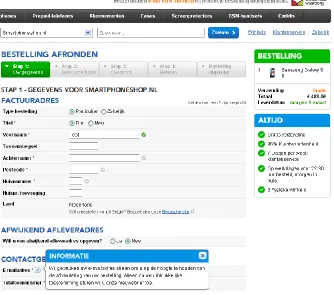
[image:21.612.73.407.166.461.2]Coolblue.nl [38] is another large Dutch e-commerce player. The first page after their cart page shows a number of interesting features: progress bar, persistent mini-cart with product images, unique selling points, delivery time when ordered within x hours, explanations for requesting sensitive data, single group of address fields and inline validation.
Figure 2. Coolblue.nl - billing and shipping details page
2.2.3. BCC.nl
[image:21.612.74.472.567.681.2]2.2.4. Toys”R”us
[image:22.612.75.314.409.668.2]Toysrus.nl [40] is the Dutch version of a major worldwide retailer focusing on selling toys. They utilize a progress bar, data review, personal & brick-and-mortar-like experience (by using question headings), multiple and hidden wrapping paper choices on e.g. their shipping page:
Figure 4. Toys"R"us - shipping method and gift option
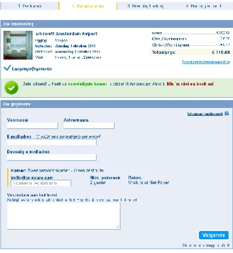
2.2.5. Booking.com
According to the Google top 1000 [18] the hotel site booking.com [41] is the most-visited hotel site online. They are well-known for their persuasive design (see e.g. [42]). With their two page checkout process these interesting aspects can be noted: limited pages, persistent mini-cart with product images, unique selling points (e.g. lowest price guarantee and no booking costs), explanations for requesting sensitive data, optional account creation (or login), subtle order costs and newsletter opt-in. Almost all of these aspects can already be discovered on the page you see after selecting the desired room:
2.2.6. Amazon.com
[image:23.612.75.414.116.423.2]The world’s (and Europe’s) largest e-commerce company Amazon.com [43] also utilizes some promising ideas on their payment page, such as progress bar, personal & brick-and-mortar-like experience (question headings), primary action buttons at the top and bottom and automatic credit card company:
2.2.7. Ebay.com
Ebay.com [44] is not a regular e-commerce web shop, however it is the top online auction site according to the Google Top 1000 [18]. Their registration form presents some interesting insights such as limited pages (just one page), unique selling points, personal & brick-and-mortar-like experience (the way headings and fields are labeled), explanations for requesting sensitive data. Part of their single page registration form can be seen below:
Figure 7. Ebay.com - registration page
2.2.8. Kmart
Kmart [45] is a Sears company and a large US retailer, also focusing on e-commerce. Their site is also part of the Google Top 1000. The most relevant insights to be found on their shopping cart page are related to the gift options and include hidden wrapping paper choices, multiple wrapping paper choices and immediate wrapping paper previews:
2.2.9. Nike
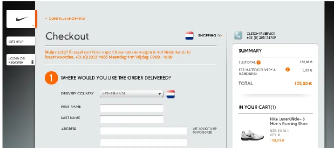
[image:25.612.71.405.159.310.2]The e-commerce shop of Nike [46], one of the major worldwide sport brands, utilizes limited pages (cart, register/login and order details), data review, a persistent mini-cart with product images, unique selling points (such as free returns within 30 days), a personal & brick-and-mortar-like experience (by phrasing their section headings as questions), shipping details before billing details and account creation:
Figure 9. Nike - first step of the one-page checkout
2.2.10.H&M
H&M is a major worldwide fashion retailer. Their website HM.com [47] is also part of the Google Top 1000. Remarkable aspects to note on their payment page as displayed below include a progress bar, persistent mini-cart with product images, automatic credit card company, expiration date as on credit card and subtle total order costs:
[image:25.612.82.465.432.541.2]2.2.11.Nordstrom
[image:26.612.75.287.144.342.2]Nordstrom is another major US fashion retailer. The cart page of their online shop Nordstrom.com [48] displays interesting aspects such as unique selling points, primary action buttons at the top and bottom and large product images in cart:
Figure 11. Nordstrom - cart page
2.2.12.Zappos.com
[image:26.612.74.435.452.691.2]2.2.13.Gap
[image:27.612.73.535.144.326.2]The worldwide fashion retailer Gap is also present online with their web shop at Gap.com [50]. All their checkout sections include a persistent mini-cart with product images, unique selling points (free shipping), hidden wrapping paper choices, multiple wrapping paper choices and immediate wrapping paper previews:
Figure 13. Gift wrap question (left) and overlay with options (right)
2.2.14.Lowe’s
Lowe’s is a US based home improvement store. The cart page of their online version Lowes.com [51] displays two interesting aspects: some form of delivery time when ordered within x hours and primary action buttons at the top and bottom:
[image:27.612.81.526.436.668.2]2.2.15.Sears
[image:28.612.75.450.171.618.2]Sears is a major US based department store. It also owns the aforementioned Kmart. Interesting to note on their one page checkout process at Sears.com [52] are (besides the limited pages) shipping details before billing details, single group of address fields, marking optional fields, automatic credit card company, subtle total order costs and repeat email address and password:
2.2.16.Target
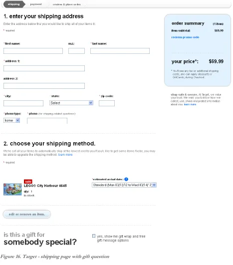
[image:29.612.72.539.161.692.2]Target is another major US department store. The shipping page of their online shop at Target.com [53] displays a number of interesting aspects such as limited pages, progress bar, personal & brick-and-mortar-like experience (the gift question at the bottom), hidden wrapping paper choices, explanations for requesting sensitive data, shipping details before billing details:
2.3. Literature and Practice
3.
Interface & Interaction Design Patterns to be Evaluated
3.1. List of Patterns
This section lists all the actual patterns that are evaluated as part of this research. It explains the relevant details of each pattern and also its origin, such as literature, practice , usability effect (e.g. efficiency or being in control) and/or its persuasiveness. In essence this origin is the rationale for each pattern. In some cases a pattern consists of two or more variations of the pattern. In such cases the variations are presented as part of the main pattern.
It is important to recognize that all patterns have a similar context. All patterns aim to improve online e-commerce checkouts for new customers, with regard to the user experience, potential for conversion, etc.
Limited pages
a) Single page (with obviously distinguishable sections) b) Three pages
Using as few pages as possible still allows for different amounts of pages to be used. As there is a lot of debate going on in literature (e.g. [29] and [30]) and online (e.g. [25], [26], [27] and [28]) about whether single page checkout processes increase usability and conversion, using one page should prove to be an interesting variation to evaluate. Given that the bol.com checkout [54] uses seven pages to allow customers order their products, using three pages is a variation fitting this pattern that might also yield interesting results. The reason for three pages is that it is somewhere in between the first alternative (one page) and the bol.com checkout process which will also be evaluated (which consists of seven pages). Furthermore, it exactly allows for a separation of the main topics of a checkout: cart, customer details and payment details.
Based on and inspired by efficiency and these sources:
Progress bar (with indication of completed and upcoming steps)
Step 1 ✓ Step 2 Step 3
A progress bar allows users to determine where they are in a process and how much still remains.
Based on being in control and these sources: Guidelines: 12, 14, 40, 43 (appendix B)
Practice: [37], [38], [39], [40], [43], [45], [48], [51], [53]
Data review a) Sidebar
b) Summary just before (above) the payment details
Providing a summary that allows users to review the data they have entered is encouraged by literature, guidelines and practice (see below). It is possibly even a legal requirement, at least in the Netherlands [55]. However, this does leave room for different implementations. Given that bol.com already uses the alternative of a separate page to allow users to review their order (possibly affected by the new/existing customer ratio), it makes sense to evaluate other alternatives. One alternative that lies far from this one is to continuously display an up-to-date summary on each page. In order to make this non-hindering yet nonetheless visible enough the most obvious solution would be to use a sidebar for this. This leaves room for another variation that somewhat holds the middle between two that are already mentioned: provide a summary just before the payment details (as on bol.com), but rather placed above the payment details instead of on a separate page.
Based on and inspired by being in control, effectiveness and these sources: Guidelines: 5, 7, 12, 48, 49 (appendix B)
Persistent mini-cart with product images a) In the normal sidebar
b) In a separate floating sidebar (does not scroll together with the page, it is fixed)
Continuously displaying a product image can be a persuasive method to increase conversion. In retail literature it is suggested that allowing a person to look at and experience the product as much as possible makes the customer imagine that he/she already owns the product (see e.g. [56]). This causes the customer to feel not ordering the product as a loss and therefore makes it harder to abort the checkout process. Of course this aspect has much more to do with persuasion and conversion than it does with usability. However, luckily enough there is also a strong user experience argument for this design pattern. It can increase the positive feeling during a checkout, as it focuses on the product you will receive (instead of only on the costs and the technical data). In addition, it is also a way to summarize a key aspect of your order in a visual way, thereby potentially increasing customer confidence.
The reason for the two options (in the normal sidebar or in a separate floating sidebar) lies mainly in the fact that a one-page checkout prototype leaves room for a floating sidebar. In addition, the product image is even more continuously visible, potentially even increasing the aforementioned argumentation for displaying it at all.
Based on and inspired by being in control, effectiveness, persuasion and these sources: Guidelines: 7, 12 (appendix B)
Literature: [56]
Unique selling points (persuasion)
a) Continuously visible, as two very short paragraphs in the sidebar b) Display as a bulleted list near the cart contents in the sidebar c) Display next to the primary button (call-to-action)
Displaying the site’s unique selling points (USP) can be very persuasive as it provides a reason for why to order at that site instead of somewhere else. In addition, it can comfort users by providing them with reassurances during the checkout process. Finally, displaying them during the ordering of products is furthermore a very actionable moment as it is often the last chance to take away doubts.
Given that a checkout allows for multiple opportunities to display this, a number of viable options have been identified. The first two are somewhat alternatives, but they can both be present in addition to the third one. This third option is also the most actionable place to put the unique selling points. Persuasion literature (e.g. [57]) supports displaying such texts at actionable moments.
Based on and inspired by persuasion and these sources: Literature: [57], [58]
Practice: [38], [41], [46], [48], [49]
Delivery time when ordered within x hours (persuasion)
Displaying the delivery time as a countdown, e.g. “Delivered tomorrow when ordered within 2 hours” can serve multiple functions. First of all, it is an informative statement that displays the delivery time as actionable as possible: the customer does not need to translate how much time there is actually left, it is already displayed this way. Furthermore, displaying the delivery time can also be a unique selling point in case the company offers a better proposition than competitors (although the same effect applies when it is not written this actionable, but simply as e.g. “Delivered tomorrow when ordered before 23:00”). Finally, it can be very persuasive as it focuses on the (time) scarcity effect, an important persuasive method (e.g. [59]).
Based on and inspired by persuasion, being in control and these sources: Literature: [59]
Personal & brick-and-mortar-like experience
a) Use question headings (e.g. “How can we contact you?” instead of “Contact details”) b) Make the order of the questions match offline (brick-and-mortar) checkout experiences
The title of this pattern is a bit more abstract and broad than others because it contains multiple concepts that may work together to provide a more brick-and-mortar like experience.
The first alternative (which in this case can work together with the other one) is to phrase heading as questions instead of more brief and formal regular heading. This can both introduce a very persuasive effect and make the whole experience more life-like. People tend to answer questions when they read them, or at least start to think about them more. Furthermore it resembles the process of going to a normal store where the clerk may ask “is it a gift?” or “where would you like it delivered?” instead of “gift.” And “delivery address”.
This last aspect could be further strengthened (yet also function on its own) by making the chronological order in which order details are asked match that of a real store. In my experience one of the first questions is if the item you are purchasing is a gift or not (in case such a question gets asked at all). And in cases where the product might be delivered, I would get asked: if I am a new customer; where I would like it delivered; how they can reach me in case of questions; how I would like to pay. This has the added benefit of starting with more lightweight answers, increasing my commitment and (time) investment as we go along, making it seem logical that decades of perfecting offline selling resulted in this sort-of best practice.
Besides having a potential for being very persuasive (as explained above), it enhances consistency with the offline world and thereby also learnability, two important aspects of most usability literature.
Based on and inspired by external consistency, persuasion and these sources: Guidelines: 4, 6, 14, 18 (appendix B)
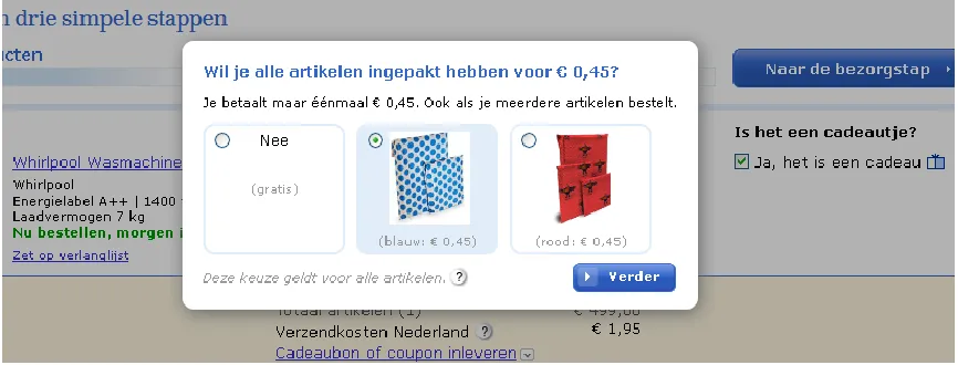
Hidden wrapping paper choices
a) Use an overlay (e.g. a lightbox) to present the wrapping paper choices
b) Use an inlay to present the wrapping paper choices (i.e. the choices appear in-page)
Whenever there are gift wrapping choices to choose from, sites can display them immediately, as an inlay (e.g. sliding down into view after the customer says it is a gift), or as an overlay. This overlay would be displayed when the user clicks e.g. a checkbox to mark items as a gift. Given that customers do not opt for the gift service for most bol.com orders (details being confidential), the wrapping paper choices will not be displayed immediately. That leaves the two straightforward alternatives presented above. Using an overlay is interesting because it provides some positive surprise potential without adding yet another page (which would be incompatible with the pattern of limiting the amount of pages). This positive surprise could turn the whole checkout into a pleasant user experience and thereby also be a persuasive element.
In the overlay version customers check a checkbox to indicate it is a gift:
Figure 17. Gift question
[image:37.612.71.504.412.577.2]After which they immediately see the overlay:
Figure 18. Gift overlay lightbox
Multiple wrapping paper choices
This pattern is somewhat related to the previous one, however it deals with other choices for creating a checkout interface with gift wrap options.
a) Allow them to pick no wrapping paper (even after they have indicated a gift) and use it as default (see Figure 20)
[image:38.612.113.322.341.402.2]b) Allow them to pick a wrapping paper after checking the wrapping paper option and select one as default (i.e. after clicking a checkbox two radio buttons appear, one of which is already selected):
Figure 19. Gift wrap with normal radio buttons with one option selected as default
c) Have users make the wrapping paper choice by using normal radio buttons d) Have users make the wrapping paper choice by using button-like radio buttons:
Figure 20. Gift wrapping button-like radio buttons
In this case the first two alternatives can be seen as opposing alternatives (either a or b) and the second two can be seen as opposing alternatives (c and d). Regarding the prototypes, this means that one of the first two can be combined with one of the second two.
The first alternative is based on usability guidelines and literature stating that extra costs should not be added without explicit consent from the user. On the other hand, the opposing alternative of selecting one wrapping choice as default does require one less user action, also increasing usability.
The last two alternatives stem from the common way of selecting an option and a method found in practice where sites use button-like radio buttons to make it more clear that a choice has to be made. This could prevent the effect that users simply overlook a radio button which can occur in practice.
Immediate wrapping paper previews
Immediate previews of the wrapping paper choices means that these previews should not be hidden (e.g. hidden in a tooltip/balloon that is shown upon hovering over a choice). This could enhance usability by reducing the steps a user needs to take. In addition, it can enhance the possibility for effectively comparing the choices.
Based on and inspired by efficiency and these sources: Guidelines: 5, 6 (appendix B)
Practice: [40], [43], [45], [50], [53]
Placeholder texts inside form fields
This is a space-saving and actionable place to provide hints about how to enter data like postcodes. Commonly such texts are displayed in a gray color. As modern browsers even include such a feature by default, it makes sense to use this feature (in case of using placeholder texts at all) to ensure consistency.
Based on and inspired by avoiding ambiguity and these sources: Guidelines: 5, 6, 21, 25 (appendix B)
Literature: [60]
Explanations for requesting sensitive data a) Next to the field label
b) Underneath the form field
People can be reluctant to provide such sensitive information, especially if it is unclear to them how it will be used. Literature suggests that providing a brief but plausible (and true) explanation can help overcome this checkout hurdle. This still leaves multiple methods for implementation. Two straightforward alternatives for this pattern will be evaluated.
Based on and inspired by effectiveness, removing barriers and these sources: Guidelines: 25 (appendix B)
Literature: [61]
Primary action buttons at the top and bottom
The primary action button is the button that allows customers to advance to the next page (effectively the call-to-action). Commonly, there only used to be one such button (at least for a specific action). Recent guidelines and literature suggest using two such buttons to make sure that such an important element is visible both above and below the fold.
Based on and inspired by efficiency and these sources: Guidelines: 54 (appendix B)
Practice: [37], [38], [39], [43], [45], [46]
Hidden coupon field as cost line in the cart
Checkout literature and guidelines suggest that a coupon field should be hidden behind a link (see e.g. [62]) to make customers less likely to go searching for coupons (bad from an e-commerce perspective), but also to prevent them from worrying that they might be missing out on discounts (decreasing the user experience). It is also suggested to place it in the cart, which makes sense given the perspective that customers like to know what they will pay as soon as possible. Furthermore when you have already received a coupon as customer, the earlier on you can use it, the likelier that you will not forget.
This still leaves room for a few locations:
a) Next to the cart’s cost block
b) As a line in the cart’s cost block, so that it can become an order discount line
[image:40.612.71.511.525.581.2]A common place is to display it next to the cost block. On the other hand, putting it in the cost block itself might be more logical. When placed there, it is located directly at its influence spot. This allows the feedback to be given at the place where the link was and where the coupon can be entered. Given this actionable place, I believe this to be an interesting alternative as it could potentially even further enhance usability. The current research allows both alternatives for this pattern to be evaluated. The second version looks as follows:
Figure 21. Coupon field hidden behind link (left) and input field after clicking link (right)
Based on and inspired by effectiveness and these sources: Guidelines: 41 (appendix B)
Returning and new customers
In order to prevent repeat customers from having to enter their details over and over again, most (modern) e-commerce sites allow (or force) users to create an account. It also resembles the fact that most online orders at bol.com are placed by repeat customers. It requires customers to indicate that they already have an account and log in.
Multiple aspects and alternatives can be taken into account here:
a) Allow them to change their initial choice without resorting to the back button b) Use radio buttons to allow easy switching:
Figure 22. Returning and new customers can choose by means of radio buttons
c) Use normal buttons for the initial choice, with a link to switch to the other option that appears after the initial choice has been made by clicking on a button:
Figure 23. Returning and new customers can choose by means of normal buttons
The first one allows for an easier undo possibility. Providing such a possibility is founded by literature and guidelines. The latter two are the straightforward and commonly found alternatives for providing users with a way to indicate that they are returning customers.
The second and third alternative are both combinable with the first one. Given that bol.com does not comply with the first alternative, both the latter ones (b and c) will be combined with the first one (a) in the prototypes.
Based on and inspired by efficiency, ease of use and these sources: Guidelines: 7, 45 (appendix B)
Shipping details before billing details
Literature and guidelines suggest that (non-business) customers have a more direct sense of a shipping address than of a billing address. Given that both addresses are usually the same, they suggest asking for the shipping address first.
Based on and inspired by ease of use and these sources: Guidelines: 46, 48 (appendix B)
Practice: [43], [45], [46], [49], [50], [51], [52], [53]
Delivery-at-work checkbox
This guides users into thinking about this possibility. Bol.com [54] suggests this in both a hover balloon/tooltip and at the order review page. However, it is easy to miss, even though it could be an important consideration. It could even be perceived as genuinely trying to assist the customer, decreasing the burden of having to think if there are relevant alternatives to questions such as the delivery address. Given this fact, this pattern is based on general guidelines and aspects such as discoverability.
After clicking the checkbox a field appears to enter the company name (the address fields for an alternative delivery address should be immediately below this field so that customers can enter both the company name and address):
Figure 24. Checking delivery-at-work checkbox displays text field
Collapsed extra address fields
a) Allow users to indicate the addresses by making a choice using radio buttons b) Allow users to indicate the addresses are different by unchecking a checkbox c) Allow users to indicate the addresses are different by checking a checkbox
When the shipping address is displayed first, hide the billing address behind a checkbox (or the other way around when the billing address is first). This allows for a cleaner and more concise (and thereby less overwhelming) interface, supporting the fact that most customers use the same address as shipping and billing address (see also the previous pattern).
There are a number of straightforward alternatives for this pattern. Because it should be an explorable option as it might not be immediately clear what happens based on this choice, it should be easy for customers to revert their choice. Therefore the alternatives selected here use radio buttons or checkboxes instead of e.g. regular buttons.
Given that bol.com already utilizes the first alternative, it should provide most insight when both prototypes use another alternative.
Based on and inspired by (perceived) efficiency and these sources: Guidelines: 46 (appendix B)
Practice: [38], [39], [40], [45], [51]
Inline validation
This is an interesting pattern for providing feedback as early as possible. Literature and guidelines suggest it to be a worthwhile pattern and the enhanced technological support (e.g. the widespread use of AJAX technology [63]), has made this pattern to be more commonly found nowadays.
Based on and inspired by efficiency, ease of use and these sources: Guidelines: 7, 26, 27 (appendix B)
Literature: [64]
Disabled primary action button with hover balloon
In this pattern, the primary action button is disabled until the form is valid. The site should indicate what is wrong when the user is (about) to try clicking it/hovering over the primary action button by displaying a balloon that describes the error. The pattern could allow for less of a feeling that an erroneous form has been submitted (because it has not been submitted yet). This might decrease negative feelings, thereby enhancing the user experience. This is related to using inline validation (the previous pattern) and is motivated by insights based on the foundations for using inline validation.
Example of a button using this pattern (disabled with balloon on the left, enabled on the right):
Figure 25. Primary button with balloon (left) and enabled button after validated form (right)
Based on and inspired by the aforementioned reasoning and these sources: Guidelines: 12, 26 (appendix B)
Literature: [64] Practice: [43]
Marking only optional fields
In this pattern only optional fields are marked as such (e.g. “(optional)” as label suffix). Required fields are not marked in any way (only implicitly by omitting the word optional).
Based on and inspired by these sources: Guidelines: 3 (appendix B) Literature: [65]
Practice: [52]
Unobtrusive account creation a) Make it optional
b) Do it behind the scenes by generating an activation link or password that is emailed to the user after the order has been placed
The pattern itself is supported by literature, guidelines and practice, whereas the two alternatives are inspired by practice. Some side notes can furthermore be found in chapter 4.1.
Based on and inspired by removing barriers and these sources: Guidelines: 45 (appendix B)
Automatic credit card company
Do not ask the user to select the credit card company (such as Visa, Mastercard or American Express) but select it based on the credit card number. The required information is available at e.g. payment providers, but it can also be found online [66] [67]. A downside could be that this requires up-to-date information. However, this information is very unlikely to change often, based on this numbering structure. When taking large amounts of customers into account, it might be very worthwhile as it is one opportunity to lower the amount of information customers need to enter. It is also supported by literature, guidelines and practice.
Based on and inspired by efficiency and these sources: Guidelines: 46 (appendix B)
Literature: [66], [67]
Practice: [43], [47], [48], [52]
Expiration date as on credit card
Display the credit card expiration date exactly as it appears on the card (including a “/”).
a) Use two text fields to enter the month and year b) Use two dropdown fields to enter the month and year
This pattern increases consistency and thereby also aspects such as learnability. It is also supported by literature. However, the same literature does not agree on if text fields or dropdown fields should be used (e.g. [68]). Therefore evaluating both these alternatives might yield interesting results.
Based on and inspired by external consistency and these sources: Guidelines: 46 (appendix B)
Literature: [68] Practice: [47]
Subtle total order costs
It is important to make the total cost easy to find before the order is placed, as relevant information should not be hard to find and this information is very relevant. This is supported by checkout guidelines and literature. However, this does not require the costs to be displayed too much ‘in-your-face’. It might prove persuasive to not emphasize these too much and focus more on the benefits (positive emotion) than on the costs (negative emotion). Given that displaying the costs in a subtle fashion focuses more on the positive emotions, it might not only be interesting from a persuasion perspective, but it could also increase the enjoyability and thereby the overall user experience. (Do note that this pattern leaves some room for interpretation.)
Based on and inspired by persuasion and these sources: Guidelines: 5, 42 (appendix B)
No repeat email address and password
The latter can always be reset. Do allow them to fix any mistakes afterwards.
Based on and inspired by efficiency and these sources: Guidelines: 18 (appendix B)
Practice: [45], [52]
Newsletter opt-in
Notwithstanding the value of newsletters, making a newsletter checkbox opt-out instead of opt-in might annoy customers. It would be interesting to see the effect of opt-in vs. opt-out.
Based on and inspired by these sources: Guidelines: 46 (appendix B)