Visualising formula structures to support exploratory
modelling
ROAST, Chris <http://orcid.org/0000-0002-6931-6252>, LEITAO, Roxanne
and GUNNING, Michael
Available from Sheffield Hallam University Research Archive (SHURA) at:
http://shura.shu.ac.uk/11866/
This document is the author deposited version. You are advised to consult the
publisher's version if you wish to cite from it.
Published version
ROAST, Chris, LEITAO, Roxanne and GUNNING, Michael (2016). Visualising
formula structures to support exploratory modelling. In: UHOMOIBHI, James,
COSTAGILOLA, Gennaro, ZVACEK, Susan and MCLAREN, Bruce, (eds.) CSEDU
2016 : 8th International Conference on Computer Supported Education.
SCITEPRESS, 383-390.
Copyright and re-use policy
See
http://shura.shu.ac.uk/information.html
Visualising Formula Structures to Support Exploratory Modelling
Chris Roast, Roxanne Leitão and Michael Gunning
Culture, Communication and Computing Research Institute, Sheffield Hallam University, Sheffield, SW1 1WB, United Kingdom
{c.r.roast, r.leitao, m.gunning} @shu.ac.uk
Keywords: Spreadsheets, Visualisation, Science Technology Engineering and Maths (STEM).
Abstract: Visualisation is often presented as a means of simplifying information and helping people understand complex data. In this paper we describe a project designing interactive visualisations to support learner competencies in the broad area of numeracy. The work builds upon: (i) the observation that while spreadsheets are traditional ICT tools, their familiarity means that they are used for exploratory mathematical modelling; (ii) a research theme examining the human factors that influence the ease with which formal notations can be understood and applied appropriately. Our paper describes the iterative design and evaluation of a tool to visualise spreadsheets, with the aim of supporting mid-teen learners based on the premise that spreadsheets serve as a gateway tool for supporting learner experimentation and confidence within numerate subjects. This iterative process is informed by background research into notational design, graphic design as well as learner and tutor feedback.
1.
INTRODUCTION
Visualisation is often presented as a means of simplifying information and helping people understand complex data. In this paper we describe a project designing interactive visualisations to support core learner competencies in the broad area of numeracy. Our premise is that, spreadsheets are a traditional, common and accessible ICT tool that supports learner confidence and experimentation of mathematical modelling. We describe the iterative design and evaluation of a tool to visualise spreadsheets, with an aim of supporting mid-teen learners in work-based education and/or prior to entering higher education. This process combines research, graphic design and learner and tutor feedback to develop a spreadsheet 'plug-in'.
2.
BACKGROUND
2.1
Why spreadsheets?
The relevance of numeracy as a foundation for educational, academic and professional skills is
widely recognised. This is evidenced by the value placed on the development of numeracy skills within science, technology, engineering and maths (STEM) education. In the UK there are various programmes to develop maths skills and skills for employment in engineering and IT. One common accessible tool for powerful numeric computations is the spreadsheet. Widely used in work and education (Chambers and Scaffidi 2010), at school level and in higher education, the spreadsheet is a core generic tool for understanding in many numerate subjects. From an employment and employability perspective, the spreadsheet is a widely used tool in most businesses. Despite the spreadsheet being a familiar tool for general purpose computation, with significant longevity, Panko (2008) and Hendry and Green (1993) argue that up to 44% of them contain errors. In addition, they are not being used to their full potential - for example 95% of IT related skills gaps in England being spreadsheet skills (Technology Insights 2012, e-skills UK).
Research into addressing issues of spreadsheet quality has motivated many enhancements. This includes additional features to ensure they are more transparent as well as to encourage more discipline in their use. (Burnett et al. Burnett 2002, Hendry and Green 1994, Hermans and Dig 2014, Panko and Sprague 1998, Sajaniemi 2000).
responsiveness being in natural opposition to their subsequent poor information infra-structure that does not support self-documentation and modifications. Their responsiveness means their users quickly become embedded in 'solutions' that are subsequently hard to manage. Specifically with regard to the complexity of inter-cell referencing, the understanding of formulae has been found to be particularly demanding, with evidence that business and governmental spreadsheets tend to avoid the use of many functions and function nesting (Sajaniemi and Pekkanen 1988). Research into complex interactive systems and user empowerment (Blackwell, et al. 2001) has provided a range of descriptive dimensions that capture some of these core characteristics. The notion of 'premature commitment' describes systems that introduce constraints before users know how to work with them, or if they want to work with them. Hence, for traditional spreadsheets simple numeric models are easy but well-structured models benefit from planning up-front. Complementing this is the notion of 'viscosity' (a resistance to change). Once used substantively, a sheet's information structure is one that allows input values to be changed, but more extensive changes are complex. The premature commitment and viscosity combined, result in users becoming locked-in to early solutions and the subsequent attempt to refine/improve them. These points are evident anecdotally from businesses and professionals who have working spreadsheets. In many cases they are rarely refined or modified because of the risk of 'breaking' a working, but opaque, 'solution'.
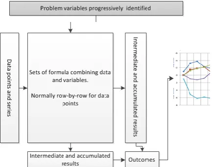
Figure 1. Schematic of spreadsheet base modelling
2.2
Educational uses
Similar factors are addressed in the early educational use of spreadsheets keeping to rigid solution styles. As part of our preliminary research, teaching and assessment materials related to spreadsheet skills were reviewed. This, in combination with conversations with tutors, showed that spreadsheet skills were focused largely upon following a given model, structure and layout. This focus upon prescribed solutions leaves little opportunity for exploratory modelling or problem solving that could depart from given examples.
2.3
Exploration and development
When used in model development, the 'locking-in' effect of spreadsheets is a powerful influence. In simple terms we can outline a spreadsheet model as being equivalent to the structure in figure 1.There are variables (at the top) used in formula (central rectangle) applied to input data (on the left). Model outputs are accumulated in rows and/or columns feed into summary statistics, results, reports or graphs (on the right hand side). We believe these structural features are common to spread modelling, even though this specific layout many not be followed.
The iterative process of development of a model is one of introducing variables identified as necessary to examine and capture emergent features. In terms of our figure, reification tends to add more subtle variables (at the top) and associated computations (in the central rectangle). However, structurally, the model output is already present (on the right hand side). Hence, as opposed to re-designing a sheet's structure with each new variable introduced, the formulas used rise in complexity to accommodate new variables.
Note that this account of use is the antithesis of skills based training where the variables, layout and requirements are all prescribed beforehand.
2.4
Example
We illustrate our account of iterative modelling with a work based training example set in the domain of construction. It concerns the cost of tiling an irregular floor shape - in this case an "L" shaped room. The floor area can be treated as three adjoined rectangles (2m x 3m, 3m x 3m and 3m x 1m). So, assuming the price per 1m x 1m tile is given as, say, 4.99 euros the total cost of the tiles would be:
Educationally, progressive modelling could include recognising that the price of a tile is a variable that can be kept in cell for that purpose (say, A2). In which case the formula would become:
=A2*(2*3+3*3+3*1)
Similarly, these tiles are a specific size. Other tiles may be of a different size. In that case another variable, the area of a tile may be kept in, say, A3 and formula updated to:
=A2*(2*3+3*3+3*1)/A3
A delivery charge can be modelled too as a fixed amount added to the total:
=A4+A2*(2*3+3*3+3*1)/A3
While this is clearly a simple numeric problem it illustrates the rise in complexity. If the model goes on to account for, say, free delivery with orders over a certain amount, then the formula becomes more complex.
= (A2*(2*3+3*3+3*1)/A3) +
IF((A2*(2*3+3*3+3*1)/A3) > A5, 0, A4)
Other factors as they are recognised will add further complexity to what was at first a very simple model.
This incremental model development will not necessarily be well designed or structured because of the factors emerging during its development. What is more, hand-in-hand with this growing formula complexity is the difficulty of seeing formula errors and errors in the resulting outputs.
3.
VISUALISATION
Graphical representations, such as flowcharts, and pictorial representations of data structures have long been used to support the understanding of programs and their underlying processes (Myers 1986). However, it is of interest to note that in visual computational language the empirical evidence of their compelling and appealing character is limited, as is their educational utility (Sorva, et al. 2013).
Previous work has proposed ways of presenting and visualizing spreadsheets, see: Saariluoma and Sajaniemi (1991), Igarashi, et al. (1998), Ballinger, et al. (2003) and Burnett, et al. (2001). However these works only consider the wider structure of spreadsheets, and the dependencies between cells. None appear to have addressed the fact that the
formulas language is computationally powerful but contracted onto a single line. It is this complexity of language presentation that can complicate its effective use. Our enhanced spreadsheet tool employs a visual language that graphically represents spreadsheet formulae.
A visualisation offers a ‘scaffold’ of geometric forms, colours and connectors that take advantage of human perceptual ability to recognise patterns and associations - and support “visual thinking”. We aim to make the relationship and sequence of formulae elements more evident and immediate using such techniques. Examples of how this might reveal itself include: learners recognising when a formula result is not fit for its intended purpose; identifying where an error is in a formula, or; identifying what modifications are necessary to ensure a formula does work. For example, if a cell is computing an unexpected result, the learner will need to closely inspect the formula and essentially ‘debug’ it. With good visual 'scaffolding', any problem in the formula should be more easily identified.
3.1
The designing a visual language
The visualisations were developed on paper to allow the authors, tutors and learners to explore and provide rapid feedback on which visual characteristics are appropriate and of value. Initially good visual design practice was followed, informed by learning scenarios and educational uses of spreadhseets (e.g. see: Gretton and Challis, 2008). The principles for the initial design phase where:
–
Evidencing structure. Within a given formula, the syntactic structure is core to comprehending meaning.–
Visual mapping. The ease of mapping between the formula and visualisation. Clearly, if this mapping is complex for a learner, the visualisation may be of little value.–
Evidencing categories. Within a given formula, being able to recognise the different categories of tokens and structures.–
Evidencing abstractions. There are various abstractions apparent in the way formulae are used. For example, the same sub-expression appearing in a number of places in a single formula. A simple example would be the formula for a quadratic, such as,=A1*X1*X1+B1*X1+C1. The repeated use of X1 is important for understanding what is expressed. A more complex abstraction is the repeated use of the expression (2*3+3*3+3*1), in the simple example above.
–
Evidencing computation. In contrast tospecific values used in determining the resulting value of a formula. Hence, when a formula such as, =2+3*4 produces the result 14, it is important to understand that arises form 2+12 and the 12 arises from 3*4.
–
Visual simplicity and scalability. Although not easily defined, this principle discourages apparently empty space, redundant arcs or overlapping lines or structures. In view of our motivation, this point is most relevant for complex formulae.Two visualisation approaches were identified: ‘Explicit Visualisation’ (EV), and; ‘Dataflow Visualisation’ (DV). Both were based on a data flow metaphor with components interconnected by flows that represented results passing between operations within a formula. Both also presumed a top-down reading with the starting expression at the top and the outcome at the bottom. Categories of node included: numeric values, cell references, strings, operators and built-in spreadsheet functions, with all such types being given a distinct visual identity.
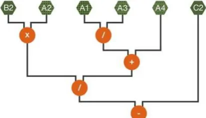
Figure 2. An initial tokenised visualisation of a formula =A2xB2/(A1/A2+A1)-C2 as graphical tokens.
3.2
Dataflow Visualisations
The Dataflow Visualisation (DV) focuses an abstract view based upon the rationale that the formula structure is key to assessing its correctness. Specifically DV was based upon the following rules:
–
Cell references are not replaced by their numeric values, as the presence of a value (and not the literal amount) which is important to the model.–
The outputs from functions and operations consistently flow down any functions that use them as inputs.–
Brackets are not used, as operator scoping can be inferred by the order of operations represented by the visualisation. The reduced number of visual elements supports visual simplicity and scalability.DV emphasises formula structure, and minimises numeric details. The rationale behind this is that a 'wrong' formula is because of it not linking its components correctly. Hence, displaying the structure in this way will help identify important errors or slips. It captures what is being proposed as a solution and not the details of any specific instance of the solution. For an example of DV see figure 3.
[image:5.595.311.517.172.290.2]In terms of our initial principles, evidencing visual mapping is weak since the formula as typed in the spreadsheet cannot be immediately obvious in the visualisation. In addition, the evidencing of computation is relatively weak since the flow is shown but not the effect of individual operations or functions.
Figure 3. A DV visualisation of the expression in figure 2.
3.3
Explicit Visualisation
Unlike DV, the Explicit Visualisation (EV) approach graphically represented each computation step in processing a formula:
–
The visualised formula is a direct match to the original spreadsheet formula. Thus supporting the concept of visual mapping.–
Cell references include the numeric values in those cells. While this detracts from the visual mapping it does support evidencing of basic computations. [image:5.595.302.516.504.670.2]–
Values, functions and operators flow down into additional nodes ("monitors") which themselves show the result of the associated operator or function applied to its arguments. This further supports evidencing computation.3.4
Conditionals
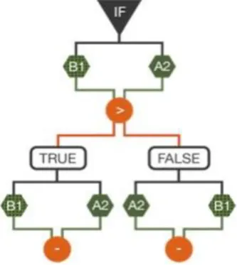
One of the issues with complexity, illustrated with our simple example, is the use of conditional functions (such as "IF"). Interestingly, conditionals highlight basic tensions between the proposed visualisation rules.
The most common conditional is the "IF" function: "IF" takes three arguments, and behaves as follows: if the first argument (the CONDITION) is evaluated to TRUE, then the second argument (the THEN-PART) is evaluated and the result is returned as the value of the "IF" expression. Otherwise, the third argument (the ELSE-PART) is evaluated and that value is returned. Hence, they embody two computational behaviours, when one is only ever used. This poses an inherent problem when we consider visualising computation behaviours.
This exposes the difficulties of visualising conditionals in EV and DV. In the case of EV, a non-computed ELSE-PART would need to be shown and it would be necessary to indicate that its value is not computed. However, the same formula in the contrary case would show the THEN-PART not computed (see figure 5). This dynamism is at odds with the idea of a single representation for a formula not itself changing.
Figure 5. A simplistic EV visualisation of a conditional expression, in which the THEN-PART is present but not used.
Figure 6. A DV visualisation of a conditional expression, illustrating the separation of flow into two alternate computations.
4.
EVALUATION
We conducted a variety of user studies. In keeping with iterative design principles each study considered both assessing the appropriateness of the visualisations and also gathering formative feedback. The primary target users were college based learners developing skills for higher education entry and improved employability.
In general, these evaluations faced methodological challenges which limited the scientific assessment of the visualisations. Firstly, our target users despite using and learning about spreadsheets had widely differing levels of familiarity. This was partly due to: the stage and structure of differing colleges; the differing examination boards being used, and; the level of staff engagement with the topic. In fact, the account of modelling that we discussed earlier in this paper was rarely apparent since teaching materials did not encourage exploratory modelling per-se. A second issue that limited controlled comparable assessment of visualisations was that differing subjects had differing approaches to using spreadsheets. For the majority the default response was that spreadsheets were "ICT" and as such were not readily used in maths or science. In these cases consultation with individual tutors was necessary to identify how to harness spreadsheets as numeracy tools relevant to specific topics.
4.1
Initial evaluations
Initial evaluations were directed at assessing the comprehension of the visualised formula with the aim of comparing textual formula, DV and EV (Leitão and Roast 2014).
Initially the two styles of visualisation DV and EV were assessed with between groups with task completion being observed and along with some post task interviews. For individual classes, the approach to user engagement varied in response to the readiness of technology, users' academic levels, and support of their tutor. This included:
[image:6.595.82.279.401.488.2] [image:6.595.84.251.532.719.2]formulae (one of which is correct for the problem).
–
Prototype implementations of DV and EV were developed as extensions to an existingspreadsheet package. With the prototype the tasks were to construct or modify a formula in the spreadsheet to solve a set of mini-problems. An example mini-problem is:
"Does =A1*(A1*A1) calculate cell A1 to the power of 4? If not, correct the formula."
Performance was measured assessed by the number of answers. Subjects varied in age profile, familiarity with spreadsheets and readiness to engage with the tasks. Quantitative results from these studies (summarised in table 1) suffered from challenges described above. However, the fact that learners engaged with the tasks set and worked effectively with the visualisations did show some positive benefits and in no cases was there evidence of them impairing the tasks set.
During the same period educational experts were consulted regarding the tool and the visualisations and encouraged to critic the approach takes. Feedback from this process and interviews with subjects were valuable in helping distinguish between DV and EV.
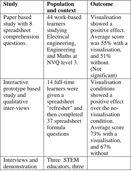
Table 1: Summary of initial evaluation studies and outcomes
Study Population
and context
Outcome
Paper based study with 8 spreadsheet comprehension questions. 44 work-based learners studying Electrical engineering, Engineering and Maths at NVQ level 3.
Visualisation showed a positive effect. Average score was 55% with a visualisation, and 51% without. (Not significant) Interactive prototype based study and qualitative inter-views 14 full-time learners were given a spreadsheet "refresher" and then completed 37 spreadsheet formula questions Visualisation conditions showed a positive effect over the no-visualisation condition. Average score 73% with a visualisation, and 67% without Interviews and
demonstration
Three STEM educators, three
with experts. STEM education researchers and five support staff
Initial evaluation stage outcomes were that the explicit EV style was of more value. The support for evidence of computation and mapping back to the spreadsheet formula counted highly for educational experts, tutors and learners.
Feedback on visualisation of conditionals was not so straight forward partly due to learners and tutors being less familiar with using conditionals. Hence the outcome was to review the visualisation taking into account the general points arising from the evaluation of DV and EV.
4.2
Design, development and
evaluation
Following the initial development and evaluation we developed a more robust prototype tool suitable for broader scale trialling and assessment. This also involved integrating with the most widely used spreadsheet, specifically MS Excel (Campbell-Kelly, 2007).
The visualisation developments focused upon developing an EV-based visualisation of conditionals that aimed to ensure a good mapping with the formula while indicating the dynamic character of conditional behaviour. The resulting visualisation is illustrated in figure 7. In this design the THEN-PART and the ELSE-PART are shown, but in addition, the un-used part is faded to indicate it is not in use and the conditional expression is shown to be "selecting" the relevant part.
Figure 7. The revised EV style visualisation of conditionals.
[image:7.595.68.292.423.714.2]were approached and introduced to the tool. Where possible, this introduction mapped to their existing use of spreadsheets, such as their current topics of study or tutorial work.
The initial evaluation was taken to have demonstrated that our general approach visualisation was valid. However, evidencing performance improvements attributable to the visualisation was judged to be too methodologically complex, for the reasons described earlier. As a consequence the second phase of evaluation focused upon whether the prototype technology was recognised by users to be of potential value. It was assumed that this judgement could be made by users, even if the tool was not used comprehensively in the sessions when it was introduced to them. For this reason the Technology Adoption Model (Davis, et al. 1989) was used to develop a series of questions for both learners and tutors.
Over 15 learners were introduced to the tool during a taught element of work related courses. They subsequently attempted specified spreadsheet tasks at a level matching their normal class. The tasks lasted for between 30 and 60 minutes, during which they worked with the tool running with MS Excel. Responses were gathered on a Likert scale questions (1 to 7). The most positive responses were with respect to the visualisation (6.17) and responsiveness of the system (6.00). The least positive response (3.92) was just below the median of 4.00, and concerned whether learners perceived the tool as helping them work more efficiently.
As with the initial evaluation, the results are on the whole positive for a small number of subjects. Qualitative feedback supports this view:: "It would help me a lot with other formulas", "You can see the values and how they are worked out, that's great." and "It would help anyone willing to learn about spreadsheets".
In addition supportive qualitative evidence came from tutors engaged during the sessions: "I am sure that it could add value to the teaching of mathematics."; "I think it would be very helpful";
"Absolutely brilliant when it comes to more complicated formulas for our learners. With regards to the IF statement, I particularly like the way it checks the condition and identifies whether it is TRUE or FALSE. Additionally really good for formulas of non-adjacent cells."
Both tutor and learner feedback also supported identifying additional visualisation details. One example of this was the need in complex cases to indicate the flow of data more explicitly, as well as the final result node. Features such as these were introduced to the next iteration of the tools which currently under going evaluation.
5.
DISCUSSION
Despite the lack of familiarity with the visualisations, their presence and use did not impair learner performance. In follow-on interviews all agreed that the visualisation approach had merit. Overall feedback was positive, with those interviewed seeing the potential to help "de-mystify" spreadsheets for learner population we are targeting. For example, trainee tutor commented:
"I struggle a lot with spreadsheets and find it hard to understand them. Seeing the spreadsheet visualisation prototype made it clearer to understand the formulas and feel that if I had chance to use a programme of that kind I would have a greater understanding and be able to pick up the skills I require much quicker. I feel that this product could help people like myself that struggle with spreadsheets."
An expert in maths education research commented:
“It will be very useful to many students to have a product that enables a better conceptual understanding of the equation format. There is a clear need for such a tool to be suitable for the many students who do not have high levels of mathematical skills and yet use mathematical symbolism every day in their studies. This will include students from Chemistry, Business, Economics, Psychology, Geography and many more."
6.
FUTURE WORK AND
CONCLUSIONS
We have reported the iterative development of the visualisation tool in terms of: preliminary design, initial development and evaluation and then the evaluation of prototype operating with MS Excel. This is part of an on going process of evaluation and refinement, with learner and tutor feedback informing future enhancements.
address some of the more complex structures found in spreadsheet formula.
The long-term benefit of making spreadsheets more usable is one that could impact upon academic progress for individuals as well as general numeracy skills. The value of the resulting improved ability aligns to national and international educational objectives regarding skills and employability.
ACKNOWLEDGEMENTS
We are indebted to local colleges' staff and students that were willing to support and participate in the studies reported. The technical development of the tool benefited significantly from the technical contribution of Tony Day. This work is supported in part by: UK Higher Education Academy, The Small Business Research Initiative (part of Innovate UK) and Department for Business, Innovation & Skills (UK).
REFERENCES
Ballinger, D., Biddle, R. and Noble, J., 2003. Spreadsheet structure inspection using low level access and visualisation. In Proc. Fourth Australasian User Interface Conference (AUIC2003). Biddle, R. and Thomas, B., Eds. ACS. 91-94.
Blackwell, A.F., Britton, C., Cox, A. Green, T.R.G., Gurr, C.A., Kadoda, G.F., Kutar, M., Loomes, M., Nehaniv, C.L., Petre, M., Roast, C., Roes, C., Wong, A. and Young, R.M., 2001. Cognitive Dimensions of Notations: Design tools for cognitive technology. In M. Beynon, C.L. Nehaniv, and K. Dautenhahn (Eds.) Cognitive Technology 2001 (LNAI 2117). Springer-Verlag, pp. 325-341.
Burnett, M., Atwood, J., Djang, R., Gottfried, H., Reichwein, J. and Yang, S., 2001. Forms/3: A first-order visual language to explore the boundaries of the spreadsheet paradigm. Journal of functional
programming 11(2): 155-206.
Burnett, M., Sheretov, A., Ren, A. and Rothermel, G., 2002. Testing homogeneous spreadsheet grids with the "what you see is what you test" methodology," IEEE Trans. Softw. Eng., 28(6) pp. 576-594.
http://dx.doi.org/10.1109/TSE.2002.1010060 Campbell-Kelly, M.,2007. Number crunching without
programming: The evolution of spreadsheet usability. IEEE Annals Of The History Of Computing, 29(3), pp.6-19, ISSN: 1058-6180
Chambers, C. and C. Scaffidi (2010). Struggling to excel: A field study of challenges faced by spreadsheet users. Visual Languages and Human-Centric Computing (VL/HCC), 2010 IEEE Symposium on, IEEE.
Davis, F.D., Bagozzi, R.P. and Warshaw P.R., 1989. User acceptance of computer technology: A comparison of two theoretical models. Management Science, 35 (8) pp. 982–1003
Gretton, H. and Challis, N., 2008. "Fundamental Engineering Mathematics; A Student Friendly Workbook" Woodhead Publishing, 2008, ISBN-13: 978-1898563655.
Hendry, D.G. and Green, T.R.G., 1994. "Creating, comprehending and explaining spreadsheets: a cognitive interpretation of what discretionary users think of the spreadsheet model." in International Journal of Human-Computer Studies, 40(6), 1033-1065, DOI=10.1006/ijhc.1994.1047
Igarashi, T., Mackinlay, J.D., Chang, B-W and Zellweger, P.T., 1998. Fluid Visualization of Spreadsheet Structures, Proceedings of the IEEE Symposium on Visual Languages, p.118.
Leitão,R. and Roast, C., 2014. Developing visualisations for spreadsheet formulae: towards increasing the accessibility of science, technology, engineering and maths subjects. In: 9th Workshop on Mathematical User Interfaces, Coimbra, Portugal, 10 July 2014. Myers, B. A. (1986). Visual programming, programming
by example, and program visualization: a taxonomy. ACM SIGCHI Bulletin 17(4): 59-66.Panko, R. R., 2008. What We Know About Spreadsheet Errors. Journal of End User Computing's Special issue on Scaling Up End User Development 10, 15-21 Panko, R. R. and Sprague Jr., R. H., 1998. "Hitting the
wall: errors in developing and code inspecting a simple spreadsheet model" Decision Support Systems 22(4): 337-353.
Peyton Jones, S., Blackwell, A. and Burnett, M., 2003. A user-centred approach to functions in Excel. In Proceedings of the eighth ACM SIGPLAN
international conference on Functional programming (ICFP '03). ACM, New York, NY, USA, 165-176. DOI=10.1145/944705.944721
Rello, L., Kanvinde, G. and Baeza-Yates, R., 2012. Layout guidelines for web text and a web service to improve accessibility for dyslexics. Proceedings of the International Cross-Disciplinary Conference on Web Accessibility, ACM.
Saariluoma, P., Sajaniemi, J.,1991. Extracting Implicit Tree Structures in Spreadsheet Calculation. Ergonomics 34(8), 1027-1046.
Sajaniemi, J., 2000. Modeling Spreadsheet Audit: A Rigorous Approach to Automatic Visualization, Journal of Visual Languages and Computing. 11, 49-82. doi:10.1006/jvlc.1999.0142
Sorva, J., Karavirta, V. and Malmi, L., 2013. A Review of Generic Program Visualization Systems for
Introductory Programming Education. Trans. Comput. Educ. 13, 4. DOI=http://dx.doi.org/10.1145/2490822 Stein, J. and V. Walsh, 1997. "To see but not to read; the
magnocellular theory of dyslexia." Trends in neurosciences 20(4): 147-152.