Contents lists available at ScienceDirect
Computers & Graphics
journal homepage: www.elsevier.com/locate/cagOn the perceptual Influence of Shape overlap on Data-Comparison using Scatterplots
Christianvan Onzenoodta,∗, AnkeHuckaufb,, TimoRopinskic, aVisual Computing Group, Ulm University, Germany
bInstitute of General Physiology, Ulm University, Germany cVisual Computing Group, Ulm University, Germany
A R T I C L E I N F O
Article history: Received May 14, 2020
Keywords: Scatterplots, perceptual study, crowdsourcing
A B S T R A C T
Scatterplots can be used for a wide range of visual analysis tasks, for example com-paring correlations or variances of clusters across potentially multiple classes of data, in order to find answers to higher-level questions. Comparing classes of data in one scatterplot demands additional visual channels to encode this dimension. While percep-tion research suggests colors as rather perceptually dominant, other studies show that shapes can also be visually salient. However, with an increasing amount of data, over-lapping shapes can cause perceptual difficulties and obscure data. Even though shapes in scatterplots have been investigated extensively, the overlap between these shapes has usually been avoided by using synthetic scatterplots. To overcome this limitation, we investigate the perceptual implications of overlap when comparing data using scat-terplots using a series of crowd-sourced user studies. These studies include common visual analysis tasks, like comparing the number of points, comparing mean values, and determine the set of points that is more clustered. To support our investigations, we introduced and compared four metrics for overlap in scatterplots. Our results provide insight into the overlap in scatterplots, recommend combinations of shapes that are less prone to overlap, and outline how our metrics could be used to optimize future scatter-plot design.
c
2020 Elsevier B.V. All rights reserved.
1. Introduction
1
Scatterplots are widely used to visually explore and commu-2
nicate abstract data. Oftentimes this involves dimensions of or-3
dinal data, defining classes which observers would like to com-4
pare against each other. For this comparison, the data is often 5
presented in a single scatterplot. But the ability to compare 6
classes in a single scatterplot depends on the given data. As the 7
data becomes more similar for example in terms of variance, or 8
with an increasing number of points, we obtain a larger amount 9
of overlap between points. 10
∗Corresponding author:
e-mail:[email protected](Christian van Onzenoodt)
This overlap of data points can hide data or introduce arti- 11 facts in certain arrangements of data points. Therefore, overlap- 12 ping data points influence the perception of an observer and can 13 thereby hinder the ability to find answers to an analytic ques- 14 tion. Additionally, the given task plays an important role, since 15 tasks like finding outliers in a set of points might not suffer from 16 high amounts of overlap, while it is difficult to identify clusters 17 under such conditions. This leads to a need for optimization 18 for a plot with respect to visual encodings, such as used shapes 19 and their size, to enable observers to explore the data and find 20
answers to analytic questions. 21
Although there is research on how to optimize scatterplot 22 design in terms of overdraw, existing approaches are limited 23 on for example only adjusting marker opacity [1]. Micallef 24 et al. [2] introduce an approach to optimize marker size and 25
marker opacity by using a cost function but limit their approach 1
to using colors to encode different classes. Other research in-2
tended to optimize scatterplot design with respect to the in-3
tended tasks [3, 4, 5], or by using animation to try to alleviate 4
overdraw by constantly redrawing points over existing ones [6]. 5
Perception research suggests that color hue is a visually dom-6
inant channel [7, 8]. However, recent work shows that shapes 7
can also be a viable choice to encode categorical variables in 8
scatterplots [9, 10, 11]. Since these shapes need to be relatively 9
large to be distinguishable, shape overlaps become likely, es-10
pecially for datasets containing a large number of data points. 11
Overlapping shapes may also result in perceptual difficulties, 12
such as occluded data or false positives. These kinds of percep-13
tual difficulties can also lead to situations where certain arrange-14
ments of shapes lead to the formation of artificial new shapes 15
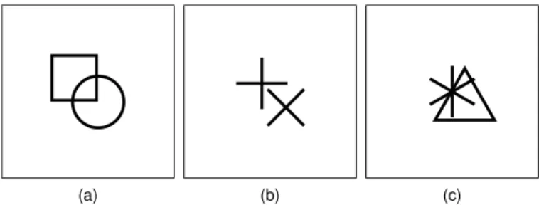
(for example multiple plus symbols forming a square shape) 16
which can not appear when only using one kind of shape in dif-17
ferent colors. While other 2D scatterplot parameters, such as 18
shape size [12] and shape color [13] have been investigated ex-19
tensively, the overlap between shapes in a scatterplot has, to our 20
knowledge, not been considered in depth yet. Furthermore, we 21
see a lack of a concrete measurement of overlap appearing in 22
a scatterplot, especially with a focus on human perception. So 23
to support our research on shape overlap, we investigated three 24
different measurements for overlap and compared their ability 25
to support the prediction of human perception. 26
Since previous work could show that results of perceptual ex-27
periments can be used to predict human perception [14, 15, 16], 28
we conducted a series of six user studies to evaluate which of 29
our metrics could serve as a valuable predictor. To do so, we 30
used Amazon’s Mechanical Turk platform (MTurk) since it of-31
fers a large and diverse pool of participants [17, 18, 19]. Since 32
all of these participants are not in a typical laboratory environ-33
ment, such crowd-sourcing studies nicely reflect the variety of 34
conditions under which users would inspect a visualization. We 35
selected three common tasks based on previous work related to 36
2D scatterplot interpretation for our experiments. These tasks 37
include judgments of the comparison of the number of shapes, 38
the comparison of variance of sets, and the comparison of av-39
erage value. Within our experiments, we have investigated a 40
set of six different shapes, two different sizes of shapes, and 41
a broad variety of overlap conditions reaching from almost no 42
overlap to heavy overlap. Finally, we show how our findings 43
can be used to optimize future, unseen scatterplots to improve 44
the ability to solve a given task. 45
The remainder of this paper is structured as follows. First, we 46
discuss work which is related to our investigations in Section 2, 47
before we discuss our overlap measurements in Section 3. Sec-48
tion 4 outlines the methods used in our experiments, followed 49
by three sections presenting the results. Afterwards, we evalu-50
ate our metrics in Section 8 and present direct implications on 51
scatterplot design in Section 9. Finally, Section 10 concludes 52
the paper and outlines possible future extensions of our investi-53
gations. 54
2. Related Work 55
The perception of shapes and the contrast between shapes 56 have been investigated in previous work [20, 21]. Additionally, 57 the usage of shapes in two-dimensional scatterplots has been in- 58 vestigated [10, 11], but so far overlap between shapes has been 59 avoided through synthetic data generation. 60
Shapes in 2D scatterplots. When using shapes to encode ad- 61
ditional dimensions within 2D scatterplots, it is required that 62 these shapes are visually separable. Demirlap et al. [20] intro- 63 duced distance matrices for perceptual judgments calledper- 64 ceptual kernels. To derive these matrices they conducted a set 65 of crowd-sourced experiments on the MTurk platform. Com- 66 parison tasks between shapes, colors, sizes, and combinations 67 thereof were investigated by using five different tasks. These 68 tasks included pairwise comparison using two different Likert 69 scales, triplet ranking with matching, as well as discrimination, 70 and spatial arrangements. Based on the obtained results, they 71 propose a metric that encodes the perceptual distance between 72 for example different shapes, colors, and sizes of shapes. 73 To investigate which pairs of shapes offer good visual separa- 74 bility, Tremmel conducted two experiments [21]. He compared 75 filled and non-filled shapes, as well as different types of circles 76 with, for example, crosses or dots in the center, together with 77 a plus shape and an asterisk. For his experiments, he created 78 different synthetic scatterplots containing two shapes. He fur- 79 ther ensured that the individual shapes are not overlapping by 80 requiring a minimum distance between each of them. One of 81 the shapes appeared more often, such that the task was to find 82 the shape which appears more often. Tremmel’s results indi- 83 cate that a combination of filled and non-filled shapes provide 84 a good visual separability. But he also found that shapes with 85 different numbers of terminators (for example four terminators 86 of a plus ( ), or six terminators of an asterisk ( )) can be sepa- 87
rated well. 88
Li et al. [10] investigated the effect of shape and size on 89 the perception of scatterplots. To do so they conducted a user 90 study including different tasks, where they for instance esti- 91 mated which shape appears more often, identified outliers, and 92 determined which shapes are more clustered. Thus, for gener- 93 ating their test stimuli, they divided the scatterplot area into a 94 uniform grid and placed the shapes into randomly selected cells 95 to prevent overlapping shapes. Their results indicate a good 96 visual separability between polygon- and asterisk-like shapes. 97 Finally, Burlinson et al. [11] could show, that shapes such as 98 squares, triangles, circles, asterisks, plus- and cross-shapes can 99 indeed be used for tasks like counting the number of elements 100 and guessing the average of a cluster. They divided these six 101 shapes into the classesopenandclosed, where squares, trian- 102 gles, and circles are considered closed shapes while all the re- 103 maining are considered open shapes. To generate their plots, 104 Burlinson et al. used an approach introduced by Gleicher et 105 al. [22] which prevents overlapping shapes. Under these over- 106 lap avoiding conditions, they found that using two shapes from 107 the same category causes a significant effect on response times 108 as well as error rates when compared to using shapes from dif- 109 ferent categories. Furthermore, they found, that open shapes 110 seem to be a better choice to be used as target shapes. 111
Overlap in 2D scatterplots. Mayorga and Gleicher [23] pro-1
posed Splatterplots, an enhanced presentation of scatterplots 2
which tries to solve the problem of overlap. TheseSplatterplots 3
abstract the presentation of dense regions in scatterplots into 4
color coded contours while keeping outliers as single points. 5
Splatterplots work well even for millions of data points, but
6
require interactions such as continuous zoom to reveal the ac-7
tual data. Another technique of preventing overlap in scatter-8
plots was developed by Keim et al. [24]. Their approach tries to 9
minimize the overlap in a plot by distorting the scales of a two-10
dimensional scatterplot. The user can freely distort the plot until 11
an optimal trade-offbetween distortion and overlap is achieved. 12
While they propose techniques to automatically optimize plots, 13
distorting the data can introduce unwanted relations. 14
Urribarri and Castro [25] recently developed a metric to mea-15
sure the number of shapes that are not completely overlapped 16
by other shapes. They show how to use this metric for diff er-17
ent shapes and how a scatterplot can be optimized using their 18
metric. However, the proposed metric only calculates the to-19
tal amount of completely hidden shapes in a scatterplot. This 20
is especially problematic when using filled shapes which are 21
relatively large. Under this circumstance, the amount of com-22
pletely hidden shapes becomes a problem. Furthermore, shapes 23
that are only overlapping partially are not considered by their 24
metrics, and the actual influence on the perception of overlap is 25
also neglected. 26
Related works by Matejka et al. [1] and Micallef et al. [2] try 27
to improve the appearance of scatterplots by adjusting the size 28
and opacity of data points. While this approach does maintain 29
the general distribution of points and does support users to find 30
regions where points are really clustered, it is difficult to apply 31
this approach when using different shapes to encode classes. As 32
the overdraw increases, and therefore the opacity of individual 33
points decreases, it becomes more and more difficult to distin-34
guish between points. 35
Furthermore, Chen et al. [6] introduced an approach to over-36
come overplotting by using animation and iteratively redrawing 37
points on top of existing ones. This makes cluttered regions in 38
the plot easy to detect, but this approach does not work in en-39
vironments where animations can not be used, for example for 40
printed plots. 41
3. Overlap Calculation
42
To be able to estimate the degree of overlap present in a 2D 43
scatterplot, an appropriate metric is needed in order to investi-44
gate the influence on human perception. These metrics should 45
further serve as an additional predictive variable in our investi-46
gations and help to understand the general amount of overlap. 47
Although we suppose that a more precise measurement leads 48
to better predictive performance, we tried to find some viable 49
simplifications which may also lead to viable predictive perfor-50
mance using our model. Therefore, we compared four different 51
metrics using the acquired data from our user studies. 52
We have not considered the metric proposed by Urribarri 53
and Castro [25], which measures the amount of data that is to-54
tally hidden by other shapes since it assumes that scatterplots 55
(a) (b) (c)
Fig. 1. Examples of overlap appearing between different combinations of two shapes. Shapes are drawn with a pixel size of fifteen and a line width of one. The overlap is measured by using all three of our introduced overlap measurements, whereMpixmeasures on a pixel based level,Mnumcounts the number of overlapping shapes based on a bounding circle, andMrel ad-ditionally takes into account how much these bounding circles overlap. This would produce the following overlap measurements: (a)Mnum=1.0, Mrel≈.29,Mpix≈.02,Mshape≈.02; (b)Mnum=1.0,Mrel≈.29,Mpix=0, Mshape=0; (c)Mnum=1.0,Mrel≈.67,Mpix≈.12,Mshape≈.55.
use filled shapes. Furthermore, the goal was to focus on over- 56 lap instead of hidden data, which can nicely be done by the 57 four metrics discussed in the following paragraphs. Also, algo- 58 rithms which depend on convex hulls are not viable, since we 59 then would need to come up with an artificial hull for our open 60 shapes. Therefore, we also decided against different kinds of 61 collision detection algorithms, which rely on convex hulls, like 62 the algorithm introduced by Gilbert et al. [26]. 63
3.1. Discusssion of Metrics 64
Our goal was to find a measurement for overlap in scatter- 65 plots. Therefore, we decided to use a pixel-precise measure- 66 ment as our baseline metric, before trying to find other metrics 67 which might reflect human perception in a better way. The most 68 precise way of measuring overlap in scatterplot would be to just 69 count the number of pixels of a shape that is overdrawn by other 70
shapes. 71
While we hypothesize that this is the most precise way of 72 measuring overlap, we also suspect that this metric does not 73 serve as a good measurement of overlap on a perceptual level. 74 For example, when two open shapes like the asterisk ( ) and 75 the plus ( ) overlap each other, there are cases where the shapes 76 are not overlapping on a pixel level, but humans might perceive 77 these shapes as overlapping and having trouble in separating the 78 shapes. Therefore, we came up with a second metric that mea- 79 sures the overlap between shapes using bounding circles, where 80 we just count the number of overlaps between the bounding cir- 81 cles. We choose the size of the bounding circles to be of the 82 size of the shape. This means for a square ( ) with a width and 83 height of seven pixels, we used a bounding circle with a radius 84 of seven pixels. While this introduces false positives, we sus- 85 pect this metric to reflect the human perception in a better way 86 than the pixel precise measurement, especially when shape size 87 decreases. Figure 1b shows an example of such a false positive 88
measurement. 89
This second metric, however, does not take into account how 90 much two shapes are actually overlapping. To overcome this 91 limitation, we came up with a third metric which does include 92 these criteria. In doing so, a plot where all of the shapes are 93
just slightly overlapping would produce a different amount of 1
measured overlap, when compared to a plot where all the shapes 2
are overlapping a lot. 3
So in the end, we came up with the following metrics: 4
Mpix : Pixel-based overlap. For this metric we rendered the
5
scatterplot and the shapes appearing in our plots and counted 6
the number of pixels for the individual shapes. We then used the 7
plots generated for the conducted experiment, where we know 8
how many points are shown and which shape they are using. 9
Using this information we can compute how many pixels in a 10
given plot should be occupied by shapes. Afterwards, the num-11
ber of used pixels in the scatterplot can be used to calculate the 12
number of pixels that appear to be overdrawn. Since our closed 13
shapes are drawn to be transparent in the center, such a shape 14
only occupies the number of pixels used for the outline of the 15
shape. 16
Mnum: Number of bounding circle overlaps.For this metric,
17
we simply count the number of overlapping shapes by using 18
a bounding circle for each shape. To do so, we calculate the 19
distance between each of the data points to all other points while 20
excluding already compared pairs. If the distance between two 21
points was smaller than the size of a shape, we found an overlap. 22
In the end, we normalized this number by dividing through the 23
total number of possible overlaps. 24
Mrel: Relative bounding circle overlaps.We created a special
25
version of our bounding circle overlap test (Mnum), in which we
26
also calculated to which degree the bounding circles overlap. 27
Calculating the percentage of overlap between each individual 28
shape offers the possibility to have a more precise measurement 29
of interactions between shapes. We again compare each point 30
with each other (excluding already tested pairs). If we find an 31
overlap, we compute the percentage of overlap by dividing the 32
distance through the size of the shape and subtract this from 33
one. To compute the final result for the complete plot, we cal-34
culated the mean of all the overlaps measured. 35
Mshape : Shape-based overlap. For our final metric, we
in-36
tended to focus on the overlap between individual shapes and 37
the way they interact with each other. We, therefore, rendered 38
all combinations of all shapes and used one shape as a sliding 39
occluder for the other shape in a way that we ended up with all 40
possible (pixel-precise) constellation between the two. After-41
ward, we calculated the number of overdrawn pixels for each 42
of these constellations so that we end up with a value of over-43
lap depending on the relative position between the two shapes. 44
These values are then normalized from the minimum (which 45
is always zero) and maximum possible overlap for a pair over 46
all constellation to the range of zero and one. Finally, to use 47
this metric for our scatterplots, we computed the overlap for the 48
complete plot and calculated the mean. 49
Figure 1 shows a comparison of overlap when measured with 50
the four proposed metrics, and Figure 2 presents overlap mea-51
surements from four of our used stimuli. 52
4. General Methods
53
To investigate the perceptual influence of overlap in scatter-54
plots, we conducted six experiments. To be broad wrt. shape 55
and task, we have used three different visual analysis tasks and 56 two different shape sizes. The general approach which all of 57 the experiments have in common is described in the following 58
sections. 59
4.1. Task Selection 60
For our investigations on the effect of overlap, we selected 61 tasks with a focus on the comparison between classes from the 62 task definitions for scatterplots by Sarikaya and Gleicher [3], 63 which have also established by previous work. From their clas- 64 sification, we decided to use tasks from theaggregate-levelcat- 65 egory. This category describes tasks, which are common when 66 answering higher level questions by aggregating sets of data 67 points. We did not use tasks that are based on finding outliers 68 since they are not prone to overlap. Furthermore, we decided 69 against using a task involving the comparison of correlation. 70 We found, the task of finding and comparing average val- 71 ues is easier to communicate in a crowd-sourced environment, 72 where people do not necessarily have an understanding of the 73 abstract concept of a correlation. Furthermore, we argue that 74 perceiving correlations is less prone to overlap since it just re- 75 quires the perception of the outer shape of a set of points, rather 76
than perceiving individual shapes. 77
Besides that, our goal was to use tasks which do enable par- 78 ticipants to answer a given question rather quickly, rather than 79 having to investigate the plot over longer periods. Thus, we 80 decided to use the following tasks. 81
Comparing Number of Shapes. Within this task, users are 82
confronted with 2D scatterplots containing two types of shapes, 83 and they have to decide which shape appears more often. 84 This task does not only fulfill all our criteria for a large scale 85 user study, but it has also been extensively used in previous 86 work [12, 11, 10, 21], which makes our results transferable. 87
Comparing Variance. During the second task, users are also 88
confronted with 2D scatterplots containing two different shapes, 89 but now they have to determine which set of shapes is more 90 clustered and thus has a smaller variance. Again, this task ful- 91 fills all our task requirements and has been used in previous re- 92 search [12, 10]. Like in previous work, we also choose the more 93 clustered shape as target, since we suspect this shape to suffer 94 more from overlap than the shape with the larger distribution. 95
Comparing Average Value. Within the third task, we ask the 96
study participants to judge which of the two displayed sets of 97 shapes has a higher average y-coordinate. Again, the task in- 98 volves the comparison between two sets of shapes and has also 99 been used in previous work [22, 11]. Furthermore, we decided 100 to use this task, since, in contrast to the first two tasks, this task 101 involvesvisual aggregationin a way that the observer computes 102 the aggregated properties over a collection of points. Such an 103 aggregation and the comparison between the results of such ag- 104 gregations are common as it corresponds to many decisions like 105 if there is one class in the data that is better than another. How- 106 ever, in contrast to the first two tasks, this task is rather complex. 107 We, therefore, included additional control questions during our 108 user study to ensure the quality of the results. 109
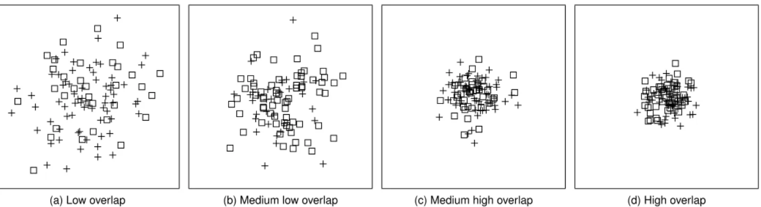
(a) Low overlap (b) Medium low overlap (c) Medium high overlap (d) High overlap
Fig. 2. Comparison of different amounts of overlap, appearing in our scatterplots. (a) shows an example of one of the lowest overlap measurements (Mnum≈.0097,Mrel≈.0025,Mpix≈.0089) we used in Experiment 1, while (d) shows an example of one of the highest overlap measurements (Mnum≈.062, Mrel≈.0211,Mpix≈.1548). (b) shows medium low overlap withMnum≈.017,Mrel≈.0055,Mpix≈.0561, while (c) shows medium high overlap with the following measurements:Mnum≈.049,Mrel≈.0162,Mpix≈.1202.
4.2. General Stimuli Generation 1
Previous work suggests that a combination of open and 2
closed shapes works well in terms of distinctiveness [11]. 3
Based on this finding and the distinctiveness of shapes predicted 4
by Demiralp’s perceptual kernels [20], we decided to include 5
the following six shapes: circles ( ), squares ( ), triangles ( ), 6
crosses ( ), pluses ( ), and asterisks ( ). While circles ( ), 7
squares ( ) and triangles ( ) are considered to be closed shapes, 8
crosses ( ), pluses ( ), and asterisks ( ) are open shapes. Each 9
shape was presented as a target shape together with one distrac-10
tor shape, whereby we have realized all possible combinations 11
thereof. 12
Even though we think that using more than two shapes to-13
gether in one plot would lead to interesting effects, for example 14
when using cross ( ), plus ( ), and asterisk ( ) together, we 15
decided against going beyond a two-way comparison by adding 16
another distractor class. Using more than two shapes at a time 17
(and all the combinations thereof) would open up a space of 18
combinations that would go beyond what would be manageable 19
in a user experiment. This is especially true considering all the 20
other parameters we would like to investigate during our exper-21
iments. 22
During the study, each of the scatterplots showed a total of 23
100 data points divided into two sets where each set was en-24
coded using a different shape. We chose normal distributions 25
to generate our pointsets because these are frequently used as 26
they underlie many natural phenomena. Although we used a 27
normal distribution for all our pointsets, the average task, as 28
well as some combinations in the other tasks, use a distribution 29
with a wider spread where the resulting pointset spreads evenly 30
over the canvas. In doing so we cover a wide range of different 31
point distributions ranging from even spreading over the canvas 32
down to heavy amounts of overdraw. The normal distribution 33
was generated by using a pdefined seed, to ensure the re-34
producibility of our pointsets. We further verified that in all 35
generated pointsets all of the shapes are completely shown on 36
the canvas, such that they are not clipped by the border. 37
We further chose to use variance as a helper to generate dif-38
ferent amounts of overlap indirectly. Rensink and Baldridge 39
(a) Large Variance (b) Medium Variance (c) Small Variance Fig. 3. Comparison of variances used in Experiment 1 (count task, big shapes). (a) shows an example of the large variance for both shapes. (b) shows an example of the medium variance for both shapes, while (c) shows the small variance for both shapes.
used a method of generating just-noticeable-difference staircase 40 approach to generate stimuli to investigate correlations in scat- 41 terplots [27]. While this is a viable approach which could have 42 been adopted to generate different amount of overlap, we de- 43 cided to use fixed amounts of variances to generate our stimuli. 44 The main reason for this is, that we already include a rather 45 large number of variables in our experiments, and we also re- 46 peated each target-distractor condition using each variance with 47 a different seed. By doing so, we also generated a continuous 48 variance in overlap appearing in our stimuli. Besides that, our 49 focus was to find combinations which are less prone to overlap. 50 Having combinations of shapes that show promising results in 51 our studies, could then be used in further studies, using such a 52 stair-case approach to further investigate the interaction of over- 53
lap and shapes. 54
In general, we used three different variances, that were cho- 55 sen in a way that the largest variance produces plots in which 56 the shapes are almost evenly distributed over the entire canvas. 57 The smallest variance produces distributions that are just big 58 enough such that the shapes are still visible. The third variance 59 was chosen to be in between the smallest and the largest one. 60 Concrete values of means, covariances, and seeds for the ran- 61 dom generation, used throughout our experiments can be found 62 in the supplementary material. Figure 3 shows a comparison of 63
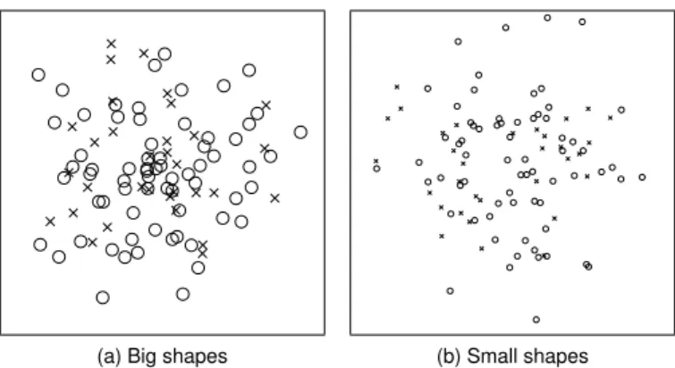
(a) Big shapes (b) Small shapes Fig. 4. Comparison of shape sizes used in our experiments. (a) shows an example of our big shapes with a pixel size of fifteen pixels, while (b) shows an example of the small shape size of seven pixels. Both examples are taken from our experiment involving the comparison number task. For both ex-amples circle is the target shape while cross is the distracting shape.
The closed shapes ( , , and ) were drawn with a transpar-1
ent center because filled shapes would introduce an additional 2
variable to reflect the order in which the different shapes are 3
drawn, which directly affects the overlap. Furthermore, draw-4
ing open shapes, like for example a plus, in front of a filled 5
closed shape, for example, a circle would end up in the same re-6
sult as using transparent closed shapes. All shapes were drawn 7
with the center of mass on the actual data point. This means 8
a triangle is slightly shifted into the positive y-axis when com-9
pared directly to for example a square or a circle. Also, the 10
shapes are drawn so that they are about equal in terms of area. 11
This means when comparing a square to a circle, the circle takes 12
up slightly more space along both x- and y-axis. The open 13
shapes ( , , ) were drawn in a way so that they would fill 14
the circle shape with their line endings and therefore also take 15
up an equal amount of space. This was done to ensure that each 16
of the shapes had a similar strong perceptual impact and this 17
way was about equally salient. The outlines of our shapes were 18
drawn with a line width of one, while the canvas was chosen 19
to be white and 400 by 400 pixels in size, as it should work on 20
all modern desktop computers and was also used in previous 21
studies [22]. 22
For each of the tasks described above, we conducted two ex-23
periments. In a first experiment, we used a pixel size of fifteen 24
pixels for the shapes and in a second experiment, we used a 25
pixel size of seven pixels. These sizes were chosen, since seven 26
pixels mark a lower limit in terms of usability, while fifteen 27
pixels mark an upper limit. If we would draw shapes smaller 28
than seven pixels in size, the square ( ) and ( ) become hard 29
to distinguish. Also, at a shape size smaller than seven pixels, 30
the asterisk ( ) is starting to become a filled square symbol and 31
does almost take up the complete area. Shapes bigger than fif-32
teen pixels also do not seem usable when drawn on a canvas 33
with 400 pixels in size. Also, fifteen pixels have been chosen, 34
since it doubles the size of the small shape size while still hav-35
ing an exact center for the shapes since fifteen is an odd number. 36
Figure 4 shows a comparison of our used shape sizes. 37
To draw the plots for our online survey, we usedData-Driven 38
Documents(D3) [28], which uses the ability of the browser to
39
(a) Easy Task (b) Medium Task (c) Hard Task Fig. 5. Examples of stimuli, as used in Experiment 1 (count task, big shapes). For all shown plots, circles are the target shape, while pluses are the distractor. The easy task shows 68 circles and 32 pluses, the moderate task shows 63 circles and 37 pluses, and the hard task shows 58 circles and 42 pluses.
(a) Large vs. medium (b) Large vs. small (c) Medium vs. small Fig. 6. Examples of stimuli, used in Experiment 3 (variance task, big shapes). For all examples, asterisk is the target, while plus was used as a distractor. (a) shows an example where the target shape uses the large variance and the distractor shape uses a medium variance as described in Section 4.2. (b) shows a large variance for the target shape and a small variance for the distractor, while (c) uses our medium variance for target shapes and small variance for distractor.
render SVG images, and thus can be used to generate vector- 40 based plots. The Figures 2, 3, 5, 6, and 7 show examples of the 41
used plots. 42
4.3. Task Based Experimental Design 43
Based on the general method for stimuli generation, we have 44 generated scatterplots for all three tasks. Within this subsection, 45 we describe how these stimuli vary wrt. task, and discuss the 46 combinations of parameters as used in our user studies. 47
Comparing Number of Shapes. As described in Section 4.1, 48
in this task participants had to rate which shape appears more 49 often in a scatterplot. We divided 100 data points into two 50 groups with different deltas between the groups to generate 51 easy, medium and difficult tasks. The actual deltas have been 52 adopted from Burlinson et al. [11]. So for easy tasks, we 53 used 68 shapes for the target set and 32 distracting shapes, for 54 the moderate task we used 63 target shapes and 37 distracting 55 shapes, and for the hard task, we used 58 target shapes and 42 56 distracting shapes. To generate different amounts of overlap 57 between shapes, we used three different variances as described 58 earlier. We used the same variances for both, the set of target 59 and the set of distracting shape and also for both the x- and the 60 y-axis. For all of the normal distributions, the mean was cho- 61 sen to be in the center of the canvas. Using each of the shapes 62 as a target (6), all other shapes as distractor (5), three different 63 task difficulties (3), and three different variances (3), we created 64 270 different combinations. For each of these combinations, we 65
created three scatterplots, where each of them uses another seed 1
for the normal distribution. This way we were able to have the 2
same combinations with different amounts of overlap and added 3
repetition to our stimuli combinations. By doing so, we created 4
a total amount of 810 stimuli for the comparison of number of 5
shapes task. Figure 5 shows examples of stimuli used for this 6
task. 7
Comparing Variance. Within this task, participants must
8
judge which set of shapes shows a smaller variance and there-9
fore is more clustered. We again divided 100 data points into 10
two groups but used two equally sized groups for this task. To 11
generate different task difficulties we used three different com-12
binations of variances. Large vs. medium variance to generate 13
a plot with a low amount of overlap, medium vs. small variance 14
to generate a plot with a high amount of overlap, and large vs. 15
small variance to generate a medium amount of overlap. The 16
mean of the normal distribution was chosen to be in the center 17
of the canvas. Using each of the shapes as target (6), all other 18
shapes as distractor (5), and our variance combinations (3) we 19
generated 90 combinations. We again repeated each combina-20
tion using three different seeds for the normal distribution to 21
generate a total of 270 stimuli for the comparing variance task. 22
Figure 6 shows examples of stimuli used for this task. 23
Comparing Average Value. In this task, participants were
24
asked to judge which set of shapes was on average higher in 25
the y-axis. Again we used 100 data points, divided into two 26
equally sized groups. Burlinson et al. used a dart-throwing 27
approach [29] to generate datasets without overlapping shapes 28
which they used as stimuli in their user study. Since our exper-29
iments focus on overlap, we instead also used a normal distri-30
bution to generate stimuli for this task. To achieve a uniform 31
distribution of the points over the complete canvas, we used a 32
large distribution for both of the sets. Different task difficulties 33
are generated by adopting the approach of Gleicher et al. [22] 34
where the distance along the y-axis between the means of two 35
sets is measured. This distance parameter is called∆. We also 36
adopted the∆values reported by Gleicher et al.: 8, 16, 24, 32, 37
40, and 80 as used for control questions. We used different 38
means for the normal distribution to generate pointsets with the 39
desired amount of offset along the y-axis between the clusters. 40
After generating the pointsets, we ensured that we obtain the 41
correct distance between the sets by calculating the given aver-42
age and offsetting the points to the desired distance in averages. 43
So by using all of the shapes as target (6), all others as distractor 44
(5), and our∆values (6) we have generated 180 combinations, 45
resulting in 540 stimuli for this task, as we again use three dif-46
ferent seeds for each combination. Figure 7 shows examples of 47
stimuli used for this task and compares the different∆values 48
used to vary difficulty. 49
4.4. Procedure 50
Each of the conducted experiments, started with a demo-51
graphic questionnaire, followed by an introduction to the task. 52
This introduction included five examples of plots similar to the 53
ones used in the study with an explanation of the task. After the 54
introduction, the participants completed five practice trials to 55
get used to the tasks. The stimuli for the introduction as well as 56
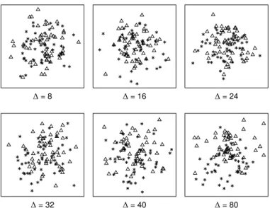
∆= 8 ∆= 16 ∆= 24
∆= 32 ∆= 40 ∆= 80
Fig. 7. Examples of stimuli, used in Experiment 5 (average task, big shapes). For all plots, triangles are the target shape, while the asterisk was used as a distractor. Task difficulty was varied using different distances between averages (∆), reaching from 8 pixel to 80 pixel. For all examples, the triangle was used a target shape, while the asterisk symbol was used as a distractor.
the practice trials were generated by using configurations which 57 were also used in the study, but using custom seeds to create the 58 normal distribution. This way we ensured that none of the ex- 59 ample or training stimuli appear in the study. 60 For each of the stimuli, the participants had to answer by 61 pressing the “f” or “j” key, such that they could rest their hands 62 on the keyboard comfortably. Each of the keys showed the 63 shapes assigned to the key, which were randomly assigned to 64 one of these keys. The participants were instructed to respond 65 to the stimuli as quickly as possible while still making sure to 66 give the correct answer. By instructing to answer as fast as pos- 67 sible, while still making sure to give the correct answer, we tried 68 to make participants answer based on their intuitive decisions. 69 In our introduction, we explained our task before giving ex- 70 amples including an explanation of the shown plot and a hint to- 71 wards the correct answer. If a participant answered incorrectly, 72 we showed additional explanations instructing the user to press 73 the correct key. Before the stimuli were presented, a fixation 74 screen containing a plus shape in the center of a white canvas 75 was shown for a random time of 500, 600, 700, 800, 900, or 76 1000 milliseconds. We adopted this approach from Burlinson 77 et al. [11] to prevent the participants getting used to the timing 78 and just clicking through the survey. The response time was re- 79 stricted to ten seconds to prevent the user from solving the task 80 by for example counting the shapes on the screen. If a partici- 81 pant exceeded this time restriction, the response was discarded 82 and a red error screen was shown instructing the user to answer 83
more quickly. 84
4.5. Participants 85
Over all our studies we recruited a total of 624 participants 86 (258 female, 360 male, 2 other, 4 did not report,Mage=33.70, 87 S D=10.55). We had to exclude a total of 46 participants due 88
to poor performance in terms of accuracy, or failing in control 1
questions as used in the study. To compensate for learning ef-2
fects, for each of the six individual experiments we excluded all 3
participants from previous experiments. 4
5. Comparing Number of Shapes Experiment
5
To investigate the perception of the comparing number of 6
shapes, we have conducted two experiments with two different 7
shape sizes. Within this section, we first describe the methods 8
used in these experiments, before analyzing the results. 9
5.1. Methods 10
As described in Section 4.2, we used big and small shapes 11
in our studies, which is also the difference between the two ex-12
periments conducted for this task. Thus, in Experiment 1 we 13
used big shapes, while Experiment 2 used small shapes. The 14
procedure of both experiments follows the description provided 15
in Section 4.4. To reduce the workload of the individual partic-16
ipants, we divided all 810 stimuli randomly into ten groups, so 17
that each participant had to rate 81 stimuli. This way we limited 18
the length of each survey to about 10 to 15 minutes to ensure 19
quality and motivation of participants [18]. 20
In Experiment 1, where we used big shapes with a pixel size 21
of fifteen pixels, 115 participants took part. We had to discard 22
the responses of four participants, due to high error rates (> 23
50%). Thus, we analyze data from 111 participants (52 female, 24
58 male, 1 did not respond). 25
For Experiment 2 we used small shapes with a pixel size of 26
seven pixels. We excluded all participants of Experiment 1 from 27
this experiment. In Experiment 2, we acquired data from 110 28
participants and had to exclude five participants because of high 29
error rates (>50%). Therefore we present the results of 105 30
participants (42 female, 63 male). 31
5.2. Analysis 32
After providing an overview of the acquired user feedback, 33
we analyze which combinations of shapes resulted in the best 34
accuracy within this section. 35
5.2.1. Data Description 36
Overall participants showed a mean accuracy of 73.57% 37
(S D = 8.80%) of correctness answers for Experiment 1 and 38
71.89% (S D = 9.54%) for Experiment 2. Only 0.25% of the 39
trials ran into the time out for Experiment 1 and 0.29% for 40
Experiment 2. Response times over participants were lower 41
in the experiment using the small shapes (M = 1770.88ms, 42
S D=1293.97ms) when compared to the experiment using the 43
big shapes (M =1915.04ms,S D=1300.42ms). We hypothe-44
sized this effect, because larger shapes result in a larger amount 45
of overlap, making the task more difficult. Using Friedman’s 46
ANOVA we tested the effect of intended task difficulty on par-47
ticipants’ accuracy and found a significant effect for both exper-48
iments (Experiment 1:χ2(2)=67.12,p< .001; Experiment 2: 49
χ2(2)=71.93,p< .001).
50
5.2.2. Shape Effects 51
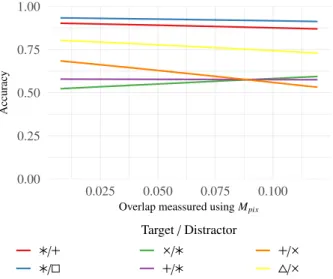
To analyze the effects of individual shapes, we compared 52 all combinations of shapes used in both experiments using this 53 task. Figure 8 shows a comparison between a selection of the 54 best and the worst combinations in terms of accuracy. Without 55 any further statistical analysis, we found that there are combina- 56 tions that seem to work much better than others. Our measured 57 accuracies for combinations of target and distractor shape var- 58 ied between around 90% accuracy for our best combinations 59 ( / , / ) down to around 50% for some of the worst com- 60 binations ( / , / ). While these results overall indicate 61 that findings of Burlinson et al. [11] also hold for conditions 62 where shapes overlap, there are also interesting outliers like the 63 triangle ( ) vs. square ( ) or asterisk ( ) vs. plus ( ) combina- 64 tions which exhibited very high accuracies under the comparing 65
number task. 66
Furthermore, we investigated which combinations of shapes 67 suffered stronger from overlap than others. In Figure 8, we 68 present a selection of combinations for target and distractor 69 shapes as used in this task. The figure shows logistic regres- 70 sion curves of accuracy for these combinations. 71 The combinations have been selected based on if they either 72 showed good or bad accuracies in this task, as also shown in 73 Table 1. Additionally, we selected combinations where the in- 74 crease of overlap showed a strong incfluence on accuracy. The 75 regression lines in Figure 8 shows that for example the com- 76 bination of triangle ( ) and asterisk ( ), as well as plus ( ) 77 and asterisk ( ), suffer drastically from an increasing amount 78 of overlap. In these cases, the accuracy drops below the accu- 79 racy of chance, indicating that the asterisk shape has a strong 80 influence when used as a distractor. This influence seems to in- 81 dicate that the asterisk makes the set appear to have more points 82
than it has. 83
We investigated if our used shape sizes had an effect on par- 84 ticipants’ performance in terms of accuracy using Wilcoxon 85 rank-sum test. This test was used since our accuracy data 86 failed a statistical test on normal distribution. When compar- 87 ing the results of our experiment using the number of shapes, 88 we found no significant difference between our experiments 89
(W =6454.5,p=.17). 90
6. Variance Task Experiment 91
Using this second task we investigated the influence of over- 92 lap on the estimation of variance. Again, in a first experiment 93 (Experiment 3), we used big shapes while in the second ex- 94 periment (Experiment 4) we used small shapes as described in 95 Section 4.2. We again first describe our used methods, before 96
discussing our results. 97
6.1. Methods 98
The experiments for the variance task was also set up as de- 99 scribed in Section 4.4. The generated 270 stimuli were ran- 100 domly divided into five groups, so each participant had to rate 101 54 stimuli. We again conducted two disjunct experiments, 102 where all participants of previous experiments where excluded 103 from subsequent experiments. Experiment 3 (using big shapes) 104
0.00 0.25 0.50 0.75 1.00 0.00 0.05 0.10 0.15 0.20 0.25
Overlap meassured usingMpix
Accurac y Target/Distractor / / / / / /
Fig. 8. Accuracy while overlap increases for the experiments involving the comparing number of shapes task. We show logistic regression curves for a selection of shape combinations which showed overall best and worst per-formance. Overlap was measured using our pixel-based metricMpix.
has been conducted by 58 participants, of which we had to ex-1
clude eight participants because of high error rates (>50%). 2
The experiment using the small shapes (Experiment 4) has been 3
conducted by 68 participants. Here we had to exclude five par-4
ticipants because of high error rates (>50%). So we present 5
data of 50 participants (24 female, 24 male, two preferred not 6
to answer) for Experiment 3, and 63 participants (28 female, 35 7
male) for Experiment 4. 8
6.2. Analysis 9
We again describe the overall performance of our participants 10
before analyzing which shapes appear to work better for the 11
given task. 12
6.2.1. Data Description 13
For this task, our participants overall showed the best accura-14
cies when compared to the other conducted experiments. Over 15
our two experiments, participants show almost exactly the same 16
performance for the experiment using the small shapes (M = 17
79.19%,S D=11.12%) and for the big shapes (M =79.18%, 18
S D=13.24%). Among all responses, .34% of the trials timed 19
out using the big shapes, and .27% using the small shapes, 20
while the response times were lower using the big shapes (M= 21
1919.26ms,S D=1393.95ms) as compared to when using the 22
small shapes (M = 2163.56ms,S D = 1466.10ms). We used 23
three different combinations of variances to generate tasks with 24
different difficulties and amount of overlap. We found that these 25
combinations of variances as shown in Figure 6 had a signifi-26
cant effect on accuracy for both of our experiments using this 27
task (Experiment 3: χ2(2) = 39.46, p < .001; Experiment 4: 28
χ2(2)=41.13,p< .001).
29
6.2.2. Shape Effects 30
Investigating our results wrt. used shapes, we again found 31
large shape dependent accuracy differences. As for our experi-32
ments using the comparing number task, we found that the com-33 0.00 0.25 0.50 0.75 1.00 0.025 0.050 0.075 0.100
Overlap meassured usingMpix
Accurac y Target/Distractor / / / / / /
Fig. 9. Accuracy while overlap increases for the experiments involving the variance task. We show logistic regression curves for a selection of shape combinations which showed overall best and worst performance. Overlap was meassured using metricMpix.
bination of asterisk ( ) and square ( ) showed the best accuracy 34 (92.6%). Using the same combination of shapes, but square as 35 target and asterisk as distractor, however, showed one of the 36 worst performances in terms of accuracy using the variance task 37 (71.2%). Also, we found again that the asterisk ( ) vs. plus ( ) 38 combination works really well in terms of accuracy with 88.6% 39 of correct answers using this combination, indicating that there 40 are indeed some combinations which seem to be an outlier from 41 the open and closed categories [11]. Figure 9 shows a com- 42 parison of a selection of combinations of target and distractor 43 shapes using this task. As in Section 5, we again, present com- 44 binations that showed good or bad accuracies for this task. In- 45 vestigating combinations of shapes regarding overlap, we found 46 that in this experiment overall overlap was a less stronger factor 47 when compared to the count task based experiments. We sup- 48 pose these results to happen because stimuli in this task overall 49 showed less overlap since one of the sets needed to show at least 50 a medium large variance. We again compared both of our ex- 51 periments using the Wilcoxon ranked-sum test, and again found 52 no significant difference on participants’ accuracy when using 53 different sizes of shapes (W =1613.50,p=.83). 54
7. Average Task Experiment 55
For this final task, we also conducted two experiments us- 56 ing two different shape sizes. In the following subsections, we 57 again first present an overview of the used methods before dis- 58
cussing our results. 59
7.1. Methods 60
The experiments for the average task were also set up as de- 61 scribed in Section 4.4. Again, we conducted two experiments, 62 one using big shapes (Experiment 5) and one using small shapes 63 (Experiment 6). We randomly divided our 540 stimuli into nine 64 groups, so that each participant had to rate 60 stimuli. 65
Again we excluded all participants from our previous exper-1
iments, as well as participants of Experiment 5 for Experiment 2
6. The experiment involving the big shapes (Experiment 5), 3
was conducted by 145 participants, while 137 participants con-4
ducted Experiment 6 investigating the small shapes. For this 5
task, we had to sort out a relatively large number of participants 6
as they failed in our control stimuli. Out of the 145 participants 7
in Experiment 5, 34 participants failed in more than 50% of the 8
control stimuli, while for Experiment 6, 47 out of 137 partic-9
ipants failed this condition. However, we suspect participants 10
failing the control questions did not understand the task well 11
enough to solve it. We suspect this happens since these tasks 12
are harder to understand and requires a deeper understanding of 13
the plot when compared to the first two tasks. 14
Even though we needed to exclude a large number of partic-15
ipants, we could still ensure that at least 10 participants were 16
acquired for each of our nine groups. Therefore, we present 17
the results of 111 participants (40 female, 70 male, 1 did not 18
respond) for Experiment 5, and 90 participants (39 female, 51 19
male) for Experiment 6. Again, for further analysis, the re-20
sponses to our control stimuli were excluded. 21
7.2. Analysis 22
We first present an overview of our acquired data before com-23
paring which combinations of shapes showed the best perfor-24
mance for this task. 25
7.2.1. Data Description 26
Participants showed the worst performance in terms of ac-27
curacy using this task. We suppose this to happen since this 28
task involves a higher level of understanding of the data when 29
compared to the judgment of how many shapes are shown, 30
or which shape has a wider spread over the canvas. For Ex-31
periment 5, participants showed a mean accuracy of 69.07% 32
(S D = 13.41%), while for Experiment 6 the accuracy was 33
with 66.78% (S D=15.12%) even lower. However, time outs 34
on this task were low again (0.37% for big shapes; 0.29% for 35
small shapes), indicating that the time restriction was appropri-36
ate. For this task participants also showed the highest response 37
times when compared to the other tasks, which again indicates 38
that this task was more difficult. In our experiment using the 39
big shapes the response times where higher (M =1991.32ms, 40
S D = 1580.62ms), when compared to using the small shapes 41
(M=1783.34,S D=1312.37ms). We again tested, if the used 42
difficulties had an influence on participants accuracy and found 43
significant effects for both of our experiments (Experiment: 5 44 χ2(4)=112.93,p< .001; Experiment 6: χ2(4) =39.213,p < 45 .001). 46 7.2.2. Shape Effects 47
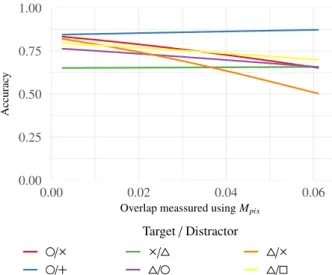
We again compared how the used shapes affected accuracy. 48
The combination of circle ( ) and plus ( ) again showed the 49
best accuracy slightly outperforming the combinations triangle 50
( ) vs. asterisk ( ) and square ( ) vs. plus ( ). The choice 51
of the target again showed a strong effect, since the combina-52
tion of plus ( ) as target and circle ( ) as distractor was one 53
of the worst combinations with only 56.7% of correct answers. 54 0.00 0.25 0.50 0.75 1.00 0.00 0.02 0.04 0.06
Overlap meassured usingMpix
Accurac y Target/Distractor / / / / / /
Fig. 10. Accuracy while overlap increases for the experiments involving the average task. We present logistic regression curves for a selected com-binations of target and distractor shapes which overall showed good and bad performance in terms of accuracy. Overlap was meassured using met-ricMpix.
Compared to the two previous tasks, we found that the open and 55 closed categories seem to work really well for this task since the 56 seven best combinations are a combination of a closed shape as 57 target and an open shapes as distractor. As we used a large vari- 58 ance for both of the pointsets (target and distractor), this task 59 involved less overlap when compared to the count task. How- 60 ever, we found that for this task essential the combination of 61 triangle ( ) and cross ( ) suffered from an increasing amount 62 of overlap. Figure 10 shows a comparison of some of the best 63 and worst combinations of shapes in terms of accuracy for this 64
task. 65
As with our previous experiments we again compared par- 66 ticipants’ accuracy between both of the used shape sizes and 67 found no significant difference (W=5389.50,p=.3366). 68
8. Regression Model 69
To evaluate the proposed overlap metrics, and to investigate 70 how they can be used as a predictive variable on unseen scat- 71 terplots, we used a regression model to fit our data. Since the 72 outcome of correctness is binary and therefore limited to two 73 discrete values, we used a logistic regression model. Such a 74 logistic regression can be used to model the probability of a bi- 75 nary event (e.g. observers’ ability to solve a given task) based 76 on a set of given parameters (e.g. visual parameters of a stimu- 77 lus). The predictive performance of different models (based on 78 which parameters are used in the model) can then be compared 79 to find which set of parameters describes the data the best. 80 To compare the models we first defined a null model without 81 any predictive variables and subsequently added more predic- 82 tive variables (target shape, distracting shape, and other depen- 83 dent variables such as for instance amount of shapes). For each 84 of these predictive variables, we determined if they can improve 85 the predictive performance of our model by using the likelihood 86 ratio test. After we defined this model we then added each of 87
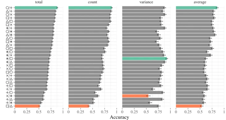
total count variance average 0 0.25 0.5 0.75 1 0 0.25 0.5 0.75 1 0 0.25 0.5 0.75 1 0 0.25 0.5 0.75 1 / / / / / / / / / / / / / / / / / / / / / / / / / / / / / /
Accuracy
T
ar
get
/
Distractor
Fig. 11. Participants accuracy using different combinations of target and distractor shapes. Ordering is done based on accuracy over all experiments using our three tasks. The left barchart shows a comparison of accuracy using all tasks, while the remaining show accuracy using this individual tasks. Green bars show the combinations which showed the highest accuracy, while red bars show the combinations with the lowest accuracy.
our metrics to this model and verified if they can further im-1
prove the predictive performance, again by using the likelihood 2
ratio test. If the metrics improved the model, we then com-3
pared which of the metrics improved the model the most. This 4
is done by comparing two models containing different metrics 5
through the Vuong’s Closeness test [30]. Thus, for each of our 6
tasks, we created a logistic regression model and evaluated the 7
relative predictive performance. Furthermore, we computed the 8
Akaike information criterion (AIC), to additionally argue about 9
the relative quality of our models. 10
Comparing Number of Shapes.As described before, we first
11
create a null model before subsequently adding variables of the 12
scatterplot to this null model. For the comparing number task, 13
these predictive variables are target shape, distracting shape, 14
and number of shapes. For both experiments we conducted us-15
ing the number of shapes task, we found that these variables 16
could improve the predictive performances of the model sig-17
nificantly with p < .001 for each of the variables. Using this 18
model we then applied our metric to investigate if our metrics 19
can be used as predictive variables. We found that all our met-20
rics could improve the predictive performances of the model 21
significantly (p < .001) for both experiments. When adding 22
our metrics to the model we found that for Experiment 1 (us-23
ing the big shapes), all of the metrics could improve the model 24
significantly (p < .001 for all models containing the different 25
metrics). However, for Experiment 2 we found a significant 26
increase in performances for Mrel (p = .04551), but not for
27
Mnum(p=.07758),Mpix(p=.06235), andMshape(p=.6311).
28
Thus, for Experiment 1 all metrics could improve the model 29
significantly, and also no significant difference could be found 30 when comparing these models containing our metrics. This in- 31 dicates that for small amounts of overlap Mrelcould describe 32 the data the best, while for larger amounts of overlap all met- 33
rics fit equally well. 34
Comparing Variance. Since the number of shapes is the 35
same for all the scatterplots, we used target shape, distracting 36 shape and variance as predictive variables for our base model 37 of this task. For our experiment using the big shapes, target, 38 as well as distracting shape, could improve the model signif- 39 icantly (p < .001). The same is true for the experiment us- 40 ing the small shapes, where target and distracting shape could 41 again significantly improve the model (p < .001). For the ex- 42 periment using the big shapes, however, using the variance as 43 a predictive variable could not improve the model (p = .797) 44 whereas for the small shapes using the variance could improve 45 the model significantly (p < .001). So for further investiga- 46 tions, if our metrics could also serve as a predictive variable, we 47 used a model with target shape, distractor shape and variance 48 for the experiment using the small shapes, and a model contain- 49 ing target and distractor shape for the experiment using the big 50 shapes. When further adding our metrics to these models, we 51 found that again all the metrics could improve the model signif- 52 icantly (p< .001). We then compared all the models with each 53 other using Vuong’s Closeness test and found no significant dif- 54 ference between the models for the experiment using the big 55 shapes. However, during analysis using AIC we found a bet- 56 ter fit of the model containing the shape overlap metric (AIC: 57 Mshape=2570,Mrel=2577,Mnum=2579,Mpix=2580). 58
When comparing the models using AIC, we found that for 1
this experiment, Mpix showed the best fit to the data (AIC :
2
Mshape=3261,Mnum=3266,Mrel=3275,Mpix=3264). By
3
futher comparing the models using Vuong’s Closeness Test, we 4
also found significant effects for this better fit (Experiment 4: 5
Mshape>Mrel,p=.0023479).
6
Comparing Average. In our last task, the mean between the
7
sets was varied, therefore we added the mean as a predictive 8
variable besides target and distracting shape. For both of the 9
experiments, we found that these three variables could improve 10
the predictive performance of the model significantly (p< .001 11
for all variables in both experiments). We then again added our 12
metrics to the models and found that for Experiment 5Mrel(p=
13
.0411), Mpix (p =.01221), and Mshape(p = 0.004627) could
14
significantly improve the model, whileMnum could not. When
15
comparing the model containing MrelwithMpix, we found no
16
significant increase in performance, but a slight increase for the 17
AIC criteria (AIC:Mshape=6477,Mnum=6484,Mrel=6481,
18
Mpix = 6479). For Experiment 6, none of our metrics could
19
improve the model significantly and the AIC values are almost 20
equal (AIC:Mshape=5327,Mnum=5327,Mrel=5327,Mpix=
21
5326). We suppose this to happen, since the overall accuracy of 22
participants in this experiment was rather low, which results in 23
data that is difficult to predict for our regression model. 24
Combined Data from all Tasks. Since our goal is to find a
25
model that works for different tasks commonly used in scatter-26
plot analysis, we then tried if our metrics can also be used as 27
a predictive variable for the complete data acquired in all our 28
experiments. We suspected this to be possible, since all task 29
parameters like amount of shapes, variance, shape sizes, and 30
mean can be used as predictive variables. Therefore, we cre-31
ated models using all these variables and compared the models 32
as described earlier in this section. 33
Target shape, distracting shape, amount of points, variance 34
and mean showed a strong significant improvement to the 35
model (p< .001 for each of the variables), while size of shape 36
only showed a weak significant effect (p = .04914). When 37
adding our metrics to the model we found that Mshape and
38
Mpixcould significantly improve the predictive performance of
39
the model (Mshape p < .001; Mnum p = .385603; Mrel p =
40
.373639; Mpix p = .026617, AIC : Mshape = 37250, Mnum =
41
37270,Mrel=37270,Mpix=37260), suggesting that this
met-42
ric serves as the best predictor for human perception. Also 43
when comparing MshapeandMpixusing Vuong’s Closeness test,
44
we found a significantly better fit in favour of Mshape p =
45
.0050261. 46
9. Implications for Scatterplot Design
47
Even though the choice of target and distractor shape is im-48
portant when designing scatterplots, our findings indicate that 49
the overlap of shapes is also of great importance. Thus, while 50
previous work could show that there are visual differences be-51
tween shapes and combinations thereof [11, 20, 10, 22], we 52
could show that overlap needs to be considered when trans-53
ferring these findings to real world scatterplot scenarios. This 54
is especially relevant since our findings indicate that there are 55 0.00 0.25 0.50 0.75 1.00 0.00 0.05 0.10 0.15 0.20 0.25
Overlap meassured usingMpix
Accurac y Target/Distractor / / / / / /
Fig. 12. Logistic regression curve of participants accuracy while overlap in-creases. This figure shows combined results taken from all our experiments using three different tasks and two different shape sizes for each task. The overlap was meassured using metricMpix.
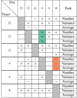
combinations of shapes that suffer stronger from large amounts 56 of overlap than others. Figure 12 shows this effect of overlap 57 on the response accuracy for selected shapes. While there are 58 combinations such as the circle ( ) and plus ( ) symbol which 59 worked well for all tasks and overlap conditions, there are other 60 combinations such as for instance the triangle ( ) and the as- 61 terisk ( ), which seem to suffer severely from an increasing 62 amount of overlap. This finding is especially relevant because 63 both of these combinations combine closed target and open dis- 64 tractor shapes as suggested by Burlinson et al. [11]. Thus, while 65 we could, in general, confirm that their findings of open vs. 66 closed shapes also hold when incorporating overlap, our find- 67 ings show that some combinations are still not beneficial to be 68
used in practice. 69
Also, the given task seems to be an important factor when 70 comparing conditions where shapes overlap. The usage of the 71 asterisk ( ) shape as target seems to work well in combina- 72 tion with all other tested shapes as distractor for the variance 73 task (see Figure 1), indicating that the saliency of the aster- 74 isk seems to be an important factor especially when trying to 75 identify clusters. The combination of plus ( ) and asterisk ( ) 76 shows a similar effect for the number of shapes task. While this 77 combination, in general, shows bad accuracies over all tasks 78 (see Figure 11), it shows especially bad results for the number 79 of shapes task and when overlap increases (see Figure 8). In- 80 vestigating the specific benefits or cost of the asterisk ( ) shape 81
remains future work. 82
Table 1 shows a comparison of all accuracies of all used 83 shapes as well as all our used tasks. While this table indicates 84 that the combination of closed target and open distractor shapes 85 seems to work well in general, the combination of asterisk ( ) 86 and plus ( ) seems to be an interesting outlier, which works 87