Contents
1 Grid Example 1
1.1 Introduction and Basic Setup . . . 1
1.1.1 Introduction. . . 1
1.1.2 Document Setup . . . 1
1.2 Grid Options and Examples. . . 2
1.2.1 The Grid Across Multiple Devices . . . 2
1.2.2 Example 1: Stacked to Horizontal . . . 3
1.2.3 Example 2 - Multi Device Support . . . 5
1.3 Offsetting and Nesting Columns . . . 6
1.3.1 Example 3 - Offsetting Columns . . . 6
1.3.2 Example 4 - Nesting Columns . . . 7
1.4 Conclusion . . . 8
1.5 Download . . . 8
2 Navbar Example 9 2.1 Project Setup . . . 9
2.2 Default Navbar . . . 11
2.3 Navbar Components . . . 12
2.3.1 Navbar Header . . . 12
2.3.2 Navbar Links and Dropdowns . . . 13
2.3.3 Forms . . . 14
2.4 Static and Fixed Navbar. . . 15
2.4.1 Fixed to Top . . . 15
2.4.2 Fixed to Bottom . . . 15
2.4.3 Static . . . 16
2.5 Conclusion . . . 16
3 Table Example 17
3.1 Initial Setup . . . 17
3.1.1 Bootstrap Setup. . . 17
3.1.2 HTML Setup . . . 18
3.2 Basic Example . . . 18
3.3 Table Examples . . . 19
3.3.1 Striped Rows . . . 20
3.3.2 Bordered Table . . . 20
3.3.3 Hover Rows. . . 20
3.3.4 Condensed table . . . 21
3.3.5 Contextual Classes . . . 21
3.4 Conclusion . . . 23
3.5 Download . . . 23
4 Dropdown Menu Example 24 4.1 Project Setup . . . 24
4.1.1 Boostrap Folder Structure . . . 24
4.1.2 HTML Setup . . . 25
4.2 The Default Example . . . 25
4.3 Cases and Examples . . . 26
4.3.1 Dropdown Headers . . . 26
4.3.2 Dropdown Dividers. . . 27
4.3.3 Disabled Menu Items. . . 27
4.4 Did you know? . . . 28
4.5 Conclusion . . . 29
4.6 Download . . . 29
5 Form Example 30 5.1 Project Folder Setup . . . 30
5.1.1 Folder Structure . . . 30
5.1.2 HTML Document. . . 31
5.2 Basic Example . . . 31
5.3 Cases and Examples . . . 32
5.3.1 Inline Form . . . 32
5.3.2 Horizontal Form . . . 33
5.3.3 Supported Controls . . . 34
5.3.3.1 Inputs . . . 34
5.3.3.2 Textarea . . . 34
5.3.6 Validation States . . . 38
5.4 Conclusion . . . 39
5.5 Download . . . 39
6 Layout Example 40 6.1 Project Setup . . . 40
6.1.1 Project Folder Setup . . . 40
6.1.2 Main HTML Setup . . . 41
6.2 What is to be done? . . . 41
6.3 Coding the Layout with Bootstrap . . . 42
6.3.1 Coding the Navigation Menu. . . 42
6.3.2 Coding the Carousel . . . 43
6.3.3 Coding the Services Section . . . 45
6.3.4 Coding the Team Section . . . 46
6.3.5 Coding the Contact Form. . . 47
6.3.6 Coding the Footer Section . . . 48
6.4 Conclusion . . . 49
6.5 Download . . . 49
7 Tooltip Example 50 7.1 Project Setup . . . 50
7.1.1 Project Folder Setup . . . 50
7.1.2 Main HTML Setup . . . 51
7.2 Usage & Examples . . . 51
7.2.1 Tooltips on Links . . . 52
7.2.2 Tooltips on Buttons. . . 52
7.3 Options . . . 53
7.3.1 animation . . . 53
7.3.2 container . . . 53
7.3.3 delay . . . 53
7.3.4 html . . . 53
7.3.5 placement . . . 54
7.3.6 selector . . . 54
7.3.7 title . . . 54
7.4 Methods . . . 54
7.4.1 .tooltip(show) . . . 54
7.4.2 .tooltip(hide) . . . 54
7.4.3 .tooltip(toggle) . . . 54
7.4.4 .tooltip(destroy) . . . 55
7.5 Events . . . 55
7.6 Conclusion . . . 55
7.7 Download . . . 55
8 Panel Example 56 8.1 Project Setup . . . 56
8.1.1 Project Folder Setup . . . 56
8.1.2 Main HTML Setup . . . 57
8.2 Default Example . . . 57
8.3 Cases and Examples . . . 58
8.3.1 Panel with Heading. . . 58
8.3.2 Panel with Footer . . . 59
8.3.3 Contextual Alternatives. . . 59
8.3.4 Panels with Tables . . . 60
8.3.5 Panels with List Groups . . . 61
8.4 Conclusion . . . 62
8.5 Download . . . 62
9 Popover Example 63 9.1 Project Setup . . . 63
9.1.1 Project Folder Setup . . . 63
9.1.2 Main HTML Setup . . . 64
9.2 Cases and Examples . . . 65
9.2.1 A Default Popover . . . 65
9.2.2 Four Directions on Popovers . . . 65
9.2.3 Dismissable Popover . . . 66
9.3 Options . . . 67
9.3.1 animation . . . 67
9.3.2 container . . . 67
9.3.3 content . . . 67
9.3.4 delay . . . 67
9.3.5 html . . . 67
9.3.6 placement . . . 67
9.4.1 .popover(show). . . 68
9.4.2 .popover(hide) . . . 68
9.4.3 .popover(toggle) . . . 68
9.4.4 .popover(destroy) . . . 68
9.5 Events . . . 68
9.6 Conclusion . . . 69
9.7 Download . . . 69
10 Tabs Example 70 10.1 Project Setup . . . 70
10.1.1 Project Folder Setup . . . 70
10.1.2 Main HTML Setup . . . 71
10.2 The Main Example . . . 71
10.2.1 The Markup. . . 72
10.2.2 The Result . . . 73
10.3 Methods & Events . . . 73
10.3.1 Methods . . . 73
10.3.2 Events. . . 73
10.4 Conclusion . . . 74
10.5 Download . . . 74
11 Modal Example 75 11.1 HTML markup for modals . . . 75
11.2 It doesn’t work! . . . 77
11.3 Customize your modal . . . 77
Copyright (c) Exelixis Media P.C., 2015
All rights reserved. Without limiting the rights under copyright reserved above, no part of this publication
Preface
Bootstrap is a free and open-source collection of tools for creating websites and web applications. It contains HTML and CSS-based design templates for typography, forms, buttons, navigation and other interface components, as well as optional JavaScript extensions. It aims to ease the development of dynamic websites and web applications.
Bootstrap is a front end framework, that is, an interface for the user, unlike the server-side code which resides on the "back end" or server. Bootstrap is the most-starred project on GitHub, with over 88K stars and more than 37K forks. (Source:
https://en.wikipedia.org/wiki/Bootstrap_%28front-end_framework%29)
About the Author
Chapter 1
Grid Example
In this tutorial we’re considering a very fundamental concept of front-end frameworks, the grid system and we’re doing so using Bootstrap. Bootstrap is the most popular HTML, CSS, and JS framework for developing responsive, mobile first projects on the web.
Bootstrap includes a responsive, mobile first fluid grid system that appropriately scales up to 12 columns as the device or viewport size increases. It includes predefined classes for easy layout options, as well as powerful mixins for generating more semantic layouts.
Below, we’ll have a look at how the grid works and the necessary syntax for several layout cases.
1.1
Introduction and Basic Setup
1.1.1
Introduction
• For proper alignment and padding, rows must be wrapped within a.containeror.container-fluidrespectively for fixed-width and full-width.
• Use rows to create horizontal groups of columns.
• Only columns may be immediate children of rows, and content should be placed within columns.
• Bootstrap offers a lot of classes to set up layouts fast, classes like.rowto create a new row or.col-xs-4to create a small sized column equal to 1/3 of the container.
• Gutters between columns are created viapadding.
• The negative margin is why the examples below are outdented. It’s so that content within grid columns is lined up with non-grid content.
• Grid columns are created by specifying the number of twelve available columns you wish to span. It could wither be 12 columns by using for example.col-sm-1or three.col-sm=4or six.col-sm-2etc.
• When trying to add more than 12 columns within a row, the extra columns will automatically wrap onto a new line.
1.1.2
Document Setup
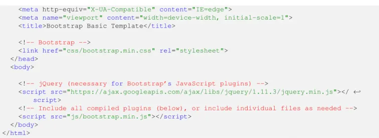
Before we start writing code, create a new HTML document and add the following Bootstrap’s basic syntax inside: <!DOCTYPE html>
<html lang="en"> <head>
<meta http-equiv="X-UA-Compatible" content="IE=edge">
<meta name="viewport" content="width=device-width, initial-scale=1"> <title>Bootstrap Basic Template</title>
<!-- Bootstrap -->
<link href="css/bootstrap.min.css" rel="stylesheet"> </head>
<body>
<!-- jQuery (necessary for Bootstrap’s JavaScript plugins) -->
<script src="https://ajax.googleapis.com/ajax/libs/jquery/1.11.3/jquery.min.js"></ ←
-script>
<!-- Include all compiled plugins (below), or include individual files as needed --> <script src="js/bootstrap.min.js"></script>
</body> </html>
If you haven’t downloaded Bootstrap,click hereand extract the bootstrap folder of the archive and then add theindex.html inside like so:
Figure 1.1: bg-1
1.2
Grid Options and Examples
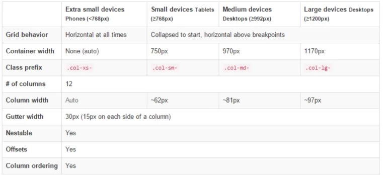
1.2.1
The Grid Across Multiple Devices
Figure 1.2: bg-2
1.2.2
Example 1: Stacked to Horizontal
In this example we’re going to use the class.col-md-*where * represents a number and show different layouts. First, let’s show how to create a 12 column row. To begin, create a new row by adding a newdivelement with a class ofrow. Inside the row, add 12 div elements with the classcol-md-1. This will create 12 columns.
<div class="container"> <div class="row">
<div class="col-md-1">.col-md-1< /div > <div class="col-md-1">.col-md-1< /div > <div class="col-md-1">.col-md-1< /div > <div class="col-md-1">.col-md-1< /div > <div class="col-md-1">.col-md-1< /div > <div class="col-md-1">.col-md-1< /div > <div class="col-md-1">.col-md-1< /div > <div class="col-md-1">.col-md-1< /div > <div class="col-md-1">.col-md-1< /div > <div class="col-md-1">.col-md-1< /div > <div class="col-md-1">.col-md-1< /div > <div class="col-md-1">.col-md-1< /div > < /div >
< /div >
In order to have some visual results, add the following CSS to emphasize the grid: <style type="text/css">
.col-md-1, .col-md-2, .col-md-3, .col-md-4, .col-md-6, .col-md-8 { background-color: #34495e;
color: white; line-height: 5em;
border: 1px solid white; height: 5em;
}
Figure 1.3: bg-3
In the same way, we can define 2, 3, 4 ,6 or combinations like 8 and 4 columns like below: <div class="container">
<div class="row">
<div class="col-md-4">.col-md-4< /div > <div class="col-md-4">.col-md-4< /div > <div class="col-md-4">.col-md-4< /div > < /div >
<div class="row">
<div class="col-md-3">.col-md-3< /div > <div class="col-md-3">.col-md-3< /div > <div class="col-md-3">.col-md-3< /div > <div class="col-md-3">.col-md-3< /div > < /div >
<div class="row">
<div class="col-md-6">.col-md-6< /div > <div class="col-md-6">.col-md-6< /div > < /div >
<div class="row">
<div class="col-md-8">.col-md-8< /div > <div class="col-md-4">.col-md-4< /div > < /div >
< /div >
Figure 1.4: bg-4
1.2.3
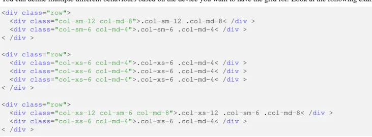
Example 2 - Multi Device Support
You can define multiple different behaviours based on the device you want to have the grid for. Look at the following example: <div class="row">
<div class="col-sm-12 col-md-8">.col-sm-12 .col-md-8< /div > <div class="col-sm-6 col-md-4">.col-sm-6 .col-md-4< /div > < /div >
<div class="row">
<div class="col-xs-6 col-md-4">.col-xs-6 .col-md-4< /div > <div class="col-xs-6 col-md-4">.col-xs-6 .col-md-4< /div > <div class="col-xs-6 col-md-4">.col-xs-6 .col-md-4< /div > < /div >
<div class="row">
<div class="col-xs-12 col-sm-6 col-md-8">.col-xs-12 .col-sm-6 .col-md-8< /div > <div class="col-xs-6 col-md-4">.col-xs-6 .col-md-4< /div >
< /div >
Figure 1.5: bg-5
1.3
Offsetting and Nesting Columns
1.3.1
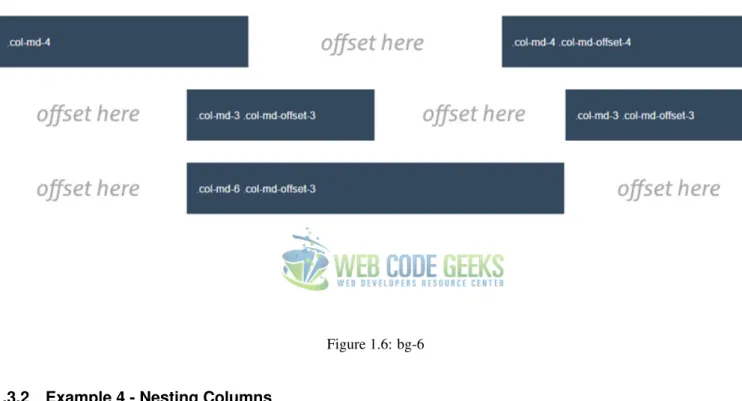
Example 3 - Offsetting Columns
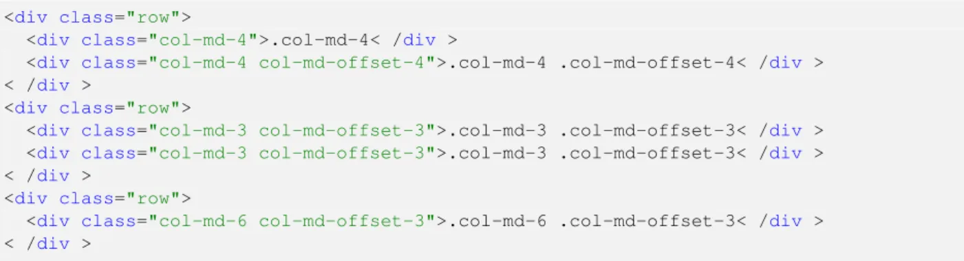
What if you didn’t want a clear layout that fills up all the row? Well, you can set up columns just the way you want by using column offsets. For example, if you wanted to create a.col-md-3and move it to the right leaving left just the same space that equals the width of the column, you can just write: .col-md-3 .col-md-offset-3. Look at the examples below for a better understanding:
<div class="row">
<div class="col-md-4">.col-md-4< /div >
<div class="col-md-4 col-md-offset-4">.col-md-4 .col-md-offset-4< /div > < /div >
<div class="row">
<div class="col-md-3 col-md-offset-3">.col-md-3 .col-md-offset-3< /div > <div class="col-md-3 col-md-offset-3">.col-md-3 .col-md-offset-3< /div > < /div >
<div class="row">
Figure 1.6: bg-6
1.3.2
Example 4 - Nesting Columns
You can easily nest columns withing one another by just adding a row and then the nested columns. The example below gives you a clearer understanding:
<div class="row">
<div class="col-md-8"> .col-md-8
<div class="row">
<div class="col-sm-8 col-md-6">.col-sm-8 .col-md-6< /div > <div class="col-sm-4 col-md-6">.col-sm-4 .col-md-6< /div > < /div >
< /div > < /div >
As you can expect, now the .col-md-8 is considered as the row of the new columns nested:
1.4
Conclusion
To conclude, Bootstrap’s grid is a powerful system, fully responsive designed for a wide range of uses and compatible with many devices. Setting up your own layout is easy with the basic knowledge. If you want to create you layout full-width, you’d have to use thecontainer-fluidclass instead ofcontainerwhich will keep the content inside a fixed width. For more information on Bootstrap grid, please refer to the official documentationhere.
1.5
Download
Chapter 2
Navbar Example
The aim of this example is to show how to create a navbar using Bootstrap. Bootstrap is the world’s most famous front-end framework. Navbars are responsive meta components that serve as navigation headers for your application or site. They begin collapsed (and are toggleable) in mobile views and become horizontal as the available viewport width increases.
Navbars are important part of websites because they provide a very functional and easy way for users to navigate the several pages of your websites. A navbar typically contains a logo, menu items (with some dropdowns) and optionally a search box.
2.1
Project Setup
Figure 2.1: navbar-1
Next, in thebootstrap-navbar.htmlfile add the basic syntax: <!DOCTYPE html>
<html lang="en"> <head>
<meta charset="utf-8">
<meta http-equiv="X-UA-Compatible" content="IE=edge">
<meta name="viewport" content="width=device-width, initial-scale=1"> <title>Bootstrap Navbar Example</title>
<!-- Bootstrap -->
<link href="css/bootstrap.min.css" rel="stylesheet"> </head>
<body>
<!-- jQuery (necessary for Bootstrap’s JavaScript plugins) -->
<script src="https://ajax.googleapis.com/ajax/libs/jquery/1.11.3/jquery.min.js"></ ←
-script>
<!-- Include all compiled plugins (below), or include individual files as needed --> <script src="js/bootstrap.min.js"></script>
</body> </html>
<div class="container-fluid">
<!-- Brand and toggle get grouped for better mobile display --> <div class="navbar-header">
<button type="button" class="navbar-toggle collapsed" data-toggle="collapse" data- ← -target="#bs-example-navbar-collapse-1" aria-expanded="false">
<span class="sr-only">Toggle navigation</span> <span class="icon-bar"></span>
<span class="icon-bar"></span> <span class="icon-bar"></span> </button>
<a class="navbar-brand" href="#">Brand</a> < /div >
<!-- Collect the nav links, forms, and other content for toggling --> <div class="collapse navbar-collapse" id="bs-example-navbar-collapse-1">
<ul class="nav navbar-nav">
<li class="active"><a href="#">Link <span class="sr-only">(current)</span></a></li> <li><a href="#">Link</a></li>
<li class="dropdown">
<a href="#" class="dropdown-toggle" data-toggle="dropdown" role="button" aria- ← -haspopup="true" aria-expanded="false">Dropdown <span class="caret"></span></a> <ul class="dropdown-menu">
<li><a href="#">Action</a></li>
<li><a href="#">Another action</a></li> <li><a href="#">Something else here</a></li> <li role="separator" class="divider"></li> <li><a href="#">Separated link</a></li> <li role="separator" class="divider"></li> <li><a href="#">One more separated link</a></li> </ul>
</li> </ul>
<form class="navbar-form navbar-left" role="search"> <div class="form-group">
<input type="text" class="form-control" placeholder="Search"> < /div >
<button type="submit" class="btn btn-default">Submit</button> </form>
<ul class="nav navbar-nav navbar-right"> <li><a href="#">Link</a></li>
<li class="dropdown">
<a href="#" class="dropdown-toggle" data-toggle="dropdown" role="button" aria- ← -haspopup="true" aria-expanded="false">Dropdown <span class="caret"></span></a> <ul class="dropdown-menu">
<li><a href="#">Action</a></li>
<li><a href="#">Another action</a></li> <li><a href="#">Something else here</a></li> <li role="separator" class="divider"></li> <li><a href="#">Separated link</a></li> </ul>
</li> </ul>
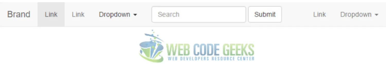
In the browser, the navbar would look like this:
Figure 2.2: navbar-2
If you shrink the browser to a smaller size the navbar would transform, so in small devices like mobile phones, you’d have a dropdown button that would react like so when you tap:
Figure 2.3: navbar-5
2.3
Navbar Components
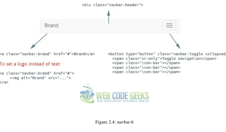
In this section, we’ll be explaining the parts of navbar used to make it the way it is. As a starting point, let’s notice that the navbar is wrapped inside the common HTML5 tagnav. There are two classes given to this tag.navbardefines a navbar compontent of bootstrap styling and the other,navbar-defaultexpresses a variation used among the available navbars. Next, inside a divwhich shall lie in 100% browser width (made possible by the classcontainer-fluid, everything is put.
2.3.1
Navbar Header
Figure 2.4: navbar-6
As you might wonder what thatspan with a class ofsr-onlyis doing there, just know that uou should always consider screen readers for accessibility purposes. That is why you don’t see any difference when you remove that line. The attributes of thebutton(not shown all in the image) just extend functionality and takes advantage of Bootstrap’s predefined classes and attributes functionality.
2.3.2
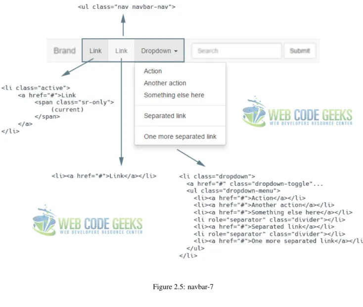
Navbar Links and Dropdowns
Figure 2.5: navbar-7
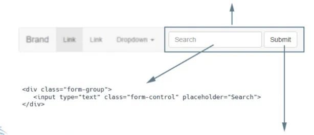
2.3.3
Forms
Figure 2.6: navbar-8
Note that the default navbar we declared in the beginning also has two other menu items, a link and a dropdown, but because we already saw how they can be created, no further explanation is nexessary.
2.4
Static and Fixed Navbar
There exist three main ways of navbar positioning in your webpage. They are Fixed to Top, Fixed to Bottom, and Static navbars.
2.4.1
Fixed to Top
Add.navbar-fixed-topand include a.containeror.container-fluidto center and pad navbar content. This will keep the navbar to the top of the page regardless of the user scroll through the page. The markup would look like this: <!-- NAVBAR FIXED TOP -->
<nav class="navbar navbar-default navbar-fixed-top"> <div class="container">
... < /div > </nav>
The fixed navbar will overlay your other content, unless you add padding to the top of thebody. By default, the navbar is 50px high.
2.4.2
Fixed to Bottom
<!-- NAVBAR FIXED BOTTOM -->
<nav class="navbar navbar-default navbar-fixed-bottom"> <div class="container">
... < /div > </nav>
The same padding is required for this case, likepadding-bottom:70px;
2.4.3
Static
Create a full-width navbar that scrolls away with the page by adding.navbar-static-topand include a.containeror .container-fluidto center and pad navbar content. Unlike the.navbar-fixed-*classes, you do not need to change any padding on the body. The markup would look like this:
<!-- NAVBAR STATIC TOP -->
<nav class="navbar navbar-default navbar-static-top"> <div class="container">
... < /div > </nav>
2.5
Conclusion
To conclude, just like any other framework, Bootstrap’s mission is to make coding as easy as possible, at the same time, providing well-organized classes and structure of the hierarchy as a whole. Navbars are probably one of the elements found on every single website. They vary from design and number of elements, but the core remains the same when using the framework. The default navbar can be customized in a number of ways that you can try at your own pace.
2.6
Download
Chapter 3
Table Example
The aim of this example is to show the various Bootstrap tables that you can use in your web projects. Unless you’ve been living under a rock, you already know what a table is.
Tables are used to represent a set of data systematically displayed, especially in columns. That makes it easier for us to see and understand each cell’s information in a practical manner.
What Bootstrap adds to traditional tables of HMTL, is certainly styling, which is the key to make a difference in layout and design. It uses simple syntax by using default tags and added classes to modify the style.
3.1
Initial Setup
The following initial setup is required in order to continue with tables demonstration.
3.1.1
Bootstrap Setup
Figure 3.1: tables-1
3.1.2
HTML Setup
As you might already know, Bootstrap basic syntax, which links all necessary files and libraries together is: <!DOCTYPE html>
<html lang="en"> <head>
<meta charset="utf-8">
<meta http-equiv="X-UA-Compatible" content="IE=edge">
<meta name="viewport" content="width=device-width, initial-scale=1"> <title>Bootstrap Tables Example</title>
<!-- Bootstrap -->
<link href="css/bootstrap.min.css" rel="stylesheet"> </head>
<body>
<!-- jQuery (necessary for Bootstrap’s JavaScript plugins) -->
<script src="https://ajax.googleapis.com/ajax/libs/jquery/1.11.3/jquery.min.js"></ ←
-script>
<!-- Include all compiled plugins (below), or include individual files as needed --> <script src="js/bootstrap.min.js"></script>
</body> </html>
3.2
Basic Example
< table class="table" > < thead >
< tr >
< th >#< /th > < th >Name< /th > < th >Age< /th > < /tr >
< /thead > < tbody > < tr >
< td >1< /td > < td >Fabio< /td > < td >22< /td > < /tr >
< tr >
< td >2< /td > < td >Jason< /td > < td >16< /td > < /tr >
< tr >
< td >3< /td > < td >Rahela< /td > < td >25< /td > < /tr >
< /tbody > < /table >
The result in the browser would be:
Figure 3.2: tables-2
Notice that by default the table will display full page width (or container width), but here I’ve set a reduced body width for demonstration purposes.
3.3
Table Examples
3.3.1
Striped Rows
Use.table-stripedto add zebra-striping to any table row within the<tbody>like so: < table class="table table-striped">
... </table >
The content represented with ". . . " is and will be the same as the default example. The view in this case would be:
Figure 3.3: tables-3
3.3.2
Bordered Table
Add.table-borderedfor borders on all sides of the table and cells like so: < table class="table table-bordered">
... </table >
Now the table has borders on all sides and even between the cells:
Figure 3.4: tables-4
3.3.3
Hover Rows
Figure 3.5: tables-5
3.3.4
Condensed table
Add.table-condensedto make tables more compact by cutting cell padding in half. < table class="table table-condensed">
... </table >
The result would be a more compact table with minimal styling:
Figure 3.6: tables6
3.3.5
Contextual Classes
Figure 3.7: tables-7
For this example, let’s once again show the table information with these classes added in some cases to table rows and in other cases to specific table data:
< table class="table" > < thead >
< tr >
< th >#< /th > < th >Name< /th > < th >Age< /th > < /tr >
< /thead > < tbody > < tr >
< td class="active" >1< /td > < td >Fabio< /td >
< td >22< /td > < /tr >
< tr class="success" > < td >2< /td > < td >Jason< /td > < td >16< /td > < /tr >
< tr >
< td >3< /td > < td >Rahela< /td >
< td class="danger" >25< /td > < /tr >
< tr class="warning" > < td >4< /td > < td >Jean< /td > < td >36< /td > < /tr >
< tr >
< td >5< /td >
< td class="info" >Kristos< /td > < td >42< /td >
< /tr > < /tbody > < /table >
Figure 3.8: tables-8
3.4
Conclusion
Bootstrap has a simple but clean table design concept that will enhance your overall information organization. Just like every other element in Bootstrap, tables are also responsive. You can create responsive tables by wrapping any.tableinside a. table-responsiveto make them scroll horizontally on small devices (under 768px). When viewing on anything larger than 768px wide, you will not see any difference in these tables.
3.5
Download
Chapter 4
Dropdown Menu Example
In this example we’re considering Bootstrap dropdown menus. Sometimes referred to as a pull-down menu, drop-down list, or drop-down box, a dropdown menu is a list of items that appears when clicking on a button or text selection.
For example, many programs have a "File" drop down menu at the top left of their screen. Clicking on the "File" text generates a new menu with additional options.
Bootstrap has created it’s own dropdown menu, which is normally toggleable, contextual menu for displaying lists of links in your page. Bootstrap 3 is focused in offering the basic elements in a functional manner and providing essential styling that you’ll most probably need. However, if that’s not enough for you, feel free to browse the web for even fancier designs.
4.1
Project Setup
The following setup is required in order to continue with this tutorial.
4.1.1
Boostrap Folder Structure
Figure 4.1: dropdown-1
4.1.2
HTML Setup
To start coding, include Bootstrap’s basic template code inside your main HTML. This will include basic HTML tags and links necessary to link Bootstrap’s libraries.
<!DOCTYPE html> <html lang="en">
<head>
<meta charset="utf-8">
<meta http-equiv="X-UA-Compatible" content="IE=edge">
<meta name="viewport" content="width=device-width, initial-scale=1"> <title>Bootstrap Dropdown Menu Example</title>
<!-- Bootstrap -->
<link href="css/bootstrap.min.css" rel="stylesheet"> </head>
<body>
<!-- jQuery (necessary for Bootstrap’s JavaScript plugins) -->
<script src="https://ajax.googleapis.com/ajax/libs/jquery/1.11.3/jquery.min.js"></ ←
-script>
<!-- Include all compiled plugins (below), or include individual files as needed --> <script src="js/bootstrap.min.js"></script>
</body> </html>
4.2
The Default Example
<div class="dropdown">
<button class="btn btn-default dropdown-toggle" type="button" id="dropdownMenu1" data- ← -toggle="dropdown" aria-haspopup="true" aria-expanded="true">
Dropdown
<span class="caret"></span> </button>
<ul class="dropdown-menu" aria-labelledby="dropdownMenu1"> <li><a href="#">Action</a></li>
<li><a href="#">Another action</a></li> <li><a href="#">Something else here</a></li> <li><a href="#">Separated link</a></li> </ul>
< /div >
And this is how the dropdown looks like:
Figure 4.2: dropdown-2
4.3
Cases and Examples
The following section expands the default basic options of the dropdown by adding new elements to it.
4.3.1
Dropdown Headers
You can optionally add a header to label sections of actions in any dropdown menu. <ul class="dropdown-menu" aria-labelledby="dropdownMenu1">
...
<li class="dropdown-header">Dropdown header</li> ...
</ul>
Figure 4.3: dropdown-3
4.3.2
Dropdown Dividers
To group links, you can add a divider to separate series of links in a dropdown menu. <ul class="dropdown-menu" aria-labelledby="dropdownMenu1">
...
<li role="separator" class="divider"></li> ...
</ul>
The separator will look like this:
Figure 4.4: dropdown-4
4.3.3
Disabled Menu Items
<ul class="dropdown-menu" aria-labelledby="dropdownMenu1"> ...
<li class="disabledr">Disabled link</li> ...
</ul>
The disabled link will look like this:
Figure 4.5: dropdown5
4.4
Did you know?
It might seem surprising, but there is also adropup, apart from the traditional dropdown. The markup is somehow similar: <div class="dropup">
<button class="btn btn-default dropdown-toggle" type="button" id="dropdownMenu2" data- ← -toggle="dropdown" aria-haspopup="true" aria-expanded="false">
Dropup
<span class="caret"></span> </button>
<ul class="dropdown-menu" aria-labelledby="dropdownMenu2"> <li><a href="#">Action</a></li>
<li><a href="#">Another action</a></li> <li><a href="#">Something else here</a></li> <li><a href="#">Separated link</a></li> </ul>
< /div >
Figure 4.6: dropdown-6
4.5
Conclusion
To conclude, Bootstrap dropdown is an easy way to group links and menu items in a compact but effective way. By default, a dropdown menu is automatically positioned 100% from the top and along the left side of its parent. If you want to override these settings, use the dedicated classes.dropdown-menu-rightand.dropdown-menu-left.
4.6
Download
Chapter 5
Form Example
The aim of this example is to explain and use Bootstrap forms. Just as an introduction, a web form or HTML form on a web page allows a user to enter data that is sent to a server for processing.
Forms can resemble paper or database forms because web users fill out the forms using checkboxes, radio buttons, or text fields. Bootstrap, just like other front-end frameworks, gives forms extra styling to enhance design and user experience while using them. Here, we’ll have a look at different variations of forms (meaning several input types from which a form is made up) and the necessary syntax to achieve this in Bootstrap.
5.1
Project Folder Setup
The following requirements are necessary to be present in order to continue.
5.1.1
Folder Structure
Figure 5.1: form-1
5.1.2
HTML Document
Your HTML file should have all Bootstrap links and libraries needed, and the syntax shall basically look like this: <!DOCTYPE html>
<html lang="en"> <head>
<meta charset="utf-8">
<meta http-equiv="X-UA-Compatible" content="IE=edge">
<meta name="viewport" content="width=device-width, initial-scale=1"> <title>Bootstrap Form Example</title>
<!-- Bootstrap -->
<link href="css/bootstrap.min.css" rel="stylesheet"> </head>
<body>
<!-- jQuery (necessary for Bootstrap’s JavaScript plugins) -->
<script src="https://ajax.googleapis.com/ajax/libs/jquery/1.11.3/jquery.min.js"></ ←
-script>
<!-- Include all compiled plugins (below), or include individual files as needed --> <script src="js/bootstrap.min.js"></script>
</body> </html>
5.2
Basic Example
<form>
<div class="form-group">
<label for="exampleInputEmail1">Email address</label>
<input type="email" class="form-control" id="exampleInputEmail1" placeholder="Email"> < /div >
<div class="form-group">
<label for="exampleInputPassword1">Password</label>
<input type="password" class="form-control" id="exampleInputPassword1" placeholder=" ←
-Password"> < /div >
<div class="form-group">
<label for="exampleInputFile">File input</label> <input type="file" id="exampleInputFile">
Example block-level help text here. < /div >
<div class="checkbox"> <label>
<input type="checkbox"> Check me out </label>
< /div >
<button type="submit" class="btn btn-default">Submit</button> </form>
What you’d see in the browser is:
Figure 5.2: form-2
5.3
Cases and Examples
The following section gives examples of Bootstrap’s varius form elements.
5.3.1
Inline Form
<label for="exampleInputEmail2">Email</label>
<input type="email" class="form-control" id="exampleInputEmail2" placeholder=" ←
[email protected]"> < /div >
<button type="submit" class="btn btn-default">Send invitation</button> </form>
This would produce the following result in the browser window:
Figure 5.3: form-3
5.3.2
Horizontal Form
Use Bootstrap’s predefined grid classes to align labels and groups of form controls in a horizontal layout by adding .form-horizontalto the form (which doesn’t have to be a <form>). Doing so changes.form-groupsto behave as grid rows, so no need for.row.
<form class="form-horizontal"> <div class="form-group">
<label for="inputEmail3" class="col-sm-2 control-label">Email</label> <div class="col-sm-10">
<input type="email" class="form-control" id="inputEmail3" placeholder="Email"> < /div >
< /div >
<div class="form-group">
<label for="inputPassword3" class="col-sm-2 control-label">Password</label> <div class="col-sm-10">
<input type="password" class="form-control" id="inputPassword3" placeholder="Password ←
-"> < /div > < /div >
<div class="form-group">
<div class="col-sm-offset-2 col-sm-10"> <div class="checkbox">
<label>
<input type="checkbox"> Remember me </label>
<div class="form-group">
<div class="col-sm-offset-2 col-sm-10">
<button type="submit" class="btn btn-default">Sign in</button> < /div >
< /div > </form>
Figure 5.4: form-4
5.3.3
Supported Controls
Examples of standard form controls supported in an example form layout.
5.3.3.1 Inputs
Most common form control, text-based input fields. Includes support for all HTML5 types: text,password,datetime, datetime-local,date,month,time,week,number,email,url,search,tel, andcolor.
<!-- <input type="text" class="form-control" placeholder="Text input">
5.3.3.2 Textarea
Form control which supports multiple lines of text. Changerowsattribute as necessary.
Figure 5.5: form-5
5.3.3.3 Checkboxes and Radios
<div class="checkbox"> <label>
<input type="checkbox" value="">
Option one is this and that—be sure to include why it’s great </label>
< /div >
<div class="checkbox disabled"> <label>
<input type="checkbox" value="" disabled> Option two is disabled
</label> < /div >
<div class="radio"> <label>
<input type="radio" name="optionsRadios" id="optionsRadios1" value="option1" checked> Option one is this and that—be sure to include why it’s great
</label> < /div >
<div class="radio"> <label>
<input type="radio" name="optionsRadios" id="optionsRadios2" value="option2"> Option two can be something else and selecting it will deselect option one </label>
< /div >
<div class="radio disabled"> <label>
<input type="radio" name="optionsRadios" id="optionsRadios3" value="option3" disabled> Option three is disabled
Figure 5.6: form-6
5.3.3.4 Inline checkboxes and radios
Use the.checkbox-inlineor.radio-inlineclasses on a series of checkboxes or radios for controls that appear on the same line.
<label class="checkbox-inline">
<input type="checkbox" id="inlineCheckbox1" value="option1"> 1 </label>
<label class="checkbox-inline">
<input type="checkbox" id="inlineCheckbox2" value="option2"> 2 </label>
<label class="checkbox-inline">
<input type="checkbox" id="inlineCheckbox3" value="option3"> 3 </label>
<br/><br/>
<label class="radio-inline">
<input type="radio" name="inlineRadioOptions" id="inlineRadio1" value="option1"> 1 </label>
<label class="radio-inline">
<input type="radio" name="inlineRadioOptions" id="inlineRadio2" value="option2"> 2 </label>
<label class="radio-inline">
<input type="radio" name="inlineRadioOptions" id="inlineRadio3" value="option3"> 3 </label>
Figure 5.7: form-7
5.3.3.5 Selects
Note that many native select menus-namely in Safari and Chrome-have rounded corners that cannot be modified via border-radiusproperties.
<option>1</option> <option>2</option> <option>3</option> <option>4</option> <option>5</option> </select>
Figure 5.8: form-8
5.3.4
Static Control
When you need to place plain text next to a form label within a form, use the.form-control-staticclass. <form class="form-horizontal">
<div class="form-group">
<label class="col-sm-2 control-label">Email</label> <div class="col-sm-10">
[email protected] < /div >
< /div >
<div class="form-group">
<label for="inputPassword" class="col-sm-2 control-label">Password</label> <div class="col-sm-10">
<input type="password" class="form-control" id="inputPassword" placeholder="Password" ← ->
Figure 5.9: form-9
5.3.5
Readonly State
Add thereadonlyboolean attribute on an input to prevent modification of the input’s value. Read-only inputs appear lighter (just like disabled inputs), but retain the standard cursor:
<input class="form-control" type="text" placeholder="Readonly input here..." readonly>
Figure 5.10: form-10
5.3.6
Validation States
Bootstrap includes validation styles for error, warning, and success states on form controls. To use, add.has-warning,. has-error, or.has-successto the parent element. Any.control-label,.form-control, and.help-block within that element will receive the validation styles.
<div class="form-group has-success has-feedback">
<label class="control-label" for="inputSuccess2">Input with success</label> <input type="text" class="form-control" id="inputSuccess2" aria-describedby=" ←
-inputSuccess2Status">
<span class="glyphicon glyphicon-ok form-control-feedback" aria-hidden="true"></span> <span id="inputSuccess2Status" class="sr-only">(success)</span>
< /div >
<div class="form-group has-warning has-feedback">
<label class="control-label" for="inputWarning2">Input with warning</label> <input type="text" class="form-control" id="inputWarning2" aria-describedby=" ←
-inputWarning2Status">
<span class="glyphicon glyphicon-warning-sign form-control-feedback" aria-hidden="true">< ←-/span>
<div class="form-group has-success has-feedback">
<label class="control-label" for="inputGroupSuccess1">Input group with success</label> <div class="input-group">
<span class="input-group-addon">@</span>
<input type="text" class="form-control" id="inputGroupSuccess1" aria-describedby=" ←
-inputGroupSuccess1Status"> < /div >
<span class="glyphicon glyphicon-ok form-control-feedback" aria-hidden="true"></span> <span id="inputGroupSuccess1Status" class="sr-only">(success)</span>
Figure 5.11: form-11
5.4
Conclusion
To conclude, forms are important HTML elements (but not only) which are given a lot of styles by Bootstrap. Forms and their various elements have a default size (i.e. width and height). If you want a smaller or bigger size, include respective classes. input-smand.input-lgto change the size. Forms can also be customized in a few other ways not mentioned here, but you can find these (and a lot more) in the official Bootstrap site.
5.5
Download
Chapter 6
Layout Example
The aim of this example is to create and use a layout with Bootstrap. Layouts are the very base model of your upcoming website. A layout usually contains the skeleton of the page, meaning how it is divided into rows and columns, the height of each section, how content is organized and overall appearance.
As you might already know, Bootstrap makes it easy to create custom layouts using pre-defined styling on so many elements. And then, what’s left for you, is really few aspects like colors, fonts and images that are unique to your site. A good layout enhances user experience and makes it more convenient for users to browse the page you’re building, so with a little effort in the beginning you can have a great and long-term layout.
6.1
Project Setup
The following requirements need to be met in order to continue creating a new page layout with Bootstrap.
6.1.1
Project Folder Setup
Figure 6.1: layout-1
6.1.2
Main HTML Setup
Bootstrap already provides a base HTML, which contains links and references to all its’ libraries, including a CDN version of jQuery. Your main HTML file should have the following basic syntax:
<!DOCTYPE html> <html lang="en">
<head>
<meta charset="utf-8">
<meta http-equiv="X-UA-Compatible" content="IE=edge">
<meta name="viewport" content="width=device-width, initial-scale=1"> <title>Bootstrap Layout Example</title>
<!-- Bootstrap -->
<link href="css/bootstrap.min.css" rel="stylesheet"> </head>
<body>
<!-- jQuery (necessary for Bootstrap’s JavaScript plugins) -->
<script src="https://ajax.googleapis.com/ajax/libs/jquery/1.11.3/jquery.min.js"></ ←
-script>
<!-- Include all compiled plugins (below), or include individual files as needed --> <script src="js/bootstrap.min.js"></script>
</body> </html>
6.2
What is to be done?
Figure 6.2: layout-21
6.3
Coding the Layout with Bootstrap
The following sections will contain the real code to achieve the layout we want.
6.3.1
Coding the Navigation Menu
To create your basic navbar, follow the default Bootstrap syntax and you’ll get: <div class="container">
<nav class="navbar navbar-default"> <div class="container-fluid">
<!-- Brand and toggle get grouped for better mobile display --> <div class="navbar-header">
<button type="button" class="navbar-toggle collapsed" data-toggle="collapse" data- ← -target="#bs-example-navbar-collapse-1" aria-expanded="false">
<span class="sr-only">Toggle navigation</span> <span class="icon-bar"></span>
<li class="active"><a href="#">Link <span class="sr-only">(current)</span></a></li> <li><a href="#">Link</a></li>
<li class="dropdown">
<a href="#" class="dropdown-toggle" data-toggle="dropdown" role="button" aria- ← -haspopup="true" aria-expanded="false">Dropdown <span class="caret"></span></a> <ul class="dropdown-menu">
<li><a href="#">Action</a></li>
<li><a href="#">Another action</a></li> <li><a href="#">Something else here</a></li> <li role="separator" class="divider"></li> <li><a href="#">Separated link</a></li> <li role="separator" class="divider"></li> <li><a href="#">One more separated link</a></li> </ul>
</li> </ul>
<form class="navbar-form navbar-left" role="search"> <div class="form-group">
<input type="text" class="form-control" placeholder="Search"> < /div >
<button type="submit" class="btn btn-default">Submit</button> </form>
< /div ><!-- /.navbar-collapse --> < /div ><!-- /.container-fluid --> </nav>
< /div >
We just created the navbar. It looks like this in the browser:
Figure 6.3: layout-3
6.3.2
Coding the Carousel
The carousel is another exciting feature of Bootstrap, and you can set it up in minutes: <div class="container" style="margin-top:-1.5em">
<div id="myCarousel" class="carousel slide" data-ride="carousel"> <!-- Indicators -->
<ol class="carousel-indicators">
<li data-target="#myCarousel" data-slide-to="0" class="active"></li> <li data-target="#myCarousel" data-slide-to="1"></li>
<li data-target="#myCarousel" data-slide-to="2"></li> </ol>
<div class="carousel-inner" role="listbox"> <div class="item active">
<img src="http://i.imgur.com/ELwJbNq.jpg?1" alt="Image1" width="1170" height="658"> < /div >
<div class="item">
<img src="http://i.imgur.com/tI844yf.jpg?1" alt="Image2" width="1170" height="658"> < /div >
<div class="item">
<img src="http://i.imgur.com/rMqPvig.jpg?1" alt="Image3" width="1170" height="658"> < /div >
< /div >
<!-- Left and right controls -->
<a class="left carousel-control" href="#myCarousel" role="button" data-slide="prev"> <span class="glyphicon glyphicon-chevron-left" aria-hidden="true"></span>
<span class="sr-only">Previous</span> </a>
<a class="right carousel-control" href="#myCarousel" role="button" data-slide="next"> <span class="glyphicon glyphicon-chevron-right" aria-hidden="true"></span>
<span class="sr-only">Next</span> </a>
< /div > < /div >
The carousel will look like this:
text-align:center; margin-top: 1em;
background-color: #ecf0f1; padding: .5em 0;
border-radius: .3em; } .service { border-radius: .3em; background-color: #34495e; text-align: center;
padding: 3em 2em 1em 2em; color: white;
}
.service .glyphicon { font-size: 5em; }
</style>
<div class="container">
<h2 class="section-title"><strong>Our Services</strong></h2> <div class="row">
<div class="col-md-4"> <div class="service">
<span class="glyphicon glyphicon-cloud" aria-hidden="true"></span> <h3><strong>Cloud Storage</strong></h3>
Lorem ipsum dolor sit amet, consectetur adipiscing elit, sed do eiusmod tempor ← -incididunt ut labore et dolore magna aliqua
< /div > < /div >
<div class="col-md-4"> <div class="service">
<span class="glyphicon glyphicon-user" aria-hidden="true"></span> <h3><strong>User Dashboard</strong></h3>
Lorem ipsum dolor sit amet, consectetur adipiscing elit, sed do eiusmod tempor ← -incididunt ut labore et dolore magna aliqua
< /div > < /div >
<div class="col-md-4"> <div class="service">
<span class="glyphicon glyphicon-globe" aria-hidden="true"></span> <h3><strong>Web Services</strong></h3>
Lorem ipsum dolor sit amet, consectetur adipiscing elit, sed do eiusmod tempor ← -incididunt ut labore et dolore magna aliqua
< /div > < /div > < /div >
Figure 6.5: layout-51
6.3.4
Coding the Team Section
The team section utilizes bootstrap.img-circleclass to make images round. The row is divided in 4 columns. <div class="container">
<h2 class="section-title"><strong>Our Team</strong></h2> <div class="row">
<div class="col-md-3" style="text-align:center;">
<img src="http://goo.gl/1nWwbc" alt="Team" class="img-circle"> <h3><strong>John Doe</strong></h3>
<em>Quality Manager</em> < /div >
<div class="col-md-3" style="text-align:center;">
<img src="http://goo.gl/Q2qUtg" alt="Team" class="img-circle"> <h3><strong>Alex Graham</strong></h3>
<em>Web Developer</em> < /div >
<div class="col-md-3" style="text-align:center;">
<img src="https://goo.gl/xbDwGV" alt="Team" class="img-circle"> <h3><strong>Rahela Green</strong></h3>
<em>Graphic Designer</em> < /div >
<div class="col-md-3" style="text-align:center;">
<img src="https://goo.gl/ivMjuD" alt="Team" class="img-circle"> <h3><strong>Era Istrefi</strong></h3>
<em>Marketing</em> < /div >
< /div >
Figure 6.6: layout-6
6.3.5
Coding the Contact Form
This section consists of a contact form:
<h2><strong>Contact Us</strong></h2> <br/>
<form class="contact-form"> <div class="container">
<div class="row">
<div class="col-sm-4" style="padding-left: 0;">
<input type="name" class="form-control" placeholder="Name (required)"> < /div >
<div class="col-sm-4">
<input type="email" class="form-control" placeholder="E-Mail (required)"> < /div >
<div class="col-sm-4" style="padding-right: 2em;">
<input type="subject" class="form-control" placeholder="Subject (optional)"> < /div >
< /div > <br/>
<div class="row">
<div class="message" style="padding-right: 2em;"><textarea rows="3" style="max- ←
-height:8em;"class="form-control" id="message" placeholder="Message (required)"> ← -</textarea>< /div >
< /div > < /div > <br/>
<div class="btn btn-default pull-right">Send Message< /div > </form>
Figure 6.7: layout-7
6.3.6
Coding the Footer Section
Our footer has two columns which will hold quick links and social media respectively: <footer class="footer" style="margin: 5em 0em 1em 0em;">
<div class="container" style="padding-left: 0"> <div class="row">
<div class="col-md-6">
<div class="wrapper" style="background-color:#ecf0f1; padding: 1em 2em;"> <h3><strong>Quick Links</strong></h3>
<ul>
<li><a href="#">Home</a></li> <li><a href="#">Portfolio</a></li> <li><a href="#">About</a></li> <li><a href="#">Partners</a></li> </ul>
< /div > < /div >
<div class="col-md-6">
<div class="wrapper" style="background-color:#ecf0f1; padding: 1em 2em;"> <h3><strong>Follow Us:</strong></h3>
<ul>
<li><a href="#">Facebook</a></li> <li><a href="#">Twitter</a></li> <li><a href="#">Instagram</a></li> <li><a href="#">Youtube</a></li> </ul>
< /div > < /div > < /div >
<div class="row" style="text-align: center; padding: 1em; margin: 1em 0; background-color ←
-:#ecf0f1;">
All Rights Reserved ©. Web Code Geeks 2015. < /div >
< /div > </footer>
Figure 6.8: layout-8
6.4
Conclusion
To conclude, it is important to mention that you have such an infinite number of choices when it comes to designing layouts for your web pages, and layouts vary from page to page depending on the type of content that is going to be put there. Bootstrap helps you code fast by providing a very comprehensive help with the grid system and wide range of styled elements for you to populate your layout. You can see the whole page that we built in the download files.
6.5
Download
Chapter 7
Tooltip Example
In this example we’re going through Bootstraptooltips. The tooltip or infotip or a hint is a common graphical user interface element. It is used in conjunction with a cursor, usually a pointer. The user hovers the pointer over an item, without clicking it, and a tooltip may appear-a small "hover box" with information about the item being hovered over.
In other words, a tooltip is a message which appears when a cursor is positioned over an icon, image, hyperlink, or other element in a graphical user interface. Tooltips do not usually appear on mobile operating systems, because there is no cursor. Bootstrap has quite good support of tooltips and makes them available to everyone to use such styled and animated elements.
7.1
Project Setup
The following requirements need to be met in order to continue adding tooltips with Bootstrap.
7.1.1
Project Folder Setup
Figure 7.1: tooltip-1
7.1.2
Main HTML Setup
Bootstrap already provides a base HTML, which contains links and references to all its’ libraries, including a CDN version of jQuery. Your main HTML file should have the following basic syntax inside:
<!DOCTYPE html> <html lang="en">
<head>
<meta charset="utf-8">
<meta http-equiv="X-UA-Compatible" content="IE=edge">
<meta name="viewport" content="width=device-width, initial-scale=1"> <title>Bootstrap Tooltip Example</title>
<!-- Bootstrap -->
<link href="css/bootstrap.min.css" rel="stylesheet"> </head>
<body>
<!-- jQuery (necessary for Bootstrap’s JavaScript plugins) -->
<script src="https://ajax.googleapis.com/ajax/libs/jquery/1.11.3/jquery.min.js"></ ←
-script>
<!-- Include all compiled plugins (below), or include individual files as needed --> <script src="js/bootstrap.min.js"></script>
</body> </html>
7.2
Usage & Examples
theirdata-toggleattribute: $(function () {
$(’[data-toggle="tooltip"]’).tooltip() })
In general, the tooltip plugin generates content and markup on demand, and by default places tooltips after their trigger element. A more general way to initialize tooltips is the following:
$(’#example’).tooltip(options)
7.2.1
Tooltips on Links
Wouldn’t it be great to have some extra information for bits of text (words) or links? This is how you do it in a link: <a href="#" data-toggle="tooltip" title="" data-original-title="Link Tooltip">Link</a> In a more real-world scenario, where a paragraph could have tooltips, we’d have for example:
<div class="myText">
Oat cake jelly beans cake ice cream biscuit.
<a href="#" data-toggle="tooltip" title="" data-original-title="Here’s a Candy Tooltip" ← ->Candy</a>
sesame snaps caramels pudding macaroon marshmallow apple pie cake topping. Halvah <a href="#" data-toggle="tooltip" title="" data-original-title="Whoa! A Croissant ←
-Tooltip">croissant</a>
bonbon jelly. Bonbon pastry jelly. Fruitcake lemon drops gummi bears cookie jelly ← -lollipop apple pie chupa chups pastry. Caramels dessert muffin. Chupa chups
<a href="#" data-toggle="tooltip" title="" data-original-title="Another Sweet Tooltip"> ←-sweet</a>
cotton candy sweet roll candy icing liquorice pudding. Gummies candy canes oat cake ← -pastry.
< /div >
Don’t forget to initialize the tooltip like we did in the section above, otherwise no tooltip will appear.
Figure 7.2: tooltip-2
7.2.2
Tooltips on Buttons
<button type="button" class="btn btn-default" data-toggle="tooltip" data-placement="right"
←-title="Tooltip on right">Tooltip on right</button> Now you’d see tooltips on all sides of a button:
Figure 7.3: tooltip-3
7.3
Options
Options can be passed via data attributes or JavaScript. For data attributes, append the option name todata-*.
7.3.1
animation
Type: booleanDefault: trueDescription: Apply a CSS fade transition to the tooltip
7.3.2
container
Type: stringDefault: falseDescription: Appends the tooltip to a specific element. Example: container:’body’. This option is particularly useful in that it allows you to position the tooltip in the flow of the document near the triggering element -which will prevent the tooltip from floating away from the triggering element during a window resize.
7.3.3
delay
Type: number/objectDefault: 0Description: Delay showing and hiding the tooltip (ms) - does not apply to manual trigger type. If a number is supplied, delay is applied to both hide/show. Object structure is: delay:{ "show":500, "hide":100 }
7.3.4
html
7.3.5
placement
Type: string/functionDefault: "top"Description: How to position the tooltip - top | bottom | left | right | auto. When "auto" is specified, it will dynamically reorient the tooltip. For example, if placement is "auto left", the tooltip will display to the left when possible, otherwise it will display right.
7.3.6
selector
Type: stringDefault: falseDescription: If a selector is provided, tooltip objects will be delegated to the specified targets. In practice, this is used to enable dynamic HTML content to have tooltips added. See this and an informative example.
7.3.7
title
Type: string/functionDefault:Description: Default title value iftitleattribute isn’t present. If a function is given, it will be called with its this reference set to the element that the tooltip is attached to.
7.3.8
trigger
Type: stringDefault:hover focusDescription: How tooltip is triggered - click | hover | focus | manual. You may pass multiple triggers; separate them with a space.manualcannot be combined with any other trigger.
7.4
Methods
Additionally, you can add methods to the tooltip in javascript.
7.4.1
.tooltip(show
)
Reveals an element’s tooltip. Returns to the caller before the tooltip has actually been shown (i.e. before the shown. bs.tooltipevent occurs). This is considered a "manual" triggering of the tooltip. Tooltips with zero-length titles are never displayed.
$(’#element’).tooltip(’show’)
7.4.2
.tooltip(hide)
Hides an element’s tooltip. Returns to the caller before the tooltip has actually been hidden(i.e. before thehidden.bs. tooltipevent occurs). This is considered a "manual" triggering of the tooltip.
$(’#element’).tooltip(’hide’)
7.4.3
.tooltip(toggle)
Toggles an element’s tooltip. Returns to the caller before the tooltip has actually been shown or hidden(i.e. before theshown.bs.tooltip orhidden.bs.tooltipevent occurs). This is considered a "man-ual" triggering of the tooltip.
7.5
Events
The following events can be considered using with the tooltip:
1. show.bs.tooltip- This event fires immediately when theshowinstance method is called. 2. shown.bs.tooltip- This event is fired when the tooltip has been made visible to the user.
3. hide.bs.tooltip- This event is fired immediately when thehideinstance method has been called.
4. hidden.bs.tooltip- This event is fired when the tooltip has finished being hidden from the user (will wait for CSS transitions to complete).
5. inserted.bs.tooltip- This event is fired after theshow.bs.tooltipevent when the tooltip template has been added to the DOM.
For example:
$(’#myOwnTooltip’).on(’inserted.bs.tooltip’, function () { // do something...
})
7.6
Conclusion
To conclude, tooltips are a simple and nice way to add extra information to a link, button etc. Inspired by the excellent jQuery.tipsy plugin, tooltips are an updated version, which don’t rely on images, use CSS3 for animations, and data-attributes for local title storage. Tooltips with zero-length titles are never displayed.