Comp150-‐02: Visualization
1
Assignment 2: Animated Transitions
Due: Oct 12 Mon, 11:59pm, 2015 (midnight)Overview
One of the things that make a visualization look polished is to add animation (animated transition) between each user interactions. In this assignment, you will be implementing animated transitions in Processing between different visualization layouts. The goals of this assignment are to: (a) further reinforce event-‐based programming, in particular with the render loop for starting and stopping user-‐triggered animations, and (b) introduce the general notion of equivalence in seemingly different visualization layouts.
Basic Requirements
1. Dataset
You will be giving multi-‐dimensional datasets in csv format. The first row of the dataset is the title of each column. The first column of the dataset is the label.
The assumptions you can make about the dataset are, a) No missing data
b) No dirty data (No abnormal data) c) No negative numbers
d) The numbers in one column are not all the same
e) The dataset is not too big (i.e. measured in tens, not hundreds of rows) f) There is a maximum number of dimensions (and rows). e.g. 100
The file is real-‐world dataset, which is the temperature of a day. You should be able to use the animated transition you build in this assignment to help a user understand the dataset.
2. Animated Transitions
The “basic” visualizations that you are required to implement are: Line graph, Pie chart, and Bar chart. These three visualizations are bivariate visualizations. Therefore, even though you will be parsing a multi-‐dimensional (i.e., multi-‐column) dataset, your Bar Chart, Line Chart, and Pie Chart will only display the first two dimensions of the dataset. Namely, use the first column as the labels and use the second column as the values. The reason that we are giving you more dimensions is to give you a chance to show off different types of animated transitions (e.g. colored bar chart to resized line graph).
Recall what you did in the last lab (Pie Chart), when the user clicks a button, the visualization will be “transitioning” to the other one. The gradual transition between visualizations helps a user to tell that these two visualizations depict the same dataset.
In this assignment, you will use animations to transition between visualizations. We expect these animations to connect the visual elements between the source and target visualizations in non-‐trivial way. Although the definition of “non-‐trivial” may be vague and subjective, there are some clear examples of “trivial” transitions. For example, fading out of one visualization and fade in another does not connect the visual elements between the two visualizations and will therefore not be acceptable. Transitioning that results in a data element showing up with no value is not useful (see class lecture).
3. Basic requirements
a. Implement Bar chart, Line chart and Pie chart, use the first column as the labels and use the second column as the values.
b. In order to trigger transition, you should have three buttons, named as Line chart, Pie chart and Bar chart. Each button responds to one of the three visualizations. When the user clicks a button, the canvas will transition to the corresponding visualization.
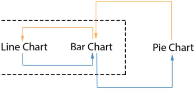
c. Add “direct” animated transitions as what’s specified in Figure 1. Specifically, you are required to implement animation transitions for:
Bar -‐> Line, Line -‐> Bar
Then pick either Line or Bar (whichever you feel more comfortable with) and add the “direct” animated transitions between that and the pie chart (polar coordinate). So you are also required to implement animation transitions for: Bar/Line -‐> Pie, Pie -‐> Bar/Line
Figure 1. The transitions you should implement
For example, if you choose Bar as the Cartesian chart that you’re more comfortable with, then you need to do: Line -‐> Bar -‐> Pie (Blue) as well as the reverse transitions Pie -‐> Bar -‐> Line(Orange).
Figure 2. Transition from Line to Pie
4. Not required
a. We will NOT require that your visualization and animation are resizable. It’s good practice to make things resizable, but it’s not a requirement for this assignment.
b. You don’t have to do hover during the transitions. c. You are free to use colors. But that’s not required.
Comp150-‐02: Visualization
3
d. The labels and the axes -‐-‐ although we encourage you to add labels on the axes -‐ -‐ are not required.
Notes for Basic Requirements
1. Interface and interaction
Your interface should include three buttons. Clicking on a button transitions from the current visualization to the selected (new) visualization. The image below is an example of your interface. Note that the specific position/size/shading of buttons in the image below are not required. You can design the interface however you want as long as there are three buttons.
Note that in the example above, if you are on a Line Chart and the user clicks on Pie, you have two options to handle this situation:
1. Grey out the option (and do nothing when the user clicks on it).
2. Automatically figure out that you need to go from Line –> Bar before you can go to Pie. In other words, it’ll perform a 2-‐stage transition.
2. Guidelines for making animation transitions
a) The purpose of making animation transitions is to help your audience understand how the different visual mappings connect to each other. So you should consider how the different visual mapping changes. For instance, see the video
Bar_Line_bad.mov. In this video, bars are directly transitioned to lines, which visually look fine. However, the semantics of this animation is inappropriate. As a bar is meant to denote the magnitude of a data point, transitioning it into a connecting line makes no sense. So a good animation for Line -‐> Bar needs to take such mappings into account (See Bar_Line_good.mov for a better example).
b) Following the above rationale, it can be reasoned that making any visual encoding disappear is not a good idea. For example, in a Bar chart, dropping all bars down to zero (i.e., stop mapping the second dimension of the data) and then have the new visual elements emerge from the x-‐axis is not acceptable.
c) Your forward transition should consistent with the backward one. For instance, assume Line -‐> Bar is the forward transition. Your backward transition Bar –> Line should be consistent with Line -‐> Bar. But this is not required!
a) There are almost always more than one way to animate the transition between any two visualizations. The examples used above and in the demo are not meant to be strict requirements. Be creative and have fun! Just make sure that the animations are meaningful semantically and visually.
b) Sometimes you may have to encoding information more than once.
c) The function lerp() is your friend. Lerp stands for linear interpolation, look it up in the Processing library. Note that if you want to be fancy, there is research that show that “slow-‐in-‐slow-‐out” is better than lerp.
d) Other functions you MIGHT use, beginShape() and endShape(), curve(), curveVertex(), arc(), beizer(), beizerVertex() etc.
Additional requirements
For implementing the “basic requirements”, you will at most receive 90% of the credits if you do it properly. The rest of 10%, you could receive from being creative. “Being creative” can mean many different things, but here are some suggestions:
• DESIGN:
There are many ways to be creative in the design. For example, consider novel, fun, or informative transitions. Note that you will need to be able to defend your design. Also, try different timing and speed (“slow-‐in-‐slow-‐out”) and see what works best and explain why.
• IMPLEMENTATION: Cool technical (programming) features
You could do more beyond the basic requirements by implementing other animated transitions. This could be done in two ways, a) you could add more visualization on bivariate dataset (the first two columns) and do the animated transition between them; b) you could consider the rest columns and add the animated transitions between the new visualizations. You could implement this in a separate file.
We will demo an example of the additional features on next Tuesday, Oct 5th. This is just an example. We do not expect you to implement this.
Submission:
1. Submit your work using “provide” by Mon October 12, 11:59pm (midnight). The assignment is called “a2”:
provide comp150viz a2 file1 file2 file3 or
provide comp150viz a2 * (to submit all files in a directory)
2. Name your “main” pde file “a2.pde”
3. As part of your submission, provide a file named “team.txt” where you: a. Give the name of all the team members
b. Provide a 1-‐2 sentence description regarding what each member did in the project.
4. Please write a half page description of your approach to the additional requirement.
Call this file “design.txt”.
• We understand that design is often very subjective. However, you should have
a rigorous way to explain why your approach is “semantic”. In other words, tell us why you deserve the last 10% in this document.
Comp150-‐02: Visualization
5
5. Note that each team only needs to make one submission. We will keep track of the individuals’ grades based on the names provided in the team.txt file.
6. For grading, your team will demo the project to the instructor(s). Tentative date for grading is the same Friday as the assignment is due. We will put up a signup sheet later.