GRISHIN, JOHN. Exploring the Boundary Conditions of the Effect of Aesthetics on Perceived Usability (Under the direction of Dr. Douglas J. Gillan.)
This research examined whether users’ judgments of usability and aesthetics, as well
as any association between the two, might change with their continued experience with a
system. This study explored the hypotheses that 1) aesthetics contribute disproportionately
to judgments of usability, and that 2) the influence of aesthetics on judgments of usability
will diminish with continued use and experience.
A website—a patient portal for a fictitious medical practice—was developed for the
Internet. Two variables, usability and aesthetics, were manipulated yielding four versions of
the patient portal website: High Aesthetics High Usability, High Aesthetics Low Usability,
Low Aesthetics High Usability, Low Aesthetics Low Usability. Participants were recruited
to perform three online tasks on each of the four versions of the website. After each task,
users’ perceptions of usability (SUS) and aesthetics (Lavie and Tractinsky’s (2004) classical
and expressive instrument, Moshagen and Thielsch’s (2010, 2013) VisAWI-S tool) were
gauged and performance measures were recorded.
Results provided very limited support for the hypotheses. The hypotheses proposed
that, at observation 1, aesthetics would contribute disproportionately to judgments of
usability, and that the influence of aesthetics on judgments of usability would diminish with
repeated use. Though Pearson correlations showed some degree of association between
ratings of usability and aesthetics, repeated measures ANOVAs failed to show an effect of
aesthetics on users’ judgments of usability. Indeed, results suggested that SUS ratings were
unaffected by aesthetics. Instead, the analyses showed a significant effect of occasion and
perceptions of improved performance accounted for increased SUS scores and that the
significant correlations between users’ ratings of aesthetics and usability in this and previous
studies were produced by an effect of scale use by participants, rather than by a relationship
© Copyright 2018 by John Grishin
Exploring the Boundary Conditions of the Effect of Aesthetics on Perceived Usability
by John Grishin
A dissertation submitted to the Graduate Faculty of North Carolina State University
in partial fulfillment of the requirements for the degree of
Doctor of Philosophy
Psychology
Raleigh, North Carolina
2018
APPROVED BY:
_______________________________ _______________________________
Dr. Douglas J. Gillan Dr. Anne McLaughlin
Committee Chair
_______________________________ _______________________________
BIOGRAPHY
John Grishin has a Bachelor’s Degree in Philosophy from the University of North Carolina at
Chapel Hill, a Master’s Degree in Technical Communication from North Carolina State
University, and a second Master’s Degree in Human Factors and Applied Cognition from
North Carolina State University. While completing the degree requirements for his MS in
Technical Communication he became interested in the cognitive aspects of user interaction
with electronic media, which led him to enroll in the Human Factors and Applied Cognition
PhD program at N.C.S.U. His chief research interests remain the usability of electronic
ACKNOWLEDGMENTS
The author would like to acknowledge and thank Douglas J. Gillan for his indispensable
roles in realizing this research. Dr. Gillan advised and guided me through the entire process
and made this study possible. I’d also like to thank my committee members, Dr. Anne
TABLE OF CONTENTS
LIST OF TABLES ... v
LIST OF FIGURES ... vi
Introduction ... 1
Literature Review ... 2
Problem statement ... 2
Purpose of Research ... 3
Review of relevant research and theories ... 3
Kurosu and Kashimura (1995) ... 3
Tractinsky, Katz, and Ikar (2000) ... 6
Hassenzahl (2004) and other studies ... 9
Tuch, Roth, Hornbaek, Opwis, and Bargas-Avila (2012) ... 9
Implications of relevant research and theories to the current research ... 12
Measure of usability ... 13
Measures of aesthetics ... 13
Research Questions/Goals/Hypotheses ... 14
General Method ... 17
Experiment 1: Development of the stimuli: websites/patient portals ... 18
Experiment 1A. Aesthetics ... 18
Method ... 18
Results and Discussion ... 22
Experiment 1B. Usability ... 22
Method ... 22
Results and Discussion ... 25
Experiment 2: Assessing the Relation Between Aesthetics and Usability ... 26
Method ... 26
Participants ... 26
Materials ... 30
Procedure ... 30
Results and Discussion ... 31
Users’ Performance ... 31
Users’ Perceptions of Usability and Aesthetics ... 37
Additional Analyses ... 45
General Discussion ... 48
Weak effect of aesthetics ... 48
Conflation of aesthetics and usability ... 49
Spurious correlations ... 50
User performance ... 50
Limitations of the research ... 52
Implications for Future Research ... 54
REFERENCES ... 56
LIST OF TABLES
Table 1 Aesthetics and Usability were manipulated on a website resulting
in four versions of the website ... 18
Table 2 Results of matched samples t-Tests comparing users’ ratings of the
high (HAHU,HALU) and low (LAHU, LALU) aesthetics versions ... 22
Table 3 Number of participants in Experiment 1B by website version ... 24 Table 4 Results of two-sample t-Tests comparing users’ ratings of the high
(HAHU,LAHU) and low (HALU, LALU) usability versions ... 25
Table 5 Number of participants (n) from each website for whom complete
data was available after four observations ... 27
Table 6 Results of two-sample t-Tests comparing Day 1 data of participants
who completed all four days of the study versus those who did not ... 29
Table 7 Results of 2 (Aesthetics: Low, High) X 2 (Usability: Low, High)
X 4 (Occasion: Observations 1, 2, 3 and 4 of overall SUS scores ... 42 Table 8 Results of 2 (Aesthetics: Low, High) X 2 (Usability: Low, High)
X 4 (Occasion: Observations 1, 2, 3 and 4 of overall VisAWI scores ... 43 Table 9 Results of 2 (Aesthetics: Low, High) X 2 (Usability: Low, High)
X 4 (Occasion: Observations 1, 2, 3 and 4 of overall CA scores ... 43 Table 10 Results of 2 (Aesthetics: Low, High) X 2 (Usability: Low, High)
X 4 (Occasion: Observations 1, 2, 3 and 4 of overall CE scores ... 44 Table 11 Results of 2 (Aesthetics: Low, High) X 2 (Usability: Low, High)
X 4 (Occasion: Observations 1, 2, 3 and 4 of average time taken ... 46 Table 12 Results of correlation between usability (SUS scores) and measures
LIST OF FIGURES
Figure 1. Model depicting the hypothesized relationship between attractiveness
and usability when attractiveness and usability are high ... 15
Figure 2. Model depicting the hypothesized relationship between attractiveness
and usability when attractiveness is low, but usability is high. ... 16
Figure 3. Model depicting the hypothesized relationship between attractiveness
and usability when attractiveness is high, but usability is low. ... 16
Figure 4. Model depicting the hypothesized relationship between attractiveness
and usability when attractiveness and usability are both low. ... 17
Figure 5 Three-image block of High Aesthetics High Usability (HAHU)
screenshots that were shown to participants. ... 21
Figure 6 Three-image block of Low Aesthetics High Usability (LAHU)
screenshots that were shown to participants. ... 21
Figure 7 Three-image block of High Aesthetics High Usability (HALU)
screenshots that were shown to participants. ... 21
Figure 8 Three-image block of Low Aesthetics High Usability (LALU)
screenshots that were shown to participants. ... 21
Figure 9 The average amount of time that users took to complete the three
tasks for each version of the website over four observations. ... 32
Figure 10 The average amount of page views that users took to complete all
three tasks for each version of the website over four observations. ... 33
Figure 11 Users’ success rates on the three tasks for each version of the
website over four observations. ... 34
Figure 12 Users’ average rating of usability for each version of the website
over four observations as measured by System Usability Score (SUS). ... 38
Figure 13 Users’ average rating of aesthetics for each version of the website
over four observations as measured by Moshagen and Thielsch’s ... 39
Figure 14 Users’ average rating of aesthetics for each version of the website
over four observations as measured by Lavie and Tractinsky’s ... 40
Figure 15 Users’ average rating of aesthetics for each version of the website
Introduction
The role of aesthetics in the design of products is as old as mankind. “Throughout
history and in every known culture, people have found pleasure and meaning in the use of
their eyes. They have consciously attempted to produce objects of beauty and have delighted
in them” (Csikszentmihalyi & Robinson, 1990, p. 2).” Similarly, creators of functional
objects such as pottery and clothing have always adorned their work with decoration (Becker,
1978). Today’s designers continue the tradition of including aesthetics in the design of
physical objects, and, with the advent of digital media, have extended the tradition to a new
array of electronic products (Lindgard & Dudek, 2002). Furthermore, a growing body of
empirical research suggests that aesthetics affects psychological and behavioral responses to
products, and that greater attention should therefore be paid to aesthetics in the design and
development of products (Bloch, 1995; Lindgaard, Fernandes, Dudek, and Brown, 2006;
Norman, 2002; Ilmberger, Schrepp, and Held, 2008). But there are costs associated with
including aesthetics in design (Hsiao, 2002), and designers may need to make decisions of
whether and when to include aesthetic considerations in the development of their products.
In making such decisions, designers would benefit from a better understanding of how and
when aesthetics affects user responses to a product.
Importantly for user-centered design, research has shown that the aesthetics of a
system affects users’ perceptions of the usability of that system (e.g., Tuch, Roth, Hobaek,
Opwis, and Bargas-Avila, 2012; Lee & Koubek, 2010). However, much of that research has
also exposed the need to learn more about when and how various factors affect this
relationship. One area that has not been well researched is how the role of aesthetics changes
and boundary conditions of the aesthetics-usability relationship by investigating the role that
aesthetics plays in the perceived overall usability of a digital product, an Internet website. In
this research, we ask whether users’ judgments of the usability and aesthetics of a system, as
well as any association between the two, might change with their continued experience with
that system. We explore the proposition that, with continued use and experience of a system
that is difficult to use, any influence of aesthetics on judgments of overall usability will
diminish.
Literature Review Problem statement
Within the field of human-computer interaction, and particularly in the areas of
usability and user-experience, the aesthetics of user interfaces has developed into a major
topic of interest, however this interest is a fairly recent phenomenon. The relationship
between aesthetics and user interfaces was largely neglected prior to studies by Kurosu and
Kashimura (1995) and Tractinsky et al. (2000) that showed that the aesthetics of an interface
affected the users’ perception of the usability of the entire system. Since then, numerous
studies have demonstrated the role of aesthetics on various outcomes, including trust and
credibility (Karvonen, Cardholm, and Karlsson, 2000; Robins and Holmes, 2007), the
perception of usability (Ben-Bassat, Meyer, and Tractinsky, 2006; Thüring and Mahlke,
2007; Tractinsky, Katz, and Ikar, 2000), and usability testing (Sonderegger and Sauer, 2010).
Despite the proliferation of studies investigating interface aesthetics, it is still “ … unclear
under which circumstances the aesthetics of an interface influences perceived usability, or
vice versa” (Tuch et al., 2012, p. 1596). In their overview of aesthetics and usability,
of aesthetics on usability through experimental manipulation. Even though a correlation
between aesthetics and usability was demonstrated in much of the research (e.g., De Angeli,
Sutcliffe, and Hartmann, 2006; Tractinsky, 1997), there were few experiments that
manipulated aesthetics and usability as separate variables. As a result, a causal relationship
between aesthetics and users’ perceptions of usability has not been sufficiently established.
Additionally, the existing studies have focused on the overall effect of aesthetics on users’
impressions of usability after a single use of the interface, and the role of aesthetics as a time
variant factor has not been well researched. To date, only one experimental study, Tuch et al.
(2012), examined how users’ experience with a system over time affected their perception of
usability. Participants became acquainted with the system as they worked through tasks and
were asked to give ratings both before and after their experience with the interface, but Tuch
et al. did not record multiple observations of users’ perceptions of the usability of an
interface as their experience with that interface increased.
Purpose of Research
This research examined whether a causal relationship between aesthetics and usability
did indeed exist, as well as the direction of that relationship. Additionally, this study
investigated whether the relationship between aesthetics and usability varied as a function of
increased experience with the interface.
Review of relevant research and theories
Kurosu and Kashimura (1995)
As previously mentioned, Kurosu and Kashimura (1995) was one of the studies that
sparked an increase in interest in the relationship between the aesthetics of a user interface
investigation of aesthetics, but as an attempt to study the relationship between inherent
usability and something they called “apparent usability”. Designers were attempting to
create user interfaces that were more efficient, easier to understand, and safer. Taken in sum,
Kurosu and Kashimura named these properties “inherent usability.” They distinguished
between inherent usability and “apparent usability.” The apparent usability of user interfaces
is “ … how much they look to be easy to use …” (p. 292). They pointed out that the inherent
usability of an interface is meaningless for the user if the interface doesn’t have enough
apparent usability to make them want to buy it. Stated another way, they wanted to
investigate the relationship between the factors that make an interface look to be easy to use
(apparent usability) and those that actually make it easy to use (inherent usability).
Kurosu and Kashimura developed 26 stimuli by having 26 participants each create a
layout pattern for an automated teller machine (ATM) interface. The participants, a
combination of graphic user interface (GUI) designers, industrial designers, engineers, and
secretaries, used the same graphical elements and they were free to vary the positions of the
elements according to any strategy “ … as they might think optimal in various senses” (p.
292). Then they had 252 subjects rate the 26 layouts on two criteria: 1) how much they
looked to be easy to use (apparent usability) and 2) how beautiful they were. They correlated
the two ratings and found that apparent usability was highly correlated to beauty (r=.589).
Next, they interviewed the 26 participants who had created the layouts to determine
the factors that had contributed to the inherent usability of the layouts. The interviews
yielded seven factors: (1) glance sequence, (2) familiarity, (3) grouping, (4) operation
sequence 1, (5) hand dominance (6) operation sequence 2, and (7) safety. These factors of
showed that apparent usability was not highly correlated with inherent usability. In other
words, layouts that users said looked easy to use, were not necessarily the ones that were
actually easy to use, and vice versa. This suggested that the user was strongly affected by the
aesthetic qualities of the interface and, in conclusion, Kurosu and Kashimura recommended
that, in addition to improving inherent usability, designers focus on improving the apparent
usability.
Although Kurosu and Kashimura showed that apparent usability correlated highly
with beauty, this fact does not establish that interface aesthetics directly influences apparent
usability. In fact, the reverse might be true—that apparent usability might cause users to
perceive greater beauty in the interface. Or, perhaps the relation between apparent usability
and aesthetics is spurious. Similarly, the study did not attempt to show a causal link between
high ratings of aesthetics and user behavior, and, for this reason, it could be said that their
recommendation that designers improve apparent usability was premature at the time they
published their findings. Additionally, the study did not attempt to correlate inherent
usability to beauty, only to apparent usability. In order to accept Kurosu and Kashimura’s
conclusion, one has to accept that, because inherent usability did not correlate with apparent
usability, it also would not have correlated with beauty. Yet, this is not necessarily the case.
Inherent usability might very well have correlated with beauty, just as apparent usability did.
As a result, one cannot rule out that actually being easy to use might also correlate highly
with beauty, just as appearing to be easy to use did. This leads to questions of both construct
validity and internal validity. If it were indeed the case that inherent usability also correlated
highly with beauty, then Kurosu and Kashimura’s conclusion would suffer from construct
Kurosu and Kashimura’s (1995) study marked a turning point in the study of the relationship
between aesthetics and usability by demonstrating a correlation between users’ perceptions
of an interface’s ease of use and its beauty.
Tractinsky, Katz, and Ikar (2000)
Another milestone in the growth of interest in the relationship between aesthetics and
usability was a study by Tractinsky, Katz, and Ikar (2000). Tractinsky et al., (2000) noted
that the mechanism linking affective and cognitive evaluations of user interfaces was unclear,
and they surmised that the correlations found between aesthetics and perceived usability
resembled findings in social psychology linking physical attractiveness and socially desirable
characteristics such as social competence. They further surmised that three processes may be
at play in the relationship between interface aesthetics and perceived usability: 1)
stereotyping—users associates beauty with other (or all) design dimensions. For example, the
affective response that a customer feels toward a store as a result of its aesthetic qualities
may affect how the customer feels about the customer service at that store; 2) halo effect—
users perceive beauty early in the interaction and this tends to carry over to later perceptions
about other characteristics; 3) affective response—an affective response to the aesthetics of a
design may improve a user’s mood and overall evaluations of a system. Additionally,
Tractinsky, et al., (2000) noted that prior studies had established the relationship between
aesthetics before users actually used the system, and they wanted to know whether this
relationship persisted after users had actually interacted with the system. Again, borrowing
from social psychology, Tractinsky, et al., (2000) noted that initial social perceptions
persevere even after evidence to the contrary is presented, so users’ initial perceptions of
goals in this study were to investigate 1) whether the correlation of aesthetics and usability
was the result of a general tendency to associate aesthetics with other attributes of a system,
and 2) whether the correlation of aesthetics and usability continues after use of the system.
Tractinsky et al. (2000) designed a 3 X 2 between-groups quasi-experimental study.
The first factor was aesthetics, which had three levels, low, medium, high. The second factor
was usability with two levels, low and high. Tractinsky et al. created a computer program
that presented participants with nine ATM layouts adapted from Kurosu and Kashimura’s
(1995). They chose nine of Kurosu and Kashimura’s 26 layouts based on ratings of those
layouts by participants in a 1997 study by Tractinsky. Three of the nine layouts had been
rated as high in aesthetics, three had been rated as low in aesthetics, and the other three had
been rated as in between. The experimental session was presented in three stages. In Stage
1, participants rated each of the nine layouts on a 1-10 scale on three attributes, including (1)
aesthetics, (2) usability, and (3) amount of information on the screen. Before Stage 2,
participants were assigned either to a high, medium, or low aesthetic condition. Participants
in these conditions performed the subsequent experiment tasks only on the versions of the
layouts that matched their own ratings. For example, participants who were assigned to the
high aesthetic group performed the experiment tasks only on layouts that they had rated high
on aesthetics. After being assigned to an aesthetic condition, participants practiced the use of
the ATM by performing the type of task that they would actually be doing in the experiment.
After the practice session, participants were assigned to one of the two usability conditions,
high or low. The computer program then presented each participant with the 11 tasks to be
performed on the ATM. Finally, in Stage 3, participants were asked to rate the system on (1)
Results showed that pre-experimental perceptions of ATM interface aesthetics and
their perceived usability were highly correlated, and that correlations between perceived
aesthetics and usability remained high after the experiment. This addressed Tractinsky et
al.’s (2000) second goal of the study, which was to investigate whether the correlation of
aesthetics and usability continues after use of the system—it did. Furthermore, perceived
aesthetics was only weakly and negatively correlated with the other pre-experimental
measure, amount of information. This addressed Tractinsky et al.’s first goal of the study,
which was to investigate whether the correlation of aesthetics and usability was the result of
a general tendency to associate aesthetics with all other attributes of a system. The results
suggested that it was not. Additionally, a 3 X 2 analyses of variance (ANOVA) revealed an
unexpected finding: that post-experiment perceptions of usability were affected by the
interface’s aesthetics and not by the actual usability of the system.
Thus, Tractinsky et al. (2000) marked another important milestone in the study of the
relationship of aesthetics to usability. Building on Kurosu and Kashimura’s (1995) findings
that users’ perceptions of the usability of an interface are correlated with their perceptions of
its beauty, Tractinsky et al. showed that the beauty-usability relation persists after the user
actually uses the system, and that its persistence is not due to the relationship between actual
usability and perceived usability. However, Tractinsky et al.’s measurements of user
perceptions of aesthetics and usability occurred only at first use of the interface. The study
was not concerned with the question of whether the user’s perceptions of aesthetics and
usability changed over time as the user gained experience with the interface. Additionally,
like Kurosu and Kashimura (1995), Tractinsky et al. (2000) established the key relationship
convergent evidence for the relationship of aesthetics to usability, however the ability to
make additional inferences about the aesthetics-usability relationship was limited.
Tractinsky et al. were aware that there might be numerous circumstances under which the
relationship they found did not hold and they were careful to acknowledge the limitations of
their findings. They encouraged additional research to “ … to assess the contingencies and
boundaries of the aesthetics-usability relationship” (p. 142). One such contingency that
Tractinsky et al. did not explore was how user perceptions of aesthetics and usability
changed as the user gained experience with the interface.
Hassenzahl (2004) and other studies
Based on the findings from previous studies, it was unclear under which
circumstances the aesthetics of an interface affects users’ perceived usability, or the direction
of the relationship. Most studies were correlative and did not attempt to manipulate
aesthetics and usability as independent variables. Hassenzahl (2004) and van Schaik and
Ling (2008) suggested a causal relationship between aesthetics and usability, but this was
mostly theoretical conjecture, and it remained untested, leading Hassenzahl and Monk (2010)
to conclude that there was a lack of studies that tested the effects of aesthetics on usability
through experimental manipulation.
Tuch, Roth, Hornbaek, Opwis, and Bargas-Avila (2012)
Tuch, Roth, Hornbaek, Opwis, and Bargas-Avila (2012) noted Tractinsky et al.’s
(2000) emphasis of the importance of establishing the contingencies and boundary conditions
of the aesthetics-usability relationship, and set out to explore the possibility that different
degrees of manipulation of aesthetics and usability might affect the relationship differently.
correlation, and they pointed out that, although these earlier studies had established a
relationship between aesthetics and usability, they had not established the direction of the
relationship. Therefore, the entirety of what was known about the aesthetics-usability
relationship prior to Tuch, et al., (2012) could be summarized in the title of Tractinsky’s
2000 study: what is beautiful is usable. In an attempt to address these limitations and
establish a firmer causal relationship between aesthetics and usability, Tuch et al.
systematically manipulated interface aesthetics and interface usability.
Tuch, et al., (2012) created a three-factor, mixed design study in which participants
performed tasks in four different versions of an online shop in which the interface-usability
and interface aesthetics had been independently manipulated. The between-subject
independent variables were interface usability at two levels (low and high) and interface
aesthetics at two levels (low and high). The within-subject variable was the time of
measurement (pre-use and post-use). The dependent variables were perceived usability and
perceived aesthetics. Before beginning their interaction with the interfaces for the online
shop, participants were presented with a screenshot of the online shop for 10 seconds, and
then rated the screenshot on several scales of perceived aesthetics and usability. Next,
participants were given four tasks in the online shop. Each task consisted of browsing for a
target item and adding it to the shopping cart. After each task, participants rated their user
experience. After completing all tasks, participants evaluated their entire interaction with the
shop, including the perceived usability and perceived aesthetics of the shop. Tuch et al.
(2012) had participants rate their user experience using multiple measures of these concepts.
For example, to test the effect of the interface on perceived aesthetics they used scales for
Similarly, to test the effect of the interface on perceived usability, they used scales for
subjective usability, pragmatic quality, and perceived orientation.
Results revealed a more complicated relationship between aesthetics and usability
than previous studies. Before use, interface aesthetics did not affect perceived usability.
After use, low interface usability lowered users’ ratings of classical aesthetics and hedonic
quality stimulation. Additionally, Tuch et al. found that the effect of interface usability on
classical aesthetics and hedonic quality stimulation was mediated by the users’ affective
experience with the usability of the online shop. Users who were frustrated by the interface’s
low usability lowered their aesthetics ratings. Thus, Tuch et al. summarized their findings
thusly, “Our results show that Tractinsky’s notion (“what is beautiful is usable”) can be
reversed to a “what is usable is beautiful” effect under certain circumstances” (p. 1604).
The preponderance of evidence from studies prior to Tuch et al. indicated that the
direction of the aesthetics-usability relationship might be higher aesthetics→higher perceived usability. However, Tuch et al. showed that under certain circumstances the direction of the
relationship was reversed—higher usability→higher perceived aesthetics. This finding was new, and it demonstrated the importance of exploring the contingencies and boundary
conditions of the specific effects of manipulations of aesthetics and usability. Tuch et al.
pointed out that additional research was necessary to understand the directions of these
effects. They also point out that their results differed from prior studies in that users’
perceptions of the aesthetics of an interface changed after experience with the interface.
However, their exploration of that particular contingency was limited to two observations,
one made immediately before, and the other immediately after users’ one-time interaction
further manipulates aesthetics and usability to different degrees to observe which effects
occur under which conditions. A promising start might be to design an experimental study in
which measurements of the aesthetic-usability relationship are taken over time, as users’
experience with a system increases.
Implications of relevant research and theories to the current research
The direction of the research into the relationship between aesthetics and usability
appeared to be on a clear trajectory prior to Tuch, et al., (2012). Kurosu and Kashimura
(1995) established a correlation between aesthetics and apparent usability, and Tractinsky, et
al., (2000) provided not only independent corroboration of Kurosu and Kashimura’s finding,
but also evidence that the correlation between perceived aesthetics and usability remained
high after the experiment. Studies in the ensuing decade, such as Hassenzahl (2004) and van
Schaik and Ling (2008), suggested a causal relationship between aesthetics and usability.
Taken together, the studies provided convergent evidence for a directional relationship
between aesthetics and usability, and it appeared that a consensus was emerging that
increased aesthetics equaled increased usability. But most of these studies were based on
correlative data. The causal relationship was therefore conjectural and had not been tested.
Finally, through the systematic manipulation of aesthetics and usability in a
quasi-experimental study, Tuch et al. (2012) showed that there are indeed contingencies in which
the directional relationship of aesthetics to usability is reversed—that is, poor usability
equaled lowered perceived aesthetics, but aesthetics had no effect on usability. The research
reported here built on Tuch, et al.’s, (2012) study to explore further the contingencies and
boundary conditions of the aesthetics-usability relationship. Like Tuch et al., the current
order to further establish a causal relationship between aesthetics and usability. However,
this study extended and refined Tuch et al.’s establishment of causality by examining how
users’ perception of usability changed with multiple experiences with an interface, rather
than a single experience as in the Tuch et al. (2012) study.
Measure of usability
Because of its widespread use and acceptance as a measure of usability (Brooke,
1996), this study employed the SUS (Appendix 1) as the principle measure of usability.
Participants were asked to perform three tasks on the patient portal, and to complete the SUS
after each task.
Measures of aesthetics
An examination of the literature reveals that there are two general approaches to
measuring interface aesthetics, objective and subjective (Altaboli and Lin, 2011, pp. 36-38).
The objective approach attempts to assign numerical values to changes in the components
and features of the interface that trigger the users’ perception of the aesthetics of that
interface (Altaboli & Lin, 2011, p. 36). Examples of the objective approach to measuring
aesthetics include simple counts measures and physiological measurements based on, for
example, eye movements, breathing, heart rate, etc.
The subjective approach to measuring aesthetics is based on the premise that the
complexity and interrelated relationships among screen design elements make it difficult to
quantify them, and that it is therefore preferable to use questionnaire-based instruments to
measure users’ perceptions of aesthetics (Lavie and Tractinsky, 2003). Two widely used
examples of such instruments include the classical and expressive instrument developed by
Aesthetics of Website Inventory (VisAWI) tool developed by Moshagen and Thielsch
(Moshagen and Thielsch, 2010) (Altaboli & Lin, 2011, pp. 37-38). Moshagen and Thielsch
(2013) further modified their instrument by shortening it. After testing, Moshagen and
Thielsch found that this short version, known as VisAWI-S yielded results that were not
significantly different from the long version.
This research was conducted over the Internet, which ruled out the objective
measures just described. Instead, this research employed three subjective measures of
aesthetics, Lavie and Tractinsky’s (2003) classical and expressive instruments, as well as
Moshagen and Thielsch’s (2013) VisAWI-S version.
Research Questions/Goals/Hypotheses
Tuch, et al.’s, (2012) study suggested that, under certain circumstances, the user’s
evaluation of aesthetics is influenced by his/her affective response caused by the interaction
experience. However, this conclusion was based on two observations of perceived usability,
the first taken immediately before the user’s interaction, the second taken immediately after
the interaction. Might not the role of aesthetics in judgments of usability change over time as
the users’ experience with the system increases? The goal of this study, then, was to
determine whether perceptions of usability and aesthetics change over time as experience
with a system increases. We hypothesized that:
H1: with first use, aesthetics contribute disproportionately to judgments of usability
H2: with continued use and the acquisition of experience, the role of aesthetics diminishes with respect to overall perception of usability
The hypothesized relationships between aesthetics and usability are depicted
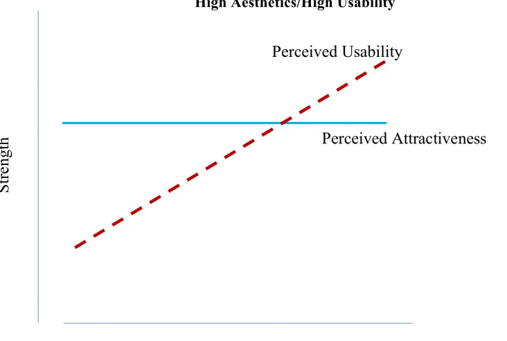
High Aesthetics/High Usability
Figure 1. Model depicting the hypothesized relationship between attractiveness and usability when attractiveness and usability are high.
Low Aesthetics/High Usability
Experience with Interface
S
tr
engt
h
Perceived Usability
Perceived Attractiveness Experience with Interface
S
tr
engt
h
Perceived Usability
Figure 2. Model depicting the hypothesized relationship between attractiveness and usability when attractiveness is low, but usability is high.
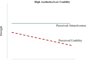
High Aesthetics/Low Usability
Figure 3. Model depicting the hypothesized relationship between attractiveness and usability when attractiveness is high, but usability is low.
Experience with Interface
S
tr
engt
h Perceived Attractiveness
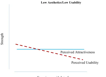
Low Aesthetics/Low Usability
Figure 4. Model depicting the hypothesized relationship between attractiveness and usability when attractiveness and usability are both low.
General Method
The two main elements of the study were: (1) development of the website/patient
portal and (2) assessing the relation between aesthetics and usability. The study used a
between-subjects design with 4 observations. The goal of the study was to determine
whether perceptions of usability and aesthetics changed over time as experience with a
system increased. Participants performed three tasks on the system on four occasions. To
determine users’ judgments of aesthetics and usability after their experience with the system,
a posttest of users’ judgments of aesthetics and usability was administered immediately after
completion of the three tasks on each of the four occasions. Experience with Interface
S
tr
engt
h
Experiment 1: Development of the stimuli: websites/patient portals
In this study, users performed tasks on a website. The website was the electronic
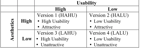
patient portal for a fictitious medical practice on which two variables were manipulated:
aesthetics at two levels (high and low), and usability at two levels (high and low). These
manipulations yielded 4 versions of the website/patient portal as detailed in Table 1. The
websites were created in Axure RP wireframe and prototyping software.
Table 1 Aesthetics and Usability were manipulated on a website resulting in four versions of the website
Usability
High Low
Ae
st
h
et
ic
s High Version 1 (HAHU) • High Usability • Attractive
Version 2 (HALU)
• Low Usability • Attractive
Low •Version 3 (LAHU) High Usability • Unattractive
Version 4 (LALU)
• Low Usability • Unattractive
Experiment 1A. Aesthetics
Method
A review of websites dedicated to aesthetic design principles yielded several
principles that are commonly used to influence the attractiveness of websites. We created
high and low aesthetics versions of the patient portals/websites by manipulating on-screen
elements according to those principles. Among the principles observed were:
• Color is more attractive than black and white
• Graphics should be used in place of text where possible
• Wherever possible, photos of people should feature attractive people who are
smiling
• Less cluttered is more attractive than cluttered
• Unifying graphic elements, such as tool lines and borders, can be used to
make a website more attractive
Materials
To confirm that our manipulation of aesthetics factors had indeed produced the
desired difference in perceived aesthetics between the high (HAHU, HALU) and low
(LAHU, LALU) aesthetics versions of the websites, we used the survey software Qualtrics to
create a survey that presented three images from each of the four versions of the website.
The images were screenshots of the actual websites. One representative image from each of
the three tasks was chosen from each of the four versions of the website for a total of twelve
images (1 image per task x 3 tasks per website x 4 versions of the website = 12 images).
Additionally, a practice block of three images was created so that participants could become
familiar with the procedure and format of the experiment. The practice block contained three
images that were unrelated to the websites and bore no resemblance to screenshots from
them.
Participants
We recruited 50 online research participants through the Internet-based recruiting site
Amazon Mechanical Turk. Because this research made no hypothetical claim regarding the
influence of age or gender on users’ perceptions of aesthetics or usability, collection of such
Procedure
After signing online consent forms, participants viewed the practice block of three
images. The images were presented in random order for five seconds per image. After the
presentation of the three-image practice block, participants were asked the following five
questions about the images they had just viewed:
1) Thinking about the 3 images you just saw, please rate the overall
attractiveness of the images on a scale of 0 to 10, with 0 meaning not at all attractive and 10 meaning extremely attractive.
2) Thinking about the 3 images you just saw, please rate how pleasing to the eye the images were on a scale of 0 to 10, with 0 meaning not at all pleasing to the eye and 10 meaning extremely pleasing to the eye.
3) Thinking about the 3 images you just saw, please rate how pretty were the images on a scale of 0 to 10, with 0 meaning not at all pretty and 10 meaning extremely pretty.
4) Thinking about the 3 images you just saw, please rate how attractive the colors were on a scale of 0 to 10, with 0 meaning that the colors were not at all attractive and 10 meaning that the colors were extremely attractive.
5) Thinking about the 3 images you just saw, please rate how much pleasure you felt looking at the images, with 0 meaning that you felt no pleasure at all and 10 meaning that you felt extreme pleasure.
Participants then viewed the twelve images of the websites presented in blocks of
three for each version of the website. The blocks were presented in random order. The
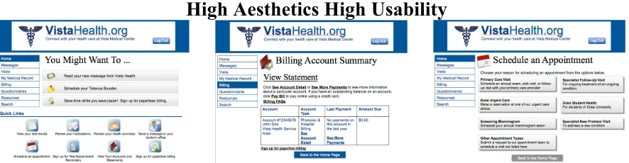
three-image blocks are shown in Figures 5-8. As explained in Table 1, the High Aesthetic
and Low Aesthetic versions of the website vary only by aesthetics and are otherwise
High Aesthetics High Usability
Figure 5 Three-image block of High Aesthetics High Usability (HAHU) screenshots that were shown to participants.
Low Aesthetics High Usability
Figure 6 Three-image block of Low Aesthetics High Usability (LAHU) screenshots that were shown to participants.
High Aesthetics Low Usability
Figure 7 Three-image block of High Aesthetics High Usability (HALU) screenshots that were shown to participants.
Low Aesthetics Low Usability
After viewing each three-image block, participants were asked the same set of
questions that they had answered after the practice block. Participants answered the
questions and were then shown the next block of three images, presented in random order,
and the process was repeated until participants had rated the aesthetics of the images from all
four websites.
Results and Discussion
Matched samples t-Tests comparing the ratings of the images from the high aesthetics
(HAHU, HALU) and low aesthetics (LAHU, LALU) versions of the website indicated that,
on all five questions, users judged the high aesthetics versions to be more attractive than the
low aesthetics versions. Results of the t-Tests are provided in Table 2.
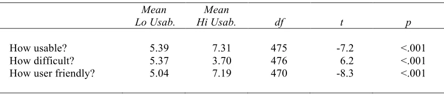
Table 2 Results of matched samples t-Tests comparing users’ ratings of the high (HAHU,HALU) and low (LAHU, LALU) aesthetics versions of the websites
Mean Lo Aesth.
Mean
Hi Aesth. df t p
Overall Attractiveness? 2.24 5.26 99 12.96 <.001 Pleasing to Eye? 2.31 5.38 99 12.49 <.001 Pretty? 1.61 4.46 99 11.61 <.001 Attractive colors? 1.60 5.70 99 14.89 <.001 How much pleasure? 1.60 4.38 99 11.19 <.001
Experiment 1B. Usability
Method
A review of Nielsen and Loranger (2006) and several websites dedicated to website
usability yielded common techniques used to influence the usability of websites. We
portals/websites by manipulating elements according to those techniques and principles.
Among the principles observed were that, on the low usability versions,
• Tasks were deliberately made “deep” rather than “shallow” so that navigation
to correct target page required more clicks and screen views.
• Shades of color were too similar in areas that needed to be visually distinct, so
that distinctions were not clear
• Pages were organized in columnar format so that data had to be requested in
one column but retrieved in another
• Fonts in main body of web site, and in general, was too small
• Bar indicating location in navigation (VistaHealth>Home) was different color
as the selected “Home” in the navigation bar—had those colors matched, it
would have been a clue that user is in Home.
• Navigation bar labels have unclear meaning, for example, in this task, users
must find results of test for fasting glucose level. It’s under Clinical>Medical
Records, which doesn’t necessarily indicate to the user that that’s where a lab
test result would be.
• The horizontal gray bar that indicates where the user is in the site has a black
font on a dark gray background making it very difficult to read
Materials
To confirm that our manipulations of usability factors produced the desired
differences in perceived usability, we used the online, remote usability testing tool, Loop11,
Participants
We recruited 40 online research participants for each version of the website using the
online labor system Amazon Mechanical Turk. Because this research made no hypothetical
claim regarding the influence of age or gender on users’ perceptions of aesthetics or
usability, collection of such demographic data was not justified and participants were not
screened by age or gender. After data was collected, participant ID numbers were compared
to participants ID numbers from Experiment 1A, and data for participants who had
participated in the earlier experiment were eliminated. The final number of participants who
provided usability ratings for patient portal website are summarized in Table 3.
Table 3 Number of participants in Experiment 1B by website version
Website Version n
HAHU 39
HALU 37
LAHU 38
LALU 40
Total 154
Procedure
Participants performed three tasks on the website version to which they were
assigned. For example, participants who were assigned to the LALU version of the website
performed three tasks on that version, and that version only. Those assigned to the HAHU,
HALU, and LAHU versions performed the three tasks on those versions. The three tasks
were:
1. Find non-fasting glucose level for patient Jane Doe
2. Find how much patient Jane Doe owes
After completing the three tasks, participants were asked the following questions:
1. How usable was the website on which you just performed the task?
2. How difficult to use was the website on which you just performed the task?
3. How user friendly was the website on which you just performed the task?
Participants were asked to answer the three questions on a 1-10 scale, with 1 meaning
low and 10 meaning high.
Results and Discussion
Users judged the high usability versions (HAHU, LAHU) of the website more usable,
more user friendly, and less difficult to use than the low usability versions (HALU, LALU).
The mean ratings for the three questions are summarized in Table 4. The ratings were also
compared using independent samples t-Tests. The analyses confirmed that users’ perceptions
of the usability of the websites were significantly higher for the high usability versions than
for the low usability versions. Results of the two-sample t-Tests are also found in Table 4.
Table 4 Results of two-sample t-Tests comparing users’ ratings of the high (HAHU,LAHU) and low (HALU, LALU) usability versions of the websites after completing the three tasks
Mean Lo Usab.
Mean
Hi Usab. df t p
How usable? 5.39 7.31 475 -7.2 <.001 How difficult? 5.37 3.70 476 6.2 <.001 How user friendly? 5.04 7.19 470 -8.3 <.001
Additionally, performance data in the form of Success/Fail/Abandon rates on each
task were collected and chi square tests were performed on the data. The differences in the
Success/Fail/Abandon rates on the high usability (HAHU, LAHU) and low usability (HALU,
p<.05). However the differences in Success/Fail/Abandon rates on the high aesthetic (HAHU, HALU) and low aesthetic (LAHU, LALU) versions of the websites were not
significant (X2(2, N=640) = .007, p>.05). These chi square results confirmed that our manipulation of the usability of the websites had affected not only users’ perceptions of the
usability of the websites as demonstrated by the earlier t-Tests, but user performance as well.
Experiment 2: Assessing the Relation Between Aesthetics and Usability
Method
For this study, participants were randomly assigned to one of the four versions of the
website/patient portal. On four consecutive days, participants performed three tasks on the
version of the website to which they were assigned. After each task, participants rated the
website on measures of usability and aesthetics.
Participants
For each version of the website (Table 1), participants were recruited on the
Internet-based recruiting site Amazon Mechanical Turk (e.g., Paolacci, Chandler, & Ipeirotis, 2010;
Goodman, Cryder, & Cheema, 2013). The Mechanical Turk add-on, TurkPrime was used to
perform all actions on Mechanical Turk. TurkPrime is an Internet-based interface that
integrates with Mechanical Turk and offers researchers additional functionality, including the
ability to include or exclude participants on the basis of previous participation (Litman &
Abberbock, 2017). TurkPrime’s built-in screening tools were used to limit participants to
those only from the United States and to those that had a hit approval rate of at least 95%.
Because this research made no hypothetical claim regarding the influence of age or gender on
justified and participants were not screened by age or gender. Participants were paid $0.55
for their participation. The HIT description also informed participants that the study was
longitudinal, and that the HIT would be made available again on the morning of the next
three consecutive days, and that they would again be compensated $0.55 for each day they
completed.
As is typical for longitudinal studies, some participants failed to participate in
subsequent days/observations. Data for those participants were not included in the study.
Additionally, connectivity and other technical issues resulted in incomplete data for some
participants, and their data were also excluded. Only data sets that were complete for all four
observations were used in the study, and the number of participants who provided complete
data after attrition and technical issues are shown, organized by website, in Table 3. We
therefore made the decision to conduct another round of data collection to increase the
number of participants for each website. Round 2, which ran from October 3-6, 2017, was
conducted exactly like Round 1, except that TurkPrime was used to exclude all participants
from Round 1. Additionally, due to cost considerations, the number of participants was
limited to 20 participants per version in Round 2. Again, a combination of technical issues
and participants’ attrition resulted in excluded data for several participants. The final count
of participants from whom complete data was collected in the two rounds is shown in
Table 5.
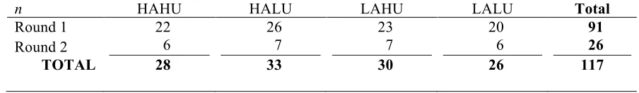
Table 5 Number of participants (n) from each website for whom complete data was available after four observations
n HAHU HALU LAHU LALU Total
Round 1 22 26 23 20 91
Round 2 6 7 7 6 26
The attrition of participants from Observations 1-4 sparked our curiosity about
differences between the cohort of participants who completed all four days of the study
versus the cohort of participants who did not complete all four days. To examine whether the
cohorts differed, we conducting independent samples t-Tests of results from Day 1 only for
participants who completed all four days of the study versus those who did not complete all
four days. t-Tests conducted on performance measures included overall average time taken
to complete all three tasks and overall average number of page views to complete all tasks.
t-Tests conducted on users’ perceptions included SUS ratings, VisAWI ratings, CA ratings,
and CE ratings. Results of the t-Tests are shown in Table 6. One participant had missing
data for the overall average time taken measure and was not included in the t-Tests on
performance measures. As a result, n for Completer performance measures was 116, while it
was 117 for Completer measures of user perceptions. We also conducted chi square tests
comparing Completers’ and Non-Completers’ Success/Fail/Abandon rates. Completers
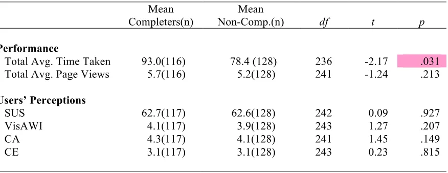
Table 6 Results of two-sample t-Tests comparing Day 1 data of participants who completed all four days of the study (Completer) versus those who did not (Non-Completer)
Mean Completers(n)
Mean
Non-Comp.(n) df t p
Performance
Total Avg. Time Taken 93.0(116) 78.4 (128) 236 -2.17 .031 Total Avg. Page Views 5.7(116) 5.2(128) 241 -1.24 .213
Users’ Perceptions
SUS 62.7(117) 62.6(128) 242 0.09 .927 VisAWI 4.1(117) 3.9(128) 243 1.27 .207 CA 4.3(117) 4.1(128) 241 1.45 .149 CE 3.1(117) 3.1(128) 243 0.23 .815
The comparison of results between Completers and Non-Completers show that
participants who completed all four days of the study took more total average time on the
three tasks than those who did not complete all four days. Additionally, the results of the
chi-square show that the Completer and Non-Completer cohorts differed on the
Success/Fail/Abandon measure. One possible explanation for these results could have been
that participants who completed all four days of the study were more conscientious than
participants who dropped out of the study. In other words, it was possible that
Non-Completers were more prone to spend less time on a task before abandoning it. In that case,
Non-Completers would be expected to have higher a higher abandon rate for Day 1 than
Completers. However, an examination of the data showed that this was not the case. The
abandon rates for Completers on Day 1 was 18% while the abandon rates for
Non-Completers was 13%. Thus, the data show that Non-Completers and Non-Non-Completers are
different (drawn from different populations), so inferences from the data cannot be applied to
who will complete the entire four days of the task and who will not on the basis of first day
performance.
Materials
Measure of usability. Because of its widespread use and acceptance as a measure of usability (Brooke, 1996), this study employed the SUS (Appendix 1) as the principle measure
of usability. Participants were asked to perform three tasks on the website/patient portal, and
to complete the SUS after each task.
Measure of aesthetics. This study employed the classical and expressive instrument developed by Lavie and Tractinsky (Lavie and Tractinsky, 2003) and the short version of the
Visual Aesthetics of Website Inventory (VisAWI-S) tool developed by Moshagen and
Thielsch (Moshagen and Thielsch, 2010, 2013). These instruments are provided in
Appendices 2 and 3.
Tasks. Participants were asked to perform three tasks on the website/patient portal on four successive days/occasions/observations. The three tasks were ecologically valid in that
they were representative of typical tasks that patients might perform on patient portals of
real-world medical practices. The three tasks were:
1. Find non-fasting glucose level
2. Determine what amount, if any, that patient still owed
3. Schedule an appointment
Procedure
Participants were asked to perform the three tasks on the website/patient portal. After
completion of the tasks, in addition to completing the SUS, participants completed Lavie and
version of Moshagen and Thielsch’s (2013) VisAWI-S tool. To measure changes in
perceived usability and aesthetics over time, the same groups of participants performed the
three tasks on the same version of the patient portal on four successive
days/occasions/observations, completing the measurements of usability and aesthetics after
each task on all four occasions.
Results and Discussion
Users’ Performance
We examined changes in users’ performance on three usability-related variables (1)
overall average time spent on tasks (response time), (2) overall average page views on tasks,
and (3) Success/Fail/Abandon rates. The performance measures for each version of the
HAHU_Time Taken
HALU_Time Taken
LAHU_Time Taken
LALU_Time Taken
Figure 9 The average amount of time that users took to complete the three tasks for each version of the website over four observations.
82 59 39 41 0 20 40 60 80 100 120
Obs 1 Obs 2 Obs 3 Obs 4
Av er ag e Ti m e in s ec on ds 103 92 64 55 0 20 40 60 80 100 120
Obs 1 Obs 2 Obs 3 Obs 4
Av er ag e Ti m e in s ec on ds 87 57 41 31 0 20 40 60 80 100 120
Obs 1 Obs 2 Obs 3 Obs 4
Av er ag e Ti m e in s ec on ds 97
65 55
50 0 20 40 60 80 100 120
Obs 1 Obs 2 Obs 3 Obs 4
HAHU_Page Views
HALU_ Page Views
LAHU_ Page Views
LALU_ Page Views
Figure 10 The average amount of page views that users took to complete all three tasks for each version of the website over four observations.
5
4 4 4
0 2 4 6 8 10 12
Obs 1 Obs 2 Obs 3 Obs 4
Av er ag e Pa ge V ie w s
6 6
5 5
0 2 4 6 8 10 12
Obs 1 Obs 2 Obs 3 Obs 4
Av er ag e Pa ge V ie w s 5
4 4 4
0 2 4 6 8 10 12
Obs 1 Obs 2 Obs 3 Obs 4
Av er ag e Pa ge V ie w s 6
5 5 5
0 2 4 6 8 10 12
Obs 1 Obs 2 Obs 3 Obs 4
HAHU_Success/Fail/Abandon
HALU_Success/Fail/Abandon
LAHU_Success/Fail/Abandon
LALU_Success/Fail/Abandon
Figure 11 Users’ success rates on the three tasks for each version of the website over four observations.
As part of our examination of performance changes, we first performed correlations
to analyze the relationships between the three usability-related variables (1) overall average
time spent on tasks (response time), (2) overall average page views on tasks, and (3) overall
34 36 35
43
33 36 38 32 17
12 11 9 0 10 20 30 40 50 60 70 80
Obs 1 Obs 2 Obs 3 Obs 4
Ta sk Re su lt_H AH U Success Fail Abandon 52 68
74 75
11 12 11 14 36 19 14 10 0 10 20 30 40 50 60 70 80
Obs 1 Obs 2 Obs 3 Obs 4
Ta sk Re su lt_H AL U Fail Success Abandon
41 42 44 40
39 42 40 39
10
6 6 11
0 10 20 30 40 50 60 70 80
Obs 1 Obs 2 Obs 3 Obs 4
Ta sk Re su lt_L AH U Abandon Success Fail
50 50 55 55
8 10 11 10 20 18
12 13
0 10 20 30 40 50 60 70 80
Obs 1 Obs 2 Obs 3 Obs 4
average SUS scores. For two of the participants, we did not have complete data for the
overall time spent on tasks, and we therefore excluded those two participants from the
correlations. The correlations showed that response time was unrelated to SUS (r=-.10, p=.30), as was page views (r=-.06, p=.50). However, as one might expect, more page views was related to longer response times (r=.59, p<.001).
Also as part of our examination of performance changes, we performed a chi square
test to determine whether the observed performance changes on the Success/Fail/Abandon
measure were affected by usability and aesthetics. The manipulations of usability had a
significant effect on overall Success/Fail/Abandon rates (X2(2, N=1872) = 99.3, p<.001), whereas the manipulation of aesthetics did not (X2(2, N=1872) = 5.1, p>.05). This result was similar to the chi square test in Experiment 1, in which there was a significant effect of
usability on performance, but not of aesthetics on performance. However, that Experiment 1
result occurred for a one-time, single observation, whereas, the results reported here for the
main experiment included all four observations. For this reason, we decided to conduct a chi
square test on the Success/Fail/Abandon measure using just the data for Observation 1 of
Experiment 2. Our rationale for performing this analysis was that Observation 1 of
Experiment 2 was similar to Experiment 1 in that Experiment 1 was the users’ first
experience with the website. In the earlier Experiment 1 result, manipulating usability
affected the success/fail/abandon rates, whereas manipulating aesthetics did not. In
Experiment 2, however, the chi square test that we performed on Observation 1 results only
showed that both usability and aesthetics manipulations affected success/fail/abandon rates
This suggests that, at least in their initial interaction with the website, the manipulations of
both aesthetics and usability had some effect on users’ performance.
Thus far, these analyses showed changes in users’ performance. The chi square tests,
while showing that usability affected performance, yielded ambiguous results on the role of
aesthetics on performance. Although the earlier Experiment 1 chi square tests suggested that
aesthetics did not play a role in users’ performance, the chi square tests in Experiment 2
suggested that aesthetics influenced performance on the initial experience with the website.
We also performed analyses of users’ success rate on the three tasks based on what
appeared to be a discernible pattern. Figure 11 showing users’ success rates on the three
tasks for each version of the website/patient portal over four observations. The graphs
suggest that the success rates differed by version. Not surprisingly, correct completion
(Success) rates are higher for the HU versions than the LU versions. Additionally, in all four
versions, there was a gap between fail and abandon rates. On the HAHU and LAHU
versions, success rates are roughly equal to Fail rates and are fairly constant, but on the
HALU and LALU versions, success rates are lower than fail rates and success rates decrease
over successive observations. Furthermore, participants’ success rates decreased over
observations on the low usability versions, even as SUS scores (Figure 12) increased. To
examine the effect of trial/observation on users’ success rates, we conducted a single-factor
ANOVA with trial/observation as the predictor variable and success rate as the criterion
variable. Success rates did not differ significantly as a function of trial observation, F(3, 464,) = .29, p = .84, η2 = .002. However, a single-factor ANOVA with the version of the website/patient portal as the predictor variable and success rate as the criterion variable
Bonferroni and Tukey HSD comparisons revealed that users’ success rates were significantly
higher on the high usability versions of the website/patient portal (HAHU: M = 1.24, LAHU, M = 1.33) than on the low usability versions (HALU: M = .36, LALU, M = .37).
Users’ Perceptions of Usability and Aesthetics
We also examined changes in users’ perception of usability and aesthetics of each
version of the website. The average ratings of users’ perceptions of usability and aesthetics
for each website are shown in Figures 12-15. Users’ perceptions of usability rose slightly
HAHU_SUS
HALU_SUS
LAHU_SUS
LALU_SUS
Figure 12 Users’ average rating of usability for each version of the website over four observations as measured by System Usability Score (SUS).
67 71 72 71
0 10 20 30 40 50 60 70 80
Obs 1 Obs 2 Obs 3 Obs 4
Av er ag e SU S_H AH U
59 61 66
70 0 10 20 30 40 50 60 70 80
Obs 1 Obs 2 Obs 3 Obs 4
Av er ag e SU S_H AL U
69 71 74 74
0 10 20 30 40 50 60 70 80
Obs 1 Obs 2 Obs 3 Obs 4
Av er ag e SU S_L AH
U 55 57 57
60 0 10 20 30 40 50 60 70 80
Obs 1 Obs 2 Obs 3 Obs 4
HAHU_VisAWI
HALU_VisAWI
LAHU_ VisAWI
LALU_ VisAWI
Figure 13 Users’ average rating of aesthetics for each version of the website over four observations as measured by Moshagen and Thielsch’s (2013) Visual Aesthetics of Website Inventory (VisAWI-S).
5 5 5
4 0 1 2 3 4 5 6 7 8
Obs 1 Obs 2 Obs 3 Obs 4
Av er ag e Vi sA W I_H AH U
5 5 5 5
0 1 2 3 4 5 6 7 8
Obs 1 Obs 2 Obs 3 Obs 4
Av er ag e Vi sA W I_H AL U
4 4 4 4
0 1 2 3 4 5 6 7 8
Obs 1 Obs 2 Obs 3 Obs 4
Av er ag e Vi sA W I_L AH U
3 3
4 4
0 1 2 3 4 5 6 7 8
Obs 1 Obs 2 Obs 3 Obs 4
HAHU_CA
HALU_CA
LAHU_CA
LALU_CA
Figure 14 Users’ average rating of aesthetics for each version of the website over four observations as measured by Lavie and Tractinsky’s (2003) Classical Instrument (CA).
5 5 5 5
0 1 2 3 4 5 6 7 8
Obs 1 Obs 2 Obs 3 Obs 4
A ve ra ge C A_H AH
U 5 5
4 5 0 1 2 3 4 5 6 7 8
Obs 1 Obs 2 Obs 3 Obs 4
A ve ra ge C A_H AL U
4 4 4 4
0 1 2 3 4 5 6 7 8
Obs 1 Obs 2 Obs 3 Obs 4
A ve ra ge C A_L AH U
4 4 4 4
0 1 2 3 4 5 6 7 8
Obs 1 Obs 2 Obs 3 Obs 4