ABSTRACT
KOCHERLAKOTA, SARAT MOHAN. Perception Driven Search Strategies For Effective Multi-Dimensional Visualization. (Under the direction of Christopher G. Healey)
Tracking and analysing large amounts of information in many different application areas is a critical problem. One approach to address this problem is the use of multi-dimensional visualizations to represent large datasets. Visualizations can be constructed effectively by the use of visual features and properties like color and texture. Our objective is to construct multi-dimensional visualizations using perceptually salient visual features which support rapid visual analysis and exploration of large datasets. We use a visualization system called ViA use to construct effective visualizations.
We present a search technique incorporated in ViA, that finds effective attribute-feature mappings to represent multi-dimensional datasets in a perceptually salient fashion. ViA eval-uates the salience of attribute-feature mappings using evaluation engines. These evaluation engines also suggest hints that recommend how the mapping can be improved perceptually. The search technique we developed uses dataset properties and the hints generated by the eval-uation engines to quickly and efficiently produce perceptually salient mappings.
Perception Driven Search Strategies
For Effective Multi-Dimensional Visualization
by
SARAT M. KOCHERLAKOTA
A thesis submitted to the Graduate Faculty of
North Carolina State University in partial fulfillment of the
requirements for the Degree of
Master of Science
Department of COMPUTER SCIENCE
Raleigh, North Carolina 2002
APPROVED BY:
BIOGRAPHY
ACKNOWLEDGEMENTS
In life, there are certain moments that one hopes to be prepared for. Yet, when the moment does actually arrive, it completely overwhelms you. One such moment is right now, when I attempt to acknowledge the contributions and influences that have brought me thus far.
This thesis would not have been completed without the guidance and motivation I received at every stage from Dr. Christopher Healey. Throughout the years that I have been in the Masters program he has always demonstrated great concern and committment towards my progress, and indeed to the progress of all his students. I probably will never be able to thank him enough for all that he has done for me.
Dr. Thomas Honeycutt has been a strong influence in my life in the last couple of years. He opened doors for me with his wonderful intuitive ability to initiate the process of self-discovery in others. His timely insight and opinions have helped me tide many moments of doubt. I cannot thank him enough.
Dr. Robert St. Amant provided me with invaluable support especially in my early days of my Masters program when I was still new at NCState. I owe him much for all that he has done for me.
I could not have also been wherever I am pursuing whatever it is that I seek without the blessings and support of my parents, Mohan and Girija, my sister Mamata, her husband Prab-hakar and their son (my nephew) Varun. I owe them more than I can possibly imagine.
Pranav, Shaibal and Brijesh, to name just a few. Without their contributions and support, I would not have gotten very far.
My relatives here in the United States, innumerable as they are, have helped me tide many moments of loneliness with their love and support. In particular, I would like to thank my relatives here in North Carolina including my uncle and aunt, Prasad and Kumari and their children, Pradeep and Deepti for their love and affection, and for providing me a home away from home.
Brent, Laura, Jason, Jiae, Mark, Amit, Vivek, Mike Romeo, Alex, Micah, Nathaniel, Juan and several others, have always encouraged and supported me through many tough moments in these past few years and have given me many moments of happiness. Subhayu, Ravi, Rahul, Rohit Badlaney, Raoul, Rohit Sharma and so many others, have been so very generous to me, and their friendship and support has made my time at NCState memorable.
I cannot thank Shaileja Chopra enough for having supported and encouraged me all these years. She has lent purpose to my life, and made it more meaningful. I am truly in her debt.
I am also deeply indebted to the city of Bombay for giving me an identity, and to North Carolina State University for being an institution that I feel proud to be a part of.
Contents
List of Figures vii
List of Tables viii
1 Introduction 1
1.1 Need For Visualization . . . 2
1.2 Scientific Visualization . . . 3
1.3 Need For Perceptual Visualization . . . 4
1.4 Multi-dimensional Dataset Visualization . . . 6
1.5 Problems In Visualization . . . 6
1.6 Flexibility . . . 8
1.7 Research Goals . . . 8
2 Perceptual Visualization 10 2.1 Preattentive Vision . . . 10
2.1.1 Color . . . 13
2.1.2 Color Selection . . . 16
2.1.2.1 CIE LUV . . . 16
2.1.3 Texture . . . 19
3 Related Works 26 3.1 A Presentation Tool (APT) . . . 27
3.1.1 Expressiveness And Effectiveness . . . 27
3.2 AutoVisual . . . 29
3.2.1 Worlds Within Worlds . . . 30
3.3 VISTA . . . 32
3.4 Automation . . . 35
3.4.1 Cataloging Objects And Tasks . . . 35
3.4.2 Classifying Visual Knowledge . . . 36
3.5 Natural Scene Paradigm . . . 38
3.6 Flow Visualization . . . 40
3.7 PRAVDA . . . 41
3.9 Search Techniques . . . 46
3.9.1 Planning . . . 47
3.9.2 Mixed-Initiative Search . . . 48
4 ViA 50 4.1 General Architecture . . . 50
4.2 ViA Architecture . . . 52
4.3 Evaluation Engines . . . 53
4.3.1 Data-Feature Mappings . . . 53
4.3.2 Evaluation Process . . . 54
5 Search Engine 57 5.1 Hints . . . 58
5.1.1 Hint Structure . . . 59
5.1.2 Perceptual Guidelines . . . 62
5.1.2.1 Discretize . . . 62
5.1.2.2 Feature Swap . . . 63
5.1.2.3 Importance Weight Modify . . . 64
5.1.2.4 Task Adjust / Task Remove . . . 64
5.2 Hint Chains . . . 65
5.2.1 Hint Chain Generation . . . 66
5.2.2 Conflicting Hints . . . 67
5.2.3 Processing Hint Chains . . . 68
5.3 Search Termination . . . 69
6 Practical Applications 71 6.1 Weather Dataset Visualization . . . 72
6.1.1 Weather Dataset Mappings . . . 73
6.2 E-Commerce Visualization . . . 87
6.2.1 E-Commerce Mappings . . . 90
7 Conclusions and Future Study 99
List of Figures
1.1 Multidimensional Visualization Example . . . 5
2.1 Preattentive Processing Example . . . 12
2.2 Streamline Visualization . . . 21
2.3 Diffusion Tensor Visualization . . . 22
2.4 Pexel Visualization . . . 24
3.1 AutoVisual Visualization . . . 29
3.2 VISTA Compositions . . . 34
3.3 Examples of Pexels . . . 45
4.1 ViA Architecture . . . 52
6.1 Top 25 Mapping Histogram . . . 81
6.2 Weather Dataset MappingM 1 . . . 84
6.3 Weather Dataset MappingM 4 . . . 85
6.4 Weather Dataset MappingM 5 . . . 86
6.5 E-Commerce Visualization . . . 93
List of Tables
3.1 Object Classes . . . 36
5.1 Hint Classes and Properties . . . 61
6.1 Weather Dataset Constraints . . . 73
Chapter 1
Introduction
Visualization is the area of science dealing with generation and presentation of information in effective and easy-to-understand representations. Various definitions exist for visualization. The Oxford English Dictionary describes it as “making visible, especially to one’s mind, things not visible to the eye.” The Webster’s Dictionary describes visualization as “forming a mental image of something not present to the sight, an abstraction, etc.”
With respect to computer graphics, one of the more specific definitions describes it as “the use of computer imaging technology as a tool for comprehending data obtained by simulation or physical measurement.” [HM90] Another definition describes it as “techniques that allow scientists and engineers to extract knowledge from the results of simulations and computa-tions.”
analysis of multi-dimensional or multi-variate datasets. The perception driven nature of ViA allows multiple layers of data to be presented simultaneously within a single image, without undermining the user’s ability to easily comprehend the information in the representation.
1.1
Need For Visualization
Although small, self-contained collections of data in its raw form of numbers and text is per-haps readable to most people, the vast amount of information being generated in various areas, makes it imperative that we devise some ways to track and comprehend it. Experts in these domains may be knowledgeable about the information they need to analyze and explore. Yet, absorbing and comprehending vast amounts of information, especially in situations where time is a critical constraint, is an enormous and difficult task. For instance, in medical scenarios crit-ical life-saving decisions by doctors and surgeons need to be made from information generated by medical scanning devices and systems. Another example is meteorological data that con-tains critical information relating to tracking potentially life-threatening storms and cyclones. In such scenarios, presenting information effectively aids in making an informed decision in a short period of time.
visualization is to construct such representations that convey large amounts of information to humans more easily than plain words and numbers.
1.2
Scientific Visualization
As with our definition of visualization, scientific visualization is the representation of scientific collections of numbers, strings, and datasets using one or more visual features (e.g. color, tex-ture or motion). Images constructed using visual featex-tures allow visual exploration and analysis to be conducted.
Imagine a dataset D = fe 1
;::;e n
g containing n sample points, or data elements, ei. A multidimensional dataset represents two or more data attributes, A = fA
1 ;:::;A
m
g, m > 1. The data elements encode values for each attribute: e
i = fa
i;1 ;:::;a
i;m g, a
i;j 2 A
j. A data-feature mapping converts the raw data into images that can be presented to a viewer. Such a mapping is denoted byM = (V;), whereV = fV
1 ;:::;V
m
gis a set of mvisual featuresV j selected to represent each attributeA
j, and
j : A
j ! V
j denotes the mapping of the domain ofA
j to the range of displayable values in V
1.3
Need For Perceptual Visualization
Since scientific visualization deals with generating a mapping between datasets and visual features thus presenting information in a form understandable to users, one would think it necessary to find answers to some important questions:
How does the human vision system perceive visual information?
Are there visual representations or techniques that are easier to interpret than others?
How much visual information can be presented in a single image, before it becomes difficult to absorb any additional data?
Finding answers to these questions allows us not just to better understand human perception, but also to develop strategies to incorporate these findings in techniques used for visualization. Perceptual visualization is thus a broad technique that harnesses aspects of human vision in order to generate effective representations of data.
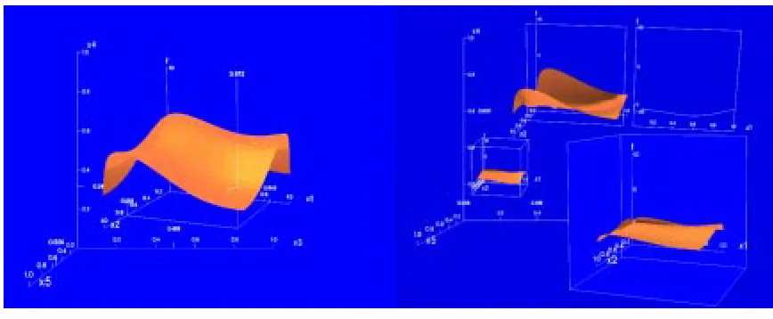
Figure 1.1: A visualization of a weather dataset using perceptual texture elements with temperature!color, wind
speed!coverage, pressure!density, and precipitation!orientation
increasing pressure. Finally, orientation represents precipitation; vertical strokes for little or no rainfall to horizontal strokes for high rainfall.
discrete values, on the other hand, is best displayed with color. Understanding rules of percep-tion allows us to choose appropriate mappings based on the properties of the datasets, and the analysis tasks the user wants to perform.
1.4
Multi-dimensional Dataset Visualization
Multi-dimensional visualization is the simultaneous representation of multiple attributes using appropriate visual features, within a single image. Such a representation attempts to present large sets of information within a single image to the user, thereby reducing the time and space needed to display the information when compared to representing each attribute in separate images. Representing multiple attributes simultaneously can also aid in understanding the relationships that might exist between different attributes.
However, representing information in this multi-dimensional manner raises the question: how much information within a single image, is too much information? It is essential that the representation of multiple attributes in a single image not exceed the user’s capacity to comprehend the image and its underlying information.
1.5
Problems In Visualization
What type of data set is it?
Are the data attributes discrete or continuous?
Do the attributes have high or low spatial frequency?
What kind of visual feature would best suit each attribute for representation?
In addition to the above questions, the presence of a user during multi-dimensional visualiza-tion raises its own issues [BCE+
92]:
What relative importance does the viewer attach to each attribute to be displayed?
Do the visual features being represented simultaneously interfere visually with each other?
How many attributes can be simultaneously displayed within the same image?
1.6
Flexibility
Many studies and research in scientific visualization seem to focus largely on the use of visual-ization in domain specific areas. This means that one tries to find the best form of visualvisual-ization suited to a specific visualization problem. Moreover, these efforts are sometimes ad-hoc in their methods for building optimal visualizations. There is no guarantee that the techniques can be applied to other problem domains, even if these domains are similar in nature to the original dataset.
In order to be a domain independent tool (at least to some extent), a visualization system would need some kind of processing capability to evaluate a mapping’s effectiveness for a given dataset and associated analysis tasks. Formalizing perceptual characteristics into rules and guidelines to direct the visualization process might allow us to provide such an evaluation. The need to search for a suitable mapping from a set of all possible mappings using such guidelines and rules becomes a critical task in this type of system.
1.7
Research Goals
per-ceptual guidelines, analysis needs, and dataset characteristic directing the search process. The research goals of this thesis:
1. Identify the appropriate information about a dataset in the user’s exploration and analysis needs to constrain a search which satisfy these initial visualization goals.
2. Supplement the evaluation process with additional information that can be used to decide how to improve weak components in the data-feature mapping.
3. Use evaluation results to rapidly and effectively identify high-quality mappings based on the dataset’s properties and the user’s analysis requirements.
In summary, we incorporate and study appropriate search strategies within the visualization tool to return a set of optimal data-feature mappings from a set of all possible mappings for a generalized dataset and analysis tasks, in an efficient and effective manner.
Chapter 2
Perceptual Visualization
The use of perceptual guidelines for designing displaying multi-dimensional datasets is aimed at producing perceptually salient images or displays to represent complex information spaces in ways that our human visual system can easily comprehend. Hence, rapid, accurate and effortless visual exploration of the representations are crucial to the effectiveness of a visual-ization system [HE99]. In order to be visually effective in this way, research in visualvisual-ization has utilized psychophysical studies to understand and harness human visual attention.
2.1
Preattentive Vision
with attention focusing on one task at a time.
By contrast “automatic processing” or “preattentive processing” is a fast, unconscious man-ner of perception. Capacity to assimilate information is independent of the load on vision and is thus very high, attention is less critical and many tasks are done in parallel. A simple ex-ample of this distinction is the use of controlled processing to perceive textual information, as compared to automatic processing to perceive basic color and texture patterns.
The dual abilities of human vision to carry out focused processing as well as to complete automatic tasks are characteristics that can be exploited in order to visualize information. One of the studies on preattentive vision conducted by Triesman [Tri85], focused on identifying the characteristics of preattentive vision in humans. A result of the study found that the hu-man vision system can rapidly identify the presence or absence of a number of basic features including color, brightness, terminators of line ends, closure or blobness, tilt and curvature.
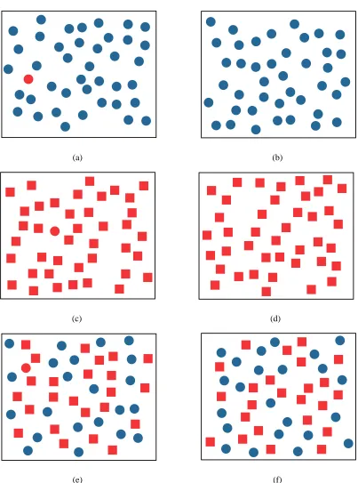
Figure 2.1 demonstrates some instances of the preattentive nature of the human visual sys-tem. A red circle in the midst of a group of blue circles is easily detected. Similarly, a red circle in the midst of red squares is also easily identified. However, the task of locating a red circle among a group of red squares and blue circles is much more difficult, suggesting that certain features can be preattentively detected, but preattentive integration of color and shape detection is not possible.
at-(a) (b)
(c) (d)
(e) (f)
tention can have a significant impact on what low-level vision can detect. In spite of this, the term “preattentive” provides an intuitive indication of the type of visual processing offered by our cognitive visual system. We will therefore continue to use this terminology. The amount of time needed to detect preattentive features is largely independent of the total number of el-ements. The use of these features can be very helpful for performing a variety of exploratory visualization tasks. Some of these include search for target elements with specific preatten-tive features, identifying spatial boundaries between groups of elements, comparing elements, and tracking groups across time and space. In the following sections we discuss some of the preattentive visual features that are useful for visualization.
2.1.1
Color
Light is electromagnetic energy, and the range of the wavelengths from 400nm to 700nm denotes the visible spectrum of light. The perception of color is principally the response of the human visual system to the visible spectrum. Color perception is described as being made up of three quantities.
The first quantity known as hue is our perception of the dominant wavelength of reflected or emitted light. Hue allows us to distinguish between colors like blue, green, orange, purple and yellow. The visible spectrum spans multiple named color regions from violet, indigo, blue, green, yellow, and orange to red.
white light with pure light. A completely pure color is considered one hundred percent percent saturated, and is said to contain no white light. Red is a pure color and is thus highly saturated, while pink is a mixture of red with white light, and is hence considered relatively unsaturated. Mixing white light in varying quantities with a pure color reduces to the saturation of the color from one hundred percent to a possible zero percent saturation, which is seen as a shade of gray.
The third quantity is referred to as lightness. Lightness signifies our perception of the intensity of the light. Intensity of light is often defined as luminance. While lightness is used to signify the perceived intensity of light emanating from a reflected object which is not self-luminous, perceived intensity of light radiating from light sources (self-luminous objects) is referred to as brightness.
The back of the retina in the human eye is made up of two mechanisms to perceive light: rods , which detect luminance, and cones, which detect hue. With respect to the cones, there are three kinds depending on the type of photosensitive pigments within the eye.
The first kind is sensitive to the color blue , with a maximum sensitivity or peak response at a wavelength of440nmof perceived light. The second kind of cones are those photopigments sensitive to color green, with a peak response at a wavelength of about545nm. And the third kind of cones are those sensitive to color red, with a peak response at a wavelength of about
580nm. This theory of the response of different types of cones in the retina to light of different wavelengths (blue, green and red), is known as the tristimulus theory.
different colors. The human eye itself can distinguish between millions of different colors. With luminance as a constant and varying between hues that are fully saturated, the human eye has been proven to be able to distinguish between about 128 fully saturated hues. The human eye is less sensitive to hue changes in less saturated light. [FvF+
93]
Efforts to quantify colored light have led to various theories surrounding generation of colors. One theory that suggests that colors can be generated or described using mixtures of red, green and blue is useful in computer graphics, as the RGB (red-green-blue) model This model is used to display color on standard computer displays that use color cathode ray tubes (CRT). While combinations of red, green and blue can be used to produce many different colors, they cannot produce the entire spectrum of colors that are visible to the human eye.
Other models in computer graphics also utilize the tristimulus theory in generating colors. The CMY (cyan-magenta-yellow) model uses the three colors that are the complements of red, green and blue, respectively. While the RGB model defines color as what is added to blackness, the CMY model defines color as subtracting from white light. CMY is a useful model for hardcopy devices like ink-jet printers and plotters.
The YIQ and the HSV models are also utilized in computer graphics. YIQ is used to encode color NTSC television transmissions. Y roughly corresponds to luminance, while I and Q encode chromaticity (i.e. hue and saturation). This model was designed to be backwards compatible with the original broadcast standard from black-and-white televisions.
providing understandable color dimensions. As with RGB, both models’ gamut cover only a subset of the entire visible color spectrum.
2.1.2
Color Selection
The CIE (Commission Internationale de l’Eclairage) model also uses a three-dimensional ap-proach to defining colored light. This model is an international standard established in 1931. Although, three primary colors are defined in this model, these do not correspond to “real” colors from the visible color spectrum. This is due to the fact that no combinations of three visible colors (such as the so-called “primary colors” red, green and blue) can produce all col-ors in the visible spectrum. However, using combinations of the imaginary primaries X, Y and Z specified in this model allows us to reproduce all possible colors.
2.1.2.1 CIE LUV
The CIE LUV color model (proposed in 1976) specifies color using three dimensionsL
(en-coding luminance),u
andv
(together encoding chromaticity). Two useful properties allow us to control perceived color difference. Colors with the same L
are considered “isolumi-nant”, since they have same perceived luminance. And, Euclidean distance and perceived color difference (specified in E
units) can be roughly interchanged. This means color dif-ference between two color stimulix and y which are positioned in CIE LUV at(L
x ;u x ;v x ) and(L y ;u y ;v y
E xy = (L xy ) 2 +(u xy ) 2 +(v xy ) 2 (2.1)
Healey and Enns [HE98] used the CIE LUV model to measure color distance (or perceived color difference). They used two additional criteria, linear separation and color category to further refine their ability to determine the perceptual balance of a set of colors[Hea98]. Color distance is defined as the Euclidean distance between different colors as measured in a percep-tually balanced model. Linear separation is defined as the ability to separate a target color all other, from non-target colors with a single straight line in the color model being used. Color categories are defined as uniquely named color regions that subdivide the color model. Each color can then be matched to the named region it occupies.
a color target in a background of a non-target colors which belong to a different named color region.
These experiments relate closely to understanding the perceptual properties of colors and how to effectively control color during visualization design. Some of the important questions that need to be addressed in order to use color in perceptual visualization systems include:
1. Based on human perception of color, what kind of colors (or color categories) can be used for visualization purposes?
2. What is the maximum number of colors that can be used for purposes of visualization without hindering the analysis of the data being represented?
Experiments conducted to address these questions [Hea96] showed that up to seven different isoluminant colors can be displayed simultaneously while still allowing the rapid and accurate identification of any of the seven colors. The study found that the time required to identify any one of these colors (shown simultaneously in the presence of the remaining six) was largely independent of display size, which suggested that target detection in this case occurs preatten-tively. However, the study also concluded that the selection criteria mentioned earlier, i.e. color distance, linear separation and color category all need to be considered in choosing colors that could be rapidly detected. Violating of any of the criteria produced a significant reduction in user speed and accuracy.
produced a system that allows users to minimize color surround effects and reduce perceptual errors to a constant value along a continuous color scale. This method was used to build scales that guarantee that color detection remains effective even as neighboring colors are changed within the visualization. Finally, Rheinigans and Tebbs [RT90], worked on constructing color scales interactively by allowing the users to trace a path through a perceptually balanced three dimensional color model. Such a tool allowed users to vary the visualization of an attribute by mapping its range of values to colors along the color path.
2.1.3
Texture
Aggregates of many small visual elements can be used to develop visual textures [JB83]. Such textures can be represented by either single elements like colored dots or circles, or complex patterns. We are interested in studies dealing with the use of textures for representing multi-dimensional datasets.
The use of textures in multi-dimensional visualization must address a various issues:
1. Identifying the fundamental visual properties of textures that can be used to encode in-formation.
2. Identifying ways in which these features can be combined together with hue and lumi-nance to visualize multi-dimensional data.
properties of textures that can be used as “perceptual dimensions” in visualization environ-ments. These properties can be used to represent multiple data attributes together in a common texture pattern. For example, size (or height, length and width), orientation and density of individual texture elements can be varied to represent a corresponding data element’s attribute values.
Triesman’s [Tri85] studies on preattentive vision and their investigations revealed the im-portance of textures in preattentive vision. The results identified features like size, closure or blobness and tilt and curvature preattentively detected. Jul´esz [JB83] also determined elon-gated blobs (rectangles, ellipses or line segments with specific size, angular orientation and color), ends of line segments (terminators), and crossings of line segments were visual features that were detected by the low level visual system. This study led to the development of the texton (texture element) theory.
Although texture patterns developed using textons proved that preattentive vision can iden-tify differences in texture patterns, certain conditions can inhibit the use of preattentive vision. One condition that interfered with preattentive detection was the size of the textons. When the textons were relatively small and the spacing was sparse, preattentive detection was hampered. Other cases where preattentive detection failed was when texture patterns were created using combinations of textons. Combinations in texture shapes and form, they concluded, could only be detected with focussed attention of the display.
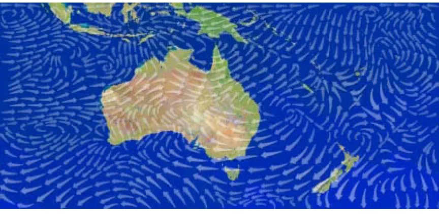
Figure 2.2: A visualization using streamlines (arrows that can vary their direction, length, and size) of a two-dimensional vector field of wind patterns over Australia and Indonesia
containing different kinds of textures. They discovered three main texture dimensions that were used by the viewers to differentiate the images. These were: repetitive patterns as opposed to non-repetitive patterns (regularity), linearly oriented patterns as opposed to circular patterns (directionality), and simple patterns as opposed to complex patterns (complexity).
Ware and Knight [WK95] applied results from vision research in synthesizing visual tex-tures for purposes of visualizing information. They constructed texture patterns using Gabor filters. The size, orientation and contrast of the Gabor elements were controlled by using the attribute values in an underlying datasets.
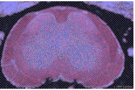
Figure 2.3: A visualization of a mouse spinal cord using painterly ellipses to represent the data; the image allows variation of the underpainting lightness, the spacing of an underlying checkerboard pattern, and the major-minor axis ratio, the major axis direction, the red saturation, and the texture frequency of each ellipse
of the flow data elements like direction and magnitude are represented by using arrowheads for the streamlines. Figure 2.2 shows a visualization using streamlines proposed by Turk and Banks to visualize wind patterns.
Laidlaw et al [LAK+
an underlying checkerboard pattern, and the major-minor axis ratio, major axis direction, red saturation, and texture frequency of each ellipse.
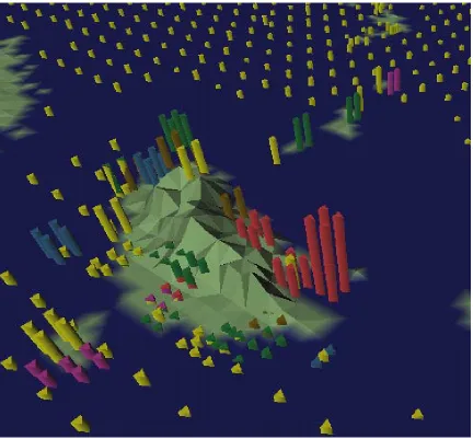
Kirby, Laidlaw and Marmanis [KML99] used a similar technique of graphical elements representing artists’ brush strokes to construct discrete and continuous visual elements arranged in multiple layers. Such representations were used to depict two-dimensional flows in fluid mechanics. These representations were multi-dimensional as they depicted velocity, vorticity and other mathematically derived quantities.
Grinsten [GPW89] furthered the idea of textons in a system called EXVIS. This technique could also be referred to as a “glyph-based” visualization method. “Glyphs” are graphical icons which have individual features like size, shape, orientation and color that can be controlled and varied by attributes of the data elements they are chosen to represent. These techniques are hence extremely useful in the display of multi-dimensional datasets. EXVIS uses stick-man icons as glyphs to construct texture patterns for the display of multi-dimensional data elements. Individual properties of the data are represented by varying the orientation and the spatial positioning of the icons. The texture patterns were used to display spatial coherence in multi-dimensional data.
Available visual features include:
color: the color of a pexel,
height: the height of a pexel in three dimensions (or its size or area in two dimensions),
density: the spatial packing of the pexels (in two or three dimensions),
regularity: the underlying spatial placement of the pexels, either regular in a repeating grid-like fashion or randomly jittered across the display, and
orientation: the tilt of a pexel in three dimensions (i.e. its polar orientation), or rotation of the pexel in two dimensions.
Chapter 3
Related Works
3.1
A Presentation Tool (APT)
Jock Mackinlay [Mac86] incorporated visualization tools in his Application-Independent Pre-sentation Tool (APT). APT was developed for designing graphical prePre-sentations (such as bar charts, scatter plots and connected graphs) of datasets, in a two-dimensional form. Though limiting presentations to a two dimensions, the early research focused on generating rules for visualization that could be used in a formalized, rule-based fashion in order to generate appro-priate mappings between datasets and visual features.
3.1.1
Expressiveness And Effectiveness
The underlying principles of this rule-based system were two very important criteria: expres-siveness and effectiveness.
The expressiveness criterion dealt mainly with the issue of expressing information in a corresponding graphical language. The graphical language generated by APT was a collection of tuples. These tuples were composed from two separate sets: a set of graphical objects like points, lines and areas (encoded on the basis of their graphical properties: positional, temporal and retinal), and a set of locations where these graphical objects were represented.
display.
The two criteria thus mentioned (expressiveness and effectiveness) are used to control the generation of a perceptually salient visualization. This process of visualization adopted by APT is encompassed in three steps:
1. Partitioning: where data is partitioned or classified and graphical objects are ranked or re-ordered based on their effect on the whole visualization.
2. Selection: where data attributes are mapped to visual features in a one-to-one fashion.
3. Composition: where the data attributes are composed in the same spatial area to construct the final visualization.
At every stage of this three step strategy, the expressiveness and effectiveness criteria are ap-plied to guide the mapping process in order to make the final visualization perceptually salient and effective.
Figure 3.1: A visualization using the principle of worlds within worlds. Each data element in the graph encloses an inner world for attributes that were not represented in the outer world.
3.2
AutoVisual
3.2.1
Worlds Within Worlds
Figure 3.1 illustrates the worlds within worlds principle. Worlds can be represented in one, two or three dimensions. AutoVisual allows user interaction at all levels. Rather than attempting to model every data attribute to a pattern of color or texture, AutoVisual relies on using lines, and surface plots, and height fields together with their worlds within worlds principle to generate effective interactive visualizations.
One-dimensional plots are represented by an interactor known as a dipstick. In the two-dimensional form, line graphs are the mode of representation. Three-two-dimensional representa-tion is done using height fields and three-dimensional colored point clouds.
Inner worlds in AutoVisual encode what could not be represented in the outer worlds. This is due to the restriction of at most three-dimensions in each world. Every position in an outer world represents a data element with up to three of its attribute valuesA
ibeing visualized. Once selected, that element can be expanded to show addition attribute valuesA
jby generating a new inner world anchored at the given position in the outer world. As the anchor position is moved in the outer world to select different data elements the inner world’s display automatically updates to reflect the new element’sA
j value. In this way, AutoVisual allows representation of high dimensional data. Based on this ability, the visualization is known as n-vision.
An n-vision virtual world is built as a hierarchy of interactors. An interactor consists of four basic components:
visualization.
2. A set of encoding objects: Encoding objects constitute the various primitives that make up the graphical representation of the information. These may include, dipsticks in one-dimensional, lines in two-one-dimensional, and dimensional height fields and three-dimensional color-scale point fields.
3. A selection set: A selection determines which geometric subset of the parent interactor’s encoding space is represented.
4. A user interface: a user-interface component consists of bindings between the user’s ac-tions and the interactor’s properties. Interactors also have bindings for creating, copying and deleting child interactors. Interactions supported include translation, scaling and orientation of the visualization for user analysis tasks.
The use of AutoVisual to encode data attributes using a rule-based system with the graphical features follows up on Jock Mackinalay’s effectiveness and expressiveness criteria. However in AutoVisual, the user specifies the visualization task rather than the visualization technique. AutoVisual also makes a difference between task operators and task selections. Task operators allow for user tasks to analyze the visualization. These tasks include exploration of the encoded space, directed search within the space, and comparison of the world with another subset of the encoded space. Task selections represents a subset of interest within a particular task.
undone using backtracking support provided by the system. Termination conditions applied to the visualization are represented by potential expressiveness and potential effectiveness criteria (which are basically similar to the expressiveness and effectiveness criteria as postulated by Mackinlay, modified to fit interactive visualization). Termination criteria are used to establish that the system has successfully achieved a satisfactory visualization.
3.3
VISTA
Senay and Ignatius [SI94] also expanded on Mackinlay’s criteria to allow for three-dimensional visualizations and user interactions. They developed a visualization tool, VISTA, as an auto-mated visualization system that also employed a rule-based composition technique for gener-ating effective visualizations. Three components used to build the visualizations are:
1. Data Unit: which mainly comprised of user selections of data attributes and operators to be represented within the visualization.
environments). This also forms a visualization hierarchy rooted at the most important data partition. The final design step, applies a composition module to combine pairs of component visualizations to form a final display of the data.
3. Rendering Unit: which creates an image based on descriptions provided by the design unit, using rendering algorithms. Composition rules are applied to unify the primitives. The composition rules are similar to the composition techniques by Mackinlay [Mac86], and are listed as follows: mark composition, composition by super-imposition, compo-sition by union, compocompo-sition by transparency and compocompo-sition by intersection.
Figure 3.2 illustrates examples of the composition rules employed by VISTA. User interaction was also provided by the rendering unit through image manipulation operators. Users could select any component of the visualization, and modify its attributes. Viewing operations like rotation, translation, and zooming, among others, were also supported. In addition to all of these, users could change the composition rules that were applied to a data partition.
3.4
Automation
Mackinlay’s criteria for developing an effective visualization encoding is an important step to-wards designing visualization tools that are not only automated in nature, but are also domain-independent. Wehrend and Lewis [WL90] used these ideas to develop of a two-dimensional matrix, with the dimensions classified as:
data types and objects, and
visualization or perceptual tasks.
that can be performed on the data objects. The two together form a catalog of visualization techniques.
3.4.1
Cataloging Objects And Tasks
Data objects are data properties that represent the nature of the data being visualized. Tasks or operations represent the various visualization and perceptual tasks that the user wants to perform on the objects. Table 3.1 lists the two columns with their available values.
Wehrend and Lewis suggested that a visualization task could be broken down into smaller sub-problems, until the size of the sub-problems was at such a level that they could be catego-rized by entries in the object/ task matrix. The final design of the visualization is a composition of the candidate representations for the individual sub-problems.
Table 3.1: A table of object classes and operation classes examples by Wehrend and Lewis
Object Classes Operation Classes
scalar identify
scalar field locate
nominal distinguish
direction categorize
shape distribution
position rank
spatially extended region or object compare
structure within and between relations
associate correlate
(e.g. three-dimensional fields). Wehrend and Lewis concluded that an automated visualiza-tion tool would require very specific definivisualiza-tions of the kinds of structures that could be used for visualization, and of the specific tasks that could be applied to each object or structure. The classification of objects and operations, nevertheless, is an effective manner of handling sub-problems within a larger visualization task.
3.4.2
Classifying Visual Knowledge
Viewers, chosen heterogeneously, grouped graphical elements in a bottom up manner into categories of similar elements. The categorization was carried out in a trailblazing manner. Since the classification was not conceptual in nature, one potential problem was that different viewers might classify elements into completely different categories. The experimenters coun-tered this with analyses designed to test both the classifications produced and the possibility that the subjects influenced those classifications.
The grouping procedure was repeated hierarchically, to collect the graphical elements into larger and larger clusters. This continued until all elements were in one cluster. Elements chosen for data classification were selected from a broad range of fields and included items such as icons, graphs, maps, and tables. On completion of the data sorting and classification process, the classification, the resulting categories were analyzed in two ways:
1. The first analysis task was called “subject analysis” and was done by asking the subjects which pair of already sorted items could be considered to be in the same cluster. This allowed the researchers to conclude that the sort was consistent and homogeneous.
2. The second form of analysis was called “item analysis”, in which the hierarchical nature of the clustering was collapsed to form non-hierarchical item clusters. The final classifi-cations were expressed in a two-dimensional coordinate area, with the extremes placed on the horizontal and vertical axis. Additional groups were derived from this coordi-nate area. This grouping helped identify perceptually salient multi-dimensional visual representations.
pro-cess visual knowledge. The classification also helped researchers understand how knowledge can be conveyed visually.
The approaches of Lohse, Mackinlay and Senay and Ignatius [LRBW90], consider data classification the first stage of a visualization process. Their visualization procedures are data-driven and the approach is usually bottom up: first the data is classified, and then the classifi-cation is represented in a graphical form chosen based on its category.
3.5
Natural Scene Paradigm
Robertson and De Ferrari [RD94] however, were not convinced that the data-driven approach was always appropriate. They worried that this approach placed too much responsibility on the users. The need for user interaction means that data has to be translated for every inter-action. As well, the user needs to be an expert at visualization in order to properly classify data into useful categories. Finally, Robertson and De Ferrari felt the bottom-up nature, of a knowledge base technique was inefficient in terms of keeping up with the amount of raw data available. Robertson [Rob90, Rob91] advocated a top-down approach for multi-dimensional visualization, with the emphasis placed on selecting an effective, and in our case, a perceptu-ally salient visualization model. Such an approach requires that data attributes be represented by the individual properties of the chosen model or scene.
pally data-driven and bottom-up in approach. According to Robertson and De Ferrari [RD94], user involvement in visualization systems occur in two ways: by means of user directives to the system, and by user interpretation aims. Through user directives, the user is able to explicitly define requirements to the visualization system. An instance of using directives, could involve asking the system to show a specific variable A using a specific representation B. User inter-pretation aims involve specifying criteria surrounding the data variables in the representation. This could, for instance, involve asking the system to show the correlation between variable B and variable C, or even criteria such as asking the system to show significant changes of the temperature variable over time. They decided to implement a user directive approach for user involvement in their system, since they believed it was easier to implement and satisfy, than user interpretation.
The Natural Scene Paradigm (NSP) implemented visualization in three stages:
1. The first stage involved the selection of a clear and understandable visualization model (such as a three-dimensional natural scene or structure).
2. The second stage involved the decomposition of the scene into its recognizable properties (these involve properties that can be controlled by external data input).
3. The third stage involved the combination of user demands with the recognizable scene properties using graphical simulation techniques.
Control-ling and modifying these factors thus controls the construction of the scene.
3.6
Flow Visualization
Gallop [Gal94] consolidated and improved upon the underlying data models in a flow visual-ization system. Gallop’s dataset was mainly flow data. He insisted on a classification of data models and abstract visualization objects, along with an underlying data representation.
The flow datasets were mainly continuous or empirical, and time-dependent in nature. Gal-lop considered the empirical components and the time components as critical attributes for the decomposition of the datasets into variables and functions.
Gallop offered the opinion that data elements are basically of two kinds: dependent vari-ables, and independent variables. His visualization methodology depended on this distinction. Dependent variables, were ranked in a hierarchical order using dependency as a factor. Data sampling was done on these variables based on their rank.
For independent variables, no ranking was used; data sampling was done in a non-hierarchical manner. Both dependent and independent variables were then mapped to a coordinate system.
3.7
PRAVDA
Rogowitz and Treinish [RT93] believed that in order to build visualization systems that are perceptually salient, the importance of human perceptual and cognitive mechanisms needs to be better understood and incorporated within visualization systems. The use of mathematical models for mapping visualizations could achieve representations that were multi-dimensional in nature, but interpretation of such models may not be consistent across many users. This is because although many models of visualization have mathematically similar relationships, they may be very different in their perceptual effect. Hence the need to understand the human perceptual mechanism better, and the need to incorporate this in a more effective manner within visualization systems.
Lohse et al [LRBW90] suggested ordering data models based on viewer’s ad-hoc classifi-cation of elements into similar categories. Such an approach is not sufficient, however. One needs to better understand how humans perceive spatial variations of luminance and color and how variations in the physical objects or glyphs used for representation influence their inter-pretation. This was the basis for PRAVDA.
Properties of human vision and perception were incorporated within a set of perceptual rules. These rules were then used within PRAVDA to guide the task of mapping data attributes to suitable visual features. The perceptual rules were themselves categorized into two separate classes:
ensure that the structure of the data is faithfully preserved in the visualization. This is described as a “perceptual isomorphic mapping” by Rogowitz an Treinish. A “non-isomorphic mapping” occurs when the structure of the data cannot be preserved by its visual feature. This can happen, for example during the conversion from a continuous form to a discrete representation. Class I rules are therefore rules that provide isomor-phic mappings from data to perceptual dimensions, or rules that ensure the invariance of higher-level visual features, such as color, size and shape.
Class II perceptual rules: These rules are used to highlight features within the data being visualized. Class II rules intentionally change the data’s structure to attracting attention, with methods like highlighting or segmenting the data into sub-regions to better aid exploration and analysis. These rules also allow the scaling of visual features to exaggerate details within the scenes.
According to the authors, PRAVDA implements a perceptually salient rule-based system for domain-independent visualization design. PRAVDAColor, uses a rule-based approach to control the variation of hue, luminance and saturation to best match properties of a target data attribute.
To implement a more flexible multi-dimensional visualization system, variations of hue, luminance and saturation do not necessarily suffice, especially if the number of attributes that need to be supported is large. Visual interference that may occur when hue, luminance and saturation are shown together in a common display, cannot be overlooked. Healey and Enns [HE98] concluded that the maximum number of hue variations that the human visual system can rapidly distinguish is only seven. They also concluded that luminance masks hue patterns when both are shown simultaneously. PRAVDA may not produce high perceptual effectiveness in a situation that requires the display of a large number of data attributes.
Color forms an important part of any multi-dimensional perceptual visualization system. However, additional methods are needed to combine with efficient color models to more fully support the purpose of multi-dimensional dataset representation.
ViA to use other types of glyphs and visualization metaphors.
3.8
Perceptual Texture Elements
Healey and Enns [HE98] designed a technique using perceptual textures to visualize multidi-mensional datasets. Information in multi-dimultidi-mensional datasets is contained in data elements. Each data element encodes one or more data attributes. These data elements are arrayed across an underlying three-dimensional height field. One or more pexels (perceptual texture elements) are used to display each data element, with the attribute values of the element controlling the visual appearance of its pexels. Texture patterns formed by groups of neighboring pexels can be visually identified by a viewer during exploration and analysis. Since the pexels are de-signed to be perceptually salient, many tasks like searching for a target or target area, boundary detection between spatial groups with common attribute values, region tracking, and estimation can be performed preattentively.
Healey and Enns [HE98] also tried to focus their research on answering the following questions:
1. Which perceptual dimensions should be used to control the appearance of a texture pat-tern?
2. How can dataset attributes best be used to control the dimensions of the pexels?
Figure 3.3: An illustration of the different kinds of pexel strips that could be used for multi-dimensional visual-ization. Starting from left, and moving right we have pexel strips showing two levels of irregularity, two levels of density, and two levels of pexel height.
Healey and Enns used thin paper strip pexels to support the visual features color, height, density of pexels per unit area, and regularity of placement. Figure 3.3 shows examples of using pexels in the form of thin paper-like strips. The examples illustrate the use of pexels of different irregularities, densities and heights.
guidelines act as the basis for ViA’s evaluation of candidate data-feature mappings.
3.9
Search Techniques
Search techniques are useful in visualization systems for exploring search spaces containing possible solutions to the problem of selecting effective data-feature mappings.
A “situation space” [RN95] is an exploratory space of possible conditions or states. In the case of visualization systems, where finding an optimal, perceptually salient mapping is important, these states are possible mappings or solutions for our visualization problem. For simple visualization tools that represent only a single attribute, each state would contain a one-to-one mapping between the attribute and a visual feature. Given a single attribute and a set of visual featuresV =V
1 ;:::;V
nwith
nvisual features that could be mapped to the attribute, our situation space would containsnstates. For multi-dimensional dataset visualization, where we consider a set ofm data attributes andn visual features, withn m, we have a possible situation space containingn!=(n m)!m!possible mappings, where each node in the space is a complete mapping with every data attributeA
i mapped to a unique visual feature from V
j. Asmandngrow in size, the number of states in the situation space increases dramatically.
To construct and explore large search spaces efficiently when only a limited amount of time and effort are available, a system needs a more flexible search strategy. Obtaining a solution that may be very good, but not necessarily the best possible solution for the task, could be more desirable when selecting a visualization for a large dataset.
3.9.1
Planning
Russell and Norvig [RN95] advocate that the use of artificial intelligence (AI) planning tech-niques to find optimal solutions efficiently, for tasks involving a wide range of possible states or actions, as opposed to accurate but inflexible comprehensive problem-solving techniques. The planning process, when assisted by a rule-base containing guidelines for search, can ex-plore a situation space and provide near-optimal solutions in short periods of time, even when the search space is large and the time required to search it completely would be great. While heuristics devised by planning systems may not always provide the best solutions for a given problem, they can still produce good workable results for a given task. This may be more desir-able than comprehensive techniques which may arrive at the best solution, but at a prohibitive cost in time and computing effort.
found.
3.9.2
Mixed-Initiative Search
Mixed-initiative search is an efficient search strategy that is inspired from the AI planning approach. Such a strategy is very effective for exploration and analysis of very large search spaces.
The mixed-initiative search technique resulted from advances in AI planning techniques as well as studies in human-computer interaction and usability. It approaches generation of a solu-tion to a task or problem (in our case, that of generating a suitable mapping) as a planning task, involving both the system and the human user. The system is partly guided by user commands and queries. According to St. Amant and Cohen [AC97], a system can be considered to be an assistant as opposed to being merely a tool kit, if it adopts a mixed-initiative approach. St. Amant and Cohen proposed a mixed-initiative strategy for performing Exploratory Data Anal-ysis (EDA) tasks for statistical analAnal-ysis and related areas. Two conditions separate assistants from being tool kits:
Partial autonomy of assistants: One needs to give general and brief instructions, and let the assistant decide how to carry them out, as opposed to giving detailed, step-by-step instructions.
characteristic of assistants.
A mixed-initiative search assistant could be supported by a perceptual rule-base containing guidelines to evaluate candidate data-feature mappings for perceptual salience. For visualiza-tion systems, a mixed-initiative approach may make the task of searching for effective map-pings more efficient.
In this chapter we examined various related efforts in scientific visualization and perceptual visualization. We also discussed rule-based methods for automated or semi-automated visu-alization design. We described the pexel method for representing multi-dimensional datasets in a perceptually salient manner. We also examined mixed-initiative search strategies as one potential technique for effectively searching for perceptually salient data-feature mappings.
Chapter 4
ViA
In the previous chapters, we discussed the need for perceptual visualization and some of the various studies and efforts within scientific visualization. We introduced ViA (Visualization Assistant) as a semi-automated perception driven assistant that aids in designing effective vi-sualizations of multi-dimensional datasets. In this chapter, we shall discuss in some detail the architecture and processes that guide the working of ViA.
4.1
General Architecture
concerned more with the visual representations as compared to the nature of the datasets. An observation that one could perhaps draw from both these approaches to visualization, is that one would need a balanced approach towards incorporating not just the nature of the data being visualized but also the visual methods used to represent the data.
Raw data is input to a visualization system, through an input mechanism. The input mech-anism could also be responsible for the classification of the attributes. For data classification purposes, information about the nature of the dataset would be very important for the visual-ization system.
A processing mechanism is responsible for performing a visual mapping for the data at-tributes, by assigning appropriate visual features to represent the attributes.
A display mechanism displays the representation generated by the processing mechanism, and aids the user in search and exploration tasks. The display mechanism supports various view transformations to be performed on the visualization.
Additionally, the visualization system would need to support an effective mechanism for human interaction. Interaction could involve many different forms, from providing suitable support for input of raw data to the system and describing the data properties, to performing view manipulation, exploratory and analysis tasks, or direct manipulation of the visual objects within the representation, and suggestions to produce new mappings or visualizations.
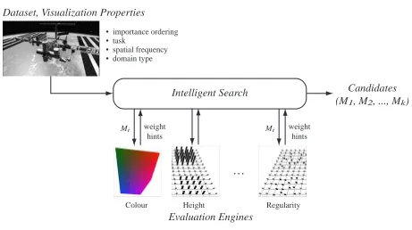
Intelligent Search
Colour
Mi weight hints
Height Regularity
. . . • importance ordering
• task
• spatial frequency • domain type Dataset, Visualization Properties
Evaluation Engines
Candidates (M1, M2, ..., Mk)
Mi weight hints
Figure 4.1: An illustration of the architecture of ViA
4.2
ViA Architecture
4.3
Evaluation Engines
An illustration of ViA’s architecture is presented in the Figure 4.1. The individual evaluation engines color, luminance, height, density and regularity represent the evaluation process. Each visual feature utilized by ViA for multi-dimensional visualization is supported by a correspond-ing evaluation engine. The evaluation engines critique data-feature mappcorrespond-ings produced by the search engine.
4.3.1
Data-Feature Mappings
A data-feature mappingM is maintained as a data structure with two parts:
1. The data attribute-visual feature pairs that make up the mapping,
2. The relevant properties of the dataset that are needed to evaluateM.
When the dataset is first given to ViA, several dataset properties are established, either by examining the dataset itself, or by asking the viewer. These include:
1. Domain type: Is the attribute’s domain type discrete or continuous?
2. Importance ordering: What is the relative importance ordering of the data attributes to the user?
3. Spatial frequency: Is the spatial frequency of each attribute high or low?
WhenM is evaluated, each individual engine tackles the data-feature pair inM containing its corresponding visual feature. For example, ifM utilizes color and luminance, it will contain a pair with an attribute mapped to color, and another pair with an attribute mapped to luminance. The color evaluation engine will evaluate the color pair and the luminance engine will evaluate the luminance pair.
The evaluation engines thus analyze each mapped pair within M and note any violations with respect to the perceptual guidelines thatM is supposed to satisfy. Based on the number and the severity of these violations, the evaluation engines generate a normalized evaluation weight. Wherever possible, along with the evaluation weight, suggestions to improve the map-ping in the form of “hints” are also generated by the individual evaluation engines. Hints include a suggested action to improve M and an estimated improvement weight if the hint were applied and implemented onM.
Hints are critical to allow the search engine to intelligently guide the search process for better mappings. Design and interpretations of the hints and the manner in which they guide the search process forms one of the primary focuses of this thesis. We will examine these topics in this and later chapters.
4.3.2
Evaluation Process
Let us consider a typical mappingM that is to be evaluated. For each data attribute Aj, M contains information about the attribute in terms of the visual featureV
j associated with A
j, domain type of A
low), its importance (as a normalized value that ordersA
j relative to other attributes), and the user tasks (if any) to be performed onAj.
The evaluation engines collectively contain the perceptual guidelines that allow analysis of the mappings produced. Each mapping M that is to be evaluated contains mapped pairs of data attributes and visual features, A
j ! V
j. Each pair, as mentioned before, also contains information about the attribute with respect to its properties and tasks. The attribute-feature mapped pair, A
j ! V
j, is evaluated by each of the evaluation engines ( color, luminance, height, density, orientation and regularity) on the basis of:
1. Attribute domain type: Whether V
j supports the domain type of A
j. For instance, if A
j is continuous in nature, can V
j produce continuous scales? Or if A
j is discrete, can V
j produce an appropriate number of distinguishable values to represent the range of discrete values ofA
j?
2. Interference: Whether another mapped pair withinM interferes visually withA j
! V j. For the purposes of the evaluation process, the perceptual salience order of the visual features is: luminance, color (hue), height, density and regularity. Interference can occur if a less important attributeA
k is utilizing a more perceptually salient attribute Vk.
3. Spatial frequency: Whether the spatial frequency ofA
j is appropriately represented by V
j.
4. Task applicability: Whether user tasks onA
j can be supported by V
j.
engine testing the pairA j
! V
j for its perceptual salience. Each evaluation engine returns an evaluation weight in the range0:0to1:0forM, along with zero or more hints. An evaluation weight of zero means that the mapped pairA
j ! V
j is a flawed mapping, and one means that the pair is a good mapping with no weaknesses. A lower evaluation weight for a mapping results from violations of the perceptual guidelines in the evaluation engine that returned the evaluation weight. A low evaluation weight, is often accompanied with hints that provide suggestions for potential improvements. The hints also estimate the improvement weight for the mapping if the hint were applied to the current mapping.
Chapter 5
Search Engine
The previous chapter focused on the evaluation engines. We discussed briefly the constitution of the individual evaluation engines. In this chapter we focus on the search engine. In particular we study the design of hints to be used by the evaluation engines to guide the search for perceptually salient mappings. This forms one of the main contributions of this thesis.
We also discussed some of the aspects of the evaluation process. The evaluation procedure returns an evaluation weight adjudging the perceptual salience of the mapping. Good mappings return high evaluation weights and poor mappings return low evaluation weights, thus allowing us to compare between mappings using evaluation weights as a suitable metric.
5.1
Hints
Search in ViA is perception driven in nature. Perceptual guidelines incorporated within the evaluation engines, are used to evaluate the perceptual salience of any mapping produced by the search engine. Although evaluation weights are extremely useful in determining the per-ceptual salience of a mapping, we need additional information to aid us in producing better mappings. The perceptual guidelines guide the evaluation procedure, and violations in the cur-rent mapping with these guidelines result in reduction of the evaluation weight for the curcur-rent mapping. Reporting these violations give us clues that would aid us in potentially fixing the current mapping. Structuring these clues in a way that suggests fixing or improving the current mapping to potentially lead to higher evaluation weights, is done with hints.
When the search engine applies the suggestion within the hint to improve the mapping, it creates a new mapping that has the potential to be better than the original mapping that caused the hint. The evaluation engine evaluates the new mapping for perceptual salience and returns an evaluation weight and hints to potentially improve the new mapping.
each mapping sent by the search engine.
2. Generating hints and hint-chains: The evaluation engines provide feedback in form of evaluation weights and hints about how to improve the mapping. The hints generated are combined into chains of hints that can be applied simultaneously to improve the mapping. The hint chains and are stored in a priority queue ordered by their estimated improvement weight.
3. Processing hint chains to generate new mappings: Each hint chain suggests certain changes to the original mapping that could improve the mapping. The most promis-ing hint chains are chosen and processed to generate new mapppromis-ings, which are then sent for evaluation to repeat steps 1, 2 and 3.
The first stage involving the evaluation process is carried out by the evaluation engines. We discussed the nature of the evaluation engines in the previous section. The second stage of the search process involves the analysis of hints and creation of hint-chains from these hints to guide the search for new mappings. These operations are explained in the following sections.
5.1.1
Hint Structure
A hint comprises chiefly of:
1. The hint class.