http://www.jedem.org
Visualization of Election Data: Using Interaction
Design and Visual Discovery for Communicating
Complex Insights
Kuhu Gupta, Shailaja Sampat, Manas Sharma, Venkatesh
Rajamanickam*
*Corresponding author: Venkatesh Rajamanickam, IIT Bombay, IDC, IIT Bombay, Powai, Mumbai-400 076, India, [email protected], +91 750 636 5826
Abstract: State elections results in India yield variegated and unique set of insights. Often it is hard to grasp the nuances of local electoral dynamics, and harder to communicate it to an audience not deeply engaged in the local political process, or to an audience from outside the state. While national news outlets do a fairly good job of analyzing and communicating the federal elections, the state elections in contrast have largely remained devoid of rigorous analysis and insightful communication. In this paper, using the data from the Assembly elections that took place in the state of Tamil Nadu in May 2016, we present a process and a set of interaction design and visualization methods to present complex insights. The general principles thus derived, will not only aid analysts and journalists to present their insights more effectively, but also empower the readers, depending on their level of interest and civic engagement, to go beyond what is presented and to discover new insights for themselves
Keywords: data journalism, data visualization, visual discovery, data analytics, infographics, open data, data democracy, data literacy
Acknowledgement: The authors wish to thank the Election Commission of India (ECI) for the data and everyone who reviewed and gave feedback at various stages of the visualization project.
1.
Introduction
Digital media have an additional benefit over print media due to their ability to incorporate interactions, movements, transitions, animations, sound effects and dense data, along with the storyline. They help to communicate data driven insights very effectively in the knowledge discovery process. There are multiple windows of opportunities to derive inferences from the unstructured data and to better present them for improved decision making.
As humans, we are blessed with an excellent cognitive and visual system that allows us to quickly explore, compare things, identify patterns and relate other similar kind of things encountered previously. However, multi-dimensional data in the form of tables or matrices thwart our ability to visualize the relation between several variables simultaneously beyond a limit. Innovative graphic representations allow us to assemble data entities and establish meaningful relationships between them. They aid easy comparison between magnitudes of the objects, better understanding the nature of data and improved perception of emerging trends. Furthermore, the interactive nature of visualizations engages readers during the reading, allowing them to explore details themselves and at different levels of information granularity. data exploration is an iterative process in graphical organization of data, guided by hypotheses and based on patterns observed, to germinate new or refined hypotheses (Wong, 2010).
2.
Data Journalism
The domain of journalism is mainly concerned with neutrally providing the content that informs society using factual reporting following an ethical framework. Conventional journalistic approaches are based on gathering information-facts about events by observation, collecting opinions by interviewing people and organizing them in literary manner. It requires concise writing as there is limited space available in print media.
In the digital era, new media and communication technologies have influenced the journalism techniques being used. Gradual shaping of journalism techniques has changed the media we experience and has made profound impact on our reading patterns. Also, data-literacy among the general public is increasing with development in the field of interactive visuals. This is evident from the large number of open data government portals have opened up around the world (data.gov, 2016).
Replicating the print content designed for the newspaper on the internet is inadequate as it does not fully leverage the power of digital technology. Hence, a new way to present and consume news and analysis beyond words and pictures was required. As we know, visuals are the best way to summarize things; we incorporated interactions, movements, transitions, animations and sound effects along with visuals.
‘Data journalism' is multi-disciplinary approach to journalism with other domains like design,
computer science and statistics. It is essentially the amalgamation of traditional journalistic working methods along with data analysis, programming and visualization tools and techniques (Appelgrena & Nygren, 2014). It incorporates the use of data and number crunching in journalism to uncover potential news stories. Interactive component of graphics allows for user customization. These graphics rely on dynamic information retrieved from the databases.
There are several organizations practicing data journalism. The New York Times is considered a pioneer in development of data-driven news applications and content creation. With evolving reading habits of people, The New York Times has discovered a complete new methodology for digital storytelling. Other leading organizations who attempted to incorporate data presentations into their workflows are - FiveThirtyEight owned by ESPN, The Guardian, Texas Tribune, ProPublica, BuzzFeed, and Vox. These media organizations have utilized the power of web technologies to blend them into unique online experience for readers with interactive and informative content. They have adapted various multimedia features and data visualization techniques for creation of self-explanatory graphics at different levels of information granularity.
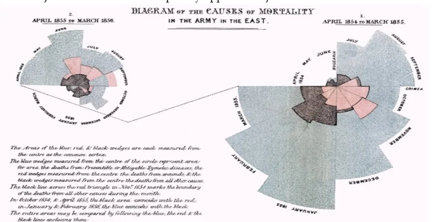
The field of data visualization has examples dating as back to the 19th century. An early example is Florence Nightingale’s report “Mortality of the British Army” published in 1858. The distinguishing part of her work was her “coxcomb”, a spiral of sections, each representing the quantity of deaths per month, which showed that the vast majority of deaths were from preventable diseases rather than war wounds.
The Figure 1 represents the original infographic and Figure 2 represents the interactive version of the same. Interactive components used here allow for user customization of views via slider selection of time (month and year), checkboxes for graphics, and other interactions for comparison and superimposition. By allowing users the flexibility of choosing views, such interactive visualization enables better sense making of complex data in a self-exploratory manner.
2.1.
Data Journalism Process
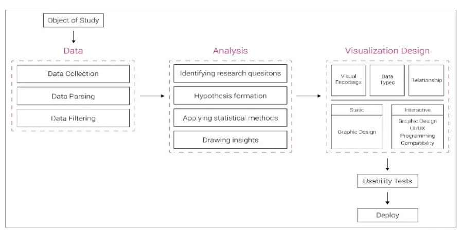
Data journalism process begins with the objective which is essentially the event, trend or issue around which the complete story-line is developed with visual components. The core of the process consists of three steps namely data, analysis followed by visualization design. All these steps are iterative in nature; this essentially means that whenever there is requirement of refining or scope of improvement, we go back to the previous step and redo the complete process. Lastly, the journalism process ends by deployment on relevant media or webpage after usability tests for verification of desired functionality of interactive graphics. The graphical summary of the complete data journalism process is explained in Figure 3.
2.1.1.
Data
Data about various studies, surveys, information collected or generated as a result of some process is made available by several public as well as private sectors. But they are not usually in the desired format required to create visual graphics. Additionally, sometimes unnecessary data that is of no use as visualization design exists.
After collecting data relevant to our story, techniques like data parsing and data filtering were used to get the data in the appropriate form. Data parsing in this context refers to the creation of some structure to get meanings, insights from the data, and ordering it into some categories on which our analysis depends. By data filtering, all irrelevant data is removed, or in other terms, we retain only the data of interest. Thus, after the data step, we have a complete dataset available with all necessary information for transforming data into interactive narratives.
2.1.2.
Analysis
Data journalism can be referred to as a corollary to big data, which aims to prove a problem with numbers, find exploitable patterns in data to help ordinary people in decision-making about stories of their interests. Once data is available, the next immediate step is to identify the specific questions we need to address around the event, trend or issue we are dealing with. Then we transform these questions into context specific terminology which is formally known as the ‘hypothesis’.
Exploratory data analysis is an iterative process where graphical organization of data is guided by a hypothesis and based on patterns observed, we germinate a new or refined hypothesis (Wong, 2010). data-driven journalism aims to support and prove stated hypothesis through the evidence of data. So, extracting knowledge out of data is very important. This is achieved by transforming data in a mathematical context by applying statistical methods and data mining to discern patterns. Statistical methods involve sorting, averages, variances, correlations for ordering and to provide relative comparison and relation among data elements.
2.1.3.
Visualization Design
Any type of visualization design involves three major components - visual encodings, data types and relationships. Visual encodings are primitive graphical elements like marks e.g., basic geometric shapes, channels include position, color, size, area, volume and orientations (angles) in visualizations. The choice of parameters like marks and channels are governed by dimensionality requirements in data. Data types refer to interpretation of an item in terms of scales of its measurement or attributes. The observation of relationship among various entities also plays an important role in getting insights clearly.
In order to make interactive visuals, visualization design process involves programming. Programming for data journalism refers to advanced tools to create data visualization by writing codes. There are two possible scenarios for graphics creation using programming; one approach is to have complete custom built visualization in case of proposing new type of graphics and the other method is to import some available libraries for commonly used chart types and bit of modification according to requirements of story. D3, R, Google Charts, Leaflet, FusionCharts and Dygraphs are widely used programming tools for designing interactive charts and maps.
D3.js, which stands for ‘data Driven Documents (D3)’, stands apart from other visualization programming languages as it is free, open-source, flexible and is comprised of interactivity rich language. It is based on HTML, CSS, and SVG to render graphics. It has a diverse range of packages and plugins for adding features to extend the core functionality. But it has a limitation in terms of compatibility in that it supports only modern browsers and requires good programming skills, efforts for totally custom built visualizations.
Use of programming languages to create infographics and interactive visualizations in the desired manner requires bit of familiarity and experience in programming. So, for non-technical users, there exists some tools and platforms which facilitate users to create interactive visualizations according to their requirements.
Figure 3: Data Journalism Process
embedded inside any webscripts in a very convenient manner as it is open source and supported by a wide range of browsers. In addition, as modern datasets are growing extremely fast, maintenance and scalability of system is very important. In comparison to D3.js, software offers less ability to further expand the system due to limited space allocated to each user or requires financial investments for additional storage. Of course, the development time using D3.js is higher, but it is most suitable to portals with very specific UI/UX (User Interface/User Experience) requirements and customization.
Thus, both the development tools have tradeoff for efficiency i.e., development need not be started from scratch versus expressiveness. Each of the development tools have their own benefits and limitations; combined use of them can help in achieving the organizational goal in timely manner. Initially, developers can start experimenting and prototyping in software with readymade templates. Once they are clear with the form of visualization and necessary modifications, coding in D3.js will help them to build pixel perfect interactive dashboards.
3.
Electoral Democracy
As stated by John Bouvier, electoral democracy is “A form of government where the powers of the sovereignty are delegated to a body of men, elected from time to time, who exercise them for the benefit of the whole nation” (Bouvier, 1856).
Elections form the bedrock of any democracy in the world. Elections give power to the people and enable them to choose their leaders who make decisions on their behalf (Banerjee, 2014). The right to vote and to hold those in office answerable at the ballot box is a necessary element of electoral democracy. The principal function of elections is to validate public authority that makes it mandatory for officials to take specific action for the betterment of their voters (Sisk, 2001). Electoral democracy survives in countries split by rifts of race, religion, language and ethnicity. India is the most apt example of an electoral democracy.
Political journalism plays an integral role as the main source of political information for most citizens (Norriss 2000). The histories of political communication and election research have been accumulated during the past decades; there is still, however, a lack of sufficient political communication research. Although there are important exceptions (Hallin and Mancini 2004), the number of comparative studies of political campaign communication (Kaid et al. 1991; Plasser and Plasser 2002) and election news coverage (De Vreese 2003; DeVreese et al. 2005;) have been recorded (Graber 2005). In one study, the works, politics in newspaper election, and news coverage in the United States and Sweden is investigated in detail. Sweden and the United States are not only different in political systems but also in media systems.
service and commercial media (Djerf-Pierreand Weibull 2001; Petersson et al. 2005), whereas in the United States the media system is highly commercialized. The private media organizations dominate the media system and it can be characterized as “market-driven” (McManus 1994). There are 9 electoral systems existing in the world with subtle nuances, which need to be addressed by evidences and detailed insights supported by data. In our work, we have studied Indian elections as an example for data journalism.
Joannes connected the notion of data journalism to its role in a democracy describing the data journalism as a tool of democracy. Furthermore, he said that data journalism is a form of rich media with an added dimension for factual investigation, and about interrogating data, finding and formatting the relationships (Royal & Blasingame, 2015).
3.1.
Indian Elections
Regular elections are the lifeline in any democracy and India has been able to maintain a flourishing democracy in spite of significant socio-economic challenges and deeply hierarchical social structure (Sanjay & Rai, 2013).
Being a federal form where elections are held not only for electing the national parliament but also for electing state assemblies. A higher voter turnout in state assembly elections in recent years indicates greater participation of people in Indian elections as well as a growing interest of people in politics. In the present era, people are interested in questions like who is likely to win elections, who is likely to vote for whom, what will be the points people are likely to vote and various related issues. The media, politicians, and political parties need advance information and a detailed study of the elections to make strategies in the future.
The Election Commission of India (ECI) is designated as an autonomous body and its role is to ensure the accountability of political parties (Naga, 2009). The data collection done by ECI is a challenging task due to social, religious, linguistic, and geographical diversity. The website of the ECI was launched on February 28, 1998 to provide accurate information and instant results of the elections [14]. It is not just ECI but https://data.gov.in/ has also helped in this initiative.
The intent of the ECI for hosting the entire country’s electoral database online is to provide electronic service delivery to the citizens. It seeks to provide “electoral look up services for citizens ... for better electoral information services.” (Ghosh, 2014) Thus, ECI has been successful in giving access to the citizens to this raw data but failed to aid public understanding of it so that people could have some insights of the data and could draw their own conclusions.
to be empowered by it and analyzing electoral data is an important part of democratic accountability enabled through good visualization design.
3.2.
News Analysis and Visual Presentation in Leading Newspaper
Newspapers still remain the most favored mode of mass communication in India to communicate new analysis and opinion. Out of all different aspects covered by newspapers, politics dominate the public interest. In order to present highlights and an overall summary of major news events, some newspapers have started using information graphics created using modern tools and techniques. The online editions of these newspapers carry the graphics as they appear in the print edition as images accompanying text formatted in HTML.
Until now, no effort has been made on the part of any news organization to present information visualized that exploits the affordances of the online medium. Interestingly, India is reported to be ahead of any of the developing countries in the world with respect to the availability of data, and yet the Indian media seem to be largely indifferent to the lure of digital data journalism (Rajasekar, 2014). While many reasons such as lack of skilled manpower and formal training in journalism, poor data literacy among the larger population, and poor access to robust datasets are attributed for this state, it is nevertheless a host of new initiatives from traditional and non-traditional news outlets to move towards data journalism.
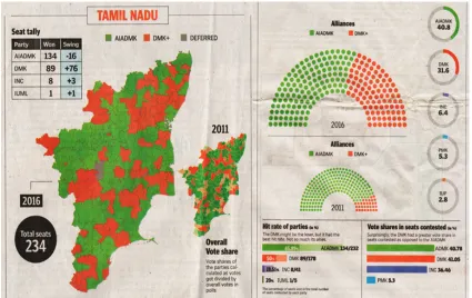
Figure 4: Tamil Nadu Assembly Elections 2016 Coverage by The Hindu1
The information graphics covers details about distribution of seats (party wise and constituency wise), vote shares, alliances formed among parties, voter turnouts. They have facilitated users with graphics of previous elections to obtain insights about previous trends and emerging patterns for this election. Visualizations incorporated in both newspapers are similar in terms of graph types used i.e., they mostly contain common graph types like bar charts, donut charts, maps etc. They have represented numerical figures in terms of number of seats as well as in normalized form using percentages.
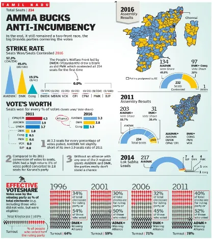
The colored maps used in infographics depict constituency wise distribution of seats followed by semi-donut chart to represent seats obtained out of total 232 seats different party alliances. The Times of India has small-multiples to represent effective vote share for ruling party as a portion of voter turnout and total electorate for all assembly elections since 1996. The Hindu has provided information regarding party wise distribution of seats and swings in number of seats compared to previous election in the tabular form. The Hindu has also provided some additional information about top three highest and lowest victory margins and prominent winners and losers in in Tamil Nadu.
Figure 5: Tamil Nadu Assembly Elections 2016 Coverage by The Times of India2
3.3.
Tamil Nadu Assembly Elections
Tamil Nadu Assembly Elections 2016 shows its extent in democracy by having 42,908,767 as total number of voters, 3727 candidates, 234 constituencies and 65, 616 polling stations. The Tamil Nadu Assembly Elections 2016 election is a real head-scratcher, with group-specific issues and seat-specific caste and economic concerns.
Previously, the state elections had only seen two-sided fights, between the All India Anna Dravida Munnetra Kazhagam (AIADMK) and the Dravida Munnetra Kazhagam (DMK). This assembly election was hyped as a multi-cornered contest with the other parties all supposed to eat into the share of the two main parties. The main contest was still between the DMK and the AIADMK, but the number of NOTA, PMK and Third Front votes played spoiler. NOTA was introduced for the first time in the state elections this year and so it could have played a pivotal role in swaying the elections one way.
The other historic facet to the big story was of how AIADMK won a second consecutive term after a period of 32 years of continuous flipping of two parties in Tamil Nadu.
The overall aim of our work was to discover all the aspects that made these elections disparate and at the same historic. Anti-incumbency, vote share, voter turnout and the effect of the Third Front, PMK and NOTA in comparison to the victory margins in this election played a decisive factor in these in elections and therefore their degree to which they affected the elections needs to be explored. Our secondary aim was to develop a data visualization design apt for to gain insight into the data, synthesize it and draw conclusions. It is important to address these aims as an essential part of democracy. We identified four research questions around which we conducted our visualization design and application:
• How did the voter turnout affect the anti-incumbency factor in Tamil Nadu?
• How did the difference between contested vote share and total vote share affect the outcome of the elections?
• How the presence of NOTA, PMK and Third Front affected the election results?
• Did the victory margins of the constituencies show any geographical pattern?
• How did the choice of people change in every election?
4.
Visualization Design
Good visualization design requires the appropriate choice of chart or graph that communicates the data meaningfully according to nature of data. In the context of Tamil Nadu assembly election 2016, in order to answer the above five question, we analyzed data pertaining to anti-incumbency, victory margins and voter turnouts. In the following sub-section we present our visualization design.
Figure 6: Anti-Incumbency Factor Using Color-Coded Timelines
The “color-coded timelines” used in Lifelines approach is appropriate to answer this question (Bade, 2004). This approach is used to visualize qualitative abstracted data with color to describe regions of different characteristics. These timelines give ample amount of information in minimum display space.
In our case of visualizing data as shown in Figure 6, color is used to represent the two parties AIADMK and DMK (red and green color respectively) and the length of the bar denotes the number of constituencies won. The challenging part was to show the difference among the number of constituencies won by each party-+ at significant polling * percentages of 80% and 75% having the same scales of measurement. A suitable solution to this challenge is animated transitions, which keep viewers oriented and facilitate decision-making. Previous researches have proved that appropriately designed animated transitions significantly improve graphical perception as well as improve interaction and understanding (Heer & Robertson, 2007).
4.1.
General Principles
• Encode part-to-whole concept on a linear scale having consistent baseline instead of an angular encoding.
• Include transitions on a common scale to keep viewers oriented and allow them to make comparisons.
4.2.
How Did the Difference between Contested Vote Share and Total Vote Share
Affect the Outcome of the Election?
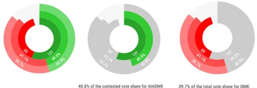
give the percentages and numbers explicitly in the text which appears below the chart on hovering over the rings (Rodden, 2013).
In the chart, the innermost ring represents the number of seats won by both the parties followed by the ring of contested vote share. The outermost ring represents the total vote share won by each party.
Figure 7: Vote-Shares Using Multi-Level Pie Charts.
4.3.
General Principles
• Employ sectioned concentric regions to depict hierarchical data.
• Use different saturation of the same hue to show hierarchy within data.
• Use highlight on hover with text popups to improve user interaction.
4.4.
How the Presence of NOTA, PMK and Third Front Affected the Election
Results?
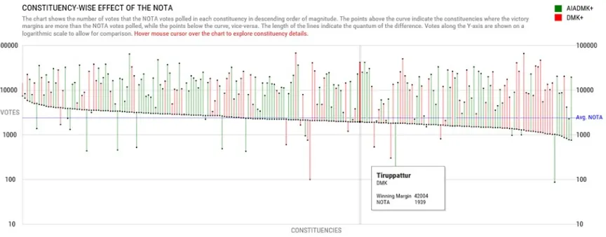
The research question here aims to observe the relationship between winning margin (difference in votes for winner and runner up candidate) and one of the parameters from NOTA (None of the Above), votes obtained by PMK party, votes obtained by Third Front (alliance of parties – DMDK, PWF, TMC).
Figure 8 is an interactive line charts presented in non-aligned fashion. Statistics for winning margin and one of the parameters as mentioned above for each constituency are represented by two bubbles. These bubbles represent votes which number typically in several thousands, hence they are plotted on a logarithmic scale by transformation of data. The logarithmic scale was used due to the varied values of the victory margins. Showing that on a linear scale would result in an extremely tall graphic. Also, in this case, inter-constituency comparison was not the focal point, instead what the graphic aimed to aid was intra-constituency comparison of victory margin versus party votes. Hence, using the logarithmic scale does not serve so much to represent the absolute numbers as to contain the graphic within a reasonable size.
Figure 9: Enlarged View of Winning Margins and Effect of NOTA
statistical measure - Median which divides a distribution in half i.e., half the observations lie above and half the below.
Initially the idea was to represent this graphics as a scatter plot, but it turned out to be creating a visual burden to the user and it presented a difficulty in relative comparison for different constituencies. Hence, in the next iteration, the idea was refined to have the line joining two bubbles for each constituency. The lines have ‘length’ as an inherent property, and the connectedness depicted by them facilitates easy comparison of two or more constituencies simultaneously. By encoding lines by colors, it augments additional dimension to have more information visible in the graph itself. Here, colors are assigned to the lines based on the coalition of winning party in the constituency.
Graphs are interactive in nature, which allows user to explore minute details for each constituency in the form of tooltips by rolling over on the graphs. As data for all the 232 constituencies is required to fit within the standard PC size, encoded visuals are very small in size. So, rolling over on lines and bubbles is cumbersome as it requires an exact pointer location on them. Hence, according to insights from the Fitts’s law (MacKenzie, 1995), which describes speed-accuracy trade-off for muscle movements in the domain of Human Computer Interaction (HCI), the target area is increased for easier navigation on the graph for the purpose of exploration. Thus, having the mouse pointer on any location, the constituency existing in its vicinity will be highlighted and the respective tooltip will pop up as shown in enlarged Figure 9.
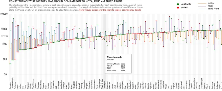
Figure 8 represents the nature of the information for only one single parameter. So, to visualize overall trends and patterns for each parameter, stacked graphs or small multiples can be used as graphic type. Here, four bubbles are required to represent in the combined graph. The idea of stacking is not more appropriate in this context as it will be difficult for the user will to look for the value of particular parameter for that constituency.
Figure 10: Combined Graph for Winning Margin and Effect of NOTA, PMK and Third Front.
are arranged in the ascending order of the winning margin. Unlike the previous three graphs, Figure 10 uses two types of color coding – one for the winning party coalition and the other for representing the type of parameter NOTA, PMK or Third Front to which winning margins are compared. The graph helps readers to grasp the overall trends by scrolling through the whole graph along with informative tooltips.
4.5.
General Principles
• Facilitate users to explore detailed numerical and descriptive information through tooltips.
• Allow quick analysis of positive and negative variation in magnitude from the reference point using sorting.
4.6.
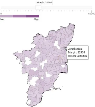
Did the Victory Margins of the Constituencies Show any Geographical Pattern?
Figure 11: Winning Margins through a Slider Controlled Heat Map.
4.7.
General Principles
• Use different saturations of same hues to show range of data (Brewer, 1994).
• Use selection tools like sliders to provider the user control of the amount of data being presented in case of large dataset.
4.8.
How Did the Choice of People Change in Every Election?
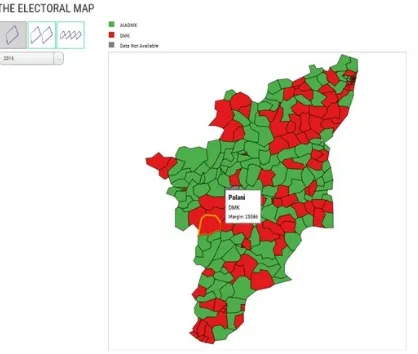
Tamil Nadu faced an idiosyncratic election this time as a party broke a 32-year jinx by winning a mandate for a second consecutive term. The state has witnessed the power swing between the two regional parties in the past six elections, therefore it is important to scrutinize the transformation of the choice of people for every constituency over the years.
The approach used to communicate this data is to use a choropleth map. Data is collected and aggregated by basic electoral units such as constituency. The constituency boundaries in the form of shape files are taken from the datameet.org and simplified and converted to GeoJSON via MapShaper. The two basic decisions for choropleth mapping are color selection and data classing (Brewer, 2006). Because the dataset is categorical in nature, it stands to reason to use color hue representing the different categories, i.e., the winning party in each constituency (Stoffel et al.,2012). In interaction strategy of visualization design, four steps of selecting, linking, filtering and remapping are taken into consideration (Khan & Khan, 2011). A single map was made showing the winning party in each constituency by assigning a different color to each party. It allowed the user to select previous election results by selecting from the drop-down menu. But the visualization design failed to show the comparison due to the use of several colors.
forms a distinction and better understanding. Data unavailability was another challenge as the constituency changed every year. The grey color denotes the data unavailability.
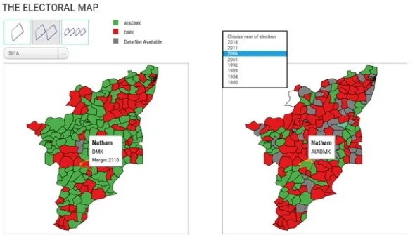
Figure 12: Detailed Electoral Map for Tamil Nadu for a Particular Year Provided Drop-Down Menu for Selection of Year (from 1980-2016).
Edward Tufte places emphasis on comparison, contrast and differences. Incorporating this principle in next iteration of visualization design the user can examine and compare trends and patterns in each constituency for every election by displaying multiple maps in different layouts. The first layout shows a single map (Figure 12), the second layout shows two maps (Figure 13), and the third one has four maps horizontally aligned (Figure 14). Multiple maps are often said to be a complete mapping effort as related data can be examined in series with coordinated classing and can also be compared easily (Stoffel, 2012). In the visual design, when hovering over the maps, the tooltips tell the user about the constituency name and even allows the user to compare between the maps of previous years simultaneously by presenting the winning party of all the years for every constituency.
Figure 14: Comparison of Electoral Map for Tamil Nadu for Four Different Elections Provided Drop-Down Menus for Selection of Years (from 1980-2016).
4.9.
General Principles
• Use small multiples to show overall patterns of data over a period of time.
• Use multiple layouts with varying sizes to maintain consistency in design to aid comparison.
• Use simultaneous popups on each multiple to aid comparison.
• Use selection tools like sliders to provider the user control of the amount of data being presented in case of large dataset.
4.10.
How Color Vision Deficiencies Affect Perception of Visualization?
Nearly 8.5% of total population around the world has color vision deficiency, significantly greater in males compared to females (Color Blindness, 2016).
Color blindness or color vision deficiency is termed as the inability to distinguish between all or certain colors which essentially affects perception. It is present at birth, hereditary in most of the cases, and has no cure. There are three main types of color vision defects namely Red-Green color vision defects, Blue-Yellow color vision defects and complete absence of color vision. Also, it can be classified based on the causes of color vision deficiencies such as protan, deutan, tritan, achromatan (Color Blindness, 2016). Figure 15 depicts how perception of a normal person differs from the person having vision deficiencies in context of the developed election data visualization.
According to scientific study of people with color vision deficiencies, 99% of all colorblind people suffer from red-green color blindness (Color Blindness, 2016). So, in an ideal situation using Red and Green colors together should be avoided when color is the only encoding method to make distinct comparison. In contrast to that, the choice of color does not make a great impact when color is additional encoding method or it has secondary encoding method available. For example, the following map contains color coding for representing two parties but tooltips for each constituency contains name of the winning party. Hence, it will not impact the perception, i.e., irrespective of user with or without vision deficiencies. These maps were generated using jsColorBlindSimulator (Wickline, 2001).
Figure 15: Comparison for Visual Perception of Ordinary Person and Person Having Visual Deficiencies Classified Based on Causes of Deficiency.
(Brewer, 2006), which helps in choosing colors for maps based on various parameters like hue types, number of data classes, colorblind friendly and print friendly as per the Figure 16.
Figure 16: Chloropleth Example Generated Using ColorBrewer.
Figure 17: Providing User Choice for Changing Color Scheme on Demand.
4.11.
General Principles
• Avoid use of color-palettes that are prone to misperception (by color vision deficient people) when only encoding method is color.
• Use of colors with significant difference in shades will minimize the risk of distinguishing between colors.
• Provide user choice for changing color scheme on demand.
5.
Discussion
One of the suggestions we got from user studies was that our visualization could be converted to a tool or a template for visualizing other state elections as well. The problem that arises when doing this is that the questions answered by this visualization are very specific to the characteristics of the 2016 assembly elections in Tamil Nadu. Thus, converting the whole of this visualization into a visualization tool would not be useful as some features would be too specific to ever be used. This would just lead to making another version of a general purpose visualization tool like Tableau which is not suitable for such specific questions. It is possible to make visualizations like “Voting Margins vs NOTA” and the choropleth map can be made into editable templates owing to their generic nature.
Hence, there is a need for a modifiable template instead of a visualization tool which also does not need very low-level knowledge of code. It is important to keep it less coding intensive as many users would be designers who would not be interested in the underlying code but only in the final graphic.
6.
Future Work
As the foremost motivation for the project was to improve public access and understanding of electoral data, the measures of success of the project are how much of the population we reached, and how effectively is our message communicated. The authors are aware of the fact that only about 30% of India’s population are able, to varying degrees, speak English—though only a third of that have some semblance of reading and writing aptitude (Aula, 2014). With the current literacy level approximately at 75%, it is imperative that the language of communication necessarily has to be in the regional languages.
Figure 18: Tamil Nadu Assembly Election Analysis in Tamil Language
the aim was to make no concessions in providing the information that was offered in the English version. Keeping this in mind, we translated the English content into Tamil by someone who is well versed in Tamil. We incorporated the simplest form of Tamil language and used numerals so that people could understand the findings with ease. At the time of writing this paper, we have only received some preliminary data about its reach and effectiveness. Another interesting question would be on the tone and flavor of the graphics—whether simple translations (as in our first attempt) would be sufficient or more nuanced localization is required. We hope to present the findings in a future paper.
References
Appelgrena, E., & Nygren, G. (2014). data Journalism in Sweden. Digital Journalism, 2(3), 394–405.
Aula, S. (2014), The Problem With The English Language In India. Forbes. Retrieved July 9, 2016
fromhttp://www.forbes.com/sites/realspin/2014/11/06/the-problem-with-the-english-language-in-india/#29b7e96e37be
Bade, R., Schlechtweg, S., & Miksch, S. (2004). Connecting time-oriented data and information to a coherent interactive visualization. Proceedings of the SIGCHI Conference on Human Factors in Computing Systems, 6(1), 105–112.
Banerjee, M. (2014). Why India Votes (Exploring the Political in South Asia). New Delhi: Routledge Publications.
Bouvier, J. (1856). Electoral democracy. A Law Dictionary, Adapted to the Constitution and Laws of the United States. Retrieved July 1, 2016 from http://legal-dictionary.thefreedictionary.com/Electoral+democracy
Brewer, C. A. (2006). Basic Mapping Principles for Visualizing Cancer data using Geographic Information Systems (GIS). American Journal of Preventive Medicine, 30(2 SUPPL.), 25–36.
Brewer, Cynthia A. 1994. Color use guidelines for mapping and visualization. Chapter 7 (pp. 123-147) in Visualization in Modern Cartography
Brewer, Cynthia A. (2006). Color Advice for Maps. Retrieved July 5, 2016 from http://www.ColorBrewer2.org
Chellappan, K. (2016). Amma Bucks 32-year trend. The Pioneer. Retrieved July 3, 2016 from http://www.dailypioneer.com/todays-newspaper/amma-bucks-32-year-trend.html
Color Blindness (2016). Retrieved July 5, 2016 from https://en.wikipedia.org/wiki/Color_blindness
data.gov (2016). Open data Internationally. Retrieved July 5, 2016 from https://www.data.gov/app/uploads/2016/10/opendatasites.xls
De Vreese, Claes H. 2003. Framing Europe. Television News and European Integration. Amsterdam: Aksant De Vreese, Claes H., Susan A. Banducci, Holli Semetko, and Hajo Boomgaarden. 2005. “Political
Djerf-Pierre, Monika, and Lennart Weibull. 2001. Spegla, granska, tolka. Aktualitetsjournalistiki svensk radio och TV under 1900-talet. Stockholm, Sweden: Prisma.
Ghosh, S. (2014). Electoral databases – Privacy and Security Concerns. The Centre for Internet and Society. Retrieved July 3, 2016 from http://cis-india.org/internet-governance/blog/electoral-databases-2013-privacy-and-security-concerns
Graber, Doris A. 2005. “Political Communication Faces the 21st Century.” Journal of Communication 55(3):479–507
Hallin, D. C. & Mancini, P. 2004. Comparing Media Systems: Three Models of Media and Politics.New York: Cambridge University Press.
Heer, J., & Robertson, G. G. (2007). Animated Transitions in Statistical data Graphics. IEEE Transactions on Visualizations and Computer Graphics, 13(6), 1240–1247.
Heer, J., Bostock, M., & Ogievetsky, V. (2010). A Tour through the Visualization Zoo - A survey of powerful visualization techniques, from the obvious to the obscure, Communications of ACM. Journal of Association for Computing Machinery (ACM), 53(6), 59-67
Kaid, Lynda Lee, Jacques Gerstlé, and Keith Sanders, eds. 1991.Mediated Politics in Two Cultures. Presidential Campaigning in the United States and France. New York: Praeger.
Khan, M., & Khan, S. (2011). data and Information Visualization Methods and Interactive Mechanisms: A survey. International Journal of Computer Applications, 34(1), 1–14.
Kriebel, A. (2012). Donut charts are worse than pie charts: Have no fear! There are many alternatives. VizWiz. Retrieved June 5, 2016 from http://www.vizwiz.com/2012/06/donut-charts-are-worse-than-pie-charts.html?m=1
MacKenzie, I. S. (1995). Movement Time Prediction in Computer Interfaces. Readings in Human-Computer Interaction, Second Edition, 483–492.
McManus, John H. 1994. Market-Driven Journalism. Let the Citizen Beware? Thousand Oaks, CA: Sage. Naga, C. A. V, Gopalakrishnan, B., Agarwal, H., Ravi, M. V, & Zatakia, A. (2009). Reforming the Indian
Election System. Report of Indian Institute of Management, Bangalore. Retrieved July 2, 2016 from http://www.docfoc.com/indian-electoral-reforms
Norris, Pippa. 2000. A Virtuous Circle. Political Communications in Postindustrial Societies. New York: Cambridge University Press
Office of chief Electoral Officer, Tamil Nadu (2014). Report of Election Commission of India (ECI). Retrieved July 2, 2016 from http://eci.nic.in/eci_main1/sveep/Sveep_data/SVEEP_Initiatives_LS2014.pdf Petersson, Olof, Monika Djerf-Pierre, Jesper Strömbäck, and Lennart Weibull. 2005. Mediernas integritet.
Stockholm, Sweden: SNS Förlag
Rajasekar, P. (2014), India’s Media – Missing the data Journalism Revolution. The Global Investigative Journalism Network (GIJN). Retrieved July 8, 2016 from http://gijn.org/2014/07/21/indias-media-missing-the-data-journalism-revolution/
Rodden, K. (2013). Sequences sunburst. Blocks.org. Retrieved July 5, 2016 from https://bl.ocks.org/kerryrodden/7090426
Rogers, S. (2010). Florence Nightingale, datajournalist: information has always been beautiful. The Guardian. Retrieved July 5, 2016 from https://www.theguardian.com/news/datablog/2010/aug/13/florence-nightingale-graphics
Royal, C., & Blasingame, D. (2015). data journalism: An explication. International Symposium on Online Journalism, Journal of ISOJ. 6(1).
Sanjay, K., & Rai, P. R. (2013). Measuring Voting Behaviour in India. New Delhi: SAGE Publications
Sisk, T. D. (2001). Democracy at the Local Level. The International IDEA (International Institute for Democracy and Electoral Assistance) Handbook on Participation, Representation, Conflict Management, and Governance
Stoffel, F., Janetzko, H., & Mansmann, F., (2012). Proportions in categorical and geographic data: visualizing the results of political elections. Proceedings of the International Working Conference on Advanced Visual Interfaces, 457–464.
Wickline, M. (2001). Retrieved July 5, 2016 from http://mapeper.github.io/jsColorblindSimulator/
Wong, B. (2010). Points of view: Color coding. Nature Methods. Journal of. Nature Publishing Group, 7(8), 573–573.
Wood, J., Badawood, D., Dykes, J., & Member, A. S. (2011). BallotMaps: Detecting Name Bias in Alphabetically Ordered Ballot Papers. IEEE Transactions on Visualizations and Computer Graphics, 17(12), 2384–2391.
About the Authors
Kuhu Gupta
Kuhu Gupta is a fourth-year Bachelor degree student in Information Technology from National Institute of Technology, Raipur.
Shailaja Sampat
Shailaja Sampat is a fourth-year Bachelor degree student in Information and Communication Technology from Institute of Engineering and Technology, Ahmedabad University.
Manas Sharma
Manas Sharma is a third-year Bachelor degree student in Design from Indian Institute of Technology, Guwahati.
Venkatesh Rajamanickam