Promoting Interactive Visualisation at the University of
Oxford: The Live Data Network
Martin John Hadley
University of Oxford University of OxfordHoward Noble
Abstract
This article introduces the Live Data project funded by the Research IT Board of the University of Oxford’s IT Services department. The primary aim of the project is to support academics in creating interactive visualisations using a variety of cloud-based visualisation services, which the academic can freely embed within academic journals, blogs and personal websites through the use of iframes. To achieve this the project has been funded from October 2015 to March 2017 to recruit visualisation case studies from across the University and to develop software agnostic workflows for the creation of interactive visualisations.
Within this report we present interactive visualisations as a vital component of the academic’s toolkit for engaging potential collaborators and the general public with their research data – thereby bridging the so-called ‘data gap’ between data, publication and researcher.
Received 19 October 2015 ~ Accepted 24 February 2016
Correspondence should be addressed to Martin Hadley, IT Services, University of Oxford, 13 Banbury Rd, Oxford. OX2 6NN. Email: [email protected]
An earlier version of this paper was presented at the 11th International Digital Curation Conference.
The International Journal of Digital Curation is an international journal committed to scholarly excellence and dedicated to the advancement of digital curation across a wide range of sectors. The IJDC is published by the University of Edinburgh on behalf of the Digital Curation Centre. ISSN: 1746-8256. URL: http://www.ijdc.net/
Copyright rests with the authors. This work is released under a Creative Commons Attribution (UK) Licence, version 2.0. For details please see http://creativecommons.org/licenses/by/2.0/uk/
Introduction
Open access and open data are necessary but not sufficient for visible and easily discoverable research. While significant infrastructure has been dedicated to the
development of research curation and long-term preservation technologies, the problem of discoverability and the so-called ‘data gap’ remain largely ignored (Wessels et al.,
2014). This is despite the universally accepted provision of public access to publicly funded research data (Pilat and Fukasaku, 2007).
There is considerable evidence that open data increases citation numbers,
particularly within the medical sciences (Piwowar, Day, and Fridsma, 2007; Piwowar and Vision, 2013). But it is a myth that ‘publicising data will automatically yield
benefits’ (Janssen, Charalabidis, and Zuiderwijk, 2012). It is crucial to acknowledge that open data has little value in itself to either researchers or the public. Data should only be considered visible when it is easily accessible and understood.
Unfortunately, it is widely acknowledged (Brown, Rachel, and Kernohan, 2015) that the implementation of research data management (RDM) practices is driven almost exclusively in terms of compliance and mandates. The benefits of open research to the researcher, wider scientific community and society are mostly lost in direct
communications from institutions to researchers. Since developing and implementing its RDM Policy and Infrastructure Strategy (Wilson and Jeffreys, 2013; Wilson, Martinez-Uribe, Fraser, and Jeffreys, 2011), the University of Oxford has sought methods to actively engage its researchers in RDM and to understand the benefits available to researchers through the infrastructure it provides.
Researchers have repeatedly provided feedback about a lack of training and advice in how to promote their publications and open access datasets in the modern, data-orientated research and publication marketplace. In response to this feedback, Research Support Services in the IT Services department interviewed academics across the University through 2013 and 2014. Their findings identified a clear need to ‘support researchers who want to engage the public, and academics in other fields, by publishing data visualisations’ (Gatto, 2015).
This report constitutes an early overview of the Live Data project funded by the Research IT Board of Oxford University’s IT Services department. The project is funded from October 2015 to March 2017 to explore the current state of cloud-based visualisation services. Case studies are the primary method through which both
academic needs and visualisation service capabilities will be explored, in addition to the formation of an academic network of individuals interested in data visualisation and its use in communicating research findings. Put simply, the project aims to support
academics in creating interactive visualisations from research data repositories or individual file uploads for embedding within academic publications, blogs, research project and personal webpages.
In addition to individual case studies, the project will output a range of software/tool agnostic workflows for processing research data into dynamic exploratory
Interactive Data Visualisation for
Communicating Research Data
Data visualisation provides a mechanism through which both data and research findings may be communicated directly to both a general and technical audience (Kelleher and Wagener, 2011), as well as providing a practical tool in collaborative projects (Kirby and Meyer, 2013). The traditional role of visualisations as furniture for academic papers is no longer valid in today’s data-driven research climate and given the digital nature of today’s academic publishing industry. (Fox and Hendler, 2011).
Visualisations now provide a tool throughout the whole life cycle of data curation: from initial experiment and data gathering to analysis, publication and promotion using social media. However, static visualisations may only be used to directly communicate the results and data interpretations of the author – they are purely explanatory tools (McInerny et al., 2014). Through the use of modern web technologies, it is possible to extend the power of a visualisation beyond a simple narrative device to an interactive exploration and analysis tool.
The following cloud-based visualisation services are currently being trialled in case studies under development by the project. Additional services will be considered as more case studies are recruited.
Plot.ly
plot.ly1 is a cloud-based visualisation service and JavaScript library that allows data to
be displayed interactively as charts, plots and cartograms. The service provides a free to use point-and-click interface for generating the most widely used chart types; a paid subscription is only required for creating visualisations that are not publicly available.
This service is recommended to researchers who require a simple interactive chart with tooltips to be embedded within a website, where it is satisfactory for the data behind the visualisation to be made available publicly.2
The JavaScript library was open-sourced in November 2015, in addition to API libraries for R and Python – two scripting languages being used in the Live Data project. This allows for the free use of plot.ly’s easily customisable data visualisations within other visualisation tools, such as Shiny, without requiring researcher’s data to be publicly available on the plot.ly service and subject to their pervasive data usage
license.
Shiny
Shiny is an R library developed as part of the Foundation for Open Access Statistics (FOAS) that allows for the development of powerful interactive elements through the exclusive use of the R programming language. R is used ubiquitously across the
University of Oxford, its pervasiveness across all four disciplines is almost unrivalled – providing an excellent default scripting language for the Live Data project. All CRAN hosted packages may be utilised within a Shiny app, providing the most flexibility out of all three services detailed in this report, as network graph visualisations are currently entirely unsupported in Tableau and are minimally supported by the plot.ly service.
1 Plot.ly: http://www.plot.ly
Interactive content created using Shiny must be hosted on a server running the Shiny Server application, due to the dependence on server-side interpretation and evaluation of R code. Shiny is made available as a service by its developers3 and examples of the
visualisations that can be created are available in the Shiny gallery4. shinyapps.io
provides a number of subscription options, with price scaling by the number of ‘interactive hours’ consumed by a Shiny app. The free tier providing ten hours
interactive time per month and a limit of five deployed applications at any one time. The Live Data project is funding a higher tier subscription that allows a maximum of 10,000 active hours per month, unlimited applications and multiple account access. This will be used to host case studies developed within the project and existing Shiny apps
developed by researchers at Oxford.
This service will be recommended to researchers who are interested in creating bespoke visualisations with significant interactivity, including tooltips,
highlighting/excluding data from visualisations, selecting between datasets to visualise, and selecting between charts/plots themselves.5
The Shiny service has a unique advantage over the other two services mentioned herein; the ability to link visualisations to live data sources. For instance, a researcher may wish to link a visualisation to a growing database within ORDS via its RESTful API or else to data stored within a Google Sheet. It should be noted that data embedded directly within Shiny apps is uploaded wholesale to the shinyapps.io service, but cannot be downloaded directly without the user’s account credentials.
After the Live Data project ends the team will seek departmental contributions to continue using the shinyapps.io service and will explore the option of a self or third-party hosted Shiny server in the long term future. Researchers will retain the code for Shiny apps developed for them and will be free to self-host the content using a free shinyapps.io account.
Tableau Public
Tableau is a software platform that provides a simple and easy to use interface for the filtering, processing and visualisation of data in variety of formats – specialising in time series, categorical and cartographic data. Tableau Public is a service provided by its developers that allows researchers to freely create Tableau visualisations using the desktop application and to host these at no cost as interactive data visualisations on the Tableau Public service6. These visualisations might more correctly be identified as
visually rich reports, as graphics, text and UI elements can be added to allow further exploration and explanation of the embedded dataset.7
Visualisations created using Tableau Public can only access static datasets uploaded directly to the Tableau service and can be forked by other users without attribution.8
This service will be recommended to researchers interested in creating interactive dashboards or reports and are able to upload their dataset to the Tableau Public service. The Live Data project team has investigated the option of using a private Tableau Server instance but does not have sufficient resources at present. In the long term we would
3 See: http://www.shinyapps.io
4 Shiny Gallery: http://shiny.rstudio.com/gallery/
5 An example large-scale Shiny app on Alaska/Western Canada and Historical and Projected Climate,
developed by Matthew Leonawicz, is available at: http://shiny.snap.uaf.edu/akcan_climate/
6 See: https://public.tableau.com/s/gallery
7 For example, see: https://public.tableau.com/s/gallery/favorite-dinosaurs-0
8 Full information about their terms of service is available at:
seek the option of providing this facility to the University through departmental contributions.
Interactive Visualisation Case Studies
Case studies for the project have been recruited through Research Support Service’s initial interviews with researchers at the University about their visualisation needs. We are primarily interested in recruiting researchers who have datasets that are
accompanying publications currently in preparation, as a means to test the assumption of visualisations bridging the data gap. However, we are also interested in working with research projects that have existing data repositories that they would like to expose to a wider audience – particularly to recruit additional deposits to the resource.
The target audience for case studies is the eponymous ‘long tail’ academic;
individuals whose needs can be satisfied by existing visualisation tools without the need to write highly customised scripts or new JavaScript libraries. Long tail academics typically suffer from immediate and significant feature creep. Having never seen the ease with which an interactive map or chart can be created, many academics
immediately seek the boundaries of what can be added to their visualisations. Expectation management within the scope of individual case studies is therefore incredibly important, as well as in documentation of tool capabilities in the project website. Importantly, there are experts at Oxford in the OERC and other departments who are suited to building custom tools and building these into services, who academics will be driven towards as necessary.
The output of each case study will be at least one interactive visualisation that will be embedded into the Live Data project website and made available to the researcher for embedding within their publication and other resources. This is in addition to a short report on the steps followed to create the visualisation, which will also be made available on the project website. Any code/scripts used will be made available under a Create Commons license, attributable to the researcher and project. Case studies have not yet been published on the project site, however a number of case studies under developed are detailed below:
Early Modern Letters Online (EMLO)
Early Modern Letters Online9 is an online repository of thousands of letters sent across
Europe between the 16th and 18th Century. The EMLO team have worked with the Live Data team to build a prototype visualisation of a subset of this data. Work is continuing well on this project and was recently discussed at the Reassembling the Republic of Letters EU COST workshop at Oxford.
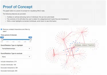
The visualisations include a dataset-wide collaboration network utilising the visNetwork library and a tool for exploring the combined ego networks of selected individuals from the parent graph. This work constitutes the basic template for the interactive network template and is expected to be finished in February 2016.
What Does Immigrant Integration (Not) Mean? Reconsidering Integration Through the Eyes of German Immigrants in the US
Dr Felix Krawatzek from the Department of Politics and International Relations studies German migrant remittances in a historical perspective and was interested in visualising a set of letter correspondences between German migrants and their domestic families in the 19th and 20th Century. Dr Krawatzek discovered the Live Data project through our networking meeting in November 2015 and expressed an interest in working with the team on creating a Shiny app for allowing viewers to explore the letters through an interactive map.
A smaller version of this Shiny app is to accompany his forthcoming article published by The Conversation10 in late January 2016. We will be using Google
Analytics to track engagement with the visualisation and investigate potential impact in collaboration with Dr. Krawatzek.
Cancer Research Collaboration Network at Oxford
Cancer research is a truly interdisciplinary and international research field. At Oxford there are researchers in biomedicine, chemistry, genetics, physics, zoology, and materials science. The core focus in promoting interdisciplinary research, particularly for ‘moonshots’ like cancer research, is for inter-university and industrially partnered academic research, but the importance of intra-university collaboration networks is under represented.
Oxford’s Cancer Research department has funded a project headed by Dr Claire Bloomfield and Kevin McGlynn, which seeks to use the University’s Symplectic Elements and other databases to build a cancer collaboration network tool. In addition to formal publication interactions, the team will collate information about other joint ventures between academics to develop a holistic view of cancer research collaboration at Oxford. This will be made available as a service for the strategic planning team to allocate funding and identify under represented research themes.
The Live Data project is working with the team to build interactive tools for exploring this network and the research outputs of academics at Oxford. Draft tools should be available through the Live Data case study website in June 2016.
ORDS API for Visualisations
The Online Research Database Service (ORDS) is an open source RDM infrastructure platform developed at the University of Oxford for the purpose of creating, sharing and collaborating on relational databases during the live data phase of a project.
Fundamentally, ORDS is not a long-term data repository, but a platform within which research is done and managed (Wilson and Jeffreys, 2013).
ORDS is the result of Jisc and HEFCE funded projects spanning half a decade to develop an originally Oxford-exclusive Database-as-a-Service tool for the Humanities into an open source, scalable and customisable service for use by other Universities. The ORDS service would provide an important ‘heavyweight’ solution for researchers that require collaborative databases on demand and a number of Universities have expressed initial interest in pilots through 2017.
The Live Data project has provided additional funding to the ORDS development team to design and implement a RESTful API for access to both database metadata and database tables through SQL queries. This will allow researchers to hook their citable datasets directly into interactive visualisations, providing the facility for visualisations to become more impactful as datasets grow and develop. API development is almost complete and will undergo beta testing in February 2016.
Visualisation Showcase and Live Data Network
Modern service improvement and infrastructure projects are dependent on a web presence to collate and communicate progress and project findings. In the case of the Live Data project it is crucial to provide a central resource for the interactive
visualisations developed through our case studies, in addition to the necessary scripts and workflows to generate such visualisations from research data repositories via API and individual file uploads.
Oxford is currently developing a Drupal-powered solution for groups or individuals who require an ‘out of the box’ website with University of Oxford branding and hosting on both University infrastructure and domains. This ‘template website’ provides a number of standard features, however did not until recently include the support for embedding arbitrary external content – for instance a plot.ly or Tableau Public visualisation. The Live Data project funded requirements gathering, estimation and research into this and it will now be possible for users to embed a variety of content directly into their websites. Delivery of the website template service is expected in the near future and is being overseen by the Software Solutions team at IT Services.
The public name of the Live Data service has not been agreed by the project team and material for the website is very much under development as of January 2016. As such the site has not been moved to a permanent URL11. The website fulfil the following
project goals:
Showcase Interactive Visualisations
All visualisations built as part of Live Data case studies will be added as articles to the Drupal site, in addition to other researcher’s visualisations that they wish to be
showcased on the project site. These visualisations will be tagged by tool used, chart type and subject domain to allow the site visitor to filter through visualisations according to their interest. Visualisations will be accompanied by DOI for the
underlying data and research (where available) in addition to the researcher’s ORCID, ResearcherID and any other identifying information or blurb that they wish to provide. It is the goal of the Live Data project to build this showcase element of the website as a resource that all researchers at Oxford will consider depositing/embedding their interactive visualisations into. To support this goal, the project team are in discussion with the ‘act on acceptance’ team in Research Services12 so as to allow deposit into the
Live Data showcase directly.
Promote Visualisation Tools
Maintaining an authoritative list of the visualisation tools available to researchers is not only beyond the scope of the Live Data project it would also be impossible to compile an exhaustive and up to date with the resources available to the project team. There are a wide variety of existing comparative lists and wikis13. However, a thorough list of the
tools and services used in project case studies and covered in project developed training materials will be maintained.
The project team will, however, seek information about visualisation tools
developed within Oxford University, with the aim of becoming an authoritative source of information about such tools.
Grow a Network of Visualisation Consultants and Experts
To encourage the dissemination of knowledge about visualisation tools and the expertise required to use them, particularly in the case of scripting languages like R, the Live Data website will maintain information about researchers interested in collaboration or consulting opportunities. However, rather than creating a distinct and isolated group the project team is seeking alliances with existing research networks, particularly the Oxford Research Software Developer Network and Oxford Research Facilitators Network. In the long term it is envisaged that a distinct web presence will be required for this consultative group.
Visualisation Framework and Training
The Live Data project is fundamentally software agnostic, seeking to encourage the use of any interactive visualisation service that may meet an academic’s needs and
expertise. In order to meet this goal, the project seeks to develop two types of training content: practical and software agnostic advice to researchers on how to get data from, for example, a database into an interactive visualisation; and tool-specific workflows for specific visualisations. Encompassing these materials the project team are working with the IT Learning Programme to write a multi-session ‘visualisation framework’ course that covers data access from repositories (such as using the ORDS API), data cleansing and analysis, visualisation, and finally hosting interactive content online.
Through Research Support Services initial investigation into researcher’s needs for interactive visualisations, the following tools will be targeted in training materials; D3, plot.ly, Shiny, Tableau Public, and Wolfram Cloud. Some of these tools are rate limited or else require individual/server licensing. The project has sufficient budget to fund licensing for a mix of these technologies and will prioritise budget according to
researcher demand. All training materials, including the Visualisation Framework, will be made available under a Creative Commons licenses.
As previously mentioned, Shiny provides an excellent default tool of choice where advanced interactivity is required due to the ubiquity of the R language. To account for this there be a number of template Shiny apps available through the project website, the following screenshots demonstrate development versions of these templates.
Figure 1. Interactive map with time slider template.
Acknowledgements
The project team would like to acknowledge the assistance of the Research IT board for funding this initiative, and the support of the project team and steering group. In
particular, we would like to thank the following individuals: Min Chen, Elizabeth Greenhalgh, Ken Kahn, Ruth Kirkham, Jonathan Prag, Richard O’Beirne, Margaret Varga, and Rowan Wilson.
References
Brown, S., Rachel, B., & Kernohan, D. (2015). Directions for research data
management in UK universities. Retrieved from
https://drive.google.com/file/d/0BwVuBK4FRW2zZzJTSG1SNUhGV0U/view? usp=sharing
Fox, P., & Hendler, J. (2011). Changing the equation on scientific data visualization.
Science, 331(6018), 705–708. doi:10.1126/science.1197654
Gatto, M.A.C. (2015). Making research useful. University of Oxford: Reuters Institute
for the Study of Journalism. Retrieved from
http://reutersinstitute.politics.ox.ac.uk/publication/making-research-useful
Janssen, M., Charalabidis, Y., & Zuiderwijk, A. (2012). Benefits, adoption barriers and myths of open data and open government. Information Systems Management, 29(4), 258–268. doi:10.1080/10580530.2012.716740
Kelleher, C., & Wagener, T. (2011). Ten guidelines for effective data visualization in scientific publications. Environmental Modelling and Software, 26(6), 822–827.
doi:10.1016/j.envsoft.2010.12.006
Kirby, R.M., & Meyer, M. (2013). Visualization collaborations: What works and why.
IEEE Computer Graphics and Applications, 33(6), 82–88.
doi:10.1109/MCG.2013.101
McInerny, G.J., Chen, M., Freeman, R., Gavaghan, D., Meyer, M., Rowland, F., … Hortal, J. (2014). Information visualisation for science and policy: Engaging users and avoiding bias. Trends in Ecology and Evolution, 29(3), 148–157.
doi:10.1016/j.tree.2014.01.003
Pilat, D., Fukasaku, Y. (2007). OECD principles and guidelines for access to research data from public funding. Data Science Journal, 6(23). doi:10.2481/dsj.6.OD4
Piwowar, H.A., Day, R.S., & Fridsma, D.B. (2007). Sharing detailed research data is associated with increased citation rate. PLoS ONE, 2(3).
doi:10.1371/journal.pone.0000308
Piwowar, H.A., & Vision, T.J. (2013). Data reuse and the open data citation advantage.
Wessels, B., Finn, R.L., Linde, P., Mazzetti, P., Nativi, S., Riley, S., … Wyatt, S. (2014). Issues in the development of open access to research data. Prometheus, 32(1), 49– 66. doi:10.1080/08109028.2014.956505
Wilson, J.A.J., & Jeffreys, P. (2013). Towards a unified university infrastructure: The data management roll-out at the University of Oxford. International Journal of
Digital Curation, 8(8), 235–246. doi:10.2218/ijdc.v8i2.287
Wilson, J.A.J., Martinez-Uribe, L., Fraser, M.A., & Jeffreys, P. (2011). An institutional approach to developing research data management infrastructure. The International