ARROW@TU Dublin
ARROW@TU Dublin
Articles Support Services
2016-10-17
Responsive Web Site Development at the Library, Technological
Responsive Web Site Development at the Library, Technological
University Dublin: aCase Study
University Dublin: aCase Study
Niamh Walker-Headon
Technological University Dublin, [email protected]
Follow this and additional works at: https://arrow.tudublin.ie/ittsupart
Part of the Library and Information Science Commons
Recommended Citation Recommended Citation
Niamh Walker-Headon (2016): Responsive Web Site Development at the Library, Technological University Dublin: A Case Study, Journal of Web Librarianship, DOI: 10.1080/19322909.2016.1229147
This Article is brought to you for free and open access by the Support Services at ARROW@TU Dublin. It has been accepted for inclusion in Articles by an authorized administrator of ARROW@TU Dublin. For more information, please contact
[email protected], [email protected], [email protected].
This work is licensed under a Creative Commons Attribution-Noncommercial-Share Alike 3.0 License
Full Terms & Conditions of access and use can be found at
http://www.tandfonline.com/action/journalInformation?journalCode=wjwl20
Download by: [Institute of Technology], [Niamh Walker-Headon] Date: 26 October 2016, At: 04:52 ISSN: 1932-2909 (Print) 1932-2917 (Online) Journal homepage: http://www.tandfonline.com/loi/wjwl20
Responsive Web Site Development at the Library,
Institute of Technology Tallaght: A Case Study
Niamh Walker-Headon
To cite this article: Niamh Walker-Headon (2016): Responsive Web Site Development at the Library, Institute of Technology Tallaght: A Case Study, Journal of Web Librarianship, DOI: 10.1080/19322909.2016.1229147
To link to this article: http://dx.doi.org/10.1080/19322909.2016.1229147
Published online: 17 Oct 2016.
Submit your article to this journal
Article views: 26
View related articles
ARTICLE
Responsive Web Site Development at the Library, Institute
of Technology Tallaght: A Case Study
Niamh Walker-Headon
Library, Institute of Technology Tallaght, Dublin, Ireland
ARTICLE HISTORY
Received 4 September 2015 Accepted 23 August 2016
ABSTRACT
This case study reviews the responsive Web design project undertaken by the Library, Institute of Technology Tallaght, with Granite Digital, including the preparatory literature review, the design process, task allocation, and the technologies leveraged to deliver thefinal design. The library is a small academic library with limited resources, and the project took place during a particularly challenging period in Ireland. The different types of testing the site underwent before launch are discussed, including testing of the design itself across browsers, accessibility testing using free online resources, testing the responsive design using free online resources, and physical device testing. The article outlines how feedback was gathered and addressed, and discusses plans for future upkeep and development. Finally, the article concludes that it is possible for a small academic library to successfully deliver a high quality library Web site using responsive design.
KEYWORDS
accessibility; consultant; hosting; OPAC; responsive Web design; testing; Web design; Web development
Introduction
This case study details a responsive Web design project at a small academic library in Ireland. The Library, Institute of Technology Tallaght achieved what many larger libraries have already been able to realize in terms of responsive design, and even reached thefinal stage for a national level Web award. Employing HTML5, CSS3 (including media queries), and meeting accessibility standards seemed daunting, but implementing strategies such as using the existing hosted catalog server, employing third-party tools, working with a design partner, and taking advantage of vendor services helped the library successfully overcome limited resources in a changing environment. The library relied mostly on freely available resources and tools, as well as the skills of the consultant project partner, Granite Digital. The culmination of the project resulted in a hosted responsive Web design at the Library, Institute of Technology Tallaght.1
CONTACT Niamh Walker-Headon [email protected] Library, Institute of Technology Tallaght, Old Blessington Road, Tallaght, Dublin 24, Ireland.
The decision to undertake this project and use emerging Web design technolo-gies was in keeping with the policy of maintaining a strong, up-to-date online pres-ence for the library with a responsive design. The library also aimed to stop maintaining two sets of online pages and to base its site design on the one used by the parent institute.
This article is based on a poster displayed at the joint European Innovative User Group/Irish Innovative User Group Conference in July 2015 (Walker-Headon 2015).
Academic libraries in Ireland
Ireland’s population exceeds 4.8 million (Central Statistics Office2015), and more than 50 percent of those aged 30–34 hold a third-level qualification (Eurostat 2015), which is a higher proportion than in other European Union countries. Edu-cation in Ireland is structured under the European Union’s Bologna Agreement, which applies to the European Higher Education Area, with ten levels (level ten being Doctorate).2 Third-level education in Ireland is generally understood as studies undertaken at higher than second-level, usually at a college, institute, or university. Education is overseen by the Department of Education and Science and the Higher Education Authority, and qualifications are granted under the auspices of Quality and Qualifications Ireland. There are several different types of organiza-tions providing third-level education in Ireland:
Universities: Seven universities, offering more traditional subject coverage and progression (Irish Universities Association2015).
Institutes of Technology: Thirteen institutes, offering non-traditional pro-gression. Students can progress from two-year courses to four-year degree courses. The Institutes initially concentrated on the science, engineering, and technologyfields (Institutes of Technology Ireland2014).
Colleges of Further Education: Often private colleges, these offer post-leaving certificate (end of second-level education certificate) education at multiple levels within the National Framework for Qualifications. There are hundreds of these, including professional institutes, vocational training, and prepara-tory courses for university entry.
The Institute of Technology sector was formed via legislation (Government of Ireland 1992), and is comprised of the pre-existing Regional Technical Col-leges and new Institutes founded subsequent to the act since 1992.3 The majority of the Institutes are less than 40 years old and serve remote areas, often with disadvantaged socioeconomic populations. Most of the Institutes serve fewer than 10,000 students, making them relatively small on an interna-tional scale. The Institutes offer a wide range of academic programs in all dis-ciplines, including but not limited to trade apprenticeships, science, computing, engineering, digital humanities, sport science, social care, and nursing.
Innovative Interfaces Inc. (III) dominates the library system market in Ireland. Three universities, thirteen Institutes of Technology, the National Library, and (since July 2015) all public libraries use library management platforms (also called integrated library systems) provided by III (Innovative Interfaces Inc.2015). The effects of the current recession, including severe budget cuts and a recruitment embargo in the public service sector (where most professional librarian posts reside in Ireland), are still being felt in Ireland (O’Sullivan2015).
To provide economy of scale, all thirteen Institutes of Technology currently use individual instances of Innovative Interfaces’Millennium integrated library system (ILS), hosted on a VMWare server off-site, by Hewlett Packard (HP). To manage procurement and support for these systems, the library software hosting is man-aged by An Cheim (An Cheim Computer Services Limited2015), now transition-ing to EduCampus (HEAnet Ltd. 2015), on behalf of the institutes as part of a larger management information systems project, which includesfinance (Agresso), student registration (Banner), and human resource management (Core).
Profile of the Library, Institute of Technology Tallaght
The Library, Institute of Technology Tallaght is a small academic library with a registered user population of 6,358,4 a student FTE of 5,200, and about ten FTE staff, with the equivalent of one FTE staff member working on the provision of Web services, split across three staff positions. The Institute is located in a disad-vantaged area of greater Dublin, and its mission is to provide local access to third-level education. A full suite of library services is provided, including silent study space, dynamic group working spaces, access to online subscription resources and open access publications, online support tutorials, and a full information literacy training program. The Institute of Technology Tallaght is a young organization, havingfirst opened its doors to students in 1992. Consequently, the journal, book, and other print material collections are small in comparison to other academic libraries serving similar population sizes, partly due to limited physical storage space and partly due to how new the institution is. The Library has used the Mil-lennium ILS since 2001. Every effort is made to provide access to materials online, within the capabilities of the resources available to the library.
Library, Institute of Technology Tallaght has a policy of providing quality serv-ices and ensuring that it continues to do so by taking part in the LibQualCsurvey on a regular basis (Russell2010). This policy includes the early adoption of new technologies where practical, such as the Simon Fraser University hosted open source researcher suite (Walker-Headon 2010), the LibraryThing App (Roberts 2010), CSS for design layout, Articulate interactive tutorials published as reusable open educational resources (Russell et al.2015), and the Summon resource discov-ery layer. In addition, the library pursues quality in its online services. For example, the Library’s suite of online interactive tutorials was recognized as the ACRL Web page of the month in September 2013 (Russell 2013).5 The Web design project
described in this article continues this tradition and integrates some of these com-ponents, providing a cohesive platform on which to deliver library Web services.
The library is facing a period of change as the Institute prepares for merging with the Dublin Institute of Technology (DIT) and Institute of Technology, Blan-chardstown (ITB), in response to the opportunity to apply for Technological Uni-versity status. The upcoming merger will create arguably the largest third-level institution in Ireland, and if successful in its current application process for Tech-nological University status, a whole new sector in Irish third-level education.6
Literature review
Very few library and information science-specific publications were found dealing with responsive design in a small academic library. Case studies about similar activities are most frequently about larger libraries with more resources, staffing, and training available to support the project. No instance was identified where the responsive site was hosted on the WebOPAC platform. This literature review will introduce responsive design conceptually and technically, present the argument for its use, and present several articles related to specific aspects of this case.
Multiple screen resolutions increasingly became a challenge for Web designers with the explosion of the tablet market in 2010 (Snell2013). Wisniewski (2013), current Web services and communications librarian at the University of Pitts-burgh, described responsive design as a set of tools that solve the problems of not knowing what screen sizes or devices will dominate in the future. CSS coding can be utilized for basic responsive functions, and to control image resolution and size, permitting different devices to access a site with the benefit of maintaining content on one site only (Fox2012; Lessick et al.2013).
The literature recommended specific technical methods to support the creation of a responsive, accessible Web site. The period 2010–13 saw a move toward using HTML5 (the standard was only finalized in October 2014) and CSS3. HTML5 aimed to solve compatibility issues and support multimedia access on mobile devi-ces, bringing major changes to Web application development. New features of HTML5 include the expanded selection of elements and support for embedding video and audio, especially via APIs (Baker2014).
CSS3 is used to control the layout of Web pages separately from page content, while a separate CSSfile entitled“media queries”contains the instructions for how the Web page should respond to different screen sizes and devices (Baker2014; Marcotte 2010); control elements of the page beyond layout, including but not lim-ited to the target area for links; and comply with Fitts’s Law on touch devices, showing and hiding page elements for navigation purposes, and responsive type-setting (Marcotte 2010). If properly utilized the media queriesfile should contain CSS coded entries to specify the layout required to successfully produce a Web page that responds to each device’s screen size requirements. Percentages instead of pixels are used to control the size of design elements and to adjust nested
content areas as the screen gets smaller. Media queries also allow break points to be inserted into page layout (Baker2014; Kim 2013).
HTML and CSS frameworks to control display can also be used to create stand-ards-compliant, cross-browser compatible Web sites. Examples include BASE, Bootstrap, and Foundation (Baker2014; Snell2013). Another example of a special-ized tool is Titan, used to provide configurable settings for WordPress themes and plugins with a few lines of code. Some CMSs like Drupal allow for integrated digi-tal frameworks with thousands of add-ons, modules for functionality, and themes for customizing presentation.
The technical solutions offered by responsive design address the constant evolu-tion of user expectaevolu-tions, Web standards, and Web technologies over the past decade, suggesting libraries strongly consider adopting responsive design (Breeding 2015). Marcotte (2010), the Web designer who coined the phrase “responsive design,” predicted that mobile access would likely outstrip desktop access by 2015, noting that the greater number of devices and browsers have caused a rise in demand for Web sites that work with these devices. While compat-ibility was initially achieved using separate sites or subdomains, a more flexible approach to design is more future-proof, especially in the context of smaller librar-ies where staff resources for online services may be part of a greater set of responsi-bilities, and it is unlikely a staff member can be allocated to the development of online services full time.
Mobile device users expect access to the same amount of information and the ability to complete the same tasks on a mobile device: content and servicesflowing smoothly from one device to another, a mobile “view” of the Web site, menu customization, and more mobile-friendly information resources (Kim 2013). Kim warned that poorly designed responsive sites are as cumbersome to use as non-responsive sites. Changing the placement of content on the mobilized pages can lead to confusion for users familiar with the non-mobile site. The load speed of a responsive site can take longer than a separate mobile site, so Kim urged designers to keep the site uncomplicated, offered steps to begin the process, and suggested tools such as CMSs. Kim noted that marketing thefinal Web site and any addi-tional mobile-optimized services is essential to the overall success of such projects.
Other motivating factors for many sites to move to responsive design have been the fact that Google’s new algorithm moved poorly mobilized sites down in the search results, along with the increasing level of site traffic in non-desktop screen sizes (Ohye 2015). Tools are available to emulate the finalized pages, such as Google Developers’Mobile Friendly Test.7
Studying how users access mobile and desktop Web sites can also provide spe-cific guidance for implementation. One way to learn about constituents’needs is to ask library staff for feedback about where they see users experiencing problems with the Web site (Riley-Huff2012). A more direct way to gather user feedback is from the users themselves. Rempel and Bridges (2013) conducted an online, 12-week survey on the Oregon State University Library’s mobile site and found that
multiple user groups accessed the mobile Web site. Top reasons to visit the site were to check opening times,find a book, research a topic, make study room reser-vations, and check computer availability. Mobile tasks undertaken were similar irrespective of the time of the term. They also analyzed Web analytics (Google Analytics) for the survey period and found the desktop site was used more fre-quently than the mobile site by mobile devices for practical tasks, such as computer or study room availability. Survey responses showed a disconnect between what users did and what they wanted to do, highlighting the need for the Web site to support more complex tasks. A new, responsive design, including the use of Drupal modules and themes, allowed the library to avoid supporting a separate mobile site. Design choices can be constrained by the need to match the design framework of the larger institution. Gayhart (user experience librarian at the University of Toronto Library), Khalid, and Belray (2014) described how their team retained the desktop Web site as-is while developing a responsive design to limit the amount of divergence from the main design. In addition, the responsive design was paired with the redesign of the application and server infrastructure. The Toronto team also discussed communications strategies for users, staff, and library staff as an important part of feedback solicitation and change management.
Accessibility is often discussed in connection with responsive design. Several librarians have argued that Web site accessibility should be a given and that acces-sible Web sites are more usable for everyone (Baker 2014; Riley-Huff2012). For libraries, this is especially important as many are publicly funded, and are often obligated by guidelines or legislation to provide accessible services online. Baker (2014) (systems/institutional repository librarian at Western Oregon University) summarized recent updates to WCAG 2.0, HTML5, CSS3, and WAI-ARIA (a set of HTML attributes for dynamic content or highly developed interfaces to make them accessible). Baker noted that while the four principles of WCAG 2.0 (per-ceivable, operable, understandable, and robust) have no legal standing, they remain the clearest guidelines for accessible design.
Because of limited human resources and the large size of library Web sites, tools for testing sites are important. Riley-Huff (2012) recommended the Web Accessi-bility Evaluation Tool (WAVE). Baker (2014) advised project planning and recom-mended a comprehensive series of steps to provide a framework. These included beginning with content stripped of layout, arranging it in a logical manner, and then adding semantic mark-up using HTML. Styling the site using CSS via an externalfile rather than the inline method makes later CSS and design changes eas-ier to apply globally. JavaScript and other technologies can then be added once these steps are complete, as long as they are made accessible by good scripting practices, use of WAI-ARIA, and are used in an unobtrusive manner. Finally, test-ing the site is important so that if it does not work as expected, time is available to rectify any issues. Riley-Huff (2012) also cautioned readers to be aware of any accessibility software or tools that the user might be using and to take them into account in the design process.
This review of the literature summarized the emergence of responsive design technologies and the argument for their use, and provided support for the argu-ment that library Web sites should impleargu-ment responsive design as one compo-nent of a universal Web design strategy. This approach also provides Web services and content to mobile users that mirrors their desktop experience. To this end, responsive Web design can be used as a tool to future-proof library Web sites against the current online environment of constant change.
Case study
Project background and rationale
In 2005, the Institute introduced the TERMINALFOUR content management sys-tem (Terminalfour Solutions Ltd. 2014) as an Institute-wide initiative to allow for local control of information on the Institute Web site and to encourage the updat-ing of course and departmental information at that level. Library Web team staff sent for training on TERMINALFOUR recommended not adopting it for the library, as there would be a significant delay in the updating of pages given how the system’s editing permissions were configured, the lack of immediacy with updating content edited on the system, and the need to clear content with other Institute staff. Because two staff members already had HTML and Dreamweaver skills, the library decided to move the existing library-related content from the main Institute Web site onto the library’s OPAC server. The site has gone through several design evolutions in the interim. The content has remained on the library’s ILS server since then.
As the library’s Google Analytics reports began to show a trend toward some access via mobile devices, the decision was made to implement the LibraryThing app in 2010 to provide a search interface for the OPAC, access to basic library information such as opening hours and contact details, and links to databases with mobile-friendly interfaces. Google Analytics showed a majority of users accessed the library Web site via desktop computers, but there is a growing mobile presence, which changed from tablet to phone-based in the previous two years.
Recognizing that Web standards are constantly evolving and that “constant beta” has become the dominant paradigm for Web services (including the Sum-mon discovery tool and Google), the library embarked on the project described in this article to provide some future proofing against these forces. This would then empower the library Web team staff to concentrate on projects and tasks needed as the library and Institute begin to work toward merging with the Technological University for Dublin partners (TU4D Steering Group2015).
The project aimed to provide a responsive, accessible, and standards-compliant Web site for library users within the limits of the proprietary nature of Innovative’s WebPAC Pro platform. HTML5 (w3schools2015) and CSS3 (Mozilla Developer Network 2016) were used to deliver a site that met WCAG 2.0 AAA guidelines (Henry 2012) where pages were controlled locally, and that met AA guidelines
where pages had vendor-controlled input boxes and forms. Where feasible, the WAI-ARIA (Henry 2014) guidelines were observed.
In addition to reviewing the literature, the project lead completed an introduc-tory course in HTML5 provided by Google on the Alison.com hosted platform8 (Google Inc. 2013) and reviewed HTML5, CSS3, W3Schools materials, general Web pages, blogs, forums, and Castro and Hyslop’s (2012) Visual Quick Start
Guide: HTML5 and CSS3. The three library Web team members visited over 100
library Web sites and evaluated them for trends in information provision and pre-sentation. These were the Web sites of the libraries of educational institutions listed in the Guardian newspaper’s top 100 universities (Sedghi and Burn-Murdoch2013), all of the Universities in Ireland, all of the Institutes of Technol-ogy, and additional leading colleges of further education and private colleges in Ireland.
The Institute of Technology Dublin Library’s redesign project began in March 2013 and resulted in a soft launch in March 2014. It took nine months tofinalize the design, ensure it worked on the WebPAC Pro platform from III, and verify that templates met accessibility standards and responsive design expectations. Transfer of content and testing of each individual page took about three months.
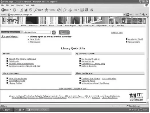
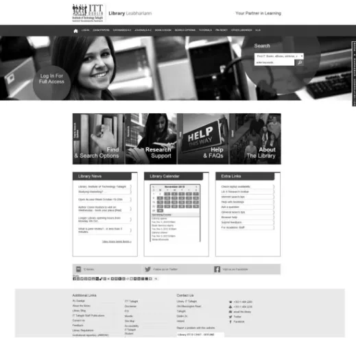
The library Web site has been redesigned several times since 2003, including a move to CSS-based design, the implementation of CSS templates, andfinally the introduction of targeted search boxes. These changes are illustrated inFigures 1,2, and3.
Simultaneous to the library’s decision to have a responsive design, a new design was launched for the main Institute Web site. Consequently, once the library’s ini-tial responsivefiles based on the new Institute Web site design were loaded to the library site, the disparity between the look and feel of the responsive design and that of the older library Web site showed that the responsive design project must be extended to include a complete redesign of the library’s existing Web site.
The library asked the design consultants engaged for the main Web site, Granite Digital, to design three pages to enable the library to develop templates for the delivery of a more uniform Web presence (for an additional fee). Engaging the consultants enabled the library Web team staff to concentrate on the design of templates and content transfer into the new templates for the project while the consultants worked on the HTML5 and CSS3 frameworks. Thus, the completed design is the result of collaboration between the Library Institute of Technology Tallaght and Granite Digital.
Design partners and process
The library provided Granite Digital a detailed briefing document to begin the project discussion. The briefing document was long because it was based on a review of the literature; a review of other library Web sites for functionality,
content, placement of page elements, search tool, and box provision;9and internal documentation from a large-scale review of library Web services. The briefing doc-ument also included an outline of previously made design decisions by the Web team, and the responsive and accessibility requirements of the project. Further-more, the document described several challenges with the III WebOPAC. There are pieces of functionality within the pages that are“black box”: The functionality is hard-coded and consequently cannot be edited or manipulated by the library in any way. For example, the OPAC has only a single library editable CSS file. In addition, each OPAC Web page is composed of three components: the top naviga-tion secnaviga-tion, the main page content, and the bottom naviganaviga-tion and credits secnaviga-tion. Furthermore, the III system uses Web code configuration options that insert code snippets into allfiles, like the HTML header, and metadata to insert into the pages <head>area. The OPAC also specifies“tokens” (i.e., snippets of server-side code that insert ILS functionality) and generates input boxes similar to “server side includes.”10
The briefing document also outlined the limitations of the III-provided ILS server used to deliver the library site, the planned homepage content based on the layout of the main Institute homepage, and page usage statistics and user demo-graphics from Google Analytics. All the issues identified during the design phase were solved except where code was generated by the system, and therefore not accessible for editing. The library Web team achieved this by working jointly with Granite Digital, and where relevant, III. The selection of thefinal design took lon-gest. It required significant testing and retesting to ensure that thefinal design was responsive, compatible with III’s WebOPAC platform, and compliant with accessi-bility standards.
Communication was a challenge throughout the project for both Granite Digital and the library. The briefing document contained significant library jargon and vendor-specific issues related to how the Web pages must be constructed. For example, Granite Digital originally provided thirteen CSS files with the initial design, but thefinal CSS code must be included in onefile along with the library vendor’s CSS to ensure that proper layout and design element inheritances happened.
Not all communication was electronic, and this helped keep things on an even keel. There were two face-to-face meetings, innumerable phone calls, and some Skype interactions. Face-to-face meetings helped, especially when held at the proj-ect lead’s desk, where the coding issues could be readily demonstrated to the con-sultants. Working with the Institute’s computing services department to provide Granite Digital staff access to the library server to work with thefiles within the local environment solved many issues. This took some time to initiate and get working successfully. Internal communication within the library was more success-ful because staff were used to working together in the same offices and were already familiar with the jargon used by III.
The initial design mirrored that of the main Institute closely. Testing by the systems librarian and the Web team identified issues with lack of contrast between the colors used and the JavaScript code used for search input boxes. Therefore, the library Web team together with the Institute Librarian decided to adapt the colors from the Institute’s logo for the project as there was no color conflict when they were tested. All other elements from the main design were retained.
Thefirst steps in testing identified issues such as conflicts between the JavaScript and CSS encoding used for the WebOPAC. This resulted in several rounds of test-ing before providtest-ing a worktest-ing design. To this end, three basic templates were cre-ated. This was in essence a triple-testing scenario, with the design tested as described inTable 1for each of the template pages before any content was changed over to the new design.
The team found a few issues related to the use of the III Web system during test-ing. Early checks indicated a Java conflict between the III-provided input boxes and the drop-down search box embedded in the top of each page on the new
design.11This problem took several months to solve. There were also some device-specific issues with the III-generated“Reset Your PIN”and“Modify Your Record” Web forms.
The new design went live using a soft launch approach. This allowed for initial testing with library staff who provided practical feedback. They reported that some users informed them at the library desk that they could notfind basic information such as the opening hours and links to log in or book a room. Because of the local control of the project and content, it was a straightforward procedure to change the design so that menus on the top of the page that contained links to the most-used pages would not be collapsed for the smaller resolution screens. However, the main page content sliders, where groups of links are presented by function or topic, were collapsed.
The Web team used Google Analytics to not only identify user demographics, such as browsers and devices used, but also to identify entry and exit pages and the most-used content. These data then informed the content of the redesigned home-page, and the top and bottom sections that appeared on each individual Web page.12 The analysis of the most-visited pages by the systems librarian identified the top 100 most-used pages and permitted grouping them by functional area to give them some context for library staff who were planning page content and lay-out.Table 2shows part of this analysis. The different shadings provide information about the number of visits to each page.
The library uses Serials Solutions 360 Link and Journals A–Z services (Proquest 2015). With assistance from the vendor, the project lead arranged for the Serials Solutions interface to reflect the new design, ensuring that the user experience appears seamless. It took more time than anticipated for the changes to take effect for the Journals A–Z portal, and eventually Serials Solutions had to assist with get-ting the CSS to work with the Citation Finder form. The online branding editor in
Table 1.Design testing scenario.
Testing steps Element tested Testing methodology
1 Browser display check: Google Chrome,
Mozilla Firefox, and Internet Explorer (the most-used browsers to access the library site)
Physically check the display of templates and/ or pages in the browsers
2 OPAC functionality check Check each OPAC page to ensure that forms,
logins, and searches work
3 Accessibility check Use WAVE (and Achecker if needed) to ensure
the new design was as close to complying with WCAG AAA standard as practicable
4 Responsive check Use the Responsinator and Matt Kersley
responsive testing sites to identify layout
issues and content overflows
5 Final checking Use actual devices, including Apple and
Android, phone and tablet, concentrate on a selection of the pages based on the eight templates, and ensure that the III-generated pages worked as expected
Table 2. Analysis of Google Analytics data on page visits presented by functional area. Top pages by function/area (in order) Help Inform ation about the library Search opt ions Subject links Gener al Patro n accoun t PIN help FAQ ’ s Exam papers Scien ce Ga teway Home Login Ac count help Opening hours Databa se A – Z Busi ness Ga teway Tutorials Pin reset FA Q ’ s Loca tion of collections OPACmen u/searc h Huma nities ga teway Book study roo m PIN He lp Sear ching help Library guides Book study room Eng ineering Gatew ay Opening Hours Account Help Library guides Libinfo Complete resour ce listing Spor t Science gate Location of collect ions Help index Cont act the libra ry ILL EU studies gate Download s Help renewing Libr ary regul ations z39.50 me nu Culina ry Arts gate Complete resou rce listing Ask a librarian Mem bership Site map Tou rism Gate Research Resea rch Libr ary trai ning (Informat ion literacy) OPAC sear ch pag e for staff Film & TV g at e Guide to WWW Site map Site ma p Staff publicatio ns Sub ject interne t gate way Guide to writing a literatu re rev iew Brows er help Feature d lists /New books Sub ject gu ides Staff Publi cations Help lists Biolog y gate Guide to Scien ce Di rect Help prefe rred Sear ch Guide to the Harvard style Legend: Vis its 1,00 0 500 200 100 Itali cs D also in anot her area
the Serials Solutions Web administration interface did not produce the changes when initially submitted, so a support call was opened with Serials Solutions to resolve this issue. It took several weeks to get the new design to display because there was a delay on the part of Serials Solutions.
Transfer of content
All development and preview work was done using the testing area on the server. Library Web team members transferred the content from the existing Web pages into the new templates and checked it for currency, relevance, and accuracy. Library Web team members checked all links by opening them online when pages were previewed. Other additions and edits included the following:
New content such as an interactive FAQ and contact pages using Articulate Engage
New room and consultation booking system from Springshare (LibCal)
Refreshed online library tutorials
The deletion or merging of pages with duplicate or out-of-date content The library Web team worked on this process and used Google Sheets’built-in notification function to make sure everyone was kept updated. The individual library Web team members editing the pages recorded comments in the spread-sheet like “out-of-date,” “same content as XXXX.html,” or “delete” to indicate pages for action by the project lead. This tracking informed decisions such as page deletions, mergers, and content updates. This process resulted in 67 pages being deleted. Once the content was transferred into the new design’s eight different tem-plates, the content was tested page-by-page for accessibility and responsive design issues.
The project lead allocated tasks to project participants based on role and ability. No library staff were dedicated full-time to the project, as they all had other essen-tial duties. Some staff outside the Web team were asked to review content related to library facilities, interlibrary loan services, and subject Internet gateways. These tasks are outlined inTable 3.
Testing
Although Granite Digital had built accessibility into the design, the library Web team double-checked the efficacy of this throughout the process, testing proposed designs as well emergent templates andfinal pages. The project lead conducted ini-tial accessibility testing on thefirst three templates using the WAVE and Achecker sites. Errors identified at the template design stage, such as lack of color contrast, werefixed jointly by the library Web team and Granite Digital depending on the design element in question, and pages were retested to ensure compliance. Other members of the team used the online WAVE tool to test thefinalized new pages individually, using the WCAG AAA standard for locally generated pages and the AA standard for system-generated pages with Web forms. The team referred
Table 3. Tasks undertaken by the library web team and granite digital. Pro ject team me mbers/t ask Project coo rdinato r We b tea m me mber Desig n Testing — Resp onsive Testing — Acces sibility Gen erate new content & Tem plates JavaScript CSS3 HTML 5
Articulate content transfe
r
Engage content creation
Cont ent che cking, trans fer and cr eation Sy stems librarian @ @ @ @ @ @ @ @@@ @ @ Library assistant GII @@ @ @ Library assistant GI @@ @ @ Cons ultants (Gr anite Digital) @@ @ @
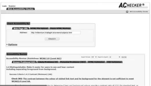
complex issues to the project lead, who used Achecker and the WC3 Web sites to problem-solve. Universal issues were solved in batches. Examples of the testing results are shown inFigures 4and5.
No specific local standard for Web sites applies in Ireland, and official docu-mentation directs the user to WCAG and W3C.13As established in the aforemen-tioned documentation, a self-audit cannot be automated because pages need human judgment. Therefore, the library undertook a two-pronged approach to accessibility checking. Online accessibility checkers were used to identify issues, and the pages were then edited and checked by library staff. This was achieved as follows:
Figure 5.WAVE accessibility test results.
The project lead selected automated checkers from a list provided by the W3 Organisation (2014).
These were reviewed by the library Web team for functionality to ensure they could check the design for compliance with the WCAG AAA standard, as far as was practical given the limits of the III platform and code.
WAVE (Webaim.org2015) was identified as particularly effective at iden-tifying errors and providing guidance on how to correct them.
Achecker (Inclusive Design 2011) was identified as a good source of addi-tional problem-solving advice.
& Both WAVE and Achecker sites are free to use.
The Library Web team used these online auditing tools to reduce staff bias from influencing testing as they provided unbiased reports into the accessibility of the pages. A report for each page was automatically generated by the selected testing sites and manually reviewed by a library Web team member. Once checked, edits identified were made by the team member where practical, or handed off to the project lead for further action where necessary (e.g., JavaScript conflicts, template errors, color contrast issues). Figures 4 and 5 show the same page’s results on WAVE and Achecker.
While HTML5 and CSS3 are designed to create responsive Web pages, it is essential to check the page content after it is laid out in the design because small issues at a large screen resolution can become large issues on smaller screens. At this time, no replacement for checking with the human eye has been identified. However, responsive design testing sites help by emulating Web sites across vary-ing screen sizes and devices to save on the amount of time required for live testvary-ing on actual devices.
Initial responsive testing simulated the new design across multiple devices and screen sizes using Matt Kersley’s (2015) free site (http://mattkersley.com/respon-sive/) and the Responsinator (https://www.responsinator.com/) (Batch Trading Company Limited2015). After reviewing the functionality of the responsive testing Web sites, the library Web team preferred the Matt Kersley site, which presented multiple views by screen size or by device size as selected by the tester, in one line across the page. This allowed the tester to view all iterations of a page without hav-ing to scroll down the page. Where further testhav-ing was needed, the Responsinator site was used because it provided a slightly different view, creating a mock-up of the page on specific devices but requiring scrolling down the page to view these. A screenshot of testing results on the Matt Kersley site is shown inFigure 6.
The responsive design testing using the online services plus double checking the visual and logical layout of the pages with the human eye highlighted issues with layout and text overflow that would not otherwise have been obvious to the project team. These techniques also identified issues requiring work to adjust the size allo-cated to some CSS-controlled elements to reduce the length of some of the link texts. For example, in the menus,“Inter Library Loan”must be shortened to“ILL,” and “Search Other Libraries” became “Other Libraries.” The library Web team
attempted to resolve such issues themselves; difficult issues were referred back to the project lead, who used additional Web resources, such as the Responsinator, WC3Schools, and the Stack Overflow Web site (Stack Exchange Inc. 2015) to search for solutions. If these steps did not solve the issue, it was then referred back to Granite Digital.
The new content and design went live during a quiet period for the library, the end of March 2014. Once again, multiple staff conducted testing on multiple devi-ces via multiple browsers to ensure WebOPAC functionality was working cor-rectly, including the search interface, the online forms, and system-generated pages. Issues identified during testing in the staging area earlier in the process ensured that this procedure was relatively smooth. The WebOPAC functionality has to be tested to ensure that the CSS, Java, JavaScript, and similarfiles did not impinge on the WebOPAC functionality.
Thefinalized web site
The finalized Web site design promises to see the library through the next few years, as the library transitions from the DTU Alliance into a Technological University applicant (Minister for Education 2014). While the layout or content of a page may change over the next few years, the design of the site will likely remain the same. The site itself provides access to multiple information sources via a single, central online service. A search box,14 with the search targets listed on a drop-down menu as opposed to the more conventional tabbed presentation, offers all the search options a user needs in a more focused area, with the integrated resource discovery layer (Summon) set as the default search, and search options from multiple search targets provided on one unified search page. These services are made available to the library’s patrons via a responsive site design compliant with WCAG AAA standards for local content and AA standards for vendor-con-trolled content. With this new design, the most-used pages and services are linked directly from the top of the page on every page, and the search option is
highlighted by its placement in a large blue circle under the heading“Search”in the top right section of the page, thus reducing the need to scroll or browse through the site. Most pages in the site are available within three clicks of the homepage. It is anticipated that the redesign should reduce total page usage numbers as the most-used pages are just a click away from the library homepage. Where possible, the team used technologies to integrate services, including HTML5, CSS3, Java-Script, and IFRAMEs to place information in the relevant positions without requir-ing the user to leave the main Web site to visit external library and non-library sources.
There are hundreds of pages on the site itself, creating a rich information resource for users, including support documentation such as “Subject Portals,” “Subject Supports,” “Subject Guides,”and“Subject Internet Gateways,”15and help documentation such as “Help,” “FAQ” pages and forms, online chat for support from Chilifresh, and Ask a Librarian/Contact Us, all of which are searchable via a Google site search. These pages were created from templates based on the nature of the page content. Additionally, a suite of interactive learner support tutorials was provided to assist students in the transition to the third-level academic skillset.
Figure 7.Topfile for each page.
The new page layout for the homepage is highlighted inFigures 7,8and9. They indicate where the Innovative Interfaces Inc. files begin and finish, where Java-Script and CSS3 are applied, and highlight specific features of the design. The main navigation menus, rotating images, and drop-down search options box are shown inFigure 7. The content sliders (tabs with hidden content), RSS feed from the library blog, and Springshare’s LibCal for opening hours are shown inFigure 8. The “Add this” social sharing, ChiliFresh chat widget, and the cookie directive pop-up are shown inFigure 9.16The content shown inFigures 7and9appears on all the library’s Web pages, except the rare ones generated by the system over which the library has no control. Once logged into the library WebOPAC, users subsequently have access to personalized information and services such as viewing and updating their account; renewing loans; placing holds; requesting titles; saving searches; booking rooms and equipment; and accessing online databases, journals, and articles.
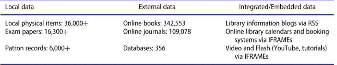
Multiple sources of data and metadata were leveraged to enable the provision of information to users at the most relevant point on the Web site for the user. These sources include local data, external data, and integrated data, as outlined inTables 4 and5.Table 4details local data, such as MARC21 records; external data such as e-books, e-journals, and databases; and integrated data such as RSS feeds and video content.Table 5details external information sources integrated into the Web site, such as Springshare, SurveyGizmo, Amazon UK, Blogger, Facebook, Twitter, and ChiliFresh.
Feedback
The new site went live during mid-term at Easter 2014, and based on feedback from library staff, academic staff, and student users received via e-mail and to staff at the library desk, some links were moved to make them easier to locate. For example, the“Book a Room”link was moved to the navigation row and placed in the middle. Feedback overall was positive, with student feedback at programmatic review boards indicating that the redesign was successful in making it easier for students to locate the information they needed. For example, onefinal-year science student noted that the redesign made it easier for her to locate relevant informa-tion for her research.
While the significant decrease in Web page views between 2013 and 2015 (¡51 percent) may be of concern to some, to the redesign team it indicates that informa-tion is being found more easily. The increase in overall visits (C5 percent, or 6,200 sessions) and users (C4 percent) indicates greater overall use of the Web site as an information resource by our users. It should also be remembered that 67 pages were removed from the site during the project, which may account for a portion of this decrease.
Table 5.Types of information sources integrated.
Local data External data Integrated/Embedded data
Local physical items: 36,000C Online books: 342,553 Library information blogs via RSS
Exam papers: 16,300C Online journals: 109,078 Online library calendars and booking
systems via IFRAMEs
Patron records: 6,000C Databases: 356 Video and Flash (YouTube, tutorials)
via IFRAMEs
Table 4.Types of data integrated.
Information source Integration
SpringShare IFRAME embed of calendars, bookings, and schedules
Survey gizmo IFRAME embed of feedback and help forms
RSS RSS via feed2js to embed news, etc.
Arrow institutional repository HTML and JavaScript embed of interactive map of most recent
downloads, drop-down target option
Amazon UK Drop-down target option; Web option to include book jackets in search
results
Add This HTML and JavaScript embed
YouTube IFRAME embed
Blogger RSS via feed2js to embed news, etc.
Facebook Link out, embedded OPAC, and Arrow searches on the Library’s Facebook
page
Twitter Link out
ProQuest: 360 Link Link out to Journals A–Z and Citation Linker; both customized to look as if
hosted on the local server
Serials Solutions Drop-down target option
Chilifresh IFRAME embed on the bottom of each page for chat
Wikipedia Drop-down target option
Google Site Search Drop-down target option
The Realex Fire Web Awards
The Realex Fire Web Awards (2015) are a national-level awards series, run annu-ally with a nomination deadline in September and an awards ceremony in October. There are 30 categories, and a site can be nominated in up to four categories. This awards process is highly respected, as illustrated by the other quarterfinalists selected for 2014: Brown Bag Films (Oscar nominated in 2001 and 2009), Raidio TelefısEireann (Irish national broadcaster), Vodafone, Connacht Rugby, Univer-sity College Cork, the AA (The Automobile Association), Axa Insurance, Ryanair, Aer Lingus, Waterford Institute of Technology, theIrish Timesnewspaper, and the
Irish Independentnewspaper.
As a result of the success of this project, and in recognition of the work under-taken by the Web Team, the Institute Librarian (the library’s top leader) nomi-nated the redesigned site for a Web award via a short online form. The site was evaluated by a panel of 120 reviewers, and passed through quarterfinal and semifi -nal stages. Despite heavy competition, the site made it to thefinals. Although Dart of Physics won the award in 2014, the fact that the library Web site reached the
finals is a significant achievement for the library and the institute as a whole, and reaffirms the library’s ongoing dedication to delivering quality services. To put the library’s achievement in context, the winner (Dart of Physics) was resourced by Trinity College Dublin, Science Foundation Ireland, Intel, Irish Rail,Metro Herald (newspaper), iQ Content, and the Institute of Physics.
Going forward
Since the launch of the new site, additional pages have been or are being added, for example, a 3-D printing page, a new“How to” tutorial, electronic resources man-agement functionality, and work on the basic design for an Irish-language OPAC microsite. Other future projects may include the following:
Additional attention to WAI-ARIA guidelines,
Short video“How to”guides for online services,
Embedding of further open source projects into the site,
Heat mapping of the use of key pages to identify if the pages are being used as designed,
Pop-up user survey asking what could be changed,
Changing or updating the menus, and
Creating new CSS styles as needed.
The library’s Web site never stands still, but this current design is still fresh-looking and includes many of the features put forward by the profession as impor-tant elements for modern library Web sites. For example, since the launch of the redesigned Web site, content and links have been added, moved, and removed. Hot zoning was recently used, which indicated that the content sliders were not getting any interaction, so it was decided to remove the content sliders, which hid links unless the user interacted with them, and replace them with modules sorted
by theme. The top menu has been relocated further down the page, just above the rotating images, and is thefirst line in responsive view so that the search box is the
first page element mobile device users get. Once this has been in place for a period not exceeding one semester, hot zoning will be repeated to assess whether the changes have been successful. As always, the library Web team will continually seek feedback from the library staff and patrons regarding our online services and respond where possible.
Discussion and conclusion
The case of the responsive design project at Library, Institute of Technology Tal-laght illustrates that it is possible for a small academic library to successfully deliver responsive Web services. This project faced similar challenges as those described by Gayhart, Khalid, and Belray (2014) in harmonizing with the larger institution’s design. Having made the decision to move away from the institutional CMS in 2005, the project remained under the control of the library and its staff. The loss of approximately 30 percent of library staff during the preceding two years meant elimination of duplicate content and effort was critical.
The responsive design methods HTML5, CSS3, and CSS media queries directly contributed to the successful completion of this project, including support for accessibility and allowing content to respond to multiple devices. While the appli-cation of a pre-existing framework as outlined in the literature review (e.g., Snell 2013) was not possible in this case because the site was to be hosted on a proprie-tary WebOPAC platform, frameworks may be of use to others undertaking such a project. While initially driven by necessity, the decision to host the library’s Web site and services on the library’s OPAC allowed for a seamless feel to the final product and gives the appearance to the user of an integrated platform from which to access the library’s services. Users are usually unaware that the information is coming into the site from an external source, or that they have left the library’s site and are visiting partner sites like Serials Solutions or Springshare.
Internal and external communication was also the key to the success of this project. Internally, the allocation of specific tasks within the project team from the outset allowed for a clear progression through the tasks involved and provided a structure within which to communicate about any issues which arose during each phase by making clear the responsibilities of each partner in the design project. It was impor-tant to remember that much communication is nonverbal,17and to not underesti-mate the value of physical face-to-face meetings in supporting problem solving, especially when terminology differences may be part of the problem. Digital commu-nication can sometimes remove the nuances and nonverbal clues that are an essential part of communication between human beings. Face-to-face meetings in this case actually saved time, especially when hosted where the project lead could demonstrate the system that must be used and the impact of design changes as a consequence of OPAC hosting. Challenges faced and overcome with external partners included two
sets of vastly different professional terminology (jargon) and change tracking. The established working relationships with III and Serials Solutions proved valuable in problem solving, especially in relation to the branding elements of the project.
Along with Baker (2014), this project found that testing was indispensable for success, applying best practices, and supporting standards compliance. The ready availability of free and openly accessible resources in relation to coding and testing was a critical success factor for the project, as there was no other way to get access to these for the Web team. If undertaking a similar project, it is important to plan time for this phase, as reviewing the online testing results with the human eye is essential to the success of the testing phase.
The soft launch of the site provided the opportunity to solicit user feedback dur-ing a non-busy period and allow users to familiarize themselves with it before criti-cal deadlines arose. Feedback to the Web team and library desk staff was acted on speedily so that missing or badly placed links were relocated before site traffic rates rose. The use of Google Analytics to inform the menus and homepage layout was a practical way to identify which content on a site was actually used and how to pres-ent it in an easily accessible manner.
This ambitious project illustrates how a small academic library with limited staff, financial resources, and time can undertake a successful Web site redesign project with proper planning, support, and partnerships. The success of this proj-ect in reaching thefinal stage of the Realex Fire Web Awards is a reflection of how this can be done withfinite resources by supporting staff and enabling decision-making at all levels of functional teams. As user expectations for mobile Web serv-ices and content mirroring their desktop experience grow, this project illustrates that responsive design is an important tool for the delivery of well-designed Web sites as one component of a universal Web design strategy. Responsive Web design as used in this project is a useful tool for future-proofing library Web sites against the need to constantly be redesigned every time a new device enters the technology market. Avoiding duplicating content yet still providing access to a variety of devi-ces is possible even for a small library. The sucdevi-cess of this project will hopefully inspire other libraries irrespective of sector, specialization, or size to undertake similar projects, to face their fears and overcome them.
Notes
1. http://library.ittdublin.ie/
2. The National Qualifications Framework is available online athttp://www.nfq-qqi.com, and information about the Bologna Agreement is available online at the European Higher Edu-cation Area’s Web site,http://www.ehea.info/.
3. Regional Technical Colleges preceded the Institutes of Technology in most cases. These were all subsumed into the Institutes of Technology in the 1990s and 2000s when the sector was founded.
4. Registered users include students, staff, external members, and external borrowers.
5. For more information on the use of open source technologies for the delivery of Web serv-ices at the library, seeWalker-Headon (2014).
6. There are no technological universities in Ireland at all, and the plan is to use them to cre-ate a new sector in the third-level landscape.
7. https://www.google.com/webmasters/tools/mobile-friendly/
8. https://alison.com/courses/HTML-5-Training
9. WebOPACs from III sites and the library sites of the top-ranked 100 universities (as ranked byThe Guardian).
10. (e.g.,https://httpd.apache.org/docs/current/howto/ssi.html)
11. Toplogo.html, in III’s nomenclature.
12. Toplogo.html and botlogo.html, in III’sfile nomenclature.
13. (e.g., Centre for Excellence in Universal Design 2012; The National Disability Authority 2012).
14. For example, see discussion at
http://musingsaboutlibrarianship.blogspot.ie/2012/08/how-are-libraries-designing-their.html#.VnFvjfmLRD8.
15. Discipline-related online sites databases and services, help, and support services.
16. The EU’s cookie directive (http://ec.europa.eu/ipg/basics/legal/cookies/index_en.htm) requires the declaration of a site’s cookies and user consent to same. This is habitually achieved via a cookie notification pop-up and can be seen on most sites hosted within the EU countries.
17. There is much discussion in the literature as to what percentage applies to nonverbal, but the overall consensus is that nonverbal cues are an important element of communication, which comprise the larger part of any attempt at communication (Yaffe 2011, 1–5;Albert
Mehrabian”2016;“Nonverbal Communication”2016).
ORCID
Niamh Walker-Headon http://orcid.org/0000-0003-1448-7393
References
“Albert Mehrabian.”Wikipedia. Accessed July 22, 2016.https://en.wikipedia.org/wiki/Albert_
Mehrabian.
An Cheim Computer Services Limited. 2015. “Our Servicesj an Cheim.” Accessed July 10.
http://ancheim.ie/our-services/.
Baker, Stewart C. 2014.“Making it Work for Everyone: HTML5 and CSS Level 3 for Responsive, Accessible Design on Your Library’s Website.”Journal of Library & Information Services in Distance Learning8 (3/4):118–36.
Batch Trading Company Limited. 2015.“Responsinator.”Accessed July 10.https://www.respon
sinator.com/.
Breeding, Marshall. 2015.“The Systems Librarian. Going Mobile: How I Made My own Site
Responsive.”Computers in Libraries35 (4):23–26.
Castro, Elizabeth and Bruce Hyslop. 2012.HTML5 & CSS3: Visual QuickStart Guide. 7th ed. Berkeley, CA: Peachpit Press.
Central Statistics Office. 2015.“CSO Quicktables: Population 1901–2011.”Accessed July 10.
http://www.cso.ie/multiquicktables/quickTables.aspx?idDcna13.
Centre for Excellence in Universal Design. 2012.“Maintaining Web Accessibility.”Accessed August 11, 2015.http://universaldesign.ie/Technology-ICT/Web-accessibility-auditing/Main
taining-Web-Accessibility/.
Eurostat. 2015.“Tertiary Education Statistics.”Accessed July 10.http://ec.europa.eu/eurostat/sta
tistics-explained/index.php/Tertiary_education_statistics.
Fox, Robert. 2012.“Being Responsive.”OCLC Systems & Services: International Digital Library Perspectives28 (3):119–25. http://dx.doi.org/10.1108/10650751211262100.
Gayhart, Lisa, Bilal Khalid, and Gordon Belray. 2014.“The Road to Responsive: University of Toronto Libraries’ Journey to a New Library Catalogue Interface.”The Code4Lib Journal (23).http://journal.code4lib.org/articles/9195.
Google Inc. 2013.“Introduction to New Features of HTML5 Online Course.”Accessed August 15, 2015.https://alison.com/courses/HTML-5-Training.
Government of Ireland. 1992. Regional Technical Colleges Act, 1992.http://www.irishstatute
book.ie/1992/en/act/pub/0016/print.html.
HEAnet Ltd. 2015.“EduCampus Services Ltd.”Accessed July 10.http://www.heanet.ie/projects/
educampus.
Henry, Shawn L. 2012. “WCAG Overview.” Accessed August 15, 2015. http://www.w3.org/
WAI/intro/wcag.
Henry, Shawn L. 2014.“WAI-ARIA Overview.”Accessed August 15, 2015.http://www.w3.org/
WAI/intro/aria.
Inclusive Design. 2011.“IDI Web Accessibility Checker: Web Accessibility Checker.”Accessed August 14, 2015.http://achecker.ca/checker/index.php.
Innovative Interfaces Inc. 2014.“Public Libraries in Ireland Go Live with the Sierra Library Services Platform 1.6 Million Citizens Now Using Innovative’s Solution.”Accessed July 10.
http://www.iii.com/sites/default/files/InformationTodayMay2015LinkedDataforLibraries.pdf.
Institutes of Technology Ireland. 2014.“Institutes of Technology IrelandjAbout Us.”Accessed August 11, 2015.http://www.ioti.ie/about-us/about-us.
Irish Universities Association. 2015.“University Fast Facts.”Accessed July 10.http://www.iua.
ie/the-irish-universities/university-fast-facts/.
Kersley, Matt. 2015.“Responsive Web Design Testing Tool.”Accessed July 10.http://mattkers
ley.com/responsive/.
Kim, Bohyun. 2013.“Responsive Web Design, Discoverability, and Mobile Challenge.”Library Technology Reports49 (6): 29–30.
Lessick, Susan, Eric Rumsey, Donald Pearson, Stevo Roksandic, Shalu Gillum, Rolando Garcia-Milian, and Devica R. Samsundar. 2013.“Moving Beyond the Bookshelves.”Journal of the Medical Library Association: JMLA 101 (4):239–43. http://www.ncbi.nlm.nih.gov/pmc/
articles/PMC3794676/.
Marcotte, Ethan. 2010.“Responsive Web Design: An A List Apart Article.”Accessed August 14, 2015.http://alistapart.com/article/responsive-web-design.
Minister for Education. 2014. “General Scheme: Technological Universities Bill.” Accessed August 14, 2015.
https://www.education.ie/en/The-Education-System/Legislation/General-Scheme-Technological-Universities-Bill-2014.pdf.
Mozilla Developer Network. 2016.“CSS3.”Accessed July 10.https://developer.mozilla.org/en/
docs/Web/CSS/CSS3.
“Nonverbal Communication.”Wikipedia. Accessed July 22, 2016.https://en.wikipedia.org/wiki/
Nonverbal_communication.
Ohye, Maile. 2015. “Official Google Webmaster Central Blog: FAQs about the April 21st
Mobile-Friendly Update.”Accessed July 10.http://googlewebmastercentral.blogspot.ie/2015/
04/faqs-april-21st-mobile-friendly.html.
O’Sullivan, Michael. 2015. “A Long Shot is Better then None? LIS Job Hunting in Ireland.” Accessed July 10.https://librarymuses.wordpress.com.
Proquest. 2015.“ProQuest 360 LinkjLink Resolver Providing a Superior User Experience and Easiest Access to Full-Text Content—360 Link.” Accessed July 10. http://www.proquest.
com/products-services/360-Link.html.
Realex Fire. 2015. “Web Awards, eCommerce Awards 2015 j Web Awards 2015.”Accessed
Rempel, Hannah Gascho, and Laurie Bridges. 2013.“That Was Then, This is Now: Replacing the Mobile-Optimized Site with Responsive Design.”Information Technology and Libraries 32 (4):8. http://dx.doi.org/10.6017/ital.v32i4.4636.
Riley-Huff, Debra A. 2012.“Web Accessibility and Universal Design: A Primer on Standards and Best Practices for Libraries.”Library Technology Reports48 (7):29.
Roberts, Darren. 2010.“2010—ITT Dublin Becomes the First Library in UK & Ireland to Imple-ment Library Anywhere from LibraryThing for Libraries.”Accessed July 10. http://www.
bowker.com/news/2010/ITT-Dublin-becomes-the-first-library-in-UK-Ireland-to-imple
ment-Library-Anywhere-from-LibraryThing-for-Libraries.html.
Russell, Philip. 2010.“Measuring Up: The Experience of LibQUALCÒat ITT Dublin Library.” SCONUL Focus(49):47–51.http://www.sconul.ac.uk/sites/default/files/documents/17_10.pdf. Russell, Philip. 2013.“September 2013 Site of the MonthjAssociation of College & Research
Libraries (ACRL).” Accessed July 10. http://www.ala.org/acrl/aboutacrl/directoryofleader
ship/sections/is/iswebsite/projpubs/primo/site/2013september.
Russell, Philip, Gerard Ryder, Gillian Kerins, and Margaret Phelan. 2015.“Creating, Sharing and Reusing Learning Objects to Enhance Information Literacy.”Accessed July 10.http://
arrow.dit.ie/cgi/viewcontent.cgi?articleD1007&contextDittsupart.
Sedghi, Ami, and John Burn-Murdoch. 2013.“World’s Top 100 Universities 2013: Their Repu-tations Ranked by Times Higher EducationjNewsjthe Guardian.”The Guardian.http://
www.theguardian.com/news/datablog/2013/mar/05/world-top-100-universities-reputation-rankings-times-higher-education.
Snell, Jeremy. 2013.“Flexible Everything: Getting Responsive with Web Design.”Computers in Libraries33 (3):12–16.
Stack Exchange Inc. 2015.“Stack Overflow.”Accessed July 10.http://stackoverflow.com/.
Terminalfour Solutions Ltd. 2014. “TERMINALFOUR—Defining Digital Engagement for
Higher Education.”Accessed August 11, 2015.http://www.terminalfour.com/.
The National Disability Authority. 2012. “Make Your Websites More Accessible.”Accessed August 11, 2015.
http://nda.ie/Resources/Accessibility-toolkit/Make-your-websites-more-accessible/.
TU4D Steering Group. 2015.“TU4 Dublin—About.”Accessed July 10.http://www.tu4dublin.ie/
about.
W3 Organisation. 2014.“Web Accessibility Evaluation Tools List.”Accessed August 11, 2015.
http://www.w3.org/WAI/ER/tools/.
W3schools. 2015.“HTML5 Introduction.”Accessed July 10.http://www.w3schools.com/html/
html5_intro.asp.
Walker-Headon, Niamh. 2010.“ReSearcher Suite: Selection and Implementation—The Hosted Option.”Library Hi Tech News27 (2):1–5. http://dx.doi.org/10.1108/07419051011050402. Walker-Headon, Niamh. 2014.“Open Source: Feel the Fear and Do it Anyway!!!”Presentation
at the LIR Annual Seminar 2014.
https://prezi.com/bmmktwsqmf3a/open-source-feel-the-fear-and-do-it-anyway/.
Walker-Headon, Niamh. 2015. “Responsive Design and the Web Awards at Library ITT
Dublin.” Dublin Institute of Technology. Accessed July 10. http://arrow.dit.ie/cgi/view
content.cgi?article=1005&context=ittsupoth.
Webaim.org. 2015.“WAVE Web Accessibility Tool.”Accessed July 10.http://wave.webaim.org/. Wisniewski, Jeff. 2013.“Responsive Design.”Online Searcher37 (1):74–76.
Yaffe, Philip. 2011. “The 7% Rule.” Ubiquity (October):1–5. http://dx.doi.org/10.1145/ 2043155.2043156.