Spreadsheet Concepts:
Creating Charts
in Microsoft Excel
l a b
6
125
Objectives:
Upon successful completion of Lab 6, you will be able to
● Create a simple chart on a separate chart sheet and embed it in the worksheet
● Create a pie chart using one series of data
● Understand the difference between plotting series by rows and by columns
● Identify and format chart elements including series, legend, titles, and chart area
● Add and delete a series from a chart
● Understand the linked relationship between the data and the chart ● Understand that some chart types are more appropriate for some types
of data
Resources required:
● A computer running Excel 2007
Starter files:
● None
Prerequisite skills:
● General keyboarding skills
● Comfortable editing an Excel worksheet or another electronic spreadsheet application
● Ability to find files using Windows Explorer or Windows search feature ● Ability to open and save a file in a Windows application
NRC’s Top Ten Skills, Concepts, and Capabilities:
● Skills
Use a spreadsheet to model a simple process—household budget expenses
• Create simple charts including line, bar, column, and pie • Identify and format chart elements
● Concepts
● Capabilities
Engage in sustained reasoning
Think abstractly about Information Technology—building generic electronic spreadsheet concepts
Lab Lesson
Frequently we find ourselves using data in some sort of table form and would like to “see” how the data changes overall. In this case, a chart can make all the difference in how the data is presented. There is a wide variety of charts available and some are more suited to different types of data than others, but they all add a terrific visual effect to any presentation material!
Creating a Simple Column Chart
In order to create a chart, we must start with an active sheet containing data.
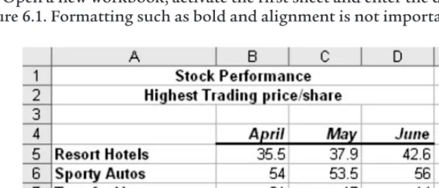
Open a new workbook, activate the first sheet and enter the data shown in Figure 6.1. Formatting such as bold and alignment is not important.
Figure 6.1 Excel chart data.
Save the file as stock.xlsx.
Remember to save your file periodically as you work through this lab. When you save a file, all sheets, including the chart sheet, will be saved in the Excel workbook file.
For our first chart, we will create a column chart, which will be placed on a separate worksheet in the workbook.
Select the range A4:D8 by dragging through it to select it. It’s important to include a row of titles and a column of titles when selecting the range for charting before the Chart Wizard is launched.
Click the Insertmenu option to display the Charts options.
There are a wide variety of chart types to choose from. As we will see, once we have defined all of the appropriate ranges and titles, changing the chart type is as easy as selecting a new type from this screen. For now, let’s create a basic column chart. The major chart types appear in the Ribbon toolbar.
Let’s create a 2-D Column chart
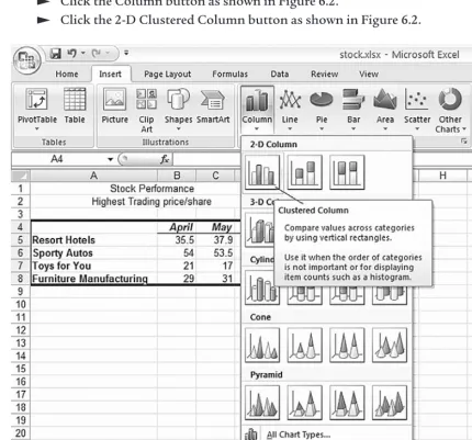
Click the Column button as shown in Figure 6.2.
Click the 2-D Clustered Column button as shown in Figure 6.2.
Figure 6.2 Excel Column chart gallery.
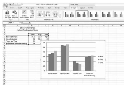
The chart will be created and placed in the worksheet as shown in Figure 6.3.
Figure 6.3 Excel 2-D Chart embedded in the worksheet.
You can move and size the chart.
Position the mouse pointer in an empty part of the chart and drag the chart to a location where it is not covering the data.
Position the mouse pointer on the sizing handles (indicated by three dots) on the chart edges or corners until it changes to a double arrow.
Drag the mouse pointer to enlarge or shrink the chart slightly.
Notice that the columns are grouped by stock and each month value is represented by a different color. Sometimes it’s useful to switch the grouping. The current chart is plotted by column (months) such that each column of data is a different color.
Suppose we wish to plot the chart such that each stock is a different color. We can do this by switching the row and column data.
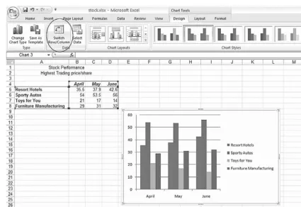
Click the Switch Row/Columnbutton as shown in Figure 6.4.
Figure 6.4 Excel Chart after Switch Row/Column.
For this data, it makes more sense to plot the months in series as we had originally.
Click the Switch Row/Columnbutton to plot the chart with the months in series.
We can change the colors and styles of the columns using the Chart Styles gallery. Let’s select a different style.
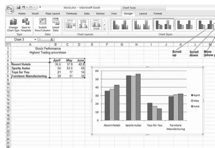
Click the Scroll upand Scroll downbuttons in the Chart Styles as shown in Figure 6.5.
Click one of the styles to apply it to the chart as shown in Figure 6.5.
Figure 6.5 Excel Chart and Chart Styles.
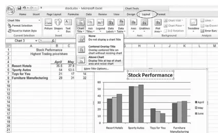
Let’s add some titles and other features to the chart.
Click the Layoutmenu option as shown in Figure 6.6.
Figure 6.6 Excel Layout options with Chart Title selection.
Click the Chart Title button as shown in Figure 6.6. Click the option Above Chartas shown in Figure 6.6.
The Chart Title will appear and the chart will be resized.
Drag through the Chart Title and type: Stock Performance. This is shown in Figure 6.6.
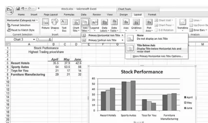
Let’s add a title at the bottom of the chart to identify the names as stocks.
Click the Axis Titles button as shown in Figure 6.7. Click the option, Primary Horizontal Axis Title.
Click the option Title Below Axisas shown in Figure 6.7.
The x-axis Chart Title will appear and the chart will be resized.
Drag through the x-axis title and type: Stock. This is shown in Figure 6.7.
Figure 6.7 Excel Chart with horizontal axis title.
Let’s reposition the legend, moving it to the bottom, below the chart.
Click the Legendbutton as shown in Figure 6.8.
Click the option Show Legend at Bottom, as shown in Figure 6.8.
Notice that the legend is now positioned below the chart.
Figure 6.8 Excel Chart with legend positioned at the bottom.
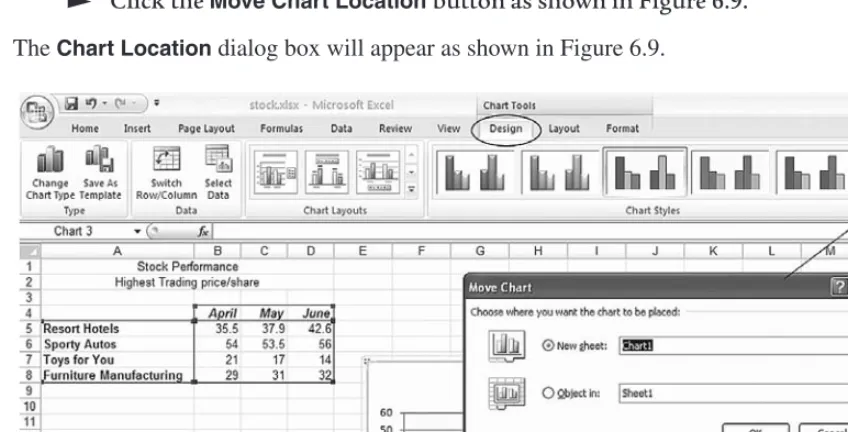
Let’s change the location of the chart to place it on its own sheet.
Click the Designmenu option as shown in Figure 6.9.
Click the Move Chart Location button as shown in Figure 6.9.
The Chart Locationdialog box will appear as shown in Figure 6.9.
Figure 6.9 Excel Chart Location button and dialog box.
Click the New Sheetbutton, as shown in Figure 6.9. Click the OKbutton.
The chart will appear on a separate sheet in the workbook called Chart1, as shown in Figure 6.10.
Figure 6.10 Excel completed column chart.
Since the chart is stored on a sheet, let’s change the name of the sheet to reflect its contents.
Move the mouse pointer to the Chart1tab and double-click. Press the Deletekey to erase the current name of the sheet. Type: Stock Performance
Press the Enterkey to enter the name in the Charttab.
Click once on an empty part of the chart to activate the chart.
There are many parts of a chart. To determine the name of a particular part of the chart, position your mouse pointer on top of the part you wish to identify, and rest the mouse pointer for a moment. The chart item will appear in a pop-up label.
Charts are linked to the table of data in the worksheet, by default.
Click the Sheet 1tab and change the figure for Resort Hotels for April, to 100.
Click the Stock Performancetab and observe how the chart has changed. Click the Sheet1tab and return the figure for Resort Hotels for April, to 35.5.
Changing the Chart Type
Let’s change the chart type.
Click the Designmenu option as shown in Figure 6.11.
Click the Change Chart Type button to reveal the chart types gallery as shown in Figure 6.11.
Figure 6.11 Excel Change Chart Type gallery.
Once chart settings have been created, changing the chart type is only a few clicks away. Experiment a little here!
Click one of the Chart Typebuttons and click the OKbutton to see how the look of your chart changes.
Notice that the same data ranges and chart titles are used when creating different chart types. Also, note that not all chart types are suitable for the current data ranges selected. As we will see later, the pie charts require only one data range.
Use the Change Chart Typebutton to select the column chart type as we had displayed originally.
Selecting Nonadjacent Series
Let’s create another chart in which we will choose nonadjacent blocks of data. We will still need to specify the block of data that contains the labels.
Click on the Sheet 1tab to display the values. Select the range A4:D4 by dragging through it.
We have included a blank cell (A4) in this range because Excel expects that the x-axis series will begin with a blank cell. If this cell is not included, then this row will be interpreted as a series and the chart will not look as expected.
Press and hold the Ctrlkey while you drag through the range A6:D6. Release the mousebutton first, and then release the Ctrlkey. The selected range is shown in Figure 6.12.
Press and hold the Ctrlkey while you drag through the range A8:D8. Release the mousebutton first, and then release the Ctrlkey. The selected range is shown in Figure 6.12.
You should notice that three ranges have been selected. Now we are ready to create a chart.
Figure 6.12 Excel nonadjacent ranges selected.
Quick Charts
Excel will create a default chart using data from a preselected range, or group of ranges.
Press the F11 functionkey.
Excel created the chart based on the nonadjacent ranges selected. The chart should be displayed on a separate sheet, Chart2.
Double-click on the chart sheettab and rename it: Autos and Furniture Press the Enter key to complete the sheet name.
Simple Chart Modifications
Now is a perfect time to discuss some simple chart modifications. Let’s make some changes to this new Autos and Furniture chart. First, let’s change the type of chart.
Click an empty area on the chart to select the chart.
Adding Data Labels
Sometimes charts are difficult to read, and it may be important to know the exact value for each data point. Let’s add some data labels.
Click the Layoutmenu option.
Click the Data Labels button as indicated in Figure 6.13. Click the Outside Endmenu option as shown in Figure 6.13.
Figure 6.13 Excel Chart Options dialog box showing Data Labels tab.
Data labels will appear above the bars in a column chart, near the points on a line chart, or around the pieces of pie in a pie chart. That is, data labels usually appear close to the plotted points on a chart.
In the column chart, we selected the Outside End position for the data labels and they appear above the columns as shown in Figure 6.14.
Figure 6.14 Excel column chart with data labels.
Formatting Chart Elements
Although we are focusing on a column chart, the skills outlined here can also be used for any other chart. Let’s look at the various elements in this column chart and use the formatting option to customize the chart. The Design, Layout, and Formatting options will show tools in the Ribbon toolbar that are applicable to the type of chart currently selected.
The chart area is the blank area that surrounds the chart. We can specify the color and other aspects.
Figure 6.15 Excel Chart selecting Chart Area.
Click the Formatmenu option as shown in Figure 6.16. Click in the Shape Fill button as shown in Figure 6.16.
Figure 6.16 Excel Format Chart Area fill color.
Click a color from the Color Palette to color the entire chart area.
In addition to selecting a simple color, we can also apply a gradient and texture. Let’s experiment some more, adding a gradient to the Sporty Autos columns.
Position the mouse pointer on one of the Sporty Autos columns and click to select the series.
Notice that handles appear on the corners of each of the columns indicating that the columns are selected.
Click the Shape Fill button as shown in Figure 6.17. Click the Gradientmenu option as shown in Figure 6.17.
Figure 6.17 Excel Shape Fill Gradient options.
Chart Types
Sometimes the most difficult decision is choosing the appropriate chart type for the data. We have focused on a 2D Column chart because our table data lends itself well to this type of chart. Most data can be represented well in a column, bar, line, or area chart. Three dimensional charts tend to be a bit more difficult to read, but a 3D column or area chart is quite readable. A ribbon chart may be more difficult to read and suitable for impact rather than readability. A pie chart is a special case in which only one series is plotted. The XY chart is suitable for data when there is a dependency such as time versus distance (km/hr, for instance). Radar charts are used in medical applications, and a stock chart type may be suitable for some financial and engineering
applications.
Pie Chart
Let’s create a pie chart which shows the sales price for each stock for the month of June.
Click the Sheet1tab to display the data. Select the ranges A4:A8 and D4:D8.
Recall that you can drag through the first range, and then press and hold the Ctrlkey while you drag through the second range.
Click the Insertmenu command as shown in Figure 6.18. Select the 2-D PieChart type as shown in Figure 6.18.
Figure 6.18 Excel Pie Chart type.
Let’s choose a Chart Layout to add appropriate titles and data labels.
Click the Designmenu option as shown in Figure 6.19.
Figure 6.19 Excel Chart Layout options.
You may use the scroll buttons to browse through the available layout selections.
Click Layout 1 as shown in Figure 6.20.
Notice that the legend has disappeared and the pie slices are identified with the stock name and percentage.
Figure 6.20 Excel Pie Chart Layout 1 option.
Review
This has been a busy lab! We have covered the following topics:
● Create a column chart on a separate worksheet
Format chart elements including a series and chart area Plot the series by rows and by columns
● Add and modify chart options including series, legend, titles, and chart area ● Add and delete a series from a chart
● Understand that when the data in the worksheet changes, the corresponding charts also change
● Create a pie chart using one series of data
● Understand that some types of charts are more appropriate for some types of data
Exercises
Use the stock.xlsx Sheet1 data and try to recreate the following charts. Don’t try to copy them exactly, but try to replicate the general look.
1. Line Chart. Hint:Switch Row/Column in order to plot the stocks as lines.
Figure 6.21 Line Chart.
2. Pie Chart. Hint:Select the cells containing the stock names and April values. Use the Layout options to add the percentages.
Figure 6.22 Pie Chart.
3. 3D Column Chart. Hint:Use the Layout options to add the data labels.
Figure 6.23 3D Column Chart.