Open Access
Review
Current practices in spatial analysis of cancer data: mapping health
statistics to inform policymakers and the public
B Sue Bell*
1, Richard E Hoskins
2, Linda Williams Pickle
3and
Daniel Wartenberg
4Address: 1Work conducted at the Division of Cancer Control and Population Sciences, National Cancer Institute, National Institutes of Health.
Current address: U.S. Food and Drug Administration, 5600 Fishers Lane Rm 15-62 HFP-20, Rockville, MD 20857, USA, 2Comprehensive Cancer
Control Program, Washington State Department of Health,111 Israel Road, PO Box 47855, Olympia, WA 98504-7855, USA, 3Division of Cancer
Control and Population Sciences, National Cancer Institute, 6116 Executive Boulevard, Suite 504, Bethesda, MD 20892, USA and 4Department of
Environmental and Occupational Medicine, Robert Wood Johnson Medical School, University of Medicine and Dentistry of New Jersey, 170 Frelinghuysen Road, Piscataway, NJ 08854, USA
Email: B Sue Bell* - [email protected]; Richard E Hoskins - [email protected]; Linda Williams Pickle - [email protected]; Daniel Wartenberg - [email protected]
* Corresponding author
Abstract
Background: To communicate population-based cancer statistics, cancer researchers have a long tradition of presenting data in a spatial representation, or map. Historically, health data were presented in printed atlases in which the map producer selected the content and format. The availability of geographic information systems (GIS) with comprehensive mapping and spatial analysis capability for desktop and Internet mapping has greatly expanded the number of producers and consumers of health maps, including policymakers and the public.
Because health maps, particularly ones that show elevated cancer rates, historically have raised public concerns, it is essential that these maps be designed to be accurate, clear, and interpretable for the broad range of users who may view them. This article focuses on designing maps to communicate effectively. It is based on years of research into the use of health maps for communicating among public health researchers.
Results: The basics for designing maps that communicate effectively are similar to the basics for any mode of communication. Tasks include deciding on the purpose, knowing the audience and its characteristics, choosing a media suitable for both the purpose and the audience, and finally testing the map design to ensure that it suits the purpose with the intended audience, and communicates accurately and effectively. Special considerations for health maps include ensuring confidentiality and reflecting the uncertainty of small area statistics. Statistical maps need to be based on sound practices and principles developed by the statistical and cartographic communities.
Conclusion: The biggest challenge is to ensure that maps of health statistics inform without misinforming. Advances in the sciences of cartography, statistics, and visualization of spatial data are constantly expanding the toolkit available to mapmakers to meet this challenge. Asking potential users to answer questions or to talk about what they see is still the best way to evaluate the effectiveness of a specific map design.
Published: 08 November 2006
International Journal of Health Geographics 2006, 5:49 doi:10.1186/1476-072X-5-49
Received: 24 August 2006 Accepted: 08 November 2006
This article is available from: http://www.ij-healthgeographics.com/content/5/1/49
© 2006 Bell et al; licensee BioMed Central Ltd.
Background
Reporting spatial health statistics to policymakers and the public – either in a descriptive report or Web site applica-tion, or as part of the results of a carefully designed public health study – is challenging and sometimes daunting. Communicating conclusions and interpretations in a way that will inform without misleading the audience after conducting complex spatial analyses, applying sophisti-cated statistical methods (e.g., spatial smoothing), and using powerful information management technologies (e.g., geographic information systems), is an important and complicated, but manageable task if one pays careful attention to certain issues. The potential audience for the results of a spatial analysis of health data is no longer lim-ited to scientists but now also includes the public, policy-makers, the media, and a host of others. That is because health data are personal and confidential by their very nature, geography and maps introduced in elementary school are familiar tools used in daily life (e.g., weather maps, street maps, and atlases), and the Internet makes scientific data and results accessible to all.
This article provides a synopsis of some suggestions and comments by practitioners on how best to communicate the results of spatial analyses of health data. It draws upon the experience of designing and producing atlases for print and of providing interactive access to health statistics using the Internet. The article includes tips, information on risks, and special considerations for mapping health data from those who have faced the challenge of commu-nicating public health information.
Review
Communicating effectively
Among the steps for the planning framework in Communi-cating Public Health Information Effectively [1] are (1) defin-ing the purpose of the message, (2) identifydefin-ing the audiences and their characteristics, (3) choosing the media, and (4) developing and testing the message. These same considerations apply to reporting the results of spa-tial analyses. The tools to communicate the message will usually be a map that may be accompanied by graphs or tables, and sometimes explanatory text.
Many people, even well-educated individuals such as phy-sicians, have great difficulty fully understanding statistical information, due to their low numeracy skills [2-4]. Pro-viding a clear context for statistical data through the use of examples, analogies, and diagrams has been shown to enhance understanding [5]. Providing audiences with results of spatial analyses through the judicious use of graphs, tables, and maps is also a useful approach for enhancing understanding of complex data sets.
MacEachren discusses how, through the abstract represen-tations of maps, we can create knowledge as well as reveal knowledge [6]. With maps, there is not only the public representation with symbols to provide meaning but also a private, cognitive dimension. The map reader publicly focuses on the map's lexicon and function while privately using vision and cognition to perceive the map's meaning.
Purpose of the maps
Three types of questions are generally asked of maps [7,8]. Consider a map of lung cancer mortality. The first type of question is a very specific rate readout task: What is the mortality rate in a certain area? Second, is a more general pattern recognition task: Are there geographic trends in the data, or regions of unusually high or low rates? The last is the most general map comparison task: Is the lung cancer mortality pattern similar to the pattern of smoking prevalence shown in a companion map?
The same map may not be equally suited to all of these questions. Environmental Systems Research Institute, Inc., (ESRI), a provider of GIS software, warns that "Trying to communicate too much in one map – having more than one purpose for the map – tends to blur the message and confuse the map reader. Using two or more maps, each focused on a single message, is always a better strat-egy" [9]. This philosophy is consistent with recommenda-tions of Monmonier, who finds designing a map tailored to precise goals easier than forcing a single map to accom-modate diverse objectives, and who recommends carto-graphic overlays for examining associations among two or more factors [10].
Audiences and their characteristics
When providing statistical results to a general audience, presenting too much data or too many caveats can be counterproductive [[1] p. 43]. Most public audiences will not be familiar with statistical terminology but will respect the practitioner's background, experience, and expertise, and usually will assume the information is cred-ible.
In contrast, scientific audiences and advocates involved in an adversarial situation often want details about the methodology used and information about the strengths and weaknesses of the specific analyses. The statistical analyst should specify when the presentation includes estimates, such as those from statistical models or smoothing, as opposed to direct observations.
audiences likely to use the map. For example, prior to gen-eral release, individuals are sometimes recruited to answer questions based on the map. The questions should be designed to assess the map's clarity as well as the potential for misinterpretation.
Making data accessible – static or interactive maps and databases
Information technology continues to change the land-scape of what is possible in the display and communica-tion of spatial data. In 1999 a special issue of the Journal of Public Health Management and Practice focused on the evolving role that GIS could play in public health [11]. In it, Richards et al. suggested that soon, "each community will have the capability to link together health informa-tion from a variety of different data sources and to recog-nize spatial data patterns that suggest where cost effective public health interventions can be applied" [11]. Much progress has been made since then, as illustrated by an extensive list of interactive Web modules [12].
Weather maps provide excellent examples of communi-cating spatial statistics using both static and interactive displays. Every major newspaper every day provides a static weather map. USA Today combines a national map with multiple small tables to provide local information consistent with Tufte's advocacy for multiwindow plots [13]. Figure 1 provides a screen image of a precipitation forecast from a popular Web venue for obtaining weather information [14]. Local reports of rain or snow accumula-tions are spatially smoothed and presented using colors to differentiate type and quantity of precipitation. These presentations of weather statistics have subtly educated the public on spatial probabilities and on statistical smoothing. Our challenge is to leverage the success of effectively communicating weather statistics to communi-cating health statistics.
One approach, designed to support the program of Com-prehensive Cancer Control planning for states and coun-ties, led to a collaboration between the National Cancer
Interactive weather maps
Figure 1
Institute (NCI) and Centers for Disease Control and Pre-vention (CDC) that developed the State Cancer Profiles Web site [15]. That Web site links cancer statistics, screen-ing and risk factor prevalence, and demographics to aid planners in focusing interventions on geographic areas and population subgroups that can most benefit. Figure 2 is an example of a creative display referred to as a linked micromap (LM) plot, which combines statistical graphs and maps by using the same colors to represent specific regions or features in all displays [16]. To explore cancer statistics using LM plots, users can select the link entitled "Comparative Data Display" on the State Cancer Profiles Home page [15] or by using a direct link [17]. The user controls the data elements shown and level of geography using the pick lists on the left. The authors encourage the reader to access the LM plots Web page and to explore the interactive features. With most Web browsers the LM plots will work on the first try; for access problems, refer to the frequently asked questions (FAQ) link at the foot of the Web page for explanations and instructions.
From the display in Figure 2, one can see that states with high lung cancer mortality rates also have a high
preva-lence of current smokers and that these states are clustered in the Southeast. Note that inferences based on compari-sons of aggregate or grouped data, such as state rates, are subject to a situation known as the ecologic fallacy [18,19]. That is, associations observed at an aggregate level may be inconsistent with associations observed among individuals. In the simplest terms, while we may know that smoking rates and lung cancer rates both are high in a given state, we do not know if those who died of lung cancer were the smokers.
Changes in the production of atlases have also produced new analytic and communication opportunities. Histori-cally, atlases were designed as books. However, over the last 10 years, mapping of health data has progressed from static maps designed for print media where the author selected both data and layout, to dynamic, interactive mapping over the Internet where the public may produce maps for their own purposes. The most recent edition of The Atlas of United States Mortality [20] was designed for print release but was also released on the Internet as an Adobe portable document format (PDF) file. Likewise, other recent health atlases that were designed for print
Linked micromap (LM) plot
Figure 2
release were made accessible on the Internet as PDF files. Examples include atlases on heart disease and on stroke [21,22] as well as Mapping Census 2000: The Geography of U.S. Diversity [23]. NCI's Atlas of Cancer Mortality in the United States: 1950–1994 [24] was also published first as a book and then released on the Internet as a PDF file. How-ever, NCI went further, expanding the Web site [25] to provide interactive mapping, animation of maps over time, and statistical graphs of the cancer mortality statis-tics.
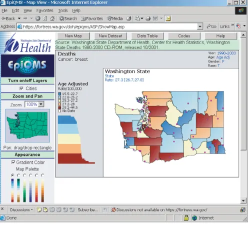
Finally, some health data repositories are exploring ways to make their data more accessible via the Internet. Many state health departments and state cancer registries pro-vide public access to their health statistics. The State of Washington has developed EpiQMS (Epidemiologic Query and Mapping System), shown in Figure 3, which combines maps, graphs, and tables for vital statistics data [26]. The State of Pennsylvania has also implemented EpiQMS [27]. Similarly, the State of Kentucky's cancer reg-istry provides interactive access to its cancer statistics, as shown in Figure 4[28]. Some state cancer registries also regularly publish static maps and tables to report progress. Geospatial One-Stop [29] is a U.S. government initiative to promote the sharing of geo-referenced data. The National Science Foundation's Digital Government/Qual-ity Graphics initiative [30] has promoted creative data dis-plays such as the linking of maps and statistical time-series plots in the Exploratory Spatio-Temporal Analysis Toolkit, developed by the Pennsylvania State University's GeoVista Center in collaboration with NCI [31,32]. The Pennsylvania Cancer Atlas previews this next-generation technology based on the GeoVista research to provide dynamic links between maps, tables, and graphs, as shown in Figure 5[33].
Guidelines for communicating spatial information
When presenting the results of statistical analyses of spa-tial data, choose a medium that best suits the message and the needs of the audience. Where control of the message is important, static maps will continue to be the most effective, although good tables, graphs, and explanatory text are still needed in order to ensure that different peo-ple will see the same thing in the maps. For exampeo-ple, cam-era-ready maps depicting the spreading epidemic of obesity in the United States were included in an article in the Journal of the American Medical Association [34], and this led to front-page newspaper and national broadcast news coverage [[35] p. 86]. Further, the maps spurred debate regarding which was the greater public health problem, smoking or obesity.
Alternatively, interactive access to data collected by cancer registries or health departments promotes public interest and exploration. In the short term, however, this broader
use of the data may increase the risk of misuse or misin-terpretation due to users' inexperience. Nonetheless, interactivity may be the attribute of scientific communica-tion with the greatest potential for increasing understand-ing of complex health information and influencunderstand-ing audiences, especially when available online [35-38]. The importance of interactivity is related to the greater value of participation in both the process and content of commu-nication. Research shows that when audience members are involved in the design and dissemination of health communication, the results and messages reported are more likely to be accepted by the broader audience [35,36]. Interactive access to data promotes audience involvement and provides opportunities for feedback and exploration of data sets. GIS technology can enable a pub-lic health practitioner to explore areas of concern interac-tively with an audience. Reference layers can be added in real time to base layers to allow concerned citizens to con-sider broader contexts. The geographic context allows cit-izens to identify their neighborhood and see how it compares with other similar neighborhoods.
Developing and testing the map
Maps should be produced using sound cartographic prin-ciples and then be tested on representatives from poten-tial audiences, including the public. This guidance applies both to static maps and interactive Web sites. Because interactive Web sites potentially provide more options and combinations for the user to select data to map and to customize the map for presentation, more testing is involved.
There are many excellent cartography textbooks to help non-experts learn how to create accurate, clear, and attrac-tive maps (e.g., Robinson et al.'s Elements of Cartography [39] or Slocum et al.'s Thematic Cartography and Geographic Visualization [40]). If possible, when constructing a map, those with limited experience should consult with a car-tographer on map design or have a carcar-tographer review a draft map design; however, excellent guides exist for GIS users [41-43]. A work group of the North American Asso-ciation of Central Cancer Registries (NAACCR) [44] pub-lished Using Geographic Information Systems Technology in the Collection, Analysis, and Presentation of Cancer Registry Data: A Handbook of Basic Practices, which includes a sec-tion on cartography [45]. The complete handbook is available for download from the NAACCR Web site.
Map layout
In designing a map layout, common elements usually include the following.
• The title matches the theme and audience, is concise but accurate, and is simple while clearly indicating the pur-pose of the map.
• The legend provides for symbol interpretation, is designed with ease of interpretation and clarity in mind,
and includes any map features that might be unknown to the audience or might otherwise cause confusion.
• The map body includes the necessary amount of data and detail while recognizing that too much detail can result in losing the intended message.
• The scale of true distance to map units is a representative fraction (e.g., 1:24,000-one centimeter on the map is equivalent to 24,000 centimeters on the ground) or a
Epidemiologic Query and Mapping System (EpiQMS)
Figure 3
graphic of the distance measure. A small-scale map shows a large geographic area so things look small, while a large-scale map shows a small geographic area so things look large.
• The direction indicator, such as a north arrow, orients viewers who are unfamiliar with the area portrayed.
• Labels for place names or data values are included only as needed, considering the major communication goal of the map. For example, major cities in a state may be shown to provide reference points.
• The source should provide clear reference links to data sources available for map user follow-up.
Optional map elements include:
• Projection of the map that was used to transform lati-tude and longilati-tude locations to x, y coordinates. The pro-jection process flattens the earth's curved surface, creating distortions in area, distance, direction, or shape. Usually a map of the continental United States will use the Albers Equal-Area map projection, which preserves area (i.e., any area defined on the map, such as 1-inch square area that is 1% of the total map surface, corresponds directly to the same proportion, e.g., 1%, of the true surface being mapped). When using multiple GIS map data layers, each map layer must use the same projection and scale so that map features align properly when overlain.
• Cartographer's name or organization.
• Date of production (this is especially important for time-sensitive data).
Kentucky Cancer Registry's interactive query and mapping
Figure 4
• Neat line around the map extent, which indicates exactly where the map begins and ends.
• Locator maps (maps of large geographic regions that include the region of interest to indicate exactly where the map or feature of interest begins and ends).
• Inset map (large-scale map of a zoomed-in portion of the main map).
• Index maps (these depict the location of each of several map compositions that comprise coverage of an area).
Consider the map's purpose and whether each map ele-ment is necessary for accurate interpretation of the map by the map reader. Ensure that the layout focuses on the
most important feature of the map and not on a back-ground element.
Statistical maps
Map types commonly used for health statistics include:
• Classed choropleth maps, which shade each area based upon its classification into a set of categories and support rate look-up and pattern recognition.
• Isopleth maps, which use contours to show patterns. These are commonly used for measures that are continu-ous over space, such as elevation or temperature. They are appropriate for representing disease rates or spatially smoothed rates. A smoothed map is a map that has removed some random variation in the underlying rates,
Pennsylvania Cancer Atlas's dynamic linked maps, tables, and graphs
Figure 5
e.g., by a spatial moving average that borrows information from neighboring areas or from regions with more stable rates.
• Graduated or proportional symbols, where the size of the symbol is proportional to each mapped value or to a representative value of each rate category. An example would be a bar chart over each census tract that depicts the percentage population distribution of racial groups but with the size of the bar chart proportional to the total pop-ulation.
• Area symbols, which are used to represent nominal or qualitative data that in concept or in fact extend over an area. For example, an area symbol could depict land use.
For classed choropleth maps, equal interval classification is useful when the mapped quantity is in familiar units (e.g., packs of cigarettes smoked per day). However, for adjusted rates that are only meaningful in relation to other similarly adjusted rates, Brewer and Pickle [46] con-ducted a study in which subjects evaluated seven potential classification methods for conveying patterns of mapped rates and found that the quantile method was best. The quantile method, also known as the percentile method, ranks the enumeration units by the variable of interest and then places an equal number of enumeration units into each class. The quantile classification tested used quintiles, or five classes, so 20 percent of the units were placed in each class by rank. Quintiles and quartiles are common choices for quantile classification.
When preparing a series of maps, such as is done for ani-mating maps over time, the same classification method and values should be used for each map in the series for consistency [46]. Usually the classification range is con-structed from the midpoint in the time series and then applied to each map in the series.
Colors
Selected colors should not violate generally accepted con-ventions. For example, individuals are accustomed to blue representing water and green representing vegetation. The convention for quantitative data is that either darker or warmer colors represent higher values. For example, the historical use of reds for high rates and blues for low rates in cancer mortality maps sets a strong expectation. When data are classified into groups (classes), colors need to be assigned that work well in distinguishing between the classes. Recent National Science Foundation-funded research by Cynthia Brewer has produced a Web site that is particularly useful for making the color choices for sequential (light to dark); diverging (dark to light of one color, then light to dark of another color); and qualitative color schemes [47]. Diverging schemes are useful when
one of the goals of the map is to show where rates are higher or lower than some middle value (e.g., U.S. overall rate). The Web site also helps the map designer to choose appropriate colors for use by the color blind (most com-monly those readers who have a particular problem dis-tinguishing red and green), for printing in black and white and for displaying on a laptop computer or a projection system.
Testing the map design
All map designs should be tested to ensure that they com-municate the intended message with the intended audi-ence. The investment in testing should be proportionate to the consequences of misinterpretation. Testing of the design can range from a simple walk-through with a peer for maps intended for internal communication only, to more thorough usability testing with representatives of the target audience for maps expected to have broad dis-tribution.
The first stop in validating a map design should be with a peer who is familiar with maps commonly used in the subject field. In preparation, develop questions that a map reader should be able to answer, and consider the ways in which the answers should be consistent with the messages that the map is to convey. If available, a cartographer should also be consulted at this time.
After incorporating the suggestions made by peer review-ers and/or by the cartographer, the same questions can be used to test the maps on several people who are represent-ative of potential audiences. If the public will be using the maps, it is very important that selected representatives be among those tested. Family and friends are a convenient source of informal test subjects, but one must also seek reviews from members of the special interest groups likely to use the maps.
to answer the questions and describe aloud what the maps communicate to them.
Special considerations
There are special considerations in communicating the results of a spatial analysis of health statistics that are not issues for other spatial applications, such as weather sta-tistics. Consideration must be given to the following: lim-itations of the data, including its quality; limlim-itations of the analysis; confidentiality; uncertainty in the estimates; effects of data smoothing; and misinterpretation of results.
Limitations of data
Spatial health data has unique characteristics. The article by Boscoe et al. [49] discusses current practices in spatial analysis of major types and sources of data, including can-cer registries, population data, health surveys, environ-mental data, and remote sensing data. In order for policymakers and the public to consider the results trust-worthy, information must be included on the source and quality of the data. Metadata for the data source should include some indication of the data quality. The Federal Geographic Data Committee [50] provides information on metadata standards for the United States. Quality of geocoding can be problematic, so a definition and meas-ure of geocoding accuracy and success is needed. Disease classification and cause of death classification can be open to interpretation. Cancer consists of many diseases with different etiologies, so cancers should only be grouped when it makes biological sense to group them. For survey data, sample size and response rates are important infor-mation to include as indications of quality and reliability. Unfortunately, data needed for an analysis such as resi-dential history and measures of exposure are often una-vailable. When an analysis proceeds with what data are available, it is important that results discuss any assump-tions and any limitaassump-tions of the data.
Limitations of analysis
Jacquez's article on "flies in the ointment" [51] and Anse-lin's "How (not) to Lie with Spatial Statistics" [52] discuss in detail the limitations of spatial analyses of health data. Quantitatively powerful techniques are available for iden-tifying locations of potential clusters, hot spots, cool spots, etc [53-55]. However, the inferences that can be drawn are often limited, because clustering does not nec-essarily illuminate the etiology – especially since scant information may be available with respect to an individ-ual's exposure history to possible putative agents. There are often spatial and temporal mismatches, where infor-mation on cases and exposures do not align in space or time. This is particularly a problem with cancer's long latency (lag time) from potential exposure to diagnosis. People move around over time, both during a single day
and over a period of years. Cases in a geographic area may have been exposed elsewhere, or people exposed may have relocated. The ecologic fallacy (i.e., that associations observed at an aggregate level may be inconsistent with associations observed on individuals) is inherent in most spatial analyses of grouped health data [18]. In addition, the level of spatial aggregation can affect the results; e.g., a multi-state, regional analysis of small area data may lead to different conclusions than analysis of each individual state [56]. As with limitations on data, it is important that a supporting section discuss limitations of the analysis.
Confidentiality
Public health reporting systems and cancer registries were committed to the protection of the privacy of the individ-ual even before the mandates included in the Health Insurance Portability and Privacy Act. There is a natural tension between providing information useful for local action and ensuring confidentiality of sensitive personal health data [57]. Methods that have been used to protect confidentiality include the following: (1) spatial and tem-poral aggregation, (2) adding geographic or etiologic con-text variables to original unmasked data and then removing the geographic identifiers, (3) random small-scale relocation of individual records, and (4) limiting access to potentially identifiable data through a user- and/ or function-restricted computer environment.
Second, geographic or etiologic context variables can be added to original unmasked data for a public use or research data set, and then the geographic identifier can be removed. In this approach, the individual records are geocoded to an administrative unit such as a census tract and then some attributes of interest from that census tract are associated with the individual record. Care must be exercised to ensure that some combination of the contex-tual variables does not serve as a geographic identifier of an individual. This approach can be particularly useful where geography is already serving as a surrogate for these contextual variables. For example, much research into health disparities focuses on socioeconomic factors. The spatial location of an individual is not so much of interest as that the individual lives in a high-poverty area or an area of high air pollution, or draws drinking water from a contaminated source.
Third, the location of individual records on a map can be relocated randomly [59]. Points are shown, but the loca-tions have been moved a random distance and a random angle from their original source, giving a general picture of the spatial distribution of the data without allowing for identification of the individuals. In the investigation of cancer clusters, there is pressure to show the true location of the subject, but this usually cannot be done without the written informed consent of every subject.
Finally, access to identifiable data may be limited to a con-trolled research environment, although this is not typi-cally a problem in health departments carrying out surveillance or cluster investigations. Researchers with protocols approved by an institutional review board (IRB) sometimes can work with the identifiable data but may be restricted to publishing results in formats that protect the confidentiality of the subjects. CDC's National Center for Health Statistics provides such a facility for researchers to work with individual respondent data from their national surveys [60]. The Long Island Breast Cancer Study Project Geographic Information System provides public access to limited data but is primarily intended as a tool for researchers with IRB approval to study relationships between environmental exposures and breast cancer [61].
Rules for accessing geocoded data vary greatly. Some states currently preclude researchers from working with data geocoded to the residential street address, while oth-ers encourage such usage.
Uncertainty in estimates
Extreme observed rates are often based on the fewest observations and are therefore unstable, or highly varia-ble, estimates of the true rate. Approaches that have been used to address this issue include spatial smoothing [62] or spatial filtering [63] of rates, hatching areas with
unsta-ble rates [64], suppression or blanking out of unstaunsta-ble rates [24,65-67], or use of two or more maps where the first map is of the observed rates and the second map is of some measure of variability (e.g., residuals, standard devi-ations, or statistical significance) [64]. A statistical signifi-cance test can be added to the level of the rate in the classification for inclusion in the legend [24]. In Figure 2, confidence bars show uncertainty in rates in an LM plot [68,69] used in the State Cancer Profiles Web site [15].
Audience, media, and purpose of the map all influence which approach can and should be used. The public is probably not familiar with statistical variability and test-ing and would be confused by the presentation of two or more maps as commonly used for scientific audiences. Nevertheless, the public is familiar with a weather map that has spatially smoothed temperatures to show the weather pattern and that uses a color scheme of warm colors for warmer temperatures and cool colors for cooler temperatures. Static maps in print or provided over the Internet can easily provide spatially smoothed or spatially filtered data to support pattern or cluster detection. EpiQMS [26,27,70] has calculated spatially smoothed rates for counties in Washington that can then be mapped interactively as an area-shaded map, as shown in Figure 3. When the primary purpose is to provide rate read-out functionality, the LM plot presented in Figure 2 provides a combination graph and map format, where the graph includes a confidence interval for the rate estimates while also providing an area-shaded map of the observed rate.
because they display only a binary assessment of reliabil-ity rather than provide a continuous measure of the degree of reliability as can be shown with two maps.
Effects of data smoothing
Data smoothing provides a picture that presents broad patterns, as can be seen in the weather map in Figure 1, but it can remove detail from the map that would permit reading an original value from a specific place. An under-lying assumption is that areas in close proximity will be more alike, but this is not always true. Instead, it may be desirable to borrow strength from areas with similar demographics. A further complication is that simple unweighted smoothing will treat all rates as equally relia-ble, possibly smoothing away important and reliable "hot spots" of high rates. To illustrate, HIV mortality rates are higher in cities, where rates are based on large numbers of cases, compared with rates in surrounding suburban or rural areas with smaller populations. Unweighted smoothing of these rates will remove the isolated urban "hot spots," whereas smoothing HIV rates weighted by their population or other measure of reliability will retain the reliable high city rates while smoothing rates in less populous places to be more like neighboring areas [62].
Smoothing of observed rates can also be accomplished by regression modeling of the underlying data. For example, statistical models of the associations between cancer inci-dence rates in a subset of U.S. states and a number of soci-odemographic factors have been used to predict cancer incidence across the entire United States [72]. These pre-dictions are statistically smoothed compared to the origi-nal observations.
In addition to illustrating broad patterns in the data, smoothed rate maps can help to remove the dependence of apparent spatial patterns on artificial administrative boundaries by smoothing the patterns across these boundaries (see, for example, maps developed for com-munity planners in Iowa [73]). A number of smoothing methods are available; a method needs to be chosen that ensures that features of interest to the reader are not lost.
Misinterpretation of results
In an editorial discussing the "promise and pitfalls" of GIS technology [18], Melnick and Fleming note that integrat-ing complex data into an easy-to-understand picture could lead to misunderstanding and misuse. There is the temptation to infer causation from correlation and to make inferences about individuals from population data (a.k.a. the ecologic fallacy) [74]. To minimize this risk, it is important that maps be tested on a representative audi-ence, as discussed above.
When the intent of the maps is to inform and educate the public about cancer risk, it is important that the provider of the information be informed about risk communica-tion. Risk perception combines the perceived probability or likelihood of an event and the severity of the conse-quences of the event. To the public, even one case of child-hood brain cancer in the neighborchild-hood elevates concern by combining an event with severe consequences and making it highly probable because it is someone they know. Discussion of the absence of a "statistical excess" of childhood brain cancers in the area is likely to increase mistrust and concern that the truth is being hidden. Rat-zan et al. [75] provide worksheets for planning risk com-munication to ensure that the messenger is prepared to address the public's concerns. Use of interactive maps can help involve the public in exploring the data spatially and increase their understanding of the complexity of assess-ing the risk of a potential exposure.
Conclusion
Lessons learned in developing effective communications media should be applied to communicating results of spa-tial analyses of health statistics. Essenspa-tial steps include defining the purpose of the communication, identifying potential audiences and their characteristics and needs, choosing the media, and testing the delivery on represent-atives from the audiences to ensure effective communica-tion is possible. In particular, consider the numeracy skills of the audiences and their need for the information, and present the data appropriately.
Desktop geographic information systems and interactive mapping capabilities on the Internet have put the power of communicating spatially into the hands of the public. However, most users of these technologies have not been trained in either cartography or statistics. Developers of quantitative mapping systems should ensure that default settings on their software or applications are based on sound cartographic and statistical principles. Users of these systems who publish maps should always test their map designs on potential consumers to ensure that the maps are communicating without misinforming. For sta-tistical maps, consider map types beyond the traditional classed choropleth map that shades each area. Isopleth maps effectively show patterns and are well understood by the public who view weather maps daily.
Mapmakers should ask, "What is the message?" and "How will the message be used?" Then, they should choose a map style that will communicate that message to the tar-get audience. Finally, mapmakers should test that the map audience understands the intended message.
Abbreviations
EpiQMS – Epidemiologic Query and Mapping System
GIS – geographic information system
IRB – institutional review board
LM plot – linked micromap Plot
NAACCR – North American Association of Central Cancer Registries
NCI – National Cancer Institute
PDF – portable document format
U.S. – United States
Competing interests
The author(s) declare that they have no competing inter-ests.
Authors' contributions
BSB led the effort to draft the manuscript, drawing upon the subject matter expertise of REH and DW. REH final-ized the manuscript, incorporating feedback from peer reviewers and updating to keep abreast of changes in the field. LWP convened the panel of experts that motivated this manuscript and also guided the manuscript's devel-opment. BSB, REH, LWP, and DW read and approved the final manuscript.
Acknowledgements
The authors wish to acknowledge the contribution of Dr. Gary Kreps, who reviewed this manuscript and contributed his insights into the challenges of communicating quantitative data. Dr. Kreps is Chair of the Department of Communications at George Mason University and was Branch Chief of the Health Communication and Informatics Research Branch in the Behavioral Research Program within the Division of Cancer Control and Population Sciences at the National Cancer Institute.
They would also like to thank Ramona Nelson of the Washington State Department of Health, who provided valuable services concerning the bib-liography and final preparation of the paper, and Paula Zeller for her copy editing services which clarified the text. In addition, the authors thank the reviewers for their helpful suggestions.
References
1. Nelson DE, Brownson RC, Remington PL, Pavanta C: Translating public health data. In Communicating Public Health Information Effec-tively: A Guide for Practitioners Edited by: Nelson DE, Brownson RC, Remington PL, Pavanta C. Washington, D.C.: American Public Health Association; 2002:33-46.
2. Lipkus IM, Samsa G, Rimer BK: General performance on a numeracy scale among highly educated samples. Medical Deci-sion Making 2001, 21:37-44.
3. Sheridan SL, Pignone M: Numeracy and the medical student's ability to interpret data. Eff Clin Pract 2002, 5:35-40.
4. Woloshin S, Schwartz LM, Moncur M, Gabriel S, Tosteson ANA: Assessing values for health: numeracy matters. Medical Deci-sion Making 2001, 21:382-390.
5. Woloshin S, Schwartz LM, Ellner A: Making sense of risk informa-tion on the web – don't forget the basics. British Medical Journal
2003, 327:695-696.
6. MacEachren AM: How Maps Work: Representation, Visualization, and Design New York: The Guilford Press; 1995.
7. Bertin J: Semiologie Graphique The Hague: Mouton-Gautier; 1973. 8. Bertin J: Semiology of Graphics Madison, WI: University of Wisconsin
Press; 1983.
9. Frye C: Making maps that communicate. ArcUser 2001, 4:38-43. 10. Monmonier M: Mapping It Out: Expository Cartography for the Humani-ties and Social Sciences Chicago: The University of Chicago Press; 1993. 11. Richards TB, Croner CM, Rushton G, Brown CK, Fowler L: Geo-graphic information systems and public health: mapping the future. Public Health Reports 1999, 114:359-360.
12. South Carolina community assessment network related links [http://scangis.dhec.sc.gov/scan/links/links.htm]
13. Tufte ER: The Visual Display of Quantitative Information Cheshire, CT: Graphics Press; 2001.
14. The weather channel [http://www.weather.com/.]
15. State cancer profiles [http://www.statecancerprofiles.cancer.gov/ ]
16. Carr DB, Wallin JF, Carr DA: Two new templates for epidemi-ology applications: linked micromap plots and conditioned choropleth maps. Statistics in Medicine 2006, 19:2521.
17. Linked micromap plot [http://statecancerprofiles.cancer.gov/ micromaps/.]
18. Melnick AL, Fleming DW: Modern geographic information sys-tems – promise and pitfalls. J Public Health Manag Pract 1999, 5:viii-viix.
19. Morgenstern H: Ecologic studies. In Modern Epidemiology 2nd edi-tion. Edited by: Rothman KJ, Greenland S. Philadelphia: Lippincott Williams & Wilkins; 1998:459-480.
20. Pickle LW, Mungiole M, Jones GK, White AA: Atlas of United States Mortality Hyattsville, Maryland: National Center for Health Statistics; 1996.
21. Heart disease and stroke maps interactive state maps [http:/ /www.cdc.gov/dhdsp/library/maps/index.htm]
22. The atlas of heart disease and stroke [http://www.who.int/ cardiovascular_diseases/resources/atlas/en/]
23. Brewer CA, Suchan TA: Mapping Census 2000: The geography of U.S. diversity Washington, D.C.: U.S. Government Printing Office; 2001. 24. Devesa S, Grauman DJ, Blot WJ, Pennello GA, Hoover RN, Fraumeni
JF: Atlas of Cancer Mortality in the United States: 1950–94 Bethesda, Maryland: National Cancer Institute, National Institutes of Health; 1999.
25. National Cancer Institute, cancer mortality maps & graph [http://www.cancer.gov/atlasplus/]
26. EpiQMS: epidemiologic query and mapping system for Washington State Department of Health [https://for tress.wa.gov/doh/epiqms/]
27. EpiQMS Pennsylvania Department of Health [http:// app2.health.state.pa.us/epiqms/]
28. Kentucky cancer registry: interactive cancer mapping [http:/ /www.kcr.uky.edu/]
29. Geospatial one-stop: facilitating partnerships and access to geospatial information [http://www.geodata.gov/]
30. Digital government quality graphics for federal statistical summaries [http://www.geovista.psu.edu/grants/dg-qg/intro.html] 31. MacEachren AM, Hardisty F, Dai X, Pickle LW: Supporting visual
analysis of federal geospatial statistics. Communications of the ACM 2003, 46:63-64.
32. Exploratory spatio-temporal analysis toolkit (ESTAT) [http://www.geovista.psu.edu/ESTAT/]
33. Pennsylvania cancer atlas: a model GIS/atlas for state com-prehensive cancer control [http://www.geovista.psu.edu/ resources/flyers/GV_PA_Atlas.pdf]
34. Mokdad AH, Serdula MK, Dietz WH, Bowman BA, Marks JS, Koplan JP: The spread of the obesity epidemic in the United States, 1991–1998. Journal of the American Medical Association 1999, 282:1519-1522.
35. Neuhauser L, Kreps GL: The advent of e-health: how interactive media are transforming health communication. Medien & Kommunikations-wissenschaft 2003, 51:541-556.
Publish with BioMed Central and every scientist can read your work free of charge
"BioMed Central will be the most significant development for disseminating the results of biomedical researc h in our lifetime."
Sir Paul Nurse, Cancer Research UK
Your research papers will be:
available free of charge to the entire biomedical community
peer reviewed and published immediately upon acceptance
cited in PubMed and archived on PubMed Central
yours — you keep the copyright
Submit your manuscript here:
http://www.biomedcentral.com/info/publishing_adv.asp
BioMedcentral
37. Rice RE: The Internet and health communication: a frame-work of experiences. In The Internet and Health Communication: Experiences and Expectations Edited by: Rice RE, Katz JE. Thousand Oaks, CA: Sage; 2001:5-46.
38. Street RJ, Rimal R: Health promotion and interactive technol-ogy: a conceptual foundation. In Health Promotion and Interactive Technology: Theoretical Applications and Future Directions Edited by: Street RL, Jr, Manning T, Gold W. Mahwah, NJ: LEA, Inc.; 1997. 39. Robinson AH, Morrison JL, Muehrcke PC, Kimerling AJ, Guptill SC:
Elements of Cartography New York: John Wiley & Sons; 1995. 40. Slocum TA, McMaster RB, Kessler FC, Howard HH: Thematic
Cartog-raphy and Geographic Visualization New York: Prentice Hall; 2003. 41. Brewer C: Designing Better Maps: A Guide for GIS Users Redlands, CA:
ESRI Press; 2005.
42. Krygier J, Wood D: Making Maps: A Visual Guide to Map Design for GIS
New York: Guilford Press; 2005.
43. Brewer C: Basic mapping principles for visualizing cancer data using geographic information systems (GIS). American Journal of Preventive Medicine 2006, 30:S25-S36.
44. North American Association of Central Cancer Registries (NAACCR) [http://www.naaccr.org/]
45. Using geographic information systems technology in the col-lection, analysis, and presentation of cancer registry data: a handbook of basic practices [http://www.naaccr.org/filesystem/ pdf/GIS%20handbook%206-3-03.pdf]
46. Brewer CA, Pickle L: Evaluation of methods for classifying epi-demiological data on choropleth maps in series. Annals of the Association of American Geographers 2002, 92:662-681.
47. ColorBrewer: an online tool designed to help people select good color schemes for maps and other graphics [http:// www.colorBrewer.org/]
48. Usability.gov: your resource for designing usable, useful and accessible web sites and user interfaces [http://usability.gov/.] 49. Boscoe FP, Ward MH, Reynolds P: Current practices in spatial
analysis of cancer data: data characteristics and data sources for geographic studies of cancer. Int J Health Geog 2004, 3:28. 50. The Federal Geographic Data Committee [http://
www.fgdc.gov/.]
51. Jacquez GM: Current practices in the spatial analysis of can-cer: flies in the ointment. Int J Health Geog 2004, 3:22.
52. Anselin L: How (not) to lie with spatial statistics. American Jour-nal of Preventive Medicine 2006, 30:S3-S6.
53. GeoDA – an introduction to spatial data analysis [https:// www.geoda.uiuc.edu/]
54. SaTScan™ software for the spatial, temporal and space-time scan statistics [http://www.satscan.org/]
55. CrimeStat III® – a spatial statistics program for the analysis of crime incident locations [http://www.icpsr.umich.edu/ NACJD/crimestat.htm]
56. Gregorio DI, Samociuk H, Dechello L, Swede H: Effects of study area size on geographic characterizations of health events: prostate cancer incidence in southern New England, 1994– 1998. Int J Health Geog 2006, 5:8.
57. Yasnoff WA, Sondik EJ: Geographic information systems (GIS) in public health practice in the new millennium. J Public Health Manag Pract 1999, 5:ix-xii.
58. CDC WONDER provides a single point of access to a wide variety of reports and numeric public health data [http:// wonder.cdc.gov/.]
59. Armstrong MP, Rushton G, Zimmerman DL: Geographically masking health data to preserve confidentiality. Statistics in Medicine 1999, 18:497-525.
60. Legler J, Breen N, Meissner H, Malec D, Coyne C: Predicting pat-terns of mammography use: a geographic perspective on national needs for intervention research. Health Services Research 2002, 37:929-947.
61. Long Island breast cancer study project (LIBCSP): a tool for research on breast cancer on Long Island [http://www.health gis-li.com/]
62. Mungiole M, Pickle LW, Simonson KH: Application of a weighted head-banging algorithm to mortality data maps. Statistics in Medicine 1999, 18:3201.
63. Rushton G, Krishnamurthy R, Krishnamurti D, Lolonis P, Song H: The spatial relationship between infant mortality and birth defect rates in a US city. Statistics in Medicine 1996, 15:1907-1919.
64. MacEachren AM, Brewer CA, Pickle LW: Visualizing georefer-enced data: representing reliability in health statistics. Envi-ronment and Planning: A 1998, 30:1547-1561.
65. Barnett E, Casper ML, JA H, Elmes GA, Braham VE, Majeed Z: Men and Heart Disease: An Atlas of Racial and Ethnic Disparities in Mortality
Morgantown, WV: Office for Social Environment and Health Research, West Virginia University; 2001.
66. Casper ML, Barnett E, Williams GJ, Halverson JA, Braham VE, Green-lund KJ: Atlas of Stroke Mortality: Racial, Ethnic, and Geographic Dispari-ties in the United States Atlanta: Department of Health and Human Services, Centers for Disease Control and Prevention; 2003. 67. Casper ML, Barnett E, Halverson JA, Elmes GA, Braham VE, Majeed
Z: Women and Heart Disease: An Atlas of Racial and Ethnic Disparities in Mortality Morgantown, WV: Office for Social Environment and Health Research, West Virginia University; 2000.
68. Carr DB, Olsen AR, Courbois JP, Pierson SM, Carr DA: Linked micromap plots: named and described. Statistical Computing & Graphics Newsletter 1998, 9:24-31.
69. Carr DB: Designing linked micromap plots for states with many counties. Statistics in Medicine 2001, 20:1331.
70. Hoskins RE, O'Connor C, Johnson C, O'Carroll P, Fuller S: EpiQMS: An Internet application for access to public health data for citizens, providers, and public health investigators. Journal of Public Health Management and Practice 2002, 8:30-36.
71. Lewandowsky S, Behrens JT, Pickle LW, Herrmann DJ, White AA: Perception of clusters in mortality maps: representing mag-nitude and statistical reliability. Edited by: Pickle LW, DJ H. Hyattsville, MD: National Center for Health Statistics; 1995:107-132. 72. Pickle LW, Feuer EJ, Edwards BK: U.S. Predicted Cancer Inci-dence, 1999. In NCI Cancer Surveillance Monograph Series Bethesda, MD: National Cancer Institute; 2003.
73. Iowa consortium for comprehensive cancer control cancer maps site [http://www.uiowa.edu/~gishlth/ICCCCMaps/] 74. Meade MS, Florin JW, Gesler WM: Medical Geography New York: The
Guilford Press; 1988.
75. Ratzan SC, Nelson DE, Eng TR, Goldberg C: Electronic communi-cation. In Communicating Public Health Information Effectively: A Guide for Practitioners Edited by: Nelson DE, Brownson RC, Remington PL, Pavanta C. Washington, D.C.: American Public Health Association; 2002:173-184.