Faculty of Cognitive Sciences
Department of Cognitive and Education Sciences
Doctoral School in
Psychological Sciences and Education
The interplay between shape and colour
An experimental inquiry
Advisor:
prof. Liliana Albertazzi
Co-advisor: prof. Luisa Canal
PhD Student: James Dadam
University of Trento
Faculty of Cognitive Sciences
Department of Cognitive and Education Sciences
Doctoral School in Psychological Sciences and Education
The interplay between shape and colour
An experimental inquiry
Advisor:
prof. Liliana Albertazzi
Co-advisor: prof. Luisa Canal
PhD Student: James Dadam
L
IST OFF
IGURESFIGURE 1.1– COLOUR CATEGORIES IN BERINMO AND IN ENGLISH... 05
FIGURE 1.2– HUE AND BRIGHTNESS SEQUENCES... 08
FIGURE 1.3– AN EXAMPLE OF SIMULTANEOUS CONTRAST... 17
FIGURE 1.4– ALTHOUGH ALL THE SQUARES HAVE THE SAME EDGES, THEY APPEAR DIFFERENT... 18
FIGURE 1.5– ON THE LEFT SIMULTANEOUS CONTRAST AND ON THE RIGHT SPREADING... 19
FIGURE 1.6– RED LINES SEEM LIGHTER WITH THE WHITE BACKGROUND... 19
FIGURE 1.7– ABNEY EFFECT... 20
FIGURE 1.8– ADELSON CHECKERBOARD ILLUSION... 22
FIGURE 1.9– LOTTO CUBE ILLUSION... 24
FIGURE 1.10– CONFIGURATION USED BY BULLOUGH... 26
FIGURE 1.11– TEAPOTS WITH THE SAME LUMINANCE USED IN THE BAILEY’S EXPERIMENT... 32
FIGURE 2.1– PEOPLE PREFER TO SAY THAT THIS FIGURE IS COMPOSED OF TWO SQUARES... 42
FIGURE 2.2– ONE CONFIGURATION IS PREFERRED TO THE OTHER... 42
FIGURE 2.3– IN THE MÜLLER-LYER ILLUSION, THE TWO LINES SEEM TO HAVE DIFFERENT LENGTHS. 43 FIGURE 2.4– CONTOUR INTERPOSITION, APPARENT TRANSPARENCY, SPONTANEOUS SPLITTING.... 43
FIGURE 2.5– MODAL PRESENCE... 45
FIGURE 2.6– MENTAL REPRESENTATION... 45
FIGURE 2.7– AMODAL PRESENCE... 45
FIGURE 2.8– KANIZSA’S TRIANGLE... 46
FIGURE 2.9– DOTS TEND TO GROUP IN COLUMNS BECAUSE VERTICAL DISTANCES ARE SHORTER... 50
FIGURE 2.10– DOTS TEND TO GROUP ACCORDING TO SIZE AND COLOUR SIMILARITIES... 51
FIGURE 2.11– WHEN PROXIMITY AND SIMILARITY COOPERATE, THE EFFECT IS REINFORCED... 51
FIGURE 2.12– LINES OF BLACK DOTS AND LINES OF WHITE DOTS ARE PREFERRED... 51
FIGURE 2.13– CONFIGURATION WITH HORIZONTAL LINE AND OBLIQUE SEGMENT IS PREFERRED... 52
FIGURE 2.14– GROUPING ACCORDING TO DIRECTIONALITY... 52
FIGURE 2.16– ELEMENTS THAT IF COMBINED COULD CLOSE AN AREA TEND TO GROUP... 53
FIGURE 2.17– THE FIGURES UNIFY THEMSELVES, PRODUCING MORE BALANCED FIGURES... 54
FIGURE 2.18– WHEN TURNED 90O CLOCKWISE, AN ‘E’ IS SEEN... 54
FIGURE 2.19– AN AMODALLY COMPLETED HEXAGON EMERGES BEHIND THE WHITE RECTANGLES... 55
FIGURE 2.20–THERE ARE A WHITE AND A BLACK CROSS BEHIND THE GREY CIRCLES... 56
FIGURE 2.21– WOUTERLOOD AND BOSELIE MODEL ... 56
FIGURE 2.22– THE DISCONTINUITY OF THE ELEMENTS PRODUCES AN ILLUSORY WHITE CIRCLE... 57
FIGURE 2.23– COMPLETION AND MOSAIC SOLUTIONS... 62
FIGURE 2.24– A SOLUTION WITH A HIGHER INFORMATION LOAD MAY BE PREFERRED... 66
FIGURE 2.25– THE SOLUTION DEPENDS ON THE INTERPRETATION GIVEN TO THE CURVATURE... 69
FIGURE 2.26– RELATABLE CONTOURS AND SURFACES DO NOT PRODUCE COMPLETION... 71
FIGURE 2.27– THE “SEA MONSTER” ... 74
FIGURE 2.28– THE CENTRAL SQUARE SEEMS TO BE NARROWER THAN THE OTHERS... 75
FIGURE 2.29– ALSO EMPTY SPACES SHRINK... 75
FIGURE 2.30– IF OCCLUDER IS MADE TO LOOK TRANSPARENT, OCCLUDED APPEARS LONGER... 76
FIGURE 2.31– VEZZANI STIMULI... 77
FIGURE 2.32– DIMENSIONAL PHENOMENA ARE ALSO PRESENT IF THE OCCLUDER IS ONLY A LINE.... 78
FIGURE 2.33– SHRINKAGE IS NOT OBSERVED IF OCCLUDER IS NOT TALLER THAN OCCLUDED... 79
FIGURE 2.34– RECTANGLE ADJACENT TO WHITE SURFACE IS PERCEIVED ABOUT 8% BIGGER... 80
FIGURE 2.35– VEZZANI EXPERIMENT... 80
FIGURE 2.36– PARLANGELI AND RONCATO EXPERIMENT... 81
FIGURE 2.37– THE LIGHTING ILLUSION IS AN EXAMPLE OF AMODAL COLORATION... 83
FIGURE 2.38– WATERCOLOUR ILLUSION: BORDER COLOUR SPREADS ACROSS ENTIRE SURFACE.... 84
FIGURE 2.39– THE LIGHT RED IN THE INNER REGION DISCOLOURS AND APPEARS WHITE... 85
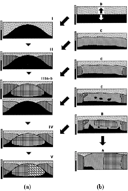
FIGURE 3.1– IMAGE WITH RELATABLE CONTOURS... 98
FIGURE 3.2– STIMULUS WITH OCCLUDER IN THE CENTRAL POSITION... 101
FIGURE 3.3– PARTICIPANTS NEVER SAW A STIMULUS LIKE THIS ONE... 101
FIGURE 3.4– WHITE AND BLACK STIMULI USED IN THE PRE-SESSION TEST... 102
FIGURE 3.5– MEAN VALUES OF THE PERCEPTUAL BOUNDARIES POSITION FOR WHITE AND BLACK... 107
FIGURE 3.7– MEAN VALUES OF THE PERCEPTUAL BOUNDARIES POSITION FOR YELLOW/PURPLE... 108
FIGURE 3.8– MEAN VALUES OF THE PERCEPTUAL BOUNDARIES POSITION FOR BLUE AND RED... 108
FIGURE 3.9– MEAN VALUES OF THE PERCEPTUAL BOUNDARIES POSITION FOR BRAZIL./ITALIANS... 109
FIGURE 3.10– MEAN VALUES OF THE PERCEPTUAL BOUNDARY POSITION – OCCLUDER’S CENTRE... 112
FIGURE 4.1– FIGURES EXTRACTED FROM HAECKEL AND USED AS STIMULI... 128
FIGURE 4.2– STIMULUS IN TASK 1 BEFORE COLOUR CHOICE... 130
FIGURE 4.3– STIMULUS IN TASK 1 AFTER COLOUR CHOICE... 131
FIGURE 4.4– STIMULUS IN TASK 2 WITH THE WORDS ‘BELLO’(BEAUTIFUL) AND ‘BRUTTO’(UGLY) .... 131
L
IST OFT
ABLESTABLE 3.1– COLOURS AND RELATIVE MEASUREMENT... 100
TABLE 3.2– NUMBER OF ANSWERS FOR AMODALLY COMPLETED FIGURE AND OTHER SOLUTIONS... 105
TABLE 3.3– MEAN VALUES AND STANDARD DEVIATION OF THE PERCEPTUAL BOUNDARY POSITION.. 113
TABLE 3.4– MEAN VALUES OF THE PERCEPTUAL BOUNDARY POSITION FOR BRAZILIANS... 114
TABLE 3.5– MEAN VALUES OF THE PERCEPTUAL BOUNDARY POSITION FOR ITALIANS... 114
TABLE 4.1– POSITIVE, RELATIVELY POSITIVE, NEGATIVE AND REL. NEGATIVE ASSOCIATIONS... 133
TABLE 4.2– POSITIVE AND NEGATIVE ASSOCIATIONS BETWEEN COLOUR AND FIGURES (8 GROUPS) 135
TABLE 4.3– COORDINATES XYZ AND CIELAB HUE ANGLE OF THE 40 COLOURS... 136
TABLE 4.4– POSITIVE AND NEGATIVE ASSOCIATIONS BETWEEN COLOUR AND FIGURES (4 GROUPS) 137
TABLE 4.5– CLASSIFICATION OF THE FIGURES ACCORDING TO THE FIVE CRITERIA AND COLOURS... 138
L
IST OFC
ONTENTSLIST OF FIGURES... V
LIST OF TABLES... IX
LIST OF CONTENTS... XI
INTRODUCTION... 01
CHAPTER I–COLOUR... 05
1.1– THE MODES OF APPEARANCE OF COLOUR... 11
1.1.1– FILM COLOURS... 12
1.1.2– SURFACE COLOURS... 15
1.2– COLOUR APPEARANCE... 17
1.3– COLOUR HARMONY... 24
1.4– THE RELATION BETWEEN COLOUR AND SHAPE... 32
1.5– SUMMARY... 36
CHAPTER II–VISUAL COMPLETION – THEORIES, EXPERIMENTS AND CRITICS... 41
2.1– TYPES OF COMPLETION... 44
2.2– AMODAL COMPLETION... 47
2.2.1– THEORIES OF LOCAL TYPE... 48
2.2.2– THEORIES OF GLOBAL TYPE... 59
2.2.3– THEORIES OF INTERNAL REPRESENTATION... 68
2.3– AMODAL COMPLETION AND DIMENSIONAL PHENOMENA... 74
2.4– THE COMPLETION OF COLOUR... 82
2.5– SUMMARY... 86
CHAPTER III–THE AMODAL COMPLETION OF BOUNDARIES... 89
3.1– DIMENSIONAL EFFECTS... 95
3.2.1– PARTICIPANTS... 98
3.2.2– STIMULI AND APPARATUS... 99
3.2.3– PROCEDURE... 102
3.2.4– EXPERIMENTAL DESIGN... 104
3.3– RESULTS... 104
3.3.1– RESULTS OF THE PRE-SESSION TEST... 104
3.3.2– RESULTS OF THE MAIN TEST... 106
3.4– DISCUSSION... 115
CHAPTER IV–CROSSMODAL MORPHOLOGY... 121
4.1– METHODS... 126
4.1.1– PARTICIPANTS... 126
4.1.2– STIMULI AND APPARATUS... 127
4.1.3– PROCEDURE... 129
4.2– RESULTS... 132
4.2.1– RESULTS FROM TASK 1... 132
4.2.2– RESULTS FROM TASK 2... 142
4.2.3– COMPARISON AMONG RESULTS OF TAKS 1 AND TASK 2... 145
4.3– DISCUSSION... 146
CONCLUSION... 151
Introduction
The motivation for this study is the awareness that current perceptual science, even
when it deals with qualitative aspects of experience, almost exclusively reasons in
quantitative terms, i.e. in terms of primary properties or stimuli. Perceptual quality is
typically considered to be an outcome of so-called top-down influences, this being the
domain traditionally regarded as being the only functionally relevant qualitative
component of mental states. However, perceptual qualities are in principle independent
of so-called top-down or cognitive modifications due to the geographical, cultural,
linguistic or social environment, to emotional and aesthetic phenomena, or to subjective
preferences. Instead, they seem to be the content-bearing referents of perception.
Nevertheless, mainstream science does not consider the semantic informational content
of perception, and treats qualities in terms of quantities, i.e. mainly as stimuli, and
considers their sensory and neurophysiologic elaboration and interpretation (Albertazzi
et al., 2011, in press).
This study starts from the classical analyses of experimental phenomenology (Kanizsa,
1980, 1991; Katz, 1911, 1935; Michotte et al., 1964/1991), which produced excellent
and never confuted results in vision perception, and considers them in light of more
recent psychophysical and neurophysiologic research. The work deals with some
perceptual aspects of shape and colour vision, and specifically with the relation between
the widespread phenomenon of amodality in vision and the multifarious characteristics
of colour appearances.
The study is divided into a theoretical and an experimental part, and the rationale of the
two experiments is discussed within the systematic framework illustrated in Chapter 1
and Chapter 2, respectively on the topics of colour and amodality.
Specifically, the first chapter reviews several aspects of colour perception and colour
theories. As to linguistics studies, it analyses how they have been developed into two
different approaches, the universalistic (Berlin and Kay, 1969; Cook et al., 2005;
Delgado, 2004; Drivonikou et al., 2007; Gilbert et al., 2006; Hardin, 2005; Kay, 2005;
Kay and McDaniel, 1978; Kay and Regier, 2003, 2006, 2007; Kay et al., 1991, 1997;
Regier and Kay, 2004; Regier et al., 2007, etc.) and the relativist ones (Agrillo and
2004; Davidoff et al., 1999; Jameson, 2005a, b; Jameson et al., 2007; Levinson, 2000;
MacKeigan and Muth, 2006; Roberson,2005; Roberson and Davidoff, 2000; Roberson
et al., 2000, 2002, 2004; etc.), and how a relatively recent study by MacLaury (1992)
proposes the integration of the two approaches into an explanatory theory. These
theories are contrasted with an alternative approach to colour analysis, based on
Hering’s theory (1878/1964), according to which colour is a purely visual phenomenon
which does not need the mediation of language to be perceived.
After different theories on colour are introduced, the modes of appearance of colour are
analysed (Katz, 1911, 1935). The recent literature on the different modes of colour
appearance are also discussed, including simultaneous contrast, spreading, crispening,
colour assimilation, etc.. Another aspect of colour study considered is colour harmony.
Analysed in particular are the experimental studies of Cohn (1894), Major (1895) and
Bullough (1907), essentially the founders of this type of analysis, and more recent ones
like Alexander and Shansky (1976), Bailey et al. (2006), Da Pos (1999), Kimura (1950),
Payne (1958, 1961), and Wright (1962).
Studies on the cold/warm (Bailey et al., 2006; Kimura, 1950; Newhall, 1941; Tinker,
1938; Wright, 1962), advancing/retiring (Chen and Lin, 2005; Goethe, 1810/1982;
Luckiesh, 1918; Tornquist 1999), dark/heavy and dark/light (Bullough, 1907; DeCamp,
1917; Monroe, 1925; Taylor, 1930; Warden and Flynn, 1926) aspects of colours are
also discussed, as well as their effects in depth perception. The last section of the first
chapter analyses the relationship between shape and colour, considering also
Kandinsky’s hypothesis in the domain of art (1912), which suggested the existence of a
fundamental correspondence between colour and geometrical shape. Experimental
literature on the topic is discussed and analysed: for instance, Jacobsen (2002), and
Albertazzi et al. (submitted), whose results, using a broader sample of colours and
shapes than previous studies, have shown a significant relation whereby some colours
are more frequently matched with certain shapes, whilst other colours are less
frequently matched with other shapes.
The chapter on amodality considers and discusses the principal theories on amodal
completion (Kanizsa, 1980, 1991; Kellman and Shipley, 1991; Nakayama et al., 1995;
Takeichi et al., 1995; Tse, 1998, 1999a, b), resulting in a critical survey of the most
relevant existent literature. The emphasis is placed on the local, global and internal
and volumes completion. The chapter then analyses the literature on the dimensional
effects of amodal completion (Kanizsa, 1980, 1991; Vezzani, 1998, 1999; Zanforlin,
1981a, b), such as the effects of expansion or shrinkage, although it is not clear whether
or not these effects result from amodal completion. Finally this chapter considers an
important but not yet analysed aspect of completion phenomena, i.e. colour.
Unfortunately, in fact, there are few studies on the relation between colour and amodal
completion (Pinna, 2005, 2006, 2008), and there are absolutely none on the effects of
colour on dimensional phenomena.
The third chapter describes an experiment carried out in Italy and in Brazil in order to
study the effects of colour in dimensional phenomena, seeking to answer questions like
whether colour strengthens dimensional effects, whether particular colours produce
specific effects when compared with other colours, whether there are differences
between chromatic and achromatic colours and whether there are any effects if
harmonic or disharmonic configurations of colours are introduced.
The results show that colour has an effect on amodal completion, and particularly
regarding dark/light colours and harmonic and disharmonic configurations. It is seen
that, for a particular group of experimental subjects, light colour always expanded,
while for other groups the expansion depended on the position of the colour in the
configuration.
The fourth chapter describes an experiment carried out in Germany and in Italy in order
to test the existence of a perceived natural relationship between shape and colour using
– differently from Albertazzi et al. (submitted) – non-geometrical figures. The figures
were taken from Haeckel (2004), and consisted in drawings of microorganisms like
Spumellaria, Cyrtoidea and Diatomea. The aim of this study was to verify whether
there is a natural relation between colours and natural shapes, and which elements or
parts of the shapes – like orientation, type of shape, margins, texture or dimensionality –
might be responsible for that relation and explain it. The analysis also considered
warm/cold colour characteristics. The first part of the experiment concerned the natural
relation between colour and shape; the second part was performed using the Osgood
Semantic Differential.
Both the experiments gave encouraging results, in some cases very significant ones,
which have prompted us to develop this type of inquiry and methodology further. Some
one of the best achievements of the research reported, has been its demonstration of the
feasibility of the phenomenological methods, complementary to psychophysical
Chapter 1
Colour
The concept of colour is usually classified according to scientific definitions, linguistic
categorizations and phenomenological descriptions. Scientific definitions are explicative
and universal, while linguistic categorizations are partly universal (basic colour terms,
see below), partly relative to the specific languages; phenomenological descriptions
reflect both universal and subjective aspects of colour perception and, for this reason,
the most difficult to analyse and classify.
According to a universalistic viewpoint, language does not model the reality, but only
its classification in linguistic categories (Berlin and Kay, 1969). Conversely, from a
relativistic viewpoint, perception of colour is influenced by language and culture (Lucy
and Shweder, 1979; Whorf, 1956). Evidence for this viewpoint is, for exemple, the fact
that Dani1 (New Guinea) have only two terms for colour: mola for warm and light colours as red and yellow, and mili for cold and dark colours, as blue and green (Heider,
1972). In other words, they group all the hues under a more general category of
light/dark. Roberson et al. (2000) found that in the Berinmo (Papua New Guinea)
language there are five terms of colour: wor for some green, wap for almost all the light
colours, kel for almost all the dark colours, mehi for red, and nol, which covers blue,
blue/purple and most of the green (Figure 1.1).
Figure 1.1 – Colour categories in (a) Berinmo and in (b) English (Davidoff et al., 1999).
Berinmo’s categories, then, primarily organize the colour terms according to luminosity
appearances, with only ‘some’ hues indicated by a specific internal partition (not all
nuances of red and green are items of the category, for example).
Different languages also present a different number of linguistic categories to name the
nuances of the elementary colours (red, yellow, blue, green and the two achromatics).
Italian and Russian, for instace, make a distinction in terms of blue. Italians have blue
and azzurro (light blue), while Russians have sinii (cиний) and goluboy (гoлyбoй) for
light blue, and so on. Depending on who is the speaker, the naming of colour depends
not only on how many linguistic terms of expression for colour the speaker’s own
language permits, but also and several other factors, among which is linguistic
competence. In general, the environment seems to exercise a particular influence in the
number of colour terms. For instance, because of the different types of ground, people
in deserts have more names for yellow and red than people in Alaska, where there
would be different names for white because of the ice and snow, or than those in a
jungle, where different terms for green would be most useful.
In conclusion, according to the relativistic viewpoint, the way one names the world
determines the cognitive modality in which one perceives the reality. Speakers of
different languages, thus, would perceive the reality in a different way.
The question of the number of linguistic terms is not the only problem about colour to
bring up concerning relativism. Albers (1963), for example, observed that if someone
said “red”, or other name of another colour, and there was a group of people listening to
him/her, then for each one of them, there would be a different ‘red’ in their minds. In
other words, fifty people would probably have fifty different ‘reds’. Albers argues that
even those fifty people who said they thought of the ‘Coca-Cola red’, which is the same
around the world, would have thought of different reds. And even if all these people had
hundreds of red samples in front of them from which to choose the Coca-Cola one, they
would probably select different reds. Even if people were shown the Coca-Cola red,
Albers continued, one cannot be sure that they would be having the same subjective
perception. This occurs, argues Albers, because it is impossible to remember distinct
colours, and because the nomenclature of colour is still most inadequate.
In their pioneering work, however, Berlin and Kay (1969) found and maintained that
there is a universal inventory of eleven basic colour categories, and that all languages
orange and grey, in that temporal order of appearance (criticism in Delgado, 2004). A
high degree of agreement on focal colours was confirmed by anthropological and
psychological studies, in the sense that focal colours are named more rapidly, the given
names for focal colour are shorter, and short-terms memory tasks give evidence that
colour memory is aided by the existence of the relevant colour terms in one’s language
(Heider, 1972). Briefly, according to the universalists, a total universal inventory of
basic colour categories exist.
Several studies have been carried out in support of both accounts of the main
established theories. Defending the universalistic point of view, there are Berlin and
Kay (1969), Cook et al. (2005), Delgado (2004), Drivonikou et al. (2007), Gilbert et al.
(2006), Hardin (2005), Kay (2005), Kay and McDaniel (1978), Kay and Regier (2003,
2006, 2007), Kay et al. (1991, 1997), Regier and Kay (2004) and Regier et al. (2007). In
the relativistic account there is the research of Agrillo and Roberson (2007), Boroditsky
(2001), Davidoff (1991, 2006), Davidoff and Roberson (2004), Davidoff et al. (1999),
Gumperz and Levinson (1996), Jameson (2005a, b), Jameson et al. (2007), Levinson
(2000), Lucy (1992, 1997), Lucy and Shweder (1979), MacKeigan and Muth (2006),
O’Hanlon and Roberson (2006, 2007), Pitchford and Mullen (2006), Roberson (2005),
Roberson and Davidoff (2000), Roberson et al. (1999, 2000, 2002, 2004), Saunders
(2000), Saunders and van Brakel (1997) and Soja (1994).
The vantage point theory on the evolution of basic colour terms of MacLaury (1992)
proposed that the findings from both accounts could be integrated by an explanatory
theory, preserving the debate between the two groups. This theory states that colour’s
categorization depends on attention; or more precisely, if it is directed more at
similarity, there would be the predominance of brightness, while if the attention is
directed at difference, hue would have predominance. MacLaury reached this
conclusion after he had taken into consideration some changes of perspective in the
analysis of colour from the study of Kay et al. (1991) on yellow-green-blue. Figure 1.2
Figure 1.2 – Hue (a) and Brightness (b) sequences (MacLaury, 1992, p. 160, original drawing).
Although brightness categorizations are not as common as hue categorizations, they
have a regular relationship with the second one and a strong emphasis at the first stage
of colour categorization evolution. However, the more evolved the categorization of the
language, the less importance is given to brightness, while hue assumes more weight.
Hue sequence, in fact, not only prevails around the world, but the development of
brightness categories melds into it (MacLaury, 1992, p. 159).
In comparison, if the first stage in Figure 1.2b is observed, a two-term brightness system
of type D is seen (MacLaury, 1992), representing a category which has been constructed
only to a level of brightness, and two cognitive coordinates, corresponding to the Stage
I (Figure 1.2a) of Berlin and Kay (1969), which comprises the black and white colours,
or light-warm and dark-cool categories from Rosch (Heider, 1972). The next step is
comprised of three versions of type C, with and without a red category. These types
merge into Stage II (white, black and red), and then into Stages IIIa (white, black, red
of Stage I is divided into white and a warm categories, which are comprised of red and
yellow. Stage IIIa splits dark-cool into black and cool, and Stage IIIb divides warm into
red and yellow.
Type B, in its turn, is characterized by a new hue category, which emerges from a
weakening brightness category, and it merges into Stage IV (white, black, red, green
and yellow), where both options of Stage III are present. Finally, the last type is
comprised of hue categories of yellow-with-green, blue-purple, red-pink, white and
black. According to MacLaury (1978, 1991), this rare type A system occurs in Salish
languages and others.
Stage V (white, black, red, green, yellow and blue – see Figure 1.2 above) of Berlin and
Kay (1969) is also represented in this scheme of MacLaury’s (1992). Here the cool
category has a new distinction between green and blue. Stages VI and VII are not listed
in MacLaury scheme, but they are characterized by the addition of brown in Stage VI,
and purple, pink and orange in the last Stage. A grey category can emerge at any stage.
It is important to notice that merger goes only in the hue direction. This could happen
because brightness, that sweeps across the domain at large, may be a more general
aspect of the perception of colour, while unique hues are located in confined areas of the
colour space. Then, when attention to similarity becomes weaker and that to
distinctiveness becomes stronger, it is possible that brightness appears less attractive as
a reference in relation to unique hues. In this sense, when the attention to similarity is
stronger, categories should be constructed on the basis of brightness. If attention is
stronger than distinctiveness, then hue should be used to form the categories.
Assuming a differential attention to similarity and to distinctiveness, it would be
possible to explain why individuals who speak different languages represent different
stages of colour-category evolution according to the Berlin and Kay (1969) schema,
despite the fact that they see the same colours from the vision point of view. It would
also be possible to explain why people from small societies could represent different
stages of colour-term evolution.
To sum it up, the two opposite viewpoints of relativists and universalists approach the
question of colour perception in two different ways: according to the universalists,
perceptual tasks are independent of language, whereas, according to the relativists, all
However, both accounts of universalism and relativism share a common argument.
Universalists argue that there are universals of colour, concerning the recognition of its
focality, that derive from the universality of perception given by physiology. Relativists,
on the other hand, argue that despite the universality of perception given by physiology,
the differentiation of the terms and the colour conceptualization are arguments that
support their position, i.e. the importance of language in discriminating the colour field
(for a criticism see Da Pos and Albertazzi, 2010).
An alternative possibility in colour analysing is adopting a phenomenological approach,
assuming that no matter how language influences behaviour, some universal constraints
exist due to the ‘natural’ perceiving of colours and environment (Bergström, 2004; Da
Pos, 2002; Da Pos and Albertazzi, 2010; Da Pos and Valenti, 2007; Hård and Sivik,
1981). Based on the observations on colour perception made by Hering (1878/1964),
this account sees colour as a purely visual phenomena, which is organized only by using
phenomenological procedures, without the mediation of language. The organization of
colour in this system is done according to their judged similarity. In a task where each
colour must be set near the most similar to it their representation in the space would
depend on their similarity in vision: the more similar they are, the closer they would be
represented.
An important aspect of Hering’s considerations about colour perception is colour
uniqueness. A unique hue is that without any mixed hues, thus only four of all of the
hues are considered as unique: red, yellow, blue and green, plus white and black.
Orange and turquoise, for this viewpoint, are mixed hues, in the sense that orange, for
instance, is seen as composed by yellow and red.
Besides uniqueness of hues, a second important point in the construction of a
phenomenological categorization of colour is the related concept of opponency. If one
looks at all the colours between red and green, passing by yellow, any trace of blue will
be found. If one passes through the blues, no yellow can be found. This means that blue
is the opponent of yellow and versa, as green is the opponent of red, and
vice-versa. In this sense, yellow is perceived from the unique green until the unique red,
which is are boundaries, while green is perceived from the unique yellow until the
unique blue. For red, the boundaries are the unique yellow and unique blue, and for
blue, the boundaries are the unique green and unique red. This means that some blue
colours. Black and white, however, are not opponents because there is no natural
boundary dividing them. Every colour can appear more or less white or black, because
between them there is a continuity in which several degrees of grey can be observed,
because every grey is composed, in different measures, by both black and white. Thus,
every colour can appear whitish or blackish (Da Pos and Albertazzi, 2010).
To sum up, a phenomenological approach maintains that the field of phenomenal visual
objects is also the primary reference of colour perception, and that, in principle,
language is not necessary to categorize colour perception; that colour space is
articulated by the distinction between unique and mixed colours, and by opponency;
that the unique colours interrupt the chromatic continuum, creating sharper boundaries
than the linguistic boundaries themselves, listed by Berlin and Kay (1969); that the
opponent categories cannot overlap, this property being allowed only for adjacent
categories; and finally, that the chromatic continuum has internal directions, and the
appearance of a colour can change in one or other direction, i.e., it can increase towards
an unique colour or towards the other.
The above aspects describe a natural perceptual categorization of colour, mostly
independent of individual subjectivity or community of speakers, and corroborates a
specific universalistic accounting of colour perception, in agreement with the perceptual
‘modes of appearance’ of colour (Katz, 1935, see below).
1.1The modes of appearance of colour
Katz developed a classification of the modes of appearance of colours, in which he
distinguished surface colour, film colour and volume colour (Katz, 1911, 1935). The
first is present in most parts of objects people are in touch with everyday. In this case,
colour is a part of the object, specifically its surface. It has a solid, compact and material
aspect, like an object. Surface colours, as the surface of an object, can be smooth or
wrinkled because they always follow the texture of the object’s surface.
Film colour, instead, does not have a precise spatial localization because it is less dense
or filmy, perfectly uniform, but without texture or heterogeneousness. An example of
film colour is fog or smoke. In this appearance of colour one has the impression that the
while in the surface colour, this does not happen because it offers resistance, forcing the
gaze to stop on the external object surface. Film colour is always located in a smooth
place and people never see pronounced wrinkles in it.
Both surface and film colour can be transparent. Transparent film colours are
characterized by a certain degree of transparency, which allow us to see something
through it. A coloured gelatine and a smoked glass are examples of this type of
appearance of colour. They do not black out the background, and the objects positioned
behind them can be seen, although the surface colour of these objects suffers some
influence of the transparent film colours. The transparency of surface colours, on the
other hand, is that which is obtained from an opaque object. If an opaque object is
placed between one of the eyes and the place where the gaze is directed, one will see the
colour of the opaque object become transparent.
The last way of appearance described by Katz is volume colour, characterized for filling
phenomenally a three-dimensional space, such as the colour of a liquid. Here the gaze
can penetrate the colour. Although a certain degree of transparency is a necessary
condition to the presence of the chromatic volume, the gaze can pass completely
through the object and perceive other objects behind it. It is considered as a volume
colour only when it has a certain degree of transparency. For instance, if the fog is so
thick and does not allow the observation of another object beyond it, then no volume is
perceived and the white of the fog is perceived as a film colour. However, if people can
see other objects through the fog, then its ‘voluminousness’ is clearly perceived.
Katz carried out a series of experiments in order to test the effects of colour in
determined situations. Although the largest part of his studies regarded surface colours,
that was not all he researched. In the following sections the main aspects of his theory
and his experiments are summarized.
1.1.1 Film colours
One of the experiments performed by Katz using film colours regarded the subjective
visual grey. Katz argued that there are no doubts about the existence of individual
differences in the mode of appearance of this colour. All subjects who took part in the
the fact that it lies in front of the eyes, it was really difficult to make a more precise
description of its location. Katz found that for most of the participants the subjective
grey did not seem to lie in one plane. The various parts of its curved surface, indeed,
seemed to appear at different distances. Observers reported that the grey ‘centre’ was
located at circa 10-40 centimetres of distance. Its surface seemed to have a concave
curvature toward subjects, described by most of them as ‘funnel-shaped’. It never
seemed to have the same colour. Sometimes it was the central parts, and other times it
was the peripheral parts that appeared distinctly brighter. The subjective grey had
something of voluminous, but it did not fill space in the same way as fog, for example.
It had the mode of appearance of film colour, was very indefinitely localized, and was
related to volume colour.
How about the location of the other film colours? If it was not easy to determine either
the location or the apparent distance of grey, in which way could observers describe the
other film colours? If closed eyes were directly illuminated, a brilliant orange was
perceived. If this was done for a long time, and then the light-source was suddenly
covered, greenish-blue colours, darker than subjective grey were observed, although
they were not as uniform as the grey. The brighter colour seemed to be darker in its
margins while the darker seemed to be bright there. The brighter colour seemed to lie at
a greater distance than the subjective grey, and also appeared more voluminous and,
with intense light-source, luminous. The darker colour, in its turn, appeared further than
the grey, but less voluminous than it. The fact that other colours had a more defined
location than the grey could be explained by the fact that the peripheral excitation
produces a colour exceeding the subjective grey in insistence2 (Katz, 1935, p. 63).
In a particular experiment, Katz used chromatic or achromatic 2.5 centimetres paper
circles pasted upon achromatic cardboard in order to produce achromatic and chromatic
after-images upon a lighter or darker achromatic background. In this way, he could
observe the most important cases of differences in colour and brightness between
after-image and ground. Observations indicated that after-after-images were almost always located
distinctly at a distance different from that of the ground, with the following
characteristics: (i) a brighter after-image always lay before a darker achromatic
background; (ii) a chromatic after-image always lay before and achromatic background
when this is not much brighter than the after-image; (iii) if the after-image was
considerably darker than the achromatic ground, in most of the cases there was an
impression that the after-image lay at a greater distance than the ground.
After-images, then, appear as film colours, although there are some fine differences
between the modes of appearance at part of the retina with different stimulation. In the
last experiment here described, the after-images that appeared nearer than the ground
were characterized by a more stable structure than the ground. On the other hand, if the
ground seemed to lie in front of the after-image, the effect was the opposite. The ground
in this case seemed to have a greater stability than the after-image. In both cases,
however, they could not be considered or seen as surface colours. One can only agree
that there are different degrees of looseness of a film colour. There is always, in any
case, a relationship between their positions. Despite film colours being intrinsically
located indefinitely, they may be localized fairly definitely with reference to each other
(Katz, 1935, p. 67).
Until now film colour had been studied as having a frontal-parallel orientation. This was
the most common way to study it, but not the only possibility. Surface colours, in their
turn, could appear in all possible modes of orientation. The question raised by Katz was
what could be a film colour orientation when it was placed near to a surface colour. To
answer this question, Katz referred to the sky as an example of film colour. The
experiment conducted consisted of presenting to an observer, in a front-parallel plane
orientation, a light grey cardboard with a two centimetres hole in the centre. The
cardboard was held about 30 centimetres from the observer, who then had to judge
where the colour film of the sky appeared while looking through the hole of the
cardboard. Reports of participants show that it seemed to lie behind the hole, parallel to
the cardboard, at a distance still difficult to report, yet was not very great. According to
Katz, the surface of the cardboard, which was definitely localized, had the tendency to
draw the film colour into its own plane. For example, if an observer looked at a film
colour using a cylindrical tube, the colour seemed to lie farther than if the cardboard
with a hole was used. Moreover, the orientation of film colours seemed to be influenced
by a surface colour. If the aperture screen was placed in a frontal-parallel position, the
film colour would appear to lie in a frontal-parallel plane. If the screen was placed in a
perceptible angle, the film colour would seem to lie in the same direction.
The same effect was observed even if film colours were not completely bounded by
frontal-parallel position from the observer, for example, the film of the sky would also
appear front-parallel. But if a cardboard in a nearer position was placed in the same
direction, the sky parts near to it would appear bent toward it, giving the impression of
an arched film colour.
In summary, film colour has a tendency to appear in frontal-parallel orientation. It
appears nearer, “the nearer the surface colour acting upon it lies to the observer” (Katz,
1935, p. 73). The more the surface colour deviates from the orientation tendency, the
more the film is deviated from the frontal-parallel position. This occurs because it is
easier for one to perceive both of them in a same plane than to have them in different
planes. Film colour ‘moves’ itself toward the orientation of surface colour in order to
facilitate its apprehension. The same principle, called convenient visibility, can be
applied to distance. It is easier to see objects near each other in a glance when they are
at the a same distance.
1.1.2 Surface colours
Achromatic colours have been aligned along a one-dimensional colour-series, where at
one end there was black, at the other there was white, and between them a series of all
possible degrees of darkness or brightness, producing different types of grey. However,
Katz argued that if achromatic illumination varied in intensity, a bi-dimensionality of
achromatic surface colours emerged. This went against a basilar principle in colour
perception which states that colour remains constant despite changes in illumination. If
a group of colours is observed with a determined illumination, and the same group is
seen with another completely different illumination, observers simply say that they are
the same. Several experiments have confirmed this result.
In an experiment about illumination perspective in artificial light (Katz, 1935, p. 79) a
strong light (the amount of lux is not reported in the text) in a dark-room was used and a
subject was placed seated under the light source. One metre from him, perpendicular to
the light-rays, a series of eighteen achromatic papers differing in brightness was held.
Five metres from the observer, papers of the same brightness of the previous ones were
set up individually. The subjects’ task was to compare the five metre papers with the
between the second or third of the series was chosen. This permitted the researcher to
have two papers at different distances from the light source equally white judged,
although the nearer had a reflectance about twenty times more than the other paper.
Katz said that the nearer had a white of greater “pronouncedness”3. Moving the white paper from the five metres position to the one metre position, there was an increase of
the pronouncedness of the white, but the white was always the same. Similar results
have been found with light grey, although they did not show different degrees of
pronouncedness as clearly as the white ones. With the dark grey, the situation was still
unclear. It was not easy to decide if the nearer or the farther member represented, in
greater pronouncedness, the particular grey quality. In extreme black conditions, the
opposite of the white condition was observed. There, in higher degrees of
pronouncedness, the paper that showed the colour qualities was the more distant one.
The different degrees of pronouncedness in which an achromatic colour appeared would
demonstrate their bi-dimensionality.
Illumination could, in this sense, modify the way in which people see the colour of an
object. However, the colour of the object does not change. Although one can see a black
object as grey or another colour according to the changes in lighting, it is always black.
Here we have an important distinction between the genuine, or real, colour of an object
and its apparent colour. The latter changes due to illumination, while the former,
instead, is the colour of an object and does not change. In other words, a black box is
always a black box. The genuine colour is perceived only under certain illumination
conditions, when the intensity of illumination is like that in the open air when the sky is
lightly clouded. This intensity is called normal illumination. Under other conditions, as
in direct sunlight or twilight, the real colour of an object cannot be perceived.
When objects are placed under normal illumination, the eye is able to see their
particular characteristics most distinctly. The ability to recognize correctly the material
from which an object is made is important in order to form the judgment about the
environment in which one live. The ‘reading’ of the aspects of an object can only be
done using the information lying on its surface when an optimal illumination condition
is reached. In that condition, it is possible to perceive more details in a better way. Only
when the microstructure with all the details can be perceived can one say that there is a
3 Pronouncedness, according to Katz, is a particular type of intensity of a colour. A surface with a higher
condition of normal illumination. Normal illumination might be the most common
illumination intensity present when objects are perceived, while the genuine colours
might be those which are perceived with more frequency.
1.2 Colour appearance
Two stimuli with the same characteristics can sometimes appear different if they do not
share the same background or surroundings, size, shape, illumination, etc.. One case in
which there are no correspondence between the same stimuli is that of simultaneous
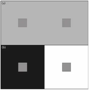
contrast. In Figure 1.3 an example of this way of colour appearance can be seen.
Figure 1.3a,b – An example of simultaneous contrast. The small grey squares used on the grey background are the same as those used in the black and white background (Fairchild, 2005, p. 112).
The small greys used in the figure are always the same, although our perception seems
to say something different about their appearances in the squares in Figure 1.3a and in
Figure 1.3b. The different backgrounds give a different perceptual rendering. With the
black background, the small grey square appears lighter, while with the white
background it appears darker. Simultaneous contrast or induction is only one of the
many colour appearance phenomena that can be observed. The colour shifts follow the
opponent theory of colour vision in a contrasting sense along the opponent dimensions:
a light background induces a stimulus to appear darker, a dark background induces it to
appear lighter, red induces green, green induces red, yellow induces blue and blue
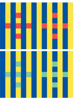
Figure 1.4 – Although all the squares have the same edges, they appear different. Squares in the yellow stripes appear darker and bluer, while squares in blue stripes appear lighter and yellower
(Robertson, 1996).
Figure 1.4 is another example of simultaneous contrast, which shows the complexity of
this phenomenon. All the red or cyan squares in the figure are surrounded by the same
chromatic edges. Every square has two yellow and two blue edges. Since the output is
not the same for the squares, and consequently they do not appear similar, the idea that
chromatic induction is determined only by edges can be rejected. Squares in the yellow
stripes appear darker and bluer, while squares in the blue stripes appear lighter and
yellower.
Simultaneous contrast is directly related to other two colour appearance phenomena:
spreading and crispening. When the stimulus becomes smaller or increases in
frequency, the simultaneous contrast disappears and is replaced by spreading, which is
the apparent mixture of a colour stimulus and its surroundings. Crispening, on the other
hand, is the increase in perceived magnitude of colour differences when the background
on which the two stimuli are compared is similar in colour to the stimuli (Mandic et al.,
2002).
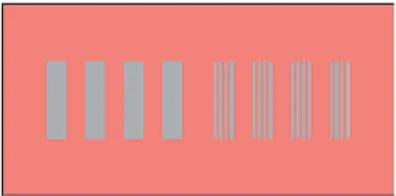
Figure 1.5 presents both simultaneous contrast and spreading. On the red background,
achromatic stimuli of different frequencies are presented. At higher spatial frequencies
(small patches on the right), the occurrence of spreading is observed, and the patches
appear pinkish. At lower frequencies (large patches on the left), patches appear greenish
Figure 1.5 – On the left simultaneous contrast and on the right spreading. The grey areas are physically identical, but the spatial scale with the red background makes them appear different
(Fairchild, 2005, p. 116).
The opposite of colour contrast is colour assimilation, also called Bezold-Brücke effect
(Purdy, 1931). In this case, colour appears different due to the relation with the adjacent
colours. The red lines in the black background appear darker while those in the white
background seem lighter (see Figure 1.6). This occurs when one observes the hue of a
monochromatic stimulus in situations with changes in luminance because there is a
mixing of the colours with the surrounding. Thus, the hue does not remain constant. The
brightness changes, however, are exactly the opposite to what would be predicted from
the knowledge of simultaneous contrast. Effects seem to be related to size, shape and
position of the borders (Burnham, 1953).
Figure 1.6 – Red lines seem lighter with the white background and darker with the black background.
The Abney effect, or effect of purity in hue, is the effect in which a shift in the hue is
observed when white light is added to a monochromatic light source, causing the
desaturation of the light source (Pridmore, 2007). In Figure 1.7 it is possible to observe
the effect of the addition of white light on the hues. The first line presents the original
hues, and the following lines show the effect of desaturation by the addition of white
Figure 1.7 – In the Abney effect, the addition of white light changes perception of the original hues (Philip Greenspun illustration project, available on
http://en.wikipedia.org/wiki/File:Abney-effect-animation.gif, 2008).
The Helmholtz-Kohlrausch effect, also called the brightness/luminance or the
lightness/luminance-factor ratio effect (Nayatani, 1997), is defined by the CIE
International Lighting Vocabulary as the “change in brightness of the perceived colour
produced by increasing the purity of a colour stimulus while keeping its luminance
constant within the range of photopic vision. For related perceived colours, a change in
lightness can also occur when the purity is increased while keeping the luminance factor
of the colour stimulus constant” (CIE Publication 17.4, 1988, p. 50). A chromatic
stimulus with the same luminance as the white reference stimulus appears brighter than
the reference stimulus. For many observers it appears to glow (Wyszecki and Stiles,
1982, p. 410). In this sense, at constant luminance, increasing the saturation also
increases the perceived brightness. This effect is believed to be caused by a contribution
of chromatic component in a chromatic colour stimulus to its perceived lightness.
However, this contribution to brightness (or perceived lightness) is different for
different hues of chromatic colour stimuli (Nayatani, 1997, p. 385). The
Helmholtz-Kohlrausch effect shows that perceived brightness cannot be considered as a
one-dimensional function of stimulus luminance. A stimulus appears brighter as it becomes
more chromatic at constant luminance (Fairchild, 2005, p. 120).
If there are changes in the overall luminance level, there are also significant changes in
the colour appearance of objects. They appear more vivid and contrasty in a bright
summer afternoon than at dusk. This is the so-called Hunt effect (Hunt, 1952), which
predicts the increase of colourfulness with increased levels of luminance. When an
image is seen under a low level of illumination, the colourfulness of the various
Stevens, 1963), in which instead of the colourfulness increase, the contrast increases
with luminance.
The work of Bartleson and Breneman (1967), which is diverse to the Stevens effect,
was centred in understanding the perceived contrast in images and its variation with the
luminance level and surroundings, and they obtained interesting results about changes
in the relative luminance of the image surrounding. Their study found an increase in the
perceived contrast of images when the surroundings of an image were changed from
dark to dim to light. The dark surroundings of an image made dark areas appear lighter
while the results on light areas were not as consistent. Despite the changes in the
surroundings, they still appeared white. This created a resultant change in the perceived
contrast, since there was more perceived changes in dark areas than in light areas.
Another effect on colour appearance is the Helson-Judd effect (Helson, 1938). These
authors found that bright objects continue to appear in the same chromatic hue as the
illuminant, and dark objects appear to have a hue complementary to the illuminant,
when the objects are under highly chromatic illuminants. Under tungsten light, for
instance, white papers continue to have an orange-yellow appearance, while dark grey
papers appear more bluish. In a normal illuminant this effect cannot be observed (Lee,
2005, p. 336). These results were found in an experimental study in which subjects,
under monochromatic illumination, chose Munsell designations to non-selective
samples composed by neutral Munsell patches. The samples which were lighter than the
background had the same chroma of the source, while those that were darker than the
background, had the chroma of the source’s complement hue.
Another phenomenon related to the colour appearance is the constancy of colour. Figure
1.8 shows the checkerboard illusion of Adelson (1995). In the figure on the left, the two
squares marked with the letters A and B have the same shade of grey, although people
see them completely different. If both squares are joined with a stripe of the same shade,
it is possible to see that they are identical. This occurs because visual system calculates
that in a shadowed area like that of square B, the grey must belong to a white surface,
Figure 1.8 – The squares marked with A and B have the same shade of grey, although they appear different (Edward H. Adelson checkerboard illusion, 1995, available on
http://web.mit.edu/persci/people/adelson/checkershadow_illusion.html).
Colour constancy is defined as the apparent invariance of a colour object’s appearance
upon changes in illumination. Foster et al. (1997) define colour constancy as the
constancy of the perceived colours of surfaces despite the changes in the intensity and
the spectral composition of illumination. Human colour vision, however, does not
display constancy for every possible scene in every possible illumination, but it does for
some scenes in some illumination conditions (Hilbert, 2005). Some authors do not agree
with the existence of colour constancy. Fairchild (2005), for example, argued that it
does not exist in humans (p. 132). He argued that if colour constancy existed, it would
not be necessary to measure the illumination of the light source in colorimetric
calculations in the prevision of colour matches. Since the information which reaches the
eyes was the result of both illuminant and spectral reflectance of the surface object, any
change in the illuminant would correspond in a change in the colour signal, and thus,
because of the constant changes in illumination, colour constancy would be impossible
to observe (Hilbert, 2005).
However, there is some degree of colour constancy. A white page under artificial
illumination or under sunlight remains always white, despite the different illumination,
although in the last condition the white will appear whiter than in the first one. The
possibility to ‘see’ the same colour in different conditions indicates that the perception
of colour is not exclusively a question of local signal.
An explanation for the constancy of colour is that while on one hand there is a sensory
change, on the other hand there is an inference or judgment. The constant element, in
product of the senses. This approach has, however, several problems. The first is the
over-intellectualizing of an automatic and independent cognitive ability (Hilbert, 2005),
since some animals and small children have shown some degree of colour constancy,
too. In human infants, colour constancy emerges in the first few months (Dannemiller,
1998). The second problem is the absence of the necessary inferences since just because
people see colour instead to think that they are in front of colours, and because these
inferences do not seem to be important for colour constancy. Even if the conclusion of
the inference is incorrect, the phenomenon does not change and persists.
Another account suggests that perceptual constancies are the result of unconscious
processes that are independent of higher cognition. According to Helmholtz
(1867/1924), light on the eye produces a reaction in the nervous system and then a
sensation, which is the beginning of an unconscious inference process. Although
Helmholtz could account for several unexplained points of previous theories, some
problems still remained. He spoke in terms of two objects of awareness: the
illumination-dependent sensation and the external property of the object. Both were
external, and Helmholtz used the term colour for both. This suggests that only one
property was involved, and not two.
The fundamental Helmholtz’s idea is that perceptual processing recovers information
about the distal causes of proximal stimuli. This idea is embodied in the most influential
theories that currently explain colour constancy (Hilbert, 2005). The basic differences
between the current theory and that of Helmholtz’ consist of the description of the
unconscious process in computational terms rather than in terms of a logical inferencial
process and in the nature of the inputs for these computations, which regard external
objects, considered to be not accessible to cognition and consciousness, and not
sensations. For computational theories of colour constancy, inputs and processes
responsible for the production of outputs are not available to conscious awareness.
However, computational theories cannot account for the question of colour constancy
from a phenomenological point of view because they cannot account for aspects of
colour appearance which depend on illuminants, such as the perception of shadow. The
problems in computational theories, observed Hilbert (2005), could be solved by
supposing that the visual system not only delivers information on the reflecting
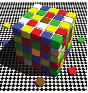
Figure 1.9 – Another example of colour constancy: the central brown square on the top and the central orange square on the side facing slightly to the left are, actually, the same colour (R. Beau
Lotto cube illusion, available in http://www.lottolab.org/).
In most cases, theories that have tried to predict colour constancy or to explain it have
failed because they have not taken into consideration the fact that, in phenomenological
terms, what changes is not the light source, but the aspect of the illumination of the
object. People do not see the illumination, but they see objects that are illuminated and
the changes in their appearance due to the changes of the illumination. Consequently,
the colour appearance of an object must have more than the three traditional dimensions
of variation, and this must be taken into consideration in order to develop a more
consistent theory of colour constancy.
1.3 Colour harmony
In discussing the harmonic aspects of colour, Da Pos (1999) suggests that a very
important distinction is that between object property and subject characteristics.
According to Da Pos, a particular combination of colours can or cannot be considered
pleasant according to some relations among the different aspects of the colours, such as
tone, saturation, lightness, etc., or according to the subjects’ personality, e.g. introvert or
extrovert, and the mental state in the moment of the observation. If the subject is happy
or sad, this aspect can have some influence in the harmony perception. The analysis of
colour characteristics has an objective aspect, because it regards the object, while the
analysis of subjects’ aspects is thought to be a subjective analysis. However, according
can also be considered as objective, verifiable and reproducible. They will not only be
considered as ‘opinion’ or common sense information, but also as scientific data. The
experimental aesthetic, for example, does not deny the existence of subjective or
cultural differences, but takes as its task to distinguish which of them comes from
external or internal variables (Da Pos, 1999). By adopting a proper scientific method, it
will be possible to control the variables and obtain a result in order to explain which
elements have a stronger impact in determining what can be considered harmonic and
what can not. In this respect, Da Pos points out an important fact, i.e. that colour is a
relational phenomenon, being the result of a complex interaction among several
components. In this sense, there is not a ‘coloured stimulus’ or a ‘coloured radiation’.
Perceived colour is determined by the relations between different stimulation in time
and space in the visual field. Understanding the chromatic phenomena, affirms Da Pos,
means having the competence to accurately formulate all the important relations that
determine or accompany them.
In the research history of colour harmony, there have been several studies that have
described regularities and relations between colour characteristics and pleasantness, and
other studies that have suggested the opposite. Da Pos cited two studies particularly
interesting because of their completely opposite results. The first was Cohn’s (1894)
study. This author found regularities among his subjects in the judgment of colours and
their association with pleasantness and wrote rules about the characteristics of preferred
and non preferred colours. The study of Major (1895), however, did not confirm Cohn’s
results. Major found that there was no constancy in the results, but strong individual
differences. In fact, his study did not observe any relations between chromatic
characteristics (saturation, lightness, grey scale, background contrast, etc.) and
pleasantness. Several studies have been conducted on the subject, with results
sometimes in favour of regularities and relations between colour characteristics and
pleasantness, sometimes not. According to Da Pos, none of them reached a definitive
conclusion in any of the aspects involved. For Da Pos, one of the most interesting
questions in the field of colour harmony is if to verify whether the pleasantness for a
combination of colours is the result of the pleasantness of the single colours present in
the whole combination. On the one hand there is the atomistic/associationist account,
which defends the idea that the beauty of a composition can be explained by the
explanation is found in the relations among the parts, which are necessary and sufficient
for the pleasantness of the configuration.
In the aesthetic researches, it was common to relate harmony with balance (Da Pos,
1999). Bullough (1907) did it in the gravitational sense. In order to have a balanced
configuration, according to him, the heavier colour must stay below the lighter colour.
For example, if one paints a wall with two different nuances of the same colour, say
pink and red, in such a way that both the same proportions, pink occupying the lower
and red the upper half of the wall, this configuration would give to most of the people
an “uncomfortable feeling of top-heaviness, instability and lack of balance, which
would be absent from the reverse arrangement of the colours” (Bullough, 1907, p. 112).
In order to have a more balanced effect, without changing the positions of colours, an
alternative would be to give a wider area to pink, and a narrower area to red. Bullough
explained that the apparent differences in weight of these two shades were responsible
for this effect. There would be no problem if the pink were painted in the upper half of
the wall, because red, as a stronger and heavier colour, could support the weight of pink,
which is lighter. He explained that dark tints, since they were seen as heavier, should
stay below the light ones. When working with shades of the same colour, this rule
seemed not to be a problem, but when dealing with two different colour-tones, as blue
and red, then there could exist some difficulty in determining which is the darkest one.
To verify this rule, and whether it could be used not only for shade-differences, but also
for tone-differences, and in order to discover the principles behind it, Bullough carried
out an experiment using plates containing two geometrical figures of identical shape,
each one composed of two colours, one above the other (see Figure 1.10).
Bullough used 30 shades and tested 50 subjects from eight to 50 years old, most of them
undergraduate or graduate students. He found that the rule works very well, almost
without exceptions, in the shade-differences, but that it could also be used in cases of
tone-differences. In this second case, there was however the introduction of an element
of uncertainty and hesitation in the selections made by the subjects. However, the
hesitation, uncertainty or indifference of some subjects did not constitute a problem,
because results seemed to be consistent enough to affirm that luminosity-differences
could afford a criterion.
Testimonials of many subjects suggested that dark colours are heavier. They seemed to
be more ‘substantial’, more ‘solid’, more able to give a better ‘support’ or a better
‘balance’ to the whole configuration.
In the few cases when people did not use, or did not agree that they were using the
weight-principle, but a different one, they basically described their choices in terms of
three alternative principles. The first was that of landscapes-associations. In this case,
subjects made an association with the perceived figure and a previously perceived sea-
or landscape visual image and interpreted the stimulus as if it were a land- or a
seascape. These associations occurred most frequently when the stimulus was a circle
with a colour configuration made by a dark and a light blue, which formed a circular
picture of the sea with a pale-blue sky above: the line contrast between both coloured
areas worked as the horizon. With other figures, such as squares and triangles, the use of
landscape-association was limited to one and four cases respectively. The square case
occurred with the shades dark and light green, when the subject reported seeing these
configurations (normal and inverted) as the slope of a hill with a dark or light sky
behind it, according to the position of colours. With triangles, subjects reported that
they seemed to look perspectives and, in these cases, the subjects’ attention went from
the base to the apex of the triangles and from the fore-ground to the background of the
landscape. However, among most of the subjects who made associations with circles,
there were no associations with triangles, which suggested that it was an individual
characteristic of these few subjects and not a rule.
The second alternative principle used was the selection of a colour according to the
subject preference. More common was the rejection of a colour because of the size of
the coloured area of an unpleasant colour. This happened only in the triangle case,