Abstract
Objective: Inpatient meal ordering trends for patients and families were assessed in 2017 and 2018 pre and post implementation of new inpatient menus designed with the goal of promoting healthier food selection.
Background: A taskforce formed at UNC Hospital in 2016 with the goal of improving the health across the variety of populations within the hospital. The idea of “nudge” approaches was explored as a
method of effecting change across these different groups, and the inpatient menu was chosen as a preliminary Taskforce intervention. In March of 2018, the updated menus were released.
Methods: Four floors at UNC Hospital were chosen for analysis. Meal ordering data was extracted from July through October 2017 while the legacy menus were in use and the same months in 2018 after the new menus were in full circulation. The data from both years were compared to each other to assess potential changes in food and drink selection.
Results: Some minor changes were noted in most sections although very few held statistical significance. The distribution of drink types ordered showed statistical significance when comparing the 2018
observed data to the 2017 expected distribution, but not all deviations were desirable. Other changes such as favorable increases and decreases in food/beverage item orders were noted but were not statistically significant. Key examples include a 27% increase in rotisserie chicken orders from 2017, and a 55% increase in grilled chicken breast plate orders. The grilled chicken sandwich was ordered 7.1 times more than the fried chicken sandwich in 2018 compared to 3.5 times more in 2017. There was a
significant increase in mashed potato consumption after being labeled as a “balanced” item, and chocolate chip cookies saw a 43% decrease in ordering after the “heart-healthy” designation was removed.
Introduction
Within the field of health, the public and clinical domains can feel siloed at times. Hospitals, specifically, are primarily focused on the clinical management of acute health concerns. To that end, the public health side of nutrition and preventive care can sometimes be an afterthought. Ignoring the public health implications of the hospital environment would be working against the overarching goals of healthcare. Furthermore, the hospital institution itself may benefit indirectly from encouraging healthier eating within the hospital environment since malnutrition is known contribute to poor health outcomes, slower patient recovery, and increased hospital readmission.1 In order to effectively promote healthy decision-making around food choices, hospital cafeterias and inpatient menus should foster and prioritize nutrition for the benefit of patients and employees alike.2 At UNC Hospital, the Healthy
Medical Center Taskforce formed in 2016 and sought out to tackle this very challenge.
Numerous studies show that environmental changes within institutions can affect populational health behavior.3-5 Through the Division of Nutrition, Physical Activity, and Obesity (DNPAO), the CDC has funded the development of tools for hospital working to make positive health changes to their environments. The Healthy Hospital Practice to Practice (P2P) Series documents a variety of ways in which hospitals across the country have made changes to their environment in order to improve health within their walls.5,14 From healthier cafe offerings and nutrition labeling to employee incentives and strategic policy changes, structural initiatives have been shown to be effective in promoting health within hospitals and other institutions across multiple levels of the social ecological model. While most of these initiatives are geared towards hospital employees and visitors, a 2015 study showed efficacy within the inpatient population. Nutritional content of regular-diet menu was shown to improve after implementation of nutrition standards for patient meals in line with New York City’s Healthy Hospital Food Initiative.13 This supports the hope that the inpatient population can also be affected by targeted initiatives.
The Taskforce decided to focus their initial efforts on nudge approaches to improve meal selection within the inpatient population. The decision to revamp the menu was both necessary (as some of the information was out of date) and practical as a first-line effort to change the food environment at the hospital. Additionally, there was hope that this change would improve employee and visitor selections as well since the inpatient menu and hospital cafeteria offerings are the same. Behavioral economics examines how people make choices, and many in the field of public health have started to apply these theories to health behavior and nutrition.4,6-11 Although there is little evidence in the literature to suggest that a menu change alone can have a significant impact on the food
environment without any changes to the offerings, the theory behind behavioral economics provides some rational support for the notion. Choice architecture, specifically, utilizes our knowledge of
behavioral economics to “nudge” individuals in the direction of a more favorable choice.10 For example, altering a cafeteria layout (or perhaps a menu redesign) can affect the foods people choose to purchase. With this, there is some potential efficacy of menu changes, in particular, to make healthy options seem more appealing. 7-11
and/or in conjunction with other influencing factors.16,17 It is thought that food decisions are often connected to emotional motivations over reason, especially when stressors are present.6 Patients and their families undoubtedly have some layer of stress inherent to their admission to the hospital altogether, and this may suggest that admitted patients and their families are all the more subject to these “emotional motivations” for decision-making. This could further indicate that the inpatient setting is an ideal environment to apply behavioral economics and choice architecture in order to “nudge” patients into making healthier food choices.4,6
The UNC Hospital inpatient menu includes over 90 different options that reflect the hospital retail environment. Patients and family members ordering off the inpatient menu are offered the same selections as the offerings found in the hospital retail locations. The legacy menu for the
UNCH inpatients was outdated in nutrient content information and lacked easy navigation icons to define healthier food options. The legacy menu identified a “heart-healthy” designation that denoted a red heart icon to items lower in sodium or fat, but did not take into account sugar content,
vitamin/mineral density, or other factors that may perpetuate poor health (such as artificial sweeteners that are non-nutritive but may encourage appetite and sugar cravings).12 The new menus were designed to include a “balanced” choice designation for food items that are low in saturated fats and added sodium, trans-fat free, low in added sugar, and reflect standards adapted from the Dietary Guidelines for Americans and the US Department of Health and Human Services Health and Sustainability Guidelines. This was a more comprehensive indicator of healthy food choices, and a clearer way to promote health across various disease states and levels of health. Additionally, the new menu included a “balanced options” section at the front of the multipage menu to highlight these choices. Gluten-free items throughout the menu were newly marked with an icon for added ease of ordering.
The purpose of this analysis is to assess if changes to the menu—without changing the offerings themselves—has had any effect on the ordering trends for hospitalized patients. With such a large selection to choose from, the Taskforce wanted to explore if patients change their ordering based on the menu layout and presentation. Since the inpatient menu and ordering flexibility reflects the retail environment, the implications of this investigation could be applicable to employees and guests visiting the physical cafeterias and may be a suitable model for change on the retail side as well.
Methods
UNC Hospital is located in Chapel Hill, NC and houses over 900 inpatient beds.15 The food service system utilizes a room-service model of ordering: patients can call at any time to order meals/snack items, and the food is delivered directly to the patient’s room. Patients are provided a menu of options available at various times of day, and those on a regular diet are unrestricted in what they can order. Meal costs for all admitted patients are included in the inpatient rate and not affected by order frequency. For the purpose of this analysis, data was gathered on foods ordered without consideration of what is actually consumed. It is assumed that if the ordering trends move in a more “balanced” direction then the foods consumed will move in the same direction.
in this process. These four floors were chosen based on relatively higher proportions of patients on a regular diet as to limit the potential confounding effect of specialized hospital diets. There are 93 beds on these four floors combined. Food items of note were aggregated together to compare various item types to each other as well as to detect patterns with the “heart” designation utilized in the legacy menu. Beverages were classified into sugar-sweetened (SSBs), unsweetened or artificially sweetened, juice (regardless of sugar content), and milk products (also regardless of sugar content). The new menus were put into circulation starting in March 2018 and were in full use by July 2018. The same ordering data was obtained again for the same four floors and during the same months, July-October, in 2018. This data was aggregated to compare the same food items side-by-side to the 2017 data.
That data was translated into mean counts over the four-month period and expressed as proportions of each category. These descriptive statistics as well as analytic statistics were used to compare and characterize the data for both years, and the results were formatted into tables. Tables 1 and 2 depict all analyzed beverage and food items (respectively) organized by item type and restaurant. Percentages of orders out of total category were included in these tables to show the proportional changes from 2017 to 2018. Food or beverage items that were not present in either 2017 or 2018 (newly added or discontinued) were excluded from the final analysis. Items labeled as “heart-healthy” in the legacy menu and those labeled as “balanced” in the new menu are indicated on both tables.
Some items of particular significance were formatted into separate tables and graphs to further depict and examine the more noteworthy changes. A χ2 goodness of fit test was performed to determine significance between proportion of beverage types ordered from 2017 to 2018. In this test, we assume that 2017 represents the normally expected counts and proportion of each beverage type relative to all beverage orders analyzed. Therefore, the baseline data from 2017 was used as the “expected”
proportions and the 2018 was considered the “observed” data. Table 3 and Figure 1 depict the percentages of each beverage type out of all analyzed orders during the chosen months. Multiple χ2 goodness of fit tests were also used to examine side dish order changes in determined categories, named “blocks” for the purpose of this analysis. Finally, Fisher’s exact test was used to determine if the proportion of all “balanced” item orders across category was higher in the 2018 data than in 2017 data for food, beverages, and both together.
Results
Tables 1 and 2 show all results for chosen food and beverage items. The data are expressed in terms of average ordering across the chosen four months (July-October) in both 2017 and 2018 as well as proportional ordering in each category.
Table 1 – Comparison of Beverage Ordering Trends by Category at UNC Hospital from July-October 2017 to 2018
Item Average Monthly
Intake 2017 (#)
Average Monthly Intake 2018 (#)
Percent of Total 2017
Percent of Total 2018
Juice 298.5 507.75 100% 100%
Apple 62 119.5 20.77% 23.54%
Cranberry 31 48.75 10.39% 9.60%
Orange 172.5 296.5 57.79% 58.39%
Prune 9 19.75 3.02% 3.89%
Vegetable 2.25 1.25 0.75% 0.25%
Milk 225.5 313 100% 100%
Milk 2% 51.25 99.75 22.7% 31.87%
Almond Milk Vanilla 8oz 0 3.75 0% 1.2%
Chocolate 21 18.75 9.3% 6%
Lactaid Non-Fat 7 8 3.1% 2.56%
Skim & Skim 4 Oz 15 22.75 6.7% 7.27%
Soy Organic 2.25 6 1% 1.9%
Whole 129 154 57.2% 49.2%
Sugar-Sweetened 590.25 976.25 100% 100%
Coke 95.75 259.75 16.22% 26.61%
Coke Caffeine-Free 4.5 3.5 0.76% 0.36%
Dr Pepper (Can & Bottle) 48 71.5 8.13% 7.32%
Fanta Orange 23.25 23.5 3.94% 2.41%
Gingerale 61.25 104 10.38% 10.65%
Mello Yello (Can) 48 68.75 8.13% 7.04%
Sprite (Can & Bottle) 64.75 117.75 10.97% 12.06%
Total Sodas 345.5 648.75 58.53% 66.45%
Tea Iced Sweet 92 182 15.59% 18.64%
Hot Cocoa 18.75 16 3.18% 1.64%
Lemonade Minute Maid 40.75 31.75 6.90% 3.25%
Fruit Punch (Can & Bottle) 26.75 20.75 4.53% 2.13%
Gatorade Lemon Lime 16.5 33.75 2.80% 3.46%
Gatorade Orange 50 43.25 8.47% 4.43%
Total Other 244.75 327.5 41.47% 33.55%
Artificially-Sweetened/Unsweet 585 1043.5 100.00% 100.00%
Diet Coke 38.25 98.25 6.54% 9.42%
Diet Coke Caffeine-Free 7.75 12.25 1.32% 1.17%
Diet Dr Pepper 19.75 29.75 3.38% 2.85%
Diet Gingerale 10.25 20.25 1.75% 1.94%
Sprite Zero 18 25.75 3.08% 2.47%
Total Diet Sodas 94 186.25 16.07% 17.85%
Crystal Light Lemonade 10.75 21 1.84% 2.01%
Sugar-Free Hot Cocoa 1.75 3.25 0.30% 0.31%
Coffee Decaf 24.75 39 4.23% 3.74%
Coffee Regular 229 429.25 39.15% 41.14%
Tea Hot 47.75 55.5 8.16% 5.32%
Tea Hot Decaf 5.25 8.5 0.90% 0.81%
Tea Iced Unsweet 28.75 49 4.91% 4.70%
Bottled Water 143 251.75 24.44% 24.13%
Total Other 491 857.25 83.93% 82.15%
Items in blue text are currently labeled as “balanced” choices and those marked with a ( ) were former
Table 2 – Comparison of Food Item Ordering Trends by Category and Restaurant at UNC Hospital from July-October 2017 vs. 2018
Item Average Monthly
Intake 2017 (#)
Average Monthly Intake 2018 (#)
Percent of Total 2017
Percent of Total 2018
Entrées 250.5 461.47 --- ---
Bandaleros
Adobo Chicken Bowl 6.25 15 36.76% 34.68%
Adobo Chicken Burrito 3.5 8.25 20.59% 19.08%
Beef Machaca Burrito 2 5.25 11.76% 12.14%
Beef Machacha Bowl 2 7.5 11.76% 17.34%
Black Bean & Rice Burrito 0.75 0.25 4.41% 0.58%
Pork Carnitas Bowl 1.25 4.5 7.35% 10.40%
Pork Carnitas Burrito 1.25 2.5 7.35% 5.78%
Total 17 43.25 100.00% 100.00%
Big City Cafe
Berlin 4.5 5 24.66% 16.81%
Paris 7.5 11.5 41.10% 38.66%
South Beach 1.5 5.25 8.22% 17.65%
Vienna 4.75 8 26.03% 26.89%
Total 18.25 29.75 100.00% 100.00%
Carolina Chicken Co.
Fried Chicken Breast 25.75 37.75 20.12% 18.04%
Fried Chicken Leg 47.25 59 36.91% 28.20%
Fried Chicken Thigh 10.5 15.75 8.20% 7.53%
Grilled Chicken Breast Plate 12 30.5 9.38% 14.58%
Plain Grilled Chicken Breast
Plate 3 3.5 2.34% 1.67%
Plain Grilled Chicken Breast
Sandwich 0.25 2 0.20% 0.96%
Rotisserie Chicken Breast 29.25 60.75 22.85% 29.03%
Total 128 209.25 100.00% 100.00%
Continental Traders
Meatloaf 34 52.5 50.75% 46.78%
Pot Roast Main 18.5 26.5 27.61% 23.61%
Roasted Turkey 14.5 33.22 21.64% 29.60%
Total 67 112.22 100% 100%
Flat Iron Grill
Fried Chicken Sandwich 4.5 8.25 22% 12%
Grilled Chicken Sandwich 15.75 58.75 78% 88%
Total 20.25 67 100% 100%
Other Entrée Components
Brown Rice 6.5 15.25 14% 19%
Fried Rice 28.25 28 59% 34%
Jasmine (White) Rice 12.75 38.75* 27% 47%
Total 47.5 82 100% 100%
Caprese's Roast Beef 8.75 10.375 21% 23%
Caprese's Turkey 18.5 22 44% 49%
Total 42.25 44.625 100% 100%
Sides 760 1252.043 100% 100%
Baked Potato 30.25 56.5 3.980% 4.51%
Broccoli 56 80.5 7.368% 6.43%
Caesar Salad 23.25 38.5 3.059% 3.07%
Carrots 32.75 42.75 4.309% 3.41%
Coleslaw 36.75 49 4.836% 3.91%
Collard Greens 44.25 55.625 5.822% 4.44%
Fries 110.5 206.9175 14.539% 16.53%
Green Beans 72 113.5 9.474% 9.07%
Mashed Potatoes 57 116.25 7.500% 9.28%
Mashed Potatoes & Brown
Gravy 74.25 108.75 9.770% 8.69%
Mashed Potatoes & Poultry
Gravy 3.75 5.5 0.493% 0.44%
Mashed Sweet Potatoes 50.25 86.25 6.612% 6.89%
Roasted Red Potatoes 41.5 60.5 5.461% 4.83%
Garden Salad 88.5 147.25 11.645% 11.76%
Vegetable Blend 39 84.25 5.132% 6.73%
Desserts 375.25 512.25 100.00% 100.00%
Brownie 25.25 29.5 6.73% 5.76%
Chocolate Cake 40 70.75 10.66% 13.81%
Cheesecake 41.75 91.25 11.13% 17.81%
Chocolate Chip Cookie (RF) 67.25 52.5 17.92% 10.25%
Nutter Butter Pack 2 2.25 0.53% 0.44%
Oatmeal Raisin Cookie 48 33.5 12.79% 6.54%
Oreo Cookie Pack 4.5 5 1.20% 0.98%
Peanut Butter Cookie 15.25 22 4.06% 4.29%
Snickerdoodle Cookie (RF) 15.5 20.5 4.13% 4.00%
Cupcake Vanilla Cake with
Vanilla & Chocolate Icing 28.75 36.75 7.66% 7.17%
Apple Pie 36.75 66.75 9.79% 13.03%
Lemon Meringue Pie 21.5 50 5.73% 9.76%
Sweet Potato Pie 28.75 31.5 7.66% 6.15%
Items in blue text are currently labeled as “balanced” choices and those marked with a ( ) were former “heart-healthy” choices.
Beverage Ordering Trends
orders was slightly reduced and unsweetened/artificially sweetened beverages were increased in 2018. Juice, however, increased in 2018 while milk orders decreased. A χ2 goodness of fit test for the given probabilities in 2017 resulted in the following values: χ2= 15.83, df = 3, p-value = 0.001229, suggesting that the deviations in ordering in 2018 are significantly different from the expected trends as identified in 2017 at a 95% confidence.
Table 3 – Beverage Type Distribution in 2017 & 2018 Relative to Total Beverage Orders at UNC Hospital (July-October of Each Year)
Key 2018
Distribution (Observed)
2017 Distribution (Expected) Sugar-Sweetened Beverages (SSBs) 34.37% 34.74% Unsweetened or Artificially Sweetened 36.74% 34.43%
Juice 17.88% 17.57%
Milk 11.02% 13.27%
Figure 1 – Comparison of 2017 and 2018 Beverage Type Distribution Out of Total Beverage Orders at UNC Hospital
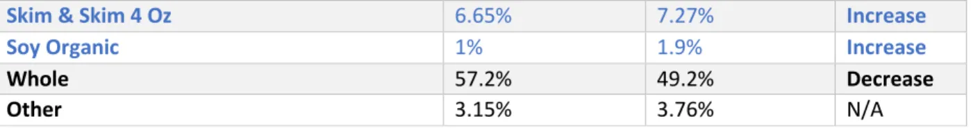
Table 4 highlights the changes to milk ordering trends between the two years. While the percentage of milk orders relative to other beverage types was reduced overall, the types of milk ordered from 2017 to 2018 showed some interesting findings. As depicted in Table 4, three of the four “balanced” milk types increased (proportionally) in 2018 compared to 2017, and the only two types not given a “balanced” icon both decreased in proportion in 2018 compared to milk orders in 2017.
Table 4 – Milk Ordering Trends by Type Relative to All Milk Orders in 2017 & 2018
2017 2018 Change
Milk 2% 22.7% 31.87% Increase
Low-Fat Chocolate 9.30% 6% Decrease
35%
34% 18%
13%
Beverages 2017
SSBs Unsweetened or Artificially Sweetened Juice Milk
34%
37% 18%
11%
Beverages 2018
Skim & Skim 4 Oz 6.65% 7.27% Increase
Soy Organic 1% 1.9% Increase
Whole 57.2% 49.2% Decrease
Other 3.15% 3.76% N/A
Entrée Ordering Trends
Entrée items from five hospital restaurants—Bandalero’s, Big City Café, Carolina Chicken Co., Continental Traders, and Flat Iron Grill—were selected for analysis. At Bandalero’s, the Adobo Chicken Bowl (most ordered) and the Adobo Chicken Burrito (second most ordered) were the only two
considered options with “heart” and/or “balanced” designations. There were slight decreases in percent ordered for both items, but the change was relatively minor: a combined percentage of 57.35% in 2017 and 53.76% in 2018.
Big City Café offers a short list of sandwich options named after cities of inspiration. Only one sandwich, the “South Beach,” was given a “balanced” icon, and it previously had a “heart” icon on the former menu. Two of the former six sandwich options were discontinued in the new menu, leaving only four options in total. The “South Beach” increased from 8.22% of total orders in 2017 to 17.65% in 2018. While this is a positive and seemingly substantial change, it is likely that some degree of difference is related to the discontinuation of other options from this restaurant.
Carolina Chicken Co. (CC) offers fried chicken and other southern-styled foods. The rotisserie chicken and plain grilled chicken (plate and sandwich) were given “balanced” icons whereas only the grilled chicken had a “heart” designation. The most marked differences between 2017 and 2018 is the rise in rotisserie chicken orders from 22.85% to 29.03% of total CC orders and the rise in grilled chicken breast plate orders from 9.38% to 14.58%. This rotisserie chicken had a 27% increase from 2017, and the grilled chicken breast plate had a 55% increase in ordering relative to all analyzed CC orders.
At Continental Traders, only three menu items were chosen for comparison. The Roasted Turkey is the only of the three to have a “balanced” icon (and previous “heart”), and the buying trends
increased as the other two items decreased slightly. From 21.64% of total orders studied to 29.6% in 2018, this menu item had a 37% increase in proportional ordering from 2017 to 2018.
Only two menu items at Flat Iron Grill (FIG) were evaluated, the fried and grilled chicken sandwiches. Although the grilled chicken (“heart” and “balanced”) was already far more popular than the fried, there was an increase in relative ordering from 2017 to 2018. The FIG grilled chicken sandwich was ordered 7.1 times more than the fried chicken sandwich in 2018 compared to 3.5 times more in 2017.
Side Dish Ordering Trends
Table 5 – Side Dish Ordering Distribution Relative to Determined “Block” Category in both 2017 and 2018 (July-October) at UNC Hospital
Side Item 2017 Mean 2018 Mean 2017 % 2018 % % Block 2017 % Block 2018
Baked Potato 30.25 56.5 3.98% 4.51% 10.85% 12.15%
Caesar Salad 23.25 38.5 3.06% 3.07% 8.34% 8.28%
Coleslaw 36.75 49 4.84% 3.91% 13.18% 10.53%
Fries 110.5 206.9175 14.54% 16.53% 39.64% 44.48%
Mashed Potatoes & BG 74.25 108.75 9.77% 8.69% 26.64% 23.38%
Mashed Potatoes & PG 3.75 5.5 0.49% 0.44% 1.35% 1.18%
Total 278.75 465.1675 36.68% 37.15% 100.00% 100.00%
Mashed Potatoes 57 116.25 7.50% 9.28% 100.00% 100.00%
Total 57 116.25 7.50% 9.28% 100.00% 100.00%
Broccoli 56 80.5 7.37% 6.43% 13.20% 12.00%
Carrots 32.75 42.75 4.31% 3.41% 7.72% 6.37%
Collard Greens 44.25 55.625 5.82% 4.44% 10.43% 8.29%
Green Beans 72 113.5 9.47% 9.07% 16.97% 16.92%
Mashed Sweet Potatoes 50.25 86.25 6.61% 6.89% 11.84% 12.86%
Roasted Red Potatoes 41.5 60.5 5.46% 4.83% 9.78% 9.02%
Garden Salad 88.5 147.25 11.64% 11.76% 20.86% 21.96%
Vegetable Blend 39 84.25 5.13% 6.73% 9.19% 12.56%
Total 335.5 547.375 55.81% 53.56% 100.00% 100.00%
From Table 5, we can see that the percent of total side orders for each “block” from 2017 to 2018 did not change much. There was a 1.2% increase for the unlabeled sides, and a 4% decrease for the “balanced” sides that were already labeled “heart-healthy” in the former menu. The mashed potatoes, however, did show a 23.7% increase in total ordering after receiving a “balanced” label.
Other Meal Components
This category was somewhat more difficult to characterize and analyze. There was a discrepancy found between rice characterization: on the new menu “jasmine” rice was labeled as “balanced” but the “white” rice option was not. While these options are listed in different places on the menu, they are technically the same and categorized as the same in Computrition. Because of this, we are unable to distinguish between orders potentially influenced by the “balanced” icon (or lack thereof) since this one item was given both distinctions on different places in the menu.
As for the Caprese’s Deli options, the three analyzed do not make up all meat choices available, so it in unknown how changes to the presentation of all options and the selection of other options may have affected the ordering trends for the three that were chosen for analysis in 2017. That aside, of the three meat options analyzed, there was a 11% increase in turkey ordering (“heart” and “balanced”) and a 25% decrease in ham ordering (no “heart” nor “balanced” icon). Roast beef orders increased by 9.5% even though it would be expected that the orders were decreased IF the menu icons had some kind of affect on ordering trends. It is possible that the affect of other option presentation changes could be related to this, but it is not possible to draw clear conclusions from the data presented.
Dessert Ordering Trends
Some desserts were discontinued in 2018 and others were added that were not available in 2017; these selections were excluded from the overall analysis for simplification. The most notable difference between the 2017 and 2018 menu was the removal of the “heart” designation from the low-fat cookies (chocolate chip and snickerdoodle). When only looking at only the desserts available in both years, both cookies had decreases in proportion of ordering out of all analyzed dessert options.
Chocolate chip cookies had the greatest change with a 43% decrease in proportional ordering from 2017 to 2018. The percent decrease for snickerdoodle cookies was minor as snickerdoodles cookies are a less popular dessert item in both years. When including all dessert options from 2017, snickerdoodles do show a very slight percentage increase in 2018 (from 3.5% of total to 4%), but this likely related to increased proportional ordering due to fewer available choices.
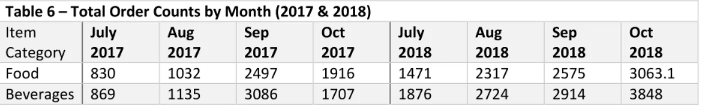
Ordering Trends by Month
Table 6 – Total Order Counts by Month (2017 & 2018) Item
Category
July 2017
Aug 2017
Sep 2017
Oct 2017
July 2018
Aug 2018
Sep 2018
Oct 2018
Food 830 1032 2497 1916 1471 2317 2575 3063.1
Beverages 869 1135 3086 1707 1876 2724 2914 3848
Overall Trends
To determine if the “balanced” icon had a global effect on ordering trends between 2017 and 2018, Fisher’s exact test was done using percent of total food and drink orders. A different test was done for food only, beverages only, and both food and beverages. The results are pictured below in Table 7.
Table 7 – Fisher’s Exact Test 2x2 Tables and Results
Food & Beverage 2017 2018 Total P-value Confidence Interval (95%)
Odds Ratio Balanced 24.83 27.67 52.5
Not "balanced" 75.17 72.33 147.5
Total 100 100 400
0.7488 0.4345, 1.6863 0.86 Food Only 2017 2018 Total
Balanced 37.8 44.54 82.34 Not "balanced" 62.2 55.46 117.66
Total 100 100 400
0.3893 0.4067, 1.3683 0.75 Beverage Only 2017 2018 Total
Balanced 12.86 13.67 26.53 Not "balanced" 87.14 86.33 173.47
Total 100 100 400
1 0.3732, 2.2446 0.92
While there was an increase in total proportion of “balanced” to not “balanced” items ordered in 2018 for both categories, it appears that there was no statistically significant change after menu implementation. The p-values are all > 0.05 and the confidence intervals cross the null of 1 indicating that the selection of “balanced” items proportional to all orders was not significantly higher in 2018 after the menu change. Nonetheless, the visual increase in “balanced” option selection is not something to ignore. The percent decreases and increases within item types still suggest that the menu change may have had some effect on ordering, albeit on a minor scale.
Discussion
Beverages
It is difficult to determine whether the changes (decrease in SSBs and increase in unsweetened or artificially sweetened beverages) can be attributed to the menu change or simply to expected variations in ordering trends. Based on the χ2 test, however, these results are shown to hold statistical significance even if not all changes were fully desirable. Milk consumption (proportional to total beverage ordering) went down in 2018 while juice went up slightly. It is difficult to fully explain the nuance behind these changes, but it is possible that a reduction in SSB and chocolate milk selection (previous “heart” items but not “balanced”) could have led to more patients choosing juice (as well as unsweetened/diet drinks) instead regardless of the lack of a “balanced” icon. Pre-formed assumptions of juice as a healthier alternative could potentially play a role, but it is not possible to assess this within this quantitative data set.
Although milk consumption went down proportionally to all beverages, the distribution of milk options chosen do show favorable results. Overall, there was an increase in proportion of chosen milk beverages with the “balanced” icon and a decrease in those without (whole and chocolate). It is possible that the “heart” designation to the low-fat chocolate milk could have been somewhat misleading emboldening patients to choose it as a “healthy” dairy option.
Food Items
Overall, it all the more difficult to categorize the changes in food ordering than in beverage orders. Similar to the nuance suggested in the rationale behind beverage selection, even more nuance is expected with meals as there is greater complexity to the orders. Beverage orders could have also had an effect on the food items chosen, but it is not possible to measure this quantitatively, and it is
assumed that the magnitude of effect is likely minimal in a large sample size. Specific items were chosen for comparison across the two years as an attempt to simplify the food choices into comparable
categories. While there was little statistical significance in most changes, some items of note did show remarkable changes. The percent increases for particular “balanced” items and decreases in items without the “balanced” logo suggest favorable results of the menu change. Whether due to the menu updates or other initiatives inpatient, ordering trends did appear to move in a somewhat “healthier” direction in 2018. While some other changes were not desirable or intended, changes in a “less healthy” direction appear limited and to a smaller degree than the favorable changes. Many food items with former “heart” designations were given “balanced” icons in the new menu while others had the “heart” removed or a “balanced” icon added. For all food items that removed “heart” icons or had newly added “balanced” logos, some positive change was noticed even if potentially negligible in magnitude.
Strengths & Limitations
The decision to capture data prior to the menu change allowed the Taskforce to utilize baseline trends as comparative measures for the trends post menu change. While it is likely that other
could be effective4,7-11, but little has been done to support the application of this theory within hospital food ordering. As this is a somewhat unique pre/post analysis, the results can contribute to the body of evidence on the subject. This investigation supports the hypothesis that menu design may, in fact, have a noticeable influence on ordering trends in the inpatient population. The conclusions drawn from this analysis could be used as support for similar menu changes at other institutions.
There are some limitations to this study as well. As mentioned above, it was found that there was a large increase in order counts from 2017 to 2018 without any apparent explanation for the increase. Regardless of these potential discrepancies, since all data were analyzed in terms of relative ordering, it is reasonable to consider these results valid as the lower n in some months should not have an effect on any trends utilizing the averages across all months in each year studied.
Public Health Implications
References
1. White JV, Guenter P, Jensen G, et al. Consensus statement of the Academy of Nutrition and Dietetics/American Society for Parenteral and Enteral Nutrition: characteristics recommended for the identification and documentation of adult malnutrition (undernutrition). Journal of the Academy of Nutrition and Dietetics. 2012;112:730–8.
2. CDC. Creating Healthier Hospital Food, Beverage, and Physical Activity Environments: Forming Teams, Engaging Stakeholders, Conducting Assessments and Evaluations, August 2014. 2014. https://www.cdc.gov/obesity/hospital-toolkit/pdf/creating-healthier-hospital-food-beveragepa.pdf. Accessed November 2018.
3. Story M, Kaphingst KM, Robinson-O ’brien R, Glanz K. Creating Healthy Food and Eating Environments: Policy and Environmental Approaches. Annu Rev Public Heal. 2008;29:253-272. doi:10.1146/annurev.publhealth.29.020907.090926.
4. Arno A, Thomas S, Avenell A, Forster M, Veerman J, Barendregt J, et al. The efficacy of nudge theory strategies in influencing adult dietary behaviour: a systematic review and meta-analysis. BMC Public Health. 2016;16:676. doi: 10.1186/s12889-016-3272-x.
5. Healthy Hospital Environments | Overweight & Obesity | CDC.
https://www.cdc.gov/obesity/strategies/healthy-hospital-env.html. Accessed November 2018.
6. Just DR, Mancino L, Wansink B. Could Behavioral Economics Help Improve Diet Quality for Nutrition Assistance Program Participants? U.S. Dept. of Agriculture, Economic Research Report. 2007; 43:34. 7. Ammerman AS, Hartman T, DeMarco M. Behavioral Economics and the Supplemental Nutrition
Assistance Program: Making the Healthy Choice the Easy Choice. American Journal of Preventive Medicine: 2017; 52 (2); 145-150. https://www.ajpmonline.org/article/S0749-3797(16)30339-7/fulltext
8. Guthrie JF. Integrating Behavioral Economics into Nutrition Education Research and Practice. Journal of Nutrition Education and Behavior. 2017; 49(8):700-705.e1. doi: 10.1016/j.jneb.2016.09.006.
9. BMC Public Health. Improving cardiometabolic health through nudging dietary behaviours and physical activity in low SES adults: design of the Supreme Nudge project. 2018;18(1):899. doi: 10.1186/s12889-018-5839-1. https://www.ncbi.nlm.nih.gov/pubmed/30029600
10. Bucher, T., Collins, C., Rollo, M., McCaffrey, T., De Vlieger, N., Van der Bend, D., . . . Perez-Cueto, F. (2016). Nudging consumers towards healthier choices: A systematic review of positional influences on food choice. British Journal of Nutrition, 115(12):2252-2263. doi:10.1017/S0007114516001653 11. Velema, Elizabeth Vyth, Ellis L Hoekstra, Trynke and Steenhuis, Ingrid HM. Nudging and social
marketing techniques encourage employees to make healthier food choices: a randomized controlled trial in 30 worksite cafeterias in The Netherlands. The American Journal of Clinical Nutrition. 2018;10(2):236.
12. Yang, Q. Gain weight by "going diet?" Artificial sweeteners and the neurobiology of sugar cravings: Neuroscience 2010. Yale J Biol Med. 2010;83(2):101-8.
14. Healthy Hospital Practice to Practice Series (P2P) | Overweight & Obesity | CDC. https://www.cdc.gov/obesity/strategies/hospital_p2p.html
15. About Us. UNC Health Care System. 2018. https://www.unchealthcare.org/about-us/
16. Pampel FC, Krueger PM, Denney JT. Socioeconomic Disparities in Health Behaviors. Annu Rev Sociol.
2010;36:349-370.
17. Konttinen H, Sarlio-Lähteenkorva S, Silventoinen K, Männistö S, Haukkala A. Socio-economic