STAB22 section 1.1
1.1 Find the student with ID 104, who is in row 5. For this student,
Exam1 is 95, Exam2 is 98, and Final is 96, reading along the row.
1.2 This one involves a careful reading of the description in Example
1.2. All the marks shown are out of 100, but when the grade is computed, some of them are out of other things. The computation is like this for the student given:
total = 88(200/100) + 85(200/100) + 77(300/100) + 90(200/100) + 80(100/100)
= 176 + 170 + 231 + 180 + 80 = 837,
taking each mark and weighting it according to the figures given in the example. According to the description, 837 is between 800 and 900, so it is a B. (Check the spreadsheet printout to see that the marks there between 800 and 900 did indeed get a B.)
1.3 Go through the variables and decide whether you would just
clas-sify the possible values (categorical) or count or measure them (quantitative). The individuals (cases) are the apartments (they would form the rows of your spreadsheet). The variables are:
• monthly rent: quantitative
• cable included: categorical (values are yes and no) • pets allowed: categorical (yes/no)
• number of bedrooms: quantitative (count them) • distance to campus: quantitative (measure it)
There are therefore 5 variables. (I prefer to figure out what they are first and then count them.)
1.4 Find the percentages having either of the two kinds of degree and
then add them up. 8.7% of students had an associate degree and 22.6% had a bachelor’s degree, for a total of 8.7 + 22.6 = 31.3%.
1.13 You might think of some different aspects of fitness that you
could measure, and then think about how you would measure them. For example, you might measure endurance (walking, run-ning, stair-climbing), strength (some kind of weightlifting, sit-ups etc), speed (sprinting), or other measures like heart rate before or after exercise. Some of these (such as walking or running) would require you either to mark out a course and use a stopwatch to time how fast the participants covered your chosen distance, or you could use a treadmill (which would take care of the measur-ing/timing). If you chose some kind of weightlifting, you’ll need a gym or some kind of weight machine, and of course measuring heart rate would require specialist equipment.
1.19 You can do this one by hand, or (easier) get Minitab to do
it. First make sure you have Minitab installed on your computer. Then you can either (a) open Minitab, select File and Open Work-sheet, and look for ex01_19.mtp on the disk at the back of the book (PC Data Sets, Minitab), or (b) use Windows Explorer to open the disk, find the data set first, and then double-click it to open Minitab with the data set already there. Your choice. (Or, of course, with a data set this small, you can fire up Minitab and type the data in yourself, to the worksheet in the bottom half of the screen.)
To get the graph, select Graph and Bar Chart. The bars are going to be the values in the Percent column, so change Counts of Unique Variables to Values from a Table. “Simple” is what we want. Click OK. The dialog box asks for two variables (columns): in the big box select Percent by double-clicking on it in the left box, then click on the box under Categorical Variable and select Spam in the same way. The bar graph comes out with the spam categories in the order given (actually, I think, in alphabetical
order). My bar graph is in Figure 1.
Figure 1: Default bar chart for types of spam
To get the bars sorted in order, re-do what you just did, up to the dialog box where you select Percent and Spam. Click on Bar Chart Options. Select Order Main X Groups Based on Decreasing Y. Click OK a couple of times. My graph is in Figure 2. This second bar chart makes it easier to see that the most spams are trying to sell products, with “adult” and “scam” categories very close together.
Figure 2: Bar chart for types of scam with bars tallest to shortest
1.20 To use a pie chart, the data need to be parts of a whole. These
figures are percentages, but of the “wrong thing” as far as a pie chart is concerned. If these figures were of all female graduates that graduated with degrees of these different types (in this case the percentages would add up to 100%), then a pie chart would work.
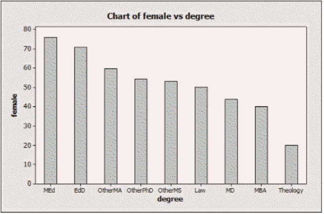
Drawing a bar chart is very like the previous exercise. Open Minitab, get hold of the data, and select Graph and Bar Chart. Make sure Minitab recognizes the percents as Values from a Ta-ble, and, in Bar Chart Options, Order Main X Groups Based on Decreasing (or Increasing, if you prefer) Y. My bar chart is shown in Figure 3. You can see easily from the bar chart that education degrees are most popular among women (compared to men) and theology the least popular. You could see this from the original data too, but it is more work to do so.
Figure 3: Bar chart of women’s degree types
1.30 The data are inta01_006.mtp(by the table number rather than
the exercise number).
The values are measured in emissions per person because some of the countries have a lot more people than others; if you just give emissions per person, you don’t know whether the figure for a
country is large because a lot of fuel is burned in that country, or because that country has a lot of people. So the figures as given are large for countries that burn a lot of fuel.
You can make either a histogram or a stemplot of the numbers. The stemplot could be done by hand, but has the disadvantage that it is not clear what you want to have as stems and what as leaves. We can see what Minitab chooses by getting the data into Minitab and then selecting Graph, Stem and Leaf. My results are shown in Figure 4. Since the stem unit is 1.0, all those 0’s in the first row are actually 0-point-something, so this accuracy is lost. Stem-and-Leaf Display: co2
Stem-and-leaf of co2 N = 48 Leaf Unit = 1.0 20 0 00000000000000011111 (9) 0 222233333 19 0 445 16 0 6677 12 0 888999 6 1 001 3 1 3 1 3 1 67 1 1 9
Figure 4: Stemplot of carbon dioxide emissions
Nonetheless, the stemplot clearly shows the right-skewed shape of this distribution: there are some countries that produce a lot of CO2. The centre is hard to judge because of the extreme skewness; as we’ll see in Section 1.2, measures of centre such as the mean and median will be very different for data like this. But it seems clear that the “top” three countries are outliers; looking back at the data, these are the United States, Canada and Australia (so no surprise there). If you ignore the outliers, the spread is from 0 to about 11.
1.36 It’s easiest to do this question backwards: first get the default
histogram, then get a histogram with 14 intervals, then get the interval boundaries in the right place.
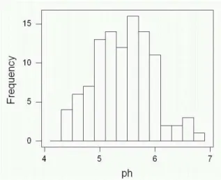
Figure 5: Default histogram of pH
The default histogram, shown in Figure 5, has about 14 intervals (actually 13), but the intervals arecentred on 4.2, 4.4 etc., which
is not quite what we wanted.
So: double-click on one of the bars of the histogram, and select Binning from the pop-up box. At the top, change Midpoint to Cutpoint (because you are going to specify the ends of the
inter-vals). Select Midpoint/Cutpoint Positions, and then type in the values for the class boundaries (4.2, 4.4, up to 7.0). When you click OK, you’ll get a histogram with the ends of the intervals in the right place.
(Version 12 instructions are: select Graph, Histogram, put C1 or pH under X, click Options. Under Type of Intervals, click Cutpoint (to ensure Minitab makes the interval boundaries, not
the interval midpoints, at the values you’re going to give). Under Definition of Intervals, select Midpoint/Cutpoint Positions, then type into the box 4.2 4.4 4.6 and so on up to 7. (Enter the numbers with spaces between). Click OK twice.)
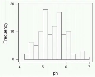
The result is shown in Figure 6.
Figure 6: Histogram (a) of pH
For (b), repeat the above, but for the cutpoint positions, enter 4.14 4.34 and so on up to 6.94. The result is shown in Figure 7. To get around to answering the question (finally): Figure 6 shows two modes (peaks), around 5.1 and 5.7. In Figure 7, the data set is much closer to having a single “flat-top” peak between about 5 and 6. The default histogram, Figure 5, has one peak around 5.6. So the way the histogram looks depends on apparently small choices about how it is drawn.
1.37 If the only possible values for a variable are 0 and 1, the
his-togram will have two bars with a gap between, like (b) and (c). There should be a similar number of males and females (with, these days, slightly more females), as in (c), while the right-handers will typically outnumber the left-right-handers (about 15% of the population as a whole is left-handed). This corresponds to (b).
The other two variables can take many different values. Some people are of average height, but we’d expect similar numbers of
Figure 7: Histogram (b) of pH
people of above-average and below-average height, ie. a symmetric shape like the (d). Finally, a right-skewed shape like (a) would make sense for studying times, because a few people study a lot (and you can’t study less than 0 minutes!)
1.39 A histogram is good here. My histogram is shown in Figure 8.
This histogram is right-skewed, with a centre around 40 thousand barrels. The two fields producing around 200 thousand barrels, and maybe also the field producing around 160 thousand barrels, look like outliers to me. (Where you draw the line is a judgement call.) Other than these, the spread of amounts is between 0 and 120 thousand barrels.
1.40 As in 1.39, you can use a histogram, as shown in Figure 9.
There appears to be one outlier, the value around 4.9 (actually 4.88). (The two values around 5.1 might be outliers too.) Apart from that, the shape is more or less symmetric, with centre around 5.5 or 5.6 and a spread from 5.1 to 5.8. My guess at the density of the earth is the centre, 5.5 or 5.6 times the density of water.
Figure 8: Amounts of oil recovered
Figure 9: Histogram of Cavendish’s measurements
1.42 A histogram, again, will do the job.
Figure 10: Histogram of survival times
My histogram, shown in Figure 10, is strongly right-skewed, with centre around 100 days. You might consider the value around 600 days, and maybe the 2 values around 500 days, to be outliers (this is a matter of taste). The spread otherwise is from 50 to 400 days.
1.43 There are really 4 variables here, since OBS just distinguishes the
individuals (students). GPA, IQ and self-concept are quantitative (measured) variables, while Gender is categorical.
When you read the data into Minitab from the disk, you’ll find that you have five columns of data (the four variables plus OBS). So make sure you make a stemplot of GPA (in column C2) and not something else! (Select gpa into the Variables box when you
select Graph, Stem and Leaf.) See Figure 11. You can verify that Minitab did indeed round or trim the GPA values to the nearest tenth of a point. (If it does not, go back to the dialogue box and type 0.1 into the “increment” box.)
Stem-and-Leaf Display: gpa Stem-and-leaf of gpa N = 78 Leaf Unit = 0.10 1 0 5 2 1 7 3 2 4 7 3 4689 11 4 0678 15 5 0259 22 6 0001249 (22) 7 1122344555566668888999 34 8 001111223378899 19 9 011133445555679 4 10 1577
Figure 11: stemplot of GPA
This distribution is skewed left, with centre around 8 The spread is from around 1 to around 11. There aren’t really any values distinct enough from the others to call outliers.
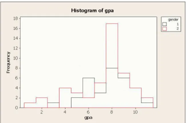
In Minitab version 14 you can make an overlaid histogram, which allows you to compare boys and girls. This is not quite a back-to-back stemplot, but is as close as we will get. Select Graph, His-togram, and then With Outline and Groups. Select GPA as your graph variable and Gender as your “categorical variable for group-ing”. When you click OK, you’ll find two overlaid histograms, with boys as red and girls as black. See Figure 12. The three lowest GPAs are all boys.
1.44 See Figure 13. A histogram would be equally good. The shape is
slightly skewed left, though if you consider the four lowest values (below 80) as outliers, the shape is more or less symmetric. The centre is around 112, and the spread from 72 (or 86) to 136. The centre is clearly above 100; in fact, only 14 of the 78 students have IQs below 100.
1.45 Same deal again, as shown in Figure 14. This is skewed left,
but not as much as GPA. The centre is about 60 (hard to judge,
Figure 12: Overlaid histogram of GPAs for boys and girls
Character Stem-and-Leaf Display
Stem-and-leaf of iq N = 78 Leaf Unit = 1.0 2 7 24 4 7 79 4 8 6 8 69 10 9 0133 14 9 6778 24 10 0022333344 36 10 555666777789 (19) 11 0000111122223334444 23 11 55688999 15 12 003344 9 12 677888 3 13 02 1 13 6 Figure 13: Stemplot of IQ
but less than 65). The spread is from 20 to 80; the value 80 is a little higher than the others, but, given the large number of values around 70, not really high enough to be an outlier.
Character Stem-and-Leaf Display
Stem-and-leaf of concept N = 78 Leaf Unit = 1.0 2 2 01 3 2 8 4 3 0 8 3 5679 13 4 02344 17 4 6799 30 5 1111223344444 39 5 556668899 39 6 00001233344444 25 6 55666677777899 11 7 0000111223 1 7 1 8 0