Oluwaseun Sunday Adewumi
The Possibilities of Visual Spatial Data Analysis Methods on
Hu-man Migration data
Aalto University, School of Engineering. Department of Built Environment.
Thesis submitted for examination for the Degree of the Mas-ter of Science in Technology.
Espoo 30.12.2019
Author Oluwaseun Sunday Adewumi
Title of thesis The Possibilities of Visual Spatial Data Analysis Methods on Human Mi-gration data.
Master programmeMaster’s degree programme in
Geoinformatics
Code ENG22
Thesis supervisor Professor Kirsi-Kanerva Virrantaus
Thesis advisor(s) Professor Kirsi-Kanerva Virrantaus
Date 30.11.2019 Number of pages 45 Language English
Abstract
The theme of this Master’s thesis is to research the possible methods for visual analysis of human migration. Precedents of analysis methods are considered as viable techniques that would successfully achieve a rewarding result if conducted on Finland´s migration database.
Human migration phenomenon can be analyzed with the visualization of spatial data. Spatial data visualization components such as spatial data, maps and methods are dis-cussed with focus on human migration. Human migration data are a type of spatial data that are georeferenced so as to give a context in relation to a location in real world. Maps are geographical presentation interfaces used for visual analysis of migration data. Special purpose and thematic maps or the combination of both are deemed suitable for this task as they are able to portray the information desired.
Spatial data visualization techniques such as flow lines, flowstrates, map animation and space time cube are researched as tools for fully analyzing migration data. Flowstrates is a specialized visualization method that analyses the spatial and temporal dimensions of migration data by utilizing a combination technique of flow lines, timelines, and origin-destination matrices for the visualization of migration data. With this novel method, de-tailed information can be visualized on individual migration flow/route.
The result of this thesis are the examples of the most fitting visual analysis methods for migration data. These examples serve as the possible methods for analyzing actual migra-tion data in Finland
Keywords Geospatial, migration, spatial, visualization, method, origin-destination map, visual, flowmaps, flowstrates, animations
ii
Foreword and Acknowle
dgements
This thesis is written as a completion to the Master’s degree program in Geoinformatics
at Aalto University, School of Engineering, Espoo, Finland. The Master’s degree
pro-gramme in Geoinformatics focuses on solving real world problems by digital models. This involves the acquisition, analysis and visualization of geospatial data thus enabling planning, simulation and communication for making decisions on real world dynamic matters. The topic of this thesis is accommodated within the scope of this Master’s field
because it discusses the methods and techniques of visual analysis of migration data. Since I started my studies and the writing of this thesis, I have experienced a lot of support through challenging times. This enabled me to affirm my knowledge of the field, review of literatures and the improvements I needed to be able to arrive at a satisfying result. Thus, I wish express my profound gratitude to the Almighty God, Jehovah for life and his loving kindness through the good people that assisted me; Professor Kirsi-Kanerva Vir-rantaus for her kind and valuable insights and direction which gave me the needed guid-ance to complete my research and write my thesis; my family and the Oladele family for their financial and moral support; and my fiancée, Rosanna Orias for her strength and loving support throughout my studies.
Finally, I hereby declare that this thesis was submitted in all parts exclusively prepared on my own and that other resources or other means (including electronic and online sources), except for those explicitly referred to have not been utilized.
Espoo 30.11.2019
__________________
Oluwaseun Sunday Adewumi1
Contents
Foreword and Acknowledgements ... ii
List of Figures ... 2
Abbreviations ... 3
1 Introduction ... 4
1.1 Background ... 4
1.2 Research Questions ... 5
2 Concept of Spatial Data Visualization ... 6
2.1 Spatial is Special ... 6
2.2 Literature Review on Spatial Visualizations ... 7
2.2.1 Maps ... 7
2.2.2 Map Types ... 10
2.2.3 Politics of Geographic Visualization ... 11
2.2.4 Utility of Geographic Visualization ... 12
3 Concept of Spatial Data ... 13
3.1 Spatial Data ... 13
3.2 Spatial Data implementations ... 14
3.3 Understanding and gathering geospatial data ... 16
3.4 Data Collection and Preprocessing. ... 18
3.5 Scales of Spatial data ... 19
3.6 Complex and Diverse Datasets ... 20
3.7 Interaction and Manipulation ... 20
3.8 Migration Data ... 20
3.8.1 Properties of migration data ... 21
3.8.2 Sources of Migration data ... 22
3.8.3 Potential Issues of Migration data ... 22
4 Techniques and Methods of Geospatial Visualization ... 23
4.1 Exploration ... 23
4.2 Interactive Information display ... 24
4.3 Use of Maps as tools for Visualization of Spatial Data ... 25
4.4 Possibilities of Visualising migration data ... 26
4.4.1 Traditional Map Types ... 26
4.4.2 New Ways to Make Maps Today ... 30
4.5 Potential misuse and pitfalls of migration mapping ... 37
5 Discussion and Conclusion ... 38
2
List of Figures
Figure 1 Migration between Finland between other countries 1993 - 2015 ... 4
Figure 2 Spatial Thinking mind map ... 6
Figure 3 Minard’s Visualization of Napoleon’s 1812 march into Moscow. ... 8
Figure 4 John Snow’s dot map of central London plotted in 1854. ... 8
Figure 5 Geological map of the Yucaipa 7.5' quadrangle, San Bernardino and Riverside counties, California. (Matti, et al., 2003) ... 11
Figure 6 Nature of geospatial data. (Kraak & Ormeling, 2010) ... 14
Figure 7 Vector Data Model (Bolstad, 2016) ... 15
Figure 8 Raster Data Models (Bolstad, 2016) ... 15
Figure 9 Working with geospatial data components ... 16
Figure 10 Longitude and Latitude. (Britannica, n.d.) ... 17
Figure 11 Digital representation of the attributes of geospatial objects modified accordding to (Kraak & Ormeling, 2010) ... 17
Figure 12 Screensnip of an example of a valid immigration data sheet into Finland (Nations, 2018) ... 18
Figure 13 Trajectories of a movement track (Parent, et al., 2013) ... 21
Figure 14 Sense making (Exploration) Schema highlighting the shoebox. ... 24
Figure 15 Example of Arcmap exploratory toolkits (ESRI, 2019) ... 25
Figure 16 Topographic map layout of Finland ... 27
Figure 17 Topographic map (connection map) showing simple origin-destination relationship. ... 28
Figure 18 Example of a thematic map showing spatially distributed variables (Nöllenburg, 2006) ... 29
Figure 19 Example of a cartogram transformed using each countires migration stock at a particular time. ... 29
Figure 20 Static origin-destination Illustration.... 31
Figure 21 An example of a dynamic origin-destination map ... 31
Figure 22 Anatomy of flow map showing the magnitude of each entity. ... 32
Figure 23 Combination technique viewing spatial and temporal aspects of migration data. ... 33
Figure 24 Example of Flow aggregation map ... 34
Figure 25 Enlarged heat map highlighting intricate information within the dataset (Boyandin, et al., 2011) ... 34
Figure 26 Screen shot of an interactive map animation. ... 35
Figure 27 3D reimagination of the trajectory of Minard's Napoleon march in to Moscow. (Kraak & Ormeling, 2010) ... 36
3
Abbreviations
CMV Coordinated Multiple View DCM Digital Cartographic Model DLM Digital Landscape Model
EU European Union
GDPR General Data Protection Regulation GIS Geographic Information Systems GPS Global Positioning Systems GSM Global System for Mobile HDI High Development Index KDD Knowledge Discovery Database KDP Knowledge Discovery Process RDI Raster Data Implementation RFID Radio Frequency Identification
UNDP United Nations Development Program VDI Vector Data Implementation
4
1
Introduction
1.1 Background
Human migration has been occurring since the dawn of time and has been the vector of shared knowledge, development and growth globally. Thus, transportation is a crucial ele-ment in our daily lives. For instance, governele-ment authorities established ports to monitor migration flow through their borders and kept data that is used to make future policies and decisions. Migration is influenced by one or many factors (such as; economical, political and social factors) either from the country of origin or destination. In modern times, migration pull suggests gravitating from developing towards developed countries in search of eco-nomic prosperity.
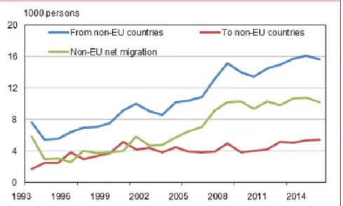
The scope of this thesis is limited to researching spatial data visualization methods that are effective in visualizing migration data. For instance, such methods should be effective in the spatial visual analysis of migration data in Finland. Finland is a country rich in data resources and it has a wealth of information in her database due to the recent surge in migration in the past 10 years. Finland is a highly industrialized and a largely free-market economically. Fin-land is considered a developed country with a high development index (HDI) according to the United Nations Development Program (UNDP) Human Development Report, 2016. The report shows Finland has maintained a progressive and steady development for more than two decades. Consequently, Finland portrays the firm image of a prosperous country that would have a good share in the global migration flow towards academics, start-ups, work, family and asylum. For example, between 1993 to 2015, there has been a significant increase in migration between Finland and non-European Union (EU) countries as shown in Figure (1).
Figure 1 Migration between Finland between other countries 1993 - 2015 (Source: Statistics Finland)
In addition to researching spatial data visualization methods on the migration as examples on methods that could be useful in Finland. I would be exploring different types of maps for visualizing human migration as well as potential blunders found in maps and in making maps.
5 With the modern-day technology, numerous datasets on migration flow are made available. These data sets are usually presented in the form of origin and destination. A popular exam-ple of these are seen on transportation manifests. Since an overwhelming number of datasets are available, it is imperative to understand the scope of research.
Geographic information system (GIS) is a potential technology with the power to create map images in a novel way to represent complex data. Additionally, GIS is an important tool that can be used for geographical analysis and suggests solutions for geographically referenced problems, information or phenomena of what is above or below land (for example, seismic activities, land use, degradation of the ice caps, meteorological assessments, migration flow, human demographics, and so on). GIS technology saves time and improves accuracy on cumbersome paper data calculations and analysis, thus, it offers a better and a crisper anal-ysis and prediction of data and the possibility of correction, repetition or duplication of tasks without starting from the beginning.
1.2 Research Questions
Research questions are the questions that this research is focused on. Likewise, they serve to establish a limit to the scope of research of this thesis. The points kept in mind about this research topic are to be clear, concise and focused. Thus, the following questions would be addressed:
1. What are the available traditional and modern-day map types and tools? 2. How the different map types can be used for migration data?
These questions would address the intricate differences between the map types and identify the failings and possibilities of developing a better visual representation of spatial data from traditional maps.
6
2
Concept of Spatial Data Visualization
Spatial data visualization makes geographically oriented data useful by its accessibility and presentation. This process gives the data depth of perception via various methodological approaches and insight. These in turn support well informed decisions. Spatial data is unlike any data and this is special.
2.1 Spatial is Special
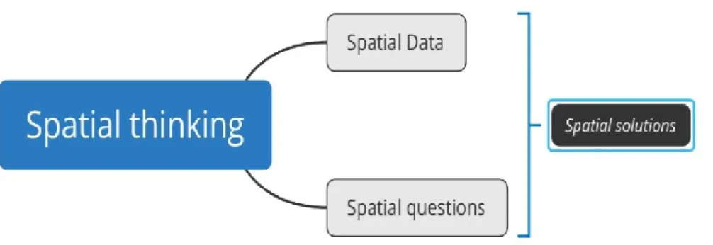
It is popularly said that spatial is special, but why? For this concept to be understood we must talk about spatial thinking (figure 2). Spatial thinking helps humans to find meaning in the geometric shape, size, location, trajectory and relative distance of objects, events or phe-nomena. However, spatial is special due to its unique characteristics backed by the follow-ing:
Coordinates, which supports the spatial referencing system. This is perhaps the most im-portant characteristic. This differentiates geographical or spatial data from any other data because it specifies location of objects with respect to the projection of the Earth surface or space under study thus having a spatial address.
The complexity in aggregating area units on a space leads to over assumptions and under assumptions. Collected spatial data needs often to be organized by some spatial structure like polygon network (in case of countries or municipalities) or grid cells. Altaweel (2018) mentioned that data analyst defines the scale of an area often arbitrarily leading to deceptive representations of density; which could be imparted by the shape or scale chosen for the visualization. Collected data is then organized into the subareas and depending on the size and shape of subareas the summary statistics can be very different. This problem is referred to as the Modifiable Area Unit Problem. (Monmonier, 1996, pp. 139-162) (Bolstad, 2016)Basically, this problem exists from the same data yielding different results when ag-gregated in different ways.
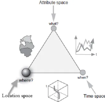
GIS plays a significant part for a human to conduct the process of spatial thinking. For spatial thinking to be conducted. Spatial data and spatial questions are needed and a result, spatial solution can be arrived at. Some examples of spatial questions are “where”, “what” and
“when”. Hence, maps have a crucial role in spatial thinking process and thus they need spe-cial attention.
7
2.2 Literature Review on Spatial Visualizations
This literature review on spatial visualization delivers a comprehensive summary of previous researches done on maps, its history as a traditional means of visualization of spatial data and on the superiority of modern mapping methods. This theoretical section was surveyed from books, scholarly articles and other relevant sources that support the topic and nature of this research.
2.2.1 Maps
Maps are visual or graphical interfaces that represent features and objects, events or phe-nomena located on the Earth drawn to a scale. In technical terms, maps display geospatial data in order to aid its users to establish an understanding of the spatial relationships between geographical data. Thus, this paved the way for the potentials we see today in geographical or spatial visualization.
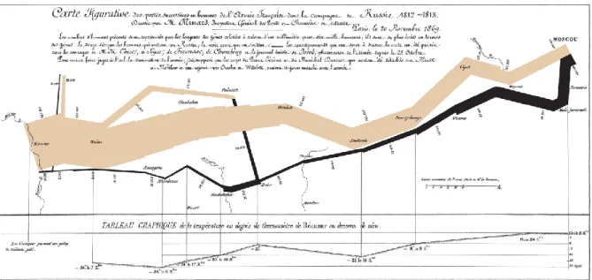
Therefore, geographical visualization is a process whereby graphic designs are utilized to facilitate the understanding of the human world around us. The human world around us con-sist of physical objects such as rivers, trees and mountains; and events such as migration, temperature variation, traffic and deforestation. These concepts can be identified by their location on the Earth hence the term spatial and additionally, these events can be temporal (this means the spatial object is also defined by a time attribute). Thus, gaining spatial un-derstanding of events, objects or phenomena are made realizable by the means of geographic visualization. For example, the process of geographic visualization like an instrument is like an efficient “prosthetic enhancement for the human body” to bolster its ability to see com-plex relationships within images by providing a graphical ideation to display a location, a phenomenon or a process that was previously unseen or invisible. (Dodge, et al., 2008) For many centuries, geographic visualizations had primarily or traditionally been presented as paper maps. Paper maps has been used in the past as a pathfinder tool and for planning strategic movements of armies. A good example of one of the best statistical maps ever drawn, the Minard Napoleon tragic march to Moscow, is shown in Figure (3) below. This multivariate map drawn in 1869 presents rich information on the events surrounding the
invasion of Russia by Napoleon’s army in the 1812. This map is unlike conventional maps
during that time because it combines a data map and time series (Tufte, 2007). Likewise, geographic visualization has been of significant use in solving one of most profound disease mysteries that plagued London in 1984. The dot map drawn to chart pattern of deaths from cholera in central London shown in figure (4). On this map the deaths due to cholera are represented by the dots. Consequently, upon examination by John Snow, it was discovered that the water pump located at the centre of the map is contaminated. (Nöllenburg, 2006)
8 Figure 3 Minard’s visualization of Napoleon’s 1812 march into Moscow.
(Tufte, 2007, p. 41)
Figure 4 John Snow’s dot map of central London plotted in 1854. (Tufte, 2007, p. 24)
Geographic visualization encompasses the development of exclusive dynamic tools for clas-sifying, representing and communicating information about the vast and complex Earth sur-face. This can be referred to as cartography. (Kraak & Ormeling, 2010)
9 Over the decades of the existence and the practice of geographic visualization, geographic visualization has often used the planar view to represent physical landscapes, and this always includes a consistent scale reduction. In modern times however, there exists no perfect method of representing the phenomena surrounding mapping including its mode of presen-tation, thus, it is heavily dependent on the ideas or knowledge the developer intends to pre-sent. For example, traditional printed paper maps which are a static representation of physi-cal landscapes and visualization of spatial data could not be explored by direct interaction to alter the scale of view without having it redrawn to suit the purpose of the user. But, now with the popularity of computers such maps have been digitized and have become more dynamic, hence, it can be explored on-demand with the built-in interactive tools without the difficulty of having it manually redrawn.
Modern geographic visualization is now capable to offer dynamic scaling which can visual-ize close-up scales of individual objects to widened-out scales of vast landscapes. Likewise, this enables the visualization of local and global scales containing graphical data mined from the continuous interactions of people with the environment. However, according to Dodge, et al. (2008), as some developers of the modern dynamic geographic visualization adhere to establish the conventions of cartographic design, many prefer to circumvent this by employ-ing some form of visual vocabularies. Also, in terms of aesthetics, geographical visualiza-tions may either be beautiful or ugly and some are useful as practical tools for spatial data analysis across many fields such as social science and environmental science. While others are not adaptable for real world problems.
In order to proceed with the understanding of modern geographical visualization, it is im-perative to understand what GIS is. According to Judith A. Tyner (2010), GIS is a computer-based system for collecting, managing, analysing, modelling and presenting geographic data for a wide range of applications. Therefore, GIS is used as the tool not just to make maps but to gain useful insight to the objects, events and phenomenon around us. GIS made the digital transition of traditional paper-based maps possible and this will be discussed later. This digital transition is brought about by the increasing availability, affordability and so-phistication of computer devices today. Thus, leading to rapid collection and storing of data, development, transmission and use of maps. Hence, GIS has made spatial visualization more interactive and expressive.
Concisely, Dodge, et al. (2008) put the whole knowledge and methods of geographic visu-alization under three classes: Looking, Querying and Questioning as a way to augment the ability or capacity of humans to analyse and understand their environment.
Looking: Is regarded as the displayed visuals or graphics which includes maps and charts
that display spatial data and spatio-temporal data (time-based data). Examples of such maps are topographic maps, thematic maps and animated maps. In these examples the user can interact with the aid of queries on the data displayed on the map and modify its display parameters such as scales, classifications and symbology.
Querying: This is process of data retrieval of a subset of data from the map database. The
user can either utilize the pre-programmed functions that retrieve data from the complex database relative to the map being explored. For example, zooming function can be regarded as a query by modifying the map parameter to suit the desired scale of the user.
10
Questioning: This is also known as exploration. This process involves the combination of
the visual insights derived from the geographic visualization by probing, scaling and filtering and the manipulation of the resulting visuals in order to answer why and what about the map phenomena. The ‘what’ and ‘why’ questions as the principal focus of this process involves
highly interactive operations that allows the user to directly control or distort the display of data in real time. However, this interactive process of questioning or exploration preserves the general overview of the data.
2.2.2 Map Types
There are numerous possible types of maps that exist, however, maps can the categorised into three major types based on their functionality or intended uses. These categories are general purpose maps, special purpose maps and thematic maps. (Tyner, 2010)
General purpose maps are maps that present a general picture, overview or planar visuals of an area. This does not emphasise a feature over another but presents the variety of spatial phenomena and features such as administrative boundaries, roads, water bodies, cities, and mountains. For example, general purpose maps such as the common country, or regional maps in an atlas and topographic maps are used for referencing, location and planning. (Tyner, 2010)
Special purpose maps are maps created for a very specific use or user in mind. Unlike general purpose maps, this emphasises one or more geographical features, events or phenomena over another to suit the user’s purpose. Such maps are usually very detailed, portraying small areas in a larger scale thus revealing more. Examples of such maps are geological maps showing rock formations or geologic distribution of rocks by distinctive colours (figure 5).
11 Figure 5 Geological map of the Yucaipa 7.5' quadrangle, San Bernardino and Riverside
counties, California1. (Matti, et al., 2003)
Thematic maps display spatial distribution or relationship and other available meta data (non-spatial data) of an attribute that is associated with a single event, process, theme or phenomenon. Thematic maps can be further characterised by two categories: qualitative or quantitative, depending on the subject of research. It can be qualitative if the subject is land use or quantitative when working with e.g. population or temperature. Thematic maps are commonly used as an addendum to atlases seen in weather reports, newspapers, reports and text books. For certain, examples of thematic maps will be featured later in this research.
2.2.3 Politics of Geographic Visualization
Every day we consciously or unconsciously encounter maps, such maps are often displayed as a tool of persuading the public and influence their thinking or knowledge for good or for bad. (Monmonier, 1996) This influence is achieved when a map is well-made with certain goals such as clarity, harmony, order and contrast. These makes the map aesthetically ap-pealing thereby contributing to its success in the presentation of ideas, and themes that maybe otherwise difficult to present verbally. For example, verbal communication of popu-lation and demographics data can prove a huge task in making sense of to the audience be-cause our short-term memory can only hold so much data at once and gain insight. Thus, presenting same information via map assist the audience thinking process and facilitates in-sight.
Prior to the production of a map, it is important to consider key factors such as; what is to be measured, map projection to use, fitting symbolology and what scale to use for presenta-tion. As discussed earlier, geographic visualization is an important tool useful for organizing
12 large amounts of often multi-dimensional data in ways that encourage organised thinking about how reality is generalized or presented.
However, it is imperative to understand that geographic visualizations are more than a knowledge bank but a creative process that can be modelled in various ways. For instance, in the process of creating a spatial or geographic visualization, premeditated and unconscious decisions are made about the theme, style, message or content and what to exclude in the final product. Thus, geographic visualizations are often a reflection of the sentiments of its creator.
As a matter of fact, geographic visualizations are made to serve to serve a target audience or interest. These interests may reflect dominant power relations in the society or as in the case of this thesis, migration with Finland as the focal point. Thus, geographic visualizations are not objective, neutral artefacts but a political view point onto the world. (Monmonier, 1996)Monmonier has written a classic book on “How to lie with maps”. He shows clearly
how the same information can be presented and understood in various ways depending on the selected maps type and the way of data aggregation, even colours or projection.
2.2.4 Utility of Geographic Visualization
Although geographic visualizations are a primary technique in geography, they have been known to be widely used in other disciplines such as anthropology, archaeology, history, outer space exploration and epidemiology, to store spatial data, analyse information and gen-erate ideas, to test hypothesis and to present results in a compelling visual form. (Dodge, et al., 2008)
However, within social science disciplines there are growing signs of a ‘spatial turns’ as
research questions and modes of analyses centre around geographic location and understand-ing of spatial relations and interactions come to a greater prominence. (Dodge, et al., 2008) These are being realized and brought about via GIS. Thus, GIS has been defended and de-fined as a complex and sophisticated as a positivist scientific endeavor that is undergoing continuous development and growth as it strives towards achieving universal truths and in-sights. (Martin & Wing, 2007)
13
3
Concept of Spatial Data
3.1 Spatial Data
Generally, data are known to be unique pieces of information, facts, figures or numbers for-matted in a specific way for reference or analysis. In addition, data are rich in information thus forming the most important factor across all disciplines, social aspects of life, politics and government.
In this project, the data we consider are of a special kind as mentioned in the preceding chapter. Spatial data possesses geographical attributes earning its multidimensional nature. Spatial data as a geographical information represents the result of observations of a phenom-enon such as migration. By analysing spatial data, the phenomena can be studied to derive insight thereby assisting the decision-making process.
Spatial data as geographical information is different from any other data information in nat-ural or social science subjects. Geographical information refers to objects or phenomena in space with a specific location or coordinates which is also known as “spatial address”.
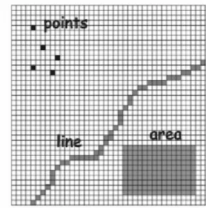
(Kraak & Ormeling, 2010) Hence, this special attribute of geographical information creates the possibility to visualize locations of objects or phenomena on maps. Real world objects like houses, fields roads, trees, or mountains have a defined location in space. There are three main steps to visualize these objects (figure 6). First, these objects can be abstracted from the real world according to some predetermined standards as Digital Landscape Model (DLM). Consequently, these are stored in GIS as points, lines or area features. Finally, these are converted into Digital Cartographic Models (DCM) represented on maps with dots,
dashes and patches assimilated via the user’s cognitive map process. Cognitive maps are mental images or any visual representation of a person’s mental model for a given process or concept that furnishes understanding, direction and insight. (Bolstad, 2016)
14 Figure 6 Nature of geospatial data. (Kraak & Ormeling, 2010)
3.2
Spatial Data implementations
Spatial data implementations are a way of representing real world objects or phenomena and their attributes in GIS. There are two types of spatial data implementations: vector data and raster data. These data implementations exert some influence on the processing speed and data storage volume.
15
Vector Data Implementation (VDI): is a representation of the real-world entities by using
discrete shapes such as points, lines or polygons (area) to describe discrete shapes such as fire hydrants, rail roads or a building respectively (figure 7), or even continuous phenomena like elevation data by contour lines. Each of the types of VDI are composed of coordinates and attributes. VDI store data about the interested objects hence, it consumes less volume of storage space and the processing time is faster. (Bolstad, 2016)
Figure 7 Vector Data Model (Bolstad, 2016)
Raster Data Implementation (RDI): is a regular grid of cells known as pixels or grid cells, arranged into rows and column. Each pixel is given a value to represent the type or quality of mapped variables (figure 8). RDI can represent both data models: discrete and continuous. Discrete RDI assigns a definite value to the pixel to define distinct themes. For example, a pixel representing a soil type. Continuous RDI pixels are with gradually changing data such as mean temperature, elevation. Rasters are a natural means to represent continuous fields in the real world, because they show considerable variations over the study region
Figure 8 Raster Data Models (Bolstad, 2016)
Raster Data models and Vector Data Models can be interchangeably used to represent many types of phenomena. For example, temperature variation across a region may be represented
16 as a raster image, or by vector data types with a series of lines representing contours of equal elevation and temperature. (Bolstad, 2016) (Zhang & Goodchild, 2002)
3.3
Understanding and gathering geospatial data
There are three conventional aspects that make up geographic data that are stored in a geo-graphic database: spatial component, temporal (time) component and attribute component (figure 9). Spatial component refers to the geometrical or positional feature of the data such as geographical coordinates. This locational attribute gives the geospatial data their unique character and distinguishes it from any other types of data. This component or variable tells
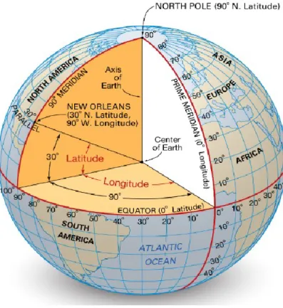
the ‘where’ of an object or phenomenon and this is usually referred to as georeferencing.
(Kraak & Ormeling, 2010) It defines a location by latitude and longitude which are measured in degrees, minutes and seconds in relation to the equator and the prime meridian (figure 10).
Figure 9 Working with geospatial data components (Kraak & Ormeling, 2010)
Attribute components are the non-geometrical characteristics of geospatial data. They
an-swer the question ‘what?’ and what characteristics the featured object possesses. Attribute data can be qualitative (language, soil type, race) or quantitative (income, average age, tem-perature). Attributes of an object can change as well as the objects that have these attributes. Attribute data are usually collected from surveys, fieldworks, remote sensing or satellite im-agery.
17 Figure 10 Longitude and Latitude. (Britannica, n.d.)
Temporal component is a dynamic variable of a geospatial data object and it refers to the moment in time the location and the attribute of the object is true in the real world. This
component answers the question ‘when?’. Thus, these three components define the nature of
an object or phenomena.
Moreover, the nature of a geospatial object can be signified by their shapes into subdivisions (point, line or area), such as how it represents the object in the real world (figure 11). These objects could be discrete or continuous in nature. On one hand, discrete objects are explicit, visible and tangible in nature in nature. These objects could be bordered on all sides (houses, parks, lakes) or predetermined areas (countries, states or administrative boundaries).
Figure 11 Digital representation of the attributes of geospatial objects modified ac-cordding to (Kraak & Ormeling, 2010)
18 On the other hand, continuous objects are commonly used to represent phenomena. These objects are considered to vary in nature and may be invisible but are measurable and tangible. Example of continuous objects are, temperature data, precipitation data, humidity data, air pollution data. This process of abstraction as discussed earlier is very important for subse-quent storage and mapping operation.
3.4
Data Collection and Preprocessing.
In our modern information age, the popularity of high-tech tools such as sensors, GSM (global system for mobile), RFID (radio frequency identification) and GPS (global position-ing systems) which forms whole or parts of high specifications portable devices like the Garmin series, airplane transponders, or mobile phones, produces and stores high-resolution spatial data and time-stamped data at a phenomenal rate.
For example, companies producing data on digital land use and socio-economic data with spatial attributes keep producing these data at high resolution quality. Likewise, the popu-larity of picture and location-based apps such as Flickr and Google maps are more often geotagged, and time stamped when the data is being stored.
Subsequent to the collection of data is to ensure the data quality. The process of ensuring a good data quality is called preprocessing. Preprocessing collected data is necessary because the data collected from the real world is comprised of inaccurate or missing data, erroneous data, outliers and inconsistencies. Therefore, collected data such as migration data needs to be checked by verifying its data quality measures such as validity, accuracy and precision, completeness, consistency, and uniformity. (Devillers & Jeansoulin, 2006)
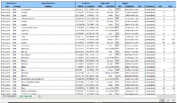
Validity of data needs to conform to a defined format and rules, such as coordinate unit type and time unit. Also, it must have an identified object id or object name, and origin and des-tination entries among other necessary attributes as needed (figure 12).
Figure 12 Screen snip of an example of a valid immigration data sheet into Finland (Na-tions, 2018)
19 Accuracy of the data must be verified to ensure it is close to the true values thus allowing values that are invalid to be identified and addressed. Precision is also needed as a way to avoid ambiguous references. For example, a coordinate to focus precisely on Helsinki should not be generalized by pointing to the middle of Finland.
Completeness is a data quality measure that ensures that all required data are known. Missing data are identified through this measure and the solution to this is to revisit and probe the source of the data for insight into the missing data.
Consistency is a measure to ensure that the data and its attributes are consistent within the same data set. For example, two countries cannot have the same coordinates nor is it correct for an European county to be identified as belonging to the continent of Asia.
Uniformity is a data quality measure that helps to check the degree to which the data con-forms to the same unit of measure with the same data set or across multiple data sets. For example, the coordinate unit measure of longitude and latitude should be consistent and not mix easting and northing
Furthermore, for a large set of high-resolution multivariate data, such as spatial datasets, the size of these data poses a challenge to the developer. The size of such data affects negatively the processing time when the data is being mined or analysed. It is always smarter to decide why the data was collected and for what purpose the data will be used. Thus, the developer needs to filter the data while retaining only the relevant attributes necessary for analysis and according to the desire or goal of the developer. This process makes exploration of the data more interactive, consumes less screen space, processes faster and allows the user to focus on relevant data.
3.5 Scales of Spatial data
Geospatial data collected in the field of research by researchers using different assortments of sensors and equipment are saved in different formats, are held physically at different lo-cations around the world and incorporate many variables and types of data. Users face myr-iads of challenges when they wish to integrate geographical data from across different do-mains and multiple databases and potentially use the data for purposes that were not origi-nally intended. (Dodge, et al., 2008) Hence the complexity of geographical data complicates the exploratory visualization.
Furthermore, having the established nature of the attribute of geospatial objects, it needs to be measured or categorised as either qualitative or quantitative. The following shows four different measuring scales that can be applied to the measurement of attribute information of geospatial objects. (Devillers & Jeansoulin, 2006) (Bolstad, 2016)
Nominal Scale: This is a qualitative measurement scale assigning labels to classify attribute values of geospatial data into discrete categories without one label being more important than the other. For example, soil types, list of languages, races, religious affiliation or gender.
Ordinal scale: This is a qualitative measurement scale that uses labels to classify attribute values of geospatial data into ordered classes such that one is greater than, less than or more
20 important than the others. For example, language skill rating as beginner, basic, intermediate or fluent.
Interval Scale: This is a quantitative or numerical measurement scale where the attribute
values are different, ordered and the magnitude between individual measurements can be determined. It provides information about the order and the differences between the values. A good example agreed by many on this measurement scale is temperature, because the difference between each value is the same irrespective of the zero value. The difference between 40 and 60 degrees Celsius is same as the difference between 100 and 80 degrees Celsius, interval scale enables the use of statistical analysis on the data. Likewise, it is in-correct to say that a temperature in Fahrenheit of 64° is twice of 32° because when converted to Celsius it becomes 18° and 0° respectively. (Kraak & Ormeling, 2010) However, this measurement scale has certain limitations such as it has no true zero value as in the case of the example above, negative numbers have no impact as opposed to everyday maths, and interval data can be added, and subtracted but cannot be multiplied nor divided.
Ratio scale: This is a quantitative measurement scale having a true and fixed zero as a min-imum value. This scale also tells about the order and value between individual measure-ments. Unlike interval scale, ratio scale provides the possibility for the variables to be added, subtracted, multiplied and divided. Examples of ratio scale variables includes height, weight, salary etc. in addition, statistical measurements such as mode, mean, standard deviation can be calculated from ratio scales.
3.6 Complex and Diverse Datasets
It is often valuable to view information through different forms and gain a better understand-ing by manipulatunderstand-ing the data. “Large and complex geographical datasets often contain miss-ing or erroneous information”. Therefore, this may affect how the user explores the infor-mation. This calls for more discretionary work from the developer, whether to ignore it, pre-filtering it out, assume and substitute the information or classify it as missing and treat it specifically. (Dodge, et al., 2008)
Additionally, the missing information, errors or discrepancies may be found on another da-tabase. Thus, amalgamation of two or more databases may highlight these oddities and in-formation may be inferred through the integration of the two datasets. (Dodge, et al., 2008)
3.7 Interaction and Manipulation
Both the developer and user need to make choices, not only on how to display the data but how to interact with the information. Many parameters are involved in the visual appearance of the display and these can significantly vary the impact of what is emphasized and what is hidden in the display. (Dodge, et al., 2008)
3.8 Migration Data
The phenomenon of migration has been studied in various forms for a long time. The study of the migration of animals has helped propagate many measures to save endangered species, understand and improve our environments, and discover new things. Likewise, the study of
21 human migration has led to understanding our behavioural impulses, discovering new ways to travel, development of cities, controlling traffic, managing the economy, monitoring the population and making administrative decisions to govern.
This thesis focuses on human migration data while limiting the research to examples of methods of visualization that would be applicable to Finland migration stock data. As al-ready discussed, large quantities of data are being produced and among these are datasets representing migrating entities. These migrating datasets are usually collected in the form of origin-destination data. However, the trajectory, which is the movement route of the entities, is unknown. (Boyandin, et al., 2011)
3.8.1 Properties of migration data
Migration datasets are multivariate in nature, simply possessing basic variables such as the origin, the destination and object or entity ID. However, migration datasets can be more robust in terms of the number of variables it can possess, and the list can be extensive. For example, time stamps (temporal), migrant count (intensity), age, gender, profession etc. The developer decides on the number of variables needed. The entity or object ID is necessary to identify the object being observed, this tag can be a unique name, country, city, or just a unique number. The origin variable data represents an initial geolocated position of the ob-ject being observed and it is usually denoted as coordinates, while the destination variable is the coordinates of the final location of the object. Time (temporal) variable brings some complexity into the migration dataset such that it broadens the observation across a temporal space. Therefore, with this variable, changes in trends could be observed depending on the extent of time data or historical data collected about the object.
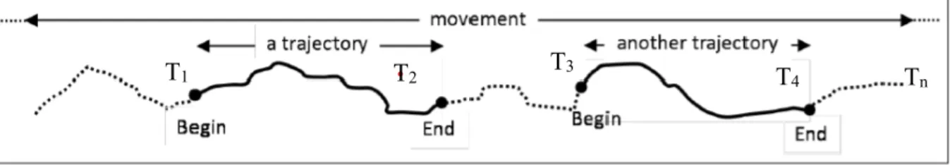
On the other hand, migration datasets can become more complex with the increased obser-vation on the temporal variable of the object while in transit. As a matter of fact, human migration has not been always as straight forward as just going from a point A to point B in all cases. Human migration has always been more of time stamped movement from a point of origin to a point of destination with possible stops or directional changes in between, thus, revealing the route of movement of the object. This time stamped movement is called tra-jectory. Trajectory of human migration always has a time function (T) that is recorded by a finite set of observations at discrete times (figure 13). This presents the possibility of dis-covering new information such as behavioural patterns and velocity.
However, it is also correct to say that simple migration of an object from a point A to point B is the trajectory of the object from time function T1 to T2.
Figure 13 Trajectories of a movement track (Parent, et al., 2013)
22
3.8.2 Sources of Migration data
There exist three main categories of migration data sources: Statistical data sources, Admin-istrative data sources and innovative data sources. (GDMAC, 2019)
Statistical data sources: This refers to data collected during national population census and housing surveys. These data are pre-processed and stored for producing official statistics. These data are often collected alongside numerous variables that are valuable for research. Census data produces variables such as country of birth, country of citizenship, year of arri-val for foreign-born persons. Household surveys produces more object oriented or object personal variables of internal migration, socio-economic characteristics and emigration. However, household surveys lack the flexibility a national population census has, thus re-sponses are delayed, and it can only target specific willing groups. (GDMAC, 2019)
Administrative data sources: These data are often collected by national border posts and
citizens registration offices specifically to support administrative processes and for purposes other than gathering information on migration. These data produce statistics on flows of nationals and non-nationals, migration stocks, and socio-economic variables. (GDMAC, 2019)
Innovative data sources: This refers to data collected via portable electronic devices like mobile phones, personal computers and tablets; and online tools and platforms such as social media, online payment services. These data collected from these sources constitute what is known today as Big Data and has become a very useful source for migration data.
3.8.3 Potential Issues of Migration data
Capturing migration data via a national census count or administrative means can be expen-sive or infrequent or raise legal questions on the innovative means. Many first world coun-tries like Finland are great role models in tackling most problems regarding data quality general data protection regulation (GDPR) issues. On the other hand, many third world coun-tries often lack comprehensive records of their citizens, complete systems of birth and death registration, although completeness is improving, and some methods have been devised to improvise on missing data. However, registration data on migrants/migrations in most coun-tries cannot be relied on to produce reliable estimates of immigrants, let alone of internal migrants/migrations. In addition, for various reasons (illegal status, temporary residence of recent migrants, fear of xenophobia, etc.) migrants (especially immigrants) are usually un-derrepresented in censuses and surveys. (Anonymous, 2012)
23
4
Techniques and Methods of Geospatial Visualization
Over the years, and with the increase in the availability and use of high end or sophisticated computer systems, researchers and developers have developed many different forms of vis-ualization that display geographical information. Each of these different forms of geo-graphic, geospatial or spatial data visualizations enable the users to perceive their data through differing viewpoints and propel the user to acquiring in-depth understanding of the information. (Roberts, 2008)
For this thesis, I am focusing on spatial data visualization methods that could be used appro-priately to visualize migration of people in Finland. This idea is brought up with the context of visualizing migration data to and from a defined administrative boundary such as a coun-try. It is easier to obtain the data of migration to and from a country from available public database sources than to obtain data of migration within an administrative boundary. For example, it is near impossible to obtain readily from public or open sources the migration data of those travelling from Helsinki to Oulu, but ready data exists in open sources for those travelling from Finland to Italy or vice versa. Such international data are large and often complex.
As discussed in the previous chapter, geographical databases often consist of a diverse range of data defined by their attributes as either spatial or non-spatial elements. It may be over-whelming or confusing when the user is attempting to understand this information without the right tools. Thus, the goal of the user is to obtain the knowledge embedded within the information and gain insight in form of artefacts to a diverse or complex data with different components and data types.
With the goal of deriving several artefacts from the information within any complex geo-graphical database such as international migration data, developers have created specific exploration environments that utilize Coordinated Multiple View (CMV) techniques. This gives the user the ability to select some information to visualize and displayed in different forms, manipulate the results, compare objects and artefacts between views, roll back to previous sessions, understand trends by visualizing the data in-depth and finally taking meas-urements of objects and areas in the display. (Roberts, 2008; Dodge, et al., 2008)
4.1 Exploration
With respect to spatial data, exploration is an act of investigation with its aim to search, locate and discover something new. A user starting out on the investigation process may not know anything about the data, let alone the question to ask. Thus, the system should help the user to not only display visual results of the information but also browse and locate pertinent information. Visual exploration enables the user to experiment with some parameters, with instant visual feedback of each parameter adjustment, manipulate the data through selection, and highlight operations and relate that information to other sources and visualizations. Fur-thermore, the user may directly select some interesting elements using a bounding box tool, see the selected list of results in both a scatter plot visualization and a textual list of results. In addition, the user may decide to edit the list either by adding more items or deselecting some from the list. Thus, exploration is a part of a larger knowledge discovery process (KDP). (Roberts, 2008; Dodge, et al., 2008)
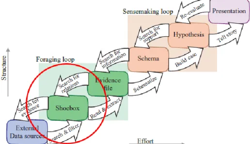
24 Exploration, just like the unavoidable curiosity when searching for new species of marine life engender many possibilities and broadens the search space. Also, the techniques the user is employing to generating multiple views, selecting and highlighting elements, zooming and displaying additional details all help the user to explore. However, it is imperative for the user to draw conclusions and present that information for the clients. (Roberts, 2008) A developer would need to consider some important steps required to generate a presenta-tion. The developer may choose different data model to adopt, however, there is a constant principle to this process. Firstly, the developer creates a demonstration dataset defined as a shoebox (it is also known as sample dataset); as shown in figure (14) from the original via the process of filtering, aggregation and processing of the original data. Furthermore, the developer decides the visual form of choice and how to synthesize the data into it. Lastly, the user manipulates the parameters of the data to modify the resulting visualization of the information. (Roberts, 2008)
Figure 14 Sense making (Exploration) Schema highlighting the shoebox.
(Roberts, 2008)
Jonathan C. Roberts (2008) described the shoebox as a demonstration set that is stored for future reference. Furthermore, he inferred that the purpose specific and relevant information that has been extracted and stored is to highlight interesting facts and confirm the relation-ship between the attributes of the data.
4.2 Interactive Information display
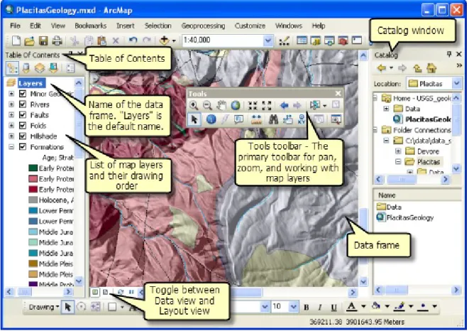
When information is displayed from a geographical dataset, the information contained within the current view is replaced with another view when the parameters are updated by the user. For example, when the user changes the position of a value slider, the display is instantly updated. Such dynamic query interfaces provide pre-attentive visualization of the information. This operation is made accessible via toolkits which are non-map-based
reali-25 zations used alongside the visualization. This toolkit provides a powerful exploratory envi-ronment housing all user controls and operations used in the visual research of geospatial datasets (Roberts, 2008; Dodge, et al., 2008).
Figure 15 Example of ArcMap exploratory toolkits (ESRI, 2019)
4.3 Use of Maps as tools for Visualization of Spatial Data
Tools are needed in order to process geographical data and spatial data. As we learnt, geo-spatial data are data that refers to location of naturally existing or human engineered features on the earth. Some examples of naturally existing features are oceans, rivers, lakes, moun-tains, vegetation cover and soil. Examples of engineered geographical features constitute those that are constructed by humans (buildings, roads, monuments) and human settlements (administrative boundaries of countries, municipalities).
Popularly in geoscience, research ideas have always been expressed by using geographical and spatial data. Thus, there are numerous usable techniques and software tools for explor-atory data analysis. Likewise, software developers and scientists continue to develop and release new tools and as a result, popular tools are mentioned in this project. There are pop-ular tools for researching these ideas, one of such is ArcMap developed by ESRI, it is a robust proprietary software capable of creating map layouts for printing in addition to creat-ing, explorcreat-ing, editing and performing several types of analysis on GIS datasets. Another readily available software among others for researching spatial datasets is QGIS. QGIS is a cross-platform, free and open source software also with the capability to create, edit, visual-ize and publish geospatial information. It is also noteworthy to mention numerous online based data analysis tools or programs that are capable of processing geospatial data. An
26 example is https://plot.ly/javascript/maps/ , an online open source statistical analysis pro-gram used for making interactive graphs.
In addition, Jonathan C. Roberts (Roberts, 2008) cited some examples of specialized tools for researching these ideas such as Visualization Input Pipeline, Link Winds, Visage, DE-Vise and Spotfire. These tools perform tasks such as describing linked cursors of 3D maps, demonstrating coordinated manipulation of maps, and product visualization along with other statistical forms respectively. There also other advance tools capable of developing and sup-porting coordinated multiple view visualizations. Such tools are CommonGIS, GeoVISTA, and Improvise.
However, developers for these tools face difficulty of time and effort for development and maintenance. Also, remote users face the challenge of interoperability despite the tools being published on the web.
4.4 Possibilities of Visualising migration data
Chapter 2 of this project gave a brief insight about some notable yet useful history of maps. Maps as geographic visualization played important role in human history especially in earth sciences. (Nöllenburg, 2006) Some of the earliest methods of mapping are known from the stone age era, and map making has been developed to have a lot of applications. Nowadays, maps are being seen by many as the only ways to present the real world or a region. Ironically there exists non-geographic visualizations that are also effective and offer some advantages in understanding the real world when used along with geographic visualizations. At this point it is viable to say that maps are more than capable of presenting phenomena such as migration of humans. Two categories of mapping methods that are useful in displaying mi-gration data will be discussed subsequently.
4.4.1 Traditional Map Types
At least at some point in our lives we have come across pictures designed as a representation of the real world. Contrary to the common perception of traditional maps only displaying natural landscapes and engineered structures, some traditional maps have successfully pre-sented migration data. The following are the simple traditional mapping methods.
Topographic maps
These are general purpose maps that are designed to portray and identify features in the real world as accurately as possible while being guided by a set scale. This map type forms the basis of thematic maps and other methods of mapping that would be discussed subsequently. Properties of topographic maps are clearly identifiable legend keys, scales, compass indica-tor, and a coordinate system. (Meaden & Kapetsky, 1995)
However, accuracy topographic maps may pose some problems associated with their use, since there are issues with missing geographic data and made up data due to the vastness of the Earth and its ever-changing landscapes.
On their own, topographic maps are like the chassis of a vehicle, it is not able to convey any more information other than its faithful portrayal of the Earth’s landscapes. Topographic
27 road networks (figure 16) or charting simple origin and destination movements (figure 17) but are not able to display other variables such as number of people migrating at a time nor is it able to display temporal variable related to the migration.
Figure 16 Topographic map layout of Finland
Modified topographic maps as shown in figure (17) are known as connection map or link map. it displays just simple facts of origin-destination relationships with no magnitude or temporal variable on display. However, it cannot display a lot of origin destination data be-cause it can lead to visual clutter and become messy. This type of map is useful for passing across trivial information without any real depth for research.
28 Figure 17 Topographic map (connection map) showing simple origin-destination
relation-ship.
Thematic maps and Cartograms
Thematic maps are useful for visualizing area phenomena. They are more complex than a topographic map because more variables of original information are displayed. Thematic maps are able to show spatially distributed features and spatial patterns and relationships. For instance, figure (18) shows a choropleth map which is a type of thematic map with spa-tially distributed values. In this example, the choropleth map uses the graphic variables to represent world population densities on the map according to each country’s administrative border. Nöllenburg (2006), described chorpleth maps as a map that uses a graphical variable describing properties of colour or texture to show properties of non-overlapping areas such as provinces or other units of territory division. In simpler terms, it is a map that represent statistical data via categories or classes (colour hues or shading patterns) on a predetermined geographical or enumeration area. (Tyner, 2010) Each value of an area is represented as a relative value to the area it is representing by using ratios or percentages rather than absolute values; this eliminates the error of misguiding the users of the map via visual misinterpreta-tion on estimating the densities of each enumeramisinterpreta-tion units or area. (Tyner, 2010)
29 Figure 18 Example of a thematic map showing spatially distributed variables
(Nöllenburg, 2006)
Choropleth maps can be used to show migration stock distribution of all countries that im-migrated into or eim-migrated from a location at a given time. This mapping method is able to display the magnitude of movement per country by the classification properties of the map. On the other hand, cartograms are a specific type of map transformations and a generaliza-tion of ordinary thematic maps in such a way that the geography of the Earth is distorted and resized to the related statistical value inputted. For example, a cartogram can be transformed by linking the magnitude of each country’s immigration stock at a particular time to the country’s geographical space thus achieving the result shown in figure (19). (Ward, et al., 2010) (Nöllenburg, 2006) this map displays the size of a country proportional to the size of its population.
Figure 19 Example of a cartogram transformed using each countries migration stock at a particular time.(Nöllenburg, 2006)
30
4.4.2 New Ways to Make Maps Today
We have discussed the modern advancement of tools and continuous development of new methods to display complex multivariate datasets. Sophisticated mapping methods have
been used in the past, for example Minard’s Napoleon march map from figure (3).
Nowa-days, sophisticated mapping method are no longer hand drawn as was in the case of Minard’s
Napoleon march map but developed on high performance GIS systems.
Powerful computer programs have been employed to utilize multivariate data but in reality, it is impossible for a single mapping method to fully analyse a geographic dataset. Some geographic visualization programs are employed to present certain multivariate data better than others. In addition, better analysis can be achieved with the combination of tools and in some cases with statistical analysis tools. Therefore, it is imperative for the map maker to be well acquainted with the capability of the tools being used.
Using modern tools to execute modern methods requires skill and comprehensive knowledge about the functions of the tool and of the nature and quality of the dataset. In order to fully synthesize a complex dataset like a migration stock dataset, one must decide which research questions needed to be answered to save time and resources from trial and error tasks. Migration stock data can best be modelled using the following methods:
Origin-destination maps and flow maps
These are visualizations representing entities migrating between geographical locations on a map (topographic or thematic) overlaid with lines connecting the flow origins with the destinations. (Boyandin, et al., 2011) origin-destination maps could either be static (figure 20) or dynamic depending on the extensiveness of the tools used and the aim of the map maker (figure 21). Dynamic origin-destination maps are limited by their mode presentation because once printed it reverts to a static map. Dynamic origin-destination are rich in infor-mation for research when exploring each entity on the map. This is able to give the user the ability to zoom and isolate an area of interest for a closer in-depth study. However, a flow map is able to display the magnitude of each migrating entity as shown in figure (22).
31 Figure 20 Static origin-destination Illustration.
(Dempsey, 2013)
Displaying too much entity data on flow maps often leads to visual clutter and mess. There-fore, a solution to solve the issue of visual clutter is to merge edges that share origin or destination. Likewise, other limitations include flow lines crossing obscuring other lines which can be solved by means of intelligent edge routing and using curved lines instead of straight lines. (Briney, 2014) (Ward, et al., 2010)
Figure 21 An example of a dynamic origin-destination map
32 Figure 22 Anatomy of flow map showing the magnitude of each entity.
(Ribecca, n.d.) Flowstrates
However, there are limitations to the use of origin-destination maps and flow maps when temporal properties are involved. Boyandin et al (2011) presented a smart solution to tackle this problem by using a combination of methods. They developed a design alternative to bring together the spatial and temporal dimensions in a way that makes it possible to explore the relationship between these two aspects of the data. Figures (23, 24 and 25) presents their combination techniques yield a sophisticated view of both data
33 Figure 23 Combination technique viewing spatial and temporal aspects of migration data.
34 Figure 24 Example of Flow aggregation map
(Boyandin, et al., 2011)
Figure 25 Enlarged heat map highlighting intricate information within the dataset (Bo-yandin, et al., 2011)
The authors of this work proposed a novel technique called flowstrates. This technique com-bines flow maps, timelines and destination matrices for visualizing temporal origin-destination data. Figure (23) show a demonstration on how the technique can be explored by highlighting point of interest, revealing the flow magnitudes via a heat map on the origin-destination matrix, thus revealing the origin-destination and changes in magnitudes over time of the highlighted origin point of interest.
Figure (24) shows the flow aggregation of the same dataset. This technique aggregated the individual flows by the country of origin hence displaying the magnitudes of the flows orig-inating from each region.
While figure (25) shows the zooming capability of this powerful tool by enlarging the coun-try of interest, showing intricate differences in value of magnitude over subsequent years. This powerful tool does have its limitations as do many other tools. The limitations men-tioned are the inability to process large numbers of flow which leads to filtering and aggre-gation of data; having too many lines drawn creating visual clutter which could be tackled by using the heat map row ordering by vertical positions of the origins; and not being able to see the flow maps on one map as with conventional flow maps.
35
Map Animation
Map animation is a dynamic technique that can be used to visualize spatio-temporal datasets. Cartographers have been experimenting with some forms of map animation such as map movies and animated maps. Animated maps use the time variable of the data to add another dimension to the visualization. This causes each scene of the animation to display the state of the data at one moment accordingly therefore making the temporal change of the attribute visible to the user. (Nöllenburg, 2006)
Past research has shown that map animation has the potential of revealing subtle space-time patterns or trends that are not easily observed with static maps. Just as condensed forms of knowledge like television commercials, animated maps are intentionally scaled-down rep-resentations of the world (Dodge, et al., 2008)
However, it is intuitive for a map animation tool to be interactive to avoid the issue of miss-ing important information and the inability to manually compare the data displayed at dif-ferent points of time.
The following website example shows a screenshot of online application programs of inter-active map animation: https://www.lucify.com/the-flow-towards-europe/
This online interactive tool displays a statistical temporal graph and the magnitude of the migration stock per year at the top, there is a slider for when the user needs to adjust the speed of display, hovering the mouse over the statistical section manipulates the time and that is a useful tool for comparing values at different points in time. In addition, the user can manipulate the location of interest by clicking on the spot.
Figure 26 Screen shot of an interactive map animation. (Saarinen & Ojala, 2018)
36
Space-Time Cubes (3D Maps)
A space-time cube is a 3-dimensional (3D) representation of space with time as the third dimension while two dimensions represent the spatial properties of the event. The mapping of temporal changes in migration data consists of events at which certain truths hold and as a result maps that display these temporal properties consider a selected time interval for an object. It displays the existential changes in the trajectory of an object by selecting moments in time simultaneously using small multiples (Nöllenburg, 2006)
Space time cubes presents a dedicated approach to visualizing singular movements in history limited to a specific time interval of an event, thus it’s not suitable for visualizing multiple
events in a single space. (Nöllenburg, 2006) However, 3D space-time cube was noted for it is advantage over 2D trajectories in displaying when and not if an object visited a place. (Nöllenburg, 2006) A novel example of a space time cube is the reimagination of Minard’s
Napoleon march into Moscow as shown in figure (27). This example depicts the temporal properties as a third dimension to the map showing the relative position and trajectory of
Napoleon’s army. This method is more pleasing to the eyes and easier to understand than the one at figure (3) that shows a two-dimensional trajectory of the trip.
Figure 27 3D reimagination of the trajectory of Minard's Napoleon march in to Moscow. (Kraak & Ormeling, 2010)